#ALSO I DID LINEART AGAIN IT WAS CRAZY
Explore tagged Tumblr posts
Visit Tumblr Blog
Explore Tumblr blogs with no restrictions, modern design and the best experience.
Last Seen Tumblr Blogs


Fun Fact
There were a total of 171.5 billion posts on Tumblr in 2019.
Text
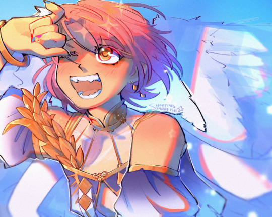
i got a few asks about my process :0 so yea i took some screenshots mid-process of my recent cliff-skk thing just for that
m gonna preface everything by saying that i did have a ref for the environment!! i avoid color dropping from the image and tracing cuz i do want to hone some digital skills. also saying i'm doing an "environment study" when i'm really just drawing skk makes me feel better abt myself
when i don't have a reference, i tend to do some thumbnail sketches in my sketchbook. here's some random stuff of past work, where i rawdogged everything:
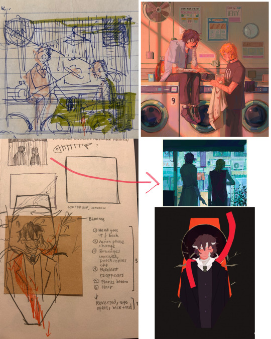
but whatever, back to the cliff-skk. i'll also post a timelapse of it for easy ref, but detailed stuff is under the cut :)
first i did some rough sketches on an orangeish background (underpainting etiquette, i find it helps things feel brighter and keep a stable tone when choosing colors to lay on top), and I quickly lined skk :)


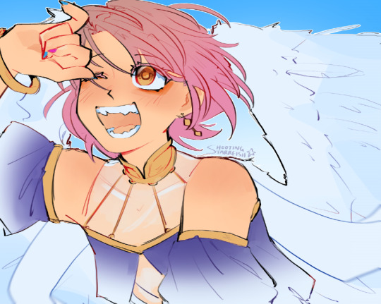
then I laid down some flats for the background, again really eyeballing the reference for hues. afterwards i thought it was a bit bright, and i wanted a more sepia/nostalgia feel to it, so i hue adjusted everything to something more uniform


then i lay down flats for skk + the ocean, which i both had to color adjust a lot (you might see that in the timelapse), and then i jump straight into rendering the background. when i render, i always prefer to do it over something lineless, so i turn the sketch layer off. i rarely do lineart for backgrounds.
i also used to render the characters first, but i've found that it's just not a great approach—especially for art where characters and background are interacting, knowing the hues and shades of the environment is crucial to effective rendering on the character that doesn't make them look out of place.
when i'm rendering, i really try to keep in mind tenants of contrast, perspective, form, and light/shadow. ex, stuff "closer" to us has more detail; the hill in the back is minimalist (in comparison); the shadows lean cool-green while the light leans gray-yellow. rake brushes really carried me here idk... my fav brushstyle forever


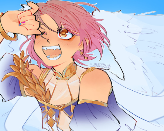
eventually i reach a point where i'm satisfied (or bored) with the background. for the last stages i usually have the subjects hidden so i can really perfect the details—but then for super duper final details, like the little leaf specks and grass strands, i unhid skk so the poppy details could work around skk. then i get to rendering the characters :)
i forgot to take ss of all the stages when i rendered skk, but here's something from... about the middle of the process? i tend to render characters with the lineart hidden as well, sometimes bringing it back just to clarify things, but ultimately i prefer to define things by form than by line. that's just me tho idk, idt it makes or breaks anything, just a preference
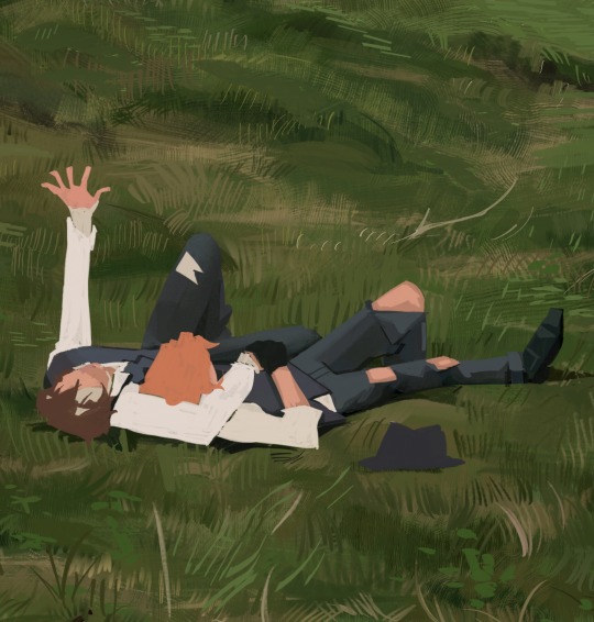
again rlly just thinking about cool/warm, reflective tones (the greenish shadow on chuuya's left inner leg, sky-gray blue on dazai's vest), really just slotting the subject into the environment. after i finish rendering the characters, i usually return to the background and add some stuff—in this one i defined the waves a bit and put some grass around skk
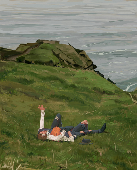
and yeah then we're done idk LOL. sometimes i run the file through camera raw (photoshop) to do some color adjustments—i find that my iPad displays colors super differently, usually making things a lot lighter than they are (u can see how dark the timelapse is...), so i find myself lightening my work a lot. i also sharpen and add noise as needed :)
i think my process has changed a lotttt even in this past year. it's kinda crazy!! it's always fun to do these and just reflect a bit on how i work. mostly just mindless insanity until it kinda works.
thanks for sending in an ask. and if u read all that, thanks to u too lolol
189 notes
·
View notes
Text

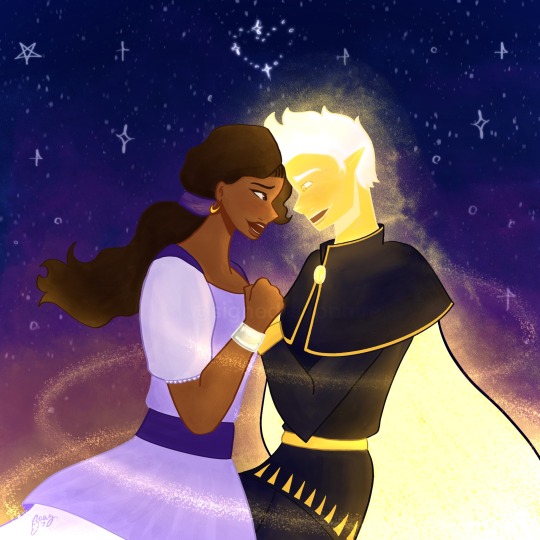
"I never meant to hurt you, Jay. If I had known it would've destroyed our friendship, I'd take it all back."
----
Full Background undercut! Thank you again @novastar134 for the lineart!!
it's been a while since I did a redraw but felt the NEED to redraw this screenshot after @goldendaydna shared it during our rewatch before DR S3

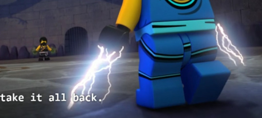
also noting why i love this scene so much-- cole having green in his powers around this time AND especially in this scene is crazy to me because of the fact he had just been talking Lloyd and tbh i wouldve ignored it of being anything if Jay hadnt had flicks of red in his lightning and HAD JUST BEEN TALKING TO KAI 😩 like I might be delulu but this is my headcanon and I STAND by the colors being there cause of how much they influence each other early on 😤😤


#ninjago#ninjago jay#ninjago cole#cole ninjago#jay ninjago#jay walker#cole brookstone#ninjago screenshot redraw#ninjago redraw#ninjago tournament of elements#jay vs cole#cole vs jay#ninjago fanart#ninjago season 4#my art#veggie art#veggie arts#veggie redraws#screenshot redraw#i know in i like up the intensity i do genuinely LOVE the red in Jay's lightning during this fight and Cole's GREEEENNN its so good frfr
89 notes
·
View notes
Text


Whaaa!! So I recently watched the new RoV movie, and it inspired me to make some fanart.T^T I haven't drawn Andre in his emo hairstyle in literal years, so I definitely struggled a bit.;x;
I also wanted to challenge myself (yet again) to try painting! I did still have a tinyyy bit of a lineart to help guide me. Tbh I didn't know what I was really doing, which sort of affected everything else, but I triedddd.x_x It was also an interesting learning experience...
Anyways, I saw a nice photo with a streak of light over the models eye, and thought it'd make for some neat symbolism/metaphor for Andre!:-D I often draw Andre with green eyes, but I went with dark brown here, and his blind eye milky (at least that was what I tried xD). I tried not to over do the sparkles either, which was hard orz.
But anyways yea! While I have some mixed feelings about the movie, it was still a lot of fun to watch and made me fangirl like crazy aha!! I watched it in english, and the VA cast did suuuch an amazing job. Especially Andre...I will NOT get over his voice it was so pretty!!T^T (the way I squeaked when I first heard his voice....u////u)
#rose of versailles#lady oscar#versailles no bara#andre grandier#andré grandier#the rose of versailles#gloomydraws#urghhh there's sooo many things wrong with it but whatever#the colours make my brain go brrr so good enough#also it's my wife!!#so even if i drew a stick figure of him i'd be like yippee!#lol i'm so simple
56 notes
·
View notes
Note
HI how did you add those textures to mspaint?!?!?
using this as an excuse to draw ted on mspaint again LOL
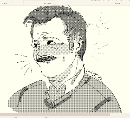
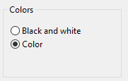
TL;DR, you click file on the top left, open properties, then under "Colors" you switch color to black and white
and you get halftones instead of colors :-]
(if you want some more tips and a little bit of process, click this 👇)
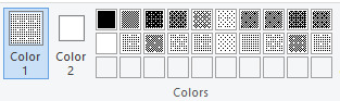
basically i start by drawing in color mode, mainly because i get "layers" in a way by using a different color for the sketch and using the eraser tool and holding right click to only erase the color i set in "Color 2" "COLOR 1"* (which in this case, the color i used for the sketch) to clean it up (WOOPS)

and then i switch to B&W mode and go crazy with the halftones :-]
i also use the eraser tool to color under the lineart in the same way just by switching up the colors

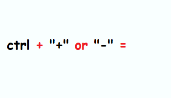
oh also you can change the size of the brushes, even the eraser by doing this ^_^ (only works if you have a numpad, unless there's another shortcut for it that i dont know??)
hope this made sense! 💛 PS. turn on transparent selection under the selection options (dotted square)
#pn.ask#i used to draw on mspaint in my early digital art days so i picked up a couple tips and tricks along the way..#shittily coloring dA bases anyone? LMAO#also sometimes when i switch to b&w it makes my lines all wibbly wobbly which i dont really care since my mspaint drawings are messy anyway#literally just play around with mspaint... its fun ^_^
294 notes
·
View notes
Text
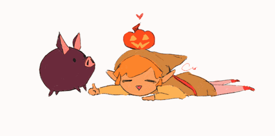
linktober 31 - HAPPY HALLOWEEN!!!
I thought for the last day I'd write a little retrospective on what this whole thing was like and what I learned. I'm too tired to draw literally anything else I'm due for a break lol
So this was my second time ever attempting a linktober/october drawing challenge, but my first time managing to complete all the days and prompts. I feel super proud of myself and accomplished for pulling it off.
There were a number of things that were surprising and that were challenging for me that I wasn't expecting this month. If anything, I think this challenge really highlighted my flaws and mental blindspots with how I approach making art.
For one thing, I came away from this not liking everything I made. I think I only like about 9 or 10 of the 30 pieces I put out there. When I don't like my art, I tend to get stuck in this mental stalemate of refusing to finish a piece until I like it, but also refusing to retrace my steps and erase/rework what I have so far for fear of losing progress or not being able to replicate the line/angle/color/etc that I liked.
It was surprisingly hard to accept when I didn't like a piece but had to move on for the sake of time and post it anyway. But once I did it a few times, it got easier. I realized prioritizing my standards over my available energy is not gonna promote progress. If I kept sinking myself into one piece and not moving on until it was optimal, I never would have finished anything-- that was the pitfall that ultimately made me bail out 10 days in last year.
I also realized my sunk cost fallacy/"what if I erase this and can never redraw it good again" stems from some real lack of confidence in my knowledge and techniques with art. I'm self-taught, and I think I tend to believe that everything I make is a dumb happy accident, even though I have mental rules when I draw, use tons of references, and have a process lol. There are a few pieces I started over 2-3 times before I got them right, and that's starting to feel liberating instead of like failing to me now, which I never expected to come out of this experience so that's cool.
Another place I had to learn to let go of control in this was with allowing for style variation. I really wanted each and every piece to be coherent and painterly, like they all came from the same book or something. But then I couldn't decide whether I wanted to do all/no lineart, all/no detailed background, all/no heavy rendering, etc. At the end I settled on just keeping the same canvas dimensions and just prioritizing filling up the space. Glad I ended up doing this, because I really would benefit from continuing to chill out and scale back how much I default to making dramatic, high-render pieces. I gotta break out of my comfort zone and make more sketchy little guys!
Sometimes my attachment to the prompts fluctuated; some prompts I thought I would love and then just wanted to get them over with. Some prompts I thought I would hate and subsequently half-ass, then I ended up redoing them and putting more effort & time into and loved the end result!
It was funny to also see how some pieces that I loved straight up did not get a whole lot of notes or attention. Some pieces I was "meh" about did crazy numbers lol. I'm used to posting maybe 5-6 times a year on here, so I'm usually indifferent to getting notes (by which I mean, I'm super grateful for likes & reblogs and the super sweet & funny messages in y'alls tags, but I'm not butthurt when I don't get notes because whatever happens, happens). Churning out 30 pieces in 30 days made me sometimes get bewildered by what did and didn't get notes, but frankly in the end I think it helps reaffirm that I should continue putting whatever I want out there because it! is! not! graded!!!
So would I do Linktober again? Probably not, sorry! it was a lot of time & effort and took me away from fall festivities more than I would have liked. I kinda only managed to pull this off because I was transitioning between jobs this month and had a week off to just draw. But I also completely see the value in taking on a challenge like this and finishing what I started, I'm super glad I did this, I think my art improved from it. I would definitely do future drawing challenges/prompt things that are quicker or have less prompts!
My advice to prospective future linktoberers: pace yourself and be gentle; this is a great chance to do something exciting and new with your art, but above all it's about you having fun. There are no prizes at the end except for what you've learned and how you feel about it, and that's for the best!!
One thing's for sure, I am zelda'd out lmao so I'll be branching out towards some little projects I have lined up for personal art and other fandoms I'm into right now
So anyway thanks to all of you who read this or who gassed me up this whole month, I appreciate you!!!!!!!! ヾ(^∇^)
74 notes
·
View notes
Text
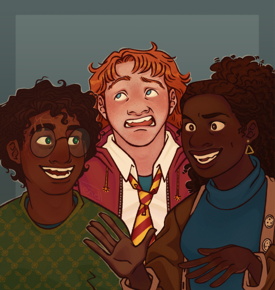
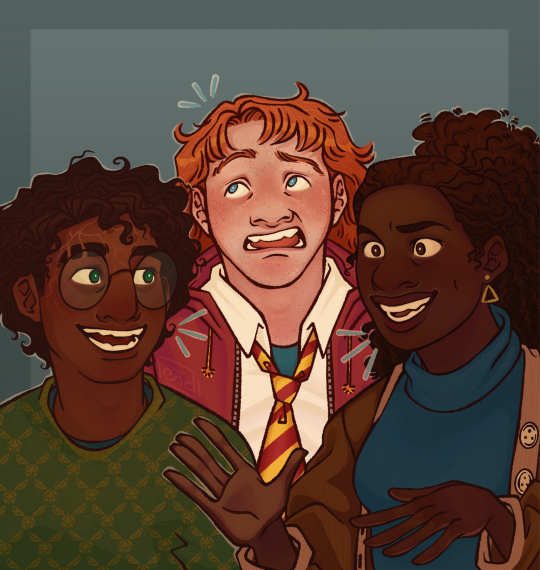
harry potter ???? 😳😳😳😳
Yeah I'm hyperfixating again lmao anyway golden trio fanart I'm pretty happy with how this turned out! I love how Harry's scar turned out hehe I think the one in the movies is so boring like have fun bro go crazy go stupid ahh
Also fuck JKR and her transphobic bullshit 😊😊😊 trans lives matter, trans women are women and trans men are men 😊😊😊🩵🩷🤍
I did record a timelapse this time!! Albeit only the rendering cause I only remembered like after I finished the lineart lol BUT I STILL RECORDED ONE so brownie points lol
#art#digital art#digital artist#clip studio paint#clip studio paint pro#csp pro#csp#digital artwork#digital illustration#artwork#illustration#harry potter#fanart#harry potter fanart#hp fanart#hp#hermione granger#ron weasley#trans lives matter#fuck jkr#commisions open#taking commisions#artists on cara#artists on tumblr#artists against ai#not ai
71 notes
·
View notes
Text

hello! I'm finally back from my thesis hibernation (I'm not done with it, yet, but I no longer have pending deadlines yipee)! It has been a hot minute, but here is the finished piece for The Great Uskglassification. The inspiration was kindly suggested by @raindoor, and it was truly a challenge (which is great, because that was exactly what I was looking for). More thoughts below.
I was looking for inspiration and also some images to practice my perspective/ more challenging compositions and I had this idea to make variants of famous paintings but like with Uskglass and the Aureates with them. I asked for suggestions, @raindoor proposed two pieces by M C Escher. I decided to try to emulate Dream (Mantis Religiosa) and oh boy, it was hard. (Behold! The reference image!)

First off, I changed the dimension of the mantis and had to move the columns in the far back to account for this, which made the perspective a bit wonky; then, I went crazy trying to nail the details in the capitelli of the columns in the foreground. Also, my pencil sketch became messy real quick with all of those lines and shades (I think I filled it in too much; I should've focused on the lines only and coloured it in at the inking stage). Uskglass also did not look good, like at all, and when I finished drawing, I was so defeated (the mantis is the only element that I liked throughout, it always looked kinda neat); I was one moment away from trashing the drawing and starting again...but then I didn't!
Instead I just set it aside and focused on school because it be like that sometimes; I came back to this from time to time and did the lineart for the Uskglass and the Mantis reeeeally slowly. To my surprise, after doing the lineart and inking them, they looked much, much better than the pencil drawing (especially Uskglass' hands an tunic); this gave me the boost I needed to finish the inking. I ultimated finished this piece today and I have to say that while I would do many many things differently (using ink and brushes instead of markers, for one), I have come around to liking it quite a bit.
As far as the lore behind this, I had this idea that Uskglass attempted some sort of astral projection that left his body asleep in a room on the Kings' Roads while his spirit wandered around (in a similar fashion to the one he used when he left his Kingdoms for one year and then reappeared asleep in his castle). As for the Mantis, I have yet to decide whether it is a curious fae snooping around, one of Uskglass' allies guarding his sleeping body, or another kind of creature attracted by the magical energy emanating from Uskglass' body. Feel free to speculate about this lore to your heart's content!
I used watercolour pencils for the background and the floor tiles, but the latter looks a bit washed out in the picture, my bad. I really wanted to give the sky a magical air and make this chapel (?) seem even more liminal. I also have a previous version without the watercolour, let me know which one you prefer!

#john uskglass#john uskglass brainrot hours#the raven king#jsamn#the great uskglassification#my art#damn this was a journey but I did enjoy myself#more uskglass posts are coming but I think it is going to be mainly ramblings about the new story and the book#I will post more fanart ofc#but it takes time#also my terrible photo skills strike again lol
21 notes
·
View notes
Text
@rascalentertainments Hey! As an apology for being gone and missing the official announcement for this DTIYS, I humbly offer my take on Asha and Star!
This was too cute to resist! I love how excitable Star is and I’m working my way through reading your, Wave’s, and all other rewrites that have updated during my absence.
Original:
Notes under the cut because this is getting pretty long lol
So I tried a new colouring style for this one
I was inspired by a lot of the artists I saw on Art Fight, and tried to incorporate that into my style
Specifically, the bold lineart and colour-blocked sections
It’s both easier for me long-term, and helps me create a finished piece without too much shading
That said, I did go crazy with the shades and tones in this one, because I just loved the glow
I do like the touch of a slight sunset/sunrise in the background, as it adds more warmth and magic to the piece
I LOATHE that bold line around Star’s cape but this is the photo I emailed over to my phone, so this is what you’re stuck with
While we’re at the improvements, comparing to your piece, Star and Asha look a bit stiff. I’ll have to work on some gesture movements
On the other hand, I really like the sky! It reminds me of Princess and the Frog
I also think the flow effect I did around Star looks reminiscent of pixie dust, which is a cool nod to Peter Pan!
The metal (?) bracelet I’m proud of— again, learning form other writings on Art Fight
I’m. Not sure about Star. He has a very cool face shape, nose and eyes wise, and I think I sort of generalized him here. Oh well, this means I’ll probably be doing more practice doodles of him in the future!
I do think that your Asha and Flicker’s seem very similar in my style, so I’ll work on making them more distinct in future pieces. I think RFTS!Asha has more doe eyes and a smaller nose, as well as distinct braids in her hair, where your Asha can have more upturned eyes and loose hair
I will have to find a way to make hair look loose and free in this style, but I’m quite happy with the finished result
Aaaaanyways… I hope you enjoy this! Now if you’ll excuse me, Imma go to bed lmao
#disney wish#wish 2023#asha x star#asha#star x asha#saph doodles#starsha#wish granted au#dtiys challenge#dtiys entry#dtiysart#draw this in your style
63 notes
·
View notes
Text
Here ye here ye, another breaking down processes post from yours truly!
For this animation, my plan was to make something I'm proud of AND also something to force me to take my time since with all previous animation works they were all rushed. I normally tend to speed through work as someone whose illustrations are painterly and I like to keep them rough. Also lets be totally honest my other plan for this animation was to animate Mizrox being so sickeningly sweet.
Fun fact, this animation was going to be longer. I had tried to plan out Olrox climbing on top of Mizrak during the kiss to lay on his chest. There was an attempt trying to rough that out and several ref videos It was scrapped because for the life of me I could not figure it out. Also hypothetically if I was going to keep it, I would cut to another angle (perhaps Mizrak's face close up) and then cut to another angle that would make it easier to see that climbing over the top. OR, consider Olrox already sleeping on his chest (im just rambling now but this is basically 'if you were able to do this again' section).
I wish I actually went through a more proper tie-down process because the jump from going from my rough straight to clean was rough (badum tsk) for the first few seconds. Defintely learnt my lesson ALSO Olrox is surprisingly really fun to draw from behind.
I challenged myself to see if I could get the idea of "bigger movements, less in-betweens, smaller/slower movements, more in-betweens." Though the effect of Olrox rubbing his face against his arm may be a little too jarring and I steered quite a bit away from my rough and self-reference video in hopes of making the face rubbing more apparent because I thought the character acting was too subtle and wanted a contrast to the other half of the scene. I reconfigured my CSP animation workspace for this too so it definitely made the process less tedious when cleaning up the animation.
(Which by the way I do record a lot of self-references depending on the section! For things I can't do/uncomfortable doing, I'll end up looking up videos. It's the easiest for me to catch subtle things in body language and also get a feels for the motion.)
Also I'm really satisfied with Olrox's anticipation before his smooch and the shoulder roll at the end even though technically the arc doesn't complete itself. MIZRAK THOUGH, when cleaning up I realised my rough wouldn't make sense because he's already looking at him so there's no need for a turn, and then the lack of a shoulder movement felt jarring, so all of that was done without any thought, wish I did think about it more though.

Now compositing was a monster in its own right and basically me jumping back and forth between turning on and off different layers, but here are all the new things I did; I duplicated and blurred the lines of the lineart, beveled the shadows so it was lighter on the inside, and added a rim of blur so the focus drew towards the couple. Also will absolutely admit that my fanboy ass went "... be crazy and try to mimic the show." The final did not go that route because I thought it was more important to emphasize the mood/atmosphere (Also Olrox is intentionally stylized differently because i wanted him to be softer here and I had to give him eye highlights for plot HELP). THOUGH to say I did not try to mimic the style, the #2 lighting test was my 'attempt' LOL 😭 I can never consume media normally.
Here are the lighting tests I went through. I definitely knew I wanted to go with a morning vibe, though I tested out a night ver for fun and did some edge lighting which led to mixing both version #2 and #3 to make #4.
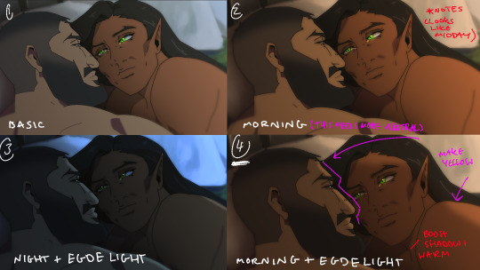
Fun fact, I almost went with #2 due to fear of getting too heavy-handed with compositing and therefore losing the animation (even though I really liked #4 at the time). Thanks to a friend, they also shared the sentiment of liking #4, though pointed out it felt like midday and encouraged me to make the colours warmer and deepen the shadows. It is a really tough balance but I think for a softer scene like this, the more additional layers of comp worked out in the end.
The edge light was a last minute thing because someone told me to add sound and to have light stream in. Also at this point I deadass forgot that you know, Olrox, is a vampire, but hey rule of cute overrules. We can pretend its light not from the sun LOL

Also yay I got to show off my own style a tad, I love paintingggg. It's not as completely fully rendered coz I knew that it would get covered up but I still made sure it was quite clean regardless. I didn't realise how much of it would be covered up even though I did make sure they would fit/make sense for bg LOL
Now we are done!
If you've gotten this far thank you! There's gonna be less frequency of these animations due to the semester starting back up soon and I don't get many opportunities to actually 2D animate (despite it being an animation degree RAH). Also I remembering cringing and laughing a lot when I immediately started putting colour down going "oh i can see the end of the horizon, i have too much power as an artist, people will see this i cant let them see me be crazy"

[Here's some memes I drew over while my friend was reviewing my work]
#mystery talks#castlevania nocturne#artists on tumblr#castlevania#castlevania fanart#fan animation#olrox/mizrak#i still keep going “oh no people who worked on the show will see this theyre gonna see im insane /lh”#its ok coz being crazy pushes you to achieve things
93 notes
·
View notes
Text
1000 kudos/100 Follower Special!
wow so um, there’s a LOT of you now

👀👀👀
WHERE DID Y'ALL EVEN COME FROM LIKE?? HI!! 👋👋👋
AND ALSO

THIS???? CRAZY, incredibly appreciated <3 but also wild
anyway, I think that deserves celebrating! So, here’s a couple ideas I came up with for y’all to vote on, with the option of sharing other ideas in the comments, I’ll do the top two and save the others for the next milestone :)
If the 'other' option gets the most/second most votes, I'll do another poll with ideas that people suggested and we'll go from there. You can scroll down and click the read more if you'd like more info on each option! SO, having said all that:
Letting you guys make the call with this one! I have stuff prepped for all of it, just a matter of people voting since this is ME showing my appreciation to YOU. And again, next milestone will have the opportunity for the other choices :)
Also, this isn't just for followers/the moots either! Anyone is welcome to vote and participate if they'd like to 💙💙
Please also feel free to ask questions in the comments if that helps you with voting! Can't wait to see what you guys pick :D
I will expand on each option here for clarity in your decision making:
CS one-shot: I will write a one-shot (3,000-5,000 words prob) based in the CS universe. It will be canon to the fic but will never be mentioned/referenced in the fic itself so stand alone to read. It may be a future scene, may be based somewhere in the current timeline. Open to ideas on the POV and such (though I have some floating around that I can do ;))
Q&A/Ask the Cast: a classic, I know my ask box is open but here's also a clear chance to ask something that you've been really curious about! I won't share spoilers for the story, but everything else is on the table, including stuff about me, writing etc. Just no super personal questions is all! Additionally, you can ask the cast questions and answers will be in character, perhaps with a little doodle as well ^-^
Finished refs/busts for the cast of CS: I'll post the finished versions of the rough sketches I shared a few months ago, along with the remainder of the cast! This includes the rest of the engineering team, the division heads, the glamrocks, and the DCA! I also will include little blurbs for all the characters as well. This will probably happen eventually anyway BUT if you want them sooner rather than later this is you're chance if you're curious :)
Spooky Season one-shot: something halloween-related that again I'm open to ideas for! Would also be about 3,000-5,000 words in length, could be related to CS or not
Writing Requests: similar to the requests I did for reveal day, same rules apply (no nsfw, suggestive is fine, be specific if you want specific) but a little longer in length (500-1000 words)
Doodle requests: I provide you with a little drawing I made with tender love and care (would be lined, colored, shaded, etc.)
A peek into the drafts: I do in fact have a couple other fic ideas floating around in my brain that I simply haven't started so that I don't get bogged down/focus on CS. I would share those and a little bit of concept art
Other: explained above
#sorry if the color and word emphasis bothers people#trying to highlight the main points of things#and also I enjoy color lmao#also if you see this you don't have to decide now#that's why it's open for a week :)#very excited about this ^-^#I know people are here for the fic (and you will get a chapter next week)#but also this has been a lot of fun overall and I want to show my appreciation for all the love and support#fnaf dca#dca fandom#dca community#milestone celebration#Confused Spirit#technically
35 notes
·
View notes
Note
I really enjoyed your post where you shared all your past old works! 🥹 I love your style so much and see how it evolved is very interesting 🫶🏻 I'm curious, at what point/how did your old style take the final leap and started to build up and grow into your current one? 🥺
From: a digital artist beginner who's impatient to stop texting brushes without knowing what I'm doing and fish around rather than finally see my style developing and settling in 😭 any advices? 🥺 I love your art so so much!!
ahhh thank you so so much! that’s so lovely of you :) honestly i think all of it happened very organically for me but i must admit switching from paint tool sai and a wacom tablet to procreate and an ipad was probably a major point in my art journey! i know procreate gets a lot of slack but i honestly never felt more comfortable using a drawing app than with procreate! so i’d say sometimes experimenting with your program of choice can help — in my case i finally found a lineart brush that i REALLY love (narinder pencil from the sketching section) and even though i did have a phase of using a different one ultimately i just stayed with narinder pencil and focused on really refining my drawing technique with it!
i still experiment with colouring because honestly i’m never satisfied with it for long hahah but instead of doing a total 180 i focus on the same method with minimal changes — the basic steps are the same (base colour -> texture brushes -> texture layers) it’s just that i might switch one of the texture brushes to another to see if i like the end result better
what also personally helped me with colouring is to start from black and white to build up my values and contrasts and then to play with gradient maps (again - something that i find works very well in procreate!)! i don’t know if you noticed but i don’t do a lot of hmm more realistic? colouring anymore (yanno when the skin colour is the skin colour etc etc) except for the majority of my commission work + some singular artworks here and there! i found that this method streamlined my process and allowed me to focus more on things i enjoy the most about art — lineart + playing around with crazy colour palettes
i don’t know if that’s helpful i tend to yap a lot but YEAH LMAO thank you again for being so so kind!
#vic.txt#vic answers#btw i am very happy that i get to do a lot of my commissions in more ‘realistic’ colouring because a#(ignore the a lmao i just can’t type) it helps me develop these skills!
10 notes
·
View notes
Note
Hi, I’m back for the second time, l guessed I missed flooding your inbox as much as you missed having your inbox flooded :P
I had kind of a wild thought, thinking about the swap AU and Volume 3 and all of the Emotions™️ of Murdle Jr—I had the completely crazy mental image of Illogico (who can channel ghosts, if I remember correctly) channeling Indigo so he can talk with his daughter one last time. Which would be nice for Olivia, who would get some closure over her dad, and hey, maybe the boys can benefit too (“I’ll let you talk to your daughter again if you agree to stop haunting us”) (because let’s be honest if ghosts exist Indigo would absolutely haunt the hell out of them just to fuck with them :P)
Of course, there’s probably some risks to channeling a murderous narcissist who hates you and especially hates your partner, but hey, these guys have already taken dozens of risks in canon, what’s one more :P
Yippee, always happy to have my inbox flooded once more!! Really really hoping I get my account back to normal soon!
You’re cooking so hard with your idea btw- Illogico can indeed channel ghosts (one of these days I’ll do a whole master post of how ghosts work and how Illogico interacts with them), and he very well might channel Indigo to give Olivia a chance to say goodbye. After all, he does feel incredibly guilty that he did kinda kill her father. And Olivia and her dad may have one of the relationships of all time, but they do care for each other in some way. They are family.
Also, yeah, Indigo would haunt and torment the fuck out of Illogico lmao. Poor thing is lying awake at night because Indigo is harassing him and thinking “I need an exorcist. Wait. I am the exorcist.” If he’s determined enough to mess with the physical world, Leo is having a hell of a time, too. A shaky agreement could be reached.
And there are absolutely risks in letting Indigo be channeled!! When Illogico channels, he’s not completely helpless, but he’s not really in control. He can wrestle it back, but it’s difficult and unpleasant for everyone involved. Trusting Indigo will be true to his word and just talk to his daughter and not exact revenge on Leo and Illogico is about the same as just giving Indigo a key to the house of his two biggest nemesis/murderers and saying ‘please don’t wreck anything!’ But hey, what’s one more risk to these two dumbassess (affectionate)!
Thanks again for the ask!! As nice as it is to try and be productive with tumblr sending me to the void, it’s always a blast to brainstorm AU stuff, and I love interacting with my friends in the Murdle fandom (oh yeah I also started the sketch for Cerebra btw, gonna try and get to lineart tonight ^_^)
6 notes
·
View notes
Note
Hii I amabsoloutly inlove eith your artstyle.
can I ask a few questions? :<
how lomg does your deawings usually take? and do you have any speedpaints,,, uploaded somewbere... for studying purposes
your drawings makr me want to to back to lineless art lol. and not take it so hard on myself.....
Hi there!! Unfortunately I don’t have any speedpaints seeing as I stop drawing while I’m working on my stuff cuz I get distracted easily 😭😭 so if I did you’d just have big periods where nothings happening LOL usually I post process shots on my personal irl server after each drawing session just so I can see how far along I am but that’s about it!
Also I fully support lineless!! I don’t do any lineart (clearly LOL) and it’s more fun to just paint over your sketch and make as you go!! And yeah don’t be so hard on yourself anon! Art is hard and shit takes time, so whether you take a few days on a piece or months I think you should be proud that you actually made something, even if it’s just for yourself :)!!
As for the question of how long I take on my drawings:
(More under the cut!)
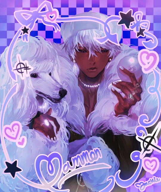
As for how long it takes me to make drawings, I’d say it varies like this purple mammon I recently posted took a month but that’s because I had lots of final school work to do and I got sick twice during that time 💀💀 but this three pose page I did as a commission:
This one took me 9 days which is crazy when I think abt it actually cause there’s way more happening but yeah!!
This mammon in the back dress as well took about five days!! So to give you an estimate I’d say anywhere from 1 to 4 weeks? Most mammons I do usually end up being on the lower half of that range! Outside circumstances may make it vary but that’s usually the time it takes!!
Oh and I’d like to add that I usually am a night owl and only start working till around the evening times when I draw!! So when I say days I don’t mean like I spend d all day over my tablet, I don’t think that’d be very good for your health anyways 🤕🤕 take breaks yall play a game you like or watch something on YouTube!!! Don’t spend all your time working lest you burn out!!
I’m gonna be real with all of you, cause my friends make fun of me for it ALL THE TIME LOL but the largest majority of mammon drawing time is like 80% redrawing the face over and over and 20% the rest give or take. I drive myself crazy drawing mammon faces cause I need it to be perfect cause it’s mammon so when it’s not “perfect” I keep working at it and I don’t move on until it is 💀💀 my friends notice a cycle where it’s like:
“You guys I have such a fire idea for a mammon drawing” (makes sketch and flats in like 10 mins) —> (starts face) “wait you guys this face is kinda good maybe I won’t spend fifty years on it :D” —> “eehhhhhhgh okay face not looking good lemme see if I can tweak it” —> “okay face need to be redone.” —> “I decided against redoing it I’m just gonna fix what I have” —> “we gotta throw the whole idea out and start again.” —> “wait you guys I think I did it the face looks good asf was I crying for nothing before??” (They tell me yes I always do) —> (I move on from the face) —> (the rest is completed within 2-4 days) —> Done!
It’s stupid as hell I know LOL but when it comes to mammon if i don’t make him as best as I can I don’t feel like I do him justice. The things we do for love, right?
#asks#mammon obey me#yeah I’m usually pretty quick#but when it comes to mammon I must stay locked in my chambers#until he’s ready#and if he’s not#I spend fifty years and fifty nights tinkering
20 notes
·
View notes
Note
Hi previously long-ask-anon here again because I fear your art is giving me more brain worms and I simply MUST lodge my complaint here once again 😔😔
Alas, your tumblr profile header of CEO of LWJ is VERY true bc now whenever I picture The Man Himself it is YOUR beautiful rendition I see so clearly in my head 😭😭 I fear he is living there rent-free sir in this economy??? Like, the way you capture distinct facial features in your style is something I could learn a lot from, no same-face syndrome here and I am shooketh.
DID I MENTION THE WAY YOU DRAW LWJ HAS ME SLIGHTLY FERAL AT ALL TIMES??? His nose is so beautiful to me I fear it is canon in my heart, and the longer face shape compared to WWX’s button nose and round face shape? Gorgeous immaculate I am eating your art as we speak none of it is safe it is my snack and I am feasting like a king rn. I wish I could give a more useful review on why your art is so good like your great technique and lineart skills but alas I have not the braincells right now only the joy and whimsy your art inspires in my gay little heart smh 😔
Idk sorry it’s so long again just you MUST know you simply MUST!! Know that your art is a serotonin generator like little else and it inspires me to draw more which I’m also very grateful for!! Thanks once again for always blessing us with your art, I hope you’re doing well! 🫶🏽 (and don’t get me STARTED on that gorgeous LXC NMJ ART—)

hellooo anon, welcome back to our complaint department - your call is VERY important to us and you'll be forwarded to a member of staff soon!
i JUST woke up and this ask is the first thing ive properly processed this morning and wow! oh my god! what !!! im glad that my title is safe and cannot express how much it means to me to hear praise for my LWJ portrayals! no character in the world has ever gripped me as intensely as he has, hes truly my number one!! so im VERY VERY happy to hear that you like how i draw my beloved boys!!!!
genuinely i cannot. properly word. how happy i am ur enjoying + r inspired by my stuff????? like thats crazy??????? im just drawing whatever gay shit comes to mind for funsies and it makes u say smth this nice???? insane!!! thank you so much!!!!!!!!! aaaaaaa!!!!!!!
#ask#notart#i love how noses r like. the main thing i get compliments for LMAOOO like im rolling in nose related compliments#bc i feel like a lot of ppl neglect noses! which is such a huge shame!!!! because noses r a. so easy and fun to draw b. so good for making#characters not samesy and c. such an easy way to push ur shape language a bit.#i like making my characters distinct bc like. i draw semi realistically in terms of proportions n features. so like...#theyre people. theyre gonna look different. i dont wanna draw same-y anime dudes!! i did that already!!#i wanna draw PEOPLE!!! especially when theyre characters where their differences are so central to who they are + who they are to eachother#making them contrast visually Even More is so much fun!!#anyway. being told that i am in fact LWJ Ceo make me cackle evilly and steeple my fingers like an bond villain...yes.s..yes.s...its working
2 notes
·
View notes
Text
some chen bin / ep2 observations
hello. today i’m putting ep2 under a microscope. 👍
.
I’m going to argue that Chen Bin was probably not directly controlled by red-eyes in the discussion scene, especially after handing Lu Guang the phone.

assumption: the glowing eyes are only for the audience, as no one has pointed them out so far (unless I'm forgetting).
Which means the show has to work around giving the audience more info than the characters -- a great example of them doing that is Liu Min in the dark room (red eyes in a red scene), but it’ll be hard to always pull off natural obscuring.
And what’s interesting to me is that... they didn’t really try to obscure CB all that much? So it made me wonder about the implications of that.
So, afaik what happened was:
Qian Jin (green haired dude) got the photo from his home for red-eyes
At some point, CB switched the phones (his and Liu Min’s)
CB gave the phone to LG.
Then CB vanished to yeet out a window.
I'm assuming he was controlled for 2) & 4). Assuming he didn't do 2) right in the room with them, it must have happened at some point during/between all of the hospital room scenes. Because the call QJ has with CB is before QJ hands red-eyes the photo and that call was while CXS was changing, so he couldn’t have done 2) (under control, at least) until the hospital room scenes.
Still, assuming 2) happened before the red-eyes ability discussion scene, we have a lot of far shots of him with his eyes seemingly blocked in (not the same as lineart, but not 1:1 his actual color tbf), implying to me that he was not directly controlled in this scene - but was at some point prior (to switch the phones).
So, red-eyes seemingly controlled him more than once.
Which, for me, opens a ton of questions:
Assuming CB switched the phone out a while before he handed it to LG, did he not notice it was his while handing it over?
if it was shortly before handing it over, why would red-eyes stop the control for such a short timeframe?
how did they know when to possess CB again to do 4)?
do they not have the 1-use-per-photo limitation that our MCs (allegedly) have? or did they have another photo? (Did they get the lockscreen photo while he was controlling him to switch the phones, perhaps?)
.
Or... is there something entirely different going on? Like some sort of hypnosis? Some freaky puppeteer or voodoo stuff with the plushies?!!
I'm half joking, but he really is quiet in that scene. He doesn't talk/discuss anything, no close-ups and just hands over the phone when he's told (looking kinda dead inside while doing so, too lol).
(could of course be because he’s controlled - and who knows, maybe the lack of close ups is their way of obscuring his eye color, but tbh in comparison to the dark room scene that seems kind of... lackluster.)
I doubt it’d be something other than control, considering red-eyes was actively given a photo - but maybe we’re also being tricked with the assumption that this red-eyes is the person controlling people; considering their natural eye color is a lot more direct than CXS and LG, which almost makes me suspicious of it.
.
I’ll stop throwing darts at a wall now, but I do hope that my limit observation OR the lack of CB substance in that scene will somehow be relevant in the future :D
Or this may all be the ramblings of a crazy person, we shall see.
#tori talks#tori has opinions#link click#link click s2#link click theory#link click spoilers#shiguang dailiren#shiguang dailiren s2#sgdlr spoilers#twt is ignoring me so im returning to my roots
59 notes
·
View notes
Note
Do you have any tips on how you do shading ?? Your art really inspires me and I literally suck at shading lmao.
hello anon!!! im honoured i can inspire you sdfhkjh it's crazy to me that i can inspire literally anyone :,DDD <33
tbh i do all my shading purely based on vibes/what makes me happy so im not sure im a good advice person but ill show you a breakdown of how i go about shading and hopefully that might help a bit? :o i've left it below the cut because i have too much to say and it ended up being really long LOL
of course if there's anything you want more details on i'm always happy to explain, just let me know!
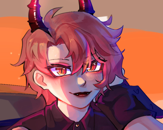
okay SO ill use this asmo as my example, i think there's enough to talk about here that it should be helpful hopefully
so here's my lineart and flats! i do all my flat colours in one layer because i find it easier to make everything look more cohesive when the pieces arent separated (i usually like it when the colours bleed into each other a lil), but i also just dont like the process of having to switch between layers for everything too LOL flats are unfortunately my least favourite part :,D probably because my lineart is so messy hahah
as you can see, the shading is very minimal here, just some subtle stuff in the wings/sheer parts of the fabric and some blushing on the skin, i also stole the orange under eye/liner thing from TBHK because <3
and then i clean up any messy stuff by just painting over top of everything on a new layer, i also rendered the metal at this stage because i felt like it i guess???
i dont think i did a suuper good job at rendering the metal here (because i was lazy), it looks fine but something to note about metal is that usually you want to push the highlights and the shadows a lot more, as well as the reflections because it is so shiny and smooth this is why you'll see a lot of pink and blue in the metal, to show the reflections of his hair and the sky
i would recommend using reference to get a better idea of how metal ACTUALLY works but again, i was lazy lol so that's a simple explanation based on what little i know/have observed
the jump here is a bit drastic and you might be like woah starr where'd all this come from?? but this is all in one layer-
('hard light' - 62% opacity)

this is how that layer looks as a normal full opacity layer, for reference:
lately i've been using hard light layers to shade! they're very versatile because unlike multiply layers i can do my shading and my highlights within one layer (do you sense a theme of me disliking having too many layers lmao)
SO this is where i have a bit more to say about shading you'll notice the prominent shading colour here is blue, this is because the main environment here (the sky) is blue. i dont know if that's how things work in the real world but it works for me LMAO i usually prefer to have my shading lean cooler purely for aesthetic reasons, i like how it looks more
you might also notice some areas where the blue is a bit brighter, this is to imitate reflected light, again because the environment is blue light tends to bounce around on things and reflect back even into the shadows so this is the effect im trying to get, i like to typically go with a brighter blue cause it gives things a sort of shinier? quality that i enjoy aesthetically, idk if its very accurate to real life tho it also helps me to give depth to the shading since shading isnt usually just one flat blob, and this is a bit of a shortcut to having more dynamic (?) looking shadows

i also want to point out my use of bright reds on the edge of the shadows:
i believe this is called diffraction- there's a real legit scientific reason why it happens but i... dont know what that is i just know it happens in real life (maybe not to this extent?) and it looks cool so i do it SFHJKSFH i usually blend it into the shadows though as opposed to into the lighter parts, i find that tends to look better
some miscellaneous things-
don't be afraid to throw random colours around!! who cares about realism, it's fun lmao
this artwork is a spoiler for asmo's bday so shhhhh but i did want to quickly show that you can also use hard light layers to create a glowy effect, i literally just painted the pink/orange directly on the shadows layer and it helped to make his eyes more glowy
of course i do go in and paint over a little after and add some layer effects but it helps to have that base there
now that you've learnt that i dont know what i'm doing, i wanted to highlight a couple of resources that have helped me! i hope they help you as well <3
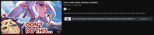
this video gives some really interesting insights into this artist's process and some problems they had throughout, as well as how they overcame them! it looks a lil clickbaity but i promise it's good!!
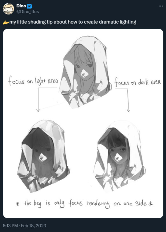
this tweet also shifted how i think about rendering when i want to do something with dramatic lighting!
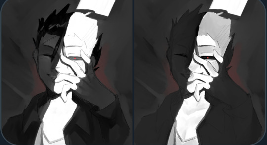
+ an attempt i made to replicate this (i wanna try this again lmao it was fun)
i hope that helps even a little bit, i did my best to explain but sorry if it was mostly nonsense though :,DDD best of luck with your art, anon!! <3333
19 notes
·
View notes