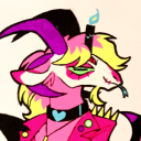
#Also obviously the flag match his color palette
Photo

btw here my personal hc. I know you don’t care but there you go. He’s a DISASTER BI and he’s very akward about it. I imagine Wario as being “mostly” straight, like on the curious side if you will, but not on the acespec, so Waluigi had to come out to him and explain what asexual means. I’ve also written a fanfiction about it, tho I’m not cringe enough to post it yet. You’ll have to wait until I’m mad enough to do it. Tho basically he come out, explain plainly the definition, Wario doesn’t gets it but he’s like “wathev’ we’re still friends, want to gets some food?” and that’s about it. I imagine Wario liking very crude humor and after the coming out of Waluigi, he respect the fact that his friend finds it inconfortable and tones it down.
It was supposed to me just posting the image without context then leaving, but guess I got into rambling again. Enjoy I guess.
Oh yea, I’m on the team “they’re not actual bros” I kinda like the theme of founded family, so I prefer to view it as like, adopted bros. They’re not biologically brothers, but still act as if they are.
#Waluigi#headcanon#Rambling#Asexual#Bi-romantic#I spend way too much time just to align the heart properly and it's still not even centered I hate myself#Now you noticed that the heart isn't centered too#you're welcome#Also obviously the flag match his color palette#I also like the hc of him being trans#tho I personally doesn't see it#He's still an ally#Waluigi respect your pronuns#He's a villain not an asshole
0 notes
Text
The Use of Color in Character Design
One detail in character design that I’ve grown to really like is when certain colors, and sometimes patterns or accessories, are used to convey or hint at some type of connection between the characters involved.
Here are some examples that I really like:
(Please note that a lot of these are my own speculation. I have no idea if these details and meanings were the artist’s and designers’ intentions when designing these characters, so please take this with a grain of salt)
Sonic The Hedgehog
Tails looks up to Sonic, and they’re close friends. Sonic and Tails both wear red and white shoes, as well as similar gloves. (I love that most of the Sonic characters’ gloves look like the basic cartoon white gloves at first glance, but they’re stylized to fit that character’s personality)

Later in the Sonic IDW comics, we get Surge and Kit, who are based on Sonic and Tails. Obviously, they wear the same shade of yellow, and their gloves and wrist bracers are identical. In this case, they were literally made for each other, so I think it would make sense for Starline to have them be matching to a degree.
Encanto:
Encanto is full of examples of color used like this! A lot of details in the Encanto characters’ character designs show their connection. But for now, I’m going to focus on color specifically.

Okay, first, all the Madrigals are shown wearing white at their gift ceremony, before switching to a more colorful outfit afterwards. This is most prominently shown with Antonio, and briefly in Mirabel’s flashback.
Pepa’s side of the family wears warm colors. Mostly shades of yellow and orange.
Dolores is shown wearing mostly red, which makes her stand out, but also blend in with her parents and siblings, at least to me. I’m not sure if that means anything. Antonio also wears a red scarf, so in that regard, Dolores matches her brother.
Julietta’s side of the family wears shades of blue.
Everyone except for Isabela that is. I’ve seen some people say that Isabela’s dress is pink, and I’ve heard others say that it’s purple or lilac. I think both make sense for her. Pink is Abuela’s color, and Isabela is shown to be the favorite grandchild. And if you really look into it, Abuela Alma seems to try to live her ideal life through Isabela, hence she might have influenced Isabela’s wardrobe, hence them both wearing pink.
Or, if you think Isabela’s dress is a pale purple, that also works, because purple can be made by mixing pink, Alma’s color, and blue, Jullieta’s color.
In her song “What Else Can I Do?” Isabela’s dress gets painted with several colors, the most prominent of which being blue, yellow, and red, which are the colors of the Colombian flag, where Encanto is based.
At the end of the movie, Isabela’s dress is colored mostly blue, the same color as her parents and sisters.
Bruno wears green, which is yellow and blue mixed together. In other words, Bruno’s color is his sisters’ colors mixed together.

And Mirabel’s dress contains lots of images that relate to her family’s gifts, but there’s no image relating to Bruno. However, Mirabel’s connection to Bruno is shown by her glasses being green, Bruno’s color.
Danganronpa:
The most obvious one: Junko’s outfit is black and white with red details. Similar to Monokuma.
Mukuro’s outfit when she’s disguised as Junko has a similar color palette. Makes sense. She’s in disguise, so she’s supposed to look identical to Junko at first glance. Does this count as foreshadowing to the mastermind reveal?
Chiaki’s design shares multiple elements with Usami/Monomi, including a similar shade of pink.
Not sure if this was intentional or not, but Hajime and Nagito have similar colors in their designs (mostly white and green). They are very much foils for each other.
Kaede and Kaito have similar colors in their design. There’s a lot of parallels between them and they play similar roles, particularly when it comes to supporting Shuichi. This one might be coincidence, but still.
Last but not least, Kaito’s associated with the color purple, Shuichi is associated with blue, and Maki is associated with red. Blue and red mixed together makes purple. In other words, Kaito’s color is his sidekicks’ colors mixed together.

I think this is my favorite example on this list because it's subtle, and it doesn't register until well into the game.
At the start of V3, Shuichi Kaito and Maki have no meaningful relationship with each other, so you don’t think the colors used in their designs have any meaning. Then as the story progresses, their friendship gradually forms and develops. Key word being GRADUALLY, until you get to the scene in chapter 4 where they sit down and chat, and that scene has a dedicated image of them sitting together in a circle (also, Kaito is pictured between Shuichi and Maki, which makes the detail of their colors even more apparent). And you can look at that image and go “oh, that detail makes so much sense now!”.
Thank you for reading!
#iza's original posts#ramblings#analysis#character design#sonic franchise#sonic the hedgehog#miles tails prower#tails the fox#encanto#isabela madrigal#bruno madrigal#danganronpa#danganronpa trigger happy havoc#danganronpa 2#super danganronpa goodbye despair#danganronpa v3#new danganronpa v3 killing harmony#training trio
14 notes
·
View notes
Text
making fun of that fucking "Debunking Lesbian Robin" thread bc I'm bored and it's late. This is long but not nearly as long as it could have been.
First off, I find it incredibly funny that the thread starts like this.

Like yeah, harassment sure is bad, huh? I would sure love it if that same energy was directed towards the queer people who headcanon Robin as a lesbian and are now getting so much shit for it.
I'm also excited to see what "evidence" has been altered or left out! Surely there's so much of it and it's not just speculative bullshit you pulled out of your ass!
Their first point is "Robin's design is more than just the colors on her cheek," which no one has ever tried to claim ever. They detail some aspects of Sunday's design and how he takes a lot of queues from Ena the Order, who was absorbed into Xipe during the Swarn Disaster. They also bring up the theory the Sunday may be an Emanator of Order. Why is this important to their overall point, you may ask? Because of this

That's right, folks! Unlike Sunday, with his clear allusions, Robin's design queues are superficial and hardly carry a resemblance to Xipe at all! Except for, you know, her entire color palette, her hair, the gold lining and the star decals. But that's not the real striking thing about Xipe's design is it?? No, no, no, the real clue is their halo!


You see, the thing that connects Robin to Xipe isn't literally everything about her design, but the fact that those three dots under her eye represent colors missing from Xipe's halo!
oh, wait, sorry, I meant that those three dots are in Xipe's halo and their colors are in the same order as on Robin's face.

Let's ignore how that is absolutely not the same shade of pink, it's a stretch to say it transitions into white, and neither that yellow nor that orange match with the orange on Robin.
Now you may be asking that very same question that OP presents: "why?? Why do you think they didn't add obvious references to Xipe throughout her whole design did they make it so subtle???" good thing they have an answer!

So! To make is clear, the three dots on Robin's face can't be a reference to the lesbian flag because
1. They made Ena references super obvious on Sunday
2. they didn't make Xipe references obvious on Robin if you're blind and/or have an agenda
3. Robin's eye decorations represent the colors missing from Xipe's halo
4. Robin's eye decorations represent the colors on Xipe's halo
5. Robin's design actually takes a lot of inspiration from Ena's design like Sunday because uh, fuck that Ena/Xipe parallel thing they had going on earlier I guess.
6. Those Ena elements exist to. Trick Sunday into believing Robin "supports" Ena. The being that has been absorbed into Xipe for millennia at this point and is, quite literally, part of the Harmony already.
7. But she also might be hiding(???) the fact that she, a prominent and outspoken member of The Harmony Cult, whom all can use the powers of the Harmony, is an Emanator of Harmony.
See??? It all makes perfect sense. Sunday gets to have eyes all over his design bc it's less of a reveal that he's connected to a supposedly dead Aeon, than it is for Robin to have obvious connections to the Aeon that her entire life is based around! Because it makes more sense for her to have strong connections to fucking Ena, which is why they had to make the references to Xipe so fucking subtle.
The rest of the thread is "you can't say Emily Dickinson is a lesbian because that's Bad and Disrespectful."

Thanks for the wikipedia summary of her writing style, I'm sure you're a long time fan.
But what's fun about this second half of their thread is the tweets directly after.

So she couldn't have been a lesbian because 1) the time period in which she wrote these poems is unclear, bc as you know, no one is gay after 11pm, 2) she fantasized about being a man, something that obviously excludes you from having an attraction to women.
And look, I'm not gonna sit here and speculate about Emily Dickinson. I don't know enough about her history and I'm not gonna try and make statements about her sexuality or her gender identity. All I know is that those two points were fucking dogshit lmao.
Also love "there is no clear documented history of the poet" right before "their personalities don't even match." And it's even funnier when they then go into detail on how those two poems are deeply connected to robin as a character and are obviously important to her theming, but it's just a few lines from two poems so it doesn't have any significance you stupid idiots.
The rest of this thread is just shadowboxing against nobody. Ending this long thread about how Robin isn't a lesbian by saying you can headcanon her as anything.
And listen, I do not care if she is or if she isn't. It is incredibly likely we will never get a concrete answer. And I think that anyone sending death threats is overblowing the issue. But also, I always find it incredibly funny how it's always the queer fans that are the bad guys. It's always those damn lesbians being too aggressive with their headcanons, we have to put out threads like this to tamp them down and make sure they know their place. You can do whatever you want! As long as you're doing it within the parameters that we have set. If we think you're being too loud about your opinion? To confident in your interpretation? Well, that just won't do.
Your thread was ass, your design analysis was ass, your lore speculation was ass, take this energy and put it towards denouncing that weirdo that thought the appropriate response to queer teens having a lesbian headcanon was to make a corrective rape joke.
1 note
·
View note
Photo

I messed around with Wilbur’s design! Design notes under the cut (if it works lmao)
General Notes:
-Wilbur’s wings are generally corvid based, but specifically raven (because Phil) and magpie (friend’s suggestion)
-Feather ear-tufts for all except for Ghostbur.
-All of them are generally based on the skins Wilbur used for the thing, but with my fruity hands rubbed all over it.
-Orange eyes.
-Yea that’s about it for the general.
L’manburg:
-Pattern lines around the edge of his coat.
-Same gold color for the patterns, the shoulder pieces, and the golden bits holding the jacket together.
-The cleanest of the ‘burs. Definitely the most outwardly put together.
-Color palette is designed to invoke the flag.
Pogtopia:
-Mullet. Man has severe depression and lives in a ravine, do you think he cares if his hair’s long.
-Hasn’t shaved for reasons above.
-Coat stolen from a dumpster; the entire thing is too large for him, which is IMPRESSIVE considering his height.
-Speaking of coat, he has a ripped piece of the flag tied around his arm.
-Shirt + pants come from the L’manburg design.
-This is when the stress starts turning his hair grey.
-Bandages bc I doubt Wilbur remained uninjured this entire time.
Ghost:
-Yellow sweater. Obviously.
-Leaking blue from eyes/mouth. Hair also fades to blue a la Hades from Hercules. Gives him an ethereal look.
-Flowers on wound: forget-me-nots, baby’s breath, sunflowers, blue tulips. (I got the flowers also from a friend, so beyond the colors matching there’s symbolism there)
-Socks because Ghostbur radiates child-like energy, and children like running around in socks.
-IDK what his wings are but they’re a vibe.
Revived:
-Thot.
-No seriously he’s got the sleeveless turtleneck because of that.
-Coat is Pogtopia’s coat but cleaned off.
-Magpie wings, unlike everyone elses’ raven wings.
-Red lenses on his glasses to give him that revived look most people draw him with.
-Daffodil flower.
-His entire roots are going grey from stress. Mostly bc there’s no way it’s just a singular streak, especially after going from Pogtopia to Limbo.
#wilbur soot#dream smp#revived wilbur#pogtopia#lmanburg#lmanberg#my art!#ya know you are entirely allowed to draw these designs#just @ me when you do#tbh most of these design choices are because i thought it looked cool
14 notes
·
View notes
Text
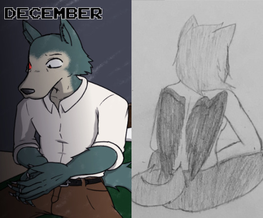
2019 Art Summary
Once again, it is time for the annual art summary! I can’t believe this is the fifth year in a row I’ve done this, so I’m very proud about continuing to make art throughout the years and getting better at it every day. Anyways, let’s get into the good stuff!
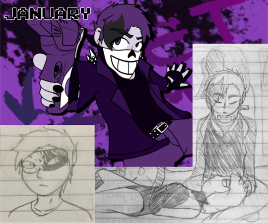
I kicked off the year with a big inspiration from The True Lives of the Fabulous Killjoys comic series and made up my own original Killjoy just before the new year began. Their name is Violet Crime, and I had created an entire backstory with them being involved with the Ultra V’s, and even proposed running a roleplay blog with them and introducing story events such as meeting a pornodroid, but that never came to pass. Maybe next year I can try getting their story off the ground.

This month, I had suddenly gotten the idea for a TOME (2011) AU where the Forbidden Power slowly corrupted and altered Alpha’s model and mind, and I did a bunch of art of the different stages of corruption and drafted certain scenes that would play out if it happened in the show. I continued exploring this a little more throughout the year, and I hope to flesh it out even more later on.
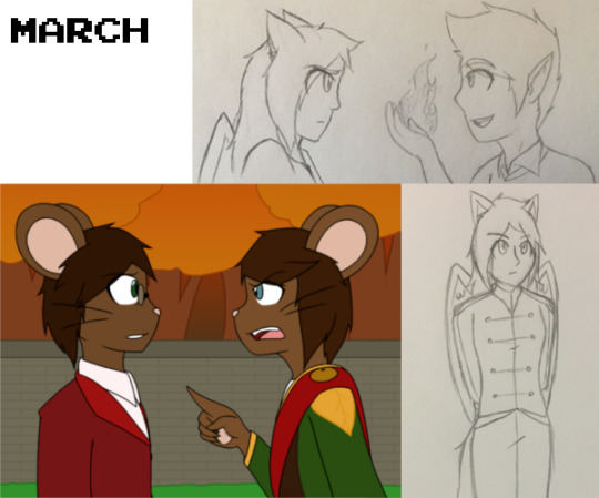
This batch has an interesting background - I was taking a Religions class in the winter quarter, and for my final project we had the option of creating our own religion based on principles from those we learned about. So, since I had already made up a religion in Legends: Children of the Dragons, I jumped on that opportunity and started expanding upon it! Because of that, I started thinking about Legends a lot, and got inspired to write and draw a bunch! I worked a lot on figuring out the story’s structure and plot, since for the longest time it’s been very disorganized, so that inspiration boost was really helpful.

I didn’t draw too much this month, but I did want to showcase two more detailed drawings in particular. The first is a climactic scene from my friend Mana’s story Empire Tale: Starlight Speedway, where Argento (the character shown) finds out his friend was in alliance with the heir of his empire’s rival nation. The second was drawn for Adam Tilford, creator of the book and webseries Shattered Heaven, as part of an opportunity to feature fan art of a certain character in part of the show. I did my best to emulate Adam’s art style in both lineart and coloring, but it still definitely looks like mine, which is totally cool. Still super honored to have contributed it!

The TOME fandom is still a huge part of my life, and this month in particular was chock full of RPG content to draw. First was my own idea based on the official fanart contest, where members of my TOME Discord server paired TOMERPG OCs and drew a picture with them interacting, and my OC Circutree was randomly matched with @scribblehooves and her OC Valentina!
There was also a trend (I forget who started it) where we designed our own versions of the White Hat Hacker, and since my choice was the Animalistic one, I gave it some details that more resembled my personal TOME OC / overall persona.
Lastly, I just... really love Phaxal from TVTOME Adventures, and I felt an overwhelming need to make him into a TOMERPG character. He’s obviously a lot different from his aughts’ counterpart, but he’s still got that dark snark goin’ on.

June was actually rather slow in terms of art, with me being more preoccupied with binging TV shows and video games, as well as going on adventures in the outside world. However, I did make a cute piece for Mana with Lux and her girlfriend/wife Nexus from ETSS as part of an art trade.
In the middle of the month, I had had a dream with a super cool character in it, and immediately I went to go and draw him, and that’s who the other character is; he doesn’t have a name, but he’s supposed to be a secret agent type of guy. Definitely inspired by Azure Striker Gunvolt, which I got super obsessed with again during that time.

I worked more on developing Legends stuff, so I wrote and drew out some more scene ideas along with various sketches. My big pieces for this month, though, were very summery and all about the TOME RPG and me and my friends’ OCs having a fun time. Not much to say other than it was really weird drawing everyone in swimsuits instead of their normal designs.

My favorite piece this month, by far, is my entry into Adam Tilford’s Shattered Heaven fanart contest. I got to draw a mecha, for goodness sake - I NEVER draw stuff like that because it’s so complicated. I’m really proud of the lighting on the piece, too.
In addition to that, me and @mew-cake did an art trade of our personas! And it was super cool and fun! Friendship! :D

So, the Steven Universe movie came out this month. And that made fall super hard back into the fandom. And now I can actually draw the characters decently, which I think is super cool.
Also TOME stuff continues to be a thing, and I continue to try new perspectives and poses and lighting and everything because I need to GROW and LEARN.
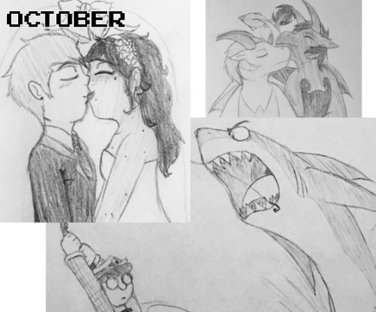
I participated in the actual #Inktober prompt challenge this year, and did so for a lot longer than I thought I’d be able to. I made a lot of pieces I’m actually quite proud of, and even though I didn’t complete it, I’m happy I did it as long as I did.

November was a pretty experimental month in terms of art. I tasked myself with drawing in the Pokemon and Hazbin Hotel styles, and I randomly got inspired by a color palette to do a very minimalist digital painting. In addition to all of these personal drawings, I got to work really hard as a member of my university’s fledgling Queer Art Collective (QuAC for short), and our first big project was to decorate a canvas for Trans Day of Remembrance and Resilience, and I contributed five pieces to that: the trans flag with a human silhouette, the NB flag with a heart, the pastel genderfluid butterfly, the construction paper PROUD 2 B TRANS, and the lyrics to “Masquerade” by Tokio Hotel.

As the year closed, it’s been slow, with finals and holiday break and stuff. I can tell that I’m improving in my art, but there are still a lot of things I don’t know and things that I need to continue to improve upon. Hoping I can keep up the work in my last months of college and my transition into full-on adulthood.
See you all in the new year.
21 notes
·
View notes
Last Seen Blogs

vieraadventurer
What's a MSQ?

sporadicskeletonhairdomuffin
Untitled

allbets168
ALLBETS
cheezeety
cheezeety
4elenaaaa
Elena Caz