#Assignment2
Explore tagged Tumblr posts
Visit Tumblr Blog
Explore Tumblr blogs with no restrictions, modern design and the best experience.
Last Seen Tumblr Blogs


Fun Fact
Kazakhstan’s Minister of Communications and Informatics has blocked the Tumblr site because it contained 60 sites of terrorism, extremism, and pornography in 2015.
Text
1. What is color in art?
Color in art for me is what sets the mood of the art itself like a painting or sculpture. For example, if I wanted the crowd to feel sad about a painting I did then I would colors dark muted colors. If my painting was something exciting/happy I would use bright colors.
2.What is its importance in visual communication?
I believe the importance of visual communication is a way to connect with the audience. Visual communication can help with clarification.
3.what is harmony in art?
Balance, sense of unity, and coherence. That consists of color, textures, shapes, lines, etc.
4. How does harmony contribute to a cohesive design?
It ensures that all the elements within a design work together to form a unified whole.
5. What is composition in art?
It’s how an artist structures the various parts of their work to create a harmonious and aesthetically pleasing whole.
2 notes
·
View notes
Text
Assignment 2 Progress and Team Coordination
This week, our group finalised the concept for our Assignment 2 game and began organising our development tasks. Team roles were assigned based on each member’s strengths, which helped us streamline our workflow and reduce overlap.
We’ve been using a shared Google Doc for brainstorming and keeping track of meeting notes. Communication has been consistent through our group Discord chat, allowing us to stay aligned and quickly resolve any development questions.
The teamwork advice from last week’s lecture—especially around clarity, consistency, and regular updates—proved extremely useful and has made this group project feel far more structured than previous ones.
0 notes
Text
Week 9 - Final Assignment 2 Designs
I think I struck a really good balance between having a strong aesthetic and showcasing as much useful game information as I could. This was definitely one of the most design focused parts of the unit so far and I really enjoyed it.


I wanted the Knightfall design to feel retro and adventure inspired, but still clean and readable. I spent a lot of time playing around with different layout ideas and colour schemes to get the right tone but I think it turned out great in the end!
0 notes
Text
Week 10 Post 10 Play testing
This week was all about getting real feedback on Hoard.io v2.0. We ran formal playtesting sessions, using the script and surveys we set up last week, and watched as a mix of classmates and new players tried our game for the first time.
Playtesting & Feedback: We had eight users play Hoard.io, with a good mix of ages and gaming experience. It was honestly eye-opening to see how people played—some picked up the controls right away, while others struggled with mechanics like weapon swapping and close-range targeting. One of the most consistent pieces of feedback was about the visual style: players found the red damage indicator distracting, and the death screen didn’t match the cartoon theme. Mechanics-wise, people wanted to be able to drop weapons and deal with close enemies more easily. Several suggested adding a melee attack, which we hadn’t even considered at first.
Teamwork & Iteration: Our group met right after each playtest session to discuss what we observed and how to act on it. I contributed ideas for how to design the weapons and i supported the idea of adding a weapon drop mechanic. We split up the fixes, with everyone tackling different improvements (UI, mechanics, balance, and more). It really drove home how much faster and better you can iterate with a group versus working solo.
Reflection: Fullerton (2018, Ch. 11) talks about the importance of “listening to your game,” and this week proved how much you learn just by watching others play. There were issues that seemed small to us but were major annoyances for new players. We’re now planning another round of tweaks, especially to the upgrade and health systems, so the next prototype feels smoother and more intuitive.

0 notes
Text
Week 9: Assignment 2 Final Design
Concluding week 9 was the submission of my Assingment 2 One-sheet and One-page. While my first iteration remained largerly the same I made some final design and text tweaks to improve my work. I am happy with how my assingment 2 turned out and believe it accurately demonstrated the overall imagery, vision and gameplay that could be used for assingment 3.

0 notes
Text
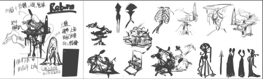
Assignment2-Human and Inhuman-2
After deciding on the general appearance, I was torn between two versions:
The Blue Version: This design featured winged hands and a veil.
The Black Version: This design had no visible hands and no veil.
Ultimately, I chose the black version on the left because I felt the blue version was too complicated, and the winged hands and veil didn't add much to the character's overall impact.
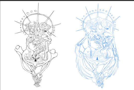
This character is a god of rebirth. Players will encounter this character in the afterlife, where they will be interrogated with various questions. The answers provided will determine what form the player will be reborn into.
Design Concept
Since this character represents rebirth, the design removes most of the human structure, keeping only key elements like bones and a heart to symbolize the human aspect. To convey life force, additional elements such as plants and water are incorporated.
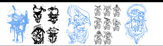
Key Structural Features
The Pelvis:
Enlarged to resemble a pond or womb, emphasizing its role as the origin of rebirth.
This is where the player’s rebirth occurs.
The Heart and Energy Source:
Comprised of a deconstructed heart and tree sweat, representing the energy fueling the rebirth pond.
The Head:
Designed to embody both good and evil, leading to two distinct appearances:
Good: Features an eyepatch, symbolizing wisdom and impartiality.
Evil: Includes a beak and goat horns, representing a darker, more ominous side.

After discussing the revision with the instructor, we concluded that the foot part of the lower half of the body appeared too large. Additionally, the structure of the ankle bone created an unintended effect, making the character look like it was wearing socks.
To address these issues, we will continue revising to ensure the proportions of the lower half of the body's foot are accurate and aligned with the character's design.

0 notes
Text
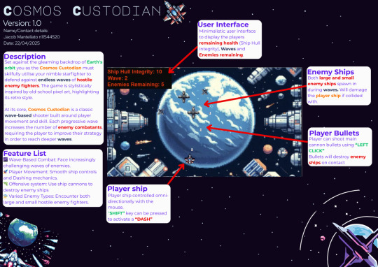
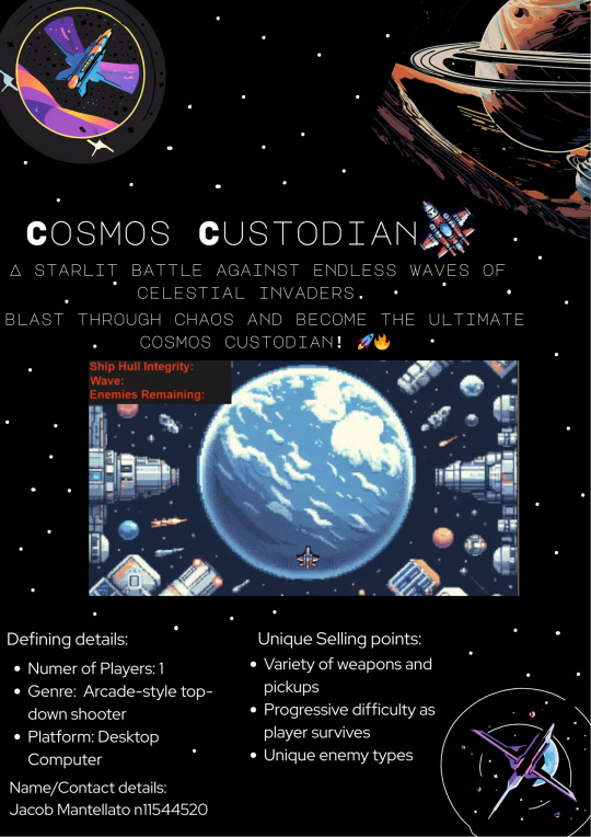
Assignment 2
For Assignment 2, I created a one-sheet for a progression-style space blaster game that builds on the classic Asteroids framework. This project allowed me to dive into my personal tastes, leaning towards rogue-like style games with a focus on progression and dynamic gameplay.
To design the one-sheet, I chose Canva for its simplicity and versatility. Canva's platform made it easy to create strong and customizable designs, perfectly suited for adjustable canvas sizes. The intuitive interface allowed me to focus on the creative aspects without getting bogged down by complicated tools.
The one-sheet highlights the game's core mechanics, emphasizing the progression system that sets it apart from traditional space blasters. Players will navigate through increasingly difficult levels, facing varied enemy types and challenges that keep the gameplay fresh and engaging. The rogue-like elements, such as procedural level generation and permadeath, add an extra layer of excitement and replayability.
Overall, Assignment 2 was a fulfilling task that allowed me to combine my interests with the skills I've developed throughout the semester. It was a great exercise in both game design and creative presentation, and I'm excited to see how these concepts might evolve in future projects.


0 notes
Text
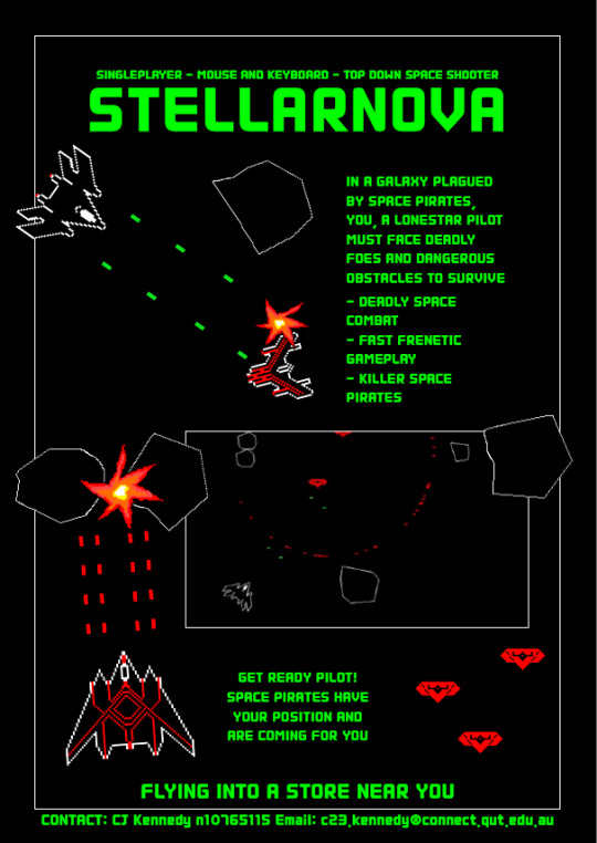
Assignment 2: Final Design
In both the One Sheet and One Page, I incorporated some blue and orange colouring for a few reasons. The Blue, is a general theme, and will be used lots in the games UI. The Orange, will also be used in UI but I felt it was a great way to signpost certain aspects of the pages. You'll see some headings are in orange, as well as words that should be the centre of focus.
One Page (A3)

One Sheet (A4)
As you can see below, I decided to make a stylistic choice to make it look like the game is being played on the poster. You can see the scrap and kill counters in the upper left and right corners respectively. Also, the gameplay looks like it's happening infront of the planet, instead of being a screenshot of gameplay directly. I feel like this gives off an almost movie like quality to this poster.

I tried to use font size hierarchy to sort of point the readers attention to the most important stuff, "Captain Zenith" is the focal point as well as the gameplay elements below it, followed by the "commits a war crime" subtitle and the "Bend the rules, break the law. Because space cops don't exist (yet)" slogan.
0 notes
Text
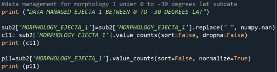

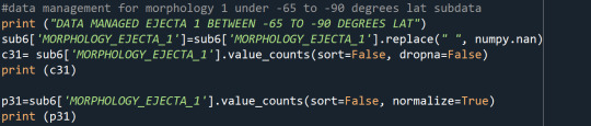
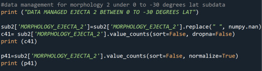
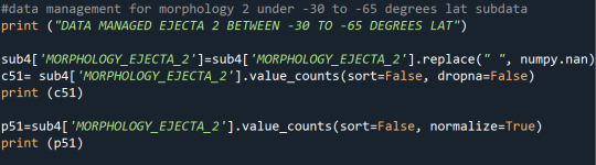
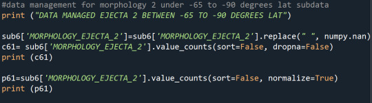


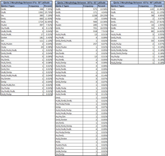

Since the study aims to determine if there is a dominant Mars crater ejecta morphology per latitude zone (0°-30°S, 30°-65°S, and 65°-90°S) on the southern hemisphere where the crust is older, only the missing values were coded out. The unique classifications were retained and not binned together even though there are a lot of ejecta types to ensure that the unique crater ejecta morphologies are presented. For ejecta 1 morphology, Rd type is dominant in all latitude zones. For ejecta morphology 2 (the morphology of the layers themselves), the dominant morphologies are HuBL type between the equator to 30°S, HuSL type between 30°-65°S, and SmSL type for 65°-90°S. Lastly, the dominant ejecta morphology 3 (generally unique morphology) are Small-crown between 0°-30°S, Pin-cushion between 30°-65°S, and Outer is Splash between 65°-90°S.
0 notes
Text
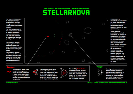
Assignment 2 Final Design
I ended up naming my Assignment 2 design 'Stellarnova' which I thought was kind of cool. I tried to find something unique and as far as I know this name hasn't been used by anything fully published. I quite enjoyed ideating some game play ideas for the one sheet, maybe after my semester is done I'll come back and finish the prototype up and publish it on GDevelop. Its looking currently like we wont be using it for Assignment 3 but I'm pretty happy about the prototype that we're going to be using instead.
one page
sell sheet
0 notes
Text
Assignment 2 Progress

Assignment 2 is coming along nicely with a finished draft of One Sheet. Not the best looking one compared to examples provided but I believe it portrays the game genre and mechanics effectively. At this point, I'm concerned whether there will be enough content for it to be even considered a game. Perhaps a One Page will remedy this.
0 notes
Text
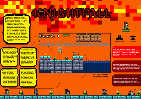
Week 8 - Assignment 2 Progress
Just checking in with a quick progress update on Assignment 2, creating the one-pager and sell sheet for KnightFall.
At this stage, I’ve completed the one-pager (screenshot attached) and I’m feeling really confident about where things are heading. The goal was to clearly communicate what the game is, how it plays, and why it’s fun and I think I’ve managed to hit that balance between informative and engaging.
The layout highlights the core gameplay: collecting coins, dodging traps, and choosing between two power-ups to progress. I also included a spotlight on the Green Goblin enemy, which gives a small taste of the kind of challenge players can expect. Visually and structurally, the one-pager flows well and feels cohesive, I’ve kept the tone energetic to match the fast-paced platforming style of KnightFall.
Next up is refining the sell sheet to make sure it complements the one-pager while serving its own purpose: selling the game’s key features quickly and effectively. I want both sheets to feel connected but distinct, one more about the experience, and one more focused on the pitch.
Overall, I’m on track and happy with how everything is progressing. There’s still some polishing to do, but I feel confident heading toward submission.

0 notes
Text
Week 9 Post 9
Night Drive Postmortem
This week, I wrapped up my Night Drive prototype and did some serious playtesting with friends and classmates. Here’s what I learned:
What worked:
The headlight/limited vision mechanic made the game way more intense and fun than I expected! Everyone said it felt tense not knowing what was coming next on the track.
The basic car controls felt smooth after tweaking the turn speed, and the neon track edges helped players stay oriented in the dark.
People really liked the synthwave soundtrack I found online and added as a background loop—it set the right mood.
What I’d change:
Random track generation is still too unpredictable; sometimes it makes impossible layouts. Next time, I’d script track pieces to ensure all layouts are actually finished.
I wish I’d added more visual feedback for collisions or going off-track. Sometimes, it wasn’t clear when you messed up.
I would add checkpoints or laps to encourage replaying and tracking best times.
Hoard.IO Development & Playtesting Prep
This week was a big step forward for our group project, Hoard.io v2.0. We finished our core prototype and started preparing for in-depth playtesting.
Development Progress: Our team pushed through the last major development hurdles and added new features for the prototype. I worked mainly on summarising the prototype and helping polish the core gameplay. Some big additions this week included updating weapon sprites, adding a player shield bar, implementing three new enemy types (swordsman, ranger, heavy), and introducing two new weapons (shotgun and minigun). The new player abilities—Dash, Shockwave, Glue, Bomb, Fast Fire, and Strong Bullets—add a lot of variety and depth. We also implemented a death/restart screen so playtesters could easily give the game another go
It was interesting to see how every new feature or fix made a big difference in gameplay. Fullerton (2018, Ch. 9) talks about how prototyping and playtesting are crucial for identifying problems that you wouldn’t notice just by looking at the code or playing yourself. Working in a team also made me appreciate how important clear communication is—everyone contributed a piece, and the game would not have come together without regular check-ins and honest feedback.
Preparing for Playtesting: We designed a detailed playtest script and feedback survey, making sure to get input from both regular gamers and people unfamiliar with roguelikes. We wanted to collect both quantitative ratings (like “how easy was the game to learn?”) and open-ended comments about mechanics, graphics, and theme.
Next week, I’m looking forward to seeing how real players interact with Hoard.io v2.0 and what surprising feedback we get!

0 notes
Text
Week 8: Assignment 2 progress
Upon nearing the end of our game elevator pitch's we are moving into assignment 2. This assignment involves creating a One-page and One-sheet for one of our elevator pitch's to potentially be used in assignment 3. I chose my "Asteroids"-like game as I believe I was able to achieve my vison the closest during development. I have made substantial progress on both my One-sheet and One-page as seen below and will be finalizing them next week.

0 notes
Text
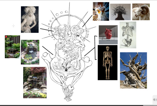
Assignment2-Human and Inhuman-1
youtube
When I saw the theme and assignment description, I thought, "Does Inhumane have to be something scary? Does Inhumane have to represent monsters?"
With these questions in mind, I watched the movie Annihilation, which my teacher recommended. The movie presented many great and intriguing concepts, but one moment stood out to me. The main character described her memories of the shimmer, saying:
"Corruptions of form, Duplicates of form. It was dreamlike… Nightmarish? Not always. Sometimes it was beautiful."
This quote shifted my perspective and made me rethink the theme of inhumanity in a new and more nuanced way.
I'm a big fan of Peter Mohrbacher. I like how he changes up the human body, making it look like a regular person, but then adds different shapes and elements to make the character seem human or not human. It gives off a weird and strange vibe.
I'm also a big fan of Zeen Chin's Dream Paradiso series. It's not too scary, but it has a spooky vibe that masterfully captures the feeling of being both human and inhuman.
I particularly admire Zeen Chin's simple yet detailed design. For instance, the exaggerated proportions and positions of the human bodies are carefully adjusted to create a spooky atmosphere.
These reference images have been a huge source of inspiration for me. From these images, I've learned that altering the human form doesn't always have to evoke negative emotions. By experimenting with different shapes and forms, we can create a wide range of atmospheres.
Based on these ideas, I'm thinking I want to design my theme with "weird but beautiful" as the core concept.
To bring this to life, I decided to start with something that embodies both weirdness and beauty. I aimed to reconstruct the structure of human beings. With the theme of "rebirth," I chose the bones and heart of a human being as the core elements and added natural elements to complement them.
After finalizing the theme and elements, I began sketching out my ideas. From these sketches, I selected the most compelling silhouettes and explored them further.
Reference Flickr (2015) Image by Faceme. Available at: https://www.flickr.com/photos/faceme/17027369817 (Accessed: [Insert date of access]).
Pinterest (n.d.) Pin on Animation. Available at: https://www.pinterest.com/pin/10766486603342236/ (Accessed: [Insert date of access]).
Pinterest (n.d.) Pin on Concept Art. Available at: https://in.pinterest.com/pin/143974519315763353/ (Accessed: [Insert date of access]).
MyAnimeShelf (n.d.) Devilman Lady The Extreme Devil. Available at: https://myanimeshelf.com/figures/1900841_Devilman_Lady_~The_Extreme_Devil~ (Accessed: [Insert date of access]).
Artwork Archive (n.d.) Butterfly Princess by Erica Berkowitz. Available at: https://www.artworkarchive.com/profile/erica-berkowitz/artwork/butterfly-princess (Accessed: [Insert date of access]).
0 notes
Text
9th August (Wed)
Description
Assignment 2 Presentation Reflection
On Tuesday, the presentation took place in the studio, with a five-minute presentation that summarised the work over the previous three weeks.
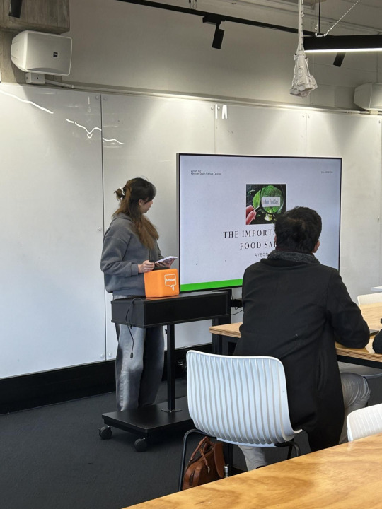
Reflection
Overall, the presentation was satisfactory. I made the most of the slides and scripts by planning how I would explain the current project status and vision, as well as my ideas and direction.
However, because I was unfamiliar with the presentation, I was reading a script. Midway through, I was able to interact with the audience. As a result, I will devote more time to preparing for and practising the presentation without a script in the final project presentation.
Evaluation
Project process 3/5 - Compared to other designers, I realized that the foundation of ideas is weak and my current process is not fast.
Time management 5/5 - Assignment 2 has been completed within the time limit, and I was proceeding to the registered place of the timeline.
Project result 4/5 - I'm satisfied with the presentation slides and scripts, and I think I've done my best.
Next Plan
This week is the beginning of the Te Rapunga(; initiation) phase, and I aim to start designing ideas after in-depth research and analyses.
Research - tool; Find issues, Uncover needs
Research - tool; Persona - We saw, We heard
Reference
0 notes