#BLACK/WHITE
Explore tagged Tumblr posts
Visit Tumblr Blog
Explore Tumblr blogs with no restrictions, modern design and the best experience.
Last Seen Tumblr Blogs


Fun Fact
1,644 Tumblr posts in 1 second.
Text


250525 SHINee World VII E.S.S.A.Y Day III
#250525#shinee#onew#lee jinki#jinki#shinee world vii essay in seoul#essay day iii#essay styling#fantaken#koala boss#black/white#poet artist era
41 notes
·
View notes
Text

© Nona Limmen {via Instagram}
989 notes
·
View notes
Text

#washington state#pnw#black/white#river#bridge#mountains#black and white photography#photography#mine
32 notes
·
View notes
Text

✦ WWE Shop Men's Black Rhea Ripley Back On Top T-Shirt ($34.99)
✦ Rothco Vintage Cargo Camouflage Pants in Woodland Camo ($53.99-$64.99 via Amazon)
✦ Converse Chuck Taylor All Star Lift Platform Canvas Sneakers in Black/White ($75)
#rhea ripley#demi bennett#Men's Black Rhea Ripley Back On Top T-Shirt#t-shirt#t-shirts#wwe shop#Vintage Cargo Camouflage Pants#pant#pants#woodland camo#Rothco#Chuck Taylor All Star Lift Platform Canvas Sneakers#sneaker#sneakers#black/white#women of wrestling fashion#wwe#WWE RAW
26 notes
·
View notes
Text
131 notes
·
View notes
Text

13 notes
·
View notes
Text
Broke: Sadie Kane is a white girl. Rick forgot her black dad lol.
Woke: Sadie Kane is white passing. Not all mixed people look the same, not all have light brown skin and wavy black hair. Mixed people come in all shapes and colors and some black/white children have light skin, blonde hair and blue eyes like Sadie. She represents the white passing mixed children.
Bespoken: Sadie Kane is white to some and clearly mixed, racially ambiguous, to others. Some clock her as mixed Arab. Some clock her as mixed Latina. Some (rightfully) clock her as mixed Black. Some think she's just a tanned white girl with curly blonde hair. They can't wrap their head what she is but they know that something about her is diffrent, they just don't know what. She's been ostracized for her ethnicity, even if they don't know if she's Arab, Latina, Black or Irish. Sadie Kane represents all the racially ambiguous children, who were asked: "What are you?"
#just my opinion#media analysis#media discourse#sadie kane#sadie kane analysis#mixed children#mixed girls#black/white#speaking out own experience#kane chronicles#rick riordan#riordanverse#racially ambiguous
28 notes
·
View notes
Text
Day 31 - Fire
(I have a dream about this)
#day31#inktober#inktober2023#tadashihamada#tadashi Hamada#tadashi#big hero 6#tadashi fire#fire#myart#digital#black/white
127 notes
·
View notes
Video
Postcrossing US-11367929 by Gail Anderson Via Flickr: Postcard with a picture of a poster advertising concerts in New York City by The Clash, a popular rock band in the early 1980s. Sent to a Postcrossing member in Australia.
#Black/White#Music#1980s#New York City#New York#1981#Advertisement#Poster#Rock#Concert#The Clash#Postcard#POstcrossing#flickr
6 notes
·
View notes
Text


(scan) ONEW 2025 Season's Greetings — Mini photobook
38 notes
·
View notes
Text
Fortnight Mirror Scene Gifs (two different speeds).


#taylor swift#taylorswift#swiftie#swifties#ts13#taylornation#taylor nation#taylor swift fan#taylurking#taytay#taylor swift fortnight#fortnight#gifs#gif#gifset#my gifs#black/white#fortnight mv#fortnight music video
23 notes
·
View notes
Text

Flood Damage, Wisconsin Rapids, WI 1880
46 notes
·
View notes
Note
Why do you often write about contrasting colors? Do you think there's a reason the show creators use contrasting colors on the set and characters?
Hi, Anon.
I first want to point out that contrasting colors can mean different things.
I often write about complementary/contrasting colors, which are colors on the opposite side of each other on the color wheel. So, for example, yellow and purple, red and green, blue and orange.
If we just talk about contrasts, however, it can include what I wrote above, but it can also mean:
Contrasting value (dark vs light), where the combination of black/white is often used, but it can also be, for example, dark blue/light blue if the same color is used or yellow/dark green when different colors are used
Contrasting temperatures (cool vs warm), where, simply speaking, the warm side of the color wheel (all the colors from yellow to red-purple) is set against the cool side of the color wheel (all the colors from purple to yellow-green), and a common contrast here is ice/fire
Contrasting intensity (saturated vs muted), where, for example, an intense, saturated red might stand against a dull, muted red, or a saturated orange might stand against a muted blue if different colors are used
In other words, there are several ways to use contrasting colors in visual media.
I tend to focus on complementary/contrasting colors, contrasts in value, and sometimes contrasting temperatures (if that seems significant to the story).
If I were to make a guess, I would say that the complementary/contrasting colors and contrasts in value are the techniques used the most (and most intentionally) in visual media.
And, in terms of complementary/contrasting colors, I would say that the blue/orange combination is used most often, followed by the red/green combination, and lastly the yellow/purple combination.
Now, to get back to your questions.
There are definitely reasons why creators of QLs (and other visual media) use contrasts.
When complementary/contrasting colors are used together (when they're in the same frame in a show we watch) they pop and grab attention. Since we're talking about visual media, one of the goals of the creators of these shows is to keep the viewer's attention on the screen. Using complementary/contrasting colors is an effective way to do that.
(Using contrasting colors is definitely not the only way to grab and keep the viewer's attention, of course, but it is an effective technique.)
Contrasting colors can be used in set design, lighting, hair colors, clothes, color grading, etc. Color is used everywhere and it's (mostly) intentional.
Now, let's get a bit detailed with some examples.
Contrasts can make the most simple scenes visually pleasing and attention-grabbing. Like this scene from The Rebound:
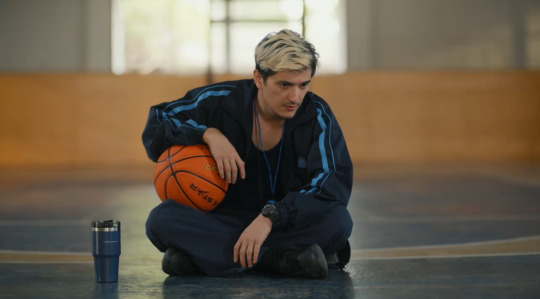
There isn't much happening in this scene. One person is visible and three items stand out (the basketball more than the whistle and the cup). But the eyes are still engaged because of the contrasts that are at play:
Contrasting value (dark/light): The coach wears dark colors while the window behind him is bright.
Complementary/contrasting colors: He has a blue whistle around his neck and lines on his jacket, which contrasts against the orange ball and the area on the wall behind him.
Contrasting temperature: The warm orange against the cool blue.
Contrasting intensity: The saturated orange of the ball against the muted blue cup.
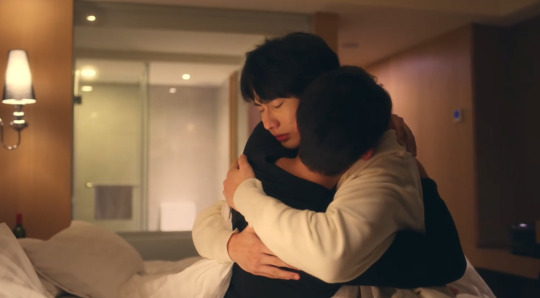
Another example of the blue/orange combo is this scene from To Be Continued:

The intensity of the orange Ji is wearing compared to the muted blue of the comforter pulls the eyes toward the orange and, in turn, to Ji and the puppy (who are both the focus of this scene as they were abandoned by Achi who decided to run away).
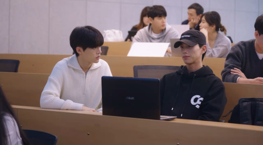
Contrasting colors can also be used in subtle ways that still say a lot about what's going on, like in this scene in I Told Sunset About You:

Here we have the red/green combination. The green coconuts with the red flowers stand between Oh and Bas to pull the eye toward what's happening between them.
Also, Oh is using a green pen while Bas is using a red pen, which is a small detail that makes the color-loving artist in me so happy. That's because Oh, who lives in a (mostly) green world, is drawn to the red. Here he's drawn to the red in Bas, but he's also drawn to Teh who lives in a (mostly) red world.
In other words, contrasting colors can be used to make a scene visually pleasing, pull attention toward the focus of the scene, say something about the characters and what's going on beneath the surface, etc.
When it comes to, in particular, characters and contrasting colors, the black/white, dark/light combination often connects to their overall mood/vibe when used to show contrast. In other words, the character connected with black/dark is usually moodier and more mysterious (often due to hiding some secret or other type of information), etc. While the character connected with white/light is often more open and peaceful, etc.
This can also be used to show that one character is the light in/lights up the other character's dark world. Like Bai Zong Yi (white) and Fan Ze Rui (black) in Kiseki: Dear to Me, and Lee Hyun (white) and Kim An (black) in Love Class Season 2:
When it comes to the complementary/contrasting colors on the color wheel and character pairs that are color-coded in this way, these characters often have contrasting aspects in terms of their personality as well.
To give some examples:
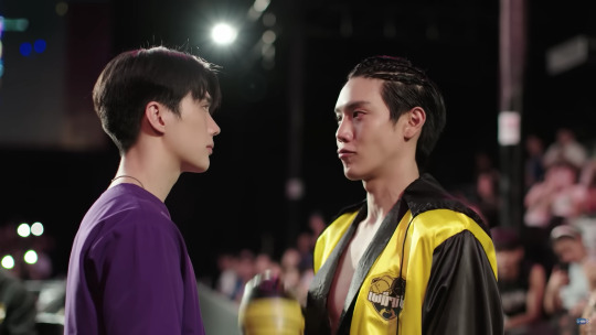
I've previously written about Yak and Dee's (Wandee Goodday) contrasting colors (yellow and purple) and personalities so I won't go too deep into that here. But, to give an example, Dee (purple) is mysterious while Yak (yellow) is more clear/direct.
For some reason, I could only find this example of the red/green combination right now, and that's Rak and Dino in Dinosaur Love. Dino (red) is dominant and a bit temperamental while Rak (green) takes his time (just like plants/nature) and is more even/balanced.

Nuea and Toh is Secret Crush on You display the blue/orange combination. Nuea (orange) is a bit impatient and dominant (which is the red coming out in the orange) while Toh (blue) has a calm (ish) demeanor and is more passive (since he's more focused on his secret crush remaining a secret than believing he can actually have a relationship with Nuea).

There are obviously many more examples, but these were the ones I could remember and find right now.
So, with all that said, I often react to/write about contrasting colors because I love them, because they're visually pleasing, and because they (often) say something more about what we see on the screen or what we hear the characters say. And I absolutely love it when they're used intentionally.
Thank you for your ask.
#ask me anything#ice queen answers#iq color post#the colors mean things#contrasting colors#complementary colors#black/white#yellow/purple#red/green#blue/orange#my shit#the rebound#the rebound the series#to be continued#to be continued the series#i told sunset about you#itsay#kiseki dear to me#love class 2#wandee goodday#wandee goodday the series#dinosaur love#secret crush on you#scoy
14 notes
·
View notes
Text

#nct riku#maeda riku#riku#nct wish#kpop idols#japanese idols#dazed korea#b/w#black/white#face#eyes#male beauty#beautiful#pretty boy#nct#boys#kpop boys
15 notes
·
View notes
Video
Postcrossing PL-2030657 by Gail Anderson Via Flickr: Postcard with a black and white photo of Audrey Hepburn taken in 1961. Sent by a Postcrossing member in Poland.
#Black/White#Audrey Hepburn#Actress#1960s#1961#Hat#Glamour#Hollywood#Movie#Film#Postcard#POstcrossing#flickr
3 notes
·
View notes