#Basteleur
Text

7ODES
#7ODES#César Ropponen-Brunel#artist#Paris#Helsinki#Finnish Lapland#portfolio#black#typography#type#typeface#font#Basteleur#Resonanz A#2024#Week 10#website#web design#inspire#inspiration#happywebdesign
3 notes
·
View notes
Note
If fonts become the new horoscopes, what would your font be? (or more simply, do you have a favorite font)
HMMM i need to think about this one... i really really like editorial new from pangrampangram ! which im using for the gay magazine im working on atm for editorial class ... but i also reeally love all the work they do at the velvetyne foundry and i admire their dedication and vision :] my favorite of theirs is basteleur methinks
4 notes
·
View notes
Note
heyy webstie, asking a couple of my fave editors this question: how do you choose what fonts you use for each piece? i find it so overwhelming, esp since theyre sorted alphabetically and not by like..."vibe" lol. also: what are your like top 5 "tried and true" fonts for edits? thank you for sharing your talent and skill 💖
MWAH thank you so much for asking this! I love talking about fonts n editing and all that so I am happy to answer :)
A lot of me finding fonts is genuinely trial and error, but I usually go into it somewhat knowing what vibe I want.
Do I want to emulate a specific era? Then I'll go to Fonts In Use and see what fonts were used back then and what styles and combos were trendy.
Do I want to emulate a specific medium? I'll go look at pictures of it and try to find fonts that are similar. (E.g.: I wanted to emulate the cover pages of Prayer books with my WCS book cover and this Fleabag poster, so I went on the hunt for fonts that either matched or had a similar essence.)
I also have a very long document where I have saved all my fonts and whenever I need inspo I just scroll through that and see what tickles my fancy. Trial and error once again.
Five fonts I have been loving recently are ITC Avant Garde, Basteleur, Erbar Grotesk, Learning Curve, and Prince Valiant. Choosing all-time-favorites would be too hard, so these are fonts I used that really elevated a design or fit what I was looking for.
7 notes
·
View notes
Text
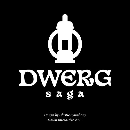
Besides pattern design, I also do graphic design. This a logo redesign job I’ve recently completed for Haiku Interative’s game Dwerg Saga. It is an indie game where you control a group of characters called Dwergs looking to build a new home. One of the key goals of the redesign was to create a symbol that was scalable across different mediums. The symbol is shaped like a lantern, but also suggests an image of a home with the candle in the centre positioned as if it was a doorway. The logotype was also changed, it uses an open source typeface called Basteleur made by Keussel.
I was also provided consulting work to find a new typeface to be used in game that was easy to read but also fit within the aesthetic of the game. We went with the Spectral typeface by Production Type.


#logo#consulting#graphicdesign#gamedev#gamedevelopment#indiegame#indiedev#typography#game dev#game design#game development#graphic design#logo design#graphic designer#video games#games#itch.io#typeface
4 notes
·
View notes
Text

concert du 09/07/2024 à GZ
police: Basteleur par Keussel, distribué sur velvetyne.fr
1 note
·
View note
Text


DNAD:
A crucial point highlighted from the New Blood Brief was that they gave the option and welcomed new name ideas for the Music Event. Happily I began thinking of subtle adaptations of the events existing concepts and how could the gratitude towards the UMG staff become more literal in the event branding. UMusic is a good name however one could say they have just shorted their name rather than reading it a YOU Music which is why the designs above mention YOU more often than not. Wanting the staff to feel mentioned and appreciated, adding the YOU feels like a honourable mention. Upon reflection, I'm not sure this is a courageous step at all, I wish I had the time to develop a brand new name but as the deadline for these awards are soon, my design development timeline certainly doesn't fit into this deadline so I cant be too ambitious with this work. I'm not sure how how acceptable is however making sure the assets and visual narrative is strong enough to UMG staff was the main goal with this brief.
When opening Illustrator and finding a suitable font (Basteleur Bold) I wanted a strong litterate structure but also felt cohesive with my hand drawn elements. From the enjoyment of the Illicit affairs type development, I continued with the experiments of the typeface using the Glyph Tool in Illustrator. The aim was to create a symbol from odd Glyphs, in the second image you can see the experiment with this concept. This was a very short lived idea as nothing was powerful enough to stand as a logo. Looking at the U and M within this typeface, I began to bend its existing shape instead. I wanted this new logo concept to look like wires of some sort. This fluidity that flown throughout the letters was to resemble the use of words when holding music events. From memory, there are always loads of wires across the stage as it's such an electrical catalyst to showcase. I began to mess with colours and stroke widths to visually articulate this concept better which did work, however I don't think it fix into the rest of my existing work.
0 notes
Text

L'atelier Mauvaises Herbes sort de l'ombre.
Affiche sérigraphie 2 couleurs sur papier doré 120g Typographie Basteleur - Keussel / fonderie Velvetyne Impression/illustration/designgraphique - Atelier Mauvaises Herbes /BrutalBrutal
1 note
·
View note
Text
Most of the time free fonts suck…
But sometimes, just sometimes creative folk push their typographic workings out there for free.
Sporting Grotesque
Basteleur
0 notes
Photo

design elixir vol.1 ... find the art manifesto via @harriette.h on insta
#design#graphic art#graphic design#basteleur#font#art#art experiment#experimental#fineart#fine art#design thinking#typography#illustration#artists on tumblr#advertising#science#tarot#tarot art#tarot design
0 notes
Text
44 Best Free Fonts for Designers and Creatives in 2022
Typography plays a huge role in current design trends and aesthetic vision. Designers use typefaces and fonts in web design, illustrations, 3D projects as well as good old prints. Thanks to the latest progressive improvements on the web, such as Variable Fonts, FlexBox, CSS Shapes, CSS Grids paved new ways to work with typography on the web. And we collected the best free fonts that fit perfectly in your creative process in 2022.Design aesthetics changes but in 2022 everything looks more abstract and interconnected. When musicians are working on new music, they always think about 15 sec snippets that might turn into a TikTok craze. Or writers have to use certain words and phrases in certain sections of the text, in this case is best free fonts. New tools and digitalization changes the way we operate. And designers also have to adjust themselves to these changes. But not everything is restrictive and oppressive. Some of the technological developments actually improve the quality of the creative process.There are some efforts to create a compelling SEO-friendly collection as you can see. But I am trying to break the 4th wall. And we are all aware that these texts aren't impactful as the images, title and the quality of the collection. So I can go on and on about the best free fonts on this year or next year. We do this by heart. We put our efforts into doing some good in the community. Therefore we handpicked the fonts and typefaces that we believe will suit you best.In this collection, you can find many fonts with different types and styles. Some of them are futuristic, and some are abstract. Some of them have many variations, but others only come with one style. If you believe we should extend this list with more free fonts, let us know by mailing us or dm us on Instagram.*Every description about the fonts taken from original download pages and descriptions. And fonts are sorted by name for consistency. Best free fonts of 2022 1. Agnes Agnes is a font created by Dominik Szabó. It is inspired by his own handwriting. It supports special characters, numbers and hungarian language too.Download Agnes 2. Apologue Apologue is a new font created by Phillip Block. This free font is a 1970's-meets-art-nouveau display font, a lower case set with ligatures and punctuationDownload Apologue 3. AtilAgg Handwriting of Turkey based architecture and designer Atıl Aggündüz.Download AtilAgg 4. Basteleur A bit more than a year after its original release, Keussel adds a new sharp thinner weight to the pre-existing soft bold weight of Basteleur.Download Basteleur 5. baunk BAUNK is a new free sans serif font created by Reza Rasenda. Baunk is a futuristic modern font that features upper & lowercase characters, multilingual, numbers & punctuation. Download baunk 6. Boris Boris is a script/display typeface designed and developed for fun by Giulia Boggio.Download Boris 7. Brassia Brassia is a typeface that was originally designed for teaching vector tracing by Ariel Martín Pérez.Download Brassia 8. Calfine This is a bold serif font featuring classic glyphs developed in a modern and classy style. Calfine provided by Letterhend.Download CalfineBonus:https://dirtybarn.com/p/colorful-and-retro-sticker-pack-20-pieces/9. Centrion Centrion is the new Futurism Typeface created by Dirtyline. inspired by visual of futuristic and techno-based design from the latest and upcoming trends.Download Centrion 10. CH Bold CH Bold is a commanding free display font from Chokun Choinw.Download CH Bold 11. Coconat Coconat is a two style non-conventional type family: a flared fair-proportioned regular style which changes its impact in the extended bold version completely. Coconat was created by Collletttivo.Download Coconat 12. Faglia This font is a super quirky serif type created by Natalia Timea Szabo, with a touch of elegance, perfect for your favorite projects.Download Faglia 13. Fraunces Fraunces was designed by Phaedra Charles and Flavia Zimbardi, with contributions by Ethan Cohen, and Andy Clymer.Download Fraunces 14. "Free Fat Font" "Free Fat Font" was created by Thom NiessinkDownload "Free Fat Font" 15. Gerbil Gerbil is a geometric sans serif font created by Abdul Artega and YUKITA CREATIVE.Download Gerbil 16. HC Gleam HC Gleam is a display font by Mitch Proctor that is inspired by the guiding light all around us.Download HC Gleam 17. Honey Honey, an all-caps display typeface, designed by Melina Sweet, is an exploration in type design inspired by the honeysuckle flower.Download Honey 18. Kobata Kobata is an experimental typeface, designed by Ariel Martín Pérez, based on some simple rules; firstly, the only possible shapes are rectangles and circles. Secondly, rectangles can’t touch each other on their sides to create more complex shapes, they can only meet by their corners. Lastly, Circles are the only shape of which the size can be optically corrected by diverting from the 50*50 UPM grid.Download Kobata 19. Kyltyrë KYLTYRË Display Font is a dynamic and rugged vintage font created by Leonit Gashi, inspired by western typefaces.Download KYLTYRË 20. Ladi Ladi is an asymmetric typeface created by Milena Leimig, based on liquid forms, as to display a high contrast in its imbalance and uncertain curves.Download Ladi 21. Lagosi Lagosi is a pointed serif typeface from Jetsmax Studio that was inspired by the features on the lagosi fabric found in wajo.Download Lagosi 22. Lerty LERTY is a free wavy display font created by Kai Javier.Download Lerty 23. Lobular Lobular is a typeface, created by Ariel Martín Pérez, that looks like cross-sections of kidneys or the transversal section of an intestinal tract.Download Lobular 24. Degheest: Louise After discovering Ange Degheest’s archives at the Rennes School of Fine Arts; Velvetyne decided to put together an exhibition that attempted to finally give the designer the full recognition she deserves. Louise created by Ange Degheest, Luna Delabre, Camille Depalle.Download Degheest: Louise 25. Lucky Digitization of the font Lucky, designed by André Pless (Mecanorma) in 1972. Digitalization made by Andrea Bianchi.Download Lucky 26. Malebolge Malebolge is a typeface created by Ariel Martín Pérez, named after the eighth circle of Dante's hell, which is reserved for minor fraudsters, and which is divided in ditches.Download Malebolge 27. Maragsa Maragsâ is a typeface created by John David Maza, that owes its form to one of the accent marks used as a guide to the correct pronunciation of Filipino words—the pakupyâ accent—whose tapered tips heralded the sharp edges, hastily-flowing strokes, and abrupt cuts in the characters, similar to the manner words with the stress should be spoken.Download Maragsa 28. Marinfold Marinford Display Font is a bold, unique, fashionable, luxurious, modern and elegant serif with lots of ties and alternatives that will make your presentation more amazing and stand out!. It’s designed and shared by Andika Fez.Download Marinfold 29. Mazius Mazius is a high contrast serif typeface with old style proportions and a strong calligraphic feel. Influenced by chancery hands, it features two italics, each one with distinct personality. Mazius was created by Collletttivo.Download Maziushttps://dirtybarn.com/p/design-elements-pack/30. Monor The Monor is an attempt at typeface, created by Cédric Rossignol-Brunet which, through a systematic construction, tries to reconcile and bring together the trace of a calligraphic design with the rigidity of a monospaced typeface.Download Monor 31. Neue Metana Neue Metana is a modern minimalist design typeface with geometric type and more feature alternative character. The typeface created by Dirtyline.Download Neue Metana 32. Newake Newake Font is a sans-serif font made by the Indieground Team. The slightly rounded corners of the letters give an elegant line to your text and quotes. A font with a minimal atmosphere that will give a cool style and weight to all your artistic compositions.Download Newake 33. Nighty This is a display font created by Dharmas Studio with sharp and beautiful letters that create fonts that are modern, trendy and elegant. It brings back the 70s vibes with a groovy, retro and unique typefaceDownload Nighty 34. Ouroboros The Ouroboros or uroborus is an ancient symbol depicting a serpent or dragon eating its own tail. Ouroboros is also a font created by Ariel Martín Pérez, for alchemists, witches, heretics, outsiders and curious people in general. It's inspired by early art-nouveau styles, which were sometimes used in relation with magical themes and symbolism, so it comes together with a set of alchemical and astronomical symbols.
Read the full article
0 notes
Photo


× Encre et ballon ×
Expérimentations
technique : Encre sur papier glacé
Outil : un ballon gonflable mou
Typos : Lithops, PicNic et Basteleur
0 notes
Text

Further play with logo design! I decided on the typeface Basteleur for it’s bold letterforms. It has both traditional and modern aspects to it, the letters have a fluidity to them, yet appear very grounded at the same time. I love the ‘A’ in particular and I think it’s a fun element to have in my logo, and makes otherwise quite a bold and intimating typeface down to earth.

At present, this is the logo design I want to play around with! The curvature in the letters brings almost a squishyness to the letters, like a soft play area. I wanted to incorporate the spark image into the logo as well, to connect with the idea of imagination and idea.
0 notes

Last Seen Blogs


pititi-dot-com
PITITI

muffinpost
I.Muffin.Post

pitijoposypandorgas
Al liquindoi por el mundo

piscespocho
pisces/pocho/LA