#Blambot
Note
first of all I LOVED your latest good omens comic!! I compliment you for the typesetting, it really enhances the whole tone of the characters! I want to humbly ask what font you used for it?
It's a font I bought on Blambot (blambot.com/), called Inkslinger! I really like it, and use it for my webcomic as well (littletinythings.com) :)
50 notes
·
View notes

Text
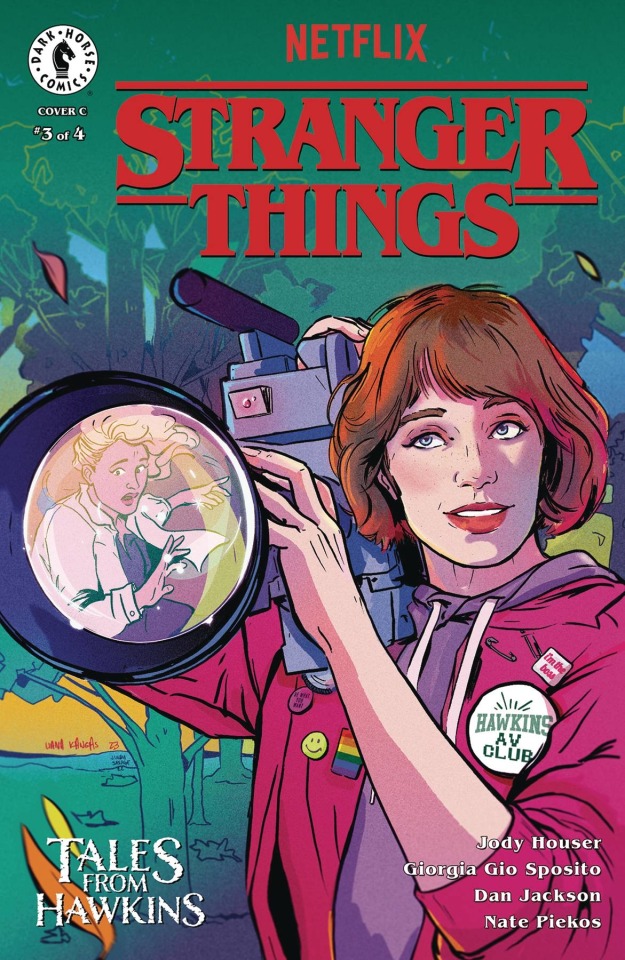
I’m stoked to announce my first @netflix #StrangerThings TALES FROM HAWKINS cover featuring Robin! 👀❤️
You can preorder it now using code JUN231364 @DarkHorseComics!
#netflix#illustration#comics#lianakangas#comicart#comicbooks#portrait#pentel#dark horse comics#stranger things#maya rudolph#robin stranger things#jody houser#GeorgiaGioSposito#dan jackson#blambot#nate piekos#tales from hawkins#lgbt pride#pride month
5 notes
·
View notes
Text
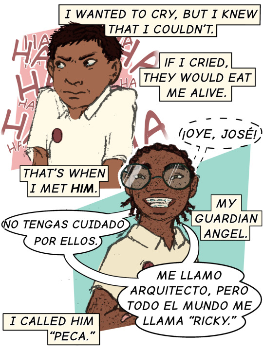
Downloaded a new font and wanted to practice lettering :)
#art#illustration#digital art#digital drawing#oc artwork#comics#comic art#lettering#comic lettering#ibispaintx#ibisPaint is really bad for lettering ngl#not part of a larger story just a one-off#…for now#blambot#latino#spanish#bilingual
1 note
·
View note
Text

easily one of the top five days on the calendar, for me
#fun fact! the other fonts in this post are also from Blambot dot com#website of the guy who made BB Casual aka the Sly Cooper font#I bought some more from him recently :3c
13 notes
·
View notes
Text
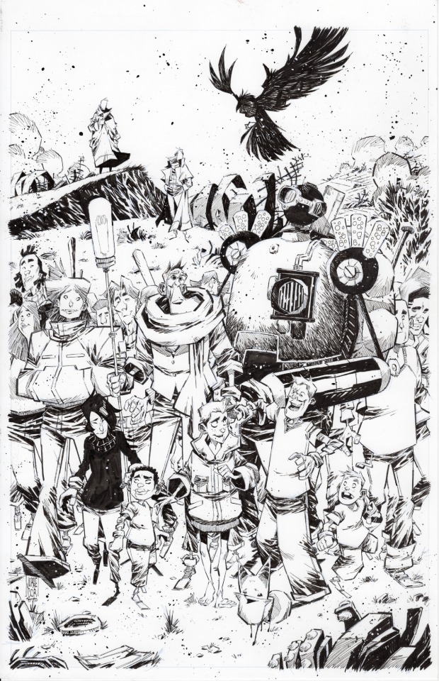
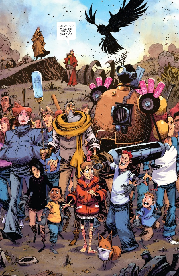
Middlewest #18
by Skottie Young; Jorge Corona; Jean-Francois Beaulieu and Nate Piekos
Image
#image comics#middlewest#jorge corona art#Jean-Francois Beaulieu colors#nate piekos of blambot letters#skottie Young writer#comic book#original art
12 notes
·
View notes
Text


[wip] god has cursed me for my hubris and my work is never finished.jpg(s)
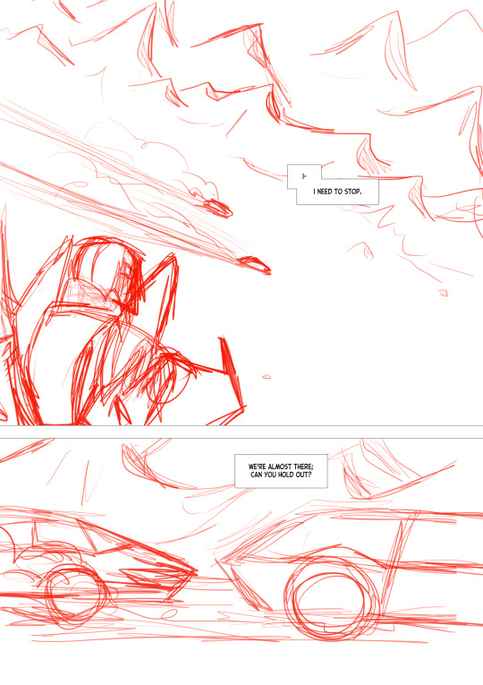
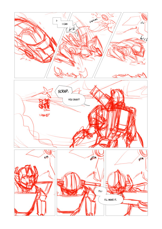
beginning the layout/sketch phase (now with earlier word balloon placement!) on the Sideswipe & Sunstreaker vs Skywarp fight scene practice comic and trying not to implode from self-loathing at my own work wish me luck good night
#wip#instead of my usual blambot classic I'm trying comicraft's samaritan tall. not sure it works with this? might go back to bbclass#also: increase font size probably
15 notes
·
View notes
Text
whoops i lied i actually love lettering this is fun again
#funny how a good blambot font can do that to a man#style tests ALMOST ALL DONE YEA friday friday friday
3 notes
·
View notes
Text
I just want a font making program that I don't have to connect to the internet for and can go in and edit directly on a letter by letter basis why the fuck is that so much to ask
I even just got my internet finally fully fixed but that's not the point
The point is that I do comics and I want to make fonts as I please the same way I can make textures and brush nibs and all else the way I please
The point is also that I like having programs you buy once and have all to yourself
#I didn't bleed to get my handwriting legible just to go to blambot#And like tbh this isn't so much me being controlling as it is that fonts I didn't make myself tend to look strange next to my art
4 notes
·
View notes
Text
whenever i see a webcomic using the same dialogue font as mine i
0 notes
Text
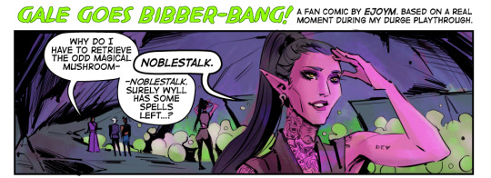
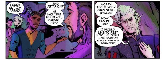
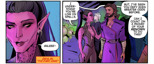
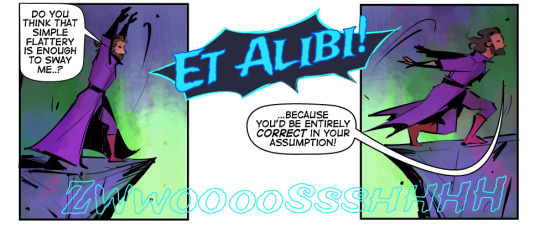

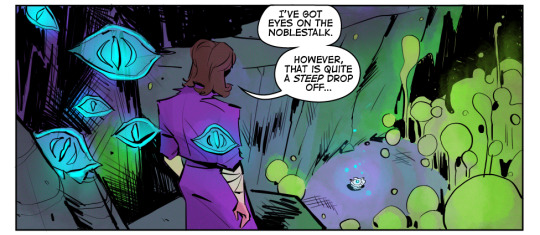
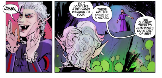
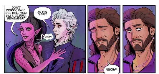
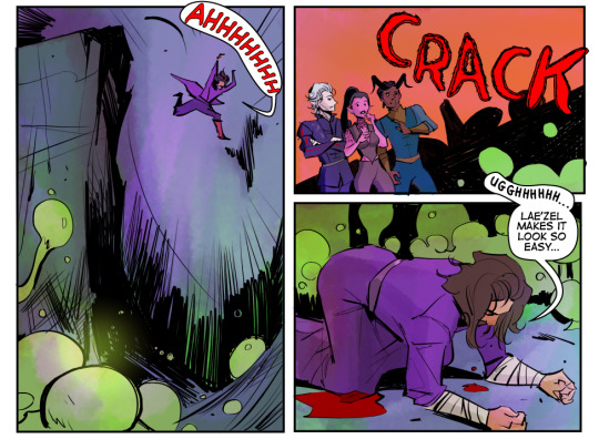
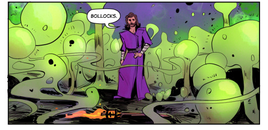
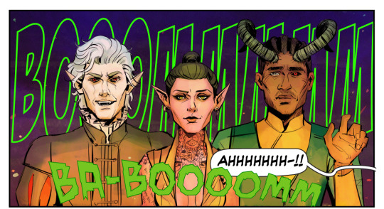
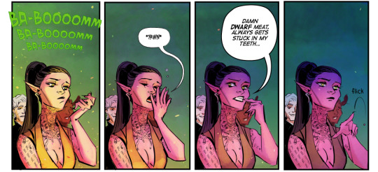
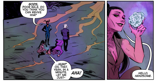
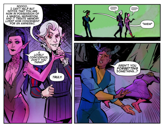
Thanks for reading my silly fan comic.
Shout out to Blambot for having the best fonts for indie creators!
#baldur's gate 3#bg3#baldur's gate fanart#bg3 fanart#bg3 comic#bg3 art#dark urge#durge#bg3 durge#astarion x durge#baldurs gate 3#ejoym art
1K notes
·
View notes
Note
Hello, first i would like to say that i love your art, and second, what font do you use in your comics?
thank you! 💚💚💚
for the last two years-ish I've been using Spinner Rack Pro, which was my holiday present to myself. :') before that I used the similar-looking but free for comics use Back Issues! both are from Blambot, which is a great resource for free comic fonts in general, if you're looking for more!
172 notes
·
View notes
Note
Hello! I would like to ask something that I've been boggling about for quite some time.
What kind of font do you use for the comic series? Is it downloadable for both PC and Mobile? (And hopefully free?)
the main font is called Anime Ace and it's by blambot!
the font i use for the werehog is called MANEATER
most of their fonts are free to use for personal non profit projects or small indie comics. you can read more about their licences here.
53 notes
·
View notes
Note
What are your favorite brushes?
Ha, you timed that well as I was considering making a 'what tools do I use' post. information wants to be free and all of that ~
Before I get into specific brushes, I need to mention hardware. Two years ago i switched permanently to linux (Ubuntu distro), via a system76 laptop. Linux isn't for the tech-fainthearted, but if you hav a passion for playing with computers and are feeling increasingly constricted with the subscription BS that mac/win is pushing, consider giving it a trial run.
Krita is an open-sourced free paint/vector program that's available on all major OS's (win/mac/linux), but is by far the best one for linux. Frankly, I adore Krita; it reminds me of the best of paint tool SAI way back in the day, a little of photoshop CS2, and I just discovered in the past two weeks it's got some deceptively powerful vector tools for speech bubbles and comics. open source programs used to be pretty pathetic compared to "professional" ones but the gap between krita and say, CSP is pretty nil.
Now to talk brushes: I uploaded a slightly older version of my go-to brushes here on mediafire, some which have been slightly tweaked from krita defaults. there's a solid pen one, a halftone brush, and some watercolor ones.
however, I discovered these brushes (thanks to @am-herrington) a few months ago and am convinced the linked newer brushes are going to make everything else I have obsolete - the natural/textural inking is just that good. tl;dr - just grab these.
some other odds and ends to my process: i could not draw without the hydrus network which is essentially a booru-esque media organizing program. stores gifs, images, can mass-download images, and has a robust tagging ability. taco's drawing book is one of the one I'll also reliably flip through when my brain's trying to figure out a piece of tricky anatomy. lastly, blambot is my trusted go-to font store when I'm in need of a manga/comics related font; there's some very generous pricing and freebies for indie comics.
32 notes
·
View notes
Text
Lettering Tips for Comics Artists!
Lettering is an easy to overlook aspect of comics creation, partially because good lettering is designed to be invisible, but bad lettering can ruin an otherwise well crafted project.
Now, I'm not a letterer by trade, I'm a colorist who thinks too much about comics craft, but I've picked up on a few common mistakes I've seen new webcomic artists making, and I thought I'd share my tricks.
#1: Get a Dialog font
Sorry, despite Comic Sans having the word comic in the name, it's not actually good for lettering comics. Comic book letterers usually use specially designed fonts when they're lettering comics, and they often have websites where you can get these typefaces for a reasonable fee (or sometimes even free!)
What makes dialog typefaces special?
The barred-I! (and other contextual options)
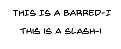
This one is subtle, but generally, you want to only use the barred-I for the personal pronoun "I" or for roman numerals. It helps clarify that what you're looking at is an I and not an L, but it takes up more space in the word, and we're trying to reserve as much space as possible for the art on the page.
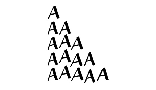
Specially made comic book fonts will also be custom designed to be legible at a distance, have multiple bold/italics options, and might even include special versions of individual letters for when you type multiple of the same character in a row! It'll give your lettering a personal touch that you won't get from typefaces designed for other things.

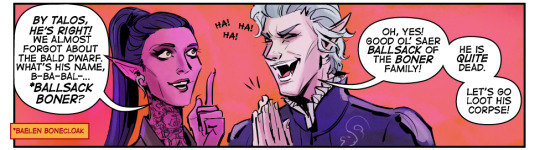
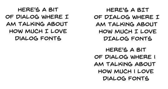
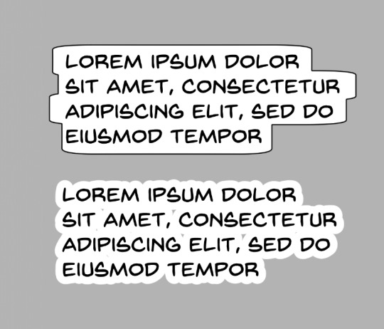
Blambot is a great resource for all your lettering needs. Here I'm using Backissues and Nightmark
#2: Dialog Stacking
Dialog should always be stacked such that your longest line of text is in the middle. The block of text itself should have a sort of diamond shape <>. Sometimes this is difficult to do, especially if you have any long words at the beginning or end of a sentence. You can't always get it to work (and if you're unwilling to rewrite your dialog so it fits), so sometimes it might not be perfect, but if your text block is more hourglass shaped >< that's a good indication that you should try putting your line breaks somewhere else. Basically try to make your text as round as possible if it's in a balloon.
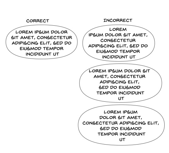
#3: Balloon Shape
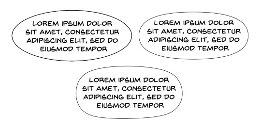
One of the more common mistakes I see webcomic artists making is using perfectly elliptical balloons. It's actually kind of difficult to fit text into balloons that are perfectly elliptical; there ends up being a lot of uneven space around the text, and it looks kind of cheap. Making your balloons slightly more rectangular is going to give you more bang for you buck, they'll fit the text block a little better. I like a hand drawn balloon, I tend to think they add variety.
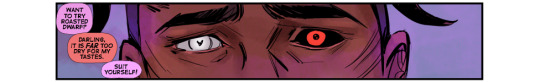
One thing you definitely shouldn't do is this:
This might be a personal preference thing more than any kind of hard and fast rule, but these lettering styles give me the impression that the text is pasted on top of the art, and that no real thought was put into arranging it thoughtfully with the art. These are probably more appropriate for captions, not so much for dialog
Lettering is a part of the medium we're working with, the dialog should be approached as a part of the artwork, and treated as such.
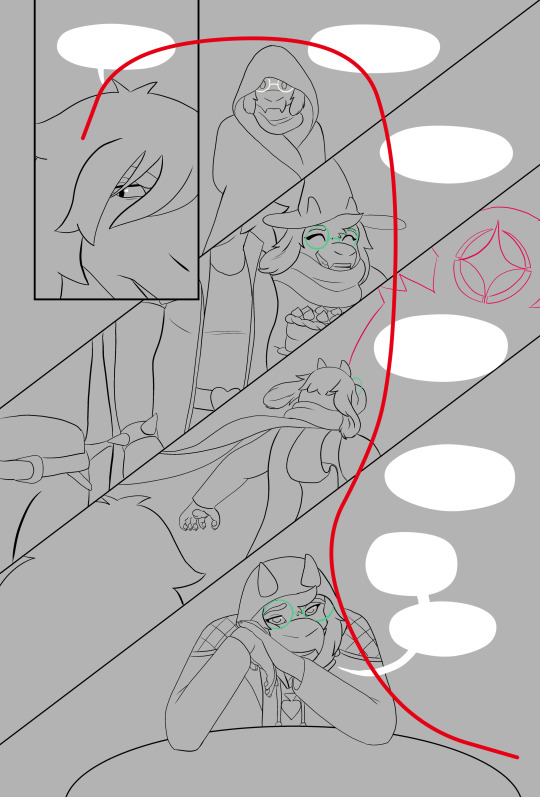
#4: Balloon Placement
The number one, most important rule of lettering, is that the placement of your balloons should never confuse your reader. The goal of balloon placement is to guide your reader around the page, each one should naturally lead your reader towards the next thing they should read. Here's an example of something I see a lot:
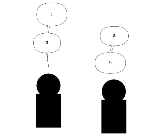
While yes, it is true that on a comics page, people read left-to-right top-to-bottom, if two balloons are connected with a line, I am going to read them one after another. Readers are not going to intuitively assume they should jump to the other side of the page just because the #2 balloon is slightly above #3. In this situation the balloons should be interwoven.

It should not be possible to look from one balloon to another and skip over intermediate dialog. If your reader misses a part of the conversation and has to double back to figure out what they missed, you've broken the flow and immersion of the page.
Like I said, lettering is all about guiding your reader around the page, it should be a part of your composition from the beginning, don't forget to incorporate lettering into your work when you're first laying out your page. Put yourself in the place of your reader and see how your eyes track across the page.

Hope these help! Like I said, I'm no expert; it took me a while to learn a lot of this. I would have found these tips super useful when I was first starting out. If you're interested in the technical side of lettering, I highly recommend The Essential Guide to Comic Book Lettering by Nate Piekos. It's one of the most useful reference books I own, and I learned most of this from that book.
#undertale and deltarune webcomics get a free pass on using comic sans#webcomics#tutorial#comics#ferrouscomicscraft#when I say I think too much about comics craft this is what I'm talking about#I could go on and on about how cool auto-ligatures are#lettering
80 notes
·
View notes
Last Seen Blogs
sadcactuhs
s a m a n t h a

kimjongwaeeee
Untitled

jinaieien
my Angel JFTK etc...

danascullys
now @ theladyeowyn
trueloveistreacherous
we get to be glorious