#ButtonDesigns
Explore tagged Tumblr posts
Visit Tumblr Blog
Explore Tumblr blogs with no restrictions, modern design and the best experience.
Last Seen Tumblr Blogs


Fun Fact
Kazakhstan’s Minister of Communications and Informatics has blocked the Tumblr site because it contained 60 sites of terrorism, extremism, and pornography in 2015.
Text
Styling Excellence: Mastering Button Designs with CSS

Introduction
Welcome to a journey into the world of styling excellence! In this blog post, we'll delve into the art of mastering button designs using the power of CSS. Buttons are a fundamental aspect of web design, playing a crucial role in user interaction and navigation. Understanding how to style buttons effectively not only enhances the visual appeal of your website but also contributes to a seamless user experience. We'll explore the basics of button styling, advanced techniques to elevate your designs, and the importance of responsiveness. Additionally, we'll dive into creating interactive buttons and optimizing performance to ensure your styles not only look great but also load efficiently. Whether you're a beginner looking to grasp the fundamentals or an experienced developer aiming to refine your skills, this blog post has something for everyone. Let's embark on this journey to unlock the secrets of crafting visually stunning and highly functional buttons with the magic of CSS!
The Basics of Button Styling
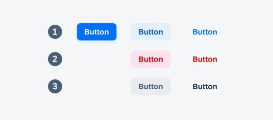
Button styling forms the foundation of creating visually appealing and user-friendly interfaces. In this section, we'll cover the fundamental CSS properties and techniques that lay the groundwork for crafting beautiful button designs. 1. Background and Color: The background-color property is essential for defining the base color of your button. Consider using a color palette that aligns with your website's overall design. Experiment with different shades to find the perfect match. Additionally, the color property determines the text color within the button, ensuring readability and contrast. 2. Border and Border-radius: The border property allows you to define the border style, width, and color of the button. Adding rounded corners is achieved through the border-radius property, providing a modern and softer aesthetic. Combining these properties allows for versatile button shapes and styles. 3. Padding and Margin: Adjusting the padding inside the button influences its size and spacing, contributing to a balanced and well-proportioned design. Meanwhile, the margin property controls the space between buttons and other elements, preventing overcrowded layouts. 4. Text Styling: Customize the font, size, and weight of the text within the button to enhance its visual appeal. Employ the text-align property for proper alignment, ensuring a polished and professional look. 5. Hover Effects: Introduce interactive elements by incorporating hover effects. This can include changes in color, shadow, or other visual cues to provide feedback to users when they interact with the button. Utilize the :hover pseudo-class for these effects. Now, let's explore a simple example to illustrate the application of these basic styling principles: HTMLClick me CSS.basic-button { background-color: #3498db; color: #ffffff; border: 1px solid #3498db; border-radius: 5px; padding: 10px 20px; text-align: center; } .basic-button:hover { background-color: #2078b4; border-color: #2078b4; } This example creates a button with a blue background, white text, and subtle hover effects. Feel free to experiment with these basic properties to craft buttons that align with your website's style and enhance the overall user experience.
Advanced Techniques for Button Designs
Take your button designs to the next level by exploring advanced CSS techniques that add sophistication and visual flair. These techniques allow you to create buttons that stand out, capturing the attention of your website visitors. 1. Gradient Backgrounds: Replace solid colors with gradient backgrounds to add depth and dimension to your buttons. Gradients can be simple two-color transitions or more complex combinations, providing a modern and vibrant aesthetic. Experiment with linear and radial gradients to achieve different effects. 2. Box Shadows: Introduce depth and realism to your buttons by utilizing box shadows. The box-shadow property allows you to cast shadows around the button, creating a lifted or floating appearance. Adjust the shadow's color, blur radius, and offset for varied visual effects. 3. Icon Integration: Enhance button designs by incorporating icons. Icons provide visual cues and can complement the button's purpose. Use the ::before or ::after pseudo-elements along with the content property to insert scalable vector icons into your buttons, ensuring a clean and modern look. 4. Custom Transitions: Implement smooth transitions to enhance the user experience. The transition property allows you to control the speed and timing function of changes in properties like color, background, or size. This creates a polished effect, especially when users interact with your buttons. 5. Border Gradients: Go beyond simple borders by applying gradients to border properties. This technique adds a dynamic and eye-catching element to your buttons. Experiment with different color combinations and gradient styles to achieve unique and visually appealing results. Let's explore an example that combines these advanced techniques: HTMLClick me CSS.advanced-button { background: linear-gradient(to right, #ff6b6b, #ffe66d); color: #ffffff; border: none; border-radius: 8px; box-shadow: 0 4px 6px rgba(0, 0, 0, 0.1); padding: 15px 30px; position: relative; overflow: hidden; transition: background 0.3s ease; } .advanced-button:hover { background: linear-gradient(to right, #ff8e6e, #ffec8b); } .icon::before { content: url('icon.svg'); margin-right: 10px; } This example showcases a button with a gradient background, a subtle box shadow, and an integrated icon. Feel free to customize and combine these techniques to create buttons that align with your design goals and captivate your audience.
Responsive Button Designs
Ensuring that your buttons look and function well across various devices is essential for providing a seamless user experience. Responsive button designs adapt to different screen sizes and orientations, catering to the diverse ways users access your website. 1. Media Queries: Start by incorporating media queries into your CSS to apply specific styles based on the device characteristics. Media queries allow you to set breakpoints where different styles take effect, ensuring a smooth transition between desktop, tablet, and mobile views. 2. Flexible Sizing: Utilize relative units like percentages or ems instead of fixed pixel sizes for your button dimensions. This ensures that buttons scale proportionally when viewed on different devices, preventing issues like buttons appearing too small or too large on certain screens. 3. Fluid Typography: Extend responsive design principles to text within buttons. Instead of using fixed font sizes, consider using relative units for font size, such as vw (viewport width) or ems. This ensures that text scales appropriately, maintaining readability on all devices. 4. Touch-Friendly Design: Recognize the prevalence of touchscreens on mobile devices. Adjust button sizes and spacing to accommodate touch interactions. Ensuring that buttons are large enough and well-spaced prevents accidental taps and enhances the overall user experience. 5. Hidden Elements: In certain situations, you may need to hide or rearrange elements for smaller screens. Use the display property and visibility property along with media queries to hide non-essential elements or present them in a more condensed form on smaller screens. Let's examine a practical example of a responsive button design: HTMLClick me CSS.responsive-button { background-color: #4caf50; color: #ffffff; padding: 10px 20px; font-size: 16px; border: none; border-radius: 5px; cursor: pointer; transition: background-color 0.3s; } @media (max-width: 600px) { .responsive-button { font-size: 14px; } } .responsive-button:hover { background-color: #45a049; } This example demonstrates a responsive button that adjusts its font size when viewed on screens smaller than 600 pixels wide. Implementing responsive designs ensures that your buttons remain visually appealing and functional across a spectrum of devices, contributing to a positive user experience.
Creating Interactive Buttons with CSS
Elevate user engagement on your website by making buttons interactive and visually appealing. In this section, we'll explore CSS techniques that add a dynamic touch to your buttons, making them responsive to user interactions. 1. Hover Effects: Implementing hover effects is a simple yet effective way to make buttons interactive. Use the :hover pseudo-class to define styles that activate when users hover over the button. This can include changes in background color, text color, or even subtle animations to provide visual feedback. 2. Transitions and Animations: Go beyond static styles by incorporating transitions and animations. The transition property allows for smooth changes in specified styles over a set duration. For more complex and dynamic effects, animations can be defined using the keyframes rule. Experiment with different easing functions and durations to achieve the desired impact. 3. Click Effects: Provide visual feedback when users click on a button. This can be achieved using the :active pseudo-class to define styles that activate during the click event. Consider incorporating effects like a change in background color or a slight shadow to simulate a button press. 4. Focus Styles: Enhance accessibility by styling the focus state of your buttons. When users navigate your site using the keyboard, a clear focus style ensures they know which button is currently selected. Use the :focus pseudo-class to define styles for the focused state, such as an outline or box shadow. 5. Interactive Icons: Integrate interactive icons within your buttons to convey additional meaning or functionality. Use pseudo-elements like ::before or ::after to insert icons into the button. Apply styles and animations to these icons to make them respond to user interactions. Let's dive into an example that combines hover effects and transitions: HTML Hover over me CSS.interactive-button { background-color: #3498db; color: #ffffff; padding: 10px 20px; border: none; border-radius: 5px; cursor: pointer; transition: background-color 0.3s; } .interactive-button:hover { background-color: #2078b4; } This example showcases a button with a smooth color transition on hover. Experiment with these techniques to create interactive buttons that not only capture user attention but also enhance the overall user experience on your website.
Optimizing Performance
Efficient button styling goes beyond aesthetics; it also plays a crucial role in the overall performance of your website. In this section, we'll explore best practices for optimizing CSS to ensure your button designs not only look great but also load quickly, contributing to a seamless user experience. 1. Minimize CSS File Size: Reduce the size of your CSS files by eliminating unnecessary code and comments. Utilize tools like minifiers to automatically remove whitespace and compress your stylesheets. Smaller file sizes lead to faster loading times, especially crucial for users on slower internet connections. 2. Use CSS Sprites: Combine multiple button images into a single sprite sheet. By doing so, you reduce the number of server requests needed to load individual images. This optimization technique is particularly beneficial when working with icon sets or buttons with diverse states. 3. Lazy Loading: Implement lazy loading for background images or other non-essential assets within your buttons. Lazy loading delays the loading of off-screen images until they are needed, reducing initial page load times. This is especially beneficial for pages with multiple buttons or images. 4. Optimize Background Gradients: If using gradients, consider simplifying them to reduce the load on the browser. Complex gradients can contribute to slower rendering times. Experiment with simpler gradient styles or use solid colors where possible to achieve a balance between aesthetics and performance. 5. CSS Hardware Acceleration: Leverage hardware acceleration for smoother animations and transitions. This is achieved by offloading graphics rendering to the device's GPU. Apply the transform property with 3D translations to trigger hardware acceleration, enhancing the performance of interactive elements like buttons. 6. Browser Caching: Configure your server to set appropriate cache headers for your CSS files. This enables browsers to cache the styles locally, reducing the need to download them on subsequent visits. Users will experience faster load times when returning to your site. Let's explore an example that incorporates some of these performance optimization techniques: HTML CSS/* Minimized and optimized CSS */ .optimized-button {background-color: #4caf50;color: #ffffff;padding: 10px 20px;border: none;border-radius: 5px;cursor: pointer; transition: background-color 0.3s;}.optimized-button:hover{background-color: #45a049;} Implementing these performance optimizations ensures that your button styles contribute to a fast and responsive web experience. By adopting these best practices, you enhance both the visual appeal and efficiency of your website's button designs.
Frequently Asked Questions (FAQ)
Explore answers to common queries about button styling with CSS. Whether you're a beginner or an experienced developer, these FAQs provide insights into various aspects of creating stylish and functional buttons for your website. - Q: How can I create a basic button with CSS? A: To create a basic button, define the background color, text color, padding, and border properties in your CSS. You can customize these properties to achieve the desired style. Consider using the :hover pseudo-class for interactive effects. - Q: What are the key properties for advanced button designs? A: Advanced button designs often involve gradient backgrounds, box shadows, icon integration, custom transitions, and border gradients. These properties add depth, interactivity, and visual appeal to your buttons. - Q: How can I make buttons responsive to different devices? A: Use media queries to apply specific styles based on device characteristics. Ensure flexible sizing, fluid typography, and touch-friendly design. Consider hiding or rearranging elements for smaller screens to maintain a responsive layout. - Q: What techniques can I use to make buttons interactive? A: Buttons can be made interactive through hover effects, transitions, animations, click effects, and focus styles. These techniques add dynamism and engagement to your buttons, enhancing the overall user experience. - Q: How do I optimize the performance of CSS for button styling? A: Optimize CSS performance by minimizing file size, using CSS sprites, implementing lazy loading for images, simplifying background gradients, leveraging hardware acceleration, and enabling browser caching. These practices contribute to faster loading times. Feel free to refer to these FAQs as you embark on your journey to master button styling with CSS. If you have additional questions, don't hesitate to reach out for further assistance!
Conclusion
Congratulations on completing your exploration of button styling excellence with CSS! In this comprehensive guide, we've covered a range of topics, from the basics of button styling to advanced techniques, responsive designs, interactive elements, and performance optimization. Let's recap the key takeaways from our journey: - Mastering the Basics: Understanding fundamental CSS properties such as background, border, padding, and text styling lays the groundwork for crafting visually appealing buttons. - Advanced Techniques: Elevate your button designs with advanced techniques like gradient backgrounds, box shadows, icon integration, custom transitions, and border gradients, adding depth and sophistication. - Responsive Design: Ensure your buttons look and function well across different devices by employing media queries, flexible sizing, fluid typography, touch-friendly design, and hidden elements for smaller screens. - Interactive Elements: Enhance user engagement by incorporating hover effects, transitions, animations, click effects, and focus styles, making your buttons dynamic and responsive to user interactions. - Performance Optimization: Optimize CSS for better performance by minimizing file size, using CSS sprites, lazy loading, simplifying background gradients, leveraging hardware acceleration, and enabling browser caching. Armed with these skills, you have the tools to create buttons that not only look visually stunning but also contribute to a seamless and efficient user experience on your website. Remember to experiment, iterate, and stay informed about evolving web design trends and best practices. Thank you for joining us on this journey to become a master of button styling with CSS. Keep pushing the boundaries of creativity, and may your buttons captivate and delight users across the digital landscape! Read the full article
0 notes
Video
youtube
Divi Pro Secrets: Create Stunning Custom Buttons for Any Text Based Module!
Unlock the full potential of your Divi Theme with this comprehensive guide on how to create your own custom buttons for any text-based module. In this video, we’ll walk you through the process of designing unique and eye-catching buttons using simple CSS code. Whether you’re working with text modules, blurbs, or any other text-based content, this tutorial will show you how to enhance your website's interactivity and visual appeal. Perfect for both beginners and seasoned Divi users, these tips will help you take your web design skills to the next level.
0 notes
Text

Apartments in Odai is a minimal apartment located in Tokyo, Japan, designed by Buttondesign. The renovation seamlessly connects various living spaces while embracing an open garden, allowing both human and canine occupants to coexist harmoniously. The entire floor, from the entrance to the dining room and onward to the garden, is adorned with the same tiles, creating a unified, earthy atmosphere that blurs the lines between indoors and outdoors.
60 notes
·
View notes
Photo
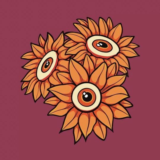
Here's some cute little designs that I recently ordered as buttons 💜🌼 #serpentssun #natureillustration #design #flowerdesign #thirdeye #trippyart #natureart #buttondesigns https://www.instagram.com/p/Cht11vKvcU8/?igshid=NGJjMDIxMWI=
15 notes
·
View notes
Photo

//there, done!! changed alot of things so it LOOKS better eyeemoji.
probs gonna make stickers of these <33
#buttondesigns#buttons#stickers#castlevania season 2#castlevania sypha#castlevania trevor#castlevania alucard#alucard tepes#sypha belnades#ot3..for sure..i love them so much..#trevor belmont#castlevania netflix#netflix
97 notes
·
View notes
Text
0 notes
Photo

a lil preview of all the be more chill buttons i’m working on. thinking of becoming a vendor for the new Fandom PDX that has replaced Newcon.
!! DO NOT REPOST/STEAL MY ART
#be more chill#be more chill art#michael mell#jeremy heere#bemorechill#bmc#bmcfanart#boyf riends#art#artist#artistontumblr#buttondesigns#selling#my art
81 notes
·
View notes
Photo
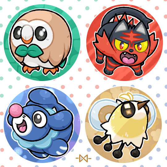
🌟 Pokémon Buttons - Alola Edition!!🌟 Alola = Done!! Now only Galar and we got them all, the starters, that is! Let's hope I can get that done before Comiccon Holland; my next big con at the end of this month .w.;;;; I also added Cutiefly because I just really dig it, usually I'm not big on the color yellow, but the Bee-fly design is charming enough to negate that~!! Also Rowlet being my unofficial mascot because of our matching bowties, Grass has always been my type~!! I do have the sketches done for the next set, Y'all will most likely see them in 2 weeks. First I got a print and another buttonset to finish >:3
113 notes
·
View notes
Photo

Congratulations! @kookstenshi won the give away of the buttons! Thank you all for participating! ☺️ Do you also want a cute set of the sushi buttons? You can find them in my webshop 🛒🛍️ #winner #button #buttons #buttonsbuttonsbuttons #buttondesign #buttondesigns #sushilove #sushilover #sushitime🍣 #sushimaki #sushitime #sushi #makingarteveryday #maki #nigiri #rice #sushifreak #sushiaholic #iloveshushi #ricetomeetyou #nicetomeetyou #sushiroll #japan #japanesefood #japanesefoods #food #foodart #foodlover #foodies (bij Beverwijk) https://www.instagram.com/p/CHFd17krDXD/?igshid=wmu6vbyfzgxm
#winner#button#buttons#buttonsbuttonsbuttons#buttondesign#buttondesigns#sushilove#sushilover#sushitime🍣#sushimaki#sushitime#sushi#makingarteveryday#maki#nigiri#rice#sushifreak#sushiaholic#iloveshushi#ricetomeetyou#nicetomeetyou#sushiroll#japan#japanesefood#japanesefoods#food#foodart#foodlover#foodies
0 notes
Photo

Grey and red buttons #handembroidery #handmade #buttons #buttondesigns (at Cellardyke)
3 notes
·
View notes
Text
Crafting Buttons with HTML and CSS: A Complete Guide

Introduction
Welcome to the world of crafting visually appealing and interactive buttons using HTML and CSS. In this comprehensive guide, we'll explore the art of button design, understanding the crucial role that HTML and CSS play in shaping the user interface of a website. Buttons are not just functional elements; they serve as a gateway for user interaction and can significantly impact the overall user experience. Whether you're a beginner eager to learn the basics or an experienced developer looking to enhance your button design skills, this guide has something for everyone. Let's dive into the fundamentals of HTML and CSS to create buttons that not only look great but also provide a seamless and engaging user experience.
Understanding HTML for Buttons

HTML, the backbone of web content, plays a pivotal role in crafting effective and accessible buttons. To create buttons, we need to harness the power of specific HTML elements that define the structure and behavior of these interactive components. Let's delve into the key HTML elements essential for crafting buttons: - Element: The primary HTML element for creating buttons. It allows you to define a button that users can interact with. You can include text, images, or other HTML elements within the button tags. - Element (Anchor Tag): While commonly used for creating hyperlinks, the anchor tag can also be styled as a button. This is achieved by applying CSS styles to simulate a button appearance. This approach is useful when you need a button that links to another page. - Element: The input element, especially of type "submit" or "button," is commonly used within forms to create submit buttons. These buttons trigger the form submission when clicked. - Custom Elements: In modern web development, custom elements (created using the or elements) are often styled as buttons. These are enriched with event listeners through JavaScript to mimic button behavior. Here's a simple example of a button created using the element: HTMLClick me
CSS Styling Fundamentals
Now that we've established the foundation with HTML, let's turn our attention to CSS, the creative force that brings buttons to life. Understanding CSS styling fundamentals is crucial for achieving visually appealing and cohesive button designs. Here, we'll explore key principles and techniques: - Box Model: The box model is the cornerstone of CSS layout. Each HTML element, including buttons, is treated as a box with content, padding, borders, and margins. Mastering the box model allows precise control over the size and spacing of buttons. - Text Styling: Effective button design involves careful consideration of text. CSS provides a range of properties to control font size, style, weight, and color. Bold text, italics, and text alignment contribute to the overall aesthetics of the button. - Color and Background: Choosing the right color scheme for buttons is crucial. CSS allows you to set background colors, gradients, and apply transparency. This enhances the visual appeal and ensures buttons align with the overall design theme. - Border and Border-radius: Borders define the outline of a button, and the border-radius property adds rounded corners for a modern look. Careful adjustment of these properties contributes to the button's visual balance. - Hover Effects and Transitions: Adding interactive elements to buttons enhances the user experience. CSS pseudo-classes, such as :hover, enable you to apply specific styles when users interact with the button. Transitions create smooth animations for a polished effect. To illustrate these concepts, consider the following CSS snippet: CSSbutton { padding: 10px 20px; font-size: 16px; color: #ffffff; background-color: #3498db; border: 2px solid #2980b9; border-radius: 5px; transition: background-color 0.3s ease-in-out; } button:hover { background-color: #2c3e50; }
Creating Button Variations
See the Pen Candy Color Button Animation by Yuhomyan (@yuhomyan) on CodePen. Now that we have a solid understanding of HTML and CSS fundamentals, let's explore the exciting realm of creating diverse button variations. Crafting buttons that stand out and adapt to different contexts involves experimenting with styles, effects, and interactive elements. Here's a guide to creating button variations: - Text and Icon Combinations: Enhance the visual appeal of buttons by combining text with icons. Use the or elements to include icons, and style them alongside button text. This is particularly effective for call-to-action buttons. - Gradient Backgrounds: Add depth and modernity to buttons by incorporating gradient backgrounds. CSS gradients enable a smooth transition between colors, providing a sleek and dynamic appearance. - Button States: Buttons can have different states such as active, disabled, or focused. Style each state to provide visual feedback to users. For instance, a disabled button can have a distinct color to indicate its inactive status. - Animated Buttons: Introduce subtle animations to buttons using CSS transitions or keyframes. This could include changing colors, scaling, or other creative effects that engage users without being overly distracting. - Transparent Buttons: For a minimalist and modern look, consider creating transparent buttons. Set the background-color to transparent and adjust borders and text color accordingly. This style is effective when layered on images or vibrant backgrounds. For a quick reference, here's a table showcasing different button variations and their corresponding HTML and CSS: Button TypeHTMLCSSText and IconShop Now/* CSS Styles for text and icon */
Responsive Design for Buttons
In the ever-evolving landscape of web design, responsiveness is a key factor in ensuring a seamless user experience across various devices. Crafting buttons that adapt to different screen sizes and orientations is essential for modern websites. Let's delve into the principles of responsive design for buttons: - Media Queries: Media queries are a fundamental tool for implementing responsive design. By using CSS media queries, you can apply specific styles to buttons based on the characteristics of the user's device, such as screen width, height, or orientation. - Fluid Grids: Implementing a fluid grid layout ensures that buttons proportionally adjust to the screen size. This involves using percentage-based widths instead of fixed pixel values, allowing for flexibility across devices. - Flexible Images: Just as with grids, images within buttons should be flexible. Use CSS properties like max-width: 100% to ensure that images scale appropriately on smaller screens without losing clarity. - Viewport Units: Utilize viewport units (vw, vh, vmin, vmax) to define button dimensions relative to the viewport size. This ensures that buttons scale proportionally, providing a consistent and visually appealing experience. Consider the following example of a responsive button style using media queries: CSSbutton { padding: 10px 20px; font-size: 16px; color: #ffffff; background-color: #3498db; border: 2px solid #2980b9; border-radius: 5px; transition: background-color 0.3s ease-in-out; } @media (max-width: 600px) { button { font-size: 14px; padding: 8px 16px; } }
Accessibility Considerations
Creating buttons that are accessible to users of all abilities is a fundamental aspect of web development. Web accessibility ensures that everyone, including those with disabilities, can perceive, understand, navigate, and interact with web content. Let's explore key considerations for making buttons accessible: - Semantic HTML: Use semantic HTML elements like , , or with appropriate attributes. These elements convey the purpose and function of buttons to assistive technologies, making them more understandable for users. - Focus Styles: Ensure that buttons are visibly distinguishable when they receive focus. Applying a clear and prominent focus style, such as a border or background change, helps users who navigate using keyboard or assistive technologies to understand where they are on the page. - Descriptive Text: Include descriptive text within buttons. This text should concisely convey the button's action or purpose. Screen readers rely on this text to provide information to users with visual impairments. - Color Contrast: Ensure there is sufficient color contrast between the button text and background. This benefits users with low vision or color blindness, allowing them to easily distinguish and read the button content. - ARIA Attributes: Leverage ARIA (Accessible Rich Internet Applications) attributes to enhance accessibility. ARIA attributes such as role, aria-label, and aria-labelledby provide additional information to assistive technologies about the role and purpose of buttons. Here's an example of a button with accessibility considerations: HTML
Optimizing Performance
While crafting visually appealing and accessible buttons is crucial, optimizing their performance ensures a seamless and efficient user experience. Users today expect fast-loading websites, and buttons play a significant role in influencing the overall performance. Let's delve into strategies for optimizing the performance of buttons: - Minimize HTTP Requests: Each button, especially those with images or external resources, contributes to the total number of HTTP requests. Reduce these requests by using CSS sprites for multiple images or incorporating icon fonts to minimize the load on the server. - Compress and Minify: Compressing images and minifying CSS and JavaScript files reduces their file sizes, leading to quicker load times. Utilize tools to automatically compress and minify your code, optimizing the performance of button-related assets. - Leverage Browser Caching: Set appropriate caching headers to allow browsers to store button-related assets locally. This reduces the need to download resources on subsequent visits, improving overall page load speed. - Lazy Loading: Implement lazy loading for images within buttons. This technique delays the loading of images until they are about to enter the user's viewport, reducing initial page load times. - Responsive Images: Provide different image sizes for various screen resolutions. Use the srcset attribute to specify multiple sources, allowing browsers to choose the most appropriate image based on the user's device. Consider the following example of a performance-optimized button with responsive images: HTML Click me
FAQ
Here are answers to some common questions about crafting buttons with HTML and CSS: Q: What's the best HTML element for creating buttons? A: The element is widely used for creating buttons. It provides semantic meaning and accessibility benefits. Q: Can buttons include both text and icons? A: Yes, buttons can incorporate both text and icons. Use the appropriate HTML elements and CSS styles to achieve a harmonious combination. Q: How can I make my buttons responsive? A: Implement responsive design principles using media queries, fluid grids, and viewport units in your CSS to ensure buttons adapt to various screen sizes. Q: Why is accessibility important for buttons? A: Accessibility ensures that buttons can be used by everyone, including those with disabilities. Using semantic HTML, focus styles, and descriptive text enhances usability for all users. Q: What are some performance optimization tips for buttons? A: Minimize HTTP requests, compress and minify assets, leverage browser caching, implement lazy loading for images, and use responsive images to optimize button performance. These FAQs cover a range of topics related to button creation, from the choice of HTML elements to considerations for responsiveness, accessibility, and performance optimization.
Conclusion
Congratulations on completing this comprehensive guide to crafting buttons with HTML and CSS. We've covered a wide array of topics, from the fundamentals of HTML and CSS styling to creating diverse button variations, ensuring responsiveness, addressing accessibility considerations, and optimizing performance. Let's recap the key takeaways: - Foundation: Understanding HTML and CSS fundamentals is crucial for creating well-structured and visually appealing buttons. - Variety: Experiment with different button variations, including text and icon combinations, gradient backgrounds, button states, animated buttons, and transparent buttons. - Responsiveness: Implement responsive design principles using media queries, fluid grids, flexible images, and viewport units to ensure buttons adapt to diverse devices. - Accessibility: Prioritize accessibility by using semantic HTML, focus styles, descriptive text, color contrast, and ARIA attributes to make buttons usable for all users. - Performance Optimization: Optimize button performance by minimizing HTTP requests, compressing and minifying assets, leveraging browser caching, implementing lazy loading, and using responsive images. As you continue refining your button design skills, remember to balance creativity with user experience. Buttons serve as gateways to interaction, and by following best practices, you contribute to a web environment that is both visually appealing and user-friendly. Now, go ahead and apply these principles to create buttons that elevate the user experience on your websites! Read the full article
0 notes
Video
youtube
(via Divi: Craft a Dynamic Button with Mesmerizing Color Pulsations!)
Welcome back, fellow Divi enthusiasts! I'm thrilled to have you join me for another exciting journey into the world of web design. Today, we're going to delve deep into the art of creating captivating buttons that not only catch the eye but also engage users on a whole new level. Whether you're a seasoned designer or a newcomer to the Divi platform, this tutorial is packed with valuable insights and step-by-step instructions to help you master the craft of button design. So, without further ado, let's roll up our sleeves and dive right in.
0 notes
Photo

Hey guys we've been working hard on some new art work and some great button designs but for now all we can show you are our great button designs, that art work half is currently on a need to know bases. But yay buttons !!! Ok so this was a long requested set by several Steven Universe fans I've met in different events. So the long over due Steven Universe Set I've used there current design as a base for there look, hope you guys like them. #stevenuniverse #crystalgems #pearl #Garnet #amathyst #steven #sketch #duskwingarts #buttondesigns #rabecasugar #cartoonnetwork #rosequartz #pinkdiamond https://www.instagram.com/p/BzLXboDj7mk/?igshid=xsn0i045cx0
#stevenuniverse#crystalgems#pearl#garnet#amathyst#steven#sketch#duskwingarts#buttondesigns#rabecasugar#cartoonnetwork#rosequartz#pinkdiamond
0 notes
Photo

My new button really is a nice little pop of color on my hat. #digitaldrawing #digitalart #digiyalillustration #selfpromotion #buttondesign #buttons #button #art #hat (at Vine) https://www.instagram.com/p/CWHBO5rvdnx/?utm_medium=tumblr
2 notes
·
View notes
Photo

Trying to come up with some more ideas for buttons/pins. I will totally wear one of these myself 😁 #seemerollin #rollerskates #buttondesigns #pindesigns #iloverollerskating (at Portland, Oregon) https://www.instagram.com/p/BxV6Z5jlV55/?igshid=azw98jxu9zvi
0 notes
Photo

I’m still learning how to digital paint with my new iPad Pro, but I’m really liking this little cartoon illustration of one out house cats, Critter! Here we have “Toonish Critter!” Lol 😸 #cats #toons #toonanimals #cartooncats #catillustrations #pets #themanimals #buttondesigns #ipadpro #learningtodigitalpaint #digitalpainting (at Hayward, California) https://www.instagram.com/p/Bv-RN-Ql5cP/?utm_source=ig_tumblr_share&igshid=1ella60rk3r2x
#cats#toons#toonanimals#cartooncats#catillustrations#pets#themanimals#buttondesigns#ipadpro#learningtodigitalpaint#digitalpainting
0 notes