#CSS Position Sticky
Explore tagged Tumblr posts
Visit Tumblr Blog
Explore Tumblr blogs with no restrictions, modern design and the best experience.
Last Seen Tumblr Blogs


Fun Fact
Tumblr is used by 21% of adults online aged 18-29 years.
Text
Old Tumblr Dashboard (Userstyle)!!
I created a Userstyle for the Chrome/Firefox Stylus Extension that reverts the new dashboard to the old look!
You need to have Stylus installed. So if you don't have it:
Install the Stylus Firefox Addon or the Manifest V2 Chrome Extension (You can install Chrome Extensions on Edge as well)
Once it's installed into Firefox/Chrome/Edge you can proceed with adding this style or any other.
To add the style (Stylus), follow the instructions:
Go to this link: https://userstyles.world/style/11286/old-tumblr-dashboard-userstyle (If it says 'style not found' then the Userstyle.world server is just down, try again in an hour)
Click on "install".
Style will open a tag with it and in the left side you'll have a button that says "install style", click there. (Step-by-step copied from the lovely dorothyoz39 who wrote this in a reply!) If you don't want the sticky header you can remove the labelled script at the top of the css below /* Sticky Header*/
For Manifest V3 only Chrome Or Stylus incompatible browsers:
For Chrome Manifest V3 install the Tampermonkey Extension
Then add the Tampermonkey Backup Script instead of the Stylus version
https://greasyfork.org/en/scripts/492279-old-tumblr-dasboard-backup I highly recommend you switch to Firefox for continued use of good extensions! Stylus does not have a V3 update yet; however, the tamermonkey script works just as good.
Be sure to check for updates regularly and if you'd like, consider supporting me on Ko-Fi https://ko-fi.com/pixiel !
I'm currently taking donations so I can afford a much-needed wheelchair, so please check out my GoFundMe for more details! Any Ko-Fi donations will be added manually to the GoFundMe
..::::HOW TO UPDATE::::..
click the Manage button on Stylus and click the check for update button next to the userstyle, then click again to install!

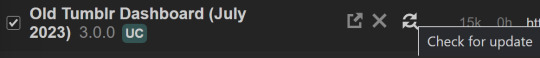
Make sure to check the Userstyle and see if the version number matches the one below if you don't see any changes!
NEW UPDATE: 26/04/25 (D/M/Y) 23:28PM BST v17.12
16.16: Fixed activity and notifications, they now look like the previous version 17.0: Final update to the new icons bs! Every page should be functional. If theres any missed parts or bugs - let me know! 17.9: Minor fixes and Tampermonkey update! You can also fix the positioning of the Communities button and subnav from this menu as well - it should remember your settings when you update!


Tumblr Post Width & More (OTD+ Userstyle) Is now available!!
OTD+ is an add on for Old Tumblr dashboard that you can use to edit the Post Width, Content Positioning & More - It must be used with Old Tumblr Dashboard installed as well on the latest update! This style might be merged with OTD in the future.
THE CREATOR OF THIS USERSTYLE SUPPORTS THEIR TRANS SISTERS. WE'RE ALL IN THIS TOGETHER!
Check the readmore for the changelog, custom code & known issues!
----- Known issues:
Only two columns in Masonry view. Semi-Unfixable, Tumblr creates columns based on monitor size, if I try adding another column (because it doesn't exist) it just perpetually loads on screen. Semi-fix: Zoom out in chrome/firefox and it adds more columns, you may need to change the font size of the page though
Search bar doesn't appear on some pages (like viewing a post), this is because Tumblr removed the search bar on those pages completely. Unfixable but not a big deal
Tumblr has ONCE AGAIN CHANGED THE ACCOUNTS MENU. The menus are now shorter and have less information on them. This is unfortunately permanent. I do not see any way to fix this. Unfixable.
If you want people's icons to stay fixed in place, instead of scrolling with the dashboard change this in Stylus;


Or if you're using the tampermonkey version

Find text:
.NLCTe > div.Evcyl > div > div > .So6RQ.YSitt > .ge_yK > .c79Av > article > header > .RYkKH > .nZ9l5 { pointer-events: auto; top: 55px; transition: top .25s; position: -webkit-sticky; position: sticky; } and replace it with;
.NLCTe > div.Evcyl > div > div > .So6RQ.YSitt > .ge_yK > .c79Av > article > header > .RYkKH > .nZ9l5 { pointer-events: auto; top: 0px; transition: top .25s; position: absolute; }
Solved issues: (Update)
Menus need to be manually closed SOLVED! in V.4 and updated in V.5! The menu & icon WILL scroll with you if you have removed the sticky header CSS, however, clicking anywhere on screen will make the Menu disappear still.
Masonry view in searches is now fixed!
Resized Messenger Chat Box!
NEW UPDATE 16/08/23, 23:55 BST v6.5: Figured out how to reorganise the icons in the header. Let me know if you have any problems with it and make sure to update your Userstyle! Some icons are hidden with Display: Block; you can hide more icons with this method!

Solved issues p2
Brought back SOME of the icons for Tumblrs latest update - Unfortunately, this does not bring back user icons for Reblogged posts! Make sure to yell at Tumblr for removing the icons as well as the horrible dashboard update here! v7.5 Fixed icons for all posts and put them back where they came from!
v6.9.6.9 (I promise this is the last funny number): Fuck Off Buggy The Clown Update + All languages support for the old header design!
v7.0: Fixed the search bar for tumblrs new collections feature, so it looks like the original search bar!
v8.0: Fixed masonry view icons, hidden the reblog icon on dashboard icons, fixed icons in blog viewport
V8.1: Fixed issue with icons not working on soft-refresh & with endless scrolling disabled - be sure to complain to staff!
v9.3: Changed a few things with the search feature, I also made the posts less round.
UPDATE2 11/04/2024: SO We mighhtttt have overrun their servers. 😅 I'm getting a 500 Internal Server Error every time I try to fix it or upload it as a new style - the massive influx of people downloading the userstyle was probably too much. The Tampermonkey backup on Greasyfork works just fine though! Probably easier for a lot of people migrating anyway! UPDATE 11/04/2024:: My code has broken on Userstyles.world, (it is now fixed as of 12/04/24) until this is fixed I have created a Tampermonkey Backup Version of the Userstyle so feel free to use this version if you've broken yours!
https://greasyfork.org/en/scripts/492279-old-tumblr-dasboard-backup
v9.6: Moved the Following | For you | Your Tags to below the create a post panel. Fixed the Accounts Menu! + Bugfixes V10.3: Patio compatibility. Added a way to hide the Patio button & "patio feedback?" button, just search for patio in the code and follow the instructions! v11.0: Temporary Chat feature fix after Tumblr broke it, fixed some positioning issues and j/k scrolling!
v12.3: Fixed a text issue (my bad!), I undid the changes to the replies function and added a way to fix icons order for when you get the communities update!
v12.5: Update to make compatible with the Content Positioning using Tumblr Post Width & More (OTD+ Userstyle) v12.6: Post buttons fixed, icons unable to be fixed yet as I haven't got the tumblr changes just yet - but I will fix them asap!
v11.7: Communities Update, changed the new search bar on communities page to resemble the old one. The search bar still doesn't work on these pages yet for some reason. Blog view icons fixed. v13.0: The icons change should now have a working patchfix! BIG THANK YOU to arcadian-asgardian for sending me the screenshots I needed and testing if it worked. + Minor tweak, communities button resized to fit the rest of the icons better v13.2: Mini fixes now that I have better access to the new changes! Communities icon re-centered, usernames nudged back into place.
V13.5 & v13.7: Nuked the Go Premium button - Re-positioned the search bar on search pages v13.10: Changed a lot of the new look for replies - it's not perfect yet mind. Small bug with the "..." menu moving to the left with shorter replies. Looks a lot more like the old replies section though! Made it possible to remove the reply to reply button just search for "NEW Replies UI" in the userstyle and remove the /* */ around "display: none" OR use Ublock to block the element! v14.1: Reverted the "Original Poster" border + text to look like old version. Edit: Whoops, fixed an issue with showing the timestamps
v13.4: Added a way to fix the communities icon position if you don't have the New Xkit button or have hidden any of the icons. Just remove the highlighted /* */ pair in the code for what you need.
v14.11: Made Premium Perks button available in the bottom left corner for all premium users v15.2: Fixed the Tumblr fuckup AND added a cool new feature that allows you to customise the look of your header & hide the reply-to-replies button if you like, here's how to customise this. Set to "Block" if you want the button/icon visible, Set to "None" if you want it hidden! V15.5: Given labels to options for clarity - now says 'show' or 'hide'!
v15.9: The Boopdate! V16.0: Fixed Search view pages and made them look normal, unfortunately, I can't bring back the dropdown menus for "top"/"All Time" etc - but it should look more like the original now
v16.3: Minor tweaks to make search pages look better
16.10: Fix changes to the notification icons 16.14: Fixed many issues with Tampermonkey Version - including a bug that makes the header go weird when you click on a post, fixed notification icons in small view
16.16: Fixed activity and notifications, they now look like the previous version
16.26: TEMPORARY UPDATE - only changes some aspects of the dashboard - THIS IS FULLY INCOMPLETE AND I AM WORKING ON A FULL FIX FOR THE REST OF THE SITE EDIT: added changes for timestamps!
25K notes
·
View notes
Text
My Neocities!
I'd like to introduce my Neocities page, which I've been building with HTML/CSS.
The splash page features two doors that open when you hover over them, which lead to my other pages. I animated the doors using the CSS "transform" property.
I recently updated this to make it look more like a 3d building, using box-shadow and transform: skewX :)

Then in the Cat Clubhouse, you will find a drag n drop game in which you position cute kitties into a bedroom! (Let me know if you try it out!!!)
The drag n drop function doesn't work on touch screens, unfortunately. I may have to find a clever alternative for non-desktop use.
Upcoming tasks:
Creating a sticky sidebar for site navigation. I don't know why I've been struggling so much with this, but whether using flexbox or relative/absolute positioning, I've been struggling to position things with the spacing and centering I want, and to also make it responsive to smaller screens.
Adding a guestbook using ayano's neocities comment widget (so excited to try this out!)
Uploading my first tribute page. I've been working on something fun and cheeky, and I'll update here with progress!
An About Me page.
Feel free to add me on Neocities [https://neocities.org/site/clubjessica] and I'll check out your site too!
41 notes
·
View notes
Text
100 days of code - days 24-25
Hi! Long time no see!
Monday - Nov 13, 2023
My main goal for this day was to close a project I was procrastinating to do. And I finally did, maybe I'll write a post only about it (if I'm not too lazy) to review, since I stopped it in the middle to do other things. It is a project where I had to use docker and up a WordPress website, with nginx and a database. It was boring, I think I don't like devops that much. But the knowledge was worth it, I had to make a lot of scripts to configure the containers and the overall docker knowledge is useful.
In web dev I studied about CSS positioning (fixed, absolute, static, relative, sticky). And about custom properties that are like variables in CSS. So you can reuse some values in many places.
Tuesday - Nov 14, 2023
I read about browser compatibility, and what I can make to avoid problems.
Also learned a little about CSS frameworks that was something I always listen but not really know what it was. My understanding is that frameworks are basically libraries with some useful, ready code for you to use in your own projects. So you don't need to reinvent the wheel.
That's it.
Well, I was missing for, idk, 4 days; I was feeling a little down, and I wasn't really inspired to write here. Idk maybe I'm charging myself too much, for writing long posts, and It makes me procrastinate on writing. So, I'll stop charging myself this way, if I write a small post it's Ok if I write larger posts It's also Ok. I just want to have the commitment with myself for studying and writing every day and turn It into a solid habit.
youtube

#day 24#day 25#100 days of code#100daysofcode#codeblr#programming#progblr#studyblr#computer science#1000 hours#code#100 days of productivity#100 days of studying#software development#100 days challenge#tech#javascript#html css#coding
16 notes
·
View notes
Text
i really really appreciate if you won't vague me indirectly (even though i am ironically doing this) and just actually approach me with your issues with my themes.
i admit that it went past my mind to delete the placeholder for the links that are not part of the final design as i intended it. i apologize. however, please consider that i am a human being capable of having mistakes.
theme: waiting game uses position: sticky; for the sidebar. what this css position does is that it's temporarily fixed and cuts off the rest of that section but you would see the bottom/the rest of your description and links when you scroll up. and had you bothered to look at the rest of the default settings in the customization panel, you would see a toggle to hide the submit link.
again, it's my fault because i did not mention that anywhere near my theme post and i apologize.
but what i don't get is your disrespect and entitlement towards not just me, but to the rest of theme makers across tumblr, just because what you wish you had in a theme is not met. if it pisses you so much, according to your words, then maybe, MAYBE you should start learning how to code yourself.
13 notes
·
View notes
Text
Chrome 133 Goodies
New Post has been published on https://thedigitalinsider.com/chrome-133-goodies/
Chrome 133 Goodies
I often wonder what it’s like working for the Chrome team. You must get issued some sort of government-level security clearance for the latest browser builds that grants you permission to bash on them ahead of everyone else and come up with these rad demos showing off the latest features. No, I’m, not jealous, why are you asking?
Totally unrelated, did you see the release notes for Chrome 133? It’s currently in beta, but the Chrome team has been publishing a slew of new articles with pretty incredible demos that are tough to ignore. I figured I’d round those up in one place.
attr() for the masses!
We’ve been able to use HTML attributes in CSS for some time now, but it’s been relegated to the content property and only parsed strings.
<h1 data-color="orange">Some text</h1>
h1::before content: ' (Color: ' attr(data-color) ') ';
Bramus demonstrates how we can now use it on any CSS property, including custom properties, in Chrome 133. So, for example, we can take the attribute’s value and put it to use on the element’s color property:
h1 color: attr(data-color type(<color>), #fff)
This is a trite example, of course. But it helps illustrate that there are three moving pieces here:
the attribute (data-color)
the type (type(<color>))
the fallback value (#fff)
We make up the attribute. It’s nice to have a wildcard we can insert into the markup and hook into for styling. The type() is a new deal that helps CSS know what sort of value it’s working with. If we had been working with a numeric value instead, we could ditch that in favor of something less verbose. For example, let’s say we’re using an attribute for the element’s font size:
<div data-size="20">Some text</div>
Now we can hook into the data-size attribute and use the assigned value to set the element’s font-size property, based in px units:
h1 color: attr(data-size px, 16);
The fallback value is optional and might not be necessary depending on your use case.
This is a mind-blowing one. If you’ve ever wanted a way to style a sticky element when it’s in a “stuck” state, then you already know how cool it is to have something like this. Adam Argyle takes the classic pattern of an alphabetical list and applies styles to the letter heading when it sticks to the top of the viewport. The same is true of elements with scroll snapping and elements that are scrolling containers.
In other words, we can style elements when they are “stuck”, when they are “snapped”, and when they are “scrollable”.
Quick little example that you’ll want to open in a Chromium browser:
The general idea (and that’s all I know for now) is that we register a container… you know, a container that we can query. We give that container a container-type that is set to the type of scrolling we’re working with. In this case, we’re working with sticky positioning where the element “sticks” to the top of the page.
.sticky-nav container-type: scroll-state;
A container can’t query itself, so that basically has to be a wrapper around the element we want to stick. Menus are a little funny because we have the <nav> element and usually stuff it with an unordered list of links. So, our <nav> can be the container we query since we’re effectively sticking an unordered list to the top of the page.
<nav class="sticky-nav"> <ul> <li><a href="#">Home</a></li> <li><a href="#">About</a></li> <li><a href="#">Blog</a></li> </ul> </nav>
We can put the sticky logic directly on the <nav> since it’s technically holding what gets stuck:
.sticky-nav container-type: scroll-state; /* set a scroll container query */ position: sticky; /* set sticky positioning */ top: 0; /* stick to the top of the page */
I supposed we could use the container shorthand if we were working with multiple containers and needed to distinguish one from another with a container-name. Either way, now that we’ve defined a container, we can query it using @container! In this case, we declare the type of container we’re querying:
@container scroll-state()
And we tell it the state we’re looking for:
@container scroll-state(stuck: top) {
If we were working with a sticky footer instead of a menu, then we could say stuck: bottom instead. But the kicker is that once the <nav> element sticks to the top, we get to apply styles to it in the @container block, like so:
.sticky-nav border-radius: 12px; container-type: scroll-state; position: sticky; top: 0; /* When the nav is in a "stuck" state */ @container scroll-state(stuck: top) border-radius: 0; box-shadow: 0 3px 10px hsl(0 0 0 / .25); width: 100%;
It seems to work when nesting other selectors in there. So, for example, we can change the links in the menu when the navigation is in its stuck state:
.sticky-nav /* Same as before */ a color: #000; font-size: 1rem; /* When the nav is in a "stuck" state */ @container scroll-state(stuck: top) /* Same as before */ a color: orangered; font-size: 1.5rem;
So, yeah. As I was saying, it must be pretty cool to be on the Chrome developer team and get ahead of stuff like this, as it’s released. Big ol’ thanks to Bramus and Adam for consistently cluing us in on what’s new and doing the great work it takes to come up with such amazing demos to show things off.
#000#amazing#Articles#attributes#Blog#border-radius#box#box-shadow#browser#change#chrome#chromium#Color#container#container-queries#Containers#content#course#CSS#custom properties#data#deal#Developer#Features#Funny#Government#Grants#how#HTML#it
0 notes
Text
CSS 15 💻 position property
New Post has been published on https://tuts.kandz.me/css-15-%f0%9f%92%bb-position-property/
CSS 15 💻 position property

youtube
position static and relative position �� controls the positioning of an element in a page. values → static, relative, absolute, fixed, sticky and global values static → default. Elements remain in their normal flow. Positional properties are not taken into account, top, right, bottom, left and z-index relative → the element is positioned relative to their normal position. With top, right, left and right you specify its offset for its natural position position fixed, sticky and absolute fixed → the element is removed from its normal flow. top, right, bottom and left specify the position relative to the viewport sticky → the element behaves like relative... until it reaches a certain threshold, top or bottom... then it becomes fixed relative to its parent or html element absolute → the element is removed from its normal flow and is positioned relative to its parent top, right, left and bottom specify its offset from its parent
0 notes
Text
User Experience Optimization Tips for Business Website
Optimizing the user experience (UX) on a business website is crucial for driving engagement, improving conversions, and creating a positive brand impression. Here are some key tips to enhance UX that can be done by a professional website designing company:
Simplify Navigation Intuitive Menu Structure: Make sure the navigation menu is easy to understand and organized logically. Use familiar terms and categorize content effectively. Limit Menu Options: Avoid overwhelming users with too many choices. Use dropdowns or secondary navigation when necessary. Sticky Navigation: Keep the navigation accessible as the user scrolls down the page, especially for long pages.
Optimize for Mobile Responsive Design: Ensure the website works well across different devices and screen sizes. Test mobile usability regularly. Touch-Friendly: Make buttons large enough to be tapped easily, with ample space between clickable elements.
Improve Page Load Speed Compress Images: Use compressed, optimized images without compromising quality. Leverage Browser Caching: Enable caching to reduce the load time for returning visitors. Minimize HTTP Requests: Combine files (like CSS and JavaScript) and reduce the number of external requests.
Clear Call-to-Action (CTA) Prominent CTAs: Make your calls-to-action stand out visually (e.g., contrasting color) and place them in strategic positions. Actionable Text: Use concise, action-oriented language (e.g., "Get Started Now" or "Shop Our Products"). Consistent CTAs: Ensure all pages have clear and relevant CTAs that guide users towards conversions.
Content Organization Use Headings & Subheadings: Break up content with clear, descriptive headings for easy scanning. Chunk Information: Present information in smaller sections or bullet points to make it digestible. Multimedia: Include images, videos, or infographics to complement text and make the site more engaging.
Optimize Search Functionality Autocomplete Suggestions: Help users find relevant information faster by offering suggestions as they type. Search Filters: Allow users to filter search results by categories or relevance to refine their results. Visible Search Bar: Place the search bar in a prominent position, especially on content-heavy websites.
Create Engaging Visuals Consistent Branding: Use a cohesive color scheme, typography, and style that aligns with your brand. Readable Fonts: Choose clear, legible fonts, especially for body text. Avoid overly stylized fonts that reduce readability. Use of White Space: Incorporate white space strategically to avoid a cluttered look and make the design feel open and breathable.
Accessibility Alt Text for Images: Ensure all images have descriptive alt text to aid users with disabilities and improve SEO. Keyboard Navigation: Make sure your website is fully navigable via keyboard for users who cannot use a mouse. Color Contrast: Use high-contrast color schemes to ensure readability for visually impaired users.
Engage with Interactive Elements Chatbots: Implement AI chatbots to answer common queries or guide users through the website. User Reviews/Testimonials: Show customer feedback prominently to build trust and encourage engagement. Progressive Disclosure: Use expandable sections or modals to reveal more information as needed, without overwhelming the user with too much at once.
Test and Iterate A/B Testing: Regularly test different versions of your pages to see which layout, content, or CTA converts better. User Feedback: Collect feedback through surveys, forms, or live chat tools to understand areas for improvement. Analytics: Monitor user behavior through tools like Google Analytics or Hotjar to understand pain points, bounce rates, and areas where users drop off.
Minimize Pop-ups and Disruptions Reduce Pop-ups: If using pop-ups, ensure they don’t obstruct the user experience or appear too frequently. Exit-Intent Pop-ups: Use pop-ups sparingly, such as when a user is about to leave, to capture interest without disrupting the browsing flow.
Seamless Checkout Process (for eCommerce) Guest Checkout Option: Allow users to complete a purchase without having to create an account. Auto-fill Forms: Enable form auto-fill and minimize the number of required fields to simplify the checkout process. Transparent Shipping Info: Make sure users can easily find shipping costs and delivery information before they complete their purchase.
SEO and Content Optimization Fast & Clean Code: Use SEO-friendly practices such as clean coding and optimized metadata to improve search rankings. Relevant, Updated Content: Regularly update your blog or resources section with fresh, valuable content.
Trust Signals SSL Certificates: Ensure the site is secure (HTTPS), particularly if dealing with user data or transactions. Trust Badges: Display trust badges, certifications, or partnership logos to boost credibility. Clear Privacy Policies: Make privacy and data protection policies easy to find and understand.
By prioritizing these UX strategies, your business website will not only become more user-friendly but will also increase engagement, conversion rates, and customer satisfaction.
0 notes
Text
NotificationX Pro WordPress Plugin v2.9.5
https://themesfores.com/product/notificationx-pro-wordpress-plugin/ NotificationX Pro WordPress Plugin v2.9.5 Maximize your WordPress site’s potential with NotificationX Pro, the ultimate marketing plugin designed to increase conversions through the power of social proof and FOMO (Fear of Missing Out). NotificationX Pro lets you create dynamic popups and alerts that capture attention, build trust, and drive sales Best Notification Plugin. NotificationX Pro Plugin Core Features: Increase Business Growth: More than 20% increase in sales & engagement rates Quick Setup: Easily build and customize notifications without hassle. Sales Notification Alerts: Instantly display recent purchases to build credibility. Blog Comments Alerts: Showcase real-time engagement from your audience. Review Alerts: Highlight positive reviews to encourage new customers. Download Count Alerts: Show off popular downloads to inspire more interest. Email Subscription Alerts: Display recent sign-ups to boost your mailing list. Notification Bar: Keep your message in view with a sticky notification bar. Custom Popups: Create tailored notifications that resonate with your audience. Flexible Display Options: Control where and when notifications appear on your site. 24/7 Expert Support: Get help anytime, day or night. Seamless Integrations: Works with WooCommerce, Easy Digital Downloads, Freemius, Zapier, LearnDash, Tutor LMS, Google Analytics, Envato, MailChimp, ConvertKit, GiveWP, Contact Form 7, WPForms, Ninja Forms, Gravity Forms, and more. Shortcode Integration: Add notifications to any page or post with ease. Advanced UTM Tracking: Monitor and optimize your marketing campaigns. White Labeling: Customize branding to match your business. Diverse Notification Types: Engage visitors with multiple notification styles and sound alerts. Targeted Templates: Use advanced and location-based templates to increase relevance and impact. Leverage NotificationX Pro to turn your website visitors into customers and see your conversion rates skyrocket. Perfect for any WordPress site looking to enhance user engagement and boost sales. NotificationX Pro Changelog: August 27, 2024 v2.9.5 Improved: Licensing mechanism revamped. Few minor bug fixes and improvements August 27, 2024 v2.9.4 Added: Bulk Time updating option for Custom Notification. Added: Custom CSS field on Advanced Design. Few minor bug fixes and improvements July 16, 2024 v2.9.3 Added: Custom Notification import using CSV file. Added: Bulk Edit and Delete options for Custom Notifications. Fixed: Growth Alert preview on Mobile devices. Few minor bug fixes and improvements https://themesfores.com/product/notificationx-pro-wordpress-plugin/ #NotificationPlugins #WordpressPlugins
0 notes
Video
youtube
Як користуватись position sticky? CSS position sticky як змусити елемент...
0 notes
Text
Tips and Tricks for Designing a Professional-Looking Website

Are you dreaming of a career in web designing? Creating a stunning website is a key skill you'll need to master. Whether you're just starting or looking to improve your skills, these tips and tricks will help you design beautiful, user-friendly websites. Plus, we'll mention some helpful resources for web designing courses in Yamuna Vihar.
Understanding the Basics
Before diving into the tips and tricks, it's important to understand the basics of web designing. This includes knowledge of HTML, CSS, and JavaScript, which are the building blocks of any website. If you're new to these, consider enrolling in web designing classes in Yamuna Vihar or looking for a web designing coaching center in Uttam Nagar. These courses will give you a strong foundation.
Tip 1: Keep It Simple
One of the most important tips for creating a stunning website is to keep it simple. Overloading your website with too many elements can confuse visitors. Focus on a clean, straightforward design that highlights your content. Use plenty of white space to make your site look neat and organized.
Tip 2: Use High-Quality Images
Images can make or break a website. High-quality images can make your site look professional and appealing. Be sure to use images that are relevant to your content and of high resolution. You can find free high-quality images on websites like Unsplash or Pexels.
Tip 3: Make It Mobile-Friendly
With more people accessing websites on their mobile devices, it's crucial to design a site that's mobile-friendly. This means your website should look good and work well on smartphones and tablets. Use responsive design techniques to ensure your site adapts to different screen sizes.
Tip 4: Optimize for Speed
A slow website can frustrate visitors and make them leave. To keep your site fast, optimize images, use efficient coding practices, and choose a reliable hosting provider. Speed is not only important for user experience but also for SEO (Search Engine Optimization).
Tip 5: Focus on Navigation
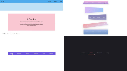
Good navigation is essential for a positive user experience. Make sure your menu is easy to find and use. Organize your content in a logical manner so visitors can easily find what they're looking for. Consider using a sticky menu that stays at the top of the page as users scroll down.
Tip 6: Pay Attention to Typography
Typography plays a crucial role in web design. Choose fonts that are easy to read and match the overall style of your site. Avoid using too many different fonts, as this can make your site look messy. Stick to a maximum of two or three complementary fonts.
Tip 7: Include Call-to-Actions (CTAs)
Encourage your visitors to take action by including CTAs. Whether it’s signing up for a newsletter, enrolling in web designing classes in Yamuna Vihar , clear CTAs can guide your visitors on what to do next.
Tip 8: Test Your Design
Before launching your website, make sure to test it thoroughly. Check how it looks and functions on different devices and browsers. Ask friends or classmates to give feedback. Testing helps you catch any issues and ensures a smooth user experience.
Final Thoughts
Creating a stunning website takes practice and patience. By following these tips and tricks, you'll be well on your way to becoming a skilled web designer. If you're serious about a career in web designing, consider enrolling web designing training in Uttam Nagar. These classes can provide you with the knowledge and hands-on experience you need to succeed.
Remember, web designing is a dynamic field that's constantly evolving. Stay curious, keep learning, and never be afraid to experiment with new ideas. Good luck on your journey to becoming a web design expert!
0 notes
Text
Mastering CSS Position Property
This topic delves into the CSS position property, a critical tool for controlling the layout and positioning of HTML elements on a web page. The position property has several values, including static, relative, absolute, fixed, and sticky, each offering different ways to position elements. This topic covers the syntax and behavior of each positioning type, explaining how they interact with other elements and the document flow. Through practical examples, you will learn how to use the position property to create dynamic, responsive layouts and achieve precise control over element placement in your web designs.
0 notes
Text
CSS Sticky
The CSS position property sets the position for an HTML element. It is also used to place an item behind another element and is useful for the scripted animation effect. The "position: sticky;" is used to position the element based on the user's scroll position.
This CSS position property allows the elements to stick when the scroll reaches a certain point. Depending on the scroll position, a sticky element toggles between fixed and relative. The element will be positioned relative until the specified position of offset is met in the viewport. Then, similar to position: fixed, the element sticks in one place.

0 notes
Text
How to Improve Core Web Vitals and Boost Website’s Ranking?
Core Web Vitals (CWV) are a set of metrics that Google uses to assess a website's user experience, and they are also considered to be ranking factors in search results. Here's how you can improve your CWV and potentially boost your website's ranking:
1. Analyze your website's performance:
Use free tools like Google's PageSpeed Insights or Web Vitals Extension to identify areas for improvement. These tools will provide you with a score and specific recommendations for each CWV metric:
Largest Contentful Paint (LCP): This measures how long it takes for the largest content element on your page to load.
First Input Delay (FID): This measures how long it takes for your website to become interactive after a user first tries to interact with it, like clicking a button.
Cumulative Layout Shift (CLS): This measures how much the layout of your page shifts visually during the loading process, which can be frustrating for users.
2. Implement solutions based on the identified issues:
Here are some common solutions that can address CWV issues:
Optimize images: Reduce image file sizes by using compression tools or resizing them appropriately. Consider lazy loading, which delays the loading of images until they are about to enter the viewport.
Enable browser caching: This allows browsers to store frequently accessed files locally, so they don't need to be downloaded every time a user visits your site.
Minimize CSS and JavaScript: Minify your code to remove unnecessary characters and comments, and consider deferring or asynchronously loading non-critical scripts.
Address layout shifts: Use CSS techniques like position: sticky or aspect-ratio to prevent elements from moving around the page as it loads.
Prioritize mobile optimization: Google's mobile-first indexing means that the mobile version of your site is considered the primary version for indexing and ranking. Ensure your website is mobile-friendly and performs well on mobile devices.
Use a Content Delivery Network (CDN): A CDN stores copies of your website's static content on servers around the world, which can improve loading times for users in different locations.
3. Monitor and adjust:
Regularly test and monitor your website's performance to track your progress and identify any new issues that may arise.
Continue to make adjustments and improvements to your website based on your findings.
Remember, improving CWV is an ongoing process. By consistently analyzing, implementing solutions, and monitoring your website, you can create a faster, more user-friendly experience that can also lead to better search engine ranking.
#digitalmarketing#seo#graphic design#marketing#web development#social media#webdesign#digital marketing#fundamentalsofdigitalmarketing
0 notes
Video
youtube
Part 4: CSS ፖዚሽኒንግ || CSS Positioning Demystified: From Static to Sticky...
0 notes
Text
Explore 15+ CSS Horizontal Navigation Menus
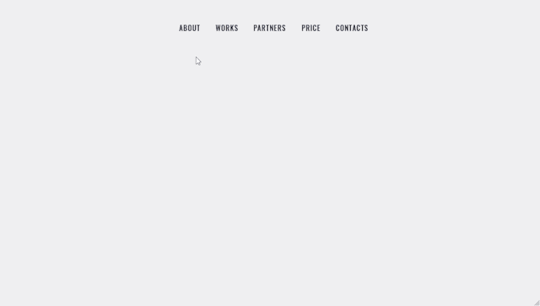
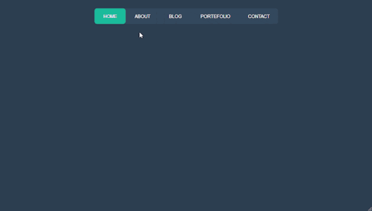
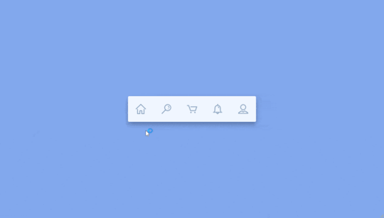
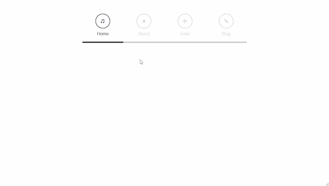
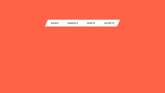
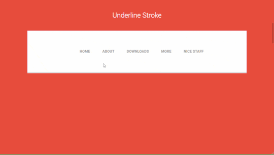
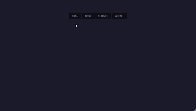
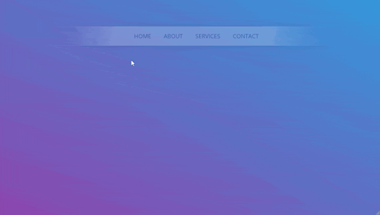
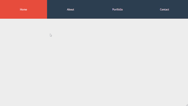
Welcome to CSS Monster, your premier destination for exploring 15+ CSS horizontal menus! In this comprehensive article, we've meticulously curated a collection of free HTML and CSS code examples for horizontal menus, meticulously sourced from respected platforms such as CodePen, GitHub, and other reliable resources. Horizontal menus are a favored choice for displaying navigation options prominently across the top of websites or applications. Our collection goes beyond the conventional, showcasing a diverse array of horizontal menu styles, including dropdown menus, mega menus, and more. This variety ensures that you'll discover the perfect design to elevate your project's navigation. With our latest update in August 2023, we're excited to introduce 2 new items to our collection, reflecting the cutting-edge trends in horizontal menu design. Whether you're a seasoned web developer, a designer seeking inspiration, or someone looking to enhance your website's navigation, these customizable code examples stand as a valuable resource. Dive into our hand-picked selection and witness the stunning diversity of horizontal menu designs that can truly enhance your user experience. Feel free to explore the latest trends, experiment with customization, and seamlessly integrate these code examples into your projects. Our collection is designed to cater to your needs, offering a blend of functionality and aesthetics. Embark on this journey to discover and implement captivating horizontal menu designs, and let your coding endeavors bring a new level of sophistication to your projects. Happy coding! Author seto89 March 4, 2019 Just Get The Demo Link How To Download - Article How To Download - Video Author HTML / CSS PURE CSS MAGIC LINE NAVBAR Compatible browsers: Chrome, Edge (partial), Firefox, Opera, Safari Responsive: yes Dependencies: - Author tris timb February 7, 2019 Just Get The Demo Link How To Download - Article How To Download - Video Author HTML / CSS (SCSS) POSITION STICKY SUBNAV Compatible browsers: Chrome, Edge (partial), Firefox, Opera, Safari Responsive: yes Dependencies: - Author Mehmet Burak Erman June 3, 2018 Just Get The Demo Link How To Download - Article How To Download - Video Author HTML (Pug) / CSS (Stylus) PERSPECTIVE MENUS Compatible browsers: Chrome, Edge (partial), Firefox, Opera, Safari Responsive: yes Dependencies: - Author Stas Melnikov March 5, 2018 Just Get The Demo Link How To Download - Article How To Download - Video Author HTML / CSS HOVER EFFECT FOR HORIZONTAL MENU Compatible browsers: Chrome, Edge (partial), Firefox, Opera, Safari Responsive: yes Dependencies: -
Author Mehmet Burak Erman December 18, 2017 Just Get The Demo Link How To Download - Article How To Download - Video Author HTML / CSS (SCSS) MENU HOVER LINE EFFECT Compatible browsers: Chrome, Edge (partial), Firefox, Opera, Safari Responsive: yes Dependencies: -
Author Charlie Marcotte September 5, 2017 Just Get The Demo Link How To Download - Article How To Download - Video Author HTML (Pug) / CSS (Sass) CSS HORIZONTAL MENU Compatible browsers: Chrome, Edge (partial), Firefox, Opera, Safari Responsive: yes Dependencies: -
Author Artyom June 23, 2017 Just Get The Demo Link How To Download - Article How To Download - Video Author HTML / CSS (SCSS) STRIKETHROUGH HOVER EFFECT FOR MENU Compatible browsers: Chrome, Edge (partial), Firefox, Opera, Safari Responsive: yes Dependencies: -
Author Irvine Potok February 22, 2017 Just Get The Demo Link How To Download - Article How To Download - Video Author HTML / CSS LAVALAMP CSS MENU Compatible browsers: Chrome, Edge (partial), Firefox, Opera, Safari Responsive: yes Dependencies: -
Author Marco Biedermann June 16, 2016 Just Get The Demo Link How To Download - Article How To Download - Video Author HTML / CSS (PostCSS) HORIZONTAL ICON NAVIGATION Compatible browsers: Chrome, Edge (partial), Firefox, Opera, Safari Responsive: yes Dependencies: -
Author Aaron Benjamin April 30, 2015 Just Get The Demo Link How To Download - Article How To Download - Video Author HTML / CSS SLIDE HORIZONTAL MENU Compatible browsers: Chrome, Edge (partial), Firefox, Opera, Safari Responsive: yes Dependencies: -
Author Claudio Holanda March 7, 2015 Just Get The Demo Link How To Download - Article How To Download - Video Author HTML / CSS (Less) SKEWED MENU IN HTML AND CSS Compatible browsers: Chrome, Edge (partial), Firefox, Opera, Safari Responsive: yes Dependencies: -
Author Dominik Biedebach January 19, 2015 Just Get The Demo Link How To Download - Article How To Download - Video Author HTML / CSS HORIZONTAL NAVIGATION EFFECTS Compatible browsers: Chrome, Edge (partial), Firefox, Opera, Safari Responsive: yes Dependencies: -
Author Karim Balaa January 6, 2015 Just Get The Demo Link How To Download - Article How To Download - Video Author HTML / CSS SIMPLE MENU NAVIGATION Compatible browsers: Chrome, Edge (partial), Firefox, Opera, Safari Responsive: yes Dependencies: - Author Justin October 8, 2014 Just Get The Demo Link How To Download - Article How To Download - Video Author HTML / CSS ANIMATED UNDERLINE HOVER Compatible browsers: Chrome, Edge (partial), Firefox, Opera, Safari Responsive: yes Dependencies: -

Author Andy Tran September 2, 2014 Just Get The Demo Link How To Download - Article How To Download - Video Author HTML/Haml FLAT HORIZONTAL NAVIGATION Compatible browsers: Chrome, Edge (partial), Firefox, Opera, Safari Responsive: yes Dependencies: -
Author MrPirrera August 23, 2014 Just Get The Demo Link How To Download - Article How To Download - Video Author HTML / CSS TRANSPARENT FADING NAVIGATION BAR Compatible browsers: Chrome, Edge (partial), Firefox, Opera, Safari Responsive: yes Dependencies: -
Author Bogdan Blinnikov April 15, 2014 Just Get The Demo Link How To Download - Article How To Download - Video Author HTML / CSS (Less) RESPONSIVE MENU EFFECT Compatible browsers: Chrome, Edge (partial), Firefox, Opera, Safari Responsive: yes Dependencies: - Author Carl Rosell October 9, 2013 Just Get The Demo Link How To Download - Article How To Download - Video Author HTML / CSS (SCSS) HORIZONTAL MENU Compatible browsers: Chrome, Edge (partial), Firefox, Opera, Safari Responsive: yes Dependencies: -
FAQs
1. What are CSS horizontal menus? CSS horizontal menus are navigation elements displayed horizontally at the top of a website or application. They provide an organized and visually appealing way to present navigation options. 2. Why choose horizontal menus for a website? Horizontal menus are a popular choice as they prominently display navigation options, making it easy for users to access different sections of a website or application. They offer a clean and efficient design. 3. What styles of horizontal menus are included in the collection? Our collection features a diverse range of horizontal menu styles, including dropdown menus, mega menus, and more. This variety ensures that you can find the perfect design to suit your project's needs. 4. How often is the horizontal menu collection updated? We regularly update our collection to stay current with the latest trends in horizontal menu design. The August 2023 update introduces 2 new items, reflecting the cutting-edge developments in this space. 5. Can I customize the CSS horizontal menu code examples? Absolutely! The CSS horizontal menu code examples in our collection are customizable, allowing you to tailor them to match your website's design and aesthetic preferences. 6. Are these horizontal menus suitable for all types of websites? Yes, our collection caters to a variety of needs, making it suitable for different types of websites and applications. Whether you're working on a personal blog or a business website, you'll find relevant designs. 7. How can I integrate these horizontal menu designs into my project? Each horizontal menu design in our collection comes with its HTML and CSS code example, making integration into your projects a straightforward process. Copy and paste the code to enhance your website's navigation.
Conclusion
In conclusion, CSS Monster invites you to explore and implement 15+ CSS horizontal menu designs into your web projects. With diverse styles, including dropdown menus and mega menus, our collection reflects the latest trends in design. Elevate your user experience, streamline navigation, and bring a touch of sophistication to your projects. Happy coding! Read the full article
0 notes
Text
CSS for disabling sticky tab bar on Dashboard
Use the Stylus extension and add a new style for tumblr.com:
/* Tab bar unsticky */ .ZaYRY { top: unset; } /* Avatar position on scroll up */ .FtjPK .AD_w7 .JZ10N { top: 69px; }
0 notes