#CSS Progress Bar with Percentage
Explore tagged Tumblr posts
Visit Tumblr Blog
Explore Tumblr blogs with no restrictions, modern design and the best experience.
Last Seen Tumblr Blogs


Fun Fact
In February 2021, Tumblr had 518.6 million blog accounts.
Text
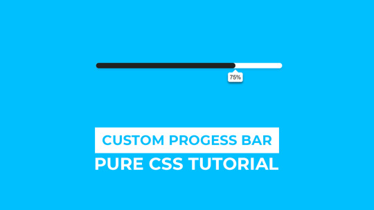
CSS Progress Bar with Percentage
#css progress bar#progress bar#progress bar css#progress bar html css#css animation tutorial#pure css animation#html css#learn to code#frontend#css#html#css3#frontenddevelopment#code#animation#CSS Progress Bar with Percentage
3 notes
·
View notes
Text
CSS Only Circular Reading Progress Indicator
A pure CSS circular reading progress indicator that provides a visual representation of the user’s current reading progress. The circular progress bar automatically fills up, and the percentage of the page that has been scrolled is displayed in the middle of the indicator as your users scroll down the page. How to use it: 1. Create the HTML for the reading progress indicator. <div…

View On WordPress
3 notes
·
View notes
Text
Learn How to make Responsive Website

Creating a responsive website involves designing and developing a website that adapts to different screen sizes and devices, providing an optimal viewing experience for users. Here’s a step-by-step guide to making a responsive website:
Use a Responsive Grid Layout
CSS Grid or Flexbox: Utilize CSS Grid or Flexbox to create flexible and responsive layouts. These CSS tools allow you to arrange elements in a grid or flexible boxes that adjust to the screen size.
Fluid Grid System: Instead of fixed-width layouts, use a fluid grid system where the widths of the columns are defined in percentages rather than pixels.
Flexible Images and Media
Responsive Images: Ensure images scale with the screen size by setting their maximum width to 100% (img { max-width: 100%; height: auto; }).
CSS Media Queries: Use media queries to apply different styles based on the screen size. This allows you to serve appropriately sized images and styles for various devices.
Media Queries
Define Breakpoints: Set breakpoints using media queries to apply different styles at specific screen widths. For example:
css
Copy code
@media (max-width: 768px) {
/* Styles for tablets and mobile devices */
}
@media (max-width: 480px) {
/* Styles for mobile devices */
}
Adjust Layouts: Change the layout (e.g., switch from multi-column to single-column) or hide/show elements based on the screen size.
Responsive Typography
Flexible Font Sizes: Use relative units like em or rem for font sizes instead of pixels, allowing text to scale based on screen size.
Viewport Units: Consider using viewport-based units (vw, vh) for font sizes to make text responsive to the screen size.
Mobile-First Approach
Design for Mobile First: Start by designing for smaller screens, then use media queries to progressively enhance the design for larger screens. This ensures a solid foundation for mobile users.
Simplified Layouts: Prioritize content and use a simplified layout for mobile devices, reducing unnecessary elements that could clutter the screen.
Responsive Navigation
Hamburger Menu: For mobile screens, replace traditional navigation bars with a hamburger menu to save space and improve usability.
Dropdown Menus: Use dropdown menus that are easy to navigate on smaller screens.
Test on Multiple Devices
Browser Developer Tools: Use developer tools in browsers to test the responsiveness of your website on different screen sizes.
Real Devices: Test on actual devices (smartphones, tablets, desktops) to ensure the website works well across all platforms.
Optimize Performance
Minimize File Sizes: Compress images and minify CSS/JS files to reduce load times, which is crucial for mobile users.
Lazy Loading: Implement lazy loading for images and other media to improve page load times, especially on mobile devices.
CSS Frameworks
Bootstrap: Consider using a responsive CSS framework like Bootstrap, which comes with pre-built responsive components and grid systems.
Tailwind CSS: Another option is Tailwind CSS, which allows you to build custom designs with responsive utility classes.
Accessibility Considerations
Touch-Friendly Elements: Ensure buttons and interactive elements are large enough to be easily tapped on touchscreens.
Responsive Tables: Make tables responsive by using overflow-x: auto; or breaking them into smaller components for small screens.
By following these steps, you can create a website that looks and works well on any device, providing a seamless user experience across different screen sizes.
TCCI Computer classes provide the best training in all computer courses online and offline through different learning methods/media located in Bopal Ahmedabad and ISCON Ambli Road in Ahmedabad.
For More Information:
Call us @ +91 98256 18292
Visit us @ http://tccicomputercoaching.com/
#TCCI COMPUTER COACHING INSTITUTE#BEST COMPUTER CLASS IN ISCON-AMBLI ROAD AHMEDABAD#BEST COMPUTER CLASS IN BOPAL AHMEDABAD#BEST COMPUTER INSTITUTE NEAR S.P.RING ROAD AHMEDABAD#BEST COMPUTER CLASS NEAR PRAHLADNAGAR ROAD AHMEDABAD
0 notes
Text
Crafting Seamless User Experiences: The Power of Bootstrap Loading Pages
In the digital age, where user experience is paramount, web developers continually seek innovative ways to enhance website interactions. A crucial element of user-friendly design is reducing loading times and ensuring visitors are engaged during the brief moments they spend waiting for content to load. Enter Bootstrap loading pages, a solution that not only minimizes user frustration but also adds a touch of sophistication to the overall website experience.
Understanding the Essence of Bootstrap Loading Pages
Bootstrap, the popular front-end framework, offers a myriad of components and utilities that simplify web development. Among these, Bootstrap loading pages stand out as a practical tool to captivate users while the website's content loads seamlessly in the background. A loading page is a temporary visual interface displayed to users as they wait, ensuring they remain engaged and informed about the ongoing process.
Seamless Transitions, Engaged Visitors
The beauty of Bootstrap loading pages lies in their ability to create smooth transitions from the initial click to the fully loaded website. Instead of facing a blank screen or a static loading icon, visitors are welcomed by an aesthetically pleasing animation or a visually engaging graphic. This subtle yet impactful touch communicates progress, keeping users patient and interested.
Key Features of Bootstrap Loading Pages:
Customizable Animations: Bootstrap provides a range of customizable loading animations. From spinners and progress bars to creative CSS animations, developers can tailor the visual aspect to match the website's theme and tone.
Branding Opportunities: Loading pages offer an excellent chance to reinforce brand identity. Incorporating a company logo or slogan within the loading animation subtly reminds users of the website they are about to explore.
Loading Progress Indicator: Bootstrap loading pages often include a loading progress indicator, informing users about the percentage of content loaded. This transparency instills confidence and patience among visitors.
Responsive Design: Bootstrap ensures that loading pages are responsive, adapting seamlessly to various screen sizes and devices. This consistency enhances the user experience across platforms.
Easy Integration: Bootstrap loading pages are easy to integrate into existing websites or new projects. With minimal effort, developers can implement these features, instantly elevating the site's user experience.
Creating a Memorable First Impression
First impressions matter, especially in the digital realm. A well-crafted Bootstrap loading page transforms a potentially frustrating waiting period into an engaging and visually pleasing experience. It conveys professionalism, attention to detail, and a commitment to user satisfaction. By seamlessly blending function and aesthetics, these loading pages showcase the website's dedication to delivering a superior user journey from the very beginning.
Incorporating Bootstrap loading pages into your web projects is more than just a technical enhancement; it's a strategic investment in user engagement. By embracing these subtle yet impactful features, developers can ensure that users are not only impressed by the website's content but also by the thoughtfulness put into every aspect of their interaction. In the ever-evolving landscape of web design, Bootstrap loading pages serve as a testament to the significance of user-centric innovations, shaping a future where online experiences are as seamless as they are delightful.
0 notes
Photo

We spent the day researching javascript and css solutions to build the circular progress bars we want to use to display the health, mana, and experience amounts. @delightedcrow found a great medium article (medium.com/@pppped/how-to-code-a-responsive-circular-percentage-chart-with-svg-and-css-3632f8cd7705) that draws these circles the same way that our Sketch mockup did, and so we quickly added some to our MagicMirror module to test drawing them at different values. We aren’t sure if we want to include the animation in our module, but it looks cool so here is a brief look at what it looks like against the default black MagicMirror theme.
15 notes
·
View notes
Text
This, Charlotte, is the internet ...

It was September 30th: day one, week one.
I cycled across Bristol that Monday morning with a mixture of excitement and trepidation. I am not a seasoned city cyclist, so crossing the leviathan of roadworks at rush-hour was my first test.
Arriving at the DevelopMe offices unscathed, I quickly found my seat. Although we’d all met the week before at a social event organised by DevelopMe (a brilliant idea because I was less nervous having already met some of my fellow classmates) the room was very quiet and you could feel the tension of 12 career-changers psyching themselves up for what was ahead.
Our teacher for the week was Keir, whose enthusiasm and sense of humour made us all feel relaxed and at home very quickly.
We started with a brief introduction to the internet.
Now, I knew that the internet was not contained in a small black box à la the IT Crowd, but I had never really considered its complexity: a global network of computers that can communicate with one another at sub-second speeds is something that takes a while to get your head around.
Although the fundamentals of the internet are fairly easy to digest, thinking about it too much at this point in my understanding is like thinking about the expanding universe - enough to make my brain explode and ooze out of my ears. So, we’re gonna leave that one for another day.
In the meantime, let’s talk about HTML and CSS, our topics for the first fortnight. This post will be an overview of what we learnt, I’ll get into the details in separate posts later on.
HTML (Hypertext Markup Language)
The phrase that has stuck in my mind from our first week at bootcamp is ‘Progressive Enhancement and Graceful Degradation’ - which sounds suspiciously like a general life lesson, or an advert for a skincare range. For our purposes, it’s a way of making sure that every user can access the fundamental parts of your website no matter what browser they use or how slow their internet connection.
The first few days concentrated on writing HTML, which contains the important ‘content’ of the webpage. CSS is used to make it look good and also deals with accessibility. We’ll get into Javascript later, but that allows user interactivity. All three together constitute Front End development. My beginners understanding of this is that a Front End specialist works on the client-side stuff you see and interact with - whilst a Back End specialist works on the server-side stuff you don’t. A Full Stack developer does both.
In terms of HTML, you can split your code up like a human body: at the top is a <head> tag wherein you store all the metadata. Just like a human head, you can’t see what’s going on in there on the webpage itself, but it contains important behind-the-scenes information. The part of the page you see online is the <body> and you can dress this up however you want using CSS.
Within the body you’ll probably have a <header>, a <main> and a <footer>, which are fairly self-explanatory ways to break up a page. A lot of this stuff comes from traditional methods in printing, so if you imagine your page layout a bit like a newspaper, then considering how to split it up seems logical: for instance, you’ll probably further divide your page up into articles, sections and asides.
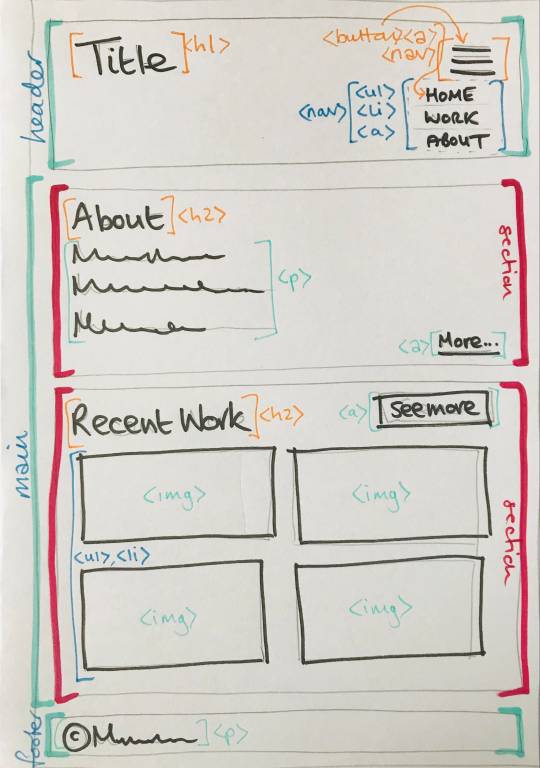
Within these sections you’ll have tags for various elements like paragraphs <p>, images <img/>, links <a>, headings <h1>, <h2>, buttons <button> and so on: again, it’s all wonderfully logical. Here’s some I wrote earlier - this is just part of the <header> on my home page:


The above example is also styled and for the majority of the first fortnight of bootcamp we got to grips with CSS.
CSS (Cascading Style Sheets)
CSS is a little trickier, mainly because there are SO MANY THINGS and you have to think about accessibility and responsiveness (i.e how a screen-reader will understand your code and what it will look like on desktop and mobile devices - this requires the use of @media queries, which I’ve grown to really like because it is SO satisfying when they work properly).
Potentially one of the biggest challenges I found in CSS was positioning things evenly. When you start fiddling about with margins and padding, and forgetting what you’ve fiddled with, you start seeing issues arising on the page: maybe it’s an <h2> that just won’t align with the image underneath; or maybe it’s a <nav> bar that is squishing all the menu items too close together, and pushing them all a little off-centre.
Now, I’m mildly neurotic when it comes to visuals. I’m trained in visual analysis and I’ve spent the best part of the last decade explaining the composition of paintings and other images - why they have a central focal point, or why they don’t etc. etc. Positioning stuff correctly and with meaning is important to me.
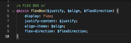
So I became particularly enamoured with flexbox and CSS grid (and not just because I enjoyed playing Flexbox Froggy and Grid Garden). These do a large percentage of the positioning legwork for you and I found myself using them a lot for the project work that we did in the second week.
Some excellent resources for these can be found here:
https://css-tricks.com/snippets/css/a-guide-to-flexbox/
https://css-tricks.com/snippets/css/complete-guide-grid/
Week 2: More CSS and SASS
In week 2 we worked on a sample project.
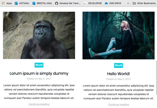
The brief was to practice our HTML and CSS skills by building a pretend portfolio site for a commercial photographer. Our teacher this week was Ruth, who was also super cool and put us all at ease instantly.
The project consisted of a home page with a grid of featured photos and a nav that turned into a burger menu when reduced to a small screen. We also had to create a gallery page, a blog page (and a sample page for one blog post) and a contact page (to practice HTML forms).
One of the main focuses of week 2 was using SASS to organise our code so that we didn’t have to repeat ourselves throughout the site.
At first I didn’t get on with SASS (it felt complicated). But being a fan of flexboxes, I spent some time creating a mixin that I was particularly proud of so that I didn’t have to create new flexboxes all the time (a mixin is like a function that can be reused by passing values into the variables - in this case, $justify, $align and $flexDirection):
Turns out SASS is super useful.
And being a bit of a neat freak, I enjoyed putting all my code into separate files and tidying everything up.
I was pretty proud of my site by the end of the week:

home page ... big screen
two sample posts on the blog page ...
Every Friday, we have an individual review with one of the course organisers so that we can discuss how we are getting on. Both weeks I mentioned that I was tired, but in a good way! I was getting great feedback from my teachers too.
So far, so good.
Downtime
Learning new information day after day is super tiring and it’s important to have a break at the weekends.
So I’ve been kind to myself and made sure I get out into nature on Saturdays and Sundays and away from my desk. The temptation just to work through is there all the time - I love what I’m doing, so it doesn’t feel like work and I have to drag myself away from it in the evenings and at weekends. This can only be a good thing though, right?!
The entire cohort are so friendly and everyone gets on really well. A few of us finished the first fortnight with a celebratory drink at Bocabar.

Next week ... Javascript ... bring it on!
9 notes
·
View notes
Text
How to Create a Vertical Progress Tracker in Elementor

Elementor is a popular page builder that allows website creators to design their own pages with ease. One great feature of Elementor is the ability to create vertical progress trackers, which can help guide users through a multi-step process or track their progress through a particular page. In this article, we’ll go through the step-by-step process of creating a vertical progress tracker in Elementor. Creating a Vertical Progress Tracker First, you’ll need to set up the progress tracker widget on your Elementor page. In the Elements tab of the tool panel, search for progress tracker, and then drag and drop the widget onto your page. A progress tracker will then appear on your page. By default, the progress tracker is horizontal. But don’t worry, we’ll teach you how to arrange it vertically. The default settings are as follows: The default Tracker Type is set to Horizontal. If you drop down the list, you will also see Circular as a tracker type option. Leave it as the default Horizontal tracker type. The default Progress relative to setting is Entire Page. You will want to drop down the menu and select Selector for this setting instead. This will give you a new settings field, called Selector. The Selector setting allows you to tie the progress tracker to an inner element on your page. To do this, you will need to select the element that you want to tie your progress tracker to. In our case, we’re going to tie our progress tracker to an image. Click on the blue edit icon in the right hand corner of the element you want to tie the progress tracker to. Then, in the tool bar, go to the Advanced tab. At the bottom of the Layout tab, there is a setting called CSS ID. This CSS ID will be your selector. In the CSS ID field, enter the identifier for the selector. In our case, we will use ‘image’. Then, go back to the progress tracker and enter ‘#image’ into the Selector field. Now the two are linked, and your progress tracker will be tied to that element. Then change the Direction to the right. If you wish, you can also choose to show the percentage on your progress tracker. By default, percentages are hidden. To show them, simply toggle the Percentage switch. For the next step, we’re going to move over to the Style tab in the tool bar. First, we’re going to go over the Progress Indicator settings. The Progress Color setting allows you to change the color of the progress bar. By default, it shows up as a bright green. You can change the progress bar to any color you like. The Border Type setting gives you 6 border options: none, solid, double, dotted, dashed, and grooved. If you select a border type that isn’t ‘none’, a width bar will appear, allowing you to change the width of the border. You can also change the color of the border, and the border radius. By default, the border radius is a rectangle. By adjusting the Border Radius settings, you can make the progress tracker’s edges more round. As you can see, we made our progress tracker orange with a solid border and set the border radius to 10 all around. Next, we’re going to adjust the Tracker Background settings. These settings are very similar to the Progress Tracker settings. You can change the background of the tracker and its’ height, and you can add a border type, box shadow, or padding. These settings are all up to design preference, so play around with them and see what works best with the style of your site. Finally, go to the Advanced tab in the tool bar. We will be adjusting settings in the Motion Effects, Transform, and Custom CSS tabs. Starting out in the Custom CSS tab, enter the following custom code into the Custom CSS field: This allows us to define the width of the tracker. In this case, we’ve set the tracker to be 50% of the height of the window. Next, we will rotate the tracker 90 degrees using the Transform tab. Click on the icon next to Rotate and enter 90 into the text box. Now go to the Motion Effects tab. Next to Sticky, select Top. Then type 100 into the Offset text box. Now you can see we have a vertical progress tracker that will move with us as we scroll down the page. This is just an example page, play around with your settings and design to find what works best with your layout and style. A vertical progress tracker can be a helpful addition to any website, as it guides users through a process and shows their progress in a clear and visual way. With Elementor's user-friendly interface and customizable widgets, creating a vertical progress tracker is quick and easy. Read the full article
0 notes
Text
The HTML Essentials Cheat Sheet: Tags, Attributes, and More

Here we can see, "The HTML Essentials Cheat Sheet: Tags, Attributes, and More" Get conversant in HTML tags and attributes in no time with this HTML essentials cheat sheet. Building web pages begin with HTML. Beautifying them and making them interactive comes later. But to start out creating functional static websites, you would like an understanding of HTML. (Want a fast introduction to the present markup language? Read our HTML FAQ.) As a part of learning the language, there is a long list of elements you would like to feature in your HTML vocabulary. And this task can seem daunting initially, which is why we've come up with the subsequent cheat sheet. It gives you a simple thanks to discovering/understanding/recall HTML elements whenever you like them. The cheat sheet covers tags and attributes for structuring web pages, formatting text, adding forms, images, lists, links, and tables. It also includes tags that were introduced in HTML5 and HTML codes for commonly used special characters.
The HTML Essentials Cheat Sheet
Shortcut Action Basic Tags ... The first and last tag of an HTML document. All other tags lie between these opening and closing tags. ... Specifies the collection of metadata for the document. ... Describes the title for the page and shows up in the browser’s title bar. ... Includes all content that will be displayed on the webpage. Document Information Mentions the base URL and all relative links to the document. For extra information about the page like author, publish date, etc. Links to external elements like style sheets. Contains document style information like CSS (Cascading Style Sheets). Contains links to external scripts. Text Formatting ... OR ... Makes text bold. ... Italicizes text and makes it bold. ... Italicizes text but does not make it bold. ... Strikethrough text. ... Cites an author of a quote. ... Labels a deleted portion of a text. ... Shows a section that has been inserted into the content. ... For displaying quotes. Often used with the tag. ... For shorter quotes. ... For abbreviations and full-forms. ... Specifies contact details. ... For definitions. ... For code snippets. ... For writing subscripts ... For writing superscripts. ... For reducing the text size and marking redundant information in HTML5. Document Structure ... Different levels of headings. H1 is the largest and H6 is the smallest. ... For dividing content into blocks. ... Includes inline elements, like an image, icon, emoticon, without ruining the formatting of the page. ... Contains plain text. Creates a new line. Draws a horizontal bar to show end of the section. Lists ... For ordered list of items. ... For unordered list of items. - ... For individual items in a list. ... List of items with definitions. ... The definition of a single term inline with body content. ... The description for the defined term. Links ... Anchor tag for hyperlinks. ... Tag for linking to email addresses. ... Anchor tag for listing contact numbers. ... Anchor tag for linking to another part of the same page. ... Navigates to a div section of the webpage. (Variation of the above tag) Images For displaying image files. Attributes for the tag src=”url” Link to the source path of the image. alt=”text” The text displayed when a mouse is hovered over the image. height=” ” Image height in pixels or percentages. width=” ” Image width in pixels or percentages. align=” ” Relative alignment of the image on the page. border=” ” Border thickness of the image. ... Link to a clickable map. ... Name of the map image. The image area of an image map. Attributes for the tag shape=” " Shape of the image area. coords=” ” Coordinates of the map image area. Forms ... The parent tag for an HTML form. Attributes for the tag action=”url” The URL where form data is submitted. method=” ” Specifies the form submission protocol (POST or GET). enctype=” ” The data encoding scheme for POST submissions. autocomplete Specifies if form autocomplete is on or off. novalidate Specifies whether the form should be validated before submission. accept-charsets Specifies character encoding for form submissions. target Shows where the form submission response will be displayed. ... Groups related elements in the form/ ... Specifies what the user should enter in each form field. ... A caption for the fieldset element. Specifies what type of input to take from the user. Attributes for the tag type=”” Determines the type of input (text, dates, password). name=”” Specifies the name of the input field. value=”” Specifies the value in the input field. size=”” Sets the number of characters for the input field. maxlength=”” Sets the limit of input characters allowed. required Makes an input field compulsory. width=”” Sets width of the input field in pixels. height=”” Sets height of the input field in pixels. placeholder=”” Describes expected field value. pattern=”” Specifies a regular expression, which can be used to look for patterns in the user’s text. min=”” The minimum value allowed for an input element. max=”” The maximum value allowed for an input element. disabled Disables the input element. ... For capturing longer strings of data from the user. ... Specifies a list of options which the user can choose from. Attributes for the tag name=”” Specifies name for a dropdown list. size=”” Number of options given to the user. multiple Sets whether the user can choose multiple options from the list. required Specifies whether choosing an option/s is necessary for form submission. autofocus Specifies that a drop-down list automatically comes into focus after a page loads. ... Defines items in a dropdown list. value=”” Displays the text for any given option. selected Sets default option that is displayed. ... Tag for creating a button for form submission. Objects and iFrames ... Describes the embedded filetype. Attributes for the tag height=”” The height of the object. width=”” The width of the object. type=”” The type of media the object contains. ... An inline frame for embedding external information. name=”” The name of the iFrame. src=”” The source URL for the content inside the frame. srcdoc=”” The HTML content within the frame. height=”” The height of the iFrame. width=” ” The width of the iFrame. Adds extra parameters to customize the iFrame. ... Embeds external application or plugin. Attributes for the tag height=” “ Sets the height of the embed. width=” “ Sets the width of the embed. type=”” The type or format of the embed. src=”” The source path of the embedded file. Tables ... Defines all content for a table. ... A description of the table. ... Headers for each column in the table. ... Defines the body data for the table. ... Describes the content for the table’s footer. ... Content for a single row. ... The data in a single header item. ... Content within a single table cell. ... Groups columns for formatting. A single column of information. HTML5 New Tags ... Specifies the webpage header. ... Specifies the webpage footer. ... Marks main content of the webpage. ... Specifies an article. ... Specifies sidebar content of a page. ... Specifies a particular section in the webpage. ... For describing extra information. ... Used as a heading for the above tag. Is always visible to the user. ... Creates a dialog box. ... Used for including charts and figures. ... Describes a element. ... Highlights a specific part of the text. ... Set of navigation links on a webpage. ... A particular item from a list or a menu. ... Measures data within a given range. ... Places a progress bar and tracks progress. ... Displays text that do not support Ruby annotations. ... Displays East Asia typography character details. ... A Ruby annotation for East Asian typography. ... Identifies time and date. A line break within the content. ¹HTML5 Character Objects " ; OR " ; Quotation marks Lesser than sign ( ; OR > ; Greater than sign (>) ; OR ; Non-breaking space © ; OR © ; Copyright symbol ™ ; OR û ; Trademark symbol @ ; OR Ü ; “at” symbol (@) & ; OR & ; Ampersand symbol (&) • ; OR ö ; Small bullet ¹Ignore space before semicolon while typing HTML character.
Conclusion
I hope you found this guide useful. If you've got any questions or comments, don't hesitate to use the shape below.
User Questions:
- What are the 4 HTML essentials? Some of the essential tags for an HTML document are doctype, , , and . doctype is that the doctype declaration type. It's used for specifying which version of HTML the document is using. The HTML tag is that the container for all other HTML elements apart from the . you employ tags to make HTML elements, like paragraphs or links. Many elements have a gap tag and a closing tag — for instance, a p (paragraph) element features a tag, followed by the paragraph text, followed by a closing tag. - Is HTML uses predefined tags? HTML uses Pre-specified tags...for e.g.: . The anchor tag is additionally HTML tag. The anchor tag is employed for adding a hyperlink on an internet page. - Feel stuck after learning HTML&CSS? Here's the way to create websites on your own https://www.reddit.com/r/web_design/comments/2x815r/feel_stuck_after_learning_htmlcss_heres_how_to/ - I have been interviewing candidates for an internet dev position. a significant lack of data in HTML/CSS. https://www.reddit.com/r/webdev/comments/bxrbdj/just_an_observation_i_have_been_interviewing/ Read the full article
#allattributesofbodytaginhtml#attributesofbodytaginhtml#basiccssstylesheet#commonhtmltagscheatsheet#excelformulacheatsheetprintable#excelformulascheatsheet#htmlatagattributes#htmltagattributes#htmltagcheatsheet#htmltagcheatsheetpdf#htmltagsandattributes#htmltagsandattributeslist#htmltagscheatsheet#sqlcommandscheatsheet#whataretheattributesofbodytaginhtml
1 note
·
View note
Text
جے جے پی کسانوں کے احتجاج پر جکڑی ہوئی ہے ، بنیادی پارٹی INLD ہریانہ میں خود کو زندہ کرنے کی کوشش کرتی ہے۔
جے جے پی کسانوں کے احتجاج پر جکڑی ہوئی ہے ، بنیادی پارٹی INLD ہریانہ میں خود کو زندہ کرنے کی کوشش کرتی ہے۔
روہتک میں پارٹی میٹنگ میں INLD سپریمو اوم پرکاش چوٹالا | ٹویٹر/@آفیشل آئی این ایل ڈی۔
متن کا سائز: A- A+۔
چندی گڑھ: جیسا کہ کسانوں کی تحریک ہریانہ میں ایک اہم سیاسی مسئلہ بن گئی ہے ، جنائک جنتا پارٹی (جے جے پی) ، جو ریاست میں بی جے پی کے ساتھ اقتدار میں شریک ہے ، کو ایک نئی پریشانی کا سامنا کرنا پڑ رہا ہے۔ ، کھوئی ہوئی زمین کو دوبارہ حاصل کرنے کے لیے احتجاج کو فائدہ پہنچانے کے لیے کوشاں ہے۔
پارٹی کو پہلے ہی پریشانیوں کی ایک جھلک مل چکی ہے جس کا اسے اتحاد میں جاری رہنے کے لیے سامنا کرنا پڑ سکتا ہے۔ جمعرات کو پانی پت میں کسانوں کا احتجاج۔ سیاہ جھنڈے لہرائے جے جے پی کے سربراہ اجے چوٹالا پر ، جب وہ پارٹی کارکنوں سے خطاب کے لیے شہر پہنچے۔
کسان مطالبہ کر رہے ہیں کہ ان کے بیٹے ، ڈپٹی چیف منسٹر دشینت چوٹالہ ، ان کے احتجاج کی حمایت میں حکومت سے استعفیٰ دیں۔
دن کے آخر میں ایک پریس کانفرنس سے خطاب کرتے ہوئے ، واضح طور پر پریشان اجے نے کسانوں اور اپوزیشن جماعتوں پر طنز کرتے ہوئے کہا کہ اگر دوشنت کا استعفی تین مرکزی فارم قوانین کو منسوخ کرنے کا باعث بنے گا تو وہ ایسا کریں گے۔ “لیکن دوشنت کو استعفیٰ کیوں دینا چاہیے؟ کیا اس نے تین قوانین پر دستخط کیے؟ اس نے پوچھا. اجے کو اس کی فہرست بنانے میں تکلیف تھی۔ مختلف اقدامات ان کی پارٹی نے کسانوں کے حق میں لیا۔
جے جے پی ، جو کہ آئی این ایل ڈی کا ایک الگ گروہ ہے ، بنیادی طور پر جاٹ کسانوں کی ایک جماعت ہے جس کا بنیادی ووٹر بیس دیہی زرعی علاقوں میں ہے۔ ہریانہ میں کسان یونینوں نے جے جے پی کو بی جے پی کے ساتھ اقتدار بانٹنے پر سخت اعتراض کیا ہے لیکن دوشیانت نے حساب کتاب کرنے کا خطرہ مول لیتے ہوئے استعفیٰ نہ دینے کا فیصلہ کیا ہے۔
اس کے قریبی ساتھی پہلے تھے۔ دی پرنٹ کو بتایا۔ یہاں تک کہ اگر جے جے پی کسانوں کی تحریک کے نتیجے میں اپنے زرعی ووٹروں کو کھو دیتی ہے ، تو یہ آئی این ایل ڈی اور بھوپندر سنگھ ہڈا کی زیرقیادت کانگریس کے پاس جانے سے صرف ایک حصہ بچ جائے گا۔
یہ بھی پڑھیں: ہریانہ حکومت آئی اے ایس افسر کے خلاف بدتمیزی کی تحقیقات شروع کرے گی۔
INLD کسانوں کے غصے کا فائدہ اٹھانا چاہتا ہے۔
INLD جے جے پی کے خلاف غصے کو کم کرنے کے لیے کوشاں ہے۔
آئی این ایل ڈی کے سربراہ اوم پرکاش چوٹالہ ، جو پانچ بار ہریانہ کے وزیر اعلیٰ اور اجے کے والد تھے ، نے اپنے چھوٹے بیٹے ابھے کا ساتھ دیا تھا جب دونوں بھائیوں نے 2018 میں پارٹی کی بالادستی پر لڑائی کی جس کے نتیجے میں عمودی تقسیم ہوئی۔
لیکن 2019 کے اسمبلی انتخابات میں ، جے جے پی نے 90 رکنی ایوان میں 10 نشستیں حاصل کر کے سیاسی حلقوں کو دنگ کردیا ، جبکہ INLD صرف ایک کے ساتھ ختم ہوئی-ابھے نے اپنی نشست برقرار رکھی ایلن آباد۔. اس نے تب سے استعفی دے دیا کاشتکاری قوانین کے خلاف احتجاج
یہ پرانے اوم پرکاش چوٹالہ ہیں جو اب INLD کو زندہ کرنے میں پیش پیش ہیں۔
86 سالہ چوٹالہ ، جو بھرتی گھوٹالے میں اپنی سزا کے بعد دس سال کی سزا بھگت رہا تھا ، بالآخر جولائی میں جیل سے رہا ہوا اور ریاست بھر میں کام شروع کر دیا۔
انہوں نے پہلے کسانوں کے ساتھ پارٹی کے تعلقات کو زندہ کرنے کی کوشش کی ، اب جے جے پی سے ناراض ہیں۔ چوٹالا نے کہا ، “میں پہلے جا کر احتجاج کرنے والے کسانوں سے ملوں گا۔” کہا تھا پہلی پریس کانفرنس میں انہوں نے اپنی رہائی کے بعد خطاب کیا۔
پھر چوٹالہ نے اعلان کیا “سمن دیوس25 ستمبر کو جند میں اپنے والد سابق نائب وزیر اعظم دیوی لال کی سالگرہ کے موقع پر ریلی
تیسرے محاذ کی تشکیل پر اتفاق رائے پیدا کرنے کے لیے اپوزیشن میں شامل قومی رہنماؤں کو ریلی میں شرکت کی دعوت دی گئی ہے۔ گھر کے قریب ، اس اقدام کا مقصد دیوی لال کی میراث کو دوبارہ حاصل کرنا ہے۔
86 سالہ نے ریاست بھر میں سفر کیا ، پارٹی کارکنوں سے خطاب کیا اور ان لوگوں کو واپس لانے کی کوشش کی جنہوں نے جے جے پی میں شمولیت اختیار کی تھی۔ اس طرح کی تازہ ترین میٹنگز ، جنہیں “کاریکارتا میلان سمیلن” کہا جاتا ہے ، منعقد کیا گیا تھا 12 ستمبر کو چرخی دادری میں
جے جے پی نے جواب دیا ، لیکن ایک جکڑ میں پھنس گیا۔
ایسی صورتحال میں پھنسے ہوئے جہاں دوشنت نہ تو اپنا عہدہ چھوڑ سکتے ہیں اور نہ ہی اپنے ریوڑ کو اکٹھے رہنے کا حکم دے سکتے ہیں ، اجے چوٹالہ نے بھی اگست کے پہلے ہفتے میں پارٹی کارکنوں سے ملن�� کے لیے ریاست کا طوفانی دورہ شروع کیا اور حلقہ وار رکنیت مہم شروع کی۔ اعلان کیا گیا کہ جے جے پی ہر حلقے میں 500 پرعزم اور فعال کارکنوں کی فہرست بنائے گی۔
انہوں نے جمعرات کو پانی پت کے اجلاس کے بعد کہا ، “جے جے پی کے 45،000 کارکن فعال ہوں گے اور عام لوگوں کی شکایات حکومت کے سامنے لائیں گے۔”
اجے چوٹالہ بھی۔ نے اعلان کیا ہے کہ جے جے پی دیوی لال کی سالگرہ بڑے پیمانے پر منائے گی لیکن کسی ریلی کا منصوبہ نہیں بنایا گیا ہے۔
اس کے بجائے جے جے پی مختلف اضلاع میں دیوی لال کے مجسموں کو خراج عقیدت پیش کرے گی جبکہ میوات میں ایک نئے مجسمے کی نقاب کشائی کی جائے گی۔ اجے چوٹالہ نے جمعرات کو کہا ، “میوات میں 108 ویں یوم پیدائش کی یاد میں دیوی لال کا سب سے اونچا مجسمہ نصب کیا جا رہا ہے۔” ہر حلقہ 108 کارکنوں کو اس تقریب کے لیے بھیجے گا۔
ابھے چوٹالا ، تاہم ، متاثر نہیں ہیں۔ پہلے انہوں نے (جے جے پی) کہا کہ وہ ہر ضلع میں ہزاروں کارکنوں کے ساتھ ایک تقریب منعقد کریں گے۔ اب انہوں نے کارکنوں کی تعداد فی حلقہ 108 تک محدود کر دی ہے۔ کیا اس ک�� وجہ یہ ہے کہ ان کے پاس کوئی کارکن باقی نہیں ہے؟ پوری پارٹی جلد ہی صرف 108 افراد تک محدود ہو جائے گی ، ”ابھے نے دی پرنٹ کو بتایا۔
لیکن اس ہفتے کے شروع میں ابھے اور دشیانت کے چھوٹے بھائی دگ وجے نے جند ریلی کے لیے INLD کی تیاریوں پر لفظوں کی بدصورت جنگ میں ملوث ہو گئے۔ دگ وجے نے منگل کو یہاں جاری ایک بیان میں کہا ، “ابھے نے کہا ہے کہ INLD کی جند ریلی جے جے پی کو سانس کے لیے لڑتے ہوئے اسپتال پہنچے گی ، لیکن حقیقت یہ ہے کہ INLD نے اپنی تکبر اور خواہش کی وجہ سے اپنی پارٹی کو وینٹی لیٹر پر ڈال دیا ہے۔” .
(ترمیم ارون پرشانت)
یہ بھی پڑھیں: سابق آئی پی ایس افسر ، سفارتکار ، کارکن ، مخیر – آپ کے پنجاب کے وزیراعلیٰ کے چہرے کی تلاش۔
ہمارے چینلز کو سبسکرائب کریں۔ یوٹیوب & ٹیلی گرام۔
نیوز میڈیا کیوں بحران میں ہے اور آپ اسے کیسے ٹھیک کر سکتے ہیں۔
بھارت کو آزاد ، منصفانہ ، غیر ہائفنیٹڈ اور سوالیہ صحافت کی مزید ضرورت ہے کیونکہ اسے متعدد بحرانوں کا سامنا ہے۔
لیکن نیوز میڈیا اپنے ہی بحران میں ہے۔ سفاکانہ برطرفیاں اور تنخواہوں میں کٹوتی ہوئی ہے۔ بہترین صحافت سکڑ رہی ہے ، خام پرائم ٹائم تماشے کے سامنے۔
دی پرنٹ کے پاس بہترین نوجوان رپورٹرز ، کالم نگار اور ایڈیٹرز ہیں جو اس کے لیے کام کر رہے ہیں۔ اس معیار کی پائیدار صحافت کو آپ جیسے ہوشیار اور سوچنے والے لوگوں کو اس کی قیمت ادا کرنے کی ضرورت ہے۔ چاہے آپ ہندوستان میں رہیں یا بیرون ملک ، آپ یہ کر سکتے ہیں۔ یہاں.
ہماری صحافت کو سپورٹ کریں۔
!function(f,b,e,v,n,t,s)
if(f.fbq)return;n=f.fbq=function()n.callMethod?
n.callMethod.apply(n,arguments):n.queue.push(arguments);
if(!f._fbq)f._fbq=n;n.push=n;n.loaded=!0;n.version='2.0';
n.queue=[];t=b.createElement(e);t.async=!0;
t.src=v;s=b.getElementsByTagName(e)[0];
s.parentNode.insertBefore(t,s)(window,document,'script',
'https://connect.facebook.net/en_US/fbevents.js');
fbq('init', '1985006141711121');
fbq('track', 'PageView');
window.fbAsyncInit = function() FB.init( appId : '885510301622193', cookie : true, xfbml : true, version : 'v2.12' );
FB.AppEvents.logPageView();
;
(function(d, s, id) var js, fjs = d.getElementsByTagName(s)[0]; if (d.getElementById(id)) return; js = d.createElement(s); js.id = id; js.src = "https://connect.facebook.net/en_US/sdk.js"; fjs.parentNode.insertBefore(js, fjs); (document, 'script', 'facebook-jssdk'));
$(document).ready(function() $(".entry-category a:contains('ThePrint Hindi')").parent().css("display", "none"); $(".td-tags li a:contains('Bloomberg wire')").parent().css("display", "none"); $(".td-tags li a:contains('ANI wire')").parent().css("display", "none"); $(".td-tags li a:contains('PTI wire')").parent().css("display", "none"); $(".td-tags li a:contains('Featured')").parent().css("display", "none"); $(".td-tags li a:contains('SG NI Archive')").parent().css("display", "none"); $(".td-module-meta-info a:contains('Sponsored')").css("pointer-events", "none"); );
$(document).ready(function() if($("body").hasClass("category-defence")) $("head").prepend(''); );
$(document).ready(function() if($('article').hasClass("category-50-word-edit")) $('meta[name=atdlayout]').attr('content', '50word'); );
$(document).ready(function() if($('article').hasClass("category-my543")) $("body").addClass("my543"); );
$(document).ready(function() $('#comments').hide(); $('#contentsWrapper').on('click', '#view_comment', function() $(this).toggleClass("display"); $(this).next('#comments').slideToggle(); ); );
$(document).ready(function() if ( $("#comments .td-comments-title-wrap").length > 0) $('#view_comment').show(); else $('#view_comment').hide(); );
/*Sticky sidebar without infinite scroll**/
$(function() if($('body').is('.post-template-default')) $(window).on('scroll', function() var conetntDivPos = $('.content .td-ss-main-content').offset().top; var scrollPos = $(window).scrollTop(); if(scrollPos >= conetntDivPos - 100) $('.content .td-pb-span4.td-main-sidebar').removeClass('absolute'); $('.content .td-pb-span4 .td-ss-main-sidebar').addClass('fixed') else $('.content .td-pb-span4 .td-ss-main-sidebar').removeClass('fixed'); ); );
/*for Font resize*/ var cookie = "fontsize";
var getFontSize = function()20;
var changeFontSize = function(direction) var newSize = Math.min(24, Math.max(16, getFontSize()+direction)) $.cookie(cookie, newSize, expires: 30, path: "https://theprint.in/", domain : ''); updateFontSize(newSize) var updateFontSize = function(fontsize) var style = $('#font_size_style') if(!style.length) style = $('
') $(document.body).append(style) style.text(".td-post-content p font-size: "+fontsize+"px; line-height: "+(fontsize + 6)+"px;") <p>var initFontSize = function() var fontsize = getFontSize() console.log(fontsize) updateFontSize(fontsize) <p>$(document).ready(initFontSize); <p>$('#td-outer-wrap').on( "click", "#up", function() changeFontSize(1) ); <p>$('#td-outer-wrap').on( "click", "#down", function() changeFontSize(-1) ); <p>function openNav() document.getElementById("myNav").style.width = "100%"; <p>function closeNav() document.getElementById("myNav").style.width = "0%"; <p>jQuery(document).ready(function($) <p>$(".overlay-content li").click(function (a) (a.preventDefault(), a.stopPropagation(), jQuery(this).toggleClass("td-sub-menu-open")) <p>); ); <p>$(window).scroll(function() <p> // calculate the percentage the user has scrolled down the page var scrollPercent = 100 * ($(window).scrollTop() - $('article').offset().top) / $('.td-post-content').height(); <p> $('.progress-bar').css('width', scrollPercent +"%" ); <p>); <p>jQuery(document).ready(function($) $('.stiky_surveyBtn span').click(function() $('.stiky_surveyBtn').hide(200); ); ); <a href="https://theprint.in/politics/jjp-in-bind-over-farmer-protests-parent-party-inld-looks-to-revive-itself-in-haryana/735891/">Source link
0 notes
Text
How to audit Core Web Vitals
A step-by-step procedure to identify problems and prioritize changes ahead of the Page Experience Update.
Google declared in May 2020 that Core Web Vitals would be incorporated into Google’s algorithms in 2021. But that there was “no imminent need to take action”. Google announced in November 2020 that this update will go into effect in May-June 2021. Thus now is the time for site owners and SEOs all over the world to take action on the aptly called Page Experience Update.
What are Core Web Vitals?
Core Web Vitals are a set of measures that are used to assess a website’s loading speed, interactivity, and visual consistency. All three are linked to site speed in some way. Which we’ve known for a long time to be crucial for both search engines and people.
What’s particularly intriguing about Core Web Vitals, and in particular the Page Experience Update, is that Google isn’t always open about the details of its algorithm adjustments. However, in this situation, we’ve been told the exact metrics we’ll be measuring and improving. As well as the date the change will take effect. This shows that Page Experience undoubtedly will be a critical improvement. But also one that we can realistically prepare for. As long as the auditing process is detailed and accurate. Here are the metrics that need to be analyzed in a Core Web Vitals audit:

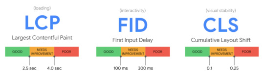
Largest Contentful Paint (LCP)
assesses the efficiency of loading (i.e., how long it takes for the largest item in the viewport to load). To avoid a “bad” score, LCP should occur within 2.5 seconds of when the page first starts loading, or no more than 4 seconds (but anything between 2.5 and 4 seconds “needs improvement”).
First Input Delay (FID)
Interactivity is measured (i.e., how long it takes for the website to respond when a user clicks on something). To avoid a “bad” score, pages should have an FID of less than 100 milliseconds or a maximum of 300 milliseconds (but anything between 100 and 300 milliseconds “requires improvement”). Because First Input Delay requires field data. A comparable metric is used in the audit method explained in this article, “Total Blocking Time (TBT),”. But this audit employs lab data because field data may not always be available for the website you are investigating.
Cumulative Layout Shift (CLS)
determines the visual stability (i.e., whether or not the page jumps around as the user scrolls through the content). To avoid a “bad” score, pages should have a CLS of less than 0.1 or a minimum of 0.25 (although anything between 0.1 and 0.25 is still “requires work”).
This audit concentrates on metrics with a “poor” score because these will be the most important areas to address, but you can also include “needs improvement” indicators. Let’s get started on the audit process now. That we know what we’re auditing.
How to audit Core Web Vitals using Screaming Frog
Knowing what Core Web Vitals are is one thing; finding a mechanism to audit and communicate Core Web Vitals issues to clients in a way that is both helpful and actionable is another. When dealing with Core Web Vitals concerns, the audit procedure I’ve put up is aimed to provide genuine facts, examples, and data to work with.
Three items are required to begin the audit:
The Screaming Frog website crawler in a premium edition.
A key for the PageSpeed Insights API (which you can get from this Google PageSpeed Insights documentation page).
The website you’re auditing’s domain.
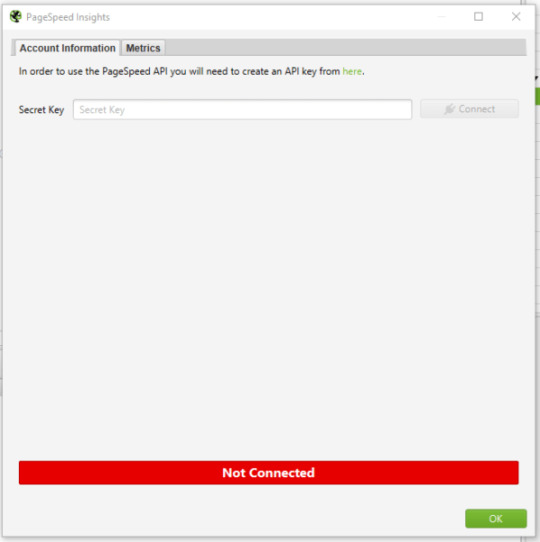
Step 1: Connect the PageSpeed Insights API key to Screaming Frog
You must first link your PageSpeed Insights API key to Screaming Frog. You’ll be able to obtain PageSpeed Insights statistics and recommendations on a page-by-page basis as a result of this. They only get a certain number of PageSpeed Insights queries each day (about 25,000), which should suffice for smaller sites, but for larger sites, you’ll need to upgrade. They will be able to apply what you’ve learned from the pages that generate the most traffic to the rest of the site.
Open Screaming Frog and go to Configuration > API Access > PageSpeed Insights with your PageSpeed Insights API key in hand.
In the “Secret Key” box, paste your API key.
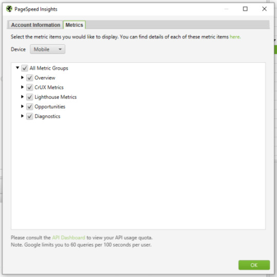
“Connect” should be selected.
Click on “Metrics” once you’ve joined. The metrics that will be displayed within your crawl will be defined here. I’m picking “All Metric Groups” for the purposes of this audit. But you can select only the ones you want to report on and click “OK.”
The metrics groupings provided are as follows:
Summary — Provides a high-level overview of the page, including its size and potential load savings.
Data from the Chrome User Experience Report (CrUX Metrics). If field data from real-life, opted-in users is available, it will appear here.
Lighthouse Metrics — This is where we get the majority of the lab data for the audit, including LCP, TBT, and CLS scores.
Opportunities — Offers suggestions for improving page speed on a page-by-page basis.
Diagnostics — Provides more information regarding the crawled website’s overall performance.

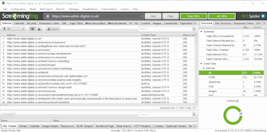
Step 2: Crawl the website
The next step is to begin your crawl. Copy the domain of the website you’re crawling and paste it into the “Enter URL to Spider” box at the top of the crawler. You’ll notice both a “Crawl” and an “API” progress bar in the top right-hand corner as the site gets crawled. Before you begin evaluating your data, you must wait for both of these to reach 100%.

Step 3: Report the size of the problem
Before you get into the specifics of what needs to be fixed, you must first express the scope of the issue. To do so, look at the percentage of pages that fail to meet each of the Core Web Vital’s minimal standards.
Select “PageSpeed” and then “Export” from the top navigation bar.
Find the following columns in your exported data and filter accordingly:
Filter by Largest Contentful Paint Time (ms) to identify all pages with an LCP of 4000ms or higher.
Total Blocking Time (ms) – Use this filter to locate all pages with a total blocking time of 300ms or higher.
Cumulative Layout Shift – Use this filter to locate all pages that have a CLS of 0.25 or higher.
Add this information to a separate datasheet so you or your customer can quickly see which pages fail each Core Web Vital. The percentage of pages on the site that fail each Core Web Vitals minimal criteria can then be reported. Here’s an example I recently emailed to a client:
95 percent of pages have a Largest Contentful Paint of more than 4 seconds (fail) – see the accompanying datasheet’s “LCP >4s” tab.
The Total Blocking Time on 58 percent of pages is over 300 milliseconds (fail) – see the “TBT >300ms” item in the attached datasheet for further information.
The Cumulative Layout Shift score on 93 percent of pages is over 0.25 (fail) – check the “CLS >0.25” tab in the accompanying datasheet for more information.
Now that you have a full list (or a sample list, if the site is too huge) of pages that fail to meet Core Web Vitals minimum limits, developers will know where to look for them. You can also report any patterns you observe now (e.g., it’s only blog pages, etc.).
Step 4: Report the issues specific to each page and make appropriate recommendations
This is where we turn problems into solutions during the audit. We’re aware that a certain number of pages are failing to meet Core Web Vitals’ basic standards. But what can we (or the client) do about it? This is where the PageSpeed Insights API shines the brightest.
Scroll down to “PageSpeed” under the “Overview” tab on the right-hand side. The list of issues/recommendations relating to page performance and, for the most part, Core Web Vitals may be found here.
The issues described here cover a wide range of topics. If there are any you don’t recognize, look them up on the web. dev page for further information. While the information provided by Screaming Frog and PageSpeed Insights does not provide a full list of all issues that can affect Core Web Vitals. It does aid in the overall analysis of your/your client’s site.
To see the pages affected by an issue, click on it and export them to your datasheet. You’re now reporting on the specifics of how many pages are affected by a problem, as well as the URLs of the pages that are affected. I’ve exported a list of all the pages with render-blocking resources that could be affecting LCP in the example below. I may now advise the customer to review this list and determine whether inlining, It might be conceivable to delay or remove the resources on these pages.
You’ll be able to view the “Savings” that could be realized by correcting that particular issue, either in bytes or milliseconds, for each of the recommendations you’re making. You can now sum up the potential savings for each issue. As well as the average savings that may be made per page by fixing that issue, using the exported data for each issue. So that you can make recommendations for which issues to address first based on the amount of load savings that can be achieved In the example below. The savings in both milliseconds and bytes are considerably greater for Deferring Offscreen Images than Removing Unused CSS. Hence Deferring Offscreen Images will be a higher priority.

Step 5: Report examples of the issues specific to each page
We provide a more comprehensive dataset by reporting on examples of issues related to each page. Allowing the client/developers to immediately grasp what the issue is and whether it is something that can be resolved or not.
Following on from the last example of render-blocking resources. Select one of the URLs that is affected by this problem and click the “PageSpeed Details” button in the bottom navigation bar. The page speed information relevant to the selected page will now be displayed in the bottom left panel. Go to Opportunities > Render Blocking Resources > Remove Render Blocking Resources.
You may now view the URLs of render-blocking resources on that page. Their size (in bytes), and the potential page load savings (in milliseconds) if these render-blocking resources are removed in the bottom-right panel.

Unfortunately, you won’t be able to export these exact concerns in bulk (as far as I know), but you can copy and paste a few instances into your datasheet and search for patterns again. The same materials will frequently exist on many pages/every page of the site, allowing for site-wide application of learnings.
After you’ve gathered this information for each issue on the site. You may write a report with recommendations for each issue in priority order, referencing the information in your datasheet.
Step 6: Once changes have been made, crawl the site again and compare
Because some of the concerns will take time to rectify, the sooner you complete this audit, the better. After you’ve resolved the issues, go back to step one and re-visit the site to check how things have changed. This is where your percentages of pages that do not satisfy Core Web Vitals’ minimum requirements will be useful. As it demonstrates a quick and simple technique to determine whether your adjustments had the desired effect or not.
When I tell clients about Core Web Vitals and the Page Experience Update. One of the most common questions I get is about how this update will affect rankings. Despite the fact that this is a critical update. I don’t think websites that don’t meet the basic requirements will notice a significant decline in rankings overnight. It’s more likely that sites with exceptional content that meets or exceeds Core Web Vitals minimum requirements will see a little boost in rankings, which will, of course, cause minor decreases in rankings for the competitors they pass. This viewpoint is backed up by Google’s own policies on the subject:
“While all aspects of page experience are important. We will favor pages that provide the most useful information overall. Even if certain parts of the page experience are lacking. The importance of having exceptional, relevant content does not outweigh the need for having a decent page experience. Page experience becomes significantly more crucial for visibility in Search in scenarios where there are several pages with comparable content.”
Site owners who satisfy the minimum standards gain a significant benefit in terms of search visibility, and while we can’t anticipate exactly what will happen on the day the Page Experience Update goes live. This audit procedure will assist you in getting ready.
The post How to audit Core Web Vitals appeared first on Soft Trending.
from Soft Trending https://ift.tt/3jl2olb via IFTTT
0 notes
Text
Represent Percentage In A SVG Circle - Circular Progress Bar
Represent Percentage In A SVG Circle – Circular Progress Bar
Yet another radial progress bar plugin to display a percentage value as an animated SVG circle.
See Also:
Top 10 JavaScript & CSS Progress Bar Components
10 Best Circular/Radial Progress Bar JavaScript Plugins
How to use it:
Download and place the JavaScript progress.js in the html document.
http://progress.js
Create a new circular progress bar.
const pb = new Progress()
Append the circular…
View On WordPress
1 note
·
View note
Text
How to audit Core Web Vitals
A step-by-step procedure to identify problems and prioritize changes ahead of the Page Experience Update.
Google declared in May 2020 that Core Web Vitals would be incorporated into Google’s algorithms in 2021. But that there was “no imminent need to take action”. Google announced in November 2020 that this update will go into effect in May-June 2021. Thus now is the time for site owners and SEOs all over the world to take action on the aptly called Page Experience Update.
What are Core Web Vitals?
Core Web Vitals are a set of measures that are used to assess a website’s loading speed, interactivity, and visual consistency. All three are linked to site speed in some way. Which we’ve known for a long time to be crucial for both search engines and people.
What’s particularly intriguing about Core Web Vitals, and in particular the Page Experience Update, is that Google isn’t always open about the details of its algorithm adjustments. However, in this situation, we’ve been told the exact metrics we’ll be measuring and improving. As well as the date the change will take effect. This shows that Page Experience undoubtedly will be a critical improvement. But also one that we can realistically prepare for. As long as the auditing process is detailed and accurate. Here are the metrics that need to be analyzed in a Core Web Vitals audit:

Largest Contentful Paint (LCP)
assesses the efficiency of loading (i.e., how long it takes for the largest item in the viewport to load). To avoid a “bad” score, LCP should occur within 2.5 seconds of when the page first starts loading, or no more than 4 seconds (but anything between 2.5 and 4 seconds “needs improvement”).
First Input Delay (FID)
Interactivity is measured (i.e., how long it takes for the website to respond when a user clicks on something). To avoid a “bad” score, pages should have an FID of less than 100 milliseconds or a maximum of 300 milliseconds (but anything between 100 and 300 milliseconds “requires improvement”). Because First Input Delay requires field data. A comparable metric is used in the audit method explained in this article, “Total Blocking Time (TBT),”. But this audit employs lab data because field data may not always be available for the website you are investigating.
Cumulative Layout Shift (CLS)
determines the visual stability (i.e., whether or not the page jumps around as the user scrolls through the content). To avoid a “bad” score, pages should have a CLS of less than 0.1 or a minimum of 0.25 (although anything between 0.1 and 0.25 is still “requires work”).
This audit concentrates on metrics with a “poor” score because these will be the most important areas to address, but you can also include “needs improvement” indicators. Let’s get started on the audit process now. That we know what we’re auditing.
How to audit Core Web Vitals using Screaming Frog
Knowing what Core Web Vitals are is one thing; finding a mechanism to audit and communicate Core Web Vitals issues to clients in a way that is both helpful and actionable is another. When dealing with Core Web Vitals concerns, the audit procedure I’ve put up is aimed to provide genuine facts, examples, and data to work with.
Three items are required to begin the audit:
The Screaming Frog website crawler in a premium edition.
A key for the PageSpeed Insights API (which you can get from this Google PageSpeed Insights documentation page).
The website you’re auditing’s domain.
Step 1: Connect the PageSpeed Insights API key to Screaming Frog
You must first link your PageSpeed Insights API key to Screaming Frog. You’ll be able to obtain PageSpeed Insights statistics and recommendations on a page-by-page basis as a result of this. They only get a certain number of PageSpeed Insights queries each day (about 25,000), which should suffice for smaller sites, but for larger sites, you’ll need to upgrade. They will be able to apply what you’ve learned from the pages that generate the most traffic to the rest of the site.
Open Screaming Frog and go to Configuration > API Access > PageSpeed Insights with your PageSpeed Insights API key in hand.
In the “Secret Key” box, paste your API key.
“Connect” should be selected.

Click on “Metrics” once you’ve joined. The metrics that will be displayed within your crawl will be defined here. I’m picking “All Metric Groups” for the purposes of this audit. But you can select only the ones you want to report on and click “OK.”
The metrics groupings provided are as follows:
Summary — Provides a high-level overview of the page, including its size and potential load savings.
Data from the Chrome User Experience Report (CrUX Metrics). If field data from real-life, opted-in users is available, it will appear here.
Lighthouse Metrics — This is where we get the majority of the lab data for the audit, including LCP, TBT, and CLS scores.
Opportunities — Offers suggestions for improving page speed on a page-by-page basis.
Diagnostics — Provides more information regarding the crawled website’s overall performance.
Step 2: Crawl the website
The next step is to begin your crawl. Copy the domain of the website you’re crawling and paste it into the “Enter URL to Spider” box at the top of the crawler. You’ll notice both a “Crawl” and an “API” progress bar in the top right-hand corner as the site gets crawled. Before you begin evaluating your data, you must wait for both of these to reach 100%.

Step 3: Report the size of the problem
Before you get into the specifics of what needs to be fixed, you must first express the scope of the issue. To do so, look at the percentage of pages that fail to meet each of the Core Web Vital’s minimal standards.
Select “PageSpeed” and then “Export” from the top navigation bar.

Find the following columns in your exported data and filter accordingly:
Filter by Largest Contentful Paint Time (ms) to identify all pages with an LCP of 4000ms or higher.
Total Blocking Time (ms) – Use this filter to locate all pages with a total blocking time of 300ms or higher.
Cumulative Layout Shift – Use this filter to locate all pages that have a CLS of 0.25 or higher.
Add this information to a separate datasheet so you or your customer can quickly see which pages fail each Core Web Vital. The percentage of pages on the site that fail each Core Web Vitals minimal criteria can then be reported. Here’s an example I recently emailed to a client:
95 percent of pages have a Largest Contentful Paint of more than 4 seconds (fail) – see the accompanying datasheet’s “LCP >4s” tab.
The Total Blocking Time on 58 percent of pages is over 300 milliseconds (fail) – see the “TBT >300ms” item in the attached datasheet for further information.
The Cumulative Layout Shift score on 93 percent of pages is over 0.25 (fail) – check the “CLS >0.25” tab in the accompanying datasheet for more information.
Now that you have a full list (or a sample list, if the site is too huge) of pages that fail to meet Core Web Vitals minimum limits, developers will know where to look for them. You can also report any patterns you observe now (e.g., it’s only blog pages, etc.).
Step 4: Report the issues specific to each page and make appropriate recommendations
This is where we turn problems into solutions during the audit. We’re aware that a certain number of pages are failing to meet Core Web Vitals’ basic standards. But what can we (or the client) do about it? This is where the PageSpeed Insights API shines the brightest.
Scroll down to “PageSpeed” under the “Overview” tab on the right-hand side. The list of issues/recommendations relating to page performance and, for the most part, Core Web Vitals may be found here.
The issues described here cover a wide range of topics. If there are any you don’t recognize, look them up on the web. dev page for further information. While the information provided by Screaming Frog and PageSpeed Insights does not provide a full list of all issues that can affect Core Web Vitals. It does aid in the overall analysis of your/your client’s site.
To see the pages affected by an issue, click on it and export them to your datasheet. You’re now reporting on the specifics of how many pages are affected by a problem, as well as the URLs of the pages that are affected. I’ve exported a list of all the pages with render-blocking resources that could be affecting LCP in the example below. I may now advise the customer to review this list and determine whether inlining, It might be conceivable to delay or remove the resources on these pages.
You’ll be able to view the “Savings” that could be realized by correcting that particular issue, either in bytes or milliseconds, for each of the recommendations you’re making. You can now sum up the potential savings for each issue. As well as the average savings that may be made per page by fixing that issue, using the exported data for each issue. So that you can make recommendations for which issues to address first based on the amount of load savings that can be achieved In the example below. The savings in both milliseconds and bytes are considerably greater for Deferring Offscreen Images than Removing Unused CSS. Hence Deferring Offscreen Images will be a higher priority.

Step 5: Report examples of the issues specific to each page
We provide a more comprehensive dataset by reporting on examples of issues related to each page. Allowing the client/developers to immediately grasp what the issue is and whether it is something that can be resolved or not.
Following on from the last example of render-blocking resources. Select one of the URLs that is affected by this problem and click the “PageSpeed Details” button in the bottom navigation bar. The page speed information relevant to the selected page will now be displayed in the bottom left panel. Go to Opportunities > Render Blocking Resources > Remove Render Blocking Resources.
You may now view the URLs of render-blocking resources on that page. Their size (in bytes), and the potential page load savings (in milliseconds) if these render-blocking resources are removed in the bottom-right panel.

Unfortunately, you won’t be able to export these exact concerns in bulk (as far as I know), but you can copy and paste a few instances into your datasheet and search for patterns again. The same materials will frequently exist on many pages/every page of the site, allowing for site-wide application of learnings.
After you’ve gathered this information for each issue on the site. You may write a report with recommendations for each issue in priority order, referencing the information in your datasheet.
Step 6: Once changes have been made, crawl the site again and compare
Because some of the concerns will take time to rectify, the sooner you complete this audit, the better. After you’ve resolved the issues, go back to step one and re-visit the site to check how things have changed. This is where your percentages of pages that do not satisfy Core Web Vitals’ minimum requirements will be useful. As it demonstrates a quick and simple technique to determine whether your adjustments had the desired effect or not.
When I tell clients about Core Web Vitals and the Page Experience Update. One of the most common questions I get is about how this update will affect rankings. Despite the fact that this is a critical update. I don’t think websites that don’t meet the basic requirements will notice a significant decline in rankings overnight. It’s more likely that sites with exceptional content that meets or exceeds Core Web Vitals minimum requirements will see a little boost in rankings, which will, of course, cause minor decreases in rankings for the competitors they pass. This viewpoint is backed up by Google’s own policies on the subject:
“While all aspects of page experience are important. We will favor pages that provide the most useful information overall. Even if certain parts of the page experience are lacking. The importance of having exceptional, relevant content does not outweigh the need for having a decent page experience. Page experience becomes significantly more crucial for visibility in Search in scenarios where there are several pages with comparable content.”
Site owners who satisfy the minimum standards gain a significant benefit in terms of search visibility, and while we can’t anticipate exactly what will happen on the day the Page Experience Update goes live. This audit procedure will assist you in getting ready.
The post How to audit Core Web Vitals appeared first on Soft Trending.
from Soft Trending https://ift.tt/3jl2olb via softtrending
0 notes
Text
How to audit Core Web Vitals
A step-by-step procedure to identify problems and prioritize changes ahead of the Page Experience Update.
Google declared in May 2020 that Core Web Vitals would be incorporated into Google’s algorithms in 2021. But that there was “no imminent need to take action”. Google announced in November 2020 that this update will go into effect in May-June 2021. Thus now is the time for site owners and SEOs all over the world to take action on the aptly called Page Experience Update.
What are Core Web Vitals?
Core Web Vitals are a set of measures that are used to assess a website’s loading speed, interactivity, and visual consistency. All three are linked to site speed in some way. Which we’ve known for a long time to be crucial for both search engines and people.
What’s particularly intriguing about Core Web Vitals, and in particular the Page Experience Update, is that Google isn’t always open about the details of its algorithm adjustments. However, in this situation, we’ve been told the exact metrics we’ll be measuring and improving. As well as the date the change will take effect. This shows that Page Experience undoubtedly will be a critical improvement. But also one that we can realistically prepare for. As long as the auditing process is detailed and accurate. Here are the metrics that need to be analyzed in a Core Web Vitals audit:
Largest Contentful Paint (LCP)
assesses the efficiency of loading (i.e., how long it takes for the largest item in the viewport to load). To avoid a “bad” score, LCP should occur within 2.5 seconds of when the page first starts loading, or no more than 4 seconds (but anything between 2.5 and 4 seconds “needs improvement”).
First Input Delay (FID)
Interactivity is measured (i.e., how long it takes for the website to respond when a user clicks on something). To avoid a “bad” score, pages should have an FID of less than 100 milliseconds or a maximum of 300 milliseconds (but anything between 100 and 300 milliseconds “requires improvement”). Because First Input Delay requires field data. A comparable metric is used in the audit method explained in this article, “Total Blocking Time (TBT),”. But this audit employs lab data because field data may not always be available for the website you are investigating.
Cumulative Layout Shift (CLS)
determines the visual stability (i.e., whether or not the page jumps around as the user scrolls through the content). To avoid a “bad” score, pages should have a CLS of less than 0.1 or a minimum of 0.25 (although anything between 0.1 and 0.25 is still “requires work”).
This audit concentrates on metrics with a “poor” score because these will be the most important areas to address, but you can also include “needs improvement” indicators. Let’s get started on the audit process now. That we know what we’re auditing.
How to audit Core Web Vitals using Screaming Frog
Knowing what Core Web Vitals are is one thing; finding a mechanism to audit and communicate Core Web Vitals issues to clients in a way that is both helpful and actionable is another. When dealing with Core Web Vitals concerns, the audit procedure I’ve put up is aimed to provide genuine facts, examples, and data to work with.
Three items are required to begin the audit:
The Screaming Frog website crawler in a premium edition.
A key for the PageSpeed Insights API (which you can get from this Google PageSpeed Insights documentation page).
The website you’re auditing’s domain.
Step 1: Connect the PageSpeed Insights API key to Screaming Frog
You must first link your PageSpeed Insights API key to Screaming Frog. You’ll be able to obtain PageSpeed Insights statistics and recommendations on a page-by-page basis as a result of this. They only get a certain number of PageSpeed Insights queries each day (about 25,000), which should suffice for smaller sites, but for larger sites, you’ll need to upgrade. They will be able to apply what you’ve learned from the pages that generate the most traffic to the rest of the site.
Open Screaming Frog and go to Configuration > API Access > PageSpeed Insights with your PageSpeed Insights API key in hand.
In the “Secret Key” box, paste your API key.
“Connect” should be selected.

Click on “Metrics” once you’ve joined. The metrics that will be displayed within your crawl will be defined here. I’m picking “All Metric Groups” for the purposes of this audit. But you can select only the ones you want to report on and click “OK.”
The metrics groupings provided are as follows:
Summary — Provides a high-level overview of the page, including its size and potential load savings.
Data from the Chrome User Experience Report (CrUX Metrics). If field data from real-life, opted-in users is available, it will appear here.
Lighthouse Metrics — This is where we get the majority of the lab data for the audit, including LCP, TBT, and CLS scores.
Opportunities — Offers suggestions for improving page speed on a page-by-page basis.
Diagnostics — Provides more information regarding the crawled website’s overall performance.

Step 2: Crawl the website
The next step is to begin your crawl. Copy the domain of the website you’re crawling and paste it into the “Enter URL to Spider” box at the top of the crawler. You’ll notice both a “Crawl” and an “API” progress bar in the top right-hand corner as the site gets crawled. Before you begin evaluating your data, you must wait for both of these to reach 100%.

Step 3: Report the size of the problem
Before you get into the specifics of what needs to be fixed, you must first express the scope of the issue. To do so, look at the percentage of pages that fail to meet each of the Core Web Vital’s minimal standards.
Select “PageSpeed” and then “Export” from the top navigation bar.

Find the following columns in your exported data and filter accordingly:
Filter by Largest Contentful Paint Time (ms) to identify all pages with an LCP of 4000ms or higher.
Total Blocking Time (ms) – Use this filter to locate all pages with a total blocking time of 300ms or higher.
Cumulative Layout Shift – Use this filter to locate all pages that have a CLS of 0.25 or higher.
Add this information to a separate datasheet so you or your customer can quickly see which pages fail each Core Web Vital. The percentage of pages on the site that fail each Core Web Vitals minimal criteria can then be reported. Here’s an example I recently emailed to a client:
95 percent of pages have a Largest Contentful Paint of more than 4 seconds (fail) – see the accompanying datasheet’s “LCP >4s” tab.
The Total Blocking Time on 58 percent of pages is over 300 milliseconds (fail) – see the “TBT >300ms” item in the attached datasheet for further information.
The Cumulative Layout Shift score on 93 percent of pages is over 0.25 (fail) – check the “CLS >0.25” tab in the accompanying datasheet for more information.
Now that you have a full list (or a sample list, if the site is too huge) of pages that fail to meet Core Web Vitals minimum limits, developers will know where to look for them. You can also report any patterns you observe now (e.g., it’s only blog pages, etc.).
Step 4: Report the issues specific to each page and make appropriate recommendations
This is where we turn problems into solutions during the audit. We’re aware that a certain number of pages are failing to meet Core Web Vitals’ basic standards. But what can we (or the client) do about it? This is where the PageSpeed Insights API shines the brightest.
Scroll down to “PageSpeed” under the “Overview” tab on the right-hand side. The list of issues/recommendations relating to page performance and, for the most part, Core Web Vitals may be found here.
The issues described here cover a wide range of topics. If there are any you don’t recognize, look them up on the web. dev page for further information. While the information provided by Screaming Frog and PageSpeed Insights does not provide a full list of all issues that can affect Core Web Vitals. It does aid in the overall analysis of your/your client’s site.
To see the pages affected by an issue, click on it and export them to your datasheet. You’re now reporting on the specifics of how many pages are affected by a problem, as well as the URLs of the pages that are affected. I’ve exported a list of all the pages with render-blocking resources that could be affecting LCP in the example below. I may now advise the customer to review this list and determine whether inlining, It might be conceivable to delay or remove the resources on these pages.
You’ll be able to view the “Savings” that could be realized by correcting that particular issue, either in bytes or milliseconds, for each of the recommendations you’re making. You can now sum up the potential savings for each issue. As well as the average savings that may be made per page by fixing that issue, using the exported data for each issue. So that you can make recommendations for which issues to address first based on the amount of load savings that can be achieved In the example below. The savings in both milliseconds and bytes are considerably greater for Deferring Offscreen Images than Removing Unused CSS. Hence Deferring Offscreen Images will be a higher priority.

Step 5: Report examples of the issues specific to each page
We provide a more comprehensive dataset by reporting on examples of issues related to each page. Allowing the client/developers to immediately grasp what the issue is and whether it is something that can be resolved or not.
Following on from the last example of render-blocking resources. Select one of the URLs that is affected by this problem and click the “PageSpeed Details” button in the bottom navigation bar. The page speed information relevant to the selected page will now be displayed in the bottom left panel. Go to Opportunities > Render Blocking Resources > Remove Render Blocking Resources.
You may now view the URLs of render-blocking resources on that page. Their size (in bytes), and the potential page load savings (in milliseconds) if these render-blocking resources are removed in the bottom-right panel.
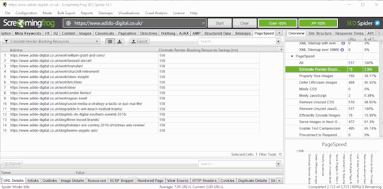
Unfortunately, you won’t be able to export these exact concerns in bulk (as far as I know), but you can copy and paste a few instances into your datasheet and search for patterns again. The same materials will frequently exist on many pages/every page of the site, allowing for site-wide application of learnings.
After you’ve gathered this information for each issue on the site. You may write a report with recommendations for each issue in priority order, referencing the information in your datasheet.
Step 6: Once changes have been made, crawl the site again and compare
Because some of the concerns will take time to rectify, the sooner you complete this audit, the better. After you’ve resolved the issues, go back to step one and re-visit the site to check how things have changed. This is where your percentages of pages that do not satisfy Core Web Vitals’ minimum requirements will be useful. As it demonstrates a quick and simple technique to determine whether your adjustments had the desired effect or not.
When I tell clients about Core Web Vitals and the Page Experience Update. One of the most common questions I get is about how this update will affect rankings. Despite the fact that this is a critical update. I don’t think websites that don’t meet the basic requirements will notice a significant decline in rankings overnight. It’s more likely that sites with exceptional content that meets or exceeds Core Web Vitals minimum requirements will see a little boost in rankings, which will, of course, cause minor decreases in rankings for the competitors they pass. This viewpoint is backed up by Google’s own policies on the subject:
“While all aspects of page experience are important. We will favor pages that provide the most useful information overall. Even if certain parts of the page experience are lacking. The importance of having exceptional, relevant content does not outweigh the need for having a decent page experience. Page experience becomes significantly more crucial for visibility in Search in scenarios where there are several pages with comparable content.”
Site owners who satisfy the minimum standards gain a significant benefit in terms of search visibility, and while we can’t anticipate exactly what will happen on the day the Page Experience Update goes live. This audit procedure will assist you in getting ready.
The post How to audit Core Web Vitals appeared first on Soft Trending.
from Soft Trending https://ift.tt/3jl2olb via softtrending
0 notes
Text
How to audit Core Web Vitals
A step-by-step procedure to identify problems and prioritize changes ahead of the Page Experience Update.
Google declared in May 2020 that Core Web Vitals would be incorporated into Google’s algorithms in 2021. But that there was “no imminent need to take action”. Google announced in November 2020 that this update will go into effect in May-June 2021. Thus now is the time for site owners and SEOs all over the world to take action on the aptly called Page Experience Update.
What are Core Web Vitals?
Core Web Vitals are a set of measures that are used to assess a website’s loading speed, interactivity, and visual consistency. All three are linked to site speed in some way. Which we’ve known for a long time to be crucial for both search engines and people.
What’s particularly intriguing about Core Web Vitals, and in particular the Page Experience Update, is that Google isn’t always open about the details of its algorithm adjustments. However, in this situation, we’ve been told the exact metrics we’ll be measuring and improving. As well as the date the change will take effect. This shows that Page Experience undoubtedly will be a critical improvement. But also one that we can realistically prepare for. As long as the auditing process is detailed and accurate. Here are the metrics that need to be analyzed in a Core Web Vitals audit:

Largest Contentful Paint (LCP)
assesses the efficiency of loading (i.e., how long it takes for the largest item in the viewport to load). To avoid a “bad” score, LCP should occur within 2.5 seconds of when the page first starts loading, or no more than 4 seconds (but anything between 2.5 and 4 seconds “needs improvement”).
First Input Delay (FID)
Interactivity is measured (i.e., how long it takes for the website to respond when a user clicks on something). To avoid a “bad” score, pages should have an FID of less than 100 milliseconds or a maximum of 300 milliseconds (but anything between 100 and 300 milliseconds “requires improvement”). Because First Input Delay requires field data. A comparable metric is used in the audit method explained in this article, “Total Blocking Time (TBT),”. But this audit employs lab data because field data may not always be available for the website you are investigating.
Cumulative Layout Shift (CLS)
determines the visual stability (i.e., whether or not the page jumps around as the user scrolls through the content). To avoid a “bad” score, pages should have a CLS of less than 0.1 or a minimum of 0.25 (although anything between 0.1 and 0.25 is still “requires work”).
This audit concentrates on metrics with a “poor” score because these will be the most important areas to address, but you can also include “needs improvement” indicators. Let’s get started on the audit process now. That we know what we’re auditing.
How to audit Core Web Vitals using Screaming Frog
Knowing what Core Web Vitals are is one thing; finding a mechanism to audit and communicate Core Web Vitals issues to clients in a way that is both helpful and actionable is another. When dealing with Core Web Vitals concerns, the audit procedure I’ve put up is aimed to provide genuine facts, examples, and data to work with.
Three items are required to begin the audit:
The Screaming Frog website crawler in a premium edition.
A key for the PageSpeed Insights API (which you can get from this Google PageSpeed Insights documentation page).
The website you’re auditing’s domain.
Step 1: Connect the PageSpeed Insights API key to Screaming Frog
You must first link your PageSpeed Insights API key to Screaming Frog. You’ll be able to obtain PageSpeed Insights statistics and recommendations on a page-by-page basis as a result of this. They only get a certain number of PageSpeed Insights queries each day (about 25,000), which should suffice for smaller sites, but for larger sites, you’ll need to upgrade. They will be able to apply what you’ve learned from the pages that generate the most traffic to the rest of the site.
Open Screaming Frog and go to Configuration > API Access > PageSpeed Insights with your PageSpeed Insights API key in hand.
In the “Secret Key” box, paste your API key.
“Connect” should be selected.

Click on “Metrics” once you’ve joined. The metrics that will be displayed within your crawl will be defined here. I’m picking “All Metric Groups” for the purposes of this audit. But you can select only the ones you want to report on and click “OK.”
The metrics groupings provided are as follows:
Summary — Provides a high-level overview of the page, including its size and potential load savings.
Data from the Chrome User Experience Report (CrUX Metrics). If field data from real-life, opted-in users is available, it will appear here.
Lighthouse Metrics — This is where we get the majority of the lab data for the audit, including LCP, TBT, and CLS scores.
Opportunities — Offers suggestions for improving page speed on a page-by-page basis.
Diagnostics — Provides more information regarding the crawled website’s overall performance.

Step 2: Crawl the website
The next step is to begin your crawl. Copy the domain of the website you’re crawling and paste it into the “Enter URL to Spider” box at the top of the crawler. You’ll notice both a “Crawl” and an “API” progress bar in the top right-hand corner as the site gets crawled. Before you begin evaluating your data, you must wait for both of these to reach 100%.

Step 3: Report the size of the problem
Before you get into the specifics of what needs to be fixed, you must first express the scope of the issue. To do so, look at the percentage of pages that fail to meet each of the Core Web Vital’s minimal standards.
Select “PageSpeed” and then “Export” from the top navigation bar.

Find the following columns in your exported data and filter accordingly:
Filter by Largest Contentful Paint Time (ms) to identify all pages with an LCP of 4000ms or higher.
Total Blocking Time (ms) – Use this filter to locate all pages with a total blocking time of 300ms or higher.
Cumulative Layout Shift – Use this filter to locate all pages that have a CLS of 0.25 or higher.
Add this information to a separate datasheet so you or your customer can quickly see which pages fail each Core Web Vital. The percentage of pages on the site that fail each Core Web Vitals minimal criteria can then be reported. Here’s an example I recently emailed to a client:
95 percent of pages have a Largest Contentful Paint of more than 4 seconds (fail) – see the accompanying datasheet’s “LCP >4s” tab.
The Total Blocking Time on 58 percent of pages is over 300 milliseconds (fail) – see the “TBT >300ms” item in the attached datasheet for further information.
The Cumulative Layout Shift score on 93 percent of pages is over 0.25 (fail) – check the “CLS >0.25” tab in the accompanying datasheet for more information.
Now that you have a full list (or a sample list, if the site is too huge) of pages that fail to meet Core Web Vitals minimum limits, developers will know where to look for them. You can also report any patterns you observe now (e.g., it’s only blog pages, etc.).
Step 4: Report the issues specific to each page and make appropriate recommendations
This is where we turn problems into solutions during the audit. We’re aware that a certain number of pages are failing to meet Core Web Vitals’ basic standards. But what can we (or the client) do about it? This is where the PageSpeed Insights API shines the brightest.
Scroll down to “PageSpeed” under the “Overview” tab on the right-hand side. The list of issues/recommendations relating to page performance and, for the most part, Core Web Vitals may be found here.
The issues described here cover a wide range of topics. If there are any you don’t recognize, look them up on the web. dev page for further information. While the information provided by Screaming Frog and PageSpeed Insights does not provide a full list of all issues that can affect Core Web Vitals. It does aid in the overall analysis of your/your client’s site.
To see the pages affected by an issue, click on it and export them to your datasheet. You’re now reporting on the specifics of how many pages are affected by a problem, as well as the URLs of the pages that are affected. I’ve exported a list of all the pages with render-blocking resources that could be affecting LCP in the example below. I may now advise the customer to review this list and determine whether inlining, It might be conceivable to delay or remove the resources on these pages.
You’ll be able to view the “Savings” that could be realized by correcting that particular issue, either in bytes or milliseconds, for each of the recommendations you’re making. You can now sum up the potential savings for each issue. As well as the average savings that may be made per page by fixing that issue, using the exported data for each issue. So that you can make recommendations for which issues to address first based on the amount of load savings that can be achieved In the example below. The savings in both milliseconds and bytes are considerably greater for Deferring Offscreen Images than Removing Unused CSS. Hence Deferring Offscreen Images will be a higher priority.
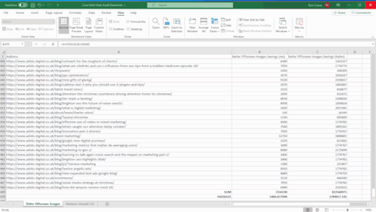
Step 5: Report examples of the issues specific to each page
We provide a more comprehensive dataset by reporting on examples of issues related to each page. Allowing the client/developers to immediately grasp what the issue is and whether it is something that can be resolved or not.
Following on from the last example of render-blocking resources. Select one of the URLs that is affected by this problem and click the “PageSpeed Details” button in the bottom navigation bar. The page speed information relevant to the selected page will now be displayed in the bottom left panel. Go to Opportunities > Render Blocking Resources > Remove Render Blocking Resources.
You may now view the URLs of render-blocking resources on that page. Their size (in bytes), and the potential page load savings (in milliseconds) if these render-blocking resources are removed in the bottom-right panel.

Unfortunately, you won’t be able to export these exact concerns in bulk (as far as I know), but you can copy and paste a few instances into your datasheet and search for patterns again. The same materials will frequently exist on many pages/every page of the site, allowing for site-wide application of learnings.
After you’ve gathered this information for each issue on the site. You may write a report with recommendations for each issue in priority order, referencing the information in your datasheet.
Step 6: Once changes have been made, crawl the site again and compare
Because some of the concerns will take time to rectify, the sooner you complete this audit, the better. After you’ve resolved the issues, go back to step one and re-visit the site to check how things have changed. This is where your percentages of pages that do not satisfy Core Web Vitals’ minimum requirements will be useful. As it demonstrates a quick and simple technique to determine whether your adjustments had the desired effect or not.
When I tell clients about Core Web Vitals and the Page Experience Update. One of the most common questions I get is about how this update will affect rankings. Despite the fact that this is a critical update. I don’t think websites that don’t meet the basic requirements will notice a significant decline in rankings overnight. It’s more likely that sites with exceptional content that meets or exceeds Core Web Vitals minimum requirements will see a little boost in rankings, which will, of course, cause minor decreases in rankings for the competitors they pass. This viewpoint is backed up by Google’s own policies on the subject:
“While all aspects of page experience are important. We will favor pages that provide the most useful information overall. Even if certain parts of the page experience are lacking. The importance of having exceptional, relevant content does not outweigh the need for having a decent page experience. Page experience becomes significantly more crucial for visibility in Search in scenarios where there are several pages with comparable content.”
Site owners who satisfy the minimum standards gain a significant benefit in terms of search visibility, and while we can’t anticipate exactly what will happen on the day the Page Experience Update goes live. This audit procedure will assist you in getting ready.
The post How to audit Core Web Vitals appeared first on Soft Trending.
from Soft Trending https://ift.tt/3jl2olb via softtrending
0 notes
Text
D3.js Bar Chart Tutorial: Build Interactive JavaScript Charts and Graphs
Recently, we had the pleasure to participate in a machine learning project that involved libraries like React and D3.js. Among many tasks, I developed a few d3 bar charts and line charts that helped to process the result of ML models like Naive Bayes.
In this article, I would like to present my progress with D3.js so far and show the basic usage of this javascript chart library through the simple example of a bar chart.
After reading this article, you’ll learn how to create D3.js charts like this easily:

The full source code is available here.
We at RisingStack are fond of the JavaScript ecosystem, backend, and front-end development as well. Personally, I am interested in both of them. On the backend, I can see through the underlying business logic of an application while I also have the opportunity to create awesome looking stuff on the front-end. That’s where D3.js comes into the picture!
Update: a 2nd part of my d3.js tutorial series is available as well: Building a D3.js Calendar Heatmap (to visualize StackOverflow Usage Data)
What is D3.js?
D3.js is a data driven JavaScript library for manipulating DOM elements.
“D3 helps you bring data to life using HTML, SVG, and CSS. D3’s emphasis on web standards gives you the full capabilities of modern browsers without tying yourself to a proprietary framework, combining powerful visualization components and a data-driven approach to DOM manipulation.” - d3js.org
Why would You create charts with D3.js in the first place? Why not just display an image?
Well, charts are based on information coming from third-party resources which requires dynamic visualization during render time. Also, SVG is a very powerful tool which fits well to this application case.
Let’s take a detour to see what benefits we can get from using SVG.
The benefits of SVG
SVG stands for Scalable Vector Graphics which is technically an XML based markup language.
It is commonly used to draw vector graphics, specify lines and shapes or modify existing images. You can find the list of available elements here.
Pros:
Supported in all major browsers;
It has DOM interface, requires no third-party lib;
Scalable, it can maintain high resolution;
Reduced size compared to other image formats.
Cons:
It can only display two-dimensional images;
Long learning curve;
Render may take long with compute-intensive operations.
Despite its downsides, SVG is a great tool to display icons, logos, illustrations or in this case, charts.
Getting started with D3.js
I picked barcharts to get started because it represents a low complexity visual element while it teaches the basic application of D3.js itself. This should not deceive You, D3 provides a great set of tools to visualize data. Check out its github page for some really nice use cases!
A bar chart can be horizontal or vertical based on its orientation. I will go with the vertical one in the form of a JavaScript Column chart.
On this diagram, I am going to display the top 10 most loved programming languages based on Stack Overflow’s 2018 Developer Survey result.
How to draw bar graphs with SVG?
SVG has a coordinate system that starts from the top left corner (0;0). Positive x-axis goes to the right, while the positive y-axis heads to the bottom. Thus, the height of the SVG has to be taken into consideration when it comes to calculating the y coordinate of an element.

That’s enough background check, let’s write some code!
I want to create a chart with 1000 pixels width and 600 pixels height.
<body> <svg /> </body> <script> const margin = 60; const width = 1000 - 2 * margin; const height = 600 - 2 * margin; const svg = d3.select('svg'); </script>
In the code snippet above, I select the created <svg> element in the HTML file with d3 select. This selection method accepts all kind of selector strings and returns the first matching element. Use selectAll if You would like to get all of them.
I also define a margin value which gives a little extra padding to the chart. Padding can be applied with a <g> element translated by the desired value. From now on, I draw on this group to keep a healthy distance from any other contents of the page.
const chart = svg.append('g') .attr('transform', `translate(${margin}, ${margin})`);
Adding attributes to an element is as easy as calling the attr method. The method’s first parameter takes an attribute I want to apply to the selected DOM element. The second parameter is the value or a callback function that returns the value of it. The code above simply moves the start of the chart to the (60;60) position of the SVG.
Supported D3.js input formats
To start drawing, I need to define the data source I’m working from. For this tutorial, I use a plain JavaScript array which holds objects with the name of the languages and their percentage rates but it’s important to mention that D3.js supports multiple data formats.
The library has built-in functionality to load from XMLHttpRequest, .csv files, text files etc. Each of these sources may contain data that D3.js can use, the only important thing is to construct an array out of them. Note that, from version 5.0 the library uses promises instead of callbacks for loading data which is a non-backward compatible change.
Scaling, Axes
Let’s go on with the axes of the chart. In order to draw the y-axis, I need to set the lowest and the highest value limit which in this case are 0 and 100.
I’m working with percentages in this tutorial, but there are utility functions for data types other than numbers which I will explain later.
I have to split the height of the chart between these two values into equal parts. For this, I create something that is called a scaling function.
const yScale = d3.scaleLinear() .range([height, 0]) .domain([0, 100]);
Linear scale is the most commonly known scaling type. It converts a continuous input domain into a continuous output range. Notice the range and domain method. The first one takes the length that should be divided between the limits of the domain values.
Remember, the SVG coordinate system starts from the top left corner that’s why the range takes the height as the first parameter and not zero.
Creating an axis on the left is as simple as adding another group and calling d3’s axisLeft method with the scaling function as a parameter.
chart.append('g') .call(d3.axisLeft(yScale));
Now, continue with the x-axis.
const xScale = d3.scaleBand() .range([0, width]) .domain(sample.map((s) => s.language)) .padding(0.2) chart.append('g') .attr('transform', `translate(0, ${height})`) .call(d3.axisBottom(xScale));
Be aware that I use scaleBand for the x-axis which helps to split the range into bands and compute the coordinates and widths of the bars with additional padding.
D3.js is also capable of handling date type among many others. scaleTime is really similar to scaleLinear except the domain is here an array of dates.
Tutorial: Bar drawing in D3.js
Think about what kind of input we need to draw the bars. They each represent a value which is illustrated with simple shapes, specifically rectangles. In the next code snippet, I append them to the created group element.
chart.selectAll() .data(goals) .enter() .append('rect') .attr('x', (s) => xScale(s.language)) .attr('y', (s) => yScale(s.value)) .attr('height', (s) => height - yScale(s.value)) .attr('width', xScale.bandwidth())
First, I selectAll elements on the chart which returns with an empty result set. Then, data function tells how many elements the DOM should be updated with based on the array length. enter identifies elements that are missing if the data input is longer than the selection. This returns a new selection representing the elements that need to be added. Usually, this is followed by an append which adds elements to the DOM.
Basically, I tell D3.js to append a rectangle for every member of the array.
Now, this only adds rectangles on top of each other which have no height or width. These two attributes have to be calculated and that’s where the scaling functions come handy again.
See, I add the coordinates of the rectangles with the attr call. The second parameter can be a callback which takes 3 parameters: the actual member of the input data, index of it and the whole input.
.attr(’x’, (actual, index, array) => xScale(actual.value))
The scaling function returns the coordinate for a given domain value. Calculating the coordinates are a piece of cake, the trick is with the height of the bar. The computed y coordinate has to be subtracted from the height of the chart to get the correct representation of the value as a column.
I define the width of the rectangles with the scaling function as well. scaleBand has a bandwidth function which returns the computed width for one element based on the set padding.

Nice job, but not so fancy, right?
To prevent our audience from eye bleeding, let’s add some info and improve the visuals! ;)
Tips on making javascript bar charts
There are some ground rules with bar charts that worth mentioning.
Avoid using 3D effects;
Order data points intuitively - alphabetically or sorted;
Keep distance between the bands;
Start y-axis at 0 and not with the lowest value;
Use consistent colors;
Add axis labels, title, source line.
D3.js Grid System
I want to highlight the values by adding grid lines in the background.
Go ahead, experiment with both vertical and horizontal lines but my advice is to display only one of them. Excessive lines can be distracting. This code snippet presents how to add both solutions.
chart.append('g') .attr('class', 'grid') .attr('transform', `translate(0, ${height})`) .call(d3.axisBottom() .scale(xScale) .tickSize(-height, 0, 0) .tickFormat('')) chart.append('g') .attr('class', 'grid') .call(d3.axisLeft() .scale(yScale) .tickSize(-width, 0, 0) .tickFormat(''))
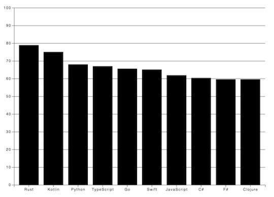
I prefer the vertical grid lines in this case because they lead the eyes and keep the overall picture plain and simple.
Labels in D3.js
I also want to make the diagram more comprehensive by adding some textual guidance. Let’s give a name to the chart and add labels for the axes.

Texts are SVG elements that can be appended to the SVG or groups. They can be positioned with x and y coordinates while text alignment is done with the text-anchor attribute. To add the label itself, just call text method on the text element.
svg.append('text') .attr('x', -(height / 2) - margin) .attr('y', margin / 2.4) .attr('transform', 'rotate(-90)') .attr('text-anchor', 'middle') .text('Love meter (%)') svg.append('text') .attr('x', width / 2 + margin) .attr('y', 40) .attr('text-anchor', 'middle') .text('Most loved programming languages in 2018')
Interactivity with Javascript and D3
We got quite an informative chart but still, there are possibilities to transform it into an interactive bar chart!
In the next code block I show You how to add event listeners to SVG elements.
svgElement .on('mouseenter', function (actual, i) { d3.select(this).attr(‘opacity’, 0.5) }) .on('mouseleave’, function (actual, i) { d3.select(this).attr(‘opacity’, 1) })
Note that I use function expression instead of an arrow function because I access the element via this keyword.
I set the opacity of the selected SVG element to half of the original value on mouse hover and reset it when the cursor leaves the area.
You could also get the mouse coordinates with d3.mouse. It returns an array with the x and y coordinate. This way, displaying a tooltip at the tip of the cursor would be no problem at all.
Creating eye-popping diagrams is not an easy art form.
One might require the wisdom of graphic designers, UX researchers and other mighty creatures. In the following example I’m going to show a few possibilities to boost Your chart!
I have very similar values displayed on the chart so to highlight the divergences among the bar values, I set up an event listener for the mouseenter event. Every time the user hovers over a specific a column, a horizontal line is drawn on top of that bar. Furthermore, I also calculate the differences compared to the other bands and display it on the bars.
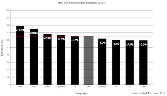
Pretty neat, huh? I also added the opacity example to this one and increased the width of the bar.
.on(‘mouseenter’, function (s, i) { d3.select(this) .transition() .duration(300) .attr('opacity', 0.6) .attr('x', (a) => xScale(a.language) - 5) .attr('width', xScale.bandwidth() + 10) chart.append('line') .attr('x1', 0) .attr('y1', y) .attr('x2', width) .attr('y2', y) .attr('stroke', 'red') // this is only part of the implementation, check the source code })
The transition method indicates that I want to animate changes to the DOM. Its interval is set with the duration function that takes milliseconds as arguments. This transition above fades the band color and broaden the width of the bar.
To draw an SVG line, I need a start and a destination point. This can be set via the x1, y1 and x2, y2 coordinates. The line will not be visible until I set the color of it with the stroke attribute.
I only revealed part of the mouseenter event here so keep in mind, You have to revert or remove the changes on the mouseout event. The full source code is available at the end of the article.
Let’s Add Some Style to the Chart!
Let’s see what we achieved so far and how can we shake up this chart with some style. You can add class attributes to SVG elements with the same attr function we used before.
The diagram has a nice set of functionality. Instead of a dull, static picture, it also reveals the divergences among the represented values on mouse hover. The title puts the chart into context and the labels help to identify the axes with the unit of measurement. I also add a new label to the bottom right corner to mark the input source.
The only thing left is to upgrade the colors and fonts!
Charts with dark background makes the bright colored bars look cool. I also applied the Open Sans font family to all the texts and set size and weight for the different labels.
Do You notice the line got dashed? It can be done by setting the stroke-width and stroke-dasharray attributes. With stroke-dasharray, You can define pattern of dashes and gaps that alter the outline of the shape.
line#limit { stroke: #FED966; stroke-width: 3; stroke-dasharray: 3 6; } .grid path { stroke-width: 3; } .grid .tick line { stroke: #9FAAAE; stroke-opacity: 0.2; }
Grid lines where it gets tricky. I have to apply stroke-width: 0 to path elements in the group to hide the frame of the diagram and I also reduce their visibility by setting the opacity of the lines.
All the other css rules cover the font sizes and colors which You can find in the source code.
Wrapping up our D3.js Bar Chart Tutorial
D3.js is an amazing library for DOM manipulation and for building javascript graphs and line charts. The depth of it hides countless hidden (actually not hidden, it is really well documented) treasures that waits for discovery. This writing covers only fragments of its toolset that help to create a not so mediocre bar chart.
Go on, explore it, use it and create spectacular JavaScript graphs & visualizations!
By the way, here's the link to the source code.
Have You created something cool with D3.js? Share with us! Drop a comment if You have any questions or would like another JavaScript chart tutorial!
Thanks for reading and see You next time when I'm building a calendar heatmap with d3.js!
D3.js Bar Chart Tutorial: Build Interactive JavaScript Charts and Graphs published first on https://koresolpage.tumblr.com/
0 notes