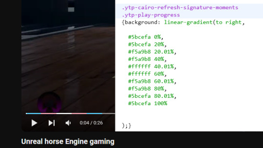
#css progress bar
Explore tagged Tumblr posts
Visit Tumblr Blog
Explore Tumblr blogs with no restrictions, modern design and the best experience.
Last Seen Tumblr Blogs


Fun Fact
China blocked Tumblr because of pornography and censorship problems in 2013.
Text

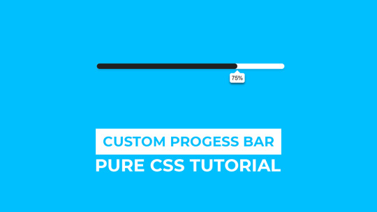
CSS Progress Bar Animation
#css progress bar animation#codenewbies#html css#frontenddevelopment#html5 css3#css animation examples#pure css animation#css animation tutorial#css#webdesign#code#html css animation#css progress bar
5 notes
·
View notes
Text
CSS Progress Bar with Percentage
#css progress bar#progress bar#progress bar css#progress bar html css#css animation tutorial#pure css animation#html css#learn to code#frontend#css#html#css3#frontenddevelopment#code#animation#CSS Progress Bar with Percentage
3 notes
·
View notes
Text

CSS Circular Progress Bar Animation
#css circular progress bar animation#css progress bar#animated progress bar#html css#learn to code#code#frontenddevelopment#divinectorweb#css3#html#css#css animation examples#css animation
0 notes
Text


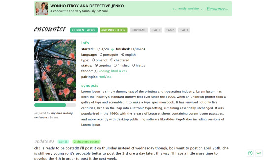
page_03: encounter by wonhoutboy
preview / code
• writing diary page: header, icon, bio, 3 links; • writing updates for each story; • progress bar; • cover space 170x250px; • tumblr controls by magnusthemes; • css icons by css.gg; • can be used as a base code as long as you credit me; • images used in the preview: x x x; • please consider buying me a coffee <3.
!! if you find any bugs/if anything doesn’t go well or if you just struggle with customizing it, please reach out to me via private message or ask and i’ll gladly help!
reading diary page coming next!
#code#page#writing page#writing diary#header#page code#writing progress#project page#ao3 writer#ao3#fanfic#html#css#themehunter
497 notes
·
View notes
Text
shameless self promotion sunday
tagged by @foxboyclit and @thegreatobsesso, thank you both!
i love all my fics but also i do in fact do other things sometimes, and i’m really quite proud of my little neocities site. it’s not perfect, and it’s very much a work in progress, but the parts that are done I really like!
i have all my fic up on there, and a load of my playlists (with meta commentary on some!), plus I made sections for Obedience and obsession that have some very neat looking character pages...i love tinkering with html and css, and i love having a project that is purely for fun and not remotely about demonstrating any kind of skill.
i've really enjoyed solving such puzzles as 'how to make a horizontal menu bar' and 'how to make a reactive image grid'


anyway i just like my lil hand-coded stick-figure of a website, and if anyone else has a neocities let me know, i wanna put you in my list of friend links~
no-pressure tagging @oh-no-another-idea @chauceryfairytales @reneesbooks and @talesfromaurea to do some shameless self promotion (on a sunday or any other day, all days are good for singing your own praises)
#writeblr#tag games#neocities#id in alt#id in alt text#self promotion sunday#shameless self promo#it is not the most accessible or cross platform site but i did make it myself and i am Not a wbe developer#by any stretch#i just like doing it! it's fun!#plus it's my backup place for fics#and a place if people don't want to use ao3 or dreamwidth#i also really like that i have a place for my playlists now#cause i love making covers and writing track commentary#listen to my yap about my music choices for my blorbos!!!
15 notes
·
View notes
Text

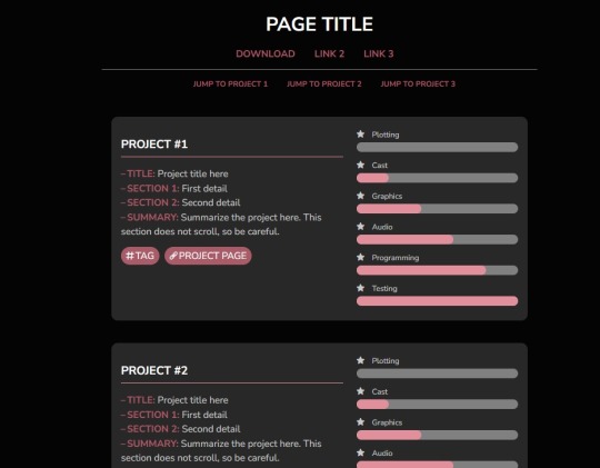
PAGE CODE 01: PROJECT PROGRESS
[LIVE PREVIEW & DOWNLOAD]
I wanted to make a custom project tracking page for my blog to match the themes I was using, but nothing caught my eye, so I threw this together. It's a very simple code used to track project progress and summarize the projects themselves.
FEATURES:
Anchor links to directly scroll to a given project
Cappuccicons font (as a direct stylesheet instead of JavaScript, so you don't need to contact support to use the code)
Straightfoward layout
IMPORTANT NOTES:
The tracking progress bars can be styled, but the styling will only show in Google Chrome or other Webkit-based browsers; Firefox doesn't have the functionality for it yet. Default style in Firefox is shown in the first image; Chrome/Webkit styling is in the second image.
Colors are changed through the variables in the ::root section of the CSS.
The theme was made to loosely match the Anemone theme by Seyche (the theme I'm using at the time of posting this).
67 notes
·
View notes
Note
Hi! just wanted to ask on how you personally use Twine I've been a fan of OM, and wondered how u made the remake in that system lmao. I was wondering if you had any tips / tutorials u used, I've spent some time testing and have got the hang of variables and linking but i was really confused on how you designed it / removed the borders around the side bar and everything, along with how you made the intimacy system, Especially the notify / achievement bar system! No tutorials were helping me lol
Sure! I'll do my best to explain below; feel free to ask me to expand on anything if it's confusing.
Changing sidebar:
The way you do this is basically through CSS ("Story Stylesheet"). When your game is open in the browser, you can inspect elements to figure out what they're called, then change their styles. For example, I removed the border of the menu buttons by putting the following in the stylesheet:
(for the overall borders)
menu ul {
border: none;
}
(for the borders between each link)
menu li a {
border: none;
}
w3schools.com is a great website if you'd like to learn CSS - it's what will help you completely restyle your story. There are also plenty of Twine design templates for something easier to use without having to learn code.
Intimacy system:
This one is a little more complicated. I'm actually completely rehauling the intimacy system for version 1.1. Right now, it uses a lot of if statements to check the amount of intimacy the player has collected with a character - and this intimacy is in a variable initialized in the special StoryInit passage. However, that's bandaid code which is messy and easily runs into bugs, as has happened ever since release lol. To fix it, I've essentially created a proper levelling system using custom macros and JavaScript. That requires a good grasp on behind-the-scenes programming, though. If your game isn't a huge project, keeping intimacy in variables should work just fine. Just make sure to keep a spreadsheet or notes somewhere that list how much intimacy is possible to gain and in which passages. It will make your life easier in the long run.
Notifications:
This one I actually got from one of Chapel's custom macros! They're super easy to use and do a lot of cool things. I highly recommend checking these out because they can make your life easier: link
Achievements:
I'm going to assume you're talking about achievements that persist over different saves - for this, you'll need to utilize Twine's special StoryInit passage again. In case you are not sure of what that is, it's essentially all the variables that will be initialized when the game is first loaded into the browser. Your achievements and important story-spanning variables (like personality traits, intimacy counters, etc) will go here. To create an achievement, you'd put something like this in your StoryInit:
<<set $achievement1 to recall('achievement1')>>
If the player hasn't obtained the achievement, $achievement1 will automatically be set to false. To have them actually get the achievement, put
<<run memorize($achievement1, true)>>
<<set $achievement1 to true>>
in the passage where the achievement is gained. Also, be sure to have your players know that keeping saves and achievements like these relies on browser cache - if that's cleared, their progress will be lost.
Hope that helps! I wasn't sure how familiar you are with Twine beyond variables and linking as it's a pretty big engine with many things, so I just covered things without going into deeper mechanics like Twine's special passages, scripts/stylesheets, macros, etc. I'm happy to explain those too if you're having trouble. Also, everything I explained is specifically in the Sugarcube language - it won't work in Harlowe, Snowman, etc.
Helpful links:
Twine cookbook
Chapel's custom macros
Cycy's custom macros
Albie's Twine Tutorial with tons more resources
13 notes
·
View notes
Text
You can use a custom CSS addon (i.e. User CSS for Chrome, CustomCSS Injector for Firefox) to make whatever pattern you want in the Youtube video progress bar. Very nifty for pride flags :3 (copy/paste in alt text)
19 notes
·
View notes
Note
hi! i've been following your twine coding tutorials and i love them so much! it's hard to find resources on how to do the stats bars, so i have been following the tutorial on how you make yours, and i've run into a strange issue that i was hoping you might have some advice for? whenever i test out my stats, half of the bar is filled with the hex code i put in for the background color, and the other half of the bar is green (even though i have set nothing in my IF to green). i'm not sure if you have ever run into an issue like this, and it's totally fine if you don't respond to this, but you know a lot more than me coding wise so i figured i would send you an ask in case :) again, thank you for making such amazing twine tutorials!
Hi anon!
I unfortunately don't have time to help you troubleshoot right now, but what I would do is open the affected element with the inspect tool and see what the CSS says. This should be able to tell you which element you need to change the colour of in your stylesheet to make your progress bar look the way you want to.
Many of the default progress bars created for SugarCube/Twine come with their own styling, especially if they were initially made as a health bar (if you're using the one I'm thinking of then that's where the green is coming from). There's likely something you'll have to override.
Good luck!
17 notes
·
View notes
Text
Progress report on the Sky shrine: The structural parts of the site are done ~ ! Now I just need to make some assets and make this a proper shrine with like, writing and stuff.

What the above screenshot doesn't show is that the background behind the text boxes also gets blurred, which should hopefully aid in that frutiger aero look I wanted. Should also help with readability.

Side note: Those scroll bars are gonna make me so mad every time I look at this shrine. They're ugly, but they can't be helped... but I wish they could be!!! Firefox does have some CSS properties to customize how scrollbars look, but the fact that I'm also a Mac user means these changes don't seem to hold. I've gotten the scroll-bar property to work only once or twice, and never reliably the way I want it to.
#sky children of the light#sky cotl#that sky game#thatskygame#skyblr#not a photo from the album#mufo draws#still not really a drawing but making webpages is still an art regardless
24 notes
·
View notes
Text

CSS Progress Bar Animation
#css progress bar animation#css progress bar#css3#html css#codenewbies#css#css animation examples#pure css animation#css animation tutorial#html5 css3#frontend
2 notes
·
View notes
Text

Static Progress Bar with Percentage
#progress bar html css#css progress bar#progress bar css#html css#learn to code#code#codingflicks#frontend#css#html#css3#frontenddevelopment#progress bar#html5 css3
0 notes
Text

Progress Circle Animation
#css progress bar#html css#learn to code#divinector#frontenddevelopment#code#css#css3#html#css animation examples#css animation tutorial#cool css animation#cool css effects#progress circle animation
1 note
·
View note
Note
sorry to bother you but i wanted to ask how you're enjoying using Obsidian? I've been eyeing it for a while but would love to know your thoughts, highlights, lowlights, etc :) if you don't mind sharing, ofc!
No worries! The short version is that I've been enjoying Obsidian quite a lot, and I find that it serves all of my needs nicely without any fuss. Using it is rather frictionless, I think, and getting used to it was pretty easy though it did take some willingness to very much learn to navigate its menus and features and how it lays everything out. It's not at all difficult, but I do think you have to sit with it for a bit. It's currently my main writing program with the exception of screenplays, for which I use Highland 2.
For context on myself, my writing needs are rather straightforward. I use these sorts of apps and programs to write and organize my fanfic, original prose writing, professional correspondence, and journalistic article drafts. I previously used Notion, which I left because of the big NotionAI push. Before Notion, I used Bear, though I can't remember why I stopped using it; I haven't checked out Bear 2, so I don't know if it suits my needs.
When I was shopping around for a new program to use, the following points were important to me, in no particular order:
no native / built-in generative AI assistants
interface is simple and clean or had customization or community themes that would make it so
offline access
mobile app with document sync
ability to organize and group notes through a folder, tag, or similar system
not too many Things going on with it or I could very easily ignore stuff I didn't use without them cluttering up the UI or my space
Obsidian organizes files within "vaults", of which you can have multiple, each of which are connected to folders that are stored locally on my laptop (or my phone). I love this. I have local versions of all of my notes. I can literally find all my stuff as markdown files within a folder on my desktop and open them up in another program with EASE. If you are someone who doesn't have a lot of storage space, this might be an issue, but for me, this is a very bright highlight.
The biggest lowlight for me is that mobile sync is reliant on a subscription fee, but considering that the rest of the program is free and the fee is small, I found this ultimately a very small concern. I very critically need mobile sync because I spend a significant amount of time writing from my phone. The mobile sync is incredibly good; it keeps all documents synchronized very well, and I have yet to run into version conflicts that cause me to accidentally overwrite and lose significant progress. I don't even have to close files on my laptop first; they'll just update in real-time on my screen like Google Docs. Sometimes I'll name documents something that my phone's file path system cannot handle; Obsidian warns me that it cannot fetch and sync these files with illegal names, and I like that it keeps me informed about that.
It has both a folder system and a tag system, which allows you to organize your files. I only use the folder system because my needs are simple, but the tag system is also solid. It also has a robust search system. It also has a bookmarking system to further organize your stuff. I don't have enough files to use that, but it is available, and I think that's neat.
More precise customization can be difficult if you're not used to writing CSS. I am familiar with CSS, so I found this a small hurdle, but this will be a bigger issue for others. That said, this does mean that Obsidian is DEEPLY customizable, and there is a large gallery of community themes that offer a lot of styles that serve a wide variety of needs. There is also a deep bench of community plugins to help get Obsidian to do what you want — I have plugins that make the word count in the status bar show the count of highlighted text and allow me to copy text as HTML instead of formatted text or markdown. There is also an active Obsidian community and forum, so you will not be necessarily troubleshooting customization alone.
Other small things that occur to me to mention right now: It supports opening files in multiple windows, and it has a tab system, which is really neat. The ability to open multiple files at a time is very good. You can also open files side-by-side for easy comparison, which is useful for more technical work. I don't use Obsidian for coding or wiki work, but I can imagine this being really useful for that. It has a reading mode. Offers a version history with a "show changes" mode and restoration capability. File merge capability. You can open images into it and organize them like any other file.
All in all, I'm very happy with it, and it serves all of my personal needs very well. I generally give it a blanket recommendation, again noting that I think it does take sitting with to get used to some of its features and UI and customizing it to your needs and preferences, but I don't think that's super difficult with some patience and time.
13 notes
·
View notes
Text
How to Create Multi-Step Forms With Vanilla JavaScript and CSS
New Post has been published on https://thedigitalinsider.com/how-to-create-multi-step-forms-with-vanilla-javascript-and-css/
How to Create Multi-Step Forms With Vanilla JavaScript and CSS
Multi-step forms are a good choice when your form is large and has many controls. No one wants to scroll through a super-long form on a mobile device. By grouping controls on a screen-by-screen basis, we can improve the experience of filling out long, complex forms.
But when was the last time you developed a multi-step form? Does that even sound fun to you? There’s so much to think about and so many moving pieces that need to be managed that I wouldn’t blame you for resorting to a form library or even some type of form widget that handles it all for you.
But doing it by hand can be a good exercise and a great way to polish the basics. I’ll show you how I built my first multi-step form, and I hope you’ll not only see how approachable it can be but maybe even spot areas to make my work even better.
We’ll walk through the structure together. We’ll build a job application, which I think many of us can relate to these recent days. I’ll scaffold the baseline HTML, CSS, and JavaScript first, and then we’ll look at considerations for accessibility and validation.
I’ve created a GitHub repo for the final code if you want to refer to it along the way.
The structure of a multi-step form
Our job application form has four sections, the last of which is a summary view, where we show the user all their answers before they submit them. To achieve this, we divide the HTML into four sections, each identified with an ID, and add navigation at the bottom of the page. I’ll give you that baseline HTML in the next section.
Navigating the user to move through sections means we’ll also include a visual indicator for what step they are at and how many steps are left. This indicator can be a simple dynamic text that updates according to the active step or a fancier progress bar type of indicator. We’ll do the former to keep things simple and focused on the multi-step nature of the form.,
The structure and basic styles
We’ll focus more on the logic, but I will provide the code snippets and a link to the complete code at the end.
Let’s start by creating a folder to hold our pages. Then, create an index.html file and paste the following into it:
Open HTML
<form id="myForm"> <section class="group-one" id="one"> <div class="form-group"> <div class="form-control"> <label for="name">Name <span style="color: red;">*</span></label> <input type="text" id="name" name="name" placeholder="Enter your name"> </div> <div class="form-control"> <label for="idNum">ID number <span style="color: red;">*</span></label> <input type="number" id="idNum" name="idNum" placeholder="Enter your ID number"> </div> </div> <div class="form-group"> <div class="form-control"> <label for="email">Email <span style="color: red;">*</span></label> <input type="email" id="email" name="email" placeholder="Enter your email"> </div> <div class="form-control"> <label for="birthdate">Date of Birth <span style="color: red;">*</span></label> <input type="date" id="birthdate" name="birthdate" max="2006-10-01" min="1924-01-01"> </div> </div> </section> <section class="group-two" id="two"> <div class="form-control"> <label for="document">Upload CV <span style="color: red;">*</span></label> <input type="file" name="document" id="document"> </div> <div class="form-control"> <label for="department">Department <span style="color: red;">*</span></label> <select id="department" name="department"> <option value="">Select a department</option> <option value="hr">Human Resources</option> <option value="it">Information Technology</option> <option value="finance">Finance</option> </select> </div> </section> <section class="group-three" id="three"> <div class="form-control"> <label for="skills">Skills (Optional)</label> <textarea id="skills" name="skills" rows="4" placeholder="Enter your skills"></textarea> </div> <div class="form-control"> <input type="checkbox" name="terms" id="terms"> <label for="terms">I agree to the terms and conditions <span style="color: red;">*</span></label> </div> <button id="btn" type="submit">Confirm and Submit</button> </section> <div class="arrows"> <button type="button" id="navLeft">Previous</button> <span id="stepInfo"></span> <button type="button" id="navRight">Next</button> </div> </form> <script src="script.js"></script>
Looking at the code, you can see three sections and the navigation group. The sections contain form inputs and no native form validation. This is to give us better control of displaying the error messages because native form validation is only triggered when you click the submit button.
Next, create a styles.css file and paste this into it:
Open base styles
:root --primary-color: #8c852a; --secondary-color: #858034; body font-family: sans-serif; line-height: 1.4; margin: 0 auto; padding: 20px; background-color: #f4f4f4; max-width: 600px; h1 text-align: center; form background: #fff; padding: 40px; border-radius: 5px; box-shadow: 0 0 10px rgba(0, 0, 0, 0.1); display: flex; flex-direction: column; .form-group display: flex; gap: 7%; .form-group > div width: 100%; input:not([type="checkbox"]), select, textarea width: 100%; padding: 8px; border: 1px solid #ddd; border-radius: 4px; .form-control margin-bottom: 15px; button display: block; width: 100%; padding: 10px; color: white; background-color: var(--primary-color); border: none; border-radius: 4px; cursor: pointer; font-size: 16px; button:hover background-color: var(--secondary-color); .group-two, .group-three display: none; .arrows display: flex; justify-content: space-between align-items: center; margin-top: 10px; #navLeft, #navRight width: fit-content; @media screen and (max-width: 600px) .form-group flex-direction: column;
Open up the HTML file in the browser, and you should get something like the two-column layout in the following screenshot, complete with the current page indicator and navigation.
Adding functionality with vanilla JavaScript
Now, create a script.js file in the same directory as the HTML and CSS files and paste the following JavaScript into it:
Open base scripts
const stepInfo = document.getElementById("stepInfo"); const navLeft = document.getElementById("navLeft"); const navRight = document.getElementById("navRight"); const form = document.getElementById("myForm"); const formSteps = ["one", "two", "three"]; let currentStep = 0; function updateStepVisibility() formSteps.forEach((step) => document.getElementById(step).style.display = "none"; ); document.getElementById(formSteps[currentStep]).style.display = "block"; stepInfo.textContent = `Step $currentStep + 1 of $formSteps.length`; navLeft.style.display = currentStep === 0 ? "none" : "block"; navRight.style.display = currentStep === formSteps.length - 1 ? "none" : "block"; document.addEventListener("DOMContentLoaded", () => navLeft.style.display = "none"; updateStepVisibility(); navRight.addEventListener("click", () => if (currentStep < formSteps.length - 1) currentStep++; updateStepVisibility(); ); navLeft.addEventListener("click", () => if (currentStep > 0) currentStep--; updateStepVisibility(); ); );
This script defines a method that shows and hides the section depending on the formStep values that correspond to the IDs of the form sections. It updates stepInfo with the current active section of the form. This dynamic text acts as a progress indicator to the user.
It then adds logic that waits for the page to load and click events to the navigation buttons to enable cycling through the different form sections. If you refresh your page, you will see that the multi-step form works as expected.
Multi-step form navigation
Let’s dive deeper into what the Javascript code above is doing. In the updateStepVisibility() function, we first hide all the sections to have a clean slate:
formSteps.forEach((step) => document.getElementById(step).style.display = "none"; );
Then, we show the currently active section:
document.getElementById(formSteps[currentStep]).style.display = "block";`
Next, we update the text that indicators progress through the form:
stepInfo.textContent = `Step $currentStep + 1 of $formSteps.length`;
Finally, we hide the Previous button if we are at the first step and hide the Next button if we are at the last section:
navLeft.style.display = currentStep === 0 ? "none" : "block"; navRight.style.display = currentStep === formSteps.length - 1 ? "none" : "block";
Let’s look at what happens when the page loads. We first hide the Previous button as the form loads on the first section:
document.addEventListener("DOMContentLoaded", () => navLeft.style.display = "none"; updateStepVisibility();
Then we grab the Next button and add a click event that conditionally increments the current step count and then calls the updateStepVisibility() function, which then updates the new section to be displayed:
navRight.addEventListener("click", () => if (currentStep < formSteps.length - 1) currentStep++; updateStepVisibility(); );
Finally, we grab the Previous button and do the same thing but in reverse. Here, we are conditionally decrementing the step count and calling the updateStepVisibility():
navLeft.addEventListener("click", () => if (currentStep > 0) currentStep--; updateStepVisibility(); );
Handling errors
Have you ever spent a good 10+ minutes filling out a form only to submit it and get vague errors telling you to correct this and that? I prefer it when a form tells me right away that something’s amiss so that I can correct it before I ever get to the Submit button. That’s what we’ll do in our form.
Our principle is to clearly indicate which controls have errors and give meaningful error messages. Clear errors as the user takes necessary actions. Let’s add some validation to our form. First, let’s grab the necessary input elements and add this to the existing ones:
const nameInput = document.getElementById("name"); const idNumInput = document.getElementById("idNum"); const emailInput = document.getElementById("email"); const birthdateInput = document.getElementById("birthdate") const documentInput = document.getElementById("document"); const departmentInput = document.getElementById("department"); const termsCheckbox = document.getElementById("terms"); const skillsInput = document.getElementById("skills");
Then, add a function to validate the steps:
Open validation script
function validateStep(step)
Here, we check if each required input has some value and if the email input has a valid input. Then, we set the isValid boolean accordingly. We also call a showError() function, which we haven’t defined yet.
Paste this code above the validateStep() function:
function showError(input, message) const formControl = input.parentElement; const errorSpan = formControl.querySelector(".error-message"); input.classList.add("error"); errorSpan.textContent = message;
Now, add the following styles to the stylesheet:
Open validation styles
input:focus, select:focus, textarea:focus outline: .5px solid var(--primary-color); input.error, select.error, textarea.error outline: .5px solid red; .error-message font-size: x-small; color: red; display: block; margin-top: 2px; .arrows color: var(--primary-color); font-size: 18px; font-weight: 900; #navLeft, #navRight display: flex; align-items: center; gap: 10px; #stepInfo color: var(--primary-color);
If you refresh the form, you will see that the buttons do not take you to the next section till the inputs are considered valid:
Finally, we want to add real-time error handling so that the errors go away when the user starts inputting the correct information. Add this function below the validateStep() function:
Open real-time validation script
function setupRealtimeValidation() nameInput.addEventListener("input", () => if (nameInput.value.trim() !== "") clearError(nameInput); ); idNumInput.addEventListener("input", () => if (idNumInput.value.trim() !== "") clearError(idNumInput); ); emailInput.addEventListener("input", () => if (emailInput.validity.valid) clearError(emailInput); ); birthdateInput.addEventListener("change", () => if (birthdateInput.value !== "") clearError(birthdateInput); ); documentInput.addEventListener("change", () => if (documentInput.files[0]) clearError(documentInput); ); departmentInput.addEventListener("change", () => if (departmentInput.value !== "") clearError(departmentInput); ); termsCheckbox.addEventListener("change", () => if (termsCheckbox.checked) clearError(termsCheckbox); );
This function clears the errors if the input is no longer invalid by listening to input and change events then calling a function to clear the errors. Paste the clearError() function below the showError() one:
function clearError(input) const formControl = input.parentElement; const errorSpan = formControl.querySelector(".error-message"); input.classList.remove("error"); errorSpan.textContent = "";
And now the errors clear when the user types in the correct value:
The multi-step form now handles errors gracefully. If you do decide to keep the errors till the end of the form, then at the very least, jump the user back to the erroring form control and show some indication of how many errors they need to fix.
Handling form submission
In a multi-step form, it is valuable to show the user a summary of all their answers at the end before they submit and to offer them an option to edit their answers if necessary. The person can’t see the previous steps without navigating backward, so showing a summary at the last step gives assurance and a chance to correct any mistakes.
Let’s add a fourth section to the markup to hold this summary view and move the submit button within it. Paste this just below the third section in index.html:
Open HTML
<section class="group-four" id="four"> <div class="summary-section"> <p>Name: </p> <p id="name-val"></p> <button type="button" class="edit-btn" id="name-edit"> <span>✎</span> <span>Edit</span> </button> </div> <div class="summary-section"> <p>ID Number: </p> <p id="id-val"></p> <button type="button" class="edit-btn" id="id-edit"> <span>✎</span> <span>Edit</span> </button> </div> <div class="summary-section"> <p>Email: </p> <p id="email-val"></p> <button type="button" class="edit-btn" id="email-edit"> <span>✎</span> <span>Edit</span> </button> </div> <div class="summary-section"> <p>Date of Birth: </p> <p id="bd-val"></p> <button type="button" class="edit-btn" id="bd-edit"> <span>✎</span> <span>Edit</span> </button> </div> <div class="summary-section"> <p>CV/Resume: </p> <p id="cv-val"></p> <button type="button" class="edit-btn" id="cv-edit"> <span>✎</span> <span>Edit</span> </button> </div> <div class="summary-section"> <p>Department: </p> <p id="dept-val"></p> <button type="button" class="edit-btn" id="dept-edit"> <span>✎</span> <span>Edit</span> </button> </div> <div class="summary-section"> <p>Skills: </p> <p id="skills-val"></p> <button type="button" class="edit-btn" id="skills-edit"> <span>✎</span> <span>Edit</span> </button> </div> <button id="btn" type="submit">Confirm and Submit</button> </section>
Then update the formStep in your Javascript to read:
const formSteps = ["one", "two", "three", "four"];
Finally, add the following classes to styles.css:
.summary-section display: flex; align-items: center; gap: 10px; .summary-section p:first-child width: 30%; flex-shrink: 0; border-right: 1px solid var(--secondary-color); .summary-section p:nth-child(2) width: 45%; flex-shrink: 0; padding-left: 10px; .edit-btn width: 25%; margin-left: auto; background-color: transparent; color: var(--primary-color); border: .7px solid var(--primary-color); border-radius: 5px; padding: 5px; .edit-btn:hover border: 2px solid var(--primary-color); font-weight: bolder; background-color: transparent;
Now, add the following to the top of the script.js file where the other consts are:
const nameVal = document.getElementById("name-val"); const idVal = document.getElementById("id-val"); const emailVal = document.getElementById("email-val"); const bdVal = document.getElementById("bd-val") const cvVal = document.getElementById("cv-val"); const deptVal = document.getElementById("dept-val"); const skillsVal = document.getElementById("skills-val"); const editButtons = "name-edit": 0, "id-edit": 0, "email-edit": 0, "bd-edit": 0, "cv-edit": 1, "dept-edit": 1, "skills-edit": 2 ;
Then add this function in scripts.js:
function updateSummaryValues() nameVal.textContent = nameInput.value; idVal.textContent = idNumInput.value; emailVal.textContent = emailInput.value; bdVal.textContent = birthdateInput.value; const fileName = documentInput.files[0]?.name; if (fileName) const extension = fileName.split(".").pop(); const baseName = fileName.split(".")[0]; const truncatedName = baseName.length > 10 ? baseName.substring(0, 10) + "..." : baseName; cvVal.textContent = `$truncatedName.$extension`; else cvVal.textContent = "No file selected"; deptVal.textContent = departmentInput.value; skillsVal.textContent = skillsInput.value || "No skills submitted"; }
This dynamically inserts the input values into the summary section of the form, truncates the file names, and offers a fallback text for the input that was not required.
Then update the updateStepVisibility() function to call the new function:
function updateStepVisibility() formSteps.forEach((step) => document.getElementById(step).style.display = "none"; ); document.getElementById(formSteps[currentStep]).style.display = "block"; stepInfo.textContent = `Step $currentStep + 1 of $formSteps.length`; if (currentStep === 3) updateSummaryValues(); navLeft.style.display = currentStep === 0 ? "none" : "block"; navRight.style.display = currentStep === formSteps.length - 1 ? "none" : "block";
Finally, add this to the DOMContentLoaded event listener:
Object.keys(editButtons).forEach((buttonId) => const button = document.getElementById(buttonId); button.addEventListener("click", (e) => currentStep = editButtons[buttonId]; updateStepVisibility(); ); );
Running the form, you should see that the summary section shows all the inputted values and allows the user to edit any before submitting the information:
And now, we can submit our form:
form.addEventListener("submit", (e) => e.preventDefault(); if (validateStep(2)) alert("Form submitted successfully!"); form.reset(); currentFormStep = 0; updateStepVisibility(); );
Our multi-step form now allows the user to edit and see all the information they provide before submitting it.
Accessibility tips
Making multi-step forms accessible starts with the basics: using semantic HTML. This is half the battle. It is closely followed by using appropriate form labels.
Other ways to make forms more accessible include giving enough room to elements that must be clicked on small screens and giving meaningful descriptions to the form navigation and progress indicators.
Offering feedback to the user is an important part of it; it’s not great to auto-dismiss user feedback after a certain amount of time but to allow the user to dismiss it themselves. Paying attention to contrast and font choice is important, too, as they both affect how readable your form is.
Let’s make the following adjustments to the markup for more technical accessibility:
Add aria-required="true" to all inputs except the skills one. This lets screen readers know the fields are required without relying on native validation.
Add role="alert" to the error spans. This helps screen readers know to give it importance when the input is in an error state.
Add role="status" aria-live="polite" to the .stepInfo. This will help screen readers understand that the step info keeps tabs on a state, and the aria-live being set to polite indicates that should the value change, it does not need to immediately announce it.
In the script file, replace the showError() and clearError() functions with the following:
function showError(input, message) const formControl = input.parentElement; const errorSpan = formControl.querySelector(".error-message"); input.classList.add("error"); input.setAttribute("aria-invalid", "true"); input.setAttribute("aria-describedby", errorSpan.id); errorSpan.textContent = message; function clearError(input) const formControl = input.parentElement; const errorSpan = formControl.querySelector(".error-message"); input.classList.remove("error"); input.removeAttribute("aria-invalid"); input.removeAttribute("aria-describedby"); errorSpan.textContent = "";
Here, we programmatically add and remove attributes that explicitly tie the input with its error span and show that it is in an invalid state.
Finally, let’s add focus on the first input of every section; add the following code to the end of the updateStepVisibility() function:
const currentStepElement = document.getElementById(formSteps[currentStep]); const firstInput = currentStepElement.querySelector( "input, select, textarea" ); if (firstInput) firstInput.focus();
And with that, the multi-step form is much more accessible.
Conclusion
There we go, a four-part multi-step form for a job application! As I said at the top of this article, there’s a lot to juggle — so much so that I wouldn’t fault you for looking for an out-of-the-box solution.
But if you have to hand-roll a multi-step form, hopefully now you see it’s not a death sentence. There’s a happy path that gets you there, complete with navigation and validation, without turning away from good, accessible practices.
And this is just how I approached it! Again, I took this on as a personal challenge to see how far I could get, and I’m pretty happy with it. But I’d love to know if you see additional opportunities to make this even more mindful of the user experience and considerate of accessibility.
References
Here are some relevant links I referred to when writing this article:
How to Structure a Web Form (MDN)
Multi-page Forms (W3C.org)
Create accessible forms (A11y Project)
#:not#Accessibility#ADD#aria#Article#Articles#attention#attributes#background#border-radius#box#box-shadow#browser#buttons#challenge#change#classes#code#Color#content#CSS#CV#dept#direction#display#email#error handling#event#Events#Exercise
3 notes
·
View notes
Text
Day 2 of publicising my website recode
So yesterday, I began the redesign/recode of my personal site due to various reasons.
Yesterday, I tackled the navigation of my site as a whole and massively chnaged the navigation bar,
Today I finished up the nav bar(I did successfully make it hidden with the menu button using Javascript), messed with the general feel and layout of the site and added a site header I dont think I have settled on the overall look just yet but at the end of day 2, this is the progress thus far.
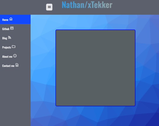
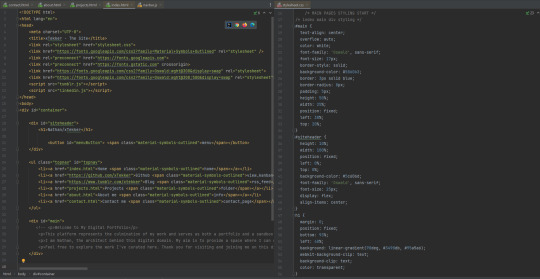
I used a CSS background generator from @xiacodes (She has some really cool webdev resources on her blog) to make the background and I changed some of the properties of the elements, tidied up the backend code and removed some redundant code which was messing with the navbar.
Overall, today was about finishing the nav bar with javascript, finding a decent background and tidying up the code.
Tomorrow, I shall tackle the projects page, I plan to display some of my java and python games/projects with a brief explanation of the process, some issues I encounted and how I solved them with a button to play that game yourself in a new window. I have a feeling this won't go as planned though.
24 notes
·
View notes