#progress bar html css
Explore tagged Tumblr posts
Visit Tumblr Blog
Explore Tumblr blogs with no restrictions, modern design and the best experience.
Last Seen Tumblr Blogs


Fun Fact
China blocked Tumblr because of pornography and censorship problems in 2013.
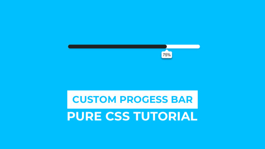
Text
animated progress bar
#progress bar css#progress bar html css#codingflicks#html css#frontend#animated skill bar#css#html#css3#code#learn to code#frontenddevelopment
3 notes
·
View notes
Text

CSS Progress Bar Animation
#css progress bar animation#codenewbies#html css#frontenddevelopment#html5 css3#css animation examples#pure css animation#css animation tutorial#css#webdesign#code#html css animation#css progress bar
5 notes
·
View notes
Text

Animated Loading Progress Bar
#loading progress bar#progress bar animation#css animation tutorial#html css#css#divinectorweb#webdesign#html#css3#css animation examples
2 notes
·
View notes
Text
shameless self promotion sunday
tagged by @foxboyclit and @thegreatobsesso, thank you both!
i love all my fics but also i do in fact do other things sometimes, and i’m really quite proud of my little neocities site. it’s not perfect, and it’s very much a work in progress, but the parts that are done I really like!
i have all my fic up on there, and a load of my playlists (with meta commentary on some!), plus I made sections for Obedience and obsession that have some very neat looking character pages...i love tinkering with html and css, and i love having a project that is purely for fun and not remotely about demonstrating any kind of skill.
i've really enjoyed solving such puzzles as 'how to make a horizontal menu bar' and 'how to make a reactive image grid'


anyway i just like my lil hand-coded stick-figure of a website, and if anyone else has a neocities let me know, i wanna put you in my list of friend links~
no-pressure tagging @oh-no-another-idea @chauceryfairytales @reneesbooks and @talesfromaurea to do some shameless self promotion (on a sunday or any other day, all days are good for singing your own praises)
#writeblr#tag games#neocities#id in alt#id in alt text#self promotion sunday#shameless self promo#it is not the most accessible or cross platform site but i did make it myself and i am Not a wbe developer#by any stretch#i just like doing it! it's fun!#plus it's my backup place for fics#and a place if people don't want to use ao3 or dreamwidth#i also really like that i have a place for my playlists now#cause i love making covers and writing track commentary#listen to my yap about my music choices for my blorbos!!!
15 notes
·
View notes
Note
sorry to bother you but i wanted to ask how you're enjoying using Obsidian? I've been eyeing it for a while but would love to know your thoughts, highlights, lowlights, etc :) if you don't mind sharing, ofc!
No worries! The short version is that I've been enjoying Obsidian quite a lot, and I find that it serves all of my needs nicely without any fuss. Using it is rather frictionless, I think, and getting used to it was pretty easy though it did take some willingness to very much learn to navigate its menus and features and how it lays everything out. It's not at all difficult, but I do think you have to sit with it for a bit. It's currently my main writing program with the exception of screenplays, for which I use Highland 2.
For context on myself, my writing needs are rather straightforward. I use these sorts of apps and programs to write and organize my fanfic, original prose writing, professional correspondence, and journalistic article drafts. I previously used Notion, which I left because of the big NotionAI push. Before Notion, I used Bear, though I can't remember why I stopped using it; I haven't checked out Bear 2, so I don't know if it suits my needs.
When I was shopping around for a new program to use, the following points were important to me, in no particular order:
no native / built-in generative AI assistants
interface is simple and clean or had customization or community themes that would make it so
offline access
mobile app with document sync
ability to organize and group notes through a folder, tag, or similar system
not too many Things going on with it or I could very easily ignore stuff I didn't use without them cluttering up the UI or my space
Obsidian organizes files within "vaults", of which you can have multiple, each of which are connected to folders that are stored locally on my laptop (or my phone). I love this. I have local versions of all of my notes. I can literally find all my stuff as markdown files within a folder on my desktop and open them up in another program with EASE. If you are someone who doesn't have a lot of storage space, this might be an issue, but for me, this is a very bright highlight.
The biggest lowlight for me is that mobile sync is reliant on a subscription fee, but considering that the rest of the program is free and the fee is small, I found this ultimately a very small concern. I very critically need mobile sync because I spend a significant amount of time writing from my phone. The mobile sync is incredibly good; it keeps all documents synchronized very well, and I have yet to run into version conflicts that cause me to accidentally overwrite and lose significant progress. I don't even have to close files on my laptop first; they'll just update in real-time on my screen like Google Docs. Sometimes I'll name documents something that my phone's file path system cannot handle; Obsidian warns me that it cannot fetch and sync these files with illegal names, and I like that it keeps me informed about that.
It has both a folder system and a tag system, which allows you to organize your files. I only use the folder system because my needs are simple, but the tag system is also solid. It also has a robust search system. It also has a bookmarking system to further organize your stuff. I don't have enough files to use that, but it is available, and I think that's neat.
More precise customization can be difficult if you're not used to writing CSS. I am familiar with CSS, so I found this a small hurdle, but this will be a bigger issue for others. That said, this does mean that Obsidian is DEEPLY customizable, and there is a large gallery of community themes that offer a lot of styles that serve a wide variety of needs. There is also a deep bench of community plugins to help get Obsidian to do what you want — I have plugins that make the word count in the status bar show the count of highlighted text and allow me to copy text as HTML instead of formatted text or markdown. There is also an active Obsidian community and forum, so you will not be necessarily troubleshooting customization alone.
Other small things that occur to me to mention right now: It supports opening files in multiple windows, and it has a tab system, which is really neat. The ability to open multiple files at a time is very good. You can also open files side-by-side for easy comparison, which is useful for more technical work. I don't use Obsidian for coding or wiki work, but I can imagine this being really useful for that. It has a reading mode. Offers a version history with a "show changes" mode and restoration capability. File merge capability. You can open images into it and organize them like any other file.
All in all, I'm very happy with it, and it serves all of my personal needs very well. I generally give it a blanket recommendation, again noting that I think it does take sitting with to get used to some of its features and UI and customizing it to your needs and preferences, but I don't think that's super difficult with some patience and time.
13 notes
·
View notes
Text
How to Create Multi-Step Forms With Vanilla JavaScript and CSS
New Post has been published on https://thedigitalinsider.com/how-to-create-multi-step-forms-with-vanilla-javascript-and-css/
How to Create Multi-Step Forms With Vanilla JavaScript and CSS
Multi-step forms are a good choice when your form is large and has many controls. No one wants to scroll through a super-long form on a mobile device. By grouping controls on a screen-by-screen basis, we can improve the experience of filling out long, complex forms.
But when was the last time you developed a multi-step form? Does that even sound fun to you? There’s so much to think about and so many moving pieces that need to be managed that I wouldn’t blame you for resorting to a form library or even some type of form widget that handles it all for you.
But doing it by hand can be a good exercise and a great way to polish the basics. I’ll show you how I built my first multi-step form, and I hope you’ll not only see how approachable it can be but maybe even spot areas to make my work even better.
We’ll walk through the structure together. We’ll build a job application, which I think many of us can relate to these recent days. I’ll scaffold the baseline HTML, CSS, and JavaScript first, and then we’ll look at considerations for accessibility and validation.
I’ve created a GitHub repo for the final code if you want to refer to it along the way.
The structure of a multi-step form
Our job application form has four sections, the last of which is a summary view, where we show the user all their answers before they submit them. To achieve this, we divide the HTML into four sections, each identified with an ID, and add navigation at the bottom of the page. I’ll give you that baseline HTML in the next section.
Navigating the user to move through sections means we’ll also include a visual indicator for what step they are at and how many steps are left. This indicator can be a simple dynamic text that updates according to the active step or a fancier progress bar type of indicator. We’ll do the former to keep things simple and focused on the multi-step nature of the form.,
The structure and basic styles
We’ll focus more on the logic, but I will provide the code snippets and a link to the complete code at the end.
Let’s start by creating a folder to hold our pages. Then, create an index.html file and paste the following into it:
Open HTML
<form id="myForm"> <section class="group-one" id="one"> <div class="form-group"> <div class="form-control"> <label for="name">Name <span style="color: red;">*</span></label> <input type="text" id="name" name="name" placeholder="Enter your name"> </div> <div class="form-control"> <label for="idNum">ID number <span style="color: red;">*</span></label> <input type="number" id="idNum" name="idNum" placeholder="Enter your ID number"> </div> </div> <div class="form-group"> <div class="form-control"> <label for="email">Email <span style="color: red;">*</span></label> <input type="email" id="email" name="email" placeholder="Enter your email"> </div> <div class="form-control"> <label for="birthdate">Date of Birth <span style="color: red;">*</span></label> <input type="date" id="birthdate" name="birthdate" max="2006-10-01" min="1924-01-01"> </div> </div> </section> <section class="group-two" id="two"> <div class="form-control"> <label for="document">Upload CV <span style="color: red;">*</span></label> <input type="file" name="document" id="document"> </div> <div class="form-control"> <label for="department">Department <span style="color: red;">*</span></label> <select id="department" name="department"> <option value="">Select a department</option> <option value="hr">Human Resources</option> <option value="it">Information Technology</option> <option value="finance">Finance</option> </select> </div> </section> <section class="group-three" id="three"> <div class="form-control"> <label for="skills">Skills (Optional)</label> <textarea id="skills" name="skills" rows="4" placeholder="Enter your skills"></textarea> </div> <div class="form-control"> <input type="checkbox" name="terms" id="terms"> <label for="terms">I agree to the terms and conditions <span style="color: red;">*</span></label> </div> <button id="btn" type="submit">Confirm and Submit</button> </section> <div class="arrows"> <button type="button" id="navLeft">Previous</button> <span id="stepInfo"></span> <button type="button" id="navRight">Next</button> </div> </form> <script src="script.js"></script>
Looking at the code, you can see three sections and the navigation group. The sections contain form inputs and no native form validation. This is to give us better control of displaying the error messages because native form validation is only triggered when you click the submit button.
Next, create a styles.css file and paste this into it:
Open base styles
:root --primary-color: #8c852a; --secondary-color: #858034; body font-family: sans-serif; line-height: 1.4; margin: 0 auto; padding: 20px; background-color: #f4f4f4; max-width: 600px; h1 text-align: center; form background: #fff; padding: 40px; border-radius: 5px; box-shadow: 0 0 10px rgba(0, 0, 0, 0.1); display: flex; flex-direction: column; .form-group display: flex; gap: 7%; .form-group > div width: 100%; input:not([type="checkbox"]), select, textarea width: 100%; padding: 8px; border: 1px solid #ddd; border-radius: 4px; .form-control margin-bottom: 15px; button display: block; width: 100%; padding: 10px; color: white; background-color: var(--primary-color); border: none; border-radius: 4px; cursor: pointer; font-size: 16px; button:hover background-color: var(--secondary-color); .group-two, .group-three display: none; .arrows display: flex; justify-content: space-between align-items: center; margin-top: 10px; #navLeft, #navRight width: fit-content; @media screen and (max-width: 600px) .form-group flex-direction: column;
Open up the HTML file in the browser, and you should get something like the two-column layout in the following screenshot, complete with the current page indicator and navigation.
Adding functionality with vanilla JavaScript
Now, create a script.js file in the same directory as the HTML and CSS files and paste the following JavaScript into it:
Open base scripts
const stepInfo = document.getElementById("stepInfo"); const navLeft = document.getElementById("navLeft"); const navRight = document.getElementById("navRight"); const form = document.getElementById("myForm"); const formSteps = ["one", "two", "three"]; let currentStep = 0; function updateStepVisibility() formSteps.forEach((step) => document.getElementById(step).style.display = "none"; ); document.getElementById(formSteps[currentStep]).style.display = "block"; stepInfo.textContent = `Step $currentStep + 1 of $formSteps.length`; navLeft.style.display = currentStep === 0 ? "none" : "block"; navRight.style.display = currentStep === formSteps.length - 1 ? "none" : "block"; document.addEventListener("DOMContentLoaded", () => navLeft.style.display = "none"; updateStepVisibility(); navRight.addEventListener("click", () => if (currentStep < formSteps.length - 1) currentStep++; updateStepVisibility(); ); navLeft.addEventListener("click", () => if (currentStep > 0) currentStep--; updateStepVisibility(); ); );
This script defines a method that shows and hides the section depending on the formStep values that correspond to the IDs of the form sections. It updates stepInfo with the current active section of the form. This dynamic text acts as a progress indicator to the user.
It then adds logic that waits for the page to load and click events to the navigation buttons to enable cycling through the different form sections. If you refresh your page, you will see that the multi-step form works as expected.
Multi-step form navigation
Let’s dive deeper into what the Javascript code above is doing. In the updateStepVisibility() function, we first hide all the sections to have a clean slate:
formSteps.forEach((step) => document.getElementById(step).style.display = "none"; );
Then, we show the currently active section:
document.getElementById(formSteps[currentStep]).style.display = "block";`
Next, we update the text that indicators progress through the form:
stepInfo.textContent = `Step $currentStep + 1 of $formSteps.length`;
Finally, we hide the Previous button if we are at the first step and hide the Next button if we are at the last section:
navLeft.style.display = currentStep === 0 ? "none" : "block"; navRight.style.display = currentStep === formSteps.length - 1 ? "none" : "block";
Let’s look at what happens when the page loads. We first hide the Previous button as the form loads on the first section:
document.addEventListener("DOMContentLoaded", () => navLeft.style.display = "none"; updateStepVisibility();
Then we grab the Next button and add a click event that conditionally increments the current step count and then calls the updateStepVisibility() function, which then updates the new section to be displayed:
navRight.addEventListener("click", () => if (currentStep < formSteps.length - 1) currentStep++; updateStepVisibility(); );
Finally, we grab the Previous button and do the same thing but in reverse. Here, we are conditionally decrementing the step count and calling the updateStepVisibility():
navLeft.addEventListener("click", () => if (currentStep > 0) currentStep--; updateStepVisibility(); );
Handling errors
Have you ever spent a good 10+ minutes filling out a form only to submit it and get vague errors telling you to correct this and that? I prefer it when a form tells me right away that something’s amiss so that I can correct it before I ever get to the Submit button. That’s what we’ll do in our form.
Our principle is to clearly indicate which controls have errors and give meaningful error messages. Clear errors as the user takes necessary actions. Let’s add some validation to our form. First, let’s grab the necessary input elements and add this to the existing ones:
const nameInput = document.getElementById("name"); const idNumInput = document.getElementById("idNum"); const emailInput = document.getElementById("email"); const birthdateInput = document.getElementById("birthdate") const documentInput = document.getElementById("document"); const departmentInput = document.getElementById("department"); const termsCheckbox = document.getElementById("terms"); const skillsInput = document.getElementById("skills");
Then, add a function to validate the steps:
Open validation script
function validateStep(step)
Here, we check if each required input has some value and if the email input has a valid input. Then, we set the isValid boolean accordingly. We also call a showError() function, which we haven’t defined yet.
Paste this code above the validateStep() function:
function showError(input, message) const formControl = input.parentElement; const errorSpan = formControl.querySelector(".error-message"); input.classList.add("error"); errorSpan.textContent = message;
Now, add the following styles to the stylesheet:
Open validation styles
input:focus, select:focus, textarea:focus outline: .5px solid var(--primary-color); input.error, select.error, textarea.error outline: .5px solid red; .error-message font-size: x-small; color: red; display: block; margin-top: 2px; .arrows color: var(--primary-color); font-size: 18px; font-weight: 900; #navLeft, #navRight display: flex; align-items: center; gap: 10px; #stepInfo color: var(--primary-color);
If you refresh the form, you will see that the buttons do not take you to the next section till the inputs are considered valid:
Finally, we want to add real-time error handling so that the errors go away when the user starts inputting the correct information. Add this function below the validateStep() function:
Open real-time validation script
function setupRealtimeValidation() nameInput.addEventListener("input", () => if (nameInput.value.trim() !== "") clearError(nameInput); ); idNumInput.addEventListener("input", () => if (idNumInput.value.trim() !== "") clearError(idNumInput); ); emailInput.addEventListener("input", () => if (emailInput.validity.valid) clearError(emailInput); ); birthdateInput.addEventListener("change", () => if (birthdateInput.value !== "") clearError(birthdateInput); ); documentInput.addEventListener("change", () => if (documentInput.files[0]) clearError(documentInput); ); departmentInput.addEventListener("change", () => if (departmentInput.value !== "") clearError(departmentInput); ); termsCheckbox.addEventListener("change", () => if (termsCheckbox.checked) clearError(termsCheckbox); );
This function clears the errors if the input is no longer invalid by listening to input and change events then calling a function to clear the errors. Paste the clearError() function below the showError() one:
function clearError(input) const formControl = input.parentElement; const errorSpan = formControl.querySelector(".error-message"); input.classList.remove("error"); errorSpan.textContent = "";
And now the errors clear when the user types in the correct value:
The multi-step form now handles errors gracefully. If you do decide to keep the errors till the end of the form, then at the very least, jump the user back to the erroring form control and show some indication of how many errors they need to fix.
Handling form submission
In a multi-step form, it is valuable to show the user a summary of all their answers at the end before they submit and to offer them an option to edit their answers if necessary. The person can’t see the previous steps without navigating backward, so showing a summary at the last step gives assurance and a chance to correct any mistakes.
Let’s add a fourth section to the markup to hold this summary view and move the submit button within it. Paste this just below the third section in index.html:
Open HTML
<section class="group-four" id="four"> <div class="summary-section"> <p>Name: </p> <p id="name-val"></p> <button type="button" class="edit-btn" id="name-edit"> <span>✎</span> <span>Edit</span> </button> </div> <div class="summary-section"> <p>ID Number: </p> <p id="id-val"></p> <button type="button" class="edit-btn" id="id-edit"> <span>✎</span> <span>Edit</span> </button> </div> <div class="summary-section"> <p>Email: </p> <p id="email-val"></p> <button type="button" class="edit-btn" id="email-edit"> <span>✎</span> <span>Edit</span> </button> </div> <div class="summary-section"> <p>Date of Birth: </p> <p id="bd-val"></p> <button type="button" class="edit-btn" id="bd-edit"> <span>✎</span> <span>Edit</span> </button> </div> <div class="summary-section"> <p>CV/Resume: </p> <p id="cv-val"></p> <button type="button" class="edit-btn" id="cv-edit"> <span>✎</span> <span>Edit</span> </button> </div> <div class="summary-section"> <p>Department: </p> <p id="dept-val"></p> <button type="button" class="edit-btn" id="dept-edit"> <span>✎</span> <span>Edit</span> </button> </div> <div class="summary-section"> <p>Skills: </p> <p id="skills-val"></p> <button type="button" class="edit-btn" id="skills-edit"> <span>✎</span> <span>Edit</span> </button> </div> <button id="btn" type="submit">Confirm and Submit</button> </section>
Then update the formStep in your Javascript to read:
const formSteps = ["one", "two", "three", "four"];
Finally, add the following classes to styles.css:
.summary-section display: flex; align-items: center; gap: 10px; .summary-section p:first-child width: 30%; flex-shrink: 0; border-right: 1px solid var(--secondary-color); .summary-section p:nth-child(2) width: 45%; flex-shrink: 0; padding-left: 10px; .edit-btn width: 25%; margin-left: auto; background-color: transparent; color: var(--primary-color); border: .7px solid var(--primary-color); border-radius: 5px; padding: 5px; .edit-btn:hover border: 2px solid var(--primary-color); font-weight: bolder; background-color: transparent;
Now, add the following to the top of the script.js file where the other consts are:
const nameVal = document.getElementById("name-val"); const idVal = document.getElementById("id-val"); const emailVal = document.getElementById("email-val"); const bdVal = document.getElementById("bd-val") const cvVal = document.getElementById("cv-val"); const deptVal = document.getElementById("dept-val"); const skillsVal = document.getElementById("skills-val"); const editButtons = "name-edit": 0, "id-edit": 0, "email-edit": 0, "bd-edit": 0, "cv-edit": 1, "dept-edit": 1, "skills-edit": 2 ;
Then add this function in scripts.js:
function updateSummaryValues() nameVal.textContent = nameInput.value; idVal.textContent = idNumInput.value; emailVal.textContent = emailInput.value; bdVal.textContent = birthdateInput.value; const fileName = documentInput.files[0]?.name; if (fileName) const extension = fileName.split(".").pop(); const baseName = fileName.split(".")[0]; const truncatedName = baseName.length > 10 ? baseName.substring(0, 10) + "..." : baseName; cvVal.textContent = `$truncatedName.$extension`; else cvVal.textContent = "No file selected"; deptVal.textContent = departmentInput.value; skillsVal.textContent = skillsInput.value || "No skills submitted"; }
This dynamically inserts the input values into the summary section of the form, truncates the file names, and offers a fallback text for the input that was not required.
Then update the updateStepVisibility() function to call the new function:
function updateStepVisibility() formSteps.forEach((step) => document.getElementById(step).style.display = "none"; ); document.getElementById(formSteps[currentStep]).style.display = "block"; stepInfo.textContent = `Step $currentStep + 1 of $formSteps.length`; if (currentStep === 3) updateSummaryValues(); navLeft.style.display = currentStep === 0 ? "none" : "block"; navRight.style.display = currentStep === formSteps.length - 1 ? "none" : "block";
Finally, add this to the DOMContentLoaded event listener:
Object.keys(editButtons).forEach((buttonId) => const button = document.getElementById(buttonId); button.addEventListener("click", (e) => currentStep = editButtons[buttonId]; updateStepVisibility(); ); );
Running the form, you should see that the summary section shows all the inputted values and allows the user to edit any before submitting the information:
And now, we can submit our form:
form.addEventListener("submit", (e) => e.preventDefault(); if (validateStep(2)) alert("Form submitted successfully!"); form.reset(); currentFormStep = 0; updateStepVisibility(); );
Our multi-step form now allows the user to edit and see all the information they provide before submitting it.
Accessibility tips
Making multi-step forms accessible starts with the basics: using semantic HTML. This is half the battle. It is closely followed by using appropriate form labels.
Other ways to make forms more accessible include giving enough room to elements that must be clicked on small screens and giving meaningful descriptions to the form navigation and progress indicators.
Offering feedback to the user is an important part of it; it’s not great to auto-dismiss user feedback after a certain amount of time but to allow the user to dismiss it themselves. Paying attention to contrast and font choice is important, too, as they both affect how readable your form is.
Let’s make the following adjustments to the markup for more technical accessibility:
Add aria-required="true" to all inputs except the skills one. This lets screen readers know the fields are required without relying on native validation.
Add role="alert" to the error spans. This helps screen readers know to give it importance when the input is in an error state.
Add role="status" aria-live="polite" to the .stepInfo. This will help screen readers understand that the step info keeps tabs on a state, and the aria-live being set to polite indicates that should the value change, it does not need to immediately announce it.
In the script file, replace the showError() and clearError() functions with the following:
function showError(input, message) const formControl = input.parentElement; const errorSpan = formControl.querySelector(".error-message"); input.classList.add("error"); input.setAttribute("aria-invalid", "true"); input.setAttribute("aria-describedby", errorSpan.id); errorSpan.textContent = message; function clearError(input) const formControl = input.parentElement; const errorSpan = formControl.querySelector(".error-message"); input.classList.remove("error"); input.removeAttribute("aria-invalid"); input.removeAttribute("aria-describedby"); errorSpan.textContent = "";
Here, we programmatically add and remove attributes that explicitly tie the input with its error span and show that it is in an invalid state.
Finally, let’s add focus on the first input of every section; add the following code to the end of the updateStepVisibility() function:
const currentStepElement = document.getElementById(formSteps[currentStep]); const firstInput = currentStepElement.querySelector( "input, select, textarea" ); if (firstInput) firstInput.focus();
And with that, the multi-step form is much more accessible.
Conclusion
There we go, a four-part multi-step form for a job application! As I said at the top of this article, there’s a lot to juggle — so much so that I wouldn’t fault you for looking for an out-of-the-box solution.
But if you have to hand-roll a multi-step form, hopefully now you see it’s not a death sentence. There’s a happy path that gets you there, complete with navigation and validation, without turning away from good, accessible practices.
And this is just how I approached it! Again, I took this on as a personal challenge to see how far I could get, and I’m pretty happy with it. But I’d love to know if you see additional opportunities to make this even more mindful of the user experience and considerate of accessibility.
References
Here are some relevant links I referred to when writing this article:
How to Structure a Web Form (MDN)
Multi-page Forms (W3C.org)
Create accessible forms (A11y Project)
#:not#Accessibility#ADD#aria#Article#Articles#attention#attributes#background#border-radius#box#box-shadow#browser#buttons#challenge#change#classes#code#Color#content#CSS#CV#dept#direction#display#email#error handling#event#Events#Exercise
3 notes
·
View notes
Text
CSS Only Circular Reading Progress Indicator
A pure CSS circular reading progress indicator that provides a visual representation of the user’s current reading progress. The circular progress bar automatically fills up, and the percentage of the page that has been scrolled is displayed in the middle of the indicator as your users scroll down the page. How to use it: 1. Create the HTML for the reading progress indicator. <div…

View On WordPress
3 notes
·
View notes
Text

throwback thursday: mariollette empire
¡Hola a todos! Quería compartir algunas de las tablillas que he hecho hace algunos cuantos años, que quizás son muy antiguas o muy específicas para compartir el código, pero que son trabajitos que me siguen gustando y me gustaría no dejar en el olvido. Como cuando la gente hacía hashtags de #throwbackthursday #tbt o como le hayan puesto (?)
Y recordando los tiempos antes del 2015, al menos en mis partes del internet todavía no se usaba fuertemente el CSS o el HTML--lo único parecido a esquematizar algo era usar tablas y WYSIWYG. Todo el peso del diseño realmente recaía en eso, el diseño, los gráficos. En esos tiempos, en verdad que un simple efecto hover era solo posible para los gurús sabios de los códigos.
En otros temas, miren estos efectos nunca antes vistos (en el 2011), woooow, increíble 😎

(pensándolo bien, la mayoría de esos componentes (con un poco más de trabajo hasta el ciclo de caminata inclusive) se pueden lograr actualmente con puro código, pero al igual que en ese tiempo que ahora, siempre es más fácil hacerlo todo con una imagen :9 )
Y bueno, la plataforma daba poca oportunidad de hacer algo, pero se lograba. Y luego de hacer tablillas que realmente eran gráficos elaborados con un espacio para poner un div con scroll y más nada, empecé a hacer tablillas que se centraban más en el código:


(miren allí, apenas entendiendo de combinación de colores y letras y todo, una ternura 🥰)
Y pues eventualmente nos mudamos de plataforma a un foro foro, más concretamente jcink, y usamos una de las skins gratis que habían en los foros de resources. ¡Pero no venía con tablillas de uso! Así que tuve que hacer algunas cuantas siguiendo la estética del skin.

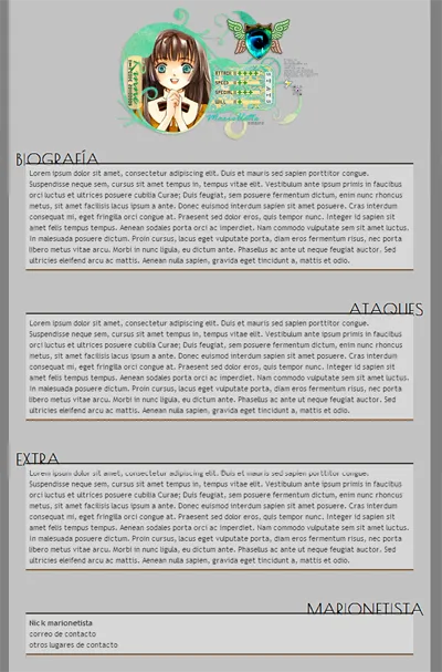
Estaba la tablilla general de información, la parte del título, una imagen representativa, un subtítulo, y el contenido dentro. Simple, estético, y fácil de usar (espero(?)). También en ciertas secciones habían agregados, por ejemplo aquí el agregado para ingresar información como pseudo tooltips, para marcar ciertos detalles.

Otro agregado fue para la parte de los tipos de personajes, que tenían cada uno sus stats representativos, y hasta ciertas formas que podían adaptar. ¡Y creo que era mi primera vez usando los progress bars! Y también creo que era la primera vez viendo que los progress bars eran usados. ¡Pero son muy útiles! Tan útiles que adaptamos el perfil en cada post para que se muestre, así:

Repletito de información, pero de una forma visible y entendible 👌
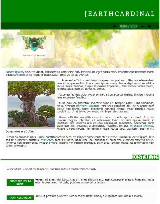
Luego, la información de las zonas de rol, usaba como base el diseño general, pero con el agregado importantísimo de un reproductor de música, obvs. En ese tiempo usábamos un reproductor de música hecho con Flash, pero ya no sirve, y tuve que medio apañarme con los reproductores actuales de HTML5. De cualquier forma, se ve hermoso todavía uvu.

Y último, pero no menos importante, la ficha de personaje, la cual podía tener los mismos agregados que los anteriores, pero cambiaba la parte de la imagen agregándole la información del personaje. De hecho, la parte de las capsulitas de la parte de Distritos (y aquí no se ve, pero las tablillas cambiaban de color según la clase que se necesitaba) fue una idea que se mantuvo desde la última ficha que había hecho en la versión anterior, pero mejorada ✨
¡Y bueno! Creo que ese ha sido mi viaje por las memorias. Quizás hubieron más cositas que se me habrán pasado, o cosas muy simples o en las que apenas ayudé y que no mencionaría como mías, pero estuvo bonito~
Hay algunas de estas tablillas que no compartiría el código, pero otras que probablemente las termine rehaciendo y compartiendo si la gente está interesada though!
Y eso, si logro encontrar algunos otros códigos a los que quisiera rememorar, quizás prepare otro throwback. Pero de momento nos estamos viendo~
0 notes
Text
Progress Bars
YAYINDA! https://mguzel.com.tr/progress-bars/
Progress Bars
Progress Bars Shortcodes
Check out all the progress bars options and can be set in different styles with Visual Composer Progress Bar, Pie Chart shortcodes.
Default
60%
0%
Contextual classes
Striped
Animated
Border Radius
Sizes
Animated & Tooltips
HTML/CSS
100%
Design
85%
WordPress
75%
Photoshop
85%
Colors
Primary
50%
Secondary
70%
Tertiary
75%
Quaternary
40%
Circular
HTML/CSS0%
HTML/CSS
Sizes
0%
HTML/CSS0%
HTML/CSS0%
Options
HTML/CSS0%
HTML/CSS0%
HTML/CSS0%
0 notes
Text
CSS Progress Bar with Percentage
#css progress bar#progress bar#progress bar css#progress bar html css#css animation tutorial#pure css animation#html css#learn to code#frontend#css#html#css3#frontenddevelopment#code#animation#CSS Progress Bar with Percentage
3 notes
·
View notes
Text

CSS Progress Bar Animation
#css progress bar animation#css progress bar#css3#html css#codenewbies#css#css animation examples#pure css animation#css animation tutorial#html5 css3#frontend
2 notes
·
View notes
Text

Circular Progress Bar JavaScript
#circular progress bar#html css#code#divinector#divinectorweb#javascript#javascript projects#html5 css3#plugins#css#html#webdesign#frontenddevelopment#learn to code
0 notes
Text
Five Key Tips for eCommerce Optimization and How to Implement Them
Optimizing an eCommerce site can significantly enhance user experience, increase conversion rates, and boost sales. Here are five key tips for eCommerce optimization and how to implement them:
Improve Page Load Speed How:
Optimize Images: Compress images using tools like TinyPNG or JPEG Optimizer without compromising on quality.
Use a Content Delivery Network (CDN): CDNs store copies of your site’s static files closer to users, reducing latency.
Minimize HTTP Requests: Combine files (CSS, JavaScript) to reduce the number of requests.
Leverage Browser Caching: Enable caching so that users’ browsers can store parts of your site, which speeds up subsequent visits.
Enable Compression: Use Gzip or Brotli to compress your site’s files. Collaborating with an eCommerce Marketing Agency can help implement these optimizations effectively.
Enhance Mobile Experience How:
Responsive Design: Ensure your site is mobile-friendly and adjusts smoothly to different screen sizes.
Simplify Navigation: Use a clear, easy-to-navigate menu structure tailored for mobile users.
Optimize Touch Elements: Make sure buttons and links are easily tappable with enough space around them.
Accelerated Mobile Pages (AMP): Implement AMP to speed up page loading on mobile devices. Consulting an Amazon Marketing Agency can streamline the mobile optimization process.
Simplify the Checkout Process How:
Reduce Checkout Steps: Aim for a one-page checkout or minimize the number of steps required to complete a purchase.
Guest Checkout: Allow users to purchase without creating an account.
Auto-fill and Auto-complete: Use tools to fill in user information automatically based on previous data.
Clear Progress Indicators: Show users where they are in the checkout process and what steps remain. An eCommerce Marketing Agency can assist in designing user-friendly checkout processes.
Optimize Product Pages How:
High-Quality Images and Videos: Use high-resolution images and videos from multiple angles to showcase products.
Detailed Descriptions: Write comprehensive and engaging product descriptions with key features, benefits, and specifications.
Customer Reviews and Ratings: Display user reviews and ratings to build trust and provide social proof.
Call-to-Action (CTA): Use clear and compelling CTAs like “Add to Cart” or “Buy Now.” Partnering with an Amazon Marketing Agency can enhance product page effectiveness.
Utilize Data and Analytics How:
Google Analytics: Set up and regularly review Google Analytics to track user behavior, traffic sources, and conversion rates.
A/B Testing: Use tools like Optimizely or VWO to test different versions of your website to see which performs better.
Heatmaps and Session Recordings: Use tools like Hotjar or Crazy Egg to understand how users interact with your site.
Conversion Funnel Analysis: Identify where users drop off in the purchasing process and make improvements to those areas. An eCommerce Marketing Agency can analyze these data points to provide actionable insights.
Implementation Example: Improving Page Load Speed:
Optimize Images:
Use TinyPNG to compress product images.
Implement srcset in HTML to serve appropriate image sizes based on the user’s device.
CDN Setup:
Choose a CDN provider like Cloudflare or Amazon CloudFront.
Configure your website to serve static assets (images, CSS, JavaScript) through the CDN.
Enhancing Mobile Experience:
Responsive Design:
Use CSS media queries to create a responsive layout.
Test the site across various devices and browsers using tools like BrowserStack.
Simplify Navigation:
Implement a hamburger menu for mobile devices.
Ensure the search bar is easily accessible on mobile.
By focusing on these key areas and continuously monitoring and refining your strategies, you can significantly enhance the performance and user experience of your eCommerce site. Collaborating with an eCommerce Marketing Agency or an Amazon Marketing Agency ensures your optimization efforts align with industry best practices and yield maximum results.
For more visits: Teamsuccesso
0 notes
Text
Create a Circular Progress Bar with HTML, CSS, and JavaScript
Hello everyone, today in this video we will be circular progress bar that will having a loading animation or a progress bar, but it will animate circularly. So if you want to learn how to build this please stick around to the end :)
Create a Circular Progress Bar with HTML, CSS, and JavaScript
Visit us :-
youtube
0 notes
Text
The Future of Mobile Commerce: How to Stay Ahead with Your App Development
The Future of Mobile Commerce: How to Stay Ahead with Your App Development
m COMMERCE, or mobile commerce, refers to the buying and selling of goods and services through mobile devices such as smartphones and tablets. With the increasing use of mobile devices for everyday tasks, m COMMERCE has become an essential part of the retail industry. As a result, businesses are increasingly turning to m COMMERCE app development to reach their customers on the go. Developing an m COMMERCE app involves creating a user-friendly interface that allows customers to browse products, make purchases, and manage their accounts seamlessly on their mobile devices. This requires a deep understanding of mobile app development, user experience design, and e-commerce functionality. To develop a successful m COMMERCE app, businesses need to consider the unique challenges and opportunities presented by mobile devices. This includes optimizing the app for different screen sizes, ensuring fast loading times, and providing a seamless checkout process. Additionally, m COMMERCE app development requires a strong focus on security and payment integration to protect customer data and facilitate secure transactions. Overall, understanding m COMMERCE app development involves a comprehensive approach to creating a mobile shopping experience that meets the needs and expectations of modern consumers.
Key Features and Functionality of m COMMERCE Apps
When it comes to M Commerce app development, there are several key features and functionalities that are essential for creating a successful mobile shopping experience. These include a user-friendly interface, seamless navigation, product search and filtering options, secure payment processing, and personalized recommendations. A user-friendly interface is crucial for ensuring that customers can easily browse products, add items to their cart, and complete their purchases without any hassle. Seamless navigation is also important for guiding users through the app and helping them find what they are looking for quickly and efficiently. Product search and filtering options are essential for allowing customers to find specific items or browse through different categories. This can include search bars, sorting options, and filters based on price, size, color, and other attributes. Secure payment processing is another key feature of m COMMERCE apps, as it is essential for protecting customer data and facilitating safe transactions. This involves integrating secure payment gateways and encryption methods to ensure that sensitive information is kept private. Finally, personalized recommendations can enhance the shopping experience by suggesting products based on a customer's browsing history, purchase behavior, and preferences. Overall, these key features and functionalities are essential for creating a successful m COMMERCE app that meets the needs and expectations of modern consumers.
Choosing the Right Platform for m COMMERCE App Development
When it comes to m COMMERCE app development, businesses have several options for choosing the right platform. This includes native app development for iOS and Android, hybrid app development, and progressive web apps. Native app development involves creating separate apps for iOS and Android using platform-specific programming languages such as Swift for iOS and Java for Android. This allows for greater customization and performance optimization but requires separate development efforts for each platform. Hybrid app development, on the other hand, involves using web technologies such as HTML, CSS, and JavaScript to create a single app that can run on both iOS and Android devices. This can be more cost-effective and efficient for businesses that want to reach a wider audience with a single app. Progressive web apps are another option for m COMMERCE app development, as they are web-based applications that can be accessed through a web browser but offer a similar experience to native apps. They are designed to work on any device with a web browser and can be installed on the home screen for easy access. Overall, choosing the right platform for m COMMERCE app development depends on factors such as budget, timeline, target audience, and desired features. Businesses should carefully consider their options and weigh the pros and cons of each platform before making a decision.
Design and User Experience Considerations for m COMMERCE Apps
Design and user experience are crucial considerations for m COMMERCE app development, as they directly impact how customers interact with the app and make purchasing decisions. A well-designed m COMMERCE app should have a clean and intuitive interface that makes it easy for users to navigate through different sections, browse products, and complete purchases. This involves using clear typography, high-quality images, and intuitive navigation elements such as menus, buttons, and search bars. In addition to visual design, user experience considerations are also important for creating a seamless shopping experience. This includes optimizing the app for different screen sizes and resolutions to ensure that it looks good on any device. It also involves minimizing loading times, streamlining the checkout process, and providing helpful features such as saved payment information and order tracking. Overall, design and user experience considerations are essential for creating an m COMMERCE app that is visually appealing, easy to use, and optimized for mobile devices.
Security and Payment Integration in m COMMERCE Apps
Security and payment integration are critical aspects of m COMMERCE app development, as they directly impact customer trust and confidence in making purchases through the app. To ensure the security of customer data, m COMMERCE apps should use encryption methods to protect sensitive information such as credit card details, personal information, and order history. This involves implementing secure payment gateways that comply with industry standards such as PCI DSS (Payment Card Industry Data Security Standard) to prevent unauthorized access to customer data. In addition to security measures, m COMMERCE apps should also provide seamless payment integration options to facilitate smooth transactions. This includes offering multiple payment methods such as credit cards, digital wallets, and alternative payment options to accommodate different customer preferences. It also involves optimizing the checkout process by minimizing the number of steps required to complete a purchase and providing clear instructions for entering payment information. Overall, security and payment integration are essential considerations for m COMMERCE app development to ensure that customers can shop with confidence and peace of mind.
Testing and Launching Your m COMMERCE App
Before launching an m COMMERCE app, businesses should conduct thorough testing to ensure that the app functions properly on different devices and operating systems. This involves testing for compatibility with various screen sizes, resolutions, and operating system versions to identify any potential issues or bugs that may affect the user experience. It also includes testing the app's performance under different network conditions to ensure that it loads quickly and responds smoothly to user interactions. In addition to technical testing, businesses should also conduct usability testing to gather feedback from real users about their experience with the app. This can involve conducting focus groups, surveys, or beta testing programs to identify any usability issues or areas for improvement. Once testing is complete, businesses can proceed with launching their m COMMERCE app by submitting it to the Apple App Store or Google Play Store for review and approval. This involves following the platform-specific guidelines for app submission and ensuring that the app meets all requirements for publication.
Marketing and Monetization Strategies for m COMMERCE Apps
After launching an m COMMERCE app, businesses should focus on marketing strategies to promote the app and attract new users. This can involve leveraging social media platforms, email marketing campaigns, search engine optimization (SEO), paid advertising, influencer partnerships, and other digital marketing tactics to raise awareness about the app and drive downloads. It also involves optimizing the app store listing with relevant keywords, high-quality images, compelling descriptions, and positive reviews to improve visibility in search results. In addition to marketing strategies, businesses should also consider monetization options for their m COMMERCE app to generate revenue. This can include offering in-app purchases, subscription services, advertising space, affiliate marketing partnerships, or other revenue streams to monetize the app. It also involves analyzing user data and behavior to identify opportunities for upselling or cross-selling products within the app to increase average order value. Overall, marketing and monetization strategies are essential for maximizing the success of an m COMMERCE app and driving long-term growth in sales and customer engagement. In conclusion, m COMMERCE app development involves a comprehensive approach to creating a mobile shopping experience that meets the needs and expectations of modern consumers. This includes understanding key features and functionalities of m COMMERCE apps, choosing the right platform for development, considering design and user experience considerations, implementing security measures and payment integration options, conducting thorough testing before launching the app, and implementing effective marketing and monetization strategies. By carefully considering these factors and following best practices in m COMMERCE app development, businesses can create successful mobile shopping experiences that drive sales growth and customer satisfaction in today's digital marketplace.
0 notes
Text
Retro CS 1.6 UI Kit for Web - cs16.css
cs16.css is a tiny JavaScript library that recreates Counter-Strike 1.6’s iconic user interface through pure CSS components. The library supports essential UI components like buttons, form fields, horizontal rules, progress bars, range sliders, and more. Each component preserves Counter-Strike 1.6’s distinctive appearance while functioning as standard HTML elements. How to use it: 1. Download and…
1 note
·
View note