#ColorSwatch
Explore tagged Tumblr posts
Visit Tumblr Blog
Explore Tumblr blogs with no restrictions, modern design and the best experience.
Last Seen Tumblr Blogs


Fun Fact
Celebrities use Tumblr as well.
Text
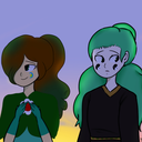
COLOR AS BRAND MEME: SWATCH

1 note
·
View note
Text
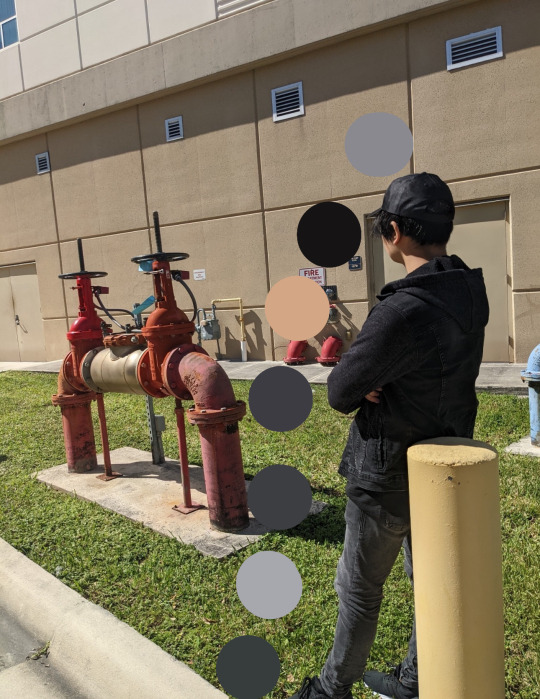
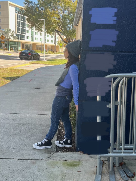
Color: Swatch
1290x1669 I like darker colors so I chose them as a monochrome tip. For this assignment, I did my best, paying attention to every detail. I took color samples from everywhere - a cap, hair, even my face and, of course, my outfit - a sweater, jeans, shoes. I then laid out the colors in order, showing exactly where each color came from, trying to illustrate different shades of black, where brighter shades show where the light hit, and dark ones, on the contrary, where the shadow was located, which in turn shows that under different lighting the black color can change its original meaning. This whole process not only shows my love for dark shades, but also allows people to see how everything is interconnected in my image.
1 note
·
View note
Text
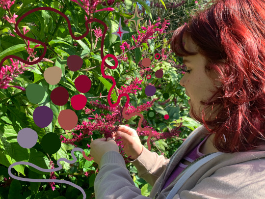
Color: Swatch
I have first included a video of how I found my color swatches.
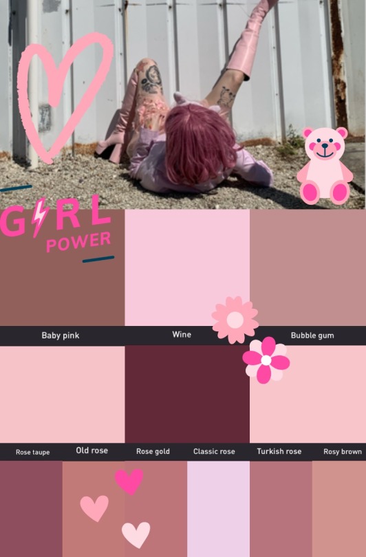
This is my color swatch. I wanted to highlight and focus on the absurdity of these color names. Maybe I’m being absurd and overthinking it but it feels like colors have gender?? because of it. How can all of these colors just be types of rose… it bothered me because I took swatches of my (male) friend and I got colors like “military brown” and “battleship blue.” I also added “female empowerment” stickers. I know women CHOOSING to wear the color pink is empowering. It’s just not something I feel empowered wearing, so I used them on the swatch collage ironically, and made sure to show the color names I found most absurd. I do have the hex codes of these colors as proof of them being swatches if needed.
Lastly, I distorted the whole image for fun and to show women are multi faceted.

Much better!!
1 note
·
View note
Text
Assignment #3 - Color: Swatch
Medium: Phone, Editing App
Dimensions: N/A
I have delved deeply into color theory and color swatches. For me, it's similar to learning about a color. Imagine it like a trip through a rainbow, where each hue has a distinct meaning and place in the rainbow. Every hue has a unique energy of its own, ranging from the passionate fire of red to the peaceful serenity of blue. I experimented with various blue tones, hues, and combinations of them, while using the environment around me in relationship to color. I'm getting to know these colors well through creative experimentation and exploration, discovering how they affect and interact with one another. While working on this color swatch, I have come to understand that making art that speaks to meaning and emotion is more important than simply combining colors on a palette. I also explored how various color combinations might elicit various emotions and moods. For instance, cool hues like blue and green may arouse feelings of peace and tranquility, while warm hues like red and orange may arouse feelings of energy and desire.
1 note
·
View note
Text

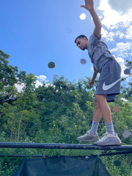
Color, Body, and Environment: Swatch
My colors for my swatch consisted of different types of blue. Most of it consist of light blues, medium tone blues, and dark blues. It was an interesting concept finding the types of blues that are in my photo.
1 note
·
View note
Text


I want the whole collection of the Windsor and Newton revival colors! But I wanted Tyrian purple the most!!!
#winsor and newton#tyrianpurple#color swatches#cinnabargreen#colorswatches#watercolor#art history#color history
1 note
·
View note
Text
Pantone Formula Guide
Buy Now Pantone Formula Guide Solid Coated and Uncoated. The Pantone Formula Guide is a universal color matching tool that includes 1800+ market-driven spot colors in two compact fan decks. Buy Now.

#PantoneFormulaGuide#PrintingIndustries#ColorMatching#GraphicDesign#Printers#ColorSwatches#CMYK#PMS#ColorAccuracy#ColorConsistency#PrintedMaterials#ColorPalette#Designers#ColorTheory#ColorPrinting#InkColors#ColorCharts#ColorInspiration#ColorCommunication#ColorPerfection
1 note
·
View note
Text

I know I haven't finished photo dumping my art, but, this girl found $1.49 and $0.74 oil paints (priced originally at $4.99-$9.99) and it was literally the best day of my life lmao.
Anyway I was only gonna swatch the colors I found that I never had before, but go big or go home, right? But that meant i had to go out to the store again and i found this pad of paper that was rough like canvas and works for oil paints and i was like going feral in a Michael's. Lol
I'm going to do greens and blues on a new sheet, and likely the rest if the colors on another. I even got FUN ONES like a METALLIC SILVER!!! WUUUUT!
0 notes
Text

runt doodles !! artist i colorswatched from/coloring inspo is the lovely 74n5n on here !!
captionless ver of the first one below cut

#everyone ignore that one brush stoke ive made so many small edits that im tired of resaving the files#jrwi wonderlust#wonderlust jrwi#just roll with it wonderlust#wonderlust#jrwi#jrwi show#just roll with it#runt jrwi#jrwi runt#digital art#arte arting
13 notes
·
View notes
Text


Quick gouache test of my himi gouache set. Did a study from James Gurney’s dinotopia.
July 24 2020
#theghostofdash#art#illustration#test#dinosaur#dinosaurs#dinosaurart#dinotopia#jamesgurney#himigouache#colorswatches#colortest#paleoart#dinosaurpainting#painting
73 notes
·
View notes
Note
dont know how else to put this buttt you lightened amirs skin pretty significantly in your most recent art :T thought youd like to know considering how aggressive youve been getting about it with others
? did i??? hold on i spent like 20 minutes colorswatching off his dossier pic and even then ended up having to fudge some of the midtones because the lighting on the render had a STRONG yellow cast to it that made everything i color dropped come up almost greenish… let me double check on a couple diff screens and make sure my monitor settings didn’t fuck me over somehow hold on
7 notes
·
View notes
Text
I think one of the strangest arguments regarding Natlan is the "Well, skin tones vary! Not everyone would be dark skinned either" conversation.
That is true! Cultures are very diverse and a good portion of them do have a lot of different skin tones, an entire range of them. ..But when you compare Natlans NPCs to Natlans playable characters, there's the very obvious flaw in that argument. The NPCs are diverse. They all have different skintones, bodies (sort of), some even have protective hairstyles. But then you look at the playable characters and that diversity is for some reason gone. They're not celebrating the diversity in the culture they took from - when your NPCs are more diverse than your main cast, that doesn't count. [Slightly. Natlans NPCs honestly don't even feel that diverse either, but I digress.]
When you can't showcase the same diversity in your characters, but you're fully capable of doing it in your side characters and NPCs, that doesn't mean anything. They're very obviously picking and choosing what skintones they deem as the most "profitable".
For some examples:
Here's some children of the echoes NPCs ; including a few nameless background filler ones. And a skintone thingy on a few of them. [Tried my best not to grab from shadows. The ones on stage are very likely under shadows so the shade I got likely isn't accurate.]

Then here's Xilonen and Kachina, and their comparison to our chart
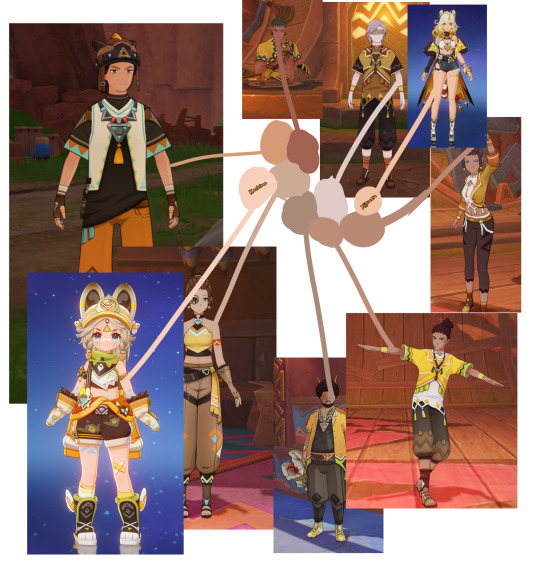
The NPCs don't really range that much originally, but there's still more darker shades than on our two playable units of the tribe.
Or how about Mualani?
Ororon and Citlali?
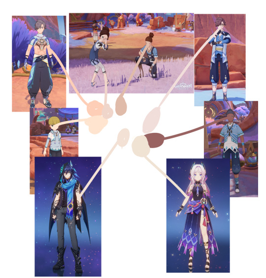
[The Masters of The Night-Wind seem like they're the most majority pale skinned]
Diversity isn't something you hide in the background on characters that don't even speak or have real meaning outside of extra dialogue. You want to know who the darkest character is probably going to be in Natlan? Lansan.
This is the ratio the playable characters are working with.
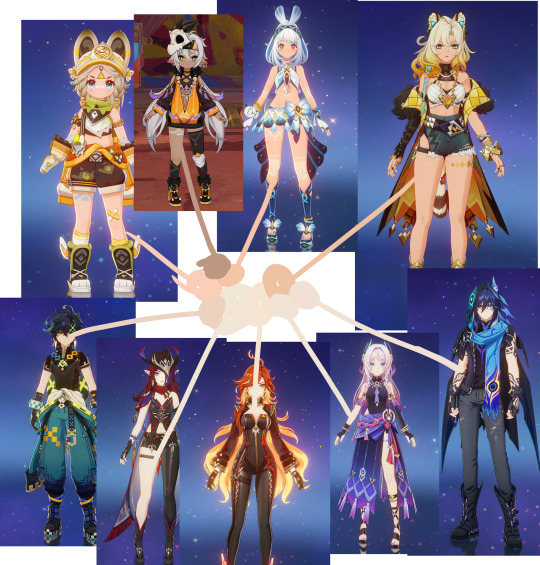
They're literally mostly the exact same shade. Mavuika, Chasca, Ororon and Citlali practically blended into one blob. Of course, this could be lighting, this could just be where I colorswatched! Maybe doing some on the head, others on the arm, and some on the leg or chest wasn't a good idea. Maybe I should've tried finding screenshots of them in-game and not on the archive. (I only own Kachina and Ororon on my account so it'd be difficult getting better screenshots) But there's not even a big difference in other places.
They are not properly showcasing the skin diversity in culture. And that's the stupidest argument I've ever seen regarding this.
It's good that people part of these cultures feel represented by what's here, I know people have said it when Sumeru had a big uproar too (I joined sometime during Wanderers release and that whole situation went under my radar). But the other half deserves to be represented too - not by the NPCs - but by the actual characters who will be on your screen 99% of the time. You shouldn't half ass someone's culture. Give them a variety of skintones and hair textures.
Honestly this'll probably be one of the last times I'll really rant about Natlan. Natlans entire thing is exhausting and it feels as though people are not really caring about it anymore. People still make mods and edit the characters, as they should, but literally most people I've seen pretty much immediately dropped the boycott and pulled every single one of them (or at least whoever they simped for) anyways. Which, yeah, is bound to happen. I know it happened with Sumeru, too. Where it started as an outrage but then people just kinda, forgot, or stopped caring about a boycott, and started pulling the characters immediately on their reruns. It'll happen with Natlan too, no doubt.
Personally. The only Natlan characters I plan to pull on release would be Lansan and Ifa. And if you can count Captiano (assuming he's playable). Everyone else? I don't really plan on it until I feel like progress has happened. I love the cast. Citlali, Mualani and Ororon are genuinely my favorite characters in this nation and I'd love having them on my account, but - I'm unsure. I know my goal was to ignore their banners until a certain point, where I feel it's better.
Honestly - anyone still participating in the whole thing with the Natlan banners, let me know your plans. Are they an eventual pull? Will you keep ignoring their banners? I need guidance.
#genshin impact#genshin impact natlan#im not sure if im really good at talking about this considering im not part of any of the cultures that natlan is#but#i hope this does make sense#sometimes my words can be choppy or weirdly done so please let me know if i say anything that can be taken in a negative way#💢 : °• Ranting •°#🎮 : °• Genshin Impact •°
3 notes
·
View notes
Text
.
#illustrator training 14
#colorswatches 🎨
https://www.instagram.com/p/DGp02B-OttJ/?igsh=MTl2aXIzZWs1ZnRmeg==

0 notes
Text

🎨✨ Color Your World with Endless Possibilities ✨🎨
Transform your space into a masterpiece with our wide range of paint options! From bold hues to calming neutrals, we’ve got every shade to bring your vision to life. Whether you’re going for a subtle accent wall or a full-room makeover, the right color makes all the difference.
🌟 Explore our collection and find your perfect shade today! 📌 Expert tips and services available to make your project stress-free. 💡 Pro Tip: Test your swatches in different lighting to see the magic!
Let’s paint something amazing together. 🖌️💫
#PaintYourHome #HomeDecorInspo #InteriorDesignGoals #DIYProjects #AccentWallIdeas #ColorSwatches
0 notes