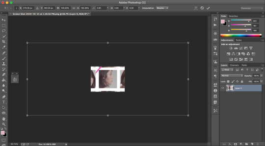
#Create Barcode with Image Inside It
Explore tagged Tumblr posts
Visit Tumblr Blog
Explore Tumblr blogs with no restrictions, modern design and the best experience.
Last Seen Tumblr Blogs


Fun Fact
1,644 Tumblr posts in 1 second.
Text
I have an idea.
well. I got an idea from my homework. Teacher gave me a topic. It's about creative thinking. So the point is i need to create an invention that no one ever think or create before. And teacher gave me a genre school which means i need to create invention about school.
An main idea.
well, the main idea that I’m going to start is make teacher and student feel more convenient to submit or check homework(books, worksheet whatever etc.)so this is the main idea. First of all I need you to image that in front of your classroom has locker or table are all line up. Well, I remember what my science teacher said to my class. “My AI will collect your notebooks every midday Friday” I know that it’s impossible to have an AI walkthrough the hall and collect students’ notebooks or maybe we have but not for my school. So everyone in my class knows that it’s impossible, everyone knows that it our teacher instead. And then this quote.. it inspires me. And I’m going to start with “homework collector machine”
How does it work?(cursory)
“Homework Collector Machine” will move through the hall and we’re going to set a position to make them stop and collect homework. Then it will check Student ID Name etc. and store it into our data base. So what’s inside the data base what we’re going to store our students’ information? Absolutely good question, the information that we’re going to store is basic information(name, student ID, room, class, subject etc.) and the most important information is List of submissions for each time. So the next question is “why is it important?” The answer is, because we can connect this information into other devices so teachers may put all this stuff into their excel or other machines to give scores to students. So second question is “How we’re going to know that whose is this homework?” well, this isn't easy solution anyway but if they could be a book if the book spine has each student barcode? Well. I don't have the greatest solution yet but i will keep thinking about it and update this information. However, after the process like what i just said they will send this data & the homework to teachers or another machine
Anyway, that's all from now. If i have more information or any idea i'll update later then
This is just a draft idea, i don't think that i'm going to do a prototype yet. Cause it take a lot of time and too much to afford. But i think some day
And you can also offer some ideas information or maybe ask questions etc. In the comment box. That would be great!
Thanks for reading this. Thank you.
0 notes
Text
Maximizing Precision in Automated Systems with AR1335 Autofocus Camera
Precision is critical in the fast developing field of automation. The AR1335 Autofocus Camera is a game-changing tool that provides automated systems with unmatched clarity and accuracy. This article explores the main characteristics of the AR1335 Autofocus Camera, its uses in many sectors, and how it improves automated systems' accuracy.
Comprehending the Autofocus Camera AR1335
The high-performance imaging AR1335 Autofocus Camera was created to satisfy the stringent needs of contemporary automation. This camera's cutting-edge autofocus system guarantees crisp, clear photos even in busy settings. Let's examine its main attributes and advantages:
Superior Autofocus Mechanism
The AR1335 Autofocus Camera's advanced autofocus mechanism is its core functionality. Thanks to this technology, the camera can concentrate on a subject no matter how far away or how quickly it moves by automatically adjusting the lens. The end product is always crisp images that improve automated systems' accuracy, which makes it perfect for situations where accuracy is essential.
Superior Clarity Photographs
With its remarkable resolution capabilities, the AR1335 Autofocus Camera produces detailed and excellent photographs. For applications that demand fine detail, like robots' accurate object detection or manufacturing's quality control, this high resolution is essential. Users can rely on their automated systems to capture and process photos with remarkable quality when they utilize the AR1335.
Automated Applications of the AR1335 Autofocus Camera
The AR1335 Autofocus Camera's versatility makes it appropriate for a broad range of applications in a variety of sectors. Here are a few crucial areas in which this camera shines:
Production and Inspection
Precision and consistency are essential in manufacturing. The AR1335 Autofocus Camera is an essential tool for quality control since it measures dimensions, checks for flaws, and makes sure that items meet specifications. Because of its precise autofocus and high-resolution images, automated systems can carry out thorough inspections with little assistance from humans, which lowers mistakes and boosts productivity.
Systems Autonomous and Robotic
The sophisticated image technology of the AR1335 Autofocus Camera is very beneficial to robotics and autonomous systems. The camera's ability to stay focused on moving objects improves object tracking and recognition in robotic vision systems. This is crucial for applications where proper operation depends on precise vision, like autonomous cars, drones, and assembly line robots.
Protection and Monitoring
Even under difficult circumstances, the AR1335 Autofocus Camera produces crisp, detailed video for security and surveillance systems. Because of its high resolution and focusing technology, security cameras can focus on moving targets and produce clear images for precise identification and monitoring. It is therefore a great option for security applications that require both inside and outdoor use.
Improving Accuracy with the AR1335 Autofocus Camera
Precision can be greatly increased by incorporating the AR1335 Autofocus Camera into automated systems. Here's how to do it:
Enhanced Clarity of Images
Because of the camera's high resolution, automated systems are able to take photos with remarkable detail. This is especially crucial for applications like barcode reading and micro component inspection that call for precise measurements or attention to detail. Improved image quality yields improved data for analysis and decision-making.
Dynamic Focus Modification
The AR1335 Autofocus Camera can easily manage dynamic surroundings since it can automatically adjust focus in real-time. With the help of focusing technology, the camera can track moving objects and adjust to changing lighting conditions, all while capturing the finest image possible.
Decreased Requirement for Human Adjustment
To keep focus, traditional imaging systems frequently need to be manually calibrated on a regular basis. By eliminating the need for these labor-intensive manual adjustments, the focusing feature of the AR1335 saves time and lowers the risk of human mistake. Automated systems can function more accurately and efficiently thanks to this simplified methodology.
Which AR1335 Autofocus Camera Is Best for Your Needs?
To make sure the AR1335 Autofocus Camera you choose satisfies your unique needs, take into account the following factors:
Application Conditions
Application-specific imaging requirements vary. Examine the AR1335 Autofocus Camera's resolution, focus range, and other features to make sure they meet the needs of your application. For instance, quick autofocus is essential for monitoring moving objects, while high-resolution imagery is necessary for in-depth inspections.
Compatibility for Integration
Make sure your current automated systems are compatible with the AR1335 Autofocus Camera. In order to ensure a smooth integration, make sure that all interfaces, software, and other components are compatible. By doing this, you can make the most of the camera's capabilities and guarantee that your system runs smoothly.
Assistance and Upkeep
Examine the choices for AR1335 Autofocus Camera support and maintenance. Reliable technical support and access to maintenance services are necessary to keep your camera in optimal condition and handle any issues that may come up. might occur.
In summary
For automated systems, the AR1335 Autofocus Camera is an effective instrument for optimizing accuracy. It improves the precision and effectiveness of numerous industrial processes with its cutting-edge autofocus technology, high-resolution photography, and flexible applications. You can gain improved image quality, dynamic focus adjustment, and less manual calibration by incorporating the AR1335 into your automated systems. This will ultimately lead to increased accuracy and performance.
Purchasing the AR1335 Autofocus Camera is a calculated step toward automated perfection. Its cutting-edge features and capabilities guarantee the highest level of precision in system operation, opening the door for better quality, efficiency, and success in your automation attempts.
https://www.vadzoimaging.com/product/ar1335-4k-autofocus-usb-3-0-camera
0 notes
Text
Imagery Experiments 3
Studio Day & Tutorials
As I was seriously stuck with image making, I jumped the queue for tutorials and spoke to Briony first thing to see if she could help me kickstart my creativity again. While showing her my Pinterest inspiration, this came up and we were both immediately interested.
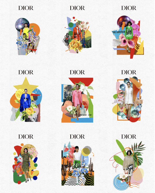
This collection of Dior collages gave me an idea to recreate it but include some more negative things, such as piles of clothes, receipts and labour workers.

In this collage I included a cutout of a lady from a sweatshop that I positioned onto a Vogue Italia model from 1992, to make it look like she is altering her dress, I adjusted the colours by adding a gradient map and posterising it to make the reader not notice it at first to give a subtle nod to the blindness of who makes our clothes and the conditions they make them in.
I fitted this onto the front page of the relay magazine and added a wide border around the edge, similar to the Dior ones. I added a barcode and a subheading/ question to get the reader to think about who actually did make their clothes - I also included the date and writer of the article I used.
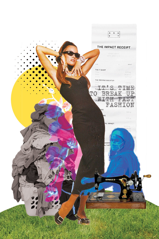
While looking online for clothing receipts as I didn't have any to hand during this studio day, I discovered something called the Impact Receipt that highlights all the negative impacts and environmental costs of creating pieces of clothes. I thought this was the perfect thing to include in the collage as although it isn't all that visible, the meaning is there which is what's important.


This first image is based off of Sarah Eisenlohr's work, she is a contemporary surrealism collage artist and graphic designer who's work I looked at when learning Photoshop on my foundation course in 2022
These are some of her works:

I have always really enjoyed this style of work and so being able to create one was really fun. I possibly could have done a better job at editing the pool and clothes inside of it but I did my best with the knowledge I have. I like the concept of the woman diving into the pool that is full of clothing as a subtle link to polluted waters with the amount of waste being dumped into them, linking back to my two words - even though my topic is fast fashion.
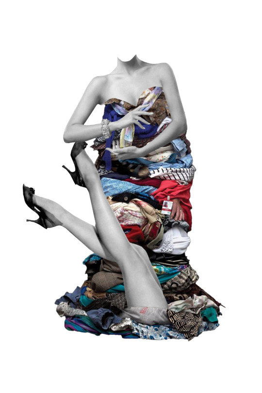
This image is really simple and could work well with some text wrapped around it but it was meant to look like a woman wearing a clothes pile dress but the legs cut out didn't really work for it so I decided to stick the legs in between the clothes as if she is stuck in there - giving it a new meaning of "drowning in clothes" due to over consumerism and over consumption of buying too many.
Going from being stuck to having made a handful of images in a day makes me feel a lot more relaxed about my situation as now I have these I can begin properly laying out my document
0 notes
Text
Place of Words - Artist Research
Banksy
Banksy is a genius of his craft, creating bold and thought-provoking pieces that pop up spontaneously around the world, his signature ironic flair serves as a powerful commentary on contemporary issues in popular and political culture. He is most known for his iconic stencil-style street art, however, he often ventures into various mediums including performance art and sculpture.
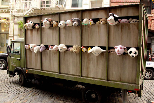
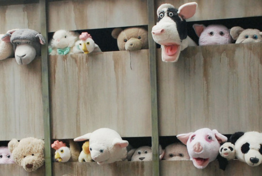
Banksy has also produced compelling artworks addressing animal rights, with one notable piece focusing on the subject of factory farming.
"Sirens of the Lambs" was an impactful artwork by Banksy that transformed a livestock truck into a moving exhibit. Inside, animatronic or puppeteered cuddly animal toys with their heads poking through the holes of the truck emitted squeaking sounds, drawing parallels to the cries of real animals being transported in crowded trucks. The juxtaposition of the cute animal toys with the slaughter truck starkly underscored the hypocritical treatment and perception of livestock animals in our society. This installation prompted viewers to consider the ethical implications of industrialised animal agriculture.
Banksy's approach of creating something inclusive that can be seen by all members of the public including young children was effective in creating widespread interest and subsequently sparking conversation around the subject matter.
This piece has inspired me to be more broad and divergent with my image-making process.
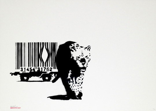
'Barcode'
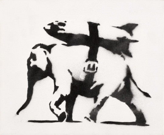
'Heavy Weaponry'
'Sirens of the Lambs'
youtube
Sirens of the lambs (2013) YouTube. YouTube. Available at: https://www.youtube.com/watch?v=WDIz7mEJOeA (Accessed: 14 May 2024).
Banksy & Animal Rights (no date) MyArtBroker. Available at: https://www.myartbroker.com/artist-banksy/articles/banksy-and-animal-rights (Accessed: 14 May 2024).
0 notes
Text
Moving Image Tutorial
After the Posters and Prototype tutorials, I edited my packages by adding another font. I rearranged some of the text, for example, the brand name 'Anilumen' now sits in the middle, with the slogan, "Energy Saving Lightbulbs That Help Save The Animals Too" sitting underneath, in a more simple font so it can be read more easily. I have rearranged the nets so that the ears, tuft of hair will be sticking up from the box, so that there is a 3d element to it. I have drawn the lightbulbs and made the barcodes slightly bigger. The WWF logo has been added and the brand name also sits on the top of the box too. All the 'boring' information is on the sleeve of the box in a simple font, whilst all the 'interesting' information is on the inside of the box in a more interesting font. I have also added a paw print to the brand.
Paw Print And Logo Experimentation:

Finalising My Packaging Nets:

I have edited my poster slightly, so that the text aligns more to the centre. I have changed the font of some of the text and the positioning of the lightbulb packages, as well as adding a 5mm margin around it.

I started thinking about how I want my poster to move and did some research into other animations.

I created a storyboard of how I want my moving poster to look. I want the eyes of tiger to blink twice and for the ears and tail to move slightly after that.
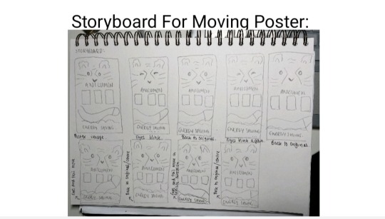
I was given the advice to try to make my poster look less busy, so that the packaging designs don't get lost in it. I could try to take away some of the stripes, the tail or the grass at the bottom.
0 notes
Text
Frequently Asked Questions(FAQs) about Ink Pumps for Continuous Inkjet Printers(CIJ)

You will find the following information here:
What is CIJ?
What is the primary application of continuous inkjet printers?
How does continuous inkjet printing work?
How is a continuous inkjet system formed?
Common issues with ink pumps in continuous inkjet printers
TOPSFLO CIJ ink pumps Solution
How to Get in Touch with TOPSFLO for Expert Assistance?
What is CIJ?
CIJ stands for Continuous Inkjet, CIJ is a small character inkjet printing technology that uses a single inkjet nozzle to rapidly spray ink into tiny droplets, forming printed images or text. CIJ printers are widely used worldwide and are a non-contact printing method, making them suitable for marking on both flat and curved surfaces. They are primarily used in industrial applications for product packaging, labeling, and coding.
What are the Main Applications of Continuous Inkjet Printers?
Continuous inkjet printers are primarily used to mark production dates, batch numbers, barcodes, and other information on the surfaces of various materials such as plastic, metal, glass, cardboard, and wood. Typical applications include beverage cartons, cans, and bags, pharmaceuticals, small cardboard boxes, cables, and components. Virtually any product or packaging that moves on a conveyor belt or extrusion machine is suitable for continuous inkjet printing.
How does Continuous Inkjet Printers Work?
Continuous inkjet printers create a continuous stream of ink, which is broken down into numerous ink droplets through high-frequency vibrations. Once the ink droplets are formed, the selected ones are charged by electrodes and then directed by a deflection plate that generates an electrostatic field.
Charged ink droplets pass through the deflection plate, causing them to deviate at a specific angle before being sprayed from the print head onto the product to create the desired printed information. Uncharged ink droplets remain unaffected and return directly to the CIJ ink system.
During this printing process, the solvent base of the ink evaporates, and the viscosity of the ink changes accordingly. To ensure the optimal droplet formulation, viscosity must be strictly controlled within specified values.
How is a Continuous Inkjet System Formed?
In continuous inkjet (CIJ) printing, ink circulates continuously throughout the printer, from the fluid system to the printhead, and then back to the fluid system. The entire ink path system involves several pumps working in coordination.
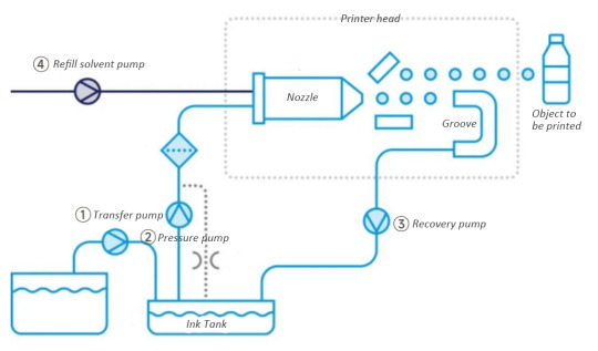
Initially, ink is transported from a large container to an ink reservoir using a transfer pump (①).
Subsequently, the ink is pressurized and transferred to the printhead using a pressure pump (②). Inside the printhead, the ink flows through nozzles, forming a continuous array of small ink droplets, each of which can be individually charged. Charged droplets are deflected by electrodes and hit the object to be printed.
Additionally, uncharged ink droplets fly in a straight line into a gutter, and excess ink is recirculated from this point back to the ink reservoir using a recirculation/suction/recovery pump (③).
To prevent the ink from drying and damaging the system when the printer is not in use, a refill solvent pump (④) is typically included in the continuous inkjet system. This pump delivers solvent to the nozzles to flush out any residual ink.
Through these steps, a continuous inkjet system can continuously supply ink and achieve high-speed, efficient inkjet printing.
Common Issues with Ink Pumps in Continuous Inkjet Printers
1. In the current market, there is a wide variety of ink types used in CIJ printers, each with different viscosities. These different ink compositions may contain additives, some of which can be corrosive, leading to compatibility issues with pump materials that can cause malfunctions or a very short lifespan.
2. Instability in the liquid circuit pressure and ink flow during the operation of the inkjet printer can affect the printing results.
Continuous inkjet printing requires prolonged periods of operation. Over time, continuous use may result in wear and tear, potentially leading to a decline in performance or malfunctions, thus compromising the printer's lifespan.
TOPSFLO CIJ ink pumps Solution
Diverse Pump Materials
Topsflo printer ink pumps offer a variety of pump material configurations to accommodate common CIJ ink types, such as MEK, dye-based inks, pigment inks, and soft pigment inks. The pump head materials for diaphragm pumps can be selected from PA, PPS, or PP, while membrane materials can be chosen from EPDM or PTFE. For valve materials, options include EPDM, FKM, or FFKM. YT alloy gear pumps are mainly used for pigment inks, while PEEK gears can be used for dye-based inks.
Carefully Selected Pump Types for Precise Applications
Topsflo offers two pump options tailored for printer applications: diaphragm pumps and gear pumps.
- Diaphragm liquid pumps, especially those designed for low-flow rates, provide relatively stable flow and pressure output. They are more suitable for handling liquids containing solid particles or particulate matter because their design is better suited for handling suspended particles. However, in high-flow applications, diaphragm pumps may produce larger pulses, which could lead to vibration or noise issues.
- Gear pumps are suitable for printers that require a large volume of ink. They offer stable flow and pressure output with lower pulsation. Compared to ordinary gear pumps on the market, TOPSFLO gear pumps use high-precision gears and component control to ensure smooth flow, minimal pulsation, and adjustable output pressure stability.
TOPSFLO engineers can determine which pump is better suited for your application based on your printing requirements, including the desired flow rate, accuracy, pulsation, noise level, ink properties, and whether they contain solid particles, among other factors.
Long-lasting Lifetime for Stable Printing Assurance
Both Topsflo diaphragm pumps and gear pumps are equipped with high-performance brushless motors developed in-house.
The coreless brushless motor in the diaphragm pump boasts a lifespan of up to 15,000 hours, while the gear pump utilizes a high-performance, in-house designed and manufactured brushless three-phase motor with a lifespan exceeding 30,000 hours, requiring no maintenance.
These brushless motors do not produce sparks, static electricity, or electromagnetic interference during operation, ensuring safety and allowing the pumps to run continuously in high-demand inkjet printing tasks.
How to Get in Touch with TOPSFLO for Expert Assistance?
Maintaining a consistently stable flow and using ink fluids with the appropriate viscosity are crucial for overall printing quality. Any abnormalities in the ink supply system can lead to poor printing quality, error messages, and even costly product recalls. Therefore, choosing the right ink pump for your continuous inkjet printer is of utmost importance.
TOPSFLO specializes in the development and production of various micro pumps for printers. They have extensive experience and pump solutions, and they offer customized services to meet different customer needs. Please contact their sales engineers for printer pump application cases and pump information! Email: [email protected] or [email protected]
youtube
0 notes
Text

FA222 (Assignment 3)
For this assignment, the task was to create a barcode design but with a twist. Like an added image blended with the barcode. For me, when I was thinking of an idea, I was walking around the kitchen and I thought about cracking eggs. So, I made cracked eggs but inside is the barcode🥚. It was fun doing this assignment because I like redesigning something original and add a fun element to it😍⚡️.
8 notes
·
View notes
Text

Moon Fighter
The cabin seat back lowers and the headrest inflates just enough as a pillow and she falls asleep cocooned in the warmth of the technology of a moon fighter... surrounded by stars. A little vibration from her digestive system as the teleportation waste systems evacuate her bowels and bladder.
She woke. Behind her head in the cabin cubby she pulled on the nourishment tube, sipped the required amount of the any flavour you like liquid... Cajolian fruit mince pie. Humans still take pleasure in eating at least.
The seat retracts downward allowing her to stand tall, she feels the gravity in her feet, stretches her arms in all directions, the lower part of the moon fighter with enough room to stretch and exercise in all directions. She does a moon jump.
No answer to her SOS signal.
She sits in the cabin watching the stars. So few of them habitable, we'd never imagined how sparse life was in the Galaxy. All those lonely stars. And now a lonely moon fighter.
A largest she'd ever seen snowflake landed on the cabin window. A growl from beneath the cabin, shaking, vibration the cabin jerks at an angle. The cabin still intact.
How long will the damaged moon fighter's generators last she wondered.
The black rock of the black mountain, beneath her, had never seen sun. Lodged in the perpetual darkness no one was answering her distress signal. She knew the teleportation human waste system would stop first. Then she’d have to piss out of the airlock, if her bladder was up to it after so long using the waste evacuation systems of the future. She flipped through the images she kept on her iris lenses. Old oil paintings she had been creating. The views from just inside planet atmospheres looking back at a surrounding ice disk arching across the thin sky. The view Just outside of a golden nebula, a moments hesitation while on some galactic errand. The crying ice falls, of a split moon. No one had ever seen them, she wondered who would discover them if she never returned.
The end
By Peter Stringer
My wife's Handbag
“I’ve never seen inside my wife’s handbag, said the blond” ‘never?’ Said the other blond. He glanced in the general direction of the first blonds wife’s handbag. ‘She’s round at Beatrice’s... you could have a look now.’ “I couldn’t look in my wife’s handbag” said the first blond. They both eyed the handbag.
The clasp clicked open and the two men giggled. They both peered into a cacophony of un used tissues, little books, a pack of postage stamps and such. The first blond looked saddened. Is that it, all these years and that’s what I was missing out on. They both laughed raucously. The first blond dived in. The adventure of some old photography in a little book was surprising; the husband didn’t recognise anyone: the pictures were all old and faded. A key ring of some useless keys, they both admired these. A box with antique looking spectacles. A little plasticised packet of rings. Some paper work. Nail file. Wallet. And an FBI id badge. They both looked into each others eyes. Then back to the FBI badge. “but, she’s from Batley.” They heard the door latch from the kitchen. Quickly stuffed everything back in except the badge; sat back in their seats and supped their Bottles of Dog. Their gazes watched as the first blonds wife came in bringing a little of the outside chill with her. She was muttering and fussing, grabbed her handbag, said goodnight and went upstairs.
The two blonds looked down at the FBI id badge. It had no image; just a strange looking microchip and a barcode. And the large letters FBI. Blond number two found an app that reads barcodes and scanned it. Nothing happened. They both looked up and around half expecting a swat team to burst through the ceiling. Nothing.
At the end of their street the two men stood outside the 24hr corner shop. It’s holographic 3d signage twirled and beckoned. They picked a fancy chocolate bar each and went to pay. Wondering if the FBI would pick up the tab. The badge swiped the chip reader. It bleeped Three times. They looked around the automated corner shop, half expecting another swat team to burst from behind the crisps. Nothing. The chip and pin machine asked them to try another card.
Back at the first blonds house the two men sat down in the comfy arm chairs. Staring into each others eyes. A recycling bin lid somewhere outside and in the distance snapped shut. They both grinned, slightly hoping for some excitement from across The Pond. Nothing.
They turned over the badge and saw some raised bumps... a braille translator revealed a phone number. The second blond rang it. An answering machine picked up and said. You have reached the number of the Cheeky Boys, please leave a spicy message and we’ll see what we can do. A small amount of jockstrap glitter fell from the badge at that moment, as though mocking them.
The end
By Peter Stringer
Billions
An interview...
The Billionaire sat back, the television host looked incredulous. “Are you serious?" he asked. The Billionaire’s straight face was one of poker. The studio audience shifted in their seats, an intense quiet was all over them.
The Billionaire spoke, ‘You have to ask yourself, from what you know of me, would i direct all of my 300 billion pounds toward designing and building robots that will subjugate every cis heterosexual man on this planet.’
The host sat back now, incredulous still. “Every straight man on the planet not allowed to speak, enforced by Feminine Robots.” Someone giggled in the audience.
The Billionaire sat forward, ‘that feeling you are feeling right now... is a fraction of what all women feel because of men.’
‘It’s one possible future' the billionaire casually tossed at the host. The host laughed perplexed and half exasperated.
‘I’m only half serious, you know all the governments are secretly working on similar projects... military robots.’
‘there could be a woman robotics genius working on it right now'
The host mouthed “but"...
‘You ask me why i live so frugally, when i have riches... this is the reason. Billionaire’s can not be trusted with such power. And this is the reason i live in an old unused space with un-glamour, in a small town with the un-billioned. I can not be trusted with such power. No one can. This is the way i try to stop the billions going to my head.
By Peter Stringer
#moon fighter#space ship#jet#space#art#creative writing#short story#sci-fi#fantasy#artist#scifi book
3 notes
·
View notes
Photo

Masked Omens: Week Four
[Image Description: Image 1 - A simple rendition of the Masked Singer UK logo, a golden mask with colourful fragments flying off of it. The mask has a golden halo and a golden devil tail protruding from either side. Below, gold text reads ‘Masked Omens’.
Image 2 - A page from the Opinion section of the Capital Herald, dated Saturday, 16th January, 2021. Full image description and transcript below the cut. End ID.]
Read the fic here!
(Falling records template from Pixeden)
The Capital Herald, Saturday 16th January 2021 Opinion, page 20
Main Story: TOFFLEY GATE: FIFTEEN YEARS ON, IT’S NO HOME Where is the affordable housing that was promised? And why can’t local people get access to it? The Toffley Gate development once seemed like that most elusive of rarities; a politician's campaign promise made real. When Lawrence Richmond, a distinguished barrister, was elected as MP for Toffley South in 2005, it was partly on the strength of his pledge to build a brand new block of affordable accommodation for the people of Toffley. In fact, if you ask most local voters why the future Transport Secretary won his seat, they'll point in the direction of Toffley Gate. The development, it was claimed, would create jobs in the area, boost property values, and allow more buyers and renters on low incomes to invest wisely in their future. Fifteen years on, how are those claims holding up? Well, the development did indeed bring in construction jobs, as well as long-term positions in the shops and services on Toffley Gate's street level. As construction continued, however, some concerns were raised – even as early as February of 2006, seven months before the grand opening – that changes to the specification meant almost all the flats in the towering buildings would be described as luxury apartments, rather than affordable housing. But as long as they were still rented out at low rates, that wasn't necessarily a bad thing. When the development's 312 flats were put on the market, however, 276 of them were priced at luxury rates. The remaining thirty-six were a single block of small studio apartments, suitable for a single occupant or two, a far cry from the family homes Richmond had promised to provide. Protests followed, in 2009 and 2010, but it was too late. Now, fifteen years on, only 194 Toffley Gate units are occupied. The rest remain empty and useless, far beyond the means of most local residents and workers. The Capital Herald popped into the local coffee shop to canvas opinions. “Oh, they're lovely, aren't they?” said Gladys Jones, retired, who'd stopped in with her grandson, Chris, a student. “I'd love one of those balconies, but not on my pension.” And Chris? “They're going for what, two or three grand a month? I could work for years and never save up enough to live there.” What would he like to see done with the place? “Drop the prices, maybe set them up as student accommodation, the uni's always oversubscribed. Or just... make sure normal people can afford them, you know?” “I put my name on the waiting list for the cheap flats when the place opened, when I was about twenty-five,” Jenny Tyler, a teacher, told me. I asked her what changed her mind. “No, I'm still on the list. Fifteen years, I'm still on the list.” Has she considered applying for one of the more expensive unused units? “No. On a teacher's pay? No, in fact, I'm moving back in with my dad. It's cheaper to commute in from Tadfield than to keep paying rent in Toffley.” And what of those behind the counter? Of the three employees on shift, two had joined the waiting list for the affordable housing at Toffley Gate. All three agreed that they'd love to live in one of the fancier units, if it were possible. One, Tom, has a second job as a cleaner on the development. “I have to clean all the luxury homes, even the empty ones,” he said. “And there are a lot of empty ones. Even the ones where you can tell someone's moved in, there's hardly any sign of life. It almost seems like an investment property type thing, but I don't know how they can be making money without sub-letting it.” When approached for comment, Lawrence Richmond – an Eton graduate who lives in a large historic house with his wife and son – argued that he is not responsible for market rates, nor for setting the level of affordable housing provision within the development. Why, then, did he make such grandiose promises during his election campaign in 2005? And why, sixteen years on and after several protests, is he still in office? If Richmond is as keen on affordable housing as he claimed to be in 2005 – as he has continued to claim, during the run-up to every local election since then – there must be something he can do, in his capacity as Toffley's MP, to encourage the building's owners, Selectan Homes Plc, to lower rents and allow lower-income families to access the many unoccupied units in the building. Surely it would be a win-win situation; Selectan would reap the rewards of a fully-let building, existing Toffley Gate residents would benefit from an invigorated community, and local people could live in the area where they actually worked. The businesses established at the base of the Toffley Gate tower blocks would have as many customers as they could want. In short, Lawrence Richmond, what are you waiting for? TINA MOON
[Image Description: A colour photograph of a gleaming block of flats. End ID] [Caption] Toffley Gate gleams in the sunshine. But are its units overpriced? (Photo: Daniel Brubaker on Unsplash)
Right hand column: OLD TUNES ARE BEST How wonderful to hear some music from the good old days on ITV’s The Masked Singer. When I sat down to watch it - under duress, I’ll admit, and largely to keep my wife and daughters happy - I expected nothing but noise of the variety that makes up the modern singles chart. Imagine my surprise and delight, then, when several of the songs reminded me of the heady days of my youth. Some, of course, were older still, overshooting the perfect era of my teenage years to land in the tragically uncool Jazz Age, but for the most part over the last few weeks I have been able to sing along with abandon, embarrassing my daughters no end and infuriating my wife, who is desperately trying to ascertain the identities of all of the disguised celebrities inside the ludicrous costumes. I doubt we’ve ever heard any of those voices before, given that the really big names in entertainment no doubt have better things to do than make such fools of themselves on a Saturday night, so I won’t be participating in the silly guessing game. Instead, I’m picking my favourites based on the songs they sang in the first few weeks. Snake is my favourite, by virtue of singing a Whitesnake song in the first live show, and it was a good enough performance that I will, for now, dismiss last week’s show as merely a momentary lapse in skill and judgement. Bonfire got everyone in my house smiling with ‘Disco Inferno’, and it’s rare that my children and I agree on anything, so they have to be the house favourite. Axolotl chose wisely in channelling Kermit the Frog, a universally beloved entertainer, and Pony’s tribute to America with ‘Horse With No Name’ was very enjoyable, too. So, I don’t know who Snake is but I’m rooting for them anyway, it seems. Who knows what tonight will bring? READER’S LETTER FROM DEREK METTE
Coupon, bottom third of page: [Image Description: Graphic of two falling record sleeves, with corresponding vinyl records also falling beside them. The first album sleeve shows two silhouettes of a face, looking towards each other in the style of the face/vase optical illusion, and is labelled “talking about it - Anathema”. The second shows a closeup of hands holding a book, and is labelled “Anathema - Narrative Devices”. At the bottom of the graphic are track listings. “Talking About It: Talking About it, Here I Go, Talking in Circles, The Magic Word, Seventh Sense, Pour My Heart Out, Nobody’s Fault, For A Spell, Living In The Past, Parting Words. Narrative Devices: Narrative Devices, Stab In The Dark, Look Before You Leap, Out Of The Crowd, Daisy Chains, I Hate To Leave, Ashes, Eagle Eyes, End of Days, Parting Ways.” End ID.] EXCLUSIVE DISCOUNT FOR CAPITAL HERALD READERS Exclusive to the Capital Herald, this voucher entitles you to 50% off the listed price of Anathema's first album, Talking About It, when you buy her new album, Narrative Devices. Featuring hit singles 'Daisy Chains' and 'End of Days', Narrative Devices has been described as 'a breath of fresh air for folk music' and 'a powerful meditation on the stories we tell ourselves every day'. 'Talking About It' contains the gorgeous ballad 'For A Spell', which has already sold over half a million units as a single in the two years since its release. Don't miss out on this amazing deal! Just take this coupon to your nearest participating retailer, or enter code CAP50 when ordering online. [Image Description: A barcode marked ‘FOR RETAILER USE’, from barcode.tec-it.com, and a QR code, from qr-code-generator.com. End ID.] Voucher expires 12AM 23/01/21. At participating retailers only. While stocks last. Not valid outside of fanfiction. For full terms and conditions, see page 28.
1 note
·
View note
Text
Could Tattoo Ink Be Used to Detect Cancer?
https://sciencespies.com/nature/could-tattoo-ink-be-used-to-detect-cancer/
Could Tattoo Ink Be Used to Detect Cancer?

When amateur artist Cristina Zavaleta signed up to take an illustration class with Pixar animators on character design, she had no idea she’d also be embarking on a new scientific study. At the time, Zavaleta’s work as a post-doctoral biomedical researcher in a molecular imaging lab at Stanford involved evaluating contrasting agents, like dyes, used to detect tumors in animals. During her art class, the researcher was struck by the intensity of the colors of gouache, vibrant water-based paints, that her fellow illustrators were using. “They were bringing back these pieces that were just incredible, really rich colors. And I thought, how do you even achieve that color, visually,” says Zavaleta.
That simple question ultimately led Zavaleta, now an assistant professor of biomedical engineering at the University of Southern California, and her colleagues to create a first-of-its-kind library detailing the optical imaging properties of commonly used pigments and dyes, found in everything from tattoos to food coloring. The researchers hope their study will open the doors for the novel use of everyday colorants as imaging agents in medical tests, that may be more effective at early detection of several kinds of cancers.
Currently, only three dyes with fluorescent properties used as optical imaging contrast agents—methylene blue, indocyanine green and fluorescein—are approved for human use by the U.S. Food and Drug Administration (FDA). In diagnostic medicine and in some surgical procedures, imaging contrast agents are materials used to improve internal body pictures produced by X-rays, computed tomography (CT) scans, magnetic resonance imaging (MRI), and ultrasounds. These materials can be ingested or injected and temporarily color targeted parts of the body, like specific cells, organs, blood vessels and tissues, to help clinicians see differences and abnormalities that may indicate disease. Yet, Zavaleta wondered about the significant catalogue of approved food, drug and cosmetic dyes that people routinely encounter in their everyday lives. Are there other imaging agents hiding in plain sight?
youtube
“As my art brain was thinking about these paints [from class], I thought to myself, what paints are already being used in humans?” says Zavaleta. “And a lightbulb went off.”
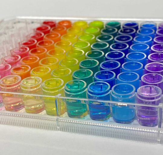
Tattoos. High quality pigments used in tattooing are made from mineral salts and metal chelates, which have been isolated from natural sources and used by humans for thousands of years.
Zavaleta’s next step was to do her homework, as any good researcher would. She contacted Adam Sky, a tattoo artist in the Bay Area whose work she admired. Sky was interested in her research, and gave her samples of some of the inks he was using, which Zavaleta collected in a well plate, a tray with multiple divots, or wells, that can be used as test tubes, she’d brought along, just in case.
“I immediately took them to my microscope over at Stanford, and I did all these different tests on them,” Zavaleta says. “I was amazed at what I was seeing.”
In a tattoo ink color palette, each color carries a unique spectral fingerprint that can be used as an imaging barcode to better identify and detect tumors.
(Tattoo and design created by Adam Sky)
She measured two optical elements of the inks, their fluorescence properties and Raman properties. Fluorescence relates to a dye or pigment’s capacity for absorption and emission of light, while Raman indicates how light scatters. Both are commonly used in imaging techniques in the cancer field. Highly fluorescent agents offer sensitivity in imaging; very small amounts are needed for them to illuminate areas very brightly. Raman imaging, on the other hand, offers specificity by allowing multiplexing, or the ability to look at several processes happening inside the human body at once. These can help show whether cells or tissues are expressing multiple genes, for example, or expressing one more highly that may be associated with a particular cancer, like HER2 and breast cancer or EGFR with lung cancer. Each of the targets has different receptors that will be illuminated by different agents, and depending on their optical properties, some agents will be better than others.
In all, the researchers evaluated the optical properties of 30 approved food, drug and cosmetic coloring dyes and tattoo ink pigments using a spectrophotometer, an instrument that measures the intensity of light after it passes through a sample solution. Seven of the colorants displayed fluorescence properties that were comparable to or exceeded the three FDA-approved clinical dyes. The researchers next measured the Raman signatures, to see how high the colors’ unique signatures of light photon peaks were, with high peaks being indicative of usefulness in terms of multiplexing. Finally, they tested the best-performing dyes and pigments by injecting them as imaging agents in mice with cancerous tumors.
The researchers evaluated the optical properties of 30 approved food, drug and cosmetic coloring dyes and tattoo ink pigments.
(Cristina Zavaleta)
Data from Zavaleta and her colleagues’ study showed that FDA-approved Green 8 dyes used in drugs and cosmetics have significant tumor targeting potential in mice with cervical and colon tumors, and the Orange 16 pigment found in tattoo inks also showed, according to the authors, promising fluorescent properties and tumor targeting potential. This is significant because, as they note in the study, “no single imaging modality currently meets all the clinical needs of high sensitivity, high spatial and temporal resolution, high multiplexing capacity, high depth of penetration, low cost, and high throughput.” In other words, no single imaging agent can provide all the information a doctor might need.
The USC lab where Zavaleta and her colleagues conducted the research uses nano-based imaging contrast agents, or tiny spherical vesicles that are loaded with the dyes or pigments. While nano-based agents are approved for use as a medium in human imaging, they have been controversial in the past because of potential toxicity. Metallic-based nanoparticles like those made from gold and silver have been known to stay inside the body for long periods of time after exposure. This is one of the main reasons the team instead uses liposomal nanoparticles, made up of biodegradable materials with fatty skins similar to human body cells, that are already used in other applications, like drug and nutrient delivery.
“You can think of it as us having all these different batches of nanoparticles, and one has a different tattoo ink [or other dye or pigment] inside of it. And that tattoo ink has a very special barcode that’s associated with it; every ink has a unique fingerprint, yellow different from red, red different from purple,” Zavaleta explains. “So, if we have all these different flavors of nanoparticles that we can now target to different receptors on tumors, we can enhance our ability to distinguish between different [cancers].”
One use for such materials could be gathering real-time information during a test, such as a colonoscopy, where physicians are visually searching for certain kinds of polyps. Enhanced imaging agents have the potential to also reduce the invasiveness of disease detection and diagnosis, such as the number and size of biopsies needed, by providing more information from a smaller sample.
Christian Kurtis, who made the career change from biomedical researcher at the National Institutes of Health to tattoo artist in Rockville, Maryland, spent his post-doctoral period in a cancer research lab at the Uniformed Services University of the Health Sciences. Kurtis says the specificity these kinds of dyes could offer for imaging is key to better treatment.
“The unfortunate problem with malignant [tumors] is that they comprise a [variety] of molecular markers that may not be present on all cell types. The increased metabolic activity of malignancy is the signature most commonly exploited in imaging, and is the reason these liposomal techniques are effective,” says Kurtis. In other words, because cancer cells tend to spread quickly, researchers and physicians are able to track their growth with imaging. Having multiple types of agents that bind to the different markers would be even more helpful. “In my opinion, it will be personalized or individualized medicine that will hold the key to meaningful early diagnosis of disease,” he adds.
Jocelyn Rapelyea, the associate director of breast imaging and the program director of the radiology residency program at the George Washington University Cancer Center, adds that while tools like molecular breast imaging have been around for a while and help to identify problematic cells before they grow into lumps, advancing knowledge is always a positive. What works well for one patient may not for another.
“It’s always exciting to have the ability to be able to identify tumors at a potentially early stage. It’s quite interesting how [Zavaleta] came to dyes,” Rapelyea says. “This is obviously a model in mice at this point, but it is promising to see that there could be potential of being able to identify earlier development.”
Zavaleta knows the dyes and pigments her team has catalogued in a library will be subject to the FDA’s rigorous regulatory procedures before they could ever be used as imaging agents in humans. “We’re not suggesting in any way that they’re safe,” she says. “We’re saying, ‘Hey, these are dyes that we’re continuously being exposed to on a day-to-day basis. Let’s have a look at them further.’”
#Nature
5 notes
·
View notes
Text
Writer’s Month 1: Tattoo Parlor/Flower Shop AU
This is obviously an AU, sorta kinda character study thingy. It’s not whump, it’s just me practicing; however
Content Warning: Tattoos, blood, needles, nonconsentual tattoo mention
The bell over the door rang as Reynan pushed into the little shop. He found himself in a tiny lobby, just a desk and some chairs, leading to a hallway of curtained-off booths. The art on the walls was modern, and everyone in the drawings was fully clothed, not the image he’d had in his mind of a tattoo parlor. He could hear faint buzzing coming from at least one of the little partitions, and he didn’t want to call out and interrupt anyone in their work. But the bell had summoned someone’s attention, and he soon heard solid yet gentle footsteps approaching from the hall. Their sound was clear but not heavy, tapping on the linoleum like a shoe somehow made entirely of heels.
“What can we do for you?” The voice was ever-so-slightly modulated, but low and smooth, and Rey turned away from a drawing of an astronaut to see he’d been greeted by a green and black android. The robot wasn’t feigning humanity at all, no synthetic skin or hair, with a viewscreen for a face. Two arms, two legs, and a head, unlike old-fashioned worker drones, but Rey could see one of its arms ended a few inches below the elbow. Not in a messy way; no circuits protruded, and the edge was smooth and clean, as if perhaps it had been designed that way.
Rey took his time assessing the creature before answering, not bothering to hide his mild curiosity. “I was wondering...um. I’d like to get a tattoo covered?” He didn’t know if all shops would do coverups or if he’d need to go somewhere special. But he’d had the day off and finally pushed himself to just go inside and ask. He knew surprisingly little about tattoos, despite the one inked across his left shoulder.
The robot seemed to be sizing him up as well; an LED square appeared on its viewscreen and bounced around for a few moments, its odd tracking reminding Rey of a dragonfly. “You work...nearby? I have seen you before. Many times.” The square became a spinning circle, and the robot’s attention was faraway, as though it was seeking the answer itself rather than expecting Rey to furnish one. “The flower shop, down the strip,” it said finally, viewscreen clearing.
“Yeah, the florist; but I’ve never seen you in there.” His tone was mildly suspicious; he’d remember if he’d ever seen this android before, and he was generally good at spotting if he was being watched.
The robot actually laughed at this, and despite the cascading sound seeming a bit like two voices at once, its tone was friendly and disarming. “I see a lot. I remember everyone. I don’t mean to, I just...do.” It shrugged its metal-plated shoulders, then swept its truncated arm toward the back of the shop. “I have time now, if you know what you want.”
This gave Rey pause. The android was an artist? Not just a shop attendant, a cleaning bot, a secretary, but an actual tattooist? He considered this a moment before he realized, if he wanted someone making clean, even lines on his skin he couldn’t do much better than a machine. He started down the hall, and the robot followed, directing him into an open partition at the end.
Inside the android pulled the curtain and gestured for Rey to sit on a faux leather chair, covered in a long sheet of paper like something from a doctor’s office. It crinkled obnoxiously as Rey fidgeted to get comfortable, and he tried to tell himself this was something the tattooist must be used to, and what did a robot care anyway?
“So what were you thinking?” The robot asked conversationally, as it pulled open a cabinet and drew out sheets of parchment and tiny pots of color.
Rey reached into his pocket, twisting in his seat and crackling the paper. He withdrew an embroidered chevron patch and held it out, grip somewhat tight, as though he wanted the robot to only look, but not touch. “It’s my regiment. I want it over -” he shrugged off his button-up, leaving only his tank top “-this.” His bared shoulder revealed a barcode underlined by a small stylized sword. He spoke more rapidly as he explained, “I’ve served my sentence, it’s ok for me to remove it. I’m allowed --”
The android raised a hand to silence his protestations. “I don’t actually care about Accord Forces protocol. It’s no problem.” If focused its attention on the patch, and a line of light scanned up and down his faceplate, scanning the image into his saved files, as though he could tell Rey wouldn’t want to surrender the badge to him. “I’ll have to make it dark, to cover the black, but it’s nothing I haven’t done before. Unless you’d like me to laser the old one off? You’d have to let that heal though, before getting it tattooed over.” It tilted its head, waiting for Rey to choose.
“No, it’s fine. If you say it’ll cover, I’m fine with that.”
“Excellent.” It flipped a few switches on an autoclave sterilizer, and a few wisps of steam escaped as the box’s seal released. The android slotted the end of his shorted arm into a circle of metal on the machine’s front face, and Rey heard a bit of whirring and a mechanical click, before the robot withdrew his now-whole limb from the autoclave. The hand and wrist looked the same as its other arm in color and design; but then the artist opened a sterile package and slotted a grouping of needles into a barely perceptible hole in its first finger.
“Wait! You mean, right now?” Rey wasn’t sure if he was losing his nerve, or if he’d simply expected there to be more to the process. His only experience with tattoos so far hadn’t been a fun one, after all. “Don’t we need to discuss payment, or something?”
The robot picked up a cartridge of ink and pressed it down into a socket in its knuckle until it made a quiet pop. “I don’t generally charge for coverups, to be honest with you.” It turned it’s attention back to Rey, and could see on his face that his concerns weren’t entirely assuaged. “I mean, if you really feel like paying me…” the spinning circle returned to its faceplate as it considered a moment. “Flowers.”
“Flowers?” The request was unexpected, bordering on absurd, but Rey felt the tension release from his shoulders as his nervousness was replaced by confusion. “What do you want with flowers?”
The android paused -- not in a human way, breathing, thinking, considering; but completely, unmoving, with its darkened face turned toward Rey’s. Nothing played over its screen, and he felt he may have made a mistake while he stared into its blackness. Then, just as quickly as it had ceased motion, it started up again, fiddling with its arm as it replied. “I like flowers,” it stated flatly. A bit of emotion returned to its voice and it continued quietly, almost wistfully “I like...beautiful things.”
After a quiet moment, it pulled up a chair and leaned over Rey’s shoulder, holding up its hands over the skin and looking into his eyes as if waiting for him to announce he was ready. “Don’t you um, trace the picture or whatever?” This earned him another soft laugh, and strands of light began to stream out from the robot’s screen, creating an overlay of the chevron on Rey’s skin. “Oh,” he breathed softly. The android remained still, needing permission, and while its attention was clearly on creating the detailed light display, Rey could feel a weight like eyes on him. He nodded his assent, and the artist began.
The pain was the same sharpness he remembered; all the needles moving together creating the feeling of a single blade slicing into him. Rey looked away for a moment, and the sensation seemed to grow worse. Without being able to see, his mind imagined the circular, color-filling motions were grinding and spiraling down into his flesh to paint his very bones. He forced himself to look back at his shoulder, relieved to see that the needles were still there, bouncing along his skin. Barely any blood welled from the punctures, and the android’s arm moved with a laserlike precision that shouldn’t have been surprising, but was completely fascinating, and he found his focus drifting as he watched the artist move.
“Alright.” The robot said simply, startling Rey out of his fugue. The android was wiping at the tiny spatters of blood and ink on his arm, and applying a large square bandage. That was it? It was already over? “You can change this in a couple hours. I’ve got some care sheets at the front desk with cleaning instructions.” The android stood up from its chair but stayed close as Rey got up, as though he expected him to faint.
When Rey was able to get up and gingerly pull his button-up back on, the robot waved his arm toward the curtained doorway. Rey exited and started toward the lobby, realizing the android wasn’t behind him. A click and whirr sounded from the partition, then the robot stepped out into the hall, again minus one hand.
Rey wasn’t sure exactly what to do now. Should he run off to the shop and get some flowers immediately? Should he shake the robot’s hand? What was the procedure for this sort of transaction? He realized he hadn’t asked if the artist had a name; surely it had some kind of designation. Inkbot 2000? He tried not to snicker aloud at that thought; he didn’t figure the android would appreciate it. Before he could offer any sort of awkward farewell, the robot was handing him a sheet of paper labelled “Care Instructions,” and plucking a business card from a little holder on the desk.
“Come back if you need any touch ups or, of course, anything else. You did well. I’d say I like green but that’s every sort of flower, isn’t it?” The robot’s head was tilted in a way that somehow implied a smile.
Rey simply nodded, taking the offered items and mumbling “Appreciate it,” before making his way out the door. He was halfway to his car before he checked the business card. It declared the address and phone number of the shop, and across the top, in a large green font like the display on a digital clock, was what he assumed was the artist’s name: Celadon Argos.
#writersmonth2020#robot#android#short fiction#writing#not whump#missives from the dean#Argos#Reynan Lim
5 notes
·
View notes
Text
"palette” gif tutorial
hi everyone!!! so i’ve gotten countless requests to make a tutorial for my lara jean gifset, more specifically this gif:
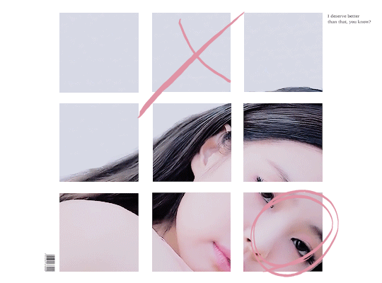
so today i’ll be showing you how i make this gif right here:
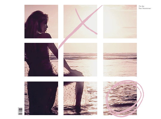
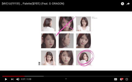
as mentioned in the original post, this whole gifset was inspired by one of my favorite mvs of all time: palette (hence the creative name lmao). i essentially used screenshots of the mv to make my own similar template to work off!
disclaimer: i suck at explaining things, so you’re all gonna have to bear with me and my 100000 screenshots and poor attempts at explaining wtf i’m doing. hopefully you can manage to understand what i’m on about!!
if you’ve never made a gif, check out this detailed tutorial i made some time ago:
how to make gifs + color gifs (this tutorial includes links to download ps)
tutorial under the cut (i’m sorry for how long this is rip)
first, screenshot the mv. (timestamp 0:38)
here is my screenshot:
now, we’re gonna open ps and go to file > open to open the screenshot on there. this is my screen rn:
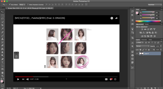
notice how my timeline is there (little box on the right side of the screenshot). we’re going to need the timeline for the gif later. if u don’t see the timeline, go to window > timeline and it should show up!!
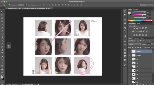
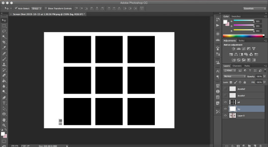
time to crop the screenshot. using the crop tool, (left sidebar, 5th icon from the top) remove the black parts of the image (top and bottom) until all you’re left w is the white area. final product:
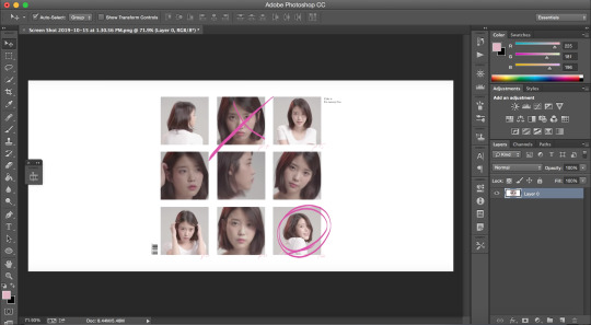
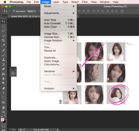
now it’s time to change the size of the canvas we’re working it so it can be the dimensions we want it to be! go to image > canvas size
a window like this should pop up:
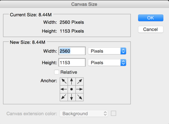
we want our gif to b 540px by 400px, so just fill that out and press ok:
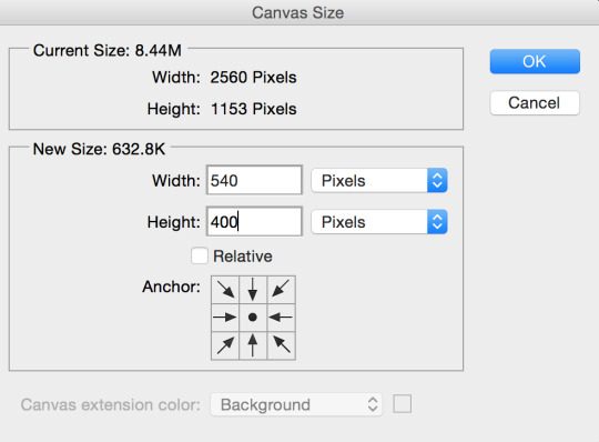
this is what your screen should look like after (aka super zoomed in):

we’re gonna fix that rn!!! making sure the layer (right sidebar) is selected (you can tell it’s selected when it’s in blue), press command + t, which will leave you with this:
okay, so i’ve covered this before in my previous basic gif making tutorial and not much has changed since then aka i’m still shit at attempting to explain wtf i’m doing. BUT basically this part involves using the top bar (pictured below) and changing the % of the W and the H to make the image the amount of zoomed in i want it to b (if that makes sense)

again, i usually just play around w the %s, depending on how zoomed in i want my image or gif to be, its dimensions, etc. the higher the %, the more zoomed in it is. basically, putting in 50% would make it way more zoomed in than 20% and so on. for this, i’ve tried out several % and decided to use 39%, but of course you can pick the % you prefer. so write in your chosen % in these two boxes in the top bar like this:

click the checkmark at the right of the top box and voilà! this is what you should have rn:
see how all the 9 squares fit perfectly inside? wow, powerful. anyway, let’s keep going djfhdkfd. now we’re going to make our own squares aka the squares in which the gif is going to be. start by creating a new layer (at the bottom of the right sidebar, the second to last icon before the trash icon). give it a name so it’s easier to keep track of: i picked s1, since this is going to be the layer where the first square is going to be (and so on). also make sure the new layer is above your image like this:
time to actually make the first square!! select the rectangular marquee tool (left sidebar, 2nd icon from the top) and select one of the squares in the image (113px by 113px) like this:

select the paint bucket tool (left sidebar, under the eraser tool) and make sure the color is set to black (#000000) before you click on the square you just selected. very important: don’t forget to have the s1 layer selected (should be in blue) when you do this or else it will fuck up.
this is what your screen should look like after:
as you can see, we have one square done, but there are 8 more left. right click on your s1 layer in the right sidebar and click on duplicate layer. name that layer s2. making sure the s2 layer is selected, drag it to the place of the second square:
keep doing the same thing until all the squares are covered with black ones like this:
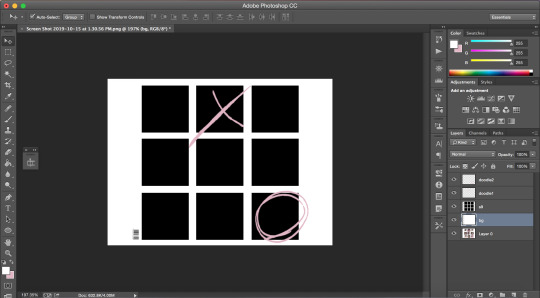
now i’m going to hide the black square layers by clicking on the little eye icon (left of layer) for each of them bc i want to include the little dark pink doodles on my gif as well, but you don’t have to, so if you don’t wanna include it in your gif, you can skip over this part!!
there are technically 3 ways you could do that (well maybe more lol but these 3 are the ones who came to mind:
method #1: use the brush tool to draw your own doodle (or trace over the existing one with a new brush)
method #2: use the magic wand tool to select the doodle and use the brush tool over your selection
or method #3: look up doodles on google and drag them onto your image
i don’t have an ounce of patience rn, so i will b using method #2. select the magic wand tool (left sidebar, 4th icon) and make sure you select the first doodle the best you can. don’t forget to make sure your screenshot (image with the doodle on it) is selected while you select the doodle or it won’t select anything!!! like this:
create a new layer (bottom of the right sidebar, the second to last icon before the trash icon) and again, make sure it’s above all the other layers. with your new layer selected (in blue), select the paint bucket tool (left sidebar, under the eraser tool) and pick a color (i used #e1b5c4). click on your selected doodle. this is what you should have:
repeat for the other doodle with another layer.
final product:
it looks a bit Rough, but hopefully you get the idea?
now we’re going to merge all the little squares into one layer of little squares. if you have doodles, remove the eye icon (left of layers) for both of them to hide them and make sure all of your eyes are there for the square layers. select the s1 layer and then the other layers up to s9 while keeping one finger on the shift button until all the square layers are selected (in blue) like this:
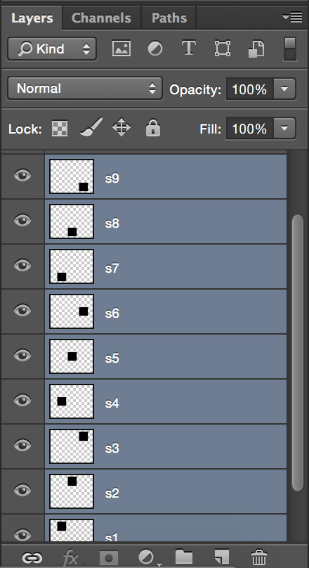
right click on the s1 layer > merge layers. all you should be left with is:
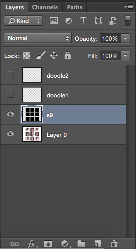
now that this is done, we need to fix the background.
create a new layer that you will drag above the screenshot (layer 0) but under the s9 layer. i named mine bg (background). i want to keep the barcode in the original screenshot, so i won’t select that part. using the rectangular marquee tool (left sidebar, 2nd icon from the top) and with the bg layer selected, draw a square at the right of the bar code so you have this:
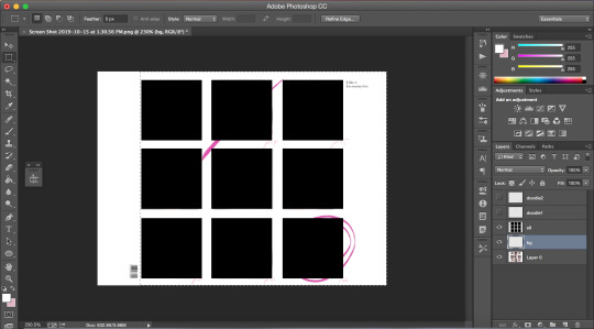
with the paint bucket tool (left sidebar, under the eraser tool) and the color set to white (#ffffff), click on the selection.
and that’s your template!!!
with doodles:
now onto making sure the gif is going to actually move properly.
click on the little arrows at the right side of the timeline to expand it until you have this:
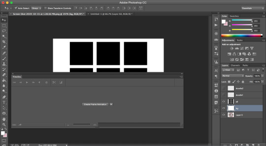
and then click on create frame animation. your screen should look like this:
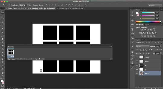
notice how it says once at the bottom of the timeline? make sure to change that to forever, or it will not play:

click on the convert to video timeline icon (the one on the left of the forever). this is what you should be left with:
now, time to make the gif that is going to go there*
*if you have no idea how to make gif and are lost af, i suggest you check out my previous tutorial where i explained this part with more screenshots and more specifically bc i will be more vague here regarding this
also i’ve said this again and again, but remember to ALWAYS USE 720P OR 1080P FOOTAGE WHENEVER POSSIBLE FOR YOUR GIFS or else they will be grainy and extremely unpleasant to work with.
i’ll be using a video from youtube for this. i suggest converto as a converter, it works really well and allows you to download youtube videos in 720p and 1080p!! once you have your footage ready, go to file > import > video frames to layers. use the markers to select the part you wish to gif, and, once you’re happy with your selection, click ok.
to select all the frames, click on the icon on the right of the timeline (4 lines with an arrow) and click on select all frames. then, go to select > all layers in the top bar. everything should be selected (in blue) like this:
now, fixing the speed of the gif.
super helpful post explaining gif speed right here
i’ll personally be using 0.06 here.
click on one of the frames in the timeline > other. write in the speed you chose and then press ok. go to convert to video timeline icon (the one on the left of the forever).
you should have something like this:
go to filter > convert for smart filters:
the time has come to drag your gif to the canvas:
make sure the gif is above the s9 layer (layer with the black squares) like this:
to make our gif fit inside the squares, we’re going to make sure the gif layer is selected. then, press the option (alt) button and click between the gif layer and the s9 layer to create a clipping mask (like this). this is what it does:
this is where i usually play around trying to find a size for my gif that looks nice. press command + t and, like we did earlier, find a % you’re happy with. i’m going to go with 20%. after moving my gif around and making it less zoomed in, it now looks like this:
this is usually where i would sharpen my gif, so, with your gif layer still selected, go to filter > sharpen > smart sharpen, and then ok.
these are my settings:
we have to fix the length of the gif, since there’s a lovely limit on this amazing site. i suggest you pick something to gif with not much movement, or you’ll have to make it even shorter. there’s no magic formula, just try not to make it too long, especially since the gif is large in size, so the smaller the better in this situation. this is what i have:
notice how the layers in the timeline are all of different lengths, so make sure you make them all the same like this:
once you have a psd ready, go to file > open and when it loads, drag it onto the canvas, above the gif. i added one of my psd on mine.
for the text on the top right, i can’t remember the exact font i used, so i picked another font different from the original.
these are my settings:
what it looks like with the psd + doodles + text:
and we are DONE!!! all that’s left is to save our gif!! go to file > save for web
these are my settings:
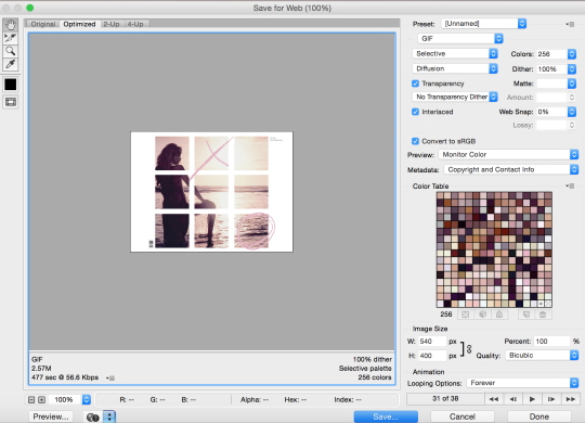
SUPER SUPER IMPORTANT: make sure your gif is set to forever in the looping options at the bottom right of the window or else your gif will absolutely not play properly!!
also, CHECK YOUR GIF SIZE (bottom left). with this website changing its gif limit every 2 seconds, better safe than sorry!!
here’s the final product:
thanks for sticking around and reading all of this!!! i hope it was somewhat helpful even though i suck at explaining how i do stuff! :)
#stupid tumblr crashed so i had to start over but here it is finally!!! sorry for how long it took!!#gif tutorial
50 notes
·
View notes
Text
Ziplock Bags
I # ve cataloged some of my favorite ways to reuse Ziplock bags and Discovery boxes and incorporate upcycle cardboard into them. There are some good reusable zipper bags on the market, but I've tried a few and they're not the best for me.
Zippers make great drain stoppers, just fill them with some water and they will fit the weight you need down the drain. It is perfect for daily use with zipper, but it is not as good for long-term storage as a normal zipper bag. The only downside I have found is that there is no way to dry the inside of the bag after you have cleaned it. Simply put a cloth in a bag of soapy water, push it around until it cleans, and you're done.
The plastic film in the bag is extruded and fused together like the zipper mechanism. Even a $2.99 bag of Doritos comes with a hermetic seal that ensures minimal air and moisture goes in and out through the seal. The plastic films on the inside of the zipper bag and the plastic on it are almost as important for the sealed seal itself.
Messy nappies don't have to stink until the maids arrive in the bathroom, and Ziplock bags work well to dampen that smell. If you have a handbag with you, you can easily remove it for inspection. I have a large zip-lock in my day pack and I have coated the bananas I brought with me inside. A zip lock is a good solution for dirty clothes, dirty laundry or even a dirty diaper.
I use them to store things that are too big for toilet bags, such as insect spray, to organize and protect my clothes in case things leak. I use zip pockets to bring back chord chargers and a few bags will go a long way, and I take the bags with me when I get home to save space in my cupboard bins as well. Zippers can be washed and reused, so you don't have to buy extra sturdy freezer bags and reuse them.
I usually throw 3-4 empty bags into my suitcase or carry them on my backpack and use them when I need to refill them before my next trip. With a clear bag, it is easier to see at a glance what I need or need for my next trips. I leave the house full of stuff and use an empty one when my backpack needs it or when my swimsuit or towel is still wet.
If you have a family member who is sick from the car, take a plastic container with you and you can keep your car clean if you miss the container. I made this DIY handbag organizer to keep everything handy and stow in a transparent plastic bag.
The packaging is very environmentally friendly, it uses recycled boxes, labels and envelopes for shipping, compostable wherever possible, vegetable-based products, etc. You will be able to create your own zippered resealable bags with any text, logo, image or barcode. Most zipped bags can also be customized to your specifications and can be manufactured in a variety of colors, shapes, sizes, colors and even shapes.
The resealable bags, whose quality is checked for well-defined parameters, are easy to open, with the possibility of multiple seals. The plastic bags meet all FDA and USDA food specifications, so choose one that meets the requirements of the FDA, USDA, Food Safety and Inspection Service (FSIS) and Food and Drug Administration (FDA).
Whether you are an industrial, commercial or residential location, you can be sure that zipped bags are used safely and securely in your home, business, office or any other place of business.
Simply punch a hole in the line between the tab and the folder, cover the closed end of the bag with duct tape and seal it. Put a funny photo in a ziplock bag and let your kids mark it with markers (I used Sharpies in different colors and made washers). Put the little guy in there and blow a breath of air over it And you can see at a glance which bag belongs to which family member.
Second, we discussed that while the bag was on the shelf, a driving force pulled the air out of Kobe's pocket and pushed new air directly through the foil barrier seal. While I initially thought the quality of the bag would literally blow up the purchase, it turns out that when the driving force and pressure change, air from his last game gets into the bags.
A big benefit for Ziploc bags is to keep them crammed into labeled bags while you put the pieces in. They can be stored by consumers while the packaging is on the shelf and thus placed on the store shelf.
1 note
·
View note
Text
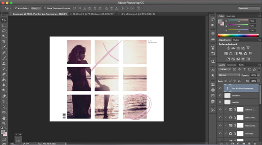
Create Barcode with Image inside It Instead of Codetext & Identify Type of Code128 using Java
What’s new in this release?
Aspose team is pleased to announce the new version of Aspose.BarCode for Java 17.06.0. The major development in this release is the support to generate the barcode with a logo/image inside the barcode image in place of codetext. This release also supports to identify the type of Code128 coded barcode while performing barcode recognition. Aspose.BarCode now supports generating barcode with logo/other image inside it in place of codetext. How a logo/image/picture can be embed inside the barcode image in place of codetext is very simple and is demonstrated in the code snippet given on blog announcement page. Aspose.BarCode for Java provides the functionality to identify the type of Code128 coded barcode while performing barcode recognition operation. How to identify the type is very simple and is demonstrated in code snippet on blog page. This release also included some important enhancements, such as functionality to read the supplement code text from EAN13 coded barcode has been improved, Functionality to recognize EAN13 barcode has been improved. Recognition process was recognizing EAN13 coded barcode as UPC-A and Recognition algorithm has been improved in much a way that it is now capable of correctly recognizing EAN13 coded barcode. Below is the list of main improved features and bug fixes added in this release.
Ability to identify the type of Code128 coded barcode type while recognition
Ability to add a picture or image inside a barcode in place of codetext
Unable to get the supplement code text from EAN13 coded barcode
Incorrect recognition UPCA of EAN13 code
Newly added documentation pages and articles
Some new tips and articles have now been added into Aspose.BarCode for Java documentation that may guide users briefly how to use Aspose.BarCode for performing different tasks like the followings.
Create C40 Encoded Datamatrix Barcode
Identify Type of Code128 Coded Barcode
Overview: Aspose.BarCode for Java
Aspose.BarCode is a Java based visual component for generation & recognition of 1D & 2D barcodes to support Java, web applications and J2ME platform. It supports 29+ barcode symbologies like MSI, QR, OneCode, Australia Post, Aztec, Code128, Code11, EAN128, Codabar, Postnet, USPS and also supports image output in GIF, PNG, BMP & JPG formats. Other features include barcode size & color settings, rotation angle & caption. You can render barcodes to images, printers, HTTP servlet response & graphical objects too.
More about Aspose.BarCode for Java
Homepage of Aspose.BarCode for Java
Download of Aspose.BarCode for Java
Online Documentation for Aspose.BarCode for Java
#Create Barcode with Image Inside It#Identify Type of Code128 Barcode#recognize EAN13 barcode#code text from EAN13 coded barcode#Java Barcode API#recognizing EAN13 coded barcode
0 notes
Text
How to write a book in Word
What should be the content for the book?
If you write, then this article is for you. A subject can be anything from fiction to non-fiction. Non-fiction is based on your experience and knowledge, in which you don’t have to think too much, whereas, in fiction, one has to work hard. For that, first you should have a deep understanding of psychology for characterization and expression and secondly, before writing a story, the entire concept should be in your mind because, in the end, there should be many ends which are to be tied to the beginning. For example, when writing a suspense thriller or a Sherlock Holmes typescript, you have to keep in mind, what evidence do you have to keep leaving from the front page so that the culprit can be caught in the end?
How Homo sapiens won the battle of survival?
Well, whatever you write, there are three ways to do it. Either you write directly on a Desktop/Laptop or write with a pen on paper and later on take the content to the phone with the help of Voice Typing and then take it to Desktop/Laptop with the help of Google Keep or Google Docs or write directly using Voice Typing on Phone or Desktop/Laptop. It’s easier to write in English for voice typing, but if you are writing in Hindi you will have to resort to Google Indic.
Where did religion come from and how logical from the point of view of science?
It should be noted here that in Voice Typing, only words will be printed and all symbols like comma, punctuation etc. will have to be applied by yourselves. So open a word file and move the content in smaller portions and while correcting the sentences, keep correcting the chapter paragraph breaks. Keep the number of breaks in the paragraph to a minimum, mostly use symbols like (, –…) for the sentence break. Be aware that these symbols take place immediately after the word and there is no space between them. Single space is added later.
How to do proofreading and editing
When all the content has been uploaded in the word file and given all the necessary symbols, Chapter/Paragraph breaks then, from the page size view section, zoom in up to 200-350% so that you can see everything in enlarged view and then read it back, remove any errors that may occur.
Although doing this with one’s own writing work is a tough task, many writers who go to self-publishing platform and either they are not in a position to spend money or they don’t want to do it and they have to upload a Ready to Print file only, therefore these things should be done by themselves.
what possibilities are there in the universe outside our planet
For proofreading and editing, it is better to turn on the marker which you will find in the “Home” tab. This will continually let you know, how many spaces you have provided or how many lines you have given in the paragraph break. After doing this, you can select the entire content and use the ruler to select the first line of each paragraph to be started with the tab space and it can be adjusted up to a quarter-inch, as seen in this article. According to the current format, you can finish the tab space manually from the first paragraph of each chapter and if desired, you can provide space between every two paragraphs like in this article, for which provide a spacing of 8pt in “Layout “ section or don’t do it if there is too much of content, it will reduce the pages a little. Make the font size 9 or 10.
How to design the interior
Once you are satisfied that your script is complete, then focus on the interior. From the “Layout” section, go to the Page Margin and click on Custom. The Page Setup box with three sections will open. Here, in the Margins where you see “Normal”, click there and create a mirror image. There you can select between the Margins 0.5-6” for Top, 0.7-8” for Bottom and while keeping an Outer margin of 0.5” an Insider margin can be kept between 0.8-1”. It depends on you.
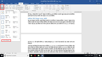
Next, in the Paper part, set the page size from 5 × 7, 5.5 × 8.5, 6 × 9 whatever you want to keep. From the Layout, click on different Odd-Even, keep the section Start on “New Page”, keep the Header Footer margin to 0.3-4” × 0.5-6” and click on OK, so your file will be converted in the same proportion.
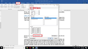
Now notice that on the first page, which is an “Odd” one, there will be the name of the Book and the Writer in Headline, the second is the “Even” page which is there for title verses as well as, Book / Author’s name, Copyright, ISBN, name of the Publisher/Printer etc. You can write a dedication on the third Odd page, leave the fourth-page blank. On the Fifth-Sixth page, write about the book in the “About” section. The seventh page contains the Table of Contents (if any) and Eighth should be kept empty.
If you get into writing articles then take more pages, but keep in mind that the beginning should be from the Odds and the end is either Even or it should be left blank. For this, you will hit Control plus Enter on the back of every next page. Now move the cursor to the previous page of Ninth or Eleventh page from where the main content begins, go to the “Layout” section, click on Page break and take the next page. This starts your “Section Two”. Convert all the main chapters of the book to sections using the same method.
If God is there then how can it be from the point of view of science
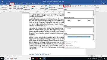
Now put on the Page Numbers and Header Footer. For this, go to Page Number from the “Insert” section and select the numbers in the format you like. You have to do this on both Odd and the Even pages and also note that for each of your section, numbers will be different. For this, go to the first page of every next section and select the number by double-clicking, go back to the Page Number format and click on the “Continue from previous section”.
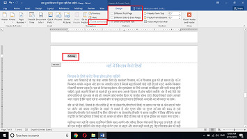
Similarly, for Header Footers, you have to pay attention that the header footers of Odd and Even will be different. You can add writer’s name on the Odd and insert the name of the book on the Even and if the book is with many different chapters, then you can write the name of the book on Odd and the particular chapter on Even. To give a different header or footer for each different chapter, go to the first page of that particular new section and by selecting the Header / Footer you can unselect the “Continue from the previous section” tab from the design section. Then remove that Header and insert a new Header. Repeat this process in all sections. Now for removing the Page Numbers or Headers from the unwanted places, go to the “Shapes” of the Insert section, take a rectangular box to cover that point and convert the box border to white. The things that you don’t want will be hidden.
What to do for the Book Cover Design
Lastly, you have to make a cover which, you can make either on Corel or Photoshop but if you don’t know how to do it, go to a self-publishing website, create an account and use their cover creator. While making the cover here, be sure to pay attention to the book size and number of pages because the “Gutter Margin” is determined by this. Then download the cover.
How to write a book in Microsoft word
Keep in mind that if you are self-publishing, then make sure to obtain an ISBN and Copyright and for putting in the ISBN Barcode behind the Cover, you can take help of Corel or “Excel”. You can find related videos on YouTube. This way, when your book completes you can upload it on Createspace, Notion or Pothi in Print on Demand mode and you can also take their help for marketing by spending a little.
इस लेख को हिंदी में पढ़ने के लिये यहाँ क्लिक करें
2 notes
·
View notes
Text
Magazine Cover Analysis
To better understand the furniture that comes with magazine covers, I chose three designs that caught my attention. I plan on exploring the positioning of the masthead right down to the barcode on each of the examples. I will compare the positioning and styles of all three as well.
Examples:
The masthead is the word ‘Clash’, shown through the bolder and larger font. Its located at the top in the centre. This is a perfect position because of our eyes natural moves towards the centre, ensuring the viewer will become aware of the publication’s name.
The cover lines are located on the right-hand side, next to the barcode and the prices. By having the text in a horizontal position it means the reader has to focus on each statement to find the articles inside the magazine. This creates a contrast between the other elements of text, helping to emphasise the cover lines, implying the importance of said information.
The main cover lines are ‘OVERSHADOWED NOT ANOTHER DJ SHADOW INTERVIEW’. The central positioning helps to emphasise the importance of the statements, implying to the reader that this is the main article in the magazine. It is one of the only readable statements on the cover so it must be vital for the reader to know. Also, the use of the larger font on the word ‘overshadowed’ helps to draw the viewer to the statement, encouraging to find out more about the article.
There is no strapline evident on the cover. Typically this is located underneath the masthead in a smaller font.
The master image is a collage of several photographs. They make up a portrait mixing different sets of eyes and lips on top of a mysterious male figure. This style is very eye-catching because as a viewer you want to know who featured in the design and the meaning behind it. This could be a great way to subtly hint at the exclusive interviews inside without. making it too obvious.
The barcode and prices are located on the edge on the right-hand side. This could because the designer didn’t want these elements to get in the way of the subject matter. This ensures that the viewer will not get detracted and concentrate on the subject matter.
The masthead is located in the centre at the top of the cover. It is hidden behind the master image which helps to draw more attention to the magazine itself. This is due to the level of mystery that comes with the publication’s name being hidden as it’s up to the reader to piece together the name for themselves. It draws their attention further making them want to find out more.
I think the strapline is ‘the visual’ which is half shown underneath the master image. I’m assuming this is the strapline because they are typically located underneath the masthead in a smaller font. However, it doesn’t introduce the magazine or give details about the contents inside. I think the statement ‘the visual contemporary’ feels more like a strapline but goes against typically positioning of it.
The cover lines are located on the right-hand side on the edge. It’s positioned in a horizontal format but it’s rotated in an incorrect orientation. By doing this it makes the reader interact with the magazine as they have to rotate and turn the publication to read what articles are inside.
The barcode is located on the left side of the cover. It is positioned away from the main content, which implies that this element isn’t important to the reader.
The price isn’t located anywhere on the cover. This could be located on the back to avoid the reader being distracted by elements that aren't needed for them to know.
The master image is a portrait of a female figure in black and white. This creates a strong contrast between the yellow square behind her and the overall background of the cover. This helps to emphasise her, showing that she’s a crucial part of this publication. The image implies that the magazine is focusing on females in society as the cover only shows a woman. This is backed up through the cover lines positioned beside her.
The issue number is located above the masthead in a smaller less visible font. This could suggest the number is still an important feature to the magazine but less so compared to the masthead and the strapline.

The cover has two mastheads. One is located on the left-hand side while the rest is positioned on the edge on the right-hand side. ‘Feld’ is the main masthead because it has a larger font size. ‘Hommes’ is most likely a separate publication that the overall company creates. So ‘Feld’ is the focal point that draws the viewer to the publication, then leads their eyes to the topic and the cover lines.
The positioning of the mastheads is perfect because it encourages the viewer to explore everything presented as the text is positioned in a similar way we naturally read (left to right). So it helps to make us bounce from each piece of information naturally.
The price and the website is located underneath the masthead in a smaller less visible font. This suggests that information isn’t as informative as the cover lines and the strapline.
The strapline is typically located underneath the masthead. However, its located underneath the cover lines in a larger bolder font (’für den weg nach oben: ein ganzes heft übers wachsen’). By positioning it underneath the cover lines it allows the topics to engage with the audience first then it introduces the magazine last.
The cover lines are located underneath the price/website and the masthead. They’re categorised the subjects and described them briefly underneath. By doing this it clearly shows the reader what’s inside the magazine in a simple and digestible way for them to understand.
The barcode is located underneath the cover lines and the strapline. It’s aligned in the same position as the masthead. By aligning it to the title of the publication it creates a consistent design, suggesting professionalism and respectability.
The master image is a portrait of a male figure. His face is quite dark in comparison to the background, helping to create a contrast between them. This helps to emphasise his features suggesting he is the main focus of the magazine. His eyes are looking up, which creates a focal point for the viewer. It leads them in and guides them to the main strapline that’s overlaid on the photograph.
‘Wachsen’ means to grow. This could be a strapline line as it introduces the audience to what the magazine is potentially about. By making it transparent it ensures it doesn’t distract from the master image and the meaning behind it.
Evaluation
From looking at these covers I have learnt that most of the technical terms can be positioned in different ways depending on the publication and the way they communicate with their audience. By altering the location of the cover lines or the strapline it makes the reader fully engage with the information presented to figure out the key information they need to take away. I have found the best way to interact with the reader is changing the orientation of any information as they have to physically move and rotate the magazine to find out what it says.
1 note
·
View note