#Crop Tool Tutorial
Explore tagged Tumblr posts
Visit Tumblr Blog
Explore Tumblr blogs with no restrictions, modern design and the best experience.
Last Seen Tumblr Blogs


Fun Fact
In 2020, Tumblr had 29.4 million users in the US.
Text
youtube
Perfecting Composition: Mastering the Crop Tool in Green Screen by DoInk
Welcome to our quick guide on harnessing the power of the Crop Tool in Green Screen by DoInk! In this blog post and video tutorial, we'll delve into how this essential feature empowers you to fine-tune your compositions with precision. Whether you're a teacher creating educational content or a content creator crafting visually stunning projects, mastering the Crop Tool will take your creations to the next level.
Key Objectives:
Introduction to the Crop Tool in Green Screen by DoInk
Step-by-step guide on utilizing the Crop Tool for precise composition adjustments
Real-world examples showcasing the versatility of the Crop Tool
Elevating your projects with polished and professional-looking compositions
With the Crop Tool in Green Screen by DoInk, achieving perfect composition has never been easier. Whether you're cropping out unwanted elements for the real world, resizing images, or fine-tuning your compositions, mastering this tool is essential for crafting visually stunning projects that captivate your audience.
#Green Screen by DoInk#Crop Tool Tutorial#Composition Adjustments in Green Screen#Polished Visuals with the Crop Tool#DoInk Tutorial for Educators and Content Creators#Professional Composition Techniques#Enhancing Your Projects with Precision Cropping#Achieving Perfect Composition#Visual Storytelling with the Crop Tool#Doink#Do Ink#Cropping in DoInk#Crop tool doink#DoInk Crop tool#Youtube
0 notes
Text
youtube
Best viewed in fullscreen. There is no audio.
What this does not show is extracting the clips from the main file, which was done by creating a script in AviSynth so VirtualDubMod could read it and clipping them individually, as well as remembering that I cropped one clip to 540x390, and using Jasc Animation Shop to crop the rest of the clips before saving to GIF format. Each clip was reduced to 44 frames at the display time of 7 1/100ths of a second.
Total time batch process: A little over an hour.
Screen-recorded file sped up by factor of 2.5x to 3x variable speed using Corel VideoStudio Pro 2021.
Timestamps for each step at Youtube.
#giffing#i've used these tools since 2000#though i have only used this method since 2021#one of these programs is severely hobbled in windows 10 so i had to change how i crop clips#not a tutorial just a demonstration
1 note
·
View note
Note
HIIIIIII!!!! sorry if this is like a stupid ask lol, but could you do a stamp tutorial? your stamps are always so high quality oml, how do you resize your gifs and images???


HIIII and no worries, I can totally make a stamp tutorial! (⌒▽⌒)
I’ll be going through on how to make a normal image stamp and then a gif stamp. By following these two tutorials, you’ll be able to make stamps just like these!


PROGRAM USED ★ Ibispaint
STAMP TEMPLATE BY ★ AHMED-ART on Deviantart.
To start off, you must find an image you’d like to make into a stamp. Then, find a stamp template you think would pair well with your image. There are many different types of stamp templates out there and you can find a lot of them on Deviantart.
Make sure to read the terms of use for the template before using though! Here is the template I will be using for this tutorial.

Making stagnant stamps is easy once you got the steps down. You can use any art program and follow a similar process, but I only use Ibispaint to create mine.
First, create a canvas that is the same width and height as your stamp template. This one is 97x57. Most stamp templates have super similar proportions. If you are unsure of your stamps dimensions, you can create a 100x100 canvas then crop it around the stamp template once you have inserted it.
(Brush icon -> Canvas button -> Trim)
To get higher quality on the image inside your stamps: the closer the better! For example:


See how the first stamp’s image is rather far away? This makes the quality appear much lower. However, once you zoom in, it becomes higher! So I recommend finding images to create stamps out of that you are able to zoom in on so the quality can pop.
You’ll need to erase the parts of the image that don’t fit inside the stamp so it remains transparent around the border.
If you want to change the border color of the stamp, fill in the canvas with the color you want. Then, clip it to the stamp border. Lastly, go and set it on multiply. This will change the stamp borders color!

If you want to put a line texture on your stamp, you can utilize the ruler tool in Ibispaint to draw lines over your stamp.

I’ll add these every once and awhile to my stamps for fun. If you set the opacity of the lines to 10%, it’ll end up looking something like this.
And that’s the completed stamp!
Changing the border color and adding the line texture is completely optional, though it’s always fun to customize stamps!

PROGRAMS USED: Ibispaint, Ezgif
GIF stamps are a little trickier, but the process is not too difficult once you got it down!
First, find a gif that you would like to make into a stamp. I’ll be using this one!

if you want to have a different colored or customized stamp border, you must edit it on Ibispaint before like explained above.
You can combine the layers and save them transparently so it’ll end up looking something like this.

I made this one blue and added a gradient to it to match the gif I want to make into a stamp! You can add a gradient to the border by adding a darker color onto the multiply layer then using an airbrush to blend both colors together in the middle on both sides of the template.
Now, open up Ezgif and click the tab called Crop. Then, insert your stamp template there. The way I find the dimensions of the inside of the stamp is by cropping my way around the inside of the template.
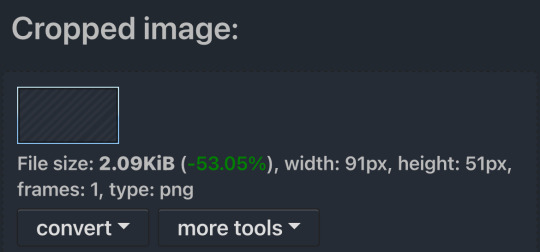
The dimensions inside this template in particular are 91x51. This is what we will resize our gif to! Before we can do that, click the crop tab again at the top of the page to refresh it and then insert your gif. This isn’t required to do, but I like to crop my gifs a bit so they focus more on what is going on inside my stamp. Like I said before, the closer the better, as it will make the quality higher!

Now that we have our cropped gif, click the tab called resize at the bottom of the page. The dimensions of the inside of this stamp are 91x51, so insert those numbers in the width and height boxes to then resize the gif.

Next step is to click the overlay tab at the bottom. You will need to click the button that says “extend canvas size” so we have room to overlay the stamp template on top of the gif. After extending the size, upload the stamp template as an overlay where it says choose file.

On computer, after clicking upload image, you can just drag the stamp template over the gif and situate it. However, you can also figure out the number coordinations to fix the template ontop of the gif by messing around with it a bit. I make my graphics on my phone so I use the numbers instead of dragging.

Left means to move the template left or right depending on the numbers you insert. Top moves the template up or down. The left for this template is 42 and the top is 21. It takes a bit of messing around to find the exact numbers.
Now that the template is ontop of the gif, all that is left to do is to crop the space around it. Click the crop tab again at the bottom of the page and then click where it says “trim transparent pixels around the image.” This will easily crop the extra space around the stamp.

Click download to save your gif and that’s it! Here is the finished product!
The whole process for making gif stamps is always the same, the only things that can vary or change are the dimensions of the gif (so it can fit inside different templates) and the left/right.
I hope you find this tutorial helpful and if anyone needs anything else explained, let me know. These stamps are free to use if anyone would also like to use them.
Happy stamp making everyone! 🩷
Dividers (c) @coco-coquette

#tutorial#web graphics#graphics#webcore#old web#rentry#stamps#web decor#gif stamps#alien stage#alien stage till#strawpage#spacehey#ᯓ ᡣ𐭩🐚asks
643 notes
·
View notes
Text
4t3 Conversion of Grouped posters by @cosmiccs4 + Recoloring PSD with tutorial
8 non-recolorable presets
1024 textures
Included PSD for retexturing (tutorial how to use under the cut)
113 poly, all LODs
Shiftable
Price - 5§
BGC
Compressed package
TOU, Ko-Fi

DOWNLOAD | ALT | SIMBLR.CC
Tutorial: How to use my PSD for retexturing
You need:
Photoshop with .dds plugin
My retexture PSD and package file of posters
19 pictures to your liking, preferably vertical
TSRW
Sims3Pack Multi Installer and Compressionizer
Step 1: Open my PSD file, open your images:
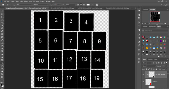
Step 2: Select (Ctrl+A) copy and paste to posters file (Ctrl+C, Ctrl+V) first of your images :
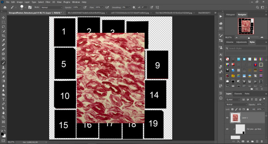
Step 3: Choose where you want to put it, for reference you can use one of the presets:
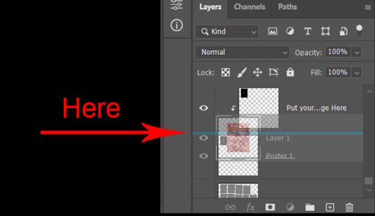
Step 4: After you decided with placement of your image. Move its layer in the Layers tab between "Poster x" and "Put your image here" layers, it will create a clipping mask, which allows the picture to be fit within the poster without cropping. Hide or delete "Put your image here" layer.
Step 5: Use Transform, Free Transform and Move tools to resize the image by your liking:

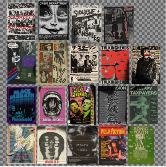
Step 6: Repeat the Step 2-5 with other 18 images:
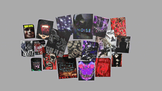
*vibes are totally random, all images from Pinterest*
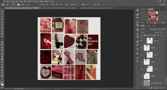
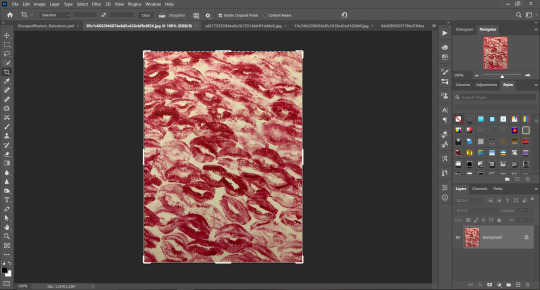
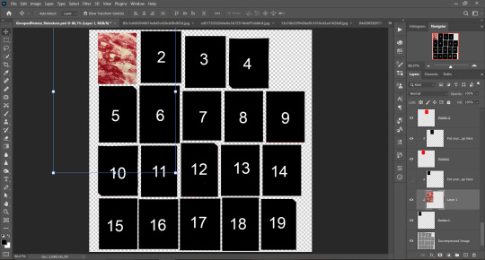
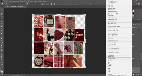
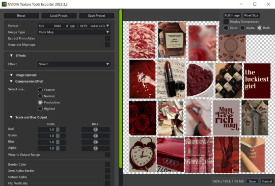
Step 7: After you've done, delete all the "Put your image here" layers, if you didn't it before. Right-click on the Layers tab and press Merge Visible (Shift + Ctrl + E). Now press Save As (Control + Shift + S) and save your image as .DDS with this parameters (2nd picture):
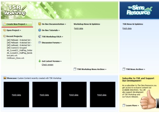
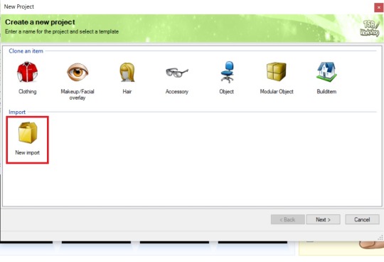
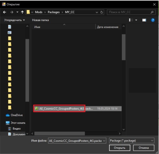
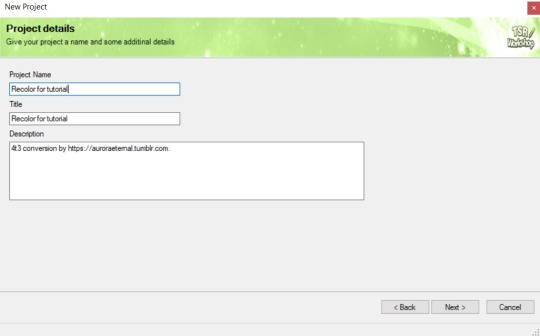
Step 8: Go to TSRW. Press Create New Project > New Import, and select package with my posters. Give for your recolor unique Title and Project name, otherwise it will override original posters:
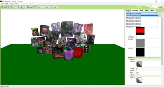
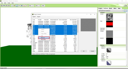
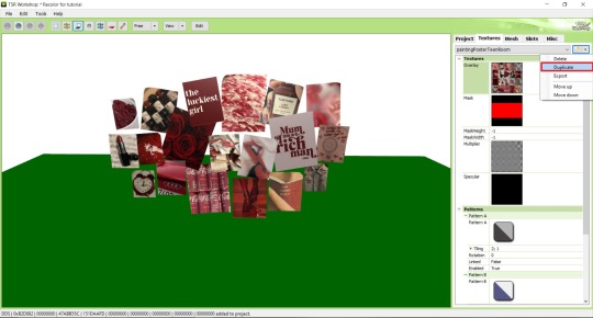
Step 9: In Textures tab go through all the presets except the first one and delete them. Then go to Edit > Project Contents and remove all the textures of removed presets. Its pretty common when someone make retexture of TS3 mesh and leave that unused textures in file, which leads to increasing its size:
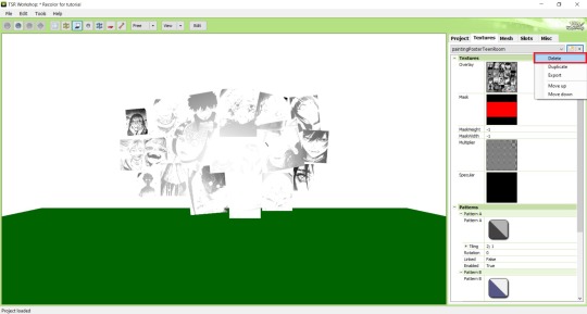
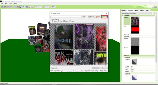
Step 10: Press Edit button next to the Overlay tab. Then press Import button and select your retexture. Press Done and when this pop-up appears, press Yes:
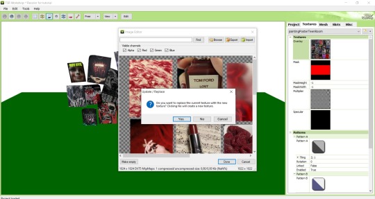
Step 11: If you want to add more presets press Duplicate and reapeat Step 10, but instead, when pop-up about replacing the texture appears, press No.
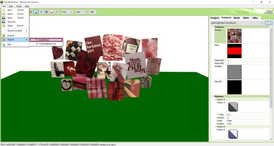
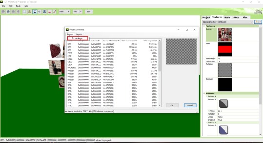
Step 12: After you've done, press File > Export > To Sims3pack or Edit > Project Contents > Export > To .package. If you choose the first method, convert your Sims3pack to Package and in both cases run it through Compressionizer. Test your recolor In-game, make thumbnails (if you want to share it) and have fun!
For those who read this tutorial to the end, click HERE to download this recolor.

@pis3update @xto3conversionsfinds @wanderingsimsfinds @kpccfinds @simfluencer-network @sssvitlanz @simblrcc-site
889 notes
·
View notes
Text

Hey! I'm Amanda | Not WCIF | 18+ (Sometimes NSFW)
Find me on YouTube: Here Main series on YouTube: The Aspiring Artist | Rotational Gameplay All posts related to The Aspiring Artist can be found here. Casual gameplay posts on my blog are separate from the storyline on YouTube. All of my Sims 4 posts | All of my reblogs | Other nsfw posts CAS Mods Cas background | Cas lighting (Studio flat) | Controlled Position Mod | More Cas Columns (6 columns) Game Lighting Mods In-Game Lighting (Dark) | Sunblind Gshade/Reshade I make my own Gshade presets. They are not available for download. However, here are some that I would recommend if you are looking for a preset: Boho dreams (Neecxle) | Birdie (Sforzinda) | Lithium (Gunthermunch) | Luminescent (HazelMine) | Raices (Folkbreeze) | Almond (Glimersims) | Kaleidoscope (Okruee) | White Willow (Tianaberrie) | Serenity (Misslollypopsims) | Neapolitan (Midsummermoon) Photo Resources I use SRWE for a lot of my screenshots. I take some of them on a higher resolution monitor without hotsampling. I use Krita for photo editing and sometimes Canva. I usually crop my photos and resize them for faster uploading. Check out this tutorial if you're new to hotsampling. Check out this FAQ for help with understanding reshade. Video Resources I use OBS to record my videos and Filmora to edit. I also recommend Davinci for a free editing alternative. I use this mic for narrated episodes. Essential Gameplay Mods I don't use a lot of mods because I strongly dislike updating them. But these are the ones that I consider essential for my game: Basemental Drugs (21+) | Wicked Whims (18+) | MCCC I do have other gameplay mods installed, but I don't consider most of them to be necessities. MCCC and WW handle nearly all of the background "tuning" in my game. Other Mods The other mods I have installed: UI Cheats Extension | RPO (I only use modules 1, 7, and 14) | Somnik and Severinka Custom Foods | Control Any Sim | No Zzz | No Music Notes | Hidden Highlight | Tool | No Romantic Satisfaction Decay | Seasons Tuner Defaults/Overrides My current default skin can be found here , default eyes here, default feet here, and default teeth here. I mostly use these skintones. Default phone | Default phone two | Default phone three | Toothbrush | Headphones | Male animation replacer (18+) I don't use custom loading screens, menu/map overrides etc. Some Commonly Used CC I use a lot of eyes from these creators found here and here. I typically use skins, skin details, and other genetics from these creators found here, here, and here.
150 notes
·
View notes
Text

Hello! I got an ask [x] for a tutorial for one of my recent gifsets for tgcf [x], so here it is, split into three parts:
Drawing a Curve
Template - optional: if you want the curve to flow throughout your entire gifset
Colouring - optional: specific to that particular gifset I did
Progressions
PART 1: DRAWING A CURVE
Trying this out as a screen recording for the first time since it's easier to show 🤡
PART 2: TEMPLATE
This part is optional and only applies if you want your curve to flow throughout all the gifs in your gifset. Of course, you can do your curves individually per gif, but it's generally better to have a template for how the entire curve will flow first so that the joining lines between each gif flow smoothly.
Create a new document for your template. For the height, calculate the height of the entire gifset, including the buffer areas between each gif (4px). E.g. for a gifset of 4 gifs, each of which are 540px in height, the total height would be 540px x4 gifs + 4px x3 buffers = 2172px
In your new document, go to View > Guide > New Guide Layout and change the number of rows to the number of gifs. Make sure Gutter is 4px.
In my case, for this gifset, I skipped step 2 and manually created the template for each gif instead, since every other gif has a different height.
Put in a single frame of each scene in your template (see image below).

5. Club the layers according to which gif they will be in, apply the corresponding layer masks for each gif, and draw your curve that will flow through all 5 gifs (see image below). The reason for doing this (having the previews of the scenes in at this stage) is so that as you're drawing your curve, you have a better idea of where it will flow.

6. Duplicate the curve such that each group (i.e. gif of your gifset) has one such curve layer.

7. When you're ready to edit your actual gif, import your scene into Photoshop and duplicate the layers for that particular gif to your imported document. You may need to shift your duplicated layers or crop your file to the right size.

PART 3: COLOURING
The colouring for this gifset is pretty straightforward since everything is in black and white.
1. Import all your scenes and position them accordingly. Add a mask on your curve layer so that you can mask out the parts of the curve you want to be "hidden under" your scene - so that your curve looks like it's interacting with your scenes.

2. These are the usual adjustment layers I use for black and white colouring, but it's up to you to use what you prefer or are familiar with. Play around with the numbers for each adjustment layer to see what works best for the particular scene.

3. Slap on a crumpled paper texture for an added grunge effect.

4. Colour the remaining scenes and done!


PART 4: OTHER GIFS THAT ALSO WORK THIS WAY
Progression 1: curves flowing to organic shapes
set: [x]
Using the same Curvature Pen Tool, but this time with the fill on, to create shapes first. Then, link up the shapes with lines.

Progression 2: flickering curves and organic shapes
set: [x]
On top of Progression 1, draw 2-3 variations of your curves and shapes and lay them out chronologically on timeline so that you get this flickering effect.

114 notes
·
View notes
Note
if you ever have time/feel so inclined, i would love to see a tutorial or some tips from you about how to do color isolation sets!! they are absolutely incredible and I love them so much! <3
absolutely! thank you so much 💙
here are a few examples of my color isolation sets:
the substance (yellow) || beetlejuice (red) || us (red) || conclave (blue) || sleeping beauty (cyan/blue) || crimson peak (yellow) || smosh (purple) || conclave (red)
beneath the cut, i'll walk you through my coloring process!
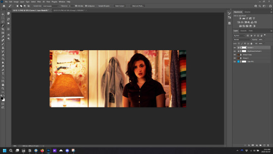
notes: tutorial assumes basic gifmaking knowledge & i'm using adobe photoshop 2023 (though afaik, your version shouldn't matter much)
i don't color my gifs until they're sharpened and i'll give you a quick overview of my process: file -> import -> video frames to layers -> trim any extra frames -> crop to desired dimensions -> run sharpening action (i used this tutorial and just made it into an action) which also converts to timeline
once i'm in timeline, i go through my normal coloring process. unless i'm giffing similarly colored scenes that i've already colored and saved a psd for, i usually color from scratch every time. obviously, some adjustment layers vary depending on the source material, but these are almost always my main adjustments, just with differing values
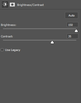
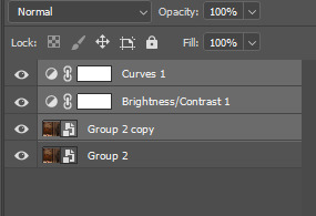
a brightness/contrast layer set to screen - this is a gamechanger for especially dark scenes. note: i do not adjust the values, i leave them both at 0 and just change the blending mode
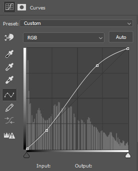
a curves layer utilizing the black & white eyedropper tools. first, i select the black eyedropper and then click on the blackest area of the gif. i do the same with the white one, using it to select the brightest/whitest spot. this can help a lot if you're dealing with heavily tinted scenes!
a selective color layer (set to absolute, not relative) where i adjust the blacks usually anywhere from 1-5 notches higher and the neutrals either up or down the same amount depending on the scene. be careful with the neutrals when giffing poc as lightening them can result in whitewashing. if need be, i will also adjust the whites, making them slightly whiter with the black slider. selective color is by far my fave adjustment layer and i use it in every single coloring.
after this, i sometimes add a black & white gradient map adjustment layer set to soft light. i'll play around with the opacity, leaving it anywhere between 5-100% depending on the scene. i think this adds depth to your colors and adds some contrast, but i don't use it in every psd.
occasionally, i'll mess around with vibrance/saturation, and that'll be my final layer, but oftentimes i won't actually add this layer until i've finished the rest of the coloring. this is just where the layer will go.
these are the main 5 layers i almost always start every single coloring with and they act mostly as a base and to color-correct any weirdly tinted or exceptionally dark scenes.
now, let's talk about scene selection. i try to set myself up for success by choosing scenes that either already have a very noticeable pop of color or have a color i know can easily be manipulated. you'll want to pick scenes that aren't drenched with the color you want to isolate though, or you won't have the contrast of the black & white.
here are a few examples of good scenes:

the only red here is the covered bridge and it will be easy to adjust only that and not the blue, green, or yellow.

same as above, apart from ralph fiennes's face, which obviously contains red undertones. i'll go more in-depth on this in a bit, but because this scene doesn't have a lot of movement, this will be able to be fixed with layer masks.

again, here we have one bright occurrence of yellow surrounded by blue that we'll easily be able to neutralize.
and a few of bad/less than ideal scenes:

while this scene is an absolute dream for making super vibrant sets or color palettes, it's no good for color isolation. this yellow covers basically everything, leaving no other colors to cancel out.

while i definitely did try this one out, the scene is ultimately too dark and too cyan-tinted to properly isolate the red of the blood or the cyan in her eyes and on the walls.

just like the first one, this scene is fully just. color drenched. would make a great base for a vibrant or color palette set but not useful for color isolation.

bad and wrong!! coloring this movie, however beloved, was a test of my sanity. you have this yellow/green filter over everything and so much of it that isolating or changing one or the other is pretty much impossible.
with all that being said, play around! the best way to learn what does what is to try it out yourself. selective color, though there are other ways of getting the same or similar effects, will be your best friend. it's how i'm able to make sets like this & this!
let's look at this adjustment layer using a scene from conclave:

truthfully, you could either isolate the orange of the wall or the blue of her outfit. i'm going for the latter at the moment.
add a selective color layer by clicking this button:

i like to really emphasize the color i'm going to isolate, make sure it's as consistent with the other scenes i'm using and that it pops. from the dropdown in the layer properties, i select blue.

each color from the dropdown will look like this. you have adjustable sliders for cyan, magenta, yellow, and black. the more to the right, the more you're emphasizing that color in any blues in your image. the further to the left, the more of that color's opposite you'll adjust. each opposite pairing is as follows:
cyan + red magenta + green yellow + blue black + white
if you're struggling with this (i did at first), visualize it. pull up one of those "bad" examples. say we take the yellow scene from the gorge. add a selective color layer to it and select yellow from the dropdown. play with the sliders to see how AND how much each adjustment changes the coloring. decreasing the yellow slider all the way to -100% is adding blue to anything ps identifies as yellow. because yellow and blue are opposites, it pretty much neutralizes the scene. instead, if you use the magenta slider and push it all the way to the left, you make any yellows become green. if you move the magenta slider all the way to the right, you'll add magenta to any yellows, making the scene orange. it's all about knowing the color wheel and experimenting!
back to the conclave gif! i want to bring out the blue as much as possible, under the blue dropdown, i crank the cyan slider all the way up and bring the yellow all the way down.

is it a massive difference? no, but you can definitely see the difference between the left (with the adjustment) and the right (without).
depending on the scene and color i'm working with, i'll play around with other layers from the dropdown. but i prefer to do each color in a different layer and i right-click on the box with the eye in the layers panel and change it to the applicable color. that way, it's easier to adjust something later on. you can also rename your layers, but this is quicker and easier imo.

with this particular scene, this is the only adjustment i want to make to the blue for the time being. now, it's all about getting rid of any other colors. to do this, add a hue/saturation layer and select every color, one at a time, EXCEPT the color(s) you're isolating and bring the saturation all the way down to -100. in this case, it's everything but the cyans & blues.

and this is what i'm left with:

from here, you can leave it, but a lot of the time, i'll add a vibrance layer or even another blue/cyan selective color layer and crank that shit up.

this is after adding a vibrance layer (increasing both vibrance & saturation to 100) AND a selective color layer (decreasing the yellows to -100 in the blues).
i would consider this finished, but this can also be super fun to mess around with, again, using selective color:


and if the way her hair changed colors is bugging you, toggle your layers on and off until you find which one(s) changed it and add a layer mask, coloring over her hair with a soft black brush:

once you're happy with everything, save your gif in your preferred way. these are my save settings just for shiggles:


et voilà!
overall, the best advice i can give is to try. experiment! if you're not sure a scene will work, give it a shot. even if it doesn't, you've still learned something. i know it can seem confusing at first, especially if you're not super familiar with these layers or the color wheel, but please feel free to ask any questions. also, let me know if anyone wants another tutorial(s) where i go more in-depth on other colors. i'm happy to do it!
#answered#daynascullys#my tutorials#gif tutorial#gifmakerresource#completeresources#dailyresources#emilyblr#usercats#userholloway#tuseruta#usertina#userrobin#uservivaldi#userchibi#userbunneis#userbambie#useraljoscha#tusermira#userelio#userscourt#userishh#angelblr#heymaur#elwintersoldado#tuserhol#usermaguire#useraashna
109 notes
·
View notes
Text
Gaming GIF Tutorial (2025)
Here is my current GIF making process from video game captures!

PART 1: Capturing Video
The best tip I can give you when it comes to capturing video from your games, is to invest in an injectable photomode tools - I personally use Otis_Inf's cameras because they are easy to use and run smoothly. With these tools, you can not only toggle the UI, but also pause cutscenes and manually change the camera. They are great for both screenshots and video recording!
As for the recording part, I personally prefer NVIDIA's built-in recording tools, but OBS also works well in my experience when NVIDIA is being fussy.
PART 2: Image Conversion
Do yourself a huge favour and download PotPlayer. It is superior to VLC in more ways than one in my opinion, but is especially helpful for its Consecutive Image Capturer tool.
Open the video recording in PotPlayer, and use CTRL + G to open the tool. If this is your first time, be sure to set up a folder for your image captures before anything else! Here are the settings I use, albeit the "Every # frame" I change from time to time:
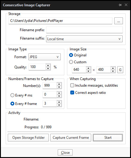
When you're ready, hit the "Start" button, then play the part of the video you want to turn into a GIF. When you're done, pause the video, and hit the "Stop" button. You can then check the images captured in your specified storage folder.
(TIP: Start the video a few seconds a head and stop a few seconds after the part you want to make into a GIF, then manually delete the extra images if necessary. This will reduce the chance of any unwanted cut-offs if there is any lagging.)
PART 3: Image Setup
Now, this part I personally always do in GIMP, because I find its "Open as Layers" and image resizing options 100% better and easier to use than Photoshop. But you don't have to use GIMP, you can do this part in Photoshop as well if you prefer.
Open the images each as an individual layer. Then, crop and/or scale to no more than 540px wide if you're uploading to Tumblr.
(TIP: This might just be a picky thing on my end, but I like to also make sure the height is a multiple of 10. I get clean results this way, so I stick to it.)
If you use GIMP for this part, export the file as .psd when done.
PART 4: Sharpening
If you use GIMP first, now it's time to open the file in Photoshop.
The very first thing I always do is sharpen the image using the "Smart Sharpen" filter. Because we downsized the image, the Smart Sharpen will help it look more crisp and naturally sized. These are the settings I mostly use, though sometimes I change the Amount to 200 if it's a little too crunchy:

Here's a comparison between before and after sharpening:


Repeat the Smart Sharpen filter for ALL the layers!
PART 5: Timeline
First, if your timeline isn't visible, turn it on by click on Windows > Timeline. Then, change the mode from video to frame:

Click "Create Frame Animation" with the very bottom layer selected. Then, click on the menu icon on the far-right of the Timeline, and click "Make Frames from Layers" to add the rest of the frames.
Make sure the delay should be 0 seconds between frames for the smoothest animation, and make sure that the looping is set to forever so that the GIF doesn't stop.
Part 5: Editing
Now that the GIF is set up, this is the part where you can add make edits to the colours, brightness/contrast, add text, etc. as overlays that will affect all the layers below it.
Click on the very top layer so that it is the one highlighted. (Not in the timeline, in the layers box; keep Frame 1 highlighted in the timeline!)
For this example, I'm just going to adjust the levels a bit, but you can experiment with all kinds of fun effects with time and patience. Try a gradient mask, for example!
To test your GIF with the applied effects, hit the Play button in the Timeline. Just remember to always stop at Frame 1 again before you make changes, because otherwise you may run into trouble where the changes are only applied to certain frames. This is also why it's important to always place your adjustment layers at the very top!
Part 6: Exporting
When exporting your GIF with plans to post to Tumblr, I strongly recommend doing all you can to keep the image size below 5mb. Otherwise, it will be compressed to hell and back. If it's over 5mb, try deleting some frames, increasing the black parts, or you can reduce to number of colours in the settings we're about to cover below. Or, you can use EZGIF's optimization tools afterwards to reduce it while keeping better quality than what Tumblr will do to it.
Click on File > Export > Save for Web (Legacy). Here are the settings I always use:

This GIF example is under 5mb, yay! So we don't need to fiddle with anything, we can just save it as is.
I hope this tutorial has offered you some insight and encouragement into making your own GIFs! If you found it helpful, please reblog!
133 notes
·
View notes
Note
hi nic!! do u have a tutorial on making gif packs?? i've been trying to look for tutorials and i think i just overwhelmed myself so i dont know where to start :((
omg hi!! i know a tutorial for this method exists, but i cannot seem to find it 😭 i'll go ahead & make one for you ! beneath the cut, you'll find my gifmaking process + all my favorite gif resources. i think something good to note is that every gifmaker i know does it a little differently, so you may prefer other methods like screencap clipping or video-to-layers. i think these tutorials by pochunts would be super helpful if you wanted to explore other options <3 here's the gif i made in the tutorial btw :p

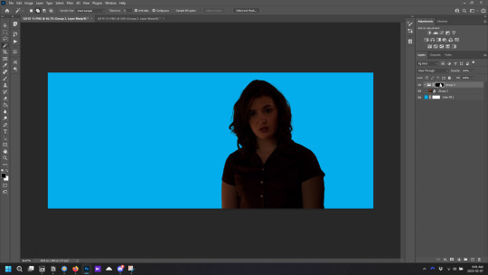
how to make gifs using photoshop's video timeline (+ extra resources):
(if you want to follow along directly, i'm using this video.)
1) download your video. i use this website (cobalt). for the cleanest final product, try to use videos that are 1080p or higher.
side note: if you're downloading something other than mp4 files, you'll need a file converter- i use handbrake for this. this tends to come up if you're downloading tv shows!!
2) open your video in photoshop. (not import, just regular file > open)
this is what mine looks like now. our layouts may look a little different because mine is tuned to my job too.
if you're new to photoshop, go ahead & pinpoint a few things: your toolbar (yellow), actions panel (pink), adjustments panel (green), layers panel (blue), and video timeline (red). if you don't see these panels, go to window in your topbar & click the names.

general photoshop tip... go to photoshop > settings > preferences and 'up' your number of history stats. this will give you more 'undos' if you mess up rather than hitting a wall :p i have mine set to 75!!

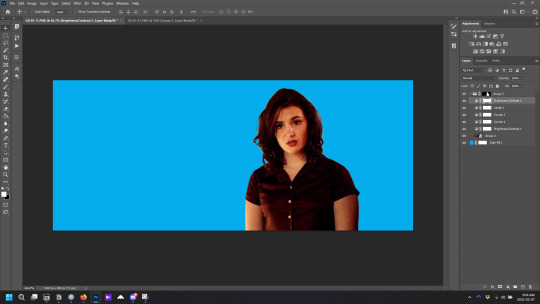
3) convert to smart object. with your base layer protected, right click > convert to smart object, or go to layer > smart objects > convert to smart object. this basically allows you to make changes while keeping the base properties in tact!! you'll notice your timeline change from blue to purple.
bc i use this so often, i made the shortcut cmd+f. you can do the same by going to edit > keyboard shortcuts if you'd like :p


let's focus on that timeline for a moment... get familiar with the split button (red), zoom buttons (yellow), work area (green).
the split button is how we'll divide the video into clips, which will become our gifs. the length of your clip will vary. i just try to fit a completed action into one clip if that makes sense!!
the zoom buttons allow you to move through the video a little easier. this will end up being a personal preference thing. i usually zoom until frames are broken up by 2's (02:00f / 04:00f / etc - shown 2 pics down) but it also depends on the length of the video
the work area defines what will export when you hit save. later on, you'll want to make sure your adjustment layers cover the entire work area.

4) clip your video. skim through your video and pick a scene you'd like to gif. split at the beginning and end by clicking the scissors, so you have something like this. i'll pick three clips for the tutorial.
as a general note, i will clip the entire video in one go, save as a psd, then move onto sizing/coloring/sharpening/etc

go ahead & delete the layers you won't be using as clips. i would rec saving as a psd at this point to save urself the grief of any photoshop crashes since u have now clipped a video to your heart's content!!

5) now, onto sizing your gifs.
first you'll use the crop tool (pink, toolbar). you can input your desired size to keep the scene in ratio (in the pink squared boxes). this is up to personal preference again, i use 260x150.
once you choose a size, you can click the menu the green arrow is pointing to, scroll down, and define a new crop preset.

adjust image size. go to image > image size and type the size you decided. make sure it's set to pixels and that you have the in-ratio button (pink) clicked.

6) next, sharpen your gif.
as you're just starting out, i would suggesting using an action. i have my favorite options in this tag! to keep us on the same pace for this tutorial, i'll use this one by svgarboo.
using an action: click into your actions panel (red), click the options button (yellow) and choose 'load action', use the arrow (green circle) to open your action's folder and choose the playable option (green box). with your layer selected, click the play button (pink).
NOTE: if your play bar isn't over your active layer it won't apply
your video should look a little better & your layer should now look like this over in the layers panel:

if you want to make adjustments, double click the options buttons (pink) and adjust opacity to your liking.
7) coloring your gif. i could not begin to make a coloring tutorial bc i hate how mine turn out 90% of the time </3 BUT there are some beautiful tutorials in here ... I WILL SHOW U HOW TO PLACE THE LAYERS STILL !!!
add a new group (pink) & drag it above video group 1. it will float above your clips on the timeline. this is where your adjustment layers will go! i'm including a screenshot of my adjustment layers so you have an idea.


8) exporting your base gifs. adjust your working area bars to the beginning and end of each clip. go to file > export > save for web. i'll attach a screenshot of my export settings.

WHEN MAKING ADDITIONAL GIFS, REPEAT STEPS 5-8 AS NEEDED. because you used smart objects, you can use ctrl+t/cmd+t on your gif layers to resize instead of cropping each time.
9) adjusting gif speed. open your exported base gifs. you'll see that your video timeline has changed to a frames timeline.
go to options (pink) > select all frames. with all frames selected, click the dropdown arrow (yellow) and adjust your time.
timing will depend on a case-by-case basis. i usually go 0.05, 0.07, or 0.09. play around with speeds until the motion seems fluid and natural. my gif is around 110 frames long so i'm doing 0.05.
10) export again, using the same settings as step 8.
YOU CAN SET UP ACTIONS TO HANDLE STEPS 9 & 10 IN BATCHES. lmk if u would want a tutorial on that :p
now i have 3 finished gifs!!


11) uploading your gif packs. i think hosting directly on tumblr is going to give you the best loading time. and by that i do mean, just uploading gifs to a tumblr page 🙂↕️ if you choose to use alternate hosting sites like imgbb or gifyu, make sure you back your gifs up with a zip file on google drive.
80 notes
·
View notes
Text
The official Japanese site has posted another weekly digest. Included are the tutorial and character introduction videos from this week, along with two new videos:
The first video demonstrates how using tools while jumping powers up their effects, with the text portion also mentioning that upgrading the tools themselves will make them cover an even wider area. Also, even harvesting barehanded has an additional effect, with a Mario 64-esque ground pound allowing you to harvest multiple crops at once.

The second video demonstrates how sometimes, by growing crops in batches, you can get special variants such as having crops turn gold or coming out larger. I can only upload one video per post on this platform, so please check the video at the official site linked above.
55 notes
·
View notes
Text

I couldn't fit the tutorial on a reply lmao, here's a full post explaining my process :]]
STAMP TUTORIAL (TF2 edition, but works for everything)
99% of the process is done on the website ezgif. Ezgif carries the stamp-making process lmao
1. Get your GIF
Tenor: Ok place to grab your GIFs. Average quality of the GIFs is good enough, and looks ok when resized to the size of the stamp. You'll find like 1 normal GIF every 4 buff characters GIF tho.
GIPHY: Average quality of the GIF is better (I don't think the web compresses the GIFs that are uploaded)… If you find what you're looking for. You'll have to SCROLL before finding what you're looking for because there are always non-related GIFs on the top of your searches or the same GIF multiple times, it's crazy.
makeagif: You will find cool GIFs, but the quality is pretty low (I think the web itself compresses the GIFs a lot). It looks bad even when resized down. And it has a watermark, which I recommend cropping because it's not even visible when resized, it just looks like a gray blob on the corner.
Google: Best option by far, quality is pretty good and the ratio of “things I was looking for/things I actually find” is SLIGHTLY in favor of “things I was looking for” (and most of “things I actually find” are just the characters rotating, not NSFW, so that's only a nice change from Tenor). You won't have to scroll much to see different and interesting GIFs. JUST REMEMBER TO FILTER BY GIFS.

You search whatever > Images > Tools > Type > GIF
Make it on your own: Aka, you download your video, go to ezgif's “Video to GIF” (then you can crop it, CUT IT. THIS IS IMPORTANT, YOU DON'T NEED TO GO ANYWHERE ELSE TO CUT YOUR CLIP, YOU CAN DO IT ON EZGIF ITSELF). Ok, I lied, it wasn't Google, this is the best oftion by far. You get exactly what you want, the best quality if you don't compress it much until after the GIF has been resized into the size of a stamp… It's just super time-consuming, and you'll have to spend like an entire hour just watching a video to find the clips.
OK, I HAVE MY GIF NOW
Hehe, his legs go pipupipu
2. Resize
Go to ezgif, this is where the fun begins (if you weren't on ezgif already). You download your GIF, or copy the link and insert it, or you'll have it there if you made it yourself.
A STAMP MAKES 99px × 56px
THE INNER PART OF THE STAMP MAKES 91px × 47px
I RECOMMEND MAKING YOUR GIF 92px × 48px
BTW, THESE MEASURES ARE FOR THE TEMPLATE I'LL GIVE YOU LATER. If you use another template, just go to an image editor and see what the inner size of the stamp is.
So, you set your GIF's width to 92px.

Then crop it, so your height is 48px.

Or you can resize it so it's directly 92px × 48px, but the crop will be in the center, and SOMETIMES YOU DON'T WANT THAT.
For example:

It's a vertical GIF whose area of interest is not in the center, so if we resize it directly-

oops-
ANYWAY
Once you have your GIF resized:
IMPORTANT: BEFORE THE NEXT STEP, REMEMBER TO CONVERT TO GIF IF THE FILE YOU'RE WORKING ON ISN'T A GIF ALREADY
Sometimes you'll be working with a webp without even noticing (EW, I hate webp) and transparencies don't work particularly well with that extension.
3. Overlay

Click on this icon.
Ok, now that that's fixed:

Extend the size of the canvas.

Select your template and Upload image!

This is the template, btw.

Then move the overlay around until it contains the GIF nicely, or just set Left to 43, Top to 20 and Generate image! (I have these numbers memorized, it saves you like 20 seconds lmao)
Also, again, these numbers work on MY template, if you use another one, you'll have to figure it out yourself.
4. Crop

THIS OPTION IS A TIME-SAVER FR
5. Optimize (optional, highly recommend)

I always set my optimization method to Lossy GIF and level 10 because I find that there is no quality loss, and the file size might drop by 30%-70% (actually crazy). These percentages don't change much in higher compressions, even though you'll start seeing a drop in quality around level 35 of compression (the default).
6. Save

YIPPE!!! Your stamp is done :D
You can save it and look at it and place it on your profile or website.


Here it is btw, in case someone wanted it :]] The Sniper GIF but correctly cropped and made into a stamp as well.
Now do that another… eleven times, and you'll have a stamp pack to make into a Tumblr post... Oof TT
There's no website that lets you make stamps faster lmao (I wish)
@sir-broken-bones (I'm @ them so they actually see it, I made this tutorial for them after all lol)
#team fortress 2#tf2#tf2 scout#tf2 sniper#stamps#da stamps#tutorial#graphics#old graphics#neocities#old web graphics#old web
185 notes
·
View notes
Text
Simtanico Cropped Tee V1 For teenagers

I've been overusing the first version of this cropped Tee set by @simtanico , but as I started working on some flashback chapters with teenaged Florian, I realized they could use it as well- so I converted it for teens! I also added two extra masks for Toadifian recolorability.
I have full permission to convert it. Simtanico originally adapted it from a University Life t-shirt.
Download Simblr.cc/ SFS / Mediafire

About the t-shirt
3 Presets with 3 different masks
1k Textures
Found under Everyday, formal, sleepwear, athletic, and career.
All lods: 2902 F 1798 V / 1199 F 793 V / 489 F 382 V
All morphs.
Custom Thumbnails


Made with
Blender 3.6
Affinity photo
Adobe photoshop
TSRW
S3PE
Meshing tool kit.
I wrote down my whole work progress, right here! Hopefully it can function a bit as a tutorial ♥
@eternalccfinds @wanderingsimsfinds @katsujiiccfinds @pis3update
#florian pistache#andres bardem#sims 3#ts3cc#downloads: me#downloads: cas#downloads: clothing#ts3#sims 3 cc#s3cc#clothing TM#ts3 cc tutorial#cc tutorial
50 notes
·
View notes
Text

Hi! I got asked if I have an icon tutorial so I thought I'd do my best to go through my (probably way too long) process :) I'm going to show how I made that icon up there 👆
When I first started making icons I used this great tutorial by @/strwrs and then slowly added my own preferences to make this chaotic process 💕
First for getting screencaps of things i normally just google "[name of show/movie] screencaps" but one of the ones I use a lot is this site.
1. Open the pic in photoshop and crop it
Here's the full image:

Here's where I'm cropping it:

I like to make the size of my icons 250x250 but it can be more of a preference thing, a lot of people use 200x200 or I've seen 100x100 too.
I also like to crop a little above the image sometimes to give more space above the head
2. Removing the background
Removing the background is way easier on animation than on real people sometimes so I can show 2 examples even though I do it the same way...
First I go to select > select and mask:

Then I use the quick selection tool to select as much of the head as i can and the brush tool to remove/re-add parts that got missed so it should look like this:


(is the quick selection tool great? not all the time but when it works well it's great 🤡)
For something like this where her hair has a lot of texture in it and it's difficult to get a good outline, I'll zoom in really far and use the brush tool to get as many of the big pieces as I can so it looks a little more natural when the background color is added

Sometimes there can be a white/black line around the icon that got missed from erasing the background and you can use the brush tool to erase that as well.
3. resizing and sharpening
Now everything should look like this:

I'm going to go to the right where my layers are at and create a new group by clicking on the folder at the bottom
Then I drag the layer mask up to link it to the group instead of just the image and drag the image into the folder:

Next I like to sharpen before I resize the image so I open the group and highlight the image layer and then go filter > convert for smart filters and then for sharpening: filter > sharpen > smart sharpen with these settings:

Now with the image layer still highlighted i go to image > image size and set it to 250x250

4. the fun part ✨
Now we can add the background color and everything else ✌️
I have a lot of previous templates saved to save me time so what I normally do is open a psd template I have then highlight the group layer i just made then right click > duplicate group and have the destination be the psd and then I can just change the colors of gradients i've already made (For this tutorial though I'll show you how I make the gradients/paint layers)
For coloring this is pretty much what my process usually looks like (im probably going way overboard with it but oh well lol) it really depends on the pic being used, some don't need to be colored as much.
I have found that over brightening/upping the vibrance isn't necessarily a bad thing sometimes (not all the time though) because of how small the icons are it kind of helps the image stand out more when they're used but it's up to you!
(I also put all the adjustment layers into one group because it gets a little chaotic if I don't)

Next we're going to make a gradient ✨ first i go to the adjustment fill button (?) and pick gradient

Then I just pick one of the generic photoshop options that kind of has the look I want ( it doesn't matter too much since it will be edited so it can be any color)

Now to change the color of the gradient click on the color part in the gradient section and you'll see this

I deleted the bottom middle square because I didn't want it, but to change the colors double click on the bottom left or right squares and a color wheel will pop up.
When I pick the lighter color i normally just go up to a lighter section above the darker color
This is the change i made, you can move the middle diamond slider to have the darker or lighter color be more prominent

Next is playing with the angle/scale until it's how you want it, these are what mine ended up being

I also normally adjust the angle so that the lightest part of the gradient is in the top corner where the light source is coming from in the icon pic to make it look more natural
Next I add a solid color layer over the coloring layers with a color that's similar to the background gradient color im using and switch to the brush tool with black paint and with the layer mask selected on the solid color layer paint over everything i don't want colored with black
Then I do a second solid color layer set to a lightish brown, normally on just the hair, to add a bit more contrast

then i set the color fill layer that matches the background to either overlay, soft light, or color (depending on which one looks best for the image) and adjust the opacity/fill to where I want it.
I always set the brown layer to soft light with the opacity at around 80%
And NOW just when you think I might be done...I'm not...because I have to make this process as long as possible 😂
Now I do another color fill layer but this time over the entire image group layer. I normally make the color a slightly lighter color than the darkest part of the background color, set it to soft light, lower the opacity/fill to about 50% or lower, (depending on how much it changes the pic) and then right click > create clipping mask so it only effects the image and not the background
This kind of just tints the image a little with the color to bring it together a little more

Now the icon looks like this:

You can add more fun stuff like doodles/background textures i've used these and these but there's a lot of resource blogs like @/completeresources and @/allresources that have long lists of different textures
If i wanted to add a texture though i would put it over the gradient layer and set it to overlay or soft light


And to add a doodle you just put it at the very top of everything and resize it/turn it using the move tool :)


Then you're done! you can go file > export > quick export as png and thats it 👏
Hopefully this makes sense! I've uploaded the template i made in the tutorial here if that's easier to follow but feel free to ask if you have any questions!
#icon tutorial#dailyresources#completeresources#icons#tutorial#tutorial*#photoshop tutorial#usertana#userzo#tusertha#ps*
49 notes
·
View notes
Note
I couldn’t resist this thing we’re doing with Homestuck characters with Youtube channels so here we go.
Beta trolls first/
Aradia: 100% she’s a spelunker who’s video content is exploring abandoned urban areas and cave systems. She even has on hand dusting tools and a pickaxe to look for exposed fossils. Her uploads coincide within a day of a person dissapearing or the report of a murder.
Tavros: he’s Alternia’s biggest Pokétuber, or I guess in this sense, a Fidutuber. He likes to discuss the meta for competitive and lore about the fiduspawn series. He also dabbles in fantasy RPGs, especially if there is a girl with magical powers or a protagonist whisked away to a fantastical realm, tying back to his Pupa Pan obsession. What’s cool about Tavros’s playthroughs for his RPG games is they’re narrated and voice acted by his friends! He has Nepeta and Aradia do some of the female cast voice acting, as well as Gamzee and Karkat for male voice acting!
Sollux: twitch streaming speedrunner, very popular in the speedrunning community for his TAS tech and glitch hunting prowess. His uploading schedule is very infrequent due to his struggle with sensing the imminently deceased.
Karkat: 100% a movie reviewer like that of the Nostalgia critic, his review gimmick is he trues to violently destroy movies he considers “COMPLETE SHIT FESTIVITIES” by using threshecutioner style combat on the DVD boxes, or if the movie was digitally downloaded, corrupt it with one of his broken, shitty viruses.
Nepeta: survivalist vlogger who gives tips on living in a cave, animal hunting, preparing meals from the meats of different wild animals, and how to keep contact with the civilized world. Notably Nepeta has collaborated with Aradia to guide her through particularly hard to navigate caves.
Kanaya: fashion and aesthetics channel. She is a lifestyle blogger dedicated to showing you how everything can be shaped colored and placed to fit your personality. She’s got playlists for landscaping and gardening, fashion, and hell even how to make the food on your plate look appetizing!
Terezi: skit and parodies channel. Her on hand plushes make her a plush skit channel similar to SuperMarioLogan, and she loves to invite her friends to cast as different pyralsprites, action figures, paper drawings and even an occasional animal carcass for her new episodes. When her plushes are worn out, Terezi instead uses GMod and editing software to make her secondary skit show, think SMG4 but now the characters type in leetspeak and reference bugs and grubs a lot. For using copyrighted characters she has been sued many times and won every case. She uploads legal advice to a secondary channel on how to avoid getting copyright claimed and how to win in court.
Vriska: e-thot and competitive gamer. She plays a lot of ranked team games like Overwatch, Marvel Rivals, Fortnite, and even Team Fortress 2! She’s toxic, and has been known to call out and swear at her teammates and opponents, has doxxed her own moderators for her chat, and once sent Tavros a virus to his computer for wiping the floor with her at FiduFLARP, a modded game of FLARP that adds in fiduspawn monsters as catchable enemies. How she’s not banned is a sinple reason: she always streams with a crop top that’s worn low.
Equius: hybrid channel for electrical engineering and combat training. He’s like electroboom in that he gets shocked quite a lot, but different in that he could build a Boston dynamic robot in less than an hour. He has tutorials on constructing the control systems of military aircraft! His combat videos focus on a lot of boxing and hand-to-hand techniques, and especially how to concentrate the force of your blow. When he does demonstrations for weapon combat, he invites Karkat and Tavros over for battle strategies for Threshecutioners and Cavalreapers.
Gamzee: naturalist and spiritual healing channel. He streams often for calls with chat members asking for their ailments and providing healing advice or even trying a through-the-screen hypnosis method to cure chat members. He’s a fraud, but people love his calm demeanor and positive attitude so much people go to him for vibes, and his “cures” work often enough that some people even believe he has healing magic.
Eridan: strategy games and naitical technology. World of Warships no. 1 advertising advocate. He also dabbles in human games like Hearts of Iron IV and Sid Mires’s Civilization series. He thinks they’re actually really really easy games. When he reviews ships he likes to go to museums to review and describe war ships and how effective they were at sea. Sometimes he can even swim to shipwrecks if he feels like it, which is… rarely.
Feferi: Vlogger for ocean diving and nature documentation. Her positive attitude and natural optimism towards the unknown makes her view even the most ugly and aggressive deep sea life seem cute and misunderstood. Surprisingly her favorite sea life is the shark! When Eridan needs to explore a shipwreck, he uses Feferi as a guide to get him safely diving down to the wreckage, and so he doesn’t feel alone in the dark waters. Deep sea diving actually burns a LOT of calories, especially with how long her videos can get (2-4 hours) so on the side she does shorter Mukbang videos! Commenters are in awe that she’s so skinny despite eating half her weight in food every time she does a Mukbang.
Beta kids/
John: illusions and pranks channel, loves to live record strangers falling for his obvious trucks and deceits. Don’t worry it’s all for fun and no one gets hurt :) His magic even extends to cool programs you can do on your computer to make your desktop do something cool, or customize your pointer (yeah to this day he’s still an amateur at coding) when Karkat is reviewing bad movies, John is usually invited for skits where he’s the stand in for a stawman of the movie’s fandom explaining why the movie is actually good.
Rose: she’s like those atheist skeptic channels but instead of just debunking God and flat earth theory she also uses her magic to prove and convince her subscribers the horrorterrors are the only real cosmic entities who exist beyond the physical universe. In the case there’s a video going around of something crazy happening that could be a hoax, she invites John over so he can rant and expose the magic tricks the video uses to make it look real.
Dave: shitposter. He posts whatever he feels like whenever he feels like. Tony Hawk combo score, Sweet Bro and Hella Jeff comic dubs, Smosh skits with John, and a lot of Youtube Poops. He’s less a poster and more an editor. He’s done video editing for a bunch of other Youtubers, like Karkat, Kanaya, Sollux, Terezi, John, and Rose. He has a lot of time on his hands and he uses it for the best editing gags and cutoffs you could imagine. Like Caddicarus but even funnier.
Jade: she’s a mystery. You’ll see her everywhere and yet her main channel has less than 10k subscribers. She has made a cameo on EVERY character I’ve described so far. She’s dug up bones for Aradia, competed against Tavros in fiduspawn (and narrates for his RPG playthroughs, voice acting for some female characters too!) she playtests Sollux’s speedrun strats to see of they’re humanly viable, she’s done skits in Karkat’s video where she parodies prominent female characters alongside John, Dave, and Sollux. She is used as a practice combatant for Nepeta to demonstrate fighting various wildlife from foxes to bears. She’s done in depth explanations for various plant life and their living conditions in Kanaya’s horticulture videos, she plays in Terezi’s skits as a character who’s a stereotypical furry, she’s Vriska’s top pick for playing casual multiplayer games like UNO, or Worms, or Smash Bros. Jade was a featured teacher for how to build a homemade Nuclear Reactor with Equius. She was interviewed by Gamzee for her dog ears and her ability to see the future. She demonstrates how to handle various firearms in Eridan’s videos, and has even done 2-person mukbangs with Feferi. So after all that, what does Jade post on her main account? Squiddles character AMVs.
If I’m gonna do the alpha kids and trolls it has to be a separate ask, this is a very long one.
Hot damn! These are all so good!
#homestuck#Beta Kids#Beta Trolls#John Egbert#Dave Strider#Rose Lalonde#Jade Harley#Aradia Megido#Tavros Nitram#Sollux Captor#Karkat Vantas#Nepeta Leijon#Kanaya Maryam#Terezi Pyrope#Vriska Serket#Equius Zahhak#Gamzee Makara#Eridan Ampora#Feferi Peixes#Influencerstuck
34 notes
·
View notes
Note
hi! i love your icons, i was wondering if you could do a tutorial on how you remove the backgrounds? the lil hair details you have is so good idk how to word it 😭🩷
thank you rachel i'm glad you like them 😊
removing the backgrounds is a pretty simple process, but depending on the shot you choose, it can take a bit more work. i'm a visual learner, and tend to over-explain, so there's a lot of images
make sure to sharpen your image first, but don't resize/crop, or at least not too much, i find it easier to work with a large canvas. also, add a solid fill layer underneath your image layers, set it to a bright colour, we'll use that later.
Option A
if you've a got a shot with good contrast between the character/hair/clothes and the background, we have the quick option
copy your image layer, we're gonna work with the top one first
the image already has good contrast, but to make step 4 easier, we're gonna add a brightness layer, crank the brightness way up, and add a little contrast. then i also added a curves layer and just played around with the lines till i felt the contrast was enough
as you can see, she's ugly. but that's okay cause we're gonna get rid of that colouring later
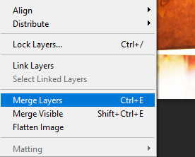
3. select the two adjustment layers, and any other adjustment you added, and also select the top copy of the image, the merge those layers layer/ merge layers (that is not your default merge layer shortcut, don't use it, i don't remember what it originally does)
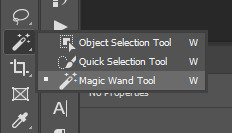
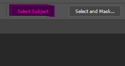
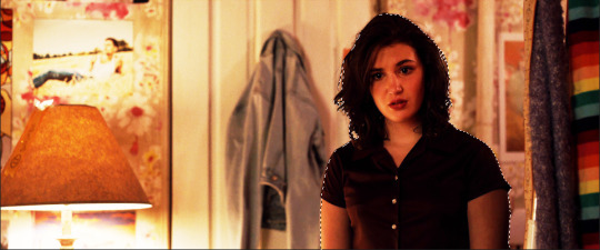
4. take the magic wand tool, and with the now merged layer selected, choose "select subject" from the top toolbar
your image should now look like this, with the person outlined. if the outline isn't completely perfect don't worry about it right now
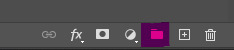
5. now select the bottom copy of the image, click create folder, and with the new folder selected click "add layer mask"
now delete the top merged copy, and you should be left with this
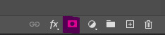
very dark
6. right click on the layer mask and select "disable layer mask" and you'll be left with the the original image.
7. you can now do all your base colouring for the icon. make sure the adjustment layers are inside the group you just made, so when you make your background underneath the group, your adjustment layers don't affect it.
colouring tips: toggle the layer mask on and off as you colour, because sometimes colouring that looks good in the scene doesn't look so good without the background. i tend to make the colouring brighter on icons than on gifs, so the character stands out more against the background.
now she looks pretty good, ready to be cropped and have a background added. but maybe the character outline wasn't perfect. the solid fill layer is to help see any errors in the outline. if there is we move on to step 4 of Option 2 and fix them
Option B
if the image you've chosen is darker or has little to no contrast, do steps 1-3 from option A first
4. add a blank layer mask to your merged layers (if you're coming from option A, use the layer mask you've already made) and select the paintbrush. for most of the image you'll want to use a brush between 20px and 50px, with a hardness of 50%. and now the not so fun part, paint over the background. toggle the layer mask off and on as needed to check what's background and what's character. make sure the layer mask is selected before you paint
painting tips:
-paint the outline first, then you can use a much large brush to quickly cover the rest of the background.
-move slowly, but smoothly.
-work in sections; don't try and paint the entire background with one mouse click, because if you mess up and use undo, you lose all the work.
-sometimes you should paint over parts of the character/clothes/hair to make it more cohesive. in the above image, the shirt juts out oddly on her left arm, and can pull focus without the original background, so i would paint over it to make it look more like her right arm
-for hair, use a smaller brush around any loose bits you want to keep. remember that the canvas you're working on is much larger than how the icon will appear when used, so you only need to paint over the parts where the background is very obvious. zoom out if necessary to see how it will look
5. when finished painting, right click on the layer mask and select "add mask to selection", then continue with step 5 of Option A. you can always adjust the layer mask after the final colouring if things don't look quite right.
and that's how you remove backgrounds for icons! probably made it seem more complicated than it is, but i'd rather tell you something you already know than assume you know it when you don't and leave you without crucial information. come back if you have any more questions
39 notes
·
View notes
Text
HOW TO: Cross-Fade Multiple Gifs
Hi! In this tutorial, I'm going to go over how I typically do a fade transition that works with Video Timeline. Disclaimer: This tutorial assumes you have a basic understanding of gif-making in Photoshop and requires the use of keyframes.

Before I start, if you're wondering "why don't you just use the cross fade tool on the Timeline?" — this thing:
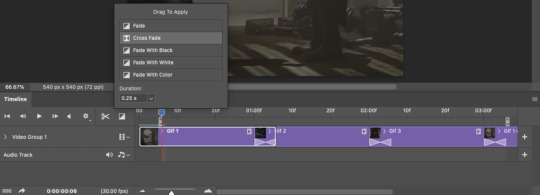
It doesn't work for me 🤷🏻♀️ Something happens when converting from Video Timeline back to Frame Animation (the converting everything into a smart object step) that completely negates the cross fade whenever I use it. I'm not sure why, but this is why I do fade transitions the way I'm about to explain.
PHASE 1: THE GIFS
1.1 – Determine how many frames you need. There are 3 things to remember here: 1) Ideally, each gif section should have the same amount of frames, so the transitions feel evenly spaced. 2) The gif's dimensions and total number of frames affect file size. Your final exported gif needs to be under 10MB (Tumblr's limit), so you should consider the total number of frames in relation to the size of your gif. My example gif is 540x540px and 60 frames total; final file size = 7.8MB. 3) Add 4 extra frames to each section to account for the cross-faded portion. (The reason I chose 4 specifically is because Video Timeline works in 0.03-second intervals. The typical duration of my fade transitions is 0.06 seconds — which, when converted back to frames, is 4 frames.) I knew 60 total frames would be a safe bet for a gif this size. Since I had 3 gif sections, each would be 20 frames. I added 4 additional frames, making each one 24 frames (before removing duplicates in the exporting process, which will be explained in Phase 3). You can make your transitions longer than 0.06, but I recommend keeping it to intervals of 0.03 due to the way Timeline works. Every 0.03 seconds = 2 frames, so use this when deciding how many extra frames you'll need.
1.2 – Import frames, crop, and resize. Do this as you normally would! If you need a tutorial for the basics, here's my tutorial. :)
1.3 – Move all gifs onto one document/canvas. Right-click the gif layer and select "Duplicate Layer:"
Then choose the appropriate document from the dropdown list:

Do this for each gif section so you can work on one document for the rest of the process.
1.4 – Put each gif into its own group. Select each layer and use the shortcut Command+G or right-click and select "Group from Layers." In Phase 2, we'll be putting the opacity keyframes on the groups instead of the individual layers.
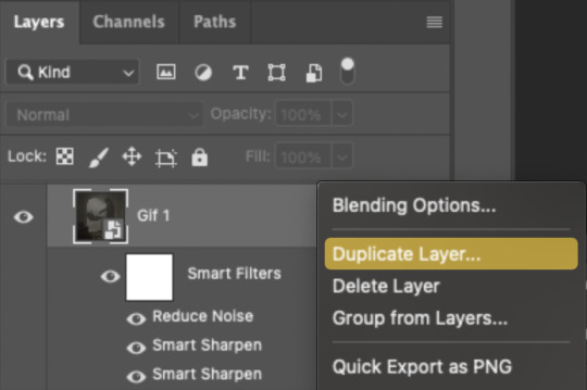
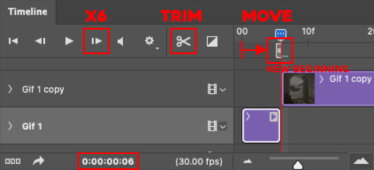
1.5 – Arrange each gif's group on the Timeline. At the end of Gif 1, move backwards 6 times. Move the starting point of Gif 2 to this spot. At the end of Gif 2, move back 6 times and make this Gif 3's starting point. Here's how my gifs look arranged on the Timeline, animated so you can see the 6-space distance:

We'll be adding keyframes to these overlapping sections in Phase 2.
1.6 – Set up the last transition. At the very beginning of the Timeline, hit the forward button 6 times and click the scissors to divide the clip. Move the starting point of your gif to the newly trimmed beginning as shown below:
Then, move the original beginning chunk of Gif 1 — that tiny 0.06-second clip — to the end of the timeline above the rest of your layers, aligning its end with the end of Gif 3. Put it in a group like you did in Step 1.4:

Note: This screenshot shows my final workspace with the coloring layers in groups and the keyframes already placed.
1.7 – Color your gifs. Do this however you want, just keep all your adjustment layers and any other effects within their respective groups:
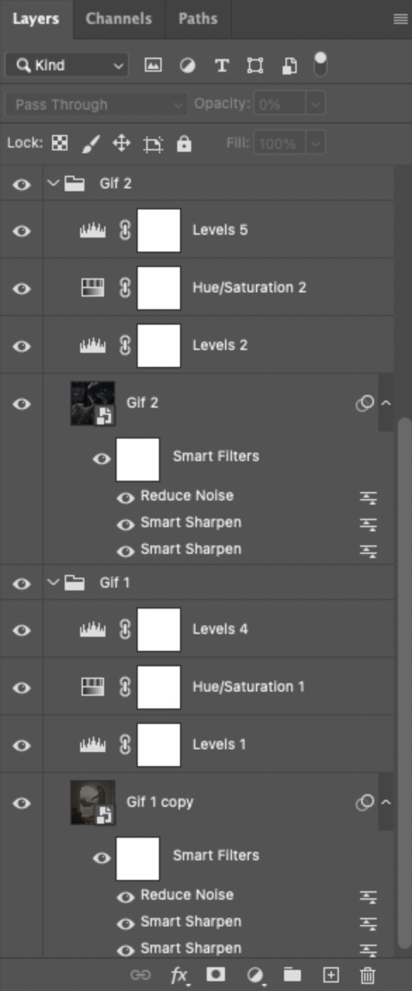
Duplicate the adjustment layers from Gif 1 and move them into the folder Gif 1 - Beginning (where your tiny 0.06-second clip is). Be sure the adjustment layers line up with the rest of the group so those adjustments don't affect your other gifs! You may want to trim the adjustment layers to match the duration of the clip or just move them so they start at the same spot as that clip.
PHASE 2: THE KEYFRAMES
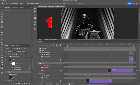
2.1 – Place a 100% and 0% keyframe at the beginning of each gif's group. Drag the playhead (red vertical line) to the end of Gif 1. Expand the Gif 2 group to reveal the opacity keyframes on the left side of the Timeline panel, then place a keyframe by clicking the icon that looks like a stopwatch. This opacity keyframe is at 100% by default; leave it like that. Drag the playhead to the beginning of Gif 2 and drop another keyframe. While that new keyframe is highlighted yellow, go to the layers panel, make sure Gif 2's group is selected, and reduce the opacity to 0%.
Repeat these steps for each gif's beginning, including the tiny chunk we moved to the end! Here's a gif to show the process:
(Btw, if you click this gif, it should expand to full size so you can get a better look! I made it 1080px.)
PHASE 3: THE DUPLICATES
3.1 – Convert back to Frame Animation. If you're not sure how to do this, I've written out the steps here. But I recommend using an action in your general gif-making process to make this step a lot faster. The one I use is linked in my tutorial which I linked earlier!
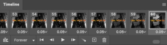
3.2 – Delete duplicate frames. Remember, at the beginning I set out to make my final gif 60 frames total. With the keyframe animations, I now have 66 frames:
Palpatine's number 👎 Anyway, that means I have 6 duplicate frames. This is what the gif looks like without removing these duplicates:

Watch closely during the transitions; there's a tiny lag. It doesn't look smooth to me. It's the clones!! Here's why we have these duplicates:
For every 0.03-second long keyframe animation, you'll get 1 duplicate frame. Unfortunately, that's just how Video Timeline works with any kind of animated keyframe. Since our fade transition is 0.06 seconds, we have to get rid of 2 duplicate frames per transition section (2 x 3 transitions sections = 6 total duplicates. Ew, math!).
There's not really a way to avoid this step that I know of, but it's not a big deal in the long run. You just have to look at each transition section, eyeball the duplicate frames yourself, and delete them. It's usually the first frame where the fade starts and then two frames after that. I already deleted the duplicates from the first two transition sections, so here's how it's done for the last transition:

Side note: I set up keyboard shortcuts so I can quickly move forward and backward by one frame and delete frames. You can do this by going to Edit > Keyboard Shortcuts and editing these:

And now I have 60 frames like I originally said I would!
If you want the transition sections to be quicker, you can even decrease the frame delay for the 3 transition frames only — 0.03 or 0.04 might be up to your speed 🥁 but I don't usually do this since I'm fine with the way it looks already.
3.3 – Export. That's it!
I hope this tutorial is helpful. As always, if you have a specific question about this tutorial, feel free to send us an ask!
#gif tutorial#fade transition#transition#completeresources#usershreyu#userelio#userzaynab#userives#usertreena#userrobin#userkosmos#userhella#alielook#uservivaldi#tuserabbie#tusermona#tuserlucie#*usergif#*tutorial#by nik
573 notes
·
View notes