#*tutorial
Explore tagged Tumblr posts
Visit Tumblr Blog
Explore Tumblr blogs with no restrictions, modern design and the best experience.
Last Seen Tumblr Blogs


Fun Fact
Tumblr.com is the 103rd most visited website in the world.
Text

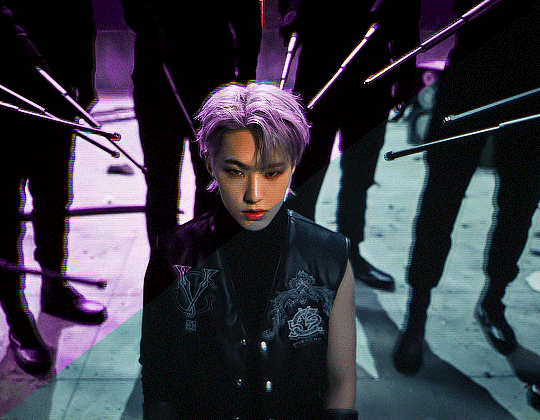
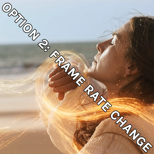
WORKING WITH YOUTUBE QUALITY - HOW TO GET THE BEST RESULTS
helloooo, i recently feel as though i have found the key when it comes to dealing with youtube quality and i thought it was worthwhile sharing! i'm finding that when you're stuck with 1080p videos only, (although there is a lot more 4k downloads these days, thankfully) the quality is pretty poor. BUT, this is speaking exclusively about the quality of youtube 1080p - if you use a site such as sharemania, that's usually acceptable and good quality and doesn't deliver poor results.
but alas, this is about youtube, so let's get into it! this process will simply go over all the ins and outs of working with youtube quality, and will not look into the entire giffing process. i'll be using photoshop 2025, but it should work on any version!
Download your video.
firstly, start by downloading your video with 4k video downloader. (<- this will lead directly to a dl of 4k video downloader if you don't have it already! link is all safe and official <3) i can't really think of any other downloader because i haven't used any apart from this one. it's safe and secure and does a really good job.
you'll want to choose the 1080p option that is the BIGGER file amount. not every video will have that, but i believe that the bigger file size is the youtube premium 1080p. take what you can get with them 😭
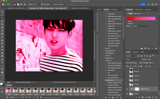
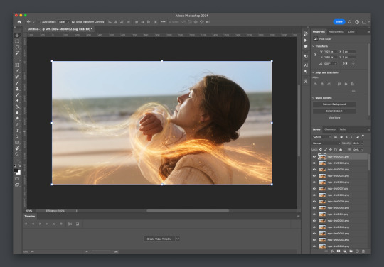
2. Load frames, crop, convert to smart object...
just get your normal prep work done! make sure to leave out sharpening. you should essentially just be here:

(if my process looks a bit odd or if, on the other hand, you'd like to know my process, you can check that here.)
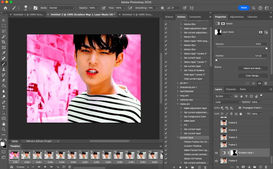
3. sharpening.
THIS is the point that changes how your youtube file comes out. often times, you'll find the gif comes out with chunks, squares and overall poor quality. kind of like if i used my regular sharpening:

chunky! gross! trashy! i'm seeing too many pixels and things aren't looking the right way that i'd like. (tbh, it's not the worst i've seen - but you can definitely notice when there's light.) if i went on as it is now and continued to colour it, it would continue to look bad.
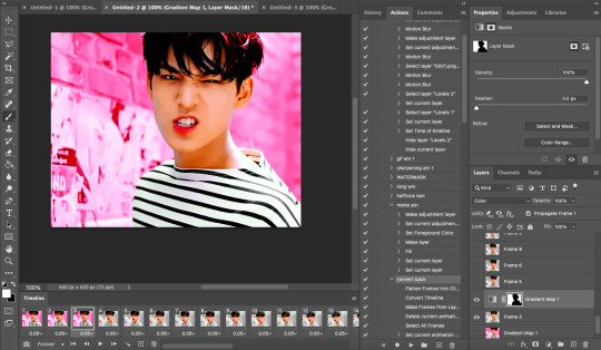
so, here's what you'll do.
i use multiple sharpening actions, for different purposes: one for hq downloads, so any movies, tv or downloaded/4k music videos, one making icons and the other for lower quality media and photos. the one that i typically use for youtube quality is @/anyataylorjoy's sharpening action (which many gifmakers use, so i wouldn't be surprised if you do already have it!) which is what you'll use. apply the action, using the 'sharper' lot.

^ that's the settings.
4. sharpening pt 2. (noise)
now, you'll need to add noise to offset how harsh the rest of the gif still comes up.
apply these exact settings onto the gif and ensure that monochromatic is enabled.

sometimes, 2% noise might make it look worse, or not be enough. i personally wouldn't go to anything more than 3%, (i don't think you'll ever want to use 3%) and wouldn't go lower than 1%.

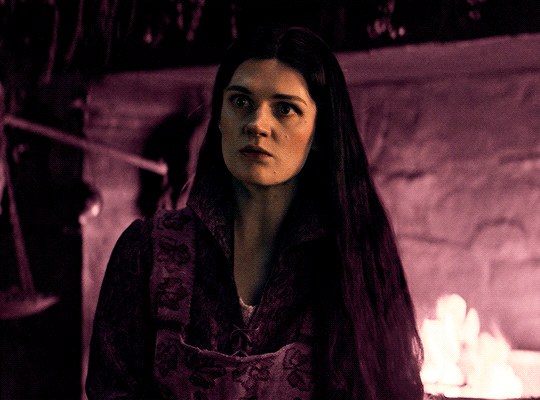
it's grainy looking at the moment, just as is. from here, i'll colour it, and then if i think it's no good, i'll go back and clear the noise filter and toggle it. that's just how the process works, don't stress if it doesn't always go your way 😭 that's just gifmaking!
here's the final product!

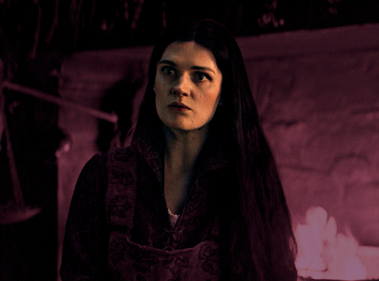
and here's another example too, i know this one has a lot going on colour wise, so it can be good to look at it working on something with less bright colours:

as compared to before! before shows the gif was really smooth, as compared to in chappell's, were the lighting was just kind of messing with everything. you're more likely to come across videos that are that weird smooth quality, so i'd say that 7 times out of 10 you'll be applying these settings to something more along the lines of doechii's!

the before :)
#*tutorial#**l.myeditss#gif tutorial#gifmaking tutorial#photoshop tutorials#just a little something :D#flashing tw
455 notes
·
View notes
Note
Coloring anon here, yes, I would definitely like to know more about how you color frame by frame and the other techniques you mentioned! It would be much appreciated, thank you!
Hi anon! I'd be happy to go over my preferred methods for colouring!

First resort (ideal):
Painting over shots with little movement (the first method in this tutorial)
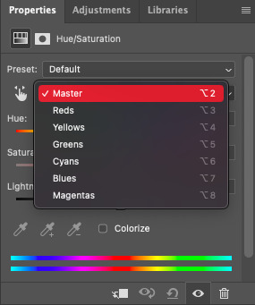
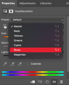
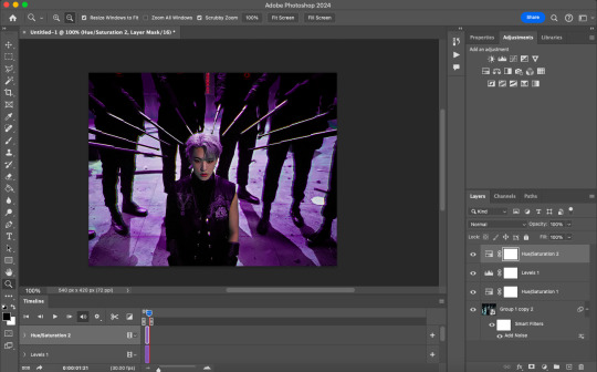
Colour manipulation using selective colours (the second method in this tutorial; alternate tutorial -> i also sometimes add a hue/saturation layer on top to manipulate the cyans/blues as well)
Second resort:
Keyframes for shots with consistent movement where it's easy to hide "imperfections" (tutorial 1, tutorial 2)
Last resort:
Frame by frame colouring -> DISCLAIMER: the way I do this method is the easiest way I've gotten it to work for me but that also means that it's very inflexible when it comes to editing any of the colouring afterwards. Once you start colouring in frame animation mode you're basically locked in so you need your gifs to be exactly the way you want them prior to adding your colour
So in this tutorial I'll go over how I do my frame by frame colouring as well as how I create actions to automate the repetitive parts of this process! (Some resources that explain how to create actions are here: 1 2)
To use the select subject feature you will need Photoshop CC 2018 or later
Step 1: Preparing your gif with base colouring
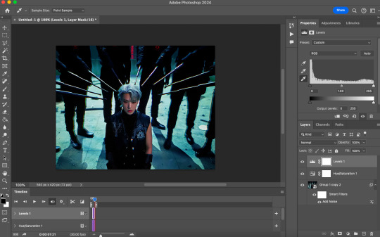
So first you want to do your base colouring for your gif in timeline mode, which I've explained here. I keep my gifs short (ideally 40 frames or less) since this colouring process is tedious!
I make sure that in my hue/saturation layer, I turn the saturation in the yellow, green, cyan, and blue tabs all down to -100 (and for the yellows I usually add around +20 to +60 in lightness)
Here's my gif with the base colouring that I'll be starting with:

Note: turning down the saturation in almost all the colours gives you that nice silver/grey neutral background to paint on top of. It's a lot less noticeable when your painted layers aren't perfect
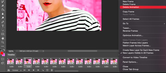
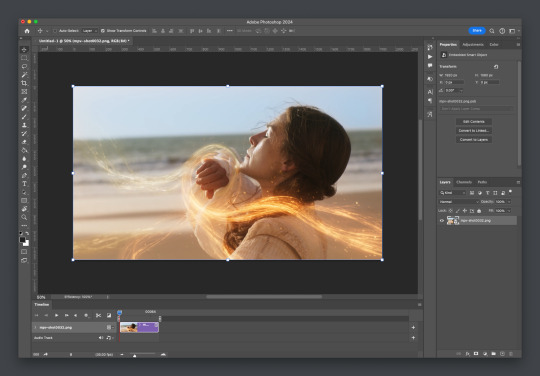
Step 2: Converting to Frame Animation Mode
I use the save action from this action pack to convert my gif from timeline mode to frame animation mode.
You cannot edit your base colouring from this point onwards!
Step 3: Using Select Subject
If you're recording an action this is the step you would *start recording*
This is what your window should look like:

Making sure your first frame and first layer are selected, go to Select at the top of your window and click Subject

You should then see the marching ants outline around the person in your gif

You then want to create a new solid colour fill layer (which can be found when you click that little circle icon at the bottom of your layers panel), and set the layer blending mode to colour.
The layer mask will automatically be created since you had the marching ants outline.

Since my person is in colour and not the background, I want to invert the layer mask by clicking on it and using command + i (or ctrl + i), and now this is what it looks like:

Note: Select subject isn't always perfect!!!, depending on how cluttered the scene is and how much contrast there is between your person and the background, select subject could either do a really good job like it did here, or screw up a little like it did here:

That's okay though because it still gives us a good base to start from! We can fix any issues by painting with black and white brushes on the layer mask.
Step 3.5: Create clipping mask
Thanks to @wolfchans for telling me about this because it gives us back a little bit of flexibility when colouring frame by frame! Instead of merging down, we can make a clipping mask instead. Right click the solid colour fill layer and select create clipping mask.


If you're recording an action, it's at this point where I would *stop recording*
Step 4: Fixing the layer mask if needed
So now I want his jacket and t-shirt to also be purple, and to show his fingers behind the glass. I make sure the layer mask is selected, and paint with a brush at 60-70% hardness (painting with black erases the colour, painting with white shows the colour). User smaller brush sizes to paint smaller details!
This is what my canvas and layer mask look like now.

Step 5: Repeat
Now I click on my second frame and second layer, and repeat steps 3-4. As you can see, using the clipping mask allows you to still see and edit the colouring of the previous frame, just make sure you click on the right frame and it's corresponding layer when you're doing further editing.

This is where an action is super helpful in cutting down all the repetitive steps and clicks you need to do. So at this point I'd just play the action I created and paint on the layer mask as needed.
Repeat for all your frames and then you're done! After this I convert it back to timeline mode again so that I can add my text and do any other effects such as blending or transitions. Hope this helped!!
#answered#Anonymous#*tutorial#userbeanie#userwintersoldado#userishh#userfaiths#usercats#usertj#tuserhol#userahri#usereus#usershreyu#userchibi#userbunneis#usermibbles#uservivaldi#carolook#userbuckleys#usertenacious#tuserheidi#userholtz
248 notes
·
View notes
Text

I got a couple of asks on how I did the text transition in this set. I'm going to explain as best as I can (with image references).
*Disclaimer: this assumes you have a basic understanding of giffing with video timeline, and keyframes. If you're new to keyframes, check out this tutorial by @userpeggycarter before proceeding.
Step 1: Go through, make your gif, color and all that jazz. if you're not familiar with giffing and need a guide, check this one out by @cal-kestis. Be mindful of the number of frames you have, as it is extremely important when keyframing begins. Make sure you have an even number of frames, or you will have an uneven transition. For this gif I'm at 60 frames total, and I'd be careful exceeding 70, as if you need to go back and delete... It just sucks, so be mindful! You'll see my gif and coloring under a group I titled "base" - and I highly recommend putting your gif/coloring/etc. into groups, as it will make the timeline a bit cleaner, and it's a little easier to find everything you need. But when you're done, you should be here:

*Quick note 1: Make sure your gif is in 8-bit mode. If you aren't familiar with bit modes, that is a tutorial for another time. For now, you can change it here:

Step 2.1: Pick your font/placement/etc. I really recommend being 100% on whatever you pick, along with the size. I've encountered problems when I move the font after the fact with alignment, so it's best to look your gif over to ensure you're satisfied. For this set, I went with Figtree, placed dead center.
I want to add to this by saying, thus far, I have found that white is the only color that works for this. I'm playing around with some other options, but black is 100% a no go. If you find a way to get that working, let me know. I'll amend this tutorial.
Photo of text settings, along with where you should be now.

Step 2.2: Since we're transitioning into a new set of words/text, you need to get that text ready as well. Shorten the length of time the first piece of text runs to halfway (I have 60 frames, so I cut it to 30).

Step 2.3: Duplicate your text layer, type your other text. The two texts should show for length of time, as you have an even number of frames, meaning you can divide by 2. Move it over to the end of where the previous text ends. If that makes no sense, it should look like the below: (again, folder for the typography to know where to reference. I have a small organization addiction so.. creator's choice)

*Quick note 2: I do not recommend changing to a new font or size with this, it won't look quite right. Of course, experiment away! This is just a small caution based on my own experimentation.
Now, to get to the actual fun part...
Step 3.1: Duplicate the first text layer. For this gif, it's the one that says "it didn't change anything". Once you duplicate it, you'll be turning it into a smart object. This is so the filter we apply works. Repeat for the second text layer. Lil gif below:

Quick note 3: I recommend going one text bit at a time, and also would tell you to put each typography layer into its own folder. This is really important for later, so doing it earlier is better.
Step 3.2: We will now apply the filter. To do this, you're going to click the smart object version of our text, then go to Filter → Stylize → Wind. For the gifset I made, I used Method → Blast and Direction → From the Right. Click "OK" and the filter will apply. Duplicate this for the other text layer.

Step 4: We now begin the keyframing. I highly recommend the rule of 0.3, which is when your transitions are over the span of multiples of 3 (i.e. if you start at frame 1 with 100% opacity, frame 3 will be at 0%). We'll be doing 6 frames from 100% to 0%, and vice versa, for this transition. This was the best time I found for this transition, but it's a matter of preference. Just follow that rule of 3.
Step 4.1: Click the smart layer of the text we made on the timeline, then click the little arrow on the left of the name of the layer. You'll see this:

See the little clock next to Opacity? Click it, and you get this lovely little yellow diamond. This is how we control the visibility of the Wind layer. It will start at 100%, keep it there.

Click the arrow on the right of the play button 6 times (aka get to the 6th frame), click the stopwatch again. While on this frame, and the yellow diamond clicked, change the opacity of the Wind layer to 0% It'll look like this:


You will repeat this, in reverse, at the end of the text layer.
Quick note 4: Sometimes, Photoshop is moody. To get the diamond on frame 30 (or whatever frame # the end of your text layer is), put it on the frame prior. You can then nudge that diamond over 1 frame. See below:


Repeat the process for the other text layer.
Step 5: We're basically done! Change your gif from video timeline to frames, maybe do a quick play through to make sure all is well.
Quick note 4 (it's the last one I promise): I have heard from many that when they work with keyframes, they end up with duplicate frames. I, personally, have not encountered this issue. I do not know if it is because of the version of Photoshop others are using, PC vs. Mac, or some other secret third thing. I recommend that, when you check your gif, verify if there are duplicate frames. The keyframe tutorial I linked earlier goes into further detail, and here is another lovely explanation from Nik, the master of all things keyframe transitions.
Step 5.1: Export, and give yourself a high five because you deserve it.
If you have any questions, don't hesitate to reach out! I'll try to clarify anything if needed. Happy giffing!
#*tutorial#c*#*ps#tutorial#userchibi#usertj#uservivaldi#userbuckleys#usertina#userroza#usershreyu#usersole#useralien#userabs#userrainbow#quicklings#userbambie#useraljoscha#userzal#userbess#userfern#tuserhol#usernolan#usermagic#userhallie#usershale#userholloway#tusermels#usergif#we will absolutely not be discussing that fact that i have been awake since 630 am
236 notes
·
View notes
Note
this a gorgeous gifset for wicked 💗
https://www.tumblr.com/tidescaller/781106467228073984/glinda-in-wicked-part-i-happy-birthday?source=share
I would appreciate a tutorial for the first gif blending and colouring

Hi anon! thank youuu, i'll leave the tutorial under the cut ૮(˶˃ᆺ˂˶)
As always, basic knowledge on making gifs is required to do this type of edits. I linked some useful guides on my previous tutorial here.
PART I: BLENDING
STEP 1, BASE GIF
I recommend getting ready the gifs you're going to use before any try on blending them. And which ones are right to blend? That's just depends on the scenes you're working on. On this gifset, I made two previous blends that didn't make it to the final version cause I didn't like how it turned out. It's all about trial and error.
For this specific blending, as I'm working with only 2 gifs, I'll start editing first the base and then the one "blended". Adjust your BASE GIF in your canvas as you want.

I sized mine like this cause I imagined the second scene of Glinda behind this one.
STEP 2: BACKGROUND
i followed becca's coloring tutorial for this part, except I didn't add any adjustments yet. only coloring the background for a later gradient blending.

STEP 3: BLENDING
Duplicate your other gif into the canvas and change its blending to screen

Now add a layer mask (the button marked with red in the picture) and, with a soft brush at 200px/300px, start erasing whatever you don't want. Remember black is 0% opacity and white is 100%.


STEP 4: THE BLENDED GIF
The problem I noticed by this point is that my background coloring on the BASE GIF was kinda irrelevant cause now the BLENDED GIF completely covered it (。•́︿•̀。) and I also wanted this one to be pink. In order to do this, I created a gradient map layer and made it as a clipping mask so it wouldn't affect my main gif.


PART II: COLORING
STEP 5: BASE
For the base coloring, I always follow this tutorial cause it's literally how I learned how to do it. Honestly, check all maziekeen's tutorials (she made A TON) cause they are so good and your learn a lot. However, I tend to give my personal touches like adding another vibrance layer if i feel like it, cause I like the colors to pop; or skipping steps if I don't think they fit my gif/style. Anyways, this is the result for now:

and these are my settings


i tried to translate as much as possible (,,>﹏<,,)
STEP 6: SMALL TOUCHES
Could leave the gif as it is, but when I was working on it, I felt like something was missing. So the last step is to apply/paint some small touches of pink (or whichever color you're working on). This trick I learned it from this beautiful and very detailed tutorial from dani (she is awesome!! and her tutorials and gifs are flawless!!)
Create a new layer, use the soft brush tool at 1000px, zoom out your gif and start painting out of the canvas (you can totally paint inside if you feel like it) Play with different opacities and blending modes of the layer, this is literally how I created all these gifs. I know it sounds stupid ajskjas but it's true!! Try what best fits the structure of the gif. The first one I made is with multiply at 60% and you can see how much the gif changed already.

The second being color at 100% and the third one hard light at 30%
STEP 7: THE CHERRY ON TOP
Finally I added an animated overlay from this post. Changed the blend mode to screen and erased a bit of it on glinda's face creating a layer mask and with a soft brush. Added my texts... and that's a wrap! :D

I used the same process on gifs 3 and 5 ⸜(。˃ ᵕ ˂ )⸝♡
#*tutorial#gif tutorial#photoshop tutorial#blending#coloring#allresources#completeresources#dreamcreations#dailyresources#gifmakerresource
74 notes
·
View notes
Text
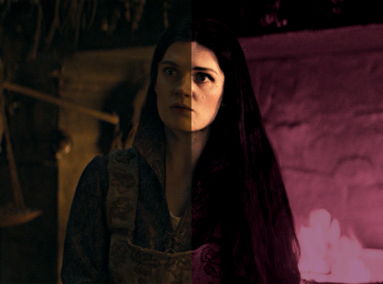
i was asked by @matthew-macfadyens for a colouring tutorial, so here we go ! i've been making gifs for almost 4 years now and finally feel comfortable and confident in my skills to make a full tutorial on my colouring process. there are so many different ways people colour gifs, and there's no wrong way, this is just how i do it ! i learned to gif by reading so many tutorials and picking and choosing what works for me, so hopefully this can help someone out !
if this tutorial helps you, please considering supporting me ! buy me coffee ♡

TUTORIAL UNDER THE CUT
what you'll need: - photoshop ( i use ps cc 2023 & frame timeline ) - basic ps knowledge ( how to make gifs, how to sharpen gifs, general understanding of adjustment layers, layer masks and blending modes ) - a whole lot of patience
helpful resources:
the beginner's guide to channel mixer by @aubrey-plaza
giffing 101 by @cillianmurphy
gif making for beginners by @hayaosmiyazaki
colouring yellow-tinted shots by @ajusnice
becca's mega colouring tutorial by @nataliescatorccio
@usergif
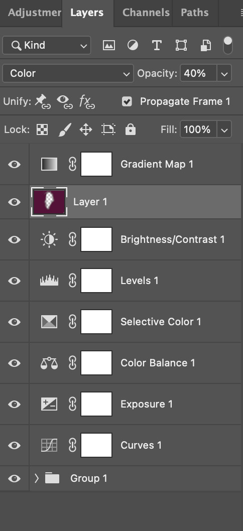
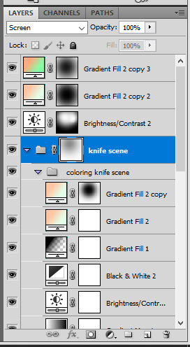
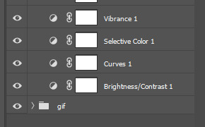
PART ONE: BASE COLOURING
- step 1: curves - step 2: exposure - step 3: colour balance - step 4: selective colour - step 5: levels - step 6: brightness / contrast - step 7: gradient map
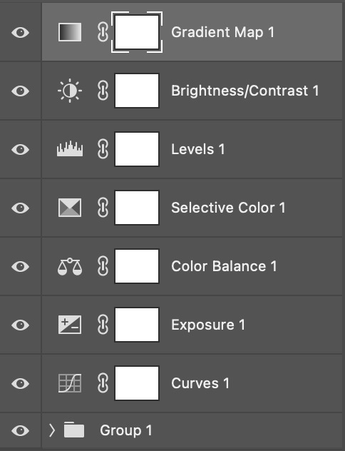
okay so, before we get started, this tutorial is for colouring only. at this point, i've already gotten my screencaps, imported them into photoshop, made the actual gif & sharpened the gif. the above image includes what my typical adjustment layer stack looks like !
STEP ONE: CURVES
a lot of people do the majority of their heavy lifting in curves...i'm not one of those people. i've never gotten the hang of curves and haven't been able to fully taken advantage of everything it can offer. i use curves to mainly brighten up my gif and to start my process.
i use the "auto" button in the curves function - this automatically corrects the curves for your gif ( mainly the brightness / contrast )
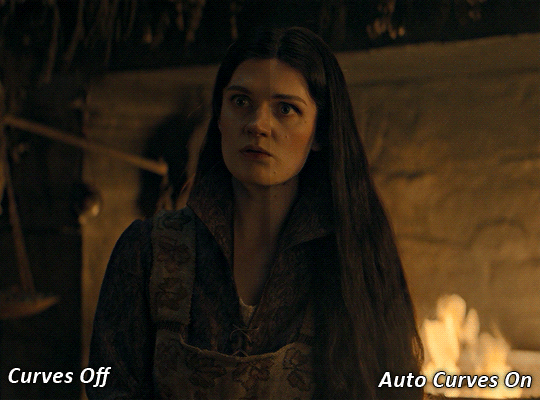
you can see that the auto curves has brightened up the gif and evened out the brightness/contrast. i just find this gives a better starting point for the colouring process.
STEP TWO: EXPOSURE
this step is for, you guessed it, brightening the gif more and evening out the contrast and blacks. i don't have any real rules for doing this, the amount i highten the exposure and contrast is different based on the scene and the show, however, i tend to stay around +1 on both exposure and gamma correction.
exposure effects the brightness of the gif and gamma correction effects the blacks and contrast. this step also effects the saturation of the gif, so it's important not to go too crazy. i often end up coming back to this step every now and again to adjust and fiddle with it.
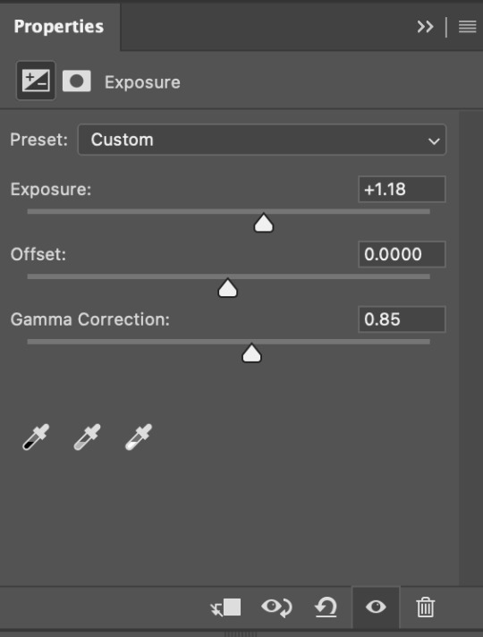
for this gif, i put the exposure at +1.18 and the gamma correction at 0.85
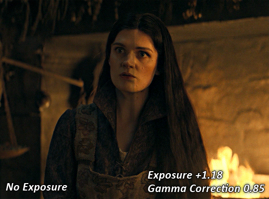
you can see this step serves to add some more brightness and contrast - it also adds some more saturation, that we don't always want, but don't worry, that's what the next steps are for !
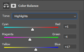
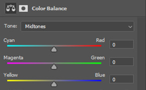
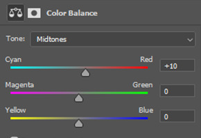
STEP THREE: COLOUR BALANCE
i use this step to do a lot of my heavy lifting - i'm a whore for colour balance. this serves to even out the colours and help neutralize the colours for an easier canvas. it's important to understand the basics of colour theory for this, i recommend checking out the channel mixer tutorial i listed above, because a lot of those steps applies to colour balance.
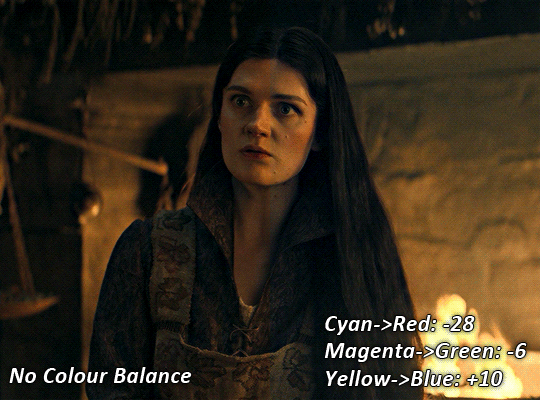
essentially, there's three separate profiles to edit on - highlights, midtones and shadows. in each profile, you have 3 colour sliders. the top one is your cyan to red, middle is magenta to green, and bottom is yellow to blue. the colouring of the scene will decide where to move your sliders.
for example: if your original scene has a cyan tint to it, you'll want to pull your slider to the right, towards the red to help neutralize the cyan. if your scene has a green tint, you'll want to pull it left towards the magenta. as you move the sliders, you'll notice that sometimes it brings out other colours you don't necessarily need, you can adjust the other sliders to help neutralize further.
i always do my main correction in the midtones profile.
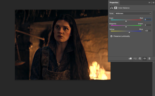
since this scene has a heavy yellow tint, my first step was to adjust the bottom slider. i pulled the slider to the right towards blue at +22. you can see this helped get rid of a lot of the yellow, but adding in the blue warmed up the reds and made it more saturated.
to help with this, i pulled the top slider left towards cyan to help neutralize that red.

i pulled the top slider to -28 and you can see this cut out that heavy saturation and redness. it's looking a lot better, but now it's a little too green for my liking. this is where that middle slider comes in!
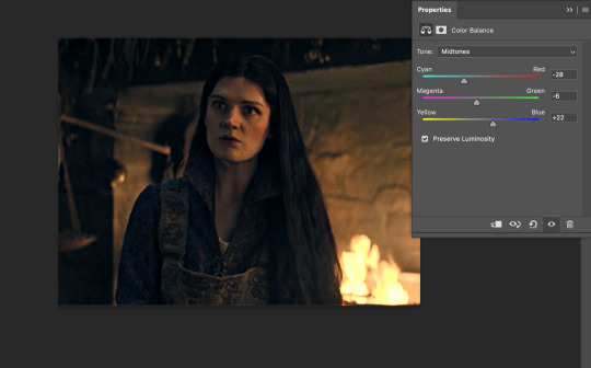
i pulled the middle slider to -6 towards the magenta to help counteract the green that came in. ( i ended up going back in and adjusting the bottom slider to +10 instead, as it was a little to blue )
you can see this step really did the heavy lifting, helping to neutralize the canvas so that it's easier to work with...but it's not quite perfect yet!
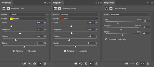
STEP FOUR: SELECTIVE COLOUR
a lot of the same principles around colour theory apply to selective colour! this is where i go to adjust the colours according to what my colour palette is. for this gif, the overall colour is going to be purple, so i'll adjust the individual colours with that in mind.
i only ever adjust my red, yellow, white and black profiles! sometimes i'll do the other colours, but that's only for tweaking the final colour. i normally don't touch them at all.
ps: you'll notice i prefer a cooler toned gif, and almost always go for a more magenta looking red/yellow.
i always start with my yellows:

in the yellow profile, i pull my cyan towards the left to -38 (this helps eliminate the green in the yellows) and my yellow slider to the left to -27 (this cools down the yellows. i top it off by adjusting my magenta slider to -10, to help lower the saturation of the yellows.
you'll notice this step got rid of most of the green undertones - that's because the green was nested inside the yellows, so by taking out a lot of the cyan and yellow, you're left with a warmer yellow as opposed to a cooler yellow.

next i go on to my reds. this step will mainly effect the alys's skin tone, but i'm going to do pretty much the same as above but with much less dramatic of a change. lowering your colours in your red profile too much can lead to a very saturated gif, which is not what i'm going for.
i pulled my cyan slider to -19, magenta to -9 and yellow to -15. you can see this helped add some more cooler tones to the reds.
the next profiles are your white and black profiles. i use white to brighten the lightest parts of the gif. no rhyme or reason here, i just pull the black slider towards the left...usually around -25. for the black profile, i always move the black slider towards the right. anywhere from +3 to +8, depending on the gif. for this gif, i did +8. this darkens the blacks and, in my opinion, helps the gif pop!
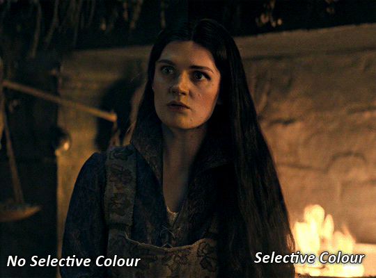
you can see this step got rid of the yellow tint, gave the gif a more neutral look and adjusted the reds to better compliment a purple colour scheme !
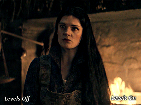
STEP FIVE: LEVELS
this adjustment has three toggles - i'm not 100% sure what each toggle really does, i just know that by pulling the leftmost toggle to the right, it darkens your gif, and pulling the rightmost toggle to the left brightens your gif.

this step is so hard to explain, but really i just pull the toggles around until it looks good...sorry !
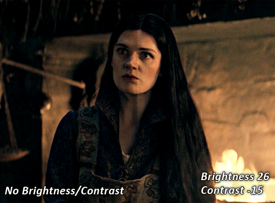
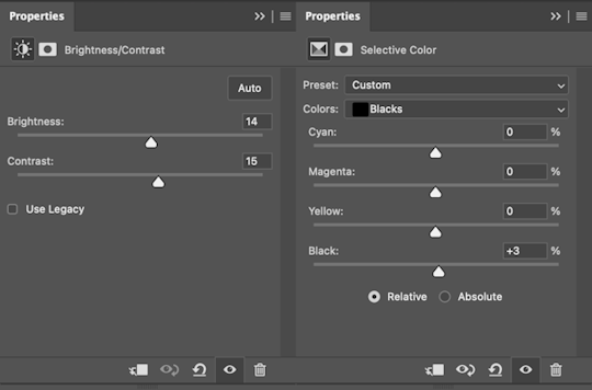
STEP SIX: BRIGHTNESS / CONTRAST
this step is exactly what it says on the tin...it brightens your gif. this step is based on your scene and personal preference, there's no real guide to it.
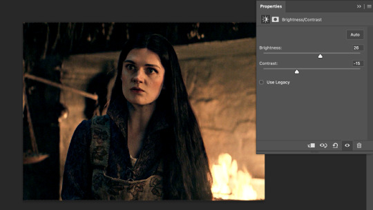
i always pull my brightness slider to the right ( brighter ) and my contrast slider to the left ( less contrast ).
STEP SEVEN: GRADIENT MAP
this last step is something i learned from @nataliescatorccio ! i add a gradient map to the top of my stack, and choose a lighter colour of what i want my overall gif to be. in this case, i used a very light purple!
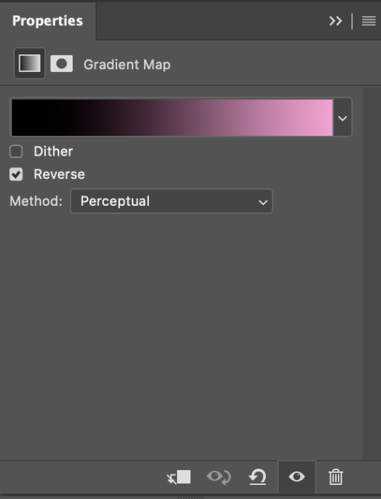
i then set the blending mode to "soft light" and lower the opacity to anywhere from 20-30%. for this gif, i did 30%
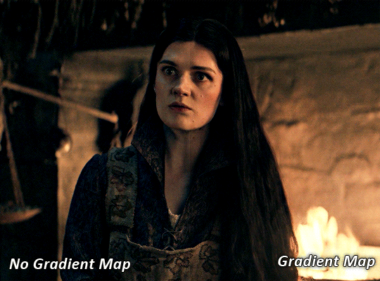
this step will help make your colour pop once you do your main colouring!
PART TWO: PAINTING & COLOURING
- step 1: layer 1 - step 2: layer 2 - step 3: layer 3 - step 4: final touches
okay, so my actual colouring process is based in 3 layers. for this gif, i'm using a deep purple/mauve colour !
STEP ONE: LAYER ONE
between your brightness/contrast and gradient map layers, add another blank layer. change the blending mode of this layer to "colour" and set the opacity to 40%.
then, using a soft round brush with an opacity of 100% ( size of the brush is your preference, i typically use around 108 ), colour the parts of the gif you want coloured !

you can see this helps us get the canvas to a more uniform purple colour!
STEP TWO: LAYER TWO
for layer two we're going to do the exact same thing. add a layer above your previous, set to "colour" at 40%. we're going to go over the same areas!
you can see this helped get the purple so much more vibrant and closer to what our final colour is going to be!
STEP THREE: LAYER THREE
for our final layer, add another layer above the previous 2, set your blending mode to "multiply" and your opacity to anything from 60%-100%. for this gif, i did 60% !
now, our colouring is pretty much done but you can see that, now that our colour is down, alys's face is still a little too blue/green/yellow for the background purple. the next step, we're going to adjust and add final touches!
STEP FOUR: FINAL TOUCHES
at this point, i went back into my selective colour layer and adjusted my yellows & reds and went back into my colour balance layer to adjust everything overall.

at this point, i'm going to go in and add some adjustments layers above everything - i usually add some brightness/contrast, and a selective colour layer to darken the blacks.
which brings us to our final result:
#usergif#dailyresources#pscentral#ps tutorial#tutorial#coloring tutorial#allresources#userbecca#tusermich#userjoelle#ughmerlin#mialook#*tutorial#**
236 notes
·
View notes
Text
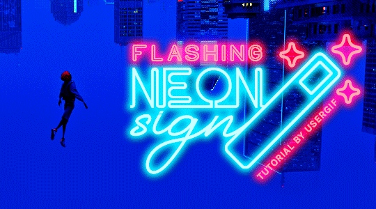
HOW TO: Make Animated Neon Text
Hi! No one asked for this tutorial, but this is one of my favorite typography effects as of late — so I thought I'd share how I do it. You can see this effect in the first gif of this *NSYNC Celebrity set and the last gif of this Anthony Bridgerton set. Disclaimer: This tutorial assumes you have a basic understanding of gif-making in Photoshop. It's also exclusively in Timeline and uses keyframes for the fading effect seen on the blue text.

PHASE 1: PREP YOUR BASE GIF
1.1 – Choose a dark scene. This effect looks best contrasted against a dark background. You can definitely do it with a bright background, but just like a neon sign irl, you only turn it on in the dark/at night — so keep that in mind!
1.2 – Determine the length of your clip. Depending on how much you want your text to flash or fade in, you'll want to make sure you have a scene long enough to also allow the text not to flash — reducing the strain it takes to actually read the text. For reference, my gif is 48 frames.
1.3 – Crop, color, etc. as you would. New to gif-making? Check out my basic tutorial here!
PHASE 2: FORMAT YOUR TEXT
Before we animate anything, get your text and any vectors laid out and formatted exactly as you want them!
2.1 – Finding neon sign fonts. It's easy as going to dafont.com and typing "neon" into the search bar!
2.2 – Fonts I used. Neon Glow by weknow | Neon by Fenotype | Neon Bines by Eknoji Studio
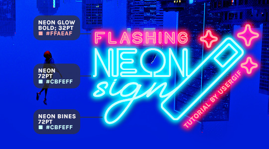
And to not leave my fellow font hoarders hanging, the font for "tutorial by usergif" is Karla (it's a Google font) 🥰
2.3 – Group your text layers. (Conditional) If you plan on having multiple text layers like I did and you want them to appear connected (like how the last letters of "NEON" and "sign" intersect with the wand icon), I suggest putting the layers into groups according to color (the shortcut to group layers is Command+G). If you don't group your text and just apply the outer glow settings to each individual layer, you'll end up with something like this:
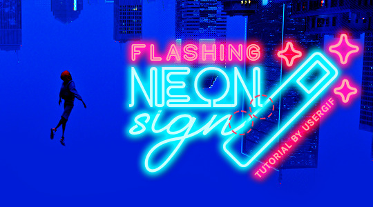
—where you can see the glow overlap with the line, instead of the smooth connection you see in my final example gif. I'm using 2 colors for my text, so I made a group for red and a group for blue.
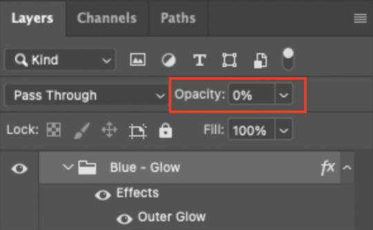
2.4 – Apply Outer Glow. Right-click your text layer (or your group if you have several layers) and select "Blending Options" to open the Layer Style menu. Check "Outer Glow" and feel free to play around with the settings until you like the way your text looks!
Your outer glow color should be darker and more vibrant than the color of the text itself. The text should be within the same color family but much brighter and, sometimes, almost white (see Step 2.2 again for my text colors).
Here are the settings for the Red Glow (the glow color is #FF3966) and Blue Glow (#00F0FF):
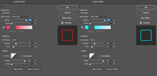
These aren't always my exact settings but they're pretty close to my standard. I always set the blend mode to Hard Light and usually have the opacity at 100%.
For every gif I use this effect on, I like to play around with Spread and Size. Spread will make the glow look denser and "expand the boundaries" (source: Adobe) and Size will diffuse the glow and blow it out so it covers a larger area (Adobe says it "Specifies the radius and size of blur").
2.5 – Duplicate your text layer/groups and remove glow. We're only going to be animating the glow on our text, and since doing this affects its opacity/visibility, we want to preserve the base text by creating a duplicate.
I just hit the Command+J shortcut to duplicate my groups and delete the Outer Glow effects, making sure that the "No Glow" version is above the "Glow" version:
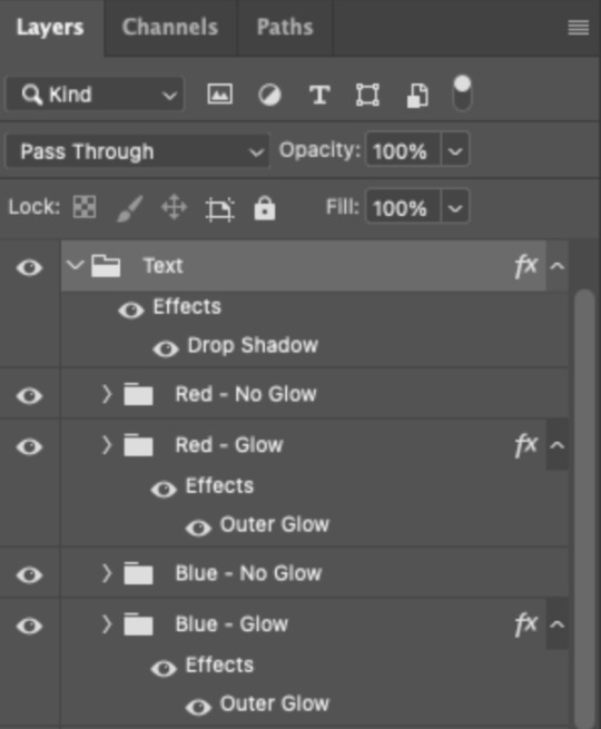
I also put all these groups into one group called "Text" for organization and so I could apply a drop shadow to all the elements for better visibility.
PHASE 3: CREATE THE FLASHING EFFECT
This is for the effect you see on the RED text in my gif!
3.1 – The 0.03-Second Rule If you've read any of my animation tutorials before, you're probably already familiar with this rule. In my experience (and for reasons I can't explain), Video Timeline pauses every 0.03 seconds (try clicking the forward button a few times, you'll probably find a "duplicate" or paused frame). So, keep all your layers a duration of 0.03-second increments (e.g. 0.06 or 0.09 seconds can also work) and align them on the Timeline at 0.03-second intervals. If you don't follow this rule, you'll get duplicate frames when you export, resulting in a choppy final gif.
3.2 – Trim and arrange your text layers. Only on the layers/groups WITH the Outer Glow effect, trim them into several segments of varying lengths where the glow will be "on" (visible) and leaving spaces where the glow should be "off."
Typically, I'll have a mixture of 0.06 and 0.03-second text. That's when the glow will be visible. Between each "flash" of visibility, I've got a 0.03-second blank space, baby *pen clicks* and I'll write your name:
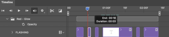
The layers shown above are arranged with a few flashes and two long segments of no flashing. This is the order and duration of each segment shown above (purple = visible segments):
0.06 blank, 0.06 visible, 0.03 blank, 0.03 visible, 0.03 blank, 0.03 visible, 0.03 blank, 0.24 visible (the long bit where "FLASHING" doesn't flash at all), 0.03 blank, 0.03 visible, 0.03 blank, 0.12 visible
(I only did this for the text that says "FLASHING" to give it a glitching effect. The other red text keeps the glow visible starting at the first long segment.)
PHASE 4: CREATE THE FADE-IN EFFECT
This is for the effect you see on the BLUE text in my gif!
4.1 – Animate using the Opacity Keyframe. Again, we're only touching the layers/groups WITH the glow effect. If you only have one layer of text, you'll find the Opacity Keyframe by clicking the film reel icon:
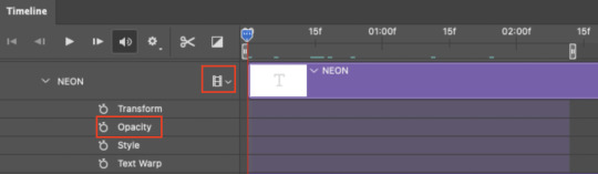
If you're working with groups like me, you'll find it in the Timeline panel under the group when it's expanded:
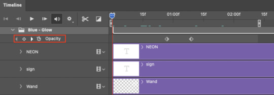
As you can see, I already added my keyframes (lil diamond babies). And luckily, it's super easy to do!
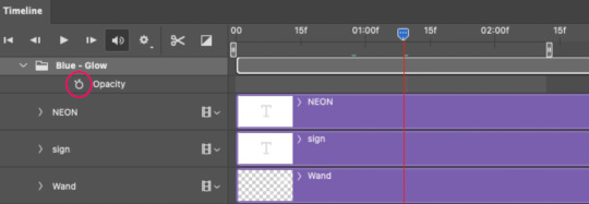
4.2 – Add the ending Keyframe first. We're starting at the end because our layers/groups are already at 100% opacity. Drag the playhead (the blue arrow attached to the red vertical line) to a spot where you want the glow to be 100% opaque — this is where the glow will be fully "on" or visible. [Again, follow the 0.03-Second Rule. You will get duplicate frames regardless when using keyframes (this will be explained in the note in Phase 5), but abiding to the rule will mitigate the amount of dupes you get.]
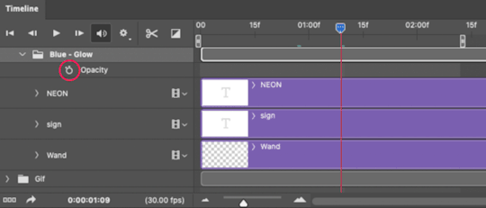
Then, click the clock icon by "Opacity" to place a keyframe:
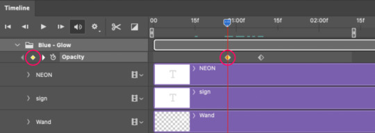
4.3 – Add the starting Keyframe. Go backward from the ending Keyframe you just placed (I went back 0.12 seconds — but you can play around with the duration of the fade, just keep it a multiple of 0.03):
And drop another keyframe, this time by clicking the diamond icon by "Opacity":
4.4 – Reduce the opacity on the starting Keyframe. Keeping that keyframe you just placed selected, go to the layers panel and reduce your layer's/group's opacity to 0%:
Now, this Outer Glow will slowly fade from 0% to 100% opacity.
And just for a visual aid, here's where my fade-in keyframes are in relation to my flashing segments:
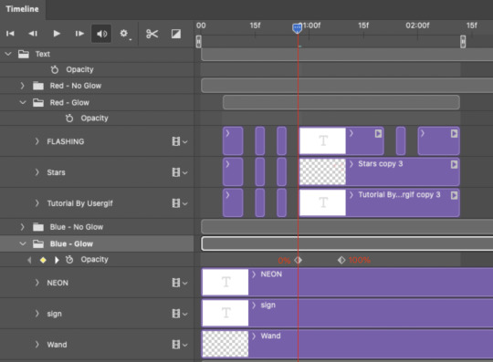
To refresh your mind, the 0% Opacity Keyframe starts when "FLASHING" is visible for 0.24 seconds (the first long segment of visibility).
With these keyframes, you'll get a smooth fade-in à la ✨light switch with a dimmer✨
PHASE 5: EXPORT
Yay, we're finished! Convert from Timeline back to Frames and export your gif!
NOTE: If you only did the flashing effect and followed my 0.03-Second Rule, you shouldn't have any duplicate gifs. BUT if you included the fade-in effect using keyframes, you WILL have duplicate frames. 'Tis the nature of keyframes. 🤷♀️ I had 4 extra frames where the fade-in starts, which I deleted. So, as always, I recommend checking your frames when you convert from Video Timeline back to Frame Animation — and manually delete any duplicate frames.
Sorry this tutorial is so long 🙈 I over-explain so you're not just mechanically copying steps, but understanding the WHY behind each step! Thanks for bearing with me
If you have specific questions about this tutorial, feel free to send a message to usergif and I'll try my best to help! :)
More USERGIF tutorials • More resources by Nik • USERGIF Resource Directory
#typography#gif tutorial#completeresources#usershreyu#useryoshi#userelio#userzaynab#userives#usertreena#usercim#userrobin#userkosmos#usersalty#userhella#alielook#uservalentina#uservivaldi#*usergif#*tutorial#by nik#flashing gif
829 notes
·
View notes
Note
Please oh please share with us how you did the effect in your latest Nancy drew set, it is truly so gorgeous I cannot stop looking at it!
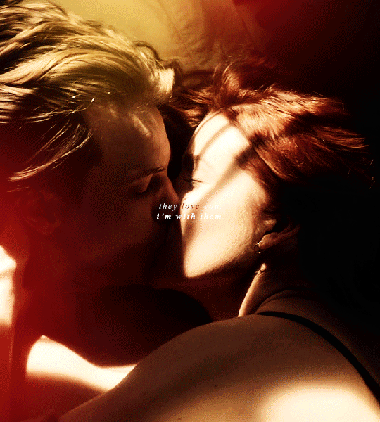
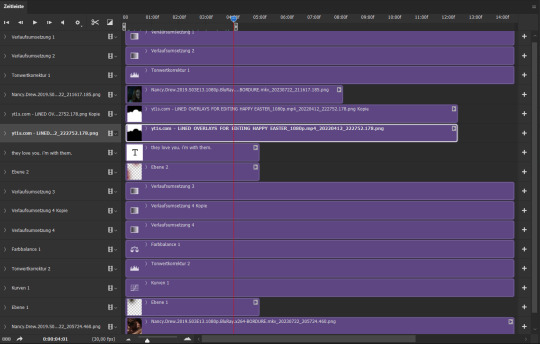
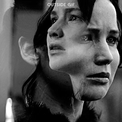
hi nonny, sorry this took a while. so you're looking for the effect from this post:
i made it fairly easy on myself for this one because i am lazy and impatient as hell, so hopefully this is a rather short tutorial.
there's a neater and tidier way to do this that would require frames instead of timeline but for the effect i was aiming for, the slightly sloppier and faster way actually worked fine.
preparation: you'll need a gif with the overlay effect that you like and want to use. i'm giving you the one i used for all the gifs in this set (just slightly altered for each individual gif):

then, of course, you need two gifs — one that'll be your base gif (the coloured one in my example) and one that'll "bleed into" the other one (the black and white one here).
base gif: i just did my regular preparation and colouring, added some yellow and red brush strokes here and there to add some colour and that was it.
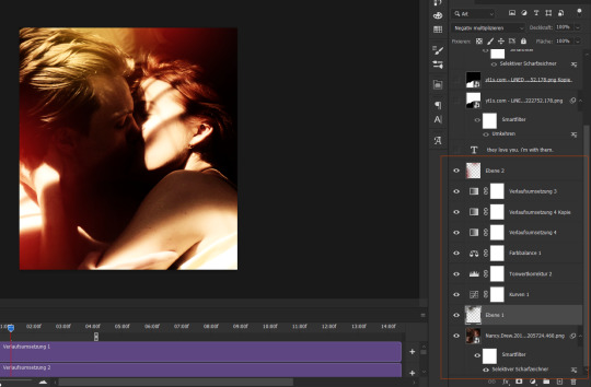
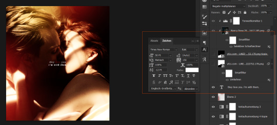
i also added some text at this point and i positioned it on top of my base gif but underneath the overlay layers (because i wanted the text to vanish with the overlay):
second gif: i did a quick and very basic black and white colouring for this one.
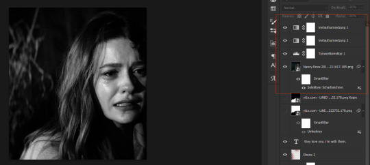
for the overlay effect to work properly, i set the blending mode of this gif to multiply.
overlay: now the fun part. i added my overlay effect gif and changed its size and position to my liking and so that the important parts of my base gif were visible long enough (aka the kiss).
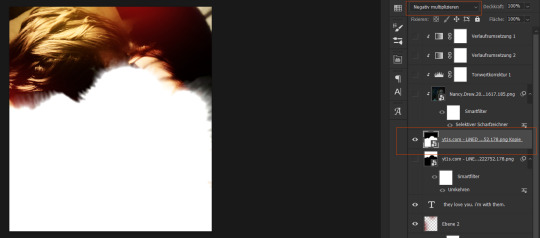
i set this layer to screen and clipped the b/w gif and the adjustment layers to it.
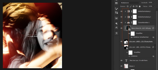
the thing is, as you can see, the overlay part is way too transparent to be efficient. you might get away with this if your base gif is dark enough but for the scene i wanted to use as a base it just didn't look right.
so i duplicated the overlay effect layer, dragged it underneath my original one, inverted it and set it to darken. et voilà, this worked wonders:
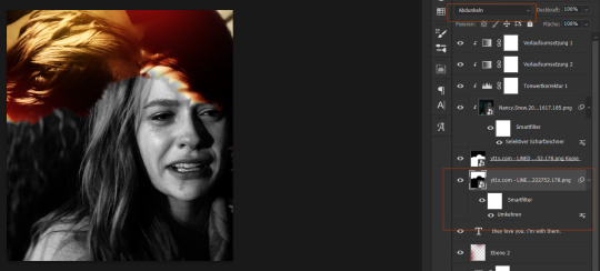
before saving, have a look at your timeline and whether everything lines up. you can change the starting point of your overlay effect (having it come in later or earlier) or your other gifs. whatever looks right to you and also fits into the size limitation.
and that's it. if something didn't make sense or you want to know anything else, just let me know. hope this helped, nonny. ♥️
282 notes
·
View notes
Note
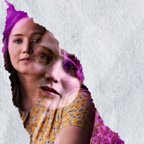
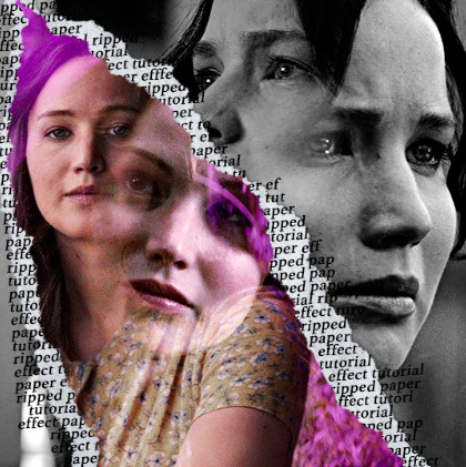
hi, your latest edit for thgweek24 is absulutely stunning and i thought if i can ask if you can make a tutorial about the ripped gifs/paper effect? if not, that's okay! have a nice day <3
RIPPED PAPER EFFECT TUTORIAL
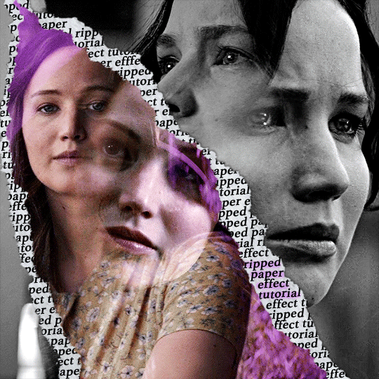
hi! thank u :D (thgweek set referenced)
below the cut are the steps that i took to create this effect. this tutorial is very screenshot heavy and assumes some basic knowledge of photoshop and giffing.
i do my best to try and explain my process so hopefully this is helpful! if you have any questions, please don't hesitate to ask.
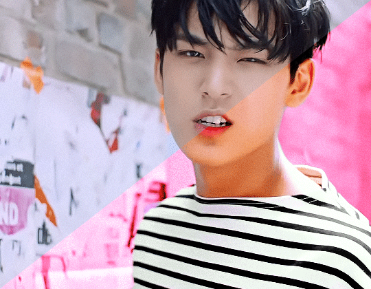
STEP 1: Choose and arrange your two gifs
with this specific use of the ripped paper effect, there's one gif on the "outside" of the rip and one on the "inside." in this example, the outside is the b&w and the inside gif is the colored:
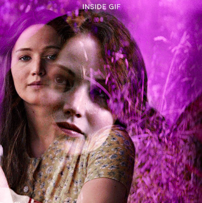
for me, the outside gif determined the positioning of the inside gif and the position/direction of the rip. as can be seen, outside gif has a lot of space on the left. therefore, i knew i was going to position the subject of the inside gif more on the right so i could create the rip without hiding too much of the b&w gif.
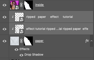
next, you want to arrange the inside gif on TOP of the outside gif. your layers panel should look like this:
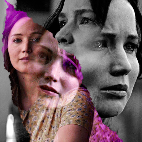
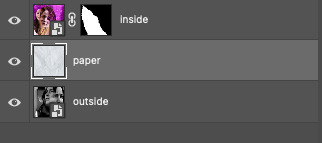
STEP 2: Creating the ripped effect
here comes the fun part! in order to create this effect, you're going to need torn paper brushes. here and here are some packs you can download (w credit to owner).
next, create a layer mask on your inside gif. you're going to use the brush of your choosing as an ERASER. then, you can play around with the size and angle of the eraser to create the look you want. this is what the gif and the layers panel now look like:
STEP 3: Adding the paper
in order to add the paper around the edges of the inside gif (where the text goes), you now need to download a paper texture. i found mine on google by searching "paper texture png."
place the paper png IN BETWEEN your outside and your inside gif. this is what everything should look like:
now, similarly to what you did in the previous step with the inside gif, you are going to create a layer mask on the paper layer. using an torn paper brush as an eraser, you will erase the paper, creating the shape you want.
be sure to leave enough room for whatever text you want to be on the paper. also, i suggest making the rips of the paper different from the rips of the inside gif so it looks more organic.
here is what my gif looks like after erasing the paper:
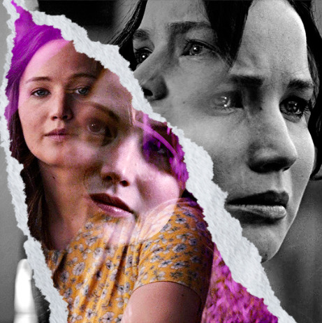
optional: add a drop shadow on the paper layer (right click -> blending options... -> drop shadow)
STEP 4: Adding the text
first, you want to identify the space where you will have room to place your full quote within the paper. if there are no spaces, you can always use your brush/eraser to modify the layer masks.

next, add a layer on top of the paper layer (and below the inside gif). select the text tool and start typing your repeated text!
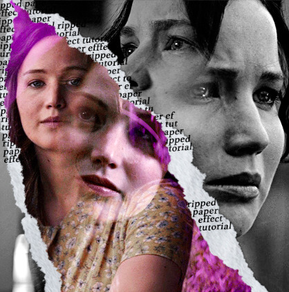
because you can see which text is hidden by the inside gif and what is on top of the paper, a shortcut i use is the "tab" button and only type words that will be seen.
type the repeated words around the quote you want highlighted:
now, in order to contain the text within the paper, convert the text layers into smart objects. then, create a clipping mask on both layers (right click –> create clipping mask). this is what your layer panels should look like:
with that, your gif should now look something like this, with the text contained inside the paper:
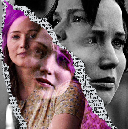
STEP 5: Highlighting the quote
as you can see, it just looked like a bunch of words. so, in order to highlight the quote you carved out in the previous step, add a new layer below the layer of the quote you want highlighted:
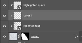
now, use a round brush (softness around 10-15% and opacity at 70-80%) with the color of your choice to highlight the words you want.
and there you have it!
i hope that this made sense and was helpful! if you have any questions or clarifications, please don't hesitate to ask :)
214 notes
·
View notes
Text
HOW TO: change the background color of a gif with a lot of movement ⭐
for if you are lazy as fawkkk like me and don't feel like figuring out how to use keyframes, or if your gif has too much movement to make it work teehee. it is labor intensive, but this gif originally looked like this so it is definitely worth the effort!
METHOD 1: adjustment layers
this works well with movement, however results are best if the background is very distinct! i would not advise against attempting this with a red or yellow background because it is going to mess with the skintones. i'd aim for blues, cyans, pinks, purples and very saturated greens (because some shades of green will be picked up as yellow and not adjust well)
for tutorial purposes, i'm going to go with a gif with a background that's cyan/blue. you can go ahead and get your gif loaded in, sharpened, etc. you can color it first, however i'm not going to be doing so.
the first thing you're going to do is make a hue/sat adjustment layer. you are going to bring the overall saturation up first (so leave it how it is and increase saturation). this is very much a matter of personal taste so just do as much or as little as you'd like. i'm also going to do a levels layer. use the eyedropper to pinpoint the darkest black and whitest white on the image. this leaves us with this, the goal here being to accentuate the background a bit.
now, create another hue/saturation adjustment layer. instead of leaving it as is, change 'master' to the most prominent color in your background. i'm going to go with blue. if you are working with a blueish background, you will likely need to follow this step with blue and cyan for everything to be picked up!
drag the 'hue' slider over in either direction until you achieve the color you're looking for. some shades will be easier than other: going from a blue to a purple or pink will be easier than reaching a yellow shade. however with enough tweaking anything is possible :3 this is what it looks like now.
i'm going to do some coloring over this now, and some underneath as well. color to your liking! if the skin tones are off when coloring over this layer, move your coloring layers beneath it. you can also just color it first as i mentioned earlier :) either works fine. export it and this is what we're left with!
METHOD 2: frame by frame
this method is a little more time intensive, but it works well when your background is a neutral color, multiple colors, or too close to a skintone to be manipulated.
a few notes here: this works best in my experience if the person in the gif has dark hair. it can totally work otherwise but dark is more forgiving lol. it also helps it blend better because you can change the highlights without throwing the rest of the hair off!
you are going to want to do all of your sharpening, coloring and any other edits first. otherwise, your background may be messed up when coloring over it. once your coloring is done, convert your gif back to a frame animation. you can find a quick tutorial on how to do this as well as an action here.
with your gif converted back, create a gradient map with the color(s) you want your background to be. start with the very first frame in the gif and put the gradient map one layer above this frame. change the blend mode to whatever you happen to think looks best: i'm using color here.
now, you're going to click that first frame and select your magic wand tool. on your top toolbar you'll see an option to 'select subject'. click the drop down menu, select 'cloud select'. then click 'select subject' and it'll select the person in your gif.

then, go back to your gradient map and select your layer mask. make sure your foreground color is white and background color is black. then, go to edit -> cut. this will mask the layer so the gradient map is only applied to the background. make any adjustments using a white brush tool on the layer mask. here, there's still some small orange pieces left over so i'm going to fix that.
afterward, you will merge your frame with your gradient map (i recommend copying the gradient map first so you don't have to create it over and over again lmfao).
the highlights in his hair start to become more visible a few frames in, so when i'm adjusting the layer mask i'm going to account for this by brushing over his hair so the highlights go from their original white to pink. again, this is optional! the white just stands out too much for my linking.
now... you are going to repeat this step until you reach the end of your gif :) gradient map above the frame you're working with, layer mask, merge, repeat. it's time consuming but worth it!
once you're finished and your sanity is depleted, delete the frames from the timeline. the animation is going to be thrown off by all the editing we've done so it's best to just remake it.
to remake it, click the three lines, then 'make frames from layers'

then, select all your frames and set the frame delay to 0.07 (you can do 0.05 too but that's just my preference). you can either export it like this or convert it to a smart object for further editing. this is how it turns out!
44 notes
·
View notes
Note
Hi! Can you please share if you don't mind, the tutorial of this gif set please?
Thank u xx
https://eddiediaaz.tumblr.com/post/763685257313714176/pscentral-event-32-magic-laurabenanti-and-me
heyy!
sorry for being 2 days late, i've been quite busy! here's my blending tutorial for how i put all the gifs together. my tutorial shows how to put 2 gifs together but it works the same for 3 gifs as well, as shown in the gifset you're referring to. blending is literally the only effect i have used for this whole set!
for the coloring i basically made the first gif green with gradient map layers and a base coloring, while retaining their skintones with layer masks, and the third gif orange with the same technique. then for the middle gif, i've colored the gif in black & white and added a few green to orange gradient fill layers (of different opacity intensities) set to the blending mode soft light. i've also used layer masks, as i always do. my layers looked like this for the middle gif:

i also have added some dust textures on top of the gifs, on top of the coloring. i find mine by searching "dirt texture" on different resource websites. they're usually black or dark grey with white specs. once you have it placed it on top of your gif layers, set its blending option to screen. in the pictures below (enlarge for more details): the first one is without the texture, the second is the texture itself, and the third is with the texture set to screen.


for the text on top it's simply screenshots from my discord dm's. i have one layer set to linear light at 100% opacity, and then i duplicate the exact same layer on top of it, and set it to normal and 50% opacity.

let me know if you'd like a more in depth tutorial :)
32 notes
·
View notes
Text
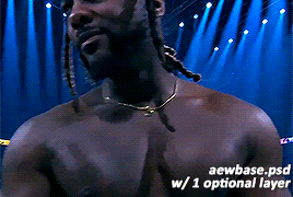
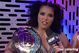
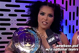
hi wrestling gif makers! as a gif maker & poc i've noticed some issues in coloring of certain black wrestlers, especially willow nightingale. though this was an issue that i believed to be solved last year, it seems to be happening again. so i decided to combine my gif making abilities and passiveness and make a little tutorial & re-release my psd used for gifs. hopefully this time, a visual guide will help remind you to not whitewash poc. here goes! gif tutorial here. psd here.
alright, you've made a gif!
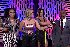
maybe your adjustments include a few of these layers?
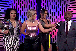
great! it's bright, it highlights the right colors, you're doing great. next up you'll want to add some vibrancy and pop those colors. i prefer to do this with my color balance. here are the settings for the optional color balance layer in the psd.
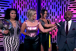
now personally? though stoke's complexion looks darker, willow's looks lighter compared to the previous gif. don't worry we fix that in post. but first, the second optional layer and my personal favorite: selective coloring. here are my settings & resulting gif:
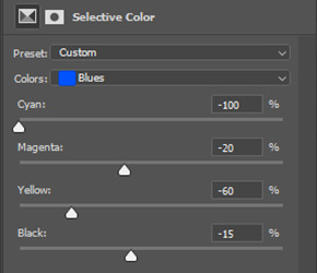
why do i do this? because i like the color purple. go wild in the selective color, it's fun. anyway, remember how i mentioned willow's complexion earlier? here's how i fixed it, back in color balance!
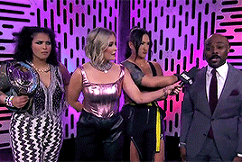
and here's the final gif!
if you made it this far, congrats! again my initial gif tutorial is here. and my psd used is linked here. go forth & gif poc confidently & in their skin tone.
54 notes
·
View notes
Text
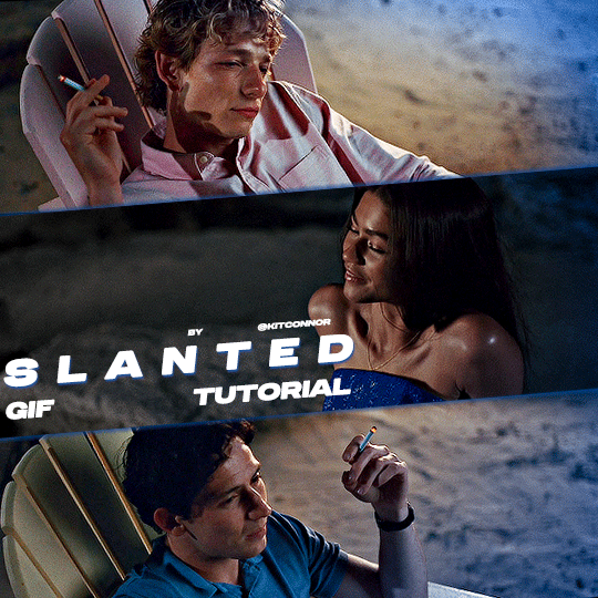
SLANTED GIF LAYOUT
anon asked 💬 : \kitconnor\754446373230919680 Hey, do you have a tutorial for how you created this layout style? easy done! i've also attached psds, found in my layouts folder, that you can use too, but i've laid out the steps as well if you want to change things up for your own layout.
want a tutorial on anything? send an ask!
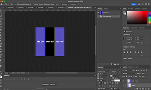
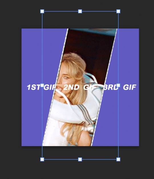
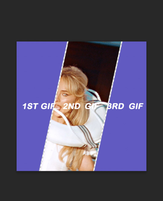
set up the layout
make sure you are following these dimensions, if you're working on a 540x540px layout (it only really works with this layout anyway 😭) if you DON'T want spaces on your gif: 1st gif: 180x540 2nd gif: 180x540 3rd gif: 180x540

and if you DO want spaces on your gif: 1st gif: 177x540 2nd gif: 178x540 3rd gif: 177x540
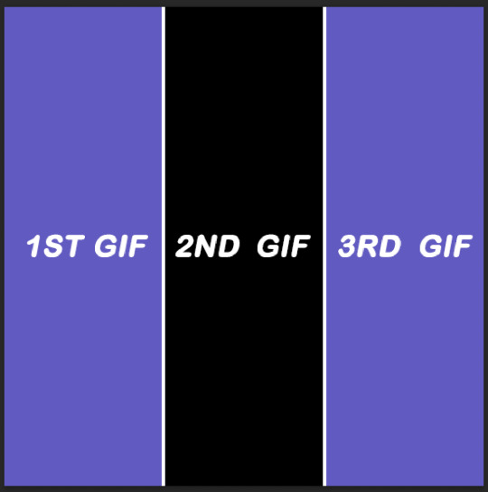
just use the rectangular marquee tool, using fixed size settings to get the shapes. also, make sure they're completely centered if you're using gutter sizes! additionally, ensure you use seperate layers.
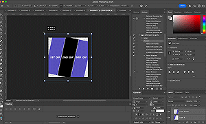
2. use the angle tool
you're going to select your three layers, and then angle them to whatever degree you want. you WILL have white spaces, but don't worry about that for now.
(i'm so sorry the quality sucks, i can't go any bigger and get the whole process in one 😭)
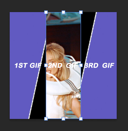
3. fill the gaps
now, you need to fill it in. i probably use a "sloppy" method, but it does eliminate the need to fiddle around with other processes. to do this, i literally just pull the corners until i fill it. after that, i center the layout as much as i possibly can, so everything is adequately filled.
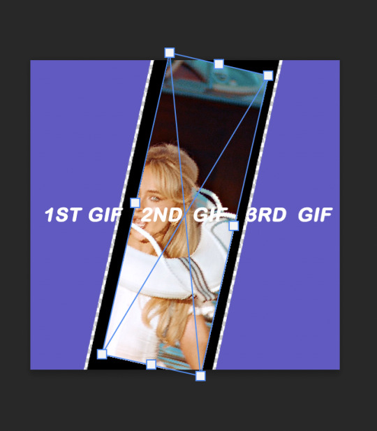
4. clipping gifs
to match the angles of the layout, you will add your gifs on, then angle it and size it to fit, the same as what you did with the layout and then clip. this part was too big to clip, but stepped out below:
repeat this with the others, then you're done!
find the psds, ready to have gifs sized to fit, here.
tip: sometimes it can give a weird jagged looking line when it saves, like this:
if you choose to do the no spaced layout, i'd suggest adding a black or white background underneath the layout, or adding outer glow to the rectangle shape which you can see in my cover gif! however, if you use the spaced one, you will notice it. there's not really a way to get rid of them, but it is a common "problem" amongst gifmakers, so i wouldn't worry too much!
101 notes
·
View notes
Note
Your gif blending skills are *chefs kiss* so, so good! Any tips/tricks you could maybe give for a seamless blending? Thank you! 💕
Thank you for the kind message!! I'd be happy to share how I blend my gifs! I did a basic blending tutorial here that just covers how to put two gifs on top of each other on the same canvas, but I can explain more about how I clean up my blends and make them seamless.
The key components are black brushes, the eraser tool, and layer opacity

So the below gif is what I get when I simply put my two gifs on top of each other and position them the way I want, but I want it to look a bit cleaner.

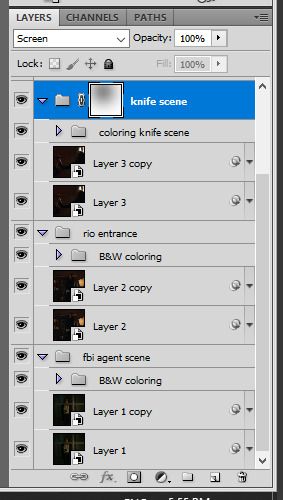
This is how I have my gifs set up, with the gifs and the colourings within separate folders (b for Buck on the left, and t for Tommy on the right).

And this is what it looks like when I open up one of those folders.

Now when I blend, I add a new layer within each folder on top of all the colouring layers, (the layer blend mode is set to normal), and I do the same thing in the Buck folder

Painting with black brushes
So now I use a big, soft, black brush to paint on this new layer I created. Wherever I paint is the area I hide. Since I'm starting in the Tommy folder, I'm going to paint over the areas from the Tommy gif that cover Buck, so that these areas get hidden.

I want to hide that bright spot on top of Buck's face (which is coming from the tommy gif) so I take a brush that roughly matches the size of the area (the circle that I drew). So in this case I'm using a 300px brush at 0% hardness set to black. And all I do is move my brush to the area I want to cover, and *CLICK ONCE*. I don't drag the brush, I simply move it into position, click once, and let go.
Here you can see the before and after


As you can see, Buck's face is a lot clearer now. And this is what my layers panel looks like.

Let's say I want to hide a little more, and clear up Buck's face even further. I simply create another new layer within the folder (above layer 4 in my screenshot) and again, click once over the desired area with my brush.

This is what it looks like now, but let's say I want to add some of that texture back. I simply go to the layer, and reduce the opacity. I usually play around with anywhere from 20% to 80% opacity.

Now I do the same thing for the Buck gif, but this time I paint over Tommy's face, meaning that I'm hiding the areas of the Buck gif that are covering Tommy's face.


This time I clicked twice with my black brush because I didn't feel that one click hid enough of the gif. Also, if you feel like you brushed over too big of an area, just take your eraser (usually the same size as/slightly smaller than your brush, also at 0% hardness) and CLICK TO ERASE. This is the final blend that I'm happy with.

Final comments
I found that this is the easiest way to blend, because other methods using layer masks sometimes leave you with those transparent pixels to deal with. Just make sure to CLICK with your brush/eraser and NEVER DRAG. This method is also super helpful when you have two "incompatible" gifs, such as when one gif is really bright. By clicking with a big soft brush you can still show the gif behind it while not making it look too disjointed, like I did here:


Here's another tutorial that I find helpful, which goes over using the dark spots in your gifs to help with the blending. Hope this helps!!
#answered#tommykinardbuckley#*tutorial#useraljoscha#userchibi#carolook#userbaz#userahri#userrobin#userwintersoldado#userbunneis#tuserheidi#usermibbles#usertj#wardengrill
180 notes
·
View notes
Text
Duplicate Frame Deletion: A Likely Unnecessary Tutorial
So… you updated to MacOS Sonoma, and–while it is amazing in many regards for photoshop things–it is a dang bummer and mood killer if you use MPV. However, after slamming my head into a wall trying to change the code on my own, I realized there is a much, much simpler solution to this.
In this tutorial, I will be showing you all how to delete duplicate frames from your gifs, with two options:
duplicate finder
within photoshop
Under the cut because pictures are a visual learner’s best friend!
A quick note:
MPV is odd with this. I’ve not had to do this on 4k capping, but have had to on anything under that. I don’t know the full reasoning, but it mostly looks to be something with the way it is reading frame rate. I know it’s in the code, but could not pinpoint it myself, and these were the only tricks that worked. If you find a better solution, please let me know! It has been rough, otherwise.
Step 1: Cap in MPV as normal
Now, this may be obvious, but make your caps in MPV. For a full tutorial on this, I highly recommend this one by kylos. The only difference between our software and their suggestion is going to be using the newest version of MPV (.0.36 at the time of this), and not the older. This is because there is an issue with MacOS Sonoma and older versions of MPV that prevent it from opening for… Some reason.
Step 2: Make sure you have your caps
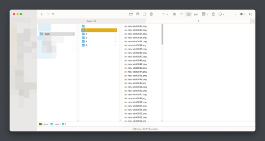
I recommend moving your caps to whatever folder you like for your own ease of use. My biggest rec is to have it in its own folder, with no older folders within the folder. Not really a requirement, but in my mind, it makes the process faster (only true depending on number of files in other folders). You should have something like this (I am doing a scene from TWOT, as it’s one I’ve tested this method on a few times in several instances):
Once there, it’s time for the line split. I recommend option 1 the most (it’s faster, IMO), but again, this is a two option thing.
Option 1: Duplicate File Finder
So, duplicate finders are what they sound like. They are pieces of software that can be used to scan your device (or specific sections of said device), for duplicate files. It does not matter the title of the file, if the system reads it as a copy, it will find it.
There are a number of varieties for this, paid and free. I will not lie, the one I use is a paid version, because I had a huge issue with duplicate files taking up space when I moved to a new device. This also helps a lot with cloud file keeping, in my opinion. But that is beside the point.
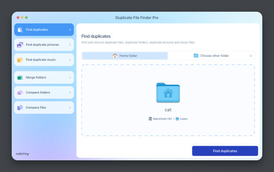
This is Duplicate File Finder Pro, which I got for other reasons, but has been very useful since this became an issue. The free version is sufficient for removing duplicate files found in folders, and that is why I still suggest it. You only need to get the pro if you have other intentions.
Now, onto the next step…
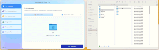
Step 3: Drag and drop the folder
With our folder full of caps, we simply drag and drop it into the application to begin.
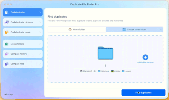
Step 4: Click “Find duplicates” and watch the pretty graph roll.
Step 5: Select the duplicate images
You can see here it found the duplicates.
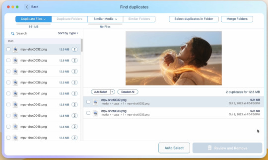
Now, I could go through by hand and click them, but… that’s a lot of time I don’t want to waste. I let it auto select them instead (you can tweak the settings for auto-select, but this is not that tutorial).
Step 6: Select review & remove, complete!
Wham bam! You’re completely set and good to go. Gif as normal~ (all final results at bottom)
Now, of course, maybe you don’t want a duplicate remover. Understandable, so what then? Well…
Option 2: Photoshop & the Changing Frame rate
So, this one is a little more technical. I suggest basic giffing and Photoshop knowledge before attempting.
Step 3: Import folder as you normally would
I believe this works as it would for import video, but I don’t want to say that and be wrong. But load your files in and you’ll be here:
Now create video timeline, make frames from layers, yada yada (kylos’ guide is very good with this if you need help, it’s the same that was linked at the beginning of this). You’ll now be here:
And the actual part of the tutorial you all came here for...
Step 4: Change the frame rate
So, in the bottom, next to the mountains for zooming in on the timeline, you’ll see it reads “30.00 fps.” We need to change this to 60. How? Easy! Click the three lines circled here:
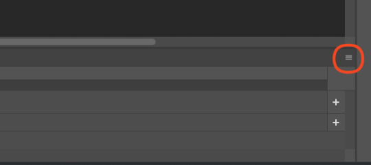
Then click “Set Timeline Frame Rate…”
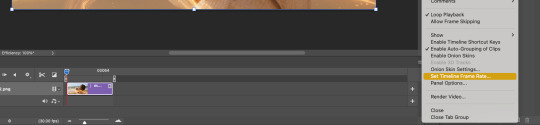
A little box will pop up, change the 30 to 15 (dropdown or typing, it works the same) and click “OK.”
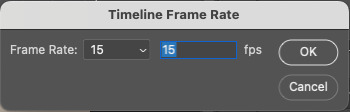
Your timeline will now be cut in half for length. That’s OKAY. DO NOT PANIC.
(Optional) Step 5: Double Checking
Click play on your gif, and you’ll notice it is no longer duplicate framed! To verify, let’s convert back to frames, just to see…
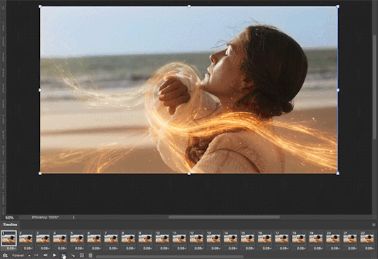
And it did, success! So make the rest of your gif as normal.
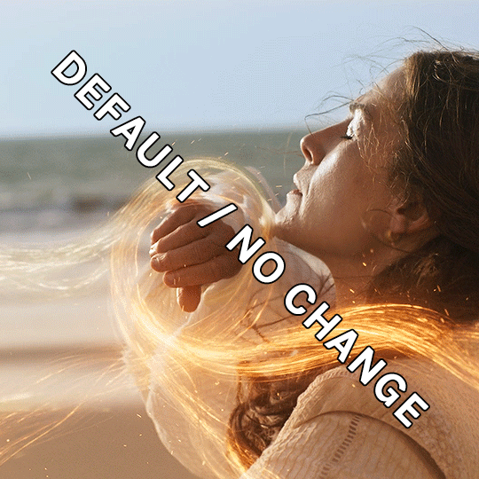
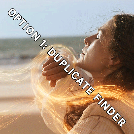
Your final results for the gif will be the following, with the gifs all labeled on what option was taken (or not). These were cropped for uploading and sharpened because of how I am. No coloring applied.
If anything was confusing, please don't hesitate to reach out! I'm happy to help in any way I can on this. My ask is always open. Happy Giffing!
#*tutorial#*ps#photoshop#resources#tutorial#alielook#singinprincess#sophiedevreaux#tuserabbie#tuserheidi#userace#userairi#useraish#userbarrow#userdorksinlove#userhella#userkayjay#userkraina#usermadita#usernik#userrobin#usershale#usersmia#usersray#usertj
175 notes
·
View notes
Note
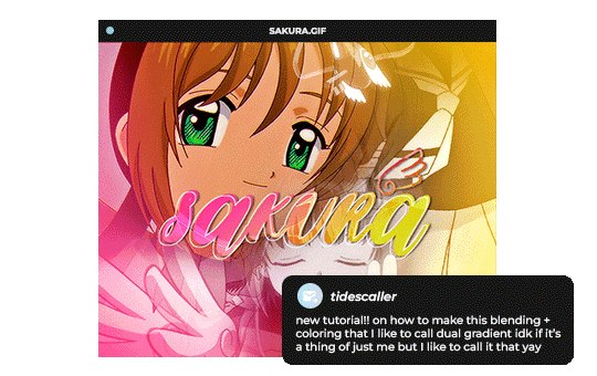
Hello, this gifset for pscentral event 37 is really pretty ✨
https://www.tumblr.com/tidescaller/779330612766081024/pscentral-event-37-trios-the-girl-the-boy-and?source=share
would you please consider posting a tutorial on how you made the blending multi gifs and colouring in the first gif?
Hi anon, so glad you liked it! I'll try my best to explain as detailed as I can. Just a small note that I'm not an expert, I'm still pretty new to blending edits in general so I'm learning as well as everyone ૮(˶˃ᆺ˂˶)
But before that real quick, and if my tutorial isn't enough, I'll leave you a list of amazing tutorials/guides that help me a lot when it comes to everything gifmaking related, so shoutout to them!
basic blending tutorial
coloring tutorial
blend gifs tips
blending, coloring and text effects guide (video)
another one similar to the previous one
gradient text
text outline
HOW TO: Blend multi - gifs / Dual Gradient coloring
You will need any version of Photoshop (I use CC 2019) and basic knowledge on making gifs.
STEP 1: THE BASE
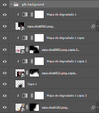
1.1 - Make sure your canvas is 540px width. Mine is 540x450. Choosing which gifs to blend is kinda tricky and no one can tell you what's perfect. Everything depends of the scenary your show, movie, anime whatever you're working on has; but a tip is to use scenes that have dark areas, since it's easier to blend then. 1.2 - Make your individual gifs: crop, color, sharpen, all that, and make sure all of them are the same amount of frames. 1.3 - Before duplicating your gifs into your empty canvas, convert them all into smart objetcs. This will help to simplify stuff, have a much more organized work space and help you load your preview faster.

STEP 2: BRING YOUR GIFS
Now all you have to do is right click on every gif you made, go Duplicate layer… and sent it on your empty document. I would suggest doing one by one, so you can work better. Duplicating them all at once can be a little bit intimidating and might have you confuse how to combine your gifs. Try imagining what you want your gif to look like and where you want each element to be. As an example, I wanted the key scene when it kinda drops to be falling from the top of my gif and also as a separation of the one in color and the one Sakura is roller-skating.
STEP 3: BLENDING
3.1 - Okay, now that you more or less know what you want your gif to look like you can start by changing the blend mode of your gifs. Photoshop has mutiple options on this and it applies to all types of layers. For blending, one of the two (or more) gifs you are working is going to be on top, that's the one you're gonna have to change its blend mode in order to start this process. Generally, Screen is the one to go to.
3.2 - Some people group (selecting your layers > ctrl/cmd+g or right click > group) all the gifs so they can then change the group's blend mode into Screen but I personally like to do separately cause if I need a gif to fill some of the background I would keep it as Normal.
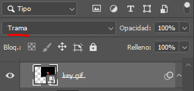
STEP 4: LAYER MASK
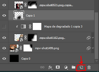
The key gif works perfect with Screen blend as it has a black background, but of course this won't be the case for most gifs you want to put in the main one. For those unwanted pixels we don't need, we use a Layer Mask. 4.1 - In order to do that, select your gif by clicking on them and next click on the layer mask button.
4.2 - Now you'll see a white square next to your gif layer. This will help by reducing the opacity of those things we don't need of your gif. What is white is 100% opacity and what is black 0%. So all you have to do is click on the layer mask, pick the brush tool and paint over what you want to "delete". Pay attention to use a soft brush, and the size of it should be around 200 and 300px. 4.3 - Repeat the process with all the gifs that need it
STEP 5: EXTRA LAYER
Sometimes a gif will look too bright/transparent/softened over the other ones. In order to fix this, you can create a new layer (the button right next to the trash can)
and paint with a black soft brush over the part you need to bring back. I don't know exactly how to explain it properly but I'll try with these before and after images. I'm adjusting the one with Sakura and her card:
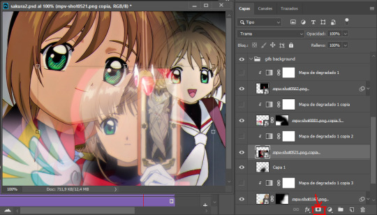
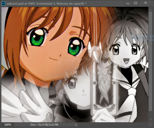
STEP 6: COLORING
6.1 - OKAY, now that we have all that sort out and the gif has a proper structure is time to add some color. As I'm going to do a dual gradient after and leave only one of these 5 gifs with color, I'll use a black and white gradient map and add it to every individual one as a clipping mask (right click on the gradient map > create a clipping mask). Like this:
6.2 - Now that we have this I can add my own psd. I started making my own psds for every edit I make and I'm not ready in any way to explain that, but I learn how to do this with this tutorial. With that, my gif now look like this:
STEP 7: DUAL GRADIENT
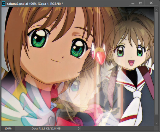
Finally for this part I recommend making another group (the folder button next to new layer) and add a new layer for the different colors you add. This is all about painting and playing with the blending modes for these layers. There's no right way to do this, you just have to play around and see what works best for you and the scenes you have. You will end up with something like this:
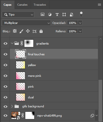
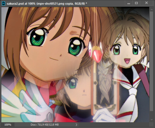
Tips for this step are: 7.1 - Use a soft brush, size it up to 1000px, zoom your gif out and start painting out of the canvas. This will help create that gradient effect we are looking for. 7.2 - Change the layer's opacity/blend mode. This is (again) about playing around with colors. I changed these settings for all my layers that are part of the gradients' group. In order: dual is Screen + 90% opacity, pink Vivid Light + 70%, more pink Lighten + 90%, yellow Hard Light + 70% and final touches Multiply at 100%. I also mixed up the colors, not only staying with certain yellow or pink. 7.3 - The gradient tool works the same way as the brush tool! Just make sure the gradient is any color you're working with + transparent. 7.4 - I also added a layer mask to my gradient's group to erase some of the extra color in Sakura's face. All this will result on this:
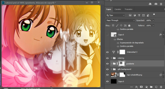
And that's pretty much it! For the text part, I was going to add it but the tutorials I linked at the beginning explain it perfectly so shoutout to them. As always, if you have any other doubt, send me an ask and I will answer it as fast as I can! Always happy to help ⸜(。˃ ᵕ ˂ )⸝♡
#answered#anonymous#*tutorial#photoshop help#gif tutorial#blending tutorial#photoshop tutorial#coloring tutorial
22 notes
·
View notes