#Curwen Press
Text


Wood Engraving Wednesday
THÉO SCHMIED
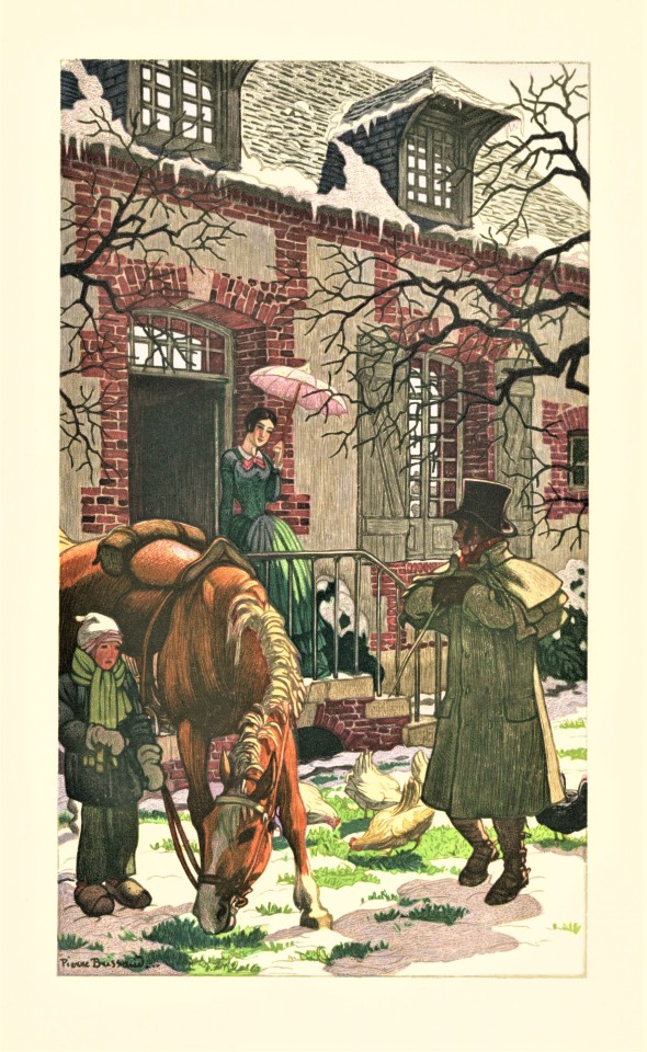
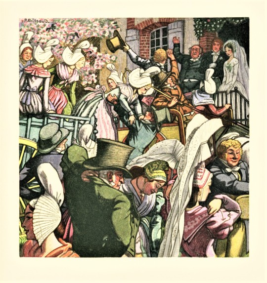
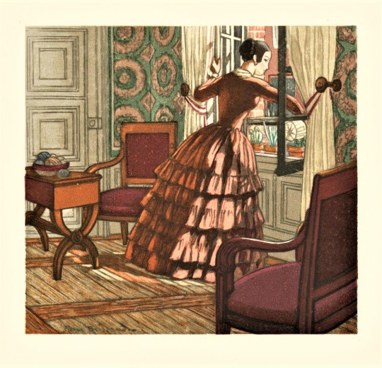
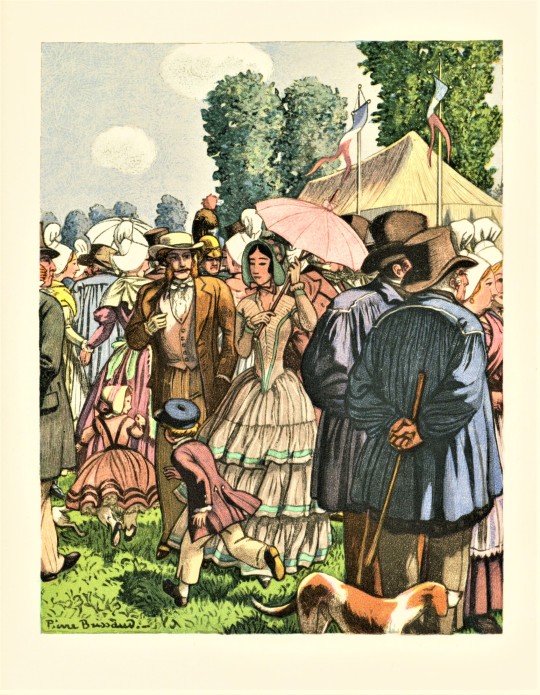
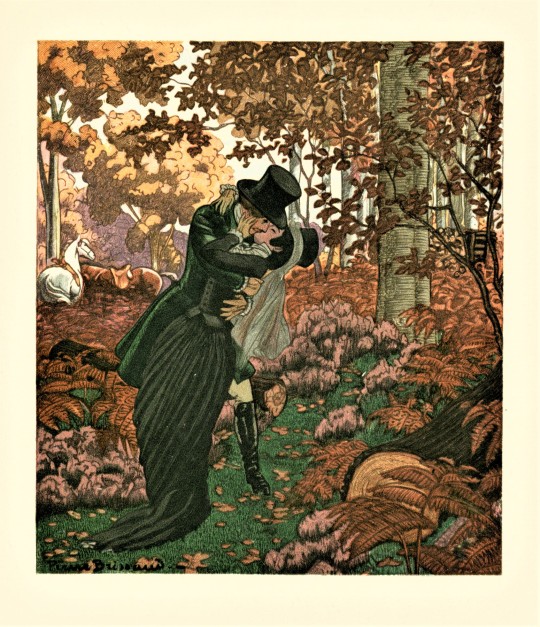
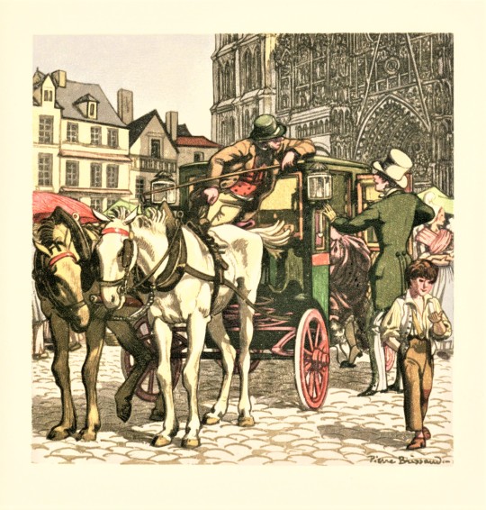
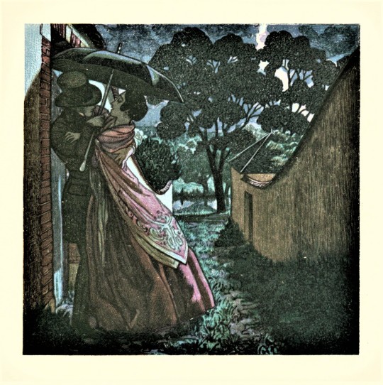
The French painter and illustrator Pierre Brissaud (1885-1964) was commissioned to produce watercolor illustrations for the 1950 Limited Edition Club (LEC) production of Gustave Flaubert's Madame Bovary. The watercolors were turned over to the workshop of master French wood engraver Théo Schmied (1900-1985) to be reproduced for the edition as these remarkable, multi-block color wood engravings.
Schmied's Swiss-born father François-Louis Schmied (1873-1941), also a wood engraver and formally trained in the book arts, established his Paris workshop in 1910 to produce deluxe, illustrated limited editions. Théo Schmied took over the management of his father's workshop beginning in 1924 and inherited the business after his father's death.
This edition was designed by Francis Meynell of the Nonesuch Press in London, with the text composed in Monotype Ehrhardt at the Curwen Press under the supervision of Ernest Ingham and printed letterpress at the Marchbanks Press in New York on specially-made paper bearing the title of the book as watermark by the Curtis Paper Company of Newark, Delaware. The edition is limited to 1500 copies signed by Pierre Brissaud.
Click or tap on the alt-text for each image to see captions.
View more Limited Edition Club posts.
View more posts with wood engravings!
#Wood Engraving Wednesday#wood engravings#color wood engravings#wood engravers#Théo Schmied#Pierre Brissaud#Limited Edition Club#LEC#Gustave Flaubert#Madame Bovary#Gustave Flaubert's Madame Bovary#Francis Meynell#Curwen Press#Ernest Ingham#Marchbanks Press#Curtis Paper Company#François-Louis Schmied#fine press books
167 notes
·
View notes
Photo
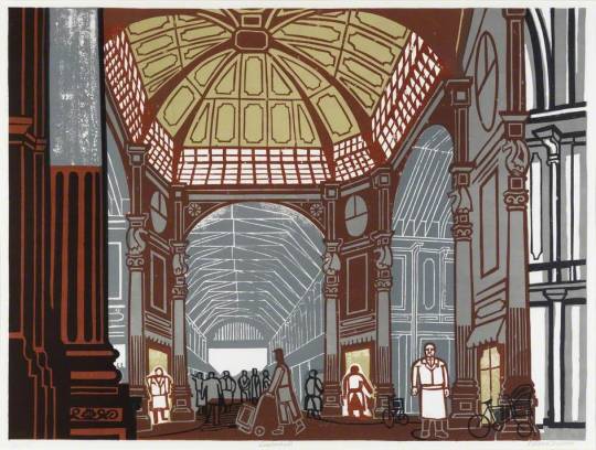


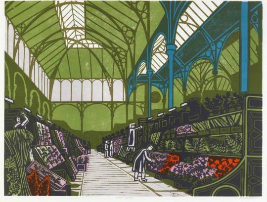
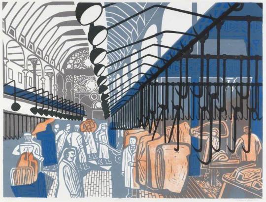
In 1967 Edward Bawden (1903–1989) was commissioned by the Curwen Press to create a set of prints of famous London markets.
https://artuk.org/discover/curations/artists-and-places-edward-bawdens-lithographs-of-london-markets/
569 notes
·
View notes
Text

Edward Bawden
Wallpaper design for Curwen Press, 1928
98 notes
·
View notes
Photo
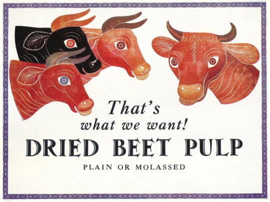
Dried Beet Pulp - poster by Edward Bawden, printed by Curwen Press, c1931
60 notes
·
View notes
Photo
Lithographs taken from 'The Iliad' or 'The Odyssey'
Print by Curwen Press, 1974-75
Elisabeth Frink
36 notes
·
View notes
Text
Thankyou to @ElCurwen Lesley Curwen for this review of my pocketbook "Wolf Eye" published by @theredceilings Press:
l
esleycurwenpoet.com/review-of-paul…
Wolf Eye is available here: https://www.theredceilingspress.co.uk/product-page/wolf-eye-paul-brookes
View On WordPress
0 notes
Text
The Poster and Design Reform • Gordon Russell Design Museum • 2023

I recently gave a talk, online, to the Gordon Russell Trust. The Trust runs the Gordon Russell Museum and celebrates the achievements of Russell as a key figure in 20C design reform.
The story of design reform in the Uk usually begins with William Morris and John Ruskin and is mostly described in relation to furniture design, architecture and various handicrafts. For Morris, and for his typographer colleague, Emery Walker, printing became part of this cultural phenomenon through letterpress printing and the private press editions of the Kelmscott Press.
The process of lithography is a kind pf magic that allows for a print to be taken from a flat surface, and without the enormous downward pressures required by the letterpress process.
Lithography was developed at the very end of the 18C and became, in the course of 19C, the technology that allowed for the industrialisation of the print economy. In addition to evident scaling effects of quantity and speed, lithography also allowed for much larger areas to be printed, without excessive pressure, and for the progressive integration of image and type into a single coherent form. The large-sized poster became, during the 1870s, the first form of image made to be seen, from a distance, and whilst moving…
In the 20C, the Design and Industries Association tried to extend the reach of design reform with mass production, so as to reach a wider audience. It is in this story that Gordon Russell, Ambrose Heal, Frank Pick, Allen Lane, Herbert Read and Kenneth Clark play a part. In printing, this began to make serious books available for a wider public and the role of Allen Lane in setting up Penguin is crucial, Various other personalities, Francis Meynell, Gerard Meynell, Stanley Morison, Eric Gill and Frank Pick, transformed the visual presentation of news, and technical information and advertising. Beatrice Warde and Nicolete Grey also played important roles in making the cultural significance of print culture more widely known. The transformation of visual print culture in Britain was transformed during the 1930s and during WW2. At the same time, developments in printing technology made the production of colour posters, prints and books more widely available.
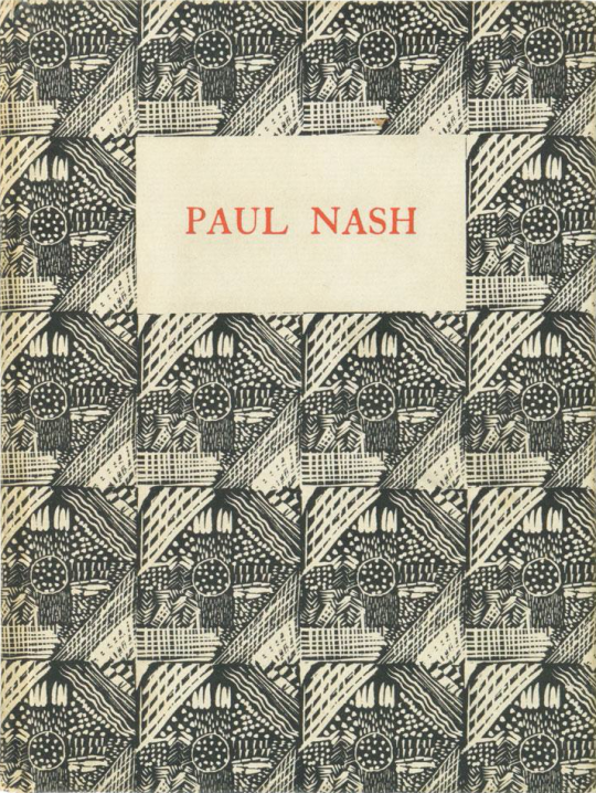
A number of artists and publishers worked together to make original coloured prints available to a wider public, sometimes in poster form. The names of Paul Nash, John Piper, Harold Curwen and Frank Pick played crucial roles in promoting this effort. London Transport and Shell Posters were complemented by print editions from Contemporary Lithographs, Lyons Teashop Posters, and School Prints. By the time of the Festival of Britain, the integration of art, architecture, design and experience had become much more coherent, and for many more people.
I love this alignment between art and life.
The recording of my talk will be placed on the talks archive of the Gordon Russell Museum website.
1 note
·
View note
Text
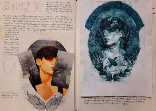

Top image showing the initial composition comprised of reference images compiled from different primary source images. A couple different colour schemes were printed, however the blue and red is particularly interesting as it combines this modern 3D effect with the Victorian inspired theme and imagery, such as the gothic trees and dramaticism of the person, who was also inspired by Claud Cahun and their exploration of self and characters.
Printing at the Curwen Print Study Centre with professional and quality presses was also a very engaging experience and created a sense of immersion with the classical themes of the piece
Etching printed at Curwen Print Study Centre A4 Ink on paper
2021
0 notes
Text
DAVID BECKHAM
It's been twenty years, but David Beckham still hasn't lived down the memory of that sarong, but the menswear icon has come up with an excuse: he was well ahead of his time, as fashion is much more fluid these days.
The 42-year-old - who is launching his fourth collection with co-owned British Heritage label Kent & Curwen - said the "outrage" and "shock" he received over the outfit wouldn't be the same response in 2018. Twenty years ago when I wore that sarong, people were shocked," he told The Telegraph.

"It was an outrage; 'why are you wearing that? What were you thinking?' Today no-one bats an eyelid if a guy wears a sarong in the street."
The star was ridiculed by the press after he stepped out in the patterned sarong over a pair of trousers with then-fiancee Victoria Beckham during the 1998 World Cup in France. And lest we forget the brown sandals too...
But he's has since braved that and some other questionable fashion moments to become one of the most influential figures in men's style.
And when he was ribbed by chat show host James Corden last year about some of his fashion faux pas incidents - including his and Victoria's very purple wedding day - he admitted he had no regrets.
0 notes
Text
Specimen Books Research
As early as the beginning of the sixteenth century, type specimen books developed as a way to help type founders, typecutters, and printers establish themselves in the burgeoning markets of the early modern book trade. Specimen books typically exhibit the full spectrum of typefaces available from a particular foundry or letterpress studio.
There was a time when printers produced type specimen books as well as type founders. Such publications show what types were being manufactured and document when specific founts were released on to the market, and their design reveals as much about the printers as the typefaces they display. These specimen books designed by Herbert Spencer for the printers Lund Humphries, provide evidence of a significant period in the development of British Modernism.
Printers’ type specimen books first appeared in the 1920s, with the widespread uptake of mechanical composition. Printers set typographic trends, and any reputable press regarded type specimen books as essential. That time was a decade of typographic expansion with many new and revived types coming on to the market. Monotype composition had also become popular, and technically up-to-date printers publicised this new system through their specimen books. By the 1980s desktop publishing had hit the industry. Responsibility for composition now lay not with the printer but with the designer, and clients ceased to choose a printer by his fonts.
Specimen books were effective vehicles for a printer to demonstrate his skills in composition, presswork and binding. Early type specimens looked like books, complete with prelims and end matter, and had page proportions and bindings that followed those of book production. The early specimens merely displayed typefaces, and provided no technical information such as character-set or casting-off tables. It was not until later that specimens developed their own style, taking the form of manuals both in content and presentation.
Type specimens were expensive to produce and were only issued by those printers who saw themselves in the typographic ‘front line’.
The Curwen Press in London favoured artists’ and ornamental Continental founts, which it advertised in its 1928 Specimen book of types and ornaments. A large, self-conscious specimen, it was exquisitely designed and printed on hand-made paper with deckle edges and excessive margins. It was a conspectus of modern printing with vignettes and ornaments, forming an unrivalled collection of work by contemporary artists, but it was expensive and too precious to be useful.
Curwen’s 1931 Working handbook was more basic. Printed on a rough stock with narrow margins, it displayed a limited range of faces and was a curious attempt to produce a useful and affordable specimen. Despite its title it failed to work, as it provided no full alphabets and its small format prohibited the adequate presentation of any text setting.
Specimen books issued by the Birmingham-based Kynoch Press were about type, not art. The Press favoured English revival types and produced two prewar specimens to publicise them. Its 1934 specimen appealed to typographic connoisseurs with its attractive presentation of rare founts. The types were divided into hand- and machine-set and were shown both as complete alphabets and as text with various leadings. The specimen was clothbound with Stevens Shanks’ Elephant
face sunk deep into the cover. This innovative cover gave dimension to the type allowing it to be seen and felt. The specimen was totally dependent upon the letterforms for impact and was a typographic solution from a printer that regarded itself as a typographer’s press.
In the 1950s the Kynoch Press produced a Specimen of typefaces, a loose-leaved two-volume manual with a Mult-O binding. The measured alphabets displayed complete upper- and lowercase alphabet lengths of all founts in all sizes, set against a pale blue background with fine white vertical lines at one pica intervals. This provided a visual character-count for each face and eliminated the necessity for casting-off tables. It was a graphic solution that was adopted by a number of other printers.
Lund Humphries of Bradford was interested in Continental sans serif types. In its 1930 Lund Humphries Type, the press showed its Modernist convictions by a bold use of geometric shapes, solid tints and reversed-out type. Bound in 2mm thick red board with a squared back, and held together by two thread screws, it had the appearance of a car maintenance manual. It was a functional specimen intended for use in inky printing works, and its large format allowed for adequate typeface presentation. The printer continued its commitment to usefulness when it produced the Type index, a utilitarian specimen book austerely bound in black, with a white sans serif titling reflecting its functionality.
In 1956, Herbert Spencer designed a specimen book for Lund Humphries. It was a visual synopsis of the full range of type laid out in a grid-format with an upper- and lowercase H and M to indicate hand- and machine-set types. Spencer’s Modernist layout sought to show the available typefaces as concisely as possible, and was an inventive solution to the challenge of type specimen presentation.
In hands of Spencer, an associate of Lund Humphries from 1950 to 1975, this specimen does not strive to impress, or to dictate how any face should be used. But it functions as it is intended, as a quick reference tool that provides the required information.
Resources:
https://guides.lib.udel.edu/typespecimenbooks/collection
https://www.eyemagazine.com/feature/article/this-is-a-specimen
0 notes
Text
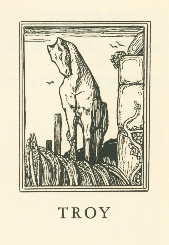
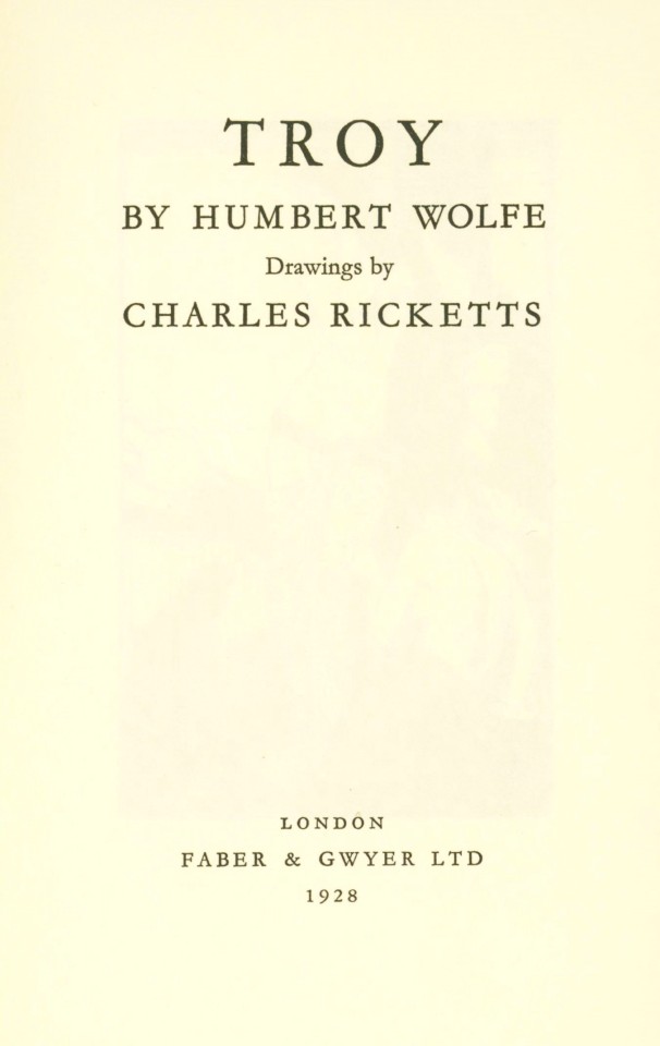
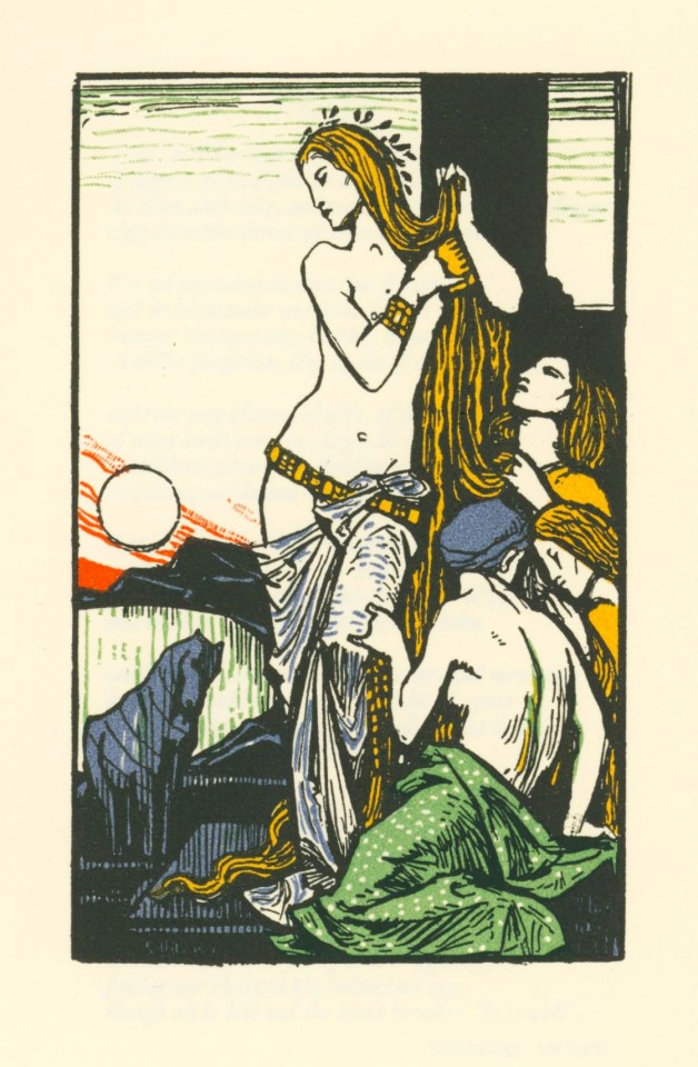


It's Fine Press Friday!
We end the work week with this slim volume of number 12 in The Ariel Poems series, Troy by the Italian-born British poet Humbert Wolfe with illustrations by British artist Charles Ricketts, printed in London by the Curwen Press for Faber & Gwyer in 1928. It is a large paper edition printed on English hand-made paper in an edition of 500 copies singed by the poet. The Ariel Poems were a series of illustrated pamphlets containing poems published by Faber and Gwyer and after 1929 by Faber and Faber. The first series had 38 titles published between 1927 and 1931. The second series, published in 1954, had 8 titles.
View other posts from the Ariel Poems series.
View more posts with work by Charles Ricketts.
View more posts with books printed by the Curwen Press.
View more Fine Press Friday Posts.
#Fine Press Friday#Fine Press Fridays#Troy#poems#Ariel Poems#Humbert Wolfe#Charles Ricketts#Curwen Press#Faber and Gwyer#Faber and Faber#fine press books
48 notes
·
View notes
Photo
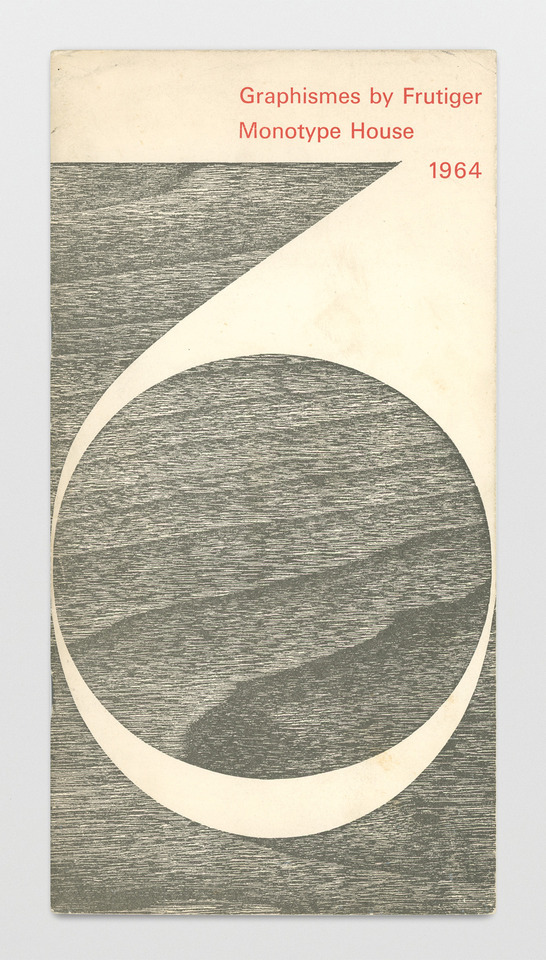
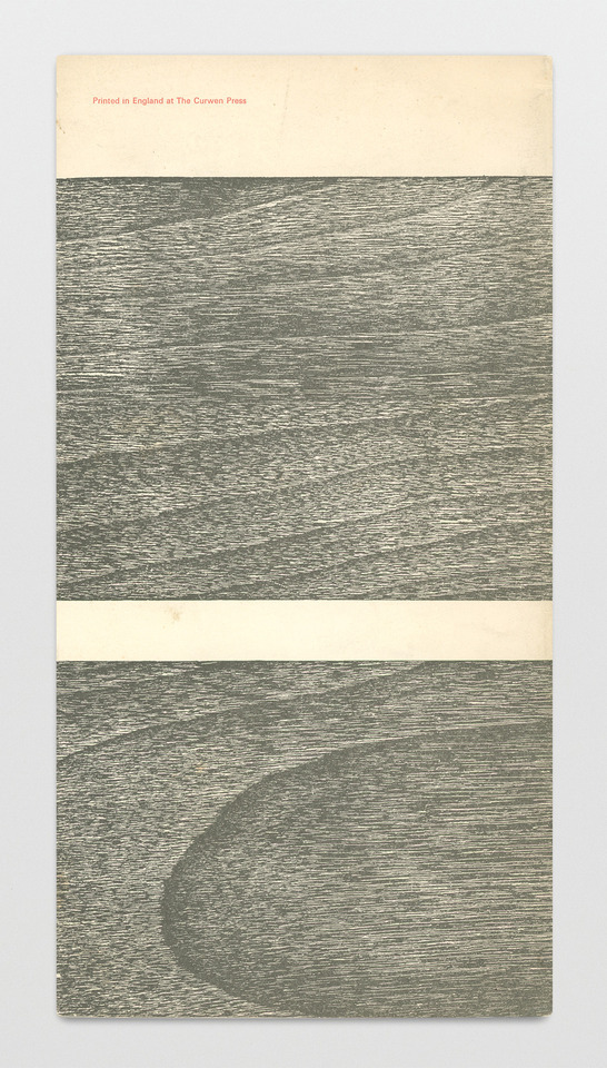
Graphismes by Frutiger, Monotype House, Printed at the Curwen Press, London, 1964
#graphic design#typography#univers#geometry#pattern#cover#adrian frutiger#monotype house#curwen press#1960s
340 notes
·
View notes
Photo


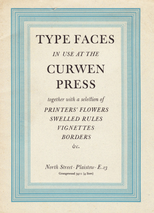
Brochure “Type faces in use at the Curwen Press”, 1952. A selection of rule borders, vignettes, display types and type faces. England. Via flickr
755 notes
·
View notes
Text
For Enid Marx
Enid Marx never received her diploma from the Royal College of Art. This was not for lack of talent nor work ethic, but because she was emboldened by abstractionism and this offended the tradition. She sought modernity in her work at a time before it was accepted in fine art, let alone in home or industrial furnishings. Unbeknownst to many of us, her designs have come to shape the language of applied pattern and textile design at large, and we’re fascinated by the course her career took.
The images included here first are from various stages of her career. It was one that endearingly began in a former-cowshed-turned-studio in Hampstead. She found herself there after working under the direction of Phyllis Barron and Dorothy Larcher, two renowned textile artists who pioneered block printing in the UK. The bold and energetic patterns reflect who she was described to be by so many of her peers: strong, opinionated, steadfast, and truly groundbreaking. She used everyday objects as inspiration to craft abstract patterns (see the first patterns, “Foot”, “Knife and Chip”, “Fishnet”, “Cable”, “Club”, respectively)


Patten ‘Foot’, Edin Marx, date unknown
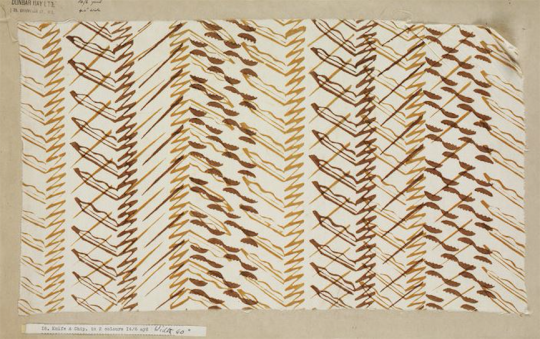
Printed dress fabric sample ‘Knife & Chip’, Enid Marx for Dunbar Hay Ltd., 1930s
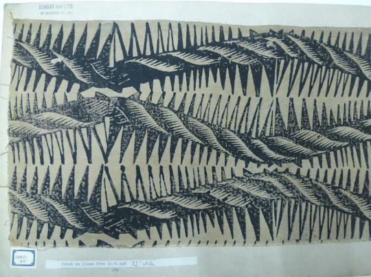
Printed dress fabric sample ‘Fishnet’, Enid Marx for Dunbar Hay Ltd., 1930s
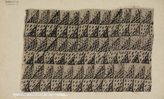
Printed dress fabric sample ‘Cabel’, Enid Marx for Dunbar Hay Ltd., 1930s
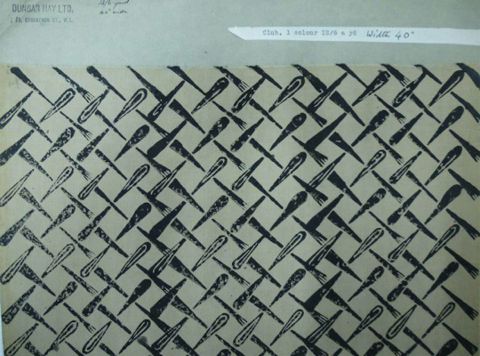
Printed dress fabric sample ‘Club’, Enid Marx for Dunbar Hay Ltd., 1930s
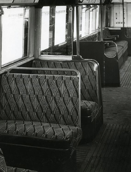
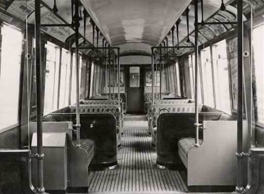
These patterns caught the attention of various industries. She was commissioned in the 1930s to develop fabrics for the London Transport System, and for Curwen Book Press. She carried into these industries the same abstractionist spirit she fostered in college, and went on to be appointed as the first female Royal Designer for Industry (RDI) in 1944. It’s always so interesting to engage with a designer’s full breadth of work because it becomes clear that a language is established at the beginning that carries through to all they do. The patterns on the books and on the underground metro were simply further developed branches of the ideas she had from the beginning.

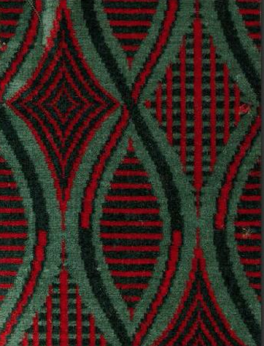
Sketch for moquette sample ‘Belsize’, Enid Marx, 1935
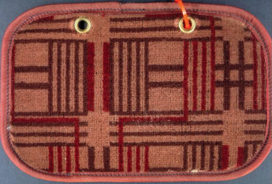
Moquette sample ‘Belsize’, Enid Marx, 1935

Sketch for moquette design ‘Shield’, Enid Marx, 1946
Moquette sample ‘Shield’, Enid Marx, circa 1946


Book cover for ‘A Book of Modern Verse’, Edin Marx, 1939
Book cover for ‘Florence Nightingale’, Edin Marx, date unknown
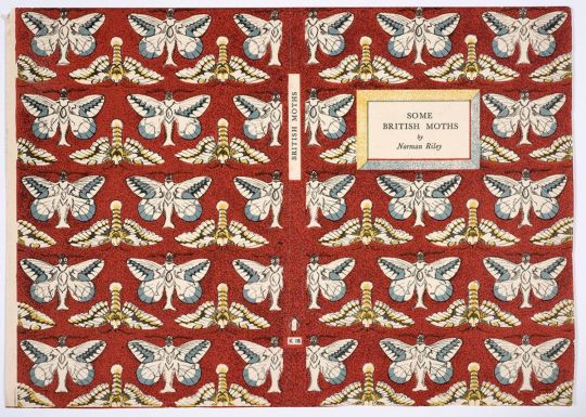
Book cover for ‘Some British Moths’, Edin Marx, date unknown


Pattern paper ‘Fiesta’ for The Little Gallery, Edin Marx, circa 1930
#enid marx#royal college of art#abstract#abstraction#modernity#applied patern#textile design#abstract textile#career path#phyllis barron#dorothy larcher#textile artist#pioneer#block printing#craft#london transport system#curwen book press#royal designer for industry#rdi#1944#pattern#patterndesign
145 notes
·
View notes
Photo

Hilary Stebbing (1915-1996)
A rabbit sketch not used for the book "Living Animals," illustrated by Stebbing, published by Cassell & Co and printed by the Curwen Press.
https://www.instagram.com/p/B1UD73GH0UT/
47 notes
·
View notes
Text
Day 4. My annual National Poetry Month 2023 ekphrastic challenge is a collaboration between artists Aaron Bowker, Beth Brooke, Oormila Vijayakrishnan Prahlad, Sara Fatima Mir, and writers, Tim Fellows, Merril D. Smith, Jamie Woods, Lesley James, Lesley Curwen, Carrie Ann Golden, Peter A., Barbara Leonhard, Jane Dougherty, Jen Feroze, Vicky Allen, Lynne Jensen Lampe and myself. April 4th.
SaraFM4
AB4
BB4
Mariammachi’s Fish (OVP4)
Robert Frede Kenter
Water lilies (all images)
Water washes through this world,
carries its cargo of fish-flowers
through all times, all spaces,
water world that mirrors the sky,
and how it blossoms with stars
risen from the deep ocean’s floor.
Jane Dougherty
31MAL (BB4)
I press down my folds and my origami creases
of pale sick paper skin
smooth the…
View On WordPress
0 notes
Last Seen Blogs

honeyraine
honeyraine

sea-overdose
Sea-overdose

pass-him
Untitled

akingdomorthis
heaven is not fit to house a love like you and i

sieuthivienthong24h-blog
Sieuthivienthong24h