#font design
Text
#today on tumblr#typography#font#fonts#writing#writblr#typografie#typographblr#writer#art#design#graphic design#lettering#graphic designer problems#free fonts#font design#typeface#verdana#comic sans#helvetica#font matters#font size
932 notes
·
View notes
Text
"At HarperCollins, a lot of attention and thought is given to deciding exactly what combinations of margin measurements, font, and layout feel most appropriate for the genre, and writing style.
But in a case of do-your-part environmentalism, designers at the publishing house have now standardized a series of subtle and imperceptible alterations to normal font style, layouts, and ink that have so far removed the need for 245 million book pages, totaling 5,618 trees.
Telling the story in Fast Company, representatives from HarperCollins, one of the four largest publishing houses in the world, explained that the idea first arose in Zondervan Bibles, HarperCollins’ Christian publishing division. Being that the Bible is 2,500 pages or sometimes more, saving ink and pages was not just an environmental consideration, but one of production costs.
A new typeface called NIV Comfort Print allowed Zondervan to shave 350 pages off of every Bible, which by 2017 had amounted to 100 million pages, and which, as Fast Company points out, would be four times higher than the Empire State Building if stacked.
The production and design teams then wondered how much they could save if they applied the same concepts to other genres like romance and fiction. Aside from the invention of the eBook, publishing hasn’t changed much in the last 100 years, and the challenge was a totally novel one for the teams—to alter all their preconceived ideas and try and find a font and typeface that resulted in fewer pages without being harder to read.
They eventually standardized 14 different combinations their tests determined were the most environmentally friendly, and which delivered an unchanged reading experience.
But the challenge didn’t stop there. Printed books, one might not know, are printed in large sheets which are then folded into sections of sixteen pages, meaning that Leah Carlson-Stanisic, associate director of design at HarperCollins, has to calculate the savings of space, words, and ultimately pages with the help of her team to fall in multiples of sixteen.
Nevertheless, they have been successful with it so far, and in the recent print run of one popular book, 1 million pages (or a number near 1 million that coincides with the 16 times tables) were saved.
“We want to make sure our big titles, by prominent authors, are using these eco-fonts,” Carlson-Stanisic said. “It adds up a little bit at a time, saving more and more trees.”"
-via Good News Network, April 4, 2024
--
Note: Great! Waiting to see this on the rest of their books and at the other big publishers!
Actually, though, it's worth noting that this may not come quickly to the other large publishers, because Harper Collins almost certainly owns that font - meaning that other publishers would have to pay HarperCollins in order to use it, on an ongoing basis.
More on publishing shit and more realistic solutions here below the cut!
What I'm hoping for and think is more likely is that this will inspire the development of open source eco-friendly fonts, which would be free for anyone to use. That would make it far more likely other publishers would adopt eco-friendly fonts.
I'm also hoping it would inspire other publishers to create similar eco-friendly fonts of their own.
Ideally, there would be a whole new landscape of (hopefully mostly open source) eco-friendly fonts. And/or to see calculations of the eco-friendliness of popular existing fonts, compared to each other.
If we could have a publicly accessible list of calculations for different fonts, including fonts designed to maximize eco-friendliness, I really do think that it would affect which fonts publishers choose to use. Here's why:
Most people in publishing are on the left (notoriously, actually) and really do care about the environment
People in publishing are plenty aware of these issues re: paper and trees, I promise
Shorter books means smaller production costs - and possibly smaller shipping costs as well, over time! So it would save them money too.
Eco-friendly fonts could also be combined with other measures for greater effect, such as bamboo paper (already in use for a lot of projects where page color/quality is more flexible) and thinner paper (aka paper with a lower weight) that uses less trees.
Don't expect books to all move to just one or two different fonts, though. Publishers and typesetters and font designers will innovate to create more options instead, though it will take longer. This is because different books really do use different fonts for various different reasons - one new font to rule them all isn't really a solution here.
"Every book is in the same font" may sound like a "whatever" deal to a lot of people, but as someone who works in publishing - trust me, it would actually make your reading experience worse, even if you could never quite put your finger on why.
#publishing#books#book publishing#bookblr#harper collins#fonts#font design#eco friendly#sustainability#conservation#trees#deforestation#good news#hope
345 notes
·
View notes
Text
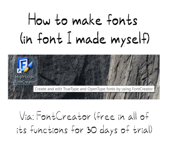
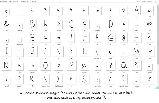


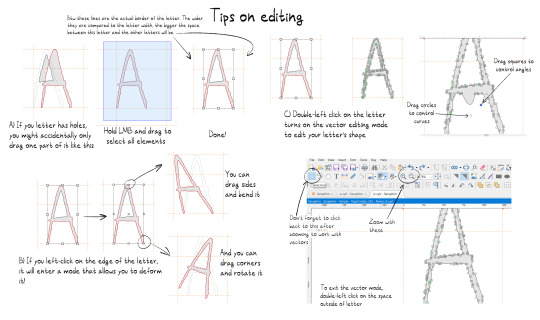

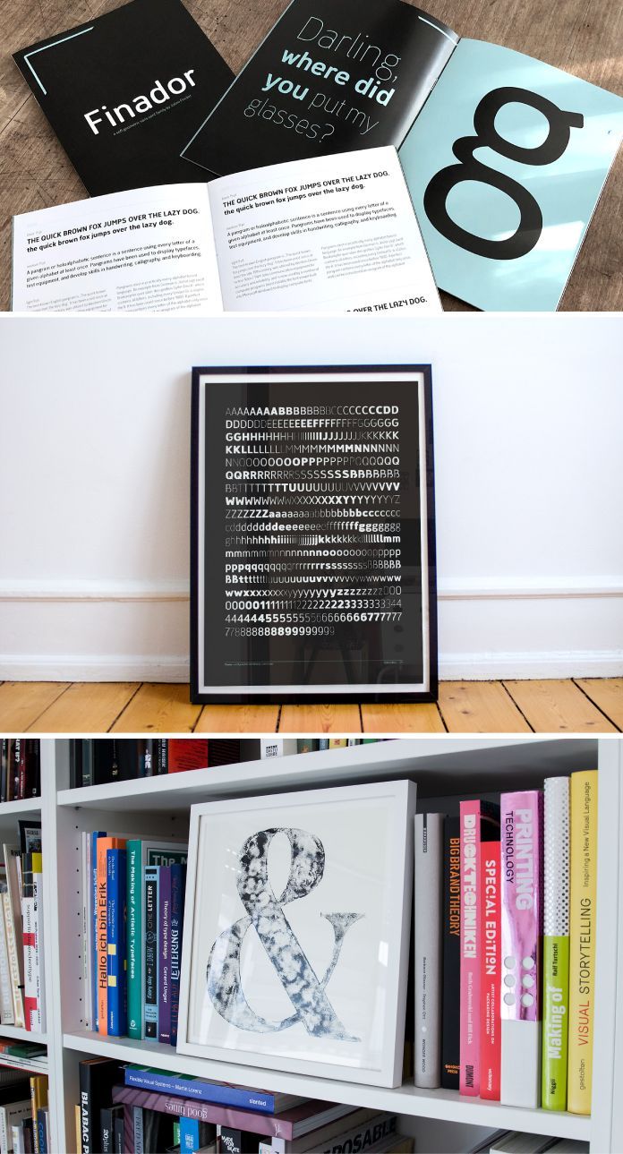
I wanted to learn how to make fonts and decided to share what I figured out with everyone!
123 notes
·
View notes
Note
hii can u do just the full alphabet of cursive capital and lowercase letters? thank u love 🎀
⠀⠀⠀⠀⠀⠀⠀⠀ 𝓐 𝓑 𝓒 𝓓 𝓔 𝓕 𝓖 𝓗
⠀⠀⠀⠀⠀⠀⠀ ⠀𝓘 𝓙 𝓚 𝓛 𝓜 𝓝 𝓞 𝓟 𝓠
⠀⠀⠀⠀⠀⠀⠀⠀𝓡 𝓢 𝓣 𝓤 𝓥 𝓦 𝓧 𝓨 𝓧
⠀⠀𝓪 𝓫 𝓬 𝓭 𝓮 𝓯 𝓰 𝓱 𝓲 𝓳 𝓴 𝓵 𝓶 𝓷 𝓸 𝓹 𝓺 𝓻 𝓼 𝓽 𝓾 𝓿 𝔀 𝔁 𝔂 𝔃

divider ctto !
#lilac♡#cursive#fonts#symbols#letters#cursive letters#letters copy paste#font copy paste#font pack#font design#uppercase#lowercase#math script font#coquette#coquette symbols#coquette fonts#requests
121 notes
·
View notes
Photo
#Yohji Yamamoto#japan fashion#fashion designer#black#love quote#life quote#quotes#graphic designer#graphic design#Typography#typografie#graphic art#japan icons#Font Design#fonts
383 notes
·
View notes
Photo
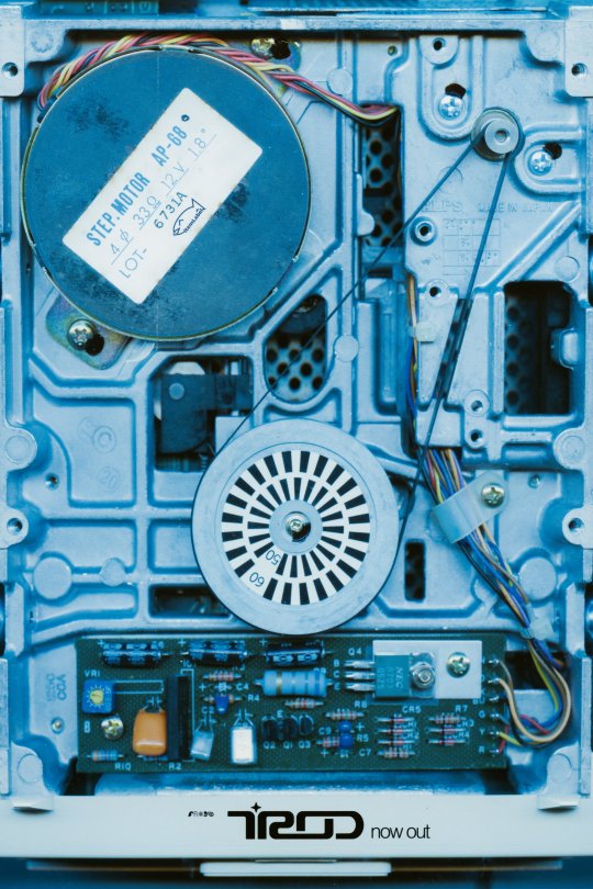
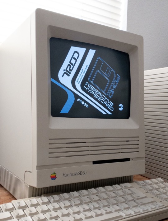


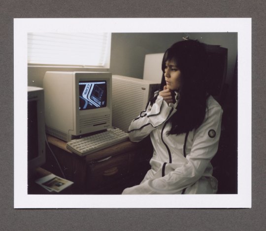

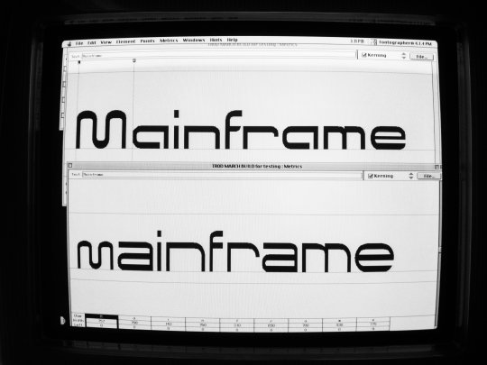

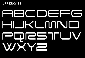
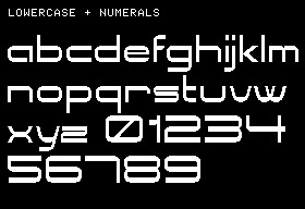
TROD, my latest font on itemLabel, is out!
$40, comes with chock full of extras and a dot-matrix companion font, baudotpunch, multi-platform support, and my HyperCard portfolio!
https://itemlabel.com/products/trod-font
It took over a year in development, and lots of testing to get it to work under many retro and current platforms.
A full specimen is linked here: https://archive.org/details/trod_font_specimen
289 notes
·
View notes
Text

Arachne is a small experiment-font that combines OCR-A with Art Nouveau decorative scripts
59 notes
·
View notes
Text
#typography#typography design#typeface#graphic design#lettering#font design#designed by me#debbie van cauwenberghe
24 notes
·
View notes
Text
From Skateboards to Fonts: Celebrating 5 Years of Julien Fincker’s Type Foundry
More here.
Follow WE AND THE COLOR on:
Facebook I Twitter I Pinterest I YouTube I Instagram I Reddit
8 notes
·
View notes
Text
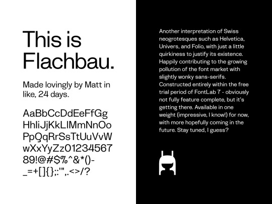
finally feel confident enough to put the first version of Flachbau out to the public! check it out on github if you so desire!
240 notes
·
View notes
Text
Thursday, October 19.
Typography.
It appears that #typography is trending today. We know not how, or why. But we won't argue. What is clear is that there are a whole lot of y'all—millions, even—who understand that it is not just what you say that matters, but how it is said. So say it. Say it well, and say it with style. White space is your weapon. Be exact in your spacing. Choose your font wisely.
#today on tumblr#typography#typografie#font#font design#font matters#font size#writing#graphic design#design#typeface#lettering#white space#type#creative writing#writblr#typography design#typography art#typo#art#writer
366 notes
·
View notes
Text
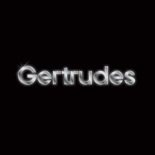
Launching a little font we like to call Gertrudes - Through Modern Type Foundry. Sign up to their email list to get early access.
8 notes
·
View notes
Text
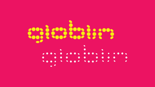
[ wip ] I think I might name this one globlin.
23 notes
·
View notes
Text
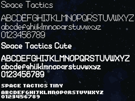
Niria Wars uses 3 unique fonts made by me just for the game - first I made Space Tactics for long text, then made it bold and cute for titles & buttons, and finally there's a teeny tiny version of the font for little context menus and stuff.
They each have some symbols built in too - the bigger two have the controller buttons so I can add text easily to the tutorials, and the tiny one has some icons that are useful in the game like the tiny clocks you see for the waiting times on factories and spaceports.
21 notes
·
View notes
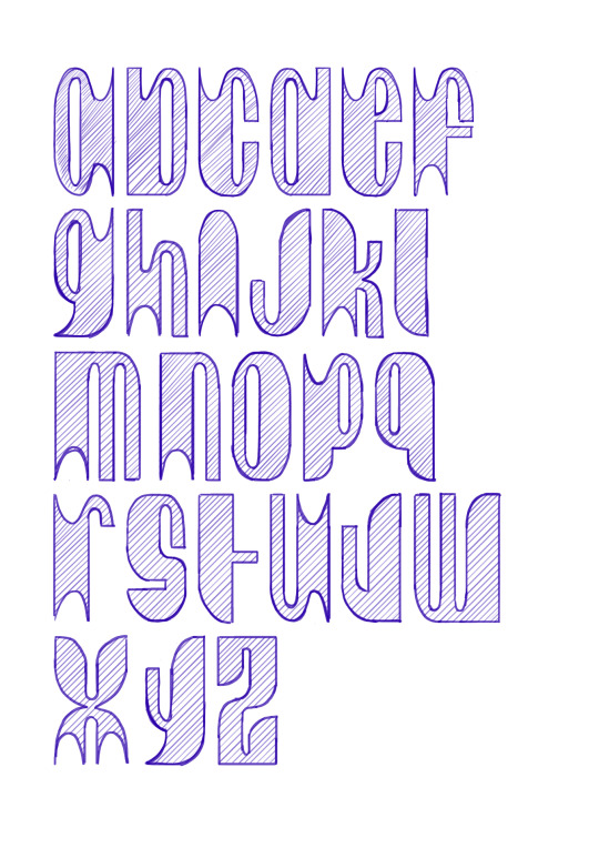
Photo

| typeface by Marta Przeciszewska |
44 notes
·
View notes

Last Seen Blogs

seluxerez
SeluXereZ Creations
velcromancyy
Nico
gaecactae
hold the cactus and proceed
frazerirving
I ART FRAZER IRVING