#Debossed Printing
Explore tagged Tumblr posts
Visit Tumblr Blog
Explore Tumblr blogs with no restrictions, modern design and the best experience.
Last Seen Tumblr Blogs


Fun Fact
Mobile US users spent an average of 115.8 minutes on Tumblr app monthly.
Text
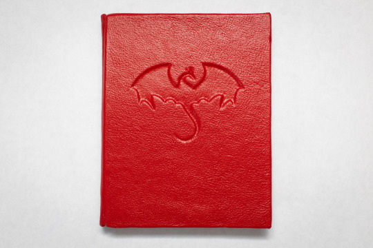


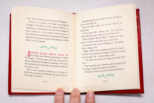

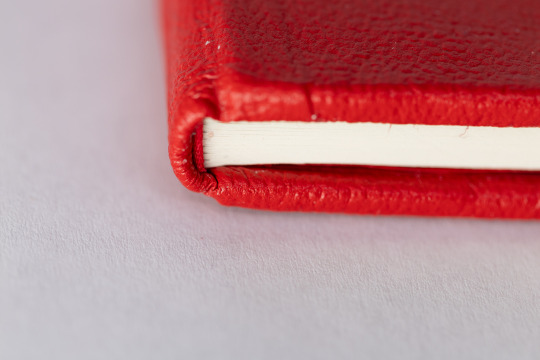
Fic binding: In Which Merlin Reveals His Magic, Arthur Embarks On A Quest, And Uther Absolutely Does Not Admit He Was Wrong About Anything, Ever, by @alex51324
Over a year after typesetting and sewing it: finally done!! This was the first time I tried to deboss-- I used two thin pieces of board for the cover, used a cricut to cut the dragon shape out of one of them, and then glued them together. Turns out jabbing at leather with a pointy stick is kind of relaxing. (Also, for a first attempt, I should probably have chosen something with fewer tiny points.)
591 notes
·
View notes
Text

Orbyt Studio / Supply.Family / Book (X) / Mockup / 2023
Download
#orbyt studio#supply.family#book#x#2023#cover#deboss#emboss#foil#hardcover#paper#printed matter#psd#sleeve#textile
2 notes
·
View notes
Text


My first book is available now on americanartcatalogues.com @americanartcatalogues
To accompany the release of Rappeneau’s first monograph, American Art Catalogues will present “The Devil, Probably”, an exhibition of five works opening September 19th.
Specifications: - Softcover, with debossing on spine and back - 9 3/4 x 13 inches (24.8 x 33 cm) - 344 pages, 161 illustrations - Text by Charlie Fox @ghostwoodfox - Edition of 1,000 copies - Printed in Italy
americanartcatalogues.com
554 notes
·
View notes
Text


I am very happy to announce my new photo book, Epitaph.
A decade in the making, Epitaph is a series that attempts to unravel the knot of mystery that exists within the dark corners of North America, shedding light on unseen histories and buried past lives.
Images from across the continent allow the viewer an intimate, voyeuristic perspective of deeply personal spaces and homes lost to decay contrasted with expansive dreamlike landscapes, all frozen as the world changes around them.
Epitaph invites you to partake in the exploration of the bizarre world that exists just outside of town.
168 pages, measuring 11x8.5”. linen bound offset printed with a debossed cover art and foil pressed lettering. Limited to 750 copies.
Preorders are now available on my website. All preorders will include a random, one of a kind 4x5 print from this series. Shipping is expected to begin in early October.
Finally I would like to express my deep gratitude for the continued support over the years, because of it I am able to bring the project to life. I can’t wait to share it with you.
PREORDER HERE
215 notes
·
View notes
Text


speak friend and enter
A beautifully textured A5 softcover notebook with a subtle debossed quote for fans of dwarves and elves alike. Stitch-bound for easier writing, and made of 100% recycled pages (GRS certified). Designed and printed in the UK. Four colours available ✨
etsy link! | my website (discount – UK only)
#lotr#lord of the rings#tolkien#hobbit#shop update#jrr tolkien#notebook#journal#stationery shop#sustainable gifts#recycled paper#moria#middle earth#khazad dum
54 notes
·
View notes
Text
The cover for the English translation of the first volume of Omniscient Reader's Viewpoint by singNsong has been released, and the books are confirmed to be getting the Korean edition interior illustrations by Black Box!
"With embossing, debossing, and silver foil accents, the English print edition of the Omniscient Reader’s Viewpoint novels will feature elegant die-cut covers with illustrations originally used in the Korean editions." (Twitter) (Blue Sky)
Volume 1 releases as a physical book, ebook, and audiobook on July 22, 2025! They're using the typeface from their English translation of the manhwa, which is ongoing.
#orv#omniscient reader's viewpoint#kim dokja#singnsong#fallfnewsposts#as expected they're using the typeface from their version of the manhwa#and the Korean cover art#looks nice
57 notes
·
View notes
Text


Twenty Thousand Leagues under the Sea
By Jules Verne
🌊🐙🐳
Boy this was a lot of foiling, and my hand definitely hurt by the end of it. Despite my efforts, the hand foiling is quite patchy, but somehow aesthetically it kinda works?
I printed the pattern on inkjet canvas first, then I laid over it a printout of the leaf border pattern (originally designed by @alderdoodle). I used vellum paper so that I could see the cover underneath and line up the pattern. Then, once everything was secured with tape, I inserted green foil between the vellum and the cover. From there I traced the pattern by hand with a foil quill. Meanwhile, the spine was debossed first with a foil quill and then filled in with gold paint.
This is the biggest book I’ve ever tried to rebind, and I’ve learned that the weight of the text block is definitely something I need to consider more in the future for how I decide to construct the case. Even with the mull, the inner shoulders feel quite weak unfortunately. I should have either chosen stronger endpapers, or done more to reinforce the marbled paper I used, especially at the hinges to prevent the text block from sagging.
Apart from the leaf pattern, all other elements are from Canva.
————
You can also check out this post on my Cara or Mastodon.
#bookbinding#handmade#handbound book#book binding#arts and crafts#bookbinder#hand bound book#jules verne#20000 leagues under the sea#twenty thousand leagues under the sea#classical literature#renegade bookbinding
75 notes
·
View notes
Text

I was commissioned to carve and print a juvenile Mississippi kite, and I’m posting it here since the commissioner doesn’t follow me on here as far as I know :3 very happy with how it turned out!!
I love printing into wet paper since it leaves a bit of a deboss where the linoleum pressed into it. It’s not crazy visible, but it adds a fun texture to the print
61 notes
·
View notes
Text


Perforated Heart Book Design by Faceout Books
Perforated Heart by Eric Bogosian Designed by Jason Heuer
About the Design: "I was very excited to be assigned Eric Bogosian’s latest novel. It comes on the heels of his two previous novels that were designed by Kevin Brainard (Mall) and Carin Goldberg (Wasted Beauty). As if that wasn’t intimidating enough, Mr. Bogosian’s wife Jo Bonney is, among other things, a cover designer herself. I felt all these factors combined would give me a chance to approach it with an expanded design sense.
"I began the process by researching heart images. In the back of my mind, after looking at Carin Goldberg’s cover, I thought I might be able to do a cover without type. The literal interpretation of the title, die cutting or “perforating” a dotted line image, with a red foil case underneath immediately came to mind. Foregoing other ideas I ran down to the art shop and purchased a paper punch die set and went about creating the fully realized comp with the case beneath. I illustrated the case to represent the main character’s (Richard Morris) journal writing-younger self from 1970’s New York City. This also left enough room for the die cut to show only red. "With the exception of this book, I usually present 3 or more ideas for a cover design, with variations. I felt so strongly about this one that I chanced showing my art director, Jackie Seow, only this concept. She strongly supported the idea and brought it to the jacket meeting where everyone got behind the project. The only small objection was the image-only cover. I hand-drew the lettering based on the Compacta I was going to use on the spine. "Now we had to see if it could be produced, or at least produced within budget. After the early approval there was time for production experimentation. With the help of our printer representative, Paul Nardi, we found a machinist out of New Hampshire that could drill the holes, as the approximate 1000 were too many for a die cut to hold. They sent us a sample so we could see that it would keep its structural integrity without tearing, and it did. (see image below). But alas, it was way out of our budget range. I already had a secondary execution ready since there were early warnings the holes weren’t economically viable. With the red foil debossed dots we had press proofs printed with 3 finishes, the two not chosen were all gloss and all matte. I was able to keep the printed case because it was still within budget and part of the concept of duality from the novel. "At the end of this process I can appreciate the anomaly of presenting one idea and having the art director, editor, publisher, author, author’s wife, and sales people all consent on a concept. Really, the hardest part was the production and even that was a fun exploration."


It took some sleuthing to dig through the Wayback Machine to find this interesting defunct blog post about the design process of this book. Shoutout to The Book Design Review, which piqued my interest. So cool to know that Jo had input on this design! I wonder if she gives input for all of Eric's books as she's a book designer herself.
#perforated heart#eric bogosian#DOG BLESS the wayback machine#the paperback ed. is really sad compared to this version unfortunately lol...#the ebay journey was a success and i bought a signed 1st ed. copy of this ahhh 🙈
22 notes
·
View notes
Text


The problem when you have too many projects is that choice paralysis strikes hard when it's time to share them.
Thankfully, today marks the 8th anniversary of the launch of Yu-Gi-Oh VRAINS, which prompts me to share one of my (many...) 3am-bout-of-stressbinding projects. I was meant to leave for a professional trip abroad at 5am, and thus decided that I needed an emotional support notebook. And who could support me better than my bae Backup Secretary? Thus here it is, an 84-page quarto notebook about bonds and love and card games made in early March 2025.
More about the typesetting and binding process under the cut!
The endpapers and the typeset were made using stock image I got from pngtree and quotes from the amazing speech at the end of episode 120. Almost all the pages look like the one I shared above, but I added a few Easter Eggs: I'm particularly happy with the "Ai" including the kanji for love in the A.


The typesetting was made using Affinity Publisher 2. The font for the bottom-right quotes is Orbitron; the Vrains font I downloaded from Booth.jp for free 6 months ago or so but it seems to have been taken down since 😕 and the pixelated Japanese font is PixelMplus12. The quote in the typeset is in French, but I have an English version too!
I printed it on standard printer paper, because it was all I had at that time, on a new laser printer I had just received and wasn't familiar with yet. I was pleasantly surprised at the quality of the print!
It was my first time trying to do an insert with debossing; I then stuck the (well-loved, well-used) card in it. I had a leftover of that nice blue bookcloth, but not enough to cover the full notebook. I realised too late and since there was no way I was starting over at 2am, I made the last-minute decision of adding that heartbreaking image to complete the cover instead. It's laser-printed too, and since I didn't wax it, you can see the way the colour faded with time.
The notebook didn't spend enough time under the press, what with me leaving 2 hours after completing it, so the cover is slightly warped. And with my lack of guillotine, of course, the pages are cut askew. It's part of the charm.
Much was learnt, not much sleep was had, and I'm pretty happy with the result. It is now my daily notebook, and I bask in the knowledge that once I'm done writing in it, I could well bind myself a new one if I want (...hopefully not at 3am this time.)
#fanbinding#bookbinding#yu gi oh#vrains#yugioh vrains#yugioh vrains quote#yugioh vrains spoiler#backup secretary#bookbinding 404
19 notes
·
View notes
Text

“CULTURE VULTURE” BARBARA KRUGER // 2012 [debossed archival pigment print | 6 x 6”]
61 notes
·
View notes
Text

Orbyt Studio / Supply.Family / Book (X) / Mockup / 2023
Download
#orbyt studio#supply.family#book#x#2023#cover#deboss#emboss#foil#hardcover#paper#printed matter#psd#sleeve#textile
0 notes
Text
Trails in the Sky 1st Chapter ‘Bracer Supply Box’ premium collector’s set announced - Gematsu

United Kingdom-based boutique merchandise studio Pin Box will release an officially licensed Trails in the Sky 1st Chapter “Bracer Supply Box” this fall for £199.99 with free worldwide shipping, the company announced. Open pre-orders are available from today until May 29. Only a single production run is planned, with no reprints.
The “Bracer Supply Box” includes the following items:
-Die-Cast Orbment Replica (4 in / 100 mm) – A zinc-alloy reproduction of the Liberl battle orbment, antique-silver plated and hand-washed to reveal every gear and conduit. The magnet-held faceplate lifts away to expose a sculpted rotor core, while six magnetized sockets accept the included quartz set for custom arts load-outs.
-Magnetic Quartz Set (14 pieces) – Two of each elemental type (seven total) cast in metal and color-finished, supplied in a flip-open case with magnetic base to keep every core perfectly aligned until deployed in the orbment.
-Estelle Bright Shoulder Bag (10.5 × 8 × 3 in) – Crafted from saddle-tan PU leather with stitched strap overlays, brushed-metal corner guards and belt loops for backpack carry. It includes an internal zip pocket; and an adjustable shoulder strap.
-Junior Bracer Notebook (A5 / 9 in tall) – Full-grain leather cover debossed with the Bracer Guild crest and “Rolent”. Six-ring mechanism accepts standard A5 refills for mission notes and field reports.
-Hard-Enamel Pin Trio (1.75 in each) – Each ships in a character art clamshell with acrylic centring insert.
Estelle Bright – Pivot-mounted spinning staff (Pin Box first).
Joshua Bright – Chibi twin-dirk stance (nickel finish).
Junior Bracer Emblem – Ultra-detailed 1:1 Emblem.
-Metal Miniature Key-Chains (3.5 in each) – Both presented in flip-open clamshells with custom artwork.
Joshua’s Dirk – Antiqued-nickel die-cast.
Agate‘s Broadsword – Slotted-spine die-cast metal.
-Liberl Map Canvas Print (12 × 8 in) – Archival giclée on matte artist canvas for razor-sharp detail and decades-long color -stability.
-3-D Cast-Acrylic Diorama (8.5 in tall) – Optical-grade cast acrylic panels slot into a 5 mm base, creating a self-standing scene of Estelle, Joshua and the Liberl skyline.
-Character Art Print Set (8 cards) – Archival matte stock, pigment-rich giclée prints of eight key party members.
-Presentation Chest – Tiered rigid-board box (33 x 26 x 17 cm) wrapped in full-color CMYK art, with magnetic flip-top lid and precision foam cavities plus two board-sleeve drawers for secure, display-ready storage.
Key Points
Official license – produced in partnership with Nihon Falcom.
All-metal centerpieces – die-cast orbment, magnetic quartz, premium key-chains.
Cosplay-ready bag and notebook – functional props, not just display pieces.
Archival prints – gallery-grade canvas and art cards.
Free worldwide tracked shipping included in the price.
It should be noted that this is a merchandise-only set, and does not include the Trails in the Sky 1st Chapter game.
Trails in the Sky 1st Chapter is due out for PlayStation 5, Switch, and PC via Steam this fall worldwide.
#Trails in the Sky 1st Chapter#Trails in the Sky#The Legend of Heroes: Trails in the Sky#The Legend of Heroes#Trails series#Falcom#Gematsu
7 notes
·
View notes
Text


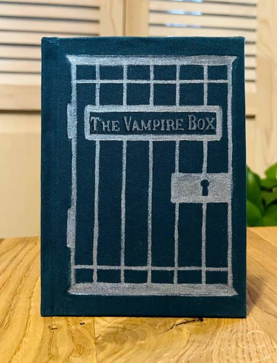
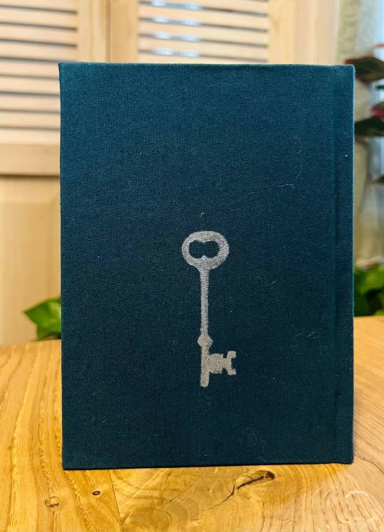
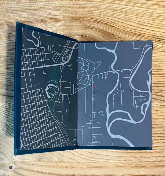


So, today I found out that I never posted the first iteration of this project here, so I guess it's time to remedy that.
The Vampire Box is a remix of Tessa Gratton's short story by the same name, written by me and my beloved spouse. It was inspired by ttrpg characters very near and dear to our hearts, and a screenshot from Castle Rock because fancasting actors as your NPCs will get you like that. It is a story about growing up and learning what's important to you, and also about keeping a vampire in a cage in your basemet to bring your family prosperity. It's short, and sweet, and I love it.
The original version (the one with a cage on the cover) is one of my first projects in general (so it was made about a year ago), and my first ever A6 book. It was a lot of firsts—first debossing on the cover, first quarto, first book printed on that good white paper to make the illustrations (there are two, the second one is a full spread) pop. I made it in a frenzy, as my darling was returning home from a trip and I wanted to give them a surprise gift, and I messed it up, and they cried anyway, and we made the version in the pictures together.
The second one also gave me hell, I think I redid it three or four times? I finished it about a week ago. It's ridiculously tiny (this is the format that prints 60 pages per side of A4 sheet, it's like an inch and a half tall). I used a different approach to typesetting: the vampire's pov is set in red, and not in a cage like in A6 version, I dropped the illustrations here. But I still love that they are very obviously the same book while also being different.
98 notes
·
View notes
Text

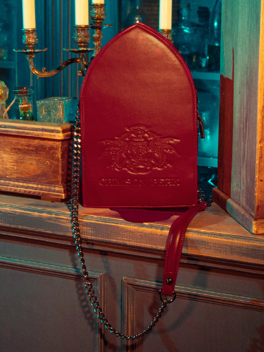
La Femme En Noir has launched a Crimson Peak collection that includes a ghostly crossbody bag designed by Micheline Pitt. Expected to arrive in late February, pre-orders are up for $88.
Made from vegan leather, the purse features debossed and screen-printed artwork along with a printed inner lining. It measures 9.5" tall, 5.75" wide, and 3" deep with a 21" handle drop.


#crimson peak#guillermo del toro#mia wasikowska#tom hiddleston#jessica chastain#charlie hunnam#doug jones#javier botet#la femme en noir#micheline pitt#shirt#gift#horror#gothic horror#gothic romance
48 notes
·
View notes
Text
speak friend and enter...
A beautifully textured A5 softcover notebook with a subtle debossed quote for fans of dwarves and elves alike. Stitch-bound for easier writing, and made of 100% recycled pages (GRS certified). Designed and printed in the UK. Four colours available ✨
Etsy link | website link (discount for UK mellyn friends!)
#lotr#lord of the rings#tolkien#hobbit#lotr fanart#tolkien fanart#jrr tolkien#artists on tumblr#shop update#notebook#sustainable gifts#stationery shop#stationery addict#recycled paper
3 notes
·
View notes