#EDIT: I FAIL AT ASK GAMES JFC
Text
Tagged here by @antitheticallyargumentative and @flyingcoffeemugs2 at my main blog so I’m just gonna answer all at once
1. Immigrants (We Get the Job Done) - Riz Ahmed, Residente, Snow Tha Product, K'naan
2. Girls Against God - Florence + the Machine
3. Hold Me Like a Grudge - Fall Out Boy
4. Heaven Sent Is a Coffee Cup - Bears in Trees
5. X Gon’ Give It To Ya - DMX
6. Drops of Jupiter - Train
7. Henrietta - The Fratellis
8. Thought Contagion - Muse
9. I Don’t Like Who I Was Then - The Wonder Years
10. The Distance - CAKE
EDIT: FOR THE SHUFFLE GAME. THE PUT YOUR REPEAT PLAYLIST ON SHUFFLE AND LIST THE FIRST 10 SONGS GAME. GODDAMNIT
FURTHER EDIT: I AM TAGGING EVERYONE IF YOU ARE READING THIS- BOOM. TAGGED.
#ooh this was fun#like a mini sneak peek into what my brains been up to lately#fun fact two of these songs have lyrics relevant to wip fic titles (chapter or otherwise)#ask game#ask box is always open#music#EDIT: I FAIL AT ASK GAMES JFC
9 notes
·
View notes
Text
Wilbert's Worst
Right, so I really was open to having my mind changed on The Worst One but nobody’s argument has budged me.
I was going to write a complete, balanced essay on The Worst W. Awdry Book, but I’m a) mired in the research phase (hey if anyone knows someone with an encyclopedic knowledge of Tom and Jerry hit me up, for real) and b) right now I wanna talk about the characters and their Beloved Dynamics instead.
So I'm just gonna get this out of the way so I can post the poll and move on to answering fun asks and watching Tom and Jerry in peace. Behold: a salty and unbalanced review.
Wilbert’s biggest failure of a children’s storybook?
Henry the Green Engine
Ohhh… because of the, uh, ra —?
Because of the racism, yes!
Oh. You do know that since 1972 they’ve republished it without the n-slur?
Good for them. Two things:
1. I know it used to be there, I’m never able to read it without knowing it was there in the first edition.
2. I consistently try, when ranking the books, to consider them in the context in which they came out. Because of this, I don’t like using “things that happened later�� (like a new character never being properly used again or whatever) against the book. This helps me evaluate the author’s successes and failures against what they were trying to achieve when they wrote it vs what I would most want (blorbo content). It helps me not bring to bear the whole weight of fanon and fandom on a text that should be able to stand or fall on its own. Tl;dr I try to read the books like a guy who picked it up in 1951, or whatever.
And yeah, if I’d bought this when it came out it would have had the slur. I’m going to judge it accordingly.
Look, racism is bad, no argument, but does that mean the book as a whole must be condemned?
Yeah, I think the slur and the “aaaand suddenly, blackface! heeheehee” bullshit fuck over the entire book, game over. Go directly to jail, do not collect $200.
The Railway Series is not a work of high art or deep thorny complex literature. The books are meant for children — small children, at that. Children small enough to get bedtime stories read to them. The main goal of each book (especially this early on — you do have to manage secondary priorities like “pleasing the long-time fanbase” the longer you go, but right now we’re only 6 books into the series) is to create a happy imaginary world to enhance childhoods and family lives… to impart to other parents and kids a similar cosy happiness to that the author and his own kids enjoyed when he was workshopping/drafting the stories for them. When we say “children’s book” we really do mean little’uns — these average 1.25 full-color illustrations per page!
And these books sold in large numbers. This means it’s a certainty that somewhere in 1951 there was a Black family who owned the whole series, who went out to the shops, whose kid was like “ooh! Henry gets a book, neat…,” who like everyone else enjoyed the wild ride of Henry’s inspection and coal and wreck and rebuild… only to get verbally spat on one page from the end.
Real mood-killer there. Epic fail, as the cool kids used to say in my youth.
All right, fine, cool kids never said that. Anyway, statistically speaking there was certainly even more than one family that got that experience. Not to mention the non-Black families who even in 1951 were like “... wtf? i’d smack my kid if they ever said a word like that around me, geez. no.” Just a lot of people who had the light the book was kindling in them snuffed out all at once.
You can actually be totally racist and your book not commit creative suicide on the penultimate page! Awdry flubbed his job of 'bestselling books-for-six-year-olds' here. Creative failure. Unforced error. Automatic zero.
But times were different then, you have to consider it in the context of the time.
1951 U.K. was not the nadir of multiracial equality or Black power, but jfc. I can assure you that over 99% of children’s books published that year in the Anglosphere managed to not use the n-slur.
All right, all right. That was bad. But this feels off-topic. If you had never known about what used to be “Henry’s Sneeze,” would you still rank the entire book as dead last in the Wilbert Awdry corpus?
Not dead last, but it is not a strong book. “Coal” and “The Flying Kipper” are super-interesting as material for Henry, but after that the book kind of falls off a cliff; the intrigue drops dramatically. The railway incidents chosen to make stories of are all solid choices, but it was not only “Sneeze” where Awdry’s handling of the material feels clumsy and weird. (And I’m not even talking here of the “heehee blackface — ain’t i a stinker?” gag in “Sneeze.”)
But… “The Flying Kipper”? C’mon. It’s a superb story and no book that contains it can be the absolute worst in the series.
“TFK” remains easily the best single TVS episode ever – but a lot of that is down to Britt and David’s artistry and judgment.
Don’t get me wrong, a full-on railway wreck makes interesting material. But I don’t think the book does nearly as much with it as it could (and I’m trying sooooo hard here to forget about the amazing TVS adaptation, as I think it REALLY shows Awdry up. Even so, the storytelling here is surprisingly tepid and low-stakes). I get that Awdry probably wanted to lean into the comic angle and not make Henry’s condition afterwards seem too grave, in order to ensure the material wasn’t too dark for his young audience? (*mutters* again, a level of tender consideration for his readers’ youth that went right out the window when it came to small Black kids, evidently coz he couldn’t imagine that they read) Understandable, laudable — but if he outright refuses* to make the wreck too dramatic or scary then, well, then the wreck isn’t real scary or dramatic. And it can’t save the rest of the book from its flaws.
*For all I know it could have been the publishers who insisted that the wreck be made preschooler-safe, that’s possible (although it’s also consistent with Awdry’s brand of humor and his overall low degree of emotionalism in his writing). Either way, though, the end result book is what it is and it will be judged accordingly.
In addition to not being as exciting as many remember... @trainsupessandhuntresses asked me once if I thought some of Awdry's stories were "mean-spirited." I had to assent vigorously. And a surprisingly high proportion of those "mean" moments are in Henry the Green Engine? For some reason? It’s not just the racism. Awdry was not in the game to give Henry a deserved happy ending, he’d wanted to kill him off (the fuck?) and when his publishers prevented him (I don’t say this often, especially since I love how salty the Awdrys get about their publishers, but this in case good job, publishers!!) he wrote “TFK” with the primary motivation of giving Henry a new engine basis. Any soft or hearty emotions we get out of the deal are a side-effect — the only emotion that was fueling Awdry as he wrote this was spite, spite and a weird resentment towards his poor, long-suffering, invaluable illustrator. (I don’t blame Awdry for being frustrated that the engine illustrations were continually inaccurate or confusing, but I do think it’s weird to read all this great Henry material knowing that it was written with such poor grace.)
So his ‘happy Henry’ stuff feels perfunctory; his Percy interlude is just brutal (why did you have to drag Percy into Henry’s book purely to give him a fuck-up, a scolding, and a messy dunce cap?); Gordon’s savaging of Henry for being too happy after recovering from a near-death experience is such an incredibly low point for Gordon that it’s hard for me to accept it as canon (there’s being proud, boastful, and self-absorbed, and then there’s being the straight-up raccoon dumpster fire Gordon is in that scene). Oh, and I think “call the police [local constabulary, doesn’t bear firearms]” woulda probably a less reckless way of dealing with the rock-throwing youths than the sneeze of hot locomotive ashes, which of course the Fat Controller doesn’t like, that shit coulda been real dangerous! Mind, there are small rays of kindness throughout that do get me (the interactions between Henry and his crew feeling to me the least perfunctory and most heartfelt), but this is overall such a mean-spirited book. God. It starts off with such a gentle story (almost a non-story, if you’re in it purely for the “railway incidents” game and not character drama), but in short order the vibes just sorta suck. At least in other RWS books, when the vibes are off, they’re usually off near the beginning and then improve by the end. This one gets worse as it goes on. Oof. Don’t like that.
Also, the last page is sooooo lame. I suspect the publisher strong-armed Awdry into writing most of it so that at least the slur wasn’t on the last page of the book... and if Awdry had any idea of how much he’d just empowered Henry and all his fans in this book he shouldn’t have found it hard to find 50 extra words to sum things up. As it was, he’s just filling space and running out the clock, lol. Lame wrap-up. Boring. As usual when it comes to every little thing about this book, Britt and David closed this up better (mind, their closer – “He had taught Gordon and silly boys a lesson, with a whistle and a sneeze” – also sucked. But at least it was blessedly short.)
Didn’t you once list HtGE on a list of your favorite Wilbert Awdry books?
I did list it as one of the books that “at one time or another” have been my favorite in the series. Unfortunately in the case of HtGE, that was back when I really couldn’t read a story that I knew from the TVS without mentally substituting the adaptation into my brain as I read… largely overriding the actual text. Plus, everything I knew from TVS as a kid kind of automatically got a halo effect. Plus, I was super into Henry’s arc.
The first time I read HtGE after calming down and actually reading all the books as books... massive disappointment. There is such a gap there between what I'd thought the book said (all our incredible fanon work overanalyzing and headcanoning Henry and building this beautiful fantasy arc about disability!) vs. what it actually said (limp and careless writing, mean vibes, airbrushed n-slur, bad aftertaste).
I do think there is some stuff about the development of Awdry’s storytelling technique here that is interesting (again, Tom and Jerry superfans reading this, please shoot me a message!) but it doesn’t counteract everything else.
At least we’re over the racism stuff?
Nah, I’m not over it, actually.
#showed his whole ass#an rws book shouldn’t leave a nasty taste in your mouth#but! here we are#okay this rant was not as short as i thought it'd be#but again. there will be a proper analysis in the fullness of time.#henry the green engine (rws)#rws discussion#racism tw#slur mention tw
46 notes
·
View notes
Text
THE TAGS LIST

For you and I's convenience, an organized Tags List! SEE THIS POST FOR HOW TO SEARCH FOR TAGS ON MY BLOG.

MUN POSTS
&& ooc / your local queen of brainrot
&& rose plays hi3 / ellie herrscher ballista go
&& rose plays gi / this is my third playing gi tag jfc
&& rose plays hsr / screams in kafka simp
&& rose plays lc / im a sadomasochist confirmed
&& rose plays lor / screams in angela simp
&& rose plays lcb / 12 idiots and 1 simp
&& rose plays bg3 / who knew cats can get you so far
&& rose plays ptn / sapphic fever dream time baby
&& rose plays pgr / my impulses won and now we're here
&& aetherose pinned post / do not reblog; non-rp blogs dni
Spoiler tags to block: hi3 spoilers, genshin spoilers, hsr spoilers, lobcorp spoilers, ruina spoilers, limbus spoilers, bg3 spoilers, ptn spoilers, pgr spoilers
GENERAL
&& ic / give all to the present for the sake of the future
&& thread / the hearts that can bend shall never be broken
&& commentary / live to the point of tears
&& open starter / freedom is nothing but a chance to be better
&& asks / seeking what is true is not seeking what is desirable
&& drabbles / a nostalgia for innocence
&& memes / there is not love of life without despair about life
&& dash games / there is scarcely any passion without struggle
&& crack / oh lord save us from ourselves
&& incorrect quotes / just a rose tradition!
&& headcanons / man is always prey to his truths
&& oc lore / the gentle indifference of the world
&& gallery / at the heart of all beauty lies something inhuman
&& edits / the glimpse of an eternity stretched across time
&& mun art / rose can draw sometimes
&& aesthetic / an appeal to the essence of being
&& musing / can you see the meaning inside yourself
&& music / where words fail song speaks
&& announcement / gather around rose’s garden
&& patch notes / just a rundown of the updates to the blog!
&& psa / you should probably read this
&& starter call / where there is no hope it is on us to invent it
&& inbox call / a day will come when revolutions will have need of beauty
&& promo / a beautiful twilight that enhances everything
&& self-promo / heyo its me rose
&& discord chronicles / hidden beneath the surface lies treasures
&& signal boost / a little can go a long way
&& misc / rose doesnt know where to put this
&& munday / stuff about rose!
&& saved / rose’s most beloveds
&& wishlist / rose’s hopes
&& queue / rose remembered she can queue stuff
MUSES
&& c. elysia / miss pink elf
&& c. aponia / disciplinary perdition
&& c. mobius / infinite ouroboros
&& c. fu hua / taixuan impression
&& c. dr. mei / ward of humanity’s flame
&& c. seele / swallowtail phantasm
&& c. veliona / starchasm nyx
&& c. theresa / valkyrie pledge
&& c. senti / herrscher of sentience
&& c. binah / degraded arbiter
&& c. faust / representation emitter
&& c. rodion / what is cast
&& c. furina / endless solo of solitude
&& c. focalors / lady of all waters
&& c. columbina / the damselette
&& c. sandrone / the marionette
&& c. la signora / the fair lady
&& c. lumine / the abyss princess
&& c. klee / fleeing sunlight
&& c. raiden ei / plane of euthymia
&& c. raiden norika / guardian of eternity
&& c. zero / song of the end
&& c. kafka / twilight trill
&& c. black swan / loom of fate’s caprice
&& c. hsr bronya / windrider bullet
&& c. hsr seele / butterfly flurry
&& c. layla / silent nightingale
&& c. lumia / niveous eminence
&& c. rosemary / nocturne illusion
&& c. pamela / paradoxical heart
&& c. arabella / bloodied blossoms
&& c. lynn / starlight’s embrace
&& c. gabriella / tempestuous waves
&& c. daphne / flowing gales
&& c. calista / transcendent damnation
&& c. radiata / crimson lily
&& c. sylve / tempest archer
&& c. raven / lunar songstress
&& c. nimue / ethereal sorceress
&& c. luna / apocalyptic moonlight
&& c. vera / redheaded death
&& c. alpha / crimson abyss
&& c. qu / kowloong monarch
&& c. nanami / searing heart
&& c. selena / tempest finale
&& c. angela / star of freedom
&& c. iori / the purple tear
&& c. zena / arbiter of the head
&& c. eden / golden diva
&& c. bronya / wolf’s dawn
&& c. skirk / girl of another world
&& c. clorinde / candlebearer shadowhunter
&& c. kokomi / pearl of wisdom
&& c. jingliu / transcendent flash
&& c. robin / caged songbird
&& c. one / song of salvation
&& c. two / song of love
&& c. three / song of obsession
&& c. four / song of envy
&& c. accord / recorder android
&& c. popola / singer of the ancients
&& c. devola / singer of the ancients
&& c. shadowheart / daughter of darkness
VERSES
&& v. crossover / and we come together despite all odds
&& v. unspecified / dance in a world of endless possibilities
&& v. genshin / step into a vast magical world of adventure
&& v. hi3 / for all that’s beautiful in the world
&& v. hsr / may this journey lead us starward
&& v. lobcorp / face the fear; build the future
&& v. lor / book; librarian; star; and city
&& v. lcb / face the sin; save the ego
&& v. projmoon / hominem te esse memento
&& v. stp / you are on a path in the woods
&& v. bg3 / to become more than what we were made to be
&& v. d&d / our adventure begins here
&& v. fe3h / promise me you won't forget me
&& v. ph / there is no black and white; only our will
&& v. pgr / reclaim the world for humanity
&& v. dod3 / the songs of oblivion
&& v. modern / a world not far off from our own
&& v. ce / the ethereal abyss
&& v. ce: rein / reborn into peace
&& v. tenebra / repetition of history
&& v. herrscher of death / birthed from broken serenity
&& v. older layla / the nightingale’s metamorphosis
&& v. younger layla / from the embers
&& v. little layla / still-burning flame
&& v. white witch / the monster they made
&& v. star of the head / flickering lights in an empty city
&& v. shining star / reignition of lost light
&& v. fallen star / all-consuming darkness
&& v. chosen of bhaal / the embrace of her rancid blood
&& v. young nimue / unknowing accursed daughter
BONDS
&& complicated found fam / butterflies daffodils and birds
&& layla + crystal / the sweetest devotion i’ve ever known
&& calista x aelia / light up the night sky together

0 notes
Text
check in tag 👑
I was tagged by my lovely @soonhoonsol 🥰
why did you choose this URL?
because I wanted to go with something Leedo related but leedo and geonhak were taken (but idk if I even tried it lmao). I also have a slight obsession with kings and stuff, so idk it somehow felt natural. And kingleedo sounds nice. Anyways, then I googled the member profiles and it was pointed out that Woong gave him that king Sejeong related nickname about being the creator of Hangeul. And I was like SO IT'S PERFECT!!!
do you have any sideblogs?
no, totally not a fan of sideblogs hahaha. I do have other blogs, tho. @kmvkxn is my personal which I almost never use now
how long have you been on tumblr?
in general, around 10 years.
do you have a queue tag?
not a fan of queues, either haha. but if I had one it would probably be something basic like q or queue
why did you start this blog in the first place?
because I got freshly into kpop after a break, my personal was already too exposed. for a time being it had the same URL as my Instagram username. And for the first time in my life I kinda wanted a member/group-oriented account so I was like I AM CREATING A NEW TUMBLR lmao but I failed since it became a multi anyways, but god knows I try to make sure that ONEUS content takes at least 60-70% of the stuff I post about.
why did you choose this pfp?
for a long time, I wanted my blog to be fancy as feck, like you know living up to the name. But this bish Geonhak doesn't run around wearing a crown (like he should). So I took matters into my own hands. ISTG if I ever go to their live fan sign I'm bringing 50 crowns for my king!
why did you choose your header?
SO IF YOU GO TO MY PERSONAL (and if you were to see ALMOST all of the blogs that I have ever had on this site), you'd see that I'm a hoe for black/red color palette. This theme looked so nice in black/grey at first tho. But then they dropped teasers for Black Mirror and when I saw Keonhee in a red suit, I lost it. And I was like IF LEEDO IS IN RED I AM CHANGING MY COLOR PALETTE so here we are :) it's only logical that I chose his teaser for the header.
what’s your post with most notes?
based on tumblr calculations it's the photoset I did for Woong which can be found here. Lmao I'm not like tumblr famous so idk man hahaha
how many mutuals do you have?
I don't count them, honestly. Almost all my followers are my mutuals, I love to follow people back. But if we were to talk about people I talk to, I'd say around 20-25 people
how many followers do you have?
currently, 139
following?
191
do you make shit posts?
bold of you to assume I don't. My whole life, whole existence is one big shitpost ahahahha
how long do you use tumblr each day?
it depends. but you can bet my ass I spend almost all my free time here.
did you have a fight/argument with another blog once?
Nope. I don't think so. Never in my life got anon hate, too. There's a joke that only popular blogs get anon hate lmao hahha (THO ANON HATE IS NOT FUNNY KIDS, DON'T BE DICKS)
how do you feel ‘you need to reblog this’ posts?
most of the time I have this "Don't tell me what to do" attitude. But if it's a signal boost or a support post (basically anything that has good intentions), I'd reblog it.
do you like tag games?
yes, but they pile up in my likes because I love them and I'm like OH MY GOD SOMEDAY I'LL GET TO THIS ONE 100% but then I either forget or life happens or I get distracted :') BUT I NOTICE THEM ALL AND I REALLY LOVE THAT PEOPLE TAG ME IN THOSE <3
do you like ask games?
of course!! But I don't do them often, because I don't want to disappoint people who send the asks in. (in case I forget or smth ;;)
which of your mutuals do you think is tumblr famous?
idk about that but I do believe that all my mutuals deserve to be tumblr famous. Especially the CC crew! They all make amazing works, be it gif making, video editing, edits, writing, drawings. You guys make this place a better place and it wouldn't exist without you all!
do you have a crush on a mutual?
no, lmao. I mean you all beautiful and amazing and I love you so much! jfc look at me friendzoning yall. In my defense, my last mutual rs didn't end well, so NAH NEVER AGAIN
tagging my squad:
@kuroyurishion @u-know-time @geniuspepe @trashlord-007 @lovepaintt @minbinlix @hoshiwhxre @kimoonday @yeongwvnhi @malzenn @moon-typewriter @naturalogre @highponyleedo @younqjo @plasticflowering @strikingtaemin @seohopeful @nyangjo @seohoshi @leed0neus @kim-hong-joongie @squirrel-seoho @donghanies @imtheoneinmyzone and anyone else who wants to do it ^^
17 notes
·
View notes
Text
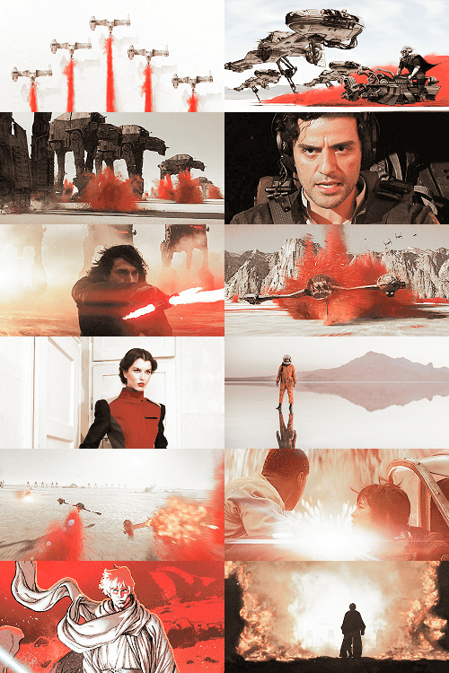
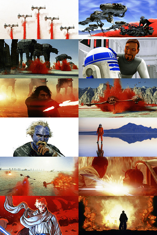
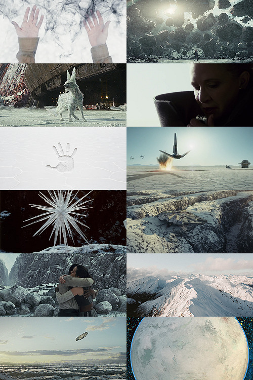
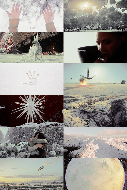
Making A Galaxy Far Far Away: An Aesthetic Photoset Tutorial
Requested by @geleixi (and varying amounts of time ago by @rockett-to-the-purple-moon, @thenameisgreed, @pizzaplanethq, and probably others who sent nice messages that I went “Oh, what a nice message this means so much I LOVE IT SO MUCH I’M TOO ANXIOUS TO ANSWER IT WRONG I’ll just do it later” and then promptly NEVER answered it.)
Brainstorming & Photo Collection
Picking a Color Palette
Choosing Images from Collection
Coloring
Textures & Effects
First off: I am not even going to remotely pretend like graphic design is a Thing I Am Better At Than Anyone Else, because that would be patently false and ridiculous, but I also get a fair number of Asks about making photosets/aesthetic posts, so here we are. I’m planning to do a separate one, maybe, for how I do the Cartoon Girls All Grown Up and Nancy Drew Dream Games series, because the “brainstorming and photo collection” part is so different that it inherently affects the rest of the process.
BUT I also feel like I don’t see a ton of tutorials that go through the brainstorming/finding images part of making aesthetics, and I tend to think of my Graphics Style(TM) as “DEEPLY Uninterested in washed-out faux sepiatone grimdark Tumblr Coloring?? + Not Good Enough At Masks To Do Negative Space Well,” which might be some people’s level of ~graphics design passion(TM)~ too, so. That’s the ride for which this ticket has been bought.

Brainstorming & Photo Collection
Obviously, the specifics of this are totally different for every aesthetic, but all of the GFFA/swworlds start from the same seed: Star Wars Aesthetic.
Star Wars itself has a very particular Lookque, imo: it’s not quite retrofuture, it’s not quite dirtpunk, it’s not quite scifi, even. There are the insanely sumptuous (and hella culturally appropriative) queens of Naboo and the ramshackle toppled AT-AT where Rey lives on Jakku and the not-even-subtle-at-all-jfc Nazi inspiration of the Empire and First Order and the straight-up millennial Tumblr witch Goffik look of the Dathomir Witches and Zabrak siths and the blue, blue water of Scarif. There “isn’t” a unifying aesthetic through Star Wars, and yet, as Gareth Edwards said, there’s a LOOK and FEEL to Star Wars: if you go a little too far to the left or right, it isn’t Star Wars anymore.*
*That said, this tutorial talks about Crait, which was invented by Rilo Jon, who went both too far left and too far right but mostly... too far-right. BA DUM BUM! Anyway.
So part of what makes Star Wars Look Like Star Wars, to me, is that it ISN’T ever Too Scifi. There’s a realism in all of Star Wars’ disparate planets -- their looks, anyway; like, talking about how Crait, in this case, makes NO ecological sense as a planet AT ALL is another post entirely. (IT MAKES NO SENSE.) It’s different from, like, Doctor Who, which I think revels in its “we can make these aliens and planets look like WHATEVER” more? Star Wars tends to be very like... “we want to use practical sets and effects.” Even for planets that only appear thus far in Clone Wars and Rebels? So it’s definitely part of the intention of SW’s Aesthetic.
ALL OF THAT TO SAY, my first step with each planet is to figure out the best way to represent it using as much real-world photography as I can and how best to channel the ~spirit of Star Wars~ in the graphic. Sometimes I fail miserably. CURSE YOU, NAR SHADAA. But most of the time it helps provide a Framework for the rest of the brainstorming and photo collection.
SO. FOR CRAIT. (For another example/totally different look and process, I wrote up a little about Haruun Kal on its post here.)
Crait has the definite benefit of appearing in one of the movies, so the first part of photo collection was to screencap TLJ. I took the caps using the 1080p digital release at a 20-frame frequency, so even once I deleted the aps that weren’t of Crait (moving the Canto Bight frames into a folder for Cantonica, of course!), I had like... 1500 images just from TLJ to start the brainstorming and collection with.
First, I trimmed down those ~1500 screencaps to 168 caps that were distinct enough from one another to give me a sense of “what happens” in the scene and, more than that, “What Crait Looks Like.” Then, because there’s additional canon material of Crait besides TLJ, I saved the unlettered images of “Star Wars: The Storms of Crait” from comic penciller Mike Mayhew’s blog @mikemayhew -- if those hadn’t been available, which they’re usually not for planets that appear in the comics (THANX MIKE MAYHEW!!!), I would have taken and cropped panels from the comic at both 100% and screen-fit/60% sizing that had utility for a graphic about planet scenery and not character.
THEN, I looked at Wookieepedia and MSW. Crait was based on the Salar de Uyuni salt flats in Bolivia, so I Google image-searched that. There weren’t actually very many images of the Salar de Uyuni salt flats that I super loved, so I ended up saving images of other salt flats as well, particularly the Bonneville Salt Flats in Utah.
THEN there was the issue of the red minerals, which were entirely fictional and not part of any real-world salt flat. BUT, there IS real red sand... so I saved some images of red-sand dunes (mostly Mui Ne in Vietnam). I also went through my Star Wars Stock Folder to find images of crystal caves and mines that I’d either saved for other planets in the past, but didn’t end up using, OR just saved because there are so fucking many crystal-based planets in SW.
Each of my big graphics series has its own Stock Folder for unorganized images that just strike the right Vibe~ and might be useful someday, in addition to every planet (or cartoon girl, or US state for the Nancy Drews, etc) having its own folder for specific/organized image collection.
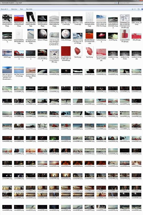
My Star Wars Stock Folder:
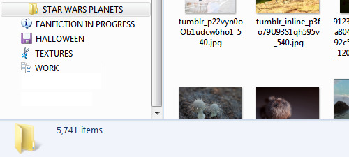
So there were already a lot of crystals, star destroyers, blasters, and bunkers that were actually in snow but whatever it was white and crystalline, to work with. I added some workable Crait-like images from the stock folder to Crait’s collection, too.
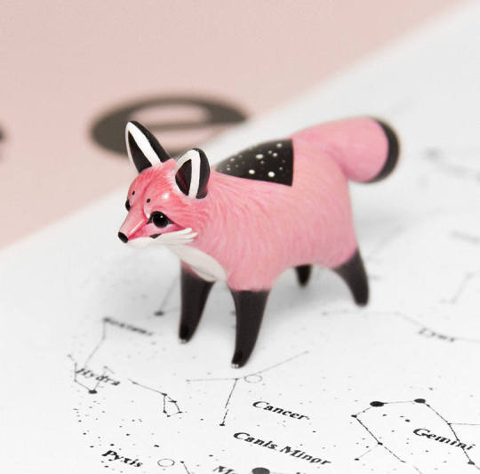
AND THEN, finally, I LOVE the vulptices, so I searched for (and found!) some of the concept art and 3D modeling images from ILM, and I put those in the folder, as well.
I also saved this, hoping I’d be able to make it work because it’s SO CUTE, but I couldn’t, but here LOOK HOW CUTE:
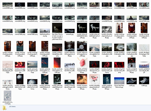
And then, lest I stay in the image-collection rabbithole forever, I said, “OK, that’s enough.” I ended up starting to actually MAKE the Crait graphic from a collection of 272 images:
Picking a Color Palette
Obviously, the dominant colors of Crait are red and white, so the aesthetic had to be based in red and white. My first instinct was to make a duotone aesthetic using only red, white, and black/grayscale. Something like this:
Which... I don’t hate, or even dislike. It’s definitely more in line with popular Tumblr aesthetic, uh, aesthetics. But I usually don’t like landing on that kind of coloring because it ALWAYS, ALWAYS whitewashes people of color (and jeez, it even whitewashes white people -- look at the model in the fourth frame down on the left, or Luke in the bottom-left.) The “vibrance -100 + Selective Color Red>Red + 100″ always ends up doing the above example to, in this case, Poe: turning him into a licorice man.
So then trying to correct THAT either whitewashes the FUCK out of him/people in general:
(Toning down the red)
Or introducing other colors back into the graphic as a whole:
(Upped yellow and cyan.)
So I nixed that coloring before I even started. (These examples were made after the fact purely to serve as examples.)
I went back to the drawing board, AKA the Crait image folder.
But looking at the collected images -- especially the screencaps and the panels from the Storms of Crait comic -- I was struck by how much Crait also incorporates yellow and blue. (Note that I really, really wanted to try to include Trusk Berinato and Bail Organa... but we’ll talk through why that didn’t work out.) I LOVE @droo216‘s bright, almost jewel-tone edits which I 100% know I don’t have either the patience or skill to make, but I liked the idea of trying to make Crait’s aesthetics in a primary colors + black/white scheme.
Which I actually really like! (Again, made post-facto as an example.) But again, red vibrance DiD tHe tHiNG!!! to Poe and ESPECIALLY to Finn and Bail.
So a high-vibrance look emphasizing bright colors was a no-go. Besides, going back to the source material: high-vibrance and high-energy are the opposite of what the planet of Crait is about. It’s a dying husk of a planet, being killed slowly by its own ecology as the salt in its crust dries out everything beneath it, sucking up water until everything either evolves into living crystal-dogs or goes extinct (thank u Rilo for not including dune-worms, this is the one thing you did right). Crait wouldn’t be vibrant.
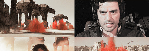
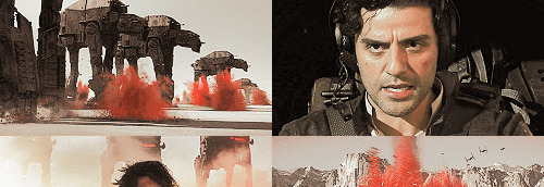
But... aha! It’s also distinctly layered. I’ve done three-panel swworlds aesthetics before, so I decided to do that for Crait, too: first a mostly-white graphic like the salt crust, then white+red+yellows in the middle, and finally a dark layer of almost entirely red like the mineral mines.
Choosing Images from Collection
With the color palette and “feel” decided (dying at the surface, then growing richer and redder and angrier as the photoset moved downwards), I was able to choose images.
NEKKID PHOTOSETS SANS ANY EDITING! XXX! But for reference to see both cropping and for reference on choosing.
TOP IMAGE, MOSTLY WHITE:
L-R, TOP-BOTTOM:
I saved this image from my dash at some point and have been tossing it into planets’ folders every time there’s a white-based color scheme. It almost got used for Ilum, but at the last second wasn’t. I felt like it fit the coalescence of Rey’s Force strength here, and also the kind of “last wisps” of Luke Skywalker, well.
“Lifting rocks.”
I’m actually still not 100% whether I should have landed on a vulptex here, but dammit they were one of the only good parts of TLJ. This vulpie baby is on the salt surface, looking out at the blinding sun, so she seemed like a good fit compared to the other caps of vulptices -- the ones loping on the canyon surface at the end were all very motion-blurry.
Carrie in that gorgeous coat in homage to Harrison in Blade Runner makes me weepy, and those were some of the most beautiful shots in the movie. This one had a good balance of white and black, so it could be placed around any level “busyness” in the surrounding photos. Especially since I suckkkk at negative space.
I saved this image to the Crait folder like the day it was announced as a planet in the upcoming Episode VIII and given its first peek. I love it!
Hi, salt flats, and also Star Wars spaceships. I actually had a lot of trouble with the level of green in this image, but the ~essence of Star Wars is PEW PEW SPACE BATTLE, so.
This is an ice sculpture in real life! It reminds me of the vulptices and is cool as hell.
The Millennium Falcon! I toyed with different caps that showed it in actual battle, but the blue would have been hardest to work with in this photoset compared to the others below. Plus, now I can save a bunch of Falcon-in-flight pictures for use on planets that only appear in the novels or comics.
NECESSARY, ICONIC, PERFECT, THE MOST IMPORTANT THING THAT HAPPENED ON CRAIT.
Fine, this is a snowy mountain and not a salt flat, but I liked the striations in color and gentle variations in grayscale.
This was the palest/least Bright Blue sky of all of the Falcon screencaps from Crait.
I tried a few screencaps of Crait from TLJ, but I landed on using the full-panel image of Crait from Storms of Crait. It has the cleanest definition of the “planet from space” options we have of Crait.
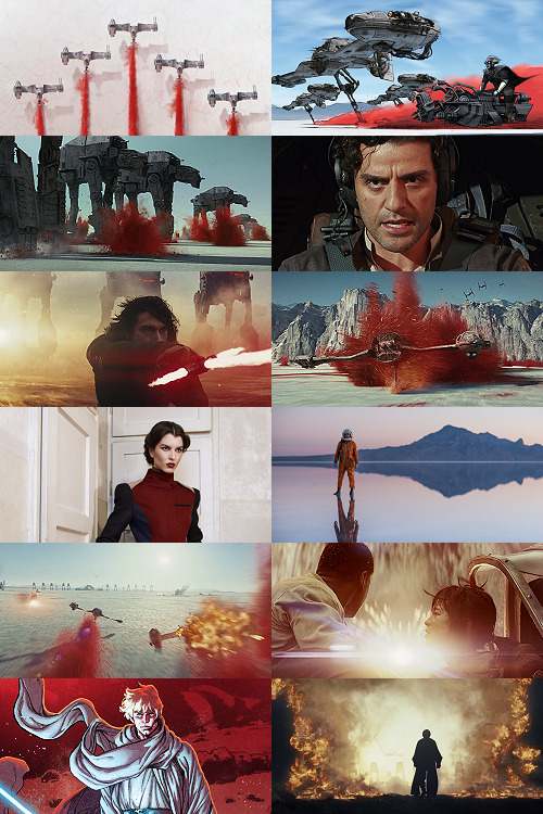
This is a promo image, not a screencap. It’s a much crisper view of the ski-speeders. I love the vivid color difference.
The blue-and-yellow additions to the color scheme didn’t work out, but I did still want to include Storms of Crait. This shot had a little more blue in it than I would have liked, but it has Leia in a ski-speeder back before the salt caused them to rust out, too!
Remember when it seemed like the Crait battle’s new AT-ATs would be super cool and like, do more than stand there menacingly behind Kyle? Me, too.
POE! DAMERON! HAS! NEVER! DONE! ANYTHING! WRONG! IN! HIS! LIFE!
KYLE! HAS! ONLY! EVER! DONE! WRONG! IN! HIS! LIFE!
I tried out like five different tiny-frame-difference screencaps of the ski-speeders kicking up red minerals, and I decided that this one, with a clearly defined spray of red surrounded by white and bluish sky, suited the placement here best: there’s red in the panel to its left as the main color, but minimal red in the above- and below panels.
I wanted to include actual Connix, but she’s wearing yellow and only ever shows up surrounded in brownish-black darkness, so here, have one of my standard Fashion Rebel Officer Stand-Ins instead -- the red and white obviously played a part in picking this shot over the rest of the options from the photoshoot.
I LOVE this slightly mystical shot of a Rebel pilot slash astronaut on a rain-slicked salt flat. How perfect?!
As we get down to the bottom of this middle panel, I wanted to include more destruction and more presence of yellow and orange. This image has a good balance of “negative space” in the sky and salt flat, and then the explosion of Nodin Chavri’s ski-speeder (I think?) ties in well to...
Finn and Rose, post-collision. I wanted to include Rose, and the almost JJ Abrams-esque white starburst in the center of this cap is a good balance to the spray of red around a ski-speeder two panels above.
Luke on Crait in the Rebel Alliance...
And Luke on Crait in the Resistance.
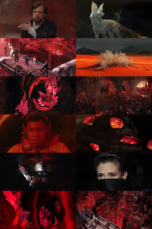
This was a kind of “????” moment of characterization -- and general direction -- in TLJ, but Luke surrounded by red as an old man would fall right below Luke as a young man, on his first mission after the Battle of Yavin, when the three graphics were aligned.
I wanted to use the straight-up concept art of the vulptex, but the black around it was TOO black, if that makes sense? So I layered it over a darkened cap of the vulptex who leads Poe to Rey and freedom. This is one of the very rare shots that I use an edited base image.
Han and Chewie! I had to include Han and Chewie. The unlettered panels from Storms of Crait that show the mineral mines are stunning; I highly recommend heading over to Mike Mayhew’s page and taking a look. The detailing of the crystals is something I wish I could have captured better at this scale.
This is one of the red-sand dunes I saved! Crait doesn’t have any living vegetation, but the drama of the black, stormy sky and the red sand drew me in here.
Some CGI crystal caves... I saved these ages ago for use on Ilum or Dantooine, I think? (Same with what will be #11 below.) I don’t love using CGI, but I think the crags on these crystal growths suited the images from canon!Crait.
A screencap of the TIEs chasing the Falcon through the mines. This was honestly one of the most visually stunning parts of TLJ, and it’s so split-second that most people missed it AND most of the screencaps have a lot of motion-blur. I’m really pleased that this one came out so crisp, and I knew I had to use it as an “anchor image.”
Finn, full-on, in red. I’m realizing belatedly as I write up this tutorial that I showed Poe face-on and Finn face-on, but I stupidly chose to show Rey only from a distance. I AM A FOOL! A FOOL!
Aren’t these resin crystals amazing? The full-size image actually shows them surrounded by snow, by the tree-stump they’re on wouldn’t fit Crait, so I cropped in closer on this image than I did for most of the Crait set.
Another shot of the Falcon in the mines. I like the way the framing of white sunlight here echoes...
Leia’s face, a bright spot in the dark, watching out over the salt flat. :(
(See #5 above!)
And again, the homage of Carrie’s coat looking like Harrison in Blade Runner made me sad, so I THREW IN ANOTHER HAN AND CHEWIE. The mining equipment here shows more detail than in the screencaps above, too.
Coloring
Like I mentioned waaaay above, in the intro: I never use set colorings for photosets. (Except Halloween Spookstravaganza, because jeez so many of those screencaps are like 240p VHS rips and it’s just not worth putting in Effort(TM).)
That said, I think one thing that I do differently than I see in most tutorials is this first step:
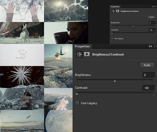
I ALWAYS start Aesthetic photosets by arranging the images and then *BRINGING THE CONTRAST ALL THE WAY DOWN.* This is especially helpful on photosets that include a mix of real photography, CGI screencaps or art, and/or comics panels, but it’s also just useful in general for photosets that use images from a wide variety of places.
The reason I do this is because it helps to “smooth out” the differences in light source, color balance, etc., that are part of the raw base images. For this set, it also helps to define the variations in color between very similar shades: the craters on Crait, the wisps of clouds, etc.
In some cases, I’ll do two layers of Contrast -50. For Crait, I did a later of Contrast -50 and then a layer of Contrast -15.
Then, I Select All > Copy Merged > [Turn Off Contrast Layer View] > Paste As New Layer.
Now, the “smoothed” version is placed as a layer above the raw layer. From there, it depends on the look of the photoset what I do -- sometimes, I leave it as-is, but I almost always lower the opacity on the “smoothed” layer until the level of contrast and balance looks consistent across the whole photoset. For Crait, I ended up with the “smoothed” layer set to Lighten 100%.
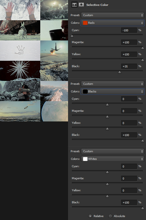
Selective Color time. There are two ways I usually start this: either one color at a time -- especially for Aesthetics like Pheryon that will essentially be monochromatic -- or, in this case, I looked at the balance of the three main colors that would carry through the entire Aesthetic.
REDS
Cyan -100 (This brightens the vivacity of the red.)
Magenta +100
Yellow +100
Black +35
BLACKS
Cyan 0
Magenta 0
Yellow 0
Black +100
WHITES
Cyan 0
Magenta 0
Yellow 0
Black +100 -- This is NOT my usual setting for adjusting white, and since white is one of the main colors in the Crait Aesthetic, it might seem counterintuitive to make the white darker instead of brighter. However, this will help to make next step of color adjustments “take” on the white/whitish surfaces a lot more easily, and it will also help to balance out the bluish sky areas with the white background areas. (I’m not sure this explanation makes sense? But it’s what I did.)
Then, I Select All > Copy Merged > [Turn Off Selective Color Layer View] > Paste As New Layer > Either COLOR or HUE 100%.
“Hue” is more effective for smaller, more incremental color adjustments -- for BIG SWEEPING COLOR CHANGES, “Color” tends to work better. But it totally depends on the photoset! Try both, and see which you like better.
I feel like this is kind of the step where my process of making aesthetics stops being any different from most tutorials -- but this has been HUGELY helpful for me, a non-graphic designer-person, to be able to create a kind of “base image” that has very similar color values, brightness/contrast, and vibrance.
Sometimes this step helps to create really extreme color differences, such as in the Raydonia Aesthetic, and other times, I use it to just adjust one or two color-values so that there’s more consistency in, say, shades of yellow or shades of green, as in the Takodana Aesthetic, for which I just wanted to create a more cohesive palette of green in particular... it started out with a zillion greens, and I wanted to bring it all together into one “aesthetic.”
I think this step, and the reasoning behind it, are why SO MANY PSDs for aesthetics rely on a layer of either gray or sepiatone-ish set to Darken or Multiply as one of their key layers. But I’m just not about the grimdark life, and if I’m making an AESTHETIC OF A THING, I want the aesthetic POST to actually HAVE THAT THING’S AESTHETICS, you know?! I want to use the colors of the thing that I’m saying is meant to evoke the visuals of the thing!
Anyway. Now you have your BASE IMAGE. Often I’ll Merge All here, just for my own sanity.
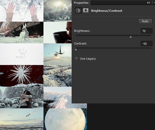
Then I go in and make any other other adjustments on a “coloring” level that I think will help with the “vibe” I’m going for! For this Crait set, I definitely needed to bring the brightness up so that the white and red popped. However, bringing up the brightness also swallowed a lot of the detail in the white surfaces -- especially the planetary surface of Crait in that bottom-right space -- so I decreased the contrast again.
Brightness +70
Contrast -50
And then I go in for the macro-level adjustments of color using any mix of Selective Color, Hue/Saturation, and Color Balance that works. For Crait, that was more Selective Color, because since I had decided on my color palette, and it sadly did not include blue, I needed to start by taking out as much of the blue, cyan, and green that I could.
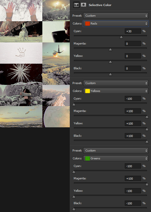
And I’m ngl, I told myself the WHOLE FREAKING TIME I was making this photoset that I needed NOT TO DELETE THE PSD RIGHT AWAY LIKE I USUALLY DO so that I could write up all the settings for this step.
But it was a reflex. And I deleted the PSD right away like I always do.
So suffice to say, I just futzed with the levels one at a time until the RED was brought up a little, the YELLOW was brought up a lot, and everything else was brought down and/or hue-adjusted to sliiiide into being yellow, red, or black/white.
Another Select All > Copy Merged > [Turn Off Selective Color Layer View] > Paste As New Layer > Either COLOR or HUE 100%. I think I also DUPLICATED this layer and set it to SOFT LIGHT 50% and then duplicated it again to SCREEN 50%.

I could have left it like this, but I am me and I am nothing if not Extra All The Time, so I opened up my folder of light textures (and other textures) and decided to Go To Town.
Textures & Effects
For your Aesthetic-Making Purposes, here are the three I used on the Crait set:
The first two were set to Screen 100%, and the bottom one was set to Burn 15%. I layered them in this order.
It still looked incomplete, so I decided to use this POWDR Element from Creative Market, which is actually like 5400x5400 pixels and which I’m not going to share here because I paid for it and don’t want CM to revoke my access or whatever, but it looks like this, only HUGE:
I also set this element to Burn 15% and moved it around the image until it looked the way I wanted it.
Textures and effects aren’t In on Tumblr anymore, but I really like using them -- they add, not to be cheesier than usual, texture to an aesthetic post, and I think that they can also help less-skilled graphic-makers like me to hide any myriad of imperfections in coloring, sharpening, whatever. I’m an especially big fan of this noise element (set as a pattern on Screen), so I’m going to share it here even though I didn’t use it on the Crait set:

Most of my textures have been saved over the last literally twenty years since I started making fannish graphics and photosets, largely from defunct old LiveJournals, but there also used to some great sources for them on Tumblr and still are live sources for them on DeviantArt. Just search around and you’ll find what you want! :)

In conclusion, I think it’s infinitely more fun NOT to rely on premade PSDs or standardized Settings, but I also recognize and fully respect that if I made graphics differently, I would probably get easily 5-10x more notes on each post than I do. But I make graphics the way that’s fun for me, and I just try to learn a little something from every set I make. The GFFA Planets/swworlds in particular have been something that I started, originally, because I wanted to catch up and learn about Star Wars planets that I felt like I was missing because I don’t have any fannish history with the Old EU, and I wanted to learn about them in a way that helped me feel like I was engaging with the SW source material AND making the enormity of the canon more accessible to other newish or casualish fans, like I was two years ago when I started this aesthetic series. I like making aesthetics that are genuinely inspired by the aesthetic of the thing that I’m calling it an aesthetic of, so even when it ends up just looking like rainbow barf (CURSE YOU, NAR SHADDAA!!!) I’m having fun.
THAT SAID, here’s how the time breakdown for the Crait set works out:
TOTAL TIME INCLUDING IMAGE COLLECTION AND SCREENCAPPING: Est. 20 hours.
COLORING AND ACTUAL GRAPHIC-MAKING PART: 7 hours.
WRITING UP THIS TUTORIAL: 5 hours.
So, um, if you are so inclined, here is my Ko-Fi link. I post at least two graphic sets every week, sometimes up to 25 (usually during October).
I hope this was helpful at all! I had a good time thinking about my process in-depth like this, and I would love to get tagged in any aesthetics you might try making using a similar method! :)
57 notes
·
View notes
Text
blog tag
I was tagged by the very sweet @the-blind-assassin-12 (who has the cutest dog in the world in case anyone is wondering). 💛
1. Why did you choose your url?
Oh man, I fucking HATE coming up with blog names because everything I come up with is usually taken. I started this blog several years ago to celebrate my love of Nick & June from the Handmaid’s Tale. I hadn’t been on tumblr in quite a few years and that ship brought me back to fandom land. I chose “sky” because when I’m on tumblr I feel like my head is in the clouds and “shipper” because I was here to post about a specific ship. Idk, I don’t love it and it’s not even a good concept but it’s staying forever because I loathe coming up with new blog names. I also get really confused on my own dash when people change their urls?? Lol, I’m a visual person. So anyway, that’s it. That’s the name. It kinda sucks but here we are.
2. Any side blogs?
Yep, but I pretty much abandoned it. I’ve found that one blog is more than enough to manage for me. I originally created it when I wanted to post stuff for shows outside of The Handmaid’s Tale. Then I decided that was silly and I should post whatever the hell I feel like. It’s very easy on social media to get caught up in likes, followers, reblogs, etc.....but ultimately I’m here for me. I know 95% of the people who follow this blog came here for content for another show, but they don’t have to stay and that’s fine. I’m just out here doing my own thing, curating a list of shit I’m into at the moment. If you’re into it too, then cool! If not, that is also cool.
3. How long have you been on tumblr?
I’ve come and gone many times. I think I had a blog around 2014 for a show/fandom that shall not be named, which I rage deleted in a fit one day. Then I had a lurker blog for a few years. I think I’ve had this one for maybe 2-3 years??? I don’t think I logged in for the majority of 2020, because the pandemic rollercoaster took an emotional toll on me just like everyone else. I’ve made a conscious decision this year to only spend my free time & social media time on things that are making me feel happy, not anxious, frustrated or sad. Din Djarin brought me back here but I’ve stayed for Pedro Pascal. Pedro makes everyone happy, bless his beautiful soul. ❤️
4. Do you have a queue tag?
Nope. I tried queuing posts for a while but I just found it to be too much work. Now I just reblog/like stuff on the spot.
5. Why did you start your blog in the first place?
To celebrate my love of Nick & June from The Handmaid’s Tale. I’m not really into the show anymore because the writing is total shit, but season one (when they were working off of Margaret Atwood’s novel) is still a masterpiece.
6. Why did you choose your icon/pfp?
Because Javier Peña is hot as fuck, that’s why. Listen, I have a hard time picking an icon and get irrationally attached to it when I do. There are so many great Pedro pictures and characters to choose from. I still think of going back to my original Pedro icon from that Vanity Fair photoshoot because it’s one of my absolute favorite pictures of him and I still love it so much. I’ve been messing around in Photoshop trying to make a cool background for it and have failed miserably to create anything I like thus far. So for now, Javi is staying.
7. Why did you choose your header?
Once again, because Javier Peña is hot as fuck, that’s why. I never held a handgun in my life, but ohhhhh, so sexy when fictional characters I love do it. Same with the cigarette smoking. Good lord just thinking about this is making me feel things. 😅
8. What’s your post with the most notes?
This weapons set I made for Din. I’m still shocked that happened because that is BY FAR the most notes I’ve ever received on a post and it will probably never happen again. I peaked too soon, haha! I just got Photoshop in February or March of this year after making mediocre gifs with a series of phone apps for years. That was maybe the second or third set I ever made in Photoshop, so I was kind of stunned it took off like that. What can I say, everyone finds Din’s weapons as sexy as I do, I guess. I do sometimes look at it and wish I would have made better quality gifs but I was, and still am, learning. Now when I look at I try and use it as a reminder that my gifs are slowly improving (at least I hope so anyway) and that makes me happy. I still get notes on that post daily which both surprises me and makes my heart all warm and fuzzy.
9. How many mutuals do you have?
I’m not really sure because I never went through and counted??? Maybe 30ish?
10. How many followers do you have?
1363, at least 1200 of which came here for Nick & June. I hope all of you like Pedro Pascal & Star Wars because I’m going to be stuck in this mode for a long time!! 🤡
11. How many people do you follow?
157
12. Have you ever made a shitpost?
No, not that I can remember anyway. Tumblr & fandom in general are way more fun for me when I spend time focusing on good things. Life (this past year especially) is hard enough. I just want to bask in the glow of Pedro’s beautiful heart and face, live in the fantasy worlds of Star Wars, read smutty things from amazing writers, and enjoy beautiful gifs & edits from content creators. All of these things bring me joy and that’s why I’m here. This is a positive vibes only space for me.
13. How often do you use Tumblr each day?
Too much??? I like to keep my work tabs open on my computer and then peak at pretty things throughout the day as a little reward when I get stuff done. Sometimes that leads to unexpected breaks (like reading fanfiction at 11am on a Tuesday) but I’m not sad. I work for myself so there is no one to get mad at me, just a pile of work that keeps growing because I’m screwing around.
14. Did you have a fight/argument with another blog once?
Nah. I’m here for pretty things, wonderful writing and nice people. If someone is an asshole I just block them, problem solved. Which has only happened to me once that I can recall and it was years ago. I try to only follow people that cultivate a space for kindness and positivity as well, that way there is nothing to argue about......just mutual pining over lovely things.
15. How do you feel about “you need to reblog this” posts?
Ugh, love/hate relationship. I definitely understand why people who create things want as many people to see it as possible. It takes a long time to create gifs/edits/write stories so I see the value in reblogs and user tags as a way to boost posts to get your stuff out there in front of as many eyes as possible. Personally, I feel like people should reblog things only when and if they want to do it. I never want anyone to reblog my creations because they feel like they have to do that. I want them to reblog it because it made them happy and/or they liked something I created. Believe it or not, I notice when a follower of mine is a person that usually only “likes” my posts and then suddenly reblogs something with the nicest tags about a post saying it’s pretty, they love it, etc. For me, that’s extremely rewarding because something I made resonated with that person. I also believe that if you’re creating things only for reblogs or likes then you’re focused on the endgame and competition (getting the most notes, etc.) which is never a good headspace to be in for creating things. I know that can be hard because social media creates anxiety, depression and imposter syndrome, but the amount of notes on a post really and truly does not always equate to the best content. So much of it is timing, or a post getting boosted by bigger blogs so more people see it. I try to create things for myself first and foremost and if I am doing that and enjoying myself in the process, who cares how many people see it/like it/reblog it? At the end of the day I want to like what I create and feel like I’m improving my Photoshop knowledge & skills. That’s why I’m here and that’s what I try to stay focused on all the time.
16. Do you like tag games?
Yeah, I do. Except the music questions. Why are there so many music/song questions? I’m the kind of person that lets someone else pick the music most of the time. I also listen to a genre to fit the mood I’m in rather than a specific artist 95% of the time, so I find those song questions really difficult. I also like tag games because I really love to learn more about other people here. I’m really flattered when someone tags me in something because it means they want to get to know me better and since I’m both introverted and shy I always find that really nice. 🥺
17. Do you like ask games?
Yes!! I always want to do those but if I’m being honest, I’m shy and anxious so I always feel like no one will send me any asks if I do it. Lol, that is peak anxiety my friends. Let’s just say I’m working up to doing one someday. I absolutely love reading them when others do them.
18. Which of your mutuals do you think is Tumblr famous?
Certainly @javier-pena ......I mean, those Din Djarin’s hottest moments and Javier Peña’s hottest moments are straight up iconic. Also @sirtadcooper whose icons/headers are absolutely amazing, instantly recognizable and rightfully used by so many people because they are fucking awesome!
19. Do you have a crush on a mutual?
Oh yeah, so many. I have creator crushes on tons of people that are not mutuals too. Jfc, there are so many lovely people here creating amazing things. I will say that @sirtadcooper is honestly one of the sweetest, kindest people I have met in this fandom and one of the most amazing content creators here. A true beacon of original content that I admire greatly. I love that I can pick out her work so easily and that she has a clear style. I aspire to get to that point with my creations some day. @javier-pena makes the mostly insanely crispy gifs and has been very kind about helping me with gif questions in my obsession quest to constantly learn how to become better. I think her gifs are magic at this point because I just don’t understand how they look that consistently amazing all of the fucking time?? Idk, I’m just glad she shares them with us. @trashcora makes some really amazing gifs that I just don’t even know where to begin. Sometimes I look at stuff like this of hers and wonder if people really appreciate the amount of time it takes to create things like that?? Same goes for @millenniumsfalcon where I just can’t even begin to think about how to create gifs that complex and beautiful. I don’t even know what to say, I’m just going to continue to admire these creations from my little corner of the web. As for writers, I absolutely adore anything @frannyzooey writes. I mean, I’m suddenly living for Dave York porn and I’ve never even watched that film??? I’m convinced anything she writes is pure gold. TMTC is one of the best pieces of fanfiction I’ve ever read. I must confess I’ve only read about 3% of the amazing fanfiction in the Pedro/Mandalorian fandom because I get stuck on Masterlists like hers that are so consistently fucking amazing. That and most of my free hours are spent clowning around in Photoshop. I can’t wait to read more stuff from so many other people here. I promise I have a list much longer than I have time for, but I’m getting there!
Tagging: @keeper0fthestars , @teamnick , & @filthybookworm if you would like to. 😊💛
#tag games#about me#jfc i'm a wordy motherfucker#i'm also the queen of typos so sorry for any grammatical errors or missing words#this is probably way more than you bargained for but there it is#and now back to my regularly scheduled work day
11 notes
·
View notes
Last Seen Blogs
the-girl-is-no-one
A B E T H

optical-red
Galactic Rock Wanderer

danga-writings
Danganronpa Writings

blues4d
BLUES4D

incorrectbatfam
*shakes them like a can of spray cheese*