#Font Bevan
Text
Về Font Bevan Việt Hóa
Bevan thực sự là một sự cải tiến của kiểu chữ hiển thị dạng slab serif thông thường được tạo ra bởi Heinrich Jost trong những 90. Ở font Bevan, các biểu mẫu chữ cái trước của Jost đã được số hóa và sau đó được định hình lại để sử dụng trực tuyến, chẳng hạn như mở ra phần nào các biểu mẫu đối chiếu và tối ưu hóa phần gốc để sử dụng cho kiểu chữ màn hình đậm trong các trình duyệt trang web thời thượng.
0 notes
Text
Lei è Mary Ann Bevan, conosciuta come la "donna più brutta del mondo", ma quando conoscerai la sua storia la chiamerai "la persona più bella del mondo". Mary Ann soffriva di acromegalia a causa della quale aveva una crescita anormale e una distorsione facciale. Dopo la morte del marito, senza un capofamiglia in casa, accumulando debiti e necessità finanziarie dei suoi 4 figli decise di partecipare all'umiliante concorso e vinse il titolo offensivo di "donna più brutta del mondo" in seguito fu assunta da un circo, ha girato diverse città dove la gente veniva a ridere e umiliarla. Ha sopportato il ridicolo degli altri per crescere i suoi figli e dare loro una migliore qualità di vita. Morì nel 1933. Ancora oggi la società giudica le persone in base al loro aspetto fisico, se i nostri occhi potessero vedere le anime invece dei corpi, Mary Ann sarebbe stata la donna più bella del mondo.
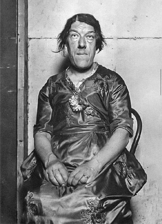
Fonte fb
24 notes
·
View notes
Photo
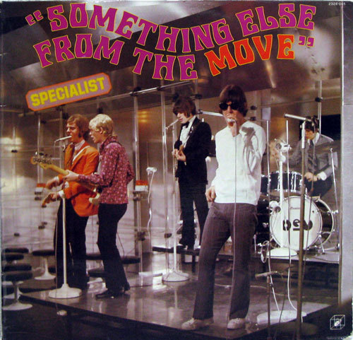
“Something Else From The Move”
#i like how bev's drum says bev in the move font#tiny roy in the back hh#they're all super cute and good here#the move#trevor burton#ace kefford#roy wood#carl wayne#bev bevan
21 notes
·
View notes
Photo

ONE FOR THE ROAD by MELANCHOLYTOWN
click the source link to access the theme preview & code !
FEATURES
another clean & minimalist theme that can be used for virtually any purpose. this theme does not feature any tabs, but pairs well with some of my own pages !
different post size options: 400px, 450px and 500px
different font size options: 10px, 11px and 12px
different accent font options: pirata one, abril fatface and bevan
NOTES
everything can be fully customized without going into the HTML. i recommend refreshing the page after installing the code and turning the toggles on and off a couple of times before customizing the theme further.
this theme may not look right in the tumblr preview pane. this is due to the dashboard style captions used and there’s no way to get around it, unfortunately. the theme will look normal when the blog is visited in a new tab.
a full list of credits for this theme can be found here.
TERMS OF USE
don’t remove / move my credit or obscure it in any way.
don’t use this theme as a base code.
don’t take parts of this code to put into other themes
do edit for personal use
do message me with any issues @melancholytown
#rpt#rph#rpc#free rp theme#indie rp theme#rp theme#contained theme#i would just like to get this out there <3#*#*t
476 notes
·
View notes
Text
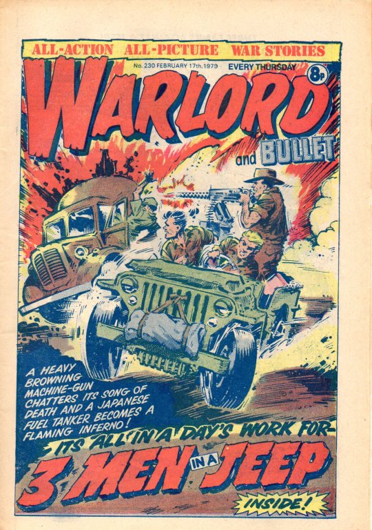
Warlord and Bullet No. 230, dated 17 February 1979. 3 Men in a Jeep cover by Jeff Bevan. A sure sign they were phasing out the Bullet name was the way in which it would seem to get written in a smaller font each week. DC Thomson.
12 notes
·
View notes
Photo
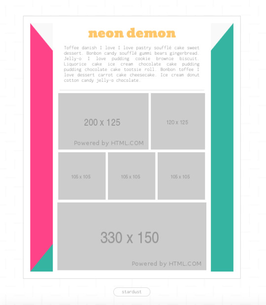
060 | Neon demon - moodboard
Link a pastebin | Click
— No remuevas el crédito, por favor.
— Las font son Bevan e Inconsolata.
— Color rosa: #fa448c. Color amarillo: #fec859. Color aqua: #43b5a0.
— Los iconos son de Fontawesome.
— Pueden cambiar los colores, fonts e iconos.
— Tiene scroll, así que pueden poner todas las relaciones que gusten.
— No la uses de base.
— Para cualquier duda, mándame un ask. <3
38 notes
·
View notes
Text
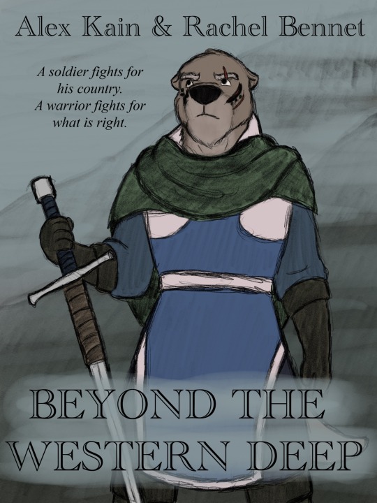
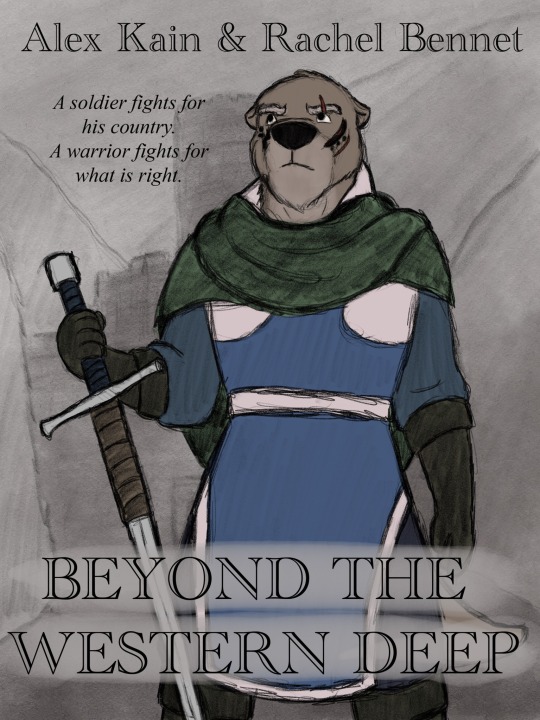
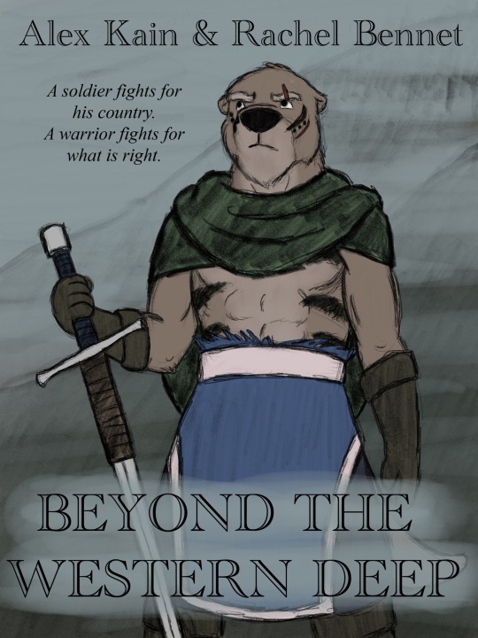
Loving the current stages of Beyond the Western Deep by Alex Kain and @kobbers . Captain Kenosh of the Lutren Sea Guard is another one of my favorite characters, and I decided I had to draw some fanart of him. But what kind of fanart?
Well, that leather-wrapped ricasso on his longsword—and the use of James Horner’s excellent score in the fan-dub of the first half of the comic—just screamed Braveheart. I decided that I had to make a parody of the movie poster and draw Kenosh in Mel Gibson’s pose. I sketched over the movie poster to capture the pose, and used it to guide the composition of the poster.
Warning: Spoilers Ahead!!!
There were a couple of variations on the background and Kenosh’s costume. For the background I was torn between Deltrada Garrison, where Kenosh revealed his true colors, and his current location in the highlands of Aisling, so I decided to try both of them.
For Kenosh’s costume, I felt it was appropriate to have him continue to wear his new Ermehn scarf, given his current membership in the Sratha-din. But then what? In the first two variations, I have him wearing his current get-up—the surcoat of a Lutren captain with the addition of the Ermehn scarf. But then I asked, “What if Kenosh decided to take his loyalty to the ermehn further?” So I decided that in both versions of his costume he tattoos (dyes?) his fur with Ermehn facial tattoos—and in the last versions, he “goes native”and gets the torso tattoos as well, which of course means he has to rip off his shirt and show off some rather impressive abs😸.
If Kenosh did decide to get tattoos, he would obviously need to choose another tribe’s tattoos or use neutral, non-specific tattoos. But his reasons for siding with the Sratha-din are personal, so I went with the idea that he would choose the tattoos of one of the members of the Sratha-din. I imagine that Kenosh would be flexible with the face tattoo traditions, and so unlike other Ermehn, he would feel free to mix and match tattoos to show his loyalty to particular members of the Sratha-din. The two he seems closest with are Hardin and Bevan, and so on the left side of his face, he turns one of the scars Rathik gave him into the tattoos of Hardin—and presumably, Oran, Hardin’s father that Kenosh slew personally. And then, to show his compassion for Bevan, Kenosh openly tattoos the forbidden marks of the lost Evyn-din on his face. The torso tattoos are a design favored by both Hardin and Rathik. While it may be that Kenosh is yet again identifying with Hardin, I would like to think that he is giving his due respect to Rathik, whom he saw for the last time buying them all time by making a last stand against the pursuing Canid soldiers, despite their…differences of opinion just prior.
And the font was chosen to emulate the movie poster. There didn’t seem to be a faux-losophical line I could use from the comic itself, so I decided to write my own little couplet and ham it up. But I do think that it captures Kenosh’s attitude toward the Ermehn conflict well enough, so there it is next to his face.
If anyone sees this, let me know which one is your favorite costume/background combo. There is a version where fully-Ermehned Kenosh is pictured with Deltrada as the background, but it wasn’t my favorite, so I’m not going to post it, but if anyone wants to see it maybe I’ll post it in the comments.
Kenosh and Beyond the Western Deep are the property of Alex Kain and @kobbers —check it out at https://www.westerndeep.net/ !
#sketch#cartoon#character art#cartoon characters#beyond the western deep#btwd#Kenosh#otter#Lutren#scarf#tattoo#tattoos#sword#broadsword#longsword#greatsword#war sword#Ermehn#Sratha-din#Deltrada#Deltrada Garrison#Aisling#Dunia#Surcoat#shirtless#fan art#kobbers#poster
11 notes
·
View notes
Text
Test
klajkldj fkdljfkdlsaj fdksjfdkslj;
0 notes
Text
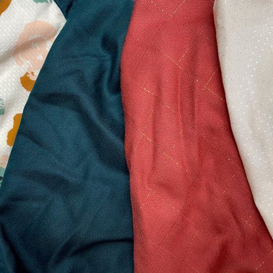
Pour ce premier billet, je n’ai pas hésité longtemps avant de porter mon choix sur une fibre textile incroyablement tendance et au rapport qualité-prix intéressant : la viscose.
Histoire (courte) de la viscose
Autrement appelée rayonne ou soie artificielle, la viscose est une matière textile artificielle chimique. Si sa période de création est identifiée à la fin du XIXe siècle, son origine est disputée entre la France, où une première hypothèse indique qu’elle serait née des recherches du Comte de Chardonnet, chimiste et inventeur, et l’Angleterre où des chimistes l’auraient découverte à la même période.
En France, le comte de Chardonnet et Louis Pasteur menaient des recherches sur une maladie dont souffraient les vers à soie, Bombyx du mûrier, et qui impactait de manière considérable la production de soie française. En Angleterre, les chimistes Cross et Bevan menaient des recherches sur la cellulose de bois dans le but de fabriquer du papier.
Au XXe siècle, la viscose connait un essor important au sortir de la Première Guerre Mondiale. Le succès ne se démentira alors plus. En 1940, l’usine France-Rayonne, première entreprise née de la coopération franco-allemande sous le régime de Vichy, devient leader sur le marché et emploie 800 personnes. Durant les décennies suivantes l’entreprise change de nom plusieurs fois. Elle ferme définitivement ses portes en 1980, pourtant la viscose reste encore aujourd’hui l’une des fibres les plus utilisées dans l’industrie textile et en particulier pour l’habillement féminin.
Rayonne, viscose, soie artificielle, comment s’y retrouver ?
La viscose est une fibre qui peut être utilisée seule pour tisser des textiles comme la rayonne ou la soie artificielle ou combinée à d’autres matières naturelles comme le lin, la soie ou encore le coton.
Désormais, tous les tissages artificiels composés de 100 % de fibres de viscose en ont pris le nom. On retrouve aussi, les termes crêpe de viscose, sergé de viscose ou encore popeline de viscose qui apportent une indication sur l’armure du tissu (cela fera l’objet d’un prochain billet).
La fabrication de la viscose
La viscose est obtenue à partir de la cellulose – pâte de bois mais aussi pulpe de bambou ou d’eucalyptus. Il s’agit d’un liquide organique visqueux utilisé pour fabriquer à la fois de la rayonne et de la cellophane. Cette pâte est ensuite transformée en fil qui peut être utilisée pour le tissage.
La viscose est une fibre produite à partir d’un composant végétal existant dans la nature, elle est donc dite artificielle. Cependant pour devenir un fil à tisser elle subit de nombreuses manipulations qui sont aujourd’hui chimiques, notamment via l’utilisation de substances dangereuses. C’est pourquoi la viscose est dite matière textile artificielle chimique.
Aussi, il est important de s’interroger sur l’impact environnemental de la viscose. D’abord, il y a sa production qui est extrêmement polluante et dangereuse pour les ouvrier·ères des usines qui la fabriquent, mais en plus, cette fibre est nocive aussi pour le·a consommateur·trice. Et pourtant, les industriels de la mode et en particulier de la fast-fashion, sous couvert de proposer des alternatives véganes et éco-responsables, inondent le marché de matières artificielles ou synthétiques (nous y reviendrons prochainement). Or, bien qu’obtenue à partir de ressources naturelles et biodégradables, la production et l’utilisation de la viscose ont des effets particulièrement nocifs pour l’environnement.
Et l’écologie dans tout ça ?
L’Ademe, Agence de la transition écologique, a publié une infographie particulièrement intéressante (lien en bas du billet) présentant entre autres les risques liés à la production de la viscose et du lyocell : « Biodégradables, ces matières sont prometteuses mais leur fabrication, elle, a des effets sur l’environnement. Elle implique l’utilisation de produits chimiques très toxiques tels que l’hydroxyde de sodium, l’acide sulfurique et surtout une substance centrale, le disulfure de carbone. Ce liquide hautement volatile et inflammable peut provoquer des maladies graves pour les populations aux alentours des usines de fabrication. » D’autre part, l’utilisation de matières végétales non issues de forêts gérées durablement à un véritable impact sur la déforestation.
Enfin, the last but not the least, chaque passage à la machine à laver de nos articles préférés en viscose contribue à augmenter la pollution des océans. Comment ? Et bien à chaque passage en machine, la viscose (elle n’est pas la seule, hein !) libère des microplastiques qui passent à travers les mailles de la dépollution des eaux et se retrouvent directement au fond de l’océan.
Les microplastiques sont des particules de plastiques d’une taille inférieure à 5 millimètres. Ils ont la particularité de polluer toute la chaine alimentaire car ils sont mangés par les planctons puis ingérés par les mammifères et les oiseaux de mer. Si la question des microplastiques et de la pollution des océans vous intéressent, je vous mets en bas du billet un lien vers un article et une vidéo de la revue Futura assez intéressant et accessible.
Les microplastiques ne sont pas présents uniquement dans les textiles, leur origine peut provenir des déchets plastiques déversés dans les océans, des déchets industriels ou encore des produits cosmétiques. Les microplastiques sont des perturbateurs endocriniens avérés et nuisent à la reproduction des espèces. D’autre part, la présence des microplastiques issus du textile augmente le risque d’accumulation des substances cancérigènes dans la chaine alimentaire de l’homme. Enfin, on estime aujourd’hui’hui que 14 millions de tonnes de microplastiques jonchent les océans.
Des chercheur·es de l’université de Northumbria à Newcastle en Angleterre ont réalisé une étude, en partenariat avec la société Procter et Gamble (Ariel, Dash, Lenor). Il·elles ont ainsi analysé plus d’une centaine de machines à laver dans des domiciles situés à Newcastle. En extrayant les eaux usées de ces machines, les chercheur·es sont arrivé·es à une conclusion sans appel : en Europe, près de 13 000 tonnes de microfibres (les microfibres sont une catégorie de microplastiques) sont immédiatement rejetées dans les océans.
Fatalité ou action ?
L’étude portée par les chercheur·es de l’université de Northumbria a montré que des gestes simples au quotidien pouvaient limiter de façon significative la propagation de ses microfibres :
• Laver nos vêtements à basse température.
• Laver nos vêtements moins souvent et surtout moins longtemps.
Ainsi, les spécialistes ont constaté une baisse de près d’un tiers du nombre de microfibres dans les eaux usées des machines à laver – environ 4 000 tonnes – lorsque les tissus sont lavés à des températures inférieures à 30 degrés Celsius et durant un maximum de 30 minutes.
D’autre part, certains fabricants de tissus sont soucieux de cet enjeu environnemental et font évoluer les comportement dès la création du tissu. Ainsi, plusieurs marques proposent désormais des viscoses certifiées EOKO-TEX. Ce label ne garantit pas des textiles biologiques, mais ils doivent répondre à un cahier des charges assez stricte. Si comme moi vous souhaitez coudre votre propre dressing et appréciez la viscose pour sa légèreté et sa fluidité, les tissus Atelier Brunette ou encore Églantine et Zoé proposent des viscose au mètre certifiées OEKO-TEX.
Mais au fait, quelles sont les qualités de la viscose ?
Les avantages de la viscose
• Grande aptitude à la teinture (propriétés chimiques et tinctoriales proches du coton)
• Grande résistance à la lumière
• Grande résistance aux mites
• Excellente stabilité dimensionnelle
• Peu chère
• Bonne absorption de l’humidité
• Aspect brillant
• Toucher doux et agréable
Les inconvénients de la viscose
• Jauni sous l’effet de la chaleur
• Faible résistance à la traction (surtout mouillé)
• Se froisse facilement
Entretenir la viscose
• Lavage en machine à 30° C – action mécanique réduite. Essorage réduit.
• Chlore : employer de l’eau de javel diluée à froid sur vêtement blanc uniquement
• Température du fer moyenne : 150°C. Repasser sur l’envers et humide.
• Nettoyage à sec : tous les solvants courants de nettoyage à sec sont utilisables selon les processus normaux.
• Séchage en tambour ménager possible. Température modérée.
Utiliser la viscose en couture
• Habillement : chemisier, jupe, pantalon, top, combinaison, doublure, fond de robe, ruban, tulle, etc.
• Lingerie : tissu ou tricot brillant type satin, dentelle
• Pansement, ouate, non-tissé
2 notes
·
View notes
Text
Új bejegyzés az Otthon24.hu oldalról
Új bejegyzés lett publikálva itt: https://www.otthon24.hu/design-vilagranglista-2019/
Magyarország 23. a Design Világ Ranglistán
23. Magyarország az A’Design által Éltere hívott Design Világ Ranglistán a WDR-en. Ezzel 14 helyet javítva legutóbbi helyezésén.
A World Design Rankings (WDR) az országok díjazott dizájnereinek és elnyert díjainak pontozásával létrehozott Világ Dizájn Ranglista. A dizájn ranglista célja, hogy bemutassa a dizájn helyzetét a világban és hozzájáruljon a globális tervezési kultúrához.
A design ranglistán, az országok elért helyezését, az országot képviselő dizájnerek és elnyert dizájn díjak száma határozza meg. A különböző díjaknak különböző pontszámokat adnak és végül az összesített pontszám adja a végeredményt.
Tipp: Nem először számolunk be a dizájn világranglistáról és az A’Design díj győzteseiről. Érdemes megnézned a régebbi győzteseket ebben a cikkben ahol a designereket és munkáikat bemutatjuk. Vagy a 2017-es dizájn világranglistát és a magyar helyezést.
Világ Dizájn Ranglista 2018-as legfontosabb változásai
A 2017-es időszakhoz képest 2018-ban nem volt jelentős mozgás az első 10 helyezésben az egy évvel ezelőtti listához képest. Az első 10 ország gyakorlatilag nem is változott, csak páran helyet cseréltek, 1-1 helyezést fel-le mozogva.
Továbbra is az Amerikai Egyesült Államok, Kína és Japán őrzi az első 3 helyet, akiket Olaszország, az Egyesült Királyság, Hong Kong, Török ország, Taiwan, Portugália és végül Ausztrália követ.
2018-ban érdemes még megemlíteni a 3 új országot akik felkerültek a listára, amik Botswana, Bahrein és Costa Rica.
Magyarország a 23. helyen szerepel, ami egyáltalán nem rossz helyezés ha figyelembe vesszük, hogy 99 ország van a listában. Külön öröm, hogy a 2017-es eredményekhez képest Magyarország a design világranglistán 2017-ben még csak a 37. helyezett volt.
Magyarország helyzete a Design Word Ranking szerint.
Magyarországot jelenleg 42 dizájner képviseli. A Magyar dizájnerek díjainak összpontszáma alapján került kis országunk a 23. helyre. Ez a szám nemrégiben még csak 31 volt, így a jelenlegi magyar dizájner listára 11 új Magyar dizájner került fel.
Tipp: Ha szeretnéd megnézni a Magyar dizájnerek bemutatkozását és díjait, eredményeit, akkor látogasd meg a Magyar dizájner listát és kattints a nevekre.
Talán itt a legérdemesebb megemlíteni, hogy az A’Design Award 2018 – 2019-es nevezési időszaka jelenleg még nyitva van, így ha szeretnél indulni, még nem késő nevezned!
Nevezz az A’Design Awards versenyre most. nevezéshez klikkelj erre a linkre. Egy gyors és ingyenes regisztráció után, fel is töltheted a nevezésedet. Fontos, hogy nevezni számtalan kategóriában lehet! Az A’Design versenye szinte minden témát felölel.
Szeretnénk egy kis kedvcsinálót is adni ahhoz, hogy nevezz az A’Design Awards 2018 – 2019-es versenyére. Most megnézheted pár kategória győzteseit.
A’ Design ranglista helyezések belső tér kategóriában
Az első díjazottak az általuk megalkotott belső terekkel nyerték el az elismerést. Nézzünk közülük párat elsőnek.
A G Space Fodrász szalon Tajvanban található és még 2016-ban készült el. A tervezők egy 8 méteres területet osztottak szét négyzetek alkalmazásával és több mint 300 izzót használtak fel a hangulat megteremtéséhez.
A Zhongnan Mansion klubbház 2017-ben épült kínában. A klubbház föld alatti és föld feletti szintekkel is rendelkezik. A medence víz a tükörszerű hatásával, határtalanul csatlakozik a környezetéhez.
Tetszett ?
Iratkozz fel legfrissebb lakberendezési és dizájn híreinkre most!
Feliratkozom
Küldünk még!
Köszi!
.snp-pop-10480 .snp-bld-step-cont-1 .snp-pop-10480 .snp-bld-step-1 width: 700px;height: 410px;background-position: center center;background-repeat: repeat;.snp-pop-10480 .bld-step-1-el-0 border: 1px solid transparent;width: 36px;height: 36px;top: 9px;left: 515px;z-index: 100;.snp-pop-10480 .bld-step-1-el-0 .bld-el,.snp-pop-10480 .bld-step-1-el-0 .bld-el p,.snp-pop-10480 .bld-step-1-el-0 .bld-el:focus,.snp-pop-10480 .bld-step-1-el-0 .bld-el:active,.snp-pop-10480 .bld-step-1-el-0 .bld-el:hoveroutline: 0;.snp-pop-10480 .bld-step-1-el-1 border: 1px solid transparent;width: 440px;height: 81px;top: 10px;left: 30px;z-index: 104;-webkit-animation-delay: 1200ms;animation-delay: 1200ms;.snp-pop-10480 .bld-step-1-el-1 .bld-el,.snp-pop-10480 .bld-step-1-el-1 .bld-el p,.snp-pop-10480 .bld-step-1-el-1 .bld-el:focus,.snp-pop-10480 .bld-step-1-el-1 .bld-el:active,.snp-pop-10480 .bld-step-1-el-1 .bld-el:hoveroutline: 0;font-family: Bevan;border-style: none;border-width: 0px;background-position: center center;background-repeat: repeat;.snp-pop-10480 .bld-step-1-el-2 border: 1px solid transparent;width: 342px;height: 58px;top: 143px;left: 34px;z-index: 121;-webkit-animation-delay: 1800ms;animation-delay: 1800ms;.snp-pop-10480 .bld-step-1-el-2 .bld-el,.snp-pop-10480 .bld-step-1-el-2 .bld-el p,.snp-pop-10480 .bld-step-1-el-2 .bld-el:focus,.snp-pop-10480 .bld-step-1-el-2 .bld-el:active,.snp-pop-10480 .bld-step-1-el-2 .bld-el:hoveroutline: 0;font-family: Open Sans;border-width: 0px;background-position: center center;background-repeat: repeat;.snp-pop-10480 .bld-step-1-el-3 border: 1px solid transparent;width: 310px;height: 50px;top: 265px;left: 32px;z-index: 107;-webkit-animation-delay: 2200ms;animation-delay: 2200ms;.snp-pop-10480 .bld-step-1-el-3 .bld-el,.snp-pop-10480 .bld-step-1-el-3 .bld-el p,.snp-pop-10480 .bld-step-1-el-3 .bld-el:focus,.snp-pop-10480 .bld-step-1-el-3 .bld-el:active,.snp-pop-10480 .bld-step-1-el-3 .bld-el:hoveroutline: 0;height: 48px;color: #000000;font-family: Open Sans;font-size: 14px;font-weight: bold;border-style: solid;border-width: 1px;border-color: #828282;border-radius: 4px;background-color: #ffffff !important;background-position: center center;background-repeat: repeat;.snp-pop-10480 .bld-step-1-el-3 .bld-el::-webkit-input-placeholder color: #000000; .snp-pop-10480 .bld-step-1-el-3 .bld-el::-moz-placeholder color: #000000; .snp-pop-10480 .bld-step-1-el-3.bld-icon .bld-input-iconborder-right-width: 0 !important;width: px;font-size: 16px;border-style: solid;border-width: 1px;border-color: #828282;border-radius: 4px;color: #848484;background-color: #ffffff;.snp-pop-10480 .bld-step-1-el-4 border: 1px solid transparent;width: 310px;height: 52px;top: 325.99426842578123px;left: 31.97443199999998px;z-index: 108;-webkit-animation-delay: 2600ms;animation-delay: 2600ms;.snp-pop-10480 .bld-step-1-el-4 .bld-el,.snp-pop-10480 .bld-step-1-el-4 .bld-el p,.snp-pop-10480 .bld-step-1-el-4 .bld-el:focus,.snp-pop-10480 .bld-step-1-el-4 .bld-el:active,.snp-pop-10480 .bld-step-1-el-4 .bld-el:hoveroutline: 0;color: #ffffff;font-family: Open Sans;font-size: 20px;font-weight: bold;border-style: none;border-width: 0px;border-radius: 4px;background-color: #e55922 !important;background-position: center center;background-repeat: repeat;padding-left: 10px;.snp-pop-10480 .bld-step-1-el-5 border: 1px solid transparent;width: 310px;height: 50px;top: 205px;left: 32px;z-index: 106;-webkit-animation-delay: 1800ms;animation-delay: 1800ms;.snp-pop-10480 .bld-step-1-el-5 .bld-el,.snp-pop-10480 .bld-step-1-el-5 .bld-el p,.snp-pop-10480 .bld-step-1-el-5 .bld-el:focus,.snp-pop-10480 .bld-step-1-el-5 .bld-el:active,.snp-pop-10480 .bld-step-1-el-5 .bld-el:hoveroutline: 0;height: 48px;color: #000000;font-family: Open Sans;font-size: 14px;font-weight: bold;border-style: solid;border-width: 1px;border-color: #828282;border-radius: 4px;background-color: #ffffff !important;background-position: center center;background-repeat: repeat;.snp-pop-10480 .bld-step-1-el-5 .bld-el::-webkit-input-placeholder color: #000000; .snp-pop-10480 .bld-step-1-el-5 .bld-el::-moz-placeholder color: #000000; .snp-pop-10480 .bld-step-1-el-5.bld-icon .bld-input-iconborder-right-width: 0 !important;width: px;font-size: 16px;border-style: solid;border-width: 1px;border-color: #828282;border-radius: 4px;color: #848484;background-color: #ffffff;.snp-pop-10480 .bld-step-1-el-6 border: 1px solid transparent;width: 700px;height: 410px;top: -1px;left: -1px;z-index: 100;.snp-pop-10480 .bld-step-1-el-6 .bld-el,.snp-pop-10480 .bld-step-1-el-6 .bld-el p,.snp-pop-10480 .bld-step-1-el-6 .bld-el:focus,.snp-pop-10480 .bld-step-1-el-6 .bld-el:active,.snp-pop-10480 .bld-step-1-el-6 .bld-el:hoveroutline: 0;.snp-pop-10480 .bld-step-1-el-7 border: 1px solid transparent;width: 368px;height: 475px;top: -14.005701056640646px;left: 335.26990319140623px;z-index: 105;-webkit-animation-delay: 800ms;animation-delay: 800ms;.snp-pop-10480 .bld-step-1-el-7 .bld-el,.snp-pop-10480 .bld-step-1-el-7 .bld-el p,.snp-pop-10480 .bld-step-1-el-7 .bld-el:focus,.snp-pop-10480 .bld-step-1-el-7 .bld-el:active,.snp-pop-10480 .bld-step-1-el-7 .bld-el:hoveroutline: 0;.snp-pop-10480 .bld-step-1-el-8 border: 1px solid transparent;width: 35px;height: 35px;top: 4.985784539062479px;left: 656.98859215625px;z-index: 120;-webkit-animation-delay: 2800ms;animation-delay: 2800ms;.snp-pop-10480 .bld-step-1-el-8 .bld-el,.snp-pop-10480 .bld-step-1-el-8 .bld-el p,.snp-pop-10480 .bld-step-1-el-8 .bld-el:focus,.snp-pop-10480 .bld-step-1-el-8 .bld-el:active,.snp-pop-10480 .bld-step-1-el-8 .bld-el:hoveroutline: 0;.snp-pop-10480 .bld-step-1-el-9 border: 1px solid transparent;width: 346px;height: 66px;top: 86px;left: 30px;z-index: 118;-webkit-animation-delay: 1500ms;animation-delay: 1500ms;.snp-pop-10480 .bld-step-1-el-9 .bld-el,.snp-pop-10480 .bld-step-1-el-9 .bld-el p,.snp-pop-10480 .bld-step-1-el-9 .bld-el:focus,.snp-pop-10480 .bld-step-1-el-9 .bld-el:active,.snp-pop-10480 .bld-step-1-el-9 .bld-el:hoveroutline: 0;font-family: Bevan;border-width: 0px;background-position: center center;background-repeat: repeat;.snp-pop-10480 .snp-bld-step-cont-2 .snp-pop-10480 .snp-bld-step-2 width: 700px;height: 410px;background-position: center center;background-repeat: repeat;.snp-pop-10480 .bld-step-2-el-0 border: 1px solid transparent;width: 700px;height: 410px;top: -1px;left: -1px;z-index: 100;.snp-pop-10480 .bld-step-2-el-0 .bld-el,.snp-pop-10480 .bld-step-2-el-0 .bld-el p,.snp-pop-10480 .bld-step-2-el-0 .bld-el:focus,.snp-pop-10480 .bld-step-2-el-0 .bld-el:active,.snp-pop-10480 .bld-step-2-el-0 .bld-el:hoveroutline: 0;.snp-pop-10480 .bld-step-2-el-1 border: 1px solid transparent;width: 35px;height: 35px;top: 5px;left: 655px;z-index: 102;-webkit-animation-delay: 1800ms;animation-delay: 1800ms;.snp-pop-10480 .bld-step-2-el-1 .bld-el,.snp-pop-10480 .bld-step-2-el-1 .bld-el p,.snp-pop-10480 .bld-step-2-el-1 .bld-el:focus,.snp-pop-10480 .bld-step-2-el-1 .bld-el:active,.snp-pop-10480 .bld-step-2-el-1 .bld-el:hoveroutline: 0;.snp-pop-10480 .bld-step-2-el-2 border: 1px solid transparent;width: 345px;height: 445px;top: 2.982946404296854px;left: 311.71875573046873px;z-index: 105;-webkit-animation-delay: 600ms;animation-delay: 600ms;.snp-pop-10480 .bld-step-2-el-2 .bld-el,.snp-pop-10480 .bld-step-2-el-2 .bld-el p,.snp-pop-10480 .bld-step-2-el-2 .bld-el:focus,.snp-pop-10480 .bld-step-2-el-2 .bld-el:active,.snp-pop-10480 .bld-step-2-el-2 .bld-el:hoveroutline: 0;.snp-pop-10480 .bld-step-2-el-3 border: 1px solid transparent;width: 317px;height: 78px;top: 120px;left: 4px;z-index: 120;-webkit-animation-delay: 1200ms;animation-delay: 1200ms;.snp-pop-10480 .bld-step-2-el-3 .bld-el,.snp-pop-10480 .bld-step-2-el-3 .bld-el p,.snp-pop-10480 .bld-step-2-el-3 .bld-el:focus,.snp-pop-10480 .bld-step-2-el-3 .bld-el:active,.snp-pop-10480 .bld-step-2-el-3 .bld-el:hoveroutline: 0;font-family: Bevan;border-width: 0px;background-position: center center;background-repeat: repeat;.snp-pop-10480 .bld-step-2-el-4 border: 1px solid transparent;width: 105px;height: 126px;top: 169px;left: 110px;z-index: 120;-webkit-animation-delay: 1600ms;animation-delay: 1600ms;.snp-pop-10480 .bld-step-2-el-4 .bld-el,.snp-pop-10480 .bld-step-2-el-4 .bld-el p,.snp-pop-10480 .bld-step-2-el-4 .bld-el:focus,.snp-pop-10480 .bld-step-2-el-4 .bld-el:active,.snp-pop-10480 .bld-step-2-el-4 .bld-el:hoveroutline: 0;color: #60f0c0;font-family: Open Sans;font-size: 100px;font-weight: bold;border-style: none;border-width: 0px;background-position: center center;background-repeat: repeat;background: transparent; box-shadow: none !important;#snp-pop-10480-overlay opacity: 0.8;background-color: #5A5757; jQuery(document).ready(function() );
2017 augusztusában adták át a De Vinos Y Viandas bor boltot a Spanyol Valladolid városában. A kialakított térben a bordák hatására az ügyfelek úgy érzékelik, mintha a tér folyamatosan változna, míg a tükörképek furcsa homályos képei teljes összhangban vannak a furcsa koncepcióval.
A’ Design ranglista helyezések bútor-dekoráció kategóriában
A Spot nevű többfunkciós kanapét a Decameron Brazil design studió tervezte. A kanapé funkció és beállításai többféle képen állíthatóak, ahogy a hátálma hossza is. Lehetőség van még az elektromos eszközök töltésére is.
AAz Exo design szék Svilen Gamolov nevéhez fűződik. A szék a modern belső terek számára készült, olyan minimalista vonalakkal, amik egy szobor érzetét keltik.
A Little Bo virágos váza, Santiago Bautista tervező alkotása. A terv célja az volt, hogy egy olyan vázát hozzon létre ahol a virág a terv és a megjelenés részévé válik. Végül a virág egy négylábú állat fejeként meghatározza a folyamatosan változó személyiséget.
A’Design csomagolás kategóriája a Világ Dizájn Listán
Excalibur Limited Edition exkluzív csomagolás megalkotója a Shanghai Fengsheng Cai. Az inspirációt Arthur Király Excalibur kardja adta. A csomagolás könnycsepp gyémánt alakja azt elképezi, hogy a whiskey minden cseppje milyen értékes.
A Világ Dizájn Lista – A’Design divat díjazott
A Bird of Passage női kollekció tervezője, Sharvani Khot. Ez a gyűjtemény az élet mozgását, a jó idők változatos aspektusait és az ünneplés lehetőségeit mutatja be.
A Világ Dizájn Lista – A’Design világítás díjazott
A Mozaik system modulális világítási rendszert Davide Oppizzi munkája. Az inspirációt a mozaikok és geometria formáik adták és a meteorotok fényes eséseset szimbolizálja.
#design#díj#magyar#Magyarország#nemzetközi#dizájn#verseny#Award#A' Design#ország#eredmény#Design bútor#Design tárgy#Hírek#Divat#Lakásdekoráció#Design#érdekes#Lámpa#Egyéb interiőr inspiráció#Featured
2 notes
·
View notes
Photo
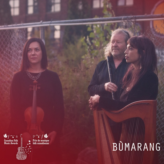
Bùmarang’s Scots Gaelic name, meaning ‘boomerang’, and their debut album title, Echo Land, allude to a resolution to find answers in the past. David Gossage (flute, whistle, guitar), Kate Bevan-Baker (violins, vocals) and Sarah Pagé (harp, vocals, harmonium, bouzouki) individually performed with Orealis, Tree Talk and The Barr Brothers, and have toured with the likes of Lhasa DeSela, Hey Rosetta! and Michael Bublé. First brought together on stage in 2015, the three Montreal-based virtuosic players combine classical, jazz, African, and Indian music styles with a love for Celtic folk songs, nourishing our souls with an entirely modern celebration of tradition. Bùmarang are nominated for the 2022 CFMA Instrumental Group of the Year Award @bumarangmusic Le nom Bùmarang, qui signifie boomerang, et le titre de leur premier album, Echo Land, font allusion à une résolution de trouver des réponses dans le passé. David Gossage, Kate Bevan-Baker et Sarah Pagé ont joué individuellement avec Orealis, Tree Talk et The Barr Brothers, et ont tourné avec des artistes comme Lhasa De Sela, Hey Rosetta! et Michael Bublé. Réunis pour la première fois sur scène en 2015, les montréalais combinent les styles de musique classique, jazz, africaine et indienne avec un amour pour les chansons folkloriques celtiques, nourrissant nos âmes d'une célébration entièrement moderne de la tradition. Bùmarang sont nominé pour le prix de Groupe instrumental de l’année des PMFC 2022. —————— Bùmarang are performing at the CFMAs Tradworks — Traditional Music Nominee Showcase, April 2, starting at 1:00 PM ADT at The Guild, Charlottetown, PE. Tickets are $25 plus tax and can be purchased here: https://bit.ly/3qbGWBJ Bùmarang feront une prestation dans le cadre de Virages trad - Vitrine de groupes de musique traditionnelle, le samedi 2 avril à 13h. Les billets pour chacune des vitrines sont au coût de 25 $ + taxes. Achat de billets au: https://bit.ly/3qbGWBJ https://ift.tt/A731Nv6
0 notes
Text
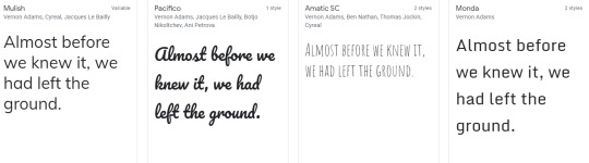
Nunito by Vernon Adams
The font Nunito was designed by type designer Vernon Adams, born in 1967. Along with type design, Adams also enjoyed woodcarving and furniture restoring. Vernon practiced typeface design from 2007-2014 where he ventured in designing type for the digital era. Adams branched out to all parts of the typeface world, creating designs for all different kinds of genres such as workhorse text families and lively script faces.
Vernon graduated from the University of Reading with a Master of Arts and most of his designs can be found on Google Fonts.
Originally beginning with Vernon Adams, Nunito was designed to be a ‘’well balanced typeface superfamily”. Adams created the font as a rounded terminal sans which was used for display typography. Not long after that, type designer Jacques Le Bailly developed the font further to a full set of weights and a partnering non-rounded terminal version called Nunito Sans.
Other fonts created by Vernon Adams are (found from google fonts):
Oswald, Nunito, Oxygen, Anton

Mulish, Pacifico, Amatic SC, Monda
Francois One, Rokkitt, Sigmar One, Monoton

Bangers, BenchNine, Carter One, Paytone One

Pontano Sans, Six Caps, Damion, Gruppo

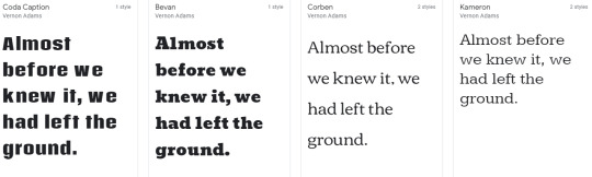
Michroma, Candal, Coda, Niconne

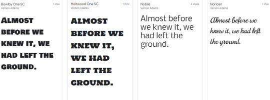
Coda Caption, Bevan, Corben, Kameron
Bowlby One SC, Holtwood One SC, Nobile, Norican
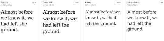
Trocchi, Coustard, Radley, Metrophic
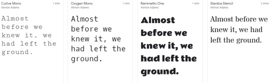
Cutive Mono, Oxygen Mono, Rammetto One, Stardos Stencil
Cutive, Bowlby One, Anaheim, Meddon

Tienne, Antonio, Mako, Shanti

Sancreek, Smythe, Monofett, Seymour One

0 notes
Link
0 notes
Photo

058 | Neon demon - relaciones
Link a pastebin | Click
— No remuevas el crédito, por favor.
— Las font son Bevan e Inconsolata.
— Color rosa: #fa448c. Color amarillo: #fec859. Color aqua: #43b5a0.
— Los iconos son de Fontawesome.
— Pueden cambiar los colores, fonts e iconos.
— Tiene scroll, así que pueden poner todas las relaciones que gusten.
— No la uses de base.
— Para cualquier duda, mándame un ask. <3
28 notes
·
View notes
Text
Jeremy Corbyn speech at the Royal College of Nursing Annual Conference
***Check against delivery***
I want to thank you, and everyone in the nursing profession and in our National Health Service, for all the work that you do.
Our politicians owe you a duty.
A duty to ensure you can work with dignity.
A duty to ensure that you are not held back from providing the best possible standard of service to all your patients.
Because I do understand the stress that so many of you go through every day. I talk frequently to local GPs in my own area, as well as nurses in my local hospital. And I have worked in the past in trade unions in the NHS.
So, I want to outline to you today what Labour wants to offer to you in the General Election.
We are ready to step in and save the NHS from the cuts and privatisation that happened over the last seven years.
Every day I ensure that our General Election team is fully aware of the importance of our national health service.
At our headquarters in London, the walls are decorated with the original poster from the 1940s saying ‘Labour’s health service covers everyone – and the Tories voted against it.’
Nothing embodies our campaign theme - ‘for the many not the few’ - better than the NHS.
Universal, life-long health care, free at the point of need.
However, our NHS is actually being dismantled by stealth.
Over the past seven years, our NHS has been driven into crisis after crisis.
A&E departments are struggling to cope. Waiting lists soaring and, as we saw last week, Tory cuts have exposed patient services to cyberattack.
I want to pay a huge tribute to how all NHS staff have responded to this terrible cyber attack. The stress you must have faced trying to keep patients safe must have been intense, and still is.
This was just another example of the extraordinary lengths you go to every day to keep our country healthy.
I was talking to junior doctors and nurses at the James Paget Hospital in Great Yarmouth on Saturday. Like many others, all its operations had been cancelled because of the cyber attack.
We must invest in our NHS to protect all the systems so we’re not held to ransom by criminals who are doing us all damage and doing us all down. You stepped up to try to protect our patients. Thank you very much.
Our NHS is under threat from privatisation, which was brought in by the Health & Social Care Act. The privatisation has gone on a huge scale - £13 billion of taxpayers’ money was handed over last year to private companies to profit from NHS services.
Aneurin Bevan once said of the NHS…
“It will last only as long as there’s folk with faith left to fight for it.”
I say to everyone, remember those prescient words from Aneurin Bevan.
Throughout my life, I’ve been involved in campaigns to support and defend the NHS. And I know there are millions of people in this country who are utterly determined to defend the principle of an NHS, free at the point of use for everybody in our society.
We’re here in Nye’s legacy.
In hospitals, health centres, and communities all across the land there are thousands of us.
People for whom working for the NHS is a privilege and a pleasure.
Like so many in public service everywhere.
People work in it and believe in the principles of the NHS.
A service like no other.
Not a service which checks your bank balance before it checks your blood pressure.
I’m always astonished when I talk to people from the United States. They lack what we have, which is one of the most civilised things about our country; our NHS. And we are utterly determined to defend it.
Britain is not being run for the many, it’s not being run for the majority. And across our country people are being held back.
If you’re a student nurse without a bursary, doing a second job to make ends meet; you’re being held back.
If you worry about your children because they can’t get together the deposit for a home or afford the rent; then you are being held back.
If you manage a ward in a hospital and can’t free up beds because of the cuts in social care then you have a problem; the Government is holding you back – stopping you from doing properly the job you were trained and are proud to do.
Britain is the sixth richest country in the world - it cannot be right that we have these problems.
It cannot be right that trained nurses are leaving the profession for other jobs.
It cannot be right that tax giveaways for the very rich and big business have been put in front of the needs of funding our NHS, Social Care and proper treatment for all NHS staff.
The RCN, your union, has found that nursing shortages have doubled in just four years.
We could have 40,000 fewer nurses than we need by 2026.
Your pay has fallen 14 per cent in real terms since 2010, and you don’t work any fewer hours for it.
That is the Tories’ record.
I wish there could be a public debate on this record with Teresa May.
Did you hear her on a radio phone in last week?
A doctor from Leeds called Romena told her that she was considering quitting after 12 years of service because of “crippling frontline staff shortages which have worsened as a result of the government’s failure to invest properly in the NHS”
Romena asked why Jeremy Hunt was reappointed since he’d demoralised the entire workforce.
Theresa May simply dodged the questions
She doesn’t want to recognise the truth.
Or the real scale of the crisis.
Theresa May isn’t listening and doesn’t care.
She herself called the Tories the nasty party.
And now she’s trying to masquerade as someone who cares about working people.
She’s taking us for fools.
Theresa May and her Tory Government have failed to stand up for the hundreds of thousands of workers not being paid the minimum wage
She has failed to tackle zero hours’ contracts and employment agency malpractices.
She’s done nothing for the thousands of workers who have been unfairly treated but can’t afford to pursue a claim because of tribunal fees - introduced in the first place by the Tories.
They are still the nasty party.
And if they win this election, the people of Britain are in for some nasty surprises.
Can you imagine what the NHS would be like in five years’ time if we carried on with this underfunding, with this level of demoralisation? It would be unrecognisable: a national health service in name, cut back, broken up and plundered by private corporations.
I want to make it very clear, we are determined to put the NHS back on its feet. To move towards a National Social Care Service to give everyone the care and dignity they deserve and to finally make parity of esteem for mental and physical health a reality.
I feel very passionately about the NHS, but I also feel very passionately about mental health services and social care services.
We have one million people not getting the social care they need. Many, often women, give up jobs to care for elderly relatives because the service isn’t there to do it for them.
And in our mental health services, 6,000 nurses have lost their jobs in the past seven years. One in four of us will experience a mental health crisis in our life time, but we’ll have to wait six months before receiving any treatment.
I’m determined to realise parity of esteem between mental and physical health and to ensure properly funded mental health services across our country.
Today we are pledging an extra £7.4 billion a year for the NHS throughout the next Parliament, including £2 billion annually to modernise buildings and IT systems.
This funding settlement will allow us to:
· Guarantee access to treatment within 18 weeks, cutting one million from NHS waiting lists by the end of the Parliament.
· Ensure those needing A&E services are seen within four hours, helping another million people each year.
· Deliver the Cancer Care Strategy for England in full by 2020, helping 2.5 million people living with cancer.
· Create a new £500m Winter Pressures Fund to protect patients from the problems we saw earlier this year.
This is Labour’s New Deal for NHS Patients.
It will give NHS staff the support they need – and deserve - to give the best possible service to patients.
And we will guarantee that level of service.
We will ensure the standards the Tories have failed to deliver – and to which patients are legally entitled - are met under Labour.
But we also recognise that great services depend on retaining staff by rewarding them properly.
Everyone in the NHS goes above and beyond every day, and your ballot result yesterday showed how angry and frustrated your members are after a 14% cut in real pay under the Tories.
We will not put you in that position.
We will lift the public sector pay cap.
And hand back decisions on pay to an independent review body.
We want nurses to be paid a decent wage.
And we will fund training. We will restore the bursaries for nurses - the vital funding that the Tories chose to end.
Last week I was in Worcester talking to nurses, who said they would not have been able to go into the nursing profession if they hadn’t received their bursaries.
I am determined to bring back the nurses’ bursary so there isn’t a nursing crisis in five years’ time. Let’s invest for the future.
This election will define the future of the NHS as no other has.
You can’t trust the Tories with our NHS. It’s too much of a risk to take.
Labour founded the NHS and we will restore it to good health.
This is central to our plan to transform Britain – our plan to create a fairer Britain for the many not the few.
We will set out our policies in full in our manifesto tomorrow.
The scale of our ambition will be clear - it will be inclusive of all aspects of our society, fair to all aspects of society and it will be fully costed.
We are going to transform Britain, together, for the better.
Only a few weeks remain to take that message to the people of Britain.
To show how we will hand power back to you.
So that everyone in this country has a stake in their future.
A future, a Britain, for the many, not the few.
I want to conclude by saying this. Those who work in the NHS represent the best in our country and our society.
But there are aspects of inequality within society, which our NHS has to cope with. Shorter life expectancy in the poorest parts of our country, those who become addicted to substances because of the misery of the lives they lead, those who live in poor quality housing likely to get ill; those that go through enormous stress likely to suffer mental health conditions.
We need to reform these aspects of our society so we can all lead healthier, richer lives.
I am very honoured to be invited here today. I am very grateful to all of you for the work you do in keeping us healthy.
I want to work with all of you in the future to improve the health, the happiness and the opportunities for everybody in our society.
Thank you very much for inviting me today.
6 notes
·
View notes
Text
Quick Tip: How to Fill Text With an Image in Adobe InDesign
What You'll Be Creating
Placing an image inside a single character can give your layouts a super-professional, design-forward look. And it’s really simple to achieve!
In this Quick Tip tutorial, you’ll learn how to transform your typography into picture frames, to dramatic effect! We’ll be using Adobe InDesign for this tutorial.
You’ll often see this sort of design technique being used in high-end magazine design, to give added impact to headlines and to showcase a photo in a unique and eye-catching way. It can also add drama to book design, marketing materials and poster design.
In this tutorial we’ll set up an InDesign layout for a magazine spread, and experiment with creating our image-filled text on that. Let’s get started!
This tutorial also available on the Envato Tuts+ YouTube channel.
1. Set Up the Magazine Layout
Step 1
Open up InDesign and choose File > New > Document or select New > Document from the Welcome window.
Keep the Intent set to Print and up the Number of Pages to 3. Keep Facing Pages checked.
From the Page Size drop-down menu select the option at the bottom of the list, Custom... to open up the Custom Page Size window. Type ‘US Magazine’ into the Name box, and set the Width to 213 mm and Height to 276.5 mm. Click Add, and then OK, to return to the New Document window.
Step 2
Break the chain icon in the middle of the Margins section, to allow you to insert different values for each margin. Set the Top Margin to 14 mm, Bottom to 18 mm, Inside to 14 mm and Outside to 12 mm.
For the Bleed, set the value to 3 mm on all sides except the Inside Bleed, which you should set to 0 mm.
Click OK to create the new three-page document.
We won’t be using the first page of the document in this tutorial, so navigate down to Pages 2 and 3 of the document, by scrolling down or clicking on the page icons in the Pages panel (Window > Pages).
2. Choosing the Right Typeface
Step 1
It’s really important to choose the right sort of typeface (font) when you’re creating an image-in-text effect.
There are three things to consider when choosing a typeface: the shape of the character you want to fill with an image; the weight of the character (whether it’s thick enough to allow the image to show through sufficiently); and the simplicity of the character (no textures or outlying bits and bobs). Let’s break it down:
The image-inside-text effect works best when you blow up a single character to large scale, which means that the design and shape of that single character will be hugely amplified. Look for a font that has attractive uppercase characters, perhaps an elegant serif or an italicized script.
You also need the character to reveal enough of the image to make a statement, so the character should have enough weight (thickness) to ensure this. When browsing font stores online, fonts tagged with ‘Display’ or ‘Slab’ will usually be a safe bet. Avoid any fonts that are too thin or light.
Lastly, and importantly, make sure your font is relatively simple, with each character being self-enclosed. What do I mean by that? Well, take a look at these two characters. To the left we have Bevan, a simple slab font, which would work really well for achieving the image-in-text effect. To the right, Brushstroke Plain, which would work much less well as the character is more disparate. Any fonts with grungy textures would also not be suitable, as scattered textures, separate to the main character, would not be filled with the image.
Step 2
In this example, I’m going to be using Lobster, which ticks all of the boxes above—the uppercase characters are attractive, weighty, and have a simple, enclosed shape.
You can choose to download and use Lobster as you follow this tutorial, or pick a different font if you’d prefer.
3. Creating a Picture Frame From Text
Step 1
Return to your InDesign document, and to Page 2.
Take the Type Tool (T) from the Tools panel and drag to create a large text frame that extends across the whole of Page 2. Type an uppercase ‘T’ into the frame, and set the Font to Lobster Regular, Size 750 pt.
There’s no problem with keeping the color of the text set to the default [Black] for now.
Step 2
With the text frame selected (use the Selection Tool (V, Escape)), go up to Type on the top menu, and select Create Outlines.
The text frame will subtly adjust; the text character has now been converted into a vector shape.
Step 3
With the character still selected, head up to File > Place.
Now you can start to experiment with filling your text with images. If you’re setting your text on a white or pale background, look for a photo that’s going to provide enough contrast, and vice versa if you want to work on a darker background.
Here I’ve experimented with this image of a fashionable woman, before finally deciding on an image of a blue, cloudy sky.
To adjust the size of the image inside the text, double-click to select the image directly, and then hold Shift and drag one of the corners to resize. If you want to fit as much of the image as possible in the letter, head up to the Controls panel running along the top of the workspace and click the Fill Frame Proportionally button.
As a final touch, to ensure no color bleeds through on the edges of the letter, open the Swatches panel (Window > Color > Swatches) and set the Fill of the shape to [None].
Conclusion
And there you have it! A super-simple method of adding a touch of visual drama to your typographic layouts! Remember the simple process:
Choose a suitable typeface (e.g. slab, display).
Convert the text character to outlines (vectorize).
File > Place a chosen image and resize within the frame.
Use this simple technique to build up dynamic, professional-standard design layouts, just like the example magazine spread below.
Feel free to share your experiments with using the image-inside-text technique in the comments below.
To find out more about filling text shapes with blocks of text to create another cool effect, check out this tutorial on creating high-impact text effects in InDesign.
from Envato Tuts+ Design & Illustration https://ift.tt/2D7xeu6 via http://www.webmasterforum.ws/rankwyz-discount-code-2015-coupons/
0 notes
Last Seen Blogs

skgprintmedia
SKG Print Media

novuweluc
Untitled

walkthegale
accomplished out of imperfection

doopn00p
Welcome!

paopura
❛ your heart's too big for your body
、