#I animate with Vector lines as well so they can be adjusted and scaled once drawn
Note
Sorry if this has been asked before, but how do you make your lineart so nice, clean, and not pixelated? Your art and animations are incredible btw 👌👌❤️❤️
Thank you!
I use big ass canvases!
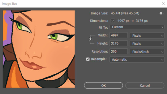
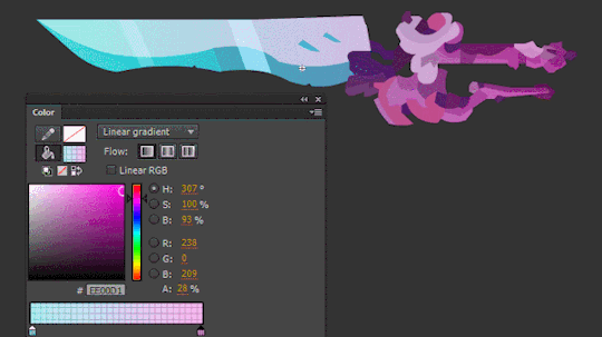
As you can see, smaller details still look a bit crunchy, but they will be okay once you zoom out to view the whole image.
Alternatively, maybe drawing with vectors in CSP would be useful for clean lines?
#I animate with Vector lines as well so they can be adjusted and scaled once drawn#I rarely if ever post the full size drawings and scale them down a bit first - now more so thanks to the rampant ai theft#personal#text#I would love to draw on canvases larger than 5000px and very rarely I have to but PS struggles....
507 notes
·
View notes
Text
‘Talking Heads’ — Lip Synch Workshop
To expand on the rotoscope animation of Mo Farah, this workshop will look at the technique of ‘rigged’ animation. Rigged animation consists usually of characters made up of rigged parts which can all be edited individually. To start with, I explored a simple rigged animation using different mouth poses to imply speech which will then be synchronised to some audio to make it even more life-like. However, this technique can be applied to limitless amounts of things. Mainly with characters, their body parts can similarly be moved gradually to imply movement; it isn’t exclusive to the mouth animation I produced.
Process
The first task was to gather an audio clip of someone speaking about happiness. There was no real limitation to this, as long as it went along with the themes of the brief it would be a suitable thing to sync to. My audio clip was from a friend talking about how music brings him happiness. Subsequently, I used this to inspire the design of my character.
The animation process is usually broken down into two sub-processes. Creating the characters/environments/assets. Then making everything come to life through movement. The first part I was familiar with due to the numerous workshops practising character design I have done in the past. I started with sketching some rough ideas first, trying not to take a long time as the main focus of this workshop should be the animation stage. To match with the idea of music, I wanted the face to feature some headphones which also helped give the character a unique aspect. Once I had an idea I was happy with after 2 or 3 tries, I sketched a more finalised version thinking about how to simplify the face into as fewer assets as possible. This was only because if I wanted to expand on the animation by moving more parts it may get too complicated to understand for me if I had a lot of detail present. Animators will rarely draw detailed, complex characters because the workload goes up exponentially due to how many times they will have to redraw the same character. Keeping it simple means you can get much easier results faster.
Afterwards was the vectoring and rigging stage. I used Illustrator to visualise my sketch into a more refined character by restricting it to just simple shapes and line work. To rig the mouth, I had to create multiple poses which would correspond to all the sounds the mouth would make. The idea here was to make each mouth pose as close to each other as possible in terms of position/scale so when it is played back as a sequence there are no noticeable discrepancies.

Once I had all of the assets ready, I then started to synchronise the visibility of the lips with the audio clip. To do this, I used After Effects and put the voice on an audio layer, with the face layer and mouth poses both on top of this. To rig the mouth, I cropped the duration of the layers to only show when each sound is being said.
youtube
Extension
To extend this workshop, I wanted to experiment with combining previous skills I have learnt in animation with those that I have learnt in this one. To do so, I used the same principals of the rigged animation, but used keyframes to blend all of the poses together, before adding movement to the teeth and lips. To do this, I created keyframes for the lips which were made out of paths. This meant that between each key frame it would blend the two path shapes together to create a smooth transition between them. Because I had already placed the right mouth poses at the right time and had already synced the mouth and the voice clip, the process of blending the lips together was easy to do.

After I keyframed the paths of the lips in synch with the audio, the next step was to add the teeth and tongue. Because they had to remain inside the mouth, I did this by creating an ‘Alpha Matte’. This just meant that when I animated the teeth and tongue in a separate pre-composition, they were only visible inside the path of the mouth. To animate these parts, I used the original sheet of lip poses as my reference and simply added keyframes between their two positions (inside and outside the mouth). This then gave the illusion that they were moving inside the mouth separate from the lips, which is how the mouth would move in reality.
Lastly, to take advantage of the pre-composition feature in After Effects, I added some secondary animation to the eyebrows, glasses, eyes, eyelids and the shadow. I was able to do this because of the ability to animate one feature at a time. Whereas with the GIF timeline/video timeline in Photoshop (the programme I used for the ‘Runners’ workshop, although being more efficient for simple rigged animation, doesn’t allow me to focus on one feature at once. In Photoshop, making once adjustment to a layer will impact the rest of the layers; in After Effects, this won't happen.
youtube
Looking Back
In comparison to the Mo Farah Rotoscope animation, I preferred the more freedom I had during this workshop. From the initial designing factor of the character, to where I took the movement of each part, it was beneficial to expand on the fundamentals of moving image from Eadweard Muybridge’s work to a more modern outlook on animation. Rotoscoping is an easier technique to make something visually accurate as it just requires you to sketch over an already established subject. With rigged animation, it is necessary to not only think about the design of the character but also how it is built up in preparation for the animation stage. The “rigging” needs to be considered so the animation stage doesn’t become over-complicated with trying to make shapes move which weren't prepared to; I encountered this with my own outcome with the eyes. For the extension task, I made the eyes move which meant I had to separate the eye colours from the eye blacks so they could be moved separately. This is an example of how Rotoscoping can be a simpler process, but at the same time more time-consuming.
Moving Forward
Reflecting on this workshop, I feel like it was a success in terms of developing an idea and expanding my skillset by combining what I already know with a workshop. Learning about the earliest methods of motion graphics from the work of Eadweard Muybridge strengthened my knowledge of how to make things look convincing as well as providing another option for a method I could use. In the future I aim to use After Effects and especially the pre-composition feature to make more refined animations, at the same time as implementing other processes like I did in this workshop. Even if it may be subtly like adding texture from analogue processes. This is something I want to attempt moving on - using previous workshops which use a mixture of analogue and digital processes but using animation on top of all of this.
0 notes
Text
Week 8 - Kinetic Typography
This week we were given the task to research kinetic typography and then create some of our own, from a short video from a movie or television show.
Kinetic typography is the name we give moving text, its an animation process in which you mix both movement and text together to convey a message. The text can end up appearing in a gradual manner in time with the audio files, it can stimulate certain emotions that may not occur the same way if the text was still.
Here is an example of kinetic typography used well:
youtube
FIG SEVENTY SEVEN
We were then given the task to create our own kinetic typography video, though it wasn’t to be all that long, around 10 seconds at most. I decided to use a clip from the new Netflix show, ‘Chilling Adventures Of Sabrina’, choosing this clip was easy, all the words said are noticeably pronounced making it easier to sync up text to the audio.
youtube
FIG SEVENTY EIGHT
To create my kinetic typography I did it in After Effects, and tried my best to follow a tutorial on YouTube by Avnish Parker. In After Effects I created a composition with dimensions of 1920x1080 with 60fps, which in the long run will allow for a much smoother outcome after adding movement to my text. I also adjusted the length of the clip that I was going to use, so it was only focused on the key part of the audio.

FIG SEVENTY NINE
The first thing I had to do was create a solid background colour for the text, and choose a font I felt worked with the overall aesthetic of The Chilling Adventures Of Sabrina. For the background I ended up choosing a deep red colour from one of the posters for the show, as for the text I chose the font ‘Gloucester MT Extra Condensed’ and made it a shade of yellow that also featured in the poster. I then typed out each of the words separately and timed them against the audio by opening up the waveform, this prepared the text for animation. I made sure to line up the text by increasing or decreasing them in size, to create a strong variation in the arrangement of words.
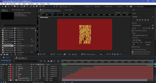
FIG EIGHTY
For the words ‘Sabrina Spellman’ there is a clear break in how they’re said, so I duplicated these layers meaning the position and size is the exact same. I then trimmed them to be in time with the audio and deleted the letters that weren’t needed from the first two versions of words.

FIG EIGHTY ONE

FIG EIGHTY TWO
To make the movement process for my text so much easier I created a Null Object and put it above all of my text layers, then renamed it ‘Animation’. I then made all of the text layers and the null object 3D, after doing this I parented all of my text layers to the null object.

FIG EIGHTY THREE
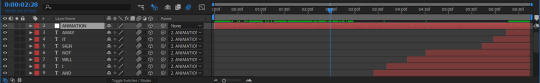
FIG EIGHTY FOUR
Inside the Null Object I began inserting key-frames to animate the next, working on scale and position. To make sure things stayed consistent through the animation process I tried my best to round off each of the numbers, sizing up and evenly each time. Another thing I made sure to do was add motion blur to each of the layers creating a much smoother effect overall, this was then increased even further by selecting all of my key-frames and choosing the easy ease option.
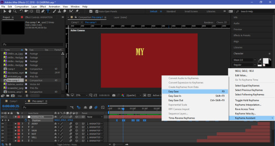
FIG EIGHTY FIVE
The next step was to in a way flatten the layer, to do this I simply selected all of the layers expect the background layer and pre-composed them, turning several layers into one.

FIG EIGHTY SIX
I then moved on to customising my typography, I started by firstly creating an adjustment layer which I applied a vignette to, this created a more defined and shadowed appearance.
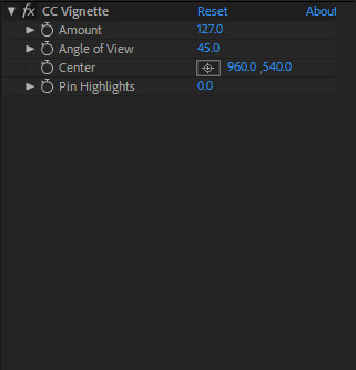
FIG EIGHTY SEVEN
After doing this it made me want to apply shadows to my typography. I started by applying a drop shadow to the pre-comp and made it a solid black, I also included an inner shadow to help bring even further definition.

FIG EIGHTY EIGHT

FIG EIGHTY NINE
The last thing I did to my text was add a 4 colour gradient, with the first 3 colours being the strong yellow colour and the last being the strong red of the background creating a smooth yet subtle fade.

FIG NINETY

FIG NINETY ONE
Once I was happy with my typography I wanted to bring something else to my design, so I found an image of Sabrina from the show and traced it out as a vector image in Illustrator and imported it into After Effects. I wanted to have it appear as she says ‘Sabrina Spellman’, I did this by simply re-positioned the anchor near the bottom of the vector and applied some rotation key-frames to create the illusion of Sabrina swinging in. Similarly to the key-frames of my typography I easy eased them and added motion blur to create a much smoother effect. Another thing I did to keep things consistent was apply a drop shadow to to the vector, but rather than make it black I made it yellow to compliment the typography.

FIG NINETY TWO
Finally I wanted to have my typography loop around, as this will stop the video from seeming as though it just cuts off awfully abruptly. I started by duplicating the necessary layers and upped the composition length, to the visible layers I applied motion tile and created a new adjustment layer, to this layer I added a distort layer called transform.
In the position option of this effect I began making key-frames, 19 frames before the end of first clip I added the first key-frame, the second was then inserted just before the end of the first clip, the third was then inserted at the very beginning of the second clip and the last was inserted 19 frames in. I changed the position of the second key-frame to 1925 and changed the position of the third key-frame to 2.0. After doing this I selected all four of the key-frames and applied easy ease to them, creating a smooth slide transition and of course I made sure to apply motion blur to this to make it so much smoother.

FIG NINETY THREE
This is the final outcome of my video:
youtube
FIG NINETY FOUR
1 note
·
View note
Text
Recent listening—
John Zorn, Naked City (1989)
Reserve judgement till after you’ve heard the likes of “A Shot In The Dark” or “You Will Be Shot” (detect a theme?) for in these Lynchian juxtapositions of the mundane and the visceral, Zorn and co-conspirators laugh in all the faces of the jazz purists, art music graduates, avant-garde cultists—compartmentalisers or cataloguers or labellers, basically. The madness was always there. Zorn was only woke enough to listen to the wind and precipitate what she betrayed of her lover’s broken heart, or hearts: New York, L.A., Chicago, either/or, doesn’t matter, once past a critical mass all tend to the same limit, the wind’s seen ‘em all and they’re all the same. Naked City’s a portrait of order gone to anarchy. Whatever identity the “Latin Quarter” once had is here presented as a frenetic collage of whims; predatory, music liable to combust at any given moment. Likewise “Siagon Pickup” for an oriental equivalent. But sometimes the omens are bad enough that you can anticipate the storm, and even enjoy it, revel in it when it comes. Like on “Reanimator” where Zorn’s freakout heralds some insane climax that’s euphoric for the awakened. And please don’t miss that it’s all awfully hilarious to them as they feel and know that these stoic truths are lost on those yet to accept that all’s gone to shit, yes, even in your ivory towers, your vaults and penthouses and corporation headquarters; there its only letting itself take a bit longer to be known, but chaos’ll come, so you might as well wise up and enjoy it.
Death Grips, The Money Store (2012)
Rather a lot to take in upon first hearing. Immediately plainly a refinement of the aesthetic put forth on Exmilitary but now with an entire studio to run around in these kids have wrought havoc on Mr. and Mrs. White’s 8-track ideal—couldn’t come up with a more fitting antithesis to De Stijl (and Mondrian’s, too) if you let the industry wallow another decade. So why’s this defunct Detroit duo in the mind?—cos where are the guitars, man? Every beat’s packed to near bursting with all manner of production craftsmanships (or gimmickries if you see it that way), MC Ride’s tripping bars overlaid—too much matter, really, to be dealt with on the first wave. But you appreciate the covenant this sonic assault bespeaks—this hip-hop New Complexity has room only to deepen from here. So steep in it, and by about round 3 or 4 (depending on how acute your lobes are) you’ll have undergone some sort of desensitisation to this violence in noise—and now you’re in a place to prophesy. Despite Ride’s barely discernible delivery (except on the eponymous hooks to nearly all 13) the ‘point’ of it all somehow gets itself across—it is, unlike the music itself, not very complex, and mainly involves embarrassing amounts of non-specifically directed anger. Dare I say it, there’s no filler on this, it’s a wild enjoyable ride and a happy side-effect to the maximalist production is there’ll always be something to tickle the ear. And when the hooks do come its a righteous clarifying of the chaos that would eventually get old if it stood alone. Plus, theorists can invoke an unholy marriage by ascribing some mutant Bartókian arch form: “Get Got” and “Hacker” as symmetrical sandwiching allegros, “Double Helix” as Nachtmusik?
Ornette Coleman, The Shape of Jazz to Come (1959)
If you’re hearing these albums in the same order I did you’ll get the same shock upon flicking on what you expect to be Coleman’s near-incomprehensible emancipated bebop and instead hearing a tune that’s actually perfectly singable, and moreover, one that you actually know—how’s that? Must be covering some standard which has somehow osmosed itself into your consciousness but—look it up, in fact its a Coleman original! And so where have you heard it before? Ah: Zorn. It seems then that those slurring drunkard articulations on the head to “Lonely Woman” embodied one of the few Coleman melodies (if not the only) that stuck itself to the underbelly of the hard bop canon—shape of jazz to come, indeed. But it wasn’t so much the heads that would (or were, at least, intended to) mould future generations—rather what lay in between: the emancipation of melody, yes, forget keys, forget harmonic structure, and while you’re at it throw your modal jazz out the window. I’ve always felt ‘harmolodics’ to be a poor term because really it ought to be just melody, that element of music which Coleman raised to the highest pedestal; melody alone, melody a priori. But as a pseudo-theoretic buzzword it does just fine.
John Coltrane, Offering: Live at Temple University (1966)
First thing you notice is Coltrane’s uncomfortably, blatantly in the fore. There’s a need to turn it up so you can make out the other activity and by the time you’ve done so Trane’s tenor’ll be blaring out so loud it’s like he’s right by you. But the mixing seems to get more favourable as the numbers progress—or maybe you just adjust. Yes, revisiting, he’s up in your grill but not to intimidate. He’s there to send a very personal message. This was, after all, his penultimate live recording before he quit the grid in July of ‘67. He was getting close to something, and to tell it, he’s gotta get close to you. In the old quartet he might’ve had trouble getting so spiritual. You get the feeling that the mystic tendencies were more at home in this more familial second ensemble. There’s a communion of sorts. And technically they’re equally fine: Alice takes up right where McCoy Tyner left off and actually on her solos she’s more in line with her husband’s ‘sheets’ than her predecessor, part of the reason why the closer on this has replaced what used to be my favourite “My Favorite Things”: Belgium ‘65, check it here. And this is no mean feat as Tyner’s comping/the extended solo on that one’s where quartal harmony came of age, or at least in my experience. The opening to the Offering take’s also a real rarity: double bass goes at taut catgut like anything but cool. We’ve heard with what’s now alarming regularity the rhythm section’s other two rip loose free-form and its high time the other essential’s had a stake in the fun. But now let’s discuss what assures Live at Temple a place in legend. Drop in somewhere about halfway through “Leo”. Trane’s just finished up screaming outta his tenor. Rashied Ali’s going at it now, wild thing on the kit like a hurricane, whirling, whirling, an Almighty gnashing of teeth on calf hide for six or so minutes when all a sudden Trane comes—or is it Pharaoh?—some fella a-moanin’ like a lunatic at the rapture; Obeah Man, elder. Some sole black voice monophonic, like plainchant only infinitely more ancient. What, or whom, are they invoking? Seems they’re their own demons—that, or they’re oracles, come to preach the word in sonic semiotic, purveyors of the sound and the fury.
Food For Animals, Belly (2008)
These D.C. fellas put out a remarkably consistent aesthetic and with more personality than you might expect from hip-hop in the industrial vein. That is, what you might expect is: An incoherent, arbitrary mish-mash of overvolted sawtooths, saturated found noise, and other cheap effects; at heart no more than a glorified dubstep. That’s where Christgau was coming from with Death Grips as “Skrillex-as-Unabomber or Skrillex-sans-fun”. But this, like Hill’s trio, is undeserving of such scoffing critique. Any incoherence (and sure, there’s plenty) is but part of a higher level narrative that itself is coherent. Hear it like timbre composition—argument between textures drives the musical conflict. Timbre variation dictates form. And sure, the jargon’s a little dry so let’s talk application: lyrically “Belly Kids” retells the ubiquitous suburbian nostalgia that we also found on the Arcade Fire’s Grammy laureate. As words cast mind’s eye far back, music evokes some sort of youth decay in reverse; the same motion but in sonic terms. The opening’s the hardest the beats ever get on this. Only one direction to go from there. So we ease up and ease up, harshness tempering at each fresh verse, vector very clear, then arrival at the final lines, delivered nude, final lines and the final element: the word. And you know them because they’re self-same to those that were spoken in the apocalyptic beginning. Brahms would be proud. A similar clarification but more on the scale of the Tristan resolution occurs between “Maryland Slang” and “Tween Fantasy” in which the former’s verse is resurrected (Mahler would be proud) before the latter’s velvet shimmering manifold, a thousand tiny chimes in a gentle breeze. And there are many more gems to be found in this urban gizzard (hints: “Shhhy” sample, preprise/main event) but I’ve written enough already.
1 note
·
View note
Text
we were given the task to take another roald dahl quote and animate it with both words and imagery.
First I went onto a website with lots of quotes from different books of his and started reading them. I was looking for quotes that stand out and use words that I can put imagery too. I Ended up going with a quote from the twits. This quote didn't have a massive amount of imagery but I felt like I could take the words within it and be able to fit some visual elements to it.
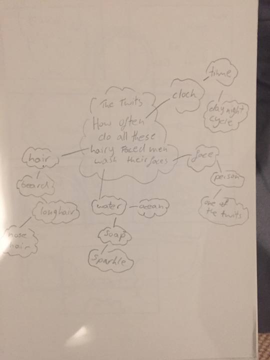
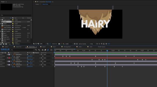
The quote by the twits was “How often do all these hairy faced men wash their faces”
I then created a small mind map where I took the words in the quote and I tried to think of some imagery I could relate to the words and how I would turn them into assets in illustrator to then be animated in after affects.
Here is my mind map.
Here is my story board:
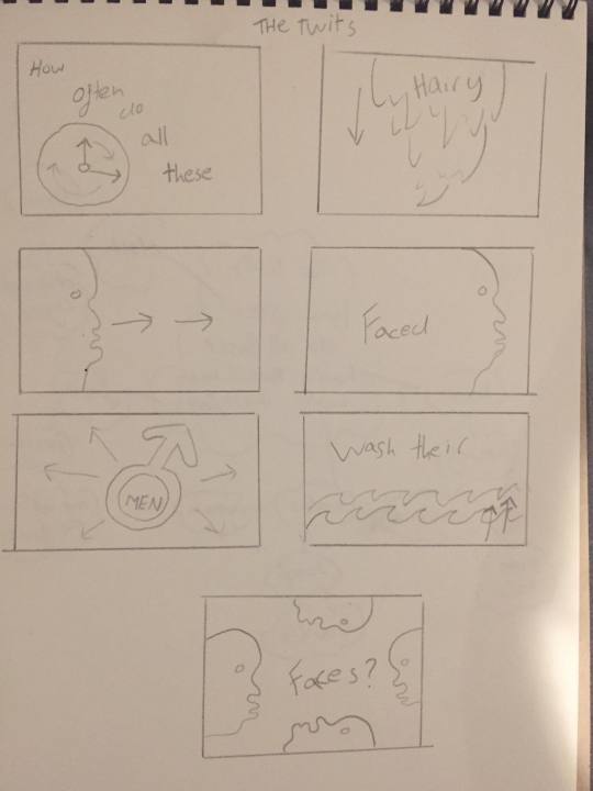
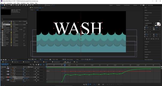
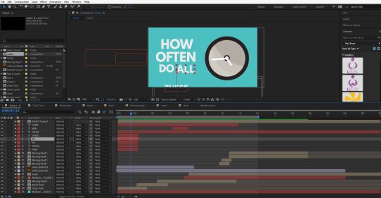
I then decided which imagery I wanted to use that related to the words and started drawing out my animation. For the first five words which are “how often do all these” I wanted them to come on screen and a clock will come on screen with the clock hands turning because the words are talking about the concept of time. For the next animation it was for the word “Hairy” and for this one I wanted a beard to drop down but I wanted separate sections of the beard to flop down and then the word flops down with it. The next word that I wanted to have a separate illustrator design for is “Faced”, the Idea for this word is that A side profile of a face swooshes on the stage on the left and then swooshes off to the right and whilst it moves the background color changes to the color of the face design. The next word is men and for this I thought I would just have the symbol for male and have it come on screen and expand with the word men in it which would also follow similar movements/animations. The next word was wash and For this I wanted to animate waves pop up in layers of waves and start moving, the idea of waves dose not relate to the word wash massively but It could do in some ways. The last two words are their and faces and for this I wanted to use the weird looking face I had previously used and duplicate and flip it so there are a few faces coming onto the stage/screen and then the all move across which will fill the screen with one color.
The next thing I did was go into illustrator and make all my assets. My thought process for time management was to plan it out then make all the assets and then animate everything and not to make some assets then animate them then make some more and then animate them. If I want to change something I can always just change things in the illustrator files its just easier this way so I can just put everything at once into after effects and just focus on the animation.
So I went into illustrator and started making all the assets. When your animating things from illustrator in after affects you haft to put each individual thing that you want to make move on separate layers so for example. When I was making the side profile of a face for the word “face” I put most vectors on one layer and the eye ball on another because I wanted to animate the eye ball so it slightly wobbled depending on the movements the rest of the head makes. Another example is for the word “wash” I wanted the waves to pop up as separate wave layers so I put each line of waves on separate layers
I then went into after affects and set up my document and imported the assets I made in illustrator. Because I was going to be animating lots of things and wanted to make them move at the same time I used precomposed layers so everything didn't get messy. So I did all the main animation in the precomposed layers and then added them all into one main final composition to bring everything together.
I tried to animate everything word by word going off the story board I had made. For example for the word hairy I wanted a beard to drop down in separate beard layers and then the word hairy also falls down behind one of the beard layers so I animated the beard dropping down in a separate composition and I had three sections of beard so I had three beard layers because that is how I saved it in illustrator, so using position key frames I made each beard layer drop down one after another and then I had the word drop down behind one of the beard layers so it falls into view from behind a beard layer, this was done by creating the word with the text tool and positioning the layer bellow the top beard layer, I then also used position key frames to make it move down. When animating the elements drop down I thought about physics and how they would react so when they drop down they bounce once or twice each bounce getting smaller until it stops moving making it look like the (beard and word) has some weight to it and in terms of the beard its animated so it stops falling down as if it was attached to someones face.
I spent a lot of time getting the timing right so I made sure all the key frames were evenly placed and making the motions within the animation look smooth and not out of time or off, I added easy ease to the key frames to make the movements look more realistic and smooth.
Some times I had finished animating a section of the animation and had added easy ease but the timing was off and not how I wanted so I went into the graph editor were I could get a more detailed closer look at how my key frames were working all together and In the graph editor I could also change everything like I could in the transform options.
For example in on section of the animation I animated the word “Wash” and it dropped down and landed in the waves and I tried to make it look like it was bobbing up and down and then it would sink but my animations timing didn't seem right and as the word bobbed and sank it didn't look accurate or realistic and I couldn't fix it by adjusting my key frames in the timeline so I went into the graph editor and moved key frames slightly to give me a smoother better looking animation compared to what I had.
When I was adding all the words and animating them I used lots of different effects like scale opacity and position and I also tried to give them personality as they acted in the environment so when the word rushed onto the screen I made it wobble because it stopped so quick, I also added motion blur to most things in the animation which I thought made quick movements look better. When I was adding the text to my animation which I did last, I laid out the words in order in my main composition rather than having them in separate compositions and precomposing the layers but for the words that I wanted to interact with the illustrator graphics like the word wash sinking into the water I added the word into that separate composition rather than the main one.

When I created the final animation I took all the separate animations and added them into the final composition and then I just duplicated certain graphics and positioned everything how I wanted and added the text that wasn't already added in the separate competitions.
Here is my final animation:
youtube
What was your final idea?
The final idea was to simply represent the words of the quote I picked using imagery and graphics. So in a part of the quote it says “How often do all these”, these few words relate to the concept of time so I thought I could have a turning clock to represent that section of the quote. I also wanted the words and graphics to act and relate to what they were so for the word washed I made a wave graphic and instead of the waves just popping up they move left to right like a wave might the word “wave interacts with the graphic and bobs up and down in the waves. I also wanted to do small details so for the word “faced” a face quickly appears and because the movement is so quick the faces eyeball wobbles and almost hast to catch up with the rest of the body. When picking the quote I also had to make sure that the words contained lots of imagery or words that I would get imagery out of and create graphics in illustrator for.
How did you arrive at this idea?
I did a mind map and took the words from the quote and looked at things that related to them and then picked the ones I thought I could animate and contained good visual elements. I then created a story board where I planed out my animation and drew simple sketches of the graphics I would create in illustrator.
What inspired you?
I wasn't really inspired by anything particular or was trying to implicate or recreate a certain style as I have only done animation a few times so i am just working and learning things out about the software for example this is the first time I made assets in illustrator and then animated them in after affects which I thought was rather handy.
What went well during this final production stage?
I think everything came together well as I put all the animation into one final composition, also I tried to make my illustrator assets minimal and not to complicated so I could put everything on separate layers so each layer/section would be ready to animate in after affects and I think the word animations went reasonably well and how I expected. Also the animation came out as planed on my story board so I didn't get massively stuck anywhere.
What issues did you encounter along the way?
There was one time where I had made a text animation in the main final composition and then I realized that It was not placed where I wanted it and could move it with out it messing up the whole animation.
How did you overcome these issues?
I simply Took the text animation and precomposed the layers and then deleted the old animation and dragged in the precomposed layer which allowed me to place the word animation wherever I wanted without destroying the original movements of the text.
What have you learnt during this project?
I have learnt how to create assets in illustrator and then bring them into after affects and animate them. I also learnt about the graph editor and I discoverer the simple motion blur button.
What do you like about your work?
I Think the animation looks fun and busy and theirs lots going on its not to striped back. I also like How I made transitions using my illustrator assets to help change the background color or clear the stage so more things can appear.
What don’t you like about your work?
I think now that I look back at it the timing on some of the animations is still slightly off also some of the words appear quickly and others appear a lot later on so there is not a smooth flow of text coming on and off the screen making the quote a little hard to read without getting confused so I could of sped sections up to make words appear quicker but I didn't really want to speed up or slow down the illustrator assets as some of the words movements interact with the illustrator assets.
0 notes
Text
Typodermic’s Raymond Larabie Talks Type, Technology & Science Fiction
[Call for Entries: The International Design Awards]
Raymond Larabie, known for creating ubiquitous futuristic and sci-fi fonts, has been involved with type since he “was about five years old” and was using type at that early age as well. His experience with typography, especially when it came to the hands-on-use of Letraset, helped him understand how typefaces looked, and how typography worked. By the mid-1980s he edited fonts and made his own fonts on his first computer, doing everything on a TRS-80 in bitmap. He eventually graduated to the Commodore Amiga.
Neuropol was created in 1997 and was used for the logo for the Torino Olympics in 2006. It’s been updated and expanded a lot over the years and also comes in a more buttoned up X style. The truncated arms were inspired by a malfunctioning vectorbeam screen on an old Tempest arcade machine.
Larabie earned a Classical Animation Diploma at Sheridan College in Oakville, and went on to work as an art director in the video game business working on games for the Nintendo Entertainment System (NES) and Super NES (SNES), as well as the Playstation and Playstation 2. During that time, he maintained his love for type and type design, and made free fonts, releasing them on the Ray Larabie Freeware Typeface of the Week website. This soon became Larabie Fonts. In 2001, he started a commercial font venture, and quit his job two years later to work on fonts full-time.
Influenced by Letraset at age five, Larabie says his own Letraset sheets got “used up decades ago,” in the mid-1980s. “I wonder if younger readers realize that fonts were once something that you’d buy and they would get used up. These are replacement copies of catalogs because I wore the originals to shreds. I don’t know why I was so obsessed with this stuff as a kid.” Photo by Raymond Larabie
Inspired by the Pinto Flare typeface, Larabie created his own groovy version called Pricedown. You might also recognize it from Grand Theft Auto‘s wordmark. “I worked for Rockstar at the time but they weren’t aware that they were using a font which was created by one of their employees before the company existed.”
Larabie moved to Japan in 2008, where he operates Typodermic Fonts. Larabie provided a behind the scenes look at his design process for HOW readers, and answered questions about his work and his influences.
How Raymond Works
Step 1
“When starting a new typeface, my first step is to draw a few heavy sample characters to establish dimensions and sidebearings.”
Step 2
“Once I’ve got a few sample characters for the heaviest weight, I add a weight axis and design a light version of those characters. This way I can test interpolation, alter the x-height, sidebearings and width, then note the scale percentages—afterwards, I delete the light test characters. I’m using a uniform line width since this will be an interpolation target which will be thrown away later. I usually use an interpolation of between 10 to 20% of the heaviest weight as my extra-light so it retains some of flavor of the heavy weight.”
Step 3
“One by one, I add completed heavy characters, making sure each one harmonizes with the existing characters. I don’t draw them in alphabetical order but I try not to leave the hard letters like a and e for last. The interplay between f,r,t,z is particularly difficult so they should be drawn all at the same time to make sure they work together. There’s no separate spacing phase—I’m adjusting and thoroughly testing the spacing for each character as I go.”
Step 4
“Next I create composite accented characters and finish the rest of the character set. I use a set of reduced height accents for the capital letters and more generous ones for the lowercase.”
Step 5
“After lots of testing and minor adjustments, I’ll create kerning classes and create all the kerning pairs. It’s important to spend a lot of time setting up the kerning classes. Not only does it make the kerning process much faster but it reduces the possibility of error and omission.”
Step 6
“Now it’s time to create the light interpolation weight. I’ll use the notes I made earlier to make everything narrower, decrease the x-height and pad the sidebearings. I’ll also create a quick, disposable outline version to use as a guide in the background.”
Step 7
“Next I’ll complete all the light characters. I need to adjust the sidebearings on thin characters like lowercase L, I, 1 etc. The accents no longer line up so they all need adjustment. The kerning will need to be done all over again. Some pairs won’t need adjusting but they’ll all need to be checked.”
Step 8
“Next, I experiment with the interpolation and make adjustments to refine the middle weights—it’s a bit like pulling strings. You can see how I need to cut away a piece of the Q so the tail goes through only on the lighter weights. This stage can involve a lot of manual cleanup and vector surgery. Now I decide which weights I’m going to export. Then I fill in the style names, do some autohinting, more testing, more adjustments and I’m done.”
Q&A with Raymond
Q. What inspired you to create your own type design foundry?
I like to call it a font company. Foundry makes it sound like I work with molten metal.
What’s behind the name? What does Typodermic mean, and why did you go with that name?
During the indie font gold rush near the turn of the millennium, font puns were in short supply so I jumped at that one as soon as I thought of it. I used it as a font name first and later a company name. “For font junkies” is my slogan but I thought of that much later.
What software do you use for finalizing, editing, and producing the font files, and why do you use it?
I use FontLab Studio because it’s been the dominant type design tool in Windows for almost two decades. On a Mac there are several other viable options but in Windows, if you want to create interpolated typefaces, it’s the only way to go.
What prior font software did you use, before the tools you currently use?
I used Fontographer but then stopped using it because it hadn’t been updated for close to a decade. I miss the vector drawing in that one but without interpolation, it’s a no-go.
When you started out as a type designer, who or what motivated you to get into type design, and why?
It was the emergence of type design tools. I was making fonts as soon as I got my first computer, a TRS-80 in the early 80s. But there was only so much you could do with those old bitmap editors. The urge was still there but dormant until I got my hands on Fontographer in 1996.
Larabie calls Conthrax “a techno typeface that’s designed to hide in the background” and he strived to make it look technological without being loud and flashy.
The average person who looks at your type catalog might see a strong science fiction influence. How has sci-fi shaped your typographic tastes, and the type designs you make?
When I started in the late 1990s that category was underserved. You’d see that style in logo designs but not much as typefaces. I think now, techno is considered a legitimate category but not long ago, that style of type was passed off as Microgramma or Bank Gothic clones. I do love sci-fi and video games and that’s definitely an influence. The choice of going square is often an attempt to make type that harmonizes with our environment. We live in a high-tech, rectilinear world. When I started seeing my techno fonts used on consumer electronics, it guided me more towards those sorts of projects.
Typography has a prominent place in many science fiction comic books, films, and cartoons. What movies or comic books get the typography right, in your opinion, and why?
Sci-fi type like in Robocop (1988), Star Trek the Next Generation (STNG), or Demolition Man were amped up versions of popular type styles in the times they were made. The STNG typeface feels like a late 1980s software company logo—perfect for the times. Sci-fi type often fails when it regurgitates old sci-fi ideas. We’ve seen decades of the Blade Runner line gap trick. It was a stark vision of the future in 1982 but maybe we should be extrapolating the visuals of today to develop new visions of the future.
Something that constantly annoys me is the use of Bank Gothic to imply “futuristic.” Bank Gothic was designed in 1930 and was based on a popular sign painting style from around 1900. It was the kind of thing you’d see on rail cars, gravestones, stock certificates etc. When I see it, it looks very old-fashioned to me so it’s a bit like seeing a Model-T Ford in a sci-fi future. Famous movie examples: Moon, Terra Nova, Edge of Tomorrow, Battlestar Galactica, Hunger Games, Falling Skies, Jumper and several Stargates. I think Bank Gothic is often chosen because it’s a square font that a lot of people already have on their computer. It’s not a bad font by any means but it’s very American, circa 1900 to me.
youtube
When it comes to your process, do you begin working directly on paper during the initial design phases, or do you go right to the computer, and what benefit does that method of working provide?
I usually don’t use paper at all. I jot down notes as I’m working such as sidebearing numbers and accent offsets. I feel like the design of each glyph should be as open as possible so they can be formed by their neighbors. If I decide what glyphs are going to look like ahead of time, I can paint myself into a corner. A far more useful visual aid is to keep a reference photo on my desktop wallpaper or pinned to my cork board—usually not of anything typographical but more of a thematic image. For one job, I needed to create a tough, military looking typeface so I pinned a picture of a Humvee to my board. To me, that’s more useful than sketching out the alphabet. Even if I don’t use visual reference, there’s some kind of doctrine I can use to help me make decisions. Otherwise, I tend to smooth the edges down until the typeface has no character.
You offer a lot of free fonts, as well as fonts that cost money. Why so many fonts for free?
It’s promotional. Those free font sites get so much traffic. I’ve had over 60 million downloads from DaFont alone. The free fonts can lead to sales of web, app and eBook licenses or other weights like heavy or ultra-light.
What are your best-selling paid fonts?
Korataki is a techno font commissioned for the Mass Effect game series that’s always done really well. Meloriac is mixed case, extremely bold geometric sans which has been a steady seller. Conthrax is a more recent success. It’s a squarish, soft, ultramodern deliberately sedate.
What are your most frequently downloaded free fonts?
Coolvetica. It’s downloaded almost twice as much as the next one down the list. Then there’s Steelfish. That was a bit of a dud until I spruced it up a few years ago. I’ve been constantly going over the old ones and freshening them up or rebuilding from scratch. Then Budmo, Neuropol and Pricedown.
The Budmo typeface, influenced by marquee signs.
What type designers, foundries, or visual culture do you look at for inspiration these days, and why do you look at that work?
I spend a lot of time on Pinterest. I try to avoid looking at design blogs, or anything tagged as typography. I feel like it’s a bit like visual dieting. It’s not just what I look at, it’s what I don’t look at. And more than ever, as a species, we’re all feeding from the same visual trough. An example of a recent tangent was diving deep into the world of reel-to-reel tape decks and obsolete audio cassette formats, strange auto-reverse mechanisms. If you don’t swerve, you’ll end up making the same typeface someone else already made.
In addition to offering your fonts through your own site, they can be found at fonts.com as well as Fontspring and other sites. What advice would you have for the budding type designer, who wants to get their fonts picked up by those distributors?
When you’re developing your typeface, you should try to imagine the kind of customer that’s going to purchase it. Give it some kind of reason to exist. It’s not enough to make an attractive or interesting typeface. It’s fine if you want to get experimental but those sites aren’t the place for that sort of thing. They’re like department stores rather than galleries. For example, if you’re making a font that looks like neon lights, you can look at what’s available and think about the kind of customer who might need one. What kind of projects would they use it for? Is there something missing in the current selection of neon light fonts?
Korataki was commissioned by Bioware for the Mass Effect game series.
Some of your influences, such as the TRS-80 and 1980s pop culture, are also found in Ernest Cline’s novel Ready Player One, which Steven Spielberg has made into a feature film. You’ve got such a deep catalog of future-forward and sci-fi fonts. Leading up to Ready Player One’s release, if we see a 1980s renaissance—and especially one with sci-fi and gaming influences from that era—what new creations can we expect to see from Typodermic Fonts?
I think the console games of the 1980s and 1990s have been well fetishized—the aesthetic is well known. Younger generations have developed a visual style based on that type of look but it’s based on a relatively narrow view on games in the 1980s. There’s an aspect of gaming that’s been largely ignored and is in danger of being lost forever: microcomputers. While some people were playing Atari and Nintendo in the living room, the rest of us were at desks, patiently waiting for games to load from cassettes. Those types of games haven’t been popular with collectors and they’re often ignored. Cassettes and floppy disks fail—manuals and packaging get thrown in the trash. Some of the Japanese microcomputers like MSX, NEC PC Series, X-1, FM-7 had specific technical limitations that created their own unique visual style. A lot of the console game franchises we know and love started off on these systems before people played them on their living room game consoles. Many microcomputer games that were released in this era will never be recovered. A few years ago I made Rukyltronic which was a tribute to 1980s UK microcomputers like Beeb and the Speccy. That’s the kind of thing I’ve got my eye out for and it’ll inevitably make its way into my upcoming typeface releases.
Where do you see type design heading in the future?
Typography has a fashion cycle so you’ll see the same kinds of typefaces come and go. But when they cycle back each time, new ideas will be applied and they’ll required upgrading as user expectations keep getting higher. Things like optical scaling which will compensate for the environment. What makes a typeface perform better in small print on a smartwatch is different from what works best on a billboard and it’s not just the weight. In the 1990s, a basic character set with a few accents and stock mathematical symbols was the norm. Typefaces rarely came with more than regular, bold and italics. Now we expect a weight range, more language coverage, cohesive symbols and OpenType features galore. Also, new font technology will allow us to finally produce convincing handwriting. I think some of the innovations required to make Arabic writing work properly will provide us with some interesting tools. Once type designers have access to these tools, who knows what we’ll come up with?
Edited from a series of online and email interviews. Captions for Neuropol, as well as Toxigenesis type design process provided by Raymond Larabie. Check out Typodermic Fonts online and follow Larabie on Twitter and Instagram.
The post Typodermic’s Raymond Larabie Talks Type, Technology & Science Fiction appeared first on HOW Design.
Typodermic’s Raymond Larabie Talks Type, Technology & Science Fiction syndicated post
0 notes
Text
Tutorial: Flash/Animate Game Asset Creation
Whatever gets the job done is a great tool for game asset creation. For quick, stylized art assets for games you’ll find breakdowns for some of the most common tools for this process. Pixel art, digital hand painting texturing, 3D modeling and more are the norm, but I remind students to keep an open mind about discovering new tools and methods for asset creation. My preferred method for 2D illustration is Adobe Flash/Animate. The vector tools are quick, easy to use and sprite-friendly for any output. Additionally, with the advent of Flash/Animate as a common User Interface tool for Indie to AAA games, it can be a good toolset to familiarize yourself with.
Here I will break down my process from concept to completion for a game asset.

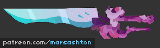
1. It all begins with a sketch. I tend to stick with a gel ink pen for more even lines since I press hard. The focus here is on the general outline of whatever asset you are creating, in this case a rad greatsword, and the general details. Don’t sweat the small stuff when it comes to this. If you’re comfortable with sketching this will come naturally. If not, practice. As you can see from my example I’m not trying to do anything fancy with this. It might as well be a doodle. A rad one of a rad greatsword.
So rad. It has a guard on the hilt, you see that? Sick.

2. Using the Line Tool (Shortcut N) start to trace your reference sketch. Get loosy goosey all you want with this. Overlapping lines are good, and typically more efficient for reasons I’ll explain later (Step 4). The important thing is just getting a solid outline down first so we can block out each part of the asset with flat fill colors. The lines themselves will be removed later.

3. The Selection Tool (Shortcut V) is where your precision is at. Based on your cursor’s location on one of your line segments, you can manipulate the bend of your straight segment, or move the anchor points on the end of each segment. Nifty, eh? Remember to pay attention to the cursor’s current “context mode” so you aren’t moving anchors when you want to add some bump to that line.
4. The next step is using your Paint Bucket Tool (K) to lay down some flat color. Your chosen Color Scheme plays a large role here, though we can fix this at any time thanks to the way Flash/Animate handles these new “fill shapes”. For my scheme I went to Adobe’s Color Wheel and found the appropriately named “sword” color scheme. Find something pre-made, create your own, select a color and Paint Bucket away!
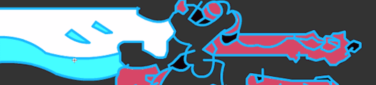
During this process, you may run into some issues like the image above. You sectioned off parts of your outline to lay down different colors and the bucket is filling in more than you asked for. Spill, I call it.
If this happens your Line segments are not closed.
To remedy this, overlapping your lines during Step 2 helps. Alternatively, you can find those "Gaps” that cause Spills by zooming in, reducing your line weight in the properties panel, or grabbing anchors with your Selection Tool and going to town to locate which one isn’t connected. Wiggling anchors will show you how lines are connected and can reveal those Gaps.
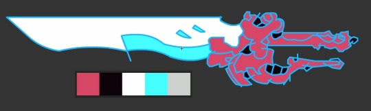
Once your initial colors are placed, start to make any necessary adjustments. My handle and hilt were pink to differentiate some of the initial components to the asset. Now that I fixed the Spills I can explore what is really going on here.

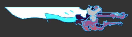
5. Time to get rid of those lines! Either double-click one to select everything it is attached to, or Select All (Ctrl+A) and change your Stroke Color to the crossed out box as shown above.


6. Now that we removed those outline Line segments we can make new ones to define details. They define highlights, shadows and allow you to make quick alterations to the shape. To do so, take a solid chunk of color and try to split it up between a shadowy (cooler) chunk and a highlighted (warm, saturated) chunk. For other details, like nicked edges, runes, torn cloth, whatever, just use your Lines to define new shapes. Think of them like cookie cutters, then fill and/or select and delete to your heart’s content.

Optional. At this point, your asset is done. Depending on the engine you can use lighting to accentuate some of the sprite’s features. Alternatively, you can “bake” some of the lighting down on top of your sprite. I typically use this method, copying the entire set of fill shapes and pasting them on a new layer. Then, I turn that entire selection into a solid fill color. Next...
...we can manipulate the fill as a “linear gradient” or any other type you prefer. By using the Gradient Transform Tool (F) you can manipulate the scale and rotation of the gradient ramp. Coupled with the gradient’s colors and alpha (transparency indicated by that A under RGB as seen above) you get some nifty looking results.
Kinda fixes my haphazard color palette, really.
7. The final step is getting it where it needs to go. For this, I leave the rest up to you. A simple File > Export > Export Image should suffice. For more complicated methods of exporting, like for animations and sprite sheets, stay tuned! I’ll be delivering animation tutorials and more in the near future.
- Mars. Indie dev. Professor. Dad.
#gamedev#indiedev#tutorial#gameart#game art#flash#animate#adobeflash#adobeanimate#animation#game tutorial#stepbystep tutorial
0 notes
Text
REVIEW – Shape Monkey
Plug-ins are a staple of life for After Effects users. For me, at least, I’m always super excited when a new effect (or bundle of effects) is/are released from a company, as it’s always cool to see what boundary these companies are trying to push next. With that being said, there is an exciting new trend, and new boundary being pushed, and those boundaries are from within the application itself, and I’m talking about After Effects scripts. The best way to describe exactly what an AE script is, is exactly the way Adobe describes it in the AE Help Document – “A script is a series of commands that tells an application to perform a series of operations. You can use scripts in most Adobe applications to automate repetitive tasks, perform complex calculations, and even use some functionality not directly exposed through the graphical user interface.” So a script, in the simplest of terms, is a way to get After Effects to do exceptionally complicated tasks relatively easily. That’s where our review comes into play. I was approached by Orrin Zucker, who is the main man behind Shape Monkey, along with his partner Dan Ebberts. What’s important to keep in mind about Orrin and Dan is that they are responsible for a six other “Monkey” scripts, including Motion Monkey, Layer Monkey, Type Monkey, Circus Monkey, Monkey Bars (you knew that one was coming in here), and Monkey Cam. You can buy them a la carte, or as part of the Monkey Suite. Let’s get in and see how you can set up AE to work with Scripts, and what Shape Monkey is going to bring to your compositing toolkit.
AEScripts.com
If you’re looking for the best scripts that you can get for After Effects, AEScripts.com is the place to find them. This is a catalogue of all kinds of different scripts with many of them serving more of a “technical” purpose (one of my favorite scripts is a bridge between Mocha and After Effects called MochaImport+), and some that are just plain creative, and that’s where all the “Monkey” effects fall into the list. Most of them revolve around text or shape animations (except for MonkeyCam), and the download itself for Shape Monkey was a whopping 1.8 mb, so needless to say, the download times will be quick, no matter what connection you have. Now, let’s talk about price.
PRICE
When looking at the price, you have to consider that even though Shape Monkey is not an effect, you need to treat it like one. My thought, when I first saw it, was that Shape Monkey (SM) would come in somewhere around the $99 US mark, so when I saw a price of $89 US, I wasn’t surprised, and it pretty much fell in line with the single effect offerings from companies like Red Giant and Video Copilot.
INSTALLATION
This one’s a little different for new users, as Scripts don’t install like plug-ins do, with an installer. When SM downloads, and you unzip it, you’re going to take the entire folder, and drag it to:
After Effects/Scripts/ScriptUI Panels (MAC)
Or
After Effects/Support Files/Scripts/ScriptUI Panels (Windows)
Once it’s there, the next step is to launch After Effects, as there are a couple of things you’ll need to know, to find and work with SM and scripts in general.
Once AE opens, most people just want to jump in and start animating, but if you head to the “Window” drop down, you’ll see all your available scripts at the bottom of the menu.
If you try to select one of them, you’ll be greeted by this error…..
What this error is telling us is that there is a preference we need to turn on before we can get started. If you head to your General Preferences, you’ll want to select “Allow Scripts to Write Files and Access Network”. Once you do, and you head back to SM in the Windows drop down, the SM Interface will appear.
HOW IT WORKS
Now, before I get rolling with the interface, I want to talk briefly about what SM does, exactly. It gives you the ability to create shape animations in an automated fashion, quickly and easily. These are not effects. What’s going to happen when you work through the SM Interface, and click “Go”, is that After Effects will create shape layers, that will be controlled by standard AE effects added to a 100×100 solid.
After the animation is created, all the shape layers will be “Shy’d” so that the only layer you can see is the Shape Monkey Control layer, which is very handy, because if you end up choosing a large amount of layers, like 30, the last thing you want is your timeline bogged down by all those layers, especially if you have a lot more layers in your project.
After Effects’ work area plays a large role in your shape monkey workflow, which I thought was a very clever workflow design on the developer’s part. By default, SM will create 10 copies of whatever shape you decide you want to use. By setting your AE work area to a specific time, you’re telling SM that you want all of your shapes to trigger their animation in the designated time, and it will uniformly (or as uniformly as possible, based on the amount of time selected) distribute Control Points (AE markers) onto the Control layer. Keep in mind that you’ll need at least one frame available per shape layer that you assign. The completely awesome thing about the Control Points that SM puts into your comp is that you can drag them back and forth down the timeline and adjust shape animations based on where you have the markers!
At this point, it’s important to get in and talk about exactly how SM works, and how you can easily set up a shape animation, and I’m going to start very simple by using only one shape, and you’ll get the idea of how multiple shapes would work from there.
Let’s start out by choosing a shape. What’s very cool about SM is that you can use not only a ton of predefined shapes, but you can also use both After Effects (vector) text or Illustrator vector files, for your layers in SM. For the purpose of what we’re doing, I’m just going to choose a simple triangle.
Now the next three parameters – Duration, Interpolation and Ease Type refer to the animation “IN” of our shape. It’s going to animate in for 30 frames (one second and six frames at 24p), with an Ease Interpolation set to Random with an Ease Type of “Out”. Now, to skip ahead a little, I’m going to change the “Transition – Out” parameter to be “Off”, and then I’m going to hit “Do It” and you can now see what my animation looks like.
Nothing fancy. Simple and straightforward. As you can see the shape animates in, in the desired time, and stays there until the end of my comp, because I turned off the out transition. This is, at it’s most basic, how Shape Monkey works. If I wanted the shape to transition out, I could choose the type of transition (both in and out), from the “TRANSITION” section of the interface, and I’d be all set to go. One thing that I want to point out, and it’s something that, to be honest, I’ve become a bit addicted to. Once you’ve created an animation, and had a chance to take a look at it, you might decide it’s not what you like, or you want to add a few different parameters to it, to spice it up. You can easily hit the “Undo It” button right beside the “Do It” button, to quickly add and remove SM animations to tweak things exactly the way you want them tweaked.
With the basics out of the way, SM is all about options, and there are a ton of them here. The first big choice you have is the type of shapes you want to create. Once you’ve chosen “Triangle”, as an example, you can choose between Fill Only, Stroke Only, Dash Only, Fill & Stroke or Fill & Dash. Then you can choose your own color combination for the different fill options, or choose from over sixty different color swatches that compliment each other, in a simple to use preview window. Don’t know what type of animation you want to use, there are thirty different Animation presets with twenty different effect presets. That’s a lot of choice!
All this is very cool, but you’ve created an animation, and the client loves it, so you now want to keep it in your back pocket for other upcoming projects, can you save these as presets? The answer is yes, you can. There is a “Save” option under the “UTILITIES” section of the SM interface, that will let you reset SM to it’s launch defaults, save your current animation and load saved presets. You can even add motion blur to your animations from here as well. I like the fact that Zucker and Ebberts have thought of SM like a plug-in, and given you almost all the same options you have in that workflow, in the SM workflow as well.
I should point out something that’s pretty important, and that is that if you’ve noticed, all of our animation options have been right dead in the middle of the screen. I haven’t adjusted them. They have animated on (and potentially off), centered. So, how do we tweak these animations, and have them moving from side to side, top to bottom, larger to smaller, etc. That’s where the START and END parameters at the bottom of the SM interface come into place. It’s fairly self explanatory. Assume that, much like I just said, that all the animations are located dead in the middle of the screen. If you would like to adjust the start animations Position, Scale or Rotation, adjust it under the “START” column. For end animation adjustments, adjust them under the END column. Now you can give your animations movement. I’ll be honest. After maybe an hour of working with Shape Monkey, you’ll be able to create complex animations like the one you see below in a matter of seconds.
One thing that I think is very important to mention, as I’m wrapping up this review is that when working with scripts, as opposed to plug-ins, if you’re sending your project to another designer, or to the client, they do NOT need to have the script, in our case Shape Monkey, installed on their machine to retain all your created animations and looks. Scripts are not like plug-ins in that manner. This is what makes them even more powerful, as you don’t need to bake (render out layers that have effects on them, and then re-import them, so the layers are not dependant on those effects anymore) in your effects work. Create how and what you want to, and your clients will see your animations exactly the way you created them.
With all that being said, there is one slightly annoying thing about Shape Monkey, but it has more to do with After Effects, than SM itself. Once you’ve created an animation, and closed the SM interface, when it re-opens, it doesn’t remember the last animation you had set up, so you won’t have the ability to go in and alter animations that SM has created, you will have to start again from scratch, so I suggest that if you’re working in a two monitor environment, keep SM open on your second monitor, so you’ll always know what the last animation you created was.
In the end, Shape Monkey is a super cool animation script that will let you create stunning animations in seconds instead of in hours, the price point is reasonable enough, and the fact that your animations can be sent or shared with anyone running the same version of AE as you, without the need for third party plug-ins makes Shape Monkey a tool you definitely need to check out. You can download a free demo of Shape Monkey at http://aescripts.com/shapemonkey/ .
The post REVIEW – Shape Monkey appeared first on ProVideo Coalition.
First Found At: REVIEW – Shape Monkey
0 notes
Text
Adobe Autopsy
Q1
What are the uses and benefits of using Illustrator? (include an understanding of vector graphics)
Unlike programs using raster graphics, Illustrator is a vector graphics based program which uses mathematic equation to draw it’s shapes and text that allows the graphics created in this program to be scaled to any size without any loss in quality or resolution and It’s mainly used for things such as logos, diagrams, promotional material and cartoons.
It’s files sizes are smaller in comparison to other programs in the adobe creative suite, it has an array of tools and features that allow the user to freely manipulate type by creating outlines from text and easily draw clean lines with the pen and brush tools which make it a very good program to use for both Illustration and typography based posters.
Q2
What are the uses and benefits of using InDesign?
InDesign’s main use is publishing magazines, books, leaflets and anything of the sort as well as digital publications such as e-books, it’s very useful for this kind of work due to it’s tools and features that allow the user to work on mutiple pages at once and the book feature allows the work to be spread out between different people and be assembled later and It’s file size when exported as a PDF is smaller in comparison to other adobe programs which makes it easier to send, share and use.
Q3
What are the uses and benefits of using PhotoShop? (include an understanding of pixels and resolutions)
Photoshop is a raster graphics software which means the images, shapes and text used in it are created using a series of many small pixels in a rectangular grid, due to this if Graphics created in photoshop have a low amount of pixels they can turn out looking low resolution and poor in quality however if an image uses more pixels it will look much clearer. It’s main use is photo editing and manipulation such as fixing the colour or retouching photos however it can also be used for Animation, Architecture, Web Design & Graphic Design Mock Ups.
Q4
What are the limitations of each of the software?
Illustrator - Illustrator is a program used to create artwork, not edit it and because of this Illustartor can be somewhat limited in how much it allows the user to edit thier work compared to programs like photoshop. Due to Illustrator being a vector based program, artwork created in it is often made using simple shapes and therefore creating photo relaistic digital paintings is nearly impossible or at least requires alot of skill and patience.
Photoshop - Since photoshop is raster based and mostly an editing software, creating artwork, though not the impossible or particularly bad can end up looking poor in quality.
InDesign - InDesign is mainly used for laying out existing images and text, therefore actually creating detailed artwork in this program isn’t one of it’s strong points. InDesign links images and artwork by default without actually embedding them, due to this it can be very easy to lose linked files unless the user packages thier work or manually embeds all images and artwork which can result in a large file size.
Q5
Keyboard shortcuts:
Cut – ⌘ X
Copy – ⌘ C
Paste – ⌘ V
Paste in place - Shift ⌘ V
Paste in front - ⌘ F
Type create outlines – Shift ⌘ O
Place in InDesign - ⌘ D
Group - ⌘ G
Ungroup – Shift ⌘ G
Save - ⌘ S
Zoom out – ⌘ -
Zoom in - ⌘ +
Fit in window -
⌘ 0
Undo - ⌘ Z
Select all – ⌘ A
Spellcheck - ⌘ I
What is the spacebar used for?
Enables the Hand Tool so when you click and drag it moves the screen.
What is shift used for?
Many Purposes such as Keeping an images ratio when resizing, creating straight lines with the brush tool and can be used in combination with the undo tool to step backwards.
What is alt used for?
Alt is used for many different tools as the alternate function tool, for example with the cloning tool it is used to select a source point.
What key do you hold down to add more items to your selection?
Hold Shift and click on the items you wish to select.
Q6
Describe how you would create a triangle in Illustrator - simple step by step points
- Click and hold the rectangular shape tool, then select the polygon tool
- Click once with the polygon tool to bring up the edit menu
- In the menu change the amount of sides to 3 and click Ok
- Click and Drag to create a Triangle
Q7
Describe how you would create type on a path and then change the start point and the location of the type?
- Use pen tool to create a path.
- Select the Type on a Path tool and click on the path.
- Type out anything.
- Use two lines on either end of the path to adjust the start and stop points.
- Use the line in the middle to adjust the type’s location.
Q8
What are Pantone colours and how would you find your pantone colours in Illustrator?
Pantone Colours are each specified by a single number and look exactly the same on every screen and will print the same from any printer, pantone colours can be found in Illustrator underneath the regular colours and are indicated by a small circle in the bottom right corner of the icon.
Q9
What is the difference between anchor points and paths?
A path is a line created between two anchor points and the achor points indicate where a path begins, ends or changes direction.
Q10
What is a compound path and when would you need to use it?
Compound paths are when multiple paths/ objects are fused together and act as a grouped object, every path inherets the colour of the backmost path. Compound paths can be used to create a hole in a shape that reveals whatever is in the background.
Q11
What colour mode and image resolution would you use for Print graphics?
You’d use the CMYK Colour Mode and the image resolution standard is 300 ppi
Q12
What colour mode and image resolution would you use for Online graphics?
You’d use the RGB Colour Mode and most would set the resolution to 72 ppi
Q13
What measurement system is used for type? Pt (Point Size)
What size font is 1 inch tall? 72 Pt
What size font is 2 inches tall? 144 Pt
What size font is 1/2 inch tall? 36 Pt
Q14
What does justified mean?
Justified is a kind of text alignment, Justified text is spaced so the left and right sides of the text box both have a straight edge, it works by adding white space in each line so all the lines are the same length.
When would you use it?
It can often be found in publication like magazines and newspapers which use multiple columns of text.
Q15
How do you create an image or graphic with a transparent background?
If the Image/ Graphic has a transparent background, export it as a PNG file to keep its transparency
Q16
What is the best way to select an object/part to isolate it from the background using photoshop?
The best way to isloate part of an image is to use the appropriate selection tool to roughly select the part of the image then go Layer > Layer Selection > Reveal Selection.
Why this way?
Because using a mask dosent delete the hidden part of the layer and you can use the brush tool to refine your selection.
Q17
What is bleed and how can you set it up in InDesign?
The bleed refers to the guides around a page that are used to ensure no unprinted edges occur in the final printed version. It can be set up when opening a new document in the “Bleed & Slug” section of the document set up window or it can be changed later by clicking File > Document Setup.
Q18
What key do you use to select a source point for the clone tool?
Click the Clone tool and hold down Alt to enable the source point selection tool.
Q19
What are the measurements for the following paper sizes A5, A4, A3, A2?
A2 - 420 x 594 mm
A3 - 297 x 240 mm
A4 - 210 x 297 mm
A5 - 148 x 210 mm
Q20
List at least 5 specific things you have learnt during the digital studies module? and how will these benefit you in the future?
1. I’ve learned how to Illustarate in Illustrator using the pen and shape tools, this could be helpful in future if i ever needed to create a logo or icon for a client.
2. I Learned how to manipulate and create fonts using illustrator, this can become helpful in future if i can’t find a good font.
3. I’ve learned a fair bit about how to create publications in InDesign, this will help me in future if a client asks me to lay out a publication for them.
4. I’ve learned how to create swatches in Illustrator, this can help save time when making patterns in future projects.
5. I’ve learned how to improve an images imperfections in photoshop, this could prove helpful in future in case i ever have a project that invloves photography.
0 notes
Text
Typodermic’s Raymond Larabie Talks Type, Technology & Science Fiction
[Call for Entries: The International Design Awards]
Raymond Larabie, known for creating ubiquitous futuristic and sci-fi fonts, has been involved with type since he “was about five years old” and was using type at that early age as well. His experience with typography, especially when it came to the hands-on-use of Letraset, helped him understand how typefaces looked, and how typography worked. By the mid-1980s he edited fonts and made his own fonts on his first computer, doing everything on a TRS-80 in bitmap. He eventually graduated to the Commodore Amiga.
Neuropol was created in 1997 and was used for the logo for the Torino Olympics in 2006. It’s been updated and expanded a lot over the years and also comes in a more buttoned up X style. The truncated arms were inspired by a malfunctioning vectorbeam screen on an old Tempest arcade machine.
Larabie earned a Classical Animation Diploma at Sheridan College in Oakville, and went on to work as an art director in the video game business working on games for the Nintendo Entertainment System (NES) and Super NES (SNES), as well as the Playstation and Playstation 2. During that time, he maintained his love for type and type design, and made free fonts, releasing them on the Ray Larabie Freeware Typeface of the Week website. This soon became Larabie Fonts. In 2001, he started a commercial font venture, and quit his job two years later to work on fonts full-time.
Influenced by Letraset at age five, Larabie says his own Letraset sheets got “used up decades ago,” in the mid-1980s. “I wonder if younger readers realize that fonts were once something that you’d buy and they would get used up. These are replacement copies of catalogs because I wore the originals to shreds. I don’t know why I was so obsessed with this stuff as a kid.” Photo by Raymond Larabie
Inspired by the Pinto Flare typeface, Larabie created his own groovy version called Pricedown. You might also recognize it from Grand Theft Auto‘s wordmark. “I worked for Rockstar at the time but they weren’t aware that they were using a font which was created by one of their employees before the company existed.”
Larabie moved to Japan in 2008, where he operates Typodermic Fonts. Larabie provided a behind the scenes look at his design process for HOW readers, and answered questions about his work and his influences.
How Raymond Works
Step 1
“When starting a new typeface, my first step is to draw a few heavy sample characters to establish dimensions and sidebearings.”
Step 2
“Once I’ve got a few sample characters for the heaviest weight, I add a weight axis and design a light version of those characters. This way I can test interpolation, alter the x-height, sidebearings and width, then note the scale percentages—afterwards, I delete the light test characters. I’m using a uniform line width since this will be an interpolation target which will be thrown away later. I usually use an interpolation of between 10 to 20% of the heaviest weight as my extra-light so it retains some of flavor of the heavy weight.”
Step 3
“One by one, I add completed heavy characters, making sure each one harmonizes with the existing characters. I don’t draw them in alphabetical order but I try not to leave the hard letters like a and e for last. The interplay between f,r,t,z is particularly difficult so they should be drawn all at the same time to make sure they work together. There’s no separate spacing phase—I’m adjusting and thoroughly testing the spacing for each character as I go.”
Step 4
“Next I create composite accented characters and finish the rest of the character set. I use a set of reduced height accents for the capital letters and more generous ones for the lowercase.”
Step 5
“After lots of testing and minor adjustments, I’ll create kerning classes and create all the kerning pairs. It’s important to spend a lot of time setting up the kerning classes. Not only does it make the kerning process much faster but it reduces the possibility of error and omission.”
Step 6
“Now it’s time to create the light interpolation weight. I’ll use the notes I made earlier to make everything narrower, decrease the x-height and pad the sidebearings. I’ll also create a quick, disposable outline version to use as a guide in the background.”
Step 7
“Next I’ll complete all the light characters. I need to adjust the sidebearings on thin characters like lowercase L, I, 1 etc. The accents no longer line up so they all need adjustment. The kerning will need to be done all over again. Some pairs won’t need adjusting but they’ll all need to be checked.”
Step 8
“Next, I experiment with the interpolation and make adjustments to refine the middle weights—it’s a bit like pulling strings. You can see how I need to cut away a piece of the Q so the tail goes through only on the lighter weights. This stage can involve a lot of manual cleanup and vector surgery. Now I decide which weights I’m going to export. Then I fill in the style names, do some autohinting, more testing, more adjustments and I’m done.”
Q&A with Raymond
Q. What inspired you to create your own type design foundry?
I like to call it a font company. Foundry makes it sound like I work with molten metal.
What’s behind the name? What does Typodermic mean, and why did you go with that name?
During the indie font gold rush near the turn of the millennium, font puns were in short supply so I jumped at that one as soon as I thought of it. I used it as a font name first and later a company name. “For font junkies” is my slogan but I thought of that much later.
What software do you use for finalizing, editing, and producing the font files, and why do you use it?
I use FontLab Studio because it’s been the dominant type design tool in Windows for almost two decades. On a Mac there are several other viable options but in Windows, if you want to create interpolated typefaces, it’s the only way to go.
What prior font software did you use, before the tools you currently use?
I used Fontographer but then stopped using it because it hadn’t been updated for close to a decade. I miss the vector drawing in that one but without interpolation, it’s a no-go.
When you started out as a type designer, who or what motivated you to get into type design, and why?
It was the emergence of type design tools. I was making fonts as soon as I got my first computer, a TRS-80 in the early 80s. But there was only so much you could do with those old bitmap editors. The urge was still there but dormant until I got my hands on Fontographer in 1996.
Larabie calls Conthrax “a techno typeface that’s designed to hide in the background” and he strived to make it look technological without being loud and flashy.
The average person who looks at your type catalog might see a strong science fiction influence. How has sci-fi shaped your typographic tastes, and the type designs you make?
When I started in the late 1990s that category was underserved. You’d see that style in logo designs but not much as typefaces. I think now, techno is considered a legitimate category but not long ago, that style of type was passed off as Microgramma or Bank Gothic clones. I do love sci-fi and video games and that’s definitely an influence. The choice of going square is often an attempt to make type that harmonizes with our environment. We live in a high-tech, rectilinear world. When I started seeing my techno fonts used on consumer electronics, it guided me more towards those sorts of projects.
Typography has a prominent place in many science fiction comic books, films, and cartoons. What movies or comic books get the typography right, in your opinion, and why?
Sci-fi type like in Robocop (1988), Star Trek the Next Generation (STNG), or Demolition Man were amped up versions of popular type styles in the times they were made. The STNG typeface feels like a late 1980s software company logo—perfect for the times. Sci-fi type often fails when it regurgitates old sci-fi ideas. We’ve seen decades of the Blade Runner line gap trick. It was a stark vision of the future in 1982 but maybe we should be extrapolating the visuals of today to develop new visions of the future.
Something that constantly annoys me is the use of Bank Gothic to imply “futuristic.” Bank Gothic was designed in 1930 and was based on a popular sign painting style from around 1900. It was the kind of thing you’d see on rail cars, gravestones, stock certificates etc. When I see it, it looks very old-fashioned to me so it’s a bit like seeing a Model-T Ford in a sci-fi future. Famous movie examples: Moon, Terra Nova, Edge of Tomorrow, Battlestar Galactica, Hunger Games, Falling Skies, Jumper and several Stargates. I think Bank Gothic is often chosen because it’s a square font that a lot of people already have on their computer. It’s not a bad font by any means but it’s very American, circa 1900 to me.
youtube
When it comes to your process, do you begin working directly on paper during the initial design phases, or do you go right to the computer, and what benefit does that method of working provide?
I usually don’t use paper at all. I jot down notes as I’m working such as sidebearing numbers and accent offsets. I feel like the design of each glyph should be as open as possible so they can be formed by their neighbors. If I decide what glyphs are going to look like ahead of time, I can paint myself into a corner. A far more useful visual aid is to keep a reference photo on my desktop wallpaper or pinned to my cork board—usually not of anything typographical but more of a thematic image. For one job, I needed to create a tough, military looking typeface so I pinned a picture of a Humvee to my board. To me, that’s more useful than sketching out the alphabet. Even if I don’t use visual reference, there’s some kind of doctrine I can use to help me make decisions. Otherwise, I tend to smooth the edges down until the typeface has no character.
You offer a lot of free fonts, as well as fonts that cost money. Why so many fonts for free?
It’s promotional. Those free font sites get so much traffic. I’ve had over 60 million downloads from DaFont alone. The free fonts can lead to sales of web, app and eBook licenses or other weights like heavy or ultra-light.
What are your best-selling paid fonts?
Korataki is a techno font commissioned for the Mass Effect game series that’s always done really well. Meloriac is mixed case, extremely bold geometric sans which has been a steady seller. Conthrax is a more recent success. It’s a squarish, soft, ultramodern deliberately sedate.
What are your most frequently downloaded free fonts?
Coolvetica. It’s downloaded almost twice as much as the next one down the list. Then there’s Steelfish. That was a bit of a dud until I spruced it up a few years ago. I’ve been constantly going over the old ones and freshening them up or rebuilding from scratch. Then Budmo, Neuropol and Pricedown.
The Budmo typeface, influenced by marquee signs.
What type designers, foundries, or visual culture do you look at for inspiration these days, and why do you look at that work?
I spend a lot of time on Pinterest. I try to avoid looking at design blogs, or anything tagged as typography. I feel like it’s a bit like visual dieting. It’s not just what I look at, it’s what I don’t look at. And more than ever, as a species, we’re all feeding from the same visual trough. An example of a recent tangent was diving deep into the world of reel-to-reel tape decks and obsolete audio cassette formats, strange auto-reverse mechanisms. If you don’t swerve, you’ll end up making the same typeface someone else already made.
In addition to offering your fonts through your own site, they can be found at fonts.com as well as Fontspring and other sites. What advice would you have for the budding type designer, who wants to get their fonts picked up by those distributors?
When you’re developing your typeface, you should try to imagine the kind of customer that’s going to purchase it. Give it some kind of reason to exist. It’s not enough to make an attractive or interesting typeface. It’s fine if you want to get experimental but those sites aren’t the place for that sort of thing. They’re like department stores rather than galleries. For example, if you’re making a font that looks like neon lights, you can look at what’s available and think about the kind of customer who might need one. What kind of projects would they use it for? Is there something missing in the current selection of neon light fonts?
Korataki was commissioned by Bioware for the Mass Effect game series.
Some of your influences, such as the TRS-80 and 1980s pop culture, are also found in Ernest Cline’s novel Ready Player One, which Steven Spielberg has made into a feature film. You’ve got such a deep catalog of future-forward and sci-fi fonts. Leading up to Ready Player One’s release, if we see a 1980s renaissance—and especially one with sci-fi and gaming influences from that era—what new creations can we expect to see from Typodermic Fonts?
I think the console games of the 1980s and 1990s have been well fetishized—the aesthetic is well known. Younger generations have developed a visual style based on that type of look but it’s based on a relatively narrow view on games in the 1980s. There’s an aspect of gaming that’s been largely ignored and is in danger of being lost forever: microcomputers. While some people were playing Atari and Nintendo in the living room, the rest of us were at desks, patiently waiting for games to load from cassettes. Those types of games haven’t been popular with collectors and they’re often ignored. Cassettes and floppy disks fail—manuals and packaging get thrown in the trash. Some of the Japanese microcomputers like MSX, NEC PC Series, X-1, FM-7 had specific technical limitations that created their own unique visual style. A lot of the console game franchises we know and love started off on these systems before people played them on their living room game consoles. Many microcomputer games that were released in this era will never be recovered. A few years ago I made Rukyltronic which was a tribute to 1980s UK microcomputers like Beeb and the Speccy. That’s the kind of thing I’ve got my eye out for and it’ll inevitably make its way into my upcoming typeface releases.
Where do you see type design heading in the future?
Typography has a fashion cycle so you’ll see the same kinds of typefaces come and go. But when they cycle back each time, new ideas will be applied and they’ll required upgrading as user expectations keep getting higher. Things like optical scaling which will compensate for the environment. What makes a typeface perform better in small print on a smartwatch is different from what works best on a billboard and it’s not just the weight. In the 1990s, a basic character set with a few accents and stock mathematical symbols was the norm. Typefaces rarely came with more than regular, bold and italics. Now we expect a weight range, more language coverage, cohesive symbols and OpenType features galore. Also, new font technology will allow us to finally produce convincing handwriting. I think some of the innovations required to make Arabic writing work properly will provide us with some interesting tools. Once type designers have access to these tools, who knows what we’ll come up with?
Edited from a series of online and email interviews. Captions for Neuropol, as well as Toxigenesis type design process provided by Raymond Larabie. Check out Typodermic Fonts online and follow Larabie on Twitter and Instagram.
The post Typodermic’s Raymond Larabie Talks Type, Technology & Science Fiction appeared first on HOW Design.
Typodermic’s Raymond Larabie Talks Type, Technology & Science Fiction syndicated post
0 notes
Last Seen Blogs
elation-station
elation station

banghwa
burn and done
thecyberceremony
CYBER CEREMONY
cuppycupid
Boe🫧🌊🐟
klimtsonian
klimtsonian