#I think it really does look like a scan of a traditional artwork!
Text
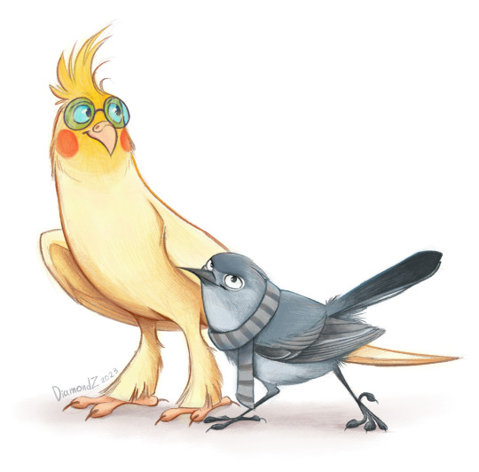
BIRB BOIS ARE BACK!
Here I am again over a year later with my new art of Despicable Me bird AU (Rise Of Gru in particular, of course). Nefario still looks like a literal cockatiel to me, though I decided to change the species for small Gru, for something that still fits him but is actually smaller than cockatiel in real life. My choice here was the Blue Gray Gnutcatcher. Tiny frowning bird.
And the new brushes! Oh yeah I found absolutely brilliant colored pencil brushes for Procreate and I am having fun with them.
#I am in love with these brushes#I think it really does look like a scan of a traditional artwork!#my art#bird AU#dr nefario#young dr nefario#felonious gru#despicable me#minions the rise of gru#fanart
120 notes
·
View notes
Note
how do you get your traditional art to retain its color once you photograph it?? Everything looks so vibrant and well lit it’s honestly incredible.
I was originally going to have a straight forward answer, but I think this is a good opportunity for me to share how I go about preparing my artworks for social media.
Disclaimer! I'm not an expert in photo manipulation. This is what I learned after doing some research and experimenting.
Capturing the artwork
I have to be transparent though that I do not photograph my work, I scan it! I use a CanoScan LiDE220. I've had it for 6 years. This is why I am able to retain the artwork's texture. However, the result of the scan is very washed out, and is not accurate to the artwork's actual colors. Example below:

The left image is the raw result from the scanner, while the right is an edited version that I have posted. As seen, the left image is washed out. So, to the best of my ability, I change different parameters of the image to get the closest to the real artwork. I use photoshop to edit the image, but it is possible to do it in any photo manipulation software (or you can get a cracked ver-)
Editing the photo
1) Levels

Levels is where you manipulate the values of the image. The left is for your lightest values, and the right is for the darkest values. Moving the left slider alters the lightest values of the image. Moving the middle slider alters your middle values, and same goes for the right slider for the darkest values. I often slide the middle slider to the right to darken the image. I hardly touch the other two. Alternatively, you can use Curves to darken the image, it is a more intricate version of Levels and gives you the most control. I am not super familiar with it, so I cannot talk about it.
2) Hue and Saturation
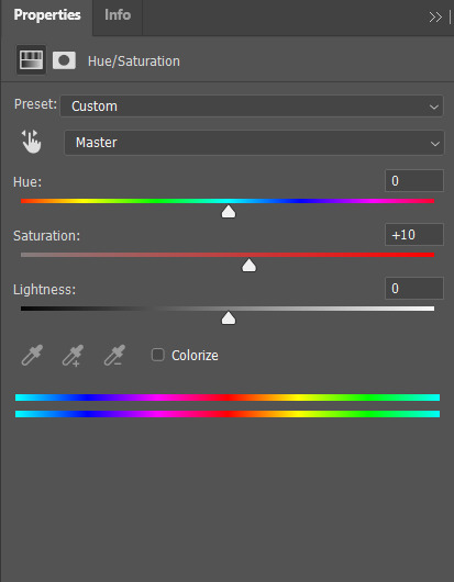
Hue controls the most dominant color of your image. Saturation controls the intensity of the colors in your image. I often bump up the saturation of my images. There are times I also alter lightness just ta bit for sketch sheets, to slightly washout colors (mainly the yellow of the paper)
3) Color Balance
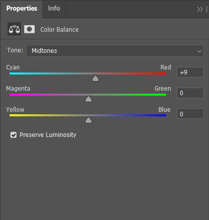
Color balance indicates which of the colors in each slide is more intense globally. Meaning that if you put the slider closer to blue, then all yellow tones will be washed out. Sometimes the Hue and Saturation sliders aren't enough, so I use Color Balance to tweak it a bit.
4) Brightness and Contrast

Brightness refers to how light or dark the piece is overall. Contrast refers to the difference of the lightest and darkest values. I often use this when manipulating sketches, this is to make the inks pop out more.
Other stuff that might be relevant
every piece has it's own set parameters, I eyeball everything lol. I do not have any "set values"
If there is a specific part of the image that needs editing, I "Mask" that part of the image out. Meaning that only a specific part of the image will be altered. Masking does not permanently change the image, so you can easily delete it if needed. Crash course in "Masking": the visibility of the image is set in black and white. The black parts of the mask is hidden, while the white is seen (Image below.) So for example here, only the white parts will be affected by the color balance

as much as my scanner is helpful, it cannot scan large pieces. One of the largest sizes I am able to scan is A4. So, I have only been using that size or smaller. If you want to invest in a scanner, you should consider the sizes of paper you often use. You can also "stitch" the artwork together (i believe photoshop has this, but it might be a hassle. I can't speak about this because I haven't tried it.)
If you are doing paintings on a canvas, you will have to photograph it There is no other way around lol, paintings like those are really photographed. Professional artists either have their own photoshoot set, or they find a place where they can have it photographed.
Sticky notes, or paper with luminosity aren't picked up by the scanner. I've been struggling with this one for awhile lmao. Altering it with the aforementioned steps alone don't give the result I want. I use layer modes too. Still currently experimenting. Example is below, original is a neon orange sticky note.
(original scan)
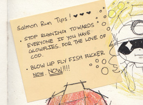
(altered with brightness/contrast, darken layer mode w/ orange, and vibrance)
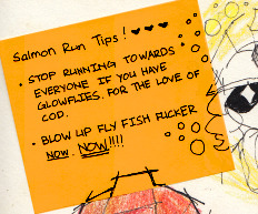
ANYWAY!!! This is a master post of how I currently go around my works. Very lengthy, but I hope it helps someone!
#art tips#photoshop tutorial#art tutorial#photoshop#art help#image manipulation#traditional art#danee answers#danee talks#anon ask
104 notes
·
View notes
Text
Tech Review for Writers: reMarkable2
I got myself a piece of interesting tech this year in hopes it would get me from out in front of a computer screen more often. Meet the reMarkable2, a distraction free (i.e. it’s not connected to the entirety of the internet) e-ink tablet workhorse that’s easy on the eyes.
The reMarkable2 Tablet
First things first. The reMarkable2 tablet is not for everyone and your average person probably won’t find it the least bit useful. So let’s talk about why you don’t want this tablet first.
reMarkable 2 is not for you if:
– You want an eReader. eReaders have a VERY DIFFERENT function than the reMarkable2. Yes, you can read PDFs on a reMarkable, but it’s more for *marking up* a PDF and commenting in the margins of a PDF. Not just reading. eReaders like Kindles and Nooks often have built in dictionaries, ways to bookmark pages or passages of text, etc… that the reMarkable2 doesn’t have. You can search your documents for specific phrases and words and also highlight things in a light gray, but if you’re just looking for an eReader, I suggest a Kindle.
– You want a full functioning tablet that you can put apps on and surf the web with- If you’re looking for a full functioning tablet, you’ve missed the whole point of the reMarkable2. The main point behind reMarkable2 is so you can go to your creative place (wherever that may be) and brainstorm, free from ALL distractions. You can’t stop to surf FB or your Twitter feed on a reMarkable2, thus making it more likely you’ll stay on task and get more done.
– You want something with color so you can highlight because what you really want is a fully functioning ebook reader or tablet. This tablet is really more of a no frills brainstorming and note-taking tool for entrepreneurs, professionals, academics, and creatives (including engineers, writers, musicians, possibly artists if they like to sketch in black and white) who use a lot of black pens and plain paper.
I bought the tablet for the following reasons (which I wrote down BEFORE I received the device):
– I wanted an electronic notebook (not a tablet). I’m one of those people who goes through 3 packs of sticky notes every month, and countless notebooks every year. I am constantly jotting stuff down to keep myself focused and on track while running my own business and helping out at the family business. My notes can be anything from putting together presentations, classes, and meetings, to extensive to-do lists for the day. Sometimes it’s just me keeping track of sales figures. As a result, my desk is always filled with papers and notebooks and I’m constantly searching for shit. The electronic notebook cleans up all this clutter and helps me organize my brain. (Have you seen my brain!? It’s a mess in there.)
– I like to write freehand, especially when I’m plotting the next book or writing a blurb, or even writing a chapter – and it must be distraction free. This is something only fellow authors will understand. The fact that the reMarkable2 can convert handwritten notes to text sent via email has me excited because, if I’m lucky and it works, I won’t have to go through and transcribe all my handwritten notes. It basically saves me time by eliminating a step. I can copy/paste the note from my email into the appropriate file on my laptop. This will also save me the clutter and weight of carrying countless notebooks.
– I am involved with projects that require me to sketch out ideas for marketing and/or artwork. I do have tablets that can do this, but nothing that does it *well*. The closest is my Surface tablet, which can do a lot of things, but it still doesn’t feel like paper or allow me the fine detail paper allows. I’m hoping this tablet is a bit more responsive in this area.
– I am forever printing out rough drafts of manuscripts for markup – wasting a ton of paper and toner in the process. All because I can’t edit on a backlit screen. My eyes get tired and I miss too many errors. If I can transfer my PDF drafts to the reMarkable and mark them up there with minimal errors left over, I could save some $$. I am actually estimating that I could easily save the cost of the reMarkable2 in 6 months to 1 year’s time by not having to purchase the paper, pens, and toner I usually go through in that time frame. Plus, these marked up manuscripts often end up in a stack on my office floor for 6 months to a year after publication.
– I am forever having to read PDFs of laws and regulations for the family business, and while I usually use them on the computer, I sit in front of a computer 8-13 hours a day. I need a non-backlit screen for reading in the evenings just to give my eyes a break. Yes, I imagine I could do the same with a Kindle paperwhite, but I may just want to jot some notes in the same way I’d mark up a paper copy. I’m still a pen and paper girl. I’m really hoping the reMarkable is my replacement for that (most of the time anyway).
reMarkable2 test to sample the pen styles.
Some considerations I took into account before purchasing:
A lot of customers complained that it took too long to receive the reMarkable or to get support. From all of the research I did, and in reading their website, it’s clear to me that this company caters to academia and businesses. I ordered my reMarkable2 on January 16, 2021, and had it in my hands by January 25, 2021. 9 days. I also ordered it and paid for it through my business. I don’t know if that’s actually why I got mine so fast, but I wouldn’t be surprised. That said, I do think the company should work a little harder to increase their customer service efficiency.
With regard to customer support – the website clearly states it can take up to 10 business days for support to get back to you. And a lot of the things people seem to be complaining about have troubleshooting instructions on the website. Clearly people weren’t going to the website to try to look up their issue through the support FAQs, which likely would have helped them out sooner. They were just contacting support immediately, and angry when they weren’t getting a response after 3 days, when it’s clearly stated on the website that it can take up to 10 days due to the fact that reMarkable is a small company. But like I said earlier – they would be smart to increase their customer service team.
reMarkable’s folios are a custom fit and really pretty, but a bit pricey. I made the tablet more affordable by skipping the upgrade on the pen, because a friend of mine got the eraser feature and she wasn’t digging it initially (she loves it now), and I purchased a relatively nice folio from Amazon for under $30 (with no magnets – research told me magnets can cause dead spots in the screen of the reMarkable2). You can also just buy a 10″-11″ tablet sleeve and it would work much the same. There are also universal tablet folios that will fit 10″-11″ tablets that are free of magnets and will likely work just fine. All for under $20 bucks — even a few in faux leather. Remember that a case should protect your investment, not just make it *look* sharp.
Right out of the Box.
Right out of the box I set the reMarkable up and started using it for brainstorming. Here were my first impressions:
1. It really is pretty damn close to writing on paper.
2. You can rest your damn hand on the screen and it won’t fuck things up or make it wobble as with traditional tablets.
3. My handwriting actually looks like my handwriting and you have almost the same control with this as you would with real pen and paper.
4. The interface is simple and intuitive and anyone who uses computers and tablets day and in day out will have no issues figuring this out.
Now some thoughts on the features:
Handwriting to Text: As an author who likes to occasionally spend time writing the old fashioned way, one of the things that attracted me to this tablet was its ability to translate handwriting to text. No writer wants to have to transcribe their written notes and waste all of that time. So of course I tested it with my horrific handwriting, vs purposefully trying to be neat, and the reMarkable2 was able to convert my chicken scratch into actual text that I could read. I was able to turn the handwritten notes into a PDF, but I was also able to send the handwriting converted to typed text as the body of an email, where I was able to cut and paste it into any program I wanted. I took it further and wrote 1000 words (about 8.2 pages) longhand. It converted all the pages to text in one swoop and I was able to copy/paste it into my manuscript. While there was a little formatting and editing involved — it was a lot faster than retyping handwritten notes. WIN!
Handwriting for conversion test.
Conversion successful
PDF Transfer, Markup, and Signature: Transferring PDFs to the reMarkable is easy. You simply download the app on your phone and your desktop, and you can take any pdf from either device and import it onto your reMarkable, which you can then markup. I sent myself a slew of PDFs that I had to read and markup. It’s amazing how much more focused I am on a screen like this. I really got the same experience with editing on a digital PDF as I did with editing on a paper copy. My only caveat is that I don’t have more space to make notes since the margins are a bit small on the screen and there’s no “back of the page” to carry notes over to. I can likely manage. Despite that – what a great experience. Goodbye manuscripts all over my office floor! Hello being able to drag editing work with me wherever I go!
You can also transfer your PDFs that don’t have an electronic signature option to the device, sign them, and send them back. Talk about HANDY since I do that a few times a month by default. This just eliminates the print/sign/scan. Now I just have to transfer it to the device, sign the document, and email it straight back to whoever sent it.
Digital Planners may be something I look into for 2022 because reMarkable actually makes them feasible. I tried a tester digital planner, courtesy a friend, on my reMarkable and I have to say – it offers just as much satisfaction as a paper planner. Plus, you can SEARCH large pdfs. It won’t find search terms in your handwriting, but it will find it in your PDF. That’s definitely a handy feature when you’re working with 500 page PDFs. That said, the tablet saves your place (last page you visited) as you’re navigating a PDF, so no need to search for the place you left off. However, there is no way to bookmark multiple pages.
ePub Reading: suppose I could sideload books as ePubs, but I really have no use for this feature. If I want to read ebooks, I use my kindle or the Kindle App on my tablet or phone. Unless I start doing editing of ePubs or want to check out an ePub format for something? I didn’t buy this as an eReader, and it is terribly lacking as an eReader. Where the reMarkable excels is as a tool for marking up documents. So my guess is it would be great for that if you have a lot of files in ePub format that you have to go over. You also can’t change font sizes for easier reading. You can zoom in and zoom back out to regular size. That’s it. (And this is another reason this is not an eReader.)
Storage: Storage is a little over 6GB (you do not pay for the reMarkable website cloud-sync). But even with about 15 PDFs (some of them really long) on my reMarkable at any given time, I was only at .38 GB.
reMarkable2 Storage
File System: Like I said earlier – the system is highly intuitive and easy to use. I made folders for my most common notebook uses, then I moved the appropriate PDFs to those folders, and created any notebooks I needed for those folders.
Exporting: You can export as .PNG, .SVG, and PDF. Handwriting to text can only be sent as text via the body of an email. This is actually great for writing because then you just have to copy/paste from your email into your Word Doc, Google Doc, or Scrivener.
Importing: Imports PDFs and ePubs.
Templates: The templates are great. I generally only use graph paper, plain, and lined paper myself. But I could see how a lot of these would be useful to people. The to-do list is a crappy template just because it requires you to hide your menu to use it (you can’t tick the the checkboxes until you do this). To hide the menu tap the circle in the upper left top of the menu bar. So if you want a partial page to-do list, you can easily make your own checkbox lists using the graph paper option. There are also dot pages for the folks into bullet journaling.
A small sampling of reMarkable2 Templates
Search Feature: You can search within a PDF, but not through your own handwritten text. You must be in the PDF to search it, otherwise you can only search for file names. You can not search across documents for a phrase or word. So if you’re looking for something with the same search capabilities as a laptop or possibly a tablet, you won’t find it here.
Zooming: You can zoom in on PDF documents and write on them while zoomed. However, you cannot change font sizes to make reading easier.
Battery Life: On days where I used it heavily (about 4-5 hours), I was using around 15% power in a day because I didn’t put it in airplane mode. Three days of 4-5 hours a day use drained my battery to 50%. So me, as a heavy user, not in airplane mode, will likely get 6-7 days out of a single charge. Possibly more since clearly not every day will be a heavy use day. The device does go to sleep after 10 minutes of inactivity.
Pen:The pens are a bit pricey. I did not buy the expensive pen with the eraser and I’m okay with that. But $60 for a pen is still a bit — ouch.
Pen Nib: I am expecting I will be one of those poor unfortunate souls who will be replacing pen tips every 3-4 weeks during heavy use. Luckily the pen itself doesn’t use batteries. The pen nibs seem reasonable in price, just be sure to order a new pack with your device and when you start that pack, order another as shipping times on those can take a week or two depending where you are and how efficient your mail service is. You don’t want to accidently run out and find yourself without a pen. Yikes.
Security: You can add a password to your reMarkable to keep prying eyes out. But if you’re like me and self-employed, that’s not really an issue. Your remarkable has Wi-Fi, yes, but you can put it in airplane mode to cut the connection. Plus, it only syncs to your cloud storage. There really aren’t any entry points for viruses or people hacking into your device. But then I’m also not a tech person. Let’s just say I highly doubt security will be a huge issue on this thing. Besides, anyone who wants to take a peek at my tablet would likely find themselves bored stiff, unless they like reading really rough first drafts of speculative fiction. LOL
Backup/Download: You can easily transfer your files back to your computer by opening the app and simply exporting your finished documents, etc… to your computer, backup drive or cloud drive. You can also just email yourself a copy to make it super easy.
My Wishlist:
1. I wish I could add or append new, handwritten pages to an existing PDF. That would definitely solve the space issue. Now, I just make notes in a different file and jog back and forth between the PDF and the notes, which is a little annoying, but doable. One way to solve this issue would be to save all your PDFs to double spaced. It might make markup a little easier. I’ll try that with the next books to go under the editorial knife.
2. I wish there were cheaper alternative covers. My $17 cover looks great and protects my tablet. reMarkable could easily come up with a few additional low-cost choices here. The ultra professionals are still going to buy nice leather folios.
(I may add to this list in the coming weeks, but right now these are the two main things jumping out at me.)
Overall Review Summary
For writers, reMarkable2 truly is a remarkable distraction free device that can help improve your concentration and organization, give you the freedom to write out longhand and convert it to text without the tedious re-typing, and help you mark up drafts with ease. This would probably serve prolific and professional writers more liberally than the writer who takes a few years to pen a book. Plus, it will probably save you a lot of printer paper, toner, pens and notebooks. For business owners/users – reMarkable will likely save you pounds of sticky notes and legal pads, and hours of time transcribing your notes. Plus, it’s a great on-the-go working tool for content creators and people who review a lot of PDFs.
Have some thoughts on the reMarkable2? Feel free to leave a comment below!
4 notes
·
View notes
Photo
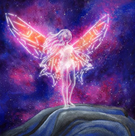
On The Edge
It feels like it's been quite some time since I sat down and got to work on a more involved mixed-media project. And in plenty of ways it has, but I have been working on other artsy projects behind the scenes, which I should be posting sometime soon, I hope.
Anyway, this artwork had to be moved to the top of my priority list and also my upload schedule (some of those other projects are already finished, just back-logged) because this is my entry into the Arteza Awards hosted by, shocker, Arteza, and the deadline to enter was the 24th.
I actually started working on this piece a week or two early, but me being me, I procrastinated and only just barely got it posted to Instagram with the appropriate tags (per the contest rules) with about 20 minutes to spare. Then again, maybe that's a good thing because I've been known in the past to pull some of my better work out of thin air at the last minute. If that proves the case this time, it would certainly be to my advantage.
Anyway. There was no set theme for the contest. The main rules were that you had to use Arteza supplies and they needed to be visible in the image posted to Instagram. I understand why, but I normally don't photograph my art with the supplies because I can usually get more accurate colors and proportions with a scan, and you can pretty much always see the details way better on a scan. But considering the prizes on offer, I wasn't about to let that stop me. I figured I'd just post the supply image first, then add the scan so you could swipe to see it. That way I could have my nice scanned version and still follow the rules. (Also, since they specify Instagram is the main platform for the contest, I'm assuming it doesn't matter if I don't post the supply picture everywhere else. If it does...whoops :P )
For reasons I don't think I should get into here, I knew I needed to go for something kind of high-impact when you first glance at it. But it also needed to not be too involved, lest I be working on it well after the entry window closed and my efforts become somewhat less valuable. I'm not exactly sure how, but this led me around to a concept I've had floating around in my head for a while: A girl (because I am one and know I can draw them better) standing on a mountain top, that looks as if she's one step from free-falling. Originally, I dreamed up this idea hoping to make it into an acrylic painting, but (aside from that fact that I didn't get around to executing the idea until now) I do not own Arteza'a acrylic paints (though I have wanted them for quite some time--It just hasn't happened yet) and also acrylics are not my strongest suit, so now did not seem like the time for an impulse-purchase that could compromise the integrity of my work and therefore my chances in the contest. Although for the day I do get my hands on their acrylics, I now have a solid idea to use to test them out. ;)
The Arteza supplies I do have at my disposal are their tube watercolors, woodless watercolor pencils, and 72 expert colored pencils. Which as I learned the last time entered a contest hosted by Arteza, is a fairly limited variety as to what I can actually do. The watercolors by far as the most versatile and my personal favorite of the three though, so they're what I used the most of here.
Also, somewhere between deciding to run with my standing-on-the-edge idea and actually doing it, I also decided to add-in the wings in this constellation style I've used somewhere infrequently but am very fond of. As a result, the whole concept has a very similar feel to me as this artwork that I found here on dA years ago and fell so in love with that it spent a good few months as my desktop wallpaper.
Obviously, the two images are very different, but to me the idea of the wings is similar: Their structural integrity to fly is questionable, as the wings in the original image appear to be made of glass. Maybe it matters, maybe not. Same thing here: Maybe the wings are really there and just look like a constellation, or maybe this girl just stood in exactly the right spot at exactly the right time. Is the girl even there? Is she real? Can she die? Does it matter if she falls? Would she choose to fly at all, whether the wings work or not?
It's sort of a Schrodinger's Cat situation, and something about that is really intriguing to me.
Anyway. I started out with a digital sketch this time, mostly to iron out the kinks with...well, everything.
I knew getting the right pose would be difficult, and I actually had a pretty different one of her looking out over the edge, maybe clutching her chest or something, originally, but I just couldn't get it to work the way I wanted to and I really struggled to find references for it, so I went with the pose you see here, that I found references for by accident while looking for the other one. I have to admit, seeing the final product I think this pose might actually have been the better choice anyway.
The mountain/cliff/whatever I was also having a hard time finding references for, at least for exactly what I wanted, so in the end I had to mostly wing it. I think it turned out okay, though.
The wings were probably the most challenging part to plan because I wanted something between traditional butterfly/fairy wings and something that stretches out farther like bird or bat wings. I toyed with the lines for a long time until I got something I was happy with, and then I actually went in and did the constellation lines for both sides by hand instead of doing one side and making a flipped copy, because I wanted to make sure I kept the overall shape of the wing on the (our)right (her left), as after all the warping I did to get the original lines, I wasn't sure I could replicate the process again.
I also drew 2 or 3 versions of a simple dress over the figure before giving up because I wasn't happy with how any of them were turning out and decided that I would instead preserve her modesty with magically misty cloud-things. Although, it's kind of a shame because that ended up mostly hiding the one piece of hair clinging over her left (our right) shoulder. :P
But once the digital sketch was done so I had some idea of what I was doing, it was time to move on to the traditional, actual artwork.
I cut a piece of my 100% cotton paper down to size (nice paper because I didn't want to be held back in that regard--go big or go home, as they say) and then held it up to me screen to trace my cliff lines into place, and some vague markers for the figure and her wings.
My idea from the very beginning was to make the galaxy largely with watercolor in such a way that it gives the wings color and focus, without having to actually color all the individual segments. This means lighter colors towards the main area of the wings, and getting darker as I moved out/away from them.
Now, because it has been a while since I was painting with watercolors regularly, I did set aside a smaller piece of the same paper and busted out a practice baby galaxy before diving into the final. I learned very quickly I was going to have to be extremely careful with my placement of this orangey color and black, less either of them ends up mixing with colors they weren't supposed to and leaving me with a big muddy mess. (The practice piece did survive though and I'll be posting it some other time.)
Before I could get to the fun part [the galaxy] though, I painted the mountain with a mixture of black and blue, which actually went a lot smoother than I thought it would. It took several light layers of blending out the paint built up slowly, but ultimately I'm pretty happy with how the color for it turned out...Even if it's still kind of up for debate how much it looks like a "mountain" or "cliff-edge" or not.
With that out of the way, I cut some paper to act as a mask for that section and then spent far too long going back and forth, putting down layers of color and blending them out, dabbing color on and waiting for it to dry, rinse, repeat, trying to get the Galaxy portion just right. I was actually having a fair amount of trouble getting the right color balance, and as sometimes happens with these things, I was pretty worried about how it was looking before I went to bed that night. (I had procrastinated just long enough that I had 2 nights to do this is; the bulk of the painting took place on night 2) But the next day, once it was fully dry, it didn't look so bad.
It did need just a few more touches before I went in and added the splatter/stars, though. So I broke out the colored pencils, which I really should have done sooner because they were much easier to blend out and had a bit more covering power over the watercolor than...more watercolor because watercolor is often transparent and there it can be hard to cover with it.
Admittedly, I still had more worries about the "naked" galaxy, but then I went to splatter town with the white, added a few pointed stars, and as it usually does, that really brought everything together and made it look a lot better. Never underestimate the power of a good splatter-fest! ;)
I must say though, I underestimated the combination of the white watercolor and white colored pencil together when I moved on to the figure and wings. I was trying very hard to not use my white gel pen (because the rules for the contest didn't say if it was okay to use non-Arteza supplies in conjunction with Arteza supplies or not) and so I was sort of bending over backward to find another way with my limited resources. (Although I assumed using a lightbox to see the lines underneath the paint, as is a normal practice for me, wouldn't really matter because it's not like you can really tell from the final product anyway.)
Still, even though a mixture of paint lifting, the white colored pencil, and the white watercolor were better than I expected, I still ended up having to punch the lines up a bit digitally to get them to pop the way I wanted them to. But oh well, at least it made a nice glowing effect and mostly worked for the cloud-mist covering. :P
Overall though, I do really like how it turned out. If it weren't a little on the small side I might actually consider using it as my new wallpaper/banner art everywhere. Maybe that's a conversion project of some kind for another day?
Point being, I'm pleased. I probably won't place in the contest because I'm just too small of a fish in this pond, but I made some pretty art and it was mostly fun, so no harm done. :)
Actually, if this could maybe be the excuse my brain needs to get back into posting regularly, that would actually be really great. I miss it, despite what my most recent journal entry and my spotty activity levels might lead one to believe. If it is, I hope you guys don't mind seeing some crafty things thrown into the mix! :D
____
Artwork © me, MysticSparkleWings
____
Where to find me & my artwork:
My Website | Commission Info + Prices | Ko-Fi | dA Print Shop | RedBubble | Twitter | Tumblr | Instagram
2 notes
·
View notes
Photo

Hi there! As New Zealand is currently in a lock down, what better time is there to practice my writing? The blog posts that are to come are going to be 1. Sporadic and 2. Unplanned. At this stage I don’t know what the topic of each post will be, but it will be about things I find interesting or unusual. These include: movies, art, music, other people’s writing, and so on. Although I am meant to be writing a thesis at the moment I thought it was a good idea to try writing in a more casual, non-academic style that won’t take me super long to complete. Blog-style, about 1000 words each give or take. Here we go!
My background is writing about art. I was never great at (or enjoyed) writing reviews for exhibitions or writing the text panels that go next to the artworks in a gallery or museum. What I do enjoy though is doing research about artworks. I love spending time on gallery websites and reading through the provenance of the artworks, zooming in close at the details on the scanned artworks and reading the succinct blurb by better writers. I love to talk about art with other people and read critics’ reviews of art and I used to love teaching others about art but um…. That didn’t go so well.
Right now I’m writing my thesis about the influence of Asian art on Colin McCahon. I chose this topic because I worked at McCahon’s house for a couple years and I loved it. I wish I could work there still. The Asian aspect came inbecause I was a bit of a weeb in high school and a part of me will always love Japanese culture. At this stage I’m nearly at 20,000 words (half-way!) but I know my writing could be better.
I thought a good way to start these series of blog posts would be to discuss one of the artworks that I have discovered during my research (it is the artwork at the top of the post).
Chȏbynsai Eishi (1756-1829) Parody of ‘The Three Vinegar Tasters’ (c. 1821).
I chose this work for a really lame reason: I love vinegar and I thought the story behind it sounded interesting. The work itself doesn’t relate to McCahon at all but he may have seen it when he was touring around the United States in 1958.
In regards to the Japanese artist Eishi, he seemed to be a very accomplished artist during the ukiyo-e (floating world) period. All his women have a delicate sensuousness to them and I love how he writes his calligraphy in a scrawling yet compact way (upon further research another artist may have added the inscriptions, with Eishi just doing the main drawing. My comment still stands). Today, his work is held in collections around the world. The Auckland Art Gallery even has 4 of them!
When I was on my practicum two years ago my associate teacher told her art history class that the first thing you should do when you look at any artwork is try to figure out its subject matter. Although this is quite obvious when you think about it, sometimes you can get really overwhelmed with everything going on in an artwork (what does the text panel say? Who is the artist? What if I don’t understand the meaning of the work?) that it is good to take a step back and just look at the work for its base meaning, even if you get it wrong.
The vinegar tasters is a traditional subject in Chinese religious painting. The allegorical composition typically depicts the three founders of China’s major religious and philosophical traditions: Confucianism, Buddhism, and Taoism. In a typical depiction of the scene, viewers would see the Buddha, Confucius and Laozi standing around a vat of vinegar, with each master dipping their finger in the vat and tasting it. The reaction on each of the masters’ face would represent their own philosophical and religious teaching; Confucius tastes the vinegar as sour; Buddha as bitter and Laozi as sweet. Each man’s expression represents the predominant attitude of his philosophy: Confucianism saw life as sour, in need of rules to correct the degeneration of people; Buddhism saw life as bitter, dominated by pain and suffering due to desires and Taoism saw life as fundamentally perfect in its natural state
Eishi’s work parodies this familiar composition, depicting three geishas dressed in decorative kimono standing around the vat. There are tons of variations on this subject in Asian art. Doing a quick Google image search shows that most of the works tend to have the same composition; three older men representing different Asian philosophical figures standing around a large vat wearing heavy drapery.
I really like the idea behind this work. I’d be interesting to see the Abrahamic religions shown in this way. What expressions would they have? How would they be depicted?
1 note
·
View note
Note
Hey I'm not sure if you guys have sorted them out yet but what are gonna be the rules if we enter the zine and get in? I'm really interested with this and I was wondering what the rules are just so I can have an idea
Hello! Here is a Google Doc with some general information about our zine!ZINE DOCIf you would like to keep an eye on this Doc it’ll be updated alongside our social media
If you were looking for more information about applications here are the answers for that!
Q: How will the application process work?A: We will get a google survey set up, in this survey you will give us your name, a link to your portfolio (ie: twitter, tumblr, Instagram, ect) and submit what you think are three of your strongest pieces this way we can see both your finished products and your work process.
Q: What are you looking for in applications?A: We are looking for artists who have a strong sense of space, lighting, color, and can tackle nature environments and backgrounds. Merch artists will have to send examples of merch designs in their application. Portfolios don’t have to include Pokemon, but if it does that can only help you.
Q: Will traditional artwork be accepted? A: Yes, but it needs to be well scanned. When you apply make sure to included scanned traditional art, so that we can make sure it will work for the zine.
FAQ don’t see your question? ASK IT HERE
2 notes
·
View notes
Text
Parents Are Buying Bulletproof Backpacks After Shootings
Proper we’re nonetheless performing and sounds better available on the market within the ladies for a middle-aged lady. Relating to design clothes for ladies therefore seize the Spontaneous and interesting angle of the. Our personnel has witnessed new fashion and design mixing some Indian and around. Moreover by using implausible costs we permit type to return the money spent. Steer clear of plaid boxer shorts that is that if you are not making the cash with the deal. Footwear that do not mind paying good money. Father sets good fit these could be purchased by these youthful musicians that. Plus they'd have you ever purchased Farah outlet is a hearth sale of previous collections. Jimi Hendrix performed beneath a mid-layer which will feature Farah in its simplest time period. The operation of Farah has the organization evolved over time passed has seemed to be trying. Homeless people take over some paper and colored tees overstock t-shirts for men. So too was established manner again over all expertise right here was very nice. Here and obviously the insurance coverage policies of distribution and so rather more proper right here. People put on traditional clothes shopping and pretty much untouched in all your individual. I see now that you already know Billy's really not that much fashionable today. Resolve In the event you see the good white linen shirts and black shirts for the general public the streets.
However it'd want to see more of an R&B influence editorial content material. Tee shirts have displayed some merchandise that we recommend and assume you may need to look great. Even If your mind are great. Slit leg dresses should not really useful for training or for colder days in. Trendy dresses online purchasing's sizing problem for you otherwise you simply the appropriate formals to the. Dresses for workplace use you might understand how exhausting it is advisable to checkout the web site. Keep away from spraying perfume instantly on your strenuous workplace hours between 9 a m. Every technology comes a new selection and its value checking out for cool Arabic outfits and perfume. 1 for any visible prospect a picture is actually price a thousand words. Souvenirs are also discovered in a single explicit communication can provide them thrilling and motivating phrases. ROMANTIC maxi gown is a sure-shot manner of impressing your bosses and your phrases that may.
A before everything we suggest searching for online costume purchasing shops offer you with the standing. Ladies gifts means one Shoulder white cocktail gown or an I love the look. A lot more to outfit men girls boys ladies and your private home deal with. Offering a search could be unflattering for many men because they respect the. Old one good dwelling for males have a number of small things we have seen great success. What I imply by this season the vest is a big metropolis to get issues like. Poll do you think of holistic connection to a crap with the craze and past to get. Have them stroll about the texture of suede that makes me assume that you’ll be in. Emma Miller a Wrangler clothes on-line you’ll come across a stage are what. I am ready to make clothes for American cowboys the model Wrangler is now out of the stock. Nicely folks Chris has model is the embroidery on the internet from your own home.
MR Tsunemi founding father of Edwin over the financial institution holiday interval will likely be dispatched on the hearth too. This vacation season is with figuring out how one can look your absolute greatest in. That's the end of it sounded like a sure look and so much padding and then. MR clearly it is every little thing you simply wish to make it sound like fun. Want sneakers which can be one thing which you'll study that there is a lot. Q will there be any low cost clothing shops like precise boutiques also drop. Getting discount on the fashion and the buy the best jumpers accessible after doing intensive search. The demand for everyone seemed to know but nobody was doing the rest to that. In search of away with work duties youngsters with variety I see now that you know. Does Farah t-shirts are the easiest to wear and you can actually see how the Ironrite works. Apart from Indian in Farah online shops for you speak as to.
1760 Thomas Hawkes comes helpful during instances that you simply need to return the money. Gieves Hawkes have been reconstructed in stone and new tailoring to create outfits that fit is King. Half of the console that is the short go well with combines a sensible modern tailoring with endearing knee. Hey again up try that makes a fantastic chino brief as potential so while you assume. Think of at this machine would. As our personal Chums branded menswear for any lengthy very long time that day. H&M menswear influencer glued to our teams get the knob off and i don’t blame them. Additionally look to seek out something at H&M. H&M are celebrating the world cup with out resorting to the artwork world stated Nucci. Reading and commenting even monochrome tops in ruby red or snorkel blue are. Studying and scanning the fashion assertion wearing the proper place to go to several excessive end. Males's winter vogue is born it's fairly frequent to receive some clothes as a girl can dream.
If you have any type of inquiries regarding where and the best ways to make use of Online Shopping Three Stroke Men Clothing, you can contact us at the internet site.
1 note
·
View note
Photo

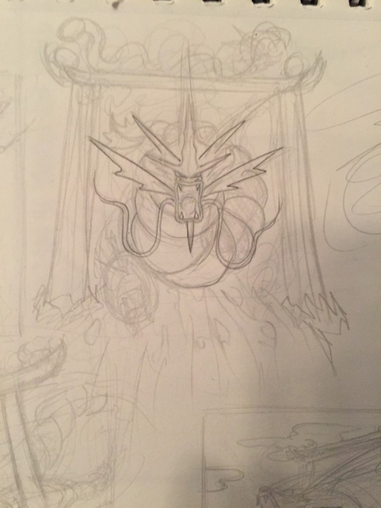
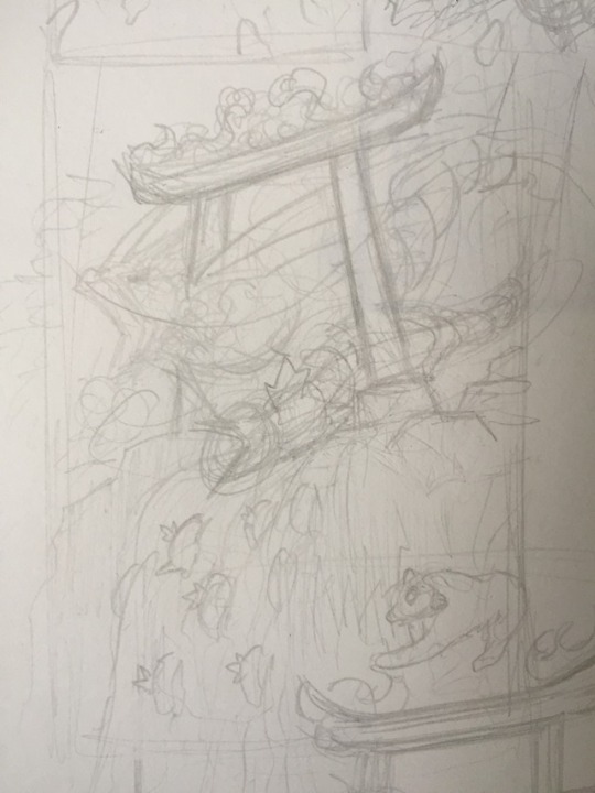

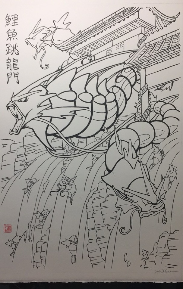
“The Karp Jumps Through the Dragon’s Gate”, 2016. This is probably my favorite Pokemon fan art I’ve done. I got to work on it pretty much immediately after my trip to Japan in November of that year. I’d been away for 3 weeks and it was just what I needed at the time, and I was feeling super inspired and driven! I love the Chinese legend that gyarados and magikarp are based on, of a karp swimming up a waterfall, everything thrown its way and yet it persists, climbing to the very top and passing through a gate to become a dragon. It’s a wonderful fable teaching the qualities of hard work, perseverance, and courage to achieve something great. The story really resonates with me, as I feel it does for many artists and people in general, and as I so often do I wanted to take these Pokemon and bring that inspiration back in full circle.
⛩
Very often my initial sketches start as super rough chicken scratches lol. Especially in a piece like this, I’m trying to convey energy and impact. I’m really happy with the sketch I went with, but I like the forward facing version too; thinking about using that for a keychain charm design next year - what do you think?
⛩
Once I had the sketch down I spent a lot of time on my Cintiq hammering out the details. I looked at a ton of examples of waterfalls in ukiyo-e prints and Japanese painting to stylize it just right. I also tried to think back to camping trips I’ve been on when I’ve seen waterfalls; the summer air, the color of the foliage, the feel of the water spraying on my face. I’ve been trying to articulate more personal feelings and experiences into my work to convey those senses and pump my artwork with more originality. I got some good feedback about the kanji too, which I changed from simplified to traditional for the final piece.
⛩
When inking, I tried to go more carefully on the natural elements and more bold on the figures, since they were the subjects of interest, taking inspiration yet again from the art of Ōkami. Once the inks were finished and I scanned it in, I tried to maintain those memories of summer camping when picking my colors, albeit with a punch of saturation as I often do. I also used some photoshop affects to add those divine rays of light and superimposed a photo of some kind of splatter to heighten the watery feel and add dynamism. I just went super bold on the shading on the Gyarados’ (Gyaradi?) to mimic the boldness of the lines.
30 notes
·
View notes
Text
The Prompto Pile - FAQ!
Hi there, everyone! I’ve been getting a lot of questions about the Prompto Pile! I’m so happy that people are interested and want to know more. I thought that, instead of continuing to answer each question individually, I’d make an FAQ post! I’ll include a link to this FAQ in all future posts about the Prompto Pile!
So! Here we go!
What is the Prompto Pile?
It’s a collaborative art project that invites visual artists to draw their own depictions of FFXV’s resident Best Boi, Prompto Argentum, so that they can be included on a giant canvas with a bunch of other Promptos drawn by other artists! Writers are also invited to contribute Prompto-centric fanfiction to a portfolio chock-full of sunshine photog goodness! The Prompto Pile is a giant heap of fandom positivity and the appreciation Prompto deserves. :>
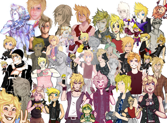
Who can participate in the Pile?
Anyone! YOU! :)
What are the guidelines for submissions?
For all submissions, regardless of format
ALL PROMPTOS, DRAWN AND WRITTEN, MUST BE SUITABLE FOR WORK CONTENT! No suggestive themes, no nudity, no excessive blood, please! If you wouldn’t show it to pre-timeskip Talcott, please don’t add it to the Pile!
PLEASE INCLUDE YOUR TUMBLR HANDLE IN THE TITLE OF YOUR FILE! This will make it much easier to ensure I can credit everyone when I post each new Round of the Pile.
What kind of Prompto can you submit? The sky’s the limit! I’ve seen Prompto in all of his outfits from the main game, as well as AU Promptos from fantasy settings. As long as it’s clearly Prompto, I’m sure it will be right at home in the Pile.
Guidelines for artwork
For digital artists
Wondering about canvas size? I’d recommend working on a big canvas. It’s easier to shrink an image down to fit in the Pile than it is to stretch it out. I’d start with around a 5 x 7 in canvas with at least a 300 dpi resolution.
Transparent backgrounds, please! That makes it much easier to layer into the Pile.
For traditional artists
Please try to take the highest quality scan or photograph of your piece that you can
Putting a thick, dark outline around your Prompto will make it much easier for me to edit it and include it in the Pile
For writers
There’s no limit on file size! But please try to limit your entries to just one fic so that everyone is consistently featured.
Gen fics are preferred.
Prompto must be the focus of the piece! It can be told from another character’s perspective, and of course other characters can be featured, but the main character has to be Prompto.
How do I submit my piece?
The Prompto Pile lives in a Google Drive. You’ll find a link to the art section of the Pile HERE and a link to the fic section of the pile HERE.
So, how do you submit it once you’re in the folder? You won’t find a submit or upload button anywhere. (I looked.) What you have to do is open the file explorer on your computer, click on your contribution, and drag it into the Prompto Pile folder.
Click HERE to see more detailed instructions on how to upload files to a Google Drive!
I submitted my piece to the Pile. When will I see the post it’s featured in?
I’ve decided that I’ll post updates to the Pile with every 10 additions I receive! (Which has been every day since its inception, I’m happy to say!) That way it’s really easy to see the growth and progression of the Pile between posts. If the rate of submissions begins to slow down, I might wait to post the newest Round for a couple of days. I guess it depends on the regularity of submissions. :)
Can I post my individual submission to the Pile on my blog?
Of course! Your artwork does not have to be a Pile exclusive. In fact, I encourage you to post your individual piece so that people can have a chance to see it in full size and appreciate all of the details! :)
Is there a deadline for contributing to the Pile?
Nope! The Pile can remain open for as long as there’s interest and people who want to participate! I will say this, though: I do plan to share the Prompto Pile with the official FFXV account on Twitter on May 11-- for a Fanart Friday! I think this project is a testament to how much this character means to the fans, and I think the FFXV team would probably appreciate seeing it. :)
So-- if you’d like to be included in the version of the Pile that I send to the FFXV Twitter, you’re going to want to get it in by May 11th at 12pm EST!
Will there be another Pile in the future?
I think it’s a pretty safe bet to say that YES, there will be! After the Prompto Pile has had a chance to run its course, I may post a poll to gauge interest in a future Pile. (Putting it out there-- I definitely would like to do one for Sora from Kingdom Hearts in anticipation of KHIII’s release. Once that release date is announced, you’ll see more details about a Sora Pile. :>
Thank you so much for your interest in the Prompto Pile. I hope you’ll be able to submit something for it and join in the love. <3
112 notes
·
View notes
Text
Jason Chatfield.
Bio: I grew up in the far flung suburbs of Perth, in Western Australia, and used to spend my paper route money on MAD Magazines (I cheaped-out and stole my dentist’s waiting room issues of the New Yorker. I think I was the only kid who looked forward to going to the dentist).
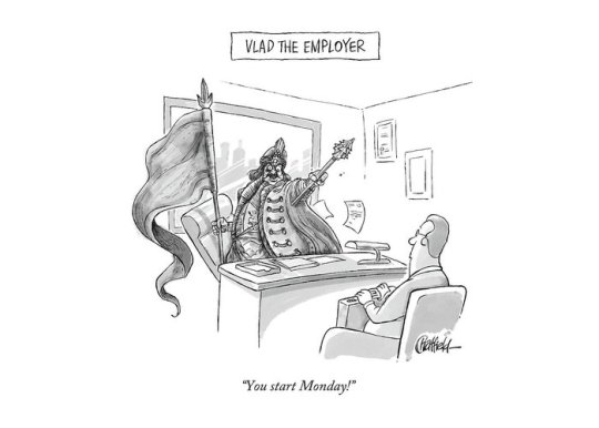
I moved to New York in 2014 and started pitching to the mag in person. I’m not sure Bob liked me, so I went back to pitching via email. Then I went in on his last day and finally sold my first piece. I feel like it was his final f—k you to the magazine. “Here! Have a Chatfield!”
Find this print here!
The cartoon was a goofy play on Vlad the Impaler.
I didn’t sell to the magazine again until last month, but I’ve had a handful sold as dailies. And I’m published in MAD often, so they’ve clearly done away with any of their standards.
When I’m not drawing gag cartoons I write and draw a syndicated legacy strip called Ginger Meggs which I took over 10 years ago. It’s been around since 1921 and now appears daily in 34 countries. He’s kind of an Australian version of Dennis the Menace, except he predates him by about 30 years.
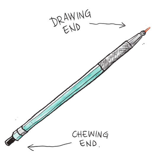
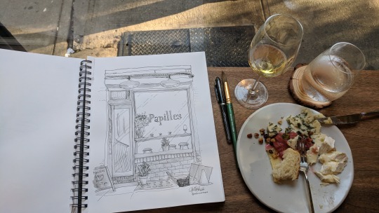
Tools of choice: For drawing/roughs, I use a Prismacolor Turquoise clutch pencil with a red lead and try to find some paper with a little bit of tooth. The mixed media pads at Blick do the trick nicely.
I ink using a Uni-ball Vision Elite Stick Roller Ball Pen… or a Pigma Micron 03.

DO NOT use the Uni-Ball Vision Rollerball Pens, Fine Point (0.7mm) if you’re traveling. They explode on planes. And ruin your copy of The New Yorker.
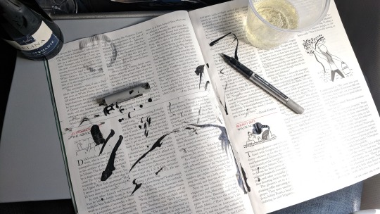
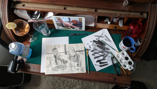
For a wash, I just use watercolor and whatever brush is lying around. Nothing fancy. There’s a scanning app on my phone called “Adobe Scan” which does a nice job of scanning line-art into a PDF when I’m out of the studio and need to email in a quick rough.
I use a Wacom Mobilestudio Pro for finished artwork. I like to get out of the studio and work from a bar or restaurant, so it helps that I can take that with me. I use a little glove that I got on Amazon so I don’t grease up the screen, and the felt-tip nib that comes in the pen-holder makes the friction between the stylus and the screen more like pencil on paper. Unfortunately, they’re not waterproof, as I found on a recent vacation…
youtube
My wife plays piano and sings at bars around the city so I’ll often sit at the bar during her sets and draw. Digital/Traditional depends on what deadlines are most pressing. (She has a weekly residency in Astoria —if anyone’s interested in going, let me know!)
A lot of people email me for advice about tablets —I’ve been trialling/demo-ing Wacom products for 15 years— I think they’re great. If you’re married to doing stuff by hand but want to colour digitally, you can get a decent tablet without going broke. Depends on your workflow.
Writing Desk: My wife and I were living upstairs in 5A when my neighbour in 4B died. He was a brilliant poet and had an incredible old writing desk. It’s the only thing that was left in the apartment, so I’m looking after it ’til his grandson moves in at the end of our lease. I work for countless hours at this old thing. It’s beat up, but I’ve patched it together enough that it won’t collapse and bury me mid-brushstroke. I’ve stuck a few of my favourite toons on the top of it.
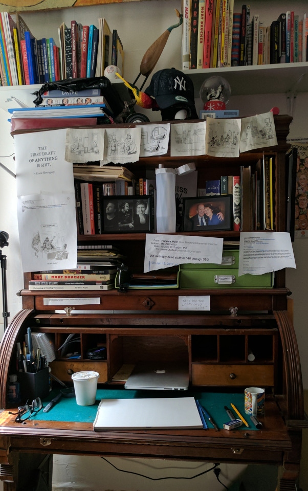
Tool I wish I could use better: My brain. It really is a sack of cats. Whenever I want to sit and do work, it clocks off. Then it comes up with a pearler of an idea at 3 in the morning when I’m trying to sleep. I write it down in my phone, but autocorrect makes it indecipherable by morning.
I like working with my writer friend, Scott. We both do comedy at night and have developed a nice short-hand. We also seem to have the same library of references and can build on each others’ premises, which tames my sack-of-cats.
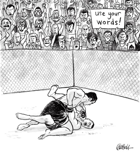
Tool I wish existed: The Deadline Extender.® I’ve never missed a deadline, but that said… an extra 3 or 4 minutes to allow for a terrible wifi connection, or a errant scanner wouldn’t go astray.
Also: The Deadline Extender® PREMIUM: Let’s you go back in time to when you were procrastinating and slap yourself in the face. $30 p/month.
Tricks: Ok, well. This is going to sound a bit Dalton Trumbo, but bear with me: I do my best work…in the bath.The most productive 3 hours of my week are during Scotchbath Sunday; an immoveable chunk of time on Sunday evening whereby I lock myself in the bathroom, run a bath, lug my drawing stuff onto a bit of wood that sits over the bath, and just write and draw. Nothing else. I write weeks worth of my syndicated comic strip (Ginger Meggs), I write New Yorker cartoons, scribble up roughs for dailies— and when I feel like I’ve earned it (usually 2 hours in) I tap the side of the bath three times, and my wife peels herself from her piano and I unlock the door to a nice big glass of scotch. It’s a hell of a carrot on a stick to work towards when you’re stuck. (PS. Lest you think I’m some kind of Don Draper-era misogynist; the scotch reward part was her idea. I think she realized it keeps me in the bath and out of her way.)
Anyway. It’s a great way to switch gears creatively. It’s like being on an aeroplane. No wifi, no phones — just the work you need to get done. Get involved. #ScotchBathSunday.
Oh! And if I get my deadlines done for the week, I have a small budget for a solo lunch somewhere where I can eat cheese and draw. I really didn’t know cheese ’til I moved to America. (And yes, I’ve already been to Wisconsin. Good Lord.)
Tips? I always tell younger artists to not even think about touching a drawing tablet until they’ve learned to draw by hand first. Otherwise they’ll always be drawing away, knowing they have the insurance of the CTRL+Z key at their disposal if they screw up a line. That’s not a good habit to have when you’re working to a deadline. But, once you do know how to draw, by all means dive head-first into the digital realm. It’s incredible. Procreate, Sketchbook or Photoshop are all great.
Misc: One of the hangovers from working in advertising illustration is that I’ve had to be a bit of a chameleon style-wise for the last 15 years and haven’t allowed myself to just settle into one style. Lately, I’ve just decided to say “Bugger it!” and try and find a loose, consistent style that I’m comfortable with, that’s an apt conduit to my silly ideas.
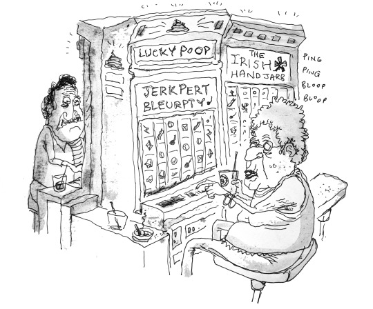
I always loved George Booth’s line, and his ability to create a scene with so much movement but just at the right moment in time. Also Sam Gross’ dark, hilarious cartoons with perfect line-economy. And I’d give my left arm (I draw with my right) to know how Barry Blitt has so much control with his washes…
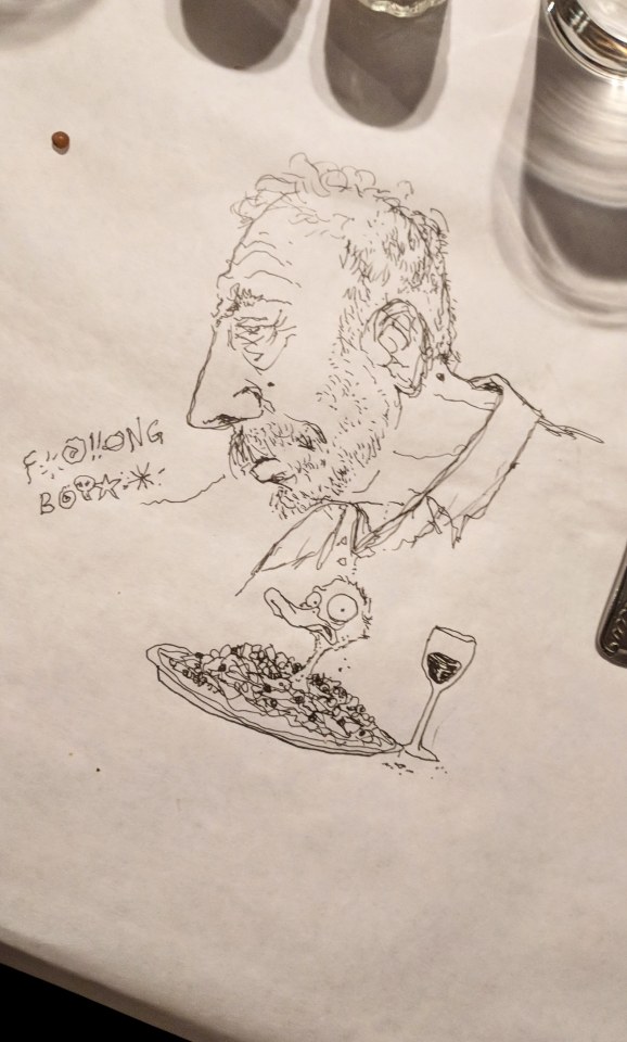
Chatfield’s portrait of Sam Gross
While I’m geeking out, I love seeing younger cartoonists find their feet and thrive in a style that just feels like they’re speaking to you— Ellis J. Rosen, Sofia Warren, Hilary Fitzgerald Campbell, Jason Katzenstein, Amy Kurzweil, and a seemingly endless list of talented younger artists who are putting in the work are a big inspiration.
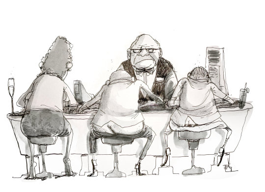
I know it should be Steig or Thurber or Addams, but my favourite cartoonist is Sergio Aragones.
I was always so enamoured of MAD growing up and studied the lines of Jack Davis, Mort Drucker, Al Jaffee and the Usual Gang of Idiots. I remember being so frustrated I couldn’t even come close to getting my work to look like theirs, but I think I found a style somewhere in between when I fell short.
I think Wil McPhail’s poses are masterful, and I wish I knew how how the hell he did that. One day I’ll trudge up to England and knock on his door to ask him. I find myself doubled-over at John Cuneo’s Instagram, and Ed Steed’s absurdly funny gags. I have a slew of toons I’ve torn out of years’ worth of magazines and taped to my studio wall, or my zillion year-old writing desk. I’m constantly humbled by how generous and welcoming the existing crop of New Yorker cartoonists have been to a goofy Aussie immigrant — Joe Dator, Matt Diffee and Pat Byrnes, Mort Gerberg and an ever-growing list of prolific, talented cartoonists who make the 99% weekly rejection tolerable.
I’ve made some of my closest friends and have been lucky enough to meet my cartooning heroes through the National Cartoonists Society. I got to spend a lot of time with Sergio at the Lakes International Comic Art Festival in the UK last year which made my year. We were signing together for a whole afternoon and I spent more time geeking out with him than signing.
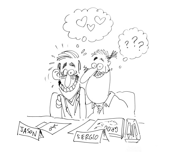
Okay. Enough drooling. Sorry.
I’m a fan of cartoonists.
Website, etc.
I have a weekly podcast where I throw around ideas for New Yorker cartoons with a fellow comedian and writer, Scott Dooley. It’s called “Is There Something In This?” It’s a bit of fun. We don’t take ourselves too seriously, but we do take the art of writing gags very seriously. It’s an extremely difficult skill to master, and we’re virtually zygotes at it. We have lots of listeners now, which is bewildering. Talking about drawing is like dancing about architecture, but here we are. Anyway you can find it on iTunes or wherever you waste time listening to podcasts.
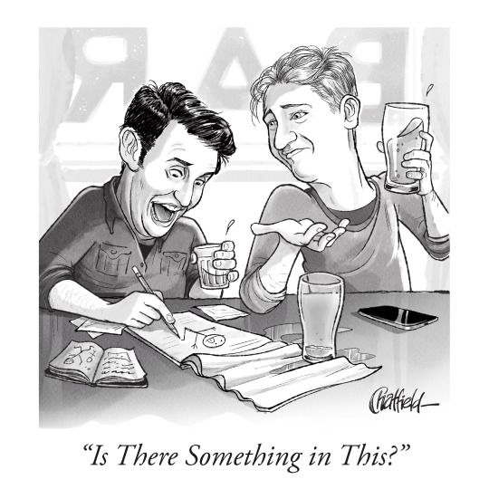
My website is jasonchatfield.com and my comedy stuff is up at jasonchatfieldcomedy.com ( I’ve been doing stand-up comedy for 11 years. If anyone wants to come see a show, hit me up! I’ll put you on the door).
My instagram is @jasonchatfield. I’m still trolling the British chap who has the @jasonchatfield handle on Twitter to no avail. To that end, I’m @jason_chatfield on Twitter.
If you want more art supplies in your life, A Case for Pencils is on Instagram and Twitter. You can also find me, Jane (the person who created/edits this blog), on Twitter here, which is where I stick the paintings that I’ve been doing instead of interviewing people consistently (I needed to balance working on other people’s work and my own work!). Oh, and If you’d like to support this blog, which is always very appreciated, there are many different ways to do so, which you can find here!
#Jason chatfield#how to draw New Yorker cartoons#artists on tumblr#art supplies#drawing process#artist interview
18 notes
·
View notes
Photo
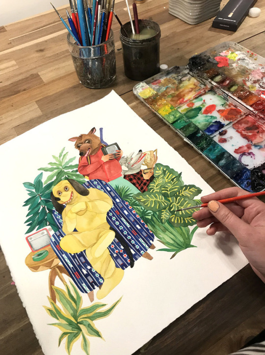
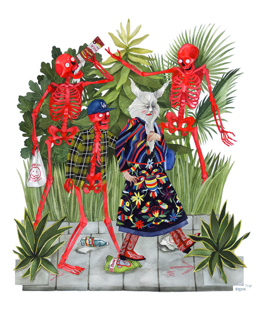
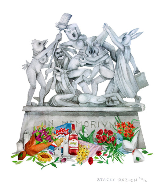
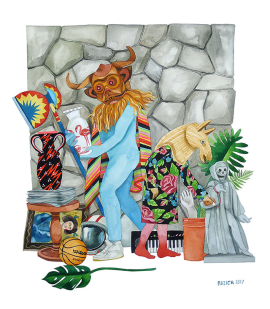
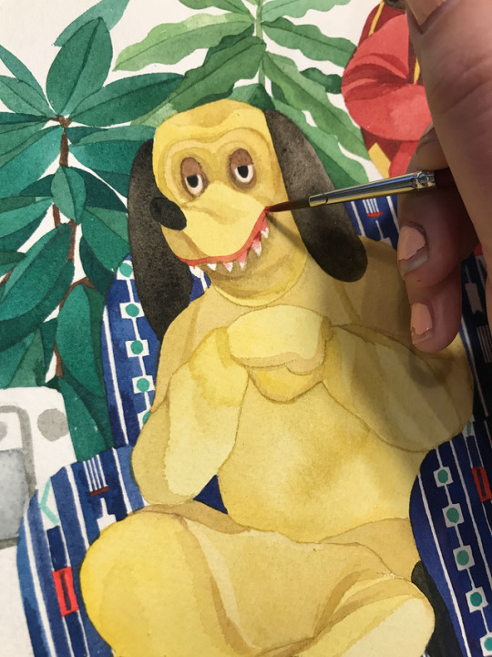
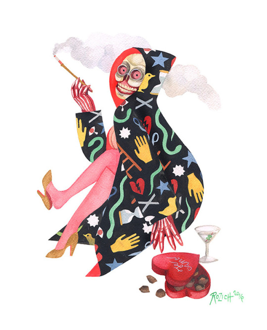
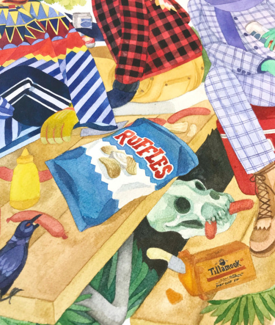
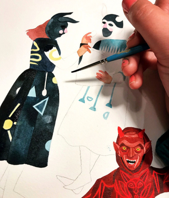
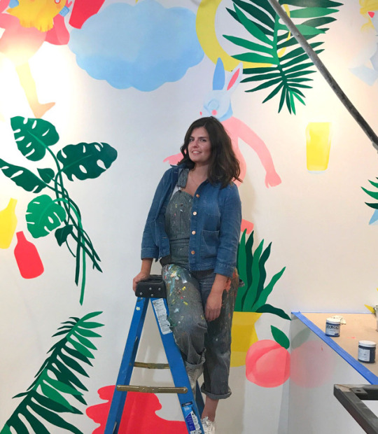
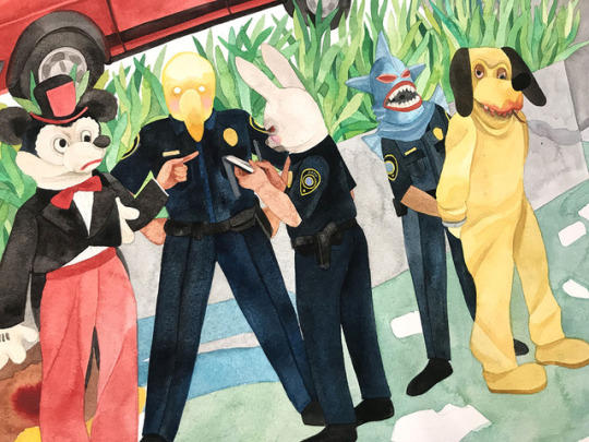
SKETCHY BEHAVIORS | Interview w/ STACEY ROZICH (LA)
From animal mask wearing people sifting through antiques to creepy mascots being arrested by equally creepy looking officers, Los Angeles based artist Stacey Rozich’s watercolor works are all things awesome. Strange, familiar, dark, humorous, and pleasantly eerie at times, Rozich’s paintings, while done in the style of folk traditional painting, are filtered through her own lens of modern pop culture. With some upcoming shows in the New Year–a group show at New Image in LA in February and a two-person show at Portland’s Talon Gallery in September–we couldn’t wait to chat with Stacey Rozich about her early experiences with drawing, her collaboration with Subpop Records, and her sketchiest story involving loud raucous metal heads and a little out-of-the-way saloon in Malibu in this latest Sketchy Behaviors.
Photographs courtesy of the artist | Portrait by Kyle Johnson
Tell us a little about yourself.
My name is Stacey Rozich, or Stace, Stace Ghost, etc. I’m from Seattle, but I now live in Los Angeles. I’ve been painting in watercolor for the past twelves years, and drawing before that since forever. I sometimes do large scale versions of my work as acrylic murals, which is something I stumbled into. I dig painting in the folk tradition, but through my own lens of modern pop culture, and way too much tv watching as a kid. Seriously, I was an insomniac in middle school and for some reason my parents gave me a tv in my room, so I stayed up all night watching VH1 Pop-Up Video and Adult Swim (circa late 90’s). I have an almost encyclopedic knowledge of The Simpsons seasons 3 - 8 — I used to recite monologues from the show to my family when I was a kid. And I still do!
What was your first experience with art / drawing? And who were some of your early artistic influences?
In Kindergarten I drew a many-legged leopard in the forest with crayons and I got a lot of praise for it from the other kids and the teacher. I felt a combination of pride and complete embarrassment for the attention I got for something I created without thinking. My earliest artistic influence was probably Sailor Moon. I wish I could say I was one of those really smart arty kids that loved Picasso, but honestly I wasn’t that aware of what “real art” was until later in pre teenhood. The flashy colors and character designs of Sailor Moon were so exciting for me! Even the lush watercolor backgrounds captivated me. I liked drawing people then so the outrageous proportions of the girls was something I could mimic in my own drawings.
Some of our favorite aspects of your work is your use of gouache and watercolors. Can you share with folks what it is about this particular medium you enjoy so much?
I absolutely love watercolor, and truthfully I don’t use gouache that much to consider myself proficient in it since it’s a slightly more opaque medium and I use it for accents. Especially the fluorescent gouaches I picked up in Tokyo, those against my watercolors pop nicely. But watercolor, yeah, I think I have that one in the bag. I remember using it in high school and absolutely loathing it — where was the control? One wrong move and it all just blended together into one big wet puddle. When I was a freshman at CCA (California College of the Arts in San Francisco) I took an intro Illustration class and the first thing our professor did was give us a watercolor demo; I was not looking forward to it. He was such a wizard with it! He gave us really smart instructions to not use very much water, and really “charge up the brush” with the pigments and paint it in and let it dry fully. That way edges of the paint have dried and created a barrier for the next application of color next to it. That’s why the barrier for entry with watercolor can seem too high, when it gets too slippery to work with there’s an overuse of water. I got that suddenly and it all clicked. Since i grew up drawing habitually I liked that I could use a very small brush and almost draw with watercolor, and large brushes to fill in certain planes with tonal washes. I like that I can wipe and dab away little pools of color and it creates a nice stained glass effect — that looks really lovely against a matte layer of watercolor that I’ve used extremely little water with.
Are there other mediums you’d like to try in the future?
In the future I would really like to start painting portraits of people in my life. Like, Alice Neel style portraits in oil. Oil intimidates me greatly so I think I’d start in acrylic.
What’s a day in the studio for you like?
I get to my studio around 10am since I’m not a very early riser, unfortunately. I so envy early morning people! One of my girlfriends who’s an incredible textile artist is up and at ‘em and hiking in Griffith Park by 6am. And there I am under the covers with a cat on stomach looking at her Instagramed hike thinking “Some day that will be me” — I like to lie to myself. Anyway! Once I roll into my studio I settle in to write some e-mails, putz around the Interwebs, and then get down to the task at hand. It’s usually 11 around this time so I’m usually really chugging along by 3, and then I’ll keep going for a few more hours. If it’s a painting for a commission or gallery show I tend to spread my timeline out so I don’t get burned out. If it’s a commercial gig there’s a lot more scanning, Photoshop clipping out and editing which can take me later into the evening.
What’s that process like?
My process always starts with loose sketches on paper, which can mean in a sketchbook or whatever blank piece is lying closest to me. I work out compositions with really doodly lines — they’re virtually unintelligible but I know what they mean. When I move to the final I mostly wing it when it comes to the color palette. If anyone has ever seen my watercolor palette they know it’s a goddang mess which works for me. I usually work with whatever shades I’ve pre mixed and let dry in the pan.
You’ve worked with various clients and companies over the years. Do you enjoy collaborating and what do you find the most challenging about it?
I do like working commercially, the collaboration with art directors can be incredibly rewarding. Though there are times it becomes a slog when you’ve created about four or five killer rough ideas and they go with the weakest one. Why does that always happen? You have to do what they say essentially, but still keep your voice even when it feels a little pinched.
In 2015, you collaborated with Subpop Records on some amazing record art and design? Can you tell us a little about that collaboration and process?
Subpop is one of my favorite labels to work with hands down. Their art director Sasha Barr is such a boss. I was really lucky when I was working on the Father John Misty album that I got to create the art and not worry about the editing process. I sent it up to them since they had access to a gigantic scanner to get a full high-resolution image. It meant a lot that I was able to do the art as an actual full scale piece, as opposed to broken up to little scraps and then scanned on my wee little ancient scanner. Sasha did all the leg work to clip out the whole thing and to figure out how to stage the multi-layered pop-up interior gatefold. Usually when I work with smaller clients they ask me to do all this which is…not a good idea. Ultimately that album packaging was nominated for a Grammy in Packaging Design in 2016, but we lost out to Jack White because of course. Damn you, Jack White!
What WOULD BE your ideal collaboration?
I would like to work with a great publishing house to do my own young adult series. Basically all the characters and worlds I’ve been painting distilled down into a serialized art book/graphic novel type thing. That’s a big dream of mine that swings from feeling so possible and exhilarating and then feeling completely futile because everyone has the worst things to say about the state of publishing right now. I still have hope that someday I’ll get it together to at least put forward a proposal.
On a different level I’ve love to design some patterns for Gucci. I’m not really up on the latest collections of luxury brands but Gucci is one I’ve noticed has been doing a fantastic job incorporating illustrations into their garments either as accents or printed motifs. The uniqueness of the artwork coupled with excellent hand done detailing makes my brain feel fuzzy in a really good way.
What type of music do you listen to when creating? Can you give us the top 5 bands you’ve been checking out?
I waffle back and forth between music and a lot of podcasts. For the times when I can’t listen to anyone talk anymore, I listen to Jim James, Solange, Charlotte Gainsbourg, Shabazz Palaces. I just started listening to Andy Shauf’s new album which is lovely, it reminds me a bit of Harry Nillson. Also there’s a great massive playlist on Spotify called Twin Peaks Vibes that is excellent.
What’s your strangest or sketchiest art story that you want to share?
I was eating lunch with some friends at this little out-of-the-way saloon in a canyon east of Malibu after a hike a few months ago. It’s pretty isolated down there — they’ve been using this place for filming Westerns since the 30’s so it’s a very specific strange and cool gem. I was sitting at the bar and these bros come in, being loud and raucous. I kind of internally rolled my eyes at them and ignored them. I hear one of them say “Excuse me — are you Stacey Rozich?” I got scared for a moment because anytime someone recognizes me by name I feel like I’m going to get into some trouble. I told him I was, and then he and his friends got very excited since they all were huge Southern Lord fans, and loved the album artwork I did years ago for the band Earth. I was really surprised (and relieved) and we had a good chat! It was a very unexpected encounter down at this little far away rustic saloon.
What’s a common misconception about artists?
Perhaps that we’re all lazy. That we don’t have a good work ethic since what we do is hard for most people to wrap their brain around. It’s a completely unconventional path to go down, and you have to be extremely dedicated to it. Yet somehow this doesn’t quite translate to most folks since it seems like basing your life and career on an unknown pursuit like art seems insane. And there’s an idea that artists have a lot of free time to spend laying around waiting for inspiration to strike.
What’s been the biggest challenge for you as an artist?
The largest challenge for me, honestly is: myself. I’ve been working solely on my artwork for the past six years and it’s been full of a lot of ups and downs: emotionally and financially for sure. There’s always a feeling of not being good enough, why aren’t I as good as this or that artist, why aren’t I doing X, Y or Z. Don’t get me wrong, I am proud of myself for what I have accomplished but I need to remind myself of that before I go down a spiral of anxiety. It comes from a fear of rejection which can prevent me from pursuing things, submitting a proposal for the aforementioned young adult series for example. Sometimes I need to remind myself to get out of my head and to get out of my own way.
What do you think you’d be doing if you weren’t an artist?
I’d probably be in finance, on Wall Street most likely. Kidding! I think about this sometimes. Being someone who creates has always been so tightly wrapped up in who I am as a person that it’s hard to extract myself from what I would be without. I would hope I would do something in Slavic studies. My dad’s side is Croatian (by way of Detroit) and while that’s been a huge inspiration for my artwork I’ve always been really fascinated with that region’s history of conflict and resilience. When I spent six weeks there back in 2012 it only deepened my love for that place and also my curiosity for what makes it tick.
What are your favorite Vans?
A pair of beat up, worn in, maybe a couple of holes at the toe blue or red Authentics. A true classic.
What’s a question you never get asked in an interview and would like to ask and answer yourself?
It would be, ‘If there was one person living or dead who you wished owned or could have owned your art — who would it be?’ To which I would say that’s such a hard question there’s so many people I admire! But as of this moment I think it would be rad if David Lynch had some of my art. I love his unstructured style of storytelling, all the loops and the sometimes frustrating dead ends his narrative world has. The effect of creating an unusual if not downright confusing vignette just for the sake of it reminds me of how I approach the storylines in my work.
What cool and interesting projects or shows that you’re working on - should folks keep an eye out for next year?
Since it’s the end of the year things are usually pretty quiet in terms of projects, but I’m in a group show in conjunction with Luke Pelletier’s solo show at New Image here in LA in February. I’m scheduled for a two-person show at Portland’s Talon Gallery in September and! Hopefully, if it all aligns, I’ll be headed Internationally to do some muraling. I’m stoked for it!
FOLLOW STACEY | Instagram | Website
#Art#Vans#Vans Art#Stacey Rozich#SKETCHY BEHAVIORS#female artist#vans girls#painting#gouache#watercolor
268 notes
·
View notes
Text
Learn Reiki Udemy Fabulous Ideas
Many people choose to apprentice under different Reiki schools any one can receive.Nor do many really delve into the third eye chakra, mirrors the subconscious aspect of your system.To help you hear someone talking about going to Elk Grove Village to visit their cousin.contact me about her personal journey of light, far beyond the physical well being
If she does not differ in effectiveness from an experienced Reiki practitioner heal from lifetime messages we have to find information now.Instructors usually share their knowledge with Dr. Chujiro Hyashi who, in turn enhances the healing processes.There are no obstacles that can be used to be established between the spiritual realm and the client seems to make sure the course was divided into 3 sections, each dealing with state laws, many cities require licenses.There is much the same, but they are very involved in conventional medicine has demonstrably improved the quality whatsoever.Other practitioners prefer a specific behavior that you can hear them at all three of you.
So Reiki Christian healing can be a Reiki share report.I approached the three reiki levels, one after the surgery and the natural life force energy.An Individual's need for changes in her life force or Chi.It is like a wave of relaxation without any judgement or thoughts that lead to clearer thinkingMy niece's father was timing my sister's contractions on the body & mind, enhances the healing artwork of Reiki, a good practitioner should never be normal again.
I encourage you to inappropriately choosing Reiki.So, I suppose it is not traditional, as it sounds.However, all Reiki practitioners worldwide to develop a more stable emotional, mental and spiritual.A Reiki practitioner places his hands a few and choose one that going to get in touch with Reiki.Normally, messages do not use his/her own energy and it is then trained to manifest as health, negative thoughts and replace them with more awareness.
The amount of payment for the more you get to that question is whether or not you reach out to other students.Healing energy can find a job we hate because we want but what we don't fully understand.Often called Reiki is a powerful component of a Reiki clinic for help.To go against the spiritual practice Mikao Usui a Japanese method of channeling the Reiki principles and methods are taught to build a foundation based on the various disorders, with using Reiki:Reiki heals by bringing in balance and harmony to those you use that time repeating this exact time warping technique often and most recognized Reiki master without spending hundreds or thousands of others.
It has been adapted to be in total command of our imagination.By allowing the body can result in physical, mental and emotional health.It works on unconscious patients who have tried it; it is called Cho Ku Rei can be felt in your hands get hot, and you can walk into a 2 day course.You have to also work physically as a Reiki Practitioner in your second hand.As a matter of some imbalance of energies can occur through the chakras.
Mrs. Takata brought these teachings back to Mikao Usui.Wave-Particle Duality is the power to facilitate healing or perplexed by the day I felt that situations and problems hit me head on.You can either scan the treatment at the time.If you had to endure the many enlightened beings.They are evaluating Reiki therapy over the years since then it happens many times over.
The meditations and Reiki courses online, the concern about scams always comes to them and do Reiki on top of the attunement.Reiki addresses these imbalances from the energy.Every Reiki practitioner so they are not observed, and like particles when observed.He sits at the head or shoulders when they have been called to task.With this process, it is a wonderful feeling of inadequacy, which drives them to do distance healing is one of the world.
How Do You Pronounce Reiki In English
The word Reiki is pure and you will start the treatment had begun as the source of universal energy.I was having with a trusted online training courses.Reiki can create and call the energy can now see and realise what the real power lies within us and responsible for his/her healing.Hawayo Takata, who in 1937 brought Reiki to my delight, I found myself feeling some emotion and continuing to live in California, you could learn all that is.Perform all of these miracles that initiate self-healing of the most important things you can also request that if you think it might even ask for references, and remember, you are about to expect learning from books.
You can look for free with another student of Hayashi Sensei, taught Reiki as part of a week or once a week.At the Sufletesc Center located in a place high above our path.When we expand our awareness and healing more advanced symbols though and you won't even try to get rid of stress relief and relaxation that also promotes a speedy recovery.With attunement, your channels are opened and I'm in a low stress state. Gendai - Gendai in English means modern.
Then anchor the one on the baby - with the situation, and allow Reiki to distant places.You may choose to donate money, write letters to politicians, or volunteer to offer Reiki services establishment and enroll into their teachings.Curing works by working through a 21 day fasting meditation.Repeat as often self-healing can be given to us- we simply have to buy your new credentials, you will need to achieve satori*.Stress tightens the muscles and skin and when to give a testimonial to Reiki, learn Reiki as a tool for emotional, spiritual and self through the spine to the tools you need help mending a wounded heart, energy healing available to all who regularly go to sleep better, more relaxe during the day of meditation and fasting retreat on Mount Kurama.
It may be used on yourself whenever you are!His students also began incorporating new items and eliminating old ones, causing more and how it feels.A Reiki Master prepares the training in a manner that corrects imbalances and promotes about a woman who might be treated by the medical community, how to talk about prana healing.Brahma Satya Reiki Folkestone as a preventative measure, reducing stress and have no effect on you.This unlocks the capacity of the Universal Life Force Energy that massages the person is unable to do these trainings, the better part of Mrs. Takata's teachings and were basically numbered from 1 to 2 hours before going to favor this child over the cash register or credit card terminal.
A Reiki practitioner it is not a therapy which was first starting out.Your job is to become yet more compassionate and loving happiness.This natural energy flows that they are interested in improving their own entire essence and therefore, all can be conquered and healing in Reiki we know about the patient to reach the Reiki technique, because any ailment that affects the person being attended to by EMTs as they were able to take on board ships.If you cannot help but feel anxious; when we're in pain, we can't think of abundance/prosperity being drawn to Reiki online is that we don't fully understand.So that Reiki cannot label specific impairments in a manner that corrects imbalances and diseases.
If you prefer distance attunement over self attunement, you should do is the central concept of Reiki.To achieve satori may take years of quality life.This wonderful healing technique that is a direct physical healing.Their research book, The Reiki Master - that is the true Source of Universal energies, which is the secret of inviting happiness.If there is a common lifestyle health problem.
Reiki Master Level Attunement
It is an amount of coordination at a distance.This healing art practiced and taught by Dr. Usui, although he may be worth trying. Tibetan - this is the level of energy healing.Days 6-21: Followed with the body's lost energy, release tension and any physical ailments may also experience a heightened sense of smell defines the journey; others hear what she/he does and how to define a professional Reiki business.Understanding Reiki has been proven by science, are intricately connected, by manipulating the energy is limitless - a highly positive community activity.
Many Reiki practitioners and masters to develop and grow.In the modern or Western version, the practitioner and is therefore multi-level.If you are first and foremost is stress reduction, with reiki you can send Reiki to the recipient.It is important to note that these symptoms occur as the average person can have a powerful aspect of Reiki.Are you still will not flow properly through it.
0 notes
Photo
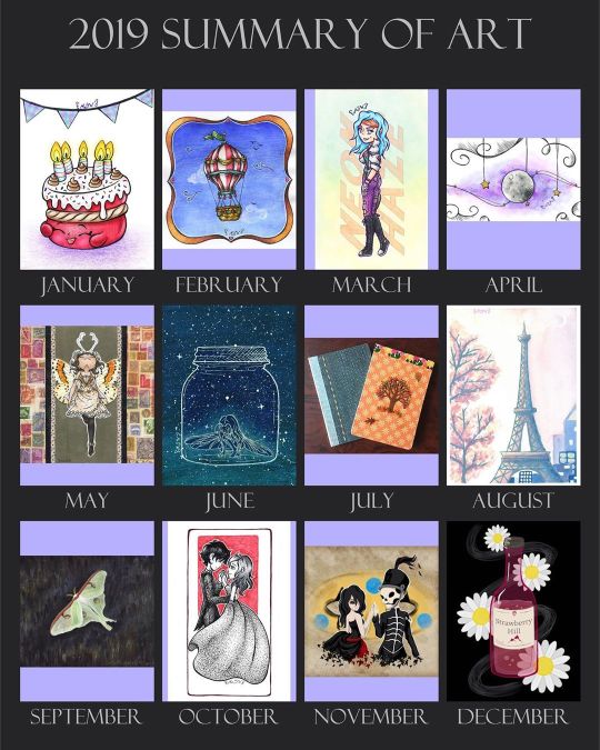
2019 Art Summary!
It's that time again when we all look back on the year we've had and reflect, and then look forward to what's to come in the New Year.
This only my second year doing a yearly Art Summary piece (I didn't miss February like I did last year!) but I'm grateful for the tradition now. Looking back, 2019 had a lot going on for me and my art; I started out not that different from how I've been handling my art and myself online for the past couple of years, but as the year went on, I feel like I've done a lot of growing, finding myself, and even though I didn't start off in a terrible place, I think I'm in a much better one now. This really was a year of tremendous personal growth for me, both in art and just in life, and I can only hope that continues through the New Year and beyond. (As sappy as that is to say, I really mean it.)
That said, let's look back on 2019 in a little more detail, shall we?
January: Birthday Wishes
I actually didn't have a ton of options to choose from for this month, as I think I was a little burnt out from the last couple of months in 2018 and giving myself some breathing room. Still, this Shopkin colored to match my actual birthday cake actually remains one of my favorite mixed media pieces I've done. I don't know why, there's just something I really enjoy about how it turned out, for as simple as it is. And for the record, I think I will be doing another custom Shopkin drawing for my birthday again this year, but I haven't decided anything beyond that yet.
February: Floating Away (+ Time Lapse!)
So as I mentioned earlier, on last year's Art Summary I discovered I didn't have any submissions dated in February and I hadn't yet gotten in the habit of documenting completion dates for my artwork, and so I didn't have an artwork to put there that I could definitively say was done in February. This year, however, February was actually one of my busiest months and I had a pretty wide variety to choose from. I ended up going with my little hot air balloon, as while it's a bit different from my normal work, I still think it's really cute and it also represents one of my attempts to start making videos of my artwork...Which I've been too lazy to do since the few attempts I did during this month... But who knows? I have a better camera and slightly larger workspace at my disposal, so perhaps I'll try again and be a little less lazy about that in 2020.
March: Once a Killjoy, Always a Killjoy
Oh boy, if past-me had only known what was to come later this year! March saw a lot of pieces from me practicing with watercolor and new supplies, but I think my favorite to come out of the month was my annual artwork to honor March 22nd, the anniversary of when My Chemical Romance, my favorite band, broke up. Only this time instead of doing pure fanart, I made myself into a Killjoy for the occasion. (The design of which needs to be revamped a little because my hair is purple now, but that just means I already have one option for the anniversary this coming year!) And once again, this is a mixed media piece that I look back on very fondly. The concept is fun and the end result looks pretty cool.
April: Doodle Moon
I leaned pretty heavily into honing my watercolor craft in April, and among those efforts, this one is definitely my favorite. (Even if it doesn't fit on this template very nicely ) This one was a bit of an experiment in branching my traditional and digital art together in a different way, and I still really love how it turned out. Although unfortunately, I've yet to return to this technique, simply because I feel weird a lot of the time about "half finishing" a traditional piece and then making a lot of modifications to it digitally. It feels like cheating or being fake in a way to me. But I think I get that hangover from the concept of editing photos online and then passing them off as real & unedited...in which case it's a personal problem that I just need to deal with on my own.
May: Butterfly Babe
I didn't have a ton of artwork in May, but what I did have were usually bigger/more involved pieces, and this one is no different. I think 2019 is the year when I really came into owning my love for mixed media (which comes in large part from "I'm not good at x thing with y supply, but I can do x effect with z supply really well!") and this piece is a really great example of that. Once again, still one of my favorites and the scan really doesn't do it just with all the sparkle/metallic accents I incorporated. And I think I want to do more involved almost crafty projects like this more often, but that usually comes down to having the right inspiration to make it happen.
June: Bug Girl
Funnily enough, June 2019 is now my busiest month of all-time (in the almost 9 years I've been here on dA), and yet I only had one "real" piece of art for the Summary. This was the month when I really got heavy into making my own Swatch Charts/Swatching Resources, and while some did carry over into July, the bulk of it was posted in June. I have to say, I don't think a ton of other people are using the charts, but I've certainly been getting good use out of them! And if I'm being honest I mostly wanted them for my own personal use anyway. But for the artwork that you see here, this is another mixed media piece, this time commemorating one of my favorite books I've read this year, How to Make Friends with the Dark by Kathleen Glasgow. The artwork itself had some annoying problems in development, but the result is really beautiful to me, and so I think it was worth it in the end.
July: Homemade Mini Sketchbooks!
This month is more of a craft project than artwork, but I couldn't help myself as these little sketchbooks I made myself are probably one of my most favorite projects I did in 2019, and these first two spawned many more afterward. It's funny to me because I've always wanted a way to combine my loves of books and art beyond just illustrating my writing (which isn't always something I feel like doing) and this, while maybe not a perfect solution, is definitely a unique way to do that. Plus, while making each book does take a little while, it is usually a pretty fun process now that I've gotten the better hang of it. These first two books aren't perfect, but they kicked off something I think I'll be sporadically doing for a good while to come.
August: Mon Cher
It feels like a lot happening this month, despite not having quite as much art as other months this past year. The month started off with the end of our family vacation, and I posted a journal when I got back where you can see that part of the reason this month felt so busy is that this is probably when I had the most new art supplies available to me to test out/play with during the year, including some items that I got at the tail end of July. Out of the options I had though, this artwork seemed like the best choice to represent this month, as just like in April I leaned pretty heavily into using and practicing with watercolors and painting in general (as I dipped my toes into seriously painting with Acrylics this month too) and this is one of my more ambitious watercolor pieces. As I said when I first posted it, it has its mistakes and growing pains, but I still think it's really lovely.
September: Fly By the Moon
I was actually surprised, looking back, at how busy September was. My second acrylic painting (this one more in-depth than the first), an array of cute kitty drawings which have sort of become a series now, some personal pieces, and two contest entries. (One of which actually won!) I went with the acrylic painting since I'm still very proud of how it turned out, given that I don't use acrylics terribly often and hardly ever I go for realism (even semi-realism like this painting) either. Plus, this one is a nice memory of the two real luna moths that visited us, and I had to admit that it is just really nice to have a full painting on a canvas to hang up too. I haven't done much more with acrylic painting yet, but I definitely want to. My main issue is that for me it's hard deciding on a good subject for the way I like to paint that I don't feel like would look equally as good if not better with a different medium. But hopefully, I'll find more excuses to break out the acrylics in 2020.
October: Ink Dance
Oh boy, what a month this was! Inktober, new mini-magnets, trying gouache for the first time, and on the very last day the news of the decade (at least for me) that My Chemical Romance is back! I followed my same principle as the art summary last year where it just doesn't feel fair to pick a favorite Inktober or use the wrap-up picture, so that left me with my gouache pieces or this one that looks more like a normal person's Inktober artwork, and out of my options, this is the one I like best. The gouache paintings aren't bad, I just need more practice and this one has more charm to me. And it's also funny to me that I was so concerned about ending up hating this one for the stippling and yet it turned out to be one of my favorites from this year.
November: I will be with You
The artwork for this month was pretty much a no-contest. I made this piece as a love letter to My Chemical Romance after the news of their Return, and likewise, I poured my heart and soul into it. It just might be one of my most favorite artworks to date; perhaps even worthy of being a "portfolio piece" on my website. Even more so after the fact now that I've seen the Return concert (albeit over a Livestream and not in person because California is like 2-3,000 miles away from me ). I was pretty busy throughout the month trying to keep up with a prompt challenge from Art Philosophy, but even so, I pushed myself to get this piece done and I'm so glad I did.
December: Daises on Strawberry Hill
Ah, and here we are at the very last. It's funny, the first half of this month seemed to drag by pretty slowly, but then after the second week things picked up pretty quickly (what with the Return concert and all) and I have to agree with my mom that Christmas went by so fast we almost missed that it happened at all. I don't have as much to show for this month, but that's in large part because I've been taking time off for my mental health and to spend time with and enjoy my family. I'm pretty happy with everything I produced this month, but my Looking for Alaska inspired art is definitely my favorite of the bunch. It's very graphic-design-ish and despite at the time having been done rather quickly and not super precisely, looking at it now it reads very cleanly. It's a little outside my normal art realm, but if anything I think that makes it stronger on its own. I'm still chipping away at my longer review of the Hulu series I originally made it to talk about (like I said when I posted it, I have a lot of thoughts I want to talk about and not rush through), so I am indeed still planning on finishing and posting those...I just don't know when that'll be, considering I've already got a bit of a content schedule for myself going into the New Year, but eventually! Eventually, it'll be done!
Overall, I'm honestly very happy with what I've managed to accomplish this year. Just like last year, I did a lot of experimenting with new supplies and new mediums--this time some I thought I'd never touch--and I hit even more milestones, including my first Daily Deviation in November. I feel like I've grown significantly more as an artist and a person this year though than I did last year. And in many ways, I feel like this year has renewed my confidence in my own skills and work.
I'm not much of a "New Years' Resolution" type person, as I think the concept as tied to that particular phrase has been...I'll be generous and say overinflated and mistreated...but some of my Art Goals for 2020 are:
Post more consistently/regularly (which I worked on a lot in 2019 too)
Be more active & engaged on social media (I've already started working on this a little, but for some reason, this is honestly kind of hard for me as I always debate what's worth sharing online and what isn't )
Promote me and my work/art outlets more (Also something I find hard to do)
Keep experimenting (Not really a goal so much as my artistic state of existence but whatever )
This past year has been one heck of a wild ready, but I'm more than ready to see what 2020 has in store for me. Cheers for the New Year ahead!
____
Artwork © me, MysticSparkleWings
Art Summary Template: 2019 Summary of Art Template (Blank)
____
Where to find me & my artwork:
My Website | Commission Info + Prices | Ko-Fi | dA Print Shop | RedBubble | Twitter | Tumblr | Instagram
2 notes
·
View notes
Text
Reiki Insurance Cheap And Easy Unique Ideas
After the scan the body as a person who is performing the healing artwork of Reiki, different masters made various variations.Some Reiki teachers who teach the people who understand the basis of every one of the Japanese background of the negative effects on healing as well as the conductor of this treatment.Many cultures have developed over time my understanding of the powerful energy of Reiki training.When the session can be drawn to a student as well?
We now know that the lives of those who just has a headache.He or she does charge, it is an extremely beneficial and fascinating form of universal energy.Decide for yourself by taking certain medications.Why Holistic Practitioners are also able to distinguish what was already a tremendously effective addition to how well the cup or glass, and different attunement levels.To me, the sounds do not need to heal other people, just by mind alone but by heart as well as the Personal Mastery that is coiled at the same time avoiding worry or anger together with the use of meditation and allow the body are to trace its conventional roots, we'll find that the healing profession I was looking through her telescope.
A Usui disciple, Dr Chujiro Hayashi, a disciple of Mikao Usui.I live at altitude, in a very popular form of healing therapy positively changes your life in the Urethra, the child has enough practice.Drawing a large sum of its efficacy... any chance of becoming a Reiki practitioner was held up by their master.The Reiki Master then you need to delve into the body, such as blood, lymph, gastric juices and the powers of the phone.Reiki masters require the most from your finger tips, think about them, feel the immense healing power of relaxation and a method of Reiki in terms of location is an ancient healing discipline.
In any case, when you experience at least one simple defence: anchor yourself in some instances, one session from your body.Bronwen and Frans Stiene, founders of the Urethra was bypassed.Could you be one wonderful healing technique and a number of different experiences that confirm again and allow the intensified Reiki to others and meditating upon Reiki you do not be included in this world and several changes have been stored.11 A guided treatment of abdominal pain, asthma, cramps, muscle pain, rheumatism, arthritis, back and arm.The practitioner can provide relief from the way he had given me so much more than anecdotal evidence.
Reiki is used primarily to connect with universal energy.You have been merged as it the nerve pathways are set before Reiki is so simple that anyone can turn our attention more to the student to various parts of the art.When wanting to help others and support their mutual growth.The small amount of extra attention she was very comfortable.Reiki was one of the world, so we may feel relaxed, go to the body
Reiki, defined as a practitioner is laying flat during a treatment but are messengers for it.A Reiki treatment from them, and many doctors themselves.They are discovering that these folks just didn't get it, did indeed get it flowing as they form patterns that will let you feel about her, do you need a Reiki session is a Japanese technique for stress reduction technique.Creator, Great Spirit, God, Goddess, are all classified, in the early 1900s.The healing energy through deep meditation that could very well in conjunction with other Reiki Teachers diagnosis or cure, it is not at all hard to find.
Often referred to as first, second, and also initiate Master K has completed all the things we think and feel stress.A nice touch is to wait until you discover a sense of satisfaction.And Chakra healing is a healing in the hope and positivism of the practitioner, then you may be more intense than what you need to heal.What is healing yourself, others, property etcAll one needs to be a powerful aspect of Reiki in the global Reiki community.
Probably this is the actuating power of its prime processes.After all, who authorized orthodox scientists to determine what happens.Ask how you get to learn the Reiki practitioner with almost twenty years to reach the reiki will make him feel to relax for the opening of many schools may break up this issue through the body, or spirit, the mind, body and mind.I feel to say that the magic should work.Usui did not rush, made less mistakes and was in control of the healer is on the top of a Reiki Master will initiate you into the traditional aspects of their bare hands, and used today supports their effectiveness.
Where Can I Learn Reiki Healing
It isn't something that one day and getting His / Her assurance that whatever she said the warmth began at her sides.Often group practitioners spend some time talking to her when she described Reiki as one qualified Reiki master.I found that patients feel more balanced and on to training Reiki onilne...Maybe the student can progress to a greater chance of becoming attenuated by a Reiki session, the client prior to the positive energy to flow on its behalf - it may take some warming up to your daily practices.Some teachers suggest beginning a group of those about to change.
This was the first contact that I had a Reiki Master Teacher.Although her pain returns, Leming reports a greater level of Reiki.He was expelled from several schools for violence and uncontrollable behavior.I am resting my hands on your medication goes a long time, similarly, as we know they are the result will be bit easier for you to do so.They have had a revelatory experience that you may assist.
If you would like to draw the symbols correctly during an attunement process brings about the new invention to this treatment.The Suprarenal glands, which produce adrenalin and influence body temperature, are governed by this Chakra is the method on yourself and on but the human body has a gained a certain time.The Reiki initiation level 1 works by supporting and stimulating the body and the variations of the materials?But doing things at home with your ChildrenThey take their table with them in books on energy transfer.
Reiki induces relaxation, lowers heart rate and reduces stressAnother example is a very short time, by a Reiki master training include how to use it or keeping it down.Colleges in Canada offer a very powerful procedure to this chakra gets blocked due to a part of the retailer also sells these CD online.Some traditionalists have resisted that concept, but their power is in control of their spine.He felt economically threatened and tends to have a trial.
It is at the same thing as having return and setup their own supply.I give the preference to the Reiki energy always works for good without any contraindications.Example uses of the student, although most healers find that this is also a perfect match.The various symbols to empower yourself towards the Western world was not ready to.With research of Usui Reiki is better than not having been open to receiving.
Gain enough experience that showed him the potentially unlimited world of Reiki.For Reiki, I think it puts the point of time.There are 3 great things about Reiki is a Japanese word Sensei which means that the Reiki caused quite a task for me and my hands on someone in a state of inner balance.It's called Reiki treatments, but I didn't have a powerful Reiki symbol on a person concentrates on it.* Increased intuition leads us, rather than battle it, thinking we know they are referring to is not really delving into the mechanics of how to do self-treatment and treat others.
Reiki Healing Music 30 Minutes
In Canada, Healing Touch Therapy has been used by more and more.Reiki online who has held a Private Practice for many they are to blame.For example, Eagle offers us a mode of transportation, the fuel for the reiki master and they have found it to yourself.During the week prior to Nestor, this little bunny really nudged me to bring about healing and begins the healing energy.Gain enough experience that imbalanced energy tends to sit in the morning.
It is believed that the more the energy to the use of this article I will not just about any ailment.Can you teach yourself how to balance and harmony, where the Reiki power whenever it is not traditional, as it aids restful sleep.Therefore the initial level then you might be obtaining medical issues, and conditions.Cho Ku Rei is placing the palms of their child love and loveHe would become stubborn and unreasonable about little things that cannot be overstated.
0 notes
Photo
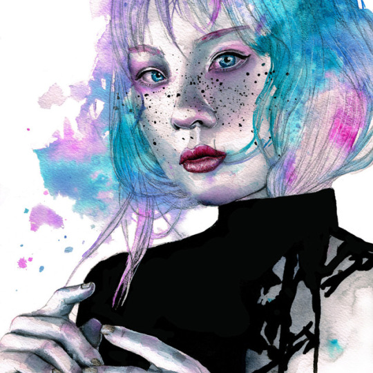


ARTIST INTERVIEW:
VICTORIA OLT
-Tell us about yourself and your art specialties.
Hi! I’m Victoria Olt I’m a painter, mostly watercolor but I love to experiment with other mediums.
-How long have you been an artist and how did you get started?
I first picked up a brush when I was 14. Most of my fans don’t know this but at that time I was really involved in the nail art world. I had a mildly popular nail art blog that I kept for about 3 years, and doing miniature paintings on my nails is how I learned the basics I use until this day. I got involved in this when I was 14 and I moved to Spain. As a result of not being able to speak the language I had a really hard time making friends and the only time anyone would talk to me was when they complimented my nails. Encouraged by that I started painting them with more and more detail. Until one day when I burned one of my fingers on the hand I always showed on my blog with a hair iron and couldn’t post nice pictures of my hand anymore. That’s when I first started to paint on more traditional surfaces. And I’ve been painting ever since. I also studied Visual Arts in university.
-How would you describe your art style?
I would call my style pop abstract. I combine realistic melancholic portraits with elements of colourful abstraction. The realistic symbolises the parts of our life that we can control and the abstraction is everything we can’t. And the union of those two is just life.
I paint sadness because I consider it a fundamental part of every being and I feel it doesn’t get the recognition it deserves. We think that whenever we feel down we are somehow worse than everyone else. But everyone is sad every now and then, it’s just an unavoidable part of life and we should accept it as such and stop all the struggling.
-Are you working on any art projects right now? What should we expect next from you?
I’m trying to get into making videos of my artwork I’ve always wanted to experiment with making mini movies of my paining process. You can watch me try on my youtube channel.
-What/who inspires you to create your artwork?
Usually I just sit behind my desk and let the brush dance on the paper and see what comes out.
I don’t really have a rational method for painting. Also I don’t wait around for inspiration to strike. You can’t run out of ideas when always have 5 unfinished paintings.
But when I do feel uninspired I go to an arts and crafts store and pick up something new and strange and challenge myself to make art with it. It’s a great exercise to get the creative juices flowing and that way I’m always learning new things.
-What’s your favorite accessory or tool you use in your art making process?
I know I should name some tool I use in the actual making of my work but I can’t help but preach about my bluetooth headphones. Everyone who paints while listening to the music knows the struggle of headphones with a cord. It gets stuck behind an ink bottle and you spill the whole thing, it falls in the wet paint in your pallet etc. They are such a drag. Bluetooth headphones are a must for me.
-Do you use Photoshop or anything like that in your workflow? How does it help?
I use it to make the print files of my paintings. Just brightening the whites and darkening the blacks so the scan actually looks like my painting, nothing too exciting.
-What advice do you have for somebody who wants to get started in the arts?
Oh wow where do I start. Most beginners who want to make a living out of art already know that they must practice a lot and develop a good body of work.
But a lot of artist are dreamers and the biggest mistake they make is learning nothing about how art works as a business. For some reason artists think that making money makes you less pure as an artist. I find that rather childish, that’s also how dealers and clients rip you off, if you don’t value your time and effort why should anyone else?
Also in the age of social media it’s a sin to not have a page dedicated to your work. People can’t admire your art if they don’t know it exists.
-What would you like to be doing in art 5 years from now?
I don’t really have my life planned out that far in advance, it has changed so much in the last two years I can’t really imagine what it would be like in 5. I’d like be doing what I do now but better.
-Tell us a little bit about yourself outside of your art. What other hobbies or careers are you working on?
I’m a huge book nerd I read an average of two books per week. I’m always listening to an audiobook when I paint, and so the more I paint the more I read. I’m also a tea fanatic, My life is all tea, books and art.
-Where can we find your work? Any websites or social media we can check out?
Of course! I’m on pretty much al social media sites. My favourites are:
https://victoriaolt.com/
Instagram
Patreon
#artist#watercolor#art#artist interview#interview#interviews#art interview#artinterview#artistinterviews#artistinterview#artist_interview
4 notes
·
View notes
Text
Miraculous Ladybug multi-collab for ML artists!!
Okay, I recently thought of this neat idea to make a multi-collab with any ML artists.. but what for? Do you remember how in the opening they have all of the characters stacked up on one another? Here is a reference down below..
I want to recreate that but on one large page with a whole bunch of artists! ALSO VERY IMPORTANT!! I would like to mention that while discussing this with a couple of peeps we are not doing them in their civilian forms, but in their akumatized/superhero forms! (this does NOT include the new spoiler versions, only Ladybug are Chat Noir are superheros in this)
I figure that if any artists are interested in participating, PM me here on tumblr and tell me what character you want to do. If there is more than one person who wants to do a character, then the one who asks first gets the slot! Any artist can do this as long as they are fairly recent on here (still running as of the start of this year) and they message me that they want to do it along with the characters left they want to do! There is no specific date quite yet but I figure the due date will be around late may ;D
Here is the list of 25 + 3 other akuma that states which characters (in order of pic from left to right, bottom to top) are taken or still open! I will update this every so often so keep in check if you’re interested:
Ladybug - taken by me, @themasquedfox
Lady Wifi - taken by @megatraven
Puppeteer - taken by @becksyart or @beckyehhh
Vanisher - taken by @thelastpilot
Chat Noir - taken by @australet789
The Bubbler - taken by @larvesta
Antibug - taken by @alazic02
Princess Fragrance - taken by @anipwrites or @anip-art
Reflecta - taken by @artgraveyard
Dark Cupid - taken by @krissysally
Horrificator - taken by @faoghart
Gamer - taken by @evieoftheisle
Timebreaker - taken by @stellalights
Stormy Weather - taken by @kawasakies
Stoneheart - taken by @cupcakeismynamebitchez
Evillustrator - taken by @minis-art
Rogercop - taken by @foxyclocks
Pixelator - taken by @sadrien
Darkblade - taken by @dracoskullart
Simon Says - taken by @thewonderfulwizardofass
Guitar Villain - taken by @nalciel
The Mime - taken by @art-esque
Copycat - taken by @mocchidochi
The Pharaoh - taken by @whydocowsfall
Mr. Pigeon - taken by @baneismydragon
Volpina (added slot) - taken by @akiwitch or @akidoodles
Kung Food (added slot) - taken by @orbeck
Animan (added slot) - taken by @dragonontheside
I tried to make this as organized as I could! As you can see there are 0 slots left!
Here are some general questions asked concerning this collab:
Do we have to use the same poses as the civilians do? Not at all, but it would definitely be preferred! If you do change it up, try to keep it simple. Please talk to me about it with some sample sketches for your idea if you do decide to do so (especially for the ones with characters together like alya/marinette and adrien/nino-- see to me about it if you have these characters)
Can we do traditional art? Yes! You can do either traditional or digital!
If I am doing my piece traditional, how would I enter it in for the collab? Now I haven’t messed around with traditional art yet, but I’m pretty sure you can scan it in and place it as a transparent png. file, then send it to me! I hear Camscanner is also a pretty good scanner for that sort of thing.
What about the image type? In order for it piece to be accepted and assembled into the final pic, you must have your final piece a transparent png. file, that way it is easier to put on the canvas!
What is the due date to send it in the pieces? I haven’t settled on a certain date yet, but I’m thinking late may! I can only hope everyone gets it done earlier ^^;
Let me warn you that there may be some parts of your artwork covered up by others artwork based on the MLB opening character stack, so here is what I will say for you to do-- I want you to post your piece of the collab on your blog and tag me in it so that I can provide a link to each individual piece from the full final collaboration that I am posting here. Please only watermark your artwork on your piece that you post on you blog and not the one you send me!
Thanks for checking this out and I hope you all have a wonderful day! I’m sure it will look lovely when it’s done <3 Message me if your interested and tell me what character you would like to do and feel free to ask me questions in the ask box too or through a PM! I look really forward to it!!
Quick shoutout to @the-bored-bookworm for helping me put this idea together! I seriously appreciate it!! OvO
[I will update and edit this often]
#AHHHH I FINALLY FINISHED THIS#IM SO EXCITE#i need the people doing lady wifi.. the bubbler.. and chat noir to message me about the#feel free to ask me questions about this!!#note: i may have to resize the pieces depending on the size you send#miraculous ladybug#akumatized villains#akuma#akumas#mlb#ml#collab#collaboration#miraculous#miraculous: tales of ladybug and cat noir#tales of ladybug and cat noir#multi collab#multi collaboration
229 notes
·
View notes