#I was just using this to test out gradient maps but the pen tool I was using ended up having this really cool effect
Text

Lunacy
#envy draws#art#artists on tumblr#illustration#digital illustration#gradient map noise chromatic aberration my beloveds#definitely one of my favourites I had so much fun w the colours for this#I was just using this to test out gradient maps but the pen tool I was using ended up having this really cool effect#bc the brush is kind of faded on one side which meant that part of the lines got assigned a different colour by the gradient map#bc it ended up as a lighter grey#which is why the brush strokes are dark blue in the centre but fade to pink#I think I’m gonna try this again sometime!!! it was really fun
23 notes
·
View notes
Note
sorry to ask but what clip studio brushes do you use?

i BARELY use csp for lineart and sketching so these are basically just. suggestions.
i prefer using sai for line art bc i like the feel better but tbh just use whatever line art/sketching brush you think fits your style.
SSA_E brush, potato lineart pen, 線画用ペン, custom is uhh literally just mashed up shit

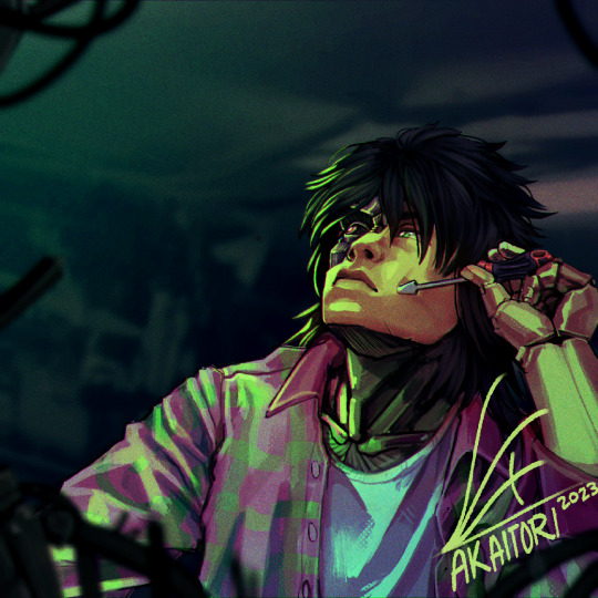
let's use this unfinished wip for testing the brushes i actually use. sure.
(i think i sketched this w my custom brush....idk this wip has been in my files for months)
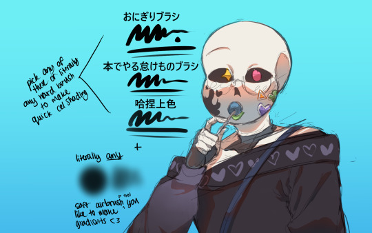
おにぎりブラシ, 本でやる怠けものブラシ, 哈捏上色 (pick any hard brush you're comfy with tbh)
something i forgot to mention, i sometimes blend out the edges
basics of soft and hard edges in art yk, use any blending tool you have

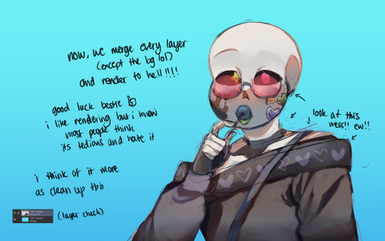

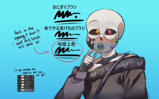
i rendered with the rice ball brush i linked earlier (this one), drew shitty clouds for the bg, added a random ass gradient map and then finished it!!! ta da!!!!!!
for rendering, i basically use the hardest sharpest brush i have at hand and just clean up anything i find messy. that's it. that's how i render.
it's so easy! that's why i really like rendering
this....ended up turning into a tutorial on how i paint in general but it's not like i could've avoided it because i needed to use the brushes shown after all
i hate those fuckin. posts where artists give their brushes out but not show how to use them, leaving them essentially useless so there u go! i hope it helps
#sorry this took so long to answer btw anon.#i knew it was gonna be really tedious to make and find all the brushes#ESPECIALLY figure out which brushes i use the most (cuz i dont use csp often)#so i hope this was worth the wait!#tutorial#hawthorn ink#(cuz i know this wip was supposed to be hawthorn ages ago)#tutoriel#ref
189 notes
·
View notes
Text
Attack Dog - Rendering Breakdown
OK here's an attempt at explaining how I go with illustrations. This isn't necessarily an 'effective' way to paint, but rather it's a process to maximize my personal enjoyment. I encourage you to do the same! Find those steps you have the most fun with, and exploit the hell out of them.
For this post, I'll be going step-by-step for this illustration
1- Sketching
A Mess. I don't like making lineart unless I'm super in the mood for it. In this case, I couldn't be bothered to spend a lot of time in the sketch. I often use 3D models as a base for paintings because, if I'm making a painting I only want to paint, not to stress out on anatomy.
2- Blocking values
I only start painting with colour if I'm certain about what I want to do. In this case, I wasn't. When it comes to visual information, values (light and shadow) are more important than colour, so it's easier to block those out first than trying to improve the values in an already coloured piece.
This is a very insightful video if you want to see if a greyscale-first process could be useful for you. Marco Bucci's content in general is a treasure.
Here's a link to the head model used for light reference
3- Paintinggg hell yeah babyyyyy
Not much to say here except, look at a lot of reference. I only limit my canvas to one or two reference pics to not get it super crowded, but I'll always have more pictures open on my browser, tablet, etc.
There's this little app you can use to compile reference pics. I don't use it because the act of opening it is too much work for me but, it's a neat tool.
The main brushes I use for rendering are the following:
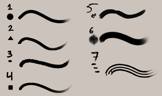
Regular round brush with pen-pressure opacity.
Custom triangle brush. It's just a triangle with some texture layered on.
Clip Studio Paint's textured paint. Unmodified.
Custom square brush. Same as the triangle, but it's a square.
Clip Studio Paint's gouache brush. Unmodified. Good for blending.
"Fur block-in" from this pack. Excellent for blocking in feathers.
"triple line" from this pack. Very good for adding texture.
You don't need this many brushes, but I like the variety to keep things interesting. I'd say that only #1, #2 and #7 are essential to me.
A quick trick I used for the muzzle was to make the wires with a white brush, on a layer with border effect.

I considered explaining how to shade feathers here but, it was making this post a little too long. Even more than it already is. But, let me know if a guide on drawing feathers is something you'd be interested in seeing!
4- Colours
For this one I kept it simple. I liked the values and I wanted to have a very stark contrast with the red blood. I made some quick tests with gradient maps trying out different palettes, using gradient maps and overlay layers.
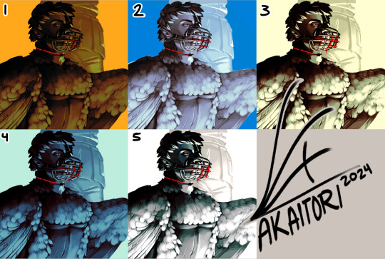
While I enjoyed #1, at the end I went with #5 as it worked better narratively. The clinical white and silvery shadows give a stoic indifference to the blood, which fits with Blackbird's character.
The muzzle and situation on itself aren't a canon event happening, so it also felt more fitting to keep a more stylized 'colouring' rather than actually putting in the character's colours and scene. For this colouring, I only used a single gradient map, but it's not rare if I end up using several, placing masks for areas of different colours.
When it comes to colouring greyscales in character colours I follow a different process, for which I'll use another illustration as an example.
(this is Loketh, he belongs to my partner)
So, for this drawing I also started with a grayscale, but started adding colour in much earlier.
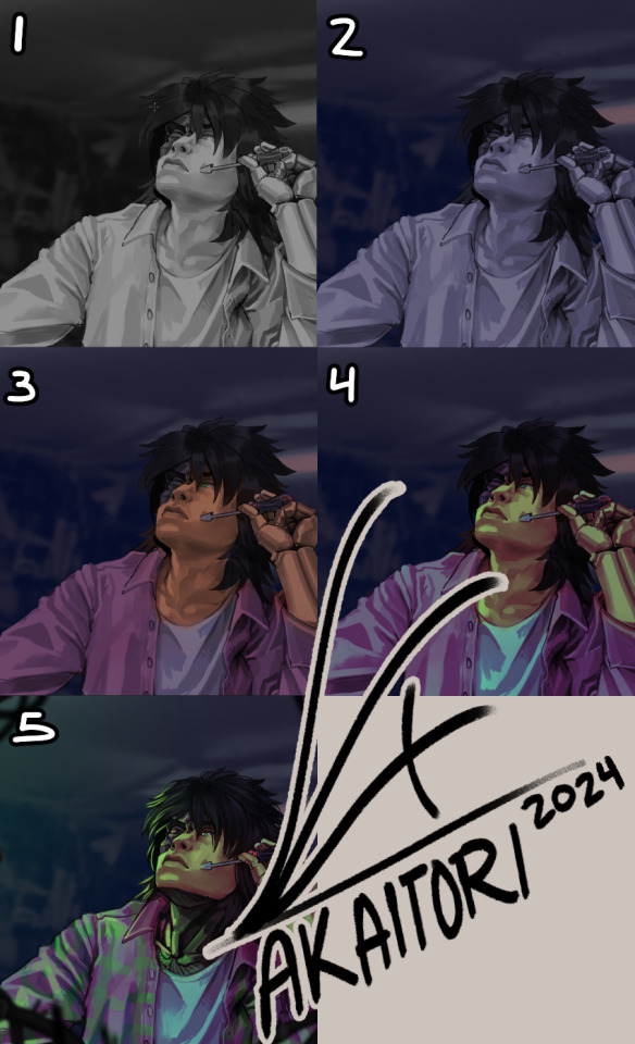
1- Black and white base render
2- New layer with a flat colour, put it on overlay. This will serve as a base for colouring, kinda like glazing on a canvas for a traditional painting
3- Adding character colours, in a new layer on overlay mode. You can do this in a single layer, or make new layers for each new colour. Just keep it loose, no need to add all detail yet.
4- Colouring the shadows. I used a gradient map adjustement layer, set to overlay. Made the lights green, and the shadows purple.
5- Flatten and paint! Now this is the step to add all intricate colour details missing from step 3.
5- Post-Processing
This is a term more used in 3D renders, where it refers to colour corrections and final tweaks. Things like adding depth of field, motion blur, vignette, any final filter.
For almost all my art I'll add a grainy noise layer and chromatic aberration, I just think it looks neat. You can also add paper textures or flat colours on top of you image and set that layer to overlay, it helps to tie everything together.
AND THAT'S ITTT
I hope this was useful, and remember to just have fun with it :)
Further reading:
Marco Bucci's youtube account
Jason Rainville's blog with breakdowns of his illustrations
Sinix Design's video on colouring skin
Anatomy For Sculptor's 3D models for muscle reference (cw nudity)
11 notes
·
View notes
Text
Week 03 - Studio and SDL
During our studio session we were tasked with a composite exercise, requiring the cutting and pasting of a train into a different scene (among other things) I did find the process quite frustrating as some of the techniques used in the tutorials felt a bit too extensive and unnecessary. I was able to work things out just fine - but did feel a bit antsy when using some of the more painstaking tools like brushes and pens.


over the past week I have been experimenting with analog photography, purchasing a Minolta-P - a small and compact range finder. While it may not be so impactful on our current project I wanted to take this opportunity to further my horizons on photography, and try out new methods.


I've managed to shoot to rolls of film - a 400 ISO colour, and a 400 ISO B&W. I've sent the colour roll off for development, and plan to learn how to do my own with the black and white roll.
During our lesson, I began by trying out some edits with the photos within the class image bank. I'm not entirely sure what direction i want to go with my edits so i'm just playing around at the moment. I like the colours and grain i this one, possibly i could take this idea further.


Photographer research - Trevor Wisecup
I dove into the photography of New Yorker Trevor Wisecup, a street photographer who shoots on film. What I love about his work is how surreal, yet grounded his photographs feel. the colours, the scenes, the places are practically bursting at the seams. While this work isn't exactly relevant to our photo manipulation task, I find his work quite inspiring, as he manages to bridge the gaps of reality and fiction within his photography. It's hard to believe that these images are shot on analogue, with no digital manipulation. It's this kind of lightning in a bottle feeling that makes photo manipulation so exciting.


SDL - WIP 01


I further developed my initial edit by bringing some signage for texture, and a flower to replace the statues head. I'm not too great at making digital compositions that look realistic, so I'm trying to lean into that by creating a bit of a style for myself. Using grain and gradient maps, I've created a bit of a rough-around-the-edges visual for myself. i've tried to select a few images that might not exactly go together typically, and bring them together with my newfound visual style.

I've used a lot of the layer and blend tools within my work, layering and compositing images and treating the document like a scrapbook or collage of sorts.
WIP 02


For this edit I started testing out clipping masks, and using the images to tell a story. I really love the mysterious misty nature of the park image, and the horse head was just so striking. The ripped signage is also very shocking, reading; "Harvesting from tortured children". Possibly this horse-man is deranged? It's a bit of a silly combo but I think it works quite well.

0 notes
Note
hiiii! i just wanna say, i adore your art. second, im teaching myself to draw and while i can draw simple basics (mouths and sometimes eyes if im lucky), im still a beginner. ive watched many art videos and im still a bit confused on wtf im doing. so i just came here to ask if you had any words of wisdom for beginners? could be anything from what tablets to buy to simple mistakes to avoid. ive read some of the other posts here and have found it all extremely helpful so far! Thx for all you do!!
Hey there! Thank you so much!
I would put a read more but tumblr is broken. I’m trying to cover a lot of varied thoughts in little points, so if there’s anything you would like me to elaborate on or otherwise have questions on, feel free to shoot me an ask or dm me!
General
I think the biggest thing to remember is not to compare yourself extensively to others. A little bit of comparison is healthy... But too much will destroy your confidence, motivation, and take the fun out of art. Particularly if you are comparing yourself to someone older than you (life experience and coordination come into play here) or that has been drawing much longer (practice).
Additionally... If you’re not having fun (and you’re not getting paid to do it), don’t force yourself. If you find yourself being frustrated or bored with art, don’t force yourself to do it. That’s how you burn out and get art block! This applies to parts of a peice, too! If you don’t feel like drawing a face or a hand today? don’t force yourself to finish it. Come back to it later when you aren’t as frustrated or are getting better results. Even if its a week or a month from now. Honestly, at any given time I have probably ten headless bodies in my drafts. That’s okay! I just come back to them when I’m ready to do the face. And don’t be afraid to abandon something if it doesn’t feel right!
Something that also doesn’t get said enough.... take care of your body! I never knew when I started art, but artists are supposed to do warmup sketches and stretches and muscle exercises! I didn’t do any of this, and i went through a period of a few months where I was drawing for 5ish hours every single day. I developed carpal tunnel from it! So remember to take care of yourself. Take breaks, stretch, remember to eat.
Practice
Practice!!!! Even if its just for fifteen minutes every day. Or twice a week. But if art is something you really want to get good at, you have to put in the time and effort!! You can’t expect to draw an hour per month and be on the same level as someone who draws an hour a day!
I know I say this a lot but I think the biggest thing is just reference! If you don’t know what something looks like, look at a picture of it when you draw it! To go hand in hand with that, though, don’t just copy what you see! Learn from it and apply it! So take, for example, a shoe! pay attention to the way the heel is shaped, the location of the eyelets for the laces... how large the toe is, how steep the top! While you’re at it, look at other styles of shoes as well, and compare them! See what makes it look like a boot versus a trainer! And then the next time you draw it, hopefully you’ll remember all the things you learned the first time around!
I do lots of studies that serve no purpose other than to teach me things! I use referencing/studies to learn about color theory, shapes, and anatomy in a real environment. For example, hands or fabric folds! Oftentimes I’ll do them timed (20 or 45 minutes) so that I don’t fixate on perfecting things, just on the process itself and what I can learn from it. This also helps with getting better acclimated to your software and more coordinated with what you’re doing. Repetitive learning, like with playing sports.
I’ve realized a lot of people don’t quite understand what a study is? Basically you just look at a photo and try to replicate it so that you can learn about lighting or color theory or textures or anatomy or whatnot. So here’s an example of a timed study.
Additionally, don’t avoid!! We, as humans, have a tendency to avoid things that make us uncomfortable or are difficult. But it will make you a better artist in then end. When I first started, I absolutely hated doing fabric. I felt like I wasn’t good at it. So instead of avoiding drawing clothing, I sat down and did studies and sketches of different kinds of fabric. By the end of this learning period, I became comfortable with it and grew to enjoy it. These days, I adore sketching clothes, and it’s why my pants and shirts and things tend to be detailed instead of stylized in line art. If you don’t like drawing hands because you feel like you aren’t good at it? Sit down, look at a bunch of pictures of different hands, and practice it. By the end, you’ll be more comfortable, you’ll have learned something. Even if you feel like the drawings you ended up with aren’t good, you’ll still have learned, and that’s what matters!
Style
I worked on basics before I tried to develop a style. I made sure to start with a very realistic method at first, so that I could be sure I understood how fabric folds, anatomy, and realistic expressions worked before I tried to stylize them. I think in the long run this approach really paid off for me. It also allowed me to be conscientious of what elements I was absorbing into my artwork. I hear from so many artists that they started drawing when they were younger and into anime or cartoons or things like that, and tried to emulate it. Because those styles became so ingrained into their artistic skillset, it becomes near impossible to iron out those influences and get rid of them later. So starting with realism is a way to ingrain proper anatomy and other good practice into your artwork.
One way to develop style is to take a look at the artwork of someone you admire, and try to list out the things you like form their style - perhaps the thickness of their lines, or the way they do eyes. Do this with several artists, take all those little details you like and try them out! See if you enjoy using them in your own drawing process! Think of it like a grab bag or a pick-n-mix, sprinkling in the elements you like here and there to create something new and your own - not just copying another artists style word for word.
Don’t worry too much about it though; don’t allow yourself to become anxious or fixated on “achieving a style”. Its a natural ever evolving process that comes with time and practice. I know a lot of people get hung up on style, but just take it one day at a time!
Also try to keep in mind what style you’re going for as you begin drawing. And I don’t mean that like sailor moon vs. ghibli. I mean that as in, is this piece going to be a painting, a lineart, a lined painting, cell shading...? It will help you in the longrun if you narrow down the broad kind of style you use, and refine from there.
Workflow
My workflow for paintings is very different from my workflow for lineart and cell shading. A full tutorial on how I do paintings can be found here! A process video for how I cell shade can be found here!
Everyone is going to have a different method that works for them! You just have to experiment and find out how you like to draw! For me, personally, I use color blocking for painting (see the tutorial above) and a spine method for lineart. How the spine method works is that I will draw lines that represent the legs, arms, back, etc. so that I can determine the placement, length, and composition. From there, I’ll add a dark outline that actually shows the shapes of the body. Then, I’ll use thinner lines to add details. This is the method I’ve found that works for me. Another commonly used method that I’m sure you’ve seen is representing body parts with cylinders and cubes. There are lots of good tutorials out there on breaking down bodies into shapes like this!
Something that I do is if I’m not quite happy with a part of a drawing, I don’t just erase it. I duplicate the layer so that I always have the original copy, and then I make changes from there. Sometimes I can end up with five or six different versions of the same arm or face that i’ve made minor changes to. And then I compare and pick the one I like best, or condense all the parts I like from each version to make a “best” version.
Tools
Currently I use Procreate and the standard Ipad with Apple Pencil. Prior to March I was using a Wacom Bamboo Touch and Photoshop Elements 2008. I find its harder for me to do full paintings in procreate, but its made my life a million times easier for lineart and cell shading. The pen pressure is phenomenal, and I also adore that its wireless / active screen instead of plug in like the wacom. The programme itself is intuitive and easy to get the hang of; it simply lacks a lot of the neat tricks that photoshop has, like rendering (lens flares, for example), gradients, and gradient maps. Try testing out different trials of programmes... firealpaca, photoshop, autodesk, whatever it may be! What works for me may not work for you!
287 notes
·
View notes
Text
My first zine pages
Subhumans page
My starting idea for the page i'm going to show you, was to use an existing album cover and make it my own, a lot of the process for this one was simply me playing around with photoshop and procreate, and trying to make it look fun and bright, as well as being able to improve my skills on photoshop.
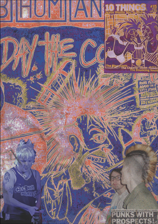

As at first I wasn't completely sure if I wanted to use this page in my actual zine I didn't photograph the process of the journey as well as I would of wanted to, if I knew how much I would love the final outcome. So the top photo is before pro create and the bottom photograph was in the second stage of making the collage. First I will explain the first steps I took on photoshop with actually laying out the images and figuring out how I wanted it to look. As I said before the basis of this idea was to use an album cover as the background, and one of my favourite punk bands were Subhumans, who I have already mentioned in my previous research as they were a very politically driven punk bands, and I always thought their cover of the album The Day the Country Died was really cool, and I really wanted to use this.

But I really wanted it to be bright so I decided to test out colour ways on the gradient map, where I decided to choose noise, which makes the colours al to more in your face and have an almost grainy effect on it. I then went to adding the photographs I wanted to use for it, with the bottom left one being one of my friends at a gig, after putting the photo in, and using the select and mask tool to get rid of the background I realised that she also had mohawk style hair just like the photo, so I decided to build the rest of the photos around this. The bottom photo I got from my friends art account called Cr0sspxtch, where she provided me with a folder of photos she had used at a gig, and seeing a photo of our friend Liam who has a mohawk I thought it would fir perfectly. However I didn't only want to use photos, I was interested in the idea of using a zine page, so I again looked through the Fanzines book by Teal Triggs which has so far being really helping me in this project for research and inspiration for my own work, here I found the perfect zine called '10 things Jesus wants you to know'.

Where the man had a mohawk, and the woman also had a spikey type hair cut, so I felt like this fit in really well. I was definitely happy with the progress so far but I still wanted to add something more. I wanted to link the fact that Subhumans were a very politically driven band so I thought a nice contrast would be to use a punk headline, and one of the most famous punk headlines of the 70's titled 'Punks with prospects', I thought this was a really nice bottom touch and as I knew I was going to add quite a bit on procreate I decided this would be a good time to move it to there.

This is the first time I had really started to experiment with procreate, I knew that I loved doing digital work but I also wanted to use my own handwriting and stick to the old zine style as well, and I knew that with procreate you can use many different types of pen and pencil styles using an apple pen which gives it a more physical feel than it does when using a font on photoshop. I'd already decided that I wanted to have fun with this piece, so I just started drawing whatever I could think of onto the page as this felt like the most authentic way to do it. From this I started to draw a black line around the mohawk in the album cover and add little bits of text like 'riots in the city' and 'subhumans', I did this by using a pencil type pen, I then coloured in the newspaper headline and the t-shirt in the bottom left corner, and as I did that in red I thought it would look cool to add some devil horns and tail, keeping the whole page quite sketchy. I loved the sketchy look of the whole page so far and while testing pens I drew a smiley face, and actually ended up really liking it so kept it in. One of the last things I did to that page was colour in the teeth green and yellow and from this I thought I gave the man quite a grim look, so I decided to extend this, as on the original album cover there is spit and also snot coming out of his mouth and nose, so I chose to extend this by drawing some of my own in green and while onto the photo below of Liam, I thought this looked quite humorous and on top of this is brought in the two elements of the cover and the photo well, so I decided to keep it. The one reason i was really like ring this page is because of how sketchy and authentic it felt to me.
This page was by far my favourite so far and I felt like the most evolved piece I had done showing my progress in using photoshop and also decided i certainly wanted to use pro create again, so I felt like it really set me off on the right track for the rest of my zine and gave me confidence to start making more pages. On the other hand I knew I didn't want to get too comfortable in my digital work and show what else I could do with my physical work.
Gig blood page
My baseline idea for this page came from a photo I took at a gig, that I has already shown in my digital sketchbook.
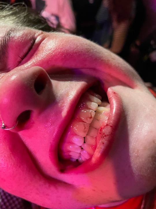
I thought it would be fun to name the page gig blood, as I took this photon at a gig when one of my friends got a busted lip from being in the mosh pit. Throughout the years punk gigs are notoriously known to be quite violent, Vim Renault writes about this for punkgirldiaries.com 'When the punk movement took off, the violence came on board. Bands like the West Ham supporting ‘Cockney Rejects’ took part in what has been described as ‘the most violent ever punk gig’...there were riots all the time at punk gigs.' A difference now however is that punk gigs aren't violent in the way of rioting and actual fights going on but in the most pits it's not uncommon to be hit or hurt, as the whole premise it to push each other around. On top of this there is a real sense of friendship inside the scene, most people know everyone there as the same crowd go to the gigs so no one hold anything personal if they get hit by one of their friends, and I really wanted to develop this idea into a page.
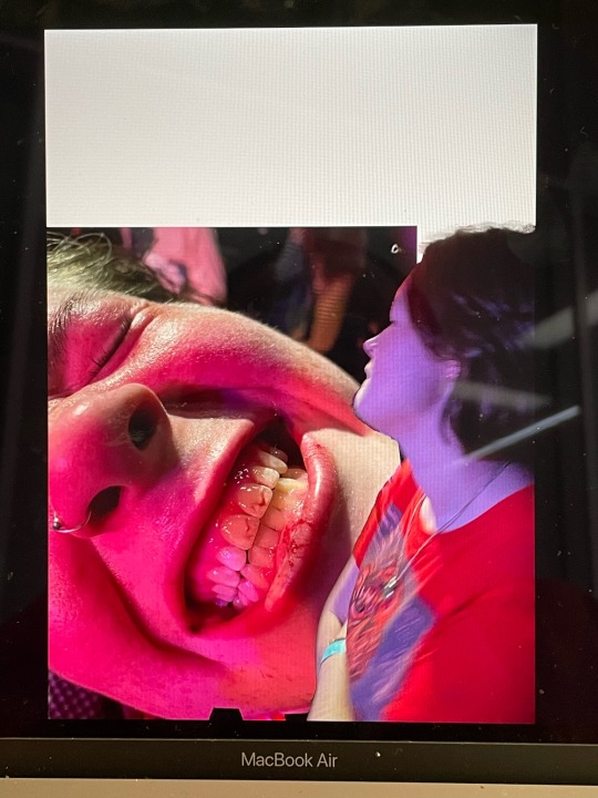
This is the work I did on photoshop for this page, I pre planned to do most of the work on photoshop for this so I wanted to keep it simple and just use photo shop as a way to display my images in the best quality I could. I added another photo I took of her in that night at the same gig and use the select and mask tool to get rid of background, and lay it on top of the other photo, and make sure I left an intentional gap so I could write gig blood at the top like a headline.


Here was my outcome, my first step was to fill in the white gap that I had left, for this I used to eyedropper tool on procreate to get the purple colour out of the photo itself and used a textured pen to start to fill in the gap, however I thought this looked quite flat and wanted to include more of the colours, so I used the eyedropper tool again to get the red out of the photos and the same pen to fill it in. I was happy with this, and it was really cohesive with the images, so I moved on to writing gig blood. Im usually not the best with handwriting but the one I used really helped me to write it quite quickly, I wanted the letters to be different sizes so as I wrote one letter too another I was changing he size as I went along, which I thought gave it a really interesting effect, it didn't really take me long at all to write it out and I was happy with the final outcome. To add more elements to the page used a pencil tool to draw round the photo of her and the top of the other photo in the same red and also black, which is only a small addition but I felt like it needed it just to bring kore colour into it with the black instead of moving just red and purple, this is why I also outlined gig blood with black pen as well.
This page possibly took me the fastest although it didn't feel rushed, I just had quite a developed idea of what I wanted it to look like before I did it so it wasn't too hard to actually translate that to the page. On top of this I also don't really have any negative feedback for this page as I think its quite simple, which isn't usually my style as I like to have really busy, in your face work, but it was nice to go more out of my comfort zone for this one to be happy with it without loads of elements onto it, and i really feel that this is because the images are quite interesting, and large on the page, and I wanted them to be the main focus.
I decided to put these two pages together as a double page spread, as they both have music links with the album and gig factors, and in addition to this I felt as though the colours worked quite well together. Lastly because the subhuman page is quite loud it could of been too much to put another loud page next to it, which gig blood is not.
0 notes
Photo
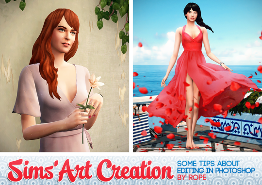
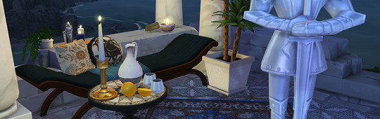
What kind of sorcery is this ?
Okay, people usually don't say it that way, but while posting my pictures for the TS4 Edit Challenge, a received some messages asking me how I do that.. Every picture is different, but most of the time, the first steps are really similar. For the moment, we will focus on that !
I use Photoshop, so some of the tools I use can be specific to this software. But most of my tips can be done on other programs.I will try my best to explain everything, but if you are not familiar with a graphic editor software, this may be too complicated.
For each complex function in Photoshop, I will try to give you a link to the official help page, in case you need more informations.
But as you can imagine, before editing something, you need some screenshots from your game ! I will begin with this, but before that, I need to explain some of the technics I use, so you can understand why I take my screens in this way.
For this tutorial, I will only focus on technical stuff.
Photomerging
Something usefull if you want to create a illustration in portrait format. The pictures you take in game are in landscape format, and usually big enough if you keep this orientation.
It’s easier to work on a bigger base picture : when you scale it down, the imperfections will be less visible, the result will be sharper. But when you want to create a picture in portrait format, you may be limited by your computer screen height, when you take your screen in game.
Fortunately, le Photomerge tool in photoshop allow you to merge two pictures automatically. It works this way :
To access the tool, go to File > Automate > Photomerge. More informations on the Adobe official page.
As you see, to use this tool, you will need to take more screens in game.
Separated layers
And... it’s not the only reason why I take lots of screens when working on a picture ! The title says it all : I work with different layers in photoshop : for exemple my background and my character are not on the same layer, allowing me to edit them separately, more easely. So I need to take screens of the different elements separately in game.
Nothing more to explain, for the moment, just keep that in mind for the next step.
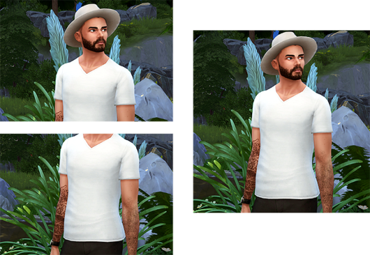
In Game.
For this step, there is three essential mods I will use :
Pose Player, and poses I created/downloaded. Have a look at the topic for more explanation.
Teleport Any Sims, to place my sims precisely.
MasteController, with the Dresser module, to change my sims outfit while she will be posing.
For this tutorial, I will create a simple picture : a not too complex background, a single sims, wearing a dress. To explain a trick I often use, this dress will be composed of two different dresses from the game.
To begin with, I just lay the foundations of the decor, and then, I place a teleporter statue to define where my sims will be. I need define the location of my camera before finishing the setting. When you will go in buy/build mode to finish the background, the sims posing will be reseted and you will need to place another statue, so don't forget where you placed it at the first place (you can place a small object on floor to mark the location).
Now it's time to teleport my sims, and make her pose (I won't detail how to use the mods here).
Press TAB to go in camera mode, and choose your view. To save your camera setting, simply press Ctrl and one number between 5 and 9 (not on the numeric keypad). Then, if you press the number you chosen (without Ctrl), the camera will return to the saved state.
As I will use the photomerging tool for this exemple, you need to save two camera states, like this :
You can already take two screenshots, to test the photomerging (you need to have enough common areas between the two screenshots for the tool to work). If it doesn’t work fine, redefine your camera states.
These screenshots will also help you determine the zones you need to fill in you background. Time to finish your setting, and don't forget to place a teleporter statue again.
When it’s done, you can take your final screenshots. Quick note, you can move your objects in the background, if some areas still seem too empty. Your sims will be reseted again, and you will need a new statue to replace her.
The scene now takes place later in the evening, as I wanted to use candles. Don't forget to choose the color and intensity of each of your light sources, it can help creating an atmosphere.
When all is ready, save your game, in case you need to make some changes, or take some new screenshots. The camera states are automatically saved when you quit the game.
I take two screenshots with the first dress. Then, I use the Master Controler (click on your sims, MC Command Cender > MC Dresser > Change Outfit) to change her outfit, and screen her with the second dress. When it’s done, I make my sims stop posing and go away, to take a screen of my background without the sims.
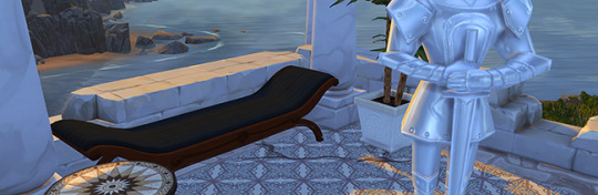
I now have 6 screenshots to work with :

Working with layers.
At first, I use the Photomerge tool to combine my differents screens (I checked perspective, for my exemple). I now have three different pictures. I Put the in the same Photoshop file. If I try to superpose them, the landscape may not match perfectly, as Photoshop never assemble your pictures exactly the same way.
But it’s not a problem : I’m going to separate my sims from the background. I will only keep the middle part of the second dress, to mask the belt, so I put this on aside for the moment !
You can already crop your screen at this step, to keep only the zone you want. I won't speak about composition rules this time, but they are the same as in photography.
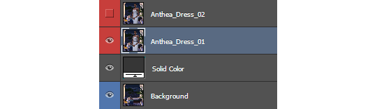
I added a solid color below my sims layer, to see the result when I will cut her out of the background.
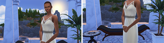
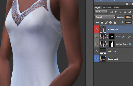
For this step, I use... the polygonal lasso tool (1) ! Using the pen tool would be more precise, but it can takes more time, especially if you are not familiar with this tool.
When I’m done selecting my sims with the lasso, I create a mask using the selection, by cliquing on this icon, in the layer panel (2).

If you need to edit your selection, simply click on the mask (3), and paint in black (to erase) and white (to show) to make corrections. More informations about how to use layer masks here.
After that, I did the same thing with the middle of the dress (I didn't bother with the face and shoulders this time, as I won't keep them on this layer). Then, I edited the mask to create a nice transition between the two dresses.
I use this trick quite often, if I need to combine to clothes or hairstyles, add a jacket on a specific top, or make the skin visible on some areas. For exemple, in my FULL BODY picture, I use this tip to make the legs and the ear visible.
When I'm satisfied with the result, I duplicate the two layers (my sims, and the bottom of the dress) and combine them. Select the two layers in the layer panel, right click on them, and use Duplicate Layers. Then, select the copies, right click on them again, and select Merge Layers. I keep the original ones just in case I need to edit my mask (you will have to do all this again), I simply hide them.
Some random tips.
I'm now ready to work on my picture, in the best conditions. These steps are common to all my pictures, but the following ones are differents for each picture. But I still have some useful tips to share !
Most of them concern nondestructive editing : it allows you to revert or modify the effects you apply on your picture at every moment.
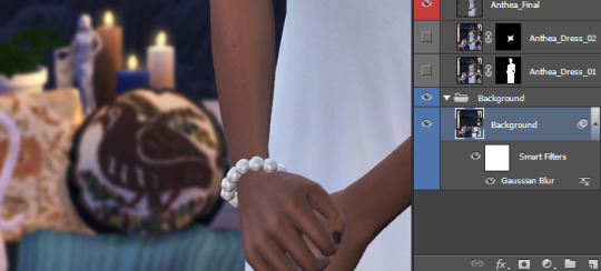
Convert to smart object
As I want to focus the picture on my sims (like in my LIGHT picture), I will blur the background layer a bit. If you simply apply a Gaussian Blur filter, and then continue your work, it will be impossible to revert or change the intensity later.
Except if your layer is a smart object. Select your layer, right click on it and select Convert to smart object. The original state of your layer will be saved, and you will be able to edit or delete each filter you applyied on it, at every moment, by double clicking on the filter name.
Ajustement Layer
If you go in the Image > Adjustments menu, there is many way to adjust the contrast and colors of your pictures. But these modifications are destructive, as the directly change your image, and can't be edited/deleted later.
Thats the reason why I use adjustment layer instead. In the Layer panel, click here (1) to create an adjustment layer. And place this newly created layer at the top (2), above all your layers, to make it affect the whole picture.
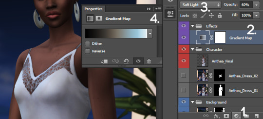
You can even change the blending mode of these layers (3), to obtain different effects. In a previous tips post, I already talk about the Gradient Map layer, in Soft Light mode, to add contrast and change the atmosphere of my picture. Try, experiment, there is a large variety of effects you can create that way ;)
You can also try to add a Color Lookup layer, and try the different options !
You can edit your adjustment layer parameters in the Properties panel (4). If you can find it, in the menu, go to Window, find Properties in the list, and click.
One last thing : as you can see, adjustment layer come with a mask. It's completely white by default (it affect the whole picture), but you can adjust where and with which intensity it is applied, by painting on the mask.
Create Clipping Mask
If you want to apply your layer adjustment layer only on one precise layer, instead of the whole picture, move it above this layer, right click on it, and select Create Clipping Mask.
This tips also work with a classic layer. On my pictures, I always correct or redraw some parts of my sims face, not on the original layer (as I avoid any destructive modicitaion), but on a new layer, applyed only on the base layer.
On a previous tips post, I spoke about my basic editing process, including how I manually adjust the shadows on my sims (I'm not going to rexplain the whole precess here, have a look at the post). I paint my shadows and light on a grey layer on Soft Light mode. If I don't use the clipping mask, it will also affect the background.
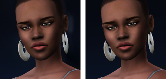
Without and with clipping mask
Another use of the clipping mask, to conclude with this. Afterwards, I decided to add some transparency to the dress. I reopened my game, take two screens of my sims without clothing (and photomeged them), and added this new layer just above my Sims layer, using the clipping mask. Then, I added a mask on this layer, turned it black, and paint some areas with a white brush with low opacity to make the skin visible.

The Final Picture.
And here is the result ! Again, I won't explain everything, as I already spoke about some of these things in this previous tutorial post. If you are curious to see my layer panel at the end, click here.
Here is the final picture.

Base Picture - Final picture in full size
Voilà ! I think it's the first time a post this long in english. I hope everything is understandable. ;)
Don’t hesitate to tag me if you create pictures using these tips ! The same goes for my Sims Creation Tips, you can tag me too if you create sims using it.
If you are looking on more tips (not only about photoshop), don't forget to have a look at my Tips tag. To see my other illustrations created with the sims, simply click here !
And if you like this tutorial, or my creations for the Sims, feel free to buy me a coffee (and a croissant if you want :D)
1K notes
·
View notes
Text
Recolouring
To showcase the AR/testing part of the proposed app, I recoloured some studio photos to different lipstick colours.
This was all done on Photoshop, using some basic masking and the gradient map

1. Using the pen tool, I drew out the area I want to recolour- lips
2. Made selection from drawing, then feather and mask selection
3. Used the gradient map on the selection, and added a middle colour to the b/w gradient to change the colour.
4. Adjusted the positions of black, white and (new colour) to make it look similar to the reference photo
I like recolouring using the gradient map as I think it just works the best out of the ways that I know of. It takes into consideration the different gradations of light on the selection, and it makes it easy to fine-tune and adjust how it looks. For example, you can easily adjust how glossy or matte the lipstick (in this case) looks by moving the white intermediary position closer or further away from the centre.

Dramatised matte example

Dramatised glossy example
It’s also a super quick way to recolour off a reference photo. All that you really need to do once you make the selection is colour pick off the reference photo and fine-tune where needed.
0 notes
Text
A Handy Sass-Powered Tool for Making Balanced Color Palettes
For those who may not come from a design background, selecting a color palette is often based on personal preferences. Choosing colors might be done with an online color tool, sampling from an image, "borrowing" from favorite brands, or just sort of randomly picking from a color wheel until a palette "just feels right."
Our goal is to better understand what makes a palette "feel right" by exploring key color attributes with Sass color functions. By the end, you will become more familiar with:
The value of graphing a palette’s luminance, lightness, and saturation to assist in building balanced palettes
The importance of building accessible contrast checking into your tools
Advanced Sass functions to extend for your own explorations, including a CodePen you can manipulate and fork
What you’ll ultimately find, however, is that color on the web is a battle of hardware versus human perception.
What makes color graphing useful
You may be familiar with ways of declaring colors in stylesheets, such as RGB and RGBA values, HSL and HSLA values, and HEX codes.
rbg(102,51,153) rbga(102,51,153, 0.6) hsl(270, 50%, 40%) hsla(270, 50%, 40%, 0.6) #663399
Those values give devices instructions on how to render color. Deeper attributes of a color can be exposed programmatically and leveraged to understand how a color relates to a broader palette.
The value of graphing color attributes is that we get a more complete picture of the relationship between colors. This reveals why a collection of colors may or may not feel right together. Graphing multiple color attributes helps hint at what adjustments can be made to create a more harmonious palette. We’ll look into examples of how to determine what to change in a later section.
Two useful measurements we can readily obtain using built-in Sass color functions are lightness and saturation.
Lightness refers to the mix of white or black with the color.
Saturation refers to the intensity of a color, with 100% saturation resulting in the purest color (no grey present).
$color: rebeccapurple; @debug lightness($color); // 40% @debug saturation($color); // 50%;
However, luminance may arguably be the most useful color attribute. Luminance, as represented in our tool, is calculated using the WCAG formula which assumes an sRGB color space. Luminance is used in the contrast calculations, and as a grander concept, also aims to get closer to quantifying the human perception of relative brightness to assess color relationships. This means that a tighter luminance value range among a palette is likely to be perceived as more balanced to the human eye. But machines are fallible, and there are exceptions to this rule that you may encounter as you manipulate palette values. For more extensive information on luminance, and a unique color space called CIELAB that aims to even more accurately represent the human perception of color uniformity, see the links at the end of this article.
Additionally, color contrast is exceptionally important for accessibility, particularly in terms of legibility and distinguishing UI elements, which can be calculated programmatically. That’s important in that it means tooling can test for passing values. It also means algorithms can, for example, return an appropriate text color when passed in the background color. So our tool will incorporate contrast checking as an additional way to gauge how to adjust your palette.
The functions demonstrated in this project can be extracted for helping plan a contrast-safe design system palette, or baked into a Sass framework that allows defining a custom theme.
Sass as a palette building tool
Sass provides several traditional programming features that make it perfect for our needs, such as creating and iterating through arrays and manipulating values with custom functions. When coupled with an online IDE, like CodePen, that has real-time processing, we can essentially create a web app to solve specific problems such as building a color palette.
Here is a preview of the tool we’re going to be using:
See the Pen
Sass Color Palette Grapher by Stephanie Eckles (@5t3ph)
on CodePen.
Features of the Sass palette builder
It outputs an aspect ratio-controlled responsive graph for accurate plot point placement and value comparing.
It leverages the result of Sass color functions and math calculations to correctly plot points on a 0–100% scale.
It generates a gradient to provide a more traditional "swatch" view.
It uses built-in Sass functions to extract saturation and lightness values.
It creates luminance and contrast functions (forked from Material Web Components in addition to linking in required precomputed linear color channel values).
It returns appropriate text color for a given background, with a settings variable to change the ratio used.
It provides functions to uniformly scale saturation and lightness across a given palette.
Using the palette builder
To begin, you may wish to swap from among the provided example palettes to get a feel for how the graph values change for different types of color ranges. Simply copy a palette variable name and swap it for $default as the value of the $palette variable which can be found under the comment SWAP THE PALETTE VARIABLE.
Next, try switching the $contrastThreshold variable value between the predefined ratios, especially if you are less familiar with ensuring contrast passes WCAG guidelines.
Then try to adjust the $palette-scale-lightness or $palette-scale-saturation values. Those feed into the palette function and uniformly scale those measurements across the palette (up to the individual color's limit).
Finally, have a go at adding your own palette, or swap out some colors within the examples. The tool is a great way to explore Sass color functions to adjust particular attributes of a color, some of which are demonstrated in the $default palette.
Interpreting the graphs and creating balanced, accessible palettes
The graphing tool defaults to displaying luminance due to it being the most reliable indicator of a balanced palette, as we discussed earlier. Depending on your needs, saturation and lightness can be useful metrics on their own, but mostly they are signalers that can help point to what needs adjusting to bring a palette's luminance more in alignment. An exception may be creating a lightness scale based on each value in your established palette. You can swap to the $stripeBlue example for that.
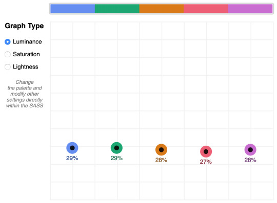
The $default palette is actually in need of adjustment to get closer to balanced luminance:

The $default palette’s luminance graph
A palette that shows well-balanced luminance is the sample from Stripe ($stripe):
The $stripe palette luminance graph
Here's where the tool invites a mind shift. Instead of manipulating a color wheel, it leverages Sass functions to programmatically adjust color attributes.
Check the saturation graph to see if you have room to play with the intensity of the color. My recommended adjustment is to wrap your color value with the scale-color function and pass an adjusted $saturation value, e.g. example: scale-color(#41b880, $saturation: 60%). The advantage of scale-color is that it fluidly adjusts the value based on the given percent.
Lightness can help explain why two colors feel different by assigning a value to their brightness measured against mixing them with white or black. In the $default palette, the change-color function is used for purple to align it's relative $lightness value with the computed lightness() of the value used for the red.
The scale-color function also allows bundling both an adjusted $saturation and $lightness value, which is often the most useful. Note that provided percents can be negative.
By making use of Sass functions and checking the saturation and lightness graphs, the $defaultBalancedLuminance achieves balanced luminance. This palette also uses the map-get function to copy values from the $default palette and apply further adjustments instead of overwriting them, which is handy for testing multiple variations such as perhaps a hue shift across a palette.
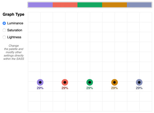
The $defaultBalancedLuminance luminance graph
Take a minute to explore other available color functions.

http://jackiebalzer.com/color offers an excellent web app to review effects of Sass and Compass color functions.
Contrast comes into play when considering how the palette colors will actually be used in a UI. The tool defaults to the AA contrast most appropriate for all text: 4.5. If you are building for a light UI, then consider that any color used on text should achieve appropriate contrast with white when adjusting against luminance, indicated by the center color of the plot point.
Tip: The graph is set up with a transparent background, so you can add a background rule on body if you are developing for a darker UI.
Further reading
Color is an expansive topic and this article only hits the aspects related to Sass functions. But to truly understand how to create harmonious color systems, I recommend the following resources:
Color Spaces - is a super impressive deep-dive with interactive models of various color spaces and how they are computed.
Understanding Colors and Luminance - A beginner-friendly overview from MDN on color and luminance and their relationship to accessibility.
Perpetually Uniform Color Spaces - More information on perceptually uniform color systems, with an intro the tool HSLuv that converts values from the more familiar HSL color space to the luminance-tuned CIELUV color space.
Accessible Color Systems - A case study from Stripe about their experience building an accessible color system by creating custom tooling (which inspired this exploration and article).
A Nerd's Guide to Color on the Web - This is a fantastic exploration of the mechanics of color on the web, available right here on CSS-Tricks.
Tanaguru Contrast Finder - An incredible tool to help if you are struggling to adjust colors to achieve accessible contrast.
ColorBox - A web app from Lyft that further explores color scales through graphing.
Designing Systematic Colors - Describes Mineral UI's exceptional effort to create color ramps to support consistent theming via a luminance-honed palette.
How we designed the new color palettes in Tableau 10 - Tableau exposed features of their custom tool that helped them create a refreshed palette based on CIELAB, including an approachable overview of that color space.
The post A Handy Sass-Powered Tool for Making Balanced Color Palettes appeared first on CSS-Tricks.
A Handy Sass-Powered Tool for Making Balanced Color Palettes published first on https://deskbysnafu.tumblr.com/
0 notes
Last Seen Blogs

rhetorical-answer
The Darkest Timeline Is Over
margaretandjoanna
Margaret & Joanna

choppedhearttimetravel-blog
Untitled
mentallifestyleadvocates-blog
Mental Lifestyle Advocates

dayzeeridley
Daisy Ridley