#I was testing out adobe after effects
Text
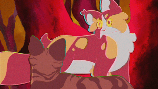
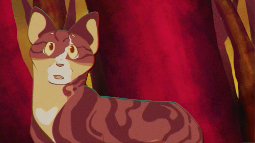
Leafpaw meets StarClan
#warrior cats#cat#feline#art#digital#video#gif#erin hunter#leafpool#spottedleaf#thunderclan#starclan#2021#I was testing out adobe after effects#didn't like it lol#tabby#tortoiseshell#calico
39 notes
·
View notes
Text
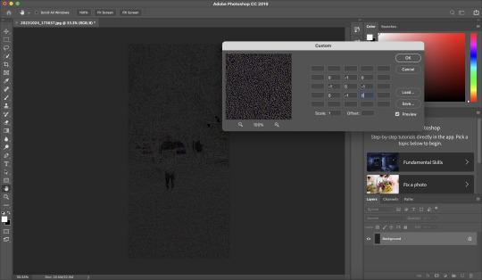
Software testing again
@petermorwood and I have a lot of decade-or-so old video that for a long time now I've been wanting to find a way to improve, as most of it's just too awful to share. So I went hunting for solutions.
At the same time, a lot of software that I've historically used for processing still images no longer works with the new versions of Corel PhotoPaint or Adobe Photoshop, so I've had to go looking for replacements for these plugins / extensions as well. One of them was called Buzz 3.0. It employed a so-called-"sieving algorithm" that was good for producing watercolor-like effects—as in this image of a gentleman watching football at the back bar of the Brasserie Federal restaurant in Zürich HB.

...Now as it happens, after a lot of digging around I discovered that the company responsible for Buzz had sold their algorithm technology to a company called Topaz Labs. So I went over there and did some research, and discovered that they'd incorporated the Buzz algorithm into a newer platform-ish app called Topaz Studio 2.
I then also discovered that they had an add-on app for the platform that does image stabilization, jitter correction and upscaling, and I'm experimenting with that now.
Check out this original video (circa 2013 or thereabouts). Link only, as I don't think Tumblr will let me add two videos to one post. ...It comes from Titisee, which is a little spa town in the mountains of the Black Forest. When he first saw this video (taken with an early Nokia camera phone), Peter immediately christened the souvenir shop in question "Cuckoo Clock Hell". No argument.
Here, though, is the same video after Topaz's app had a word with it. (Sound up if you insist. The ticking alone is bad enough. I say nothing about the chiming and cuckooing.)
This is a first attempt, but it's not at all bad for a test run. (I mean, the subject matter's still a touch freaky, but at least it's not jumping around as much.) The lighting changes and color-temperature shifts had to be managed in Lightworks, as the Topaz app wasn't designed for that: but whatever.
...Anyway, experimentation continues. Cuckoo clocks are easy. We'll see how this does with video of our cats. :)
76 notes
·
View notes
Text
Storytelling Script To Screen: EVALUATION
For my project, Storytelling: Script to Screen, I was tasked with coming up with a story for an animated short film, pitching a synopsis with concept art to my peers, writing a screenplay/script and creating a 90 second animatic of my story.
I first started by doing research into different philosophies of storytelling and the different types of story structure in order to get a good idea on how to make a well-structured story for a short film. Looking to creators like Andrew Stanton and his rules of storytelling, and Dan Harmon’s story circle – a narrative structure formula created by Harmon loosely paralleling Joseph Campell’s theory of The Hero’s Journey. I analysed several animated short films, taking note of how they fit into or, in some cases, subverted the steps of structures like Harmon’s story wheel, what that said about the types of stories being told, and how I could apply these types of rules to my own story.
With these theories in mind, I brainstormed possible ideas. After collaboratively brainstorming with my classmates and on my own - based on the prompts unrequited love, mysterious portal, obsession, and heist, I eventually came up with two ideas: a short where a bird becomes attached to a snail who she mistakes for one of her own eggs, and a plot where an activist breaks into an animal testing lab and discovers something sinister. After writing a synopsis and artwork for both, I pitched my ideas to my class and received their feedback which was more favorable for the serpent synopsis. I ultimately agreed and chose the second idea, as I felt the story had more potential for interesting visuals and would convey a message I felt more connected to.
I then made a second draft of my synopsis that refined some details and cut down the length significantly. That way it could fit into a shorter runtime for my animatic short film.
After this, I used the synopsis as the basis of a script which I wrote on the script writing website Celtex. I then edited and redrafted the original script and created a final script in which I added more location detail and refined its format.
With this script in hand, I set about drawing some concept art for the two main characters; Sam the activist, and the Uktena serpent Sam frees from the water company lab. I also drew concepts for maps of the film’s locations, such as the interior of the lab, some thumbnail sketches for storyboard shot compositions, and created a Pinterest board to gather reference material for inspiration. I also studied material such as Peter Loomis’s book ‘Figure Drawing for All Its Worth’, as reference for figure drawing and drawing multiple figures in a 3d plain with two-point perspective.
For the animatic, I used the storyboarding program Storyboarder on my laptop whilst using my iPad (connected to my laptop) as a drawing tablet using the app Astropad Studio. The storyboarding process was going well as I drew each shot. But at some point, the program crashed, and I lost a few drawings, even though I was saving frequently, and the program was supposed to save things automatically. So, to prevent these shots being lost, I started screenshotting each shot and saving them to a folder.
Once the animatic was completed, I took all the clips and screenshots and put them all together in Adobe Premiere Pro.
Some clips and frames did not fit into the 16:9 aspect ratio. So I selected the clips, set the frame to fit to scale and the image fit the screen.
I also sought out sound effects on Pixabay (royalty-free sounds/music site) and edited these into my film.
Originally, the animatic was two minutes and twenty-seven seconds in length. But the brief specified the animatic be ninety seconds to a maximum of 120 seconds. So I edited down the footage. Eventually being able to cut down to one minute and fifty-seven seconds, including the opening title and end credits.
After this, I exported the video as an MP4 and uploaded the whole thing onto my Vimeo page.
I also arranged the animatic shots on a PowerPoint in three-by-three rows, much like a professional storyboard. This way, I could put these frames in my visual portfolio.
I’m overall proud of the work I’ve done for this project. I gained a better understanding of the animatic short film production process. I gained valuable experience writing a well-structured narrative through studying theory and other short films, writing a synopsis and a properly formatted screenplay. I learned to use new software tools such as Celtex for script writing and Storyboarder to create my animatic. As well as gain more experience with editing an animatic on Adobe Premiere Pro. All these programs I will use in future creative projects. Most of all, I’m very proud of the film I created through this project, and I feel it’s one of the most high-quality short films I’ve produced so far.
7 notes
·
View notes
Text
Weekly Update September 15, 2023
Life is hitting hard. I had a big interview for a really important internship, and while I think the interview itself went really well, the rest of the week has been pretty rough, with the exception of a nice discord call I had with a friend. I don’t know how much of this is bad luck, physical stress on my body due to nerves, or bad decisions on my part, but most likely a mixture of the three. I have not heard back from the internship yet but I do think it went really well, it’s the second time I’ve interviewed for it, and I was really close to getting it last time, and that was before I had officially completed all the relevant courses I took that semester, and also before the lab job I worked this summer. I think I’m in good standing, but I don’t want to be overconfident either. I was told I’d hear back by the end of this week, but given that they’re changing a lot about how they’re doing things I was expecting to hear back closer to next Wednesday, which looks to be the case. I’m fine with the wait, but given what my nerves have been doing to my body, it does unfortunately mean I won’t be able to make as much progress on art projects as I’d like.
I said earlier this week I’d be done for the rest of the week, but I have gone back on that a little. I sketched out some nice shots of Shaun to use as more blood practice, which I’d like to digitize in the near future, and I have kept work on TRGA going. I finished up the character animation for shot 1-2, and have started keyframing Jon for 1-3. 1-3 should be a lot quicker, as it’s short, it has few keyframes, and Tim does not appear, meaning there’s theoretically 33% less animation to do (although in practice it’s more like 12-25% less since Tim has been less complex so far, although I know it won’t stay like that). I’ve probably got almost as much done as I would’ve if I hadn’t ‘called this week off’, but I’m still not going to hold myself to my schedule on it until I hear back about the interview (and possibly then some). It’s still going good though.
I’ve also been messing with effects and whatnot for drawings in general, I’d like to be able to animate with some as well, but I’m going to stick with current projects for now. I’d like to mess with after effects as well, as I’ve been learning a bit about the features it has, and I think I can probably do more with it than animate. I think Adobe programs are meant to be used in tandem with one another anyway. I don’t think I’ll need it for the current animation, but I’ll keep it in mind for maybe the next TRGA. Or I could do more tests in-between.
I think I should be investing more time into music as well, should I have time this weekend I may take another crack at it. I’ve been writing down bass patterns as I hear them from music I listen to, although I’m not trained enough I can identify notes of their own, just in relation to one another, so I probably mistranscribed, meaning what I wrote down would technically be original. I’ll try to mess with that and drums, until I get something nice enough sounding. I already tested my strategy for finding original Melodies, and it doesn’t work 100% of the time but it does work. I really should make a bigger push for music I think it would be pretty good for my state of mind. I need to commit to a basic project but I’ll keep the larger one in mind.
I’m going to keep taking it easy but I’ll try to get stuff done. I’ll keep trying.
5 notes
·
View notes
Text
Animation Skills - Weeks 10-12: After Effects Path Animation
During these final three weeks, my task was to create a path animation using Adobe After Effects which shows background elements scrolling and an action in the foreground. We were first asked to create a test animation using stock assets, and I am not particularly proud of it because I did not finish it and I was only just learning how to make objects move on a path. However, what I am pleased with is my final path animation. It took a while for me to figure out the theme; initially I wanted my animation to be about a giant monster rampaging through a city, but since this was already done by a previous year’s student, I then came up the idea of a retro arcade ‘shoot ‘em up’ set in space with a pixel art style.
I created the assets using a pixel art program called Aseprite, then I upscaled them in the software as I exported them and imported them into the After Effects project. I feel as if the only complication I had was that, because of the small resolution the original assets were drawn in, they could only be scaled up to 1280x720. However, I found that setting their scale in the After Effects project to 150% perfectly scaled them up to 1920x1080. While I could have used After Effects’ 3D camera tools to differentiate the background elements, I found that it would not work with how flat my assets were, so I opted to have each background element move at different speeds to create the illusion of depth. After I was finished, I applied some post-processing effects, sound effects and music to make my final animation look like it was being played on an arcade machine in a room.
0 notes
Video
youtube
Hiya!
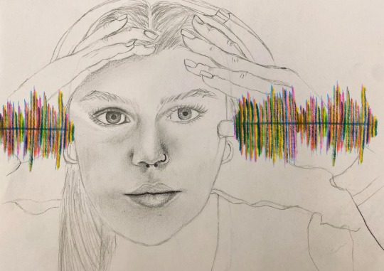
I’ve been working on a new project that I’m really excited about, so I figured I’d share it here too. I’ve been trying for quite a while, to figure out how to share how I hear things with other people. FINALLY, after many hours of learning how to use a zoom audio recorder + Adobe Premiere Pro, I think I’m figuring it out:
I was born with single-sided-deafness, meaning my left ear is mostly just ✨decorative✨, and I have a mild hearing loss in my right ear.
So essentially, I hear sound only from one, slightly filtered side. My original goal for this perspective project, was to figure out how to filter audio in real time according to the frequencies I have trouble hearing. This way, anyone wearing the earbuds connected to my computer would be able to hear what I hear, while they did whatever it was they were doing in that moment.
My knowledge of technology limited me significantly. So that’s on hold for now…
So, I took another path, and played around with RECORDED sound.
On my YouTube, you can now find a video of me reading Going Deaf, a poem by Miller Williams (see below for link to the poem). I chose this poem because I felt like it really spoke to my own experiences of frustration relating to hearing loss. I’ve found that most people (not all) have very little patience for anyone who can’t hear. After a single try, most people throw in the dreaded, “never mind” Or worse, “I’ll tell you later” -an empty promise.
The first reading of the poem contains unedited audio. The second time the recording plays, you will hear the audio as I would heard it. I was able to create audio filters for the frequencies that I have difficulty hearing and have turned them down to match my hearing tests. This may go without saying, but this is NOT 100% accurate to my own experiences of sound. It’s about as accurate as I could get, with the technology available to me.
I’m hoping to expand this project with more recorded experiences of my actual daily life (and maybe at some point, that real-time simulation I was talking about). For now, the video will be linked in the description of this post. Alternatively, my Youtube is linked in my bio.
HEADPHONES ARE NECESSARY TO EXPERIENCE THE FULL EFFECT OF THE VIDEO, AND MAKE SURE “MONO-AUDIO” AND ANY OTHER CUSTOM SOUND FILTERS ARE TURNED OFF IN YOUR PHONE’S SETTINGS. Feel free to let me know what you think about the experience of hearing through my ears in the comments. I’m curious to hear what you have to say!
EDIT: Link to Going Deaf by Miller Williams https://www.poetryfoundation.org/poems/52373/going-deaf
0 notes
Text
Adobe has plenty of animation features to help animate works of art. Better yet, it has motion blur to make all of it look natural.
In this project I used my name "Ralph" and tested out all the features that Adobe After Effects has to offer. At first I wanted to make a sort of "jumping" effect to the text, to make it feel like it has a personality. The text bounces and floods with rainbow text, before it finally settles down with a small spin. I transformed the position of the text and scaled it, then used eases in order to make the text feel more natural. Next, for the text to spin, I used the rotation property and made it swing. I added anticipation to the text by making it slide slightly behind and after the full 360 degrees the text was taking. It made the text look like it was almost like elastic. Lastly, I found an interesting feature with the Animation property inside the text, which allowed me to apply a certain property to a certain part of the text. I decided to try out the stroke tool and apply it to a certain part of the text. Then, using the "Offset" property, I found out that it can slide through all the text. This is useful so that I can give the text even more character and functionality for the future.
I can see After Effects has a lot of special functionality effects for text, and I'm looking forward to using this in the future to demonstrate my projects. It's almost satisfying in a way, because we all look at the way it is and think it's fluidly moving across the screen. However, it's always been just a 2D figure on our screen that's been manipulated through an advanced program. Nonetheless, After Effects has a lot of cool demonstration techniques for text and animation.
0 notes
Text
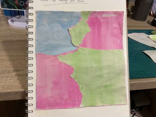
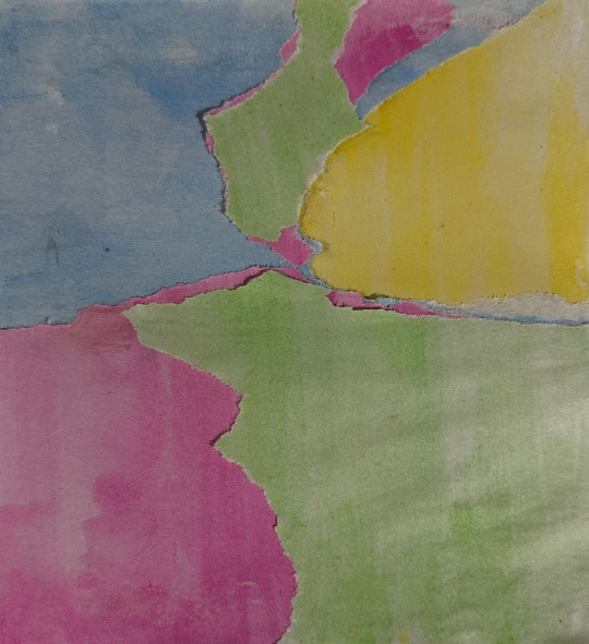
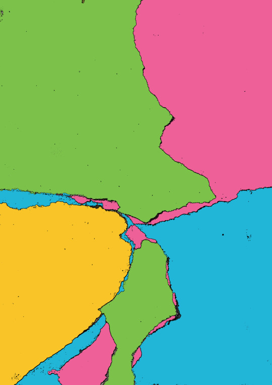
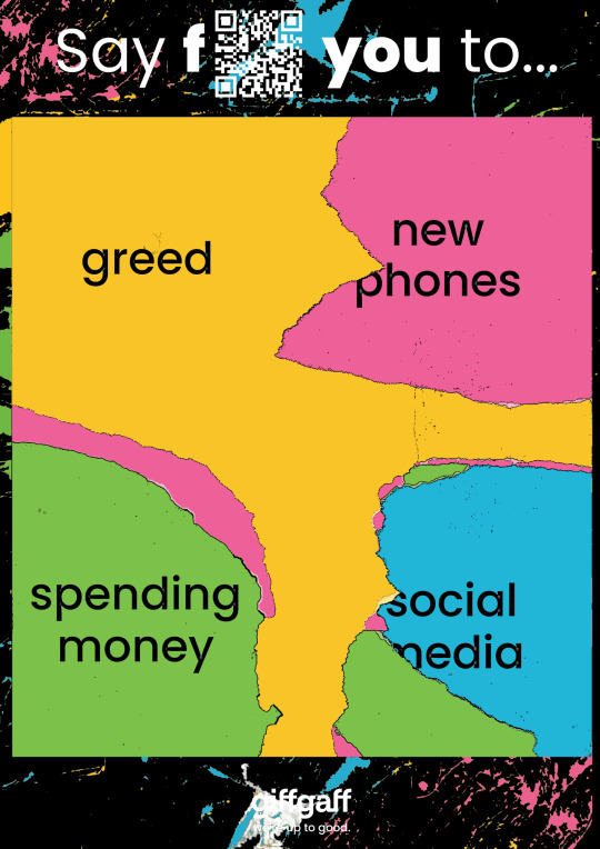
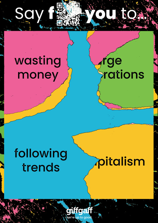
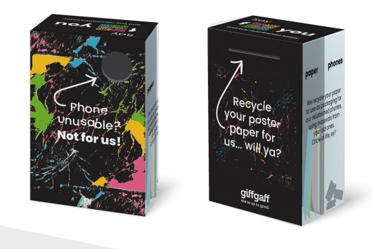
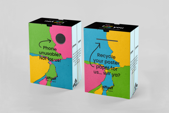
06/03/24 - Feedback with Tim Metcalf
I had a meeting with Tim as I was unsure what to do with the bins and why they weren’t working. He suggested to use the cracks as a background for the poster, or the poster as a background for the bins.
After making a new background using the coloured paper process, I tested both out, and I really liked the poster background for the bins. I feel it made the bins much more colourful and eye catching, and linked with the poster better. I didn’t like the cracked background as it made the poster extremely busy.
I kept the same distorted text effect as it gave off the impression of being broken, yet still working, like old phones. It also had the same effect as the poster, where some of the words were ripped off, so it would all link together when the poster and bin were positioned next to each other.
I also found a new bin mockup, which was still just a box packaging mockup, however this time I used Adobe Stock, whose mockups were better and easier to use than random websites online.
0 notes
Text
(I've been very busy since the second year of my third course has started, very sorry for lack of updates)
Before I post anything relating to the last major project in the first year of the third course, I am side tracking to a smaller project that was done just before the last project.
This smaller project was to design a risograph print that would be sold in another pop-up shop. This time I could choose whether to have an A3 print or smaller prints to sell.
For this I chose to produce 4 prints that were A5 sized where my theme was to be different flowers in a range of layouts and patterns. After creating a range of mood boards for inspiration, I drew the main flowers I was going to use for the prints which I had a variety of different 'poses' I was going to us.
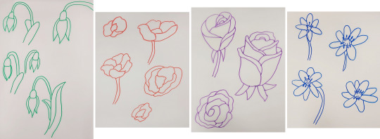
The linework was redrawn digitally in Adobe Illustrator before they were coloured and aligned in Adobe Photoshop. All the prints were placed onto an A3 document to make printing on the Risograph Printer easier.
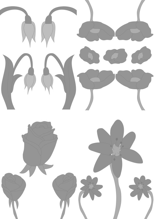
I gained advice for colour options as I had a form of idea as to what I wanted to do but wasn't too sure. After doing some colour tests, I printed the final prints and cut them to be the correct size for them to be sold. I fortunately printed a lot so I had some copies spare to showcase the final products.
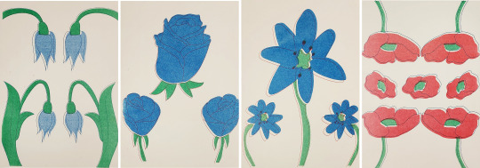
The finalised colours were burgundy, blue, green and red. They were meant to be more aligned but they came out uneven however I still liked these as the unaligned areas created a more unique effect.
That's all for now.
If you have any questions don't be afraid to ask.
0 notes
Text
Developing the Experience
Blog Post # 2
Angelique Shelley (MA Concept Art)
To begin creating the portal, I experimented with setting up a camera animation through some planets/spheres in Maya and choosing Arnold VR in the render settings (see fig. 1).
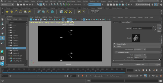
Fig. 1 A screenshot of Maya before rendering out the spheres.
Fig. 2 A brief test to see if the VR render would output to dome format correctly.
I rendered out a couple of seconds as a test and output it into dome format, but there was something amiss with the way it was rendered (see fig. 2). It may be due to traveling vertically rather than horizontally and the eye-spacing setting. This needs some troubleshooting, so I moved onto the bulk of the portal animation which was the portal effect itself and I’ll attempt to correct the 3D aspect later.
youtube
Fig. 3. How To Make a Portal Tunnel In After Effects (EASY), LuCa, 2023.
I had decided to use After Effects to create the portal after some research into tutorials and was fairly confident I could do it. I followed a tutorial (see fig. 3), but it was slow and arduous as I'm fairly new to After Effects and they used unspecified hotkeys I did not know, I also had to reverse engineer a plugin that I did not own with blending modes. I had trouble with After Effects interpreting the camera settings in the tutorial shown. I realised belatedly that it was still set up for dome output. I reset my composition settings and had to restart the tutorial. Despite this steep learning curve, the initial result was really convincing and I was able to apply the technique to new layers, building a richer image, such as the stars in fig. 5&6. Because I chose not to warp the stars it created a 3D parallax effect. I attempted using alternative source images for the portal effect, but none worked as well as the detailed nebula in fig. 7.
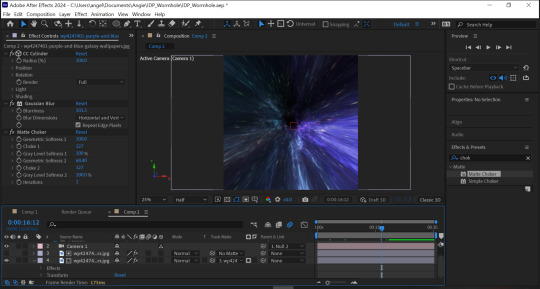
Fig. 4 A work in progress shot of the portal.
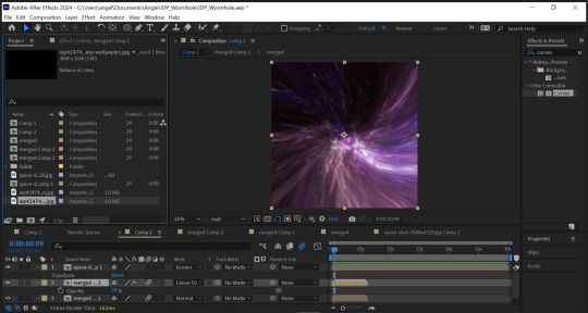
Fig. 5 I applied a starry effect to the portal with a different animation type and speed.
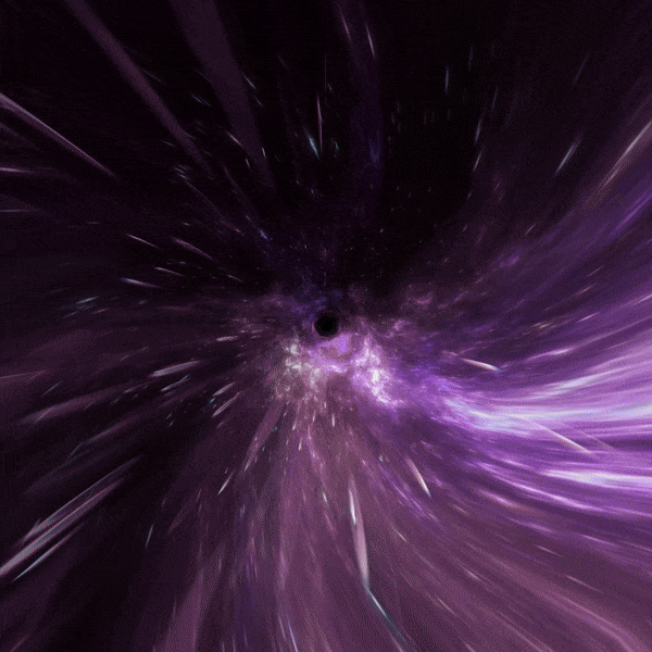
Fig. 6 A GIF showing the 3D parallax effect.
I wanted to further enrich the portal and lengthen the time, so I precomposed my work yet again (this would be the fourth time to achieve the effect) and offset two duplicate layers all on a screen blending mode and faded them into one another using opacity and keyframing. I also needed to conceal the “black hole” that was created from the edge of the source image. I took the source images into Photoshop and painted in a black, feathery edge to help soften the fade, I also offset the image and removed the seam for clean wrapping (see fig. 7&8).
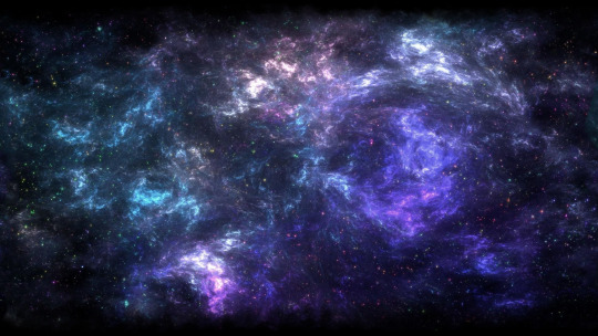
Fig. 7 Purple and blue galaxy wallpaper, jor4gea, 2024, altered for better fading.
Fig. 8 Space-Dust …, Wallpaperwolf, 2024, altered for better fading.
I precomposed again, scaled it down and created a circle mask about the same size as the hole. I then increased the feathering as much as I could. There was still a visible black dot, so I repeated the above technique only pulling from another part of the portal. I added a gaussian blur to this to reduce the amount of animation (see Fig. 9). The final result is quite effective (see Fig. 10). To tie into the original portal concept and to prepare to transition into the final scene, I added a hue/saturation effect to turn the portal red. I rendered the portal using Adobe Media Encoder.
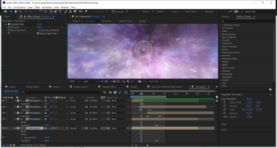
Fig. 9 A screenshot showing my keyframes for the fades and my feathered and blurred mask to conceal the “black hole”.
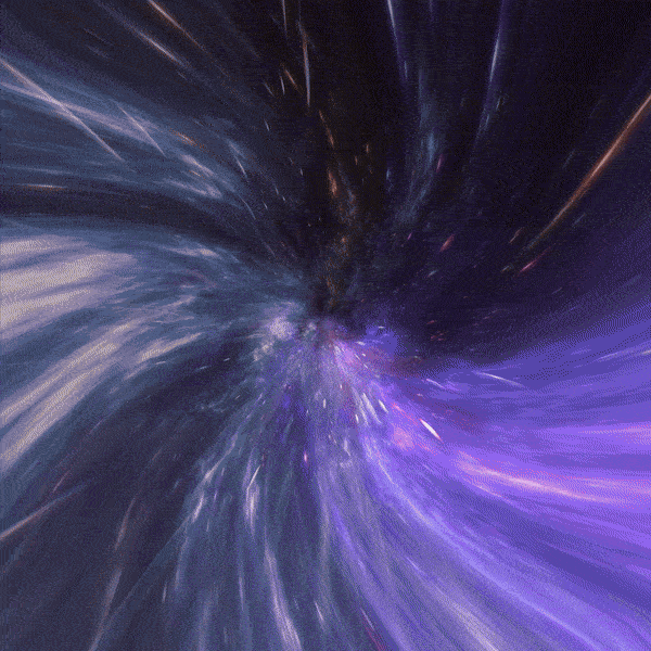
Fig. 10 A GIF showing a part of the final render of the base portal, please see separate blog post for full render.
References:
Jor4gea (2023). Purple and blue galaxy wallpaper. [Online]. Available at: https://wallpapercave.com/w/wp4247401 [Accessed 07 February 2024]
LuCa (2023). How To Make a Portal Tunnel In After Effects (EASY). [Video]. [Online]. Available at: https://www.youtube.com/watch?v=MHipcwcsZ0k [Accessed 07 February 2024]
Wallpaperwolf (2024). Space-Dust … [Online]. Available at: https://www.chromethemer.com/wallpapers/8k-wallpapers/space-dust-wallpaper-8k.html [Accessed 07 February 2024]
0 notes
Text


The past couple of weeks I’ve been creating complex paper cutouts with my Silhouette Cameo paper cutting machine. You can create custom art in a drawing software like Adobe Illustrator and then export to the Silhouette software. I’ve used the machine to cut out pieces of black card stock and coloured acetate for that stained glass look. The image of the Immaculate Heart of Mary is a vectorized image taken from the Internet, digitally painted and printed on vellum. This is stuff for a new animation project.
Could I just make these images digitally rather than adding the time-consuming process of cutting and gluing a physical object? Yeah, I could, but I’ve tested this out in After Effects and I just don’t like the purely digital artwork. Looks flat and uninteresting. Besides, paper animation and painstakingly laborious workflows are kinda my brand now. Also, a character will be interacting with this image at a later point in the film, so it makes sense that it’s a physical prop.
The second image is a frame from Dragonframe. It’s darker because I stopped down the exposure so the light box doesn’t wash out the colours.
And, no, I’m not even remotely religious. I do, however, love the aesthetics of religious and esoteric art. That’s the sort of imagery I’m looking at for this project.
#stained glass#immaculate heart#immaculate heart of Mary#papercraft#paperarts#indie animation#traditional animation#animation
0 notes
Text
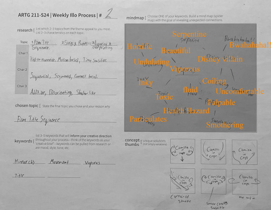
Illo-2 Media
Topics of Interest
Strips and Panels. Sequential, segmented, contrast-based
Layering and Overprinting. Additive, disorienting, shadow-like
Film Title Sequence. Tied to narrative, motion-based, time-sensitive
Final Selection, Film Title Sequences
Because despite being surrounded by ads my entire life I've never put “moving” and “graphic design” together in my head before and it's a realy cool idea.
Title Sequences
Film title sequences are opening sequences at or near the beginning of a film or episode of a series. They introduce the cinema that follows, can acknowledge the makers of the film, and reinforce brand recognition.
Most of the time title sequences are a step removed from the story of the film. They can hint at the themes to come but usually do so through out-of-context shots, symbolism, and music.
Keywords
Hierarchy
movement
vaporous
title
Creative Concept
My goal is to use assets from an already existing project to create a graphic that could belong in a title sequence. I’m using my graphic novel Camilla in Crepe and animating its logo as if it were a tidal graphic at the beginning or end of a title sequence. Camilla in Crepe is a strange and dark story about finding beauty in the ugliest of settings. I’m hoping to convey that sense of sweetness and grotesqueness by animating acrid clouds of smoke around the logo in flower-like coils. The goal is to frame the title with a moving element, so the hierarchy shifts from the billowing smoke to the word “Camilla.”
Design Decisions
I ended up working in Adobe Animate and then Premiere with assets made in Illustrator. My first inclination was to try After Effects but wanted control over the shape and character of the smoke. Turns out the easiest way to do that is to just draw it. 94 times. Ok im sure there's an easier way out there, but having no experience with After Effects or Animate I kind of liked the simplicity of just figuring out how the smoke was going to act frame by frame. Nothing but respect for the people who do this for a living. I made a four-second clip and I’m tired, I can't imagine the kind of commitment you'd need to make a whole movie.
I didn't get the smoke as refined as I'd have liked but I realized that this was a good test run. When I try this again I’ll make the smoke curl inwards, toward the title on both sides. My thinking here was it'd be fascinating if it was asymmetrical, billowing as if there was wind gusting sporadically in from the right of the screen but I feel the smoke reaching out to the left ended up being distracting.
0 notes
Text
Week 12
This took a lot longer than I expected, Krita is a bit annoying when it comes to transforming singular objects in a layer compared to how it works in Photoshop. If I make a circle in a layer that already has stuff in it it will transform that entire layer rather than just that circle which gets annoying especially when you want to duplicate a leg or an eye cause it will duplicate all the keyframes you don't want as well. But anyway this is how my animation came out, all the voice acting and sound mixing was done at 1am so don't focus too much on it especially since I couldn't find a sound effect of a person falling out of bed. I'm glad I was able to find a way to transfer my frames from my initial test animation and put it into a scene because I think it fits perfectly. Also, the way everything looks in this animation is way better than my initial storyboards, and that is because I scanned all the pages and traced over the ones that I liked as well as traced over the couch and CRT TV from Family Guy. As I was working on this I was thinking about switching to Adobe Animate since that is a paid program that some animation studios use so if I am to struggle with a program I might as well struggle with one that would look good on my resume. Overall I think this animation came out great, I realize that the best way to approach animation is to just not care how rough and off-model everything looks cause all that matters at the beginning stages is the motion and feel of the scene.
REFLECTION:
After these two weeks of animating in Krita I'm finally over my fear of digital art. All I'm constantly thinking about is fixing the script so that I can just get started animating and coloring as soon as possible. I'm going to email a Visual Arts alumni to ask if I should switch to Adobe Animate since he also did an animation for his Capstone and from his social media posts I see he does a lot of animation and 3D modeling in his free time.
0 notes
Text
FILTER DESIGN
Filter design is the process regarding designing a filter to modify the appearance of an image. Digital filters are algorithms or mathematical operations applied to the pixels of an image to achieve specific effects. These filter effects can be used to achieve blurring, noise reduction, colour corrections and artistic transformations. After some research i have come up with a guide to designing filters for pictures. find the guide below.
What is your objective? : essentially what are you trying to achieve with this filter or what exactly about your image are trying to adjust or change. it could be the image sharpness, colour balance or add effects like distortion or blur.
2. Commiserate with image processing methods : You would have to get to know the different image processing methods. These methods would help build a foundation in designing filters. These methods include; histogram equalisation, Fourier transform, edge detection and noise reduction.
3. Picking a software : There are a lot of image editing softwares available for free and for a price. but in this article i would be looking at adobe photoshop. but apparently you can also implement filters on pictures by using python programming language with with OpenCv or python imaging library.
4. Selecting a filter : With using photoshop you can select built in filters, effects and also create custom ones.
5. Testing and Adjusting : Test your filter on your image if it gives you the desired look, then you can go about adjusting the parameters till you get your result.
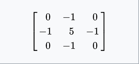
There are two key words i would like to mention ; convolution and kernels.
First of convolution is the procedure of adding each element of an image to its local neighbours weighted by the kernel. A kernel is also known as a convolution matrix which is a small matrix used for sharpening, edge detection, embossing and blurring. all this can be attained by convolution between the kernel and the image.
Find below a list of operations and its kernels;
Identity
This is also known as the identity matrix or kernel. This filter doesnt really modify the image, it serves as a baseline for understanding effects of other filters. Here is how identity filter affects images ;
No modification: When this filter is applied to images it is no different from the input image
Usefulness as a baseline: Used as a baseline for comparing effects of other filters on images
Understanding filter effects: when the identity filter is applied followed by other filter, it helps understand the effects of those filters.
Basically the identity filter is a fundamental concept in image processing, serving as a standing point in understanding the effects and transformations of various filters on images.
2. Ridge or Edge reduction
A Ridge or Edge Reduction filter is an image processing technique used to reduce or suppress edges or ridges in an image while preserving other features. Here's how it affects images:
Edge Suppression: The primary effect of a Ridge or Edge Reduction filter is to suppress or weaken the visibility of edges in the image. This can be useful in scenarios where edge details are not important or may be causing distractions in the image.
Noise Reduction: Similar to Gaussian blur, Ridge or Edge Reduction filters can help reduce noise in images by smoothing out fine details and high-frequency patterns. This can result in a cleaner and more visually pleasing image, particularly in images with high levels of noise.
Detail Softening: Along with edges, other fine details in the image may also be softened or blurred. This can give the image a smoother appearance and reduce the perception of sharpness.
Enhanced Smoothness: The overall smoothness of the image is increased as a result of suppressing edges and fine details. This can sometimes result in a more aesthetically pleasing or painterly effect, depending on the artistic intent.
Loss of Sharpness: Since the filter aims to reduce edge contrast, it may lead to a loss of sharpness in the image, especially in areas where sharp transitions occur.
Selective Application: Ridge or Edge Reduction filters can often be applied selectively to specific regions of the image or adjusted in intensity to achieve the desired effect without overly affecting other areas.
Improved Compression: In some cases, reducing edge details can result in better compression performance for the image, leading to smaller file sizes without significant loss of visual quality.
Overall, Ridge or Edge Reduction filters are useful tools in image processing for various applications, including noise reduction, smoothing, and enhancing the visual appeal of images. They can be particularly effective in scenarios where reducing distractions or emphasising certain features is desired.
3. Sharpen
The sharpen filter is an image processing technique used to enhance the clarity and detail of an image by increasing the contrast along edges and boundaries. When applied, the sharpen filter effectively accentuates the high-frequency components of the image, making edges appear crisper and details more pronounced. Here are the key effects of applying a sharpen filter to images:
Enhanced Edge Contrast: The sharpen filter increases the contrast along edges in the image, making them appear sharper and more defined. This effect is particularly noticeable in areas where there are significant changes in intensity or color.
Increased Clarity: Fine details in the image are emphasized, resulting in a clearer and more detailed appearance overall. This can be particularly beneficial for images with intricate textures or patterns, such as landscapes or close-up shots.
Improved Focus: The sharpen filter can help to compensate for slight blurring or softness in the original image, making it appear more focused and crisp. This is especially useful for images that have been resized or compressed, where some loss of detail may have occurred.
Artifacts Amplification: In areas of the image with high-frequency noise or compression artifacts, the sharpen filter can amplify these imperfections, leading to a grainy or "over-sharpened" appearance. Careful adjustment of the sharpening parameters is essential to avoid this issue.
Increased Visual Impact: By enhancing the edges and details of the image, the sharpen filter can make the image more visually striking and engaging, drawing the viewer's attention to key elements and enhancing overall aesthetics.
Potential Haloing: In some cases, the sharpen filter can produce haloing artifacts around edges, where there's a noticeable brightening or darkening of pixels adjacent to high-contrast edges. This effect can be mitigated by adjusting the strength of the sharpening or using more sophisticated sharpening algorithms.
Overall, the sharpen filter is a powerful tool for enhancing the clarity and detail of images, but it should be applied judiciously to avoid introducing artefacts or an unnatural appearance. It's often used in post-processing workflows for photography, digital image editing, and computer graphics to improve the visual quality of images before publication or display.
4. Box Blur (normalised)
Box blur, also known as a uniform blur or mean blur, is a simple image processing technique used to blur images by averaging pixel values in a local neighborhood. The "normalized" variant of the box blur filter ensures that the sum of the weights in the blur kernel equals 1, which helps to preserve the overall brightness of the image. Here's how the normalized box blur filter affects images:
Smoothing: The primary effect of the box blur filter is to smooth out an image by averaging pixel values in a local area. Each pixel in the image is replaced with the average value of its neighboring pixels within a specified radius. This results in a reduction of high-frequency detail and noise, leading to a smoother appearance.
Uniform Blurring: Unlike Gaussian blur, which applies a weighted average based on a Gaussian distribution, the box blur filter applies a uniform weight to each neighboring pixel. This results in a more uniform blurring effect, without any preference for specific directions or orientations in the image.
Edge Preservation: While box blur blurs the image, it tends to preserve edges less effectively compared to Gaussian blur. This is because the uniform averaging of pixel values across the entire neighborhood can cause edge pixels to blend with their surroundings more evenly, resulting in a slight loss of edge contrast.
Brightness Preservation: With the normalized box blur filter, the sum of the weights in the blur kernel equals 1. This ensures that the overall brightness of the image remains relatively unchanged after blurring, compared to unnormalized box blur filters where the brightness might be affected due to the different weight distributions.
Fast Processing: Box blur is computationally simpler compared to Gaussian blur, making it faster to apply, especially on large images or in real-time applications where efficiency is crucial.
Artistic Effects: Box blur can be used to create artistic effects such as a soft-focus or dreamy look in photographs, or to simulate the appearance of motion blur in images.
Overall, the normalized box blur filter is a useful tool for image smoothing and noise reduction, providing a simple and efficient way to achieve a blurred effect while preserving the overall brightness of the image. However, it may not be as effective as Gaussian blur in preserving edge details.
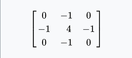
5. Gaussian Blur 3 x 3 (approximation)
This is a regularly used image processing method for noise reduction and detail in images while still maintaining overall structure and edges. when this is used with the 3 x 3 kernel it has the following effects on images ;
Noise reduction : it reduces noise in images by smoothing out small fluctuations in pixel values which is very useful on pictures taken in lowlight.
Detail Smoothing : details are blurred or softened, this can be used especially in portrait photography to achieve smoother skin texture or reduce imperfections.
Edge preservation : preserves the edges of images even though it blurs the image. this is attained by giving more weight to nearby pixels that are closer in intensity to the central pixel. maintaining the contrast at the edges
smoothing of gradient transitions : Gives image a uniform appearance.
Effect on sharp features : sharp features might be softened slightly while depending on the amount of blur.
This is a very good tool for image enhancement in photography, graphic design and digital image processing to achieve various aesthetic effects and prepare images for further analysis or manipulation.
6. Gaussian Blur 5 x 5 (approximation)
Applying a Gaussian Blur with a 5x5 kernel to an image has similar effects to using a smaller kernel, but with a greater degree of smoothing and a slightly broader impact on the image. Here's how it affects images:
Increased Smoothing: With a larger kernel size, Gaussian blur with a 5x5 filter will result in greater smoothing of the image. This means that finer details will be more effectively blurred, leading to a softer overall appearance.
Enhanced Noise Reduction: The larger kernel size allows for more extensive averaging of pixel values, leading to better noise reduction. This is particularly useful in images with high levels of noise, such as those taken in low-light conditions or with high ISO settings.
Broader Edge Preservation: While Gaussian blur attempts to preserve edges, using a 5x5 filter may result in a slightly broader transition zone around edges compared to smaller kernels. This can lead to a more gradual blending of adjacent regions, which can sometimes be desirable for creating smoother transitions.
Increased Computational Cost: Applying a Gaussian blur with a larger kernel requires more computational resources compared to using a smaller kernel. This means that processing time may increase, especially for high-resolution images or when applying multiple layers of blur.
Softer Appearance: Overall, the image will have a softer appearance compared to the original, with reduced detail and a smoother texture. This can be useful for achieving a more artistic or dreamy effect in photography or for creating backgrounds in graphic design.
Loss of Sharpness: Very sharp features in the image may appear more blurred or softened with a 5x5 Gaussian blur, compared to using a smaller kernel. While edges are still preserved to some extent, the broader smoothing effect can lead to a greater loss of sharpness in certain areas.
In summary, applying a Gaussian blur with a 5x5 filter to an image results in increased smoothing and noise reduction, along with a slightly broader impact on edges and details compared to using a smaller kernel size. This can be beneficial for achieving specific aesthetic effects or for preparing images for further processing or analysis.
7. Unsharp Masking 5 x 5
[Gaussian Blur with amount 1, threshold 0 and no i mage mask]
Unsharp masking is a technique used in image processing to sharpen images by enhancing edges and details. Despite its name, unsharp masking doesn't involve blurring the image. Instead, it works by increasing the contrast along edges. When applied with a 5x5 filter, unsharp masking can have the following effects on images:
Edge Enhancement: Unsharp masking boosts the contrast along edges in the image, making them appear sharper and more defined. This is achieved by subtracting a blurred version of the image from the original, which enhances the high-frequency components (i.e., edges and details).
Detail Enhancement: Fine details in the image are accentuated, leading to a perceived increase in sharpness and clarity. This is particularly noticeable in textures, patterns, and intricate features within the image.
Increased Perceptual Sharpness: The overall perception of sharpness in the image is improved. This can make the image appear clearer and more visually appealing, especially when viewed at smaller sizes or from a distance.
Artifacts Amplification: In areas with high-frequency noise or artifacts, such as JPEG compression artifacts, unsharp masking may amplify these imperfections, leading to a more pronounced appearance of noise or artifacts.
Haloing: If the strength of the unsharp masking is too high, it can result in haloing artifacts around edges, where there is a noticeable brightening or darkening of pixels adjacent to the edges. This can detract from the natural appearance of the image.
Selective Sharpness: Unsharp masking can be selectively applied to specific regions or features within the image, allowing for targeted sharpening without affecting the entire image uniformly. This level of control is useful for emphasizing important elements while minimizing artifacts in other areas.
Contrast Boost: In addition to sharpening, unsharp masking can also increase overall contrast in the image, making it appear more vibrant and dynamic.
Overall, unsharp masking with a 5x5 filter is a powerful tool for enhancing the sharpness and detail of images, but it requires careful adjustment to avoid introducing artefacts or unnatural effects. It's commonly used in photography, graphic design, and digital image processing to improve the visual quality of images before printing or display.
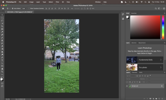
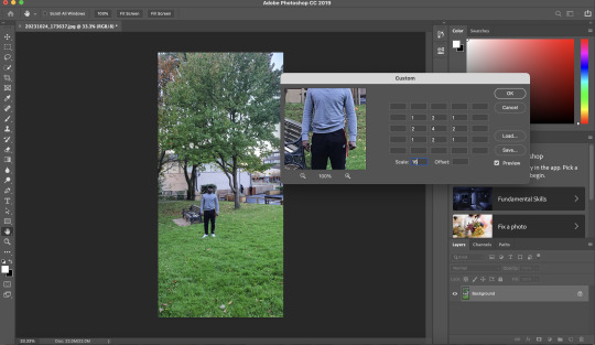
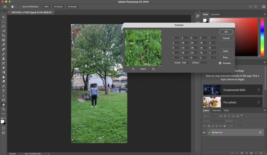
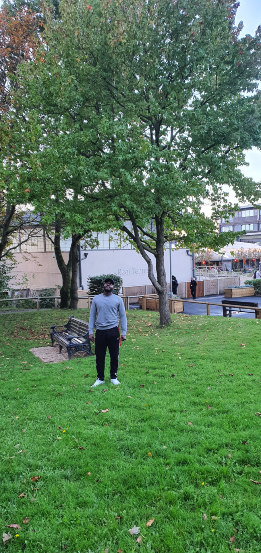
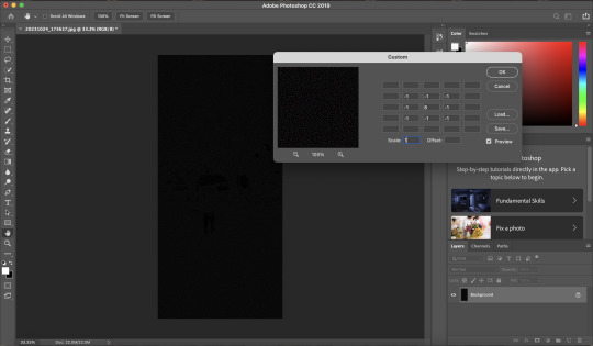
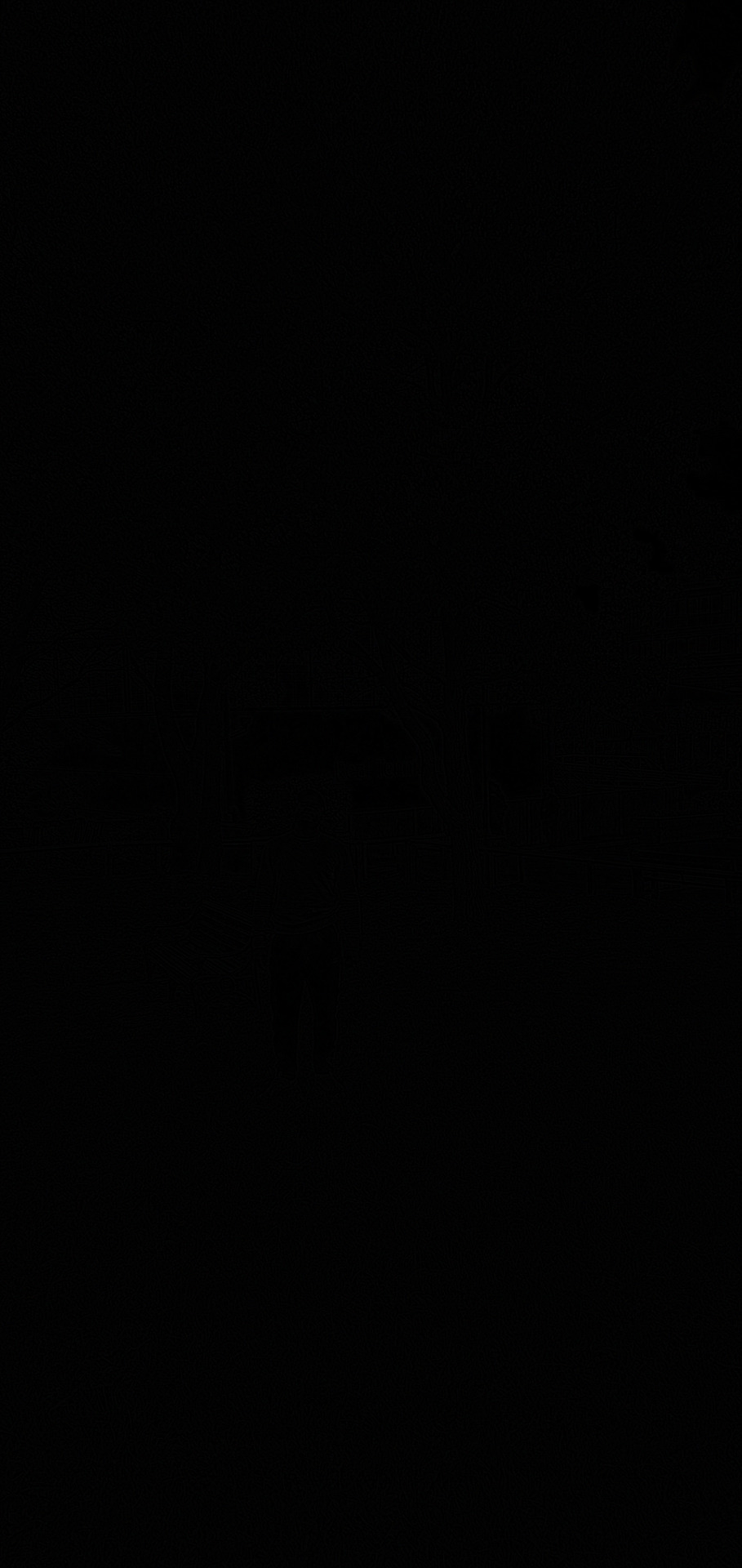
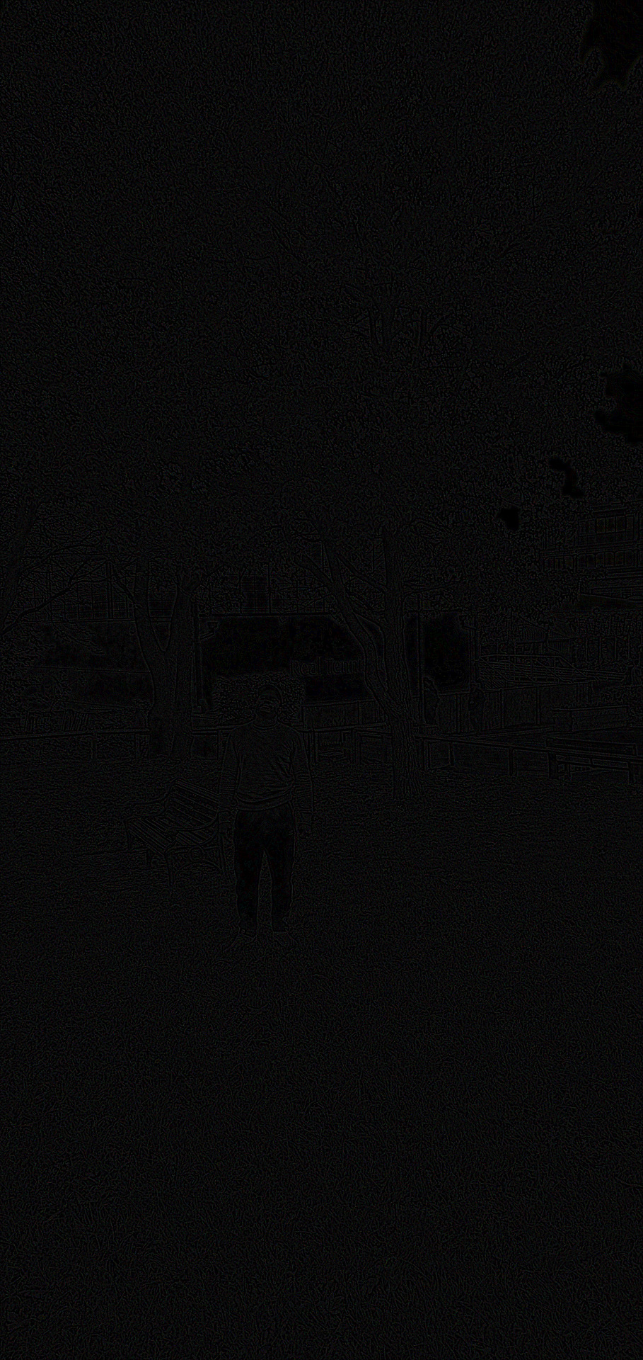
In this article i would be taking you through the process of using Photoshop to make custom filters to affect the appearance of an image. The image i used below, was taken during one of the lab sessions outside class on campus grounds. Several pictures were taken but i chose this picture in particular because it showed how the weather was good that day, with good natural light and the green leaves on trees also the grass was very green, showing the beautiful outdoors and nature. The good picture quality was also a huge advantage in assisting me demonstrate using the custom filter option in adobe photoshop. Find below the steps i used in making some custom filters listed above.
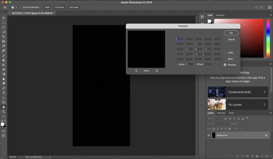
STEP 1: load image into photoshop as seen below in the screenshot
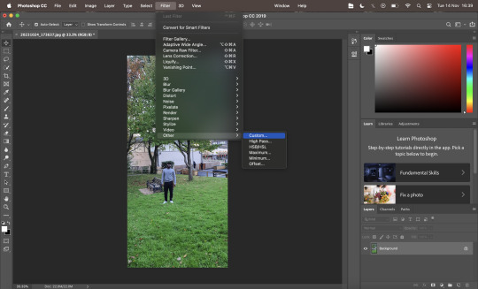
STEP 2: Click on filter at the top of the window, then click on other, then click on custom. As shown in the image below.
STEP 3: After clicking on custom, the custom window would pop up as seen below in the screenshot of the window.
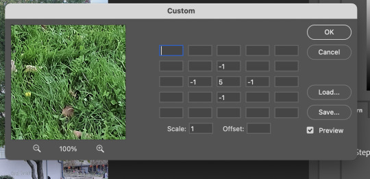
STEP 4: In this step i would be explaining the process of the Gaussian blur. this blur has figures of a 3x3 and 5x5 matrix with the values as seen below. The fraction outside the matrix would be used when filling in the scale in the custom window.
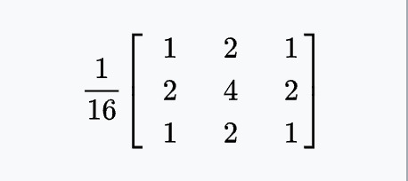
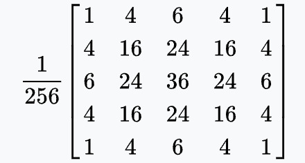
Here are examples of Gaussian Blur filter i got from the internet
I would try the 3x3 matrix first as seen below
click ok and export image
then 5x5 matrix next as seen below
click ok and export image
find below the end product of the Gaussian blur filter for both the 3x3 and 5x5.

STEP 5: Next i would be explaining the process of ridge or edge detection filter which uses two matrices as seen below.
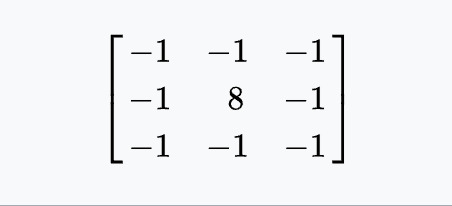
Find below the screenshot of the first matrix, of his values being put inside the custom window.
click on ok and then export image
Find below the screenshot of the second matrix, of his values being put inside the custom window.
click on ok and then export image
find below the products of the ridge or edge detection filter.
STEP 6: We would be looking at the sharpen image filter, with the matrix as seen below.
i would go ahead and put the values of the matrix in the custom window as seen below.
click on ok and then export image
The final product of this filter seen in the image below.
TUTORIAL ON HOW TO USE THE CUSTOM FILTER OPTION IN PHOTOSHOP
youtube
Elias Wick (2019) [Photoshop] Custom Filter. Available at: https://www.youtube.com/watch?v=OeMOriFQqBU&t=10s(Accessed November 2023).
FILTER DESIGN USING FILTER FORGE
0 notes
Text
Week 3 - Disrupt
I didn’t go to a workshop this week however I was quickly shown how to use adobe photoshop
I brought two photos into this and put them together to create one picture and I like how it turned out but I didn’t 100% love it as I used the wrong drawing however I do like the effect that the photoshop gave
I tried to make another picture after this one but I was finding it difficult to merge the two pictures together but I will definitely be trying to recreate this soon
I then also tried experimenting in stop motion and created this short clip of my impression of sound waves coming out of this magazine cutouts ear
I will definitely try this again with another piece and show my progress through it. I just wanted to test it out first as I have never tried stop motion before
1 note
·
View note
Text
BCM116 - Week Eight Journal Entry
The concept for my final work was loosely inspired by Malcolm le Grice’s Horror Film 1. It centres around the psychological phenomena 'pareidolia', where our brains allow us to perceive things, mainly faces, in objects when they actually aren’t there. I will be creating a slightly animated video that contains hidden illusions of faces in a colourful patterned background that the audience have to try and spot. These animated images will be then projected on the walls of a room. They will switch between each colour, as the different colours make it harder to see the hidden images. It will run between 2-5 minutes long.
I have started experimenting on this, and have created a bunch of images with hidden faces in them in every colour. I have the skills I have learnt in classes, especially week 5, to make this project come to life. I used Adobe Photoshop to create the image and After Effects to animate it. Here they are below, try and spot the faces if you can, they are just three dots arranged like two eyes and a mouth:
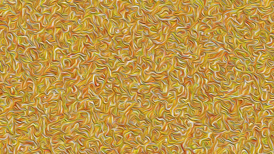
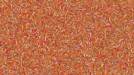
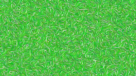

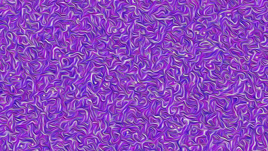


Personally, I think that the faces are more easily spotted in the darker colours, namely blue and purple, whereas they are harder to spot in black and white or yellow. It is very fascinating. I need to work on the quality, as when I export them they end up being very pixelated. When I presented it to my teacher, he suggested that I try and make the faces less obvious, so that it is more of a challenge for the audience to spot them. I think this will be very challenging but I am excited to test it out!
I also will create some sort of eerie background track using Adobe Audition that can play in the background while viewers watch my project, which I think will add to the effect of it. I want them to feel both fascinated and unsettled by it. I also really liked a lot of my peers’ works, especially one guy who made a whole moose cutout out of cardboard to project onto, and the girl who had a whole dance routine with projections. My classmates are very talented! I am very excited to see how the final works turn out!
0 notes
Last Seen Blogs
edmundo-diaz
Be kind. Always.

loverofamputees
⚠️🔞NO MINORS! NSFW! ADULT CONTENT!⚠️I love amputees
ode-to-fury
Aurë Entuluva

suzziecat14
Untitled

radhikaramchandani
Untitled