#InteractiveCharts
Explore tagged Tumblr posts
Visit Tumblr Blog
Explore Tumblr blogs with no restrictions, modern design and the best experience.
Last Seen Tumblr Blogs


Fun Fact
130K people were victims of a chain letter scam that affected Tumblr in May 2011.
Text
Mastering Recharts in React: A Beginner’s Guide | Memetic Solutions

Visualizing data effectively is crucial in creating impactful web applications. Recharts is a robust charting library built on D3, enabling developers to create stunning and responsive charts with ease in a React environment. In this blog, we’ll guide you through the fundamentals of Recharts, share actionable tips, and explain how you can leverage its features to improve your applications.
What is Recharts and Why Use It? Recharts is a versatile and lightweight library tailored specifically for creating charts in React applications. It simplifies data visualization by offering an easy-to-use interface while ensuring high customization and responsiveness.
Key Benefits of Recharts: 1. React Integration: Built for React, allowing seamless component-based development. 2. Declarative Syntax: Enables developers to create charts with minimal code. 3. Customization: Offers extensive options to tweak chart properties and styles. 4. Responsive Design: Automatically adjusts to different screen sizes. 5. Built-in Animations: Enhances user experience with smooth transitions.
Getting Started with Recharts: A Step-by-Step Guide 1. Install Recharts: Begin by adding Recharts to your React project. Use the following command to install recharts Installs the library along with all its required dependencies into your project.
2. Set Up Your Data: Recharts requires a structured dataset, usually in JSON format.
3. Create Your First Chart: Import the necessary components from Recharts, such as LineChart, XAxis, and YAxis, and render the chart in your React component. Diving Deeper into Recharts: To fully utilize Recharts, it’s essential to understand its advanced features. Here are some tips to help you: 1. Explore Chart Types: Recharts supports a variety of chart types like bar charts, pie charts, and scatter plots. Choose the one that best suits your data representation needs. 2. Leverage Custom Components: Use custom tooltips, legends, and labels to enhance chart readability and interactivity. 3. Use Responsive Container: Wrap your chart in a Responsive Container component to ensure it adjusts perfectly to screen sizes: 4. Customize Appearance: Adjust chart colors, line thickness, and more to align with your branding guidelines. 5. Combine Charts: Create complex visualizations by combining multiple chart types within the same component.
Common Use Cases of Recharts:- 1. Business Dashboards: Display KPIs like sales, revenue, and customer growth. 2. Market Analysis: Represent trends in stock prices or marketing campaign performance. 3. Health Metrics: Visualize patient data and health trends for healthcare apps. 4. Education Platforms: Track student progress through graphs and charts.
Why Choose Memetic Solutions? At Memetic Solutions, we specialize in crafting innovative solutions tailored to your business needs. Our services include:
Web Development: From interactive dashboards to full-scale web platforms.
Custom App Development: Building scalable and user-friendly applications.
Data Visualization Services: Transform your raw data into actionable insights with our expertise in many tools and Power BI.
AI-Powered Solutions: Leverage artificial intelligence to optimize your business processes.
Looking to bring your data to life? Visit our website Memetic Solutions to explore more about our services and how we can help you build smarter applications. Unlock the potential of your data with Memetic Solutions — your partner in innovation and growth.
#Recharts#ReactCharts#DataVisualization#ReactDevelopment#RechartsInReact#ReactJS#DataVisualizationWithReact#InteractiveCharts#ReactUI
0 notes
Photo

Welcome to Cratos.ai, the ultimate tool for creating stunning data visualizations and presenting them in real-time. In this guide, we will walk you through the essential steps for using a time series chart in a Data Studio Account. Step 1: Creating a Data Studio Account. To create a Data Studio Account, navigate to https://datastudio.google.com/ and sign up or log in with your Google credentials. Once you have signed up, you can access a wide range of visualization tools to create your time series chart. Step 2: Selecting the Time Series Chart. Once you have selected the time series chart, you will be prompted to select the data source you want to use for the chart. Data Studio provides the option to connect to a wide range of data sources, including Google Sheets, Google Analytics, and various other data warehouses. Step 3: Configuring the Time Series Chart. After selecting your data source, you will need to configure your chart to display the data accurately. You can choose the time interval for the data, define the time range, customize the chart colors, and select from various other customization options. Step 4: Editing the Time Series Chart. Data Studio provides the option to customize your chart’s design by editing the chart’s properties. You can edit the text, background color, font, and other elements of the chart to give it a unique look and feel. Step 5: Adding Interactivity. Adding interactivity to your time series chart is an essential step in making it more engaging and informative. You can use clickable elements to display additional information or insights. By doing so, you can help your viewers explore the data and uncover hidden trends. Step 6: Publishing the Time Series Chart. Once you have created your chart, you can publish it to share it with others. You can use a shareable link, embed the chart on your website, or export it as an image or PDF. At Cratos.ai, we believe in providing our users with the best possible tools and resources to create stunning visualizations and share data insights. To learn more about our platform, visit Cratos.ai, and join the data visualization revolution today! #Cratos.ai #DataVisualization #TimeSeriesChart #DataStudio #InteractiveCharts #RealTimeInsights 💻📊📈
0 notes
Text
An Introduction to MDXJS
Markdown has traditionally been a favorite format for programmers to write documentation. It’s simple enough for almost everyone to learn and adapt to while making it easy to format and style content. It was so popular that commands from Markdown have been used in chat applications like Slack and Whatsapp as document applications, like Dropbox Paper and Notion. When GitHub introduced Markdown support for README documentation, they also rendered HTML content from it — so, for example, we could drop in some link and image elements and they would render just fine.
Even though Markdown isn’t broken by any stretch of the imagination, there’s always room for improvement. This is where Markdown Extended (MDX) comes in.
When would we consider MDX over Markdown? One thing about MDX is that JavaScript can be integrated into cases where normal Markdown is used. Here are few examples that illustrate how handy that is:
Frontend Armory uses MDX on its education playground, Demoboard. The playground supports MDX natively to create pages that serve both as demo and documentation, which is super ideal for demonstrating React concepts and components.
Brent Jackson has a brand new way of building websites pairing MDX and Styled System. Each page is written in MDX and Styled System styles the blocks. It’s currently in development, but you can find more details on the website.
Using mdx-deck or Spectacle could make your next presentation more interesting. You can show demos directly in your deck without switching screens!
MDX Go, ok-mdx and Docz all provide tools for documenting component libraries in MDX. You can drop components right in the documentation with Markdown and it will just work™.
Some sites, including Zeit Now and Prisma docs, use MDX to write content.
MDX shines in cases where you want to maintain a React-based blog. Using it means you no longer have to create custom React component pages when you want to do something impossible in Markdown (or create a plugin). I have been using it on my blog for over a year and have been loving the experience One of my favorite projects so far is a React component I call Playground that can be used to demo small HTML/CSS/JavaScript snippets while allowing users to edit the code. Sure, I could have used some third-party service and embed demos with it, but this way I don’t have to load third-party scripts at all.
Speaking of embedding, MDX makes it so easy to embed iFrames created by third-party services, say YouTube, Vimeo, Giphy, etc.
Use it alongside Markdown
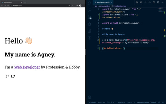
You’ll know a file is written in MDX because it has an .mdx extension on the filename. But let’s check out what it looks like to actually write something in MDX.
import InteractiveChart from "../path/interactive-chart";
# Hello - I'm a Markdown heading
This is just markdown text
<InteractiveChart />
See that? It’s still possible to use Markdown and we can write it alongside React components when we want interactive visualizations or styling. Here is an example from my portfolio:

Another benefit of MDX is that, just like components, the files are composable. This means that pages can be split into multiple chunks and reused, rendering them all at once.
import Header from "./path/Header.mdx" import Footer from "./path/Footer.mdx" <Header /> # Here goes the actual content. Some random content goes [here](link text) <Footer />
Implementing MDX into apps
There are MDX plugins for most of the common React based integration platforms, like Gatsby and Next.
To integrate it in a create-react-app project, MDX provides a Babel Macro that can be imported into the app:
import { importMDX } from './mdx.macro' const MyDocument = React.lazy(() => importMDX('./my-document.mdx')) ReactDOM.render( <React.Suspense fallback={<div>Loading...</div>}> <MyDocument /> </React.Suspense>, document.getElementById('root') );
You can also try out MDX on the playground they created for it.
MDX contributors are very actively working on bringing support for Vue. A sample is already available on GitHub. This is though in Alpha and not ready for production.
Editor support
Syntax highlighting and autocomplete have both been increasing support for VS Code, Vim, and Sublime Text. However, in use, these do have some sharp edges and are difficult to navigate. A lot of these come from the inability to predict whether we are going for JavaScript or Markdown within the context of a page. That’s something that certainly can be improved.
MDX plugins and extensions
A key advantage of MDX is that it is part of the unified consortium for content that organizes remark content. This means that MDX can directly support the vast ecosystem of remark plugins and rehype plugins — there’s no need to reinvent the wheel. Some of these plugins, including remark-images and remark-redact, are remarkable, to say the least. To use a plugin with MDX, you can add them to your corresponding loader or plugin. You can even write your own MDX plugins by referring to the MDX Guide for creating plugins.
MDX is only a few years old but its influence has been growing in the content space. From writing blog posts and visualizing data to creating interactive demos and decks, MDX is well suited for many uses — well beyond what we have covered here in this introduction.
The post An Introduction to MDXJS appeared first on CSS-Tricks.
via CSS-Tricks https://ift.tt/3av2csc
0 notes
Text
An Introduction to MDXJS
Markdown has traditionally been a favorite format for programmers to write documentation. It’s simple enough for almost everyone to learn and adapt to while making it easy to format and style content. It was so popular that commands from Markdown have been used in chat applications like Slack and Whatsapp as document applications, like Dropbox Paper and Notion. When GitHub introduced Markdown support for README documentation, they also rendered HTML content from it — so, for example, we could drop in some link and image elements and they would render just fine.
Even though Markdown isn’t broken by any stretch of the imagination, there’s always room for improvement. This is where Markdown Extended (MDX) comes in.
When would we consider MDX over Markdown? One thing about MDX is that JavaScript can be integrated into cases where normal Markdown is used. Here are few examples that illustrate how handy that is:
Frontend Armory uses MDX on its education playground, Demoboard. The playground supports MDX natively to create pages that serve both as demo and documentation, which is super ideal for demonstrating React concepts and components..
Brent Jackson has a brand new way of building websites pairing MDX and Styled System. Each page is written in MDX and Styled System styles the blocks. It’s currently in development, but you can find more details on the website.
Using mdx-deck or Spectacle could make your next presentation more interesting. You can show demos directly in your deck without switching screens!
MDX Go, ok-mdx and Docz all provide tools for documenting component libraries in MDX. You can drop components right in the documentation with Markdown and it will just work™.
Some sites, including Zeit Now and Prisma docs, use MDX to write content.
MDX shines in cases where you want to maintain a React-based blog. Using it means you no longer have to create custom React component pages when you want to do something impossible in Markdown (or create a plugin). I have been using it on my blog for over a year and have been loving the experience One of my favorite projects so far is a React component I call Playground that can be used to demo small HTML/CSS/JavaScript snippets while allowing users to edit the code. Sure, I could have used some third-party service and embed demos with it, but this way I don’t have to load third party scripts at all.
Speaking of embedding, MDX makes it so easy to embed iFrames created by third-party services, say YouTube, Vimeo, Giphy, etc.
Use it alongside Markdown
You’ll know a file is written in MDX because it has an .mdx extension on the filename. But let’s check out what it looks like to actually write something in MDX.
import InteractiveChart from "../path/interactive-chart";
# Hello - I'm a Markdown heading
This is just markdown text
<InteractiveChart />
See that? It’s still possible to use Markdown and we can write it alongside React components when we want interactive visualizations or styling. Here is an example from my portfolio:
Another benefit of MDX is that, just like components, the files are composable. This means that pages can be split into multiple chunks and reused, rendering them all at once.
import Header from "./path/Header.mdx" import Footer from "./path/Footer.mdx" <Header /> # Here goes the actual content. Some random content goes [here](link text) <Footer />
Implementing MDX into apps
There are MDX plugins for most of the common React based integration platforms, like Gatsby and Next.
To integrate it in a create-react-app project, MDX provides a Babel Macro that can be imported into the app:
import { importMDX } from './mdx.macro' const MyDocument = React.lazy(() => importMDX('./my-document.mdx')) ReactDOM.render( <React.Suspense fallback={<div>Loading...</div>}> <MyDocument /> </React.Suspense>, document.getElementById('root') );
You can also try out MDX on the playground they created for it.
MDX contributors are very actively working on bringing support for Vue. A sample is already available on GitHub. This is though in Alpha and not ready for production.
Editor support
Syntax highlighting and autocomplete have both been increasing support for VS Code, Vim, and Sublime Text. However,in use, these do have some sharp edges and are difficult to navigate. A lot of these come from the inability to predict whether we are going for JavaScript or Markdown within the context of a page. That’s something that certainly can be improved.
MDX plugins and extensions
A key advantage of MDX is that it is part of the unified consortium for content that organizes remark content. This means that MDX can directly support the vast ecosystem of remark plugins and rehype plugins — there’s no need to reinvent the wheel. Some of these plugins, including remark-images and remark-redact, are remarkable to say the least. To use a plugin with MDX, you can add them to them to your corresponding loader or plugin. You can even write your own MDX plugins by referring to the MDX Guide for creating plugins.
MDX is only a few years old but its influence has been growing in the content space. From writing blog posts and visualizing data to creating interactive demos and decks, MDX is well suited for many uses — well beyond what we have covered here in this introduction.
The post An Introduction to MDXJS appeared first on CSS-Tricks.
An Introduction to MDXJS published first on https://deskbysnafu.tumblr.com/
0 notes
Text
Cannex Capital Holdings Announces Substantial Financial Results
Cannex Capital Holdings Inc (CNSX:CNNX) (OTCMKTS:CNXXF) announced impressive financials today. The low profile Washington and California-based operator reported revenue and adjusted EBITDA increases that have few peers in the cannabis sector. We explore further.
This morning, Cannex released numbers regarding its Q1 2019 financial results ended July 31st, 2018. These were of the audited variety, in accordance with International Financial Reporting Standards (IFRS). The results, as mentioned, should garner some attention.
Revenues—generated primarily by way of packaging sales and rental income—increased 223% to $3,400,435 in Q1 2019, compared to $1,528,341 for the comparative period. Income for the period was $2,428,507 ($.01 per share) versus a loss of $403,027. Adjusted EBITDA increased 73% to $1,780,832 for Q1 2019, as compared to $983,186 for the prior corresponding period.
While these numbers signal robust growth, it’s important to note that due to the company’s change in fiscal year end, the quarterly numbers only included two months of operations instead of three. Thus, the YoY comparables look more impressive than might otherwise be the case. Still, the vigorous growth is clearly indicating that Cannex is making a significant dent in the marketplaces in which they operate.
youtube
Cannex Capital Group CEO Anthony Dutton shares news of the company’s strong financials based on revenue generated from its holding company, Northwest Cannabis Solutions
The next milestone in-wait for Cannex is the closing of the Jetty Extracts (Ametrine Wellness Inc.) announced in April. The acquisition of the popular Oakland-based edibles operator is still pending months after the binding letter agreement was reached. Today, the company also revealed it had executed an amendment to the previously‐signed accord, extending it until October 15, 2018. No assurances were given that the transaction will actually follow through as proposed—or at all.
Apparently, some additional due diligence was required, however Cannex CEO Anthony Dutton revealed that the acquisition was “still on track… there are no issues other than just the typical things you would expect to see around a complex, cross-border transaction” as early as September. The pending transaction would qualify as among the most material events the company’s short history, should it close.
Midas Letter will have further coverage on Cannex Capital Holdings as further events warrant.
Original article: Cannex Capital Holdings Announces Substantial Financial Results
©2018 Midas Letter. All Rights Reserved.
source https://midasletter.com/2018/10/cannex-capital-holdings-announces-substantial-financial-results/
0 notes
Photo


UI Development & Experiments ~ Coral Interactive Chart ~
Through the use of Java script I was able to achieve my vision of creating an interactive chart that would enhance the users experience, connecting between themselves and my website.
The first image is of my html and how I’ve had to insert each element into the web layout. The second image is of the css that was relevant with the making of the coral chart. This is where I positioned each element directly, one by one, to match the design layout of my Illustrator wireframes. The last image is of the Javascript that was used to create the interactive clicking.
0 notes
Link
0 notes
Video
tumblr
UI Development & Experiment ~ Interactive Charts
This video showcases my second interactive chart of how the issue of Overfishing is affecting our coral reefs. The first button is of 2000 and the coral to the right of it is looking alive and healthy. The second button is 2005 and this is where the coral changes colour. This colour change represents the impact of overfishing and how its affecting reefs around the world and in particular The Great Barrier Reef. The third button is 2015 and this too shows how overfishing and destructive fishing practices are affecting coral reefs as the coral has become whiter and has minimal colour. The last button, “button 2050″ represents what the future holds. This is basically suggesting that if we don’t act now in the near future we quite typically won’t have any coral reefs and The Great Barrier Reef will have been just a memory. It will have been complete whipped out. This is represented through the coral changing its colour from orange to completely white (death).
0 notes
Photo


UI Development & Experiments ~ Interactive Charts ~
To create this interactive chart I firstly structured its layout through html and used the css to determine all of the elements exact positions. With the help of Javascript I was able to create a clicking interactive element and seen through the video and evidently displayed through the third image.
0 notes
Video
tumblr
UI Development & Experiments ~ Interactive Charts
This video showcases my first interactive chart about Overfishing and who in society understands, has an idea, trying to stop it and people who don't think its important. As more people understand it is an issue I wanted to help that percentage and create a website that can cater for their needs and provide them with information and data, and ways they can prevent the issue and be apart of the solution. This website will also provide information and create awareness to the percentage that have no idea about the issue and hopefully change their perspective about it.
0 notes