#Johann Zainer
Explore tagged Tumblr posts
Visit Tumblr Blog
Explore Tumblr blogs with no restrictions, modern design and the best experience.
Last Seen Tumblr Blogs


Fun Fact
Tumblr’s reach among the 26-to-35-year-olds in the US is 11%.
Text
238J Peregrinus of Opole
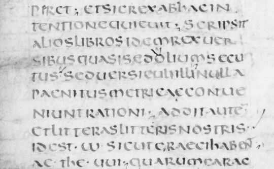
238J Peregrinus of Opole (1305-1327) Jacobus de Voragine (1229-1298) & Nicolaus de Dinkelsbühl (1360-1433) Peregrinus: Sermones de tempore et de sanctis. Add: Jacobus de Voragine: Quadragesimale. Nicolaus de Dinkelsbuel: Concordantia in passionem dominicam. Est autem huius operis ordo talis. Primo ponuntur sermones d[omi]nicales de tempore per anni circulu[m]. Secundo de sanctis, Tercio…

View On WordPress
#13thc Autors#14thc Authors#both defective.#Clare Bolton#Goff P267#Johann Zainer#Nicolaus de Dinkelsbühl#Only two North American copies#Peregrinus of Opole
0 notes
Text

Johannes Zainer, active 1473-1523
Woodcut illustration (leaf [c]9v, f. [xix]) of Niobe, Amphion and their dead sons, from an incunable German translation by Heinrich Steinhöwel of Giovanni Boccaccio's De mulieribus claris, one of 76 woodcut illustrations.
Penn Libraries (Universitat de Pennsilvània, Philadelphia), Catalog number Inc B-720
15 notes
·
View notes
Video
youtube
Test 4 Rönesans'da Basımcılığın Gelişimi Aykut ilter Tipografi Aykut ilter 0532 322 2351 4. RÖNESANS’DA BASIMCILIĞIN GELİŞİMİ YazdırTüm Cevapları GizleMateryal Listesine Dön ________________________________________ Soru 1: Hangisi Gutenberg öncesi bir baskı yöntemi değildir? (Çoktan Seçmeli) Mühür baskı, Kalıp baskı, Ağaç baskı, ✔ Gravür baskı, Yüksek baskı Cevap : Gravür baskı, ________________________________________ Soru 2: Hangisi Gutenberg’in hareketli hurufat ile bastığı bilinen ikinci kitaptır? (Çoktan Seçmeli) Gökbilim Takvimi, ✔ Türk Takvimi, 36 Satırlı İncil, 42 Satırlı İncil, Mainz Mezmurlar Kitabı Cevap : Türk Takvimi, ________________________________________ Soru 3: Gutenberg’in baskılarında kullandığı hurufat hangi yazı çeşidinden kesilmiştir? (Çoktan Seçmeli) Bastard Gotik, Round Gotik, ✔ Textur Gotik, Fraktur Gotik, Schwabacher Gotik Cevap : Textur Gotik, ________________________________________ Soru 4: Gutenberg’in hareketli hurufatla baskı dizgesi en az kaç yıl sürmüştür? (Çoktan Seçmeli) 100 yıl, 200 yıl, 250 yıl, 300 yıl, ✔ 500 yıl Cevap : 500 yıl ________________________________________ Soru 5: Venedik’te matbaacılığı ilk başlatan basımcı hangisidir? (Çoktan Seçmeli) ✔ Johannes da Spira, Conrad Sweynheym, Arnold Pannartz, Peter Schöffer, Albrecht Pfister Cevap : Johannes da Spira, ________________________________________ Soru 6: Fransa Kralı’nın basımcılığı öğrenmesi için görevlendirdiği ve Mainz’e gönderdiği, çıraklık dönemini Gutenberg’in atölyesinde geçiren basımcı kimdir? (Çoktan Seçmeli) Arnold Pannartz, Peter Schöffer, Anton Koberger, ✔ Nicolas Jenson, Günter Zainer Cevap : Nicolas Jenson, ________________________________________ Soru 7: Venedikli basımcılar tarafından geliştirilen dik hurufatlar hangi adla tanımlanır? (Çoktan Seçmeli) Yeni Biçem, ✔ Eski Biçem, Eşit en, Geçiş dönemi, Modern Cevap : Eski Biçem, ________________________________________ Soru 8: Öklid’in “Geometrinin Unsurları” adlı eserini ilk kez basan hangi basımcıdır? (Çoktan Seçmeli) Nicolas Jenson, William Caxton, Anton Koberger, Albrecht Dürer, ✔ Erhard Ratdolt Cevap : Erhard Ratdolt ________________________________________ Soru 9: Basımcılıkta ağaç oyma gravür tekniğini geliştiren sanatçı hangisidir? (Çoktan Seçmeli) Anton Koberger, Nicolas Jenson, ✔ Albrecht Dürer, Peter Schöffer, Philippe Pigouchet Cevap : Albrecht Dürer, ________________________________________ Soru 10: Hangisi Yunanca ve Latince klasikleri basma amacıyla 1494’te Venedik’te kendi basımevi Aldine Press’i kurar? (Çoktan Seçmeli) ✔ Aldus Manutius, Pietro Bembo, Francesco Colonna, Desiderus Erasmus, Philippe Pigouchet Cevap : Aldus Manutius,
0 notes
Text
Tik Tok - Ides of March Edition (A Julius Caesar (the play) fanvid and song parody)
youtube
A music video for the upcoming Ides of March!
Based on the song Tik Tok by Kesha with new lyrics and vocals by me. Audio editing by my partner.
(I know it's not the ides yet, but people play Christmas music for a month leading up to Christmas, so.)
Lyrics and artworks in the video under the cut (artist birth and death years where I could not find the year of creation).
Lyrics:
Wake up in the morning feeling hyped up from battle No I haven't got a crown, but it ain't worth the hassle Before I leave hear a warning from the cheering mass I don't care, he's just a dreamer, so I leave him and pass
I'm talkin: just took out my foe, foe, Got parades wherever I go, go Bout time I got that throne, throne. [gasp I mean--]
On to the Senate on the Ides, Ides, Hear the pleading of my wife, wife, That's when it gets a little bit tricky…
[Chorus:] Can't stop; you know the gods already made this story up Three times, I've declined, and it's nearly the Ides Tick Tock, on the clock, but the Senate don't stop, no Whoa-oh oh oh, Whoa-oh oh oh
[Repeat Chorus] Ain't got a care in the world, 'cause her dream's just a dream And the omens that she's seen could be 'bout anything Now the Senate's lining up, 'cause they heard I got swagger Beggin' mercy for Publius--Wait. Is that a dagger?!
I'm talkin bout--errybody got a knife, knife Even Brutus wants my life, life Should'a listened to my wife, wife.
Now, now does Caesar lie so low, low, But the people will still know, know Of the fortune he brought Rome, Rome… Fortune he brought
[Chorus x2]
Romans, We stabbed him but, you have to know This was for Rome, not for power I loved him but he had to go, a threat he posed to our freedom
Brutus, you stabbed me but, you'll see me soon upon your doom at Philippi You'll see me soon upon your doom, upon your doom
But the party don't start 'til Marc walks in.
[Chorus x2]
Artworks:
Brutus and Caesar's Ghost: Brutus and the Ghost of Julius Caesar, Edwin Austin Abbey (1852–1911) Brutus Disturbed By The Ghost Of Caesar, From Shakespeare's Julius Caesar, Act IV, Scene III, Henry Tresham (c.1751 – 17 June 1814)
Caesar's Death: "Julius Caesar, Act III, Scene 2, the Murder Scene", George Clint (1822) Death of Caesar, March 15, 44 BC Painting by Vincenzo Camuccini (1798) The Assassination of Julius Caesar, William Holmes Sullivan (1888) The Murder of Caesar, Karl von Piloty (1865) The Death of Julius Caesar, George Esten Cooke (1837) The Death of Caesar, by Jean-Léon Gérôme, 1867 Assassination of Julius Caesar, Spanish School, (19th century) The Assassination of Caesar, Heinrich Füger, 1818 The death of Caesar, Victor Honoré Janssens (1658-1736) Woodcut manuscript, Johannes Zainer, c. 1474
Marc Antony: Marc Antony Reading the Will of Caesar, William Hilton (1786-1839) Marc Antony's Oration, William Holmes Sullivan (1836-1908)
Declining the throne: Caesar refuses the Diadem, 1894 Antoine offre le diademe a cesar, 1810 Copper engraving
Roman Senate: Cicero Denounces Catiline (1888), Cesare Maccari Caesar going to the Senate on the Ides of March, Abel de Pujol (1785-1861) The Roman Forum by Hodgkin (1800-1860)
Soothsayer: Beware the Ides of March Soothsayer warning Julius Caesar of the Ides of March, 1858 Wood engraving Caesar and the Soothsayer, Illustrator Unknown, Published 1880.
Caesar's Wife pleads with him: Cowards die many deaths - Hans Holbein the Younger (1497-1543) Calpurnia, Caesar's wife admonishing Caesar, Abel de Pujol (1785-1861)
Triumphs of Caesar: Julius Caesar, Andrea Mantegna, c. 1490 The Vase Bearers, Andrea Mantegna, c. 1490 Picture Bearers, Andrea Mantegna, c. 1490 Musicians, Andrea Mantegna, c. 1490 Corselet, Andrea Mantegna, c. 1490 A Roman Triumph, Rubens, c. 1630 Vercingetorix Throws Down his Arms at the Feet of Julius Caesar, Lionel Royer (1899) Caesar Crossing the Rubicon, Adolphe Yvon, 1876
#shakespeare#kesha#ides of march#julius caesar#julius caesar (the shakespeare play)#parody#song parody#Youtube
38 notes
·
View notes
Text
Typographical development up to and beyond Nicolas Jenson’s roman typeface
Introduction
While reading about the history and early development of typography, I grew interested in the point at which typographic design became, for the first time, abstract; moving away from letterforms that mimicked handwritten script towards new styles that were driven by a growing awareness and appreciation of the formal possibilities allowed by the nascent technique of letterform printing. This technical and conceptual shift is generally attributed to the French typographer, Nicolas Jenson, who designed one of the earliest and finest Roman style typefaces in 1470s Venice: a typeface now referred to as Jenson.
Background/history of writing
Typography, of course, derives from writing, which can be traced back to the 3rd millennia BC, an era in which cultural interactions between the societies of ancient Egypt and Mesopotamia, saw the Sumerian cuneiform script of the latter influence the development of hieroglyphics in the former, both written forms establishing themselves as powerful communicative aids before developing into new forms which influenced the creation of subsequent abjadic and alphabetic stems of writing.
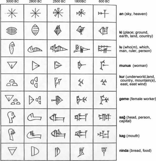
Sumerian cuneiform
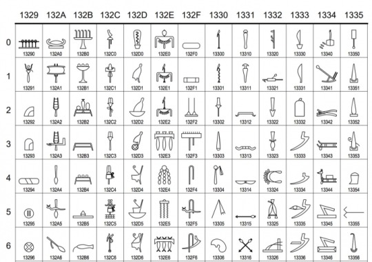
Egyptian hieroglyphics
The Phoenicians simplified the act of writing by drastically reducing the number of letterforms, creating what is now recognised as the first abjadic alphabet, consisting entirely of consonantal sounds. The Greek alphabet derived from the Phoenician, but included letters for vowel sounds, making it the first of a new form of alphabet. This, in turn, informed the development of written Latin - a system that, according to Eric Gill, ‘reached a permanent type about the first century AD.’
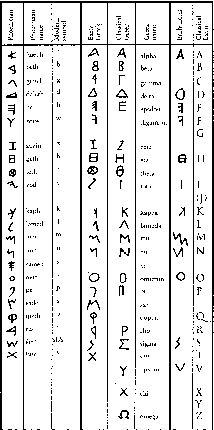
Development of the Phoenician, Greek and Latin alphabets
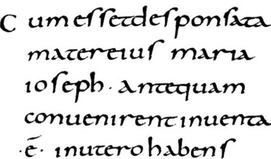
During the next fifteen-hundred years, a period in which the Latin alphabet itself remained for the most part fixed, the forms of lettering written in the languages derived from Latin developed in manifold ways: from the square capitals that were a characteristic of Roman lapidary inscriptions, through later and less formal cursive, insular and uncial scripts that eventually found a level of standardisation from the ninth to the early thirteenth centuries in the form now referred to as Corolignian miniscule. In turn this form of script developed into blackletter, or Gothic script, that was used from the 1150s through to the invention of printing and beyond.
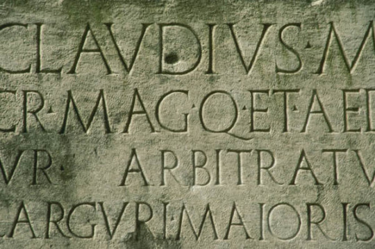
Roman lapidary inscription
An example of uncial script
Carolignan miniscule
Gothic blackletter
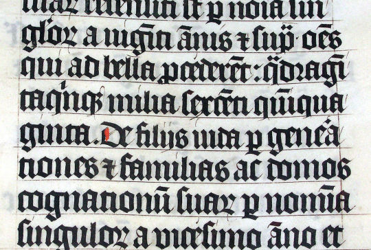
At the time Johannes Gutenberg introduced printing with moveable type in 1439, the new technology was conceived as a means by which texts - specifically indulgences - that had previously been produced, painstakingly, by hand could be mass produced and the process of manufacture and dissemination made more efficient. The focus was on the speed and convenience that the mechanical process allowed, rather than clarification or any improvement in the aesthetic quality of handwritten script. This meant that the initial conceptual scope of mechanical printing was to produce scripts in the style in which they would, previously, have been handwritten. The standard method of writing in the germanic world used Gothic letterforms and, since printing was invented in Germany, the early typefaces mimicked Gothic script.
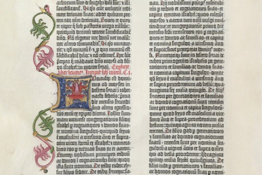
A page from Gutenberg’s bible of 1454
However, as Italy was the most culturally developed country in Europe at the time, German printers moved south to cities like Venice and began creating typefaces that took account of humanistic handwriting that was developing in Italy - a form that took as its inspiration the clarity of Roman lettering, marrying this with minuscule forms that had developed during later eras.
In his Essay on Typography, Eric Gill explains that the process of using current technology to repeat received forms of lettering was not new and that, in an earlier era when lapidary inscriptions were the norm, texts written using a very different technology, the pen, mimicked the then culturally dominant form:
Pen writing, even as late as the fourth century, shows very clearly that the scribe had no idea of inventing ‘pen’ forms of letters, but was simply making as well as he could with a pen what he conceived to be ordinary lettering. Whether he held the pen one way or the other (so that the thick strokes came vertically or horizontally) makes no difference to the primary intention of the scribe. He was not inventing letters; he was writing forms already invented.
…whatever tools or materials or economic circumstance (that is hurry & expense), the artist, the letter-maker, has always thought of him self as making existing forms, & not inventing new ones. Thus, the Lombards of the fourteenth century did not sit down and invent Lombardic lettering. The Siennese inscription in the Victoria and Albert Museum, dated 1309, is simply a stone version of the pen letters with which the letter-cutter was familiar. The letter-cutters of the fifteenth century did not invent ‘gothic’. They had the job of cutting stone inscriptions, and they did it in the ordinary letters of their time. The forms of their letters were what we call ‘pen’ forms. But they cared nothing about that. To them they were simply letters. And just as we saw that in Roman times the Roman scribe imitated the stone inscription forms because, for him, nothing else was letters; so, in the fifteenth century, when the written was the most common and influential form of lettering, the position is reversed, & the letter-cutter copies the scribe — the stone inscription is imitation pen-writing (with such inevitable small modifications as, in stone, cannot be avoided), whereas in the fourth century the written book w as an imitation of the stone inscription (with such small modifications as the pen makes inevitable).
Gill goes on to say that,
…the first printers were no more the inventors of new letter forms than any other craftsmen had been. The first printed books were simply typographic imitations of pen writing, just as were fifteenth century inscriptions in stone.
So there was a sense in which the originators of typography, like the practitioners of earlier techniques, were tied by custom to past practice - in their case the organic, humanistic (in the sense of being physically formed by humans) physicality of scribal penmanship, which was deep rooted, and linked to a seemingly intrinsic need to make marks.
However, while early typographical practitioners referred to earlier calligraphic forms, increased usage and improved technology had significant implications as the categorical difference between handwritten and printed letters became apparent: as Elaine Lupton says in her book Thinking With Type, ‘Words originated as gestures of the body. The first typefaces were directly modelled on the forms of calligraphy.Typefaces, however, are not bodily gestures — they are manufactured images designed for infinite repetition.’ As people worked with type, there was an emerging realisation of the new formal possibilities inherent within the new medium.
The move away from traditional forms took place quickly, during the space of fifteen years, from Guttenberg’s Blackletter type in the mid-1450s, through Gothic Roman to the emergence of humanistic Roman types that emerged in 1470, and was inextricably linked with the movement of German practitioners to Italy and the influence Roman capitals combined with contemporary Italian handwritten forms on typographical development.
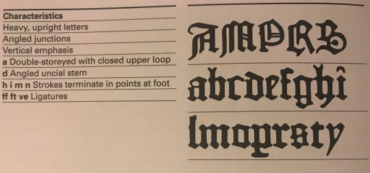
Characteristics and sample of Gutenberg’s Textura blackletter

Characteristics and sample of the Gothic Roman Subiaco Type
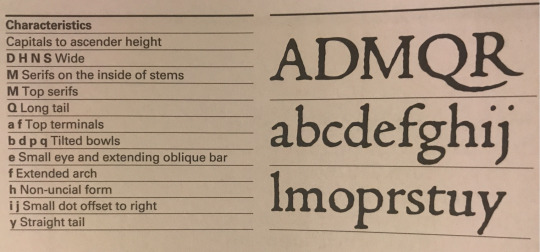
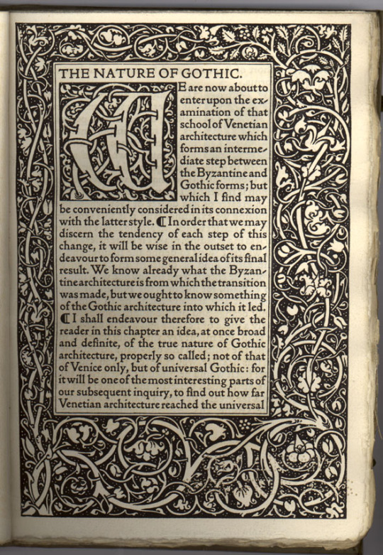
Characteristics and sample of Jenson’s roman type
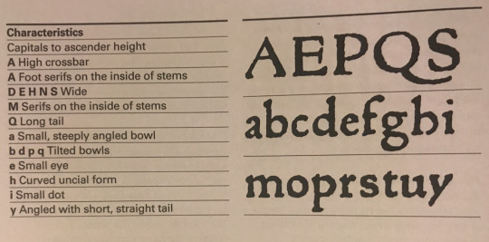
Characteristics and sample of the Von Speyers’ roman type
Images above taken from Paul McNeils The Visual History of Type
The earliest instance of this is, what’s now known as the Subiaco Type, was created by two German monks, Sweyynheym and Pannartz, who established the first printing press in Italy and developed a hybrid, Gothic Roman type that combined elements of medieval lettering with renaissance forms, to appeal to local audiences. The typographer, Stanley Morison, thought that Sweyynheym and Pannartz’s invention is entitled to rank as the first humanistic or roman type’, because it established a principle, of movement away from Germanic towards humanistic letterforms, that influenced the emergence of new typographical forms and new ways of thinking about the possibilities of the medium. For this reason, Paul McNeil, in The Visual History of Type, says that, ‘The Subiaco typeface represents a milestone in the history of printing and typography.’
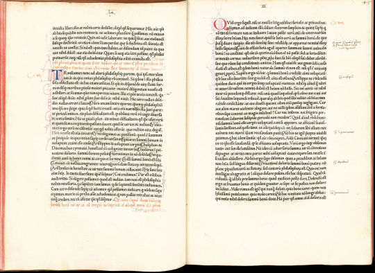
De divinis institutionibus by Lactantius; printed by Pannartz and Sweynheim in 1465
So the typographical style now known as Gotica Antiqua, invented by Sweyynheym and Pannartz and developed by practitioners such as Gunter Zainer, represents a significant movement away from a earlier purely germanic forms and a broadening of awareness of the formal possibilities of the still nascent technology. However, it was the development in 1470 of a purely Roman typeface that constituted a complete shift away from medieval lettering and Blackletter type towards printed lettering that seems familiar to us today. There is some dispute as to who should be given credit for this - the Von Speyer brothers (also known as da Spira brothers) or Nicolas Jenson, who seem to have made similar breakthroughs simultaneously. Of the Von Speyers’ roman type, printer and historian of typography D.B. Updike wrote in the 1930s, ‘Many roman types of varying degrees of purity and attractiveness were used by Italian printers of this period. It was reserved for John and Wendelin de Spire to show a roman type which today appears roman to us.’
An example of the Von Speyers’ roman type
However, it is Jenson’s roman that is the more famous today, considered the progenitor or all subsequent roman typefaces. Paul McNeil states that, Jenson’s type, ‘marks a turning point in the history of printing. A blueprint for all that followed, it continues to influence type design today.’ He goes on to say that, ‘Nicolas Jenson’s work elevated the nascent craft of printing to a fine art. The balanced proportions of the letters, the evenness of their spacing and the restrained overall tone of his pages demonstrate why he was acclaimed above other printers working in fifteenth-century Italy and why his work has remained a cornerstone in the history of typography.’
Jenson’s roman type
In his, An Essay on Typography, Eric Gill in summarising the impact of Jenson’s roman, says that it represents, ‘the emancipation achieved from the gothic of northern Europe and from handwriting generally. Henceforth, the designing of type was primarily the work of punch-cutters, that is of engravers. Letters were still reminiscent but no longer an imitation of handwriting.’ So while Italian printers, advanced the art of typography by moving from a type that was an imitation of Germanic handwritten forms to one that took Roman capitals and contemporary Italian minuscule for inspiration, the revolutionary insight was that mechanical typography - a new technology that allowed standardisation of letterform, technical refinement and reproducibility - made possible a formal abstraction, away from handwritten letterforms to a distinct system of lettering, occupying a different conceptual space to handwriting, that could improve efficiency and readability, while constituting an artform in its own right.
This relationship between the written and the printed letterform is one of the defining characteristics of typography. As Ellen Lupton says, in her book Thinking With Type, ‘The history of typography reflects a continual tension between the hand and the machine, the organic and the geometric, the human body and the abstract system.’
This excerpt from an article on Jenson’s roman by Paul Finn of Fitzroy & Finn studio, goes someway towards explaining what makes Jenson’s roman typeface special:
Gutenburg's invention was realised by Jensons first True Roman typeface. A convergence of all that had gone before. The alphabet now became in focus, sharpened through sacred geometry, asymmetric logic and the golden section. A monastic devotion of meditation brought forth a revelation. Jenson's inspired amalgamation of Roman capitals with the humanistic handwritten miniscule of the day imposed a structural unity upon the miniscule through remodelling the serif structures bringing form and clarity, unifying an essence of perfectly proportioned form.
The Renaissance. Rebirth. The revival of Ancient Rome. Classical antiquity; mathematics, geometry, architecture, art and science infuse Jenson's typeface. Jenson sought a suitable vehicle to disseminate the knowledge of humanities new epoch. He created the typeface which became the foundation stone of all future typographical endeavours. Constructed with architectural precision he attained a unified cohesive whole. Practising the Renaissance ideal of balance between Form and Space, when white space is as important as the blackness of form. Presence v's Absence. This is illustrated in his 1470 edition of Eusebius, De Evangelics Praeparatione the counters, wordspacing, linespacing are suspended in perfect equilibrium with the letterform, whose relationship with the extender lengths add elegance to the balanced body of type. These decompressed forms are reaction to the dense blocks of Blackletter type of Gutenburgs printed matter. Instead spacious circular rhythmic forms grace the paper enticing the reader.
Jenson’s roman has has a fundamental impact on subsequent typographical development. The principles behind his work formed the basis for later well-known roman faces, such as Griffo’s Roman (or Bembo), which was cut for the Venetian printer Albert Manutius by the punch cutter Francesco Griffo. In his book The Visual History of Type, Paul McNeil states that Griffo’s roman, ‘became the progenitor of all old-style typefaces, setting a new standard for typographic excellence.’
Griffo’s Roman or Bembo
In turn Griffo’s roman influenced later generations of type cutters, such as Claude Garamond, whose roman type has become one of the most popular Old Style typefaces in the world
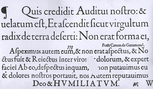
A sample of Garamond’s roman typeface
More recently, from the end of the nineteenth century to the present day, direct revivals of Jenson’s roman have been either cut or - in the digital era - computer designed.
These include William Morris’ 1890 Gold Type on Jenson' type in 1890.
Cobden-Sanderson modelled his typeface for Doves Press on Jenson's alphabets in 1900.

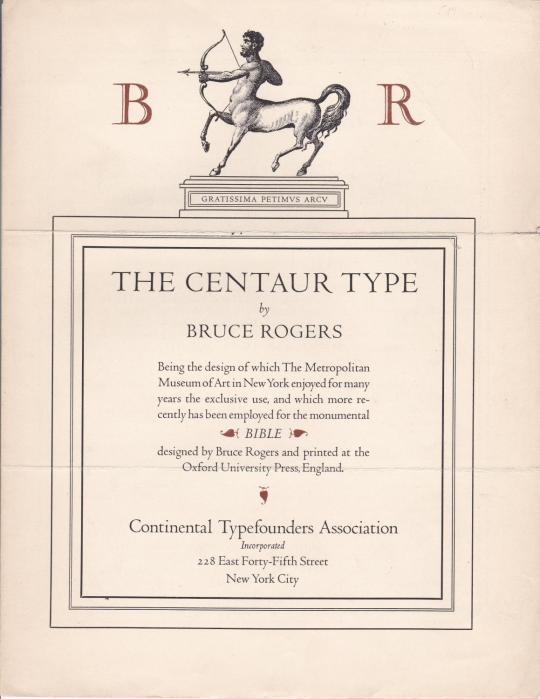
Bruce Rogers’ Centaur of 1914
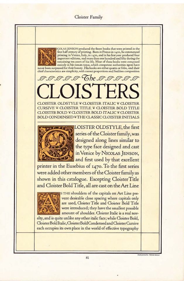
Morris Fuller Benton’s Cloister Old Style from 1926
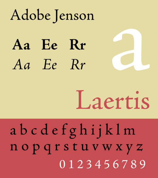
Robert Slimbach's digital Adobe Jenson from 1996
3 notes
·
View notes
Photo


Typography Tuesday
This week we present some ornate initials from Geoffrey Chaucer’s A.B.C. called La Prierie de Nostre Dame, printed in San Francisco by Robert Grabhorn and Andrew Hoyem in an edition of 1000 copies in 1967. The title page goes on to say that the original was “Made, as some say, at the request of Blanche, Duchess of Lancaster, as a Prayer for her private use, being a Woman in her Religion very devout.”
Of the type, Grabhorn and Hoyem note:
The large letters used in this little book were first printed in books issued in Ulm, Germany, in the last quarter of the fifteenth century. They are probably the work of Johann Zainer, woodcutter and printer. They are usually found colored as they undoubtedly were intended to be. They have been redrawn for our printing with reconstructions of the N, X, and Y. The type used for Chaucer’s text is a nineteenth century rendering of a lettre batarde used in France and the Low Countries for writing & printing of books for popular use. Chaucer’s text is taken from the Kelmscott edition of “The Works of Geoffrey Chaucer” based on Professor Skeat’s editing of the Ellesmere manuscript.
The Grabhorn Press, consisting of Robert, his bother Edwin. and Robert’s very able wife Jane, were the predominant San Francisco fine-press printers for over forty years until Edwin retired in 1965, and Robert and Jane took on their assistant Andrew Hoyem as a partner. In 1974, after the deaths of Robert and Jane, Hoyem took over the business, renaming it Arion Press, which continues to produce fine-press editions in San Francisco to this day.
Our copy of Geoffrey Chaucer’s A.B.C. is yet another gift from -- you guessed it -- Jerry Buff.
View more of our posts on the Grabhorn Press.
View more of our posts on Andew Hoyem and the Arion Press.
View our other Typography Tuesday posts.
#Typography Tuesday#typetuesday#Robert Grabhorn#Andrew Hoyem#Johann Zainer#Geoffrey Chaucer#Geoffrey Chaucer’s A.B.C.#Blanche of Lancaster#Walter William Skeat#woodcut initials#lettre batarde#bastarda#Jerry Buff#20th century
64 notes
·
View notes
Text
Two Books Printed by Johann Zainer in Ulm and Two Leaves printed by Günther Zainer in Augsburg.
Albertus de Padua (1282-1328): and Pseudo-Nicolaus de Dinkelsbühl (1360-1433) Goff A340 In one of the most informative books I have ever read about a printers work, The fifteenth-century printing practices of Johann Zainer, Ulm 1473-1478 , Dr Claire M. Bolton states “Zainer was Chosen for this study because he was a clumsy printer, leaving many marks on his printed pages.” ()()()()() I on the…
#Adam Haslmayr#Albertus de Padua#Claire M. Bolton#Günther Zainer#Incunabula provenance#Jacob Hartlieb#Johann Zainer#Karl Widemann#MEI#Nicolaus de Dinkelsbuel#Peregrinus of Opole#Provenance#Rosicrucian#Speculative bibliography
0 notes
Text
9 incunabula not in NYC Part TWO
This week’s blog is descriptions of a few more incunabula not represented in NYC libraries #1 Two Incunabula bound together. One Very Rare, printed at Vienne by Eberhard Frommolt. Both rubricated at the same time and both signed by the Rubricator! https://data.cerl.org/istc/_search?query=+ig00654800&from=0 https://data.cerl.org/istc/it00553000 444J Guillermus…
#238J#284J#305J#502J#563j#Aristotle#Burley#Claire Bolton#Gualtherus Burlaeus#Incunable#Incunabula#ISTC#Jacob de voragine#Johann Zainer#memorativa#mnemotechnics#NOT IN NYC#Pelbartus de Themeswar#Peregrinus of Opole#Petrus de Roenheim#Robert Grossetestes#Thomas Aquinas
0 notes
Text
Inc's not in NYC
This week’s blog is descriptions of six incunabula not represented in NYC libraries. 284JBurley 1500. https://data.cerl.org/istc/ib01301000 Boston Public, Newberry Library, Library of Philadelphia, Uof Illinois, 4658J Eusebius 1487https://data.cerl.org/istc/ih00257000 The Walters Library, Huntington Library2305JPelbartus de Themeswar 1501. https://data.cerl.org/istc/ip002525000238J Peregrinus…
#238J#284J#305J#502J#563j#Aristotle#Burley#Claire Bolton#Gualtherus Burlaeus#Incunable#Incunabula#ISTC#Jacob de voragine#Johann Zainer#memorativa#mnemotechnics#NOT IN NYC#Pelbartus de Themeswar#Peregrinus of Opole#Petrus de Roenheim#Robert Grossetestes#Thomas Aquinas
0 notes
Text
Peregrinus de Opole, Jacobus de Voragine, Nicolaus de Dinkelsbuel . 1479
238J Peregrinus of Opole (1305-1327) Jacobus de Voragine (1229-1298) & Nicolaus de Dinkelsbühl (1360-1433) Peregrinus: Sermones de tempore et de sanctis. Add: Jacobus de Voragine: Quadragesimale. Nicolaus de Dinkelsbuel: Concordantia in passionem dominicam. Est autem huius operis ordo talis. Primo ponuntur sermones d[omi]nicales de tempore per anni circulu[m]. Secundo de sanctis, Tercio…

View On WordPress
#Claire Bolton#Fifteenth-Century Printing Practices#History of the book#Johann Zainer#Nicolaus de Dinkelsbuel#Peregrinus of Opole#Racibórz#Voragine#Wrocław#Zainer
0 notes
Text
8 fol Incunabula
Albertus of Padua & Spiegel des Sünders AN INCUNABULUM PRINTED BY JOHANN ZAINER in Ulm with pastedowns of waste pages (printed on one side only) printed at Augsburg by Gunther Zainer. 564J. Albertus de Padua (1282-1328): and Pseudo-Nicolaus de Dinkelsbühl (1360-1433)Expositio evangeliorum dominicalium et festivalium. Add: Nicolaus de Dinkelsbuel: Concordantia in passionem dominicam.Ulm : Johann…

View On WordPress
#Albertus of Padua#Dunns Scotus#Eberhard Frommolt#ficino#Günther Zainer#Guillermus Parisiensis;#Hannibal Foxius#Hieronymus of Cardia#Incunabula#Johann Zainer#Johannes de Turrecremata#Livius#Pelbartus de Themeswar#Temesvári Pelbárt.
0 notes
Text

Johannes Zainer, ?-ca. 1541
The sacrifice of Polyxena by Neoptolemus at the tomb of Achilles, woodcut illustration (leaf [f]4r, f. xliiij), hand-colored in red, green, yellow and black, from an incunable German translation by Heinrich Steinhöwel of Giovanni Boccaccio's De mulieribus claris, printed by Johannes Zainer at Ulm ca. 1474. One of 76 woodcut illustrations (1 on leaf [e]8v dated 1473), 8x11 cm
Source: Omnia-Johann Zainer Künstler
4 notes
·
View notes
Text
Albertus of Padua & Spiegel des Sünders
AN INCUNABULA PRINTED BY JOHANN ZAINER in Ulm with pastedowns of waste pages (printed on one side only) printed at Augsburg by Gunther Zainer. 564J. Albertus de Padua (1282-1328): and Pseudo-Nicolaus de Dinkelsbühl (1360-1433) Expositio evangeliorum dominicalium et festivalium. Add: Nicolaus de Dinkelsbuel: Concordantia in passionem dominicam. Ulm : Johann Zainer, ‘about’ 15 June 1480. (with…
0 notes
Text
Albertus of Padua & Spiegel des Sünders
AN INCUNABULA PRINTED BY JOHANN ZAINER in Ulm with pastedowns of waste pages (printed on one side only) printed at Augsburg by Gunther Zainer. 564J. Albertus de Padua (1282-1328): and Pseudo-Nicolaus de Dinkelsbühl (1360-1433) Expositio evangeliorum dominicalium et festivalium. Add: Nicolaus de Dinkelsbuel: Concordantia in passionem dominicam. Ulm : Johann Zainer, ‘about’ 15 June 1480. (with…
0 notes
Photo

Medusa
Woodcut illustration (leaf [d]7v, f. xxvij) of Medusa and Neptune embracing beside a winged horse (either Pegasus or Chrysaor), with Perseus mounted upon Pegasus (following later developments of the Perseus legend) in the background, hand-colored in red, green, yellow and black, from an incunable German translation by Heinrich Steinhöwel of Giovanni Boccaccio's “De mulieribus claris”, printed by Johannes Zainer at Ulm, ca.1474 (cf. ISTC ib00720000).
One of 76 woodcut illustrations (1 on leaf [e]8v dated 1473), each 80 x 110 mm., depicting scenes from the life of the women chronicled (for a full list of subjects, cf. W.L. Schreiber, Handbuch der Holz- und Metallschnitte des XV. Jahrhunderts (Nendeln: Kraus Reprints, 1969), no. 3506).
10 notes
·
View notes
Photo

Amalthea, the Cumaean Sibyl
Woodcut illustration (leaf [e]3v, f. xxxiij) of Amalthea (the Cumaean sibyl), Tarquinius Superbus and the Sibylline books, hand-colored in red, green, yellow and black, from an incunable German translation by Heinrich Steinhöwel of Giovanni Boccaccio's “De mulieribus claris”, printed by Johannes Zainer at Ulm, ca.1474 (cf. ISTC ib00720000).
One of 76 woodcut illustrations (1 on leaf [e]8v dated 1473), each 80 x 110 mm., depicting scenes from the life of the women chronicled (for a full list of subjects, cf. W.L. Schreiber, Handbuch der Holz- und Metallschnitte des XV. Jahrhunderts (Nendeln: Kraus Reprints, 1969), no. 3506).
9 notes
·
View notes