#Linograph
Explore tagged Tumblr posts
Visit Tumblr Blog
Explore Tumblr blogs with no restrictions, modern design and the best experience.
Last Seen Tumblr Blogs


Fun Fact
Tumblr has 16.74 million mobile monthly users in the US.
Text
Trying to become more serious about my art but this depression is really kicking my ass
1 note
·
View note

Text


Got a duck girl hanging out with goose, amazed by it's serrated beak. She's jealous: some ducks have such features, but she is not one of those ducks.
I also made a little linograph stamp based on the kind of duck she is! Only cut my hand open once while making it :p.
Done with watercolor and markers.
#my art#traditional art#watercolor#alcohol markers#traditional illustration#duck girl with some geese#ill name her Yazizi maybe
11 notes
·
View notes
Note
I think SVSSS as a 2D cartoon would be the best moving medium for it imo.
I mean, personally, yeah, that's how I'd enjoy seeing it as well! My ideal slightly pretentiously artsy SVSSS screen adaptation would probably look only a little more detailed than linograph prints (2D or shaded 3D?) (someone hit me up in like two weeks to draw an example of what I mean, if I don't remember on my own, I don't have access to art stuff right now), very stylized and vibrantly colorful, because that's one of the art styles that I particularly enjoy.
I'm not a personally a fan of the 3D SVSSS show because I find the characters a little too doll-like and same-facey for my tastes? It's fine! It works! It's serviceable! It's just all, backgrounds included, a little... safe? I tend to like over-the-top bright colors and intricate details and impractically weird shapes and yet also coherent world production design in my fantasy, which is a lot to demand of any production, perhaps especially with animation productions, which are always squeezed for time and money.
(EDIT: I know the SVSSS show was under heavy constraints and the results are impressive considering their resources; it doesn't change the fact that I just don't like the art style and nevertheless find the results underwhelming. I don't like a lot of "realistic" modeling / rendering styles, not just "anime" ones, even if they are extremely technically impressive. Believe me when I say that I know the vast majority of the entertainment industry is overworked and underpaid and creatively restrained.)
Slightly tangential general note: I don't think 2D is inherently superior to 3D (EDIT: NOT trying to imply asker is saying this, just having some general thoughts), especially because, with the realities of production, each have their advantages. 2D has a lot of stylistic advantages still, but 3D shaders are catching up and doing some incredible things these days! More advanced puppet controls and particle effects and such are doing some beautiful things for 2D shows as well these days. A lot of stuff has been subtly mixed media as soon as 3D became possible. It is potentially possible (note: not saying any studio would actually greenlight this) to do an equally slightly weird and artistically stunning 3D SVSSS show, given the freedom to work. (Good boarding and writing is also sooooo important in both mediums, obviously, it's not just about the art design. You can get away with incredibly limited animation with good boarding, writing, and art design.)
Another slightly tangential ramble: both 2D and 3D have the potential for stiff animation and poor character acting, which also comes down to production limits and animator skills? (I often think of character animators as a type of actor!) There are a lot of 2D shows that I don't really like because I find the animation incredibly stiff, both puppet and handdrawn (there's great 2D puppet stuff out there these days), which pretty much always comes down to production limits (deadlines and budget and software, saving up their animation for the coolest scenes). One of my favorite things about Studio Ghibli films (which as features get a lot more space to focus on art compared to the demands and restraint of television) has always been the squash and stretch in otherwise relatively realistic action, making things like hugs look SO nice for example. But 3D stuff is getting better at that these days! The ways characters slumped into each other in "Nimona" for example was great. And it's just fascinating to look at the elasticity / stylized sculpt of expressions in "Puss in Boots: The Last Wish" compared to the technical limits of the models / rigs in "Shrek" or "Shrek 2".
Adding these side notes because I want to be clear about my respect for both 2D and 3D artistically! A lot of video games are doing cool stuff in 3D that looks very close to 2D with stylized shaders, which you can sometimes spot by the large or small rotations in character action / acting, which is difficult (and therefore often expensive) to do in 2D with all of those extra drawings / angle poses. Also, I think the current push towards funky shaders in 3D is so cool and it's hard not to gush about them!!!
77 notes
·
View notes
Text
I also have this little side by side thing and a little breakdown of the process :3
We’ve got storyboard, animation, and then filters and compression
Also here are some of the gifs I used for this animating ( yes I animate only using gifs )

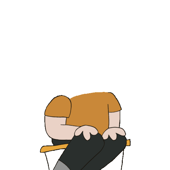
These are bases I used so I didn’t have to re draw the parts that didn’t move a whole bunch ( in this case it was the bodies )


Some Pete chatting


And then the Patrick heads :)
And then I put the gifs as an overlay on a paper animation, using the app capcut. Then once that’s done I go in and use the app prequel to add some grunge ( I use the effect Linograph and the filter Brownie, lower contrast and highlights, add a bunch of grain and just fiddle with things )
Then finally I use some rando online video compressor cus I find it just,,,, looks odd if it’s HD cus like most old animations are NOT HD those things are like 2 x 2 pixels
138 notes
·
View notes
Note
hi clay!!! 7, 11 and 30 for the artist asks!!
hello eliott!! :D
7. A medium of art you don't work in but appreciate?
hmm i would have to say linograph printing/printing in general!! i feel like they always come out looking so cool and you can get such vivid colours. but i do get bored carving out stuff i've already drawn & waiting for inks to dry & layering </3
11. Do you listen to anything while drawing? If so, what?
i have to listen to smth while drawing!! i feel like most people are the same. if i'm just drawing mindlessly i'll put on a video essay/a commentary video/a stream in the background (usually jerma). if the drawing is actually hard and i have to concentrate i'll put on music 👍
30. What piece of yours do you think is underrated?
answeredd here ! :3
3 notes
·
View notes
Text
Heart - Risograph
I used the technique of risograph printing to create this piece. This piece shows the negative effects that puberty can have on the heart. With heightened emotions and more insecurities, it makes the heart become much more prone to having health issues.

I wanted the heart to look delicate in order to exaggerate the contrast between it, and the harsh effects of the emotions pumping through the body. I initially planned to use lino as the medium for this piece however, I thought that the linograph was more fitting as I am able to recreate the image over and over.


6 notes
·
View notes
Note
is it ok if i do a linograph stamp of your most recent k/s art? it calls to me
I wouldn't mind, but please credit me! If you past it elsewhere as well (or in servers) otherwise go ahead !
1 note
·
View note
Text

For Kurahi's actual text, I tried out the three different fonts I liked.
Top is Raslani, middle is ancient, bottom is linographer. Personally I am partial to all three, they each have their own charms. Ancient has this hand written look which I like, Raslani is chaotic but very clear to read white linographer is maximum chaos but can be harder to read.
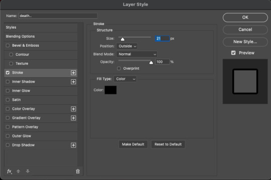

I ended up choosing Raslani pure white with a black outline. Above is how you add one in photoshop, setting the stroke position to outside. I did this to make it easier to see the text in front of the commonly white background.
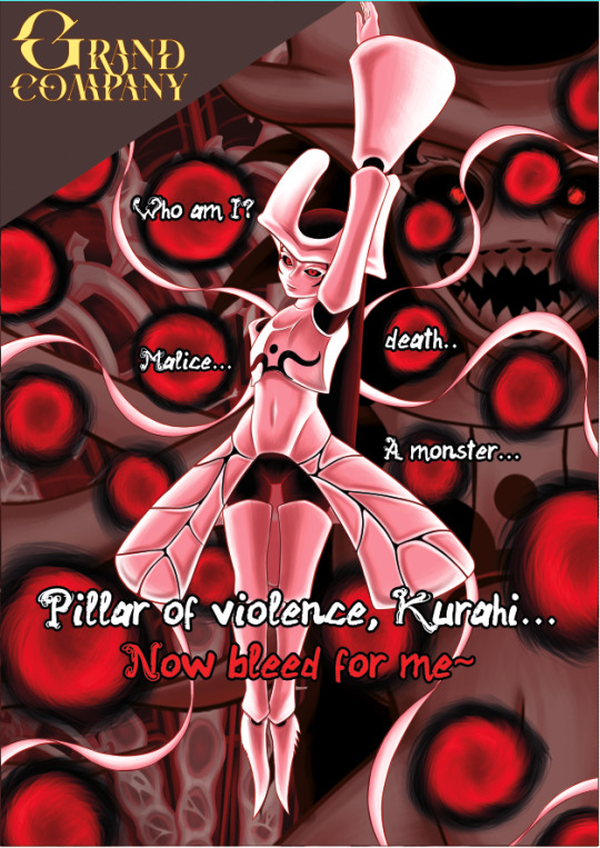
The finalised poster. I added a block behind the logo to make it stand out further.
Getting everything to fit inside the margins was annoying but I found that if you hold shift while using the eraser, it erases in a straight line. Super duper helpful.
0 notes
Note
I can't imagine how long it took you to get good at just making linographs. AND you make ones that are intricate and look AMAZING. The Star is my favorite major arcana and it makes me so happy that yours has stretch marks and a belly. I hope you're having a good day.
im so so grateful for this message, thank u ❤️❤️❤️❤️
1 note
·
View note

Text

👁
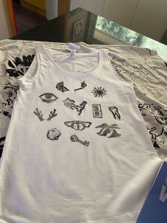
Having a fantastic time trying some creepy Magnus archives themed printing! Yay!
Anyone have any tips for printing lino on fabric without it going all patchy? If I add more ink it squishes beyond the stamp but it’s a bit too faded for my liking :/
#lino#printing#art#printmaking#linograph#block printing#t shirt#eye#Magnus archives#Magnus archives fanart#artists on tumblr
14 notes
·
View notes
Photo


stamps I carved for a finals project
51 notes
·
View notes

Text


i just spent way too long intensely focused on carving this. going to test some prints tomorrow
1 note
·
View note
Photo

Ororo, Black and White print
2014, linograph
https://www.redbubble.com/people/torifoster/works/36401711-ororo-black-and-white?asc=u&ref=recent-owner
#illustration#xmen#x-men#storm#ororo#ororo munroe#feminism#intersectionality#intersectional feminism#black and white#black woman#super hero#superhero#super heroine#superheroine#heroine#linograph#printmaking#impressionism#woman illustrator#women in art#marvel#marvel comics#punk#mohawk#punk art#fan art
13 notes
·
View notes