#Mada's Art
Text

Woahhhhh I made some art of Saphira, one of the main characters of my PMD comic! I'm honestly really proud of this piece, so I hope y'all like it too!
#pokemon mystery dungeon#pmd#mada's art#pmd ocs#pokemon#pkmn#vulpix#alolanvulpix#alolan vulpix#oc: saphira#a precarious world#pmd comic#mada's oc: saphira#pmd: apw#comic tags just in case ehehe
231 notes
·
View notes
Text

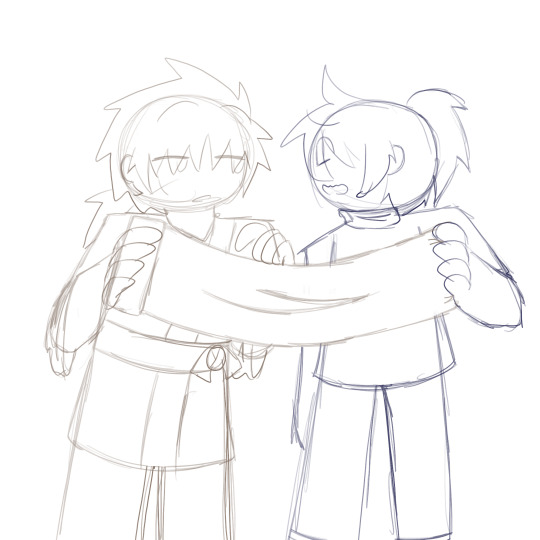
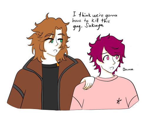
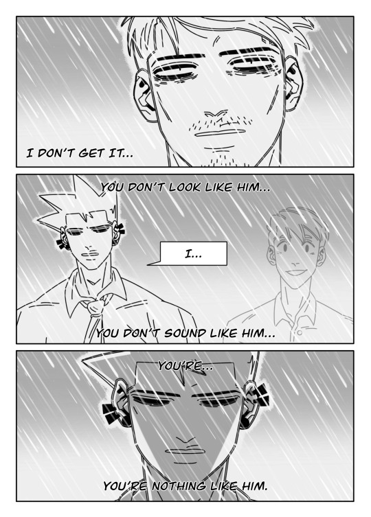
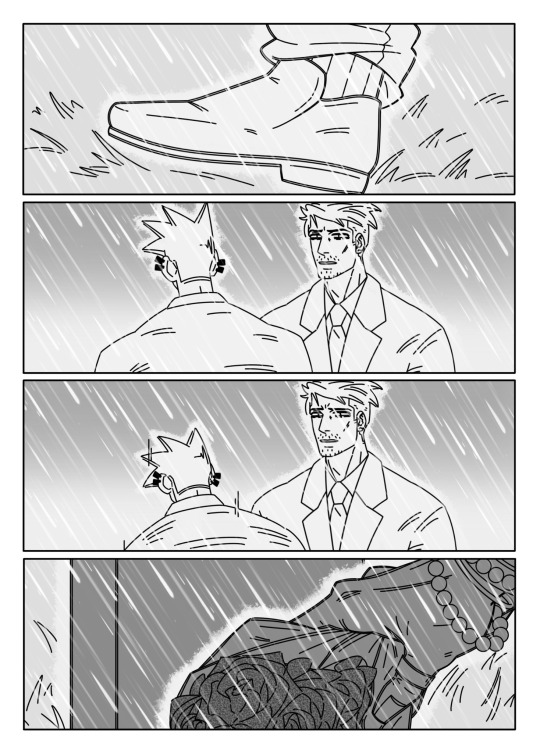
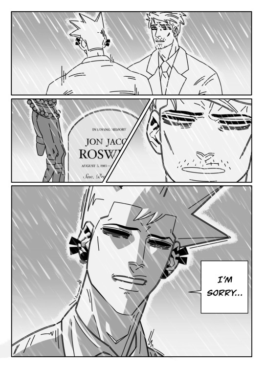
Darcy doesn't seem too happy about all this… but then again, Piper doesn't seem too happy with her either.
Next Page Expected - 9/29/24
#mada's comic#pmd webcomic#pmd: apw#a precarious world#pokemon mystery dungeon#pokemon#pmd comic#apw comic#pmd#mada's art#oc: darcy#oc: piper#oc: alki#skitty#jigglypuff#fennekin
12 notes
·
View notes
Text

was drawing them separately for stickers and they kinda ended up fitting together pretty well hehe
They're finished! :D
#art#digital art#madas kritzelblock#myart#lmk#lmk sun wukong#lmk macaque#shadowpeach#doodle#lmk fanart#lmk sticker
441 notes
·
View notes
Text


Menma ; AnoHana ☆ Good Smile Arts Shanghai
#menma#anohana the flower we saw that day#anohana#honma meiko#meiko honma#anohana menma#anohana figure#pop up parade#good smile arts shanghai#anime#anime figure#figure#figure collecting#anime figurine#figurine#anime collecting#scale figure#myfigurecollection#manga#ano hi mita hana no namae o bokutachi wa mada shiranai#ano hi mita hana
145 notes
·
View notes
Note
Can we see a half shifted or fully shifted monster Tom design from you?


sure.
His half Monster form's pretty standard. I always liked the typical fanon look, so that's basically the same. You can see a few older sketches of him throughout my blog.
His full Monster form's different. I'm not a big fan of Monster Tom's canon design, but I try to keep myself at least a bit within its scope. This big hulking body, these big arms. He reminds me a lot of a bear. Here I leaned more into a dinosaur look, but that's just because I really like dinosaurs. He alternates between walking on his hind legs and all fours.
#mada hcs#eddsworld#eddsworld art#eddsworld fanart#eddsworld tom#eddsworld poweredd#eddsworld monster tom#ew#ew art#ew fanart#ew tom#ew poweredd#ew monster tom#anonymous#anon#art#digital art#sketch#sketches
65 notes
·
View notes
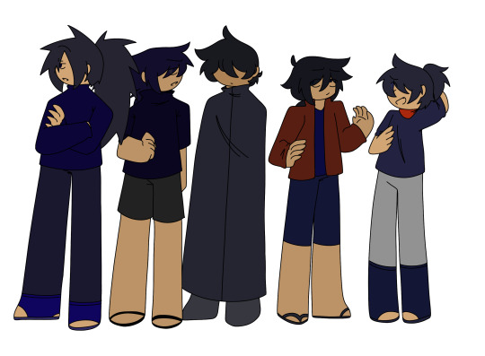
Text

squish he
#made in denialcity#uchiha madara#senju hashirama#hashimada#hashi&mada#u can tell how stressed i am bc all my writing/art is spilling out
121 notes
·
View notes
Text
au where they all lived b/c i said so >:P
couple doodles under the cut
#art tag#Naruto#Hashirama Senju#Tobirama Senju#Itama Senju#Kawarama Senju#Madara Uchiha#Izuna Uchiha#and then hc names for the other brothers#Kuromaru Uchiha#Myoko Uchiha#Togakushi Uchiha#in that order#they're named after the same other mountains in the group mada and izuna got their names from#except i had to change kuromaru's a little b/c the mountain is kurohime#so i just replaced the hime with maru
24 notes
·
View notes
Text
"if you're sad this is a sign to draw your two biggest comfort characters as the steven meme." thank you twitter user g4teway31
#a3!#enstars#sakuya sakuma#a3! sakuya#madara mikejima#enstars madara#feb draws#long time no art#i also have a mada/saku fic on ao3 if you like crossover ships wink wink
40 notes
·
View notes
Text

#mada no ichi#ichi the witch#osamu nishi#shiro usazaki#manga#ichi#desscaras#mangacap#cap#manga art#manga aesthetic#monochrome#manga screenshot#bw#b&w#black and white#mni spoilers#ch2
7 notes
·
View notes
Text

#mada#oc#originalart#original art#character#original work#original artwork#original post#original character#illustrators on tumblr#female illustrators
13 notes
·
View notes
Photo

Back to Tumblr after years away (hi folks!), so I guess I’ll share the cover art I painted for THE JADE SETTER OF JANLOON by Fonda Lee!
This is a wraparound cover for Subterranean Press’ limited edition of the novella; I got to do the title lettering too:

When coming up with ideas, I wrote a mini brief for myself: balance, power, mystery, family ties. The jade setters' neutrality is central to the story and a counterpoint to the clans’ power. (Alternative brief: make it jade as fuck.)
Figuring out the composition was tricky—the piece's rhythm has to work not just when viewed as a whole, but also in smaller sections like the back and front flaps. And while the novella introduces new characters, the Pillars and Horns still loom large as symbols over Janloon...a nod to both their power in the city as well as how readers would be coming off JADE CITY or JADE WAR familiar with the Kaul family or Mada and Gont Asch.
While reading the manuscript I jot down ideas as they flash by. The seed for this cover can be seen in the top left of this sketchbook page:

I then develop each thumbnail into a very rough colour sketch and put them together with reference images to send to Fonda and Bill Schafer at Sub Press. Sort of a combination of moodboard and thumbnails:

Got the go-ahead to develop thumbnail D, so I make a more detailed sketch of the full composition, with two options for characters’ gestures on the front cover:

And then it’s off to paint! I sneak in little references to the story where I can. The mansion is based on the Straits Eclectic architectural style of shophouses in Penang, where I live, while some of the buildings in the city are based on Hong Kong. Many hours of painting and finagling later, it’s finished, gets sent to the publisher, then the printers, then to Green Bone fans everywhere.
I recently turned in the cover for JADE SHARDS, a short story anthology that’s my favourite Green Bone Saga title so far, and I can’t wait for everyone to see it when pre-orders open next year! Don’t take my word for it: https://twitter.com/FondaJLee/status/1574248123463266304
Fonda’s also posted a peek at the signature page over on her Instagram, showing a crop of Shae and cormorants from the cover art. It’s been a real honour and pleasure getting to draw for a world I’m a fan of :)
#jade setter#fonda lee#green bone saga#jade city#cover art#book illustration#ayt mada#kaul lan#kaul hilo#janloon#jade war#jade legacy#gont asch#jade setter of janloon#process
233 notes
·
View notes
Text
@azurityarts !!!!
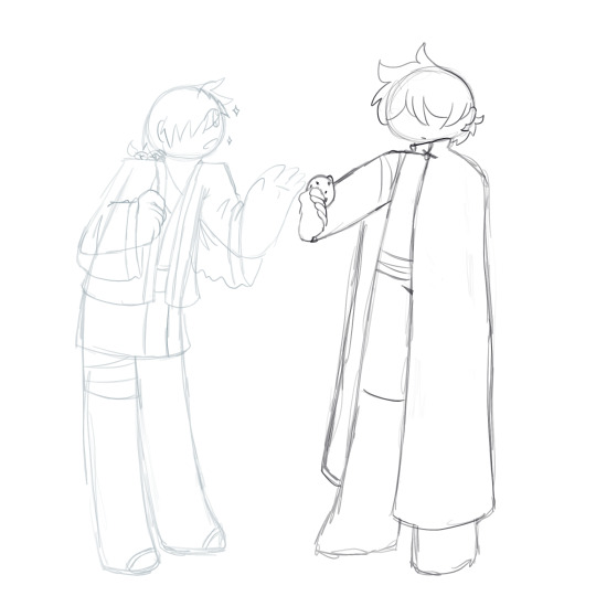
IT WAS MEEEEEEEEEEEEEEEEEEEEEEEEEEEEEEEEEEEEE!!!! I WANTED TO DRAW YOU GIFT ART!!!! I loved the art you drew for me with Saphira, so I wanted to pay back the favor!!! Choosing an OC was honestly the hardest part but in the end I narrowed it down between Brooke and Vex, since I felt like I could do a better job with the latter! I want to draw her again at some point tbh, just as soon as university lets me. I had a lot of fun drawing her design!!! But all your OCs are awesome, they just have so much personality to 'em. In any case, I hope you like the art!!!


With three flavours cause I was proud of the pencil sketch and couldn't decide if I liked the version with or without the hand lettering more. THANK YOU IN ANY CASE!!! Your art's an inspiration to me ^_^
#mada's art#pokemon mystery dungeon#pokemon#pmd#other's ocs#pmd oc#purrloin#oc: vex#gift art#pokemon mystery dungeon oc
74 notes
·
View notes
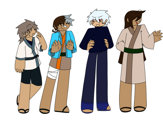
Text

Soooo I forgot to upload last week I'm realizing. Oops! In other news, I'm probably going to move my release schedule to biweekly until the end of chapter 1. I simply feel too rushed to try (and usually not quite accomplish,) and meet the weekly deadline. As such, I want to give myself two weeks, since I'm making the pages one by one at this point, and I'd like to have more time to make sure they're a quality I'm happy with. Thank you so much to everyone who's stuck around and continues to read my pet project, I'm so happy y'all enjoy it enough to keep checking it out!
Also, I decided I wanted to work with different dimensions to make the linework seem smoother with the brushes I'm using. I think it works well, but part of the reason I want to give myself more time between pages is so I can experiment with my linework and art a bit more :D. I'm going to change a lot about my release schedule for Chapter 2, but I really want to have more time to practice and figure out what I like and what I don't in these last few pages of Chapter 1.
Next Page Expected: 9/15/2024.
#pmd#pokemon mystery dungeon#pkmn#pokemon#mada's art#pmd: apw#mada's comic#pmd webcomic#pmd comic#a precarious world#apw comic#oc: alki#oc: josie#oc: darcy#oc: piper#jigglypuff#skitty#fennekin#pichu
13 notes
·
View notes
Text
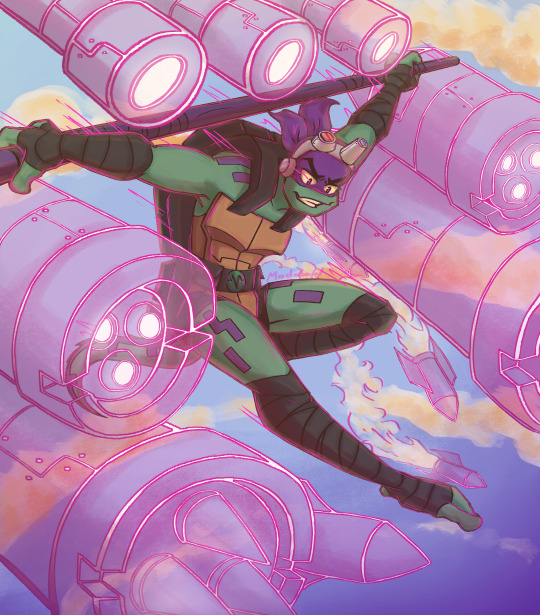
TURTLE
#art#digital art#madas kritzelblock#myart#rottmnt#rise of the tmnt#rottmnt fanart#tmnt#rottmnt donnie#rottmnt donatello#rise of the teenage mutant ninja turtles
870 notes
·
View notes
Text

it's still august 19 here so, happy 2nd anniversary to my beautiful wife jupiter
#vocaloid#niru kajitsu#nilfruits#heaven dope#hi fi club#ameri#meme redraw#my art#kris draws#my pretty princesses 😚😚 jupiter and mada yaaay
10 notes
·
View notes

Last Seen Blogs
goonedmirroragent
Gooned MirrorAgent

vuonxinhhn
vuonxinh.net


freshdefendorcollectorstuff
Sin título

stormytala
Untitled