#Menu Design
Text
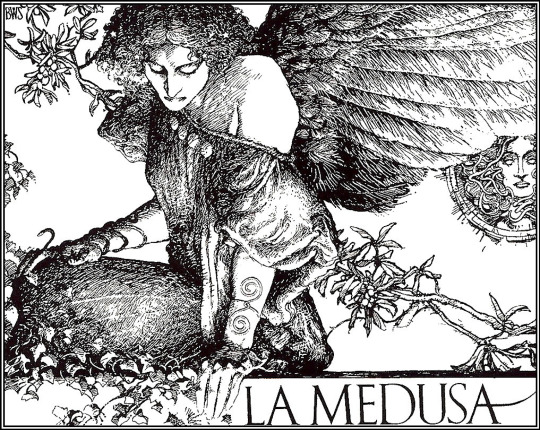
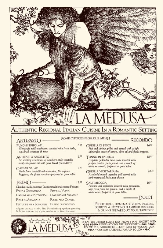
Barry Windsor Smith, La medusa, 1981
Via: https://arthive.com/it/artists/11223~Barry_Windsor_Smith/works/298141~Medusa
Via: https://x.com/CoolComicArt/status/1013227246381748225/photo/1
164 notes
·
View notes
Photo
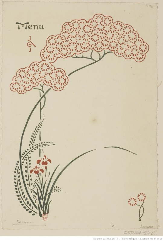
Menu (1899) for Madame G. Auriol by George Auriol (1863-1938).
Bibliothèque nationale de France, département Estampes et photographie
237 notes
·
View notes
Text
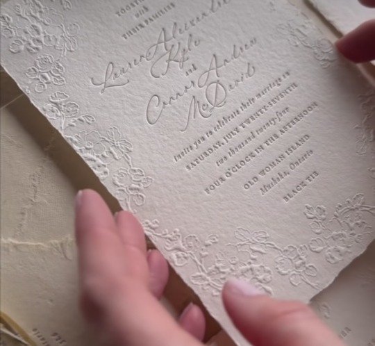
L+C Wedding Invitation And Menu

12 notes
·
View notes
Text

Colorful logo & branding for a bar ☆☆☆
50% discount for design services this month!!
PM us for details and reservations! 💌
#bar#restaurant#drinks#fast food#tequila#cocktail#fiesta#latina#latino#logo#branding#illustration#colorful#artwork#pattern#stationery#menu design#business cards#south america#brazil#columbian
15 notes
·
View notes
Text
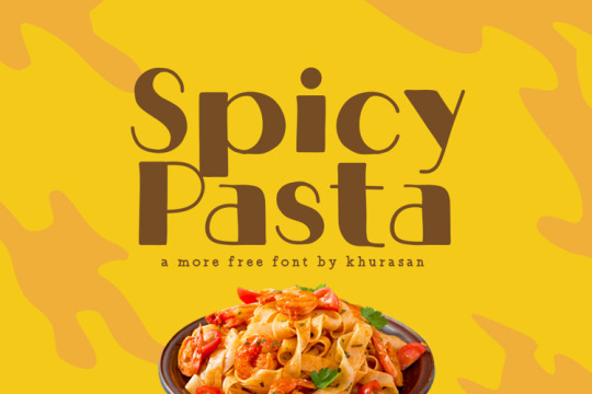
Spicy Pasta font designed by Khurasan
#fancy#fonts#typography#design#webdesign#lettering#font#type#typeface#inspiration#bookcover#bookcoverdesign#magazinecover#magazinecoverdesign#ttf#menu board#menu design#menu
12 notes
·
View notes
Text


Tea run
2 notes
·
View notes
Photo
11 notes
·
View notes
Text


2 notes
·
View notes
Text
WEEK 2 AESTHETICS
For this week's activity, we talked about aesthetics.
Identity, personality, style, and uniqueness come to mind when I think about the word "aesthetic.' To give your design a specific aesthetic, we need to pay attention to colors, fonts, images, compositions, and grids. Let's take a look at these menus:
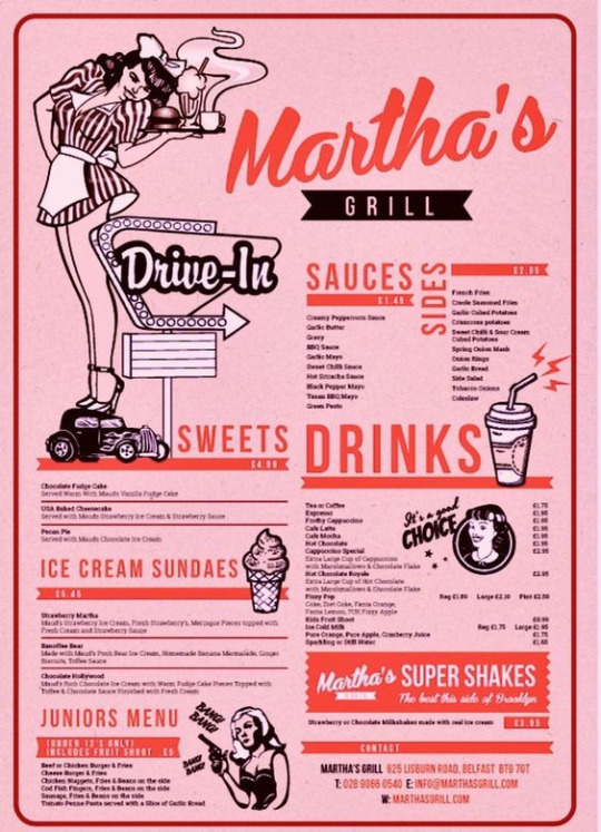
(“Almamun_Cool: I Will Do an Amazing Menu Design, Food Menu, Restaurant Menu Design for $30 on fiverr.com”)
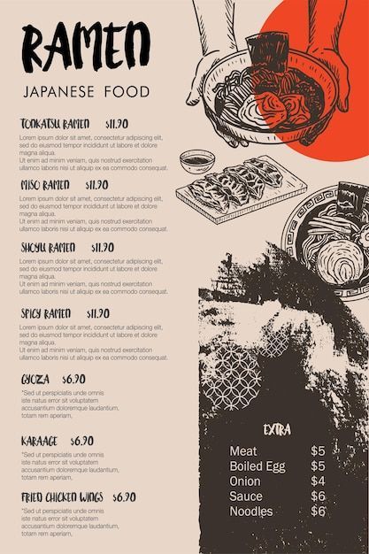
(“Premium Vector | Food Sketch Japanese Menu Template Ramen and Gyoza Vector”)
After analyzing both menus, we can see that they have different approaches. The first one is a menu for Martha's Grill. We can see the predominance of pink and red (vibrant colors), vintage fonts, and an illustration that reminds us of a typical American Diner. For the second restaurant, there is a small appearance of colors, only red, which goes well with the composition since we are looking at a ramen shop, a typical Japanese dish. So it reminds us of the flag of Japan. Also, the font they used, reminds us of Japanese characters. In conclusion, aesthetics are built depending on what message you want to give.
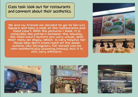
For the activity, we had to go out and look at restaurants and hawkers. Do we see any similarities? Do they all look the same? Which one looks more expensive? What is their aesthetic?
We took notice of all of these points and went on a walk. I ended up going to a food hawker and noticed that their aesthetic can be a little bit messy...? Usually, those food stalls don't pay much attention to their menu design, yet they want to make food more accessible to the customers by showcasing these dishes, in case they don't know what to order. With simple fonts and images, food hawkers' aesthetic can be different from our usual indie cafe


CPJ NOTES!!

word count: 304 words
2 notes
·
View notes
Text
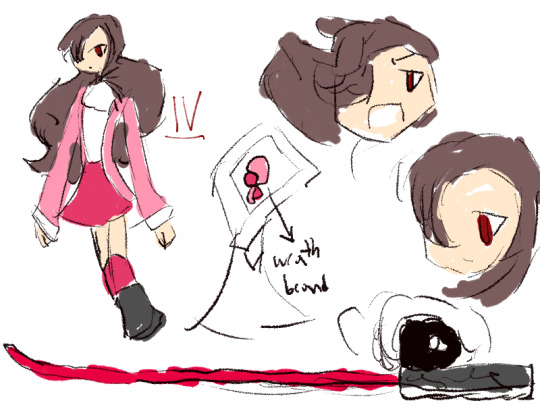


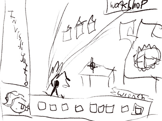
IV + MENU CONCEPTS
#concept art#concept design#character design#original character#menu design#indiedev#rpg maker#SiaFinite#IV SiaFinite
3 notes
·
View notes
Text

5 notes
·
View notes
Text
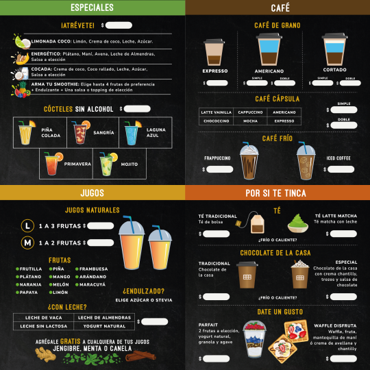
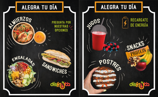

Menu design for Healthy Food Truck
2 notes
·
View notes
Text

Menu & collaterals designed for a restaurant ☆
Need design services? PM us and let's talk about your project! 💌
#menu design#restaurant#food#exquisite#exclusive#lush#logo#collaterals#stationery#business cards#print design#illustration#artists on tumblr#branding#entrepreneur#creative
14 notes
·
View notes
Text
Cocktail menu concept design for a client. We're moving in a different direction but this was my favorite of my mock ups.

#illustration#procreate#menu design#concept art#drawing#design#digiral art#nobodyartistclub#illustrator#art
6 notes
·
View notes
Text
Drift Coffee - Menu Design & Loyalty Cards

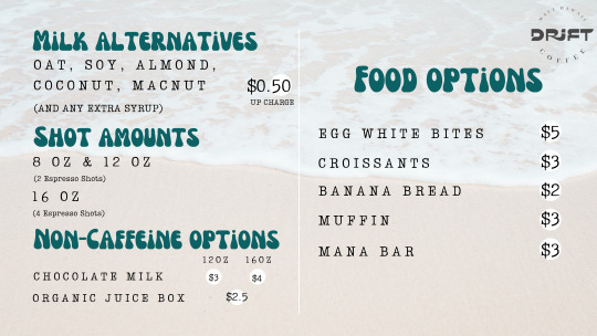
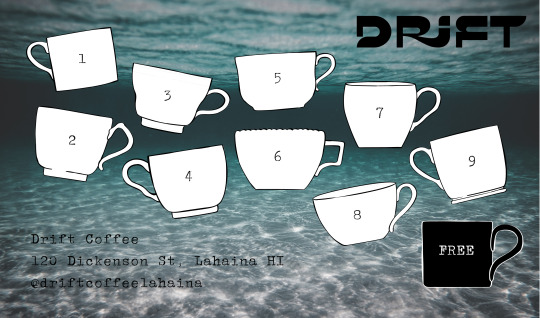
2 notes
·
View notes
