#Old pc palette
Explore tagged Tumblr posts
Visit Tumblr Blog
Explore Tumblr blogs with no restrictions, modern design and the best experience.
Last Seen Tumblr Blogs


Fun Fact
Tumblr has 4 main sources of revenue.
Text
*judges You epically*

27 notes
·
View notes
Text
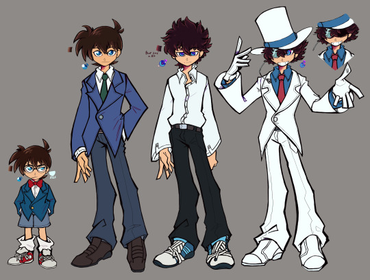
One guy. Er, I mean two, no, no! Four, four completely different guys, no correlation between them, no sir! Started this around same time as this KID one. It should be same style proportion-wise. As I was messing around for fun/on purpose of finding something that more cartoony? simpler in flow? Anyways, the design/style notes/thoughts under the cut, I did put lots of my exhausted braincells into Kaito/KID difference
Overall style inspos: 1) "I need to think of Sonic but like more human-y" 2) Miho Shimogasa (PPGZ/Kaito Joker/BatuSpi Toppa Bashin) 3) PSWG and SPvsW lol kinda, just from my head how I remembered em though
>Cone and Shin: Originally wasn't planning on putting shadows in his eyes, but without em he's straight up "People with blue eyes" meme. Creepy too much. Neat and sharp a bit. Cone is a pain to size correctly. I think I kinda got it right? But maybe he should had been just tad taller? You never know if he's like 95cm or 1m and something Side note, but Cone's shoes really make me think of Sonic's- >Shin and Kaito: Neat and bit sharp vs more laid back and messy. Also more puffy/round on corners? I basically want him to have puffy sleeves/sleeves that got some volume to em because it fits the magician in my eyes. Adds to hands/arm movement Also Shin's eyes of more your blue/dark blue shades, while Kaito's of blue-ish purple That's to say, I imagine/think Shinichi is the one who hunches more, while Kaito is the one who tends to lean back a bit/keep posture mostly straight (if he ain't sleeping in class lol) >Kaito and KID: Kinda pathetic and messy vs your perfect phantom thief. More shadowy/half-closed eyes vs "oh he's bright awake and ready to go stupid go crazy". Some guy vs the charisma itself. That's to say, shadows cover Kid's visible eye most of the time. And he also has that grin...or his mouth hidden at all. His hair appears bit more fluffier and neater, too. I also tried to keep that juxtaposition with Shinichi of "more sharps vs more round" with him as well. Overall, I like the thought of what if Kaito was more loser in canon, as in less people in school liking him, pitying for his family situation, etc, no entirely of course, because it's simply him, but feel it be more fun in contrast with Kid (and Shinichi) Also, for Kid's cape...just didn't felt like drawing it here, you can excuse me, right?
I think that's all I have to say, but if there's anything ya wanna point out/hear, please ask away!~
#dcmk#detective conan#magic kaito#kaitou kid#kaito kuroba#kudo shinichi#edogawa conan#anyway uh if anyone wants to ref those either for style or just to color pick the palette go ahead#also my friend said this style made her think of those old vns from saturn/psx/pc engine of that time and it makes me happy#i'd love to try and mb do some fakescreenshots in that style...if i know how </3 and also what plot to put there#alas i am not good of a writer#mecha's art
274 notes
·
View notes
Text

warm up with a sunset color palette, was supposed to a messy warm up getting "used" to clip studio paint but feels way too rendered/smooth [apparently I never updated clip on my old pc? because I installed it on a new one and it's completely different nearly all the default brushes are different haha…]
#title of this one is: blooming hearth#it's just the 1.0 version…actually had to go on my old pc to grab the old oil paint brushes since they were gone#deadbeat sketches#sketches#dragons#dragon art#digital art#artists on tumblr#color palette#abstract art#fantasy art#clip studio paint
4 notes
·
View notes
Text
man i have some duplicates of rlly rare the rose photocards (and concert merch pcs which are somewhat rare)
but i fucking hate selling online.... my only dupe album i sold to someone at a concert lol
#personal#i have two duplicates of wolf/dawn (dojoon) pcs#and then like 3x of one of the sammy d2d tour pcs#the dawn boy paper literally runs for 50-70 on mercari so holding onto it is stupid#my fucking the rose collection outperformed my stock account in valuation cuz of jstar lawsuit rofl#cuz i have lwyt/sorry signed eps... palette photobook with the posters#all jstar label eps/albums#the old lightstick.... ALL the photocards#the guitar pics...etc...etc#and im so fast on their merch drops that i have all the vinyls including moth ep signed lol#i got lwut/sorry secondhand but before the lawsuit.... so it was before they got pity famous with americans lol#(and then i also have the merch packs from all concerts with transparent now.... including the stuff ill never sell#(like my UKULELE!!!!!!!))
0 notes
Text
i got this new laptop to draw but colors are really off on this thing and i dont know how to adjust them so i just have to trust that my art will look right on good displays
1 note
·
View note
Note
I recently started learning to use rpg maker (vx ace!) and as a result have become increasingly interested in pixel art. I hadn't really done pixel work since my teens - I do more digital painting and vector art - so while I'm a little familiar and can do passable editing, there's a lot I don't know.
One thing that's kind of perplexing for me is understanding the differences in style between two creators of pixel art. I studied art history and I'm used to the differences being things like brush stroke length or degree of realism... I feel like I'm lacking in lexicon in this new frontier lol
What nuances of an artist do you think are most important to style in pixel art?
This kind of stuff is not really officially studied (yet) so it's all a bit of opinion from me.
Usually in pixel art the biggest differences in styles are which limitations the artists choose to impose on themselves; colour count, resolution, palette... Or more stylistic choices like hue shifting, anti-aliasing style or no, dithering or no, etc.
I personally think there are a huge variety of styles in pixel art, as it's literally just a medium, and I hope you'll agree by the end 8)
Also (imo) there is some seperation between the styles of art for art's sake, and art for videogames, where things have to be clear and readable to be actually playable.
🎮 Old school games:
Sometimes referred to as something like '8-bit' or '16-bit' (relating to the NES era / SNES era consoles), these artstyles usually follow the rules and limitations of the hardware at the time.
This all falls under retro art, most popular styles include: NES, SNES, GB, GBC, C64
Notable artists: Nickwoz, Sandy Gordon, Franken, Cisco
📚 Old school art:
There were also events called Demoscene (still are), where developers would go to a big convention and share their demos. A lot of pixel art competitions were held here, where artists would draw live.
Generally they used to favour a high realism/semirealism style, with lots of texture/dithering, fairly high resolution (if the hardware allowed for it), and adjacent pixels mostly being different from one another.
There are even older styles than this but they are fairly niche and I'm not that well educated. If interested look into some of the old PCs/consoles.
⭐ Modern pixel art:
Usually using more colours and higher resolution, larger clusters of pixels instead of individual ones. Strong use of art fundamentals.
Artists to look at: Adam Ferguson (yes it is pixel art), Snake, Slym, 6VCR, Yes I do Pixels, Gijotto, SovanJedi, JoeCreates, Franek, @8pxl
the rest below are "modern" pixel artists too but I think they have other things in their style that are a bit different!
🎨 Painterly:
Some artists choose to emulate the natural brushstrokes digitally, and keep their clusters large and loose. Usually don't focus on the minute details as much.
@makrustic, @hexh-pixel, Umbohr, Gawrone
🟦 Dithering
These artists all use dithering / texture in ways that make their styles totally unique.
Deceiver, Night, Reo,
💥 Experimental
These artists are always trying new things and honing in on their unique style.
AJ, hby, @ilta222, Alphons
I could really go on for ever, there are so many different styles, cute pixel art, horror pixel art, 1bit (2 colours only), and then adding animation takes it even further, but I think you get the idea
If you want to learn more, the Masters of Pixel Art books have works /interviews from pixel artists of different eras, including demoscene and contemporary.
😊👍
293 notes
·
View notes
Text
I was gonna do a separate page for these guys, showcasing more design aspects of them but I genuinely don't feel like doing it now so erm
Introducing Incognito, Browser History, and User !
An undercover agent who likes to get his dirty work done, the unfortunate assistant who's the backbone of all operations, and the authoritative leader of it all.


( Also alt palettes aka "Light mode" )
More below is information stuff about them + their current storyline / world I'm working on vvv
Currently some stuff is not set in stone and subject to change, if I don't forget I'll update this post with any changes, but I have given it the name Code Breach !
Code Breach resides within The Motherboard, a VERY large cybernetic city with split districts that represent various parts of a computer. ( Example : Coolant district is a snowy, industrial part with not many people wandering it due to it's temperature, and large windmills that produce energy for the whole city ) The citizens of Code Breach typically consist of software, apps, and internet / PC features. They live about their own lives on the day to day basis, but there seems to be trouble on the rise. Criminals ( Viruses / PC worms ) have infested the peaceful streets of The Motherboard, and a secret agency / justice department have come out of the woodworks to put an end to the terror.
As with that out of the way, small fun facts about these guys !
All of these guys are REALLY old ocs, I decided to completely repurpose them as of recent and actually make them interesting lol
Incognito stands at 6' 7, History at 5' 9, and User at 6' 10
Incognito is 37, History is 26, and User is 48
As said on the images above, User is the father to History ( Incognito is not related to them in anyway and only met them when he signed up to Chromatic INC. )
The watch on Incognito is actually a disguise watch. With whomever he scans, he is able to transform into them in the blink of an eye ( Think of it as Spy's cloak watch cus that's literally what it is lol )
Incognito is a very quiet and gruff guy, History is a train wreck but managing to get by, and User acts really robotic in movement and speech
Incognito's voice claim, History's voice claim, and User's voice claim
and that's all i got rn lol
#oc#oc artwork#art#code breach#also yea there's a tag for this lalala !#there's a couple other fellas in there already lol
136 notes
·
View notes
Text
A Brief Look into "Ten no Oshigoto"
So, a while ago, anon asked me if I knew anything about a game of Kumazaki Shinya's (general director of the Kirby series) called "Heaven's Work" or "Ten no Oshigoto."
While anon didn't give themselves a clearer identity in their followup, simply wrote to let me know that they had sent in some helpful information before (thanks for that btw!) they and another returned with links to a Japanese Youtube Let's Play by Ochanaito that allowed me a greater look into just what this game actually was!
(Also thanks to Papen for their NOTE post who I also sourced heavily for this)

So, many of you may be familiar with the RPG Maker series of games. While most of the popular entries have come out in English, Japan had many more of these games come out, including a few entries for the Playstation 1! Given the highly customizable nature of the PC ones, you might think that making a big custom game on the Playstation would be very difficult...and you'd be right!

(One of the classic dev tricks of the older entries was to make a custom menu by building a map that LOOKED enough like a menu and turning the protagonist into a cursor who teleported from location to location. It was actually super clever!)
"Ten no Oshigoto" was an RPG Maker 3 game created by Kumazaki when he was 20 years old, 3 years before he would enter HAL Labs as a designer. It was not the first independent game he tried to make. In fact, it was the 2nd game out of 4 (?) he had a part in creating! What distinguishes "Ten no Oshigoto" (outside of the fact that it filled up a STAGGERING 13 memory cards worth of data in a time where most other games took 3-4) is that it actually won an award!!
See, another thing that distinguishes the Japanese and English RPG Maker communities is that parent company ASCII often had competitions and gave out prizes to the best RPG Maker games of that season/year! A few of those games that won, ASCII would even go on to assist in porting to and publish on consoles, like the PS game "Palette." Now, the prize Kumazaki's "Ten no Oshigoto" won is listed as simple a "consolation" prize, so it obviously wasn't on the fast track to publishing, but it was enough to draw some eyes to it!
(As for the English side of things, well, the RPG Maker community, and even the "Maker" part of the title came entirely out of the Russian pirate/hacker scene, with several of the engines being mass distributed illegally and many of the non-JP "classics" being made on pirate copies of 2000/2003 before it was finally licensed in English - explaining why we never had contests and cash prizes. In fact, it took a while to work some of the piratical tendencies out of its larger user base ^^ Sadly, EN RPG Maker has now gone full late-stage capitalist: while the Japanese community *still* frequently produces free resources, including art, music, and scripts, the EN community, thanks to a few high profile folks setting the bar with payments for everything, has developed a culture of asking people to pay nearly as much or more for add-on scripts than the actual engine itself costs I'm not salty la la la)
AHEM!!
So, what IS "Ten no Oshigoto?"
Well, I didn't watch through the whole 20 video series (not yet) just far enough to get a feel for the basic game play loop, and I have to say, while it's terribly silly (!!) it is also a dastardly impressive game, especially knowing the tools Kumazaki had to work with!

The story of "Ten no Oshigoto" has you playing a god named "Ten" (His name means "Heaven," haha!) who is the young, lazy, unaccomplished son of Zeus, king of the gods!

The angelic Ten spends his days tinkering with robots (there is a joke where he says that all that's left is to paint the monitor with mustard, turning it a gold color, before he is surprised, bumps it and the robot explodes fantastically; a bizarre, comical little scene that is repeated almost word for work with the king of the bad guys later on!)
He is called to see his father by this weird little flying hippo/angel/kirby thing that serves as your companion throughout the rest of the adventure named... "Hengel?" "Hangel?" "Engel?" something, and told that he's finally being given a planet of his own to be god over! He just has to clear it of the "Waruma" ("Evilies") and plant the seeds of humanity to really get the planet started!

Not too long after that, Ten meets another strange companion, "Sebas-chan" (a pun on "Sebastian?") another god who looks like a naked man wearing a lime-green full body spandex suit. Like I said. The game is...terribly silly. It is fully of goofy dialogue, with most of the gods and monsters talking in silly regional accents and characters' priorities being all over the place. Ten himself is a bit lazy and at times a coward, but he does pull through when needed!
What's truly impressive about the game is how it is put together. You see, it's something of an action game, and I want everyone to know, while it's not unusual for clever folks to use RPG Maker as a shell to create all kinds of games now, making an action game in RPG Maker 3?! That's a huge challenge. And even then, you can definitely see the seams in "Ten no Oshigoto." When you encounter an enemy, you can walk up to it and unleash a weak physical attack, trading blows.
However as you start off with only 3 Hearts, this is not recommended. Instead, these glyphs show up on random places on the map that charge up Ten's magic and allow him to use a more devastating magic attack or heal himself! So, battle is a mix of keep-away and hide-and-seek till you can gather the power you need.

One of the first boss battles puts you up against a reaper Waruma who splits into three! You have to attack the main body to do any damage. Staying close and keeping track of which is which leaves you vulnerable to his powerful "Tri-Attack" which can instantly bring you down to 1 Heart! While running all over looking for glyphs means you're liable to lose track of which one to use your single attack on!

It's all quite clever! There's a simple location-based map and I have to say, the scene right after meeting Sebas-chan where he takes you to this oddly high-tech sci-fi observatory station and shows you the various locations where you'll need to purge Waruma with the big bad King Waruma on screen gave me MASSIVE flashbacks to Return to Dream Land and looking for the Starcutter's parts!!

(Tell me if you've seen this before! ...O-Okay, maybe not like THIS but...)
I didn't get far enough into the LP to see if there are any of the cosmic/body horror chops we know Kumazaki for. This game really seems to play more to his sense of cheesy non-sense humor, at least so far! (Of course, he was just 20 when he made it) but even if it's silly, "Ten no Oshigoto" is clearly made with a lot of love!

TLDR, if I were in charge of HAL Labs back then and I saw what he'd been able to do in just this one game? I'd have hired him as a designer on the spot, no question! He's clearly a fitting successor to Sakurai, and even his old indie game work demonstrates that imo!
-
All that said, I don't have much else to add about "Ten no Oshigoto" at the moment. I suppose if I ever get around to finishing Ochanaito's Let's Play, I might come back to this post if I can think of more that I feel expands on the positive picture this has painted of him so far.
Altogether, I *do* think that this is an interesting piece of Kumazaki's (and to a lesser but not irrelevant degree) the Kirby series' history! It's not often we get to see the things our favorite directors made during their early forays into the "work" of creation! ^_-
26 notes
·
View notes
Text

Ms. Lastnamera, a PC i made forever ago for a campaign that ended up never happening due to scheduling issues :/ i got into a discussion yesterday abt why her old design was kind of bland (The discussion was me one-sidedly explaining all of the shortcomings of her design to a group of my friends who think she’s cute and like her as she is already and were unconvinced by my arguments as to why her design was not strong enough) and i figured i might as well give her an update.
i like the idea of an inscribed character whose epithet is also a common term of endearment, and who technically uses the common definition of their epithet, but who leans much more into the pet-name connotations with their design and personality. Ms. Lastnamera can probably freely summon, like, those little palm-sized pumpkins you get for your window sills, and maybe she can concentrate extra hard to summon a regular sized pumpkin, but her epithet manifests mostly in what i like to call Weaponized Mousiness. She just has that vibe where you want to hold the door open for her and say ladies first, or offer to carry her bags for her. don’t do it though. it’s a trap. i’m so serious. ID under the read more!
[image ID: a rough concept of a character design sheet of OP’s original character, Ms. Darling Lastnamera. The page features two fully lined and flat colored drawings of her, plus several rough concept sketches, other reference images, and interspersed text. The character is a white woman with a 1960s mod fashion aesthetic. She has red hair in a short, round bob with a tuft of hair at the top resembling a pumpkin stem. She also has freckles, and emphatically large green eyes. Her outfit is mostly green in contrast to her red hair. She’s sporting a matching two-piece vest and miniskirt combo in medium green, with a puffy sleeved blouse underneath that has a lime green screentone pattern. Her blouse has an attached neckerchief with a small, stylized pumpkin flower pinning it to her collar. Her outfit is completed with pantyhose, brown leather loafers, and round owl-eyed glasses. She has a gold pen behind one ear. Her old design, featured in the corner, has her in more of an 80s power-suit aesthetic, with duller greens making up her palette. beside the concept sketches, OP includes a gallery of character inspiration images- Annie Edison and Frankie Dart from community, Caroline from Portal 2, Ms Pauling from TF2, Yoomtah from Epithet Erased, Joan Cusack’s character in School of Rock, and Peggy Olson from Mad Men- and below the concept art there is a meme of the roger hargreaves little miss sunshine character edited to look like OP’s character with the title changed to LITTLE MISS INFIDELITY. Notable text on the page reads “Ms. Darling Lastnamera, she/her, 26, 5’4”, voice claim: sarah stiles, stamina 2, proficiency 3, creativity 2, animal: cowbird, favorite food: thinks coffee is an appropriate answer to this question.” at the top of the page, factoids about the character are listed as “workaholic. extremely high-strung type-A. has a degree in journalism. does not work in journalism. low-key does not have a moral compass. she and howie honeyglow would probably try to kill each other. do not offer to help her carry these.” with the last factoid positioned next to an image of her carrying a large stack of papers. OP’s art style is comparable to a comic book or old school disney animation with the way it stylizes human proportions. end ID]
#epithet erased#inscribedsona#epithet erased oc#character design#character art#dairydraws#epithet erased fanart#jelloapocalypse
48 notes
·
View notes
Text


people were wondering how i got my tumblr to look ^^ like this and asked for a mini tutorial so. here is how to get a custom tumblr theme (if youre on desktop) (obviously) [included screenshots of both the old & new layout so you can see how it looks]

go to the firefox (or chrome) store and install this extension. or just look up 'stylus browser extension' and it should show up


once youve got it installed, click the 'find' button in the bottom right. it should just show you tumblr stuff and if u scroll down a bit itll be there. but if it doesnt for whatever reason, look up the custom dashboard palette and install That One specifically

theres a gear icon. click it. you can change a whole bunch of stuff in here (notably, the color palette of basically everything on the site) but for backgrounds specifically theres this

find whatever image you want to use. it'll probably be the most convenient to find an aesthetic picture off tumblr itself. or, if you have a wallpaper you want to use thats downloaded onto your pc, upload it onto your blog or something. for whatever picture you want to use, right click and select 'copy image link' specifically and then paste it into the 'custom background image url' box and hit save. if it has a https in the link, then it should work out just fine

voila. that should do it. and side note if you want the old tumblr dash layout before they twitter-ized it, heres a post about that & the stylus extension for it
39 notes
·
View notes
Text
Bailey Yapping
Bailey is the opposite of a furnace. Sum' bitch is always cold. If the wind blows a little too hard he bundles up in the middle of summer he's not playing that
SWEATERS AND SWEATPANTS! His closet palette is all dark colors or something plain white. No patterns or nothing. Boring.
Has a heat blanket but ISN'T weighted. If he gets too comfortable in bed he will never get anything done.
Has a burger joint he goes to because he had it once at this specific time under very specific conditions and it was so good he just goes and grabs a burger just because
Speaking of food he's a bad foodie. He'll have plans to cook something at home and have time set aside to make it and enough of it for leftovers and the second he catches a whiff of middle eastern cuisine he blacks out. Driving home MAD AF
Doesn't know shit about loving anyone but has one hell of an obsession with certain things.
Actually enjoys trash tv. Makes him feel better about his whack ass life
Has reading glasses lol. Can't see dick without them. Keeps them stored in a case in the same drawer of hi desk that hides his gun
Has a gun btw. Only used it once.
Dances like the lit uncle at the family bbq
Demands to be called MR BAILEY. Hates when his name is used like it's his first name because its not. In fact, don't even perceive him in any sort of way unless he's present.
English skill check cheater this mf lies like CRAZY
Pregnancy kink but you didn't hear that shit from me
Lowkey ADHD because he can and will talk over you when he knows what you're going to say, cannot sit still or else he will EXPLODE, if you touch him he's liable to make you swallow your teeth, swears hes listening when someone is talking to him and he actually is but he looks like he dont gaf and probably because he actually doesnt.
Sorry mom I can't hear you over the 50 packs of cigarettes I'm smoking could you repeat that? (is respectful to put his cigarettes out when people ask or roll down the window if he's in the car.)
The same fragrance for the last 20 years. Like you smell that shit from miles away and know he's coming. Makes it even more fucked up when he changes scents one day just to throw you off track (looking at YOU fox, wolf, and cat TF pcs)
Off days? WHATRE THOOOOOOOOOOOOOSE
-10000 rizz but he looks good so who is checking that mf
likes the color green but not because of money or anything but because it reminds him of grass
moyai emoji 24/7 sometimes his face will twitch but he looks wholly unimpressed but the entire universe and dares someone to pay him to stop frowning so fuckin hard
he is a sore fuckin loser i stg he loses that game of poker and after everyone leaves he crashes tf out
has a video game console that is COLLECTING DUST IN HIS APARTMENT HE HASNT TOUCHED THAT SHIT IN YEARS. Wont sell it tho bc its a classic even tho it might be worth a lot
his laptop is so old his father probably could still use it but all his orphans who see it thing that shits from the 80s or something its so fucking old
on that note hes bad with technology. he could fix your car for a good price but dammit if you told him to defrag his hard drive he would grit his teeth and spend 27 hrs trying to figure out what the fuck that means before he grabs (mickey) one of his wards to do it for him for £20
probably wanted to be a journalist or something to do with writing/investigating
hes into fat bitches hes a waist watcher hes a warrior he can handle all that
kissed a guy once 20 years ago and was like hm maybe thats not so bad (never did that shit again, he'll call you back eden he promises)
#jinx thoughts#bailey dol#dol bailey#bailey the caretaker#degrees of lewdity#degrees of lewdity bailey#im sorry i have been holding this in for like 3 days bro help me
28 notes
·
View notes
Text
Every Umineko Pachinko sprite that made me feel an ounce of joy that the PC/PS3 sprites did not provide (Part 1 of 2)
- I like Beelzebub's croissant hair. That's very cool. Also I like this expression that's shared by all the Seven Sisters so Beelzebub is their representative.

- Ok I can't find a single thing wrong with the Dlanor sprites. They all look like her no matter the expression or pose. She is the only character I would call flawless in that regard.

- I'm putting these two together because they're here for the same reason: I like their hair. It's very nice.


- I think the Pachinko Ange sprites do the best job at making her look like a six year old. That being said, they don't have her tired ass eyes, so I can't call them the best iteration of her.
- Grouping two people together again. I really like the color palettes on these sprites. They're very vibrant and I like it.


- AHAHSGSFSFSTAHAGAGSGSGSGSTST

- I don't like how tired most of the siblings/spouses look in the Pachinko sprites HOWEVER I think it actually kinda works for Natsuhi.

- I like Sakutaro's design.

Thank you ten image limit for making this a two parter and for making it so I have to keep these sprites downloaded on my phone for another day
31 notes
·
View notes
Text
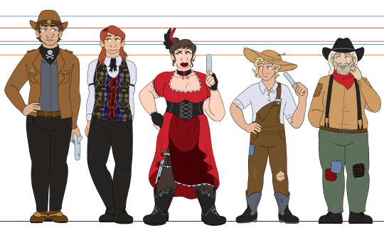
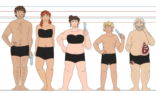
aaand here's deadlands! it didnt take seven months this time, who cheered?
i'll probably do another post grouping all of my line-ups together, but that's gonna wait for when i do the wyrdwood PCs as well :] more thorough design thoughts/smaller details will be under the cut, but im putting this here so that everybody has to know: their eye shines are all different card suits, except for nate, who gets J for the joker card :]
oxventurers guild | the hobby horses
unlike my other designs where i let everyone have individual colors/palettes, i tried to keep colors more consistent across these designs! the oxventurers guild has the fantasy element and theyre all very different, so the wide mishmash of colors are fine, and the hobby horses all have a lot of dark colors so that keeps them looking consistent together. but for these guys, i wanted a more consistent feel, so i tried my best to reuse colors between each design (especially between delacy and nate ^-^)
silas - ough. my boy. i wanted him to be broad with a strong build, and i hope i pulled that off :D i had so much trouble with his hat that i almost just didnt give him one, but eventually i decided it was better to just. give up and rock with it, even if he looks a bit like a mountie hbjgfjhd and he is wearing cowboy boots, theyre just tucked into his pants because he doesnt feel the need to flash them (looking at delacy, lol). he has spurs on his boots, even though he doesnt ride horses, because he likes the way they jangle <3
garnet - people really liked it when i gave garnet dark roots, so i have decided to always give her dark roots. i like how it looks hehehe and i also like to give her freckles!!! i think theyre cute!!! for the vest, i struggled for a while trying to capture the vibe of jane's vest, because its so so strange and specific in a way that makes it impossible for me to picture garnet without it. i'm pretty happy with where i landed with it, especially the pattern, since i've never tried to make a pattern like that before :3 i dont know why ive been loving patterns so much lately LOL but i will keep riding this wave and regret it later when drawing the designs again
edie - definitely the furthest departure from canon outfits, though still in the right wheelhouse. i just don't like drawing multiple layers of ruffled skirt. i didn't like how my sketches kept looking. i wanted to give her a skirt slit, especially after my friend reminded me about her thigh rifle holster. so today, i stared at a bunch of victorian ballgowns and party city costumes, and then completely redesigned her skirt before i lined these XD and i think it was worth it!! i love the layers and the way her rifle peeks out, and it meant i could show off more of her boots and give them a pretty design :]
delacy - my main thought going into drawing delacy was just. "i need to malnourish this boy" LMAO i refuse to believe that he is eating properly, i just know that he is not. otherwise, i mostly just stuck to the campaign art but scuffed up his clothes a bit. as implied on silas's notes, i very purposefully had his boots be Big. he's overcompensating a little bit :] also sorry i did not want to draw rooster so he just gets a generic handgun. i didnt feel like drawing complicated guns, and i wanted it to be a smaller handgun so that he could be poorly copying edie :') he has no trigger discipline but neither does edie so its fine
nate - that's just nate, baby!!! i think, canonically, he's meant to be a bit. emaciated. but i cant help but just picture him being a bigger guy, i think it fits his vibe better and its more fun for me to draw that way. i like having variety in body shapes, and garnet and delacy already have the rail thin thing down for this line-up. let my old man be fat !!! also. he has a weird nipple because he is transgender. heart emoji
#oxventure#oxventure deadlands#silas flint#garnet munro#edie valentine#delacy oxventure#nate janssen#'travis you forgot the buttons on a few of the shirts-' SHHH SHHHHHHHHHH DONT LOOK AT THAT IM TIRED#i just wanna move onto wyrdwood im done with these bhjgfhjdbghjd#i am super happy with how this came out though :3#okay time for sleep i have a friend visiting tomorrow and its past my bedtime
38 notes
·
View notes
Text
RO Updated Look³ (but I'm actually satisfied)
Under the cut for my design and change ramblings + the old design if you wanna compare and see the changes.


Here they are, fully in technicolor. Blasted melanin into Weylyn, Eliseo, and Ophelia, because A) I dislike how washed out they looked in the old design, B) makes them actually look distinct and not muddled, and C) they are literally mixed race and that feels like an injustice to them (yes 'them', because I'm including Weylyn now (his other half is from his mother's side). The color palette for each of them (individually and together) looks better, now that it's less saturated and easier on the eyes since the colors are bit more muted now. The clothes are better now too, and look like something they would all actually wear on a normal day based on their style preference. Plus, noses! All of 'em got distinct nose shapes. I tried to give also their own eyeshapes, but I think I mostly failed at that. And, uh, I guess face shapes? Weylyn's the most noticeable compared to his old design, and I honestly am happy with how he looks now.
Fleur's the only one that changed the least, I swear. She only got a haircut and called it a day. Jasiel too, but I'm already satisfied with how I dressed him, so he's fine the way he is already. Just changed his color palette from the saturated traditonally drawn art of him by muting down his colors and gave him brass bronze colored eyes to differentiate him from his siblings' golden ones.
I'm still really happy about Zephyrine's redesign, makes her the girly I knew she was destined to be. It really makes her stand out more and gives a better impression of her, plus it oomfs her character silhouette which is nice. I'd like to imagine she thrifts her clothes frequently, so there are a few clothes she has that look worn and washed out and clearly refurbished by her. The golden zig-zag on her cardigan is put there by her since she found it plain without a little pizzaz, and the gray beads on the end of her skirt used to form a leaf patter for each pleat, but lost beads overtime, so Zeph just added more beads, not to remake the shape (god forbid her patience runs out before she even manages to make one), but more on mark the skirt as now hers and styled to her preference.
Weylyn and Cooper were eventually dragged in to the redesign, mostly with fixing their hair (especially Cooper's since I didn't like him looking similar to Eliseo's) and clothes. Cooper's fit needed to give him that goofy weirdo vibe I wanted for him, plus actually making him look more friend coded than, uh... whatever I had in mind for his old fit. He's a bit more bejeweled, as more of a subtle telling that this man comes from wealth and is also kinda eccentric. For Weylyn, besides minutely fixing his hair and gave him new clothes, I changed his eye color too to a more yellowy hue than the old gold-ish one. It's not that obvious on mobile, but I swear it is on PC when I was drawing. 😭
Finally, Ophelia and Eliseo. The latter is fully embracing the dark grunge with pierced ears, a bit more silver chains and more rings and all that black clothes. The yellow smiley face is based on the band Nirvana's iconic logo, I just made it drippy and the smile into a toothy one for the troublemaker vibes this dude is going for. I gave him a mullet now (I think it's a mullet yet I also refuse to believe it is), based on some bad boy hair pictures I used as reference from Pinterest. Ophelia, on the other hand, had layers remove, let her wear a grandpa sweater and brown pants instead of her shorts (permanently stained with mud from all the times she went out to the forest to find for beetles), have a little string with beads dangle from her belt line as a treat. Her hands wear fingerless gloves now, and her doc martens are now replaced with regular old sneakers and black socks to hide her scarred ankles. She's droopy eyed now and I think it fits her more now for her personality and story compared to her round eyes. I based that loosely on Anya from Mouthwashing.
I didn't do a uniform line up like last time for the RO's that attend Lumintoile, because that'll be it's own seperate thing alongside an updated uniform look in general for the students. So you'll see everyone (minus Cooper) wearing uniforms with one of three pairs wearing a uniform variant for the different seasons. I also do plan to make an updated relationship chart, to see what's going on now currently between the RO's now that the story has changed and a new contender has arrived.
Older designs for comparison (minus Jasiel bc the man was not a concept at the time of me making this 😭)


#L's scream#L art#Weylyn#Fleur#Zephyrine#Eliseo#Cooper#Ophelia#Jasiel#will update the character appearances when I wake up (it's 6:26 am)#time to eep
15 notes
·
View notes
Text
demos i've finally gotten around to playing recently
steel judgment: what if ultrakill was a roguelite? you've got your dash and your parry and your style meter and weapons with cool alt-fires, but also a hub where you can buy new upgrades and unlock items after each run! the main mechanic is taunting enemies, which when killed, will give you health, and taunting augments your basic movement abilities if you time them after a taunt. really cool stuff! i am quite bad at it! game does not have a release date
metal eden: majoring in doom 2016/eternal, minoring in ghostrunner, this game struggles to run on my aging PC but it's still pretty cool. weapons feel fantastic and are appropriately punchy, but combat flow is a little weird in that i'm just running around waiting for my core cooldown so i can get my super punch back to strip armor, when i think i should just be shooting? i don't know, when a game introduces a mechanic to me, i want to use that mechanic as much as possible, sometimes to my own detriment. game comes out in Q3 2025
reignbreaker: isometric action roguelite, if you like hades, you'll like this. spray paint artstyle is really sweet, characters are... okay i suppose, not really compelled by any of them from the demo, and the main gameplay loop of keeping your combo up and balancing your fists and javelin is engaging and fun. and the full game is available now for only 10 bucks!
unbeatable: ohhhhhhhhhhh i have a bias because i backed this game on kickstarter in 2021, however i played the new demo (not white label) and it's soooo cool. each character has a distinct personality, presentation and cinematography is striking and evocative, there's side quests and minigames and optional dialogue everywhere. and that's just the story mode! there's also, ya know, the traditional arcade rhythm game mode, which is excellent. the only bug that bothers me is that the controller just... stops working in the arcade menu? other than that, pretty much flawless two button rhythm game, backed by an incredible soundtrack. game comes out sometime in 2025
haste: i think if i were to describe this game in one word, it's "joy". like woody from toy story said, it's not flying, it's falling with style! one of those games where it's easy to learn, hard to master. you run fast and you control your falls so that you hit the slopes of hills just right so you can gain even more speed! the levels are just challenging enough to make you think about your trajectory, but not to break your momentum. character art and colour palette is wonderful, dialogue is pretty charming, soundtrack is banging. bonus points for having unique dialogue specifically for the demo. genuinely a really good time! game is out now for about 20 bucks
peripeteia: immersive sim very much inspired by ye olde deus ex (no clear objective markers, complex mechanics, multiple ways of interacting with the world and accomplishing tasks, interesting worldbuilding and characters), you play as a cyborg woman waking up in a scrap pile in poland and scrape together whatever you can to survive. game is in early access, so it's a little barebones, costs about 30 bucks, but it was rejuvenating to play this kind of game again
--
playing through these demos today brought me back to when i was younger and i was browsing the PS3 store and downloading whatever demos were available, and my dad subsequently yelling at me for exceeding the data cap
i'm glad i got around to these, and i hope you check out some of them too
7 notes
·
View notes
Text
Your Journey Ends: A Parting Retrospective on Dragon Age (Part Two)
II. The Threshold
Being more of a Star Wars aficionado as a kid than a pen-and-paper fan, I was first introduced to western RPGs through BioWare’s Knights of the Old Republic (2003). Admittedly, I didn’t immediately grasp the mechanics (it would take years for me to understand what Armor Class or Will Save meant), but the opportunity to immerse myself in a fictional universe with a story that I could mold through dialogue exhilarated me. It was one of those special feelings that I’ve yearned to recapture for the rest of my life.
My relationship with BioWare games further blossomed with the release of 2007’s Mass Effect, the start of a series that would go on to be one of my favorites and equally as important to me as Dragon Age. While Mass Effect sought to take the roleplaying genre in a more setpiece-driven, action-oriented, cinematic space, the studio shortly thereafter released Dragon Age: Origins (2009) to cater to the more traditional RPG sensibilities: methodical pause-based tactical combat, sandbox narrative design, and your all-important +1 rings. For me, the two approaches to a modern RPG – the progressive action vs the traditional throwback – worked in harmony. I loved Origins. Even at the time of release, the whole game exuded nostalgic charm. Imagine playing it, taking in its stony interiors, crackling torches, and earthy color palette, all while the crisp autumn winds hum outside. That’s the Origins that exists in my memory.
And yet, it’s the title I have the least to say about – probably because Origins speaks for itself. Its quality as both a player co-authored story and a character-focused epic are rarely challenged, and with good reason. For its time, it was virtually unmatched in its scale and scope for roleplaying depth, being perhaps the closest approximation you could get to a tabletop Dungeons & Dragons campaign on a PC or console. In my opinion, this distinct accolade would only be unseated by Baldur’s Gate 3 in 2023, fourteen years later. That’s how long Origins dominated as the pinnacle of comprehensive roleplaying experiences.
The attention to detail and freedom afforded to the player would never be matched by any future game in the series (though I do think Origins fans have a tendency to mythologize the game and ignore the contributions and accomplishments of its successors). Take the case of Berwick. Don’t remember Berwick? I’m not surprised; he barely matters. He’s a spy for the villains that you can find in Redcliffe’s tavern. Yet despite his insignificance, the devs programmed numerous ways to interact with him: you can discover his treachery through cunning dialogue options, or through observations from the right companion combinations, or you can pickpocket him and discover a note detailing his orders. Once you’ve done that, you can confront him about it and either kill him, let him go, or conscript him into the village’s defense against an undead horde. Or you could ignore him and the town entirely, allowing it to fall to the slavering zombie maws. Most games wouldn’t give you this many options for a single quest, but Origins does it regularly. You see this pattern again with the various recruitment methods for Sten, or the different outcomes to the standoff with Ser Cauthrien, which range from a difficult boss encounter to a naked jailbreak to any combination of poorly thought-out heists by your party members. Every major quest sports branching outcomes, and even small details about your journey are remembered and referenced in dialogue. Origins gives the audience an unparalleled sense of control and reactivity in the story. More than most titles before or since, it creates a compelling illusion that it is truly your story.
On the flipside, Origins’s commitment to its hardcore RPG roots occasionally burdens it. This is perfectly summarized by playing a dwarf character during the much-maligned Fade section. The healing lyrium veins, your sole respite in this godforsaken dungeon, do not work on dwarves because they, canonically, have a resistance to the substance’s effects. Origins’s devotion to its lore and worldbuilding runs so deep that it will not sacrifice it for the player’s convenience. Aspects like this are as aggravating as they are admirable.
For all of the praises that I and others have heaped upon it, I want to emphasize that Origins is far from a perfect game. Jank, for lack of more accurate term, plagues many of its sequences and encounters. The expansion “Awakening” especially mars it, with numerous sequencing errors, narrative inconsistencies, and bugged quests. However, I mainly want to focus on what I consider the game’s few (but noteworthy) narrative and artistic shortcomings.
Fans often chide the later entries for moving away from the “dark fantasy” tone and aesthetic that Origins presented. While I do think the first game is superficially grittier than its younger siblings, I feel that Dragon Age has always been high fantasy that happened to, in its early days, insecurely masquerade in the bleak, mismatched set dressings of dark fantasy. Look no further than this actual, real trailer from 2009 that matches up a montage of gratuitous sex and violence to Marilyn Manson’s “This Is the New Shit” – a stark contrast to the game’s plodding moment-to-moment gameplay and surprisingly traditional narrative. It’s every bit as juvenile and embarrassing as it sounds, and that’s the issue. Origins feels its most adolescent when its pantomiming what a fourteen year old thinks is “adult.” It somewhat recklessly employs sexual violence against women as a plot point to a numbing degree, which doesn’t even make textual sense when the setting explicitly states that men and women are treated equally in Fereldan. If anything, women should be more privileged in this setting, since only they can be ordained as priests in the Chantry’s religious monopoly; and Orlais, the largest empire in the world, is led by an empress. But I digress. “Realistic” discriminatory violence was in vogue for the edgier sensibilities of the late 2000s, even if it lacked nuance or any semblance intratextual critique.
This key art goes really hard, though.

Origins puts up a front that tries to say, “This isn’t your dad’s D&D!” Except it is your dad’s D&D. It was a throwback to a more classical RPG style, even when it first came out – a deliberate counter-current against modern trends that skewed more toward dazzling (or obnoxious) action and spectacle. Strip away the veneer of gore and sexual violence and you’re left with a story that’s not dissimilar to The Lord of the Rings (1954-1955). The Warden must unite an army of men, elves, and dwarves and restore the rightful king to the throne in order to stand against an impending horde of monstrous humanoids led by an ancient evil. It’s familiar, romantic, even comforting – a tried and true story that’s brought new life by its lively cast and interactive components. I think this is why people responded so well to Origins – not the “dark fantasy” aspects that, by and large, contribute little and have aged poorly. The inclusion of these elements don’t amount to a substantive critique on the traditional story structure and tropes at play, so the overemphasis on brutality, gore, and sex come off more as self-conscious byproducts of their time, desperate attempts to stand out as more “mature” fantasy, than genuine artistic flourishes. It isn’t Drakengard (2003) or Berserk (1989 – present) or even A Song of Ice and Fire (1996 – probably never). It’s solid as hell high fantasy in disguise.
All this is to say that I feel the series’s eventual shift to heroic fantasy with Inquisition was natural – like it was finally admitting what it always was at its core. Or at least, it was finally leaning into what it was good at.1
Yet despite my minor gripes, I think Origins manages to tell a compelling story while interweaving its themes through each character’s personal journey. While I don’t think it has the absolute strongest narrative in the series, its combination of those cozy, familiar tropes and nuanced, textured character drama makes it consistently effective. With that said, I want to delve into what I view as the core tension at the story’s center, the thematic conflict that seems to underscore almost every major dynamic throughout.
This is not to say that The Veilguard’s method of sanding off all the edges and childproofing every conceivable problematic element was an ideal solution, or even an acceptable trade-off. Rather, I merely think that the franchise has struggled with its identity since the first day. I find that the series is best when it’s at its most mature – which is neither the excessive broodmother rape/body horror from Origins nor the frictionless “coffee shop AU” vibe of The Veilguard.
Full article: https://planckstorytime.wordpress.com/2025/03/29/your-journey-ends-a-parting-retrospective-on-dragon-age/
#planckstorytime#writing#analysis#essay#dragon age#dragon age inquisition#dragon age origins#dragon age 2#dragon age the veilguard#datv critical#the inquisitor#the warden#hawke#solavellan#trick weekes#sheryl chee#bioware#solas#cw rap3
7 notes
·
View notes