#Online CSS Padding
Explore tagged Tumblr posts
Visit Tumblr Blog
Explore Tumblr blogs with no restrictions, modern design and the best experience.
Last Seen Tumblr Blogs


Fun Fact
Tumblr has a low social media market share in South America.
Text

I CANT USE CSS ON ARTFIGHT...............
#I WAS REALLY HOPING TO FIX THE FUCKING. PARAGRAPH WIDTH. SIGH#idk why but it stretches across the ENTIRE page like. it takes up the full width of the browser and it BOTHERS ME. ON ALL THE PAGES#i could try manually putting shift breaks but im worried it might not look so good on mobile. ugghh... auyggghhh.....#im already learning CSS and API so i thought i could put it to good use but. AUGH#this whole time ive had to go into the inspect panel myself and change the padding so i dont have to read the length of the screen#like a fucking typewriter... i would have also loved to use custom fonts and animations......#i did find a guide for BBCode which the site uses on default and it covers basic styling but its not the same. sniffle#you CAN unlock CSS if you donate $25 to the page which seems fair. and if i could do it i would but. i do not have any way of#sending or receiving money online </3 i really need to figure out how to do that so i can set up comms like i said i would last summer#but it intimidates me.... and im already kept on a short leash when it comes to that so it feels like a lot of things could go wrong#i think toyhouse allows CSS or some sort of code...?? i remember seeing some oc pages with custom layouts#if thats the case i'll try fiddling with it but im not very familiar with using toyhouse so thatll take a while#(thanks again for the code sal ^_^ ill put it on my pin once its ready but im trying to learn my way around the site heh ;;)#at least i can use my pixel dividers.. ive been digging around for pixels to use and found some really cute ones#yapping
51 notes
·
View notes
Text
I learnt the 'vw' unit in CSS~!
% and rem/em units weren't working properly for the responsiveness so I search online for other units I could use and I came across vw and now I'm satisfied! Scales semi-smoothly~! 😏
Using vw means the font size is directly proportional to the width of the viewport.
You don't need to worry as much about setting breakpoints for different screen sizes. The font size adjusts automatically based on the viewport.
Hope this helps other people learning CSS and working on making their site responsive! I used the vw unit on the font-size, padding height and width of the elements! Might need to add it to the box-shadow property too? 🤔💭
#codeblr#coding#progblr#programming#studyblr#studying#computer science#tech#css#css tips#comp sci#programmer
86 notes
·
View notes
Note
Your gallery looks really cool! How’d you learn how to customize it like that either circle items etc.
thankyou! 😊
To first learn I copied and paste an already built free code (i think from sunnyneo) and just edited parts to learn what different things CSS did, googling along the way. Then I went to Sunnyneo where they have a list of common changes you can do and built my own, its a really amazing resource:
specifically for the circles I had to hunt for an answer about it online, it took a long time because I didnt know what it was called but I finally found the answer as a 'content table img'. It looks like below:
.content table img {border:none; border-radius: 50px 50px;background-color: #835f9c;padding: 10px;}
#asks#i kept using content table and it changed the border around the entire page haha i was losing my mind trying to get it to work#but finally found out its a content table IMG lolol#Next changes will be my userlookup and my art page. I edited it to be colours I want and my own art but i want my own code for them too
12 notes
·
View notes
Text
Revisiting CSS Multi-Column Layout
New Post has been published on https://thedigitalinsider.com/revisiting-css-multi-column-layout/
Revisiting CSS Multi-Column Layout
Honestly, it’s difficult for me to come to terms with, but almost 20 years have passed since I wrote my first book, Transcending CSS. In it, I explained how and why to use what was the then-emerging Multi-Column Layout module.
Hint: I published an updated version, Transcending CSS Revisited, which is free to read online.
Perhaps because, before the web, I’d worked in print, I was over-excited at the prospect of dividing content into columns without needing extra markup purely there for presentation. I’ve used Multi-Column Layout regularly ever since. Yet, CSS Columns remains one of the most underused CSS layout tools. I wonder why that is?
Holes in the specification
For a long time, there were, and still are, plenty of holes in Multi-Column Layout. As Rachel Andrew — now a specification editor — noted in her article five years ago:
“The column boxes created when you use one of the column properties can’t be targeted. You can’t address them with JavaScript, nor can you style an individual box to give it a background colour or adjust the padding and margins. All of the column boxes will be the same size. The only thing you can do is add a rule between columns.”
She’s right. And that’s still true. You can’t style columns, for example, by alternating background colours using some sort of :nth-column() pseudo-class selector. You can add a column-rule between columns using border-style values like dashed, dotted, and solid, and who can forget those evergreen groove and ridge styles? But you can’t apply border-image values to a column-rule, which seems odd as they were introduced at roughly the same time. The Multi-Column Layout is imperfect, and there’s plenty I wish it could do in the future, but that doesn’t explain why most people ignore what it can do today.
Patchy browser implementation for a long time
Legacy browsers simply ignored the column properties they couldn’t process. But, when Multi-Column Layout was first launched, most designers and developers had yet to accept that websites needn’t look the same in every browser.
Early on, support for Multi-Column Layout was patchy. However, browsers caught up over time, and although there are still discrepancies — especially in controlling content breaks — Multi-Column Layout has now been implemented widely. Yet, for some reason, many designers and developers I speak to feel that CSS Columns remain broken. Yes, there’s plenty that browser makers should do to improve their implementations, but that shouldn’t prevent people from using the solid parts today.
Readability and usability with scrolling
Maybe the main reason designers and developers haven’t embraced Multi-Column Layout as they have CSS Grid and Flexbox isn’t in the specification or its implementation but in its usability. Rachel pointed this out in her article:
“One reason we don’t see multicol used much on the web is that it would be very easy to end up with a reading experience which made the reader scroll in the block dimension. That would mean scrolling up and down vertically for those of us using English or another vertical writing mode. This is not a good reading experience!”
That’s true. No one would enjoy repeatedly scrolling up and down to read a long passage of content set in columns. She went on:
“Neither of these things is ideal, and using multicol on the web is something we need to think about very carefully in terms of the amount of content we might be aiming to flow into our columns.”
But, let’s face it, thinking very carefully is what designers and developers should always be doing.
Sure, if you’re dumb enough to dump a large amount of content into columns without thinking about its design, you’ll end up serving readers a poor experience. But why would you do that when headlines, images, and quotes can span columns and reset the column flow, instantly improving readability? Add to that container queries and newer unit values for text sizing, and there really isn’t a reason to avoid using Multi-Column Layout any longer.
A brief refresher on properties and values
Let’s run through a refresher. There are two ways to flow content into multiple columns; first, by defining the number of columns you need using the column-count property:
Second, and often best, is specifying the column width, leaving a browser to decide how many columns will fit along the inline axis. For example, I’m using column-width to specify that my columns are over 18rem. A browser creates as many 18rem columns as possible to fit and then shares any remaining space between them.
Then, there is the gutter (or column-gap) between columns, which you can specify using any length unit. I prefer using rem units to maintain the gutters’ relationship to the text size, but if your gutters need to be 1em, you can leave this out, as that’s a browser’s default gap.
The final column property is that divider (or column-rule) to the gutters, which adds visual separation between columns. Again, you can set a thickness and use border-style values like dashed, dotted, and solid.
These examples will be seen whenever you encounter a Multi-Column Layout tutorial, including CSS-Tricks’ own Almanac. The Multi-Column Layout syntax is one of the simplest in the suite of CSS layout tools, which is another reason why there are few reasons not to use it.
Multi-Column Layout is even more relevant today
When I wrote Transcending CSS and first explained the emerging Multi-Column Layout, there were no rem or viewport units, no :has() or other advanced selectors, no container queries, and no routine use of media queries because responsive design hadn’t been invented.
We didn’t have calc() or clamp() for adjusting text sizes, and there was no CSS Grid or Flexible Box Layout for precise control over a layout. Now we do, and all these properties help to make Multi-Column Layout even more relevant today.
Now, you can use rem or viewport units combined with calc() and clamp() to adapt the text size inside CSS Columns. You can use :has() to specify when columns are created, depending on the type of content they contain. Or you might use container queries to implement several columns only when a container is large enough to display them. Of course, you can also combine a Multi-Column Layout with CSS Grid or Flexible Box Layout for even more imaginative layout designs.
Using Multi-Column Layout today
Patty Meltt is an up-and-coming country music sensation. She’s not real, but the challenges of designing and developing websites like hers are.
My challenge was to implement a flexible article layout without media queries which adapts not only to screen size but also whether or not a <figure> is present. To improve the readability of running text in what would potentially be too-long lines, it should be set in columns to narrow the measure. And, as a final touch, the text size should adapt to the width of the container, not the viewport.
Article with no <figure> element. What would potentially be too-long lines of text are set in columns to improve readability by narrowing the measure.
Article containing a <figure> element. No column text is needed for this narrower measure.
The HTML for this layout is rudimentary. One <section>, one <main>, and one <figure> (or not:)
<section> <main> <h1>About Patty</h1> <p>…</p> </main> <figure> <img> </figure> </section>
I started by adding Multi-Column Layout styles to the <main> element using the column-width property to set the width of each column to 40ch (characters). The max-width and automatic inline margins reduce the content width and center it in the viewport:
main margin-inline: auto; max-width: 100ch; column-width: 40ch; column-gap: 3rem; column-rule: .5px solid #98838F;
Next, I applied a flexible box layout to the <section> only if it :has() a direct descendant which is a <figure>:
section:has(> figure) display: flex; flex-wrap: wrap; gap: 0 3rem;
This next min-width: min(100%, 30rem) — applied to both the <main> and <figure> — is a combination of the min-width property and the min() CSS function. The min() function allows you to specify two or more values, and a browser will choose the smallest value from them. This is incredibly useful for responsive layouts where you want to control the size of an element based on different conditions:
section:has(> figure) main flex: 1; margin-inline: 0; min-width: min(100%, 30rem); section:has(> figure) figure flex: 4; min-width: min(100%, 30rem);
What’s efficient about this implementation is that Multi-Column Layout styles are applied throughout, with no need for media queries to switch them on or off.
Adjusting text size in relation to column width helps improve readability. This has only recently become easy to implement with the introduction of container queries, their associated values including cqi, cqw, cqmin, and cqmax. And the clamp() function. Fortunately, you don’t have to work out these text sizes manually as ClearLeft’s Utopia will do the job for you.
My headlines and paragraph sizes are clamped to their minimum and maximum rem sizes and between them text is fluid depending on their container’s inline size:
h1 font-size: clamp(5.6526rem, 5.4068rem + 1.2288cqi, 6.3592rem); h2 font-size: clamp(1.9994rem, 1.9125rem + 0.4347cqi, 2.2493rem); p font-size: clamp(1rem, 0.9565rem + 0.2174cqi, 1.125rem);
So, to specify the <main> as the container on which those text sizes are based, I applied a container query for its inline size:
main container-type: inline-size;
Open the final result in a desktop browser, when you’re in front of one. It’s a flexible article layout without media queries which adapts to screen size and the presence of a <figure>. Multi-Column Layout sets text in columns to narrow the measure and the text size adapts to the width of its container, not the viewport.
Modern CSS is solving many prior problems
Structure content with spanning elements which will restart the flow of columns and prevent people from scrolling long distances.
Prevent figures from dividing their images and captions between columns.
Almost every article I’ve ever read about Multi-Column Layout focuses on its flaws, especially usability. CSS-Tricks’ own Geoff Graham even mentioned the scrolling up and down issue when he asked, “When Do You Use CSS Columns?”
“But an entire long-form article split into columns? I love it in newspapers but am hesitant to scroll down a webpage to read one column, only to scroll back up to do it again.”
Fortunately, the column-span property — which enables headlines, images, and quotes to span columns, resets the column flow, and instantly improves readability — now has solid support in browsers:
h1, h2, blockquote column-span: all;
But the solution to the scrolling up and down issue isn’t purely technical. It also requires content design. This means that content creators and designers must think carefully about the frequency and type of spanning elements, dividing a Multi-Column Layout into shallower sections, reducing the need to scroll and improving someone’s reading experience.
Another prior problem was preventing headlines from becoming detached from their content and figures, dividing their images and captions between columns. Thankfully, the break-after property now also has widespread support, so orphaned images and captions are now a thing of the past:
figure break-after: column;
Open this final example in a desktop browser:
You should take a fresh look at Multi-Column Layout
Multi-Column Layout isn’t a shiny new tool. In fact, it remains one of the most underused layout tools in CSS. It’s had, and still has, plenty of problems, but they haven’t reduced its usefulness or its ability to add an extra level of refinement to a product or website’s design. Whether you haven’t used Multi-Column Layout in a while or maybe have never tried it, now’s the time to take a fresh look at Multi-Column Layout.
#:has#ADD#almanac#Article#Articles#back up#background#book#box#browser#challenge#clamp#colours#columns#container#content#course#creators#CSS#CSS Grid#css-tricks#Design#designers#desktop#developers#digitalocean#display#easy#English#Explained
2 notes
·
View notes
Text
CIW Certification Exams 2025: Your Career-Boosting Guide

Why Is CIW Certification Still Relevant in 2025?
In a digital-first world where the internet is the foundation of nearly every business, individuals with strong web and internet technology skills are in high demand. This is where the CIW certification Certified Internet Web Professional proves its continued relevance in 2025. As technology and business evolve, CIW certification keeps pace by offering vendor-neutral, job-role-based certifications that prepare professionals for success in real-world environments. Whether you're a high school graduate entering the IT field or an experienced professional looking to formalize your skills, the CIW certification exams offer a structured, credible path toward career advancement in areas like web development, data analytics, internet business, and cybersecurity.
What Makes CIW Certification Exams Different from Others?
Unlike many IT certifications that focus on specific technologies or platforms, CIW certification exams are vendor-neutral. This means the knowledge gained is applicable across multiple tools, programming languages, and web environments. This flexibility is a key reason why many educators, employers, and learners choose CIW over other options. The curriculum is designed to build foundational understanding first, such as HTML, CSS, networking, and internet business, before progressing to more complex topics like JavaScript, databases, and security principles. This progressive structure makes it accessible and effective for both beginners and seasoned professionals. In 2025, the global workforce will increasingly value professionals who understand the full spectrum of internet-based technologies, and CIW certification provides that competitive edge.
Who Should Consider Earning a CIW Certification in 2025?
CIW certification is ideal for a wide range of individuals from high school students beginning their journey in web development to mid-level professionals transitioning into technical roles. If you’re looking for the best CIW certification for beginners, options like CIW Internet Business Associate or Site Development Associate are perfect starting points. These entry-level exams require no prior technical knowledge and serve as a launching pad for higher certifications. For professionals, more advanced credentials such as the CIW Web Development Professional or the CIW Web Security Associate offer specialized expertise in high-demand areas. Because of its modular approach and role-based design, CIW allows you to tailor your certification path based on your interests and career goals.
How Can You Effectively Prepare for CIW Certification Exams?
Success in CIW certification exams requires more than just reading textbooks it calls for a mix of conceptual understanding, practical application, and focused exam strategies. Preparation should begin with understanding the structure and objectives of your chosen certification level. This includes reviewing the syllabus, identifying key focus areas, and establishing a study schedule. Hands-on practice through coding exercises, mock exams, and real-life projects is crucial, especially for certifications like CIW web development certification, which test your ability to write and troubleshoot code. Visual learners may benefit from tutorials and interactive labs, while others may prefer traditional note-taking and quizzes. A balanced approach ensures not only better retention but also greater confidence during the exam.
What Study Resources Are Best for Passing the CIW Certification Exam?
There are many resources available online to help you prepare for the CIW certification exams, but not all are reliable or up to date. A great place to start is PracticeTestSoftware, a trusted provider of simulated exam environments that mirror the actual testing format. Their practice exams cover a wide range of CIW certifications and are tailored to reflect the latest updates for 2025. Access to timed mock tests, detailed explanations, and performance analytics allows learners to identify their weak areas and reinforce their strengths. This platform stands out because it does not just test your memory it helps build exam readiness through strategic repetition and real-world scenarios. You can explore their CIW-specific offerings and learn more about how to enhance your exam readiness by visiting their main website at PracticeTestSoftware.
Why Is the Certified Internet Web Professional Title Valuable to Employers?
The Certified Internet Web Professional designation carries weight in the industry because it shows a standardized level of expertise across essential web technologies. Employers recognize that CIW certified professionals understand not just how to build websites but how to manage their performance, optimize them for users, and protect them from security threats. It assures hiring managers that the candidate has passed a rigorous exam aligned with real-world job functions. Moreover, CIW’s focus on both technical and business skills makes certified individuals more adaptable and capable in multi-disciplinary teams. In an era where companies must move fast and innovate continuously, having staff with verified skills in digital tools and technologies is no longer optional it’s a necessity.
How Can You Pass the CIW Certification Exam on Your First Attempt?
One of the most common concerns among candidates is how to pass the CIW certification exam efficiently and confidently. The answer lies in a combination of proper planning, consistent effort, and reliable practice. Begin by assessing your current knowledge base, then choose a certification that aligns with your level. Stick to a study schedule that allows for gradual learning and periodic self-assessment. Simulated tests are essential, as they help you get familiar with the exam environment and time constraints. Read explanations for both correct and incorrect answers to build deeper understanding. Finally, take care of exam-day basics rest well, stay calm, and use strategic time management. With proper preparation, you can absolutely clear your CIW certification on your first attempt.
Where Can You Find CIW Practice Exams and Supportive Study Tools? For those committed to success, accessing the right tools is essential. This is where PracticeTestSoftware becomes a vital partner in your certification journey. Their targeted practice exams, real world scenarios, and intuitive platforms provide everything you need to feel confident before sitting for the actual test. Whether you are preparing for entry-level credentials or tackling more advanced certifications, their resources are designed to align with official CIW exam objectives. To explore their full range of CIW preparation tools and get started with realistic exam simulations, visit their dedicated CIW resource hub at PracticeTestSoftware’s CIW Certification Page. This is your opportunity to transform preparation into performance and take a confident step toward professional growth
0 notes
Text
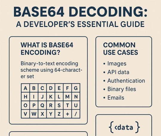
🧬 Base64 Decoding: What Every Developer Needs to Know
Let’s be honest — you’ve definitely come across a weird string of letters and slashes ending in “==” and thought:
“Yeah, that’s Base64… but what the heck is it really doing?”
Welcome to your crash course. 🧠💻
🔍 What Even Is Base64?
Base64 is how we turn messy binary data into readable text — perfect for email, APIs, or sending files over the web. It uses a special 64-character set (A-Z, a-z, 0-9, +, /) to encode data safely into ASCII. Clean, compact, and protocol-friendly.
🧩 Example: You → upload an image → server encodes it to Base64 → sends it in a JSON → you decode it back to… pixels!
📦 Where You’ll See It
Base64 is everywhere:
🖼 Embedded images in HTML/CSS
🔐 JWT tokens and API keys
📦 Binary files in APIs
📧 Email attachments
📁 Config files and logs
📱 Mobile backend comms
If you’re building or debugging anything beyond a to-do app, you’ll hit Base64.
🛠 How to Decode It Like a Pro
🧑💻 Tools:
base64 -d (Linux/Mac CLI)
Online decoders (for quick checks)
Code:
Python: base64.b64decode()
JS: atob()
Java, C#, Go, etc. all have built-in support
Bonus: most browser DevTools and IDEs can decode Base64 too! https://keploy.io/blog/community/understanding-base64-decoding
✅ Best Practices
✔ Validate input before decoding ✔ Handle padding (= at the end) ✔ Know what the output should be (text? image? zip file?) ✔ Be super cautious with user-supplied data (hello, malware 👀)
🧠 Pro Techniques
Streaming decode big files (don’t blow up your memory)
URL-safe Base64 (replaces + with -, / with _)
Custom alphabets (legacy systems love weird stuff)
Know the variant you're working with or your decoder will cry.
🐛 Common Gotchas
Missing/extra padding
Non-standard characters
Encoded inside a URL (needs double decoding)
Newlines and whitespace (strip ’em!)
🔄 Real-World Dev Workflows
CI/CD pipelines decoding secrets and config
API testing tools validating Base64 fields
Git diffs showing Base64 blobs
Debugging mobile apps or IoT devices
Basically: If your app talks to anything, Base64 shows up.
🔧 TL;DR
Base64 is the bridge between binary chaos and readable text. Learn to decode it confidently and you’ll:
Debug faster
Build cleaner APIs
Catch sneaky security threats
Save your teammates from “what’s this encoded blob?” horror
Oh, and if you want to auto-test and validate APIs that use Base64? 👉 Keploy is your new best friend. Mocking + testing with encoded data made simple.
0 notes
Text
HTML + CSS = The Foundation of Your Online Brand
Thinking about building a webpage for your business?
Whether it’s a single landing page or a full website, HTML and CSS are where it starts.
Here’s a peek at the essentials:
💡 HTML gives structure
Use <h1>–<h6> for clarity
Organize content with <div> and <p>
Engage users with <button> and <a href="">
🎨 CSS brings it to life
Use color: and background-color: to reflect brand identity
Add spacing with margin: and padding:
Make it responsive and sleek with display: flex; or grid;
Choose brand-accurate fonts and weights with font-family and font-weight
👀 Want a page that looks good and converts?
We do that.
Let iBCScorp create webpages that are functional, beautiful, and brand-perfect.
📞 Book a call—we’ll handle the tech so you can focus on your message.
#HTMLandCSS#WebDevelopment#SmallBusinessWebsite#DigitalBranding#ResponsiveDesign#WebTips#MadeWithiBCScorp
0 notes
Text
Web Designing 101: Everything You Need to Know as a Beginner
Introduction
In case you've ever wondered how web sites go from clean pages to sleek, interactive stories, you have stepped into the world of web designing. From the format and shades to the fonts and navigation, net layout shapes how customers sense and engage online. In today’s digital-first international, know-how the fundamentals of net layout is essential—now not only for designers however for all and sundry who wants to launch a website with cause and varnish.
Whether or not you are an entrepreneur, innovative, or someone seeking to pick up a valuable skill, this guide will walk you via the crucial factors of net layout, display you the equipment you want, and assist you begin constructing web sites which might be each lovely and useful.
1. What exactly Is net design?
Internet design is greater than simply making things look pretty—it’s bridging aesthetics with usability:
Visual layout (UI): choosing colorings, typography, and layouts that engage customers and bring brand identity.
User revel in (UX): Crafting intuitive and exciting navigation paths thru the web site.
Responsive layout: making sure the web page works properly on laptop, pill, and cell gadgets.
Interaction layout: Incorporating animations, buttons, and comments to make the site sense alive.
🧩 Why internet design matters
First Impressions matter: A smooth, professional site builds agree with right away.
Better Engagement: nicely-designed websites encourage customers to stay longer, discover greater—because of this higher conversions.
Seo pleasant: clean code and mobile responsiveness assist your site get located via engines like google.
Stick out from the gang: precise, well-designed sites assist you stand aside in a crowded online space.
2. The net Designing technique: A Step-through-Step manual
Right here’s a newbie-pleasant roadmap to approach your net design adventure:
A. Research & planning
Define Your goals: Do you want to showcase a portfolio, promote products, or proportion content?
Recognise Your audience: who're they, what troubles do they've, and how do they seek on line?
Competitor analysis: discover strengths and weaknesses in competitors' web sites to set your USP!
B. Wireframing & layout
Caricature the structure: Use tools like Figma, comic strip, or Adobe XD—or maybe pen and paper—to map out pages.
Focus on Hierarchy: arrange content material to manual attention, placing CTAs where they naturally belong.
Make sure White space: deliver your layout room to respire—litter overwhelms.
C. Visible layout (UI design)
Pick a shade Scheme: A number one palette of two–three colorings maintains the layout unified. Use gear like Coolors or Adobe color for notion.
Pick web-secure Fonts: Pair a serif header with a sans-serif frame; Google Fonts is a first-rate free supply.
Include Imagery: Use satisfactory pictures or icons (Unsplash, Pexels, Flaticon) to make your format pop.
D. Responsive layout
Mobile-First technique: layout for the smallest display screen first, then scale up.
Trying out across devices: Use browser tools or preview in actual devices to ensure your web site works anywhere.
Bendy factors: keep away from fixed width—use percent-based totally sizing and bendy grids.
E. Development basics
HTML for structure
html
CopyEdit
<header><h1>web site title</h1></header>
<nav>…</nav>
<main>…</main>
<footer>…</footer>
CSS for style
css
CopyEdit
Body font-own family: Arial, sans-serif; history: #f8f8f8;
Header heritage: #003366; color: white; padding: 20px;
Optional: JavaScript for Interactivity
Show/cover content, animate buttons, reply to person actions
F. Checking out & Refinement
Pass-Browser exams: make sure it looks correct on Chrome, Firefox, Safari, and side.
Usability assessments: Ask actual people to test it—look ahead to confusion, damaged hyperlinks, or gradual pages.
Performance checks: Use Google PageSpeed Insights and GTMetrix to optimize load time.
G. Launch & preservation
Use a reliable Host: alternatives variety from Bluehost and SiteGround to cloud solutions like AWS.
Select a CMS: WordPress, Webflow, or maybe headless CMS depending in your desires.
Monitor & enhance: Use analytics equipment to track overall performance and refine primarily based on real facts.
Three. Critical tools each newbie need to recognize
Layout & Prototyping
Figma: loose collaboration with effective UI equipment.
Adobe XD: tremendous for prototyping and interaction-heavy designs.
Cartoon: A macOS favourite—easy however effective.
Improvement
VS Code: A free, extensible code editor with heaps of beneficial plugins.
Browser DevTools: best for actual-time edits and debugging.
Git + GitHub: version manage way to song adjustments and collaborate.
Portraits & images
Canva: smooth tool for simple banners or social photos.
Unsplash/Pexels: terrific unfastened pictures.
TinyPNG: Compress pictures with out dropping first-rate.
Fonts & Icons
Google Fonts
Font terrific or Flaticon
Overall performance & checking out
Google PageSpeed Insights
GTMetrix
Google Analytics
Four. Middle layout standards every clothier ought to comply with
Visual Hierarchy
Highlight crucial factors (headlines, CTAs) the use of length, colour, and site.
Alignment & clarity
Steady spacing across elements maintains your layout balanced.
Consistency
Repeating design patterns builds familiarity and accept as true with.
Accessibility
Alt text for pix
Keyboard navigation
Colour contrast ratios (use equipment like WebAIM contrast checker)
Comments
Make certain buttons and inputs respond (hover styles, click animations) so customers understand what’s happening.
Five. Not unusual errors novices ought to keep away from
Litter Overload: Too many fonts, snap shots, and buttons confuse customers.
Ignoring cellular: laptop-most effective web sites frustrate most people of cellular visitors.
Slow Load times: massive pics or heavy scripts force users away.
Terrible clarity: Tiny fonts, low assessment, and lengthy paragraphs harm consumer experience.
Broken hyperlinks & Typos: Small errors break credibility.
6. Studying & developing: What’s subsequent After the fundamentals?
Be part of on-line publications: Coursera, Udemy, or freeCodeCamp have notable tutorials.
Construct a Portfolio: Create small initiatives like a non-public web page, landing pages, or event microsites.
Observe other web sites: analyze top manufacturers and nearby competition—what works and why?
Study a CSS Framework: discover Bootstrap or Tailwind for faster, cleanser code.
Iterate & update: Your first website isn’t your ultimate—hold refining as you learn.
Conclusion
Net design is a blend of art and technology—stability visuals with usability to create stories human beings enjoy. With this manual, you have got the fundamentals covered: making plans your site, learning the equipment, know-how format and visuals, building and trying out your design, and launching it live.
The nice component? Web layout is a adventure of continual boom. Practice regularly, collaborate with others, and keep refining your capabilities. Destiny you'll thanks for starting now.
FAQs
1. Do I need to learn coding to be a web clothier?
Not continually—tools like Webflow or Wix permit you to layout visually. However knowing HTML/CSS allows you customise and stand out.
2. Am i able to layout on cell devices?
It is better to use computing device for layout work. Mobile tools exist, however actual layout paintings desires display screen area and precision.
3. How long does it take to build a basic web site?
Easy portfolio or brochure web sites can take some days. More complicated designs and CMS integration might also take some weeks.
4. Ought to I begin with a non-public assignment or purchaser paintings?
Start with personal or pattern tasks—no deadline stress—then show off them on your portfolio to attract actual customers.
Five. Where can i get feedback on my design paintings?
Join communities like Dribbble, Behance, Reddit’s r/web_design, or facebook/Webflow corporations to acquire critique and enhance quicker.
0 notes
Text
Boost Your LinkedIn Profile with These Top UpGrad Certifications
Why UpGrad Certifications Matter
In today's competitive job market, having the right certifications can make a significant difference in your career prospects. UpGrad, a leading online education platform, offers a wide range of certifications that can give your LinkedIn profile a serious boost. These certifications not only demonstrate your commitment to continuous learning but also equip you with job-ready skills that employers value. If you're searching for honest insights, this UpGrad Review covers everything you need to know before enrolling.
Top UpGrad Certifications for Tech Professionals
1. Data Science Certification
Data science is one of the most in-demand fields in tech today. UpGrad's Data Science Certification covers:
Python programming
Machine learning algorithms
Data visualization techniques
Big data analytics
This certification can open doors to roles like Data Analyst, Machine Learning Engineer, and Business Intelligence Specialist.
2. Artificial Intelligence and Machine Learning Program
AI and ML are revolutionizing industries across the board. This certification includes:
Deep learning
Natural language processing
Computer vision
AI ethics
Showcasing this certification on LinkedIn can attract attention from companies looking for AI specialists and ML engineers.
3. Full Stack Development Program
Full stack developers are always in high demand. UpGrad's certification covers:
Front-end technologies (HTML, CSS, JavaScript)
Back-end programming (Node.js, Python)
Database management
DevOps practices
This comprehensive program can help you land roles as a Full Stack Developer or Software Engineer.
4. Cybersecurity Certification
With the increasing frequency of cyber threats, cybersecurity professionals are more crucial than ever. This certification includes:
Network security
Ethical hacking
Security operations
Incident response
Adding this to your LinkedIn profile can attract opportunities in roles like Security Analyst or Information Security Manager.
How These Certifications Boost Your LinkedIn Profile
Skill Validation: UpGrad certifications serve as third-party validation of your skills, enhancing your credibility.
Industry Relevance: These programs are designed in collaboration with industry experts, ensuring you learn the most current and relevant skills.
Network Expansion: UpGrad's programs often include networking opportunities, which can lead to valuable connections on LinkedIn.
Continuous Learning Indicator: Displaying these certifications shows potential employers your commitment to staying updated in your field. must visit our youtube chanel .
Maximizing Your UpGrad Certification on LinkedIn
To get the most out of your UpGrad certification on LinkedIn:
Add it to your 'Licenses & Certifications' section
Share your certification completion as a post
Include key skills learned in your 'Skills' section
Mention the certification in your profile summary
"Investing in yourself through education is the best way to prepare for a future that's constantly changing." - Unknown
By adding these UpGrad certifications to your LinkedIn profile, you're not just padding your resume – you're demonstrating real, valuable skills that can set you apart in the tech industry. Whether you're looking to advance in your current role or pivot to a new area of tech, these certifications can be a powerful tool in your career development arsenal. If you're eyeing the best data science course to future-proof your career, UpGrad’s data science program is definitely worth considering.

0 notes
Text
How to Add Shopify Buy Button to Squarespace Website

Want to sell products on Squarespace without leaving the platform? The Shopify Buy Button makes it possible. It lets you add a Shopify-powered checkout to your Squarespace site. This guide walks you through the process step by step.
What is the Shopify Buy Button?
The Shopify Buy Button is a simple way to sell products on any website. It allows you to embed a customizable shopping button that connects directly to Shopify’s checkout. It works well for bloggers, small businesses, and content creators who want e-commerce functionality without running a full Shopify store.
Key Features:
Secure checkout through Shopify
Mobile-friendly design
Customizable button styles
Automatic inventory updates
Why Add a Shopify Buy Button to Squarespace?
Squarespace offers built-in e-commerce, but Shopify provides more advanced checkout and inventory management. By combining both platforms, you get:
A powerful e-commerce checkout with Squarespace’s sleek design.
Access to Shopify’s payment processing and order management.
A way to sell without fully migrating to Shopify.
Prerequisites: What You Need
Before you start, ensure you have:
An active Shopify account (Basic plan or higher).
An active Squarespace site (Business plan or higher to add custom code).
At least one product added to Shopify.
Step-by-Step Guide to Adding Shopify Buy Button to Squarespace
Step 1: Generate a Shopify Buy Button
Log in to your Shopify account.
Go to Sales Channels > Buy Button.
Click Create Buy Button.
Choose a product or collection to embed.
Customize the button’s appearance (color, text, and layout).
Click Generate Code and copy the HTML code.
Step 2: Add the Buy Button to Squarespace
Log in to your Squarespace account.
Navigate to the page or post where you want the button.
Click Edit Page, then select Code Block.
Paste the Shopify Buy Button code into the Code Block.
Click Save, then preview the page.
Step 3: Test the Buy Button
Click the button to ensure it redirects to Shopify’s checkout.
Check for mobile responsiveness.
If needed, adjust the button’s styling using CSS in Squarespace.
Customization & Optimization Tips
Match the button style to your Squarespace theme.
Use CSS to adjust size, color, and placement.
A/B test different button texts to increase conversions.
Troubleshooting Common Issues
Button not displaying? Ensure you pasted the code inside a Code Block, not a Text Block.
Layout issues? Adjust width, padding, or alignment using CSS.
Checkout not working? Verify Shopify’s checkout settings and product availability.
Alternative E-Commerce Solutions
Shopify Lite: Best for small businesses needing basic e-commerce without a full store.
Full Shopify Integration: Ideal if you want more advanced features and scalability.
Conclusion
Adding a Shopify Buy Button to Squarespace is an easy way to enhance your online store. It combines the best of both platforms Squarespace’s design and Shopify’s powerful checkout. Test your setup, refine your design, and optimize for better sales. If your business grows, consider migrating fully to Shopify for a more robust e-commerce experience.
1 note
·
View note
Text
Tooltip Personalizado.
Ooooooooooi :3
Hoje de manhã eu não tinha nada pra fazer e fui procurar tutorias pra traduzir, achei um tutorial de uns tooltips e resolvi traduzir eles, 1 eu já tinha traduzido mais como efeito pra foto, e agora vou ensinar como fazer esse tooltip aqui:
PREVIEW ONLINE AQUI
Gostaram dele ? entãao eu adaptei alguns códigos meus nesse tooltip pra que ele desse certo aqui na plataforma do tumblr :) vamos aos códigos ? Sim !
Então, primeiro vocês tem que colar esse código abaixo depois da tag <head> no seu theme:
<link href='http://fonts.googleapis.com/css?family=Play' rel='stylesheet' type='text/css'>
Esse código acima vai definir a fonte do seu tooltip, se quiser colocar outra fonte nele não precisa colar o código acima;
Depois de colar o código da fonte, vamos ajustar o nosso css ou seja, vamo definir os códigos que vão fazer nosso tooltip funcionar, então cole esses 3 códigos depois de <style> e antes de </style>:
.tt-wrapper{padding: 0; width: 435px; height: 70px; margin: 80px auto 30px auto;} .tt-wrapper li{ float: left;} .tt-wrapper li a{ display: block; width: 68px; height: 70px; margin: 0 2px; outline: none; text-indent: -9000px; position: relative;} .tt-wrapper li a{ width: 50px; height: 50px; margin: 0px 3px; position: relative; outline: none; text-indent: -9000px; display: inline-block;}
.tt-wrapper li .tol1{background: url('http://static.tumblr.com/de00tfu/j30mb409i/t.png') top left no-repeat;} .tt-wrapper li .tol2{background: url('http://static.tumblr.com/de00tfu/Lwtmb40a0/o.png') top left no-repeat;} .tt-wrapper li .tol3{background: url('http://static.tumblr.com/de00tfu/Lwtmb40a0/o.png') top left no-repeat;} .tt-wrapper li .tol4{background: url('http://static.tumblr.com/de00tfu/tJbmb40af/l.png') top left no-repeat;} .tt-wrapper li .tol5{background: url('http://static.tumblr.com/de00tfu/j30mb409i/t.png') top left no-repeat;} .tt-wrapper li .tol6{background: url('http://static.tumblr.com/de00tfu/Tt2mb40as/i.png') top left no-repeat;} .tt-wrapper li .tol7{background: url('http://static.tumblr.com/de00tfu/kKVmb40b2/p.png') top left no-repeat;}
.tt-wrapper li a span{ width: 100px; height: auto; line-height: 20px; padding: 2px; left: 50%; margin-left: -54px; font-family: 'Play'; font-weight: 400; font-size: 12px; text-transform: uppercase; color: #fff; text-align: center; background: #3c77b5; text-indent: 0px; border-radius: 5px; position: absolute; pointer-events: none; bottom: 100px; opacity: 0; box-shadow: 1px 1px 2px rgba(0,0,0,0.2); -webkit-transition: all 0.3s ease-in-out; -moz-transition: all 0.3s ease-in-out; -o-transition: all 0.3s ease-in-out; -ms-transition: all 0.3s ease-in-out; transition: all 0.3s ease-in-out;}
.tt-wrapper li a span:before, .tt-wrapper li a span:after{ content: ''; position: absolute; bottom: -10px; left: 50%; margin-left: -9px; width: 0; height: 0; border-left: 10px solid transparent; border-right: 10px solid transparent; border-top: 10px solid #3c77b5;} .tt-wrapper li a span:after{ bottom: -10px; margin-left: -10px; border-top: 10px solid #3c77b5;} .tt-wrapper li a:hover span{ opacity: 0.9; bottom: 70px;}
Pronto, agora vou ensinar a modificar esses códigos e tudo mais, voce vai alterar apenas o que eu coloquei em negrito, só o que eu coloquei em negrito certo ? Certo ! vou explicar agora, primeiramente:
width: 50px; height: 50px;
Esses valores definem o tamanho da sua imagem, a imagem dos moderadores, parceiros etc… tem que ser todas de um mesmo tamanho, como todas as minhas imagens usadas foram no tamanho 50px por 50px, voce coloca la ! se for maior ou menor voce altera.
.tt-wrapper li .tol1{background: url('http://static.tumblr.com/de00tfu/j30mb409i/t.png') top left no-repeat;}
Esse “.tool1” é a class da sua primeira imagem, e a imagem é aquele primeiro “T” da frase tooltip que voce viu na preview no começo do tuto, essa imagem está no tamanho 50px por 50px que foi os valores do código que eu expliquei acima, se voce quiser mais imagens voce vai adicionar mais class com outros nomes.
padding: 2px; margin-left: -54px; font-family: 'play'; font-size: 12px; color: #fff; background: #3c77b5;
Então, esse padding é a distancia do nome para as bordas do tooltip, diminua ou aumente à seu critério, o margin-left é importante se sua imagem for maior ou menor do que a que eu usei voce vai ter que diminuir ou aumentar o valor do margin-left para que ele fique no centro, font-family é a fonte voce pode mudar e o tamanho tambem, a cor da fonte está branca voce tambem pode mudar e o background voce muda tambem :)
border-top: 10px solid #3c77b5;} border-top: 10px solid #3c77b5;}
Esses dois códigos acima é aquela setinha que liga a imagem ao tooltip, conhecida como arrow, voce tem que colocar a cor da setinha a mesma cor do background, apenas mude a cor !
Então amores, depois de colar esse código no seu css e entender ele por completo vamos passar para o html, ou seja vamo fazer com que o tooltip apareca no seu theme, para que isso aconteça vamo colar esse código no lugar que quiser o seu tooltip:
<ul class="tt-wrapper"> <li><a class="tol1" href="#"><span>Tutorial</span></a></li> <li><a class="tol2" href="#"><span>Por</span></a></li> <li><a class="tol3" href="#"><span>João Netto</span></a></li> <li><a class="tol4" href="#"><span>Dê like</span></a></li> <li><a class="tol5" href="#"><span>e credite</span></a></li> <li><a class="tol6" href="#"><span>obrigado</span></a></li> <li><a class="tol7" href="#"><span>e bjos ♥</span></a></li> </ul>
Depois de colar esse código no seu html onde quiser que apareça o tooltip voce vai editar ele ou seja:
<li><a class=“tol1” href=“#”><span>Tutorial</span></a></li>
Esse tol1 destacado quer dizer a class da imagem lá nos códigos no css, voce vai alterar de acordo com a class da imagem nos códigos acima, href coloca a url e no lugar de tutorial coloca o nome quer apareca no tooltip.
0 notes
Text
Website Development: A Gateway to Digital Success

Website Development In this digital age, the necessity of most businesses is a well-developed website. Regardless of whether you are an entrepreneur, small business owner, or part of a multinational corporation, the website is where you will build your image online. It is basically the first introduction for most people to your brand, hence an important growth and success tool.
Website development is the procedure for developing, maintaining, and providing internet-friendly compelling sites either for business or personal use. It is an amalgamation of art, skills, and strategy, and does not only include coding; it principally addresses the area of conceiving a digital location that encompasses their brand, attracts their audience, and delivers measurable results.
What is Website Development?
Website development encompasses the creation and upkeep of webpages. It involves several elements working in concert to create a website that is attractive, easy to use, and performs its functions.
Frontend Development: This can be referred to as what users view and interact with on the website. This includes the aesthetic aspect, the navigation, and the overall layout. Technologies like HTML, CSS, and JavaScript bring the site to engaging life.
Backend Development: The backend is where the action happens. It involves the servers, databases, and business logic that makes the website run smoothly behind the scenes.
User Experience (UX) Design: UX deals mainly with how the users interact with the site and aims to provide an intuitive, accessible, and fun way to use it.
Reasons to Justify Website Development:
A well-developed website acts as a great tool to realize business objectives. Here's why it is so important:
Generates Credibility : A well-designed, polished website acts as a great trust-building tool. For most users, this will be their first touchpoint on the business—first impressions always count!
Gives Round-the-clock Access and Global Outreach : Websites have put a stop to the concept of geographical restrictions, as the business is open for customers across the world 24×7.
Growing Business : Websites are the hub for selling products and driving sales and fostering customer relations. E-commerce stores and businesses that render services cannot do without a website that drives their growth.
Integration of Marketing Strategies : The website is the very nucleus from which emanate all the digital marketing efforts, from SEO and social media marketing to content marketing. It forms an anchor pad for running marketing campaigns because it becomes a physical presence for conversions.
Website Development Trends
According to rapidly changing technology, alterations in website development will keep occurring. To exist in a competitive sphere, one must learn to stay up with trends.
Mobile-First Design : Among all forms of internet traffic, mobile devices usually account for the majority. Hence, a website must be optimized for smaller screens and touch navigation to provide any decent experience.
AI and Machine Learning : Artificial intelligence is enhancing website personalization, enabling chatbots, predictive content, and tailored user experiences.
Voice Search Optimization : Voice assistants like Alexa and Google Assistant bringing up the need for optimizing websites for voice search have necessitated conversational language and structured data.
Faster Loading Times : The speed is vital. Websites that load faster enhance user experience and higher ranking in search results.
Greater Cybersecurity : A fast-rising trend of cyber threats highlights the need for online security to be at the forefront of any web development solution nowadays.
How GTS Consultant India Supports Your Digital Journey
At GTS Consultant India, we understand that a website is not just another platform available on the internet for the pretty equivalent of business success. We expanded our wings from our domain of expertise in accounting and consultancy by adding innovative solutions in web development to our list of services that we provide.
Our Website Development Services-A Custom Website Design
We create websites tailor-made for business needs, ensuring that they are in line with the brand identity as well as resonate with an audience.
Responsive Design : Our websites run smoothly across all devices, from desktops to smartwatches, giving users a seamless experience.
Maintenance : We deliver a full life-cycle for the ongoing maintenance of your website, from updating information to keeping it secure to making sure it is operational 24/7.
Our Development Process
Understanding of Your Needs : Our strategies are personalized, focusing on your business, its goals, and your target audience.
Design and Prototyping : Our design team produces relevant mockups and wireframes according to your specified standards, for design approaches and usability.
Development : With advanced tools, we code the design so that it functions, responds, and scales.
Testing and Launch : Before launching it to the public, we ensure the website is tested under various conditions for performance, compatibility with other devices and browsers, security, and scalability.
Post-launch Support : Our involvement is not only limited to the launch. We stand by with updates and support from then on, helping to keep your website growing with your business.
Why Choose GTS Consultant India?
Industry Experience: Who will understand the peculiar requirements of making this business better except those who have years of insight in business?
Innovation-led Approach: Judging how technological standards change with time, so we stay ahead of these trends to provide modern, future-proof solutions.
Customer-Centric: Every bit of work we do prioritizes your goals, locations where we closely work with you to get to a website where you will say, "this is exactly what I wanted!"
End-to-End Services: To deliver seamless services- from development to maintenance-offered the best in one place under one roof.
Conclusion
The development of a website is not a luxury anymore; it is a necessity in the digital age. A wonderful website goes beyond mere designs-it attracts, retains confidence, and facilitates further growth of a business.
GTS Consultant India is committed to seeing your business flourish online. So whether you need to start from scratch or are looking to redesign an existing site, our team is ready to build a website that speaks to your vision and propels you toward your goals.
So what are you waiting for? Step into the leadership role by paving the way to digital success and develop something great with us.
0 notes
Text
7 Reasons Why Elementor WordPress Plugin is Essential for Your Website Design

You may have heard about the Elementor WordPress plugin if you're considering building or redesigning a website. But why should you utilize it and what makes it such a strong tool?
The Elementor WordPress plugin offers amazing features that can elevate your website, regardless of your level of experience. This is true whether you're a novice trying to start a personal blog, a business owner hoping to establish an online store or an experienced web designer searching for a more effective solution.
We'll go over seven reasons why the Elementor WordPress plugin is crucial for the design of your website in this blog. By the end you'll know why it's so highly recommended and why millions of WordPress users around the world now utilize it.
1. No Coding Experience Needed: Drag-and-Drop Easyness
Not everyone wants to hire a developer, and not everyone is a developer, let's face it. You don't need to know any coding to create a beautiful website thanks to the Elementor WordPress plugin. Yes, you can create a polished and professional-looking website without knowing HTML, CSS or JavaScript.
You may easily move elements across the page with Elementor's drag-and-drop editor. Do you want to include a button, image or heading? To personalize the widget, simply drag it into position. With a straightforward visual interface, you can change everything from font sizes and colors to margins and padding. Anyone who desires complete control over the design of their website without the daunting learning curve will love it.
Quick Tip: Have you ever tried editing a page and been disappointed when you couldn't obtain the exact layout you wanted? This annoyance is eliminated by Elementor's drag-and-drop editor which gives you total design flexibility. Take a look!
2. Time-saving pre-made templates and blocks
Not everyone has the time to devote to website design. The good news is that a vast collection of professionally designed pre-made templates and blocks are included with the Elementor WordPress plugin. You can discover a template that works for you, whether you want to make a blog post layout, landing page, or homepage.
You may quickly alter a design to match your brand once you've chosen one. With a few clicks, you can customize the text, colors and fonts. You may still develop a distinctive, customized website without having to start from scratch saving you a significant amount of time.
A Quick Tip: Look through the Elementor templates for a bit. Which ones best represent your brand? You can mix and match them to get a unified, polished effect!
3. By default, mobile-responsive
It's critical that your website works well on all platforms, particularly smartphones and tablets, in today's mobile-first market. This is where the responsiveness of Elementor on mobile devices is useful.
Every design you make with the Elementor WordPress plugin is automatically optimized for mobile devices. To see how your material will look on various screen sizes you may alternate between desktop, tablet and mobile views while you construct your website. Do you need to modify for mobile? No issue! For mobile devices you can change certain components without changing the desktop version.
A Quick Tip: When creating your page consider switching to mobile view. What is the appearance of your design on smaller screens? You may observe certain changes that can enhance mobile visitors' experience.
4. Complexity-Free Advanced Design Capabilities
The Elementor WordPress plugin stands out from the many other WordPress page builders by providing sophisticated design options that are easy to use but very powerful.
Do you want to use full-width photos, grids, or columns to construct intricate layouts? You'll have no trouble at all. To adjust spacing, font, colors and even animations, the plugin offers a number of widgets and settings. Designers can develop stunning, eye-catching websites with Elementor without requiring sophisticated coding knowledge.
Furthermore, even more sophisticated tools like theme builder, dynamic content and custom CSS for greater control are unlocked by the Elementor Pro version.
Quick Tip: Try exploring with Elementor's many widgets and design components. Experiment with the hover effects and animations; they may truly make your website come to life!
5. Integrated Features for SEO Optimization
SEO and website performance are closely related. If your website isn't search engine optimized, it doesn't matter how gorgeous it is. Fortunately the Elementor WordPress Plugin comes with built-in SEO tools to assist make sure your website is search engine friendly.
To increase your SEO you may quickly change headings, alt text for photos and meta tags. You can further improve your ability to optimize content for higher results by integrating Elementor with SEO plugins like Yoast SEO.
You can make sure your website is optimized for search engine exposure and looks fantastic by utilizing Elementor.
Quick Tip: After using Elementor to create your page, launch the Yoast SEO plugin. Is there anything you can do to improve SEO, such as changing meta descriptions or adding target keywords?
6. Quick Loading for an Improved User Experience
Slow websites have higher bounce rates, as we all know. Visitors will abandon your website before they have had a chance to view your material if it takes too long to load. Speed is a priority in the design of the Elementor WordPress plugin.
Your website loads faster thanks to Elementor's simple, light code. Additionally, it has features like lazy loading, which improves performance by delaying the loading of videos and graphics until they are needed.
For those who like speed, Elementor is a great option because a speedier website offers a better user experience and may rank higher in search results.
Quick Tip: Check the loading speed of your website with tools like Google PageSpeed Insights. Can you resolve any performance issues? The amount of speed you can achieve with a few easy adjustments may surprise you.
7. A vibrant community with frequent updates
The Elementor WordPress Plugin is always becoming better. Elementor keeps up with the times with frequent upgrades, new features, and bug fixes.
Additionally, Elementor WordPress Plugin boasts a sizable user, developer, and designer community that participates in social media groups, forums, and tutorials. It's simple to solve issues and pick up new skills in this vibrant community.
Quick Tip: Visit the official forums or become a member of the Elementor community on Facebook. Have you faced any difficulties with Elementor? There are many beneficial conversations and resources available to assist you in overcoming them.
FAQs Regarding the Elementor WordPress Plugin
1. What is the Elementor WordPress Plugin?
With the help of the Elementor WordPress plugin, users may create websites with a drag-and-drop interface. It allows you complete control over the appearance of your website and does away with the necessity for coding. You can apply sophisticated design elements, add widgets, and alter layouts.
2. Does using Elementor require coding knowledge?
No, coding knowledge is not required to utilize Elementor. For both novice and expert users, the plugin is made. Anyone can easily create websites that appear professional without knowing a single line of code thanks to the drag-and-drop editor.
3. Is it free to use Elementor?
Yes, you may design stunning websites with Elementor's free edition, which has modest functionality. Even more sophisticated capabilities, like a theme builder, dynamic content, and access to more widgets and templates, are available with Elementor Pro, the paid edition.
4. How simple is it to move from another builder to Elementor?
Making the switch to Elementor is not too difficult, particularly if you are currently using WordPress. You may immediately begin utilizing Elementor's drag-and-drop editor after the plugin smoothly integrates into your current WordPress setup. The change is seamless overall, though you may need to rethink a few pages.
5. Is Elementor compatible with SEO?
Indeed, Elementor is compatible with well-known SEO plugins like Yoast SEO and is SEO-friendly. For improved search engine optimization, you can quickly alter the headlines, pictures, and metadata on your website. Additionally, Elementor's lightweight and clean code contributes to a faster website, which is important for SEO rankings.
6. Can eCommerce websites be made with Elementor?
Elementor is excellent for creating eCommerce websites, indeed. Elementor Pro's WooCommerce widgets allow you to personalize your product pages, checkout procedures, and other elements, giving your customers a distinctive and easy-to-use shopping experience.
7. Can mobile devices use Elementor?
Of course! Elementor is responsive on all mobile devices. To ensure a fantastic user experience on all screen sizes, you can quickly switch to mobile view when designing your website and make changes especially for mobile devices.
8. How can I begin using Elementor?
Just install the plugin from the WordPress plugin directory to begin using Elementor. After installation, you may use the Elementor editor to alter pre-existing pages or begin creating a new page from scratch. You can upgrade to Elementor Pro to access additional features.
Important Data Regarding Elementor
1. 5+ Million Active Installs: With more than 5 million active installations globally, Elementor is one of the most widely used WordPress page builder plugins.
2. More than 50 Widgets: Elementor includes more than 50 editable widgets that let you easily construct beautiful webpages with text, photos, videos, buttons, and more.
3. 3,000+ Templates: Elementor users can simply customize over 3,000 pre-designed templates for any kind of website
4. Every day more than 500,000 new websites are generated thanks to Elementor, which has facilitated the rapid and effective creation of websites by millions of users.
5. Mobile-Friendly Design: More than 90% of websites made with Elementor are fully optimized for mobile devices thanks to its responsive design features.
6. Page Speed: Because Elementor's code is lightweight, websites created with it load more quickly. Many users have reported that their page loads are up to 50% quicker than those of competing page builders.
7. Global Reach: As a leader in website design and development, Elementor is utilized by companies, web designers, and developers in more than 180 nations.
8. Customer satisfaction: The plugin's functionality, convenience of use, and capacity to expedite the web design process have been praised by more than 95% of Elementor customers.
These figures demonstrate Elementor's widespread use and track record of revolutionizing website development, making it a vital resource for anyone wishing to create a polished WordPress website.
In summary: Your Secret to a Professional Website Is the Elementor WordPress Plugin
The Elementor WordPress plugin is ideal for building a polished, high-performing website because of its drag-and-drop ease of use, mobile flexibility, and SEO optimization. Elementor WordPress Plugin provides all the tools you need to create beautiful, useful websites that engage your audience and achieve your objectives, regardless of your level of experience as a web designer.
What are you waiting for, then? Elementor WordPress Plugin is the best option if you want to improve the look of your website without adding too much complexity.
Quick Tip: Try Elementor if you haven't already! Set it up on your WordPress website and begin using all of its robust features right now. Awaiting you is the metamorphosis of your website!
It should be obvious to you by now why the Elementor WordPress plugin is essential for building beautiful websites. Are you prepared to begin? Use Elementor to let your creativity run wild!
0 notes
Text
@import url(https://fonts.bunny.net/css?family=ibm-plex-sans:400,600); #_form_3_font-size:14px;line-height:1.6;font-family:arial, helvetica, sans-serif;margin:0#_form_3_ *outline:0._form_hidedisplay:none;visibility:hidden._form_showdisplay:block;visibility:visible#_form_3_._form-toptop:0#_form_3_._form-bottombottom:0#_form_3_._form-leftleft:0#_form_3_._form-rightright:0#_form_3_ input[type="text"],#_form_3_ input[type="tel"],#_form_3_ input[type="date"],#_form_3_ textareapadding:6px;height:auto;border:#979797 1px solid;border-radius:4px;color:#000000 !important;font-size:14px;-webkit-box-sizing:border-box;-moz-box-sizing:border-box;box-sizing:border-box#_form_3_ textarearesize:none#_form_3_ ._submit-webkit-appearance:none;cursor:pointer;font-family:arial, sans-serif;font-size:14px;text-align:center;background:#004CFF !important;border:0 !important;-moz-border-radius:4px !important;-webkit-border-radius:4px !important;border-radius:4px !important;color:#FFFFFF !important;padding:10px !important#_form_3_ ._submit:disabledcursor:not-allowed;opacity:0.4#_form_3_ ._submit.processingposition:relative#_form_3_ ._submit.processing::beforecontent:"";width:1em;height:1em;position:absolute;z-index:1;top:50%;left:50%;border:double 3px transparent;border-radius:50%;background-image:linear-gradient(#004CFF, #004CFF), conic-gradient(#004CFF, #FFFFFF);background-origin:border-box;background-clip:content-box, border-box;animation:1200ms ease 0s infinite normal none running _spin#_form_3_ ._submit.processing::aftercontent:"";position:absolute;top:0;bottom:0;left:0;right:0;background:#004CFF !important;border:0 !important;-moz-border-radius:4px !important;-webkit-border-radius:4px !important;border-radius:4px !important;color:#FFFFFF !important;padding:10px !important@keyframes _spin0%transform:translate(-50%, -50%) rotate(90deg)100%transform:translate(-50%, -50%) rotate(450deg)#_form_3_ ._close-iconcursor:pointer;background-image:url("https://d226aj4ao1t61q.cloudfront.net/esfkyjh1u_forms-close-dark.png");background-repeat:no-repeat;background-size:14.2px 14.2px;position:absolute;display:block;top:11px;right:9px;overflow:hidden;width:16.2px;height:16.2px#_form_3_ ._close-icon:beforeposition:relative#_form_3_ ._form-bodymargin-bottom:30px#_form_3_ ._form-image-leftwidth:150px;float:left#_form_3_ ._form-content-rightmargin-left:164px#_form_3_ ._form-brandingcolor:#fff;font-size:10px;clear:both;text-align:left;margin-top:30px;font-weight:100#_form_3_ ._form-branding ._logodisplay:block;width:130px;height:14px;margin-top:6px;background-image:url("https://d226aj4ao1t61q.cloudfront.net/hh9ujqgv5_aclogo_li.png");background-size:130px auto;background-repeat:no-repeat#_form_3_ .form-sr-onlyposition:absolute;width:1px;height:1px;padding:0;margin:-1px;overflow:hidden;clip:rect(0, 0, 0, 0);border:0#_form_3_ ._form-label,#_form_3_ ._form_element ._form-labelfont-weight:bold;margin-bottom:5px;display:block#_form_3_._dark ._form-brandingcolor:#333#_form_3_._dark ._form-branding ._logobackground-image:url("https://d226aj4ao1t61q.cloudfront.net/jftq2c8s_aclogo_dk.png")#_form_3_ ._form_elementposition:relative;margin-bottom:10px;font-size:0;max-width:100%#_form_3_ ._form_element *font-size:14px#_form_3_ ._form_element._clearclear:both;width:100%;float:none#_form_3_ ._form_element._clear:afterclear:left#_form_3_ ._form_element input[type="text"],#_form_3_ ._form_element input[type="date"],#_form_3_ ._form_element select,#_form_3_ ._form_element textarea:not(.g-recaptcha-response)display:block;width:100%;-webkit-box-sizing:border-box;-moz-box-sizing:border-box;box-sizing:border-box;font-family:inherit#_form_3_ ._field-wrapperposition:relative#_form_3_ ._inline-stylefloat:left#_form_3_ ._inline-style input[type="text"]width:150px#_form_3_ ._inline-style:not(._clear)+._inline-style:not(._clear)margin-left:20px#_form_3_ ._form_element img._form-imagemax-width:100%#_form_3_ ._form_element ._form-fieldsetborder:0;padding:0.01em 0 0 0;margin:0;min-width:0#_form_3_ ._clear-elementclear:left#_form_3_ .
_full_widthwidth:100%#_form_3_ ._form_full_fielddisplay:block;width:100%;margin-bottom:10px#_form_3_ input[type="text"]._has_error,#_form_3_ textarea._has_errorborder:#F37C7B 1px solid#_form_3_ input[type="checkbox"]._has_erroroutline:#F37C7B 1px solid#_form_3_ ._errordisplay:block;position:absolute;font-size:14px;z-index:10000001#_form_3_ ._error._abovepadding-bottom:4px;bottom:39px;right:0#_form_3_ ._error._belowpadding-top:8px;top:100%;right:0#_form_3_ ._error._above ._error-arrowbottom:-4px;right:15px;border-left:8px solid transparent;border-right:8px solid transparent;border-top:8px solid #FFDDDD#_form_3_ ._error._below ._error-arrowtop:0;right:15px;border-left:8px solid transparent;border-right:8px solid transparent;border-bottom:8px solid #FFDDDD#_form_3_ ._error-innerpadding:12px 12px 12px 36px;background-color:#FFDDDD;background-image:url("data:image/svg+xml,%3Csvg width='16' height='16' viewBox='0 0 16 16' fill='none' xmlns='http://www.w3.org/2000/svg'%3E%3Cpath fill-rule='evenodd' clip-rule='evenodd' d='M16 8C16 12.4183 12.4183 16 8 16C3.58172 16 0 12.4183 0 8C0 3.58172 3.58172 0 8 0C12.4183 0 16 3.58172 16 8ZM9 3V9H7V3H9ZM9 13V11H7V13H9Z' fill='%23CA0000'/%3E%3C/svg%3E");background-repeat:no-repeat;background-position:12px center;font-size:14px;font-family:arial, sans-serif;font-weight:600;line-height:16px;color:#000;text-align:center;text-decoration:none;-webkit-border-radius:4px;-moz-border-radius:4px;border-radius:4px;box-shadow:0px 1px 4px rgba(31, 33, 41, 0.298295)@media only screen and (max-width:319px)#_form_3_ ._error-innerpadding:7px 7px 7px 25px;font-size:12px;line-height:12px;background-position:4px center;max-width:100px;white-space:nowrap;overflow:hidden;text-overflow:ellipsis#_form_3_ ._error-inner._form_errormargin-bottom:5px;text-align:left#_form_3_ ._button-wrapper ._error-inner._form_errorposition:static#_form_3_ ._error-inner._no_arrowmargin-bottom:10px#_form_3_ ._error-arrowposition:absolute;width:0;height:0#_form_3_ ._error-htmlmargin-bottom:10px.pika-singlez-index:10000001 !important#_form_3_ input[type="text"].datetime_datewidth:69%;display:inline#_form_3_ select.datetime_timewidth:29%;display:inline;height:32px#_form_3_ input[type="date"].datetime_datewidth:69%;display:inline-flex#_form_3_ input[type="time"].datetime_timewidth:29%;display:inline-flex@media (min-width:320px) and (max-width:667px)::-webkit-scrollbardisplay:none#_form_3_margin:0;width:100%;min-width:100%;max-width:100%;box-sizing:border-box#_form_3_ *-webkit-box-sizing:border-box;-moz-box-sizing:border-box;box-sizing:border-box;font-size:1em#_form_3_ ._form-contentmargin:0;width:100%#_form_3_ ._form-innerdisplay:block;min-width:100%#_form_3_ ._form-title,#_form_3_ ._inline-stylemargin-top:0;margin-right:0;margin-left:0#_form_3_ ._form-titlefont-size:1.2em#_form_3_ ._form_elementmargin:0 0 20px;padding:0;width:100%#_form_3_ ._form-element,#_form_3_ ._inline-style,#_form_3_ input[type="text"],#_form_3_ label,#_form_3_ p,#_form_3_ textarea:not(.g-recaptcha-response)float:none;display:block;width:100%#_form_3_ ._row._checkbox-radio labeldisplay:inline#_form_3_ ._row,#_form_3_ p,#_form_3_ labelmargin-bottom:0.7em;width:100%#_form_3_ ._row input[type="checkbox"],#_form_3_ ._row input[type="radio"]margin:0 !important;vertical-align:middle !important#_form_3_ ._row input[type="checkbox"]+span labeldisplay:inline#_form_3_ ._row span labelmargin:0 !important;width:initial !important;vertical-align:middle !important#_form_3_ ._form-imagemax-width:100%;height:auto !important#_form_3_ input[type="text"]padding-left:10px;padding-right:10px;font-size:16px;line-height:1.3em;-webkit-appearance:none#_form_3_ input[type="radio"],#_form_3_ input[type="checkbox"]display:inline-block;width:1.3em;height:1.3em;font-size:1em;margin:0 0.3em 0 0;vertical-align:baseline#_form_3_ button[type="submit"]padding:20px;font-size:1.5em#_form_3_ ._inline-stylemargin:20px 0 0 !important#_form_3_ .sms_consent_checkboxoverflow:auto#_form_3_ .sms_consent_checkbox input[type="checkbox"]float:left;margin:5px 10px 10px 0#_form_3_ .
sms_consent_checkbox .sms_consent_messagedisplay:inline;width:95%;float:left;text-align:left;margin-bottom:10px#_form_3_ .sms_consent_checkbox .sms_consent_message.sms_consent_miniwidth:90%#_form_3_position:relative;text-align:left;margin:25px auto 0;padding-top:20px;padding-right:20px;padding-bottom:20px;padding-left:20px;-webkit-box-sizing:border-box;-moz-box-sizing:border-box;box-sizing:border-box;background:#FFFFFF !important;border:0px solid #B0B0B0 !important;max-width:500px;-moz-border-radius:0px !important;-webkit-border-radius:0px !important;border-radius:0px !important;color:#000000#_form_3_._inline-form,#_form_3_._inline-form ._form-contentfont-family:"IBM Plex Sans", Helvetica, sans-serif#_form_3_._inline-form ._row span,#_form_3_._inline-form ._row labelfont-family:"IBM Plex Sans", Helvetica, sans-serif;font-size:14px;font-weight:400;line-height:1.6em#_form_3__inlineform input[type="text"],#_form_3__inlineform input[type="date"],#_form_3__inlineform input[type="tel"],#_form_3__inlineform select,#_form_3__inlineform textarea:not(.g-recaptcha-response)font-family:"IBM Plex Sans", Helvetica, sans-serif;font-size:14px;font-weight:400;font-color:#000000;line-height:1.6em#_form_3_._inline-form ._html-code *:not(h1, h2, h3, h4, h5, h6),#_form_3_._inline-form ._form-thank-youfont-family:"IBM Plex Sans", Helvetica, sans-serif#_form_3_._inline-form ._form-label,#_form_3_._inline-form ._form-emailidentifier,#_form_3_._inline-form ._form-checkbox-option-labelfont-family:"IBM Plex Sans", Helvetica, sans-serif;font-size:14px;font-weight:700;line-height:1.6em#_form_3_._inline-form ._submitmargin-top:12px;font-family:"IBM Plex Sans", Helvetica, sans-serif#_form_3_._inline-form ._html-code h1,#_form_3_._inline-form ._html-code h2,#_form_3_._inline-form ._html-code h3,#_form_3_._inline-form ._html-code h4,#_form_3_._inline-form ._html-code h5,#_form_3_._inline-form ._html-code h6,#_form_3_._inline-form ._form-titlefont-size:22px;line-height:normal;font-weight:600;margin-bottom:0#_form_3_._inline-form ._form-brandingfont-family:"IBM Plex Sans", Helvetica, sans-serif;font-size:13px;font-weight:100;font-style:normal;text-decoration:none#_form_3_:before,#_form_3_:aftercontent:" ";display:table#_form_3_:afterclear:both#_form_3_._inline-stylewidth:auto;display:inline-block#_form_3_._inline-style input[type="text"],#_form_3_._inline-style input[type="date"]padding:10px 12px#_form_3_._inline-style button._inline-styleposition:relative;top:27px#_form_3_._inline-style pmargin:0#_form_3_._inline-style ._button-wrapperposition:relative;margin:16px 12.5px 0 20px#_form_3_ ._form-thank-youposition:relative;left:0;right:0;text-align:center;font-size:18px#_form_3_ ._form-pc-confirmation ._submitmargin-top:16px@media (min-width:320px) and (max-width:667px)#_form_3_._inline-form._inline-style ._inline-style._button-wrappermargin-top:20px !important;margin-left:0 !important#_form_3_ .iti.iti--allow-dropdown.iti--separate-dial-codewidth:100%#_form_3_ .iti inputwidth:100%;height:32px;border:#979797 1px solid;border-radius:4px#_form_3_ .iti--separate-dial-code .iti__selected-flagbackground-color:#FFFFFF;border-radius:4px#_form_3_ .iti--separate-dial-code .iti__selected-flag:hoverbackground-color:rgba(0, 0, 0, 0.05)#_form_3_ .iti__country-listborder-radius:4px;margin-top:4px;min-width:460px#_form_3_ .iti__country-list--dropupmargin-bottom:4px#_form_3_ .phone-error-hiddendisplay:none#_form_3_ .phone-errorcolor:#E40E49#_form_3_ .phone-input-errorborder:1px solid #E40E49 !important#_form_3_._inline-form ._form-content ._form-list-subscriptions-field fieldsetmargin:0;margin-bottom:1.1428571429em;border:none;padding:0#_form_3_._inline-form ._form-content ._form-list-subscriptions-field fieldset:last-childmargin-bottom:0#_form_3_._inline-form ._form-content ._form-list-subscriptions-field legendmargin-bottom:1.1428571429em#_form_3_._inline-form ._form-content ._form-list-subscriptions-field labeldisplay:flex;align-items:flex-start;justify-content:flex-start;margin-bottom:0.
8571428571em#_form_3_._inline-form ._form-content ._form-list-subscriptions-field label:last-childmargin-bottom:0#_form_3_._inline-form ._form-content ._form-list-subscriptions-field inputmargin:0;margin-right:8px#_form_3_._inline-form ._form-content ._form-list-subscriptions-field ._form-checkbox-option-labeldisplay:block;font-weight:400;margin-top:-4px#_form_3_._inline-form ._form-content ._form-list-subscriptions-field ._form-checkbox-option-label-with-descriptiondisplay:block;font-weight:700;margin-top:-4px#_form_3_._inline-form ._form-content ._form-list-subscriptions-field ._form-checkbox-option-descriptionmargin:0;font-size:0.8571428571em#_form_3_._inline-form ._form-content ._form-list-subscriptions-field ._form-subscriptions-unsubscribe-all-descriptionline-height:normal;margin-top:-2px Cuenta* Correo electrónico* Número de empleados 45658 26 - 50 51 - 100 101 - 500 501 - 1000 Más de 1000 Ingresos anuales Menos de 100.000 100.000 - 500.000 501.000 - 1M 1M - 5M 6M - 10M Más de 10.000 Industrial/Vertical Contabilidad/Financiero Consultoría/Agencia Bloguero/Autor E-commerce/ventas al por menor Entretenimiento/Eventos Fitness/Nutrición Cuidado sanitario Medios/Publicidad Sin ánimo de lucro Formaciones online/Educación Mercado inmobiliario Software Viajes/Hospitalidad Otro ¿Cuál es tu nivel de ingresos? De 0 a 500 euros De 501 a 1.000 euros Más de 1.000 euros Enviar window.cfields = []; window._show_thank_you = function(id, message, trackcmp_url, email) var form = document.getElementById('_form_' + id + '_'), thank_you = form.querySelector('._form-thank-you'); form.querySelector('._form-content').style.display = 'none'; thank_you.innerHTML = message; thank_you.style.display = 'block'; const vgoAlias = typeof visitorGlobalObjectAlias === 'undefined' ? 'vgo' : visitorGlobalObjectAlias; var visitorObject = window[vgoAlias]; if (email && typeof visitorObject !== 'undefined') visitorObject('setEmail', email); visitorObject('update'); else if (typeof(trackcmp_url) != 'undefined' && trackcmp_url) // Site tracking URL to use after inline form submission. _load_script(trackcmp_url); if (typeof window._form_callback !== 'undefined') window._form_callback(id);
; window._show_unsubscribe = function(id, message, trackcmp_url, email) var form = document.getElementById('_form_' + id + '_'), unsub = form.querySelector('._form-thank-you'); var branding = form.querySelector('._form-branding'); if (branding) branding.style.display = 'none'; form.querySelector('._form-content').style.display = 'none'; unsub.style.display = 'block'; form.insertAdjacentHTML('afterend', message) const vgoAlias = typeof visitorGlobalObjectAlias === 'undefined' ? 'vgo' : visitorGlobalObjectAlias; var visitorObject = window[vgoAlias]; if (email && typeof visitorObject !== 'undefined') visitorObject('setEmail', email); visitorObject('update'); else if (typeof(trackcmp_url) != 'undefined' && trackcmp_url) // Site tracking URL to use after inline form submission. _load_script(trackcmp_url); if (typeof window._form_callback !== 'undefined') window._form_callback(id); ; window._show_error = function(id, message, html) var form = document.getElementById('_form_' + id + '_'), err = document.createElement('div'), button = form.querySelector('button'), old_error = form.querySelector('._form_error'); if (old_error) old_error.parentNode.removeChild(old_error); err.innerHTML = message; err.className = '_error-inner _form_error _no_arrow'; var wrapper = document.createElement('div'); wrapper.className = '_form-inner'; wrapper.appendChild(err); button.parentNode.insertBefore(wrapper, button); var submitButton = form.querySelector('[id^="_form"][id$="_submit"]'); submitButton.disabled = false; submitButton.classList.remove('processing'); if (html) var div = document.createElement('div'); div.className = '_error-html'; div.innerHTML = html; err.appendChild(div); ; window._show_pc_confirmation = function(id, header, detail, show, email) var form = document.getElementById('_form_' + id + '_'), pc_confirmation = form.querySelector('._form-pc-confirmation'); if (pc_confirmation.style.display === 'none') form.querySelector('._form-content').style.display = 'none'; pc_confirmation.innerHTML = "" + header + "" + "" + detail + "" + "Administrar preferencias"; pc_confirmation.style.display = 'block'; var mp = document.querySelector('input[name="mp"]'); mp.value = '0'; else form.querySelector('._form-content').style.display = 'inline'; pc_confirmation.style.display = 'none'; var hideButton = document.getElementById('hideButton'); // Add event listener to the button hideButton.addEventListener('click', function() var submitButton = document.querySelector('#_form_3_submit'); submitButton.disabled = false; submitButton.classList.remove('processing'); var mp = document.querySelector('input[name="mp"]'); mp.value = '1'; const cacheBuster = new URL(window.location.href); cacheBuster.searchParams.set('v', new Date().getTime()); window.location.href = cacheBuster.toString(); ); const vgoAlias = typeof visitorGlobalObjectAlias === 'undefined' ? 'vgo' : visitorGlobalObjectAlias; var visitorObject = window[vgoAlias]; if (email && typeof visitorObject !== 'undefined') visitorObject('setEmail', email); visitorObject('update'); else if (typeof(trackcmp_url) != 'undefined' && trackcmp_url) // Site tracking URL to use after inline form submission. _load_script(trackcmp_url); if (typeof window._form_callback !== 'undefined') window._form_callback(id); ; window._load_script = function(url, callback, isSubmit) var head = document.querySelector('head'), script = document.createElement('script'), r = false; var submitButton = document.querySelector('#_form_3_submit'); script.charset = 'utf-8'; script.src = url; if (callback)
script.onload = script.onreadystatechange = function() this.readyState == 'complete')) r = true; callback(); ; script.onerror = function() if (isSubmit) if (script.src.length > 10000) _show_error("3", "Lo sentimos, ocurrió un error con el envío. Acorta tus respuestas y vuelve a intentarlo."); else _show_error("3", "Lo sentimos, ocurrió un error con el envío. Vuelve a intentarlo."); submitButton.disabled = false; submitButton.classList.remove('processing'); head.appendChild(script); ; (function() if (window.location.search.search("excludeform") !== -1) return false; var getCookie = function(name) var match = document.cookie.match(new RegExp('(^ var setCookie = function(name, value) var now = new Date(); var time = now.getTime(); var expireTime = time + 1000 * 60 * 60 * 24 * 365; now.setTime(expireTime); document.cookie = name + '=' + value + '; expires=' + now + ';path=/; Secure; SameSite=Lax;'; var addEvent = function(element, event, func) if (element.addEventListener) element.addEventListener(event, func); else var oldFunc = element['on' + event]; element['on' + event] = function() oldFunc.apply(this, arguments); func.apply(this, arguments); ; var _removed = false; var form_to_submit = document.getElementById('_form_3_'); var allInputs = form_to_submit.querySelectorAll('input, select, textarea'), tooltips = [], submitted = false; var getUrlParam = function(name) if (name.toLowerCase() !== 'email') false; // email is a special case because a plus is valid in the email address var qString = window.location.search; if (!qString) return false; var parameters = qString.substr(1).split('&'); for (var i = 0; i < parameters.length; i++) var parameter = parameters[i].split('='); if (parameter[0].toLowerCase() === 'email') return parameter[1] === undefined ? true : decodeURIComponent(parameter[1]); return false; ; var acctDateFormat = "%m/%d/%Y"; var getNormalizedDate = function(date, acctFormat) %e).*%m/gi) !== null) return decodedDate.replace(/(\d2).*(\d2).*(\d4)/g, '$3-$2-$1'); else if (Date.parse(decodedDate)) var dateObj = new Date(decodedDate); var year = dateObj.getFullYear(); var month = dateObj.getMonth() + 1; var day = dateObj.getDate(); return `$year-$month < 10 ? `0$month` : month-$day < 10 ? `0$day` : day`; return false; ; var getNormalizedTime = function(time) var hour, minutes; var decodedTime = decodeURIComponent(time); var timeParts = Array.from(decodedTime.matchAll(/(\d1,2):(\d1,2)\W*([AaPp][Mm])?/gm))[0]; if (timeParts[3]) // 12 hour format var isPM = timeParts[3].toLowerCase() === 'pm'; if (isPM) hour = parseInt(timeParts[1]) === 12 ? '12' : `$parseInt(timeParts[1]) + 12`; else hour = parseInt(timeParts[1]) === 12 ? '0' : timeParts[1]; else // 24 hour format hour = timeParts[1]; var normalizedHour = parseInt(hour) < 10 ? `0$parseInt(hour)` : hour; var minutes = timeParts[2]; return `$normalizedHour:$minutes`; ; for (var i = 0; i < allInputs.length; i++) var regexStr = "field\\[(\\d+)\\]"; var results = new RegExp(regexStr).exec(allInputs[i].name); if (results != undefined) allInputs[i].dataset.name = allInputs[i].name.match(/\[time\]$/)
? `$window.cfields[results[1]]_time` : window.cfields[results[1]]; else allInputs[i].dataset.name = allInputs[i].name; var fieldVal = getUrlParam(allInputs[i].dataset.name); if (fieldVal) var remove_tooltips = function() for (var i = 0; i < tooltips.length; i++) tooltips[i].tip.parentNode.removeChild(tooltips[i].tip); tooltips = []; ; var remove_tooltip = function(elem) for (var i = 0; i < tooltips.length; i++) if (tooltips[i].elem === elem) tooltips[i].tip.parentNode.removeChild(tooltips[i].tip); tooltips.splice(i, 1); return; ; var create_tooltip = function(elem, text) var tooltip = document.createElement('div'), arrow = document.createElement('div'), inner = document.createElement('div'), new_tooltip = ; if (elem.type != 'radio' && elem.type != 'checkbox') tooltip.className = '_error'; arrow.className = '_error-arrow'; inner.className = '_error-inner'; inner.innerHTML = text; tooltip.appendChild(arrow); tooltip.appendChild(inner); elem.parentNode.appendChild(tooltip); else tooltip.className = '_error-inner _no_arrow'; tooltip.innerHTML = text; elem.parentNode.insertBefore(tooltip, elem); new_tooltip.no_arrow = true; new_tooltip.tip = tooltip; new_tooltip.elem = elem; tooltips.push(new_tooltip); return new_tooltip; ; var resize_tooltip = function(tooltip) ; var resize_tooltips = function() if (_removed) return; for (var i = 0; i < tooltips.length; i++) if (!tooltips[i].no_arrow) resize_tooltip(tooltips[i]); ; var validate_field = function(elem, remove) ; var needs_validate = function(el) if(el.getAttribute('required') !== null) return true if(el.name === 'email' && el.value !== "") return true if((el.id == 'field[]' ; var validate_form = function(e) var err = form_to_submit.querySelector('._form_error'), no_error = true; if (!submitted) submitted = true; for (var i = 0, len = allInputs.length; i < len; i++) var input = allInputs[i]; if (needs_validate(input)) input.type == 'time') addEvent(input, 'blur', function() this.value = this.value.trim(); validate_field(this, true); ); addEvent(input, 'input', function() validate_field(this, true); ); else if (input.type == 'radio' remove_tooltips(); for (var i = 0, len = allInputs.length; i < len; i++) var elem = allInputs[i]; if (needs_validate(elem)) if (elem.tagName.toLowerCase() !== "select") elem.value = elem.value.trim(); validate_field(elem) ? true : no_error = false; if (!no_error && e) e.preventDefault(); resize_tooltips(); return no_error; ; addEvent(window, 'resize', resize_tooltips); addEvent(window, 'scroll', resize_tooltips); var hidePhoneInputError = function(inputId) var errorMessage = document.getElementById("error-msg-" + inputId); var input = document.getElementById(inputId); errorMessage.classList.remove("phone-error"); errorMessage.classList.add("phone-error-hidden"); input.classList.remove("phone-input-error"); ; var initializePhoneInput = function(input, defaultCountry)
return window.intlTelInput(input, utilsScript: "https://unpkg.com/[email protected]/build/js/utils.js", autoHideDialCode: false, separateDialCode: true, initialCountry: defaultCountry, preferredCountries: [] ); var setPhoneInputEventListeners = function(inputId, input, iti) input.addEventListener('blur', function() var errorMessage = document.getElementById("error-msg-" + inputId); if (input.value.trim()) if (iti.isValidNumber()) iti.setNumber(iti.getNumber()); if (errorMessage.classList.contains("phone-error")) hidePhoneInputError(inputId); else showPhoneInputError(inputId) else if (errorMessage.classList.contains("phone-error")) hidePhoneInputError(inputId); ); input.addEventListener("countrychange", function() iti.setNumber(''); ); input.addEventListener("keydown", function(e) var charCode = (e.which) ? e.which : e.keyCode; if (charCode > 31 && (charCode < 48 ); ; var showPhoneInputError = function(inputId) var errorMessage = document.getElementById("error-msg-" + inputId); var input = document.getElementById(inputId); errorMessage.classList.add("phone-error"); errorMessage.classList.remove("phone-error-hidden"); input.classList.add("phone-input-error"); ; var _form_serialize = function(form); const formSupportsPost = false; var form_submit = function(e) e.preventDefault(); if (validate_form()) // use this trick to get the submit button & disable it using plain javascript var submitButton = e.target.querySelector('#_form_3_submit'); submitButton.disabled = true; submitButton.classList.add('processing'); var serialized = _form_serialize( document.getElementById('_form_3_') ).replace(/%0A/g, '\\n'); var err = form_to_submit.querySelector('._form_error'); err ? err.parentNode.removeChild(err) : false; async function submitForm() var formData = new FormData(); const searchParams = new URLSearchParams(serialized); searchParams.forEach((value, key) => if (key !== 'hideButton') formData.append(key, value); //formData.append(key, value); ); let request = headers: "Accept": "application/json" , body: formData, method: "POST" ; let pageUrlParams = new URLSearchParams(window.location.search); if (pageUrlParams.has('t')) request.headers.Authorization = 'Bearer ' + pageUrlParams.get('t'); const response = await fetch('https://kampa5569.activehosted.com/proc.php?jsonp=true', request); return response.json(); if (formSupportsPost) submitForm().then((data) => eval(data.js); ); else _load_script('https://kampa5569.activehosted.com/proc.php?' + serialized + '&jsonp=true', null, true); return false; ; addEvent(form_to_submit, 'submit', form_submit); )();
0 notes
Text
Home
New Post has been published on https://www.gctasarim.com.tr/satilikkiralikcadir/home-2/
Home
[vc_row][vc_column]
[/vc_column][/vc_row][vc_row][vc_column offset=”vc_col-lg-6″]
#cz_44637 .cz_title_contentmargin-left:-90px.rtl #cz_44637 .cz_title_contentmargin-left: 0;margin-right: -90px#cz_44637 .cz_shape_1font-size:6em;color:rgba(239,174,22,0.1);margin-right:15px;margin-left:15px;top:-40px#cz_44637 .cz_title_line span,#cz_44637 .cz_line_side_solobackground-color:#efae16;width:100px;top:0px@media screen and (max-width:480px)#cz_44637 .cz_title_contentmargin-left:0px#cz_44637 .cz_shape_1font-size:3em;margin-right:0px;margin-left:0px;top:-50px#cz_44637 .cz_title_line span,#cz_44637 .cz_line_side_solodisplay:none
BUILDING
_
Welcome to Construction
The Department of Buildings promotes the safety build
[vc_row_inner][vc_column_inner width=”1/2″]
#cz_29949 .cz_shape_1font-size:6em;color:rgba(239,174,22,0.2);top:-35px#cz_29949 .cz_title_icon_beforefont-size:24px;color:#efae16
01
Design & Building
[vc_column_text]Services currently available at the Department’s Development HUB have been enhanced.[/vc_column_text]
#cz_49334 .cz_shape_1font-size:6em;color:rgba(239,174,22,0.2);top:-35px#cz_49334 .cz_title_icon_beforefont-size:24px;color:#efae16
03
Remodeling
[vc_column_text]The virtual review software eliminates the need for developers to visit a borough office.[/vc_column_text]
[/vc_column_inner][vc_column_inner width=”1/2″]
#cz_49078 .cz_shape_1font-size:6em;color:rgba(239,174,22,0.2);top:-35px#cz_49078 .cz_title_icon_beforefont-size:24px;color:#efae16
02
Safe Construction
[vc_column_text]Applicants and Owners can review plans and objections alongside their plan examiner virtually.[/vc_column_text]
#cz_50588 .cz_shape_1font-size:6em;color:rgba(239,174,22,0.2);top:-35px#cz_50588 .cz_title_icon_beforefont-size:24px;color:#efae16
04
Tiling Painting
[vc_column_text]Will allow the applicant to access reviewer comments and objections online.[/vc_column_text][/vc_column_inner][/vc_row_inner][/vc_column][vc_column offset=”vc_col-lg-6″]
#cz_70225 > divposition:relative;float:right;margin:0 auto;
[/vc_column][/vc_row][vc_row full_width=”stretch_row” css=”.vc_custom_1498826509660background-color: #efae16 !important;”][vc_column]
#cz_57343 .cz_title_contentmargin-left:-90px.rtl #cz_57343 .cz_title_contentmargin-left: 0;margin-right: -90px#cz_57343 .cz_shape_1font-size:5em;color:rgba(0,0,0,0.06);margin-right:15px;margin-left:15px;top:-25px#cz_57343 .cz_title_line span,#cz_57343 .cz_line_side_solobackground-color:#000000;width:100px;top:0px@media screen and (max-width:480px)#cz_57343 .cz_title_contentmargin-left:0px#cz_57343 .cz_shape_1font-size:3em;margin-right:0px;margin-left:0px;top:-55px#cz_57343 .cz_title_line span,#cz_57343 .cz_line_side_solodisplay:none
PROJECTS
_
Latest Projects
Check out our latest construction projects around the world
#cz_21519 .cz_grid_item > divborder-radius:10px#cz_21519 .cz_grid_linkborder-radius:10px#cz_21519 .cz_grid_link:beforebackground-color:rgba(15,0,0,0.7);border-radius:10px#cz_21519 .cz_grid_details h3font-size:30px;margin-right:30px;margin-left:30px#cz_21519 .cz_grid_details smallfont-size:13px;margin-top:15px#cz_21519 .cz_sub_iconcolor:#000000;line-height:1em;background-color:#efae16;width:1em;height:1em;padding:6px;border-radius:99px@media screen and (max-width:768px)#cz_21519 .cz_grid_details h3font-size:22px@media screen and (max-width:480px)#cz_21519 .cz_grid_details h3font-size:18px
Not found any posts in this category.
#cz4188 div.slick-slidemargin-bottom:20px#cz4188 .slick-dots li buttonbackground-color:#000000#cz4188 .slick-listmargin: 0 -5px;clip-path:inset(0 5px 0 5px)#cz4188 .slick-slidemargin: 0 5px
[/vc_column][/vc_row][vc_row][vc_column]
[/vc_column][/vc_row][vc_row][vc_column offset=”vc_col-lg-6″ el_class=”z9″]
#cz_40267 .cz_vp_cmargin-right:25px;margin-bottom:40px;z-index:1.rtl #cz_40267 .cz_vp_cmargin-right:0px;margin-left:25px#cz_40267 spancolor:#0f0000;background-color:#efae16#cz_40267 .cz_vp_innercolor:#efae16@media screen and (max-width:768px)#cz_40267 .cz_vp_cmargin-right:0px;margin-left:0px@media screen and (max-width:480px)#cz_40267 spanfont-size:15px;padding:15px#cz_40267 .cz_vp_innerfont-size:15px
Watch Video
[/vc_column][vc_column offset=”vc_col-lg-6″ el_class=”z1″]
#cz_51741 .cz_title_contentmargin-bottom:40px;margin-left:-90px.rtl #cz_51741 .cz_title_contentmargin-left: 0;margin-right: -90px#cz_51741 .cz_shape_1font-size:5em;color:rgba(239,174,22,0.1);margin-right:15px;margin-left:15px;top:-25px#cz_51741 .cz_title_line span,#cz_51741 .cz_line_side_solobackground-color:#efae16;width:100px;top:0px@media screen and (max-width:480px)#cz_51741 .cz_title_contentmargin-left:0px#cz_51741 .cz_shape_1font-size:3em;margin-right:0px;margin-left:0px;top:-55px#cz_51741 .cz_title_line span,#cz_51741 .cz_line_side_solodisplay:none
WHY US ?
_
Why Choose Us ?
The Department of Buildings promotes the safety build
[vc_column_text css=”.vc_custom_1584345360596margin-bottom: 25px !important;”]From the High-Risk Construction Oversight Study (HRCO), 41 recommendations were developed to strengthen the safety and oversight of these activities recommendations building and the construction.[/vc_column_text][vc_row_inner][vc_column_inner width=”1/2″]
#cz_82052 limargin-bottom:0px;font-weight:500;font-size:18px#cz_82052 ifont-size:26px;color:#efae16;border-radius:99px#cz_82052 li:hover icolor:#0f0000;background-color:#efae16
We Are Creative Team
Honest and Dependable
[/vc_column_inner][vc_column_inner width=”1/2″]
#cz_58991 limargin-bottom:0px;font-weight:500;font-size:18px#cz_58991 ifont-size:26px;color:#efae16;border-radius:99px#cz_58991 li:hover icolor:#0f0000;background-color:#efae16
Quality Commitment
We Are Always Improving
[/vc_column_inner][/vc_row_inner]
#cz_92905, #cz_92905:beforeborder-radius:50px;background-color:#efae16;padding-left:28px;padding-right:28px;font-weight:500;color:#232323#cz_92905:hover, #cz_92905:afterbackground-color:#212121;color:#efae16
Read more detailsRead more details
[/vc_column][/vc_row][vc_row][vc_column]
[vc_separator]
[/vc_column][/vc_row][vc_row][vc_column offset=”vc_col-lg-6″]
#cz_108274 .cz_title_contentmargin-bottom:40px;margin-left:-90px.rtl #cz_108274 .cz_title_contentmargin-left: 0;margin-right: -90px#cz_108274 .cz_shape_1font-size:5em;color:rgba(239,174,22,0.1);margin-right:15px;margin-left:15px;top:-25px#cz_108274 .cz_title_line span,#cz_108274 .cz_line_side_solobackground-color:#efae16;width:100px;top:0px@media screen and (max-width:480px)#cz_108274 .cz_title_contentmargin-left:0px#cz_108274 .cz_shape_1font-size:3em;margin-right:0px;margin-left:0px;top:-55px#cz_108274 .cz_title_line span,#cz_108274 .cz_line_side_solodisplay:none
WHY US ?
_
Who We Are ?
Meet our team members and our work places
[vc_column_text]From the High-Risk Construction Oversight Study (HRCO), 41 recommendations were developed to strengthen the safety and oversight of these activities recommend.Construction is a dangerous business and workers must take every precaution to protect themselves from the risks of the job. Employers are required by law to provide construction workers with safety harnesses.[/vc_column_text][vc_row_inner][vc_column_inner width=”1/3″]
#cz_31314 .cz_counter_num_wrapfont-size:58px;font-weight:300#cz_31314 .cz_counter_afterfont-size:15px;color:#0f0000;font-weight:600;background-color:#efae16;padding:8px 20px;margin-top:12px;border-radius:99px;display:inline-block#cz_31314:hover .cz_counter_aftercolor:#efae16;background-color:#0f0000@media screen and (max-width:768px)#cz_31314margin-bottom:50px
57Years of Experience
[/vc_column_inner][vc_column_inner width=”1/3″]
#cz_104671 .cz_counter_num_wrapfont-size:58px;font-weight:300#cz_104671 .cz_counter_afterfont-size:15px;color:#0f0000;font-weight:600;background-color:#efae16;padding:8px 20px;margin-top:12px;border-radius:99px;display:inline-block#cz_104671:hover .cz_counter_aftercolor:#efae16;background-color:#0f0000@media screen and (max-width:768px)#cz_104671margin-bottom:50px
99+Projects Done
[/vc_column_inner][vc_column_inner width=”1/3″]
#cz_17927 .cz_counter_num_wrapfont-size:58px;font-weight:300#cz_17927 .cz_counter_afterfont-size:15px;color:#0f0000;font-weight:600;background-color:#efae16;padding:8px 20px;margin-top:12px;border-radius:99px;display:inline-block#cz_17927:hover .cz_counter_aftercolor:#efae16;background-color:#0f0000
64+Awards Winning
[/vc_column_inner][/vc_row_inner]
[/vc_column][vc_column offset=”vc_col-lg-6″]
#cz_19801 .cz_vp_cmargin-left:25px.rtl #cz_19801 .cz_vp_cmargin-left:0px;margin-right:25px#cz_19801 spancolor:#160000;background-color:#efae16#cz_19801 .cz_vp_innercolor:#efae16@media screen and (max-width:768px)#cz_19801 .cz_vp_cmargin-right:0px;margin-left:0px@media screen and (max-width:480px)#cz_19801 spanfont-size:15px;padding:15px#cz_19801 .cz_vp_innerfont-size:15px
Team VideoOur Company
[/vc_column][/vc_row][vc_row full_width=”stretch_row” css=”.vc_custom_1498841417972background-color: #f5f5f5 !important;”][vc_column]
#cz_103839 .cz_title_contentmargin-bottom:40px;margin-left:-90px.rtl #cz_103839 .cz_title_contentmargin-left: 0;margin-right: -90px#cz_103839 .cz_shape_1font-size:5em;color:rgba(239,174,22,0.1);margin-right:15px;margin-left:15px;top:-25px#cz_103839 .cz_title_line span,#cz_103839 .cz_line_side_solobackground-color:#efae16;width:100px;top:0px@media screen and (max-width:480px)#cz_103839 .cz_title_contentmargin-left:0px#cz_103839 .cz_shape_1font-size:3em;margin-right:0px;margin-left:0px;top:-55px#cz_103839 .cz_title_line span,#cz_103839 .cz_line_side_solodisplay:none
CLIENTS
_
Testimonials
Check out why our customers loves us in each projects
#cz_75602 blockquotebackground-color:#ffffff;border-style:solid;border-width:1px;border-color:#ffffff;border-radius:10px#cz_75602 h4font-size:20px;font-weight:900#cz_75602 h4 smallfont-size:16px;color:#4f4f4f
Praesent sapien massa, convallis a pellentesque nec, egestas non nisi. Proin eget tortor risus. Vivamus magna justo, lacinia eget consectetur sed, convallis at tellus. Curabitur arcu erat, accumsan id imperdiet et, porttitor at sem.
John CarterBusinessman
#cz_93053 blockquotebackground-color:#ffffff;border-style:solid;border-width:1px;border-color:#ffffff;border-radius:10px#cz_93053 h4font-weight:900;font-size:20px#cz_93053 h4 smallfont-size:14px;color:#4f4f4f
Vestibulum ac diam sit amet quam vehicula elementum sed sit amet dui. Curabitur arcu erat, accumsan id imperdiet et, porttitor at sem. Nulla quis lorem ut libero malesuada feugiat. Vivamus magna justo, lacinia eget consectetur sed lorem ipsum.
Jessica RossetaDoctor
#cz_50399 blockquotebackground-color:#ffffff;border-style:solid;border-width:1px;border-color:#ffffff;border-radius:10px#cz_50399 h4font-weight:900;font-size:20px#cz_50399 h4 smallfont-size:16px;color:#515151
Vivamus magna justo, lacinia eget consectetur sed, convallis at tellus. Vestibulum ante ipsum primis in faucibus orci luctus et ultrices posuere cubilia Curae; Donec velit neque, auctor sit amet aliquam vel, ullamcorper sit amet ligula.
Nicolas AnelkaGentelman
#cz_34584 .slick-prevfont-size:18px;color:#0f0000;background-color:#efae16;border-radius:50px;top: -24px;right:14px#cz_34584 .slick-prev:hovercolor:#efae16;background-color:#0f0000#cz_34584 .slick-nextfont-size:18px;color:#0f0000;background-color:#efae16;border-radius:50px;top: -24px;right: 14px#cz_34584 .slick-next:hovercolor:#efae16;background-color:#0f0000#cz_34584 .slick-listmargin: 0 -10px;clip-path:inset(0 10px 0 10px)#cz_34584 .slick-slidemargin: 0 10px@media screen and (max-width:480px)#cz_34584 .slick-prevmargin-top:30px;margin-right:-40px;right:34px#cz_34584 .slick-nextmargin-top:30px;margin-right:-20px
[/vc_column][/vc_row][vc_row][vc_column]
[/vc_column][/vc_row][vc_row][vc_column]
#cz_80042 .cz_title_contentmargin-bottom:40px;margin-left:-90px.rtl #cz_80042 .cz_title_contentmargin-left: 0;margin-right: -90px#cz_80042 .cz_shape_1font-size:5em;color:rgba(239,174,22,0.1);margin-right:15px;margin-left:15px;top:-25px#cz_80042 .cz_title_line span,#cz_80042 .cz_line_side_solobackground-color:#efae16;width:100px;top:0px@media screen and (max-width:480px)#cz_80042 .cz_title_contentmargin-left:0px#cz_80042 .cz_shape_1font-size:2.5em;margin-right:0px;margin-left:0px;top:-55px#cz_80042 .cz_title_line span,#cz_80042 .cz_line_side_solodisplay:none
CERTIFICATES
_
Clients & Partners
Lorem ipsum dolor sit amet, consectetur adipiscing elit
[vc_row_inner][vc_column_inner width=”1/3″ offset=”vc_col-lg-2″]
#cz_89579 .cz_image_inpadding:14px 34px;margin:0 auto;border-style:solid;border-width:1px;border-color:#e5e5e5;border-radius:10px#cz_89579:hover .cz_image_in, .cz_box_front_inner:hover > div > #cz_89579 .cz_image_inborder-style:solid;border-color:#efae16#cz_89579 > divposition:relative;display: table;margin:0 auto;@media screen and (max-width:768px)#cz_89579 .cz_image_inmargin-bottom:20px
[/vc_column_inner][vc_column_inner width=”1/3″ offset=”vc_col-lg-2″]
#cz_44209 .cz_image_inpadding:14px 34px;margin:0 auto;border-style:solid;border-width:1px;border-color:#e5e5e5;border-radius:10px#cz_44209:hover .cz_image_in, .cz_box_front_inner:hover > div > #cz_44209 .cz_image_inborder-style:solid;border-color:#efae16#cz_44209 > divposition:relative;display: table;margin:0 auto;@media screen and (max-width:768px)#cz_44209 .cz_image_inmargin-bottom:20px
[/vc_column_inner][vc_column_inner width=”1/3″ offset=”vc_col-lg-2″]
#cz_68018 .cz_image_inpadding:14px 34px;margin:0 auto;border-style:solid;border-width:1px;border-color:#e5e5e5;border-radius:10px#cz_68018:hover .cz_image_in, .cz_box_front_inner:hover > div > #cz_68018 .cz_image_inborder-style:solid;border-color:#efae16#cz_68018 > divposition:relative;display: table;margin:0 auto;@media screen and (max-width:768px)#cz_68018 .cz_image_inmargin-bottom:20px
[/vc_column_inner][vc_column_inner width=”1/3″ offset=”vc_col-lg-2″]
#cz_30976 .cz_image_inpadding:14px 34px;margin:0 auto;border-style:solid;border-width:1px;border-color:#e5e5e5;border-radius:10px#cz_30976:hover .cz_image_in, .cz_box_front_inner:hover > div > #cz_30976 .cz_image_inborder-style:solid;border-color:#efae16#cz_30976 > divposition:relative;display: table;margin:0 auto;@media screen and (max-width:768px)#cz_30976 .cz_image_inmargin-bottom:20px@media screen and (max-width:480px)#cz_30976 .cz_image_inmargin-bottom:20px
[/vc_column_inner][vc_column_inner width=”1/3″ offset=”vc_col-lg-2″]
#cz_94173 .cz_image_inpadding:14px 34px;margin:0 auto;border-style:solid;border-width:1px;border-color:#e5e5e5;border-radius:10px#cz_94173:hover .cz_image_in, .cz_box_front_inner:hover > div > #cz_94173 .cz_image_inborder-style:solid;border-color:#efae16#cz_94173 > divposition:relative;display: table;margin:0 auto;@media screen and (max-width:768px)#cz_94173 .cz_image_inmargin-bottom:20px@media screen and (max-width:480px)#cz_94173 .cz_image_inmargin-bottom:20px
[/vc_column_inner][vc_column_inner width=”1/3″ offset=”vc_col-lg-2″]
#cz_20278 .cz_image_inpadding:14px 34px;margin:0 auto;border-style:solid;border-width:1px;border-color:#e5e5e5;border-radius:10px#cz_20278:hover .cz_image_in, .cz_box_front_inner:hover > div > #cz_20278 .cz_image_inborder-style:solid;border-color:#efae16#cz_20278 > divposition:relative;display: table;margin:0 auto;@media screen and (max-width:768px)#cz_20278 .cz_image_inmargin-bottom:20px@media screen and (max-width:480px)#cz_20278 .cz_image_inmargin-bottom:20px
[/vc_column_inner][/vc_row_inner][/vc_column][/vc_row][vc_row][vc_column]
[/vc_column][/vc_row]
0 notes
Text
[vc_row equal_height="yes" css_animation="fadeIn" css=".vc_custom_1494510617612margin-right: -50px !important;margin-left: -50px !important;"][vc_column css=".vc_custom_1496938621896margin-bottom: 20px !important;border-right-width: 1px !important;padding-top: 15px !important;padding-right: 50px !important;padding-left: 50px !important;border-right-color: #e8e8e8 !important;border-right-style: solid !important;" offset="vc_col-lg-6 vc_col-md-6"][woodmart_title align="left" title="Sản phẩm" woodmart_css_id="5f7be7cbcb631" title_width="100"][vc_tta_accordion shape="square" color="white" c_icon="chevron" c_position="right" active_section="1" no_fill="true" collapsible_all="true"][vc_tta_section title="Đây là sản phẩm gì?" tab_id="1484652030151-41d816a1-ec06"][vc_column_text text_larger="no"] Đây là sản phẩm được sản xuất từ nhà máy gốc (sản xuất hàng chính hãng) để phân phối cho thị trường trong nước và lân cận. Bạn có thể thấy trên thị trường mọi người thường gọi là hàng xuất khẩu hay replica. [/vc_column_text][/vc_tta_section][vc_tta_section title="Sản phẩm này có chất lượng không?" tab_id="1484652030190-407b08ef-5de7"][vc_column_text text_larger="no"] Khi bạn mua sản phẩm tại 1Sneaker thì giá của nó sẽ rẻ hơn ⅓ so với những đôi giày chính hãng, chất lượng tương đồng lên đén (90-95%). Là 1 trong những sản phẩm phủ hợp với túi tiền cua mọi người. [/vc_column_text][/vc_tta_section][vc_tta_section title="Tại sao tem lại ghi Made In China?" tab_id="1484652030219-c6960c7e-ee62"][vc_column_text text_larger="no"] 70% sản phẩm ngành may mặc hiện tại đều được gia công, sản xuất tại Trung Quốc – xưởng gia công lớn nhất trên thế giới. Ngoài ra sản phẩm cũng có thể được gia công tại nhà máy Việt Nam (Made in Vietnam) / Campuchia (Made in Cambodia) / Ấn Độ (Made in India) với chất lượng đạt tiêu chuẩn. [/vc_column_text][/vc_tta_section][vc_tta_section title="Sản phẩm có fullbox không?" tab_id="1484652030238-302a2c7c-fe6f"][vc_column_text text_larger="no"]Sản phẩm được gói bằng giấy gói tiêu chuẩn, đầy đủ tem, tag, hộp chính hãng và phụ kiện. Sản phẩm cũng sẽ được gói double box nếu quý khách mua online để đảm bảo chất lượng.[/vc_column_text][/vc_tta_section][vc_tta_section title="Hình ảnh trên website có giống sản phẩm không?" tab_id="1484652030262-e10da133-51b0"][vc_column_text text_larger="no"]1Sneaker cam kết sản phẩm đúng như hình ảnh trên website mà chúng tôi cung cấp. Tất cả sản phẩm được bán tại Sneaker đều là hình ảnh tự chụp có logo của cửa hàng.[/vc_column_text][/vc_tta_section][/vc_tta_accordion][/vc_column][vc_column css=".vc_custom_1496938627545margin-bottom: 20px !important;padding-top: 15px !important;padding-right: 50px !important;padding-left: 50px !important;" offset="vc_col-lg-6 vc_col-md-6"][woodmart_title align="left" title="Hỗ trợ khách hàng" woodmart_css_id="5f7be88299723" title_width="100"][vc_tta_accordion shape="square" color="white" c_icon="chevron" c_position="right" active_section="1" no_fill="true" collapsible_all="true"][vc_tta_section title="Những lý do nên chọn 1Sneaker là điểm dừng chân của bạn??" tab_id="1"][vc_column_text text_larger="no"]Có thể nói đây cũng là đam mê của chủ cửa hàng chúng tôi?? Sở thích là đam mê 1Sneaker cho cung cấp cho bạn những thông tin và những đôi giày chất lượng nhất dành cho bạn 1Sneaker luôn cập nhật những mẫu mã đa dạng mới nhất dành cho bạn, với thái độ phục vụ nhiệt tình và tận tâm, nó là điều sẽ làm nên thương hiệu của chúng tôi.[/vc_column_text][/vc_tta_section][vc_tta_section title="Sản phẩm có được bảo hành không?" tab_id="1484056430132-f06cc1b5-a7ca"][vc_column_text text_larger="no"]Bạn mua online hay tại cửa hàng của 1Sneaker đề được hỗ trợ bảo hành 3 tháng kể từ ngày mua. Ngoài ra bạn có thể giọi ngay đến Hotline: 096 1414 407 để được hỗ trợ 1 cách tốt nhất nhé.[/vc_column_text][/vc_tta_section][vc_tta_section title="Tôi có được kiểm hàng trước khi thanh toán khi mua online không?" tab_id="1484049984302-e0b553b6-82dc"][vc_column_text
text_larger="no"]Qúy khách hàng hoàn toàn có thể kiểm tra hàng trước khi thanh toán nhé, quý khách được quyền không nhận hàng mà không mất bất kỳ chi phí phát sinh nào. Ngoài ra bạn có thể đến trực tiếp tại cửa hàng 103 Sông Ray, Ấp 1, Tỉnh Đồng Nai để được hỗ trợ thử và đổi giày.[/vc_column_text][/vc_tta_section][vc_tta_section title="Bao lâu thì nhận được hàng?" tab_id="1484057271889-b3b2ad15-15f7"][vc_column_text text_larger="no"]Nếu quý khách ở nội thành TPHCM: nhận hàng ngay trong ngày hoặc sau 1 ngày kể từ khi nhân viên tư vấn liên hệ. Nếu quý khách ở ngoại thành TPHCM và khu vực khác: nhận hàng trong 3-5 ngày tùy khu vực. Đơn hàng có thể giao chậm hơn phụ thuộc tình hình thời tiết và đơn vị giao hàng. 1Sneaker cung cấp cho quý khách hình thức giao hàng COD – nhận hàng trước thanh toán sau. Đơn hàng trên 1.000k được freeship. Quý khách cũng có thể chuyển khoản trước để cửa hàng giữ sản phẩm nếu hết size. Để tránh tình trạng lỡ đơn hàng. Quý khách vui lòng giữ điện thoại để nhận cuộc gọi của nhân viên giao hàng. Để đảm bảo thuận tiện, quý khách cũng có thể hẹn giờ nhận hàng phù hợp với nhân viên giao hàng hoặc gọi cho cửa hàng số hotline 08 250 42093 để được hỗ trợ.[/vc_column_text][/vc_tta_section][vc_tta_section title="Tôi có thể đổi Size không?" tab_id="1601956137649-285784f2-e552"][vc_column_text text_larger="no"]Quý khách hoàn toàn được đổi size nếu mang không vừa. Vui lòng giữ lại hoá đơn thanh toán, hộp giày, phụ kiện và sản phẩm còn nguyên vẹn, mới 100% để được nhân viên hỗ trợ. Mỗi sản phẩm sẽ có kích cỡ size giày khác nhau. Hãy lưu ý cho nhân viên bán hàng để được tư vấn kỹ hơn về size giày c��a quý khách.[/vc_column_text][/vc_tta_section][vc_tta_section title="Tôi có được đổi trả hàng không?" tab_id="1484056425804-e857e9fe-0c57"][vc_column_text text_larger="no"]1Sneaker có hỗ trợ đổi trả sản phẩm trong trường hợp sản phẩm còn đúng yêu cầu như chính sách đổi trả ( Bạn có thể đọc thêm )[/vc_column_text][/vc_tta_section][/vc_tta_accordion][/vc_column][/vc_row]
0 notes