#Save CSS styles in separate file
Explore tagged Tumblr posts
Visit Tumblr Blog
Explore Tumblr blogs with no restrictions, modern design and the best experience.
Last Seen Tumblr Blogs


Fun Fact
70% of Tumblr users say the Dashboard is their favorite place to spend time online.
Note
hi!!! i love for custom blog theme,, do you have a link to the code or creator 0:?
ya!
so my theme is actually a heavily modified version of redux edit #1 by lopezhummel (current url: holyaura). i always remind users that most tumblr themes are old and that you'll need to replace all instances of "http://" in the code with "https://" so tumblr will save the theme. i had to do it with this one
these are the modifications i made to the theme. i edited this theme over the course of at least a year or so and don't quite recall how i did all of these things. but to the best of my ability:
i moved the "left side img" to the right side of the screen. i also made this element "responsive" so the image will never get cropped when you resize your screen. this was a bitch and a half to figure out and i truthfully do not remember how i did it
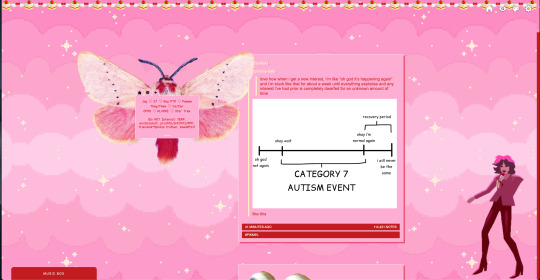
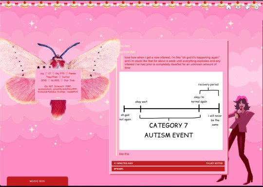
i deleted the text in the drop-down navigation so it appears as a little line that is otherwise not noticeable. this type of theme, the "redux edit," used to be very popular because having a drop-down menu let you cram a bunch of links that lead to sub-pages on your blog. i've done away with my sub-pages, but i still like the format of the "redux style" tumblr theme, for its minimal UI and for its customization options.
i separated my mobile description from my web description for formatting reasons. basically, most elements in tumblr themes are connected to specific text fields and toggles. i simply went to the section that was connected to my blog description and deleted it. the web description has to be manually typed inside of the CSS/HTML editor when i want to change it. whereas my mobile description is whatever i type in the "description" box of the normal tumblr theme editors.


i added code someone else made ("NoPo" by drannex42 on GitHub) which allows you to hide posts with certain tags on them. i did this to hide my pinned post, as it looks bad on desktop.
i replaced the tiny pagination arrows at the bottom with images that literally say "next" and "back" because the arrows were far too small/illegible. i know they aren't centered in the container i'm not sure how to fix that lol

i added a cursor

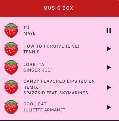
i installed a working music box ("music player #3" by glenthemes), and then added music by uploading MP3 files to discord and then using the links of those files as the audio sources. iirc i also had to make this element responsive and i aligned it so it would sit on the left side of my screen. i made the "album art" for each one the same strawberry pixel art
the moth is just a PNG i added and then moved around so it was behind my sidebar using the options that came pre-packaged with the theme
if you want something like the strawberry shortcake decoration at the top (called "banner" in the theme) your best bet is to google "pixel divider"
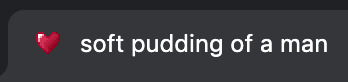
theme didn't support favicon so i added that in so i could have a little heart
ALSO:
this theme is. really weird about backgrounds. any background that i have ever set for it, i've had to do weird shit in photoshop. like making the background HUGE, mirroring it, etc. - because it would crop the image weird, or there would be a gap where there was no image. idk man, it's haunted. i'm sure there's a way to fix this but i am NOT tech savvy enough. anyway, patterns are probably your best friend. and if you DO want something that isn't a pattern, it's going to take a lot of trial and error. but i love this theme so i deal with it 😭
the sidebar image and the floating image do not scale. if your image is 1000 pixels, it will display at 1000 pixels. you'll either have to edit the code so that the theme scales the image for you, or resize any images before you add them
my white whale of theme editing (aside from the Weird Background thing) is that i cannot get infinite scrolling to work. i have tried every code out there. all of them break my theme. it makes me sad because like. i have music there for a reason. the idea is that people would listen to it while they scroll. unfortunately, the way it's set up now, the music will stop every time someone clicks "next" or "back" 💀
anyway sorry for rambling but i hope you enjoy the the theme and customizing it in the way that you want to!
24 notes
·
View notes
Text
Learn HTML and CSS: A Comprehensive Guide for Beginners
Introduction to HTML and CSS
HTML (HyperText Markup Language) and CSS (Cascading Style Sheets) are the core technologies for creating web pages. HTML provides the structure of the page, while CSS defines its style and layout. This guide aims to equip beginners with the essential knowledge to start building and designing web pages.
Why Learn HTML and CSS?
HTML and CSS are fundamental skills for web development. Whether you're looking to create personal websites, start a career in web development, or enhance your current skill set, understanding these technologies is crucial. They form the basis for more advanced languages and frameworks like JavaScript, React, and Angular.
Getting Started with HTML and CSS
To get started, you need a text editor and a web browser. Popular text editors include Visual Studio Code, Sublime Text, and Atom. Browsers like Google Chrome, Firefox, and Safari are excellent for viewing and testing your web pages.
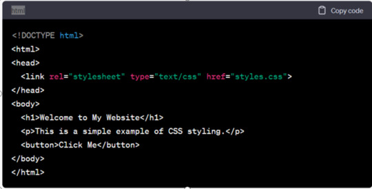
Basic HTML Structure
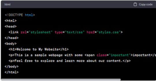
HTML documents have a basic structure composed of various elements and tags. Here’s a simple example:
html
Copy code
<!DOCTYPE html>
<html>
<head>
<title>My First Web Page</title>
<link rel="stylesheet" type="text/css" href="styles.css">
</head>
<body>
<h1>Welcome to My Web Page</h1>
<p>This is a paragraph of text on my web page.</p>
</body>
</html>
: Declares the document type and HTML version.
: The root element of an HTML page.
: Contains meta-information about the document.
: Connects the HTML to an external CSS file.
: Contains the content of the web page.
Essential HTML Tags
HTML uses various tags to define different parts of a web page:
to : Headings of different levels.
: Paragraph of text.
: Anchor tag for hyperlinks.
: Embeds images.
: Defines divisions or sections.
: Inline container for text.
Creating Your First HTML Page
Follow these steps to create a simple HTML page:
Open your text editor.
Write the basic HTML structure as shown above.
Add a heading with the tag.
Add a paragraph with the tag.
Save the file with a .html extension (e.g., index.html).
Open the file in your web browser to view your web page.
Introduction to CSS
CSS is used to style and layout HTML elements. It can be included within the HTML file using the <style> tag or in a separate .css file linked with the <link> tag.
Basic CSS Syntax
CSS consists of selectors and declarations. Here’s an example:
css
Copy code
h1 {
color: blue;
font-size: 24px;
}
Selector (h1): Specifies the HTML element to be styled.
Declaration Block: Contains one or more declarations, each consisting of a property and a value.
Styling HTML with CSS
To style your HTML elements, you can use different selectors:
Element Selector: Styles all instances of an element.
Class Selector: Styles elements with a specific class.
ID Selector: Styles a single element with a specific ID.
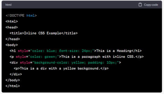
Example:
html
Copy code
<!DOCTYPE html>
<html>
<head>
<title>Styled Page</title>
<link rel="stylesheet" type="text/css" href="styles.css">
</head>
<body>
<h1 class="main-heading">Hello, World!</h1>
<p id="intro">This is an introduction paragraph.</p>
</body>
</html>
In the styles.css file:
css
Copy code
.main-heading {
color: green;
text-align: center;
}
#intro {
font-size: 18px;
color: grey;
}
CSS Layout Techniques
CSS provides several layout techniques to design complex web pages:
Box Model: Defines the structure of an element’s content, padding, border, and margin.
Flexbox: A layout model for arranging items within a container, making it easier to design flexible responsive layouts.
Grid Layout: A two-dimensional layout system for more complex layouts.
Example of Flexbox:
css
Copy code
.container {
display: flex;
justify-content: space-around;
}
.item {
width: 100px;
height: 100px;
background-color: lightblue;
}
Best Practices for Writing HTML and CSS
Semantic HTML: Use HTML tags that describe their meaning clearly (e.g., , , ).
Clean Code: Indent nested elements and use comments for better readability.
Validation: Use tools like the W3C Markup Validation Service to ensure your HTML and CSS are error-free and standards-compliant.
Accessibility: Make sure your website is accessible to all users, including those with disabilities, by using proper HTML tags and attributes.
Free Resources to Learn HTML and CSS
W3Schools: Comprehensive tutorials and references.
MDN Web Docs: Detailed documentation and guides for HTML, CSS, and JavaScript.
Codecademy: Interactive courses on web development.
FreeCodeCamp: Extensive curriculum covering HTML, CSS, and more.
Khan Academy: Lessons on computer programming and web development.
FAQs about Learning HTML and CSS
Q: What is HTML and CSS? A: HTML (HyperText Markup Language) structures web pages, while CSS (Cascading Style Sheets) styles and layouts the web pages.
Q: Why should I learn HTML and CSS? A: Learning HTML and CSS is essential for creating websites, understanding web development frameworks, and progressing to more advanced programming languages.
Q: Do I need prior experience to learn HTML and CSS? A: No prior experience is required. HTML and CSS are beginner-friendly and easy to learn.
Q: How long does it take to learn HTML and CSS? A: The time varies depending on your learning pace. With consistent practice, you can grasp the basics in a few weeks.
Q: Can I create a website using only HTML and CSS? A: Yes, you can create a basic website. For more complex functionality, you'll need to learn JavaScript.
Q: What tools do I need to start learning HTML and CSS? A: You need a text editor (e.g., Visual Studio Code, Sublime Text) and a web browser (e.g., Google Chrome, Firefox).
Q: Are there free resources available to learn HTML and CSS? A: Yes, there are many free resources available online, including W3Schools, MDN Web Docs, Codecademy, FreeCodeCamp, and Khan Academy.
#how to learn html and css#html & css course#html & css tutorial#html and css#html course#html css tutorial#html learn#html learn website#learn html#learn html and css#html and css course#html and css full course#html and css online course#how to learn html and css for beginners
3 notes
·
View notes
Note
How did ypu create the settings, saves, etc. Icon links? I'm very stumped on how to do that.
Heyy ~
It's just a stylised <<link>> macro. The icons are from Font Awesome (make sure you import the icons in your Javascript file) so you can directly use the icons in html on the StoryInterface passage or wherever your UI is. I'm using cerberus' template and I have a separate passage for the menu. You'd write it like this for example :
<<link '<i class="fa-solid fa-gear"></i>'>><<script>>UI.settings()<</script>><</link>>
You have to write your Html inside the single quote, inside the link macro. You can add multiple html tags and classes to style the links however you want in CSS. After closing the first <<link>>, you can write what script that button is supposed to trigger. You can use <<script>> for something like UI.settings() or UI.saves(). If you want, instead of a script, to have a link to another passage or a website, you can write it just like you would with a normal <<link>> :
<<link '<a href="https://gthiah-if.tumblr.com/" target="_blank"><i class="fa-brands fa-tumblr"></i>tumblr</a>'>><</link>> <<link '<i class="fa-solid fa-heart"></i>credits' 'credits'>><</link>>
Hope that's what you were asking about, if not or if you still have questions, let me know :^)
15 notes
·
View notes
Text
ToolsToEdit.in – Your Ultimate Free Toolkit for Everyday Digital Tasks
In today’s fast-moving digital world, being productive means using the right tools at the right time. But what if you could access over 30+ essential online tools in one place—without paying a cent? That’s exactly what ToolsToEdit.in offers: a centralized, no-cost platform built for students, teachers, professionals, content creators, and anyone who wants to get things done—fast and efficiently.
🌐 What Is ToolsToEdit.in?
ToolsToEdit.in is a multi-purpose online toolkit that combines the functionality of dozens of individual tools into one convenient, browser-based hub. From quick calculations to SEO audits, PDF conversions to text clean-up—this platform is designed to simplify your work, save you time, and help you perform complex tasks with just a few clicks.
👥 Who Is It For?
This site isn’t just for techies or web developers. ToolsToEdit.in is built for everyday users:
🎓 Students can calculate percentages, solve EMI questions, or convert between binary and text.
👨🏫 Teachers can create resources, check text readability, or compress files.
🧑💻 Content Creators & Bloggers can analyze SEO, clean content, and manage PDFs.
👥 General Users can generate strong passwords, spot phishing links, and much more.
🔧 Key Tool Categories and Features
Here’s a breakdown of what ToolsToEdit.in offers:
🧮 Calculator Tools
No need for separate apps—just launch and use:
BMI Calculator – Check body mass index.
Discount Calculator – Know how much you’re saving.
EMI Calculator – Plan your finances smartly.
Age Calculator – Get accurate age from date of birth.
Percentage Calculator – Solve quick percentage problems.
✍️ Text Utilities
Content handling made easy:
Word Counter – Know your length before publishing.
Case Converter – Switch between uppercase, lowercase, and more.
Remove Duplicate Lines – Clean up large text files.
Find & Replace – Mass replace words or phrases.
Binary ⇄ Decimal/Text Converters – Useful for coding and education.
Text Encoder/Decoder – Encrypt and decode web-safe content.
🔐 Security Tools
Keep your data secure:
Password Generator – Create complex passwords.
Password Strength Checker – Test how secure your password is.
Phishing URL Detector – Protect yourself from scams.
🔍 SEO Optimization Tools
Get your website found:
Meta Tag Analyzer – Improve search engine visibility.
Mobile-Friendly Test – Make sure your site works on smartphones.
Page Speed Analyzer – Identify and fix performance issues.
Sitemap Generator – Generate XML sitemaps for indexing.
Keyword Density Checker – Analyze your content for keyword balance.
Robots.txt Generator – Guide search engine bots effectively.
🎨 Design & Image Tools
Handy for bloggers, designers, and developers:
Color Picker Tool – Find and copy hex codes easily.
CSS Gradient & Animation Previews – Visualize effects before using them.
Box Shadow & Border Radius Preview – Quick CSS styling helpers.
Image Compressor – Reduce image file sizes without losing quality.
Image to Base64 Converter – Embed images in web code.
Image Color Picker – Get exact color details from any picture.
📄 PDF Tools
Manage documents like a pro:
Merge PDF Files – Combine multiple documents into one.
PDF to Image/Text/Word – Convert PDFs into different formats.
Image to PDF Converter – Make professional documents from images.
💡 Why ToolsToEdit.in Stands Out
✅ No Installations: Everything runs right in your browser.
✅ Free Forever: No subscriptions, no sign-ups, no hidden fees.
✅ Mobile-Friendly: Use it seamlessly across devices.
✅ Time-Saving: Get tasks done in seconds.
✅ Clean UI: Easy to use even for beginners.
📢 Final Thoughts
In a world of scattered tools, ToolsToEdit.in brings clarity and convenience. Whether you're a digital marketer doing an SEO audit, a student calculating your GPA, or a teacher preparing resources—this site empowers you to work smarter, not harder.
Visit www.toolstoedit.in and explore the full suite of tools today. It’s time to edit, create, calculate, optimize, and convert—all in one place.
1 note
·
View note
Text
Child Themes vs Parent Themes: What You Really Need to Know
If you’ve ever wanted to customize your website but were scared of breaking things, you’ve probably heard about child themes and parent themes. But what do these terms actually mean? And why should you care?
Let’s break it down in the simplest way possible — no confusing jargon, just clear answers that’ll help you make smarter choices with your WordPress themes.
What Is a Parent Theme?
Think of a parent theme as the main foundation of your website. It comes fully packed with everything you need — the design, layout, styling, and features.
You can install it and start using it right away. No problem there.
But here’s the catch: if you ever tweak its code directly and then update it later, all those changes? Gone.
This is where child themes step in to save the day.
So, What’s a Child Theme?
A child theme is basically a mini version of your parent theme — one that inherits everything from the parent but lets you make your own changes safely.
Think of it like this:
Parent theme = the full cake
Child theme = the icing you add on top
You’re not changing the base cake, just adding your own flavor to it.
This way, whenever the parent theme updates (which it should, for security and compatibility), your customizations stay safe and untouched.
It’s a must-know concept for anyone who wants to personalize their WordPress themes without breaking anything.
Why Use a Child Theme?
Using a child theme gives you total peace of mind.
✔ Safe customizations ✔ Easy maintenance ✔ Keeps your design updates separate ✔ Lets you tweak styles, functions, or layout freely
Many WordPress themes (like the ones you’ll find at webxThemes) are child-theme-ready — meaning they’re built to support this kind of setup right from the start. That saves you a lot of technical headaches.
When You Don’t Need a Child Theme
Not everyone needs to use one.
If you’re:
Only using the theme as-is
Making changes through the WordPress Customizer
Installing page builders like Elementor
…then you’re probably good with just the parent theme.
But the moment you plan to touch any code — whether it’s CSS, functions, or templates — using a child theme is the smart move.
That way, no matter how often your WordPress theme updates, your changes stay right where you left them.
How to Set Up a Child Theme
Good news — it’s easier than you think.
You can:
Create one manually with just a few lines of code
Or use a plugin like Child Theme Configurator (fast and beginner-friendly)
And if you’re using a theme from webxThemes, you’re in luck. We design all of our WordPress themes to work seamlessly with child themes, and we even provide starter child themes with some of our popular templates.
Final Thoughts
Child themes are like insurance for your customizations. If you’re planning to get hands-on with your website’s design or functionality, they’re a must.
Just remember:
Use a child theme if you're editing theme files
Stick to the parent theme if you're using it as-is or customizing through safe tools
Always choose themes that support child themes (like the ones at webxThemes)
That’s it — now you know exactly what matters when it comes to child vs parent WordPress themes. No fluff, just facts that help you make the right call.
Need help setting one up? Just ask — happy to guide you through it!
0 notes
Text
Styling is something that has been a part of our society since forever, really. Whenever you print certain text, it has to be edited and formatted. And to manage this, desktop publishing programs and word processing programs make use of styles. Word Processors offer you the provision of creating and saving styles for common features (headlines, captions etc.). When it comes to print design, styles help you combine a collection of formatting options into one. You can take the likes of bold, italics and Arial etc. and put them into a single style and then go on to make that style applicable to any selected text that you might have. And all this is done by using a sing style. Needless to say, this lowers your time consumption. Moreover, if you make any alteration in a certain style, that change can be applied throughout the places that style has been used in a document. All this is put to use just in the print design scene. Imagine the world of possibilities that open when styles are put to use on the web. There the significance of styles goes way beyond text formatting. Say, you decide to use styling for the purpose of changing background and link colors, or use CSS for creating styles that align images to a certain side of the page, add padding around text or images. You can even come up with multiple style sheets. Distinct style sheets for desktop, mobile devices and print pages, etc. It’s just a matter of what suits your preferences. These were just a handful of reasons that make CSS ever so beneficial in the modern day and age. People are focusing more and more on designing their webpages through this particular means. What Is CSS? Let’s take a look at how exactly CSS works for you. Let’s use an example for this. Say you’re creating a style for your headlines. For this, you first redefine your tag to create a large, blue and bold headline. Over time you feel that things have been too monotonous, there needs to be a little change in the looks. Now, if you weren’t using CSS, you would have had to go and open each webpage separately and make that particular change. But if you make use of CSS you can make changes to all the headlines simply by making a change in the style that contains formatting information for tag in the style sheet. Now CSS proves to be most useful whenever you decide to give your design a make-over by saving you hours, maybe even days of hard labor. Also, CSS will help make a distinction between the design part of the website and the content part. This proves to be beneficial not only for you, but also for the visitor. CSS Tutorials Learning CSS is very easy since there are plenty of free tutorials available on web as well as good web development books to refer. I found many high quality Youtube videos and made a playlist for you to conveniently view it. THE BENEFITS While we are talking about benefits that usage of CSS provides, let’s take a clear look at them point by point: Matching Standards: When you use CSS, it helps you maintain and comply with the current standards in the market. Internet standards are set by W3C, and even it suggests the use of CSS. That because CSS designs provides your website with flexibility, adaptability and also makes it a lot more accessible. Simplification: CSS helps you in simplifying the changes made to the designs. There are two different ways of saving your CSS file. They can either, be saved separately and then attached to multiple XHTML pages, or they can be saved at the very top of an XHTML page in the header section. No matter which, by editing the style you can make formatting changes. Multiple Style Sheets: As you get more and more familiar with CSS you can experiment with it yourself. You can even come up with more that one style sheet for the same webpage. Accessibility: Nowadays, some of the best designers in the world are pushing towards making everyone follow a standard when it comes to website making. They are trying to get more and more people develop their website using CSS.
Designing a website through CSS immediately makes your website accessible to a larger number of viewers. Accessibility does not just include people who use normal browsers. Visually impaired people also access the internet. Often times, they use special browsers, such as screen readers, which read out the content to them. Specialized browsers are used for a host of different reasons. Using CSS you can make sure that your website is accessible to all sorts of viewers. Design-Content separation: As we have discussed that CSS helps you form a distinction between design of the page and its content. You do not know who will stumble across your content, using what device. By marking a distinction between design and content you’re enabling the creation of separate style sheets for separate devices. Your content might be displayed using projectors, or someone might access it using a mobile device, you can never tell. Using CSS you up the adaptability of your webpage. The device can vary, but your webpage will make the necessary changes for a seamless display. Popularity Of CSS Google search trends demonstrate the popularity of CSS and latest version CSS3. The trend is downward however the search volume is still very high. Countries Where CSS is in High Demand CSS NITTY GRITTIES People tend to look at CSS as something that is highly complex, without really looking at the underlying concept behind it. It is understandable that this is a difference compared to that used in print. One thing that really tends to baffle people new to CSS is thinking of text and design as separate entities. Let’s say you wish to apply a particular set of formatting to a headline. Instead of applying it to that headline directly, you have to save it as a style in a separately file called an external style sheet. This will add up an extra step of applying that style, but you have the advantage that you can apply it to any set of content you want to. Another thing you might find challenging is dealing with the tons of style selectors that you have to select from. Understanding the different kind of style selectors, such as ID, class and tag selectors etc. is difficult. When you’re creating a style, no matter what type it is, it will always contain a selector and a declaration. The job of the selector is to identify the name and type of style. Another basic issue that people need to grasp is, understanding how CSS and HTML complement each other. Understanding their working is the key. Starting off with CSS can be a bit nerve wracking. But once you are thorough with the fundamental working of CSS, and start with creation and application of styles, everything will start falling place itself. There are numerous tutorials and forums where you can learn and discuss your problems, or take up new ideas. It will take some time, but you will get there. Maggie Sawyer is a creative web developer at MarkupHQ Ltd., a leading PSD to Html with vast experience in web development & design. She provides Html theme conversion services with 100% client satisfaction guarantee.
0 notes
Text
Randomly thinking about small protocols or protocol changes that I think should exist.
Prime example is Static HTTPS: I think there should be a companion protocol to HTTPS for handling static requests. This would be great for caching, general performance, and even saving storage/bandwidth on things like ActivityPub.
The gist of it is that HTTPS uses a static set of keys to negotiate a dynamic set of keys and dynamically encrypts your entire conversation with the server. It's impossible to do any sort of caching on HTTPS without decrypting it first, but also there's no way to make it unique either without things like php sessions (requiring logins or backchannel confirmations).
How this would work, using the existing HTTPS keys, a request would be made similar to HTTP where the connection itself is unencrypted, but the host/url will specifically be encrypted and the payload of the data sent in return will be encrypted. If you were to cache it the same encrypted request will net the same encrypted data (unless the file behind it gets updated of course). If headers must be added then those can be encrypted separately as well, but also support unencrypted where not necessary... everything would be avoiding using headers in general for this, especially as the files are static.
(Optionally the html could also include a key explicitly for that file)
This means that anything in the middle can cache data without necessarily knowing anything about it. Meaning that something like Cloudflare could provide caching for an HTTPS website without also having to have the key.
Obviously in less secure cases where it doesn't include a special key in the html it will mean that if someone knows what site you're accessing (often an easy guess from IP unless it's something like a cloudflare protected site) they can potentially identify the file by matching to their own browsing... but these should be unimportant files anyways (ie. the google logo, css style sheets, etc), even if visible they'll be effectively signed and you'll know the site wasn't tampered with in transit.
But the really special case shines in things like the fediverse where when I make a followers-only post with a picture attached... right now either the picture is relying on obscurity (publically visible if you know the address) or it has to be embedded in the post as it's sent to the recipient.
This protocol would mean that the html of the post could include the key to the file. The receiving server wouldn't even need to support this protocol or have any change at all in ActivityPub standard to show this image, but the image would still be visible to the recipient so long as their browser or client supported it.
Example: <a href="shttps://foggyminds.com/images/123456" key="101010101"> (obviously the key would be much longer usually)
A backwards compatible call when privacy isn't a concern (ie. google logo): <a href="https://foggyminds.com/images/123456" shttps=1> (Browser with no shttps support would use https normally, but one with that support would see the shttps=1 on there and change the protocol automatically)
0 notes
Text
Node JS and Databases
Steps to Build a Blog Application
1. Project Setup
First, you create a new Node.js project on your computer.
You also install necessary tools like Express (for creating a web server) and Mongoose or MySQL (for interacting with the database).
Nodemon can be used during development to restart the server automatically when code changes.
2. Folder Structure
Organize your project files so that everything is easy to manage.
Models: This folder will store database schemas (like the blog post structure).
Routes: These handle requests to different parts of your blog (e.g., showing all posts or creating new ones).
Views: These are the templates used to render your pages (like home, post details).
Public: A place for static files (CSS stylesheets, images).
3. Setting Up the Database
You can use either MongoDB (a NoSQL database) or MySQL (a relational database) to store your blog posts.
MongoDB is easier for beginners because you don't need to define strict tables.
You create a "Blog" model, which defines the structure of each blog post (e.g., it should have a title, content, and a timestamp).
The database connection is established at the beginning so the app can interact with it throughout.
4. Handling HTTP Requests with Express
The Express framework helps manage the flow of the app:
When a user visits the home page, the server sends a list of all blog posts.
When they click on a specific post, it shows the details of that post.
There is also a form where users can create new posts by submitting titles and content.
You create routes to manage these requests. Each route corresponds to a specific URL (e.g., / for the home page, /post/:id to view a post).
5. Creating Views (Templates)
To make your pages dynamic, you use EJS (or another templating engine like Handlebars). Templates allow you to display different content based on the data from the database.
For example:
The home page lists all available blog posts with links to view them individually.
The post page shows the title, content, and date of a single post.
There can also be a form on the home page that lets users submit new posts.
6. Routing and User Interaction
When users visit the homepage, the server pulls data from the database and shows a list of posts.
Clicking on a post’s link takes them to a detailed view of that post.
Users can also add a new post by submitting a form. When they do, the app saves the new post in the database and refreshes the list.
7. Starting the App
You need to make sure both the database server and Node.js app are running.
MongoDB needs to be started separately (if using it).
The Node.js server listens for requests and responds based on the routes you’ve created.
The server is accessible via http://localhost:3000. You can open this in a browser to test the blog app.
8. Testing the Blog API (Optional)
To make sure everything works correctly, you can use tools like Postman to test your routes:
Test retrieving all posts by making a GET request.
Test creating a new post by sending a POST request with sample data.
You can also build error handling to manage invalid inputs.
9. Future Improvements
After setting up the basic blog, you can add advanced features:
User Authentication: Allow users to log in and manage their own posts.
Comments: Add a comment section for each post.
Pagination: Break long lists of posts into pages for better readability.
CSS Styling: Make the blog look more attractive with a custom stylesheet.
Summary
This blog app involves setting up a Node.js server, connecting it to a database to store posts, and using templates to render pages. When users visit the blog, they can view, create, or manage posts, all of which are stored in the database. Express routes manage the requests, and the views ensure everything is displayed neatly.
This project gives you hands-on experience with backend development using Node.js, along with frontend templates, and a solid understanding of working with databases.
Fullstack Seekho is launching a new full stack training in Pune 100% job Guarantee Course. Below are the list of Full Stack Developer Course in Pune:
1. Full Stack Web Development Course in Pune and MERN Stack Course in Pune
2. Full Stack Python Developer Course in Pune
3. full stack Java course in Pune And Java full stack developer course with placement
4. Full Stack Developer Course with Placement Guarantee
Visit the website and fill the form and our counsellors will connect you!
0 notes
Text
How to Handle Complex PSD Designs During WordPress Conversion
Converting complex PSD designs to WordPress can be a challenging task, but with the right approach, you can achieve a seamless transition. Here’s a step-by-step guide to help you navigate the PSD to WordPress conversion process efficiently.
1. Understand the Design Thoroughly
Before starting the PSD to WordPress conversion, ensure you fully understand the PSD design:
Analyze Layout: Break down the design into sections like header, footer, content, and sidebar.
Identify Features: Note any special features such as sliders, forms, or interactive elements.
Check Responsiveness: Ensure you understand how the design should adapt to different screen sizes.
2. Prepare Your Tools
Equip yourself with the necessary tools for a successful PSD to WordPress conversion:
Design Software: Use Adobe Photoshop or a similar tool to inspect and slice the PSD.
Development Environment: Set up a local WordPress environment for testing.
Plugins and Themes: Install necessary plugins and choose a base theme if needed.
3. Slice the PSD
Slice the PSD into manageable pieces for the PSD to WordPress conversion:
Header and Footer: Extract these elements as separate images.
Content Areas: Slice images used in the content area, such as backgrounds and icons.
Buttons and Icons: Save these as individual images for easy integration.
4. Convert to HTML/CSS
Create a static HTML/CSS version of the design as a precursor to the PSD to WordPress conversion:
HTML Structure: Write clean, semantic HTML to match the design structure.
CSS Styling: Apply CSS to achieve the visual appearance. Use responsive design techniques like media queries for mobile optimization.
5. Integrate with WordPress
Convert your static HTML/CSS into a WordPress theme in the PSD to WordPress process:
Create a Theme: Set up a new WordPress theme directory and create necessary files (style.css, index.php, etc.).
Template Files: Break down the HTML into WordPress template files (header.php, footer.php, sidebar.php).
Theme Functions: Add theme support features in functions.php and enqueue styles/scripts properly.
6. Implement Functionality
Add dynamic functionality during the PSD to WordPress conversion:
Custom Post Types: Create custom post types if the design requires special content types.
Widgets and Menus: Set up widgets and custom menus as needed.
Plugins: Integrate plugins to add features like sliders, contact forms, or SEO enhancements.
7. Test Thoroughly
Ensure everything works as intended:
Cross-Browser Testing: Check compatibility across different browsers.
Mobile Responsiveness: Verify that the site looks good on various devices.
Performance: Test site speed and optimize images and scripts for better performance.
8. Debug and Optimize
Fix any issues that arise:
Debugging: Use debugging tools to identify and resolve errors.
Optimization: Optimize CSS and JavaScript files, and implement caching to enhance site speed.
9. Deploy and Monitor
Deploy the site to the live server:
Migration: Use migration tools or plugins to move from the local environment to the live server.
Monitor: Keep an eye on the site’s performance and user feedback to make necessary adjustments.
10. Documentation and Maintenance
Document the conversion process and plan for ongoing maintenance:
Documentation: Write detailed documentation for future reference.
Updates: Regularly update WordPress, themes, and plugins to ensure security and functionality.
By following these steps, you can effectively handle complex PSD designs during the PSD to WordPress conversion, ensuring a smooth transition from design to a fully functional website.
0 notes
Text
Learn CSS at TCCI

CSS stands for Cascading Style Sheets. Along with HTML, CSS is fundamental to web design. … CSS is a language used to detail the presentation of a web page’s mark-up language (most commonly HTML or XHTML) – such as colors, fonts, and layout.
CSS Conserves user bandwidth, Speeds up page rendering, Reduces design and development time, Reduces updating and maintenance time . Design-wise it is easier, clearer, flexible, and more resilient if these “concerns” are kept separate from one another.
What is CSS? CSS is a language that describes the style of an HTML document. It stands for Cascading Style Sheets. CSS is used to define styles for your web pages, including the design, layout, and variations in display for different devices and screen sizes.
CSS stands for Cascading Style Sheets. CSS describes how HTML elements are to be displayed on screen, paper, or in other media. CSS saves a lot of work. It can control the layout of multiple web pages all at once. External stylesheets are stored in CSS files.
TCCI computer classes provide the best training in online computer courses through different learning methods/media located in Bopal Ahmedabad and ISCON Ambli Road in Ahmedabad.
For More Information:
Call us @ 9825618292
Visit us @ http://tccicomputercoaching.com/
#Computer classes in bopal Ahmedabad#Computer classes in iscon-ambli road Ahmedabad#Web design course in bopal Ahmedabad#Web design institute in iscon-ambli road
0 notes
Text
Boost Your Website's Performance: A Comprehensive Guide to Optimization for Speed
In the fast-paced digital era, where users expect instant access to information, website performance plays a crucial role in retaining visitors and ensuring a positive user experience. Slow-loading websites can lead to frustration, increased bounce rates, and a negative impact on search engine rankings. To address these concerns, optimizing your website for performance and speed is paramount. In this comprehensive guide, we'll explore various strategies and best practices to boost your website's speed.
Optimize Images: High-resolution images can significantly contribute to slow page loading times. To address this issue, consider compressing images without compromising quality. Tools like ImageOptim, TinyPNG, and Squoosh can help reduce image file sizes. Additionally, implement lazy loading to load images only when they come into the user's viewport, saving bandwidth and speeding up initial page rendering.
Minimize HTTP Requests: Each element on a webpage, such as images, scripts, and stylesheets, requires a separate HTTP request. Minimizing the number of requests can significantly improve load times. Combine CSS and JavaScript files, use CSS sprites for small images, and reduce unnecessary elements to streamline your website's structure.
Leverage Browser Caching: Enable browser caching to store static files on a visitor's device, allowing quicker loading times for subsequent visits. Set appropriate expiration dates for different types of content to ensure that users always access the latest version of your site.
Optimize CSS and JavaScript: Reduce the size of CSS and JavaScript files by removing unnecessary code, white spaces, and comments. Employ tools like UglifyJS and CSSNano to minify and concatenate your files. Additionally, consider loading JavaScript asynchronously to prevent it from blocking the rendering of the page.
Implement Content Delivery Networks (CDNs): CDNs distribute your website's static assets across multiple servers worldwide, reducing latency and accelerating loading times. This ensures that users from various locations experience consistently fast page loads.
Prioritize Critical Rendering Path: Optimize the critical rendering path to prioritize the loading of essential elements, allowing users to see and interact with your site quickly. Utilize techniques such as inlining critical CSS and deferring non-essential JavaScript to enhance the initial loading speed.
Minimize Server Response Time: Optimize your server infrastructure and reduce server response time by using efficient server-side scripting languages, optimizing database queries, and leveraging caching mechanisms. Choose a reliable hosting provider that aligns with your website's needs.
Enable GZIP Compression: Compressing your website's files using GZIP can significantly reduce file sizes and speed up data transfer. Most modern browsers support GZIP compression, and enabling it on your server can lead to faster loading times for your visitors.
Optimize Fonts: Choose web-safe fonts and limit the number of font styles and weights to minimize the impact on page loading times. Consider using font-display: swap; in your CSS to ensure that text is visible even if custom fonts haven't fully loaded.
Regularly Monitor and Test: Use tools like Google PageSpeed Insights, Lighthouse, and GTmetrix to regularly test and monitor your website's performance. These tools provide insights into areas for improvement and help you stay proactive in maintaining a fast website.
Conclusion:
By implementing these optimization strategies, you can significantly enhance your website's performance, providing users with a seamless and enjoyable experience. Remember that ongoing monitoring and adaptation to evolving best practices are crucial for maintaining optimal speed as your website grows and evolves. A fast website not only improves user satisfaction but also positively influences search engine rankings, making it a key factor in the success of your online presence.
0 notes
Text
CSS basics in Web development | Top web design institute in Delhi
What is css?
CSS stands for Cascading Style Sheets. It is a language that describes how HTML (Hyper Text Markup Language) and XML (eXtensible Markup Language) elements are to be displayed on screen or paper or in other media.It helps designers and developers to decide how elements should be displayed, including their layout, fonts, spacing, colours and other visual aspects. It consists of Selectors and Declarations. Selectors state which elements the rule should apply to whereas Declarations state how to specify the properties and their values.
CSS helps in saving a lot of time and effort, by making it an important technology for creating visually appealing and user friendly websites. It can also control the layout of different web pages all at once. Also the external spreadsheets are stored in CSS files which are linked to HTML documents. It follows a ‘cascading order’ which states that multiple styles can apply to each element. Also CSS provides more attributes that plain HTML to define the look and feel of the website. Basically it is designed to enable the separation of presentation and content, including different layout, fonts and colours.
What Are The Benefits Of CSS ?
Let's now discuss why using CSS is significant.
Consistency
CSS helps in ensuring that the design remains consistent throughout the site. Also you can apply consistent styles to multiple styles on a website.
Accessibility
Css helps in improving the accessibility of the web By properly structuring and styling content, you can make it more accessible to users with disabilities, such as screen readers and keyboard navigation.
Reusability
CSS styles SS styles can be reused across different web pages. You don't have to repeat and write the code again and again. Hence this is particularly useful in larger websites or web applications.
Saves a lot of time and efforts
Css helps in saving a lot of time and effort, as the entire website can be changed by changing just one file. As CSS style definitions are saved in external CSS files.
Platform Independent
CSS is the script that offers consistent platform independence and can also support the latest browsers.
Example of CSS
In this example, we'll define CSS rules to style the text, background, and a button:
HTML:
Types of CSS
In CSS there are mainly three types or ways to apply styles to HTML elements They are inline, internal and external . Let us understand all three one by one:
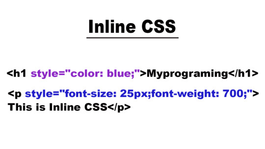
Inline CSS
Inline CSS involves applying styles directly to individual HTML elements within their HTML tags using the ‘style’ attribute. Common uses of CSS Inline include quick styling adjustments or applying unique styles to individual elements.
But this CSS type is not mainly recommended, as for styling entire web pages, especially for larger websites for following reasons it is disadvantageous:
● It can make the HTML code less maintainable and harder to update consistently.
● Adding CSS rules to every HTML element is time-consuming and makes your HTML structure messy.
● Inline styles can make your HTML code more cluttered and less readable. This can affect the maintainability of your code and make it harder to collaborate with other developers.
However it has some significant advantages like:
● Inline CSS is easy to apply on a small or on a single portion of a webpage. There is no need to modify external stylesheets or create additional CSS files, which can be a lot of time and effort consuming.
● These Inline CSS have a higher priority than styles defined in external stylesheets. This can be advantageous if you want that a particular style is always applied.
In CSS, you can apply styles inline directly to HTML elements using the "style" attribute.
Here's an example of CSS inline styling:
Internal CSS
Internal CSS, also known as embedded CSS or inline CSS. It is a method of adding multiple CSS (Cascading Style Sheets) styling rules directly within an HTML document.Internal CSS requires you to add a <style> tag in the <head> section of your HTML document.
But this CSS type is also not much recommended as:
● Styles cannot be easily reused across multiple pages,which makes it less efficient for maintaining a consistent feel and look across a website.
● For larger websites, managing styles becomes more challenging when styles are scattered throughout multiple HTML documents.
However it has some significant advantages like:
● It’s known for its simplicity, straightforward, user friendly and easy to use mainly for small scale projects.
● Also you can quickly type or prototype styles without creating separate CSS files.
Here's an example of CSS internal styling with an HTML document:
Step1- Open your HTML page and locate <head> opening tag.
Step2- Put the following code right after the <head> tag.
<style type="text/css">
Step3- Add CSS rules on a new line.
body {
background-color: blue;
}
h1 {
color: red;
padding: 60px;
}
Type the closing tag:
</style>
External CSS
External CSS is also a method of applying styles to HTML documents by placing the CSS code in a separate external file. This method is usually used in web development to keep the structure of web pages separate from their visual presentation. With the help of this, you can link your web pages to an external .css file which can be created by any text editor in your device (e.g., Notepad++).
Here are some major advantages of External CSS:
● It helps in separation of different concerns as it separates the content(HTML) from the presentation (CSS), making your code more organised and maintainable.
● It has a reusability feature as you can use the same CSS file for multiple HTML documents.
Although it faces some drawbacks that are:
● It requires an additional HTTP request to fetch the CSS file. This can lead to more time wastage as page loading time increases, particularly if the CSS file is larger or not properly optimised.
● To maintain multiple external CSS files, it can become a bit complex as a website grows. It may be challenging to keep track of which styles are used where, especially in larger projects.
Here's an example of CSS external styling with an HTML document:
HTML File (index.html):
Trainer from top web design institute in Delhi explains CSS is an important and an integral part of web development. As it plays a major part in creating user-friendly and visually appealing websites. It also allows web developers to control and manage the layout and design of the web content. It is a fundamental technology for web development that gives control and consistency in presenting and designing the web content. Also, among the three different types of CSS, the best practice is to adapt external CSS for most web projects. As it offers better code organisation, maintainability and reusability.
0 notes
Text
Inline CSS Editing: Quick Styling
Inline CSS editing is a valuable technique in web development, offering a quick and efficient way to style HTML elements. Unlike traditional CSS, which is typically defined in external stylesheets or within the Throughout this blog post, we will explore the advantages of inline CSS editing, discuss when it's most appropriate to use this method, and provide practical guidance on how to implement it effectively. Whether you're a beginner looking for a straightforward way to style your web page or an experienced developer in need of a quick solution, inline CSS editing has its place in your toolkit.
Advantages of Inline CSS Editing
Inline CSS editing offers a range of advantages that can be particularly beneficial in various web development scenarios. Here, we'll delve into these advantages to help you understand why this technique is a valuable tool in your styling arsenal: - Immediate Visual Changes: One of the most significant advantages of inline CSS editing is the ability to see instant visual changes on your web page. When you apply styles directly to an HTML element using the style attribute, there's no need to reload the page or wait for external stylesheets to update. This real-time feedback is invaluable during the development and debugging process. - Isolation and Specificity: Inline CSS provides a high level of specificity. Styles applied using inline CSS take precedence over external styles, making it easy to target specific elements without affecting the entire document. This isolation is particularly useful when you want to make precise adjustments without worrying about unintended side effects. - Efficiency for Small Projects: In small-scale web projects, creating a separate stylesheet might be overkill. Inline CSS eliminates the need for an external stylesheet, streamlining your development process. It's a practical choice for one-page websites, landing pages, or prototypes, as it simplifies the styling process without the overhead of managing separate CSS files. Let's explore these advantages in more detail: AdvantageDetailsImmediate Visual ChangesWhen you edit inline CSS, the results are instantly reflected in the browser. This immediacy allows you to fine-tune your design swiftly and observe the impact of your changes without delay.Isolation and SpecificityInline CSS provides a high level of specificity, ensuring that the styles you apply affect only the selected element. This specificity helps prevent unintended consequences for other parts of your website.Efficiency for Small ProjectsFor small web projects, inline CSS offers an efficient way to manage styles without the need for an external stylesheet. It simplifies development and keeps your codebase minimal and straightforward. These advantages make inline CSS editing a powerful and flexible tool for web developers. However, it's essential to use it judiciously and in the right contexts to fully leverage its benefits.
When to Use Inline CSS
Knowing when to use inline CSS is crucial to harness its benefits effectively. Inline CSS can be a valuable tool in specific scenarios, providing quick and targeted styling solutions. Here are some situations in which using inline CSS is the most appropriate choice: - Rapid Prototyping: When you're in the early stages of web development and need to create a prototype or a proof of concept, inline CSS can be a game-changer. It allows you to make rapid styling adjustments without the overhead of managing external stylesheets. This agility is perfect for quickly visualizing your design ideas. - Temporary or One-Time Styling: If you need to apply a unique style to a single element or a small section of your website, inline CSS is the ideal solution. It saves you from creating a separate stylesheet for a single use case, which can be time-consuming and unnecessary. - Override Global Styles: In some instances, you may want to override global or external styles temporarily. Inline CSS provides a simple and immediate way to override specific styles on individual elements without modifying your entire stylesheet. This can be handy when dealing with third-party components or libraries that have conflicting styles. Let's explore these scenarios in more detail: SituationDetailsRapid PrototypingDuring the prototyping phase, you often need to experiment with different styles and layouts quickly. Inline CSS allows you to make on-the-fly changes, providing a visual representation of your ideas without the hassle of managing extensive style rules.Temporary or One-Time StylingFor specific, isolated styling requirements that won't be reused, inline CSS is a pragmatic choice. It ensures that the style you define is applied only where needed, saving you from creating unnecessary stylesheets.Override Global StylesSometimes, you may encounter situations where you need to override certain global styles temporarily. Inline CSS allows you to take control of the styling of individual elements without affecting the rest of the website's design. By recognizing these scenarios and leveraging inline CSS judiciously, you can make your web development process more efficient and responsive to the specific needs of your project. HTMLThis is a styled heading
Best Practices
When using inline CSS, it's essential to follow best practices to ensure your styling is effective, maintainable, and in harmony with web development standards. Here are some recommended best practices to keep in mind while implementing inline CSS: - Keep It Minimal: While inline CSS offers immediate styling capabilities, it's best to use it sparingly. Avoid overloading your HTML elements with numerous inline styles. Instead, reserve inline CSS for specific, isolated styling needs to maintain clarity in your code. - Use Inline CSS Sparingly: Inline CSS should be reserved for scenarios where it provides clear advantages, such as rapid prototyping or temporary styling. For more extensive and repeated styling, it's better to rely on external stylesheets, which promote consistency and maintainability. - Avoid Inline Styles in Production: In production-level code, it's recommended to minimize the use of inline styles. External stylesheets, cascading styles, and well-structured CSS files are better suited for maintaining a cohesive and manageable design across your website. Let's delve deeper into these best practices: PracticeDetailsKeep It MinimalLimit the use of inline CSS to essential cases. Overusing inline styles can lead to cluttered HTML code and make it challenging to maintain and troubleshoot your styles.Use Inline CSS SparinglyInline CSS is best suited for situations where immediate visual changes are required. For consistent styling across your website, rely on external stylesheets and adhere to the DRY (Don't Repeat Yourself) principle.Avoid Inline Styles in ProductionFor long-term, production-ready projects, consider migrating inline styles to external stylesheets. This approach ensures a more organized and maintainable codebase, simplifying ongoing development and collaboration. By adhering to these best practices, you can make the most of inline CSS while maintaining code quality, readability, and scalability. It's a powerful tool when used judiciously, particularly in situations that demand quick and isolated styling adjustments.
Common Mistakes to Avoid
While inline CSS can be a valuable tool for specific styling needs, it's essential to be aware of common mistakes that developers might make when implementing inline styles. Avoiding these pitfalls ensures a smooth and efficient development process. Here are some common mistakes to steer clear of: - Excessive Inline Styling: One of the most common mistakes is applying inline styles to multiple elements within your HTML document. This can lead to a cluttered and hard-to-maintain codebase, making it challenging to track and manage your styles. - Conflicts with External Stylesheets: Mixing inline styles with external stylesheets can lead to conflicts and unexpected styling results. It's crucial to be mindful of how inline styles interact with your global styles to avoid unintended consequences. - Accessibility Concerns: Failing to consider accessibility is another common mistake. Inline styles can sometimes hinder accessibility features, such as screen reader compatibility or keyboard navigation. It's essential to ensure that your inline styles don't compromise the accessibility of your web content. Let's explore these mistakes in more detail: MistakeDetailsExcessive Inline StylingApplying inline styles to numerous elements can result in a messy and convoluted codebase. It's best to reserve inline styles for isolated, specific cases to maintain code clarity and ease of maintenance.Conflicts with External StylesheetsMixing inline styles with global styles from external stylesheets can lead to conflicts, as inline styles have higher specificity. Developers must carefully consider how these styles interact to avoid unexpected outcomes.Accessibility ConcernsAccessibility is a critical aspect of web development. Using inline styles that interfere with accessibility features can create barriers for users with disabilities. Developers should prioritize accessible design principles in their styling decisions. Avoiding these common mistakes can help you make the most of inline CSS while maintaining a clean and accessible codebase. By being mindful of these pitfalls, you can ensure a smoother and more effective web development process. CSS Flex Wrap is a powerful tool for responsive web! Learn about possible values in this overview 🧑💻🚀 pic.twitter.com/6cruQ4hibZ— David Mraz (@davidm_ml) November 4, 2023
FAQ
Here are answers to some frequently asked questions about inline CSS editing: What is inline CSS? Inline CSS refers to the practice of adding CSS styles directly to individual HTML elements using the style attribute. This allows you to style specific elements independently, and the styles are applied immediately, resulting in visual changes on the web page. When should I use inline CSS? Inline CSS is best suited for scenarios that require rapid prototyping, temporary or one-time styling, or the need to override global styles for specific elements. It provides quick and isolated styling solutions in these cases. What are the advantages of using inline CSS? The advantages of inline CSS include immediate visual changes, high specificity and isolation, and efficiency for small projects. It allows you to see instant styling results, target specific elements, and simplify styling for smaller-scale web projects. What are the best practices for using inline CSS? Best practices for inline CSS involve keeping it minimal, using it sparingly, and avoiding its use in production-level code. It's essential to maintain clarity, code organization, and adhere to established web development standards. What are common mistakes to avoid when using inline CSS? Common mistakes include excessive inline styling, conflicts with external stylesheets, and neglecting accessibility concerns. These mistakes can lead to cluttered code, unexpected styling results, and accessibility issues for users. These FAQs should help you gain a better understanding of inline CSS and how to use it effectively in your web development projects.
Conclusion
In conclusion, inline CSS editing is a valuable and versatile tool in web development, offering immediate styling capabilities for individual HTML elements. Throughout this blog post, we've explored the advantages and best practices of using inline CSS, as well as common mistakes to avoid. It's essential to use inline CSS judiciously and in the right context to make the most of its benefits. Inline CSS allows you to: - Make immediate visual changes with real-time feedback. - Isolate and target specific elements with high specificity. - Simplify styling for small projects, prototypes, and temporary adjustments. However, it's crucial to remember the best practices: - Keep inline CSS minimal to maintain code clarity. - Use it sparingly, reserving it for appropriate scenarios. - Avoid excessive use in production-level code. Additionally, steer clear of common mistakes like excessive inline styling, conflicts with external stylesheets, and accessibility concerns to ensure a smooth and effective development process. By understanding when to use inline CSS, following best practices, and avoiding pitfalls, you can harness the power of inline CSS for quick and targeted styling adjustments in your web projects. While it's not a replacement for traditional CSS, it's a valuable addition to your web development toolkit. We hope this blog post has provided you with the knowledge and guidance needed to utilize inline CSS effectively and make informed decisions about when and how to apply it in your web development endeavors. Read the full article
0 notes
Text
How to create svg icons online for free?
Free SVG icons are a powerful and smart means of communicating your ideas across audiences. Knowing that it would simply up the effect of your creation, these magic shapes are just so hard to overlook.
Graphic designers are often found to experiment with an array of methods for using icons on their websites, applications, and other digital content. Lately, the use of non-standard fonts has also gained tremendous popularity amongst designers. However, there has been a hullabaloo on the Internet over what’s better, icon fonts, or free SVG icons?

What’s Better- Icon Fonts Or Free Svg Icons?
Although icon fonts are highly customizable with its standard CSS (Cascading Style Sheets) styling rules over image icons, their designing is quite limited to monochromatic colors, size, standard transforms, and animations, They can also turn out to be glitchy, leading to the generation of multiple server requests. Additionally, your browser’s expected failure to identify the icon font can show up a blank space instead of fonts themselves.
On the other hand, SVG is a bundle of XML code rather than an image or a font. This makes them reasonably sized, highly performant, and scalable. Plus, they can undergo modifications without losing quality as opposed to icon fonts. You can also edit, color, or animate each individual bit of an SVG icon, unlike the conventional icon font.
Scalable Vector Graphics (SVG) refers to a vector image format that can be encoded with the help of Extensible Markup Language (XML) syntax. It is a scalable image that is created with a series of coordinates. It is directly linked within a browser, adding further to its scalability.
Guide on how to create SVG icons .
Let us understand how to create SVG icons. Here is much that you need to know for creating free SVG icons.
Drawing Icons
The first step to creating your own free SVG icon is to sketch them out. Draw each design on a distinct artboard and save each of them in a separate file. Now, open the vector design program of your choice. A vector image program entails drawing icons with the help of different colors, shapes, and path administration on a virtual drawing board. Following this, you export the .svg file, and the coding will take place behind the scene.
Affinity Designer, Inkscape, Sketch, DesignEvo., Vecteezy, CorelDRAW, and Vectr are some of the popularly used vector image programs. Alternatively, you can consider trying the readily available free SVG icons download on free vector icon websites out there.
Understand The Artboards
The artboard size won’t be a matter of concern if it’s a single icon. You will just need to ensure that it has a decent size, meaning neither too large nor too small. However, if you are seeking to create a uniform icon set, your artboards should be of the same size.
Draw Over A Grid
Consider drawing the icons over a grid so they turn out as symmetrical as possible. Also, use a square Artboard and customizable stroke size for maximum efficiency. If you are creating a mono-colored icon, it would be best to set your design tool to solid black. Do not worry, as it can be easily changed in the application or the stylesheet to your desired color.
Keep Shapes Simple
While creating free SVG icons, make sure that the vector shapes are simple. It will bring out a simpler SVG code that loads in the blink of an eye and is least susceptible to show-up errors. Cut out the unnecessary points. For instance, a circle must need not more than four-vector points. Anything more than that can easily invite technical fuss.
It is also essential to know that SVG images are based on universal shapes which can be created virtually by employing numbers and coordinates. The seven main shapes include line, path, circle, ellipse, polygon, and polyline. In terms, each shape is denoted as <circle>, <line>, and so on.
Layer Them Right
Consolidate shapes and layer them over one another to generate versatile imagery. Transform any grouped layers, circles, or ellipses to aggravate paths. This will assist you in creating free SVG icons with small file sizes and make sure that their quality remains intact across different channels.
You can reshuffle the artboards, retitle them, and export them as SVG files. Now, start creating a new Illustrator document with a resolution of 64x64px.
Read rest of the article here
0 notes
Text
6 Expert Solutions to Boost Your Website Speed
Frustrated with your website’s poor performance? Slow loading times not only deter visitors but also affect your search engines. Fortunately, there are several proven strategies you can use to increase your website’s speed and provide an optimal user experience. In this article, we will explore six effective ways to fix a slow website and improve its performance.
But first we discuss some of the serious drawbacks of a website that loads slowly. These drawbacks may have an adverse effect on user experience, search engine rankings, and general business success.
Here are a few of the main drawbacks:
Poor User Experience: Visitors become frustrated and have a bad user experience when websites take a long time to load.
Reduced Conversions: Slow pages, particularly in e-commerce, might result in reduced conversion rates. If a page loads slowly, users are less likely to finish a transaction or carry out other intended actions.
Reduced Engagement: Users may become less engaged when pages take a long time to load.
Higher Bounce Rate: This may have a negative effect on the functionality and search engine positioning of your website.
SEO Penalties: Search engines like Google take page speed into account when determining rankings. Which might limit organic traffic.
Mobile friendliness: On mobile devices with poorer internet connections, slow-loading pages can be particularly troublesome. This might make many of your viewers unhappy and damage your position on mobile search engines.
A slow-loading landing page may have a negative impact on your advertising campaigns by increasing expenditures and decreasing their efficacy. For example, Google Ads looks at how fast your webpage loads when deciding how good it is.

Effective Strategies to Enhance Website Speed
Optimize images
Optimize images for fast loading Images are an important part of web design, but they can significantly slow down page load times. You can reduce this by making sure your images are properly compressed without compromising quality. Use modern image formats like WebP, which offer better compression while maintaining visual integrity. Additionally, enable lazy loading, a technology that delays loading images until they begin to appear on the user’s screen, saving valuable loading time.
Use browser caching
Use browser caching to reduce load times Browser caching is a powerful technology that stores frequently used website resources, such as images, style sheets and scripts, on the user’s device. This allows for faster loading on subsequent visits. By setting deadlines for different types of content, you can ensure that visitors receive updated versions of resources when needed. This not only improves download times, but also reduces server load and bandwidth consumption.
Enable Content Delivery Networks (CDNs)
Enable Content Delivery Networks (CDNs) Content delivery networks, or CDNs, distribute your website content to multiple servers around the world. This geographic distribution ensures that users receive data from a nearby server, minimizing latency and load times. CDNs also provide protection against traffic spikes and provide security. Integrating a CDN with your website can greatly improve its speed and overall performance.
Minimize HTTP requests
Minimize HTTP requests Each element of your web page, including images, scripts, and style sheets, requires a separate HTTP request. The more requests, the slower your site will load. Simplify your web design by reducing the number of HTTP requests. Combine CSS and JavaScript files and consider using inline images or CSS sprites to minimize the number of elements fetched from the server.
Optimize your website code
Optimize your website code Efficient and clean code is a prerequisite for a well-functioning website. Remove unnecessary spaces, comments, and unnecessary codes. Minify your CSS, JavaScript, and HTML files to remove extra characters without affecting functionality. Also, if possible, prioritize asynchronous loading of scripts so that important content is loaded without waiting for non-essential scripts to finish.
For more details, please visit: https://www.startmetricservices.com/blog/6-expert-solutions-to-boost-your-website-speed/
0 notes
Text
Styling is something that has been a part of our society since forever, really. Whenever you print certain text, it has to be edited and formatted. And to manage this, desktop publishing programs and word processing programs make use of styles. Word Processors offer you the provision of creating and saving styles for common features (headlines, captions etc.). When it comes to print design, styles help you combine a collection of formatting options into one. You can take the likes of bold, italics and Arial etc. and put them into a single style and then go on to make that style applicable to any selected text that you might have. And all this is done by using a sing style. Needless to say, this lowers your time consumption. Moreover, if you make any alteration in a certain style, that change can be applied throughout the places that style has been used in a document. All this is put to use just in the print design scene. Imagine the world of possibilities that open when styles are put to use on the web. There the significance of styles goes way beyond text formatting. Say, you decide to use styling for the purpose of changing background and link colors, or use CSS for creating styles that align images to a certain side of the page, add padding around text or images. You can even come up with multiple style sheets. Distinct style sheets for desktop, mobile devices and print pages, etc. It’s just a matter of what suits your preferences. These were just a handful of reasons that make CSS ever so beneficial in the modern day and age. People are focusing more and more on designing their webpages through this particular means. What Is CSS? Let’s take a look at how exactly CSS works for you. Let’s use an example for this. Say you’re creating a style for your headlines. For this, you first redefine your tag to create a large, blue and bold headline. Over time you feel that things have been too monotonous, there needs to be a little change in the looks. Now, if you weren’t using CSS, you would have had to go and open each webpage separately and make that particular change. But if you make use of CSS you can make changes to all the headlines simply by making a change in the style that contains formatting information for tag in the style sheet. Now CSS proves to be most useful whenever you decide to give your design a make-over by saving you hours, maybe even days of hard labor. Also, CSS will help make a distinction between the design part of the website and the content part. This proves to be beneficial not only for you, but also for the visitor. CSS Tutorials Learning CSS is very easy since there are plenty of free tutorials available on web as well as good web development books to refer. I found many high quality Youtube videos and made a playlist for you to conveniently view it. THE BENEFITS While we are talking about benefits that usage of CSS provides, let’s take a clear look at them point by point: Matching Standards: When you use CSS, it helps you maintain and comply with the current standards in the market. Internet standards are set by W3C, and even it suggests the use of CSS. That because CSS designs provides your website with flexibility, adaptability and also makes it a lot more accessible. Simplification: CSS helps you in simplifying the changes made to the designs. There are two different ways of saving your CSS file. They can either, be saved separately and then attached to multiple XHTML pages, or they can be saved at the very top of an XHTML page in the header section. No matter which, by editing the style you can make formatting changes. Multiple Style Sheets: As you get more and more familiar with CSS you can experiment with it yourself. You can even come up with more that one style sheet for the same webpage. Accessibility: Nowadays, some of the best designers in the world are pushing towards making everyone follow a standard when it comes to website making. They are trying to get more and more people develop their website using CSS.
Designing a website through CSS immediately makes your website accessible to a larger number of viewers. Accessibility does not just include people who use normal browsers. Visually impaired people also access the internet. Often times, they use special browsers, such as screen readers, which read out the content to them. Specialized browsers are used for a host of different reasons. Using CSS you can make sure that your website is accessible to all sorts of viewers. Design-Content separation: As we have discussed that CSS helps you form a distinction between design of the page and its content. You do not know who will stumble across your content, using what device. By marking a distinction between design and content you’re enabling the creation of separate style sheets for separate devices. Your content might be displayed using projectors, or someone might access it using a mobile device, you can never tell. Using CSS you up the adaptability of your webpage. The device can vary, but your webpage will make the necessary changes for a seamless display. Popularity Of CSS Google search trends demonstrate the popularity of CSS and latest version CSS3. The trend is downward however the search volume is still very high. Countries Where CSS is in High Demand CSS NITTY GRITTIES People tend to look at CSS as something that is highly complex, without really looking at the underlying concept behind it. It is understandable that this is a difference compared to that used in print. One thing that really tends to baffle people new to CSS is thinking of text and design as separate entities. Let’s say you wish to apply a particular set of formatting to a headline. Instead of applying it to that headline directly, you have to save it as a style in a separately file called an external style sheet. This will add up an extra step of applying that style, but you have the advantage that you can apply it to any set of content you want to. Another thing you might find challenging is dealing with the tons of style selectors that you have to select from. Understanding the different kind of style selectors, such as ID, class and tag selectors etc. is difficult. When you’re creating a style, no matter what type it is, it will always contain a selector and a declaration. The job of the selector is to identify the name and type of style. Another basic issue that people need to grasp is, understanding how CSS and HTML complement each other. Understanding their working is the key. Starting off with CSS can be a bit nerve wracking. But once you are thorough with the fundamental working of CSS, and start with creation and application of styles, everything will start falling place itself. There are numerous tutorials and forums where you can learn and discuss your problems, or take up new ideas. It will take some time, but you will get there. Maggie Sawyer is a creative web developer at MarkupHQ Ltd., a leading PSD to Html with vast experience in web development & design. She provides Html theme conversion services with 100% client satisfaction guarantee.
0 notes