#SetDesign
Explore tagged Tumblr posts
Visit Tumblr Blog
Explore Tumblr blogs with no restrictions, modern design and the best experience.
Last Seen Tumblr Blogs


Fun Fact
130K people were victims of a chain letter scam that affected Tumblr in May 2011.
Photo


These dining chairs, seen in the 1974 horror comedy 𝒀𝒐𝒖𝒏𝒈 𝑭𝒓𝒂𝒏𝒌𝒆𝒏𝒔𝒕𝒆𝒊𝒏, were later reused in the 2003 film 𝑷𝒊𝒓𝒂𝒕𝒆𝒔 𝒐𝒇 𝒕𝒉𝒆 𝑪𝒂𝒓𝒊𝒃𝒃𝒆𝒂𝒏: 𝑪𝒖𝒓𝒔𝒆 𝒐𝒇 𝒕𝒉𝒆 𝑩𝒍𝒂𝒄𝒌 𝑷𝒆𝒂𝒓𝒍 before making their way to 2015’s 𝑪𝒓𝒊𝒎𝒔𝒐𝒏 𝑷𝒆𝒂𝒌. Where else have these chairs been used, and where are they now? Find out! Bit.ly/props001
#PropReuse#YoungFrankenstein#PiratesOfTheCaribbean#CrimsonPeak#Props#VintageChairs#FilmProps#SetDesign#MovieTrivia#FilmHistory#FurnitureInFilm#RecycledMovieCostumes
2K notes
·
View notes
Text


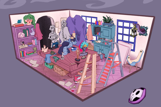
designing a workspace as a part of a mentorship program o7 sorry, I've been a bit inactive in terms of replying and fanart-ing! My schedule has been a bit crazy, but I'm going to try to get back into the swing of things organically
#visualdevelopment#visdev#bgdesign#bg#background#setdesign#props#fantasy#characterdesign#vickychendraws art#the bestiary#fantasy art#magic#crowwkui art
743 notes
·
View notes
Text


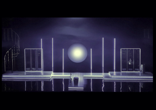
light / thgil
#design#marble#minimalism#geometry#setdesign#moda#marbledecor#designinspiration#blender3D#blendercycles#ambiance#concret#light#severance
48 notes
·
View notes
Text
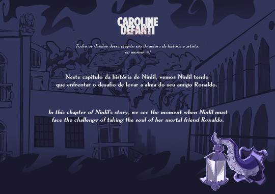
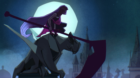
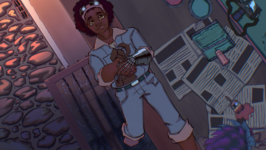
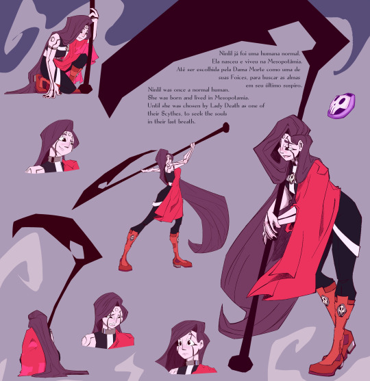
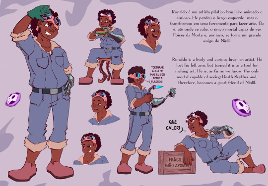
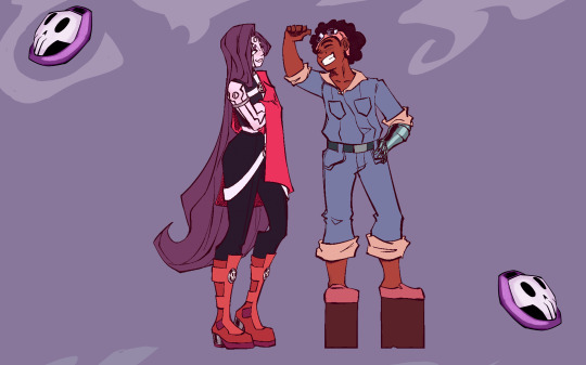

Ninlil - For a Mortal Project, CONCEPTS
2 notes
·
View notes
Text
Gregory Crewdsons work with flowers.


23 notes
·
View notes
Text


set design for Chylak Bags - "Sękacz"
photography by Borys Synak
2 notes
·
View notes
Text


Fabien LEDE
WoW – Word on Wirecard / Munich Kammerspiele / 2023
A Play by Anka Herbut Directed by Łukasz Twarkowski Stage Design Fabien Lédé
Info/Link
#setdesign#scenography#theatre#contemporaryart#installation#fabienlede#art#performance#neon lights#red
14 notes
·
View notes
Text

Georgina Pragnell for Lanvin
6 notes
·
View notes
Text
Women and Wallace- Set Design

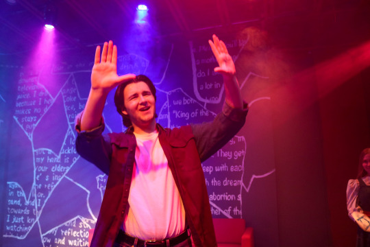
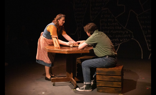
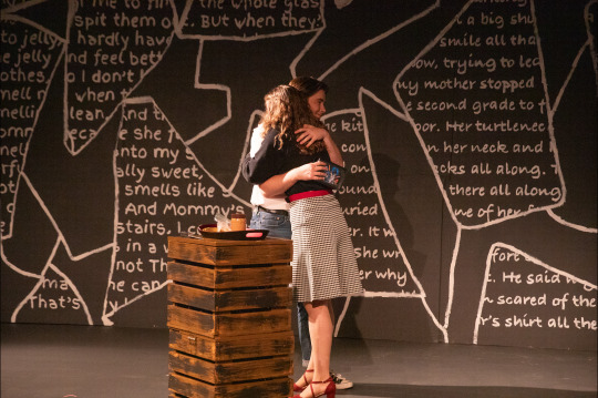
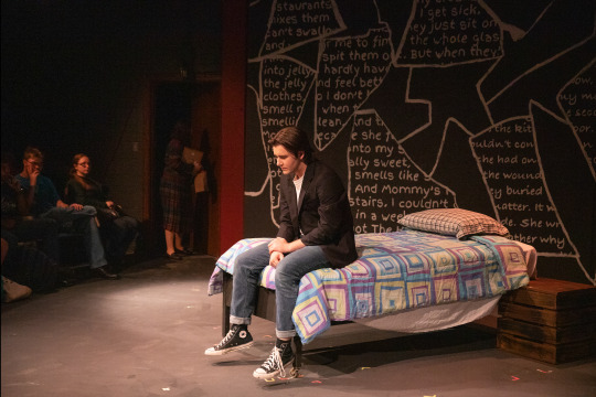
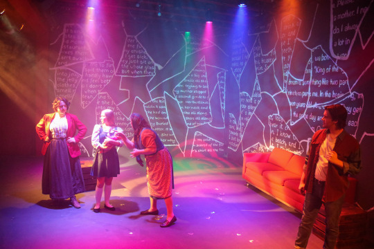
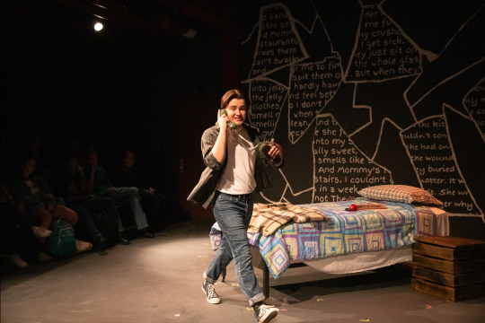
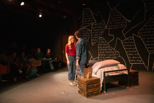
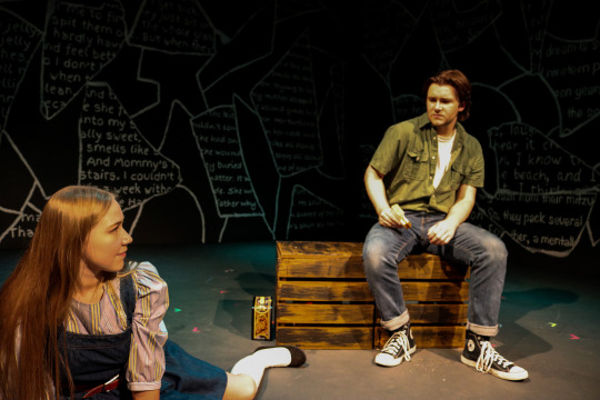
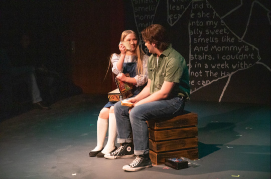
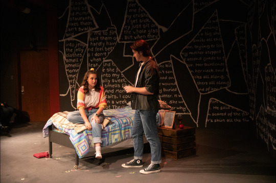
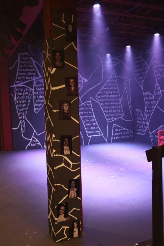
Women and Wallace, by Jonathan Sherman
Set Designer & Student Technical Director
Directed By Danielle Broyles
📸: Trey Spivey, Unknown, and Amber Cardenas
Content Warning: Women and Wallace contains themes of depression and suicide that may be present in set photos.
2 notes
·
View notes
Text


SETDESIGN FOR THE 65MM MOVIE „LEHITRAOT“ by NOAH LISCHKA & JOSHUA EWERT
2 notes
·
View notes
Text


Marble Bloc
#design#marble#minimalism#geometry#setdesign#moda#marbledecor#designinspiration#blender3D#blendercycles#ambiance#concret#bloc
4 notes
·
View notes
Text
#runway#cphfw#copenhagen fashion week#set building#on set#setdesign#aesthetic#minimal design#aesthetic style#designinspiration#design ideas#interior designing#designer#white interior#aesthetic post
15 notes
·
View notes
Text


#decor#decorpeint#peintredecor#peinture#dessin#manica#perspective#trompe l'oeil#setdesign#scenic art
0 notes
Text
Custom Props and Displays Singapore – Bespoke Signage Solutions
Get eye-catching custom props and displays in Singapore with iSignage. Specializing in unique signage fabrication, we expertly handle key production areas while outsourcing specialized tasks when needed. Our team ensures creative, impactful, and high level quality visual solutions that make any event memorable. From intricate props to large-scale displays, we bring your vision to life with precision and flair.

#CustomProps#DisplaysSingapore#CustomDisplays#SingaporeProps#EventProps#SingaporeEvents#DisplayDesign#ThemedDisplays#CreativeProps#EventStyling#SGevents#SetDesign#PropMaker#ExhibitionDisplays#SingaporeDesign#UniqueDisplays#CustomCreation#EventPlanning#PropsAndDisplays
0 notes
Text

The right paper
Finding the right paper for a project can sometimes be a real challenge. The right colour, the right format, the right grammage. We make sure that different colours can be combined well and harmoniously, that the quality is right and that each colour combination is aesthetically pleasing. The selected papers are characterised by a matt surface, versatility and colour intensity. In addition, all papers are FSC®-certified (Cradle to Cradle Certified® Silver). Some selected paper projects can be found on the website under „Projects“.
.
Das richtige Papier
Das richtige Papier für ein Projekt zu finden, kann manchmal eine echte Herausforderung sein. Die richtige Farbe, das richtige Format, die richtige Grammatur. Dabei achten wir darauf, dass sich verschiedene Farben gut und harmonisch kombinieren lassen, dass die Qualität stimmt und jede Farbkombination ästhetisch ansprechend ist. Die ausgewählten Papiere zeichnen sich durch eine matte Oberfläche, Vielseitigkeit und Farbintensität aus. Darüber hinaus sind alle Papiere FSC®-zertifiziert (Cradle to Cradle Certified® Silver). Einige ausgewählte Papierprojekte sind auf der Website unter Projekte zu finden.
#origami#paperprops#event#eventdesign#setdesign#bespoke#paperenginnering#kristinawissling#design#graficdesign#easter#mothersday#highquality#papercraft#paperart#paperartist#valentinesday#handmade#folding#geometry#ostern#muttertag#geschenkidee#muttertagsgeschenk#osterkoerbchen#osteranhaenger#deko#geschenk#fruehling#papierkunst
0 notes