#ShadowEffect
Explore tagged Tumblr posts
Visit Tumblr Blog
Explore Tumblr blogs with no restrictions, modern design and the best experience.
Last Seen Tumblr Blogs


Fun Fact
Mobile Tumblr US users spend an average of 4.04 minutes per session on the app.
Video
youtube
Laser Hair Removal Shedding Phase Explained | What the Shadow Means After Laser Treatment
Ever noticed those tiny dark dots after your laser hair removal session? Don’t worry — it’s not hair regrowth! 👀 Welcome to the shedding phase, a natural and crucial part of your laser hair removal journey. This short video from Paradise Wellness Clinic breaks down what’s really happening when you see that "shadow" after treatment.
💡 What is the Shedding Phase? After a successful laser session, the treated hair follicles begin to push out the remaining hair over 1–3 weeks. This results in what looks like "regrowth," but it’s actually dead hair being expelled from the follicle. This process is a strong indicator that the laser is working properly!
🔬 Why Does Shedding Happen? Laser hair removal targets the hair in its active growth phase (anagen). Once zapped by the laser, the hair root dies and the shaft detaches. The body then pushes it out naturally. This is not regrowth, but part of the process that leads to permanent hair reduction.
📍 Where to Get Safe & Effective Laser Hair Removal in Delhi? At Paradise Wellness Clinic, we use FDA-approved laser technology suitable for Indian skin types, with precision and comfort. Our team of trained dermatologists ensures safe, customized treatment plans for every skin and hair type.
📍 Clinic Locations:
Vasant Vihar – B7/1A, Block B, Vasant Vihar, New Delhi, Delhi 110057
Pitampura – Plot no. 6, Engineers Enclave, Harsh Vihar, Pitampura, New Delhi, Delhi 110034
📞 Call to Book: +91 97738 63777 | +91 97738 93377 🌐 Visit: www.paradisewellness.in
✅ FAQs Covered in This Video:
What is the laser hair removal shedding phase?
Is hair falling out after laser normal?
Why do I see black dots after laser hair removal?
Is it safe to exfoliate during shedding?
How many sessions until hair stops growing?
📚 Sources:
American Society for Dermatologic Surgery: https://www.asds.net
Mayo Clinic: Laser hair removal overview – https://www.mayoclinic.org
Dermatology Times – Laser hair removal trends and safety
Paradise Wellness In-Clinic Guides (2024)
🔔 Don’t forget to like, share & subscribe for more real skin transformations and honest treatment insights!
#youtube#LaserHairRemoval#SheddingPhase#ParadiseWellnessClinic#DelhiSkinClinic#LaserTreatmentResults#SkinCareIndia#ShadowEffect#HairRemovalJourney
0 notes
Text


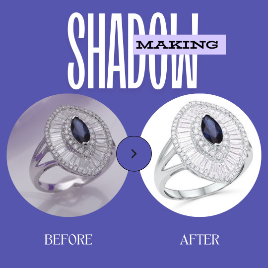
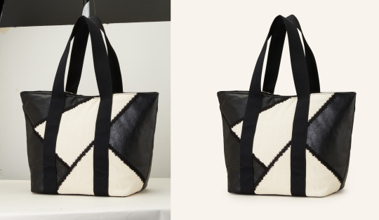
Before & after photo here.
Get eCommerce product image editing services at a competitive price. Our on-demand services include photo retouching, color correction, clipping path, and so on.
Thank you!
#clippingpath#Ecommerce#productimage#colorcorrection#photoretouching#bgromove#ShadowEffects#PhotoCleaning#tumblr#retouching
2 notes
·
View notes
Text
We create outstanding floating, drop, reflection, and natural shadows. Depending on your publishing platform, we will add the right shadow effect to your photo.
https://clickthephoto.com/image-shadow-making-services/
0 notes
Text
Let Your Product Stand Out with Shadow-Making Services
Need to add depth and dimension to your product images? Our shadow-making service has got you covered! 💡
Transform your photos into eye-catching masterpieces and stand out on social media. 🚀
0 notes
Photo
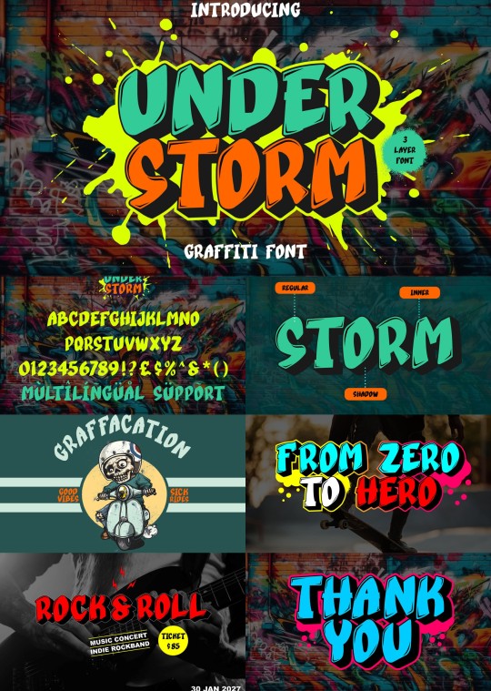
This graffiti font features three layers: regular, inner shadow, and outer shadow, adding depth and dimension to typography, creating a captivating 3D effect with bold and edgy vibes.
Link: https://l.dailyfont.com/1Oq0C
#aff#Typography#DesignInspiration#FontLovers#GraphicDesign#ArtisticFonts#VisualIdentity#CreativeAgency#DigitalArt#ModernTypography#StreetArt#ExperimentalFonts#BoldTypefaces#ShadowEffects#TexturesAndPatterns#UnconventionalFonts#UrbanStyle#EdgyVibes
1 note
·
View note
Text
Shadow Play: Mastering Box Shadow in CSS

Introduction
Welcome to the world of shadows in web design! In this blog post, we'll delve into the fascinating realm of box shadows in CSS and how mastering them can elevate your design game. Box shadows add depth, dimension, and a touch of magic to your web elements, making them visually appealing and modern. Whether you're a beginner looking to grasp the basics or an experienced developer seeking advanced techniques, this guide will walk you through the ins and outs of box shadows. Get ready to unlock the full potential of this powerful CSS feature and add a captivating layer to your web projects.
Understanding Box Shadow
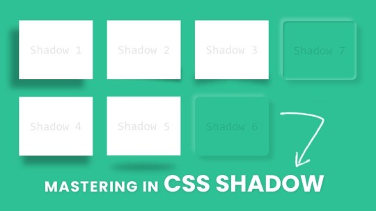
Box shadow is a versatile CSS property that allows you to add visual depth and dimension to elements on your webpage. It creates the illusion of elements lifting off or casting shadows, contributing to a more immersive and engaging user experience. Let's break down the key components of the box shadow property: - Color: The color of the shadow, specified in a variety of ways, such as named colors, hex codes, or RGB values. - Blur: The blur radius determines how blurry or sharp the shadow appears. A higher value results in a softer, more diffused shadow. - Spread: This property controls the size of the shadow. A positive value increases the size, while a negative value decreases it. - Inset: An optional keyword that creates an inner shadow, giving the appearance that the element is pressed into the page. Here's an example of a basic box shadow declaration: CSS.box { box-shadow: 10px 10px 20px #888888; }
Creating Basic Shadows
Now that we've laid the groundwork for understanding box shadows, let's dive into creating some basic shadows to enhance the visual appeal of your web elements. Creating a basic shadow involves specifying the color, blur, and spread properties to achieve the desired effect. Here's a step-by-step guide to creating a basic box shadow: - Choose the Element: Select the HTML element to which you want to apply the box shadow. This could be anything from buttons to cards or images. - Define the Shadow: Use the box-shadow property in your CSS to define the shadow. For example: - CSS.basic-shadow { box-shadow: 5px 5px 10px #333333; } CSS.radial-shadow { box-shadow: radial-gradient(circle, #4CAF50 0%, transparent 100%) 10px 10px 20px; }
Optimizing for Performance
See the Pen CSS Box Shadow Examples by vavik (@vavik96) on CodePen. While box shadows can enhance the visual appeal of your website, it's crucial to consider performance optimization to ensure a smooth and efficient user experience. Implementing box shadows irresponsibly can lead to increased page load times and negatively impact overall performance. Here's a guide on how to optimize box shadows for better performance: - Limit the Use of Shadows: Avoid applying box shadows to a large number of elements on a page. Excessive shadows can contribute to increased rendering times and slower performance. Reserve shadows for key elements that genuinely benefit from the visual enhancement. - Use Conservative Shadow Values: Opt for smaller blur radii and spread values, especially for shadows that don't require a pronounced effect. Smaller values contribute to faster rendering times while still providing a subtle visual lift. - Avoid Animating Shadows: Animating box shadows can be resource-intensive. If possible, limit or avoid shadow animations, particularly on elements that are frequently interacted with or visible on the screen. - Consider CSS Hardware Acceleration: Leverage hardware acceleration for smoother rendering. This can be achieved by applying shadows to elements that have their own GPU layers, such as elements with the CSS property transform: translateZ(0);. Additionally, here's a quick reference table summarizing key optimization tips: Optimization TipDescriptionLimit the Use of ShadowsAvoid excessive application of box shadows to maintain optimal performance.Use Conservative Shadow ValuesOpt for smaller blur radii and spread values for faster rendering.Avoid Animating ShadowsMinimize or avoid animations on box shadows for improved performance.CSS Hardware AccelerationApply shadows to elements with GPU layers for smoother rendering. By following these optimization techniques, you can strike a balance between visual enhancement and website performance. Remember, thoughtful and judicious use of box shadows contributes to a polished design without compromising speed and responsiveness.
Practical Applications
Now that you've honed your skills in mastering box shadows, it's time to explore practical applications where these subtle yet powerful design elements can make a significant impact on your website. Let's delve into real-world examples of how box shadows can enhance various elements and contribute to a visually appealing user interface. - Card Components: Implement box shadows on card components to create a sense of elevation and separation from the background. A subtle shadow can make cards appear as if they are floating, adding a modern touch to your layout. - Buttons: Apply box shadows to buttons to make them visually stand out and convey a sense of interactivity. Experiment with shadow intensity to find the right balance between a subtle lift and a more pronounced 3D effect. - Images and Thumbnails: Enhance the presentation of images and thumbnails by adding shadows. This technique provides a subtle border and makes the images pop on the page, especially when placed on a light background. - Navigation Menus: Use box shadows to distinguish navigation menus from the rest of the content. Shadows can help create a layered effect, making it clear that the navigation is a separate and interactive element. Here's a quick reference table summarizing practical applications of box shadows: ElementPractical ApplicationCard ComponentsCreate elevation and separation with subtle box shadows.ButtonsEnhance interactivity by applying shadows to buttons.Images and ThumbnailsAdd a subtle border and make images stand out with shadows.Navigation MenusDistinguish menus with layered effects using box shadows. As you integrate box shadows into these elements, remember to maintain a consistent design language throughout your website. Striking the right balance between visual enhancement and coherence contributes to a seamless and aesthetically pleasing user experience.
Common Mistakes to Avoid
While mastering box shadows can significantly enhance your web design, it's essential to be aware of common pitfalls that can lead to unintended and undesirable outcomes. Steering clear of these mistakes ensures that your use of box shadows contributes positively to the overall aesthetics and user experience of your website. Let's explore some common mistakes and how to avoid them: - Excessive Use: Avoid the temptation to apply box shadows excessively throughout your site. Overusing shadows can clutter the visual hierarchy and negatively impact performance. Instead, selectively apply shadows to key elements that benefit from the enhancement. - Contrast and Readability: Be mindful of the contrast between the shadow color and the background. If the contrast is too high, it can affect text readability or create a distracting visual effect. Opt for subtle shadows that complement the overall design without overpowering the content. - Uniform Shadow Values: Using the same shadow values for every element may result in a monotonous design. Vary the shadow properties based on the context and size of the element to achieve a more dynamic and visually interesting layout. - Ignoring Performance: Failing to optimize box shadows for performance can lead to slow page load times. Limit the number of elements with box shadows, use conservative shadow values, and avoid unnecessary shadow animations to ensure a smooth user experience. Here's a quick reference table summarizing common mistakes and their solutions: MistakeSolutionExcessive UseApply shadows selectively to key elements for a clutter-free design.Contrast and ReadabilityEnsure a balanced contrast between shadow color and background for optimal readability.Uniform Shadow ValuesVary shadow properties based on element size and context for a dynamic layout.Ignoring PerformanceOptimize shadows for performance by limiting elements, using conservative values, and avoiding unnecessary animations. By steering clear of these common mistakes, you can leverage box shadows effectively, enhancing the visual appeal of your website while maintaining a seamless and performant user experience.
FAQ
Explore answers to frequently asked questions about mastering box shadows in CSS. Whether you're troubleshooting common issues or seeking clarification on specific aspects, this FAQ section is designed to provide helpful insights and solutions. Q: Can I apply box shadows to any HTML element? A: Yes, box shadows can be applied to most HTML elements, including divs, buttons, images, and more. However, consider the purpose and visual impact before adding shadows to ensure a cohesive design. Q: How do I create a box shadow with a transparent color? A: To achieve a box shadow with a transparent color, use RGBA or HSLA values for the color property, adjusting the alpha channel to control transparency. For example: box-shadow: 5px 5px 10px rgba(0, 0, 0, 0.5); Q: What is the impact of box shadows on website performance? A: Excessive or unoptimized use of box shadows can impact performance by increasing page load times. It's recommended to limit the number of elements with shadows, use conservative shadow values, and avoid unnecessary animations for optimal performance. Q: Can I animate box shadows for dynamic effects? A: While it's possible to animate box shadows, it's important to consider the potential impact on performance. Avoid excessive shadow animations, especially on frequently interacted elements, to maintain a smooth user experience. Q: Are there alternative techniques for creating depth without box shadows? A: Yes, alternative techniques include using borders, gradients, and pseudo-elements to create depth and visual interest. Experiment with different approaches to find the method that best suits your design goals. Feel free to refer to this FAQ section as you navigate the nuances of working with box shadows, addressing common queries and optimizing your approach for a seamless and visually pleasing web design.
Conclusion
Congratulations on completing this journey into the art of mastering box shadows in CSS! Throughout this guide, you've learned the fundamentals of box shadows, explored advanced techniques, and discovered practical applications that can elevate your web design skills. As you continue to integrate box shadows into your projects, keep in mind the importance of balance. Strive for a harmonious design where shadows enhance the user experience without overwhelming the visual landscape. Experiment with different values, apply shadows selectively, and consider the unique context of each element to achieve optimal results. Remember to prioritize performance by avoiding common mistakes, such as excessive use of shadows and neglecting optimization. By following best practices, you can ensure that your web pages load quickly and provide a seamless experience for your visitors. Whether you're creating subtle shadows for a clean and modern look or experimenting with advanced techniques for a bold and dynamic design, box shadows offer a versatile tool to express your creativity in web development. Thank you for exploring the world of box shadows with us. May your future designs be visually captivating, user-friendly, and optimized for top-notch performance. Happy coding! Read the full article
0 notes
Link
#AdaptiveResolution#AmbientOcclusion#Anti-Aliasing#ColorCorrection#DynamicLighting#FieldofView#GraphicsSettings#MTGArena#PerformanceOptimization#Post-ProcessingEffects#Resolution#ShadowEffects#TextureFiltering#V-Sync#VisualExperience
0 notes
Text

#eCommercePhotoEditing #ProductImageEditing #PhotoRetouching #BackgroundRemoval #ShadowEffect #ProfessionalEditing
"Enhance your online store with high-quality e-commerce product photo editing services. Background removal, retouching, shadow effects & more for stunning product
4 notes
·
View notes
Text

Our Product Shadow Service adds depth and dimension, making your items stand out in photos! Whether you're in e-commerce, advertising, or product photography, perfect shadows can elevate your brand and attract more customers.
✅ What we offer:
Realistic drop shadows
Soft or hard shadow effects
Perfect for product listings, catalogs, and ads
Quick and precise editing
Give your products the professional look they deserve and boost sales with stunning visuals!
#ProductShadowService #ShadowEffect #PhotoEditing #EcommercePhotography #ProductPhotography #VisualEnhancement #DropShadow #ImageEditing #PhotographyServices
0 notes
Text

A crisp image of a product on a clean white background with a soft, natural shadow, creating a minimalistic and professional look. The shadow adds depth, making the product stand out.
For more information please contact us: Website: www.choosygraphics.com Email:[email protected] WhatsApp: +8801724680810 Call: +8801724680810
whitebackground #softshadow #minimalistic #cleanlook #depth #productphotography softshadow #naturalshadow #shadoweffect #realisticshadow #shadowdepth #shadowphotography
1 note
·
View note
Text

Improving image appearance with realistic shadows is one of the hallmarks of expert image editing. The ability to create natural shadows is an important aspect of the Adobe Photoshop skill set. This detailed Photoshop lesson will teach you how to produce realistic or natural shadows for product images.
🌐Learn More: https://ukclippingpath.com/how-to-give-natural-shadow-effect-in-photoshop-quickly/
✅#naturalshadows #eCommercephotographs #shadoweffect #clippingpath #HowToCreate #ukclippingpath
0 notes
Text
The Importance of Shadow Creation in Product Photography

📸 Level Up Your Photography Game with Our Shadow Making Service 🎨 Enhance Your Images and Impress Your Audience!
0 notes
Text

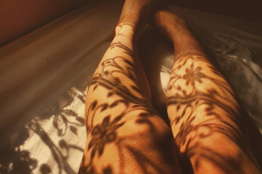

☀️Comme un collant ☀️
#art#artists on tumblr#leggs#light#shadowandlight#shadoweffect#shadow#photo#my photography#photography#myphoto
12 notes
·
View notes
Text
Looking to enhance your product photos? Our Best Photoshop Drop Shadow Service adds depth and realism.
#DropShadowService#ShadowEffect#ProductShadow#EcommerceEditing#ImageShadow#PhotoEditing#ShadowCreation#ShadowManipulation#GraphicDesign#ProductPhotography#ShadowOverlay#ShadowRetouching#ProfessionalEditing#ShadowEnhancement#VisualEffects#ShadowPlacement#ShadowRendering#ShadowEditing#CreativeEditing
0 notes
Photo

Average-quality photos can ruin any good impression. Especially if this happens in eCommerce or any other business, the loss can be huge. But if you invest a tiny amount, you can improve the quality of all of your pictures.
Graphic Experts Online (GEO) has been providing a photo enhancement service online for a long time. Our highly skilled editors make us one of the best in the market for such photo editing services.
0 notes