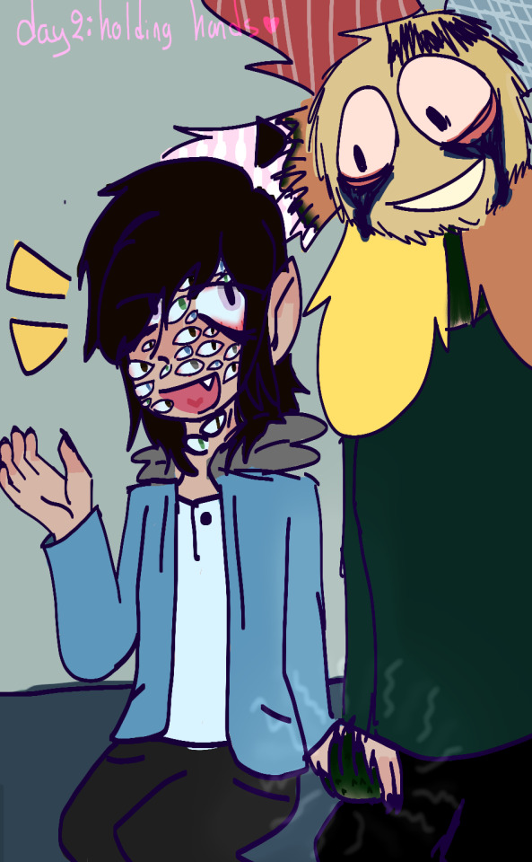
#The artstyle is simple but so effective
Text


If tomorrow would ever, if tomorrow would come
What I'd give just to grow some flowers with you
↳ Itterashai - Ai Higuchi
#attack on titan#shingeki no kyojin#eren yeager#mikasa ackerman#eremika#aotedit#myedit#mygif#fav song project#I LEGIT CRIED AT THIS#The artstyle is simple but so effective#this and the previous ED both are placed in flower meadow#but its the exact opposite vibe...#AAAAAAHH save me cabin AU#also big kudos for the translation my heart just cant
42 notes
·
View notes
Text
GUESS WHO REACHED 200 FOLLOWERS? THIS GUY!!
I've literally only been here for two months and I'm already at 200... hot damn. That may not seem like a lot to some, but it is to me. To celebrate, I'm hosting a DTIYS! They'll be open for the entirety of June (and maybe longer if I feel like it, who knows). Anyone is free to participate!
I was originally going to do something much more intricate, but I figured it'll be easier for some artists to just make a simple drawing, so here we are! The... the perspective is a little weird, don't look too much at it... please...

What is a DTIYS?
For those of you who don't know, DTIYS is an acronym. It simply stands for "Draw This In Your Style". It means what it sounds like, remake this drawing in your own artstyle! Customize it how you wish, tweak the color palette, redo the composition, add some effects, change the background, and more! Go crazy with it. I'm entrusting this into your hands, you're more than free to do what you wish with it!
Hope you have fun with this, artists!
Textless ver under cut

#my art#tmnt#tmnt mm#tottmnt#mm donnie#tottmnt donnie#DTIYS#EDIT: FUCK I MESSED UP THE BACKGROUND COLORS AUGH I NEED TO FIX THOSE ONE SEC
93 notes
·
View notes
Note
VFX ask! You've mentioned before that Jessica the Liberated has notably good bullet and glass shattering VFX, would you be willing to break down what makes them stand out?
Okay yes absolutely I will, and in order to do so, I am going to briefly talk about Arknights' history of guns because this is my feed and you can't stop me. This one will probably be long. I wanted it to be short. But it is not.
Guns in AK's worldbuilding are extremely rare, with only Blacksteel, Lateran, and collab ops wielding guns. So there's a sort of weight towards making the rare gun wielder... feel like they're using a gun, making them feel distinct from a crossbow.

Early on, AK did this in a very very simple way. Simple, single color muzzle flash, impact spark, no visible projectile. All the guns worked hitscan, which did really help to sell the illusion of a gun, it hits instantly.
Exusiai even amps it up a little and adds a visible bullet trail when she's in Unloading Mode!
But for a time, because of how rare guns were, that was kinda... It. After Nacho Cheese Executor, the next wielder of a traditional gun was the Rainbow 6 Siege Operators?? Really??
R6S is extremely important. Being from a shooter-ass shooter game, they had a lot of reason to make them feel like real guns. So what does Ash do? Well!
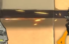
That's a VISIBLE BULLET baby!
It's WILD that removing the single biggest trait about guns - that they are instant - does a LOT to actually help sell that it is a Real Gun.
But on top of that, they do a few interesting things. The muzzle flash isn't just a single flash, it's a semi-realistic looking muzzle flash that also releases sparks. The bullet trail emits sparks as well, eschewing AK's stylization for the sake of making it feel like a Real Bullet Trail. This really helps sell the
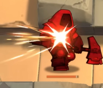
Even on the impact, there's no Textures or traditional bursts to be found - instead it is black, white, and red sparks alongside a very very layered flash of light. This is really unique in AK, and it serves brilliantly to juxtapose the R6S ops within the world of Terra, while still being over-the-top enough to fit in within the game's cartoony artstyle.
What's interesting is that these choices carried forwards in the future! Enforcer has very realistic-looking muzzle smoke with Ash's black/white/red sparks. Meanwhile, Insider has a visible bullet and sparks coming out of the muzzle flash!
Also I just barely noticed while writing this but all the Lateran use the shape of their wings as part of their effects! Exusiai's bullet trails are triangular like her wings, Ezell's impacts are dark iregular polygons with a lip like his, Insider's trail is rectangular like his, and Cool Ranch Executor's shots are shattered diamonds that fade to black as they get closer to him. Neat!! That's SUPER fucking cool.
(Also notable is that Exusiai and Ezell's effects are the only lateran guns that don't have a predominantly white aesthetic. Just a little treat for Exu Errari Believers)
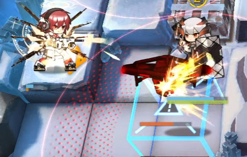
So, with a history of four ops with Real Guns and a bunch with weird magic guns, how do you make an operator whose gimmick is that she is definitively Terran who also uses a fuck ton of Guns?
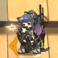

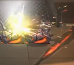
Jessica's muzzle flash is a realistic-esque flash that quickly fades into a burst texture. She gives off a few sparks like Ash does, but there are few of them, and they're really large for stylization. Also her bullet is much larger, but is distinctly a realistic bullet.
I wish so badly I could get footage of this one properly but an image will have to do. The trail of the bullet is a rotating mesh spiralling like the bullet is rotating. Also the bullet itself is glowing, allowing it to stand out better against the background.
And when it hits, hooooly shit. There's blurry, semi-realistic looking light textures flying off the enemy, sparks, and the same hitflash she has on her muzzle flash (cool asset reuse there!) They went all out to show the impact of her shot, since it is a Real Ass gun.
AND ALL THIS FLAIR AND DRAMA FOR JUST HER NORMAL ATTACK. THIS IS OFF-SKILL. When she's on-skill...
WHOO. WHOOOO. WHOOOO.
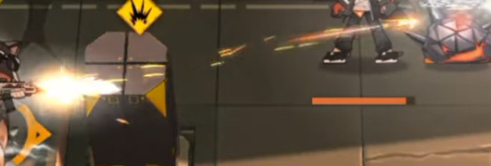
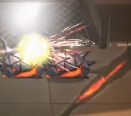
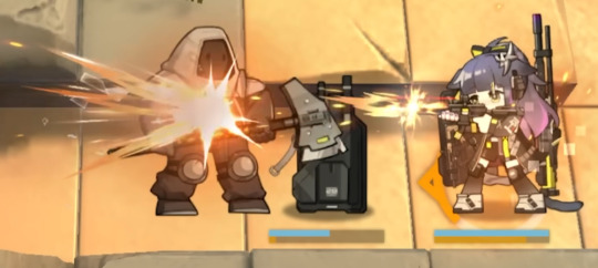
The muzzle flashes become longer to sell a BIG impact, but they last MUCH shorter (this muzzle flash lasts one single frame), since all her skills are rapid-fire, making it feel like bigger shots in less time. The impacts become ABSURDLY BIG. And then. My absolute favorite part of the whole thing.

(These are Not The Texture, but a similar, oft-mistaken cousin of The Texture.)
This fucking followthrough. Every hit on an enemy creates a burst of shattered glass and fire. I would not have thought of adding EITHER of these, but I love it. It's a great call to her art, it's unique and distinct, and even though it can be "where is the glass coming from" it's so cool i don't care. I literally saw it and gasped and went "I have never seen this before." It adds great color contrast, conveys the armor-piercing nature of her bullets, adds unique shapes, makes it look more chaotic, I can't praise these glass shards enough, I love them, they're so cool.
Fortunately for you, Jessica's skills all kinda look the same, so I don't have much more to say about this. I like that her S3's muzzle flashes create more chaotic sparks, creating the look of a wild, uncontrollable spray and pray strat. I like that she fires multiple shots and muzzle flashes but only shoots one bullet, but you rarely ever notice it because of the weight of the impact.
But I have one final thing to say.
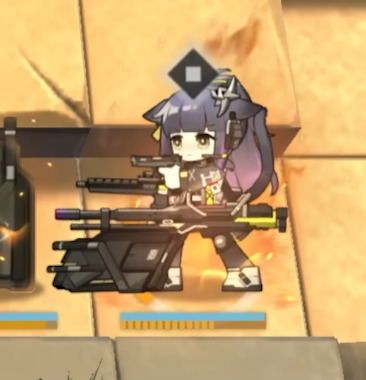
BEHIND HER IN HER S3 SHE HAS AN ACTUAL ROILING, BURNING, MOVING FLAME. WHY IS HOEDERER BEING SHOWN UP BY JESSICA. WHAT THE FUCK.
74 notes
·
View notes
Note
how draw in the cs style im taking notes
OOOOOO i've been waiting for someone to ask me this!!
this will be pretty long so bear with me :'D
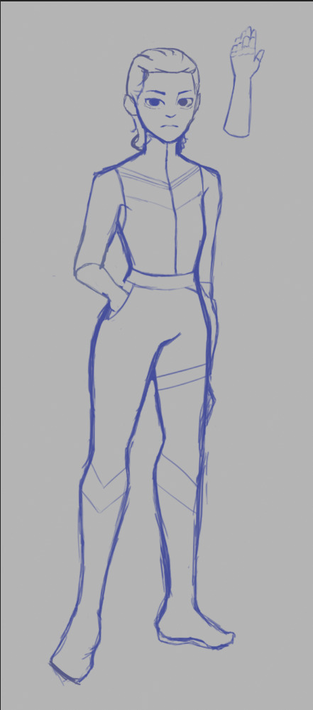
Firstly, The Sketch (ft. sleep deprived looking sketch)
personally i chicken scratch my sketch when it comes to base layers, but when it comes to more detailed parts, i still chicken scratch it but i tend to clean up the sketch more (to make it more refined and make sense)

secondly, The Base Colors
Stick to simple colors that are easy to be read by the eyes before adding any eye catching designs! the CS style is pretty simplified (for example, carmen sandiego's eye catching Red fedora and Coat)
Less is More in the CS style! so use more simple and refined shapes!
i noticed that in the CS style, the characters in the show are drawn with easy to identify shapes, there are points in the style that are sharp, sometimes rounded, it's always sharp, simplified and kinda cartoony.
the way you design and assign colors in your art is IMPORTANT!
for example: my oc here Blank! i stuck with a bold and easy to identify color on Blank's attire to take attention away from the face (because he's a master of disguise, the way people would interpret him is through what he was wearing. making him harder to find when he's in disguise)
in short, assign your colors well to fit your character's design and how the viewers would see them!

Third, Catchy Details :D
Like i said before, LESS IS MORE
on my oc here, i put a few details on his upper clothing to also attract abit of attention.
USE CONSISTENT YET SIMPLE DESIGNS
(either rounder or sharper details)
AVOID ADDING TOO MANY DETAILS
adding too many details can be hard to process to the viewer's eyes. and in the CS style, you'll notice that most designs on characters are always simplified.

Fourth, Shadows
i noticed that in the CS style, most of their shadows are blocky instead of faded/blurred like an air brush's effect.
the shadows bit are a little hard to explain by Word so i'll give you a visual example
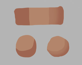
This is how i draw CS styles use shadows.
even if it does have a faded effect, the shadows always have a sharper look to it.
These 2 types of shadows you can use in the CS style, Hard shadows and Slightly Faded shadows (and rarely any faded shadows)
i added a personal detail that i think i can sometimes see in the show's artstyle, specifically when looking at the lower portion of the characters.

idk if it's just me but i personally like adding this. it looks more interesting :'D
LASTLY, DON'T LIMIT YOURSELF TO MY METHOD OF DRAWING THE CS STYLE!!
everyone has different methods and styles of drawing this kind of artstyle, limiting yourself to only my method keeps you from experimenting with easier ways for you to draw in this style.
so that's how i draw in the CS artstyle! if you have more questions, don't be afraid to ask!!
#carmen sandiego#carmen sandiego netflix#carmen sandeigo 2019#10leon13#self insert oc#blank#carmen sandiego 2019#carmen sandiego art style#art style#artstyle#how to draw in CS artstyle#tutorial
151 notes
·
View notes
Note
Hi!! Love your artwork and your Charlastor AU with Dawn!!
I was wondering if you think Alastor would make any dawn-themed dad jokes and puns in your AU, and if he does, what would Dawn and Charlie think of them? I can’t really think of any off the top of my head right now, but I know ‘a brand new dawn’ is a phrase he could maybe use!
Again, love your art!!! If you don’t mind answering questions about it, do you have any advice for artists who want to improve their drawing or any practices that have helped you develop your skills? And are there any particular artists that really inspire you?
You’re one of my favorite artists and I don’t know how to explain it but your drawings have so much life in them!! 🌟
sdlksdflkj thank you so much omg!!!
I'm so glad you're enjoying them ;W;
And he would be insufferable with them lmfaoo, especially because I'm sure Charlie would hop in on a few of them and add to the pile as well xD
One more I can think of rn is "Oh, I was wondering where the sun went!" whenever Dawn enters a room, because the implied punchline is "but then it Dawned on me" or something? XD idk I'm not good with puns sadly
Now regarding the art advice!! This one got HELLA long so I'll hide it under a cut for everyone's comfort lmao
I know it sounds shallow and like worthless advice, but a huge huuuuge part of getting better at art is to just... make art! Practice makes perfect - it develops your motor skills, gives you somewhat of a muscle memory for certain basic shapes that are a necessity to have a good feel of for good foundation sketching.
Practice also develops your eye for compositing and for how color theory actually applies in practice, it basically helps you develop a more consistent grasp on art as a whole :D
There are some things I've learned over time that definitely helped speed things up though xD
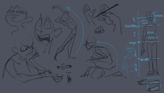
here's some rough sketches I did just to demonstrate what my rougher drawings can look like - also a little diagram (on the right side of the image) of things I keep in mind for the average proportions of a human body!
I tend to sketch very loosely and try to capture the overall vibe and silhouette/rough shapes first before I even think about adding details - there's a certain flow, squish and stretch to everything that's just much easier for me to get a good feel for when I use quick, loose brush strokes and as few lines as possible to convey a concept.
Repeatedly sketching humanoid characters of various shapes, builds and sizes for years genuinely helped enormously in getting not only faster but also more consistent with it!
I'm fairly well practiced with hands and expressions especially at this point since I like to focus on those in my art often, so those come fairly easily to me as well now!
Something I learned along the way about keeping a certain liveliness to my artworks is that sometimes you have to forego anatomical correctness a bit if you want to fully express specific emotions - if you try too hard to keep everything perfectly proportional and realistic, it can make the outcome look stiffer than you might've aimed for - this is something I actually struggle with in my cleaner artworks :'D The ones I do proper lineart for, since a lot of the flow of the original sketch gets lost in the process haha
As for artists/artstyles that inspire me...
There's @/southpauz for example!

Her artstyle is unbelievably expressive and her eye for compositing and her use of shapes is SUBLIME - it inspired me to let loose more with my expressions, exaggerate features a bit more and to push the way I try to vary facial features :D
Then, back when I had that massive Rise of the TMNT phase, the artstyle of it has actually greatly influenced how I draw today!
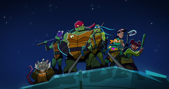
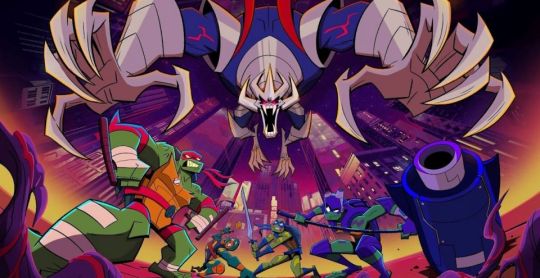
It manages to be detailed and highly recognizable despite its deceivingly simple style - it exaggerates shapes and uses it to communicate personalities, emotions and action super effectively and taught me a lot about utilizing those more efficiently myself :D
And last but not least Ishida Sui - the mangaka behind Tokyo Ghoul (which used to be a highschool obsession of mine)
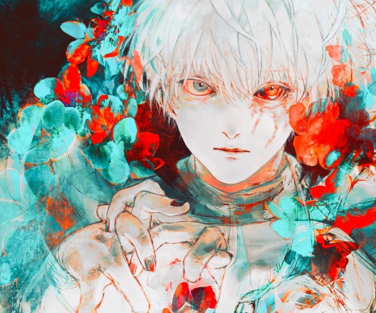
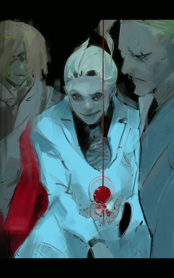
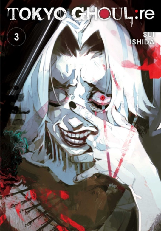
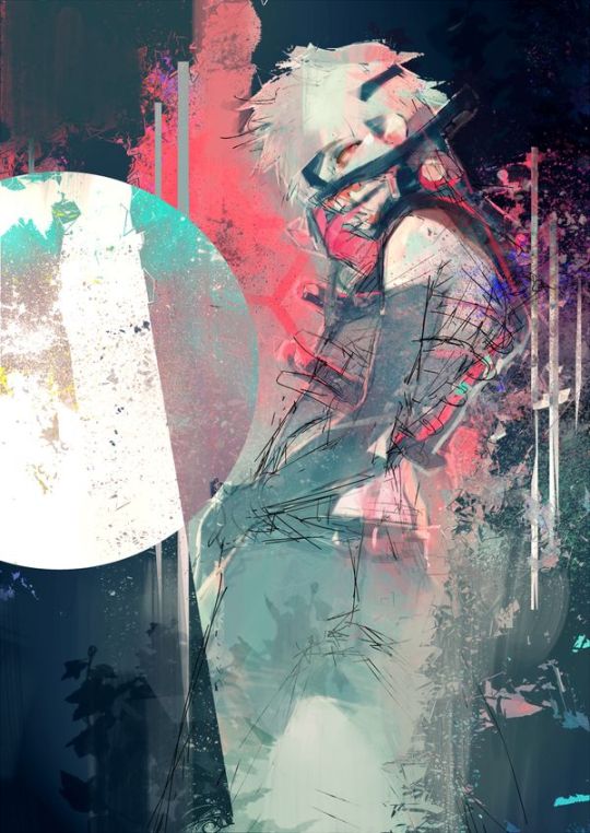
His striking use of colors, textures in abstract, yet symbolically heavy ways and his courage to be rough and expressive rather than looking polished, yet also having such a solid understanding of realism blew me the fuck away as a teen and still does now!!!
His art may have less of an influence on my style today than it used to back then, but I think in my more exagerrated, more horror-esque drawings you can kind of see it still :'D Either way I greatly admire him as both a writer and artist.
-----
I'm genuinely so so flattered that you enjoy what I do enough to give me such high praise, thank you so much for writing me such a wonderful ask <3 I'm glad I got to gush about some of my favorite artists/artstyles for a bit haha
If you have any more specific (digital) art related questions don't hesitate to reach out!! I love giving pointers about a subject I'm so passionate about, we don't gatekeep helpful information in this house!!! <3<3<3
45 notes
·
View notes
Text
Mistborn Game
Now, think about it. Who DOESN’T want a Mistborn game? So I was thinking. What about a roguelite? One where you choose the class at the start.
At the start, you can only choose Allomancer Mistings. It only includes the base 8 metals from the beginning of the series.
Coinshots: Are able to use their currency as weapons, and push on enemies that have metal on them. They can also hover for a short period of time.
Lurchers: Pull on metal, rather than push. They can pull enemies towards them, or pull objects to use as weapons.
Thugs: Basic melee class, capable of hitting very hard.
Tineyes: While it may seem useless in gameplay, a tineye sees secrets better as is better at stealth, as they can avoid enemies altogether. Great for players wishing to avoid combat.
Rioters: Along with tineyes, these mistings are capable of rioting specific emotions in enemies in order to get their way.
Soothers: Same with Rioters, except opposite.
Smokers and Seekers: Both of these mistings are useful only in multiplayer, as you can work with another misting to hide or seek out allomancy. However, you can choose it at the start of a singleplayer game, because of a specific mechanic I have yet to explain.
Mistborn: A very, very rare chance at the start of the game, you may find a bead of Lerasium. This unlocks all your metals, allowing you to play as a Mistborn.
Metals: Drop as you defeat enemies. This is your resource. You can sometimes find metal that isn’t your specialty, which you can trade or share with other players.
Feruchemy: You unlock feruchemical powers upon your first completion of the main game. (1 Successful run)
Hemalurgy: Hemalurgical spikes are rare items you can find in enemies. You can use them, however, there are immense caveats:
-You lose part of your max health
-If placed incorrectly (a %) You may suffer terrible side effects, including a death.
-You can only have a max of three spikes before suffering consequences.
Perhaps in a multiplayer game, one can create hemalurgical spikes with enemies, but that is another idea entirely. The key is to accurately portray metallic arts in a fun way without being too overwhelming.
The artstyle would be simple but beautiful. I’m thinking a top down or 2D game, or something similar to Hades, isometric. I’d get Dragonsteel themselves to bring artists in, and the game studio would work to mimic the style.
DLCs would incorporate era 2 metals, along with Aluminum and Duralumin. Also incorporate era 2 enemies, Trellian enemies, modernized weapons.
A DLC incoporating single player stories where you play as Kelsier, Vin, The Crew, Sazed, etc.
Let me know what you think!
114 notes
·
View notes
Text
another ramble about art again so i’m hiding it all under a ‘keep reading’ thingy so as to not clog ur feeds :]
aka thoughts about imposter syndrome, fanart, and what it means to draw stuff loosely disguised as a ‘ramble’. maybe a bit of akito almost-kinnie-isms (and probably ena) in there too because why not. also sorry this gets a lot less coherent as it goes on (i lost my train of thought near the end. it’ll come back someday)
i want to keep getting better. i want to keep growing and improving, so that i can convey the ideas in my head to others. i’m afraid to stagnate for too long, because what if it means i’ve hit my limit? what if i’ll never get better than i am right now? an irrational thought, really, but that doesn’t mean it’s impossible. hell, i felt like i hadn’t improved all that much from a year ago, when i tried to redraw a few of my older posts.
part of this stems from the question ‘how do people see my art? what kind of artist am i to them?’ which comes from when i got into fanart and fandom spaces, a long time ago. i would categorize the people i looked up to, my idols, my role models. there was the one that made comics that felt like home with your friends, and there was the one that made pieces that felt like i was sitting in a café in the middle of a busy city, and there was the one that made renders that felt like i was looking at liquid gold. i was fascinated by the effects of all these different artstyles, and decided that i wanted to do the same. i wanted to make art that made people feel at home, like a fic that you keep coming back to, or art that conveyed how i felt well enough that others felt the same way, or could understand it at the very least.
naturally, as i continued to draw and admire these artists from afar, i wondered why exactly their art appealed to me. at first, the answer was simple: i like looking at it. but that wasn’t good enough - what about the things i didn’t really care to look at, then? what made this piece any different?
so i tried to understand, why i liked something, or why others liked something. after studying art for a little (yay classes) i understood more, i understood why those artists made the choices they did. for one, it was their powerful composition, and how they wanted to pull the viewer in with the characters. for another, it was their color palettes, which were always balanced yet strong and guaranteed to catch your eye because of it. other times, it would be the lighting, angled to present the characters in such a way that it made you feel like you were there too, or linework that made you feel just how much the artist cherished the characters. there were other, less technical things too, but i was trying to build a foundation before diving into things that were harder to learn.
in short, there was so, so much more to everything than i had realized as a kid.
so i asked myself the same question. why do people like my art? why is my art appealing and worthy of your time? and where did i fit in, if i were to categorize myself?
these questions got a little worse. incredibly irrational. imposter syndrome was kicking in when i saw that more people were liking my art, especially when i compared it to myself from a year ago. or when my favorite artists were following me back. (it was weird, somewhat. i had always seen them as worlds away from my own space, artists that i had admired from afar and thus never believed that they would turn around and see me.)
‘do people actually like my art? is my art actually worth anyone’s time?’ i wonder. ‘do i deserve these nice comments, or even these likes?’
‘am i even getting better at all?’
these are a bit foolish of me to think. it shouldn’t matter, really. as long as i’m enjoying drawing and having a fun time, then why should it matter whether others like it or not? i don’t have to be doing my best, giving it 110% all the time, i’m allowed to make goofy art or self-indulgent art. this is my motto, for the most part. as long as you’re enjoying the craft, then it’s worth it.
but with the goal of improvement, i don’t always want to stay in my comfort zone. i want to keep pushing my limits, even if its just a little at a time, so i can make something impressive, something that really resonates as much as i want it to, as much as certain pieces resonated with me when i was younger. the same way that i kept coming back to certain pieces (and still do), i want to be able to do that too. i don’t want to feel like a kid playing at an adult’s game, like someone who doesn’t know what they’re doing and it shows.
it’s a tricky balance. i’m not sure if i’ll ever truly feel like i’ve ‘finally done it’. i think that most artists are never truly content with their work as a whole, anyways, and that’s okay. that’s something i should be more okay with. i can make art just for fun, and i can also make art with the intent of solely improving or practicing. i can even combine the two, and most of the time, i try to anyways.
(sorry, i lost my train of thought after writing the last few paragraphs... i dunno where i wanted to go with this exactly HHH.
tldr; i’m always stuck between ‘i’m happy making this art even if its bad’ and ‘i need to get better and leave people in awe to feel like i deserve the love and nice comments i receive’.
if you somehow managed to get to the end of this, ty for reading, even if it was a hot dumpster fire LMAO)
#cat does some thinking#I NEED A BETTER TAG FOR MY RAMBLES#even if theyre only like. once or twice a year max#lol after writing this i came back to the piece i was working on (and what solidified this whole thing)#and it doesn't look as bad anymore :)#argh lost my train of thought at the end of this. i got distracted#i know the akitoisms and enaisms arent explicitly said but i think theyre still there#shinonome struggles
78 notes
·
View notes
Video
youtube
Sonic the Hedgehog CD Part 1: Sonic CD is sponsored by Marty McFly
Oh boy, now we’re getting into some spicy territory!
My history with CD is...complicated
Unlike the other Classic titles, while I was exposed to this one at around that same time thanks to the Sonic Gems Collection, I never played it quite as much due to...reasons that will become quite clear in future parts. It’s only with the release of the Whitehead version years ago that I truly dived into this game
So let’s start with the best and most obvious parts
Firstly: the opening and closing cinematics are literally some of my favorite pieces of animation ever. (Well the uncompressed versions anyway, ‘cause the Sega CD was what it was). Not just because they’re animated beautifully but because they feature what is, to me, the gold standard of Sonic’s body language.
This Sonic is quick, adventurous and fun loving when he’s zooming around, but dead serious and determined once he notices Eggman’s effect on Little Planet
But most of all: he’s cool. He’s effortlessly cool in the way he runs around and toys with badniks, while at the same time still retaining a cutesy side to him to remind you that this is still a light hearted and fun loving cartoon character
While I’m not one of those people who thinks that Sonic should never talk (specifically Classic), there is a case to be made on how in just a few minutes’ worth of animation CD is able to tell us literally everything there is to know about Sonic’s character without having him utter a single word while the Storybook games had to devote hours long narratives to get the point across. It also further lampshades just how backwards Sega’s recent handling of Classic as a character has been, focusing completely on his cutesy side while completely neglecting his cooler one, or at least downplaying it, while one of the main reasons for the switch to Modern was because they feared that Classic was being perceived as too cute by fans at the time, but whatever that’s a topic for another time
From a graphical standpoint...yeah this game is above and beyond the best of the classics, both in general spritework (though bosses in Sonic 3 actually look better, but that might just be due to that game having actual bosses that look more imposing in general), color variation, level of detail and artstyle, which is without even mentioning the way that the game manages to tell a simple yet subtle narrative through its backgrounds but I’ll focus on that at a later time
But personally I’ve...actually never been head over heels for these graphics unlike everyone else, mostly due to a personal thing, since Sonic game move so quickly it’s usually hard for me to really focus on background details and whatnot, which isn’t helped by the one thing you’ll be looking at the most, Sonic’s sprite, pretty much being ripped straight from Sonic 1 and looking so out of place compared to the rest of the game. But again: it’s not a knock against the game, it’s just me
Musically I...think it’s good, it’s certainly the most varied and smartly utilised soundtrack in the Classic games (or even in the whole series) due to how each track ties very well to the feel of not only each Zone but also each era, but personally? When it comes to Sonic music I tend to prefer more upbeat, fast paced tracks. CD’s OST is much slower and usually pretty calming and atmospheric, which works very well for what it’s trying to accomplish, it’s just not what I personally prefer to hear in a Sonic game (and yeah I’m talking about the JPN score, it’s been ages since I’ve listened to the US tracks)
On the other hand however I like all of the vocal tracks
Sonic Boom was the first I was introduced to and it still sounds great, but over time I also gained a lot of appreciation for You can do anything. The lyrics are really cheesy and are bordering on nonesense half the time, but I like the energy it has
My absolute favorite however is Cosmic Eternity. I really wish more people would talk about this one because this is, and I’m not kidding here, one of my favorite Sonic songs in general. Right up there with the likes of Open your Heart, Live and Learn and What I’m Made of. It’s just so upbeat and uplifting, it fits both this game’s happier aspects and Sonic’s character like a glove, the latter more in the sense that it sounds like something that Sonic would sing someone to cheer them up
7 notes
·
View notes
Text
Link Designs Ranked
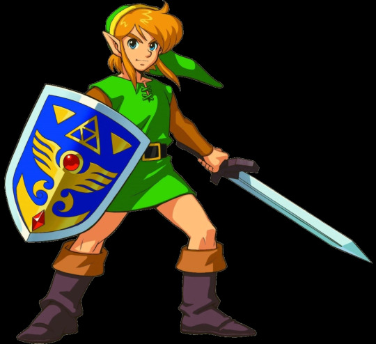
Zelda 1/Adventure of Link

There is not much to talk about here. The design is the base for every Link in the series, and it actually the best out of the NES era triforce trio designs, mostly because the simplicity works surprisingly well here. 5/10
A Link To The Past/A Link Between Worlds/Oracle Games
This is an improvement over the NES design. Not much has changed, but the change in tunic and artstyle truly helped benefit Link this time around to create a truly iconic design. However it does suffer from being outclassed by some of the later designs for the character. 9/10
Ocarina of Time/Majora’s Mask (Young)

Beautiful. It’s simple, it’s instantly recognizable, and it’s fitting for the younger incarnation of The Hero of Time. Instant 10/10
Ocarina of Time (Adult)

While not my favorite design for Link, this is still one of his best designs. It’s the classic tunic, but with a white undershirt and white tights. However the context makes this design work better than it should. 9/10
Fierce Diety

What you think of when you’re thinking about Hyrule’s Hero, but it’s a sick design regardless. 10/10
Hero’s Shade

He looks like a frickin’ Eldin Ring character, but I cannot ignore how fitting this design is. 8/10
Toon Link
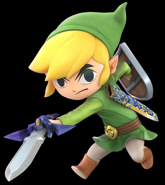
This is my fifth favorite design for da boi, primarily because of the artstyle, the coloring, and the simplicity of his design. He’s the literal embodiment of “he’s just a little guy,” and it works in his favor, especially since Link is pretty much usually just a guy before he becomes a hero. Instant 10/10
Twilight Princess/Smash Bros

I like the extra detailing, and the more knight-like feel, but the darker colors don’t do it for me. Regardless it’s pretty cool. 9/10
Skyward Sword
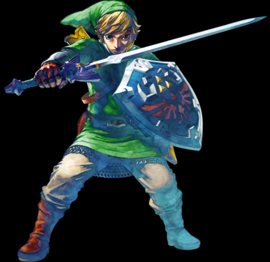
The more detailed design from Twilight Princess got altered into this, and I’m all here for it. The brighter colors, combined with the expressiveness Link has in that game instantly sells me on it. Instant 10/10
Hyrule Warriors

The foundations that Twilight Princess and Skyward Sword set up have been brought to their final evolution. A more knight-like Link with a big ol’ blue scarf and a vibrant green tunic. Beautiful. Instant 10/10
Ancient Hero
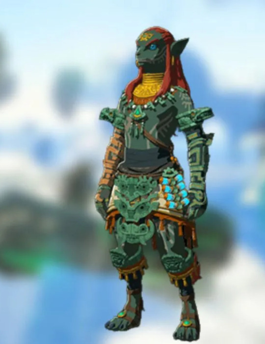
I’m intrigued, but… this unfortunately is an 8/10
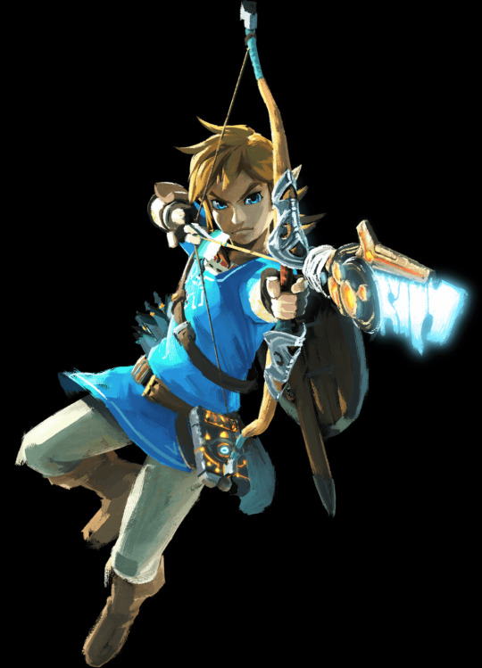
Breath of The Wild/Age of Calamity
Link looks so great in blue. As for the attire itself, it’s yet another simple yet effective look. Instant 10/10
Tears of The Kingdom (Champion Tunic)

Not much has changed, but the design does have a similar knight-like aura to what we see in TP, SS, and HW, Rauru’s arm definitely looks cool. Still, this isn’t the best Link design in the game. Instant 10/10
Tears of The Kingdom (Archaic Tunic)
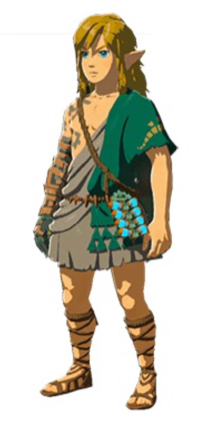
Between the return of the green, the rugged feel of the tunic, the little triforce shapes on the side, and the unkempt hair, Link looks perfect. The design is drastically different to anything we’ve seen, but in a good way, and I’m all down for it. Instant 10/10
#link#ancient hero#hero’s shade#the legend of zelda#legend of zelda#a link to the past#ocarina of time#wind waker#twilight princess#a link between worlds#skyward sword#breath of the wild#age of calamity#tears of the kingdom#hyrule warriors#ranking
42 notes
·
View notes
Note
Okay so ermmmm u asked for it so here ya go x3 (gonna lost things I like abt ur art alodheoqmsowms)
Okay so first of all, I LOVEEEE THE SOBBING PATHETIC WET CAT ENERGY ARGOS HAS IN UR FANART. SUITS HIM FR. His hair is just so mwaa absolutely PERFECT!! I also love the pointy ear and tail u give him! Makes him look more cryptid loll. The way his face is filled with eyes omg I adore it, I love it when Argos fanarts have like Argos' face not even have any open space cuz it's so filled with eyes LMAO. The main eyes design is so cool too!! Like especially the red part and eyebags it's amazing. And I love the way u draw his outfit!! Like that's so him!! And HOLY SHIT YOU CAN ACTUALLY DRAW HANDS??? I BOW DOWN TO YOUR HIGHNESS. The way u use colour in your artworks is amazing, like idk how to describe it but it's so edible yk? And the way u do backgrounds! So simple yet so effective!! I love your lineart like especially the sketchy lineart style on Mr plant's face!! I love the colours n patterns u put on Mr plant's petals and I love the way u draw his big ol' eyes n eyelids n the black tears! His outfit and shoes r so hashtag slay too. I have GOT to study your artstyle on a petri dish someday cuz it rocks so hard I'm foaming in my mouth. AND AND OMG DONT GET ME STARTED ON THE WAY U DRAW POSES!!! SO FLUID AND SIMPLE YET IT DOESNT LOOK LIKE. YK IT DOESNT *LOOK* SIMPLE.

^ two of my favourite arts from u of all time!! I really love your art man you're so cool aldiwbqpodn2pqmde
*unintelligible happy yelps and squeaks*
Thank u SOO. Very much. 😭😭😭 You do NOT know how happy it makes me 2 know that people on the INTERNET appreciate my little gay art 🥹🥹🥹
Feel free to talk 2 me anytime, the ask box ( or anywhere rlly) is open for a reason :,DDD
9 notes
·
View notes
Note
This might be a weird question, but what gives you the energy and motivation to draw?
I just don’t understand how people can make multiple high-quality drawings in such a short time
not a weird question at all! i've also used to wonder that a lot
for me, i think it becomes more obvious what motivates me to draw when you look through my art. my au is my primary inspiration for everything, i think about it all the time and whenever i see something cool or funny, i immediately start thinking of drawing something like that with my characters. that's why you'll see a lot of meme/photo redraws on my blog, for example. but it carries over to real life as well, like when i got a haircut and got inspired to draw fpk trimming grimm's fur. it's the little things that motivate me to get my tablet pen and draw, and being able to actually make what i'm imagining real is a great feeling
of course, this is not the first time i felt the urge to draw my favorite characters, i've had that every time i got into a new game or series. the difference being that, at their core, hk character designs are very simple and give a lot of freedom for experimentation, be it with original design interpretations, or more complicated compositions where you don't have to worry about too many details on the characters. this is what finally got me to focus more on painting and rendering, something i've struggled with for years before i got into hk
seeing the progress i've made is also a massive source of motivation. you don't notice it as you draw, but looking back you start seeing all the things you've improved and new techniques you applied, and it makes you want to keep going and get even better. i still have moments where i feel like i'll never be able to achieve the level of the artists that inspire me, but i want to try. at the end of the day, i'm doing this for myself, it's not a competition
and lastly, as toxic of a mindset it can be sometimes, the response and feedback i get from you guys also motivates me. i've never expected people to get this invested in my au, i honestly thought people would just ignore it, or call it dumb or worse. i don't think i would still be active on this blog, or really get far in my art, if it wasn't for the incredible response i got. sometimes chasing that high of having my art blow up gets toxic and it's something i'm trying to work on, but i can't also ignore the positive effect it had on me. i guess it's just a matter of finding a healthy balance
so in short, my advice is to find a character or two that you're really obsessed with, and just draw them. make it anything, it doesn't have to be the next mona lisa every time. draw them eating their favorite food, or give them a fun little outfit. you'll improve a lot with time, even if at the time it doesn't seem that obvious. from my own experience, using something like a meme inspiration as the base to experiment with your artstyle is another thing to do that serves as very good practice and keeps you engaged
it's not always easy, sometimes i lose motivation too, but having something to fall back on helps. just don't give up, keep drawing your favorite guy or gal, or anything else you enjoy, and it'll all be okay
14 notes
·
View notes
Note
the socialstuck art is toptier. do you have any tips to be able to get that socialstuck/homestuck artstyle down?
Thanks so much! I loosely base my Socialstuck style to the HS style. HS has had waves of different styles, each of them consisting of their own respective and distinctive features.
I use several awesome tutorials to help me shape the style that I strive towards.
A general tip for when studying a style is to do a general surface overview. Choose a style that you find appealing. Do a basic study of what you see: For instance, if you're wanting to imitate the Hero Mode style, observe any consistent features displayed in the panels. You'd pick up on the fact that body shapes are fluid and simple. The characters have silly bean fingers. The lack of linework, and the usage of a raster medium (a pixel brush), Etc., you get what I mean? Dividing your studies into individual categories is an effective way to closely study the style. In one area, dissect the style of facial expressions. And in another area try and figure out how the anatomy works. Trace panels to figure out proportions and whatnot. Doodle and draw when you're taking notes!
My explaining might be kind of weak. These are just general tips on how to effectively study the style, I'll provide tons of tutorials that are very helpful and provide visuals. This is the most I could do. Maybe one day I'll make a visual tutorial. I hope my answer can help out!
MSFPA HELP GUIDE
https://radicaldude42.tumblr.com/post/155234428647/mspfa-help-guide
GUIDE TO MSPA STYLE
https://paperseverywhere.tumblr.com/post/120499232325/this-is-by-no-means-a-comprehensive-guide-and-just
HOMESTUCK POPORTIONS
https://eldritchdraaks.tumblr.com/post/700683448675942400/how-do-you-get-the-proportions-for-the-homestuck?is_related_post=1
HTD IN MSPA STYLE (PT 1)
https://www.deviantart.com/lal0nde/art/how-to-draw-in-mspa-style-p1-285506348
HTD IN MSPA STYLE (PT 2)
https://www.deviantart.com/lal0nde/art/how-to-draw-in-mspa-style-p2-285506504
HOMESTUCK CHARACTER STYLES BROKEN DOWN
https://lankque.medium.com/homestuck-character-styles-broken-down-2467878641e7
HOMESTUCK STYLE REPLICATION
https://twitter.com/goreticulture/status/1584380496221732864?s=20&t=lqDCIaUtE308-stPbvjXWw
HOMESTUCK STYLE MISTAKES
https://aminoapps.com/c/homestuck-hiveswap/page/blog/how-to-troll-call-you-think-you-have-it-but-youre-doing-it-wrong/8p7W_jDhmujpagaJePYq0RmgBZVvpDZXKG
121 notes
·
View notes
Note
Question, how would you advise a beginner to animate? Like, tips and tricks qwq
Hmmm... Idrk if I'm qualified to be answering questions like these considering I've never taken art or animation classes but I'll try to give a list of some personal takeaways I've had from my journey in teaching myself to being an animator.
It's going to be a bit of a long read so I'll keep it under the cut for those interested!
Here are a few things I learned in my ongoing learning experience as a self-taught animator:
The 12 Principles of Animation - I'm going to start using a bit of technical terms here so I suggest you first study this video to understand my ramblings below!
Break things down one by one - this was one of the struggles I've had when I first started animating. I wanted to make smooth and completely extravagant animations without planning what I wanted to animate into pieces. You really ought to break down body parts, starting off with the limbs that are dominantly leading the main body first (for example torso and legs) before adding the arms and other appendages that are often dragged along by the main body. Here's an example of a study I did months ago showcasing what I mean! (Though it's not the smoothest I've ever made, but it's the only study animation I have readily available lmao). This doesn't have to be for animations alone though, it can be for animatics as well. Make sure you're doing them step by step, starting with rough storyboards to sketching then moving up to lining the backgrounds and characters and adding effects last to not overwhelm yourself.
Pacing - I loved it when I had that epiphany moment after first realizing this. Be it if you're trying to make smooth animations or trying to tell stories with simple animatics like I do— pacing will always be a key and important principle in animation. You can make the smoothest looking animations with only 8fps (as opposed to industry standards of 24fps) if you know how to pace your frames, and you can tell the most impactful stories with only a few shots if you know how long or how short a scene should stay on screen.
Other Principles - ofc pacing isn't the only principle we have in animation that serve significant purposes as well. There are many others as well as linked in the first bullet of this list!
References and Studying - I don't think I need to elaborate further on this. Even animators need references they ought to study to make their creations more life-like!
Animation Program - this advice is not for everyone. Simply because some people can work with any animation program, but I can't. I struggle with programs that don't feel "intuitive" to me, so if you're anything like that I suggest finding a program you're most comfortable with in order to focus on the animating part more than the technical stuff.
Simplicity - another major struggle I had in the past. I used to animate with a semi-realistic artstyle. Not that it's bad or wrong to do so, I'm sure as hell there's tons of people out there who have semi-realistic animation art styles and are rocking it. But for beginners, it's best to keep your style simple, this is so you can focus on worrying about how you can apply the animation principles you're learning without getting too overwhelmed with the amount of details you have to add with each frame. You can develop a more complicated style later on as you progress!
Continue - ofc no one ever gets better just by learning for a day and completely stopping. Rome wasn't built in a day, take your time in accompanying yourself through this journey and soon enough you'll be looking back at the already long path you've taken.
Aaand that's it! I might one day look back at this list and go "Aw tf you telling this person right now, that ain't right" because I've learned some new things as well but this is the best that my present skills and knowledge can give you. Do keep in mind I've only been animating for 2 years and I am just as much as a beginner as you are, in a sense, but I like sharing what I know so I hope this helped a bit even if I'm probably not qualified to be sharing this at all LMAO
Good luck on your animator's journey! It's gonna be one hell of a struggle at the start but there'll be some wonderful payoffs once you start to greatly improve! :}
32 notes
·
View notes
Note
what do you think the most stellar examples of arknights' vfx are?
Okay so there are a lot of examples, so I'm going to try to keep my description of each one short. Unsurprisingly, most of my favorite effects are on more recent, paid skins for fan-favorite/meta 6* operators, since those are the ones they put their whole ass into.
Executor the Ex Foedere. The way that it weaves blasts of light and the shapes of Sankta wings into his shotgun blasts is absurdly creative. Perfect for a saint of Laterano.
Passenger's Skin. Specifically his S3. Stellar lightning is a weird pitch, but it's so fucking beautiful that it works. This is the effect that convinced me that I might enjoy being a VFX artist after all, not fucking kidding.
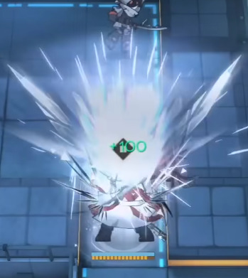
Jessica Alter. Look. Her skills are underwhelming as fuck, they're all the same shot effects every time. But. Do you genuinely understand how amazing these gunshots look? Do you know how hard it is to make a stylized gunshot that doesn't just look like magic? These are breathtakingly good. The glass shattering on hit genuinely made my jaw drop when I first saw it.
Eyjafjalla the Hvit Aska. It's hard to make a healer that genuinely looks unique, but Eyjalter's dreamlike colors and flat effects manage to bring the visual style of So Long Adele into every map and make it look reasonable with the artstyle.
Kirin R Yato. Monster Hunter's effects are extremely distinct, and seeing them recreate MH's style in Arknights' is really lovely. My one sorrow is that I wish there was more lightning, since like. Kirin.
Lin. Glass is a legitamately hard thing to pull off because it so often just looks like crystal, but leaning more into glass dust and shards makes it work perfectly. Her skin is also quite pretty, but it loses the glass look that made me love Lin to begin with.
Reed the Flame Shadow. Holy fucking shit holy fucking shit holy fucking shit holy fucking shit fire made of flowers?? The way the fire looks secondary to the whole thing while being undeniably present is stunning. Her skin is nowhere near as good tho.
Penance. Penance has such a stunning aesthetic that it immediately endeared me to her. Her vibe of gilded thorny chains carries to her effects and it works.
Texas the Omertosa. Fucking. Duh. It's hard to make a normal sword swipe look unqiue but Texas nails it. Her skin's effects are even more stunning, even if the animations are awful.
Minimalist. It's hard to make effects that are minimalist and still look good.
Specter the Unchained + Skin. I need to specificially call out her skin. Her skin may be one of my favorite pieces of effects at all time. The colors, the aegirian poetry as part of the visuals, the stellar water, it's all practically perfect.
Kazemaru. A sleeper hit!! She's got a lot going on with the "paper-controlling ninja whose clone has a completely unique aesthetic" thing so it seems like she might be too busy, but it manages to pull it off. Shoutouts to her clone's spawn, which actually does the slash mesh slightly wrong intentionally because the ring look actually helps a lot.
Goldenglow. It's rare that I see a lightning character and say "I have never seen anything like that before in my life" and Goldenglow's pink and blue stylized lightning genuinely shocked me.
Ling (Does it Wash The Strings). If you want my choice for best VFX in the game, this would at least be in running for first. It's flashy as hell, but manages to not be overbearing. The S3 dragon attacking with mountains rising from the earth alone is stunning, but the normal attack impact is my favorite part of the entire thing. It's so simple and elegant and stylish.
Amiya Guard. Amiya's Guard form is the combination of Amiya's Arts, Sarkaz Arts, Ch'en's swordfighting, the normal AK Arts and sword design languages, and a tiny bit of weird space tech to represent the Precursors. And it manages to come together to something that feels really cohesive while still drawing attention to how incongruous these elements are. The effects actively tell the story of Amiya - a girl with big shoes to fill, carrying the legacy of so many.
Ceobe, and her Unfettered Freedom skin. At this point in Arknights' lifespan, they had a much more defined visual language for how Casters look compared to melee units. Ceobe, being a Caster who throws fucking enchanted melee weapons instead of casting spells? So she combines their languages, with the buildup and trails of Arts casters and impacts of melee units, it's subtle and I love it. Unfettered Freedom deserves a special shoutout because I love geometric magic so fucking much.
Conviction's Skin. Why is this so good they're a joke operator.
Dorothy's Skin. I may have mixed opinions on this skin, but the effects are objectively stunning. I am personally heartbroken that she doesn't have the sand anymore, but that's a personal thing. I also don't like that her S3's range is obfuscated by the explosion but again that's nitpicking.
There's probably WAY more that I've missed and even more I cut for time, but those are my favorites after browsing the list of operators and skins for like, two hours straight. If there are a few I missed... Look, this list is this long already.
Also note that I didn't really list enemies or anything other than playable operators. Their enemy effects are usually... servicable, with a few standout exceptions with Talulah and Frostnova.
41 notes
·
View notes
Text
the cookie run artstyle is literally wonderful . the big thick lines .. the nice bright friendly colours , the simple but effective shading .. the coloured lineart that manages to not ever clash , the Big & round & bouncy shapes !!! the little nub arms and legs ! the white outlined eyes .. Augh .... its simple & cute but so full of personality and intrigue . i want to Eat this game's artstyle . which is fitting because they are Cookies
#sorry im having an autism moment <- art/design special interest (<- this is why he is an artist)#buddy's cool words
42 notes
·
View notes
Note
CODFISH your splatoon ocs are so ADORABLE! I just love your art so much you have some incredible talent. I always struggle w/ translating Splatoon character proportions into my art style and you do it so effortlessly :,,D. I wanted to ask, what software/app do you often use for your illustrations and what is your go-to brush(es)? It's an experimental thing, I'm asking other artists what they use and I'm trying to find a medium I really like. If you're not up for sharing, that's totally fine!
Also (abt the twitter tag post) I'm not entirely sure what you mean by "vibe" but piercings and jewelry spawn in on almost all of your characters. Very flowy and vibrant artstyle!
oh thank you so much!! ;; i'm really glad you like my ocs!!
i actually still struggle a lot with splatoon proportions myself ;v; lots of tweaking and resizing when i sketch, I hope to be able to draw them more naturally eventually ..! But i'm glad I can make it seem like it's natural, because I put a lot of effort into it 😭🙏
Currently I use paint tool SAI ver.2 for about 95% of my drawing process. I eventually hop into CSP v1.13 if i need more specific tools or brushes (mostly for background or effects)
My go to brushes in sai2 is the effect pen tool for sketching and rough lineart, and I use the brush tool for coloring and rendering (alongside the default pen and airbrush tools)

I've been using sai for over ten years now.. its very simple and clean UI allow me to focus entirely on my drawing. I've tried switching to CSP for maybe 2 years, but still ended up going back to sai, because the wide array of tools and brushes etc. that csp has just kept distracting me (think of it like forcing yourself to use a ballpen to draw instead of a pencil and eraser, with which you end up trying to correct every single small mistake you make) (i tried to simplify csp's UI to mimick sai's but it was still overwhelming for me)
Good luck on finding your soulmate art program and brushes!! It can be difficult but definitely worth the experiments
And thank you!! I do really like piercings, so I'll make sure to give that new oomie some :^)
#mail#sapphiretarantula#i hope you dont mind me replying publicly i figured people might be interested in seeing my brushes (idfk)
2 notes
·
View notes
Last Seen Blogs

nishaniran-blog
Untitled

quadrantmodelquotes
Quadrant Model Quotes from 2013 Lectures
icombthecrowd
now we stressed out

kpopth0t
Chandaddy

dvrksoul
Dark