#Tim Eldred
Text

Star Wars: Han Solo and the Corporate Sector Sourcebook - Invincible Class Dreadnought by Tim Eldred
#Star Wars#Star Wars: Han Solo and the Corporate Sector Sourcebook#Star Wars: Roleplaying Game#West End Games#Star Wars: Legends#Invincible Class#Dreadnought#Sci-Fi#Mecha#Spaceship#Tim Eldred
51 notes
·
View notes
Text

The Japan Foundation is holding a livestream on March 26th, 2024 on Leiji Matsumoto, one year after his passing. The online panel will include Darren-Jon Ashmore, Tim Eldred, Zack Davisson (all 3 you might have heard before on my Leiji Matsumoto memorial livestream last year). As well as Professor Deborah Shamoon, who is well known for her Japanese cultural research (many of which touching on manga and gender studies relating to manga). You can request your free ticket to the streaming event here on their Eventbrite page.
#Event#Livestream#Leiji Matsumoto#Leijiverse#Zack Davisson#Tim Eldred#Darren-Jon Ashmore#Deborah Shamoon#links out
21 notes
·
View notes
Photo

Lafrarians were an avian species native to Lafra, in the Outer Rim. Their arms’ vestigial wing membranes the only remnants of their ability to fly, Lafrarians were excellent pilots, possessing keen instincts for navigating the skies and space. On their homeworld, they rarely traveled by land or sea vehicles, keeping to the air.
Source: Han Solo and the Corporate Sector Sourcebook (Art: Tim Eldred; 1993)
First Appearance: Han Solo at Stars’ End (1979)
Read more on Wookieepedia.
#lafrarian#star wars aliens#lafra#han solo adventures#star wars roleplaying game#west end games#star wars d6#tim eldred#star wars#expanded universe#star wars legends
3 notes
·
View notes
Text

Going really retro this week with some classic comic books. Robotech: Invid War is an early 90’s comic that expands on the stories of the original 80’s anime series.
I’ll just get this out of the way up front - I’m a fan of all things ‘mecha’ related. Movies, TV shows, books, comics, the lot. If it involves giant robots, especially in the classic japanese style, I’m down for it. Yes, that includes Pacific Rim in its various iterations. And maybe even ‘Atlantic Rim’ films when I’m in the mood for films so bad they’re entertaining.
Robotech is a classic example of that late 20th century period where American television networks aired Japanese anime recut and redubbed to fill early morning or late afternoon time slots. In the 1990s, these classics found their way to VHS cassette, then in the 2000s, anime lovers sought them out on DVD or torrent sites. Now they’ve made it to various streaming sites.
But nothing beats the thrill of finding original comics…
I was browsing through one of my favourite second hand bookstores when I stumbled across two bound volumes of Robotech comics. It's been a long time since I’d watched any of the series, but I immediately fell in love with these beautifully preserved volumes of original comics.
‘Robotech: Invid War’ tells the story of the fight against the Invid. The plot of the comics skips about a bit since it’s interwoven with the original animated series. Yes, every edition of the comic is in this collection, so there is a complete story. But the story for me was secondary to the joy of finding a classic 90’s anime/mecha comic and just soaking in the comic book style and artwork of that era. Oh - and the throwback 90’s advertising!
This collection of comics is both niche and unique. It’s something of a collector item, although something collected for the love of what it is rather than the monetary value. For that reason it’s not a book I can recommend you go out and buy since you’ll more likely need to buy the individual comics.
Rather, my recommendation is to keep on visiting and supporting those second hand books stores that still exist. Help keep them alive and thriving because you never quite know what treasures they might hold.
#robotech#invid war#bill spangler#fred perry#tim eldred#mecha#comics#anime#retro#80s#90s#bookbacklog#yearofreading
0 notes
Text
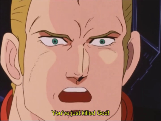
AoY Podcast #171 - Takahashi vs Tomino Round 6 Pt A (Armored Trooper Votoms Review)
Also known as: “Ain’t nobody got a level like dat!”
and also: “Chirico, YOU JUST KILLED GOD!”
Download Episode HERE! (Total Time:…
View On WordPress
#Gaia Gear#Ghost#Gundam#Neon Genesis Evangelion#Sentai Filmworks#Steven Foster#Superhuman Samurai Syber Squad#Tiger Electronics#Tim Eldred#Votoms#Zeonic Scanlations
1 note
·
View note
Text


two middle aged dudes that i feel inexplicable affection towards and who most embody/ied who i would want to look like if i was a man
#i cant find a better pic of tim where hes not in a hugesuit#thats ryan eldred and tim smith may he rest in peace
1 note
·
View note
Text
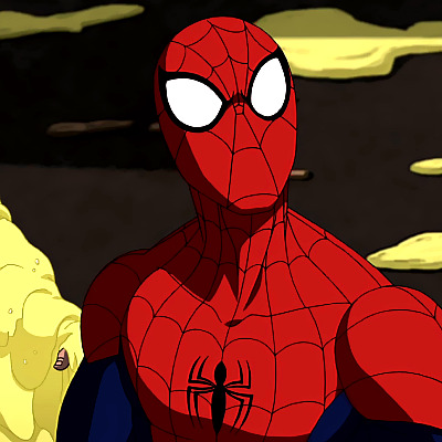


ULTIMATE SPIDER-MAN (2012) Great Power - 1x1 dir. Alex Soto & Tim Eldred.
#icons#spider man icons#spider man#ultimate spider man#ultimate spider man icons#spiderman icons#spiderman#animation#peter parker icons#peter parker#marvel#marveledit#marvel icons#icons without psd#cinematv#tvedit#tvandfilm#tv shows icons#tvshowsedit
62 notes
·
View notes
Text
Notes on Comic Art #3: Dynamicism [again]
I've recently been devouring Tim Eldred's writings. Eldred is not a very famous artist, but you're almost certainly familiar with his work. He's been a storyboard artist and / or director on Extreme Ghostbusters, Avengers EMH, Teen Titans (2003), and every Spider-Man show beginning with TNAS, as well as many, many other shows.
But before primarily becoming a board artist, Eldred worked in the comics industry. He did a lot of work on anime/manga-inspired comics, and was a staff artist at Malibu Comics for a few years.
One of the many odd-jobs he did in his career was create art for a few of those Christopher Hart "how to draw X" books you've probably seen. Don't worry, Eldred has credibility; he thinks the books are shit and he only accepted the work to make ends meet. But he thinks an example of good comicbook storytelling that he did for one of Hart's books mostly holds up, if you ignore the writing Hart added around his examples.
I recommend you read Eldred's post about this first, and then come back around here to read my own commentary.

An entire book drawn like this first example would eventually start to feel like those comics laid out by Jim Shooter. Shooter's comics are a many notches above this, but the effect of having few dynamics would basically be the same.
Eldred says he constantly saw direct downshots in pages from beginners during portfolio reviews. I don't think Eldred is lying, but the weird thing is that I can't recall ever seeing a direct downshot in a comic. I guess it's because none of those beginners ever got published. Either way, I do agree that it's an awkward, mechanical angle. There might be an occasion where it's the correct choice, but I can't imagine when that might be.
Anyways, Eldred was trying to make a point by having these pages use six panel grids; he's implying they're boring. I think Hamm's rebuttal to this POV is the best one I've ever read:
Varying the size and shape of panels or their points-of-view doesn't "add drama," it adds visual interest. And narrative is more important than visual interest. Some of the most gripping comics have mostly same-sized panels: Watchmen, V, Toth's work, much of Los Bros Hernandez, not to mention most comic strips.
You can also throw in Steve Ditko, Jack Kirby, and many other gold / silver age artists. The Dark Knight Returns is built using a sixteen panel grid.
There are many other things that can be said about this "worst" example, but my final comment is that the first, fourth, and sixth panels of the first page, and the first panel of the second page, are all completely fine. I'd even argue that there's nothing really wrong with the third panel of the second page. The big problem with most of these panels is that they lazily flatten objects that could've had depth, mostly cars, and I don't really see that problem in the ones I mentioned [aside from 1-4, but that's appropriate].

Here's what Eldred calls the "intermediate" example. Something we start to see here is figures breaking out of panels. Once again, Jesse Hamm has something to say:
Panel borders are a symbol that helps the story move swiftly and clearly. Like punctuation. Each time you break them, letting figures or objects jut out of them, you slightly erode their effectiveness. You can break them occasionally to good effect…but broken often, they lose power, and it looks gimmicky. Be judicious!
I think all of the panel breaks across these two pages are not only completely superflous, but they're also actively detrimental to the artwork. Especially the one in the second panel, which makes the left side of that panel feel more tangent-y than it would otherwise.
I have a lot of problems with the following quote from Eldred:
The big panel in the center is what I later learned to call a “three-quarter downshot.” I learned the term once I made the jump into TV animation and found out that (like the direct downshot) it was a common default angle for storyboards. Everyone used it without understanding what a cliche it was. You almost never see it live-action filmmaking, for example. Once it was beaten out of us, we all learned how to find better alternatives. But until you get that training, you just think of it as a helpful way to convey geography.
Once again, I don't doubt that some people in the storyboarding world think that the "three-quarter downshot" is bad. But it's perfectly fine for comics. There are two reasons you don't often see this kind of shot in live action filmmaking:
-It requires either a crane or a cameraman moving onto a building. One of those things is expensive, and both of them eat up a lot of time, which is always in short supply in filmmaking.
-Because live action filmmaking is live action, our eyes are always being bombarded with a lot of information. It takes too much time for a viewer to spot the relevant figure in a three-quarter downshot composition, and so it's mostly useless in live action.
In comics, budget is not a problem, and time works differently so a reader can have a second to discover where the relevant figure is standing. There are some comics, like RoboCop vs The Terminator, that would've been served quite well by a few three-quarter downshots, because they don't do enough to convey geography.
It's worth mentioning that the first example uses 12 panels to convey what the second example conveys in 9. I haven't said it outright yet, but aside from the panel breaking stuff, I do think the second example is better than the first.
Anyways, here's the "advanced" example:

Whenever I see a book dominated by compositions like this, I always make the same mental note: I'm not reading this. The actual mental note is more of a This artist lacks discernment and this is visually incoherent, but the end result is that I'm still not going to read it. My eyes immediately glaze over; it's too much work to parse the tilted panels and constant panel breaks. Everything is cranked up to 11 and I have no time for any of it.
Canted angles work just fine when the composition is canted while the panel borders are normal; that's easy to understand. But I don't enjoy this Gene Colan-type stuff. This is why I've never read Spawn, or a lot of newer manga.
While I was reading Eldred's post, I kept expecting him to say something to the effect of "You should mix and match stuff from these different levels, because the loud 'advanced' example is not always appropriate", but he never says that. Maybe he just didn't think it needed to be said?
What are the lessons here? Sometimes good artists give bad advice, and sometimes people can try so hard to be cutting-edge and smart that they get in their own way.
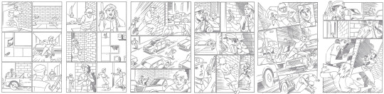
Let's look at one last thing, a similar demonstration from How to Draw Comics the Marvel Way. There are a lot of things that can be said about how much of the advice in How to Draw Comics the Marvel Way is destructive, but let's just ignore that larger discussion for now.
Obviously the left page is the boring, non-Marvel page, and the right page is the Marvel page. Notice how much more dynamic the Marvel page is without changing the panel grid, or breaking any borders. Dynamics, in many cases, really does come down to using high or low angles and creative blocking / composition. And, once again, there are instances where some of the panels on the left page might be more desirable than compositions on the Marvel one; context is key.
Varying the size and shape of panels or their points-of-view doesn't "add drama," it adds visual interest. And narrative is more important than visual interest.
5 notes
·
View notes
Photo

Here’s a little process gif of my last piece. I didn’t realize it at the time, but I actually drew it on Votoms’ anniversary. Happy birthday, Scopedog! I posted it the day after, though.
The references are sourced from a video of the Volks 1/8th “Mechanical Moving” Scopedog, and the interior drawing I found in Tim Eldred’s Votoms Viewer’s Guide, though I figure it’s from some production or model sheets. Eldred also uploaded the Volks video, so big kudos to him.
64 notes
·
View notes
Text


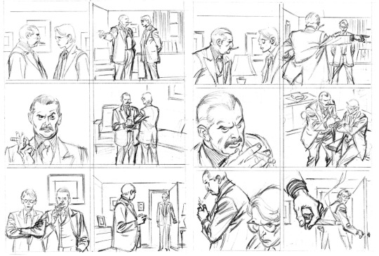
Firearm #1
by James Robinson; Cully Hamner; John Lowe;Paul Mounts and Tim Eldred
Malibu
2 notes
·
View notes
Text
"Yesterday's" Comic> Star Blazers: The Magazine Of Space Battleship Yamato #3
BW's "Yesterday's" Comic> Star Blazers: The Magazine Of Space Battleship Yamato #3
“It worked for Cybertron in the 1980s. I’m sure we’ll be fine.”
Star Blazers: The Magazine Of Space Battleship Yamato #3
Argo Press (December, 1995)
“The New Voyage” part 2
ADAPTATION/ARTIST: Tim Eldred
COLORISTS: John Ott & Tim Eldred
(more…)

View On WordPress
2 notes
·
View notes
Text

Bronze Frog, Tim Cotterill # 3004 / 5000, Engraved "Frogman"

Source:
East Dennis, MA
Eldred's
1 note
·
View note
Text
I guess this show was almost lost to an internet generation; all star voice acting.
0 notes
Photo

In today’s shop update we’re off to outer space! these and over 200 more will be posted in the upcoming week! as some of you may know I run a small mail order online shop of over 10,000 small press & alternative comics (No Marvel or DC here!) it isn't up quite yet but I wanted to start sharing some of the stock updates with you all as I am still shipping all over the US & Canada (orders over $100 get free shipping) so, if you'd like a list of what we have (we update the list every week) just ask and I can e-mail it to you
6 notes
·
View notes
Photo

“I Can Hear Between The Lines”
Death Rattle #1 (November 1995)
Tim Eldred
Kitchen Sink Press
#Death Rattle#Tim Eldred#Kitchen Sink Press#Great Comics#Great Comic Art#Dollar Bin Finds#I Can Hear Between The Lines
0 notes
Last Seen Blogs

russianmonarchybook
Русская Монархия

star-eye-blog1
Starry

mitzvahrain
Sokak ağzı

6rescvh
6rescvh

oskardraws
oskardraws