#Until the Light
Text
favorite hobby when I'm driving is to catch someone trying to climb up my back bumper while I'm going a completely reasonable speed and just slowly take my foot off the gas. you seem upset, brother. why don't we slow down and enjoy the view awhile
#if you won't maintain enough space to stop if I have to slam on brakes then I will just have to go slow enough that it won't kill us both.#kisses 💜#goes double if you have your brights on#some guy tried to tailgate me with brights on in the rain at night a while ago and I was like beloved we are going 20 until you stop that.#like at that point it's not even spite it's literally that I can't see to safely go any faster than that#lights off back off go around or accept the pace I've set for us#I don't like driving. also.
20K notes
·
View notes
Text
“You were right. You were right about me. Tell your sister…you were right.”
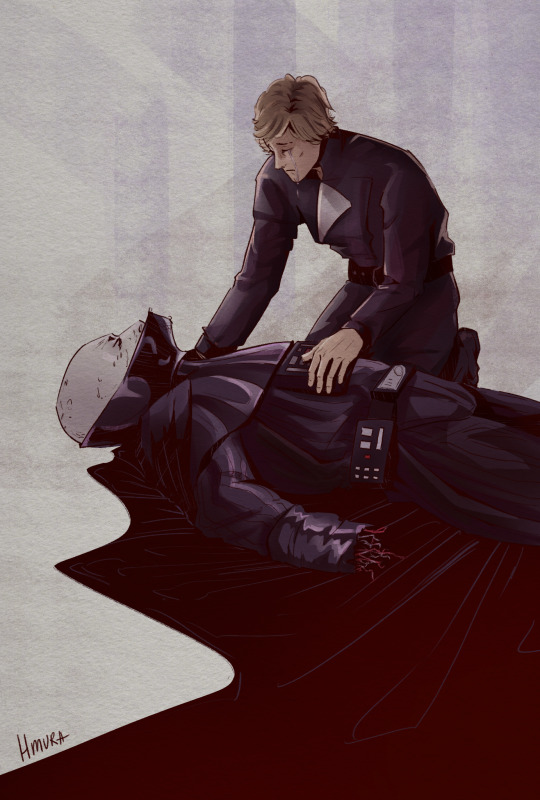
#rewatching rotj made me emotional okay#i struggled an unreasonable amount while drawing this#vader and luke with their fifty shades of black clothing#like father like son what can i say#every time i think how luke not only accepted that vader was his father#but also believed that he could return to the light side#how he refused to fight vader untill the last moment#and how he was grieving anakin after his death while everyone else were celebrating#every time i die a little bit inside#luke deserves the world is all im saying#star wars#star wars fanart#luke skywalker#anakin skywalker#darth vader#artists on tumblr#digital art#illustration#украрт#art
1K notes
·
View notes
Text

(...) but amongst the pastiche of war and desire, beauty and damage, I saw Claudia, in an impossible afternoon light she could never survive in. Claudia as Madeleine perceived her. Resplendent. rendered even more beautiful by her beholder. And I knew then, with all certainity, she would be a better companion to Claudia than I ever had.
#claudiaaaaaaaaaaaaaa. i love you. you should have been in lesbos with that weird girl for all eternity#iwtv#my art#portraits#i said at 12 i would stay up drawing until 3 to get the brainworms out and i did it goodnight#i really picked the most hazy screenshot with the worst lighting didnt i
2K notes
·
View notes
Text

Memories
#artists on tumblr#star wars fanart#star wars: the clone wars#clone trooper boil#Numa (implied)#more playing with style and lighting#temuera morrison#referencing photos until I can recreate this face without them#Thanks to Nils for choosing Boil as the next clone in this study#post-order 66#don’t ask me where the light is coming from in this
1K notes
·
View notes
Text
tears of a dragon
#Tears of the Kingdom#The Legend of Zelda#Light Dragon#Totk#not gonna tag this with spoilers because we see this dragon literally in the tutorial#i have more art ideas for it but I won't draw\post them until the game has been out for a longer while#have fun everyone i fucking love dragons
12K notes
·
View notes
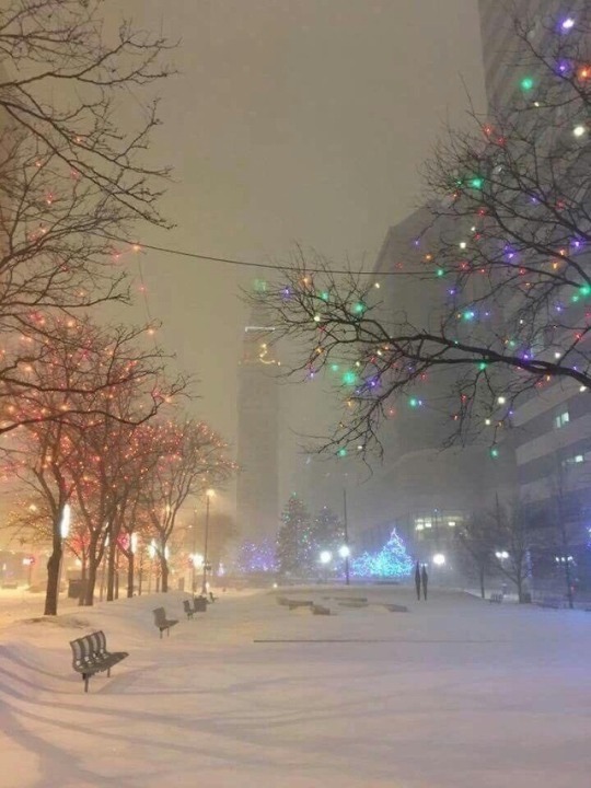
Photo
#xmas#xmas time#christmas#christmas tree#Christmas Cookies#christmas eve#Christmas countdown#christmas lights#Merry Christmas#christmas time#white christmas#christmas morning#christmas food#christmas chocolate#christmas is coming#can't wait for christmas#days until christmas#snow#winter#cold#cuddle#presents#santa#santa claus#Dear Santa#sweather weather#warmth#warm#cozy#cosy
4K notes
·
View notes
Text
Fellas is it gay to kneel between your friend’s legs and beg him with tears in your eyes to pause the mission, just temporarily, so that one no one in your party dies in the effort? Is it gay to plead with him and tell him that you’re afraid to lose him, that all 3 of them matter to you, but that your fate is ultimately in his hands?? Fellas????
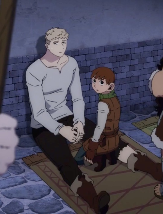
#catch me shipping all the dunmeshi ships idgaf THEY’RE ALL GOOD#dungeon meshi#delicious in dungeon#chilchuck tims#laios touden#chilaios#i was so certain that somebody had to have made a post about this by now and NOBODY HAS???#like trigger follows the manga but they EMPHASIZED the angles on how close chilchuck is between laios’ legs#i wasn’t even thinking of them in a shippy light until this scene#chilchuck#laios dungeon meshi#chilchuck dungeon meshi#chilchuck x laios#laios x chilchuck#neo queen serenity’s posts
2K notes
·
View notes
Text
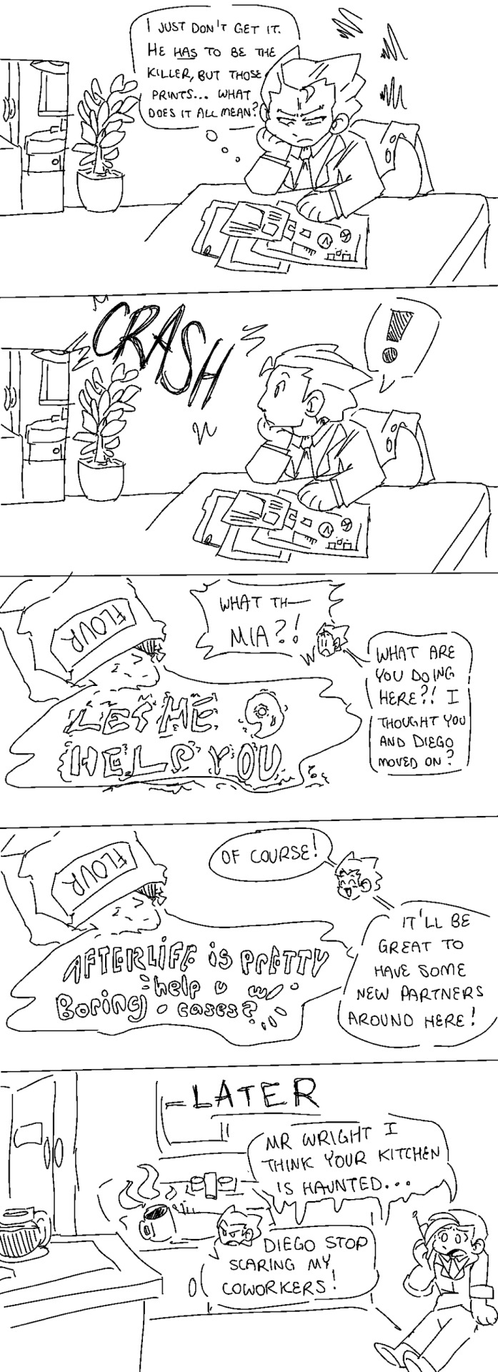
I like to think that the WAA is super haunted because the ghost lawyers got bored and want smth to do
#phoenix wright#mia fey#diego armando#apollo justice#godot#ace attorney#Phoenix makes the house very ghost friendly. There’s a whiteboard and bells and a bunch of stuff they can use to communicate#Mia is actually helpful with cases and uses the bells and whiteboard to help Phoenix when he’s stuck or missing smth#Diego just waits until Phoenix makes a dumb conclusion and dumps coffee on his head or flickers the lights bc he’s an asshole#mod vex#comic#vex art
4K notes
·
View notes
Text

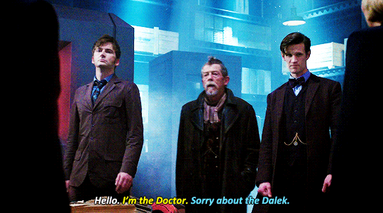


#mine#doctor who#dwedit#christopher eccleston#david tennant#matt smith#peter capaldi#jodie whittaker#ncuti gatwa#john hurt#jo martin#ok i really only started making this gifset for the last one of fifteen lmao#i did not expect to be sitting here making 9 more gifs but here we are!!!#the only one i really left out is david bradley as the first doctor#but that's because the scene where he says his line in tuat... i don't like the lighting#and you don't even really see his face until after he's said it#but i mean technically these are all the new who doctors :')#and of course dt is in 4/10 of these lol
2K notes
·
View notes
Text
I think 90% of my gripes with how modern anime looks comes down to flat color design/palettes.
Non-cohesive, washed-out color palettes can destroy lineart quality. I see this all the time when comparing an anime's lineart/layout to its colored/post-processed final product and it's heartbreaking. Compare this pre-color vs. final frame from Dungeon Meshi's OP.


So much sharpness and detail and weight gets washed out and flattened by 'meh' color design. I LOVE the flow and thickness and shadows in the fabrics on the left. The white against pastel really brings it out. Check out all the detail in their hair, the highlights in Rin's, the different hues to denote hair color, the blue tint in the clothes' shadows, and how all of that just gets... lost. It works, but it's not particularly good and does a disservice to the line-artist.
I'm using Dungeon Meshi as an example not because it's bad, I'm just especially disappointed because this is Studio Trigger we're talking about. The character animation is fantastic, but the color design is usually much more exciting. We're not seeing Trigger at their full potential, so I'm focusing on them.
Here's a very quick and messy color correct. Not meant to be taken seriously, just to provide comparison to see why colors can feel "washed out." Top is edit, bottom is original.
You can really see how desaturated and "white fluorescent lighting" the original color palettes are.
[Remember: the easiest way to make your colors more lively is to choose a warm or cool tint. From there, you can play around with bringing out complementary colors for a cohesive palette (I warmed Marcille's skintone and hair but made sure to bring out her deep blue clothes). Avoid using too many blend mode layers; hand-picking colors will really help you build your innate color sense and find a color style. Try using saturated colors in unexpected places! If you're coloring a night scene, try using deep blues or greens or magentas. You see these deep colors used all the time in older anime because they couldn't rely on a lightness scale to make colors darker, they had to use darker paints with specific hues. Don't overthink it, simpler is better!]
#not art#dungeon meshi#rant#i'm someone who can get obsessive over colors in my own art#will stare at the screen adjusting hues/saturation for hours#luckily i've gotten faster at color picking#but yeah modern anime's color design is saddening to me. the general trend leans towards white/grey desaturated palettes#simply because they're easier to pick digitally#this is not the colorists fault mind you. the anime industry's problems are also labor problems. artists are severely underpaid#and overworked. colorists literally aren't paid enough to do their best#there isn't a “creative drought” in the anime industry. this trend is widespread across studios purely BECAUSE it's not up to individuals#until work conditions improve anime will unfortunately continue to miss its fullest potential visually#don't even GET ME STARTED ON THE USE OF POST-PROCESSING FILTERS AND LIGHTING IN ANIME THOUGH#SOMEONE HOLD ME BACK. I HATE LENS FLARES I HATE GRADIENT SHADING I HATE CHROMATIC ABBERATION AND BLUR
2K notes
·
View notes
Text

dungeon lord marcille ft. timelapse
#marcille#dungeon meshi#dunmeshi#dungeon meshi spoilers#my art#thought it would be fun to upload a process vid teehee#love the 0.2 seconds where i tried the pink color scheme & then immediately abandoned it#i still =kind of like it but i think id need to lean harder into the orange rim light#and i really wanted to keep her bloodstained feet bc thts why i drew this. TBH!@!! i love that aspect of her design so much#and her cowl.^__^ <3 sooo cute. I CANT BELIEVE PPL IN UNIVERSE THINK ITS UGLY AND WEIRD .??? DIEEE#also srries for starting the recording late . i dont have it auto checked bc of storage n i always FORGET!!!!!!#until its too l;ate but whtevers i actually kind oif remembered this time
611 notes
·
View notes
Text
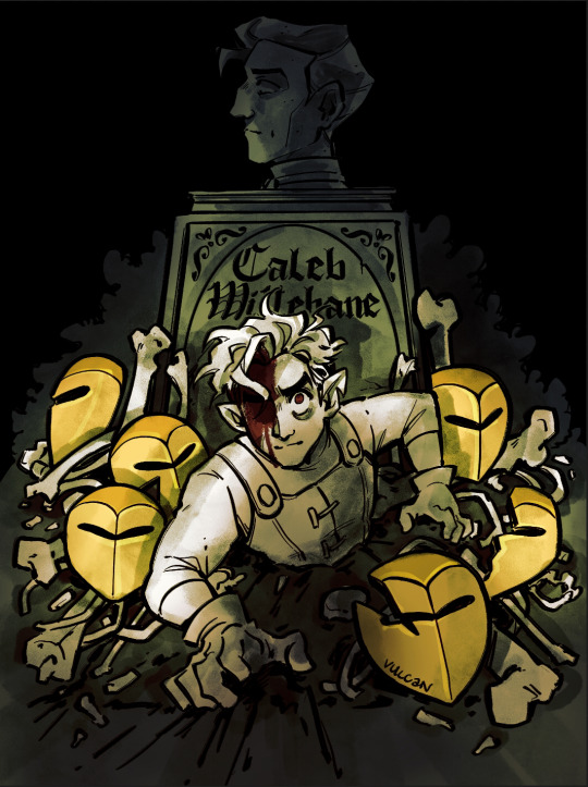
tumblr can have a wip, as a treat
#i'll finish this eventually#until then#hands u all this lol#hunter toh#hunter noceda#toh#the owl house#fanart#my art#digital art#wip#caleb wittebane#golden guard#this is mainly a lighting test ive got flats in another file#i want it to have the vibes of a ghost investigation photo fjdjg
13K notes
·
View notes
Text


Nicole "fuck this shit" Haught vs DarkAngel!Waverly
#wynonna earp#wynonna earp: vengeance#kat barrel#dpc#nicole haught#waverly earp#wayhaught#mine: wynonna earp#oy vey i could not see these in action after i made them until now lol#i barely touched any settings so theyre not very pretty but#oh god the lighting I'm sorry#mine
438 notes
·
View notes
Photo


HAPP Y DE MON
also some aiolis
#min draw#monkie kid#mk#mei#red son#ao lie#didn't know when to post the ao lie drawings so just waited until the specials came out hehe#HAPPY PRIDE MONTH#featuring the#traffic light trio
4K notes
·
View notes
Text


perseids and northern lights?!!?! magical ✨
#northern lights#perseids#mine#you can see a shooting star in the first photo#the faint line#(the other is a plane)#anywho#we sat watching the shooting stars for so long#and saw some of the biggest brightest ones I think I’ve ever seen#but also didn’t know about the lights until right before we got there so even better#sitting under all that with my favorite girl too?#blessed as shit#also those people were screaming and jumping for joy watching too#was so damn cute had me smiling#🖤#photography#photographers on tumblr
660 notes
·
View notes
Photo
#christmas#christmas tree#Christmas Cookies#Christmas countdown#christmas lights#christmas eve#Merry Christmas#christmas time#christmas spirit#white christmas#christmas morning#christmas is coming#christmas food#christmas chocolate#can't wait for christmas#days until christmas#santa#santa claus#Dear Santa#winter#snow#cold#warm#warmth#presents#sweather weather#cuddle#xmas#xmas time#cozy
3K notes
·
View notes
Last Seen Blogs

giselleermz
Y así...
mossyappendix
𝒮𝒶𝒹𝑒, 𝒹𝒾𝓈-𝓂𝑜𝒾...
remus-poopin
Remus Lupin, My Beloved

izmirtravestigozdepolat
#izmirtravesti

studyboldstorm
storm's study inspo