#visualgrammar
Explore tagged Tumblr posts
Visit Tumblr Blog
Explore Tumblr blogs with no restrictions, modern design and the best experience.
Last Seen Tumblr Blogs


Fun Fact
12.7% of mobile users access Tumblr.
Text
See, how color and contrast can alone make a big impact in a design

Color and Contrast, are one of the most important visual hierarchy principles every designer should know.
Read more such design rules - Good Design Rules
1 note
·
View note
Photo
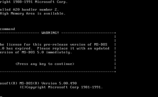


The Visual Grammar of MS-DOS
MS-DOS, an acronym for the Microsoft Disk Operating System, was an operating system released in 1981. Based off the command line, it began to diminish thanks once Windows 3.0 released with a GUI and the rise of graphical user interfaces on personal computers.
However, MS-DOS was still packaged with the operating systems for troubleshooting and launching old software. Even though it no longer exists, the modern command line interface is still from the same roots and aesthetically not worlds apart.
Key Elements of the Aesthetic
Text Driven - Hierarchy is determined mainly by colour, capitalisation, and spacing.
Dark UI - That old school terminal haze dominates, with a dark background and light text (normally white).
High Contrast - Matching the dark theme, if there is colour it tends to come in a bright white, blue, green, or orange which stands out on the dark background. Different colours are generally used sparingly and only for clearly defined meanings (such as errors).
Narrative:
Arcadia should feel timeless so that it can feel real and modern while rooted in the mystery of its past. MS-DOS and command line interfaces are perfect for this, capturing the 80s-90s tech aesthetic but also still underlying in most tech today.
The fact that MS-DOS still released with later software and was used for bootstrapping or troubleshooting when the GUI failed makes this kind of aesthetic the perfect narrative fit for Arcadia: capturing the idea that the software is broken and maybe had a GUI portion which you are trying to restore.
This gives me all sorts of ideas for how it might be presented: potentially even glitching to show the GUI at different points as you restore parts of the database.
Onboarding could be a fake install/boot up of the Arcadia database using a faux command line interface style.
6 notes
·
View notes
Text
Book Reference
0 notes
Text
Does Teaching “Visual Grammar” Make Sense?
In their book “Reading Images: The Grammar of Visual Design”, Kress and Leeuwen discuss how different cultures have rules that determine what their images and designs look like. They call these rules “grammar of visual design” (2). They go on to say later in the book that visual communication and literacy skills should be emphasized more for children going as they go through school (17).
They say: “in terms of this essential new communication ability, this new ‘visual literacy’, institutional education, under the pressure of often reactionary political demands, produces illiterates” (17)
But they say that grammar varies within cultures, and that it is simply an observation of patterns that have emerged, not necessarily a set of rules to restrict artists... so why do we even need to teach kids these rules?
Shouldn’t we let kids explore different designs on their own, and figure out what looks best to them, rather than teaching them rules about design? I feel like it’s better to learn by just trying things out in this case, and saying that one type of design is better than another is inherently subjective.

Sources:


0 notes
Text
Notice - Visual Grammar
I have been doing research into brand attributes (visual grammar) and I have done a few brands audits on competitors to see what I thought their visual grammar was and how the words they used made me feel about their brand. Doing the brand audits I started to see a pattern among them as they were very similar products so the words they use were very similar.
The following words I have chosen to describe my brand are:
Inspiration
Designers
Discover
News
Up to Date
Organisation
Save
Problem-Solving
Go-To Resource
Community
Trust-worthy
Reliable
I have chosen these words to set the tone of my application. With each word I want my users to feel something. I want them to have a sense of community that they can trust and know that they will always be supported in their projects with my application. They can trust to have the latest and greatest content. They can save for later, solve their design problems and keep up to date on news. I want my brand to give off the vibe of reliability and contentment that my users can rely on “Notice” to hold on to all their research.
0 notes
Photo

I could spend hours peering into the fourth dimension // Christian Leborg’s Visual Grammar explains both the basic and the complex with beautifully comprehensible language and design // #christianleborg #fourthdimension #time #timeandtimeagain #graphicdesign #graphicdesigner #grammar #visualgrammar #art #colour #philosophydontgiveadamn (at Austin, Texas) https://www.instagram.com/p/B3deY3PHo7W/?igshid=1iu3tgbengc6y
#christianleborg#fourthdimension#time#timeandtimeagain#graphicdesign#graphicdesigner#grammar#visualgrammar#art#colour#philosophydontgiveadamn
0 notes
Text
Visual Grammar - Colour injection
Nospr
Polish National Radio Symphony Orchestra (NOSPR), is one of Poland's radio orchestra and premier musical institutions. It was founded in 1935 in Warsaw. In 1945 the orchestra was re-established in Katowice and since 2006 it has become a "National Cultural Institution".

The website consists of a very minimal monochromatic colour scheme with an injection of colour (red). The colour injection is just a simple red box overlapping a black box. I love this idea, I think it works really well and looks clean and simple but not boring and drab.

when you move to a different page away from the main home page the red box shifts to the side. This again adds a simple splash of colour in a simple way. The website also uses some text in red to bring the colour out more and create an interesting visual aesthetic.

Again the red box has shifted to the right. The image used is in black and white which again is in-keeping with the overall colour scheme and feel of the website. I think the overall aesthetic of this website is amazing and I hope to include the idea of colour injection within my portfolio website.
0 notes
Text
IXD 301 - Where Does Content come from + Visual Grammar
For this lesson of week 2 for IXD 301 we began learning about where content comes from and Visual Grammar to help us with content for are portfolio website.
First we began learning about different areas you can get content, for the website:
Client
Client Content is gathering / analysing info about your clients and making content on your website that suits the needs of them clients.
Self Generated Content
Self generated content is content which you have written on your own or created on your own for example your brand, website etc.
Third party Content
"Third party content"is exactly what it sounds like - content which was made/created by someone else for example wikipedia
User Generated content
Is any type of content that has been created and put out there by unpaid contributors or, using a better term fans.
Then we began learning about what a content creation is:
What is content Curation?
Content curation is the process of sorting through the vast amounts of content on the web and presenting it in a meaningful and organised way around a specific theme. The work involves sifting, sorting, arranging, and publishing information.* - Beth Kanter
Why is content curation valuable?
Content creation is a very important practice in the market today as its needed because when you create content, you're providing free and useful information to your audience, attracting potential customers to your website, and retaining existing customers through quality engagement.
Basic Principles for content curation:
Good content is appropriate
Good content is useful
Good content is user centred
Good content is clear
After learning about Content curation we set about on learning about User stories and Job stories:
User stories
What are user stories?
User stories are short, simple descriptions of a feature told from the perspective of the person who desires the new capability, usually a user or customer of the system. They typically follow a simple template: As a < type of user >, I want < some goal > so that < some reason >.
For example:
When[ looking for a placement student]
I want to [ find out who they are or what they can do.]
So I can [ recruit a student]
Job Stories
What are job stories?
A Job story is a powerful way to facilitate the team conversation and discovery when designing products. They are meant to cut right to the job to be done by eliminating distractions. The job story encourages the product’s design process to focus on content, causality and motivations instead of assumptions, subjectives, personas and implementations.
https://jtbd.info/5-tips-for-writing-a-job-story-7c9092911fc9
When _ , I want to _ , so I can _ .
For example:
When an important new customer signs up, I want to be notified, so I can start a conversation with them.
Furthermore to further understand user stories and job stories Kyle got us to do the first exercise of the lesson which was to write are own user stories:
Exercise 01 (write a user story)
For exercise 01 I wrote two user stories and after doing this exercise I gained a better understanding of user stories.
User story 1
I'm a small home-made clothing company and I’m looking for a website for my small business
When [I am looking to attach more customer to my business]
I want to [find out who is visiting my business]
So I can [make clothing that attracts them customer]
User story 2
I'm a driving instructor and Im looking to for someone to create an app for my business
When [I am looking for learners]
I want to [book lessons]
So I can [have more lesson which equals more money]
Visual Grammar
What is visual Grammar?
To properly understand what visual grammar is, Christian Leborg’s brilliant book called “Visual Grammar” is the best solution. An excerpt from the book, rather its preface, says the following:
“The reason for writing a grammar of visual language is the same as for any language: to define its basic elements, describe its patterns and processes, and to understand the relationship between the individual elements in the system. Visual language has no formal syntax or semantics, but the visual objects themselves can be classified.**”
https://www.thejigsaw.in/blog/visual-grammar
Or in very simple terms visual grammar is anything you see on scene.
Tips of Visual Grammer:
Simplify as much as possible
What can you do with constraints
Focus on re-using elements and minimising visual complexity
Language and Typography
Language
when deciding what type of language you should use for your website.
You should be asking:
Who are you? ( Do you what to be protrayed as an professional or a down to earth guy)
What are your values? ( are you in it for fame etc.)
All we have is words, All we have is worlds - Tim Etchells.
Typography
What is typography?
Typography is the art and technique of arranging type to make written language legible, readable, and appealing when displayed.
“Typography is the craft of endowing human language with a durable visual form.” - Robert Bringhurst
When thinking about of what typography you should have for the portiofio website.
You should be asking:
Does it optimise legibility
Improve accessibility
Improve usability
Tips for language and typography:
Spend some time developing a brand dictionary at the beginning of the project. What can you do with constraints?
Ensure every page or screen has a clear call-to-action
When considering typography, less is more
0 notes
Photo

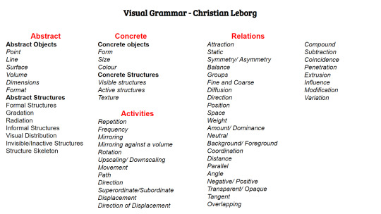
Visual Grammar
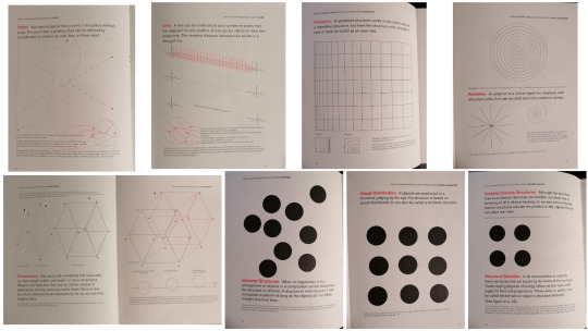
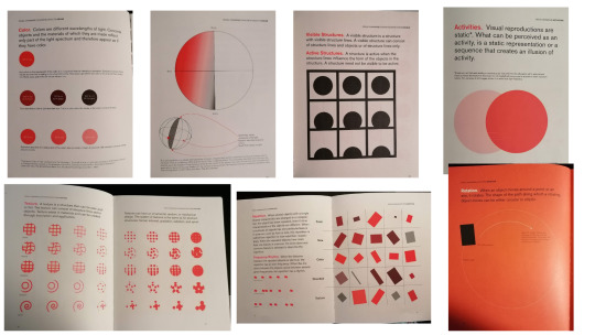
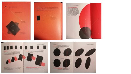
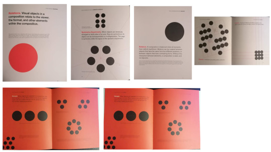
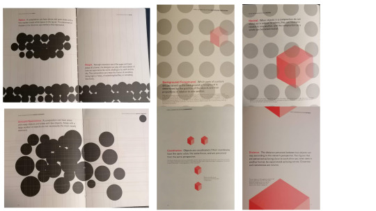
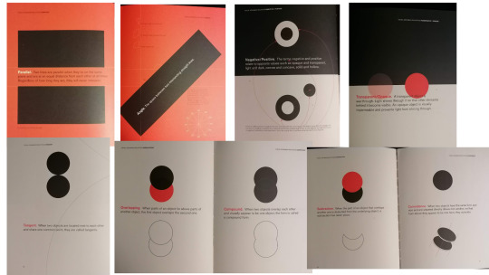
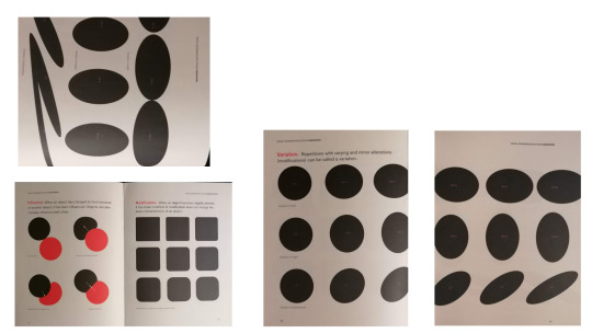
Before moving any further with my work, I'm reading up about visual grammar. Christian Leborg has clearly displayed the ways in which simple shapes can be extremely communicative and powerful within design. The section surrounding relations between circles demonstrates that displaying connections visually doesn't have to be overly complicated and can create a strong flow in your work. For example, the above image from the book displays rhythmn. Within my wallpaper I want to emulate the simplicity and use of white space Leborg employs.
0 notes
Photo

Today's essential reading...#dvc17 #postgrad #graphicdesign #visualcommunication #visualgrammar #christianleborg #lotsofdots
0 notes
Photo


VisualGrammar course of Dora Balla Typography workshop by de_form
66 notes
·
View notes
Photo

Know about visual brand assets!!!
Click here to join visual grammar course - https://www.graphic-design-institute.com/visualization-course-institute-delhi
1 note
·
View note
Photo


The Graphic Posters of Bráulio Amado
Bráulio Amado is Portugese graphic designer/illustrator/designer supreme. His work ranges from New York Times and WIRED to artist collaborations with Frank Ocean and Beck. My sister first introduced me to his work and I loved the kinetic, often colourful designs which mixed a feeling of handcraftedness with digital grunge. However, it wasn’t until looking at his posters again that I realised some of the pieced together style, signboard typography, and bold layouts actually could be relevant for The Arcadia Report.
In particular:
I love the various signboard, tickets, stamp, 90s computer style typographic layouts. They feel like a surreal artefact without any of the photorealism or skeuomorphic design. This is the kind of style I would love to achieve for the files in The Arcadia Report.
Overlapping text, missing letters, blank spaces - what’s missing from the layout becomes as important as what is there. It feels full even when empty.
Bold graphic style meshing seamlessly with illustrations and photographs - One of my concerns was how to maintain realism while treading carefully around where to go illustrated vs photographic (and how to make both feel natural and not like cheap stock images). Braulio’s posters are an excellent example of mixing all while feeling natural and timeless.
2 notes
·
View notes


Photo
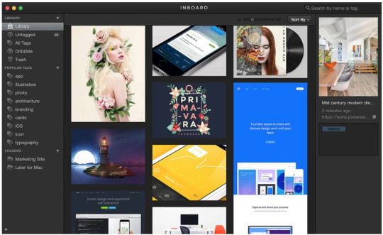
Inbound - Brand Audit
While I have been starting to plan my user flows, I have been trying to come up with my brand dictionary for my application.
Inbounds Phrases are:
Ready to Try Inboard too?
Organizing screenshots, images or photos in Finder is a major pain.
Organize Your Inspiration
Words:
Organize
Inspiration
Workflow
Desktop
Images
Creatives
Browse
Projects
What I think and how it makes me feel about their brand?
I can tell from the words this application uses that it focuses a lot on organisation, that this is their main aim. This makes me feel like I could trust them to help me keep my inspiration organised. From them also showing their user personas and using the word “Creatives” makes me feel like this is something that would work for me as I would be in their persona bracket. It makes me feel like I can relate to the purpose of their brand to help creatives to stay organised. This is important as it resonates well with their target audience.
0 notes
Photo

For now I'am smoking in the dark place..
dont know what i want and only can breathe back continuously
1 note
·
View note