#DesignStrategy
Explore tagged Tumblr posts
Visit Tumblr Blog
Explore Tumblr blogs with no restrictions, modern design and the best experience.
Last Seen Tumblr Blogs


Fun Fact
Post activity is at the highest at 4:00 pm EDT; notes peak at 10:00 pm EDT.
Text


Fecktor - Modular Font
Download
Fecktor is a decorative typeface made for display needs, headlines, logos etc. Made with minimalism inspired by the shape of butterfly wings combined with modular to produce a modern Art deco impression and style. Fecktor has 8 variations ( light, regular, bold, solid, extended light, extended regular, extended bold and extended solid ) equipped with uppercase, lowercase, numbers and some symbols
#BrandIdentity#Font#FreeFont#Freebie#LogoFont#Logotipo#Typeface#Typography#VisualIdentity#GraphicDesign#CreativeDesign#DesignInspiration#DesignTrends#ModernDesign#DigitalDesign#PrintDesign#WebDesign#Illustration#ArtDirection#DesignStudio#VisualArt#DesignProcess#DesignConcept#MinimalDesign#CreativeProcess#DesignPortfolio#DesignCommunity#DesignChallenge#DesignThinking#DesignStrategy
7 notes
·
View notes
Text
UI/UX Design Services - Vee Technologies
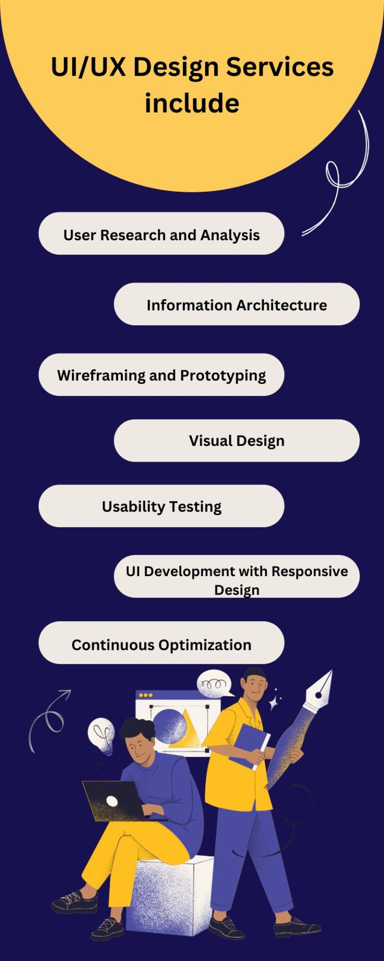
The UI/UX services team of seasoned experts is committed to creating seamless, visually impressive interfaces that captivate users while elevating your brand. Their strategic approach combines aesthetics with functionality, ensuring a user-centric experience for your audience.
Explore More: https://www.veetechnologies.com/services/it-services/product-and-application-development/ui-ux-design-services.htm
#UIDesign#UXDesign#UXUIDesign#UserExperience#UserInterface#DigitalDesign#WebDesign#InteractionDesign#ProductDesign#UserCenteredDesign#UIUX#DesignStrategy#Wireframing#Prototyping#VisualDesign
2 notes
·
View notes
Text

Another example of a wicked design problem is our healthcare system. As we look at our healthcare options, cost, and accessibility, it's clear this isn't a tame problem, as described in our reading (Rittel 1972). There are so many layers to the healthcare system, from who benefits, to how much should be accessible to all at low or no cost. This is something that still could use some problem solving as we navigate the current healthcare and insurance landscape.
Image credit: Getty Images
2 notes
·
View notes
Text
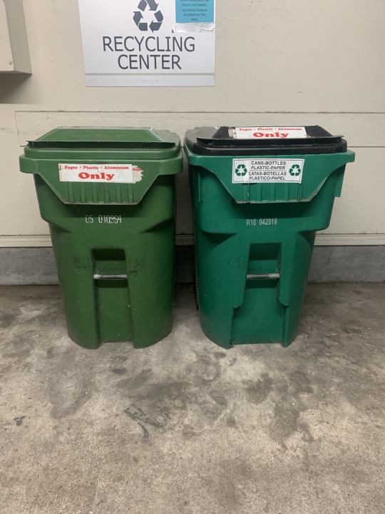
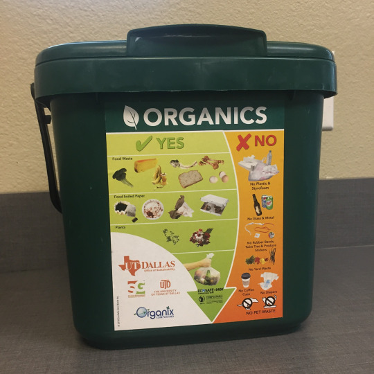
Visual Diary 2: Food Waste
A wicked problem that I see in my own community is food waste. It’s estimated that 2.3 million tons of food in Dallas is added to landfills from businesses and residents. Although there are programs that individuals can pay and sign up for to compost their food waste, it’s often expensive and requires a lot of work on the individual’s part (space to compost, driving the compost to a donation center, etc.). Also, the majority of Dallas residents live in apartments or small lots and don’t have the space for a large composting bin.
The first image is of my apartment’s recycling center and as you can see, there are only options for paper, plastic, bottles, and cans. The second image is an example of a small composting bin that clearly labels what foods can be donated. If a bin like this one was in my apartment's recycling center, I would definitely use it! This seems like a wicked design problem that is begging for an innovative way that local residents can easily recycle their food waste.
Sources:
Food & Organics Diversion in North Texas. (n.d.). https://www.texasenvironment.org/wp-content/uploads/2020/08/Food-Organics-Diversion-Report-2020-FINAL.pdf
How to Recycle Food Waste in Dallas – A guide. Recycle Track Systems. (2021, June 11). https://www.rts.com/blog/how-to-recycle-food-waste-in-dallas-a-guide/#:~:text=While%20there%20is%20not%20a,turn%20their%20scraps%20into%20compost.
Sanitation services. Composting Food Waste. (n.d.). https://dallascityhall.com/departments/sanitation/Pages/foodwaste_recycle.aspx
#designstrategy#designintervention#desideratum#designstratey#holisticdesign#subjectivecritique#intentionality
2 notes
·
View notes
Text
Alleviating parameters such as time and finances.
With this crew, any dream is possible. Set sail on an adventure with ONE PIECE, the global phenomenon, now streaming only on Netflix.
12K notes
·
View notes
Text


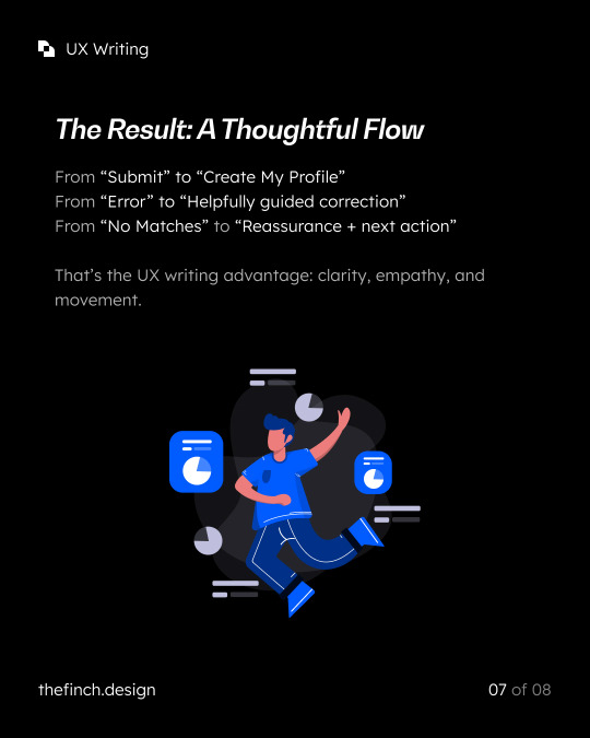

In digital products, every word matters. It goes beyond labels and buttons; it's about how language shapes what users feel, understand, and do.
Too often, copy is added at the last minute and only utilized to fill spaces rather than guide behavior and follow the user journey.
But when done right, UX writing becomes a design tool. It reduces confusion, builds trust, and keeps users moving with confidence.
We recently analyzed a dating app signup flow as a case study, which signifies how UX writing makes an impact without even us noticing!
In the carousel below, you’ll see how small language shifts make a big difference:
✅ A vague “Submit” becomes “Create My Profile” – clear and goal-oriented
✅ Cold error messages are replaced with helpful, human explanations
✅ Progress microcopy lowers friction during multi-step flows
✅ Even empty states turn into useful suggestions, not dead ends.
These changes aren’t about sounding “nicer.” They’re about designing an experience where the words do as much work as the visuals.
We’ve unpacked this in detail in our latest blog: https://thefinch.design/ux-writing-an-integral-component-of-ux-design/
#uxwriting#uxwriter#uxwritingtips#uxwritingenespañol#uxdesign#microcopymatters#designwithwords#contentdesign#microcopy#designstrategy#productdesign#technicalwriting#userexperience
1 note
·
View note
Photo
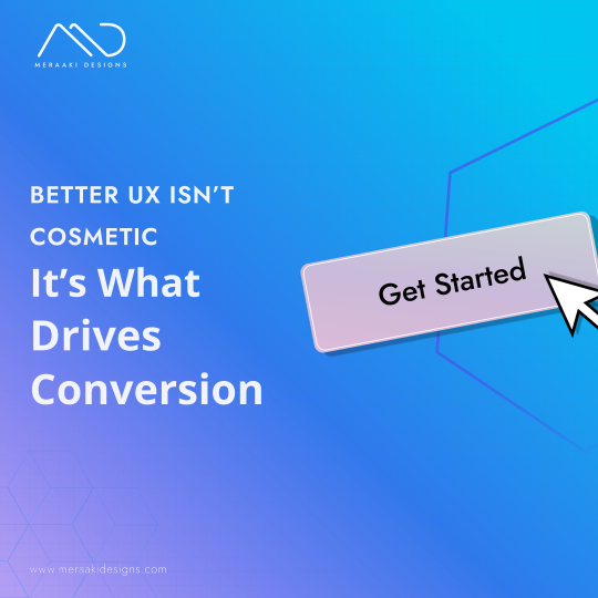
𝐆𝐥𝐨𝐛𝐚𝐥 𝐑𝐞𝐭𝐚𝐢𝐥 𝐂𝐥𝐢𝐞𝐧𝐭 – 𝟓 𝐔𝐗 𝐅𝐢𝐱𝐞𝐬 𝐓𝐡𝐚𝐭 𝐃𝐫𝐨𝐯𝐞 𝟐𝟎% 𝐌𝐨𝐫𝐞 𝐒𝐚𝐥𝐞𝐬 🛒 This retail brand had great products, seasonal demand, and consistent traffic. Yet they were leaving revenue on the table. Users abandoned carts. Navigation was clunky. Pages didn’t personalize. 𝐖𝐞 𝐜𝐨𝐧𝐝𝐮𝐜𝐭𝐞𝐝 𝐚 𝐟𝐮𝐥𝐥 𝐔𝐗 𝐚𝐮𝐝𝐢𝐭 𝐚𝐧𝐝 𝐚𝐩𝐩𝐥𝐢𝐞𝐝 𝟓 𝐜𝐨𝐫𝐞 𝐝𝐞𝐬𝐢𝐠𝐧 𝐬𝐡𝐢𝐟𝐭𝐬: Personalized homepage blocks based on browsing and campaign traffic Adaptive filters that dynamically changed by category and stock Streamlined checkout flow with a progress indicator and auto-fill UX copy that addressed objections during purchase decisions Behavioral data applied to CTA placement and sizing across devices 𝐓𝐡𝐞 𝐫𝐞𝐬𝐮𝐥𝐭? ✔️ 20% increase in online sales ✔️ 15% increase in repeat purchases ✔️ Better engagement across PDPs and category pages UX isn’t just about beauty—it's about buyer psychology. And when you fix the right friction points, your customers stay (and buy). 🧠 𝐖𝐡𝐞𝐧’𝐬 𝐭𝐡𝐞 𝐥𝐚𝐬𝐭 𝐭𝐢𝐦𝐞 𝐲𝐨𝐮 𝐰𝐚𝐥𝐤𝐞𝐝 𝐭𝐡𝐫𝐨𝐮𝐠𝐡 𝐲𝐨𝐮𝐫 𝐞𝐧𝐭𝐢𝐫𝐞 𝐜𝐡𝐞𝐜𝐤𝐨𝐮𝐭 𝐣𝐨𝐮𝐫𝐧𝐞𝐲 𝐥𝐢𝐤𝐞 𝐚 𝐫𝐞𝐚𝐥 𝐜𝐮𝐬𝐭𝐨𝐦𝐞𝐫? 𝐓𝐡𝐞 𝐚𝐧𝐬𝐰𝐞𝐫𝐬 𝐦𝐚𝐲 𝐬𝐮𝐫𝐩𝐫𝐢𝐬𝐞 𝐲𝐨𝐮. 𝐋𝐢𝐧𝐤 -> https://meraakidesigns.com/?utm_source=facebook&utm_medium=social&utm_campaign=homepage_traffic
#RetailBrand#OnlineSales#RevenueBoost#UXDesign#ConversionRate#BuyerPsychology#Engagement#CustomerRetention#Personalization#CheckoutFlow#UserExperience#BehavioralData#FrictionPoints#DesignStrategy#EffectiveEcommerce#Meraakidesigns
0 notes
Text
Enhancing Audience Engagement Through Effective Presentation Design Strategies
Presentation Design Ideas: Frequently Asked Questions Explained
1. "What’s the best way to structure a presentation design?"
The best way to structure a presentation design is to start with a clear outline: introduction, main points, and conclusion. Use a consistent theme and layout, limit text per slide, and incorporate visuals. Ensure each slide supports your message, maintain a logical flow, and engage the audience with interactive elements or questions. Practice for smooth delivery.
2. "What is the difference between presentation design and graphic design?"
Presentation design focuses on creating visual aids for presentations, ensuring clarity and engagement for an audience, often using software like PowerPoint. Graphic design, on the other hand, encompasses a broader range of visual communication, including branding, marketing materials, and digital content, emphasizing aesthetics and functionality across various mediums. Both require creativity but serve different purposes.
3. "Why is typography important in presentation design?"
Typography is crucial in presentation design because it enhances readability, establishes hierarchy, and conveys tone. Effective font choices can engage the audience, emphasize key points, and create a cohesive visual identity. Poor typography can distract or confuse viewers, undermining the message. Overall, good typography ensures that information is communicated clearly and effectively.
4. "What’s the difference between PowerPoint and Google Slides for presentation design?"
PowerPoint is a desktop application with robust features, extensive templates, and offline access. Google Slides is a web-based tool that allows real-time collaboration and easy sharing. While PowerPoint offers more advanced design options, Google Slides is user-friendly and accessible from any device with an internet connection. Both serve well for creating presentations but cater to different needs.
5. "What happens to your presentation if the design is too cluttered?"
If your presentation design is too cluttered, it can overwhelm the audience, making it difficult for them to focus on key points. Important information may get lost in the chaos, leading to confusion and disengagement. A clear and simple design helps convey your message effectively and keeps the audience’s attention on what matters most.

Visit: VS Website See: VS Portfolio
0 notes
Text
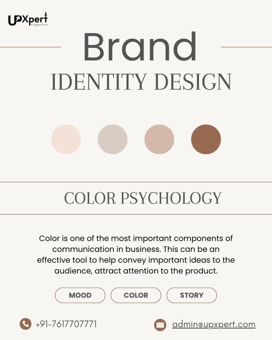
Colors do more than just look good — they evoke emotions and shape how your audience perceives your brand. The right hues can build trust, spark excitement, and make your brand unforgettable.
Ready to discover the perfect palette for your brand? Let’s create designs that truly connect!
📩 DM us “COLOR” or contact us: 📧 [email protected] 📱 +91-7617707771"
#ColorPsychology#BrandColors#GraphicDesignTips#CreativeDesign#MarketingDesign#BrandIdentity#DesignStrategy#VisualBranding#UpXpert#ColorTheory#DesignInspiration#BrandBuilding
1 note
·
View note
Text
0 notes
Text


Florisa - Flowers Font 🌷☘
Download
Florisa is a typeface inspired by the unique shape of flower petals, which are made into unique letters. Florisa can be used for displays, headlines, logos etc. Florisa comes with capital letters, numbers and some symbols, and line version
#BrandIdentity#Font#FreeFont#Freebie#LogoFont#Logotipo#Typeface#Typography#VisualIdentity#GraphicDesign#CreativeDesign#DesignInspiration#DesignTrends#ModernDesign#DigitalDesign#PrintDesign#WebDesign#Illustration#ArtDirection#DesignStudio#VisualArt#DesignProcess#DesignConcept#MinimalDesign#CreativeProcess#DesignPortfolio#DesignCommunity#DesignChallenge#DesignThinking#DesignStrategy
5 notes
·
View notes
Text
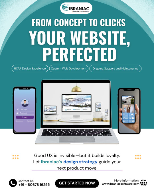
Stop guessing. Start designing with purpose.https://ibraniacsoftware.com/design-strategy-building/
#design#designstrategy#ibraniac#brandbuilding#strategicdesign#creative#creativethinking#designintent#designwithstrategy
0 notes
Text

The Microsoft Surface is an example of good design by incorporating a stand and hide-able Surface pen
2 notes
·
View notes
Text
Visual Diary 1: Patagonia
Patagonia is an example of a brand that promotes environmentalism with the use of sustainable products, spreading awareness, and encouraging activism. They are a leader as a large brand that continuously gives back.
2 notes
·
View notes
Text
Best – Australia’s Leading Wayfinding & Placemaking Design Studio
Best Design Studio is a visionary Australian firm crafting intuitive wayfinding systems, signage, and placemaking strategies. Their work empowers people to experience, explore, and feel connected to the spaces they move through. Trusted by cities, airports, and brands—Best is where design meets purpose.
#UrbanDesign#WayfindingExperts#PlacemakingAustralia#SignageSolutions#DesignStrategy#HumanCenteredDesign
0 notes