#Readability
Explore tagged Tumblr posts
Visit Tumblr Blog
Explore Tumblr blogs with no restrictions, modern design and the best experience.
Last Seen Tumblr Blogs


Fun Fact
Post activity is at the highest at 4:00 pm EDT; notes peak at 10:00 pm EDT.
Text
Btw, in case anyone was wondering...

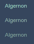
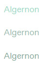
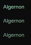
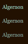
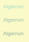
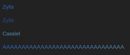
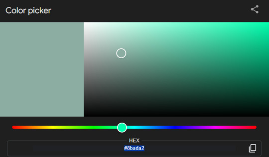
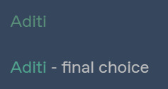

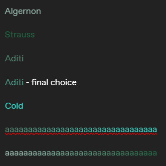
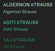
It can be difficult to get the colors for characters!
Especially because I like giving families similar colours, or align colors with people's magic! 👀
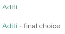
(Also, the middle color for Algernon was selected, haha)
Taglist under "read more"!
@honeybewrites @the-golden-comet @illarian-rambling @ashirisu @urnumber1star
@the-letterbox-archives @48lexr @aalinaaaaaa @thecomfywriter @an-indecisive-nerd
#the faechild speaks#character colors#color coding#readability#color design#color coordination#color theory#writeblr#writers on tumblr#writing#writerscommunity#writers#creative writing#writblr#writing community#writers of tumblr#writer stuff
16 notes
·
View notes
Text
It's okay. 🙂↕️
Kindness is obviously the hardest form of labor. 😶

#writeblr#writing#writers on tumblr#writer problems#writing process#fantasy#writerblr#writer#spilled ink#writers#readables#readability#quite frankly#hard work
10 notes
·
View notes
Text
font rant below cut - I think it's important
STOP USING TIMES NEW ROMAN (and other fonts with high thick/thin contrast) IN ACADEMIC SETTINGS/ANY LONG PARAGRAPHS
[pt] Stop using Times New Roman (and other fonts with high/thick/thin contrast) in academic settings/any long paragraphs [end pt]
I'm learning typography right now, and something that has been repeatedly said is that Times New Roman is not a good font for readability. (Note that readability is not the same as legibility. Readability aims to make a large section of body text easy to recognize and understand, while legibility applies to a specific word or phrase, usually a title or headline.) Times New Roman has a lot of thick/thin contrast, meaning that each letter is made up of both (very) thick and (very) thin lines. This causes more "visual clutter," as my teacher puts it, and makes the text less readable. It also affects dyslexia and visual impairments more than its low thick/thin contrast counterparts.
Times New Roman is also a serif font, meaning that it has the funny little things on the ends of letters, like this recreation of the Vogue font:

The funky things on the ends of the letters are serifs. These decorative lines, while pretty, make a font less readable. Serif fonts are best for headlines, titles, or small bursts of text. Sans serif (lit. "without serif") fonts don't have these funky decorations. By default, Tumblr uses a sans serif, Helvetica. Some of the themes use serif fonts, but default and dark mode use Helvetica. The lack of thick/thin contrast and distracting (albeit cool) serifs gives the brain less information to process, making words more recognizable. This helps people like me who are visually impaired. I'm not dyslexic, but I've heard that it can help dyslexic people as well.
In modern academia, there is no reason to be using Times New Roman for everything in existence. There is more to the readability equation, but this is just a rant on the funny hellsite. Helvetica and Ariel are no less "professional" than Garamond or Times New Roman, and the former two fonts make writing much more accessible than the latter two.
Also, Comic Sans is only annoying because it's overused in professional settings to make things seem more "fun."
#cardinal rambles#fonts & typography#readability#literature mentions#disability#accessibility#graphic design#typography#typography design#font design#text formatting#I wrote this because i can't read my book for english class#the font & size are terrible#oh yeah#use no smaller than 11pt font size for body text#10 and 9 are acceptable#but really hard to read in print
7 notes
·
View notes
Photo

Jadeite is a geometric monospaced display font inspired by Mid-Century Modern era, designed for readability and featuring 10 styles in Latin, Cyrillic, Hebrew, and Greek character sets.
Link: https://l.dailyfont.com/PGEBz
#aff#typography#designinspiration#fontlove#midcenturymodern#geometricfont#typographicdesign#latincharacters#cyrilliccharacters#hebrewcharacters#greekcharacters#displayfont#monospacedfont#readability#designelements#creativework#graphicdesign#visualidentity
3 notes
·
View notes
Text
Update: State of my Website
Over the last few days, I went from not having a website to having my own website, having a social wall, having a blog, and basically linking everything to everything.
I have also added a blogroll, so that people can actually leave my website following their own urge to surf the web.
But I think the most radical thing I did was take inspiration from an ebook I am currently reading: Interpassivity, by Robert Pfaller, or rather from the way it looks and reads, if this verb allows for being changed into something an object does, instead of being something done with an object you can read.
Ebooks are, similar to how apps are these days, wrapped web pages: they are basically html and css (and javacript, if you look at apps).
So I studied why I found this ebook such easily readable, and it turns out that it is for the simple fact, that, all by itself, it was set to display in Times New Roman. Should that typeface not exist, then it would be displayed in Times, and if that, too, should fail, just a Serif typeface (like I first tried with Georgia, but I really didn’t like Georgia’s bombastic medieval numerals, it felt like a winery!).
There is still some tweaking to be done (based around my knowledge of typographic detail and grids, I need to take a second look at line height and how far paragraphs are spaced out vertically), but having done this change all I can say is that I am amazed by how readable my website and my blogged articles suddenly are.
It honestly feels like doing something new, because basically everyone is doing the custom typeface, sans‑serif for everything, really, while, what I think, the eye of the reader suffers for it.
The screenshots above were made while my Dark Reader plugin was active, so don’t be surprised that the real thing looks different ;)
There is also this bonus effect of how Serifs are connected to authority, and despite what the Bauhaus nerds tell us graphic designers in a top‑down abstraction, authority is good, especially if it comes for free by increasing the readability.
#work in progress#grafikdesign#build in public#graphic design#learning design#learn design#typography#readability#times new roman#ebooks#epub#code and canvas
2 notes
·
View notes
Text
Asgardian Fonts in Marvel Comics
Thor with standard font for once??
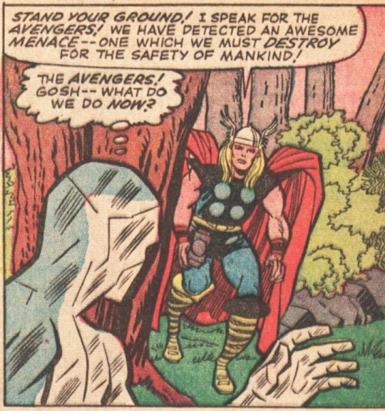
It's always easier for me to read comics on a screen since I can zoom in and all that, but for some the "new" Thor / Loki/ Asgardian fonts bug me? is anyone else the same? I can't figure out why it bothers me so much when trying to read it? maybe cause it's thinner than the other comic fonts? like I know I have shit vision but this shouldn't be bugging me so damn much??
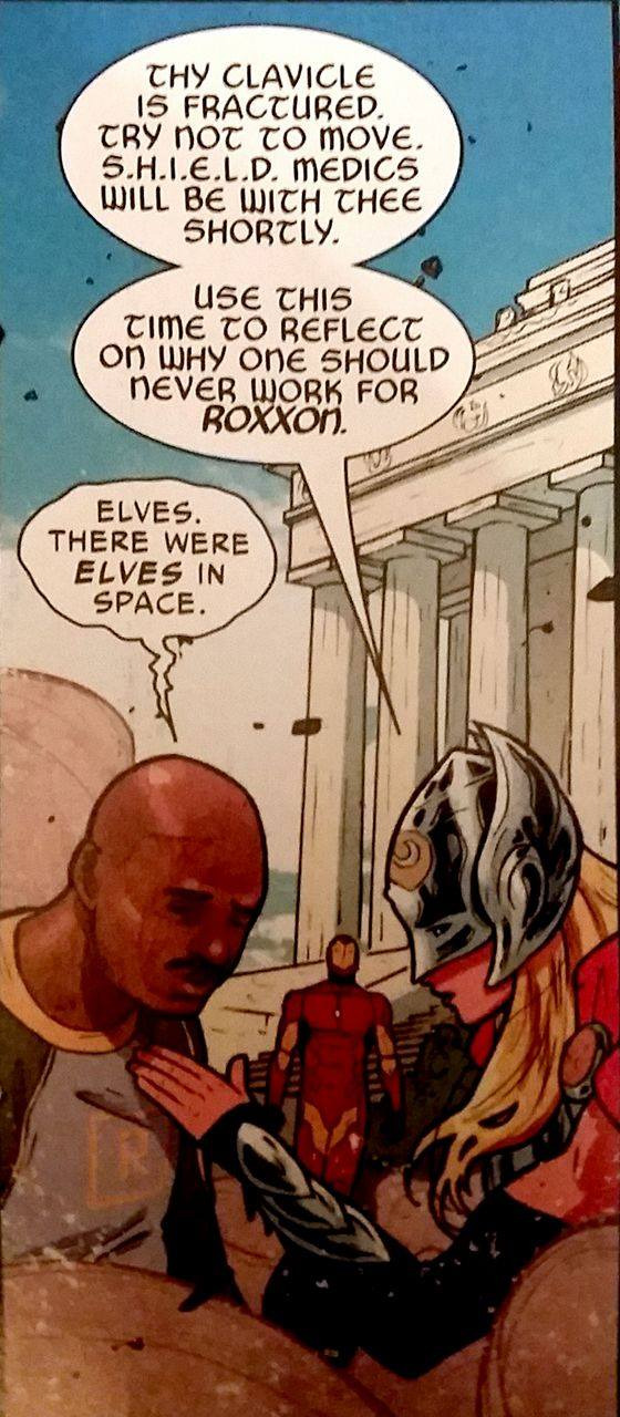
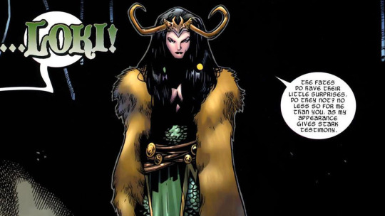
the font changes between comics on its level of intensity and slight stylistic changes but it's hard on the eyes in most forms to me? like the issue is significantly mitigated through reading it online but like I also like to read comics in their physical form too sometimes yknow?
#thor and loki fonts#comic fonts#readability#someone's probably explained my issue in better words before#rant
7 notes
·
View notes
Text
Joking aside, there are too many words using the default skins, because those predate modern responsive web design techniques, and they never restricted the words per line on large monitors to optimize readability.
I made some skins that do, and use a serif font with a larger line height. Available in white, off white, and black:
i flipping hate ao3's layout there's too many goddamn words
211K notes
·
View notes
Text
I just found the funniest font ever
Like. What is this. Why is this. Who is the target audience of this?
#I was playing around with ellipsus when I saw this#It's so funny#writing#writeblr#writers on tumblr#ellipsus#Ellipsus writing#sillyposting#Someone saw cursive and thought “nah that's too readable.”#Confession now that this is my most popular post ever. I have completely forgotten what fic I was writing when I made this#I'm 90% sure it's a scarian fic#fanfiction#ao3#WHYS THIS MY MOST LIKED POST EVER???#ITS SO STUPID#I SENT IT TO MY GC AND IT GOT LIKE. 3 LAUGH EMOJIS AND THAT WAS IT#AND NOW ITS LIKE.#100K#?????
109K notes
·
View notes
Text
Common Design Mistakes in White Papers: Enhancing Effectiveness for Authors
White Paper Design Mistakes: Common Questions Answered
1. What are the most common visual design mistakes made in white papers that can detract from their effectiveness?
Common visual design mistakes in white papers include cluttered layouts, inconsistent fonts and colors, poor use of whitespace, overly complex graphics, and lack of hierarchy in information presentation. Excessive text without visuals, low-quality images, and ignoring accessibility can also detract from effectiveness, making it harder for readers to engage and understand the content.
2. How has the trend towards minimalist design impacted the way white papers are structured and presented?
The trend towards minimalist design has led to white papers being more visually streamlined, with reduced text and increased use of whitespace. This approach emphasizes clarity and readability, often incorporating infographics and concise bullet points. As a result, white papers are now structured to convey key messages quickly, making them more engaging and easier to digest for readers.
3. In what ways do outdated formatting practices hinder the readability and engagement of white papers in today's digital landscape?
Outdated formatting practices, like dense text blocks and excessive jargon, make white papers difficult to read on digital devices. They can overwhelm readers, leading to disengagement. Modern readers prefer clear headings, bullet points, and visuals that enhance comprehension and retention, making it crucial to adapt formatting to improve accessibility and maintain interest in today’s fast-paced digital environment.
4. What role does typography play in white paper design, and what are some frequent typographical errors that authors should avoid?
Typography in white paper design enhances readability and conveys professionalism. Key roles include establishing hierarchy, guiding the reader's eye, and reinforcing branding. Frequent typographical errors to avoid include inconsistent font sizes, improper line spacing, poor contrast, excessive use of different fonts, and typos in text. Maintaining a clean, consistent typographic style is essential for effective communication.
5. How can the integration of multimedia elements (such as infographics and videos) enhance or complicate the design of white papers, and what are the common pitfalls to be aware of?
Integrating multimedia elements like infographics and videos can enhance white papers by making complex information more accessible and engaging. However, it can complicate design by increasing file size and requiring careful layout planning. Common pitfalls include overcrowding content, distracting from the main message, and technical issues that may hinder accessibility. Balancing multimedia with clarity is essential.
Visit: VS Website See: VS Portfolio
0 notes
Text
My workplace uses Open Sans and it is a remarkably readable sans serif font.
i think i got the major ones
24K notes
·
View notes
Text
SEO Writing for Beginners: How to Use Keywords Without Sacrificing Quality

The Tightrope of SEO Writing
SEO writing often feels like walking a tightrope. Lean too far into keywords, and your content becomes robotic. Prioritize readability alone, and search engines might never find it. But here’s the secret: you don’t have to choose. With the right strategies, you can craft engaging, human-centric content and rank on Google’s first page.
In 2025, 68% of online experiences begin with a search engine (BrightEdge), and 53% of marketers say SEO generates more leads than any other tactic (HubSpot). But Google’s algorithms are smarter than ever — they reward content that satisfies both bots and humans. Ready to learn how? Let’s dive in.
Want the full breakdown? Read the full article
#SEOTips#SEO#ContentWriting#KeywordResearch#ContentCreation#QualityContent#BloggingTips#DigitalMarketing#SEOWriting#ContentMarketing#WritingTips#BloggingForBeginners#SEOHacks#ContentCreator#OnlineBusiness#Copywriting#FreelanceWriting#MarketingTips#SEOTools#Readability
0 notes
Text
Simplify Like a Pro: Cut the Clutter with AcademIQ’s Smart Tool
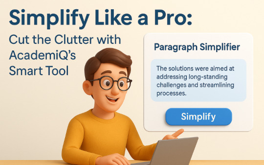
In today’s fast-paced digital world, clarity is king. Whether you're a student trying to grasp complex material or a professional polishing reports, simplifying long and confusing paragraphs is key to understanding and impact. That’s where AcademIQ.io’s Paragraph Simplifier steps in — a powerful AI writing assistant designed to make your text clearer, shorter, and easier to read.
What Is the Paragraph Simplifier?
The Paragraph Simplifier tool at AcademIQ.io is built for anyone who wants to turn wordy, confusing, or academic paragraphs into plain, readable English — without losing meaning. Powered by advanced AI and natural language processing, this tool automatically refines your content by removing unnecessary jargon, breaking down complex sentences, and improving flow.
Whether you're drafting essays, writing blogs, summarizing research papers, or creating email content, this AI paragraph rewriter helps you get to the point—fast.
Why Do You Need a Paragraph Simplifier?
1. Improve Readability Long sentences and technical jargon can confuse readers. Using this tool, your text becomes easy to understand and more accessible — perfect for students, marketers, or bloggers.
2. Save Time on Editing Manually editing a wall of text takes time. With just one click, this tool provides simplified and streamlined versions of any paragraph, helping you focus on content, not formatting.
3. Enhance Communication Clear writing equals clear thinking. Whether you're writing an email, a report, or an article, this tool ensures you deliver your message effectively.
How It Works
Using the Paragraph Simplifier is easy:
Visit AcademIQ.io
Paste your paragraph into the simplifier tool
Click “Simplify” and instantly get a clearer, more concise version of your content
You can choose from multiple simplification levels — short, medium, or detailed — depending on how much rewriting you need.
Real-World Uses of AcademIQ’s Paragraph Simplifier
Students: Summarize academic texts and simplify notes for better exam prep
Bloggers: Convert complex ideas into readable blogs for broader reach
Professionals: Draft crisp emails, simplify reports, and sharpen presentations
Content Creators: Rewrite scripts and articles for smoother delivery
Final Thoughts
If you've ever asked, “How do I make my writing clearer?” or “Is there a tool to simplify long paragraphs?” — your answer is here. AcademIQ.io’s Paragraph Simplifier is like having a writing coach and an editor in one smart tool.
Ready to streamline your writing? Try it today at 👉 www.academiq.io
Keywords Used: paragraph simplifier, simplify long paragraphs, AI writing assistant, paragraph rewriter, online writing tool, simplify text tool, how to improve readability, content simplifier, make writing clearer, best AI tools for students
#best AI tools for students#ai in education#academiq.io future of learning#content simplifier#readability#AItools#ai tools for students#academia#education
0 notes
Text
Oh hello, awesome little accessibility feature in Apple Books!
Meet my new best friend, Line Guide!
Video: A screen recording, from my iPhone, as I activate the line guide feature in the Apple Books app, and then tap the screen to advance it, as it dims the rest of the screen and keeps the line I’m reading in focus.
1 note
·
View note
Text
Dark Mode vs. Light Mode
Which is Better for User Experience?

The debate between dark mode vs light mode in UI/UX design has gained significant traction. Major platforms like Apple, Google, and Microsoft now offer both, but which one truly enhances user experience? While dark mode offers reduced glare and a modern aesthetic, light mode remains popular for its readability and familiarity. In this article, we explore the pros and cons of dark mode and light mode, and their impact on UX design.
For more UI/UX design insights, visit Pixelizes.com
What is Dark Mode?
Dark mode features light text on a dark background. It’s widely adopted by developers, gamers, and users who prefer low-light environments.
Pros of Dark Mode
Reduces eye strain during nighttime browsing by minimizing screen glare and blue light.
Improves battery efficiency on OLED/AMOLED devices.
Modern UI appeal, perfect for sleek, tech-forward interfaces.
Ideal for light-sensitive users.
Learn more about psychology in UX design and how dark mode can emotionally influence perception.
Cons of Dark Mode
Reduced readability in bright settings.
Harder to scan long-form text or dense content.
Not universally accessible—some users report eye strain from light-on-dark formats.
What is Light Mode?
Light mode—dark text on a white background—is the traditional layout in digital design. It resembles printed content and offers strong visual hierarchy.
Pros of Light Mode
Superior readability, especially for articles and documents.
Works in all lighting conditions without adjustment.
Familiar experience aligned with decades of visual habits.
See how UI design trends have evolved from skeuomorphism to modern layouts.
Cons of Light Mode
Causes more eye strain in dark environments.
Increased battery usage on OLED screens compared to dark mode.
Which Mode is Better for UX?
It depends on your audience and use case:
For reading and productivity apps → Light mode is optimal.
For entertainment, nighttime use, and modern aesthetics → Dark mode prevails.
For battery-sensitive mobile apps → Dark mode has an edge on OLED screens.
Read how AI and machine learning are shaping adaptive UX, including automated dark/light transitions.
Best UX Practice: Let Users Choose!
The best user experience is customizable. Many apps now include:
Dark/light mode toggles
Auto-detection of system preferences
Time-based switching (light during the day, dark at night)
Explore more UX design best practices that prioritize user control and accessibility.
Conclusion
There’s no one-size-fits-all answer in the dark mode vs light mode UI debate. The key lies in offering users control, ensuring contrast and readability, and maintaining design consistency across themes.
Ready to build better, more accessible experiences? Explore more at Pixelizes.com and get inspired by smart, human-centered design.
#Dark Mode#Light Mode#UI Design#UX Design#Dark vs Light Mode#Accessibility in UX#Visual Hierarchy#Eye Strain#OLED Battery Efficiency#Adaptive UX#Night Mode UI#Design Preferences#Customizable UI#Contrast in Design#Readability#UX Best Practices#Human-Centered Design#UX Trends#Modern UI#Design Psychology#Light Sensitivity#Mobile UX#User Control#System Theme Detection#User Experience Optimization
1 note
·
View note
Text
I know basic accessibility is not exactly Tumblr’s biggest priority, but Jesus Fuck, y’all keep coming up with increasingly disturbing ways to say “GOOD LUCK reading this mess, you fucking cripple”.
(Y’all should be glad I gave up on the idea of making this post ONE DROWNED JPEG SCREENSHOT PER WORD just to illustrate what I mean.)
0 notes
Text
Panduan Yoast SEO Terbaik: Optimasi Website agar SEO-Friendly!
Yoast SEO adalah plugin WordPress yang sangat populer dan banyak digunakan untuk membantu pemilik website mengoptimasi konten mereka agar ramah mesin pencari. Dengan fitur-fitur canggih dan antarmuka yang mudah digunakan, Yoast SEO menjadi pilihan utama bagi banyak blogger dan pemilik website.
Artikel ini akan memberikan panduan lengkap tentang cara memanfaatkan Yoast SEO untuk meningkatkan performa website Anda di mesin pencari.
Apa Itu Yoast SEO dan Mengapa Penting untuk Website Anda? Yoast SEO adalah plugin WordPress yang dirancang khusus untuk membantu Anda mengoptimasi website dari segi SEO. Plugin ini menawarkan berbagai fitur, seperti analisis konten, optimasi kata kunci, dan manajemen sitemap.
LSI Keyword:
Manfaat Yoast SEO untuk website
Fitur utama Yoast SEO
Plugin SEO terbaik untuk WordPress
Dengan Yoast SEO, Anda dapat memastikan bahwa setiap konten yang Anda buat memenuhi standar SEO, sehingga memiliki peluang lebih besar untuk muncul di halaman pertama hasil pencarian. Plugin ini juga membantu Anda mengelola aspek teknis SEO, seperti meta tag, sitemap, dan struktur URL.
Fitur-Fitur Utama Yoast SEO yang Harus Anda Ketahui 1. Analisis Konten: - Yoast SEO memberikan skor SEO berdasarkan penggunaan kata kunci, panjang konten, dan faktor lainnya. Fitur ini membantu Anda menulis konten yang ramah mesin pencari.
2. Optimasi Kata Kunci: - Plugin ini membantu Anda fokus pada kata kunci utama dan long-tail keyword. Anda juga bisa melihat seberapa sering kata kunci muncul di konten Anda.
3. Manajemen Sitemap: Yoast SEO secara otomatis membuat sitemap XML untuk website Anda, yang membantu mesin pencari mengindeks halaman dengan lebih efisien.
Long-Tail Keyword:
Cara menggunakan analisis konten Yoast SEO
Tips optimasi kata kunci dengan Yoast SEO
Langkah-Langkah Mengoptimasi Website dengan Yoast SEO 1. Instal dan Aktifkan Plugin Yoast SEO:
Masuk ke dashboard WordPress Anda.
Di menu "Plugins," cari "Yoast SEO" dan klik tombol "Install Now."
Setelah proses instalasi selesai, klik "Activate" untuk mengaktifkan plugin.
2. Konfigurasi Yoast SEO:
Ikuti panduan setup yang disediakan untuk mengatur preferensi SEO Anda.
Pastikan fitur seperti XML sitemap dan breadcrumbs diaktifkan.
3. Optimasi Konten:
Gunakan fitur analisis konten untuk memastikan artikel Anda SEO-friendly.
Isi meta title dan meta description yang relevan dengan kata kunci utama.
Untuk panduan teknis SEO lainnya, baca juga panduan SEO lengkap di Spuluh.
Anchor Text (Internal Link):
Cara membuat sitemap XML dengan Yoast SEO
Panduan lengkap optimasi meta description
Tips Menggunakan Yoast SEO untuk Meningkatkan Ranking 1. Fokus pada Kata Kunci Utama: - Pastikan kata kunci utama muncul di judul, URL, dan beberapa kali di dalam konten.
2. Gunakan Fitur Readability: - Yoast SEO juga menganalisis keterbacaan konten Anda. Pastikan skor readability hijau untuk konten yang mudah dibaca.
3. Perbarui Konten Secara Berkala: - Yoast SEO memiliki fitur yang memungkinkan Anda melacak performa konten dan memperbaruinya jika diperlukan.
LSI Keyword:
Cara meningkatkan skor readability Yoast SEO
Manfaat memperbarui konten secara berkala
Keuntungan Menggunakan Yoast SEO untuk Website Anda 1. Meningkatkan Visibilitas di Mesin Pencari: Dengan optimasi yang baik, website Anda akan lebih mudah ditemukan oleh mesin pencari seperti Google.
2. Membantu Menghasilkan Traffic Organik: Konten yang SEO-friendly akan menarik lebih banyak pengunjung organik.
3. Menyederhanakan Proses Optimasi: Yoast SEO memudahkan Anda untuk mengelola semua aspek SEO dalam satu tempat.
Long-Tail Keyword:
Manfaat Yoast SEO untuk traffic organik
Cara meningkatkan visibilitas website dengan Yoast SEO
Tools Pendukung Yoast SEO untuk Optimasi Lebih Lanjut 1. Google Search Console: Integrasikan Yoast SEO dengan Google Search Console untuk melacak performa website.
2. Screaming Frog: Gunakan tools ini untuk menganalisis struktur website Anda.
3. Ahrefs atau SEMrush: Tools ini membantu Anda melakukan riset kata kunci dan analisis kompetitor.
Anchor Text (External Link):
Kunjungi Google Search Console untuk analisis website
Pelajari lebih lanjut tentang Screaming Frog
Kesimpulan Yoast SEO adalah alat yang sangat powerful untuk mengoptimasi website Anda agar SEO-friendly. Dengan mengikuti panduan ini, Anda dapat memaksimalkan penggunaan Yoast SEO untuk meningkatkan ranking website di mesin pencari. Jangan lupa untuk selalu memperbarui konten dan memantau performa website Anda secara berkala.
#Yoast SEO#Optimasi Website#Plugin SEO WordPress#Tips SEO#Analisis Konten#Sitemap XML#Readability#Traffic Organik
0 notes