#PresentationDesign
Explore tagged Tumblr posts
Visit Tumblr Blog
Explore Tumblr blogs with no restrictions, modern design and the best experience.
Last Seen Tumblr Blogs


Fun Fact
Tumblr has 411 employees.
Text
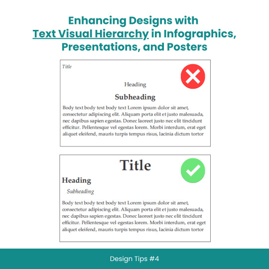
Enhancing Designs with Text Visual Hierarchy in Infographics, Presentations, and Posters
#scicomm#sciencecommunication#VisualHierarchy#TextHierarchy#Typography#InfographicDesign#PresentationDesign#PosterDesign#Layouts#Fonts#Contrast#Alignment#DesignTips#DesignPrinciples#GraphicDesign#WebDesign#PrintDesign#CreativeProcess#DesignInspiration#DesignCommunity#DesignThinking#GoodDesign#EffectiveDesign#DesignMatters
8 notes
·
View notes
Text
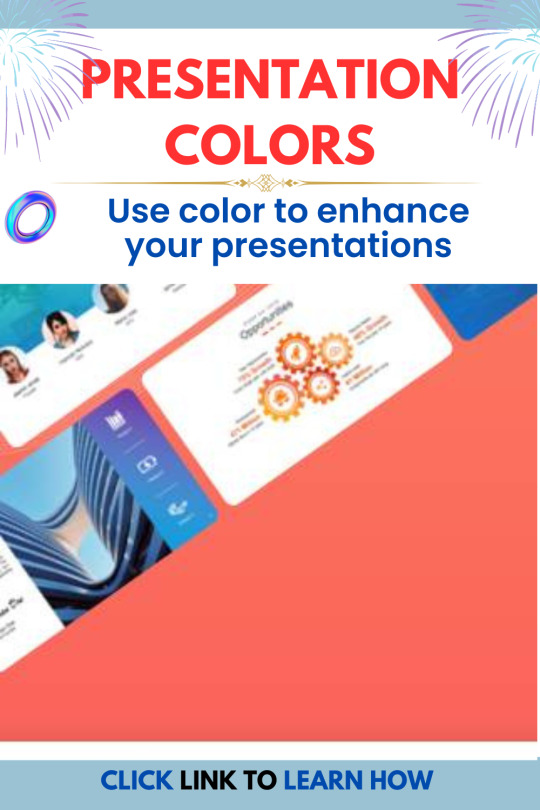
Learn how to use colour to enhance your presentations. Get tips on choosing the right colours, using them effectively, and avoiding common mistakes.
#presentationcolors#presentationdesign#presentationtips#presentationideas#publicspeaking#software engineering#presentation#creative logo#business
3 notes
·
View notes
Text
Understanding Information Visuals: The Role of Charts, Graphs, and Infographics in Data Representation
Categories of Information Visuals: Common Questions Answered
1. What are the primary categories of information visuals, and how do they differ in terms of data representation?
The primary categories of information visuals include charts (bar, line, pie), graphs (scatter plots, histograms), maps (heat maps, choropleth), and infographics. These differ in data representation: charts display trends or comparisons, graphs show relationships, maps visualize geographic data, and infographics combine text and visuals for storytelling, often summarizing complex information in an engaging format.
2. How can the choice of information visual category impact the effectiveness of data communication in a presentation?
The choice of information visual category—such as charts, graphs, or diagrams—affects clarity, engagement, and comprehension. Different visuals convey information differently; for example, bar charts emphasize comparisons, while line graphs show trends over time. Selecting the appropriate visual helps the audience grasp key insights quickly, making the communication more effective and enhancing retention of the information presented.
3. What roles do charts, graphs, and infographics play in the categorization of information visuals, and when is each type most appropriately used?
Charts, graphs, and infographics are tools for visualizing data. Charts, like bar or line graphs, are best for showing trends or comparisons. Graphs are ideal for displaying relationships between variables. Infographics combine text and visuals to present complex information clearly and engagingly, making them suitable for storytelling or summarizing data. Each serves a specific purpose based on the information's needs.
4. How can understanding the different categories of information visuals enhance a designer's ability to convey complex information clearly and effectively?
Understanding different categories of information visuals, such as charts, graphs, and infographics, helps designers choose the most appropriate format for the data. This enhances clarity by tailoring the visual to the type of information, making it easier for the audience to grasp complex concepts quickly. Effective visuals can improve engagement and retention of information.
5. What are some common challenges faced when selecting the appropriate category of information visual for a specific dataset, and how can these challenges be addressed?
Common challenges include understanding the dataset's nature, audience needs, and visual complexity. Misalignment can lead to misinterpretation. These challenges can be addressed by clearly defining the data's purpose, considering the audience's familiarity with visuals, and experimenting with different formats to find the most effective representation. Testing visuals with users can also provide valuable feedback.

Visit: VS Website See: VS Portfolio
#InformationVisuals#DataRepresentation#DataCommunication#EffectiveCommunication#VisualData#PresentationDesign
0 notes
Text

🎨 Level Up Your Brand with Professional Graphic Design! At Rudram Soft, we offer top-notch graphic design services tailored for all types of businesses — from startups to established enterprises. 💼✨
💡 What we offer: ✅ Logo Designing ✅ PPT/PDF Presentations ✅ Digital Business Cards ✅ Banner Design ✅ Animation Videos ✅ Full Plan Explanation Videos
🖥️ Let your business stand out with creative, eye-catching visuals!
📩 Get in touch today: 📧 [email protected] / [email protected] 📞 +91 7015751353 🌐 www.rudramsoft.com
#GraphicDesign#LogoDesign#BusinessBranding#CreativeDesigns#DigitalMarketing#AnimationVideo#PresentationDesign#RudramSoft#DesignServices#SmallBusinessSupport#mlmsoftware#mlm software demo#best mlm software#mlm#digital marketing#mlm software#software development company#seo
0 notes
Text
Top 10 Apps to Make Stunning PPT Presentations in 2025

Creating visually striking and engaging presentations is more important than ever in 2025. Whether you’re a student, professional, entrepreneur, or educator, the ability to craft compelling slide decks can significantly boost your communication and storytelling. Luckily, there are numerous apps to make PPT presentations that are fast, intuitive, and feature-rich.
In this blog, we’ll explore the top 10 apps to make PPT presentations that help you stand out in meetings, classrooms, or online webinars.
1. Microsoft PowerPoint (Desktop & Online)
Microsoft PowerPoint continues to lead the way in presentation software. In 2025, it has evolved with new AI-powered design suggestions, real-time collaboration, and cloud integration. It’s ideal for those who want both creative freedom and professional control. Features like Designer, Presenter Coach, and Copilot AI make it easier to build beautiful slides in minutes.
Best for: Professionals, educators, corporate users.
2. Google Slides
Google Slides remains a strong competitor with its simplicity and collaborative nature. It’s completely web-based, allowing users to edit and share slides in real-time. In 2025, it now integrates with more third-party tools like Canva and Grammarly and supports enhanced animations and design themes.
Best for: Teams, remote workers, and classrooms.
3. Canva
Canva is more than just a graphic design tool; it’s become a go-to app for stunning slide decks. With thousands of ready-made templates and drag-and-drop elements, even non-designers can create eye-catching presentations. Canva’s Magic Design AI suggests layouts and visuals to make your slides impactful.
Best for: Designers, marketers, and creative professionals.
4. Prezi
Prezi offers a unique, zooming user interface that moves beyond traditional slide-by-slide formats. In 2025, Prezi’s video integration and storytelling tools have taken a leap forward. Its motion-based design is excellent for grabbing attention during live or recorded presentations.
Best for: Public speakers, trainers, educators.
5. Beautiful.ai
If you struggle with design, Beautiful.ai is the app for you. Its intelligent design engine automatically adjusts layout, spacing, and alignment. The result? Clean, modern slides in no time. It’s a powerful tool for business presentations where consistency and branding matter.
Best for: Business users, analysts, consultants.
6. Visme
Visme combines infographics, charts, videos, and presentations into one platform. Its robust set of tools and templates makes it perfect for anyone needing data-driven presentations. In 2025, Visme also offers AI-powered writing help, animations, and offline access.
Best for: Content creators, educators, and marketing teams.
7. Zoho Show
Zoho Show is a cloud-based alternative to traditional presentation software. It allows you to create, collaborate, and broadcast your presentations online. Zoho integrates well with the broader Zoho ecosystem and is perfect for users already using Zoho CRM or Mail.
Best for: Startups, remote teams, and business users.
8. Pitch
Pitch is a relatively new app designed with startups and product teams in mind. It focuses on modern aesthetics, fast collaboration, and team-based workflow. With its pre-built templates, version control, and AI assistance, Pitch has gained popularity in 2025 among tech-savvy users.
Best for: Startups, product teams, and design-led companies.
9. Ludus
Ludus is built for designers who want full creative control. Unlike traditional tools, it allows you to embed HTML, CSS, and JavaScript directly into your slides. It’s ideal for showcasing design work or delivering interactive presentations.
Best for: Designers, developers, and creative professionals.
10. Haiku Deck
Haiku Deck simplifies presentations by focusing on imagery and minimal text. Its interface is easy to use and prioritizes storytelling through visuals. In 2025, it includes AI-powered photo suggestions, voice-over features, and mobile editing support.
Best for: Educators, public speakers, bloggers.
Choosing the Right App for You
With so many apps to make PPT available in 2025, your choice should depend on your goals, audience, and technical comfort. Here’s a quick guide to help you decide:
Need Recommended App Simple collaboration Google Slides Unique zoom-based transitions Prezi Beautiful slides with minimal effort Beautiful.ai Complete design freedom Canva or Ludus Data-heavy presentation Visme Team-based business presentations Pitch or Zoho Show
Why Use Specialized Apps in 2025?
In today’s digital world, static slides are no longer enough. Audiences expect dynamic, visually rich content. Using the right app:
Saves you time with templates and automation
Makes your message clearer and more engaging
Enhances professionalism and credibility
Allows real-time collaboration
Supports mobile and remote work needs
Plus, many of these tools are cloud-based, meaning you can access your presentation from any device, anywhere.
Final Thoughts
Creating powerful presentations is no longer a task reserved for designers or tech experts. With the right tools, anyone can produce slides that are informative, engaging, and visually appealing. The apps to make PPT presentations in 2025 have evolved to serve a wide range of users — from students to business executives.
So whether you're preparing for a big pitch, an academic project, or a marketing report, one of these apps is sure to match your style and needs. Explore a few and see which one helps you create your next killer presentation!
#PresentationApps#PPT2025#AppsToMakePPT#BestPPTApps#CreatePresentations#SlideDesign#PresentationDesign#ProductivityTools#TechTools2025#DigitalPresentation#PresentationSoftware#PowerPointAlternatives#OnlinePresentationTools#EdTech#WorkSmarter
0 notes
Text

Mini PowerPoint Template by Creatiya – A Compact Yet Powerful Presentation Tool
In today’s fast-paced professional world, creating visually engaging and effective presentations is no longer optional—it’s essential. The Mini PowerPoint Template by Creatiya is designed to help individuals and teams craft stunning presentations without spending hours on design. Whether you’re a marketer, entrepreneur, freelancer, student, or educator, this template gives you everything you need to communicate your message with clarity and style.
This compact yet powerful template offers 30+ beautifully designed slides with a minimal and modern layout that suits any business or personal purpose. It includes free fonts, drag-and-drop image placeholders, fully editable charts, and easy-to-customize color schemes. It’s compatible with both Microsoft PowerPoint and Google Slides, making it versatile and accessible for all users.
Who Is This Template For?
The Mini PowerPoint Template is ideal for:
Startups & Entrepreneurs preparing business pitches
Freelancers who frequently deliver client presentations
Marketing professionals needing fast, sleek slides
Students & educators who want polished academic visuals
Content creators & coaches who present online courses or webinars

Why Choose Creatiya?
Creatiya stands out in the digital marketplace for offering high-quality, easy-to-use creative assets. With a subscription plan, users get unlimited downloads of not just this template, but hundreds of other design resources—including pitch decks, brand kits, social media kits, and more. It’s the perfect solution for professionals who need fresh content regularly, without breaking the bank.
The Mini PowerPoint Template is one of the best-valued presentation tools in its category. It combines elegance, simplicity, and functionality—perfect for making a lasting impression.
Get Started Today
If you want to elevate your presentation game, don’t miss this powerful tool. Subscribe to Creatiya today and enjoy unlimited access to all premium design assets at one affordable price.
👉 Explore the Mini PowerPoint Template
1 note
·
View note
Text
Mastering PowerPoint: From Basics to Advanced Presentation Design and Animation
Unlock the full potential of Microsoft PowerPoint with EasyShiksha's comprehensive course. Whether you're a beginner or looking to enhance your presentation skills, this course covers everything from basic slide creation to advanced design techniques and animations. Learn to craft compelling, visually engaging presentations that captivate your audience and effectively communicate your message.
0 notes
Text
Death by PowerPoint? 6 Secrets to Slides That Don’t Suck (And Keep Audiences Awake)

This is a quick insight from the article Powerpoint Presentation Design Services originally published on March 26, 2025
Most PowerPoint presentations suck. You’ve sat through them. You’ve suffered through them. And, be honest, you’ve probably given a few that made people question their life choices.
But it doesn’t have to be that way. You can make your slides engaging, interesting, and (dare I say) enjoyable. Here’s how.
1. Kill the Bullet Points (Before They Kill Your Audience)
Look, bullet points aren’t evil. But when a slide looks like a page ripped out of a high school textbook, you’ve got a problem.
✅ Instead:
Use one powerful statement per slide.
Swap text for images, icons, or simple infographics.
Let your voice do the explaining instead of dumping everything on screen.
Your slides should support what you’re saying, not replace it. Otherwise, people will just read ahead and tune you out.
2. Stop Using Ugly Colors and Fonts
You know that presentation with neon green text on a bright red background? The one that made you want to claw your eyes out? Yeah, don’t do that.
❌ What NOT to do:
Rainbow color schemes (this isn’t a unicorn festival).
Comic Sans or fonts that scream, “I made this in 1998.”
Pixelated stock photos of people shaking hands like they’re sealing a billion-dollar deal.
✅ What to do instead:
Stick to 3–5 complementary colors.
Use clean, professional fonts (Arial, Montserrat, Poppins, etc.).
Choose high-quality visuals that actually add value.
If design isn’t your thing, hiring a PowerPoint presentation design service can make your slides look polished and professional, without the DIY disasters.
3. Tell a Story (Not a Data Dump)
Nobody remembers a bunch of numbers. They remember stories.
📊 Instead of this:
"Our revenue increased by 32% last year."
🎤 Try this:
"Last year, we hit a wall. Revenue was flat. So, we switched gears, took a risk, and boom—32% growth. Smart moves lead to real results."
Stories stick. Numbers don’t. Wrap your data in a narrative, and people will actually remember it.
4. Animation? Use It Like Salt, Not Like Ketchup
Animations are cool, until they aren’t. If your text is zooming in like it’s in a Fast & Furious movie, you’ve gone too far.
✅ Good use:
Simple fade-ins for smooth transitions.
Subtle motion effects to highlight key points.
❌ Bad use:
Spinning text (please, no).
Flashy animations that scream "Look at me!" instead of "Listen to me."
A little movement? Enhances your slides. Too much? Makes your audience dizzy.
5. Stop Reading Off the Slides (It’s Torture)
Ever sat through a presentation where someone just reads every word off the slide? Brutal.
🚀 Instead:
Talk naturally, your slides are your backup, not your script.
Engage the audience, ask questions, use humor, make eye contact.
Practice like you’re explaining it to a friend, not a teleprompter.
People don’t want to hear a robot. They want to hear you.
6. End with a Strong Call to Action
What do you want your audience to do? Buy something? Change their mindset? Take action? Spell it out.
✔ If selling: "Visit [your website] to get started."
✔ If teaching: "Try this technique today and see the difference."
✔ If persuading: "Remember, small changes lead to big results, start now."
A weak ending makes your whole presentation forgettable. A strong one makes people act.
Final Thoughts: Make Your Slides Suck Less
Bad PowerPoints are everywhere. But you don’t have to be part of the problem. Keep it clean, simple, and engaging. If you need help, a presentation design agency can take your slides from “meh” to “wow.”
Because if people are actually paying attention to your slides instead of checking their phones, you’ve already won. 🚀
0 notes
Text
Make use of eye-grabbing icons, pictures and stickers to enhance your presentations

Visual material is necessary to increase the efficiency and commitment of presentations in today’s digital world. By using the top -oriented presentation icons, graphics and stickers can improve the slide and increase the effect of your message regardless of background element, professional or designer. Iconadda offers a large selection of both premium and free design resources to increase your presentations.

Iconadda has free presentation icons and illustrations . We have a wide range of the presentation icon in Iconadda, for instance: Office and professional icons: Suitable for business and company-related presentations. Educational icon: Suitable for online courses, coaches and students. Technology icons: Suitable for software and IT-related presentations. Financial and marketing icons: Suitable for explaining the report and the company strategy. Health and medical icon: Ideal for presentations of medicine and health professionals. You can get the perfect icon for your slides, ranging from flat, outline and stuffed designs with selecting both our free and premium icons.
Iconadda offers gratis presentation icons and images.
We simplify your access to free icons, stickers and objects in Iconadda. Our resources for design will enhance the visual appeal for any presentation, whether you are preparing a marketing report, business proposal or teaching project.
Explore our collection now!
Get the top presentation icons, graphics and stickers today by logging onto iconadda . Blowing plain audience with blind performance!
#PresentationDesign #PresentationIcons #SlideDesign #VisualStorytelling #BusinessPresentation #InfographicDesign #CreativeSlides #PitchDeck #PresentationAssets #SlideIcons #ProfessionalPresentation #IllustrationForSlides #PresentationGraphics #PowerPointDesign #EngagingSlides
#PresentationDesign#PresentationIcons#SlideDesign#VisualStorytelling#BusinessPresentation#InfographicDesign#CreativeSlides#PitchDeck#PresentationAssets#SlideIcons#ProfessionalPresentation#IllustrationForSlides#PresentationGraphics#PowerPointDesign#EngagingSlides
0 notes
Text
Professional PPT Maker at Presentation4You
With our Professional PPT Maker service, Presentation4You is committed to producing high-quality presentations that impress. We combine creativity with strategic design to ensure each slide serves a purpose, making your ideas come alive in a visually engaging format.
1 note
·
View note
Text
🎤 Master Professional Presentation Design & Delivery! 📊
Are you ready to become a more confident, persuasive communicator? Whether you're creating PowerPoint slides or speaking in front of an audience, this course will teach you the key skills to design and deliver impactful presentations that will captivate and influence your audience.
Course Highlights:
Effective Communication: Learn the four pillars of communication to engage, build rapport, and connect with your audience.
Handling Difficult Conversations: Gain the tools to manage tough conversations with confidence using the ACHE model and the Win-Win mindset.
Designing Powerful Presentations: Master the essentials of creating clean, impactful slides using PowerPoint and other tools.
Impactful Delivery: Develop the ability to present confidently through voice, body language, and engagement.
Overcoming Presentation Anxiety: Learn techniques to manage nerves and perform with confidence under pressure.
Why Attend?
🔹 Build confidence to present effectively without notes or props 🔹 Learn advanced PowerPoint design techniques to create visually appealing presentations 🔹 Gain practical tools for handling difficult conversations and delivering powerful feedback 🔹 Master non-verbal communication techniques to strengthen your message 🔹 Overcome presentation anxiety and deliver your message with poise and clarity
🔗 Sign up now: Professional Presentation Design
#ProfessionalPresentations #CommunicationSkills #PublicSpeaking #PowerPoint #PresentationDesign #Confidence #CareerGrowth
#ProfessionalPresentations#CommunicationSkills#PublicSpeaking#PowerPoint#PresentationDesign#Confidence#CareerGrowth
0 notes
Text
#artificial intelligence#digitalcontent#contentcreation#aitools#PresentationTools#AITools#PresentationDesign#PublicSpeaking#VisualCommunication#StudentSuccess#ProfessionalDevelopment#EducatorResources#EfficiencyInWork#CreativeProcess#TechInEducation
0 notes
Text


SlideMasterz offers a wide selection of free PowerPoint templates available for download. These templates are 100% editable, covering various categories like business, education, healthcare, and more. Customize the designs to fit your brand, ensuring a professional and impactful presentation. Whether for meetings, marketing, or academic use, these templates make creating visually appealing slides easy and efficient. Download now and elevate your presentations with stunning designs that captivate your audience!
#PowerPointTemplates #FreeDownload #EditableTemplates #BusinessPPT #EducationTemplates #PresentationDesign
#PowerPointTemplates#FreeDownload#EditableTemplates#BusinessPPT#EducationTemplates#PresentationDesign
0 notes
Text
Enhancing Audience Engagement Through Effective Presentation Design Strategies
Presentation Design Ideas: Frequently Asked Questions Explained
1. "What’s the best way to structure a presentation design?"
The best way to structure a presentation design is to start with a clear outline: introduction, main points, and conclusion. Use a consistent theme and layout, limit text per slide, and incorporate visuals. Ensure each slide supports your message, maintain a logical flow, and engage the audience with interactive elements or questions. Practice for smooth delivery.
2. "What is the difference between presentation design and graphic design?"
Presentation design focuses on creating visual aids for presentations, ensuring clarity and engagement for an audience, often using software like PowerPoint. Graphic design, on the other hand, encompasses a broader range of visual communication, including branding, marketing materials, and digital content, emphasizing aesthetics and functionality across various mediums. Both require creativity but serve different purposes.
3. "Why is typography important in presentation design?"
Typography is crucial in presentation design because it enhances readability, establishes hierarchy, and conveys tone. Effective font choices can engage the audience, emphasize key points, and create a cohesive visual identity. Poor typography can distract or confuse viewers, undermining the message. Overall, good typography ensures that information is communicated clearly and effectively.
4. "What’s the difference between PowerPoint and Google Slides for presentation design?"
PowerPoint is a desktop application with robust features, extensive templates, and offline access. Google Slides is a web-based tool that allows real-time collaboration and easy sharing. While PowerPoint offers more advanced design options, Google Slides is user-friendly and accessible from any device with an internet connection. Both serve well for creating presentations but cater to different needs.
5. "What happens to your presentation if the design is too cluttered?"
If your presentation design is too cluttered, it can overwhelm the audience, making it difficult for them to focus on key points. Important information may get lost in the chaos, leading to confusion and disengagement. A clear and simple design helps convey your message effectively and keeps the audience’s attention on what matters most.

Visit: VS Website See: VS Portfolio
0 notes
Text

Can AI Replace Human Presentation Designers?
AI tools streamline the design process, but they lack originality and emotional storytelling. Discover why human presentation designers remain irreplaceable.
Learn more: https://road5.studio/presentations-keynotes
0 notes
Text
Piktochart: Create Infographics, Presentations, and More.
youtube
As we live in a visual world today, communicating well often means presenting information in the most appealing way possible-simply putting, using visuals interesting enough to grab people's attention so they can understand it. From marketing to running presentations, preparing social media posts, and working on internal reports; aesthetically pleasing content is always attracting attention and will help understand matters in detail. Piktochart shows up as an efficient and easy-to-use platform to empower individuals and businesses to create beautiful visuals, without being much of a designer. The article covers multiple aspects, explaining all the features and benefits of Piktochart.
Do you want to be part of these success stories?
Piktochart is an online visual communication tool that provides a comprehensive set of templates and design elements for infographics, presentations, posters, reports, social media, and much more. What's more, it is very easy to use, employing the ubiquitous drag-and-drop interface; you don't really have to be a professional designer to use it. This is what makes Piktochart light and flexible; it concentrates on content while the technical aspects of creating the final visual representation are managed by the software.
Features and functionalities are summarized as follows:
User-Friendly Drag-and-Drop Editor: Easy interface is the power of Piktochart. A drag-and-drop editor allows you to add, move and configure any number of design elements such as text boxes, images, icons, charts, and maps with great ease. The intuitive approach to the editor reduces the effort for a user to learn the software, as compared to other professional design software.
Rich Template Library: Piktochart has a collective wealth of pre-designed templates to suit your needs for almost anything concerning visual communication. These templates make a good launching pad by offering pre-designed content to be altered with the user’s specific context and branding. From infographics to present data, presentations to pitch ideas, and social media graphics to promote an event, Piktochart certainly has templates for many and each occasion.
Do you want to be part of these success stories?
youtube
Awesome Variety of Design Elements: A great number of unique design elements like icons, illustrations, photos, and fonts. Users can quickly search and use those design elements in their creativity.
Do you want to be part of these success stories?
#easygraphicdesign#draganddropdesign#diygraphicdesign#designhacks#designtips#graphicdesigntools#visualstorytelling#datavisualization#infographicdesign#presentationdesign#socialmediagraphics#marketingmaterials#createvisuals#design#graphicdesign#visualcommunication#visualcontent#contentcreation#contentmarketing#marketing#digitalmarketing#socialmediamarketing#infographics#presentations#posterdesign#reportdesign#creativity#designinspiration#Youtube
0 notes