#Windows Photo Viewer Alternative
Explore tagged Tumblr posts
Visit Tumblr Blog
Explore Tumblr blogs with no restrictions, modern design and the best experience.
Last Seen Tumblr Blogs


Fun Fact
Tumblr has 411 employees.
Text
ImageGlass
ImageGlass is a lightweight and versatile free image viewer for Windows PCs, designed to replace Photo Viewer in Windows OS, especially in cases where Photo Viewer struggles to display PNG and GIF files. The software continues to improve with each new version, introducing innovations, features, and bug fixes. As an open-source, straightforward image viewer, ImageGlass offers impressive speed due…
#Color Picker Tool#Customizable Image Viewer#Free Image Viewer#Image Format Support#Image Viewer Features#ImageGlass#Lightweight Image Viewer#open source software#Real-Time Updates#Windows Photo Viewer Alternative
0 notes
Note
hi recurring-polynya: in a recent post of yours that had to do with orihime inoue's choconomiyaki, you incorporated a gif of orihime's finished creation.
i really would like to know how you create gifs from bleach's episodes.
Here is my process for making gifs:
You will need the thing you want to make your gif out of as a video file (generally mp4) saved locally.
Trim the video down to just the part you want
Convert it to a gif
There are many ways to do these steps, but I've detailed the way *I* do it in excruciating detail under the cut, along with some tips.
Get the video file Ha ha ha, obviously you want to only do this with videos that you have the rights to use and definitely not anything you might find from some link on r/Piracy! I'm going to demonstrate using a free-to-use video I downloaded from Pexels, a great source for free stock footage, specifically this video of some koi swimming.
Trimming the video
Windows comes with two different utilities that work great for this. I'm sure MacOS and Linux have their own versions, I'm just not that familiar with them.
Option 1: Photos Yes, Photos. It actually used to be even better for video editing, but Microsoft has been nerfing it, which is a shame. This will not likely be your default video-viewing program, so right click and then hit "Open With" and then "Photos."
The "Trim" button is the leftmost button on the toolbar along the top of the app (or you can hit ctrl-E).

This will take you into a different screen where you can adjust the sliders to set the start and stop of your video to what you want your gif to be. Then hit that turquoise "Save as copy" button on the upper right. If you hit the down arrow, you can do "Save" instead, but that will overwrite your original file, which you most likely do not want.
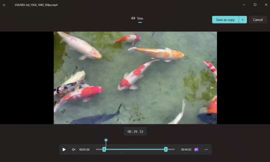
Once you've saved it, Photos will automatically open up your new, cropped file. Now, if your video is long (like an episode of a tv show or movie), it may be hard to get good granularity on your start and stop. You can do a rough trim first, and then repeat the process on your new, shorter file. If you're having trouble getting down to the exact frames you want, don't sweat it, you can take care of that in step 3. Alternatively, you can use ClipChamp instead, which I will describe in just a moment.
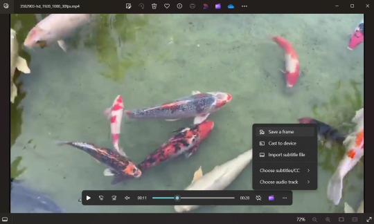
Before we go, though, I want to point out that Photos has another really cool feature that you would think most video editing programs would have, but many don't, and that is "Save a frame."
(You need to be back in the regular movie viewer screen, so back out of the Trim window if you're still there)
Pause the video at the frame you want. Hit the "..." button on the bottom toolbar, and the option will be there. (If you're not paused, it will be grayed out).
Trimming Option 2: Clipchamp
Clipchamp is a more powerful video editing tool that also comes with Windows. For some dumb reason, you have to be signed into your Microsoft account to use it, and it takes a long time to open especially if your file is big, so if I'm trying to do something real quick, I'll just do it in Photos. On the other hand, if I'm trying to get multiple gifs out of a single video, or I'm trying to do something fancy, it's usually the better tool.
You can right click on your file and choose "Edit with Clipchamp". If you've already got the file open in Photos, you can hit the little purple clapboard icon just the left of the "..." icon in the screenshot above, and that will also open the file in Clipchamp. There's a second icon along the top toolbar, too, because Windows just really really wants you to use Clipchamp.
Here's what our video looks like in Clipchamp:
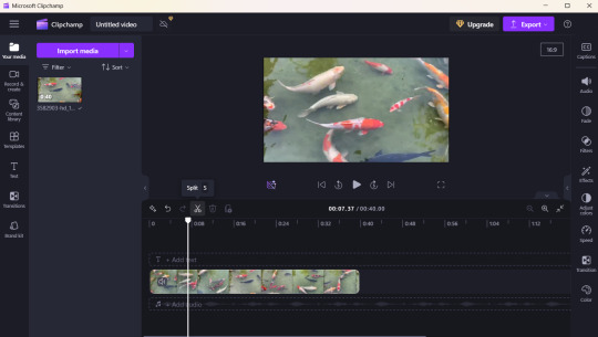
You can drag that white bar around, or use the video controls to play the video or jump forward or back, and then choose the little scissors icon to "cut" it. Then select the part you don't want (in this case, I am setting the start of my gif, so I am going to delete everything to the left), and select the little garbage can icon (or the delete key) to delete it. It will leave a gray space-if you hover over it, a little trash can icon will appear, and you can click it to delete the gap.
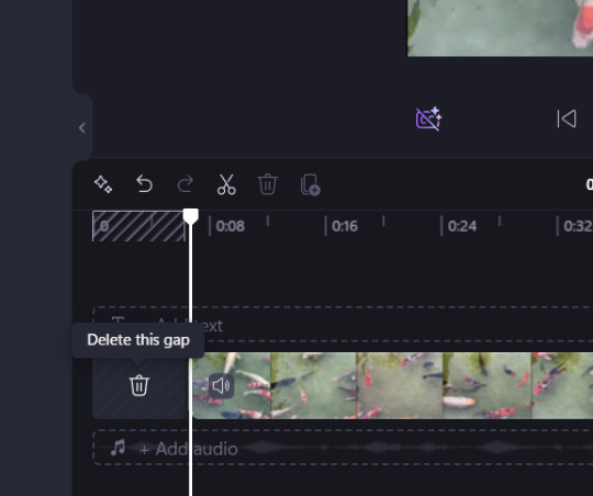
Again, if you're cutting a gif out of a big file, you probably want to do a rough cut first to give you a smaller chunk of video to work with. Then do a finer trim to get it down to just the frames you want. It can be hard to click on tiny, slivery gaps to delete them, so you can also right click in any of the gray area after the end of the video and select "Delete all visual gaps". Also, over on the right, there are little magnifying glass icons you can use to zoom in and out if you need.
Repeat the process to set the end of your video.
Next, go up and hit that purple button at the top right that says "Export." I always pick "Export in 1080p" even if my videos are not 1080p. (Note: If you haven't already deleted your gaps, it will ask you now if you want to delete them, so I guess you can just do it there if you prefer.)
You may notice that "GIF" was an export option. However, the gif it outputs will be small and grainy looking, so I don't recommend using it.
Exporting will take you to this screen where it tries to convince me to post this beautiful koi gif I am making to various social media, including LinkedIn. Clipchamp, thank you, I will not.
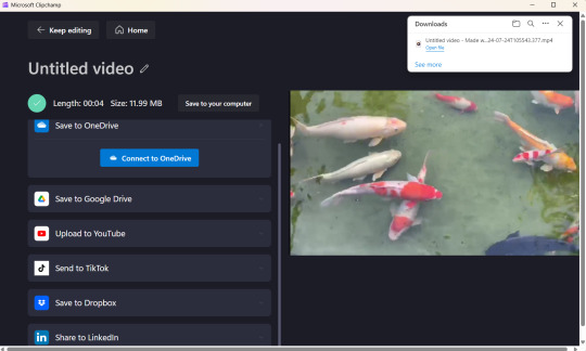
It will automatically save your export to your Downloads folder with an auto-generated filename. You can hit that little "Save to your computer" button (it's above and a little to the right of the bright blue "Connect to OneDrive" box") and save it where you want, with a meaningful name.
Clipchamp has loads of other features--you can use it cut together multiple videos, you can add captions, you can do stuff with the sound. This is not a tutorial on Clipchamp, but I've been able to figure out a lot just messing around with it.
Converting to a gif
For this second part, I use a fantastic website called Ezgif. There's a ton of stuff here, but we are specifically going to use their Video-to-Gif utility.

Hit that "Browse" button and select your file.
Then hit the blue "Upload video!" button. If your file is big, it may take a few minutes to upload. Once it has, it will give you a preview, and some options. I usually leave the options as they are, and hit that blue "Convert to Gif!" button at the bottom.
Note: You could, in theory, skip step 1 and do your trimming right in Ezgif. However, it does have filesize limits. Also, it would take a long time (and bandwidth) to upload a big file--it just makes more sense to me to trim it locally first.

Again, depending on how long your gif is, it may take a few seconds, but then it will give you a preview of your gif (it will be animated, but this is just a screenshot)
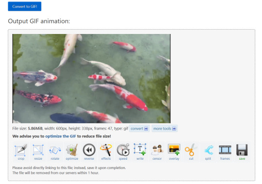
If you're happy with it, you can simply right click and save the gif as is.
Optional, but possibly very helpful:
Right below the preview, it will always recommend you optimize the gif, and I almost always do. Even just picking "Lossy Gif" and setting the compression to 30 will usually reduce the file size by 20-40%. If I have a long or slow gif, I will sometimes also play around with the "remove every Nth frame" option. This is kind of arbitrary, but I aim for less than 3MiB if I'm planning to post it to Tumblr.
It might be hard to see, but I've got some little black letterboxes on the left and right sides of my gif. You can use the "Crop" option to get rid of those.
I often adjust the speed of my gif, especially if removing some frames made it too fast.
If you select the "Frames" option, opens a page that shows every frame of the gif and how long it plays. Back when you were trimming the video, if you ended up with some extra frames, you can turn those off there. Also, sometimes, my gifs end too abruptly, like if the scene cut to something else I don't want in my gif. In this case, you can set the delay on the last frame to be longer, and it may end up looking smoother.
Anyway, Ezgif is easy to explore and figure out on your own and doesn't add any watermarks to your final product. It is one of my very favorite sites on the internet.
Here's my final product:

Hope this was helpful and good luck!
#thank you for this ask! i have the sickness where i simply love to write up a little set of instructions#i am very much an amateur at this but it's fun and the output is good enough for my humble tumblr
4 notes
·
View notes
Text
Demystifying Digital Images and Video: Formats, Tools, Copyright, and More.
Introduction
In today's digital age, images and videos have become an integral part of our daily lives. From personal photographs shared on social media to professional content uploaded on platforms like YouTube and Twitch, understanding the intricacies of image and video file formats, codecs, and manipulation tools is essential. This blog post aims to provide a comprehensive overview of these digital elements, focusing on the definitions of common file types, export settings for popular broadcasting platforms, image manipulation tools, and the critical aspects of image copyright.
Definitions of Commonly Used Image and Web Video Formats, Wrappers, and Codecs
Image Formats:
JPEG (Joint Photographic Experts Group): JPEG is the most widely used image format for photographs and digital images. It uses lossy compression, which reduces file size while maintaining reasonable image quality.
PNG (Portable Network Graphics): PNG is preferred for images with transparent backgrounds or crisp, high-quality graphics. Unlike JPEG, it uses lossless compression.
GIF (Graphics Interchange Format): GIFs are a popular choice for short, looping animations and simple graphics. They use lossless compression and support transparency.
TIFF (Tagged Image File Format): TIFF is a versatile format commonly used in professional photography and graphic design. It supports lossless compression and maintains high image quality.
BMP (Bitmap): BMP is a Windows-native format known for its lack of compression. It results in large file sizes but retains image quality.
Video Formats and Codecs:
MP4 (MPEG-4): MP4 is a widely supported video format that uses the H.264 codec. It offers a balance between quality and file size, making it ideal for streaming and sharing on the web.
AVI (Audio Video Interleave): AVI is an older format that supports various codecs. It is not as efficient as MP4 in terms of compression and is used less frequently nowadays.
MOV (QuickTime Movie): MOV is a format developed by Apple and is popular among Mac users. It can use various codecs, such as H.264 and ProRes, for high-quality video.
MKV (Matroska): MKV is an open-source container format that can contain videos with a variety of codecs, making it highly customizable.
Export Settings for Popular Broadcast Platforms
When it comes to sharing images and videos on popular broadcasting platforms like YouTube, Twitch, and Facebook, selecting the right export settings is crucial for optimal quality and compatibility.
YouTube: For video content on YouTube, the recommended format is MP4 with H.264 video codec and AAC audio codec. The ideal resolution is 1080p (1920x1080) or 4K (3840x2160) for higher quality. These settings balance quality and compatibility across devices.
Twitch: Twitch also prefers the MP4 format with H.264 video and AAC audio codecs. A resolution of 720p (1280x720) or 1080p is recommended, depending on the viewer's internet speed and quality preferences.
Facebook: Facebook accepts a wide range of video formats, including MP4 and MOV. However, MP4 with H.264 video and AAC audio codecs is a reliable choice. The resolution should be adapted to the target audience and device capabilities.
Commonly Used Image Manipulation Tools and Techniques
Image manipulation tools are essential for enhancing and editing images. Here are some commonly used tools and techniques, along with their purposes:
Adobe Photoshop: Photoshop is a versatile image editing software that can be used for tasks like retouching, color correction, and compositing.
Adobe Lightroom: Lightroom is perfect for photo organization and enhancement, with features like exposure adjustment, color grading, and batch processing.
GIMP (GNU Image Manipulation Program): GIMP is a free alternative to Photoshop, offering similar features for image editing and manipulation.
Canva: Canva is a user-friendly online tool for creating graphics and social media content. It simplifies design tasks for non-designers.
Cropping and Resizing: These techniques are fundamental for adjusting image dimensions and removing unwanted parts of an image.
Image Copyright Essentials
Artists and content creators must be aware of copyright laws to protect their intellectual property. Key copyright essentials include:
Ownership: Creators automatically own the copyright to their work upon creation, but registration provides additional legal protection.
Fair Use: Fair use allows limited use of copyrighted material without permission for purposes like criticism, commentary, news reporting, and education.
Licensing: Creators can license their work under specific terms, such as Creative Commons licenses, allowing others to use their work while respecting their rights.
Public Domain: Works in the public domain are not protected by copyright and can be used freely.
DMCA Takedowns: The Digital Millennium Copyright Act (DMCA) enables copyright owners to request the removal of infringing content from online platforms.
Attribution: When using copyrighted material, proper attribution is often required to credit the creator.
Conclusion
Understanding digital image and video formats, codecs, export settings, image manipulation tools, and copyright essentials is essential for content creators, whether amateur or professional. By adhering to best practices and legal guidelines, creators can ensure their work is of high quality, reaches the right audience, and is protected from unauthorized use. Whether you're a budding photographer, a vlogger, or a graphic designer, the knowledge presented in this blog post can serve as a valuable resource to navigate the digital content landscape successfully.
References
Reference list
Arts Law Centre of Australia 2010, Copyright - Arts Law Centre of Australia, Arts Law Centre of Australia.
Attorney-General's Department 2022, Copyright basics, Attorney-General’s Department.
Image Manipulation: The What, How, and Why 2021, Clipping Path Campus.
Image Processing: Techniques, Types, & Applications [2022] n.d., www.v7labs.com.
Video File Formats, Codecs, and Containers Explained | TechSmith 2018, Welcome to the TechSmith Blog.
By: Juan Gutierrez.
4 notes
·
View notes
Text

‘Batman Unburied’ podcast series to debut on Spotify
ByCeline Littlejohn|Apr 8, 2022
(L-r) ROBERT PATTINSON as Batman and ZOË KRAVITZ as Selina Kyle in Warner Bros. Pictures’ action adventure “THE BATMAN,” a Warner Bros. Pictures release. Photo: Jonathan Olley/™ & © DC Comics. © 2021 Warner Bros. Entertainment Inc. All Rights Reserved.
The shift to streaming for entertainment becomes more evident with a podcast series based on characters from Batman being released on Spotify following HBO Max’s premiere of “The Batman”
The world of entertainment and how fans consume technology has changed from what it was even a decade ago. With movies having a smaller theatrical window and faster release at home through streaming services, more people have easier access to the latest Hollywood blockbusters than before.
This has become even more apparent with Spotify, the audio streaming giant, signing on to a multi-year deal with both DC Comics and Warner Bros. for scripted podcasts. According to The Verge, the DC podcast universe will feature nine shows focusing on characters such as Superman, Wonder Woman, the Riddler, Batgirl, Catwoman, and Lois Lane.
There’s even a Marvel podcast universe, with Marvel partnering up with SiriusXM to release unscripted and scripted series of their own, going through such services as Pandora, which SiriusXM owns.
The Batman releases on HBO Max on April 19, followed by April 23 for the traditional linear HBO network. The Spotify podcast, Batman Unburied, will follow soon after on May 3.
Starring Winston Duke in the role of Bruce Wayne/Batman, TechCrunch explains that in this scripted series, “Bruce Wayne works as a forensic pathologist in Gotham Hospital, where he’s tasked with examining the victims of The Harvester, a cannibalistic serial killer.”
The release fits perfectly as audiences are still feeling the elation of seeing The Batman. The Batman has performed well at the box office, earning the second-best pandemic era opening with $128.5 million at the box office, as reported by Complex, coming in second to Spider-Man: No Way Home‘s $260 million box office debut, and joining only No Way Home, No Time to Die, F9: The Fast Saga, and Venom: Let There be Carnage as films to make $500 million worldwide during the pandemic.
Complex also explains that The Batman was number one in the United Kingdom, as well as Mexico, Japan, and Australia. This was just for the opening weekend.
Add this number of viewers to the wider audience the film will gain when it premieres on HBO Max and HBO’s linear network, and many people will be filled with even more enthusiasm for the Batman franchise.
With the film being number one in other countries as well, according to The Hollywood Reporter, the podcast series will be adapted for a global audience, “with each country’s version featuring local talent to voice the characters.” This includes Brazil, France, Germany, India, Indonesia, Italy, Japan, and Mexico.
With Duke playing Batman/Bruce Wayne, The Hollywood Reporter shares that the rest of the “U.S. English-language version will feature Hasan Minhaj as The Riddler, Jason Isaacs as Alfred, Gina Rodriguez as Barbara Gordon, Lance Reddick as Thomas Wayne, Toks Olagundoye as Martha Wayne, John Rhys-Davies as Dr. Hunter, and Ashly Burch as Vicki Vale.”
David S. Goyer, who previously worked as a screenwriter for Batman Begins, is the creator and executive producer of the series.
Content for comic books and superheroes has grown beyond just theatrical film releases and the traditional physical comic book. From spinoffs like The Peacemaker, based on James Gunn’s 2021 film, Suicide Squad, and the planned Penguin spinoff from The Batman, to alternate releases of films, as seen with the HBO Max release of Zack Snyder’s Justice League, it’s a great time for superhero content to expand across multiple platforms. Streaming is the main target, whether it is through visual series and films such as seen on HBO Max or podcasts like on Spotify.
0 notes
Text
Honestly, as an actor who is photography/modeling adjacent: THE PHOTOS THEMSELVES ARE SHIT!!!
I would be embarrassed if that was my shitty photography marketing someone's shitty product.
-Problem 1: The first two photos are blurry!!! I just know someone took this on their iPhone and forgot to press the screen a couple of times, to make sure that little yellow square focused on the ACTUAL RING and not like, the fucking background. And they clearly didn't know that you need to take MANY, MANY PHOTOS so that if you end up with a blurry photo, you can just get rid of it and use the others you have!
-Problem 2: The photos are all just amateur "ooh shiny gemstone!" photos from the same or similar angles! I don't even know how thick the bands are! Usually when I look at jewelry that I can't afford, you get a close-up shot of the piece, a side shot or two, and a shot of it on a living model or the equivalent jewelry-holder, which NONE OF THESE THINGS ARE!
You're telling me you had no craft-stores around for even a basic ring holder instead of that freaky broom-stick handle and whatever the plastic is? Why aren't the rings on anyone's real hands? Do you not want those dirty motherfuckers touching your skin? In which case, refer to the jeweler's tags about "WHY DIDN'T YOU CLEAN THIS???" and "WHY DOES THIS NOT LOOK LIKE ACTUAL SILVER???"
-Problem 3: The lighting is crap and the background in everything but the first two photos is crap. Who thought that gray paper/wall backdrop was a good choice for jewelry??? And they have clearly photographed the rings indoors, where they languish away from the light of the sun.
Literally, the easiest way to make your stuff look better is sunlight. The most common advice is to take photos by a bright window! Alternately, just get a fucking lamp!
When you are starting to photograph jewelry, you need a nice blank slate to help the viewers focus on the piece. The easiest way is just to photograph it on something white, because that's the standard for many big companies. Dark colors and neutral colors are also okay, but you have to KNOW COLORS FIRST!!! Props and fancy backgrounds are for experienced jewelry photographers with like, ACTUAL CAMERAS and LIGHTING AIDS and MODELS.
With that cement-gray background and not a sniff of a light source to help, you're making these clearly not-silver rings look even dirtier, and even more yellow from whatever-the-fuck gave them jaundice.
kinda obsessed with these, clearly beginner, rings on Etsy being marketed as garnet when i'd bet money that they are glass

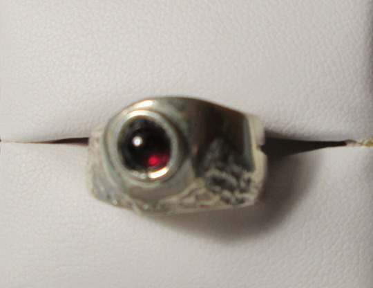


the metal work is. certainly better than what i've ever made, so i don't want to speak to harshly. but uh. um.
51K notes
·
View notes
Text
Virtual Sketchbook 2
Journaling
Principles of Design: Visual Outline
1. Unity and Variety
Definition: Unity is the feeling of when you see a piece of art that there is a sense of completion and an instinct that tells you that that art work is complete and that all the aspects of the art work well together to give you the experience of the art work. Variety is having more than one aspect of art into an art piece. Having different layers and things that catch your aye in a piece of art.
Everyday Example: Comic books that I have displayed in my room (unity) but a variety of flowers (variety).

2. Balance
Definition: Balance is artwork having the aspects of it work with each other to not having things over power other aspects. And if it is asymmetrical then it does it in a way where it highlights the art by using different elements.
Everyday Example: My living room is a well-arranged living room where furniture is symmetrically placed around a focal point which is the TV.
3. Emphasis and Subordination
Definition: Emphasis is creating a focal point to draw attention to an area or a point on the piece of art
Everyday Example: Taking a photo and it has a focus on you and the background is blurred

4. Directional Forces
Definition: Directional forces guide your eyes through the art, usually created through lines, shapes, or colors. Everyday Example: Guidelines on the road that direct you, or lines on a piece of art and they don’t have to be straight

5. Repetition and Rhythm
Definition: Repetition involves using the same element multiple times, while rhythm creates a sense of movement through the repetition of elements.
Everyday Example: The pattern of tiles on a floor.

6. Scale and Proportion
Definition: Scale is the size of an object in relation to other objects, while proportion refers to the relationship between parts of the entire thing.
Everyday Example: A skyscraper next to a small building (scale) or the proportions of the human body. (Proportion)

Recipe for Composition:
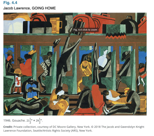
Implied Lines:
Description: The movement of the figures and the angles of their bodies create implied lines that guide the viewer's eye across the canvas.
Example: The direction in which the figures are looking and moving, as well as the angles of the train seats and windows.
Color Scheme:
Description: Lawrence uses a vibrant color palette with a mix of warm and cool colors to create a dynamic and engaging composition.
Example: The bright reds, yellows, and blues in the clothing and seats contrast with the cooler tones of the background.
Geometric Shapes:
Description: The composition is structured with strong geometric shapes, creating a sense of order and balance.
Example: Rectangular forms of the train seats, windows, and luggage create a structured environment.
Balance:
Description: Lawrence achieves balance through the placement of figures and objects, creating an equilibrium between the different elements.
Example: Figures and objects are evenly distributed across the canvas, with each side of the painting having a similar visual weight.
Rhythm and Movement:
Description: The repetition of shapes and colors creates a rhythmic flow, guiding the viewer’s eye throughout the painting.
Example: The repeated patterns of the seats and the alternating colors of the passengers' clothing contribute to a sense of rhythm.
Focal Points:
Description: Lawrence uses focal points to draw the viewer’s attention to specific areas of the painting.
Example: The central figure reading a newspaper and the brightly colored luggage overhead serve as focal points within the composition.
Perspective:
Description: The use of perspective gives depth to the painting, making the train car appear as a three-dimensional space.

This is meaningful in my life because I feel that I learn from my mistakes and believe that you can not get better at something without failing first and I choose this example because it represented how I was when I took Calculus I failed my first test then I put in the work and then I ended up passing with a B when at the beginning I did not even think I could pass the course. (This was a very fun assignment)
0 notes
Text
Beyond the Camera: 5 Advantages of Black and White Photography

© David Schmid
Are you an aspiring photographer and want to try black-and-white photography? Or perhaps you’re just curious why this type of photography is so popular among established photographers.
Either way, I plan on unraveling the mystery for you in this article. Black and white images are beautiful, and there is thought behind opting for them. Monochrome images come with a series of advantages that photographers know how to tap into – and soon, so will you.
The Advantages of Black and White Photos
Without further ado, let’s dive into the advantages of capturing a black-and-white photograph:
1. Timelessness
To start with, the fact that black-and-white photography has been around since the dawn of the camera makes it impossible to immediately assign a certain era to a black-and-white photograph.
Particularly in the realms of apparel, company logos, automobiles, and architecture, color schemes can and do evolve.
Consequently, datable elements are easy to spot in color images, but may be considerably more elusive in black and white. This particularly applies to landscape photography, yet the same can also be said about portraits.
2. Eliminates Distractions
While it's great to live in a colorful world, there are times when it becomes too much. In particular, when reduced to black and white, a number of visual distractions that are present in color disappear.
In a color portrait, a striking floral pattern might stand out, but when converted to black and white, it's almost hard to see. A striking blue sculpture in the foreground of a cityscape might, for example, become an attractive neutral tone after being converted to black and white.
Color also has the potential to take away from other design elements that should be highlighted, such as texture, lighting, shape, and form. Black and white photography brings out the depth and texture of worn tree bark that is full of subtle features. Color, on the other hand, has the opposite effect and distracts the eye, making it hard to grasp the photo's central message.
By removing any potentially distracting hues, black and white helps keep the viewer's attention squarely on the subject at hand.
3. Sets The Mood and Emotion
When it comes to capturing emotions and atmospheres in photographs, black-and-white shots work like magic. They avoid using a plethora of colors in favor of various black and white tones. Because of this, the contrast between light and dark areas is more pronounced, giving the images a unique vibe.
It's as if ordinary time is transformed into an enduring memory.
Try to visualize a cityscape shot in monochrome with a lone figure. The lack of vibrant hues creates an atmosphere befitting a moment of reflection. The once blue sky, now grey, carries a lot of symbolism.
A monochrome image has a certain emotional resonance. It evokes emotions and conveys stories that bring the visuals to life. In doing so, each photograph becomes a fragment of history and a window into the emotions of the people captured.

© David Schmid
4. Encourages Creativity
We can assume that color photography is more accurate and illustrative, since that is how the world is. In contrast to monochrome photography, which merely portrays an alternative reality that appears more imaginative and subjective, color photographs portray the world as it truly is.
To some extent, black and white photography can assist you in liberating yourself from specific limitations.
In a colorless environment, you are not constrained to depict reality as it is. Instead, you are free to depict your observations, which may include intriguing shadows, lovely textures, unexpected relationships, etc.
In the end, removing color means taking away the viewer's familiarity with the image. Now that color is out of the question, how can you grab the viewer's attention? Well, you may be creative, play around, and portray the world in a whole new light.
5. Fixes Lighting Issues
Among the many viable options for dealing with lighting issues in photographs, black and white photography stands out. It does a better job than color photographs at dealing with different lighting conditions.
It draws attention to deep blacks in high-contrast situations, illuminating compositional structures. The mid-range tones are brought out more, making the shifts between grey scales more noticeable.
Through black-and-white conversion, the high-key and low-key possibilities make it an ideal medium for capturing both light and dark images. It is a trustworthy tool for photographers due to its ability to handle a variety of lighting conditions.
It goes beyond being a mere filter, fixing your photos so they look great no matter the lighting conditions, and transforming obstacles into possibilities for artistic brilliance.
Conclusion
These advantages should give you insight into why photographers opt for black-and-white, and how they expect their art to benefit from that. Monochromatic images bring a lot to the table – the emotional side paired with the advantages of lighting and creativity.
If you want some important events from your life captured in black-and-white, or you just want to immortalize a place or a person, contact me and let’s set up your black-and-white photoshoot.
1 note
·
View note
Text
exhibition reviews (all)
Karl Maughn, Sprung at PAGE 21 September - 14 October
https://www.pagegalleries.co.nz/exhibitions/172-karl-maughan-sprung/works/ PAGE gallery on Victoria street
The work was all presented in the space to show it in the most sellable format, a beautiful clean space with white walls and presentable sitter. The work was at a standard eye level, all evenly distributed through the space.
Work was placed around the space in symmetrical series and individuals. repeated forms and colours as the exhibit seemed to be a study on one particular garden. As his work all is colourful representations of gardens this exhibit was clearly a show for sales and distribution. Which was successful, as every work on the website but one from this exhibition has been sold. As that was the intention I see the hang and presentation only as a way to present a product rather than a way to bask in one's creation, immerse your senses or enjoy a space
This was not the intention of our exhibition. Going into the exhibition paper our group had the intention of breaking away from a white cubesque space, creating a space not for sales and perfect presentation of work and one for obstructed view, crammed corners and tripping hazards. Not ideal for selling work, as Maughn does - at the price and scale. So the space was well lit, clear and calm. To showcase the work that he makes. With neutral white walls and gray floors.
In picking a space we wanted something that wasn’t going to be absurdly far from that space at
PAGE gallery, I appreciated the medium level hang and the symmetry of the show but intentions for exhibiting work were clear and definitely clashed. Though selling work for a Karl Maughn price tag would be excellent.
image from PAGE gallery website. taken by

Sione Tuívailala Mon�� the way we were at Robert heald, 24 august - 16 September
A different dissemination of similar artwork by the same artist (Sione Tuívailala Monū) as another survey done by Cailin.
This exhibition was at Robert Heald, a dealer gallery at the top of left bank. One that usually presents paintings/ wall work. This work that was shown on the 24th was a video work and used the usually very cold space in a way that changed it. Not drastically but slightly. An iPhone format video work projected onto the main wall of the gallery. A white wall. The gallery usually has big wide-open windows and an archway that leads you into another room. Today it had curtains to block light and close the space off so the viewer can engage with just the projected video work and not be distracted by the surroundings - surroundings that usually wouldn’t distract from the presented art work but as this was video work the curtains were a necessary touch.
The way we intended to use the space we acquired for our own exhibition was to transform it - to not distract from the work but embellish it and also create an artificial, slightly experimental and definitely exciting atmosphere. Cailin had projected video work so covering up external light, similar to the use of curtains in this show, was crucial to make sure the work was visible and honored. As for the rest of the works we exhibited - mostly paintings and some photographs, the natural and external light being taken away was very important to make sure the works would be presented and read in an experimental way rather than just being placed in a space designed for artwork to go into.
(Isla)
Photo from Robert Heald gallery website

The Barbie Collector Exhibition at Wellington Museum
As a somewhat alternate exhibition space, I visited The Barbie Collector Exhibition at the Wellington Museum. While not a typical gallery space (the white cube) with a display of (fine) art, the exhibition did present an array of “artworks”, Barbies of varying makes and models strewn across the room. This collection is privately owned by the Barbie aficionado Patsy Carlyle. The exhibition was intended to be both a space to witness the Barbie mayhem while also getting to know Pasty and a collector and as her own person. I recognise this exhibition serves a different purpose/intention as a informative, museum backed exhibition, over our intended art focus.
The room had a wide entrance but was not overly big. The room felt smaller still with the wall to wall case of 500 Barbie figures and the room full of visitors. The atmosphere was therefore busy but not chaotic, the brightly coloured displays kept up an optimistic atmosphere. The scale of the main shelves was quite impressive, almost overwhelming. The stacking and positioning of the Barbies (all still within their boxes) meant each Barbie could be seen. The bright overhead lighting lit up the shelves as well as the room (as opposed to a dim space with specifically placed spotlighting). The lights directed towards the shelving looked to be angled in a way as to avoid a direct glare coming off the glass case and obscuring the memorabilia. There were other facts to the space, including interactive features like a childrens colouring table. There was also informative wall/plinth texts speaking to the historical relevance of some of the Barbies on display. A video was also displayed on the opposing wall, being an interview of Patsy Carlyle on her extensive Barbie collection. I did not notice a specific publication on the works although there were purchasable museum mementos (postcards, bookmarks etc).
While the technical display of the work does not align with the direction our exhibition group is heading (an alternative space, low lighting, spotlighting etc), the visual craziness does align with some of my own aesthetic favourings within my work (loud, colourful, vintage). I liked the brightness of it, and the evident consideration for the Barbies being the full focus.
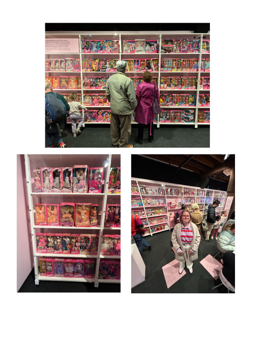
(Felix)
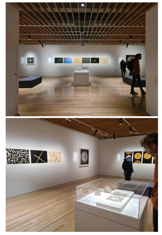
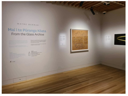
Mai i te Pūranga Kōata | From the Glass Archive Exhibition at Wellington Museum
I recently visited Wayne Barrar’s From the Glass Archive Exhibition, currently on display at Te Papa Tongarewa. The work explores diatoms, silica skeleton fossils, arranged into microscopic mosaic formations, as a past fad of the 19th century.
The gallery was a white walled, wooden floored space, a side room to the larger Toi Art component of the museum. Some works were framed while others were pinned prints. From my understanding, this framing vs pinned prints was partially dependent on what was owned by Te Papa and what was owned by Wayne (I went during his talk in the space). This also affected the lighting. The space was spotlit, and the level of brightness varied slightly, due to how long the work was meant to be on display. The length of time affected the max level of brightness Te Papa was willing to light things under for the sake of the artwork's longevity. Some of Wayne’s (owned) pieces were therefore brighter, as he was less concerned with the ageing of the work and more concerned with how dimly lit the pieces were. The atmosphere within the space was calm and cool, being a temperature controlled space. The works varied in scale, with some larger prints (framed) being quite captivating, although not overly large (approx 1m tall and wide by eye). There was also a central island with a glass top, displaying the diatom arrangements in real size (microscopic) as a recognisable sense of scale between the real thing and the microscopic photography around the room.
I didn’t see a publication specific to the exhibition, but they did have a Te Papa owned copy of Wayne’s previous publication for the displayed work. Being in the space, you could argue there’s potential overlap in wanting to create a dim, spotlit space, albeit to different extremities (we intend for ours to be more dramatic and not a white cube). I did like the work in itself, (although very different to my own) but found the necessary dimness of the images frustrating as a viewer (although its purpose was respectable). I also liked the clean white frame and matte board choices, leaving the image to take full focus.
(Felix)
Nova Paul
Ngā Pūrākau Nō Ngā Rākau
City Gallery, 1 July - 8 October 2023
During my visit to the City gallery, I viewed Nova Paul’s large scale four channel video work. The works' video, sound and its dramatic installation created an ‘other-worldly’ feel to the otherwise white wall gallery space I am used to in that room of the City Gallery.
I spent an extended amount of time with this work. The four projections that extend around the whole room, with slow paced narratives, allows for an extended moment of quiet and ‘awe’ with the work. The long benches in the middle of the huge space made me feel like I was sitting alone with the work even when others were in the room too, which added to the intimacy of the content of the work. The long thin benches also allowed you to turn around and view the different channels as a 360 when they were displaying different visual content. The video works had a neutral simplicity to them, a peering into different lives and location sites, not trying to convince you of anything but more of a presentation of appreciation. This resonated with me and the way I want our exhibition to feel, a look into our lives, experiences and senses of self without trying to convince the viewer of anything but just an honouring of experiences.
The scale and sounds of the work, particularly during the shots of nature made you feel like you were really there amongst a field with children playing or sitting staring up at a big landscape or looking out at a running river. The floor was varnished and shiny which allowed for the projections to reflect on the floor, allowing the work to take up the space further. This reflective quality was something I wanted to bring into my own video work to add depth, light quality and immersion.
This work spoke to me because, as a video artist, I am always looking for ways to unconventionally display video work in ways that takes it out of conventional screen and into an atmospheric experience for the viewer, which is exactly what this work did for me. I'm interested in the ways installation elements can both inform and change the way a video is received. It showed the utilisation of install methods to align the content of the work with how you want your audience to feel when they are viewing it. This show felt beneficial to the curation of our show as it presented ways in which you can change the energy of a space with use of scale, sound, light and movement. Although it was changing a white cube gallery space into an atmospheric space I feel we are doing something similar with transforming our underground space.
(Cailin)

Sione Tuívailala Monū
Stories
City Gallery, 6 May - 3 September 2023
Sione Tuívailala Monū’s mixed media video installation at the City Gallery was a youthful and playful show, with colourful hanging sculpture and video work in the format of raw iphone footage and snapchat videos. The video works were shown on a mixture of projection, monitors and mounted iphones. I felt a sense of connection and inspiration to the content and installation of this work and our ‘Still or Sparkling’ exhibition due to the themes of youth and of nuances of gender and identity in the contemporary world. On the City Gallery website they describe that “ Their films and floating ‘Ao Kakala embody the vibrancy and contradictions inherent to diasporic life.” The playful and relatable format of iphone and snapchat videos made the work personal and intimate, a factor that is prevalent in all our individual practices and the coming together of us as a group as we explore ideas of self and identity.
I enjoyed the bright plastic flowers used for the hanging sculpture, they replicated tropical flowers that don't typically grow in Aotearoa so were sourced from dollar stores. The synthetic and ‘kitschy’ yet beautiful plastic flowers were aesthetically appealing to me, much like the dollar store fake candles I’m using in my work. I like that they suggest something real being represented but not present, the fabricated nature of them speak to the themes of the work, much like the elements of constructed reality within my work and what they can communicate.
Colour was a large aesthetic factor of the show, Monū didn't shy away from utilising a rainbow of colours in their work. The embracement of so much colour brought a sense of fun to the work, while still a presence of careful consideration felt apparent within the use of all these colours. Bright and various colours are shown throughout each of our members' works, which actually brought them together rather than clashing. With the use of lighting and placement we were able to make connections between our works through shades of pinks, oranges and blues. Use of colour within our lighting in order to connect our works in the show was important to us, Isla and Elenas works both feature pinks and oranges and drew to my video work and candles. Felix’s prints were lit with a cool toned spot light which related to Isla’s glowing blue forms in her outer paintings. (Cailin)

Brent Harris, Transfiguration at Robert Heald - 21.9.23 — 14.10.23
Robert Heald is a commercial gallery in Wellington. To me, the gallery often feels cold and sterile due to its white walls, concrete floors and fluorescent lights. Because of this very simple gallery setting, Brent Harris’s paintings have a lot of room to breathe and hold themselves in a way that speaks to the viewer, with no distractions around them.
It may be the sterile room or Brent Harris’s paintings, but the exhibition feels a little sombre. Brent Harris is a very successful contemporary New Zealand born artist who has spent most of his career in Australia and recently moved back to his motherland. The imagery in his paintings, the colours and the title of the exhibition Transfiguration, makes me believe that the room is meant to feel nostalgic and contemplative.
Overall, this exhibition is very simple and doesn’t push many curatorial boundaries, but it is an effective way of showcasing the beauty of these paintings without any distractions.
(Elena)
Ayesha Green: Folk Nationalism
1 July–15 October 2023 at Wellington City Gallery
This show includes a range of work in different mediums all done by the same artist Ayesha Green, presented in some very interesting ways that push white cube boundaries. Which makes sense since this exhibition “interrogates the ways that power is upheld by images” and “examines histories of Māori and Pākehā representation, often questioning the particular ‘truths’ or myths they perpetuate”.
Because Ayesha Green works across sculpture, drawing, and painting, the show feels full of life and you can feel her artistic expression coming through each work. I have found in the past that many people sense that rooms feel empty when there is just work on the walls, and to “fix” this, the most common solution is to put sculptures in the middle. I personally think this can be a hit or a miss. It’s true, sometimes rooms feel empty when there is only work on the walls, but I think that if that is the case, it is because the work on the walls don’t captivate the viewer as they should, rather than the room being “empty”. Sometimes having sculptures in the middle can distract the viewer from fully taking in the work that’s on the walls. I found that Ayesha Green’s sculpture in the middle worked really well in the context of the exhibition and I found it very intriguing and an extension of the other work, rather than a distraction from it.
Overall, this exhibition made me think a lot about how different mediums can work together harmoniously in the same exhibition as long as they each hold themselves up in their own way.
(Elena)

0 notes
Text
Creating Watermarks for Your Photos: A Quick and Easy Guide
Watermarks are a valuable tool for protecting your photos and maintaining your ownership and brand recognition when sharing them online. Here's a simple guide to creating watermarks for your photos:
Step 1: Choose Your Watermark Design
Decide on the type of Watermark maker for photos you want to use. It could be a text-based watermark with your name, logo, website URL, or a combination of these elements. Alternatively, you can create an image-based watermark using a logo or a signature.
Step 2: Select a Watermark Creation Tool
There are various software applications and online tools available for creating watermarks. Some popular options include:
1. Adobe Photoshop: If you're familiar with graphic design, Photoshop offers robust tools for creating custom watermarks.
2. Canva: Canva is a user-friendly online graphic design tool that provides templates for creating watermarks.
3. Photo editing software: Many photo editing programs, like Adobe Lightroom, also offer watermarking features.
4. Online Watermark Generators: There are websites specifically designed for creating watermarks. Examples include Watermark.ws, iWatermark, and PicMarkr.
Step 3: Design Your Watermark
Regardless of the tool you choose, the process of creating a watermark generally involves these steps:
1. Text Watermark:
- Enter your desired text (e.g., your name, website, copyright symbol) in the watermark creator.
- Customize the font, size, color, and transparency of the text.
- Position the text on the photo where it's visible but not obtrusive.
2. Image Watermark:
- Upload your logo or image to the watermark creator.
- Adjust the size, transparency, and placement of the image on the photo.
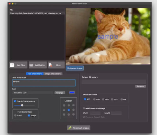
Step 4: Apply the Watermark
Once you've designed your watermark, follow these steps to apply it to your photos:
1. Single Photo:
- Use the watermarking tool to apply the watermark to your photo.
- Adjust the size and position of the watermark as needed.
- Save the watermarked photo as a new file to preserve the original.
2. Batch Processing:
- If you have multiple photos, consider using batch processing to apply the watermark to all of them at once. Many watermarking tools offer this feature.
Step 5: Review and Export
After applying the watermark, review your photos to ensure that the watermark doesn't interfere with the image's quality or content. Make any necessary adjustments before exporting or sharing the watermarked photos.
Remember that the goal of a watermark is to be visible enough to deter unauthorized use while allowing viewers to still appreciate the photo. Finding the right balance between protection and aesthetics is key.
By following these steps, you can create professional-looking watermarks for your photos and enhance your brand presence while sharing your work online.
For more info. visit us:
Free watermarking software for windows
Watermark application for mac
0 notes
Text
11 Unforgivable Historical Photos Mistakes Everyone Makes
Historical photos are invaluable windows into the past, capturing significant moments that have shaped our world. However, despite their importance, historical photos can sometimes be misunderstood or misinterpreted. In this blog, we will explore 11 common mistakes that people make when analyzing and sharing historical photographs, shedding light on how to avoid these pitfalls and gain a deeper understanding of our shared history.
One of the most common mistakes is interpreting historical photos without considering their context. Failing to understand the historical, cultural, and social background of the image can lead to misconceptions and inaccuracies.

Assuming the identity of individuals in historical photos without proper research can be misleading. It is crucial to verify the identities of people in the image through reliable historical sources.
In the pre-digital era, photos were sometimes manipulated, leading to inaccuracies or altered meanings. Being aware of potential photo manipulations can help maintain historical accuracy.
Some historical photos are reproduced or altered over time, leading to copies with different levels of authenticity. Relying on verified and original sources is essential to avoid misinterpretations.
Projecting modern stereotypes onto historical photos can distort the true representation of cultures and perpetuate biases.

Photographers often had their biases, which might influence the composition or content of historical images. Acknowledging the photographer's perspective is essential for an unbiased interpretation.
Photos might depict a singular perspective, but historical events are often multi-dimensional. Overlooking alternative narratives can limit our understanding of complex historical events.
Captions accompanying historical photos may not always be accurate or comprehensive. Cross-referencing with reputable historical sources is crucial for obtaining a complete picture.
Sharing sensitive or distressing historical photos without appropriate context or warnings can be insensitive and disrespectful to the subject matter and those affected.
Pairing historical photos with unrelated or out-of-context quotes can distort the image's original meaning and mislead viewers.
Using historical photos to further a particular political or ideological agenda can lead to misinformation and the manipulation of historical narratives.
Historical photos are invaluable treasures that offer us glimpses into the past, but interpreting them requires careful consideration and thorough research. By avoiding these 11 common mistakes, we can honor the authenticity of historical images, gain a deeper understanding of our shared history, and ensure that these valuable records continue to inform and inspire generations to come. Let us approach historical photos with respect, curiosity, and a commitment to preserving the integrity of our collective heritage.
0 notes
Text
Top 10 Greatest Shows From Nickelodeon’s SNICK
Since I’ve done so many lists on Disney, I thought I should do a throwback list on Nickelodeon. SNICK was Nickelodeon’s Saturday prime time lineup during the 90’s and 00’s. It aired every Saturday night.
Many different shows aired throughout its run, but these ten were the best.
10. KaBlam!

KaBlam! was a sketch comedy cartoon show created specifically for SNICK. It featured a variety of cartoon sketches including Action League Now, Life With Loopy, Prometheus and Bob, and many more. Many of the cartoons used alternative animation commonly used in indie films, such as stop motion animation and cutout photo animation. The humor was definitely on the darker side, as was most of Nickelodeon’s cartoons at the time.
9. Space Cases
Space Cases was a kids version of Star Trek and Lost in Space. It featured a kid crew who sneak aboard a ship and get lost in space. Some of the kids were aliens with special powers, like super strength and hearing, electricity blasts, and a supersonic scream. It featured Walter Jones (the Black Power Ranger) and Jewel Staite (Kaylee from Firefly). It was definitely cheesy but a fun show with a little bit of suspense thrown in.
8. Clarissa Explains It All
Na na na na! This show follows Clarissa as she explains everything in her life directly to the viewers. She has a rivalry with her younger brother Ferguson. Every day she gets a visit from her best friend Sam, who climbs through her bedroom window using a ladder. Clarissa Explains It All was Nick’s first show with a female lead. It’s success paved the way for many more to come.
7. GUTS
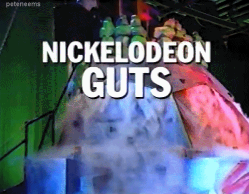
Before American Ninja Warrior, there was Nickelodeon GUTS. Hosted by Mike O’Malley, each episode featured three kids running through various obstacle courses. Each episode ended with all three climbing The Crag, a rock climbing fixture with various buttons the competitors had to push to earn points. The one with the most points who reached the top first won the episode. It was lots of fun.
6. Are You Afraid of the Dark?

A bunch of kids gathered around a campfire telling scary stories was a concept behind Are You Afraid of the Dark? Each episode featured a different spooky tale. Some of them were more silly than scary. But some were legitimately creepy.
5. Animorphs

Based on the popular book series, Animorphs was about a group of teenagers given the power to morph into animals to fight invading aliens. It was a combination of The X-Files, Power Rangers, and National Geographic. It was darker and more suspenseful than other Nickelodeon shows. Unfortunately, it was limited by the technology of the time and lasted only two seasons. A real shame as the books were fantastic.
4. The Mystery Files of Shelby Woo
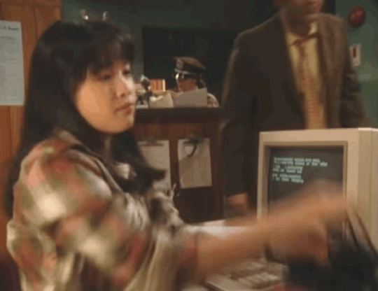
The Mystery Files of Shelby Woo was a great show ahead of its time. It was about a teenage girl who interns at a police station. She can’t help but try to solve the mysteries that come in. The show follows her as she finds clues, suspects, and allows the viewer to try to solve the case along with Shelby Woo. It was a rare gem that featured an Asian American actress in the lead role. Mr. Miyagi Pat Morita also starred as Shelby’s grandfather.
3. The Secret World of Alex Mack
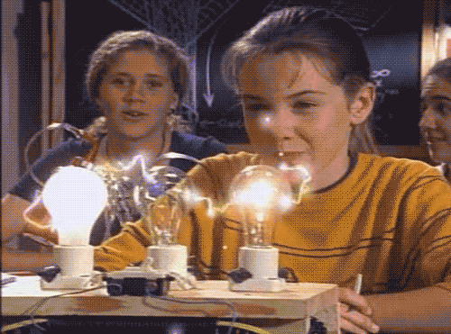
The Secret World of Alex Mack was about a junior high school teen who was accidentally covered in a mysterious chemical. That chemical gave her special abilities to shoot electricity from her fingers, telekinesis, and to turn into a puddle of water. It sounds really weird, but it was a really good show. It featured Jessica Alba in one of her first roles as a mean girl at Alex’s school.
2. Kenan & Kel
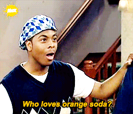
Kenan & Kel was a spinoff series starring All That stars Kenan Thompson and Kel Mitchell as best friends. Kenan was the schemer who came up with crazy ways to get rich, and Kel was his goofy best friend roped into every terrible plan. Of course, chaos and hilarity always followed. It’s running gags were Kel’s undeniable love for orange soda and ending each episode with “Aww here it goes!”
1. All That

All That will always be the greatest Nickelodeon show. It was a sketch comedy show for kids, starring kids. It was gut busting funny. The writing was really smart and the kids were crazy talented. It launched the careers of Kenan Thompson, Amanda Bynes, Nick Cannon, and Gabriel Iglesias. But the first two seasons and the original cast will always be the best. It featured spoofs of Oprah, Ross Perot, Superman, Steve Urkel, and more. Its best segments were Good Burger, Ear Boy, the Loud Librarian, and Vital Information. It was so successful it launched spinoff series Kenan & Kel, The Amanda Show, and Good Burger became its own feature film released in theaters.
#90s nostalgia#90s throwback#90s#nickelodeon#snick#all that#kenan and kel#the mystery files of Shelby woo#the secret world of Alex Mack#alex mack#Nickelodeon guts#clarissa explains it all#animorphs#are you afraid of the dark#kablam!#space cases
50 notes
·
View notes
Photo

Retrospective - Limited Edition 1 of 8, Goedz Illa
. . _______________________________ Entire edition of 8 + 1 AP (artist’s proof); all sizes included; . . REGULARLY the artwork comes ready to hang (no further framing necessary), printed with light-resistant archival inks on the best acid-free archival photo canvas (by Hahnemühle) on stretcher frame. The print is coated with a UV, scratch and humidity front protection varnish also by Hahnemühle. ALTERNATIVELY if you wished it as an archival ink pigment print on acid-free fine art paper by Hahne-mühle: just tell me when purchasing; please go to general contact for that => “request type” => “Contact The Artist”. You cannot attach fine art paper directly on the wall without laminating or framing it behind glass or acrylic glass, which in addition is also a UV protection (I recommend “UV 100” by Plexi). If you preferred the paper option, you can have the artwork sent directly to your local photo lab or framing service by giving their ad-dress to SaatchiArt when you are purchasing. My TIFF files of high resolution photos of 42 to 168 megapixel also allow to view larger prints from close and still see the small but often important details clearly and sharp. Prints produced by a renowned specialist laboratory (no cheap internet upload prints) for best image quality, durability/archivability and long term inflation-proof investment in art. Comes with a hand-signed and numbered certificate 1) that guarantees the limited artwork is for ever only available at the entire edition stated and 2) that lists the premium materials used to produce the prints. The certificate can be attached to the back of the frame. Please allow 5 to 10 working days production time for canvas and 3 to 5 for fine art paper. Carefully, professionally packed with acid-free materials. If there is any further question, feedback etc., feel free to message me. . . . . Only to whom it may be interesting to get information about the context and content of this group of works: The art photograph as seen above is part of a project with the working title "Unity". The following text is only understandable with the pictures of the four “Unity” photo works, which you can see in seperate offers here. UNITY The contradictions and connections of some phenomena of quantum physics with philosophy and our everyday experiences are part of my inspiration, but not the subject of group of works. Even if partially visible in the pictures, the specially developed tools do not form the content either. Rather, it’s mainly about making it possible for people to experience the flow of the boundaries between art and the viewer, and generally between subject and reality and thus the truth. Interlocked there are other levels, such as psychological ones and the question of how the time is to these constellations. A detailled interpretation of these contents is deliberately omitted here as well as within the pictures, in which questions are raised rather than answered, in order to leave the recipient neither too much nor too little space for associations and own thoughts. Yet, for a better access, it is important to document the above-mentioned tools as well as the processes: (Image) Bei Pfeiffers, 2017 The photographer, the camera and the viewer of a photo usually adopt the same perspective, that of the image carrier. For ten years I’ve been thinking about various possibilities how to split this situation in order to have them make individual statements when needed. In the photographic work „At Pfeiffers“, for example, the photographer is no longer in that position, but can be seen in the picture. A part of the camera system, the smartphone and laptop, with which he is driving the cameras, also changed the perspective. Furthermore I adjusted the window casement so that the camera is visible in the reflection (and also the actual opposite of the cafe). The viewers now experience themselves more as though they alone adopt their perspective, more as part of the work of art and the events in the image more directly and in their own way. (Image) Distant Blue (triptych), 2016, In the triptych „Distant Blue“, on the other hand, the recipient becomes aware of his direct partic-ipation, be-cause he has a structure directly in front of his eyes. It is as if he himself were stand-ing there, but it also feels as if at the same time this was someone else, who has been there already, looking into the distant blue. This curtain can be seen in both photographs. I have them printed on canvas and mounted on a stretcher frame, so that they are coherent with the third part of the triptych, which consists of the original curtain mate-rial mounted on the same kind of stretcher frame. The information field reality of the photo is confronted here with the reality expe-rienced by us, namely with a material part from the motif of the picture. (Image) Coordinates, 2016 Like most of my photographs, also this one was taken in several parts by shifting the digital back of a viewer camera, which allows getting a very high resolution for large photo prints (for example with a width of 400 cm/13 ft and viewed from close up the very small performer is still completely sharp). In the case of this artwork, however, the performer also moves with each section of the photograph taken, and thus appears several times in the entire picture. Knowing this, the viewer can experience not only the result, but also the process and the aspect of time in a better way. The location and image motifs were chosen and processed in such a way that one perceives even more something like a time axis. The direction of motion of the performer was reversed in one half of the picture, which makes one think he goes against that time axis. The water mirror side was also taken in separate parts, whereby deliberately neither a chronology nor linearity was kept in the motif. (Image) Retrospective, 2017, My intention is that “Retrospective” is perceived as only one single picture and, on closer exami-nation, at the same time as the four photographs contained therein. The viewer can now adopt different perspectives (from the left to the right): The one from behind the scene, the one on the motif person and - unusually - also the one of the motif person as well as the „back view“ on the building he is situate in. In summary, with the work group „Unity“ a new kind of photography is emerging for me. . . .
https://www.saatchiart.com/art/Photography-Retrospective-Limited-Edition-1-of-8/1008693/3815636/view
1 note
·
View note
Text
View Private Instagram Without Following

Instagram is supposed to be one of these social platforms, which is contributing to changes regularly.
After getting available on the Instagram portal, there will be no need for a person to feel like they are not in touch with all the latest trends.
Many Instagram viewer websites and apps are claiming that by using their site’s feature of the private Instagram viewer, you can See Private Instagram Profile of anyone you want, but they are all hoaxes, in my opinion.
Potential Methods To View Private Instagram Pictures Without any Instruments
The Insights for Instagram, Ghosts, Followers, Stories is another software to verify who viewed your Instagram story. You can believe this software in terms of your monitoring wants.
Someone could be a private Instagram viewer because of the next causes. It is often important to urge a too who works fast as you verify the individuals you please alongside your posts.
Enter the right name of the consumer without error and get the small print. Click on the Spy now button and observe the instructions as mentioned. One is most of the people account and therefore the alternative one is for personal customers.
In public, one and everyone can follow you and appearance at the images. So, it’s far a superb deal smooth to identify someone and just suits them to look at the account. Alternatively, privately debts, there are some severe settings as a result of which the simplest picked citizenry can see your profile.
Private Instagram Viewer Tool in 2021
View Private Instagram - if you're wondering the way to view private Instagram profiles, here you go. Visit our incredible private Instagram viewer tool to unlock any private Instagram profiles. Now, you do not get to worry if someone blocked you on Instagram.
Here are the best ways to View a Private Instagram Account
IntsaLooker - View the private Instagram account

InstaLooker has three steps to getting the results. First, get the target right Instagram usernames, click on start view, and await two-three minutes. There is a verification process to make sure you're not a robot.
Finally, you'll view the content from your target. Once you're satisfied and feeling such as you need the viewed photos or videos, press the ‘export all’ button and obtain the content for your offline use.
IMGLookup - View the Private Instagram profile

Instagram is one of the popular social media where people share photos, videos, and chitchat with family, friends, and colleagues but put the privacy to access it.
When you type in the username you are looking for, it'll open a screen with a log window that appears to be searching for the account and providing access. And for your first search, it works.
How to See Private Instagram Accounts and Profiles in 2021?
But when you own an enterprise account on the platform, your sole choice of going private is to switch back to your account. Since its creation, Instagram has evolved to become the world’s greatest platform for sharing visuals.
Today, the social media platform has quite one billion active monthly users. With such enormous viewers, it's logical for Instagram to encourage public sharing of photographs and videos.
However, the platform has privacy options in situ for people who wish to ban users from viewing their private Instagram photos, movies, and private data. With the powerful Android keylogger, you most likely can the way to view private Instagram all accounts on the target telephone.
The simplest thing that you simply can do to possess entry to non-public Instagram account photos and videos is to suits them. She travels full time and has lived on the highway working remotely for over two years.
Conclusion
Social media evolves quickly to keep up with consumer demands and competition from other platforms. Your best bet is to remain informed of those new features and updates and specialize in how you'll enjoy new features as a marketer or business.
1 note
·
View note
Text
Microsoft Outlook For Mac Free Download 2010

Along with the rise of the internet's popularity, emailing has become a common practice of both personal and professional communications. Outlook is just one of the manyemail service providers available in the market.
Outlookis Microsoft's email child, available for both PC and Mac users through its web app or software. Much like its competitors, this application offers all the tools needed to compose, send, and receive emails. Here's a detailed rundown of all of Outlook's features and performance.
Ample features and email experience
Outlook offers the basic function of sending and receiving emails just as much as its competition. What sets it apart are the many features that make your email experience even better.
Outlook is Microsoft's email server for Office 365. You can get it with the complete office suite or access it online. It offers the basic function of sending and receiving emails just as much as its competition. What sets it apart are the many features that make your email experience even better.


Get the most up-to-date version of Outlook and enjoy email, calendar, and contacts in one place. Upgrade to Microsoft 365 today. Create Groups to discuss, collaborate, and share files and notes with others. Use Skype for Business voice and video calls for real-time decisions. Improved conversation. Microsoft Outlook for Android helps millions of users connect all their email accounts, calendars and files in one convenient spot. With intelligent email, calendar reminders and contacts, Outlook for Android lets you do more from one powerful inbox. Email friends, family and colleagues from multiple accounts on one app and see what matters most first with the Focused inbox that keeps the. Outlook 2010 free download - Microsoft Outlook Express, MSG Viewer for Outlook, Microsoft Outlook 2019, and many more programs.
There are two types of rules in Outlook for Mac: server rules and client rules. Server rules If you are using a Microsoft Exchange account managed by Microsoft Exchange Server 2010 SP1 or later, you can use Outlook for Mac to create and edit server-based rules.In the Rules box of Outlook for Mac, server rules are grouped by account under Server Rules in the left pane. Microsoft outlook 2010 free download - Microsoft Outlook Express, Microsoft Outlook 2019, Microsoft Office 2011, and many more programs.
Overview of Outlook
At first glance, Outlook is like any other email suite: simple design, straightforward look. You cancompose emails in rich text and bold, highlight, underline your message however you want. Format your emails easily with tools available to insert tables, links, lists, and change font colors in one neatly arranged toolbar.
When opening emails, Outlook shows a new tab to view the entire message on the app itself. Use its Immersive Reader feature to see the email in full screen or preview photo attachments in a slideshow before deciding which one to download or save.
Keeping you organized
Outlook keeps things organized by providing you several options to sort your emails. Why get lost thru labels when you can create folders to classify emails as you see fit? You can alsoplace tags to easily categorize emails accordingly.
Its search feature is but another feature that distinguishes Outlook from other email providers. You can filter emails by file size, making it easier to offload unnecessary emails and avoid exceeding the memory limit.

Outlook products
While this email application comes with Microsoft Office 365, users can still get an Outlook account by signing up on their website. You'll get 15GB worth of email storage space the same as any other email service provider on the web. If you download the Outlook app, you can get a whopping 50 GB worth of storage great for sending and receiving emails with large file attachments.

Apart from the email suite, Outlook also comes with Microsoft's Calendar application to help you easily schedule meetings and appointments. This application notifies you ahead of your sessions so that you are in the loop, always. Outlook also helps you manage contacts using the People application.
Where can you run this program?
Outlook runs on several devices, including Windows and Mac computers. Its web-based application allows you to access your email even on others' desktops. This email suite also offers apps supported by both Android and iOS devices so that you can manage your inbox on the go using your smartphone or your iPad. Finally, this popular Microsoft program can be downloaded on Windows Mobile or integrated into numerous business systems and applications, including Skype, Evernote, Paypal, Yelp, and many more. Truly ideal for any type of user.
Is there a better alternative?
There are plenty of alternative global communications software to Outlook. If you need to use an email suite mostly for personal use, Google's Gmail is a good choice. It's free and can be accessed through any web browser or its app on Android and iOS. It also offers the same amount of storage as that of the free Outlook account, allowing messages with up to 50 MB of file attachments.
For company and business use, Workplace by Facebook is another effective communication tool that gives a more instant experience. It's a somewhat spitting image of the social media website, except for the fact that it's a central communication hub for staff and managers to use in their day-to-day work.
Download Microsoft Outlook 2010 Full
Our take
From the looks of it, Outlook is definitely worth giving a shot. The best features include classifying emails by folders and tags, as well as sorting out email through file size. Speed and performance will not be a problem for those using the desktop version, and the interface is clear and easy to understand.
Should you download it?
Yes. Microsoft's Outlook is packed with so many features that cannot be found in other email clients in the market. While you will have to shell out a little more in order to get all its features, it will definitely be worth the investment. So, if you're a fan of keeping your inbox organized and personalized, then Outlook is the tool for you.
Install Microsoft Outlook 2013 Free
2010
1 note
·
View note
Text
Capture One 6 For Mac


Capture One Pro is available from Phase One here. But if you'd like to consider the alternatives, have a read of our guide to the best pro photo editors for Mac. Capture One 20 Pro. Continues to lead the way in RAW file image editing. Expertise from creating customized color profiles for more than 400 cameras, combined with our relentless dedication to creative freedom has brought recognition to Capture One Pro workflow, our exceptional color handling, and precision editing tools. Capture One is a professional RAW converter offering you ultimate image quality with accurate colors and incredible detail from more than 400 high-end cameras - straight out of the box. It offers state-of-the-art tethered capture, powerful digital asset management, extensive.
Capture One Pro 10 Crack may be a powerful and professional image editing software that enables you to get astonishing high-quality images. The appliance also assists you in converting your images into different formats, including all popular formats. Capture One Pro 10 Serial Key 2017 download from our software category for one hundred pc free and safe download.
Bringing in enormous quantities of Capture One pictures just got quicker. With improved imports also appreciate the upgraded import experience when 400+ to Capture One. To styles of work, even the process is presently significantly The smoother. Apply Styles or Presets legitimately to your picture, or as an execution, Layer to even control the darkness. The effect of Styles and Presets bringing in have never been pictured simpler to manage and now can profit by the too most recent Styles Pack, “Spring,” as a complementary expansion to. You can likewise also download
Capture One Pro Crack 2020 For Mac OS X Windows Latest Version Pre-Activated Free also Download at Soft as – and this is a standout amongst even most genuine of the RAW converter as of late. The To program appears to be identical; the devices have not in even a general sense changed, but rather trust me – will change your The RAW preparing process. Also, The Best Of RAW record picture altering programming make redid shading Ti profiles for more than cameras joined with also Capture One tireless devotion to imaginative opportunity.
Explain your pictures in by including written by hand notes and illustrations also straightforwardly on your photographs. Incorporate the AnnotatTo ions in your traded PSD record as a different layer for too complete flexibility. To Layers in Of are currently more powerful than any other time in recent The memory. also Refine and of illustration Feather the cover Of in the wake, or modify the of your also to control the effect of nearby alterations.
Also Download https://crackwao.com/syncovery/
Contents
2 System Requirements:
Key Features
Execution and Performance: To Customizable and console To easy routes to quicken illustrations and moment recording over the Internet.
Resource Management: Important Capture One Pro keygen mac for any picture taker, picture the from individual regular undertakings or vast accumulations with a large number of pictures.
System Requirements:
Intel® Core ™ 2 Duo or better
8 GB of RAM
10 GB of free hard circle space
Windows 7® SP1 64-bit, Windows 8® 64-bit, executives windows ten ® 64-bit
Capture One 9
What’s New
multiple Also, times quicker with multi-threading support
New innovative instruments for honing simpler
New channel to Also,discover scene and representation pictures
More backings several advanced cameras
Modern apparatus for focal point remedy and examination
Capture One 6 For Macbook Air
Other bug fixes and enhancements.
Capture One Review
How To Activate:
Separate from
web
(generally Also, suggested)
Never let the program to play out any updates
Continuously hinder the program in your firewall application!
haroon
Capture One Pro
5
Capture One Pro 11 Mac Crack is the latest release version of the most popular sophisticated application that provides a suite of professional tools for editing images. After running the program, the program introduction menu, along with the educational videos of the program, is placed in the main window of the application. The View menu of Capture One Pro 11 for Mac Cracked provides users with a variety of options including Viewer, Browser View, Loup Tool, Full Screen, Slideshow, Capture Pilot, and several other useful options. In Capture One V11 Pro Crack there is a bar, which allows you to access many things including cutting, zooming, landscape or portrait adjustment, image effects, also other image settings. You can also Download ON1 Photo Raw 2018 12.0.0.
In addition being the world’s most demanding photographers, Capture One 11 is the professionals’ choice in imaging software. Capture One Pro 11 Crack Mac tools allow users to access image sources, adjust colors, shine, eliminate lens deviations, metadata, and performance settings, so you can get color sensitivity, contrast, lighting, image noise, blur removal, It provides clarity, style and presets, personalization of the user’s tapes, shortcuts also simultaneous operation in two projects. based on its powerful processor engine, the software delivers the highest quality to your images. This suite includes all the essential tools and the highest performance for capturing, organizing, editing, sharing and printing images in a fast, flexible, and efficient flow. You may also like to Download Raw Power 1.2.1.
The final release version of Capture One Pro V11 for Mac Cracked adds some noticeable enhancements, improvements, also new features which you′ll experience after Downloading this Photo Editor Software for MACOSX:
Includes essential tools for editing, sharing and printing images
Working with multiple photos simultaneously and combining different photos
Change the image settings and color attributes
New raw CPU engine
Various photo preview modes
Create black and white images also
Quick conversion of RAW images
Ability to edit selected sections of images
Set White Balance Color
Detailed histogram
Remove photo noises
Correction of images. Quick and easy conversion of shots to healthy shots
Specified point settings
Ability to edit selected parts of the images for creative also unlimited control
Save and reuse the settings made for a picture
Move custom settings from one image to another
Quick and easy conversion of cropped photos to healthy photos also
Screenshots:

What′s new in Capture One Pro 11 For Mac + Crack ?
Redesigned Local adjustments concept (now Layers)
New Custom tool tab icons
Color editor logic for blending multiple Layer adjustments
Layer creation options
Toolbar Auto tool aligned with Tool Auto
Added Brightness also Contrast parameter to Auto
System requirements:
Manufacturer :PhaseoneLanguage :Multi-languagesMac Platform :IntelOS Version :OS X 10.11.6 Or laterCPU Type:X 64 bitSize :288 MB
1 note
·
View note
Text
Lighthouse, Jie Ma, 2019

By Johann von Kimaris
bgm: candlelight - sunset rollercoaster, ohhyuk
You know the feeling when you go to a new place, or maybe a place you know well through a different route, and you feel as if you shouldn’t be there? Or that maybe you’ve trespassed into forbidden territory, or that you’ve crossed the border to an alternate dimension, or perhaps even gone through time to a post-apocalyptic world where you’re the only person left on Earth? It’s the feeling of alienation and liminality, and above all, the loneliness.
The Internet as a platform is kind of like that, too. It’s an entire ever-expanding universe where new galaxies (websites) are born every day, and the different ones are all of vastly varying ages and constitutions. It’s almost impossible to please everyone, or in the case of this extended metaphor, to sustain life. Internet art, therefore, is a stupidly broad theme, but we wanted to show that we are indeed in touch with modern society, and also to celebrate the technological innovations that exist today.
One example of modern technology in art is the usage of computer graphics. In the above image, a figure stands with their back to the viewer while they look out the monumental windows. Centred in the image, through the window, stands a lighthouse (a monolith against the elements). At first glance, it is difficult to tell whether it’s a photo, a photo manipulation, or a painting, which is part of the fun when it comes to digital media. Does it really matter? The feelings evoked by the image seem much more important. The faceless figure could be any one of us, and the bleakness of the environment is conveyed through the muted yet starkly contrasting colour palette. The overarching feeling of desolate loneliness prevails.
Jie Ma, the creator of this picture, is a concept designer based in Shanghai, China. Many of his works have a similar sense of a post-traumatic world, rife with sci-fi elements and surrealist imagery, and even seems to be taken straight out of a movie. The lack of a visible face/expression on the singular figure is also a recurring theme, which creates a sense of mystery and provides a doorway for us, as the viewer, to place ourselves into the scene.
The internet is a cold and unfeeling place. There’s freedom in that, of course: you can post whatever you want! You can be as self-centred as you want. But the hopeful dreams people had about the internet in the past as a force that unites people are dashed now. Ultimately, the internet reflects the values of the offline world, often amplifying and magnifying certain issues that have always existed.
Again, I am certainly grateful for its existence, since I am able to post my thoughts and share my writing with the void. Hopefully these words will resonate with someone out there, or at least shine some light onto their path. Kind of like a lighthouse. I’ll be here, till the end of time.
...
sources: https://www.visualatelier8.com/art/jie-ma
https://mymodernmet.com/jie-ma-digital-art/
1 note
·
View note