#a supposed redraw of my 2020 art
Text
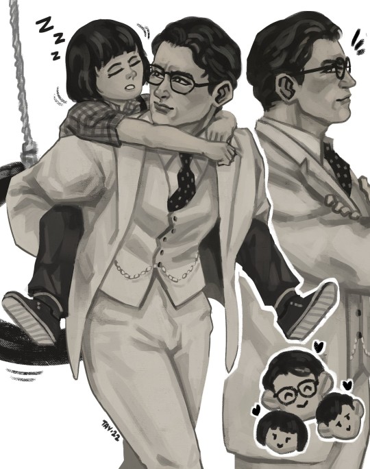
mr finch
#a supposed redraw of my 2020 art#really gotta rewatch this again tbh#to kill a mockingbird#atticus finch#scout finch#jem finch#gregory peck#old hollywood#movies#1960s films#classic film#harper lee#art#fanart#digital art#my art#karyagustay
363 notes
·
View notes
Text

Vol. 21 p.170 panel redraw
#it was supposed to be for the redraw from 2020 meme but the original was too ugly#posting it here with the wrong watermark bc i dont want people following my dead main tumblr lmao#ao no exorcist#blue exorcist#fanart#okumura rin#rin okumura#colored#not chibi#aoex#yeah sometimes i shade#my art
176 notes
·
View notes
Text

REDRAW!!!!!
ORIGINALS BELOW:

#this is like. a genderbent version of those 2018 cuphead humanizations LMAO#does it count as fanart#fanart#cuphead i guess???#gijinka i suppose#redraw#2023 vs 2020 lmao#yay#yay yay yay#art#my art!!#meeple deeples artles
3 notes
·
View notes
Text
Redraw the art that is already a little over 7 years old. (2017 ---> 2020 ---> 2024)
A little about the old art and about 2017-2020.
Initially, according to the idea, Hollyleaf was supposed to be here, because, as it seemed to me at that time, it was much easier to draw her, and she was a character that was i liked.
Now, I can't even remember why Hollyleaf eventually became Dovewing. Doubly strange, since at that time Dovewing was a character that I didn't like.
Then there was supposed to be a Starclan Spirit nearby, who would hold the cat by the paw (there (art from 2017), you can even see the line left from the paw). But apparently, I did not have enough skills for such an idea.
Then, some genius was found who took my 2017 sketch and colored it to match his character. I was shocked when I was little.
Already in 2020, I remember that my crooked and slanted redraw with Dovewing got into one of the large wc groups. To say that I was shocked is to say nothing..

Now, let's go back to 2024. I changed the pose a lot. Why? I don't like the previous one. This levitating cat makes me nervous, I understand that in the end, this is more new art than redraw. But.. what can I do? Honestly, the flying Dovewing made me nervous.
Now, about my current attitude towards Dovewing. Now Dovewing has risen in my eyes in the new cycles, she is trying to be a good mother, she went to another tribe for her beloved. I have no complaints about her (although I'm lying, in the book "Squirrelflight Hope. " Dovewing said something that made me very angry. I don't remember). There is no anger or disgust towards her, but there is no love or sympathy either. I don't think I would have been able to find a common language with this cat if my cat version had been there.


18 notes
·
View notes
Text
The (Brief) Metahistory of Ben-Gal

Yet another instagram request. Bengal hasn't gone through much change because PH development is pretty recent. But still, good to keep an archive of these things.
Note that Powerhouse is a comic in the works so obviously I can't share every detail about certain plot points because where's the fun in that?
Let's a go!
CREATION: 19th September 2020


Figure 1. First drawing (19th September 2020) | Figure 2. Second drawing (23rd September 2020) | Figure 3. Third drawing (30th September 2020)
Before he was Bengal, he was my AMONG US SONA!!!!!!!!!!!! Also Powerhouse didn't exist yet. That's it.
A NEW NAME AND A NEW STORY: 6th December 2020

Figure 3. Bengal concept art (6th December 2020)
Now he was no longer a sona, but alive! His story (aka Powerhouse) was called Orbital Immolation at this time. You can see he is quite scrawny and scared. The story was pretty consistent to what it is now, being that he escaped from his work prison and is trying to find his way back to his family and sister, Grizel. Kasper was created around this time too. Since this is a post about Bengal, I'm not going to go the extra mile of mentioning other PH characters (unless someone wants that) despite being made the same time, because I'm tired. More Orbital Immolation art (with Bengal in it) below.


Not dating these individually but they were from December 2020 to June 2021, in order of creation.
By the way, it was called Orbital Immolation because I had the idea to make Bengal blow himself up to save the world in the end of it, hence, Immolation. At this time, I also had an idea for a sequel that would center around Grizel in the future still grieving over Bengal, as you can see in that picture with her and Robot Bengal.
In the 7th picture, there is a cat-looking girl. She was supposed to be Kasper's niece trying to avenge him after Bengal killed him. I don't remember exactly when I decided Kasper was a robot, but at that time he probably wasn't one because he had a niece. Or she was a robot created by a sister company of Kasper’s engineers, hence making her a cousin? Idk. Also you can see Cain in the 5th picture!
Also back then, Bengal was aroace.
From Bengal's toyhouse page (roughly December 2020):
"Bengal is a worker for MADA Space Corp, a prison-like space station floating in the middle of Mezuno. He boarded the ship when he was 16 to make money for his sickly mother, as well as provide tuition funding for his sister, Grizel, so she doesn't have to end up like him, rotting in manual labour.
Bengal would describe himself as hardworking, nimble, and expendable. He has had the same routine for 12 years hoping his effort has paid off and that there may be a slight possibility he could return to his home planet. Little does he know, Isari had been destroyed for 2 years now, along with its culture and inhabitants. The only Isarians alive now are either refugees or had migrated to different planets before its destruction."
Interesting part about his planet, which probably isn't still canon. I had forgotten about that.
POWERHOUSE: 19th October 2021


Figure 4. First Powerhouse poster | Figure 5. First Powerhouse poster (sketch), both 19/10/21. A day before my birthday!
Here was when I decided to change the name of the comic because Orbital Immolation was Not Catchy. By now I had established the role of Reckoners in the story and wanted a technology-related title that also reflects something about our protagonist. I had 2 ideas for names: 1. Live Wire, and 2. Powerhouse. My lovely oomf helped me choose, so you have her to thank. Imagine calling it Live Wire.
Besides a bit of a personality change (he's silly now) and a workout, that's about all that's different from modern PH. I told you it was brief. Let's just look at the evolution of Bengal illustrations to finish this off.


Figure 5. What would become the basis of "Jailbreak" (28th June 2021) | Figure 6. "Snack" (18th July 2021)

Figure 7. Supposed redraw of "Snack" (23rd August 2021)
Figure 4. (19th October 2021)


Figure 8. "Murder Machine" cover (24th November 2021)


Figure 9. "Jailbreak" cover sketch (4th February 2022) | Figure 10. "Jailbreak" cover (2nd May 2022)


Figure 11. Powerhouse title sketch (17th July 2023) | Figure 12. Powerhouse title (7th August 2023)
Ohhh they grow up so fast.
Bye!
9 notes
·
View notes
Text
David Bowie and Peter Schilling's Major Tom
English
Hi guys, today I decided to share with you a series of fanarts that I've made over the years. In 1969, David Bowie released Space Oddity, one of the best songs of his musical career. The song is about an astronaut named Major Tom who went to space but never returned to Earth. After the song's resounding success, Bowie decided to continue using his character in other songs, such as Ashes to Ashes, Hallo Spaceboy and Blackstar.
In 1982, Peter Schilling released Major Tom (Coming Home), a song that made him world famous, becoming an even bigger success than Space Oddity. The song is a reinterpretation of Space Oddity, where astronaut Major Tom manages to return to Earth, providing a happy ending for Bowie's character.
Yes, both singers used the same character in their songs and after Schilling's song was released, several other singers also ended up using Bowie's character in their songs, either reinterpreting one of his songs, or telling a new story for the character and so on.
Schilling's music really marked my childhood and remains one of my favorite rock songs, but Bowie's music is certainly an absolute classic, being a bubblegum song that keeps playing in my mind because it's so catchy, It's also one of my favorite rock songs.
Anyway, in 2019, I made the first fanart of these two singers, in which they are representing Major Tom wearing astronaut clothes.

Furthermore, this was also one of the first drawings I outlined before painting and as you can see, the outline is very crooked, horrible hahaha Not to mention the poorly done painting right lol
In 2020, I made the second fanart of David Bowie and Peter Schilling. It was supposed to be a realistic drawing, but everything went wrong LMFAO

Think about an ugly drawing, it's definitely one of the worst drawings I've ever done in my entire life… Like, look at David Bowie, I was supposed to aim at him but I ended up getting right on Kevin Bacon XD
In 2021, I made the third fanart. It was the second time I tried to make a realistic drawing of David Bowie and Peter Schilling, but this time it was a thousand times better than the previous fanart, which was already shit.

I'm not very good at making realistic drawings, but this drawing here is good for a beginner.
And this was the last fanart I made of these two singers in 2023.

I had the idea of doing a redraw/remake of the first fanart, but instead of doing an anime drawing, I decided to use my "semi-realistic" style, a style that reminds me of comic books.
In addition to drawing Bowie and Schilling, I also had the idea of drawing two furry characters to represent them, so I decided to draw two characters from Lackadaisy: Zib and Joey. After I made this fanart, I really wanted to paint, but my painting is very simple (it's as if a child had painted all my drawings) and I wanted a really cool painting, a well-done painting, you know.
Even a friend of mine who does amazing digital arts was going to paint my drawing, but unfortunately she couldn't do it because she was very busy. Almost a year later, I was finally able to find someone who was available to paint my drawing, which in this case is Camila Vytória. This isn't the first time we've done a collab together, as we've done other collabs since 2022, where I drew and she painted the drawing.
She is a super talented artist who makes realistic art and watercolor paintings, as well as being a very nice and kind person. After she painted my fanart, I saw that she made a small mistake. She painted Joey using the wrong color LMFAO Despite that, I had the idea that this cat was no longer Joey, now he's my new OC. Then meet Cosmo, a feline astronaut who loves traveling and adventuring through space.
I still don't know if he'll be a Lackadaisy OC or a completely original character with no connection to this comic, but I'm still thinking about it. Thank you very much for doing another collab with me, you don't know how grateful I am for that. Seriously, I really loved the painting of this drawing, it was incredibly beautiful ❤️ If you want to see her work, click here: https://www.instagram.com/vcamilart/
Well, I hope you liked these fanarts I made over the years 😊
Português (Brasil)
Oi pessoal, hoje resolvi compartilhar com vocês uma série de fanarts que eu fiz ao longo dos anos. Em 1969, David Bowie lançou Space Oddity, uma das melhores músicas de sua carreira musical. A música é sobre um astronauta chamado Major Tom que foi viajar pro espaço mas nunca mais voltou pra Terra. Após o sucesso estrondoso da música, Bowie resolveu continuar a usar seu personagem em outras músicas, como Ashes to Ashes, Hallo Spaceboy e Blackstar.
Em 1982, Peter Schilling lançou Major Tom (Coming Home), uma música que o tornou mundialmente famoso, fazendo um sucesso ainda maior que Space Oddity. A música é uma releitura de Space Oddity, onde o astronauta Major Tom consegue voltar pra Terra, sendo um final feliz pro personagem de Bowie.
Sim, ambos os cantores usaram o mesmo personagem em suas músicas e depois que a música de Schilling lançou, vários outros cantores também acabaram usando o personagem de Bowie em suas músicas, seja fazendo uma releitura de uma de suas músicas, ou contando uma nova história pro personagem e etc.
A música de Schilling marcou muito a minha infância e continua sendo uma das minhas músicas de rock favoritas, mas a música de Bowie com certeza é um clássico absoluto, sendo uma música chiclete que não para de tocar em minha mente de tão cativante que é, sendo também uma das minhas músicas de rock favoritas.
Enfim, em 2019, fiz a primeira fanart desses dois cantores, no qual estão representando o Major Tom usando roupas de astronauta.
Além disso, esse também foi um dos primeiros desenhos que contornei antes de pintar e como deram pra notar, o contorno tá muito torto, horrível ksksksksksksks Sem contar a pintura mal feita XD Essa primeira fanart era pra ser anime, mas acho que não deu muito certo rsrs
Em 2020, fiz a segunda fanart do David Bowie e Peter Schilling. Era pra ser um desenho realista, mas deu tudo errado sksksksks
Pensa num desenho feio, com certeza é um dos piores desenhos que já fiz em toda a minha vida… Tipo, olha pro David Bowie, era pra mirar nele mas acabei acertando no Kevin Bacon XD
Em 2021, fiz a terceira fanart. Foi a segunda vez que tentei fazer um desenho realista do David Bowie e do Peter Schilling, só que desta vez ficou mil vezes melhor do que a fanart anterior, que já era uma merda.
Eu não sou muito bom em fazer desenhos realistas, mas esse desenho aqui até que ficou bom pra um iniciante.
E essa foi a última fanart que fiz desses dois cantores em 2023.
Tive a ideia de fazer um redesenho/remake da primeira fanart, só que ao invés de fazer um desenho em anime, resolvi usar o meu estilo "semi realista", um estilo que lembra de HQs.
Além de eu ter desenhado Bowie e Schilling, também tive a ideia de desenhar dois personagens furry pra representá-los, então resolvi desenhar dois personagens de Lackadaisy: Zib e Joey. Depois que fiz essa fanart, eu queria muito pintar, mas a minha pintura é muito simples (é como se uma criança tivesse pintado todos os meus desenhos) e eu queria uma pintura muito foda, uma pintura bem feita, sabe.
Inclusive uma amiga minha que faz incríveis artes digitais ia pintar o meu desenho, mas infelizmente ela não pôde fazer isso por estar bastante ocupada. Quase um ano depois, eu finalmente pude achar alguém que estivesse disponível pra pintar o meu desenho, que no caso é a Camila Vytória. Essa não é a primeira vez que fizemos uma collab juntos, pois nós já fizemos outras collabs desde 2022, onde eu desenhava e ela pintava o desenho.
Ela é uma artista super talentosa que faz artes realistas e pinturas em aquarela, além de ser uma pessoa muito legal e gentil. Depois que ela pintou a minha fanart, vi que ela cometeu um pequeno erro. Ela pintou o Joey usando uma cor errada ksksksksksksksks Apesar disso, tive a ideia desse gato não ser mais o Joey, agora ele é o meu novo OC. Então conheçam Cosmo, um astronauta felino que adora viajar e se aventurar pelo espaço.
Eu ainda não sei se ele vai ser um Lackadaisy OC ou um personagem totalmente original sem qualquer ligação com essa HQ, mas ainda estou pensando nisso. Muito obrigado por fazer mais uma collab comigo, não sabe o quão sou grato por isso. Sério, eu amei demais a pintura desse desenho, ficou incrivelmente lindo ❤️ Caso queiram conhecer o trabalho dela, cliquem aqui: https://www.instagram.com/vcamilart/
Bom, espero que tenham gostado dessas fanarts que fiz ao longo dos anos 😊
#my art#fanart#david bowie#peter schilling#major tom#space oddity#major tom (coming home)#ziggy stardust#astronaut#traditional art#traditional painting#realistic art#anime#anime art style#semirealistic art#lackadaisy#lackadaisy cats#dorian zibowski#lackadaisy zib#original character#lackadaisy oc#lackaoc#my oc#furry#anthro#furry art#anthro art#folk rock#synthpop#collab art
9 notes
·
View notes
Text
2023 vs. 2022 vs. 2018

Here's a redraw if a redraw of mine.
I feel like I've finally reached a point where my artstyle (even the sketch) no longer associates with my quarantine artstyle, back in 2022, even tho my art was much different from 2020, how i did stuff still felt reminiscent of 2020, now it's completely new, and in a good way. I reached a style I'm kinda happy with? It's so much more cartoony and pops out more
Idk I'm just really proud
I'd say 2022, it's good. I didn't make it better. I just changed the art style to one i feel happier with
2018....it's eh, good for my age at the time. i suppose XD
But I'd say this newer version of her, it finally gives off the vibes little me wanted for her
Also, I'd recommend listing to "Every Night" by Hannah Dimond, bc that was the song i used to the video where the first drawing came from, and it will give the full vibe I've been wanting out of my stlye since that video, which i belive i finally achieved
Tho i will say, my stlye may change still from here, as I'm currently just, trying to figure things out, but the corrent way of shading for me has been a blast so far so i might stick to it for a while :3
BTW this is my old persona, Cat, from my YouTube channel in 2018 (she actually didn't have much of a name bc i had no jdea what i wanted to be called online, but i was called "Little Miss Cat" so it's what it is). The drawing from 2018 itself is a screenshot from my first YouTube video, bc i lost all the files from back tgen and only have those videos as proof of my art then. Tho they are all private now
#cakes art#nsdcakeocs#oc#original character#persona redraw#also my i add#the only thing that's actually white in the newer version are the highlights#been having fun messing aroynd with some color theory#as in I'm not actively studying it#I'm just playing around with jt to see what works#like throwing stuff to the wall to see what sticks XD
12 notes
·
View notes
Text

REDRAW TIMEEE LETS GOOO
im so proud of how much ive improved during these past year tbh
old redraw from 2021 and og drawing from 2020 are under the cut
old art jumpscare, also as you can see i was a dumbass who didnt realize the sickness its called hanahaki and not hanaki


also for clarification some of the changes i made to the character are bc its supposed to be me, i used to always struggle when it came to my skin tone and make it darker than it is bc of this, i have gotten better at colors as you can seeXD
4 notes
·
View notes
Text
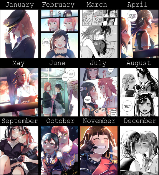
Art Summary: 2022
It's that time of year again! This makes my 9th year of art summaries... Kind of insane to think about.
It's been a very eventful year and I have a lot to say. Extended art performance review under the cut 👌 (3k words lmao)
Previous: 2014 | 2015 | 2016 | 2017 | 2018 | 2019 | 2020 | 2021
ABOUT THE COMIC:
So! What happened this year? Well, my book happened. I'm not sure if anything else happened ahfhasjkdkasf
See, I actually cheated this art summary a tiny bit. Usually I use the upload date of the art to place it in the summary. But if I did that for this year, there would be at least 4 blank spots. That's why February, April and May all feature different pages of the same comic (CH 9).
I really did spend the first half of the year finishing my comic. I only released 2 chapters too (the finale and the epilogue). In March I took a week and a half off to work on a short for Ayumu's birthday, but otherwise slaved all the way until June for the webcomic.
Then I spent July and August doing all of the redrawing and edits required for a physical release. Those who have a copy of my book might already know but the first two chapters have been redrawn. I also had to go through the entire comic, fixing it so that it could actually be printed (because the webcomic version definitely can't be printed as it is.) It was super time-consuming. Like, I can't even begin to describe. Moving forward I'll try to draw every comic so that it's printable from the beginning so I don't have to deal with reformatting ever again...
I'm pretty sure it was in August that I had the first copy of the book done. Then the preordering period opened in Septemeber... and now we're here! People are just now starting to receive their books. Sorry it took so long guys ;w;
I'm very happy though... Depending on who you ask, 100 sales might not be a lot, but it's a lot to me. To think that so many people would spend the money to buy this kind of product is just so surprising to me... It's expensive and all of the content is already available to read for free!!! So it's really surprising and I'm so incredibly grateful. That's why I went through the trouble of creating that golden special print for everyone! It was quite a bit of money out of my pocket, but I really wanted to show my appreciation.
As a side note, the 100 sales were really exhausting to pack. My body was sore in November because of it LMAO
So I'd say this year was great for my comic! Both its webcomic finale and its physical release. But this summary isn't meant to be about my comic, it's supposed to be about my art and me as an artist.
ABOUT MY ART:
So how did my art go this year?
Looking back I feel nothing but exhaustion. I know I'm happy to have my comic released but, my body and mind is still very very tired. I feel like I took at least 2-3 weeks off or more from work throughout the year to keep the comic on track. It's just a huge undertaking.
What I'm getting at is I feel a tired and... a little disappointed. But don't get me wrong, I don't feel regret! It's just that... well every artist draws for their own reasons. For me, I love getting my ideas and stories out there. So I guess I felt creatively-starved spending about half a year polishing and releasing an already-complete product. Also technically starved - you don't really see much improvement if all you're doing is cleaning up art. I didn't really have a lot of time to draw because of the physical release so I often felt like I wasn't doing enough.
And honestly that's my main sentiment. While I feel happy and satisfied with releasing the book, another part of me feels like she didn't do enough.
In terms of technical skill, I definitely saw improvement this year. It's like something clicked in me and I had a better understanding of atmospheric lighting. CH 9 and the epilogue are probably some of my favourite bits of colouring I've ever done. I just love how it turned out. In CH 9, the gradual setting of the sun to create this orange/pink/purple colour palette was so fun to implement. And in the Epilogue, this blue/green/yellow rainy day came out perfectly. It was a rainy day, but unlike CH 7, it wasn't a dreary downpour but something more hopeful instead. I have a love for creating atmosphere and especially through colour. And I think I did well there.
In the realm of black/white, I also feel lots of improvement! I'm becoming more confident with monochrome and am starting to push it further. I'm not satisfied with my skill level, but I think it's promising. I may be more confident with creating tone through colour, but I'm sure I can do the same without it!
This year I also did quite a bit of painting. I really love how the October and November artworks came out. Honestly it was around this point in the year, I had the most time to output works as the only comic work I had to do was purely admin (until I started packaging things in November). I could go into technical depth, but this post is long enough. Just know that I'm happy with the little leaps my colouring skills made.
GOALS FOR 2022:
For my art summaries, I've been doing a performance review styled thing where I create goals for the upcoming year. Let's take a look at what goals I wrote for 2022 and how I went with them.
“I want to finish my comic series”
Passed with flying colours! I think the comic release was a success. This goal is a little cheap of a goal though, since I don't think I'd let myself live it down if I gave up.
“I also want to continue to try things that are outside of my comfort zone. I want to see myself try things like different angles/perspectives and more complex backgrounds.”
Now this goal... I think I made progress here. I'm not sure if people noticed but I did definitely try to slip in different angles here and there. I'm particularly good at them... but I'm trying! And I think that's the least I can do. You won't get good at something if you don't try after all. That being said, I should push backgrounds more... I rarely do them 😅
"I want to do more illustrations/quick drawings on top of my comic work."
My comic work was suffocating a lot of the time. But I did try to draw on top of it. I haven't really talked about it, nor shown anyone, but I started learning copic markers this year (borrowed my friend's set!). So in the background I've been doing 30-60 minute traditional art exercises. I'm not terribly diligent, but diligent enough that I already think it's made an impact on my art. See, I'm only doing monochrome copic markers (I'm not confident enough to do colour just yet). I'm pretty sure doing monochrome markers has helped me with my manga skills 😂. I have a better understanding of tones and values because of it! Isn't that kind of amazing? Come to think of it, it's linked to the next goals.
"I want to learn to paint."
"I want to learn to draw faster."
While I still have a long way to go, somehow my marker exercises have helped me with these too. The understanding of tones/values has made an impact on coloured work and painting as well. And because I'm doing shorter pieces, my speed has increased a tiny bit. I'm sure if I keep at it, I can continue to develop better habits!
"I want to draft more quickly and be smarter about it."
Now this goal is something I have just been trying to mentally direct myself to. It's working... a little bit. I still need to try harder.
See, I think my drafting process is really slow and inefficient. This results in me spending too much time drawing a comic because I've drafted like 5 extraneous pages. If I wanna increase my output and lower my workload, I have to learn to be more clever with how I compose each page. I think I got a tiny bit better. Need to work harder on that for sure (it's quite hard to just "learn" though...)
MOVING FORWARD:
With the past year in mind, how do I want 2023 to go? To be honest, I still feel so exhausted because of 2022, I definitely need some time to recover, so let's not go too crazy next year.
But before I create my next goals, I wanted to talk about where I want to go in general - the grand scheme of things. Like I mentioned, I feel a lot of disappointment, like I wasn't doing enough. Which is contradictory because I also feel like I did too much with how exhausted I am... But the source of that disappointment is really tied in with how I feel about my art skill on a technical level.
I'm nearing a whole decade of hobby artist experience. And I don't feel like my art shows it. While there are things that I am better at, there's so much that I struggle with.
I want to become better. I want to improve.
It's hard to explain but I feel like I'm not doing the best I can for the stories I want to tell if I don't keep pushing and learning. And I love what I make, so I want to do those stories justice.
So it's really important to me that I keep trying to improve.
In the long term, I think my dream is to be like a pro-manga artist. Please don't make fun of me LMFAO. But there's more to it. See, I don't actually want to be a pro artist. I never want to compromise my creative vision for the sake of pandering to an audience. I sincerely think I wouldn't be able to succeed without doing that so I'm content with drawing as a hobby. A programmer as my day job and a manga artist by night...
I want to be as skilled as a pro some day though.
To be honest, I think the distance is so great that it's basically impossible. So my true goal is a little lower than that.
My true long-term goal is to be... a little comparable to a pro.
And I don't think I'm at that point. And I don't want to use "being a hobbyist" as an excuse to allow myself to remain like this.
I think it's terrifying actually. Where I'm at with my art.
I'm really happy people enjoy it, and don't get me wrong - I love my own work. I love drawing. But I think it's important to be critical of it - if I want to be able to reach my goals.
I think if people read this far, they might be thinking something like "but you're already so good!" or something to that effect. But I don't think it's true.
I think it's terrifying because there's so much I'm not good at. Comics are scary because they're an amalgamation of so many different skillsets. I possess some of these skills but there's just so many different ways that I feel that I'm lacking.
For instance, my art itself has such stiff lines. I'm not great at perspective. My art isn't dynamic. And this is just a few examples of stuff related to my illustration skills.
But comics are more than that.
There's the individual panel compositions that come together to create a unifying page composition. The visual flow - controlling how the reader scans the page. The storytelling skills - pacing, dialogue, story beats. The dialogue writing skills. The typesetting.
I think there's so many places I'm weak with and it's scary because it's difficult to just pick something to improve at when it feels like everything is wrong at once. It's so easy for me to pick up some manga from a shelf, flick through and think "this artist does x better than me, how can I learn from them?" but learning is hard and I'm not good at it so I'm just stuck with this awareness that I could be better.
But at the end of the day, I just have to pick a direction and go, right? I think that's all I can do and that's okay. It's just hard to shake the feeling of drowning in my own mediocrity.
Sorry I didn't mean to bring down the mood of this art summary.
I promise that at the end of the day that I love drawing. This is just my overly-critical side shining through. I don't have too much natural talent, just a very stubborn mind. I kind of need to be critical so I can push myself in the right direction. And I'm fairly happy with the way I've been pushing myself through these past years.
I'm not particularly fussed if my works receive a lot of traction or not because what's most important to me is the way I see my own work. My personal satisfaction.
And that's just tied with doing the best I can!
So with that in mind...
GOALS FOR 2023:
"Improve at atmospheric lighting"
This isn't particularly ambitious because it's something I'm already working on, but I know I can push lighting even further. So expect to see me experimenting more and more!
"Participate in a paid online course"
Now this is linked to my wall of text just now. I feel very overwhelmed so I think having an unbiased and experienced teacher's guidance could be valuable. I'm eyeing ones that include personalised feedback. The only concern is that it's hard to find the time for things like this when I work full-time.
Also it's a bit scary having a professional roast me, but I think it'd be good for me.
"Continue to practise traditionally"
This is linked to all of my technical art gripes. I think continuing to do traditional art exercises will help me with a lot of my weak points.
"Continue to be ambitious with art"
I don't mean ambition on a work-load level, but I want to continue to push out of my comfort-zone. Keep trying those weird angles and backgrounds, be more experimental!
"Start planning that next story"
I always have a billion different story ideas in my back pocket that I am itching to tell. I also don't wanna die of overwork though. So lets keep the bar low.
I have many great ideas, so I want to start outlining the next one! This is just a vague goal to remind myself to keep thinking ahead.
"Rest up."
I think this is the most important goal. Like I said I feel completely and utterly exhausted this year.
So I want Myon in 2023 to have more time for herself. Improve her health, catch up with her relationships, spend more time watching movies and playing video games.
Don't work too hard next year.
EXTRA REFLECTION:
I seriously don't know if anyone actually reads these reflections. I wonder what kind of person I come off across... (probably a try-hard 😂)
I wanted to talk about one more thing. It's not really linked to goals, just the future in general.
So I've been drawing for Nijigasaki for 2 years now. I think a lot of people are moving on from it though.
To be honest, I think that's okay. I'm kind of used to the people around me shifting into new interests. I think I'll still be with Niji for a long time to come. I just have a lot of large scale ideas and will probably stick with them unless something sweeps me off my feet.
I mean, even if my ideas take too long to actualise while I'm interested in Niji, I'm also open to converting things into original content. There are just so many stories to tell...
It makes me wonder why my readers enjoy my work and how they interact with it? Are people a fan of me? The ship/characters/fandom? Or the stories?
Probably some mix of the above. It's not terribly important why though.
I'm sorry that I'm not very good at keeping up with everyone's interests. I think the world moves too quickly and I draw too slow and I can barely keep up. But I'm a bit too stubborn with my own desires so I keep working on my own things without another thought. So maybe that apology is a bit empty eheh
But I hope people will continue to enjoy the stories that I make.
I should be less harsh on myself though. 9 years of art isn't something to just shrug off.
Anyways, before I keep rambling. Happy new year everyone. Let's keep working hard in 2023!
#ive been using the same art summary template for the last 9 years#it doesnt even have the year displayed in the image but im committing anyways LMAO#art summary#i drew setsupomu for an entire year#i talk a lot in the readmore; no pressure to read it though#it's more for me than for anyone else#also its 3k
38 notes
·
View notes
Text


to start off, here's my 2020 (can't remember if it was posted early or late 2020??) header that had been. up for like, nearly four years while i was on hiatus,, and here's my 2023 header i just finally updated!
anyway. thoughts on the new header.
the rangers uniforms are meant to be representation of their powers. and the colors? herald & argent's colors are light blue-ish while ortega & chen's are dark blue, meant to represent who had been a Ranger for longer, and who is a new Ranger in a short time.
now... if you look closer on the rangers, they're all staring at anita. and here's what their expressions indicated from right to left-
chen: he is very, very aware of them. his expression is meant to be a straight face, a unreadable expression and anita wouldn't dare to poke at his mind. if anything he seen through anita, whether they like it or not.
ortega: she is worried for them. like, genuinely worried for someone who was her best friend, and her almost partner. Someone she had seen them as her love of life. And, seriously, she sees the haunting behind anita's expression.
argent: there was a original idea that she was suppose to show off her sharp teeth and all, because she is interested in how they had fought her but... i went this way because she's truly sharper than she looks. she is judging them, she respects them, and keep a eye on them because you will never know what anita would do.
herald: i'm going to be real honest, it's kinda tricky to figure what he feels about anita. but given what he really does, he's concerned about his favourite hero, he wants to help them but doesn't want to, like, push them especially anita had told him to literally give time to get to know them, after all!
finally, rat king: the girls are there for anita, like a child supporting their parent in a cool sport. also yes, they're hanging on anita's cape-
anyway, in conclusion, this header is meant to dedicated to the sequel. who knows if future me will make a third header. that's future me's problem after all-
oh and lastly-
it's also a redraw of this art i did ages ago <:'3c

#fhr#lori ramblings#idk wHAT TO TAG THIS MSDGMSDGM#its me and my silly rambling on that silly header that im so happy MDGMSDGMSDMGMSDG#LONG POST
9 notes
·
View notes
Text
TR's Palette Challenge Part 3
Part 1, Part 2
Original post with palettes
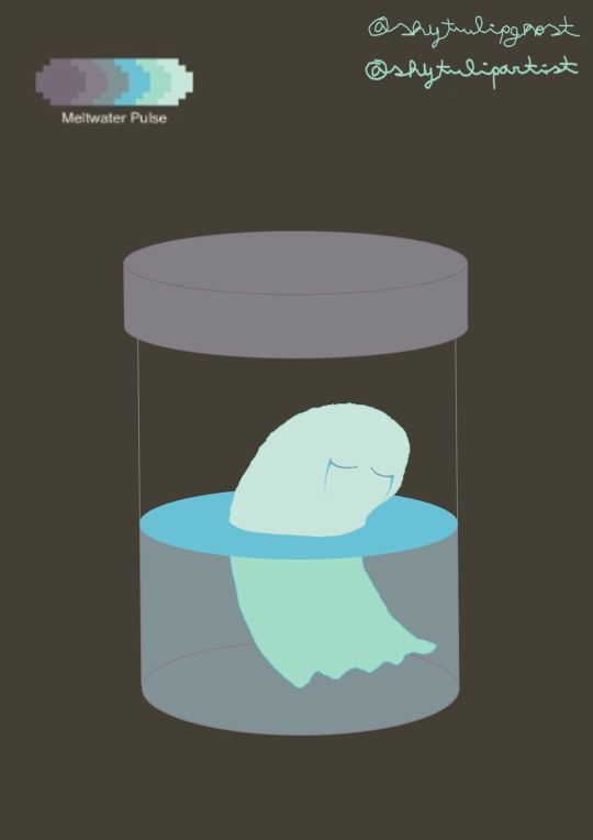
Ghost in a jar
"They died from crying too much."
Pattern used: Meltwater Pulse
I decided to redraw the first illustration I made on Autodesk Sketchbook, back when I didn't know how to use other art programs besides MS Paint. There are still things I need to learn about Krita, but I prefer to do it at my own pace.
Let me give you some context for the drawing. When I was bored at school, I would sometimes draw a ghost crying inside a jar. For some reason, I liked drawing that doodle, even though I was emotionally okay at the time.
In 2020, I made a digital version on Autodesk, but I never shared it online. Now that I have an art blog, I might post the original version and compare it with the new one.
There's no hidden meaning, it's just about someone who drowned in their own tears and became a ghost.
What are you doing in my swamp?
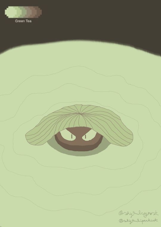
Pattern used: Green Tea
For some reason, I associated the palette with swamps and that's how I came up with the idea for this drawing. The lily pad is supposed to cover most of the monster's face as it slowly comes out of the water. If the palette had included more colours, I would have made the monster's silhouette much darker to make its appearance more mysterious. But, oh well, I worked with what I had.
Sketches for the two illustrations
#digital art#krita#original art#beginner artist#illustration#palette challenge#ghost#swamp monster#tr's palette challenge#there was supposed to be a third drawing but i couldn't finish it earlier because i was busy#i feel like i've taken too long to make this post so i'm showing the ones i finished#once i'm done with my exams i'll post the last one separately
3 notes
·
View notes
Note
Hey, here's one for you, would you be willing to show some of the pieces you've done that you found most interesting, either because of their process, their inspiration, misadventures, or other types of involvement in your process? Your art looks so cool! Hope you have a nice day, you who reads this ask <3
Oooo this is one is actually a really good one! Warning for kinda old art though!
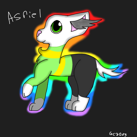
My first thought was this old catified Asriel I made back in 2018 which was actually a redraw of old base art from 2016. I like to consider this my first real catify design and was really proud of it for a while
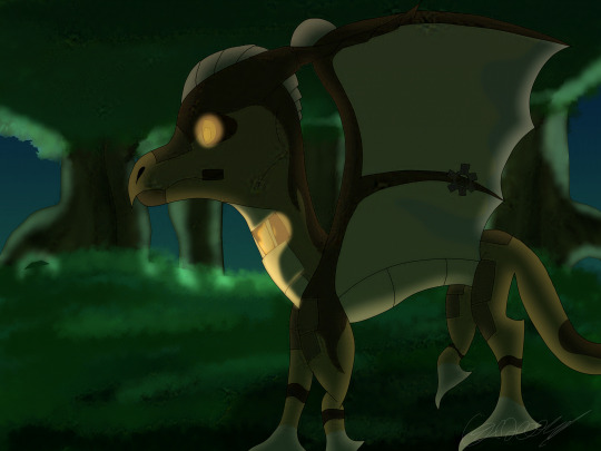
This one is actually a redraw of some classwork I made in 2021 with a dragon design I made for a defunct game that didn't really get anywhere. The classwork was my first time doing vector art actually and I think that version only exists now in the speedpaint for this drawing XD.

Ok last one I just really like the composition in this one. Made in 2020 and features Compass, Whispering Blizzard, and Alius who I haven't talked about much before. It's supposed to be Compass kinds transitioning from good to bad and I think I pulled it off?? Kinda wanna redraw tbh
#asriel#catify#undertale#dutch angel dragon#dragon oc#dragon art#oc artist#fandom artist#girlcraft ask#girlcraft art
9 notes
·
View notes
Text
Intro to the artist I guess?
Figured I’ve had this account for a while now, so I might as well start posting at the behest of one of my friends HEHAHA /nm
Wasn’t sure what to start it with other than an introduction to the artist, but I don’t have anything like that readily available so why don’t we use some old art over the years?
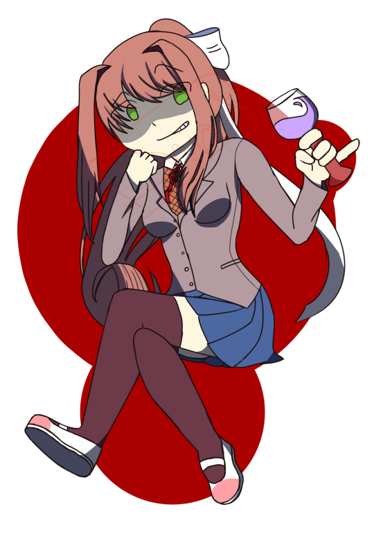
Let’s start with my oldest drawing of Monika from Doki Doki Literature Club! This drawing was made and posted onto my Deviant Art in 2018, not a super long time ago but still long enough for me to improve a LOT on my artwork. Even now I can see so many errors in my linework, anatomy, folds, etc. For some reason for a lot of these Monika drawings I really wanted to make her out to be evil.

Here’s the first redraw I did back in early 2020, also posted this one to my Deviant Art. Already we can see some improvements from 2018, but there’s a LOT of uncanny valley coming from this one for me. I really wanted to “reject” my cutesy “anime” art style that I had developed for YEARS, so I went on a huge streak this time around to try and make my art style more “realistic”, (spoiler alert, I failed HEHA) and in return I just developed uncanny valley. If I could go back in time I would punch 2020 me square in the face for drawing this, it’s ugly as FUCK compared to my newer work, which I’m super proud of.

Speaking of! This drawing was made in 2021, getting closer in date, but not quite there just yet! Already there’s some anatomy improvements, but in terms of hands and the continued uncanny valley effect with the face, there isn’t much I have to say about this one. I guess the fact that I was still out to make Monika look like a villain? She’s my favorite character in DDLC I swear, I guess I just wanted a villain to back in the story haha.
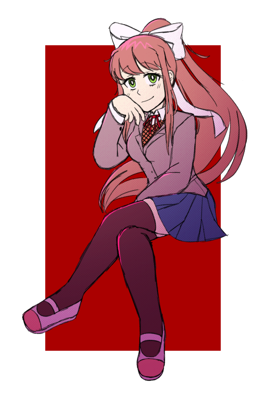
And now we come to today, even if the drawing is very much so a sketch, I’m still immensely proud of this redraw. I ditched the wine glass (she’s not supposed to be drinking anyways, I think I just made it like,, grape juice later on), gave her a more relaxed pose, and ditched the “evil aura” I kept drawing her with. She’s not evil, she’s just WILDLY MISUNDERSTOOD (/ref).
I guess with that there’s my introduction to the artist. Hi! Welcome to my page where I may or may not try to post more often than my other very dead socials! We don’t talk about my very dead and neglected socials!
Not sure what to add after that, I guess go look at my Deviant Art for some somewhat older artworks? (it’s a mega crusty and old account hence the bizarre name lol) Not sure if anyone will recognize me from that one drawing that has 1k views on it though.
#doki doki literature club#doki doki monika#what the fuck should I put for tags someone help me#i'm practically on life support here
3 notes
·
View notes
Text
Art reposting part 1 (miscellaneous)
Since this account is new, I figure I would repost some of my previous artwork onto here, since this is supposed to be also my art blog. Most of these reposting are based on my Deviantart acc rather than my Insta, for Deviantart is where my finest works are at.
Staring with my miscellaneous art:

My first attempt at poly art; a poly fox based on the fox plush toy you can get at ikea. Created in 2019, back when poly art was sort of hyped (maybe it still is, who knows).

My banner; a random blue wolf in a poly art style. From 2019. My biggest nitpick is the way I shaped its head lmao

A bunch of lineless cats I did for dribbble. Should probably sell it as a table cloth. Made in 2020

Poly Ruldoph, that I also did for dribbble, back when I uploaded regularly on there. Done in a rush bc I wanted to give me followers there a christmas gift. Also made in 2019.

A redrawing of one of my characters, Tundra, a husky/wolf/samyoed mix from my dog story I made back when I was around 11. Despite it being a redraw, it was actually made, again, in 2019.
Part two of art reposting
1 note
·
View note
Photo


As a last ditch effort to get more art out before I started writing tomorrow, I realized that I had done marker pieces of these two back when I wrote the first version of WCBH back in 2020. So, naturally, I knew I had to redo them, since traditional pieces don’t take me nearly as long. Plus, needed to make them more ‘accurate’.
Jordan gets, like, zero change other than I made his boots shorter. I sort of like the flow of the old one better, plus the blacks are darker because I used to wrong dark grey/it was dying anyway, lol. But otherwise, the new one’s pretty nice! When looking at the rainbow colors together when I was doing the rainbow bits of his uniform, I really liked seeing the colors together and so decided to make his outline a rainbow instead of just orange like it should be. Mostly to show that he technically can use all the colors if he wanted. Plus, it works out thanks to him being gay and all, lol.
Alan, well, I suppose there’s nothing like deciding the day before writing to completely change a uniform, lol. I had done a different version of this when I did Jordan’s, and I was laughing that somehow, Alan was the only one with a ‘proper’ superhero uniform. But that got me thinking - why would he have one and not anyone else? I mean, he’s the poorest out of all of them, being literally the middle child of nine. He’d be the most likely to just scrap something together, making his shirt himself and saving for a while to get his fancy boots. And so, that’s what I did, and I have to say, I really like it. Bonus that it matches the other two now! Sort of.
(Interesting fact about Alan - when thinking about who Lane would have ended up with if Greg never came to Earth, while the obvious answer seemed to be Miles, I realized recently that the answer would actually be Alan! He and Lane were destined to meet regardless, since it’s also his and Jordan’s dream to work at Davenport. Miles and Jordan would still end up together, and pretty much the only reason Lane is uninterested in Alan right now is because she had Greg. It’s a weird thought experiment, but there ya go. ^^;)
I have to admit that I have no idea what I was thinking in the original Alan picture, other than maybe I just couldn’t think of a good pose? I mean, the boy looks so stiff, and he is quite literally my most adorable character. So I corrected in the new picture, which is why it’s not an exact redraw. He turned out so cute, yay!
0 notes
Text

This, I might actually complete. It was supposed to be for Halloween last year, but I started it late, got busy writing fics, and all that, so that fell through.
It's a redraw/rehash of this old original work from Halloween 2020 (that I've never posted online)

Man have I improved.
At the time the hands holding the book were my most impressive set of hands yet, so it stuck with me. The fire was cool too, for my first time at actually attempting it.
It's fun, looking back. This drawing was done about a year after I really started drawing, after I decided I wanted to actually practice and learn, and do it for fun. Prior to this I hated having to draw because, well, school. I was a test-guy, not a creative outlet guy. (Still hate having to do art for school though).
I should probably mention that the hands were partially referenced from some sort of tutorial that I could probably still find but can't be bothered to sift through for right now.
And yes, that is a literaly 5 minute knock-off vamp Unma sitting on the left that I put minimum effort into. I wanted to fill the paper.
Anyway I now have the motivation to complete this so perhaps in a couple of days I'll post the result.
#my art#original work#original art#oc#this was actually supposed to be some witch version of Unma or something lol#but I got too invested in drawing the hands and poses the first time around to actually focus on adding flair to the design#Also 90% sure the third costume was gonna be a werewolf or something#Unma
0 notes
Last Seen Blogs
s0ullessboy13
Trust no one

lhbibesoussi
Sans titre
kirkwallgremlin
this is a carver hawke blog now

naturawaxspa
Natura
Sugaring Melt & WaxSpa
tates-wrld
Tatum Grace