#also more Mark
Text
Currently watching the warp effect since it's been on my list since forever and omg I love it??? Which I didn't think I would for some reason. But it's very queer? And even the straights are interesting?????
Who would've thunk...
Also go watch if you haven't yet!!
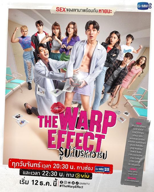
#the warp effect#I love it!#very queer#alao what cab I say I just love wild stories#also more Mark#more mark is always good in my book#mark pakin#go watch if you haven't yet#underrated as fuck
6 notes
·
View notes
Text
1000 Books You May Have Actually Read
#Polls#Literature#Books#Lists#15000#I've read 106 books - it took me so long to pass the 100th mark ;____;#Also I realised I should have written 'More than 175' and not 'More than 176'#I messed up there I'm sorry ;____;
18K notes
·
View notes
Text


PART 4!!
01 02 03 04 05 06
I stg I'm kicking yall in the shins one last time, we're ALMOST done with the angst!
Let me tell you I had this finished(!) twice(!), but no, I had to go back and change it lmao
In my first go the fight scene was much more rough, it was hard for me to draw from the beginning, I'm not really good at this sort of thing. So I took a little break from the comic and when I got back to drawing the last two panels (static ch close ups) they turned out so GOOD and CRISP! I just had to go back and redraw the previous ones. Didn't change the composition back then, just made the drawings less sketchy and fixed minor mistakes. This panel in particular went through bigger fixes, I couldn't get the pose right:

I emphasized the arch in Zoro's back so it's more clear he's hunched over, the head is lower, and the hand on his stomach wasn't looking good, so I switched its direction and I feel it looks more natural now. The whole pose is shifted to the side now, whereas in the previous ones it was more straight up, but I wasn't conveying perspective well.
So after that I had it all exported, loaded into drafts and as I scroll it on my phone I'm like... There should be one more panel where Zoro's getting kicked : | Imma need to change it AGAIN.......
It just didn't flow well. I work on the comic in chunks so I haven't put these panels together before, I always saw them side by side in my main file.


I just didn't like how you go from Zoro getting kicked to him being thrown, it just felt disjointed to me.
So first I looked through the three sole volumes of BNHA that I have at home to maybe understand drawing fight scenes just a little bit better. That's how I got to the new version of Zoro getting kicked so there's more lines showing movement etc. but most importantly you have the kick and Zoro's reaction separate. So now Zoro's face has a bigger closeup, you can see his open eye.
In the previous version it was more distant, the closeup wasn't as big and you couldn't see his expression well. With just the side view you could only see he's in pain but nothing more than that,whereas when you have a full view of his face you can get much more from that. You see where he's looking, you know he's looking at Sanji when he kicks him in the guts.
I guess that's why, in the first version, I was trying to still show his face where he's being thrown off of Sanji bcs I felt the side profile wasn't doing it's job, but at the same time it felt off, like there was less force in the kick bcs his head wasn't following the movement idk. Also he was def too big in the frame. So now Zoro's smaller to emphasize the perspective more, the head is down, the right arm is more to the side and there's more lines, the flame is more aggressive now and bursts into the sides when it comes in contact with Zoro's body to show the impact. I know they could be better still, but this is the best I can do right now and I'm happy with the result!! I'm glad I kept pushing it! These poses were VERY confusing to draw lol
Alsooo, it would make more sense if Sanji threw Zoro in the other direction, over his head like in karate/judo, but I wanted to keep my directions consistent. I had to have Sanji standing back to the carriage, so he doesn't notice the spear being thrown and Zoro facing the carriage so he can get hit from the front, right after he gets up. It's like..... did he not see it? Did he get hit on purpose? You decide lmao
Though I'm probably too rigid with my 'camera', in BNHA you see the action from any and every direction, i guess it adds to the dynamism of it all, also there's just many MANY more panels in manga lmao
Judge giving me major "isn't there somebody you forgot to ask" vibes at the end there lmao I hope you forgot he's even there and this comes as a surprise!
#zosan#wci zoro au#zoro#sanji#roronoa zoro#black leg sanji#kuroashi no sanji#whole cake arc#whole cake island#one piece#my art#one piece au#the closeup on Zoro coughing blood#the last panel of Sanji#and Judge#are my favourites in this part#the action shots were SO HARD TO DRAW#I hope it's more or less clear what's happening#I could show them to someone and ask#but I don't wanna change it AGAIN#gotta stop somewhere lol#judge#vinsmoke judge#vinsmoke#NOT me scheduling the post already and then COMING BACK TO THIS MF FILE#to add little droplets of Zoro's blood on Sanji's shirt lmao#also made the burn marks more pronounced
4K notes
·
View notes
Text

It's crazy how Dungeon Meshi's manga can feel more cinematic and emotional than the anime to me, even when they're practically the same. Compared to the anime, this moment is such a heartbreaking gut-drop. The way Kui uses negative space and flat compositions to create a sense of horrific stillness is so key.
The way the text (Senshi's monologue) is sequestered to an empty corner of a panel or huddled away from the edge of its text box is not only a great way of showing Senshi's headspace (fearful, isolated, dissociating), but creates a visual representation of pause, as if you hold your breathe after each line. The first panel puts us directly in Senshi's perspective too (compared to in the anime, which puts us as an outside observer over Senshi's shoulder). The detail of the door and bricks so effectively implies that he stared at it for so long, waiting and hoping, that its image is burned in his memory. The wood grain, the brick arch, the number of rivets. The lack of dialogue in the second panel shows a moment of realization too –– "he's dead" (also a great example of the Kuleshov effect). And it's that pause that creates a beat and sets a great rhythm to his headspace, like a music rest: "He never came back." (oh god.) "I'm all alone." Finally, the third panel's negative space, cropping Senshi, shows how truly alone he feels. Without his family, the world ceases to exists. Under shock, he traps himself in a 1-foot radius, too scared to even perceive a world outside its boundaries; a world that can hurt him, kill him, make him disappear with it. There is only his body, the stone beneath his feet and against his back, his thoughts, and that awful bowl of soup.
Even though they're a series of flat images, there's an implicit reading of silence in Senshi's realization and horror. Kui influences your experience to slow down and take your time.
Compare this to the anime, which fills every shot with dialogue. The pacing is fast; we never get to sit in silence like we do with the manga. The horizontal frame allowed the boarders to add Senshi, turning the composition into an over-the-shoulder shot, which takes us out of Senshi's POV. They also added a zoom-out in shot one, which adds unnecessary energy to a very somber scene. The tightening on Senshi as a close-up reaction shot also dulls the moment. In the original panel, Senshi stares ahead at the empty space to his left as a shadow surrounds his mind. It not only shows how Senshi's senses are dulling and his world is shrinking (setting up panel three), but shows how terrified Senshi is of what's in front of him, how the air itself becomes pitch black and opaque, how Senshi is surrendering himself to fear. The pacing is understandable and necessary; this episode packed a lot of story content together. It's just a shame because it really (imo) deflated one of the most nauseating moments in Dungeon Meshi.
#dungeon meshi#senshi#analysis#personal#long post#not art#because comics are inherently more abstract and rule-breaky the format thrives off show don't tell#i think trigger is doing a great job overall but they missed the mark on this scene#for me cinematic storytelling will prioritize rhythm; tension; and silence over plot. that's why the manga feels more “cinematic”#if you've been enjoying the anime i cannot recommend also reading the manga enough. it's a completely different experience with much more#subtext and emotion to draw from
4K notes
·
View notes
Text
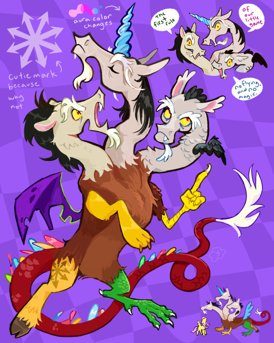
Discord redesign idea I had! He has three heads representing the three types of ponies that are constantly bickering.
#mlp#my little pony#discord#mlp fim#mlp discord#also his cutie mark is the symbol of chaos!#kind of in my mind the three heads are all “discord” like its not 3 characters its 1 guy with three heads. like when he makes copies of#himself to talk to himself in the show only permanent#so the main body doesnt get confused when he walks around#and when he talks they can talk at the same time. but they prefer not to lol unless its to be creepy. i think the voices from the 3 heads#sound more or less the same
2K notes
·
View notes
Text
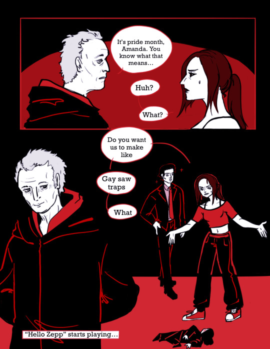
Happy Pride Month to the Saw community ✨
#saw#sawposting#amanda young#mark hoffman#john kramer#saw franchise#also my first saw post!!! ive had saw brainrot for months at this point#might do more sawposting for pride#doods
2K notes
·
View notes
Text
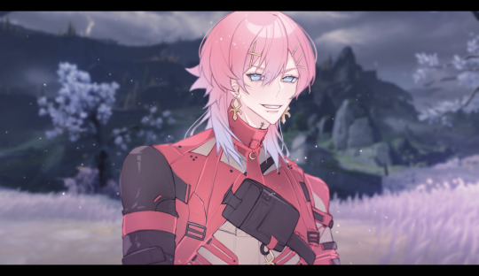
❤️🖤🩷
Wuthering Waves has taken over all of my free time recently, so here's a sketch of Scar!Ren I originally shared in da 14DWY Discord!!
#14 days with you#to be tagged later#Sometimes a team is just Sephiroth; some random flower girl; and a dragoon from FFXIV#Like....... Look me in my eyes and tell me that one of Jiyan's abilities isn't just stardiver /silly#Anyways!! Sharing dis on my main only because it's just a sketch and doesn't feel ''official'' enough for da 14DWY blog#If I come back to this piece + retouch/put more effort into it maybe I'll reupload it there instead#But ya!! Any inconsistencies in Scar's outfit is because I was too busy staring at Taoqi <3#There was also absolutely no rhyme or reason as to why I drew Ren as Scar specifically too—#—Other than the fact that he WOULD rock da onigiri strip (RIP T_T) /ij /silly#Plus I was going to draw [REDACTED] as (WUWA SPOILERS AHEAD!!!!!!!) Geshu but?? Babes I don't think the timeline works out??#I really saw the marks in the same spot and was like “oh!! they're the same person :3” LIKE GIRL NO?? This is what happens when you skip cs#Geshu is still my number 1 next to Taoqi though (in terms of design) <3 I have a type teehee#Mayhaps I will draw [REDACTED] after all...... (It's currently 3pm and I'm nowhere near my tablet)#Also also!! A treat for those who've read this far: Day 3.5 will be made public very soon!! It's pride month n I wanna celebrate—#—With everyone's fave demi/pansexual enby (who sometimes does a bit of stalking) (as a treat) (he's a yandere)#Violet's birthday is also June 10!! Early birthday gift!! Yippeee!!#Ok I'll shuddup now <3
1K notes
·
View notes
Text
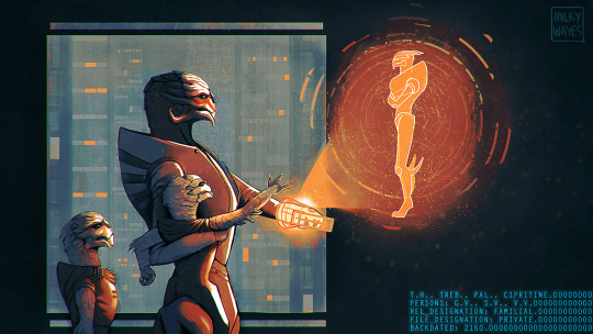
GARRUS VAKARIAN: DATABASE IMAGE ACCESS.
> PT. 1 : 2160, 2166, 2170.
> all files backdated according to user preferences: (terran_coordinated.calendar).
#mass effect#mass effect fanart#garrus vakarian#mass effect garrus#castis vakarian#solana vakarian#turians#alien#palaven#artists on tumblr#illustration#art#scifi#video games#milkyart#garrus retro#I want to make more of these so I'm giving it a tag#headcanons go as such:#turians have a downy coat from birth to toddler age after which actual feathers develop - which molt during puberty.#they're the color of the plates since feathers are modified scales! so for the vakarian siblings they're silvery.#child garrus playing spectre - solana already annoyed by it back then. but hey at least he's using sources for his make believe? nerd#first time castis takes him shooting it's a live target. have fun kid I hope this won't awaken anything in you or do irreparable damage#castis voice: I didn't raise him like this!#well buddy someone did.#also - hard to see but the leaves and tree trunks have a metallic sheen :-)#god this took SO LONG ive never done something quite like this before! also wanted to do landscape for once.#social media is so hostile to this format but I think 3 images is a good workaround#will make a detail post later on... the faces are probably getting fried by tumblr :(#oh I gave castis the comic markings. they look way better and imo make more sense. and we don’t talk about me:a here
1K notes
·
View notes
Text
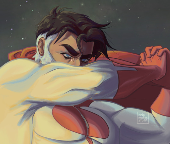
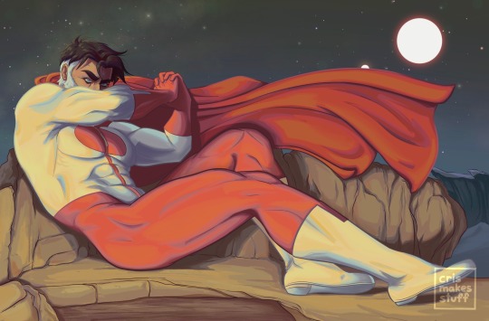
cast out of paradise
#please see my vision here#PLEASE#sorry for injecting my catholic trauma into the silly superhero show guys I can’t help it#the fallen angel#invincible#invincible show#invincible fanart#omni man#omniman#nolan grayson#mark grayson#debbie grayson#crismakesstuff#the original painting ‘the fallen angel’ is just SO HIM#the grief the despair and anger about his own choices#ITS NOLAN!#ok but if you guys let me ramble if I had to assign biblical roles to the graysons#i can see nolan as god himself (or lucifer but more so god tbh) debbie is mother mary and mark is jesus#the whole ‘lamb of god’ motif just fits mark wayyyy too well#also I saw someone make art of debbie and mark as ‘la pietà’ and I’ve been a changed person since#AGAIN SORRY FOR THROWING CATHOLIC IMAGERY AT THE SUPERHERO SHOW#this is how my brain wants to cope w it ig ;-;#catholic imagery
2K notes
·
View notes
Text
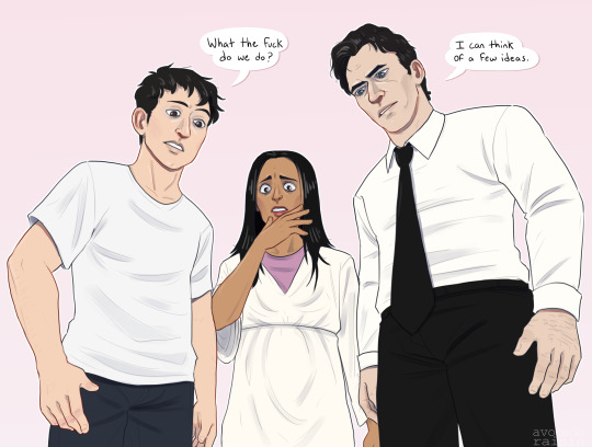

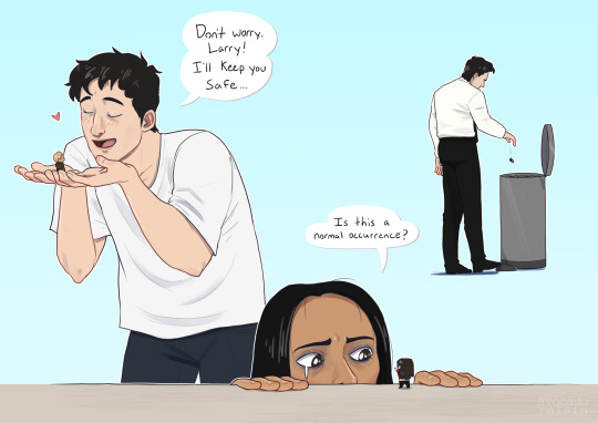
hits the Saw characters with my shrink ray
#“i want to draw more angst” i say before drawing the dumbest shit ever#also i put so much more energy into this than i meant to please clap#also shoutout to all the doomed lovers all wearing white what the fuck#im suddenly very into the idea of them all interacting and talking about their insane partners#saw#saw franchise#saw fanart#coffinshipping#chainshipping#shotgunshipping#adam faulkner#adam faulkner stanheight#adam stanheight#lawrence gordon#lynn denlon#amanda young#peter strahm#mark hoffman#sawposting#drawing#lynnmanda#hoffstrahm#lord help me thats a lot of tags
2K notes
·
View notes
Text
Dungeon Meshi's been a big fav of mine for years.............I can't believe I haven't drawn like any art for it
#dungeon meshi#izutsumi#getting good at knowing where her markings are thanks to the cosplay i did of her recently LMAO#trying to self care by drawing more fandom stuff#it's been nice to get myself out of a pretty severe art block I've been having#though I also was just busy for like three months WHOOPS
1K notes
·
View notes
Text

late christmas drawing ,, was really torn between reposting this or not !! i feel like ive lost my edge n all but i liked how the faces turned out 🥲 its unrendered and unfinished in some places but my awesome moots convinced me 2 post it here !! so u have them to thank for … hehehej… i love them alot and have been writing sm drabbles of ambereve ..;
#amber bennet x atom eve#amber bennett#invincible#invincible season 2#atom eve#my art#wlw#sapphic#mark grayson#samantha eve wilkins#eve wilkins#samantha wilkins#wlw drawing#hi im still alive#tip ;; take it from me.. dont over render ur artwork .. itll absolutely destroy it 😭#i literally fucked up on eves part please dont notice#also !! is it me or do imminent kisses feel sm more intimate??#ambereve#amber bennet#invincible fanart
2K notes
·
View notes
Text
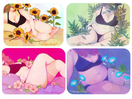

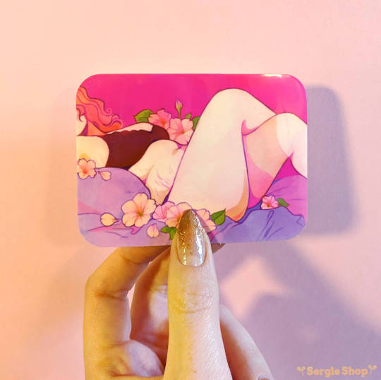
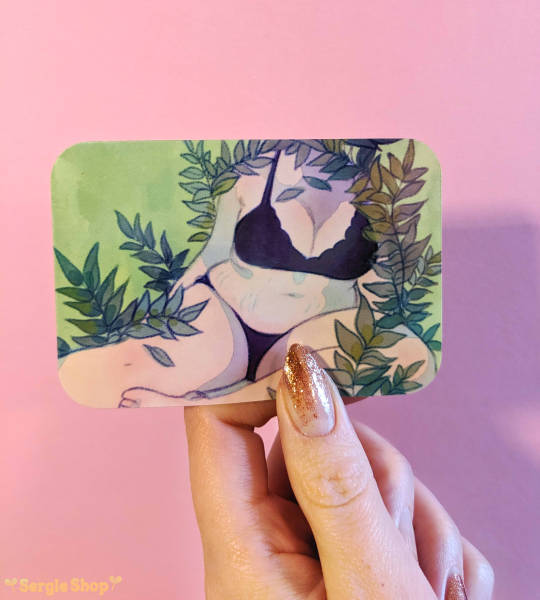

alright!! since all 12 pieces at once would be a lot of stickers to make, I took ppl's suggestions, and I did a sample batch!
these 4 pieces from my floral portrait series are now available as stickers!! I hope you like them!
🌻SergleShop🌻
#sergle art#artists on tumblr#illustration#body positive#body posi#self portraits#stretch marks#fat art#depending on how things go I can make more of the pieces into stickers over time!#also lmk what you think about rounded edges... I think they're prettier than sharp corners but I could change that when/if I restock.
2K notes
·
View notes
Note
Is Machete a Silken Windhound?
Silken windhounds are a recent breed, they were developed in the 1980's in Texas, they wouldn't exist in 16th century Italy (but then again, random somewhat similar looking dogs could). Machete's breed is fictional (and he isn't purebred to begin with, distict breeds aren't really a thing in their universe), but I tend to think that the closest real life equivalent would be Ibizan hound.


#answered#anonymous#I usually just default to calling him a sighthound#most ibizan hounds have more red markings than this#but I have a habit of picking mostly white individuals to better illustrate the resemblance#also as you can see all dogs are born with floppy ears#it takes a while for the cartilage in their ears to harden before they can stand upright reliably#Machete's ears stayed kind of semi-droopy until his early teens or something like that#Vaschete lore
667 notes
·
View notes
Text
uhhh so the number four is associated with death in certain cultures, including japanese, which is fitting for the butcher’s son, yes but just remember neil was supposed to be number three and jean was supposed to be number four ,and in every draft but one jean dies. he is symbolically saved from that fate by dodging the number four (being given, instead, the number three which represents REBIRTH of all things - i made a whole post about that if ur curious) because it means he was never marked for death. so in this draft, where he’s number three, but was supposed to be number four, he comes so close to death - to the point where renee doesn’t know how he’s still alive - because he was supposed to die, doomed by the narrative, but that number three saves him. that number three represents resurrection, and so he doesn’t die like he was supposed to. because he’s not number four, he’s number three. he comes back. he transforms, he heals. he becomes number 29 (i will eventually make a post about jean and the 29)
neil, though, was marked for death. he had the number four tattooed on him, and he goes through his own narrative believing he will die by the end of it. his survival, however, is foreshadowed in the very moment neil thinks he’s about to die - when he is kidnapped. lola burns the number four - the signifier of death - off his face, leaving him scarred, yes, but not marked for death anymore. and so he lives. and guess what: the number 10 represents the start of a new chapter, that one cycle is coming to an end and a new life is starting, one that you’ve worked hard for. so for the number four to be burned off of neil, that tells us neil is going to live. and when neil becomes neil legally, he settles into the number 10 properly. and his new life begins.
#god this was difficult to write bc i have so much more to say about this but i just can’t word it#like i can’t make myself make sense#so i’ll leave it here lol#aftg number analysis#number 4#number 10#neil josten#jean moreau#aftg#all for the game#the number 10 also represents completeness which is seen as neil completes the team allowing them to get to championships#and the number four also represents balance which neil attempts to achieve on the team#by uniting the upper class men and the monsters#i still have so much more to say but i’ll leave it here#stay tuned for more unhinged number analysis#i have to say when i first read the books at 16 i got SO HAPPY when lola burned the four off neil bc HE NO LONGER IS MARKED BY DEATH SO#HE’s GOING TO SURVIVE THIS#but i’ve not seen anyone else point it out
928 notes
·
View notes
Text

Here is my fourth prompt for SVSSSAction and donated by @starry-stan-blog! Drawing this TianJiu prompt was super fun, thank you again for your donation (^^)/
#tianjiu#tianlang jun#shen jiu#svsss#ren zha fanpai zijiu xitong#the scum villain's self saving system#svsssaction#I had a lot of fun drawing this old man I should definitely do that more#there's beauty in the visible veins and the skin marked by the passage of time... there's beauty in age#also I'm so so so sorry I posted this super late compared to my other socmed idk I got distracted#I've got two more prompts to work on so... coming soon I suppose?
809 notes
·
View notes
Last Seen Blogs

ofsvpers
warriors

iopodytisgone-blog
* autoplay.

melliphor
babu

fatasticbeasts
time for change

flybuttress
Mellisa E. Johnson