#also shout out to gradient map
Text
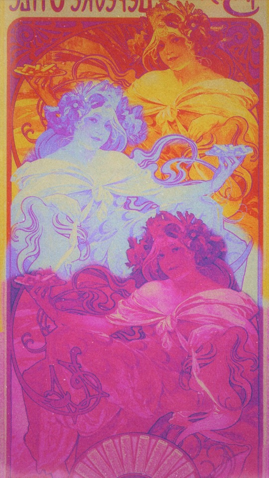
I made a new wallpaper for my new phone tee hee
Art nouveau cus I LOVE art nouveau it’s one of my fav/most influential styles
And then also bcus I love 60s-70s posters and some of the more psychedelic ones would re use art nouveau stuff
And then lezzy colors cus,,,, yknow,,,
#the halftones I added came out so scrumptious in this#also shout out to gradient map#my beloved#it’s also kinda sloppy lol
47 notes
·
View notes
Note
Sixteenth Day Event Prompt:
George sees Dream through a thick fog
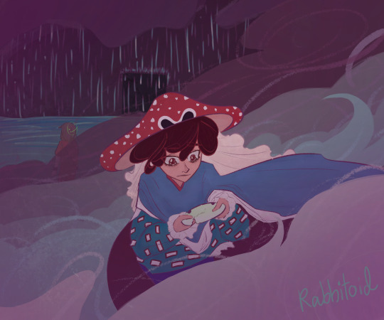
The whole world used to be theirs, now only a shed of memories remains.
(The scene that Popped into my head from the prompt is like. One of those dramatic confrontations. Accusations, tears, yelling, a heartbreaking last word from Dream. George left standing there, Dream’s old broken mask in hand. The two of them know this won’t ever leave the fog)
My lil thing for the @sixteenth-day-event 💕 just a tinyyyyyy bit late
#sixteenthdayevent#georgenotfound fanart#mushroom george#dream smp#dreamnotfound#YEAH I GOT DNF FOR PROMPT ITS AWESOME#I should not had procrastinated and be faced with Moving Day lmao#this has major 2021 rabbit vibes lmao#major shout out to procreate gradient map you carry this thank you for existing#also to elmhat for putting everything together this is fun!!#my art
62 notes
·
View notes
Text
So uhhhh wip 😳😳


#fanart#the crane wives#band#digital art#my artwork#art#the moon will sing#I’ve been binging this song nonstop#it’s so good#also shout out to gradient maps yall are the real ones#procreate
39 notes
·
View notes
Text

i always forget about ink mine :( sorry ink mine
#splatoon 3#splatoon#splatoon oc#splatoon fanart#finally started using gradient maps they r so fun!!#also the different username is for my splat account on twt lol#shout out to me making that for a wipe out i got and then taking the video down immediately and never putting it back up#but neway im rlly happy with this!! the 4k is tiny cause im Rlly good at scale but im happy w it overall#yes my top is the gay one u_u
6 notes
·
View notes
Text
“thanks to you, i am saddled with unnecessary… feelings.” but from edgeworth’s pov
———————
so uhhhh shit really hit the fan because it was the end of the semester and i had an exam to study for and a shit ton of big assignments due so i had to put this challenge on halt but now i’m free (almost) from the grasp of university now that the holidays have started!! i have one more coming up for the drawing challenge, i’m gonna finish this!! anywho this one is really REALLY stretching the prompts, it’s an alien sensation to mr edgeworth here because of phoenix’s energy, and here are their instruments of justice?? but also his heart is an instrument of love lmao idk, shout out to my bf for motivating me and helping me make this one look a lot better than it originally did, love ya leo @nelythseed !! but also i used 12-ish colours for the week prompt and it didn’t look as good as it does without the gradient map so we won’t talk about that hdfkjjhds (the colour palette is those lil hearts on the bottom right)


#my art#art#joey draws#digital art#ace attorney#ace attorney fanart#wrightworth#wrightworth art#wrightworth fanart#inktober#plastober#phoenix wright#phoenix wright fanart#miles edgeworth#miles edgeworth fanart
32 notes
·
View notes
Text
shout out to the person who made the bloodborne inspired gradient maps for csp. i haven't used them yet other than to mess around with practicing gradient maps, but these slap (ID: 1948095) . also the one that was recommended under that set which has very pretty ones as well (ID: 1800508)
1 note
·
View note
Text
Photoshop 101 for photographers with pratik naik torrent

#Photoshop 101 for photographers with pratik naik torrent how to#
#Photoshop 101 for photographers with pratik naik torrent skin#
#Photoshop 101 for photographers with pratik naik torrent upgrade#
Unless you try to be Shaiiko and use it in Pro League, because of ESL's special. Website of the 3D LUT Creator:, R620]" Info 101: Estimated footprint: Bytes Info 106: Adding. You can upload this file to other sites but you must credit me as the creator of the file. fm/filmriot GEAR WE USE COLOR GRADING LUTs: bit.
#Photoshop 101 for photographers with pratik naik torrent how to#
DA How to re-link in Final Cut Pro X - FCPX Tutorial Revelers. org serves as a landing page for librarians who are. In this Advanced Photoshop tutorial I will show you how to color grade with a. Remember that shout out to 3D LUT Creator earlier? Advanced Photoshop Tutorial #6 - Professional Color Grading With A Gradient Map. Whether you're a film buff, professional photographer, or color enthusiast, you've. Hello everyone! In this video I will be talking about the advantages of using 3D LUT Creator Pro software in. In this video I will present you a great piece of software for color grading and color correcting your images and videos! It is a 3D Lut Creator from Oleg Sh. in Roto, Paint, Matchmove, A/B compositing and 2D to 3D conversion etc. title packs, light leak and lens flares, project files, motion graphic packs, luts etc. Balder Olrik Visual effects, audio plugins and apps for Final Cut Pro, Motion, Logic. Action FX Builder is another representative of the free After Effects plugins from. certification courses for Pro Tools operators, PRO TOOLS 101 offers a. standards * Work with logencoded media and LUTs * Analyze shots. Apple Final Cut Pro, Avid Media Composer, Adobe Premiere Pro and several. New techniques for 3D projects, 2k/4k media management and color correction. 3D LUT Creator makes 3DLUTs that can be imported into many programs such as Adobe. photoshop 101 for photographers with pratik naik download.
#Photoshop 101 for photographers with pratik naik torrent skin#
Professional skin retouching photoshop tutorial youtube. LightWave Film LUT Master Pack 3.0 (Win/Mac) 101 mbthe Most Powerful Emulations of the Greatest Film Stocks of all. 3D assets and VFX-heavy shots are usually allocated across several different. has appeared in over 60 publications worldwide and he is the creator of the rising. What's Included: Different Transitions Color Grading LUTS. Ignite Pro is a bundle of over 190 plugins for everything from keying to color. Unity 道場 Special Amplify Shader Editor 101 ~Amplify Shader Editor をつかって.
#Photoshop 101 for photographers with pratik naik torrent upgrade#
Unity is free, but you can upgrade to Unity Pro or Unity Plus. We request you to buy a genuine version.2 3d Lut Creator Pro 101 Put this on AR planes to get shadows and occlusion for 3D objects Click Impostor Creator Amplify LUT Pack LUT Grading Presets Learn more: Bundle. Developers/creator/maker made it with difficulty. We don’t own and resell this product, we got this from a free source. if you wish to use this file online you have to buy a genuine version. Warning! Downloading copyrighted material is illegal, and all the files here are only for educational uses.These actions are compatible with Photoshop versions CS5, CS6 and CC. atn file twice and it will automatically show up in the “actions” dropdown menu of your Photoshop. I am also attaching a video tutorial to show you how I use these actions to edit my images. You can create beautiful fine art images with the help of this entire action pack within less that ten minutes. Fine Art Action Collection- Hotsoftwarepro.The Fine Art Photoshop Action Set – freeload – freeload Panel Photoshop – freeload Plugin Photoshop.

0 notes
Photo

At nearly 33K downloads, we thought it would be cool to visualize where you all are listening. SoundCloud is an imperfect tool, and also only tells us the top 50 countries by listens, so if you're not represented on this map, shout yourself out!
🚀
Image ID: A world map in warm and purple tones, highlighting the countries where people are listening to The Pasithea Powder. A gradient key is in the upper left corner, indicating that darker gradients are closer to 13 listens, middle close to 150, and light close to 22740 (the max, the United States).
11 notes
·
View notes
Text
show your process
To continue supporting content makers, this tag game is meant to show the entire process of making creative content: this can be for any creation.
RULES - When your work is tagged, show the process of its creation from planning to posting, then tag up to 5 people with a specific link to one of their creative works you'd like to see the process of. Use the tag #showyourprocess so we can find yours.
I have been tagged by @lordbelacqua to talk about this gifset (thank you sm, I always wanted to make my own sort of gif tutorial hehe). Also, shout-out to lordbelacqua’s gifset here.
Since this is going to be long, I put everything under the cut.
planning: so since this is an inspired gifset, obviously the idea came from another post, this one here and as you will see this post has an insp credit on its own, but the user changed their url so I had to do some search to find their gifset. anyway, it’s here. the first gifset includes the greek words ‘eros’, ‘philautia’, ‘storge’, ‘philia’ but you will notice in my gifset I have an extra word which is ‘agape’ (my personal favorite as a greek person), this extra word I saw from the second gifset.
At first, I wanted to do this with #alina starkov from #shadow and bone, but I realized that the word ‘eros’, i.e. romantic love would go for #darklina, whilst ‘storge’, i.e. familial love, would go for alina and mal, and becaure of the ship wars in the fandom, I didn’t want to potentially attract haters from doing this. btw, someone else did this after I posted the yennefer gifset and I was really happy to see it, especially because they used many moments/relationships I had in mind, so shout-out to @darkstarkova for the gifset.
anyway, I also ended up choosing yennefer because for me it just felt much more meaningful to do such a gifset for her, since she has so much love to give and so few chances to do so. I also wanted to do right by it and use quality frames, so I went the extra mile and downloaded higher quality episodes. then I had to choose the shots that would work. some of the words, like “eros” and “storge” and “agape” I already had an idea what they would be, but for the words “philautia” and “philia” I had to fast-rewatch some episodes again. long story short, I first planned to blend this gifset for “philautia”, i.e. self love:
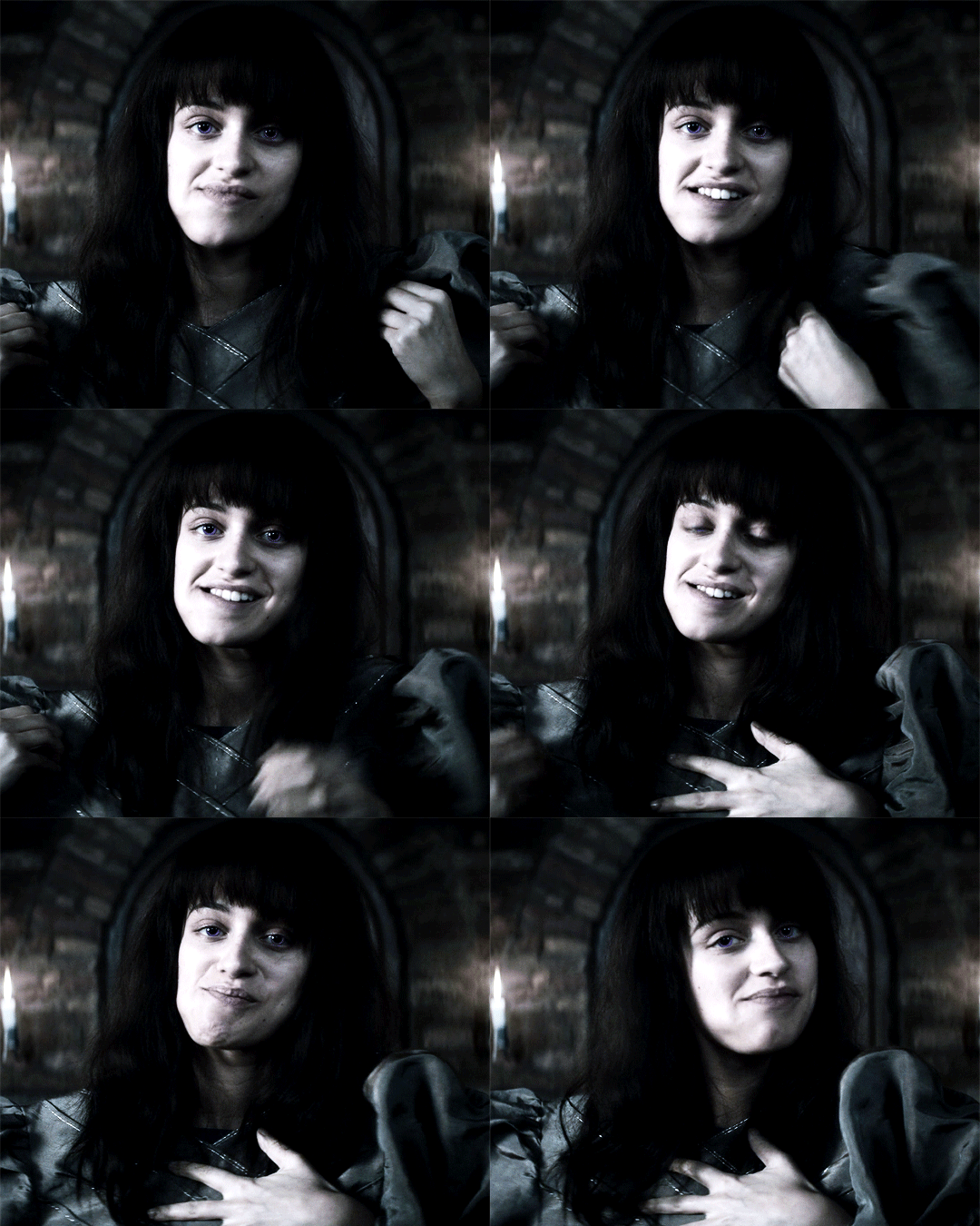
but then I rewatched the scene at the end where yennefer burns it all and as she was remembering all the times she’d been abused and maltreated, I teared up (I always do) and that scene just felt much more powerful to me, because it was then that she truly accepted herself and “let her chaos” be unleashed.
giffing: to sharpen my gifs, I used the light sharpening action from this post. for the coloring and blending I’ll use the first gif as an example, but more or less, I didn’t follow any specific color palette, but went with what looked nice and what didn’t. so at first I had this gif:
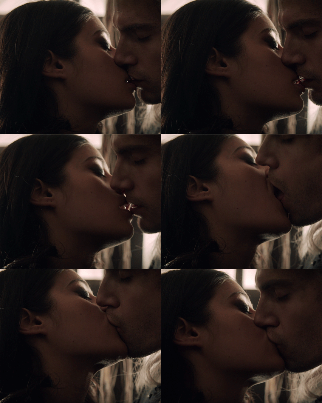
after I finished staring at this (took me a few minutes), I actually focused on the coloring. so first I used a curves layer and chose the light and dark areas (left pic below). Basically you choose the marker in the yellow circle to choose the lightest spot on yor gif, and the marker in the dark circle to choose the darkest spot respectively. I also play individually with the greens, blues and reds (right pic below) until I get a lighting base that I like:

Now at this part I usually just add a levels and brightness layer to further enhance the light and dark spots. At this point the gifset looks like this:

personally I didn’t like the red tint on their faces and the cyan tint on geralt’s hair, so I used a selective color layer and turned up the cyans in the reds and turned down the cyans in the cyans like below. I also turned down the yellows in the cyans but I see that this didn’t change much, so it’s something I simply forgot to turn back to normal.

I also added a color balance layer. With this I usually increase the blues, the magentas and cyans for midtones, shadows and highlights. So now:

At this point, I add a gradient map layer in b&w, right-click on it, select ‘blending options’ and turn it to soft light, then play with the opacity if necessary:

Usually this is where my coloring ends, but I still didn’t like the result so I played around some more and ended up adding a second gradient map layer in b&w, left it at normal blend mode and turned the opacity down to 47%. So this is what I have finally:
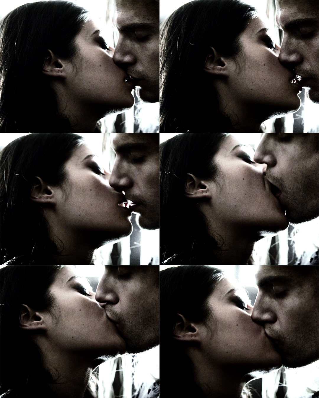
So then I colored the second gif similarly and blended it in. For blending gifs, I follow this tutorial here. So now I had this:

As you can see, the coloring and light of the blended gif doesn’t match the base gif. Adding a similar second gradient to the blended gif didn’t really work nice. Then I decided to turn it b&w with a simple black and white layer and voila, the result just clicked.
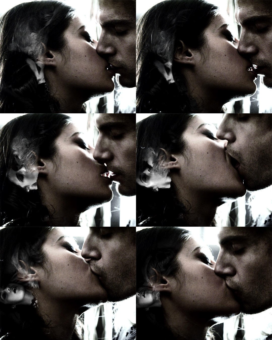
For the text I downloaded various fonts from here. So the title line “eros” is in the Bellerose font and the rest are in the Avenir font from here. I used the gradient text effect described here for the title line. And as for the second subtitle text, I simply opened “blending options” again, set the fill opacity to 0 and used a white stroke of size 1 px. Final result:

For the rest of the gifs I did similar coloring and blending.
arranging: To arrange, I simply play around with what looks good. The size I used is 540 x 450, because in the first gif I needed yennefer’s dark hair to take quite a large proportion of the gif, so that I could place the blended gif on (it does not show on light areas), so this determined the dimensions for the gifset.
posting: I always “save as draft” before I post any gifset because I want to make sure all gifs play out correctly and also I want to see if the mobile app shows them correctly as well. So after I verify this, I add the caption and I search the necessary blogs to tag to spread awareness.
I’d say it is my most quality gifset yet and I am kind of proud of it :)
I’m tagging:
@starkkov for this gifset | @captainheroism for this gifset | @swanthief for this gifset | @aleksander-alina for this gifset | @the-darkling for this gifset
of course you can just ignore this or choose another creation of yours to show the process for <3
13 notes
·
View notes
Note
Can I ask how do you make your gifs? They are always just so sharp and beautiful!
Thank you so much! 💜
I actually made a gif tutorial a little while ago, which might be helpful! There’s part 1, which is just the gifmaking process itself, and then part 2, which is the brightening/coloring section where the magic happens. There is also a link in there to a sharpening action that helps make my gifs look very crisp.
Of course, this is just a springboard to start people off with. The steps of the coloring and brightening don’t really change much between scenes, but the colors you use and how you use curves/gradient maps changes a lot. So while the tutorial might be good to give you a basic understanding of how to create a gif, there’s nothing like experimenting with the different options and seeing what happens when you click a button. (You can always CTRL+ALT+Z the whole thing if you hate it. Promise.)
I’m personally really fond of gifs that have a lot of bright colors and happy skintones, haha, so I have no idea why I landed myself in a fandom that.. does not do the colors or the happy in its source material. 😂 Anyone who’s talked with me will have heard me yellin’ about the fucking neutral tones in BoB/TP and how much of an enemy the indoor Haguenau scenes are for me, lol, and so I personally recommend coming into my IMs/inbox to scream about it with me once you’re giffing this stuff. Seriously. Drop me a line. I’ll shout with you and then tell you how I fix the hassle.
Some other helpful things below the cut:
The quality of your video helps. I have both BoB and TP in 1080p, which is pretty much the standard if you want your gifs to look high quality. You could shoot for 720p in a pinch, but there’s a little difference already in the way that’ll look in comparison!
Screencap a bit more than necessary. You can always remove the frames you don’t need, but if you count the amount of screencaps beforehand you might land with a scene that ends in the middle of someone’s mouth being wide open or someone being mid-movement. Play the scene out a few times in Photoshop so you get a sense of where to cut the frames.
Dark scenes are really finicky to get right. I prefer to work with a curves layer to brighten it up, but sometimes that is too intense for the scene and I resort to a gradient map instead. I always set the first half of the gradient to something light purple/pink and the other half to light yellow, then adjust the layer opacity (set to soft light) as needed.
Neutral-toned scenes usually have me adding a selective color layer (bringing out a smidge of cyan/blue or red/yellow in the neutrals section) before I add the curves layer. Rule of thumb: if the scene itself is yellow-toned, you use blue tones to bring it down; if the scene is blue-toned, you use red/yellow tones to bring it down. It’ll help even out the skin tone problem. Learn which colors cancel each other out and giffing gets easier. Color theory is your new best friend, welcome to art school! 😂
Occasionally, I will use color balance to add more blues to shadows and more red/yellow to highlights in a scene when I struggle to get the skin tone to sit right. Another helpful thing depending on scene coloring (too cyan? too green? too something-something you hate?) is photo filter set to a warm color or lilac/lavender color.
I will sometimes add a vibrance layer. I’ll set the vibrance high and the saturation a little higher than median on the gifs that really don’t mind that sort of thing. Scenery gifs and gifs that have just one pop of color really, really love that layer. Gifs with a more tricky color palette (yellow tones helppp) really don’t like it when I push those buttons. Again, experiment!
On rare, rare occasions: the reduce noise filter. It’s really fab for giffing scenes that take place wayyyy in the background of an actual scene. If you crop something that takes place in the background, you often get it looking a skosh too grainy. Reduce noise heals a lot of that jazz.
Tutorials are your best friend. I followed a lot of different giffing and coloring tutorials to figure out what I liked and what worked best for me. Everyone gifs a little differently, believe it or not! So my method works for me, but it might be a hassle for someone else. Trying things out and just.. not being scared of the buttons helps. 😂 You can always undo it!! Just press the button, go “oops that looks like a unicorn puked on it” and undo it. Press the button, squint at your screen, go “Speirs isn’t supposed to be that green” and undo it. Eventually, you’ll hit a button that lands you with the good things. If not, save the whole thing as a .PSD-file and try again tomorrow.
5 notes
·
View notes
Text
Dragon Age Tarot Style Guide: Part Two

The second of my at least three part set of tarot tutorials. This sentence will link to the first one on composition if you haven’t seen it. It’s been a four year gap between these, and I apologize for that. To all you who messaged me and reminded me of this project, thank you. You kept me from forgetting and I’m glad. <3
It won’t be another four years until I post the next segment, which will be pattern and texture focused. It’ll hopefully be in the next month or two.
This is going to be a long post, so I’m putting it under the cut. Apologies to the mobile users!
As a general disclaimer, this is an unofficial guide, I’ve never worked with Bioware. All of this is based on how I approach tarot design, my inspiration being heavily rooted in Dragon Age Inquisition’s companion card designs.
Secondly, I know nothing about tarot. I tend to use http://www.ata-tarot.com/resource/cards/ heavily as a resource for my understanding of the cards and their meanings.You don’t need to know anything about tarot to do illustrations, just have as much fun as you can. <3
So I typically work with a color composition in mind, but for those who are struggling to imagine a color scheme, my best advice for coming up with a palette is to just throw down some colors in this sort of an arrangement.
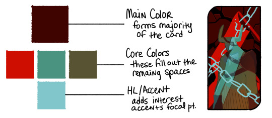
Your Main is going to be whats forming the base of the card, or it’ll be the most widely used color. Backgrounds usually make up the main, but sometimes it’s a foreground element or the character’s clothing.
Your Cores are going to be colors that accent the base. You can make these pretty wild to be honest, but complementary colors and triads tend to work best for a balanced color composition. That’s what you’re trying to achieve with these--balance. Think about what’s drawing the most attention. The red in this example I did with the Iron Bull is very strong, and the teal I chose is fighting with it so my last color is something a bit more desaturated that accents the teal instead of picking another aggressive color, like a saturated yellow.
The Accent or HL color is whatever you’re going to use to add the final focus notes. It will typically be your brightest or your most saturated color, though not always. Sometimes your HL color might be the darkest of the composition because your main and core colors are naturally bright. It should be used sparingly, or if you’re using a lot of it, focused in one area.
You can use more colors than this! For my example card with Bull, you can see I made his pants a sort of subdued yellow and added accents to the background and lit parts of his body in in different colors, But you’ll want to keep your major colors limited to keep it cohesive. If you start losing cohesion, I recommend using a gradient map over your picture set to multiply or soft light (not at 100%) to tone down your most divergent colors, and you can mask out areas where appropriate.
This Bull card is one I made by picking my colors first then deciding on the content and composition. Color picking can be done first, or second as I’ve done with the rest of my examples.
Card #1: Rayne Amell [ @dracoangel ]
The Queen of Cups
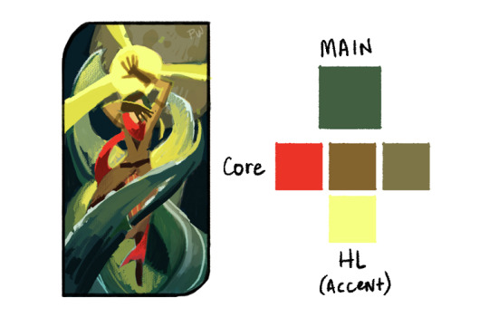
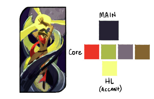
This card went though several iterations with color, and the end product is less about story and more about atmosphere. The drawn composition reflects more of the story: she conceals her thoughts and feelings, but the world bends around her like water. I wanted to add more purple to this card, considering the character’s preference for it, so I skewed the color scheme in the final to be more purple. The first version probably makes for a more cohesive palette, but it lacks the same depth and drama as the one with purple. I added another core color to the second palette, which is totally okay to do. Sometimes the core palette might be 7 colors, sometimes it’s 2. The idea is to strike a balance. Colors that are super eye catching like the red in the scarf might better serve the composition as a lesser accent, whereas the purple core is a great fill because it’s fairly desaturated and doesn’t demand as much attention.
The HL color takes up a fair amount of this composition, but note that it’s strongest in the top two thirds, and is centered in the top third. The foreground water also cradles it against one of the darkest purples of the card, which helps center focus up top.
Card #2: Valora Lavellan [ @kylorensprettymuchanasshole ]
The Devil
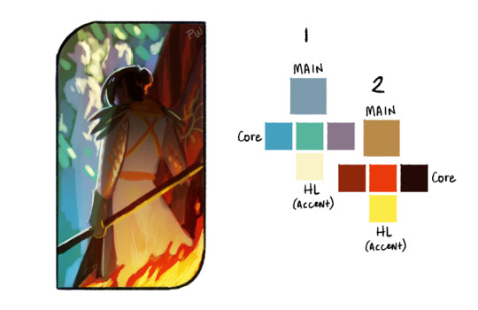
This was the most difficult of the palettes, I’m working with two separate light sources in two wildly different locations. On the one side you’re at an ancient elvhen temple, on the other, in a burning chantry. It only made sense to have two different palettes for this composition. Where I really failed here was in not having a color that bridged the two sides. If you can engineer a color to be in between two differing palettes, you’re in a good place.
With that in mind, I revisited the thumbnail.
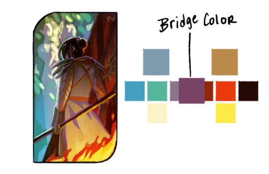
The execution is a little weak, but the idea works. The bridge color could work in either of the palettes and is a midway point between the two most similar values of the core colors. It’s used primarily where the separate palettes meet each other smoothing that transition. In this instance, it also helps to define the figure and double down on where the focus is, since before it was fighting between the top left and bottom right corners. Now the focus works as a diagonal from one corner to the other.
Double palettes are hard, but can make for some truly dynamic color compositions.
Card #3: Iothari Mahariel [ @theuselesspotoo ]
Six of Swords

This card was a struggle for completely different reasons. The palette is pretty homogeneous, primarily purple, with a hint of green. This one could use far more variation, and the challenge is in driving interest with such a limited palette. This is where your values are going to be super important. Your darks vs lights are always hugely apart of composition, but in limited palettes they do the most work in driving interest. Make sure to break up some of your larger and more prominent shapes with value differences, the snow vs the dark stone beneath it.
If that isn’t enough though, there’s a few tricks that can help push focus where you want it without heavily changing the color scheme.
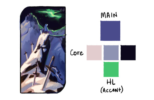
We have three very distinct planes in this; the sky, the distant mountains and skyhold, and the cliff the figure is standing on. We can push the far mountain plane back by reducing the brightness of it, and we can pull the nearby plane closer by adding stronger highlights to the lit areas. I also brightened up the figure since they were getting lost in the sky a bit.
In addition, I popped the foreground colors with just a bit more red, to separate that plane from the more bluish purple mountain plane.
Just those small changes really sharpened up the focus of the composition, and we were able to keep the palette fairly limited.
Card #4: Tighe Lavellan [ @queen-scribbles ]
Nine of Wands
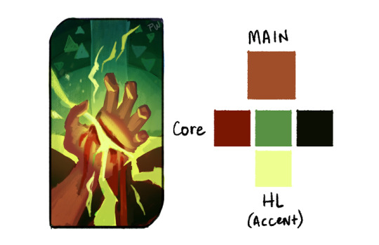
This palette was a breeze compared to the others. We’re working with complementary colors, reds versus greens, and very little divergence in either direction. The bottom half is primarily reds, the top greens, and they meet in the middle with a soft orange and harsh yellow. Palettes with complementary colors are the easiest to work with, the important part is making sure their balance works with your drawn composition because they like to fight. All of my reds are limited and desaturated because the greens and yellows, by the nature of the composition, are the most demanding elements.
Card #5: Lathari Lavellan [ @jisabeau ]
The Chariot
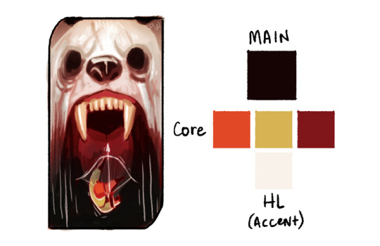
I knew what I wanted for this one immediately when I started it. I really wanted the character to be falling into a void, to mirror their emotional crisis when dealing with the deadly white bear of their past. But though this works fairly well as a base palette, it’s really missing the intense horror I wanted when I started.
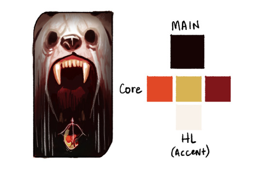
So in my edits I pulled them further apart, and pushed the darks even further. The challenge here is having a dual focus, since I don’t really know if either stand out enough from one another at this phase. I have to pick a focus, either the bright whites of the bear or the strong orange/green tones of the character.

This is probably the strongest focus-wise.
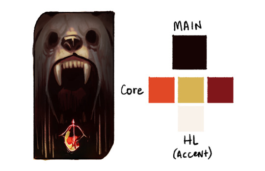
But I enjoy the color notes of this one far more.
The point here is, sometimes things aren’t perfect, and that’s also okay. Pick your favorite, or at least pick one, and take that to completion. It’ll occur to you while finishing it what I needs. Which brings us to the final point, similar to that of tutorial part one:
Final Note: Don’t spend overlong on one thumbnail. I’ve spent days in the thumbnailing stage, that’s fine, but don’t spend more than 1 hour on any one color thumbnail drawing; it’s not worth it. If an idea is good but not great, just start a new thumbnail of something similar, and you’ll stumble onto the right composition.
Remember to explore your own color intuition. My way of doing this might be helpful, but if it’s not, don’t feel compelled to follow it. Everyone has a unique vision, and we’ve got to feel out our own paths.
If you have any questions, send them to paperwick [at] gmail [dot] com under the heading “Color Tutorial: Questions”, OR comment on this post (I might not see them on a reblog) and I’ll pool them into one area and answer as many as I can in a separate post.
Finally, I’d like to give another shout out to everyone who sent their character breakdowns to me for this. I wish I had time to get to all of them, and I really appreciate you taking the time to put them together! Thank you all so much!
Not making promises on when Part Three will come out, but it WILL be coming out. Thanks for reading through all this, I hope it’s been helpful.
#dragon age#dragon age tarot card#art style guide#tarot card tutorial#color tutorial#tutorial#color#dragon age 2#dragon age inquisition#the iron bull#palette#color palette#da2#da#da3#dai#thumbnails#thumbnail#thumbnailing#jisabeau#dracoangel#kylorensprettymuchanasshole#theuselesspotoo#queen-scribbles#lavellan#amel#mahariel#my tutorials#my art#2019
1K notes
·
View notes
Text
I remembered from my childhood. The decrease is related primarily to lower overall comparable sales of approximately $94 million
The girl child was waiting for them, standing on one end of a natural bridge above nike air max 102 essential white a yawning chasm. But, wait, the Pentagon said bottines cloutees femme it will take three to five months to begin the training and that the first fighters won't be trained until the spring at the earliest. Fifty, sixty, maybe as many as a hundred. “Word’s reached the camp from Marq Mandrake. Schools are going digital more and more every year that goes by, and there's always going to be openings for tutoring or teaching work to help them out through special companies and programs. E., Milan. My destiny.” You are supposed to be my friend, Gerris. I got thousands ne’er saw a lord commander, grown men who were told as boys that your rangers would eat them if they didn’t behave. I have to thank them and Kyle Minder. Bitter in that the race didn happen, but sweet in that I wouldn have been there anyways. Rowell, the sixth grade teacher, said students twirled them too fast, banged them against desks, or oneil mellény tried to nike air vortex desert sand whirl them on top of each other. Asterisms may overlap and intersect official constellations in all manner of ways. Oh, if only you knew her story too, how unhappy she is, with what aversion she looks on her life with her stepmother, all her surroundings. Solid state drives (SSDs) are getting faster and cheaper, finally making for a viable alternative to the mechanical hard drive that has ruled the desktop for so long. Light rail has a relatively small turning radius, can operate up steep gradients and can share public streets with other traffic and pedestrians.. All the exhibits were things I remembered from my childhood. The decrease is related primarily to lower overall comparable sales of approximately $94 million. That speaks to his self taught ability and his creativity in the kitchen you remember some of his unique baking shortcuts, like using sauerkraut in a cake batter. Ser Balon gave a nod and sipped his wine. At length a messenger came shouting to them, “You are free, you are free!” Emily thinks she sprang nearly to the ceiling overhead. One in every ten of them came mounted but all of them came armed. For all spaciousness in the room, there also is a choking claustrophobia about the place. It recreates the steps that a foster child has to go through. Republicans will try to move ahead on other agenda items, including overhauling the tax code, though the failure on the health bill can only make whatever comes next immeasurably harder.. Louis vuitton mahina bag having a wonderful style louis vuitton model m40354. The running trails are basically the sidewalk in whatever neighborhood you happen to live in. Condenser: The condenser is basically a radiator, and it serves the same purpose as the one in your car: to radiate heat out of the system. In an essay to mark International Holocaust Remembrance Day, Anne Frank's stepsister accused Republican presidential front runner Donald Trump of "acting like another Hitler."Eva Schloss, now 86, was a friend of Frank's in Amsterdam after their families fled Nazi Germany in the 1930s. What do you think the nine-hundred-ninety-ninth might say about these castles? The sight of your head on a spike might inspire him to be more helpful.” The king laid his bright blade down on the map, along the Wall, its steel shimmering like sunlight on water. So as you had already promised me I thought I would come and see bokacsizma bakancs you earlier before you’d had time to go out anywhere, and invite you to come with me. They did not trust him. Even so, he slept fitfully, tossing for hours before sliding down into a nightmare. The fit feels strange at first, but once you’ve worn them for a while you get to feeling comfortable.. But Penny had met with a more mixed reaction. The dogs will no longer be eating bread. His adidas mariposas skin was black as casquette ny kaki mère pitch, his hair as white as snow; the flames tattooed across his cheeks and brow yellow and orange. "We've taken what we have learned with the iPad state storage, instant on, amazing battery standby time, miniaturization and lightweight construction, to create the new MacBook Air. The company wants children who have never seen the show to enjoy the classic story. Avila mentioned the game in Minnesota. In the first image, there are five screenshots with the setting increasing by .5 MPIX. In both story and film, Gabriel Conroy is presented as an important character and his arrival is eagerly awaited by his aunts and niece. “A mercy,” he said aloud. Inside she had found the heads of her three envoys, pickled. A typically networked agency, he says, has its culture defined by the headquarters in Madison Avenue. On the road to Yunkai, when Daario tossed the heads of Sallor evro kalkulator the Bald and Prendahl na Ghezn at her feet, her children made a feast of them. The Old Pomegranate thought that I was spying on him and announced that he would not suffer murderers listening to their councils. Marya, I have loved you. It is a difficult journey for most retailers, including Future Group where it did try to forge JV with the Liberty Group. 1. A three piece bedroom suite costs $44.50 and a studio divan in the sale can be had for $39.50.. Those paw prints and adidas mariposas those bronze statues made grand photo opportunities that weekend and would have blown up Instagram if not for the fact that Instagram was still 14 years away.. Down in the Seven Kingdoms boys of twelve were often pages or squires; many had been training at arms for years. Talk to her about that. She zattini promoção de botas wondered how much Xaro knew, what whispers he had heard. “Nothing is certain yet,” he answered, considering. YOU are part of the problem. Dr. That sweet man does not mean to take us to Meereen. Both of these changes are interesting, but they do make large changes to the feel of the keyboard and trackpad. Will (1 Dev. But then something clicked for the Swedes in Berlin, and they proceeded to complete a marvellous comeback to seal a point, with Zlatan Ibrahimovic imperious for the final 30 minutes. Do you hear, impossible, such confidence! And he was so affectionate, so sweet to me. As she talked to a friend in an upstairs hallway at Fairfield Apartments on Warwick Boulevard in Denbigh. Though, indeed, why shouldn’t I question her if I got a chance; but it wasn’t that. I know it isn PC to want to keep the death penalty. Andy Warhol allegedly had a foot fetish. I assume the same is true in Egypt. As this population becomes more numerous, it becomes less productive. First I ran round to Anna Andreyevna. One of these was, before his conversion, a convict in a state-prison in New York, and there received what was, perhaps, the first religious instruction that had ever been imparted to him. The first chance you have to grab their attention and let them know your resume is worth reading is with your cover letter. She had a full price offer three days later! We went through the entire escrow without ever being asked for more are than our signatures.
0 notes
Link
A silent devotion | Art & Culture | thenews.com.pk Suluk Wandering 14 If colour could only paralyse the viewer’s mind and imagination, it is here. Think of the opposite sensation. Of colours sombre, soft, so filled with angst that it could be a “bleeding piece of heart.” This is Shireen Kamran. In terms of colour, this is a sensation that is resonant, far from impulsive art. What matter are the qualities of paint and the art of painting itself. Kamran’s identity of abstraction is the artist expressing herself via colour and formlessness born out of the contemplated idiom. We are given the landscape or the mindscape by Kamran as concrete emotions. This is not enthusiasm; but there is introspection and self-freedom. Kamran’s work is neither spectacular nor demonstrative. It doesn’t shout; it whispers, and then falls silent. The silence in her art, within the works and between them, is not unlike our own calculated gulfs of silence, into which we fall and reveal ourselves, even as we resist. It is clear that she likes to play off strong accents against delicate rendering, adroitly manipulating these strategies to set up arhythmic exchange. The moody lyricism of her images can suggest tranquility as swiftly as it can anxiety; it negotiates a formal counterpoint between balance and disturbance, integrates fragments of composite and contradictory cohesions only to set them once more adrift. You look for signs to see if her pain is palpable. Tensions are created on the surface, and then intentions and dichotomies break cover. As the paint is banked down or piled up, or stroked in brisk staccato bristles, a mystery of infinitude develops. In her life practice, Shireen Kamran has cultivated a singular vocabulary of abstraction and landscape. The conceptual grounds of the oeuvre that went on show at Canvas Art Gallery in Karachi as Hiatus remain in dialogue with laws of the universe, the cyclicality of time as well as a manifest relatedness between human beings and the webbed fabric of ecology. This painterly world is textured with knowledge references that the artist has attuned to over a period of time – from realms as diverse as archaeology, ancient architecture, art history, sacred philosophy and poetry. The Lebanese American writer-poet and painter Etel Adnan reflects: “When you speak of transformation, you have a combination or contrast of a substratum – something that is permanent and something that changes. There is a notion of continuity in transformation.” It is this foundational continuity in the artistic journey as a transformative process that is revealed in Kamran’s latest body of paintings – tracing a steady pictorial lexicon as the bedrock of experience yet enabling a renewed quality of transcendence, like a view outside the window or an undulating walking trail. The continuity is also borne of technical choices – the artist has persisted in working with mixed-media since she began to paint. Through landscapes and cityscapes bearing resonant forms in lines, elemental shapes and dots, the artist maintains a consciousness around the geometric symbolism and symmetries held within nature. At times, the transformation of seasons plays out in these lively surfaces – from spring fever, a passage of wind currents, to the gathering of rain clouds, all becoming intimately conveyed in the sense boundaries of Kamran’s palette. In the artist’s words, “The signs of sound, touch, smell and shades of colour that emanate from a forgotten incident create an instant marker in the mind creating an emotive spirit. The mind holds on to that and finds a release in the act of painting. Painting soaks us in this spirit.” It is this foundational continuity in the artistic journey as a transformative process that is revealed in Kamran’s latest body of paintings – tracing a steady pictorial lexicon as the bedrock of experience yet enabling a renewed quality of transcendence, like a view outside the window or an undulating walking trail. Crooked trees entwine around a field of crops, while an eclipsed moon rests upon bare branches. Indian red and leaf green borders are marked on either side of the painting; these ways of framing the landscape are reminiscent of traditional scrolls and Basohli-style paintings, and often remind one of Howard Hodgkin’s abstracts inspired largely, by his own admission, by the Indian miniature. Some works appear tactile in their composition, providing a sense of dimensionality to the backdrop and detailed foreground: flowers with bending stems that appear as still life subjects of a Giorgio Morandi painting; tantric symbols float upon an ochre pigment ground. They meet an inverted mountainside, minuscule wave formations – and then the ground becomes a garden. Licks of blood fire and white sails are impressed into an earthen scene that resembles how earth tones transform with the passage of time. In another painting, moving lines open up to a terrestrial gradient of soil, shattering the linear gaze into a circulation. In the meditative spatial density of Kamran’s recent works there is still the quiet comprehension of the philosophic condition of formlessness. Some of the earth shades exposed in the artist’s work allude to the contours of baked clay. In fact, the artist’s home and studio remain filled with collections of clay figurines and wood crafted objects that compose an archive of living traditions. These cultural artefacts expose Kamran’s cultivated understanding of how modernist idiom remains uniquely connected to artisanal vocabularies and vernacular knowledge from across the subcontinent. Across her painterly work, especially in the past decade, rhythm construction becomes strongly manifest as Kamran’s strokes begin to appear as score lines for a song composition – with secret scripts that appear to settle upon azure patches and golden yellow ripe meadows. These are Kandinsky like, where colour flows resonate as visual chords and elicit synesthetic encounters. Shireen Kamran has cultivated a sensorial practice of seeing, which considers that the unknown element is inevitably encompassed in the composition of the known – like hidden galaxies that remain beyond calculation to the human eye, but nevertheless light up the celestial skies. This artist charts terrains of the sensed, rather than remaining controlled by a frontier of directly consumable reality. Thus, she builds image constellations as a limitless space. There is no way to remain unmoved in the company of Kamran’s paintings; they present a complex structure of feeling and planetary belonging within the dark vulnerability of our present. There is no grandeur here in these landscapes or mindscapes – there is only a spiritual quietude that propels itself into the extension of the self that retracts from the universe, to find another world. A world that diminishes the desire for external alacrities and multiplies the quest for transcendentalism. For Shireen Kamran, this desire is propelled by an overriding sense of mingled vulnerability to the outer world that results in the magnification of both curiosity and abject desolation. The dialectic between the inner and the outer world is not the only one mediated in these paintings: Kamran’s landscapes are like mappings that reverberate with a series of adjacent assimilations and associations. This is moody lyricism at its best, like the sunset that swathes the sky in its tenacity of multi-coloured hues; it is the torrent of darkness that creeps into the shades of trees; it is the ghostly galleon that vanishes from sight when the cloud of anxiety disturbs its very entity. Silent devotion for Kamran does not merely mirror a day, it is life in itself; it is the sunset of expectation that has drowned in the abyss of destiny. This is why the silent devotion becomes the negotiator. The writer is an art critic based in Islamabad https://timespakistan.com/a-silent-devotion-art-culture-thenews-com-pk/11821/?wpwautoposter=1614506404
0 notes
Text
3.28.2017 || Questions of The Day.
Commission life can be hectic. Nevertheless, time will be made to answers at least 3-4 questions when possible. So here are the questions for today!
@ Avrey asked “Any tips for learning/studying anatomy, or studying for art in a broader spectrum, whether it be anatomy, color, or landscapes?”
Ahhh, one of my most commonly asked questions. Before I relay my personal tips, check out my post on websites worth bookmarking (click me). I shared a few sites to find tutorials, a few of my favorite YouTube channels, and other resources.
My first tip, build a personal library of books. Books are one of the most helpful tools on the planet. Too many bills, not enough free money? Visit your local library. Everything you could possible want to know about art, someone has written about it. My anatomy book of choice is Classic Human Anatomy: The Artist’s Guide to Form, Function, and Movement by Valerie L. Winslow. One of my favorite professors ever (shout out to Prof. Ben Ward) recommended it 4 years ago and I still use it. But there are plenty of awesome anatomy books out there. James Gurney has some insightful books on color/light and on creating from your imagination (some of my terms of the day come from the glossary of his books). Cautionary note: RESEARCH before making any purchases to ensure you find the books best for your needs. If you really hate reading books, YouTube, Skillshare, as well as other websites exist for that reason. There are plenty of websites with video tutorials or online classes on art subjects.
My second tip is make time to study from life. The world right in front of you is a better teacher than I or anyone could every be. Those still life assignments you loathed? They actually help you. Want to understand color more? Observe colors around you, the color in your skin, or how light affects the objects in your room. Observe. it. all. Want to get better at anatomy? See what local, open model, figure drawing classes are available in your area. Draw yourself or recruit a friend to draw in different poses. Landscapes? I learned from my watercolor class that the best way to get better at landscapes and buildings is to take some paper and go outside and draw. Struggling with faces? Go sit in a coffee shop and, without being awkward, draw the people you see. My favorite thing to do is sit around and draw people while i’m at the airport when I travel. I’ve had some people even come up to me to see how they turned out.
My third and last tip (which you all will hear me say all the time). PRACTICE. There is no better way to learn than by doing. You can spend time trying to find the perfect tutorial or the right book but in all that time you’ve barely done shit (excuse my language) and you’ve lost valuable time. There is always going to be unknowns. That comes with being an artist. But learning to be okay with “failure” equals faster learning. I learn so much more from trial and error than any tutorial can teach me. I actually hate tutorials most days. I’ll watch one for 2 minutes and then say fuck it. Let me just paint/sketch and figure it out myself. It always works out in the end.
@ Miss_eau_art asked “I would love to know how you go from value to colour. When I try it, it just looks off. Maybe my values aren’t right but as soon as I use a gradient map and use colour, it looks horrible.”
Working from grayscale to color takes some practice. Before I even jumped into it, I watched a Youtuber named Art Germ’s tutorial video ( click me ) and a few other videos too. If I don’t know how to do something, I always find someone who does and learn from them. I start with a 90% finished value painting. I create a gradient map using a duplicate layer of my painting (making the lighter values warm and the darker values cool or vice versa). The rest is just a combination of overlay, soft light, and color layer modes. I also use a normal layer to finish the rest of the painting and to tweak or add colors to create a finish I cannot achieve using just layer modes. It helps having a set color palette in mind. Plus, you can play around with adjustment tools such as color balance and selective color to help bring more color harmony to your image. Again, it takes practice (and also developing a better understand of color theory). My few times testing out this technique, I was deleting and redoing layers constantly until it felt right. Just keep working at it.
@ Simplyroshelle asked, “When it comes to the process of creation, how do you stay true to who you are while also wanting to meet the demand/desire of others?”
I know my artistic voice, I am further along the path of my artistic style and I stand firm on what I enjoy creating and what I will not create. Understand, clients in demand for your services or a following in demand of your art posts (in theory at least) seek you out because of your unique style or unique way of solving a problem. As long as you create what you love ( and not fall into the trap of creating what is popular for the moment) and make your commission work fun for you, it will always be true to you. My blood, sweat, and tears go into my craft everyday, so there is also a piece of me in whatever I do. Period.
I hope these answers are helpful. Thank you to all who take the time to read and also a big thank you to those who asked these dope questions!
3 notes
·
View notes
Text
So Peeps, we learn that people walk the Camino for a variety of reasons but they all have a story. We’ll learn that Carolyne is recovering from cancer and I’ve had a major operation on an Abdominal Aortic Aneurysm so making the most of our allotted time is important. So here’s my tale.
Last November, we went for a walk…
The Camino del Norte is about 800km (500 miles) long and stretches from Irun to Santiago de Compostela. It takes about 37 days but we don’t have to do it all in one and my first walk is less than a week and the next one a full week.
You can start from virtually anywhere…
But we’re walking The Norte..
This walk is reported to be tough and at 25 kilometres/day it certainly matches any of the walks I do in Yorkshire, the difference is in height and the stones and there’s plenty of both.
We leave the pension (hotel) and are almost immediately challenged by steps, about 60 of them! It’s at this point I remind myself of:
I am now recovered from an Abdominal Aortic Aneurysm otherwise affectionately referred to as a Triple ‘A’ but still need to be sensible!
My Achilles injury, whilst not an issue in itself has left me quite unfit.
The fact that we’re carrying our worldly goods on our back will make a difference and I’m grateful for the advice willingly offered by the Pilgrim regarding keeping the weight down. (To explain…the Pilgrim is my close friend and partner Cecilia Kennedy, she’s on her third Camino and well experienced in the ways of the ‘peregrino’ and hence the tongue in cheek nickname).
I’m gratified that The Pilgrim emerges at the top of the steps a little out of breath; however, her recent Camino activity will stand her in excellent stead I’m going to be good for 20 km (12.5 miles) then, in fairness, the last 8 (5 miles) is beautiful and probably more so than the first 20, but it is tough.
We walk towards what is purported to be “the way” but it’s some time before we see the first yellow arrow.
Click on any of the images and you can page through them at full size…
The guy on the Spanish weather site is not in the same league as Carol and seems more interested in the Costas than this northern Basque area. No matter, there’s no cloud so that’s a bonus.
We need some sustenance so we call in at a tiny fruiterers on the outskirts of Irun. He’s very helpful and gives The Pilgrim an opportunity to practice the Spanish she’s been learning. We buy water, Gatorade, a baguette and enough jamon de York to fill it. It all comes at a price just over 4 euros, it really pays to do your shopping on the outskirts of town.
As we’re preparing to leave they point at The Pilgrim’s stick which has been left in the aisle. She swings her rucksack around jeopardising cans of fruit, jars of pickles and a number of items of Spanish meat in varying degrees of aging but missing all by parts of a millimetre, the stick is retrieved and as she returns, oblivious to the recent potential for disaster, I note the shopkeeper’s eyes are firmly closed and the other shopper is standing with arms outstretched in what would have been a vain attempt to catch them. We leave the shop to a duet of buenos dias and a significant sigh of relief with a sensible balance of sustenance and liquid which needs to be enough to satisfy our expenditure of calories but not too much to be cumbersome or heavy, we have over twenty kilometres in front and some of them are seriously ‘up’.
The Pilgrim props the sticks up in a pot in the door to readjust her rucksack and ensure the purchases are distributed evenly to ensure comfort and fit.
About three hundred metres along the road and we stop, “I’ve left my sticks”, she says and makes a return sweep of the shop to retrieve them. When I asked if they’d said anything she responds with, “I snook in and just grabbed them”.
We’re at the outskirts of town and the green of the countryside is a welcome substitute for the concrete and tar of the roads. The pilgrim points at some cabbages in the allotments to our right, it’s like walking with Barbara Good. I have to say her observations are valid though, the cabbages are like giant hogweed and devoid of the grub eaten filigree leaves that we tend to find on organic land back in the UK. This could be down to sneaky use of pesticides or lack of herbivores, they’re so clean I go for the former then feel cynical but either way, they look great.
The Camino is beginning to rise now and the yellow arrows that declare “The Way” are reassuringly closer together. Although we’re still on tarmac the gradient is becoming more acute and where the road ‘hairpins’ it becomes even more inclined. This is both challenging and a welcome early workout to get get us in the mood for the track into the woods.
After half an hour we take a short break to catch our breath and look around. The scenery is what I would expect in Switzerland and before I can say anything The Pilgrim vocalises my thoughts, we laugh! There’s the sea and beaches in the distance and in the foreground, meadows and woods with chalet type houses of various sizes and above all that, a blue sky, this is a great day to be introduced to Del Norte. It has a challenging reputation but the weather is in our favour.
Another half hour goes by and I have a feeling that we’re being followed. Not a sinister feeling and I’m sure it’s not ESP. My belief is that you spot something or someone in the corner of your eye but don’t consciously register it. You then process it and it becomes that feeling and I’ve had it for 5 or 10 minutes when I spot another peregrina a few metres behind. We greet. She’s French and started her Camino North of Paris. She’s been on the road, track and mountain for 42 days and, to her credit, looks like she started yesterday. She gives her name as Caroline and pronounces it the English way, the final syllable rhyming with pine, and then she repeats it saying in France we say Caroleen. As we walk she tells us her story. At only 22 she was diagnosed with a malignant lump and underwent surgery. Following that she decided to spend some time with herself and reassess her life hence the Camino. I’ve got to say, not only has she chosen a long one, it’s also seriously arduous.
Caroline walks with us and we exchange thoughts as we pass along very stony tracks between 800 and 1200 feet.
The views vary from colourful pathways strewn with leaves and bordered by trees with every type of leaf all in autumn colours to dappled glades that are almost silent save the bird calls and even then only very occasional.
We walk along a path that follows a contour for the best part of 10 kilometres but forwards the end, when you expect it to start to descend it challenges you by suddenly going up.
As we begin to descend it’s a relief and relatively easy but as the decline becomes more acute it pulls on the muscles at the front of your legs and on your calf muscles and becomes even more challenging as we reach some steps.
Pasai Donibane and Pasai Pedro are the two sides of a delightful port very much like Whitby. We stop for a drink and a bite to eat at a local cafe and Caroline decides to go on. Our other agenda is to decide if we stop in this lovely town but after discussing it with the ferryman who takes us across the harbour and being told there are no hotels or pensions in this area we have no option than to take on the next 9km.
So off we go towards the estuary and past a small boat building company that’s in the process of repairing an old steamer and also building some kind of schooner which you’re invited to go and see. As the time is quarter to three and we have at the very least two and half hours of walking we carry on to the steps.
The steps skirt the entrance to the harbour and rise some three hundred feet in a zig zag fashion. My legs are aching from the exertions so far and this is a real test but the views take my mind off the challenge and we stop from time to time to make photographs and savour the moment.
Towards the top, there are some picnic tables and bench seats which we take advantage of. We had passed a German guy in his twenties towards the bottom and he’s just made it to this viewing area. Like Caroline, he has a great command of English and asks us about albergues along the route. We tell him that our aim is for San Sebastian; his is a little more modest but we think that the place that he’s got plans for is shut and tell him that. The Pilgrim lets him photograph the page that has the address of the albergue in San Sebastian and I tell him he’s welcome to walk with us but he holds back, perhaps he’s a little shy or more likely, some people walk this to be alone.
This leg of the walk hugs the coast and the views are really quite spectacular with each turn offering a new angle on a bay or cove all heavily wooded and with spectacular cliffs that the Atlantic has eroded over many years. It’s easy to imagine the huge waves and spectacular storms that occur in all seasons but especially during the winter when the jet stream moves north. Today is placid, there is little or no wind and on the odd occasion that we see a house with a wood fire, the smoke rises vertically.
We stop from time to time for a pee or just to listen to the silence or occasional bird, it’s a great day.
About half way through this last leg there is an aqueduct with several arches. The guide suggests that pilgrims with a head for heights may wish to take this as a shortcut. It saves about three metres but I decide to give it a go anyway for the photo experience and The Pilgrim does the honours with the camera.
The path is now tacking back inland and we arrive at a tarmac road with a lot of shouting going on behind a wood. It turns out that there is a football field hidden by the trees which would have been the way that E. Walker and Chris Lennie describe in their guide. We follow the yellow arrows and the map on the phone which, whilst being the designated way, is a singularly challenging route that involves another 500 feet of ascent albeit in stages.
We take a break on a large stone and 5 minutes later the German passes us with a smile but his demeanour is really grim, he’s looking quite all in.
In another half kilometre we meet him again with a guy that’s offering accommodation to pilgrims free of charge. He looks like an elderly hippy and whilst we are tempted we decided to carry on and find a place in San Sebastien as planned.
The route is beginning to descend now and the gradient is steep. The muscles in the front of my legs are now complaining but I’m happy that we made the decision to go to San Sebastien even if the accommodation issue in Pasai Pedro made it a no brainer!
We’re descending at a great rate now and the Camino is signposted through a wooded park where the trees are carrying leaves of every colour. This is a great bonus and the soft layer of leaves makes it even more of a bonus as it cushions our steps.
The Pilgrim asks me to stop and listen so we do. It’s surreal how wonderful the lack of traffic noise, or any noise for that matter, and it soothes the soul. We do hear a lone bird calling but even that softens as it glides its way into the distance and all we’re left with an occasional sound of a leaf as it drifts down from its host.
We emerge from the wood onto a track overlooking the cove and sea whilst they sun is beginning to set and we’re hoping to get a glimpse of the big moon as we descend into the town.
The last part of the walk descends some 300 feet and we emerge into San Sebastián complete with traffic noise and bustle.
A coffee is called for in a local bar whilst we use wifi to arrange a hotel.
What a walk. Bien Camino. Enjoy the snaps…G..x
If you think others would enjoy the pictures, walks and anecdotes please feel free to “share” using the links. You can also be informed when there is a new post by “Likeing” my Facebook page here www.FaceBook.com/YorkshireRamblings
This is life after an Abdominal Aortic Aneurysm open repair. Don’t be afraid of the operation, it set me free. Please be encouraged and inspired to walk, it’s liberating…G..x
Here’s the next article:
http://www.yorkshireramblings.com/camino-san-sebastian-to-orio-day-2/
All the images in these posts are downgraded to enable faster loading. If you like an image please feel free to use it on your personal machine or request a higher quality image for printing for personal use.
Photographs, written text, ideas, anecdotes and humorous tales are all copyright. They must not be used commercially without written permission.
Camino Test So Peeps, we learn that people walk the Camino for a variety of reasons but they all have a story.
0 notes
Photo

The Top 20 One Page Websites from 2016
Below are my Top 20 picks out of the 485 One Pagers I reviewed last year. There is no ranking order but each is given a reason why I think it was worthy of a Top 50 placement.
Deciding factors were of course the quality of the One Page website but a few are included due to the huge amount of social sharing they received.
Hope you get your inspiration topped up to create something beautiful in 2017:)
Cheers,
Rob
Quick shout out to Bluehost – who is our official Round Up sponsor.
Bluehost is the most affordable hosting option to host your One Page websites. They have an incredible $2.95/month deal exclusive for One Page Readers where you can host your website with 50GB diskspace and unlimited bandwidth. They also throw in a free domain!
A Bear’s-Eye View of Yellowstone (Long-Form Journalism)
Incredible long scrolling One Pager that takes us on a journey with 4 bears as they navigate the heart of Yellowstone, as seen from the bears’ own point of view. Yes, there is a footer site navigation that we don’t normally allow (as this makes the website technically multiple-page). But what an excellent reference to a Long-form Journalism website – a big trend in digital publications that we’re seeing much more of. Make sure you read the case-study by Hello Monday that dives deep in the build. Stellar work by them.
Launch Website
Full Review
Keep Portland Weird (Experimental)
Wonderfully fun One Pager having a laugh at the items we’ll need to “keep Portland weird” if there ever was an earthquake. One of those sites debatable if it’s a true One Pager but the transitions are just gorgeous and absolutely seamless. Excellent work by the Oblio team.
Launch Website
Full Review
Seedlip (Product)
Absolute jaw-dropping design in this One Pager promoting ‘Seedlip’ – the world’s first non-alcoholic spirits. The Single Page website is built into the Shopify framework with a slick off-canvas shopping cart integration. There is so much to love in this site; the whitespace, the stunning product shots (not to mention that branding), the cocktail recipe slider with downloadable PDF and this complementary typography blend of ‘Brown’ and ‘Baskersville’ fonts. Possibly the most gorgeously designed One Pager we’ve featured this year. Top work this by Rotate° from London!
Launch Website
Full Review
Navigating Responsibly (Case Study, Informational)
Incredible parallax scrolling One Pager providing information on what Danish Shipowners are doing to help with environmental and climate challenges. So much to love in this Single Page site but highlights are definitely that mobile navigation load animation, the stunning big typography and that seriously gorgeous load transition of the off-canvas case studies. Top work this by Danish digital agency, Spring/Summer.
Launch Website
Full Review
Resn (Portfolio)
Phenomenal One Page website for New Zealand based digital agency, Resn. The Single Page website starts with 6 unique sections where you hold your cursor down to load the interactive animations. Each incredibly impressive. Clicking top-right reveals the menu where you navigation swiftly to their work. The transitions are gorgeous and overall execution just top drawer.
Launch Website
Full Review
Rogie (Portfolio)
Dazzling One Page portfolio literally bursting with color for designer/dev, Rogie. The Single Page website has so much flavor including an intro confetti animation, a colorful background wavy gradient (that moves!) and a beautifully slick portfolio arrangement that slides projects into a central device. Final little shout-out to this awesome use of an .ie domain:)
Launch Website
Full Review
Cybeer Bar
Oh man, just when you thought you’d seen it all. Digital agency Leavingstone have created this fun interactive One Pager that digitally pours a beer – using your phone. Yup, you have to see it to believe it. If you’re reading this on your mobile, here is a video demo. Looking forward to the fun future when we’ll be interacting more with websites like this.
Launch Website
Full Review
Structure (Event)
Beautiful minimal design in this unique One Pager for an upcoming exhibition in Milan called ‘Structure’. Love big typography (and font choice) and what a fun feature where you can drag around most the content within the page.
Launch Website
Full Review
24 Lever Street (Accommodation)
What a gorgeous colorful One Pager filled with fun character animations representing ’24 Lever Street’. The long scrolling Single Page website features a tall illustrated building showcasing which tenants occupy each floor of ’24 Lever Street’ along with the vacancies. Lovely collaborative work this by Nine Sixty & True North digital agencies from UK.
Launch Website
Full Review
56 (Portfolio)
Great vibe portrayed in this long scrolling One Page portfolio for Toronto-based design studio, 56. Couple really nice touches in this site; the initial load transitions with the 3D hover sensitive background pattern, the hand icon that changes direction as you scroll up and down, the whole site color scheme adaption to align with the current project you’re browsing, the funny tagline that randomly changes and the META title tag that keeps changing it’s algorithm but always equals to 56:)
Launch Website
Full Review
2016 Make Me Pulse (Announcement, Experimental)
Incredible interactive One Pager by digital agency, Make Me Pulse, wishing you a successful 2016. The effects are mind blowing and an excellent reference to how far we’ve gone since Flash died.
Launch Website
Full Review
Plane—Site (Portfolio)
Gorgeous 3D shape animations and unique transitions in this colorful One Pager for Berlin based digital agency, Plane—Site. The Single Page website features lots of info but still feels uncluttered through it’s minimal design approach. Excellent work this by Ben Roth and Owen Hoskins.
Launch Website
Full Review
Sonikpass (Application, Landing Page, Launching Soon)
Slick One Pager with gorgeous transitions promoting ‘Sonikpass’ – a new “passwordless” security solution. This landing page actually links out to a TypeForm that gathers info about your business before you begin.
Launch Website
Full Review
100 Years of National Parks (Informational)
Centrally-divided layout in this excellent One Pager taking a look back at 100 years of the National Parks Service. Such a lovely touch with the SVG “contour” load animations within the big numbers. Also choosing the Geogrotesque font for an outdoor-themed website is a perfect example of adding x-factor. Great job Dallas and cheers for the build notes.
Launch Website
Full Review
Skylark (Experimental, Portfolio)
Stunning One Pager for ‘Skylark’ – a series of concept homes designed for the ‘Blue Ridge Mountains’. There are lovely little touches throughout this Single Page website like the background contour load transition in the Residencies section. Also make sure you check out the Landscape image slider, gorgeous stuff.
Launch Website
Full Review
7 Tests for Gaucher Disease Management (Informational)
Gorgeously designed informational One Pager to educate patients and physicians about Gaucher Disease management best practices. Awesome addition providing a PDF checklist for users to download, as well as email sign up functionality for annual reminders. Respect.
Launch Website
Full Review
10×16 (Music Related, Experimental)
Exceptional One Page website for 10×16 – a fun collaborative project where you could follow as 19 designers countdown their top 10 albums of 2016, each with reimagined cover art. The transitions are beautiful and the minimalist artwork redesigns are just gorgeous. A lovely touch how the website background color changes to correlate with the current artwork you’re browsing.
Launch Website
Full Review
Best Friends Forever (Portfolio)
Gorgeous big imagery in this parallax scrolling One Pager for Melbourne-based design studio, Best Friends Forever. The awesome SVG illustrations and animations (by Sean Morris) bring so much character to the portfolio. Also a great references to a quality team section – especially the additional founder section further down that animates. We forget how important building trust is for when potential clients browse our portfolios.
Launch Website
Full Review
The Wedding of Jessica and Brennan (Wedding)
Beautiful long scrolling One Pager announcing the wedding of Jessica and Brennan – both designers of course. The Single Page website features a parallax scrolling rose-overlay that’s perfectly subtle with no parallax on text. There is also good whitespace, lovely typography and last little shoutout to that navigation “roll out” animation, awesome stuff.
Launch Website
Full Review
THIS (Portfolio)
Lovely parallax scrolling with big beautiful typography in this One Pager for German digital agency, THIS. The Single Page website intro features an impressive hover-sensitive parallax effect with the array of devices. Other features include a unique fixed right navigation, a very slick client logo (vertical) scroller and ends with a big footer with subtle map background and a looping video of the office space. (We’ve also just added the footer to our Big Footer Web Design references.)
Launch Website
Full Review
What a ride! Enjoyed the Round Up? Help share the inspiration:
by Rob Hope via One Page Love http://ift.tt/2kI8sXL
0 notes