#and each box containing both unique image and text
Explore tagged Tumblr posts
Visit Tumblr Blog
Explore Tumblr blogs with no restrictions, modern design and the best experience.
Last Seen Tumblr Blogs


Fun Fact
The Tumblr office adopted Tommy, an 11-year-old Pomeranian.
Text
no way i've been trying to figure out the same tiny piece of code for months now. like there's no damn way it's that hard.
#if anyone knows specifically:#how to code multiple modal boxes on one page#with the button for each box being an image#and each box containing both unique image and text#please dear god help me#any time i put a new one in it overrides the last one and all the modal boxes *work* but show the exact same content each time#i'm just trying to make a characters page save meeeeee#.txt
7 notes
·
View notes
Text
Umurangi Generation Deluxe Kit physical edition announced for PS5, Switch - Gematsu

Serenity Forge will release an Umurangi Generation “Deluxe Kit” physical edition for PlayStation 5 and Switch, the distributor announced. Pre-orders are available now at Serenity Forge Store and participating retailers for $69.99, and are not expected to ship until May 30, 2025.
The physical edition will include a copy of the game (the PlayStation 5 version also includes Umurangi Generation VR for PlayStation VR2), a camera strap, an acrylic standee, a set of clear character cards, a microfiber cloth, and a paper photo bounty.
Here is an overview of the game, via Serenity Forge:
About
Umurangi Generation is an award-winning first-person photography game set in the retro future. Complete tasks by taking photos that meet specific conditions (such as photographing a particular piece of graffiti with a specific camera lens) but otherwise free to exercise your creativity. Use multiple methods, techniques, and opportunities to achieve your photography bounties, then edit or add effects with complete freedom. Unlock camera and lens attachments as you progress to achieve different effects, such as telephoto and fisheye lenses. Get out there and exercise your photography skills in Umurangi Generation.
Key Features
Play as a courier for the Tauranga Express in the city of Tauranga Aotearoa under an impending crisis. Complete Photo Bounties any way you like, then deliver the parcel to finish the level.
Discover exploration bonuses on each level. Unlock new equipment for your camera by finding film canisters, recreating postcards, fulfilling timed deliveries, and finding a way to fit all of your friends in one photo.
This special edition includes the downloadable content Macro, Gyro Controls, Touch Screen Support, and Images saving directly to the Switch Gallery.
Edit your photos and develop your unique color grade. Flexible tools let you touch up your photos to get that perfect look. Experienced photographers will fit right in. New to photography? Don’t worry, you’ll be on your journey in no time.
Each Umurangi Generation Deluxe Kit includes physical copy of the game, illustrated inner coversheet, Deluxe Kit outer box, camera strap, clear character cards, acrylic standee, microfiber cloth, and paper photo bounty.
The PlayStation 5 version contains both standard game and PlayStation VR2 game.
In-games text languages: English, German, Japanese, Simplified Chinese, Spanish, and Traditional Chinese.
Umurangi Generation is currently available digitally for PlayStation 5, PlayStation 4, Xbox One, Switch, and PC via Steam. Umurangi Generation VR is available for PlayStation VR2 and Quest.
9 notes
·
View notes
Text
CSS 58 💻 Cheatsheet
New Post has been published on https://tuts.kandz.me/css-58-%f0%9f%92%bb-cheatsheet/
CSS 58 💻 Cheatsheet

youtube
Basic Selectors Element Selector: Targets elements by tag name. `p color: blue; ` Class Selector: Targets elements with a specific class. ` .highlight background-color: yellow; ` ID Selector: Targets an element with a specific ID (unique). ` #main-title font-size: 36px; ` Universal Selector: Applies to all elements. ` * margin: 0; padding: 0; ` Attribute Selector: Targets elements with specific attributes or attribute values. `[type="text"] border: 1px solid black; ` Combinators Descendant Combinator (Space): Selects elements that are descendants of another element. ` div p color: red; ` Child Combinator ( ): Selects direct children of an element. ` ul li font-weight: bold; ` Adjacent Sibling Combinator (+): Selects the element immediately following another element. ` h1 + p margin-top: 20px; ` General Sibling Combinator (~): Selects all siblings that follow another element. ` h2 ~ p font-style: italic; ` Box Model Margin: The space outside the border. ``` margin: 10px; margin-top: 20px; margin-left: 30px; margin-right: 40px; margin-bottom: 50px; ``` Padding: The space inside the border. ``` padding: 10px; padding-top: 20px; padding-left: 30px; padding-right: 40px; padding-bottom: 50px; ``` Border: The line around an element. ``` border: 1px solid black; border-width: 2px; border-style: dashed; border-color: red; ``` Width/Height: Sets the width and height of an element. ``` width: 300px; height: 200px; ``` Typography Font Family: Specifies the font family for text. `font-family: Arial, sans-serif;` Font Size: Sets the size of the font. `font-size: 16px;` Font Weight: Controls the boldness of the font. ` font-weight: bold;` Text Align: Aligns text within an element. ` text-align: center;` Background Background Color: Sets the background color of an element. `background-color: #f0f0f0;` Background Image: Sets a background image for an element. `background-image: url('image.jpg');` Background Repeat: Controls how the background image is repeated. `background-repeat: no-repeat;` Background Position: Positions the background image within an element. ` background-position: center;` Display Display Block: Makes an element take up the full width available and start on a new line. ` display: block;` Display Inline: Allows elements to sit next to each other horizontally. ` display: inline;` Display Inline-Block: Combines both inline and block properties. ` display: inline-block;` Display Flex: Creates a flex container for child elements. `display: flex;` Display Grid: Creates a grid container for child elements. ` display: grid;` Positioning Position Static: Default value. Elements are positioned according to the normal flow of the document. ` position: static;` Position Relative: Moves an element relative to its normal position. ``` position: relative; top: 20px; left: 30px; ``` Position Absolute: Positions an element relative to the nearest positioned ancestor (not static). ``` position: absolute; top: 50px; right: 100px; ``` Position Fixed: Keeps an element in a fixed position even when scrolling. ``` position: fixed; bottom: 20px; left: 30px; ``` Flexbox Flex Direction: Defines the direction of the main axis (row or column). ``` flex-direction: row; /* Default */ flex-direction: column; ``` Justify Content: Aligns items along the main axis. ``` justify-content: flex-start; /* Default */ justify-content: center; justify-content: flex-end; justify-content: space-between; justify-content: space-around; ``` Align Items: Aligns items along the cross axis. ``` align-items: stretch; /* Default */ align-items: flex-start; align-items: center; align-items: flex-end; ``` Grid Grid Template Columns: Defines the number and size of columns in a grid container. ` grid-template-columns: repeat(3, 1fr);` Grid Template Rows: Defines the number and size of rows in a grid container. ` grid-template-rows: auto;` Justify Items: Aligns items along the row axis within their grid area. ``` justify-items: start; /* Default */ justify-items: center; justify-items: end; justify-items: stretch; ``` Align Items: Aligns items along the column axis within their grid area. ``` align-items: start; /* Default */ align-items: center; align-items: end; align-items: stretch; ``` Other Useful Properties Color: Sets the color of text. ` color: #333333;` Opacity: Sets the opacity level of an element. ` opacity: 0.5;` Margin/Padding: Controls the space around or inside an element. ``` margin: 10px; padding: 20px; ``` Box Shadow: Adds a shadow effect to an element. ` box-shadow: 2px 4px 6px rgba(0, 0, 0, 0.5);` Transform: Applies 2D or 3D transformations to an element. ` transform: rotate(90deg);`
0 notes
Photo

Egyptian Star Oracle Egyptian Star Oracle Contributor(s): McHenry, Travis (Author) Publisher: Rockpool Publishing ISBN: 1922785180 Physical Info: 2.16" H x 8.89" L x 4.52" W (1.13 lbs) 144 pages One of the foremost occultists of the modern era, Travis McHenry has written books on the history of the tarot and a memoir about his ten-year research study into paranormal phenomena. A native of rural Pennsylvania, Travis grew up surrounded by the folklore of the Appalachian Mountains, which shaped his desire to uncover and share the historical truths hidden behind mythological stories. He began studying the dark arts in the late 1990s when he stumbled upon a secretive coven of witches who subsequently befriended him and allowed him to publish the first written history of their magical tradition. Travis has been a student of many religions, including Buddhism, Jainism, Hinduism and the Greek Pantheon, and was an ordained deacon in the Baptist Church. This diverse spiritual background has given him a unique insight into harnessing the divine energies found in cultural groups around the world. His formal education in anthropology helps balance his spiritual training with a scientific mindset. From 2001 to 2008 Travis served as an intelligence specialist in the United States navy, using his powers of analysis and research to track terrorist groups and determine the military capabilities of foreign countries. After leaving the military, Travis entered the corporate world as a recruiter for the largest telephone psychic company in the world. As the most successful psychic recruiter in the industry, he pioneered a concrete process for discovering and authenticating individuals with intuitive powers that is still used to this day. The Egyptian Star Oracle is the first of its kind: an oracle deck that uses only authentic Egyptian artwork, spells, translations, names, and meanings to create a divination tool that is entirely Egyptian. The Egyptian Star Oracle is not merely an "Egyptian themed" deck, it is an authentic Egyptian Oracle, utilizing astrology as it was originally practiced in 2400 BC, with all Greek, Persian, and Hebrew influences stripped away. The foundation of this deck is the astrology practiced by the ancient "star priests" of Asyut for divination and evocation of the thirty-six unwavering stars known as "decans". The cards are packed with information, transformative energy, and ritual magic details. Seasoned readers of the classic tarot will find many parallels between the meanings of this deck and the cards of the Minor Arcana. At the core of this deck are the thirty-six decans of Egyptian astrology. Each decan represents both a specific star and a deity. These are not the same as the thirty-six decans of modern astrology, although they are connected. Produced with exceptional detail, the Egyptian Star Oracle features 42 cards printed in full-color with gilded edges, an extensive 144-page guidebook, and comes with a small Eye of Horus charm all packaged in a sarcophagus-shaped boxed adorned with motifs of Egyptian art. Renowned occultist and best-selling author Travis McHenry has sourced all the images on these cards from ancient Egyptian artwork, including papyrus, pottery, and from the walls of tombs. The background of each card contains a snippet of texts that the author personally gathered from the Pyramid of Teti in Saqqara. Each card includes historical details, meaning, and ritual uses. This oracle set is ideal for art lovers, those fascinated with ancient Egypt, tarot historians, and collectors alike. Contributor Bio: McHenry, Travis
0 notes
Photo
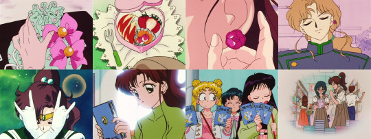
I fell in love with these postcards from the Girl’s Night Out popup cafe the moment I saw them! I knew I had to get my hands on them, and the lovely @blaze-rocket was able to help that happen.
I cannot get over how perfect these postcards are. To me, this is what Sailor Moon is; a testament to the little moments from the series that made us fall in love with the characters, especially how their personal preferences were reflected in their fashion choices. In a world of merch where it’s easy to just slap a random crescent moon on something pink and say “look, it’s Usagi,” the designer responsible for these graphics went the extra mile to take imagery from the show itself that needles its way deep into our nostalgia-cortexes.
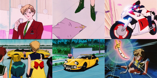
How many references do you recognise? Quiz yourself against this comprehensive (image-heavy) list! 👇
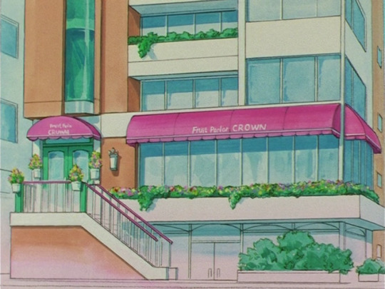
The inners’ postcards all reference the eye-catching sign for Game Center Crown, the iconic arcade where Motoki Furuhata worked and the gang would all congregate to play games and share information.

Starting in R they switched to hanging out at Fruits Parlor Crown, a cafe attached to the arcade staffed by Motoki’s sister Unazuki, which the Inners’ postcards all also reference. They would often get brightly-coloured drinks there, but the drinks pictured on these postcards seem to specifically line up with the real drinks available at the Girls Night Out popup cafe.

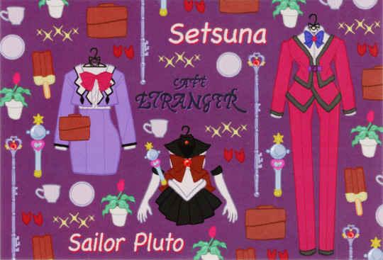
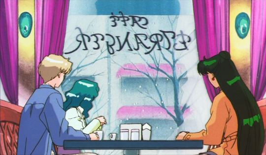
Sailors Neptune, Uranus, and Pluto’s postcards all reference “Café Étrangère,” which was the name of the cafe they were seen dining at in the Sailor Moon S movie. Even the logo is replicated faithfully from a scene only a few seconds long.
All the girls’ clothes are hanging on coat hangers shaped like Luna/Artemis/Diana.
Ami / Sailor Mercury’s references:
Ami’s casual outfit is an unusual choice since she only wore it a handful of times over the entire series, and half the times she wore it, it was given a different colour scheme with a green jacket instead of the yellow version pictured here.
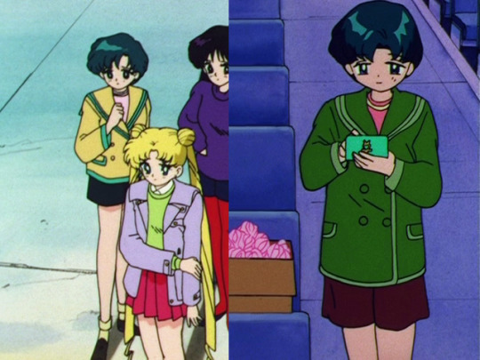
Her “mini data computer” is her most iconic tool/weapon/accessory, revealed in episode 009, directly after her introduction.
The pink package is how Usagi and the other girls wrapped up her transformation stick and communicator watch as Ami’s going-away present in episode 062.
The ice cream may be a reference to the same episode, as she shared a cone with Chibi-Usa before she left, and returned to the store to protect her friends from the Droid Nihpasu.
The flash cards are a method Ami commonly used to help her study, and are particularly similar to the ones shown in the SuperS short “Ami’s First Love”.

Rei / Sailor Mars’s References:
Rei wore her casual outfit fairly frequently, starting and most notably in the beginning of the Sailor Moon R movie.
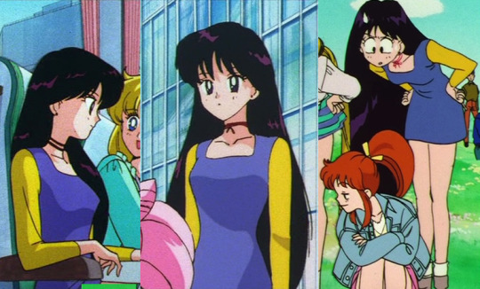
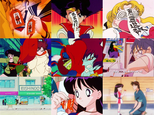
The small red o-mamori charm is from Hikawa Shrine, seen frequently but introduced in episode 010.
The paper ofuda ward was used frequently by Rei to fight evil, even before she could transform, but most notably in the attack sequence for “Akuryou, Taisan” (“Foul Spirit, Begone”).
To my knowledge the purple bag isn’t a specific reference, but Rei did throw a similar purse at a Cardian as a makeshift weapon in episode 048 before she got her Guardian memories back.
The gift-wrapped shopping boxes are the exact same ones as carried by Rei in the Sailor Moon Sailor Stars opening sequence before she trips and falls, right down to the patterns on the paper...
... which in itself may be a reference/callback to Rei’s tendency to make Yuuichirou carry her shopping (maybe so she doesn’t trip).
The phoenix-shaped pendant is a reference to episode 183; it’s made of glazed ceramic, crafted by Rei’s cousin Kengo Ibuki, given to her as a child after she convinced him not to smash it even though he his pottery a “failure”.
Makoto / Sailor Jupiter’s References:
Makoto didn’t start wearing her casual outfit until around S, but she wore it frequently after that, especially as she became more confident wearing “feminine” clothing. They even remembered her iconic gold wrist watch worn over her sleeve!
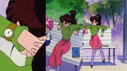
Her uniquely decorated bento bag debuted in episode 026, her introductory episode, along with the rounded green cutlery. The pouch has been featured a few more times since and its design is a mainstay in almost every Sailor Moon canon.
The teal hairtie and the rose-shaped earrings are two of Makoto’s iconic accessories, some of the only non-magical fashion accessories in the entire series to stay the same whether the character is transformed or not (the other being Minako’s infamous red bow). Her earrings also served a dual purpose as makeshift projectile weapons in episode 025.
The blue book is 月夜の天馬 (Tsukiyo no Tenma, “The Moonlit Pegasus”), a novel which was written by Tomoko Takase and introduced in epsode 134. Makoto knew Tomoko from her old middle school, before she transferred, and was the first one to read her first draft after retrieving it from bullies. She encouraged Tomoko to try and get it published. Makoto meets with her again and helps her overcome her writer’s block to finish her sequel, 天馬幻想 (Tenma Gensou, “Pegasus Fantasy”).
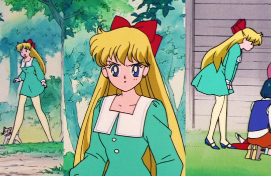
Minako / Sailor Venus’s References:
This is one of Minako’s most-worn casual outfits, especially if you consider the additional outfits based off it. Despite its prevalence, she didn’t start wearing it until the beginning of S.
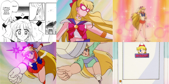
Minako’s red hair ribbon is her most iconic accessory, but did you know why she started wearing it? The Codename: Sailor V prequel manga explains that she started wearing the ribbon instead of her usual red hairtie on the suggestion of her “first crush” Higashi. But when he turns out to be an enemy in disguise, she decides she looks good with a ribbon anyway, and keeps wearing it for her own benefit.
The red mask is a reference to Minako’s role as Sailor V before joining the team as Sailor Venus. Sailor V was known as a mysterious vigilante superhero and a fictional video game character as early as episode 001, but in episode 033 Minako revealed herself to the rest of the Sailor Team, dramatically removing her mask one final time.
Minako was known to be a skilled volleyball player, especially in the manga, and it was especially relevant in episode 100 where she had to delicately return the serve of an energy sphere containing the Pure Heart of her old volleyball crush, Asai.
The sign with Minako’s name can be seen hanging off the front of her bedroom door in episode 192.
[Manga scan courtesy of Miss Dream.]
Usagi / Sailor Moon’s References:
Usagi wore this outfit in the Sailor Moon R movie, making it a memorable choice. Although the movie aired roughly midway through R, Usagi didn’t start to wear this outfit casually again until the S season.
Usagi is shown eating a lot of food, especially sweets, but she seems to have a particular fondness for crepes, snacking on them in several different episodes.
In episode 143 we can see that Usagi is very technologically trendy - for the times. She’s carrying that blue-and-pink pager which she and Mamoru use to contact each other by way of goroawase, that is, deciphering messages based on the different pronunciations of numbers, a precursor to modern texting. Mamoru pages her the numbers 84 51, which could be read as hachi yon go ichi; reading only the first syllables, and substituting go for the related sound ko, Usagi would interpret the message as hayo koi, which sounds a bit like “come quick” - she’s late for their date. Oops!
By the way, pagers were often called “pocket bells” (pokeberu) in Japan, and became so rapidly popular they even found their way into the lyrics of Rashiku Ikimasho, the ending song for the SuperS season; 「泣きたい時には ポケベルならしてよんで、戦士の休息」 [Nakitai toki ni wa POKEBELL narashite yonde, senshi no kyuusoku] “If you feel like crying, send a page thru the Pocket Bell, take a break from [being a] Guardian”

Chibi-Usa / Sailor Chibi Moon’s References:
Chibi-Usa doesn’t technically have a school uniform, but her casual clothes are often styled after sailor suits as a reflection of both her idolisation of the figure of “Sailor Moon” and of her desire to be seen as older and more mature than she appears. She changes “uniforms” every season, and this pinafore outfit is the version she wears in SuperS. She wore the other outfit in the SuperS premiere episode.
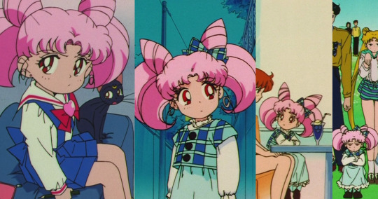
The handgun is from episode 060, Chibi-Usa’s introduction to the series and arguably one of the most iconic absurdist scenes in all of Sailor Moon. The gun itself is actually a toy, probably a transformation of the Luna-P sphere, which Chibi-Usa uses to try and threaten Usagi into giving her the Legendary Silver Crystal. When she “shoots” Usagi, the bullet is revealed to be nothing but a suction-cup flower, also pictured. (By the way, if you were wondering, Chibi-Usa’s fake gun is based on a real Colt M1911A1.) She transforms the Luna-P into a toy gun to shoot Sailor Moon again in the Sailor Moon R movie, this time as a way to motivate Usagi to fight.
The Luna-P sphere was a mysterious gadget Chibi-Usa kept with her for the duration of R and parts of S. It’s unknown where it came from, but it could be assumed to have been created from advanced 30th century technology. It was a combination toy and tool which could transform itself into a variety of objects, formulas, and even weapons, though none were shown to be particularly powerful. It could also be used to communicate with Sailor Pluto at the Time-Space Door. When Chibi-Usa was manipulated into becoming Wicked Lady in episode 085, the Luna-P sphere also transformed into an “evil” and much more dangerous version.
The Space-Time Key was a special tool given to her by Sailor Pluto that allowed her to travel between the past and the future, though it was difficult for her to wield effectively.
The sunhat was given to Chibi-Usa by Ikuko, so she treasured it greatly. In episode 112 it got blown away and was retrieved by Hotaru Tomoe, which allowed her to meet Chibi-Usa and marked the beginning of their close friendship.
The blue-and-red package was a gift containing two manga books (”Drop Drop” vol. 1 & 2 by Ukon Katakuri) which Chibi-Usa intended to give to her new friend Hotaru in episode 113.
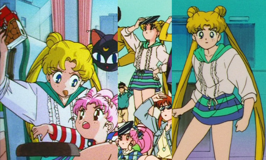
In episode 127, Chibi-Usa returned home to the future, and the girls all made her some going-away gifts. Ami made her a floppy disk (lol) to help her study, Rei made her a casette tape (double lol) of her music, Makoto packed her a lunch, and Minako made her a photo album of their time together. Usagi hand-sewed Chibi-Usa the rabbit-shaped backpack using a real outfit she used to love when she was a child.

Michiru / Sailor Neptune’s References:
This is a somewhat unusual choice for Michiru’s casual outfit, as she only wore it for two episodes, and that’s only because they made up a two-part story. But perhaps because the episodes were so pivotal - with Haruka and Michiru almost learning Usagi’s true identity - the outfit itself became more memorable.
Not only do they include Michiru’s violin, but they included the lemon she bounced off the instrument as she played to show off her skills in episode 093.
The teacup, teaspoon and saucer are the same set Michiru was seen drinking from at Fruits Parlor Crown in episode 094.
Michiru and Haruka both reference episode 095, where they had to enter a “true love” contest as part of their investigation. The contestants were asked to find their partner’s hand in an anonymous lineup, and Haruka was able to identify Michiru’s hand immediately.
Michiru used Haruka as a model for an illustration in her green sketchbook in episode 106.
Michiru’s Talisman is the Deep Aqua Mirror, revealed in episode 110 and used in her attack Submarine Reflection. She could also use it to receive prophetic visions. Visually, it was based on real-life art nouveau hand mirrors, and symbolically represented the mirror from the Three Sacred Treasures.
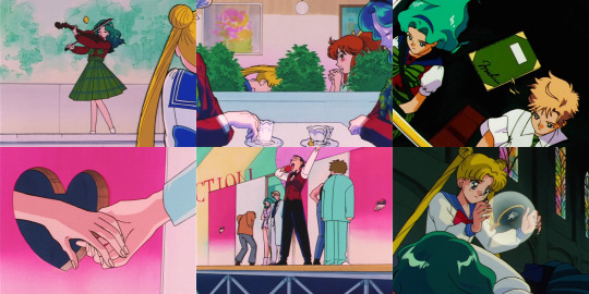
Haruka / Sailor Uranus’s References:
Conversely, Haruka wore this outfit a lot. Maybe more than she should’ve.
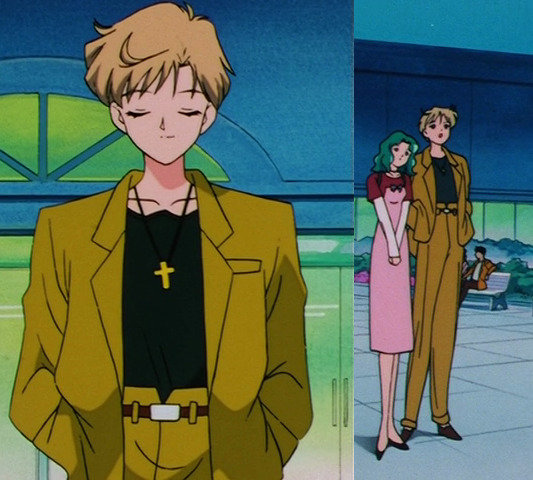
The teacup and saucer is the same set Haruka was seen drinking from at Fruits Parlor Crown in episode 094.
Haruka’s postcard also references the lovers contest in episode 095 (see above).
The purple scarf is from episode 096; Haruka was wearing it as a necktie when she almost ran into Makoto on her motorcycle. Haruka used the scarf to bandage Makoto’s road rash, which she returned later, though now smitten.
Not only is Haruka’s motorcycle included, they also referenced (one of) her car(s), the 1968 Toyota 2000GT.
Haruka’s Talisman is the Space Sword, revealed in episode 110 and used in her attack Space Sword Blaster. Symbolically it represented the sword from the Three Sacred Treasures.
Setsuna / Sailor Pluto’s References:
Setsuna didn’t have a school uniform, since she wasn’t a student, so she got to double-up on her casual outfits. Her mauve outfit is her most recognisable, wearing it so often it may as well have been her uniform. In fact, she was rarely seen wearing anything else until Sailor Stars, where she started experimenting with other outfits, including the Time Lord-esque suit on the right.
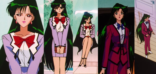
The potted plant is a Tellun, the energy-draining plant created by Tellu in episode 121. Setsuna was investigating it when it attempted to attack her, but she was protected by her Talisman, the Garnet Orb (also pictured, representing the jewel in the Three Sacred Treasures). She then went on to destroy the remaining Tellun plants and defeat Tellu with the help of Sailor Moon, Sailor Chibi Moon, and Tuxedo Mask.
The teacup and saucer are the same set Setsuna is seen drinking from at Cafe Etranger in the Sailor Moon S movie.
In episode 182, the girls are discussing the mysterious arrival of Chibi Chibi while eating ice cream on a hot summer’s day. Setsuna appears out of nowhere to confirm their suspicions... carrying that popsicle of her own.

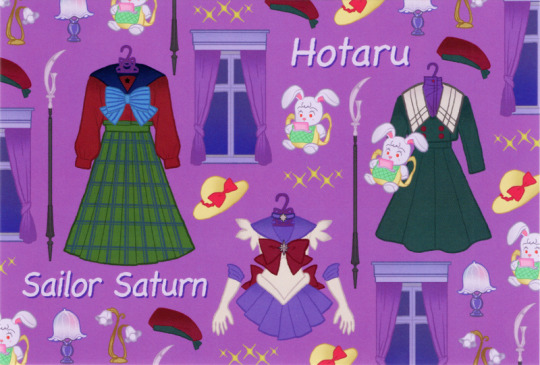
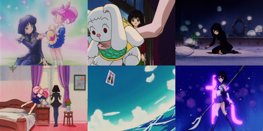
Hotaru / Sailor Saturn’s References:
Hotaru tended to wear the same thing, mostly all-black, but she did occasionally adventure into rich colours like this bottle green two-piece outfit and iconic raspberry beret.

The sunhat belonged to Chibi-Usa; it symbolises the beginning of their friendship, when Hotaru caught it after it blew away in episode 112.
Chibi-Usa gave Hotaru the rabbit backpack in episode 116, using it to pass a note inviting her on a picnic.
Hotaru collects lamps, and the two referenced here are seen in her bedroom, which she keeps dimly lit to manage her pain.
The window might seem random, but it was random in the series, too - it’s one of the curtained window which looks out from Hotaru’s bedroom, and when a Daimon experiment goes terribly wrong in episode 118 and transforms her house into a Bamboozled-like inter-dimensional maze, one window overlooks a vast ocean while the other overlooks a strange jungle.
Hotaru’s weapon as Sailor Saturn is the Silence Glaive. It’s said that she possesses enough power to destroy the world with a single drop of her scythe.
That’s it! You made it! How many references did YOU know? 🌙
#sailor moon#long post#I couldn't have done this the easy way. I couldn't have just posted the pictures and been like 'ooh look pretty'.#it was fun though and I actually learned some things in the process#I feel like I slipped through time somehow and designed these for Toei and then blacked it from my memory#again: sincere apologies to those on mobile
2K notes
·
View notes
Text
A Easy Prepare For Embed Google Map
just How Does Google Maps generate Income?
By downloading this file as well as opening it in Google Earth, users are able to browse hillshades with two lighting angles for faults in the north San Andreas fault system. The degree of the LiDAR data is revealed by the cyan colored details. The hillshades will load when the customer has zoomed into a location of interest.
Why is there no voice on my Google Maps?
How to resolve “Google Maps not talking” issue in Android. Check your device's volume. Make sure voice is turned on in the Maps app. Clear the app's cache.
With one click of the computer mouse, a Google Planet customer can switch over to Sky Mode and reverse the perspective. With hi-res pictures from NASA, the Digital Study Consortium as well as the Sloan Digital Skies Survey, Google Earth has actually created an accurate and fascinating look at celestial spaces. Individuals can fly around, just like in Planet setting, to look the much reaches of room. Google Earth has actually produced 3-D structures for numerous significant UNITED STATE cities. Generally, they're not outlined replicas-- they're simple, gray 3-D drawings-- but you do get an excellent feeling for the city when you turn on this layer.
One can likewise upload an entire documents of places and also addresses and also pick different base maps. It's additionally very easy to export maps as KMZ documents and also open in Google Planet to produce an excursion. All this and also extra is explained in their Assistance Overview. These maps may be seen inGoogle Planet with our KML links in My Places or in the Gallery layer of Google Planet, Rumsey Historical Maps layer, or directly in the no download Google Earth Internet browser.
Quick & Easy Tips For using Google My organization and Also Google Maps For search Engine Optimization.
A minimal group can also be seen in the Google Maps audience on this website. Planet Map's information is split right into thematic teams and allows the customer to imagine layers as well as to produce data to explain the areas of rate of interest.

Scroll down under the editor as well as discover the https://googlemapembed.com MapPress area.
Most likely to the page or article that you want to include a Google map too.
Insert your Google API secret right into the proper box and click the "Conserve Modifications" switch.
This short article illustrates exactly how nonspecialists made use of Google Planet ™, a complimentary program, to produce community maps. In 2006, Google Earth started supplying detailed photos of identified areas in Israel. Likewise revealed was the supposed headquarters of Mossad, Israel's foreign knowledge solution, whose area is extremely categorized. The Google Earth API was a cost-free beta solution, enabling individuals to place a variation of Google Planet right into websites.
Each of these versions of Google Planet can be used to review as well as produce information in KML style, which makes it possible for instructors, pupils, and various other users to share data. Google Planet for Web - A simple to utilize, browser-based variation that offers ease of ease of access however is restricted in regards to performance. The sound, pictures, photos, as well as videos are credited under the media property, with the exception of marketing pictures, which typically link to an additional page that contains the media credit report. The Legal rights Owner for media is the person or group credited.

reasons To add Your service To Google Maps.
How many miles should you walk a day?
The average American walks 3,000 to 4,000 steps a day, or roughly 1.5 to 2 miles. It's a good idea to find out how many steps a day you walk now, as your own baseline. Then you can work up toward the goal of 10,000 steps by aiming to add 1,000 extra steps a day every two weeks.
Creation devices are currently offered in Google Planet on web. You can view your tasks on mobile and tablet gadgets making use of the most up to date variation of our iOS or Android app. Many thanks to a combination with Google Drive, you can share your stories with your target market and also they can see it anywhere-- their phone, tablet or laptop. Most importantly, you can welcome others to team up as well as co-author tasks with you. With creation tools in Google Planet, you can attract your very own placemarks, lines and also shapes, after that connect your own custom-made text, pictures, and videos to these places.

How can I track my husbands car without him knowing?
Spyine is the most popular phone monitoring solution on the internet. You can use it to keep an eye on your husband 24x7, without him finding out about it. It can monitor your husband's phone regardless of whether it is an Android smartphone or an iOS phone. All this happens with complete data security in mind.
The mobile variations of Google Earth can utilize multi-touch interfaces to proceed the world, zoom or revolve the sight, and also enable to choose the present place. An automobile variation of Google Earth was made available in the 2010 Audi A8. On February 27, 2020, Google opened up its online variation of Planet to web browsers like Firefox, Edge, and Opera.
How far back can Google Earth go?
Earth Engine is a platform for scientific analysis and visualization of geospatial datasets, for academic, non-profit, business and government users. Earth Engine hosts satellite imagery and stores it in a public data archive that includes historical earth images going back more than forty years.
Some are constructed right into the application, however mostly Google is currently letting users produce and import 3-D illustrations themselves making use of the cost-free Google SketchUp program. Just like any kind of various other view, you can make use of the "tilt" as well as "rotate" buttons in the navigator panel to obtain the full 3-D view. In this section, we've covered the majority of the basic functions of Google Earth.
This Is Google's New Smart screen device.
With a collection, for instance, there is a huge operational benefit to having a real location, an actual audience and a trusted community goal as a structure for the future. The shelf-life of modern technology firms, their applications, their tools as well as also details itself is unnervingly brief, about the transformative drift of an area.
Earth Map consequently gives users both a temporal and also a spatial viewpoint to their locations of interest. Its attributes are based on Google Planet Engine's big data capacities, enabling individuals to take on complex evaluation of planet monitoring, ecological as well as environment information in a straightforward fashion. Fish and also Wild animals employees appropriately use Google mapping software program and recognize its limitations and uses. There are several scenarios where Google mapping software can be a valuable and efficient device to help our job. FWS team need to comprehend the proper application and use Google software.
They counted produce types by aesthetic inspection or by examining a menu. Supermarket and also dining establishments were ranked according to a system created by the authors that utilized the selection as well as top quality or freshness of produce. The score and address information were tabulated and also moved from a spreadsheet to the Google Earth And also program, which outlined geo-coordinates for the data points. Maps are made use of to track illness and illustrate the social context of health issue. Nonetheless, commercial mapping software program requires unique training.
1 note
·
View note
Text
White Box AI: Interpretability Techniques

While in the previous article of the series we introduced the notion of White Box AI and explained different dimensions of interpretability, in this post we’ll be more practice-oriented and turn to techniques that can make algorithm output more explainable and the models more transparent, increasing trust in the applied models.
The two pillars of ML-driven predictive analysis are data and robust models, and these are the focus of attention in increasing interpretability. The first step towards White Box AI is data visualization because seeing your data will help you to get inside your dataset, which is a first step toward validating, explaining, and trusting models. At the same time, having explainable white-box models with transparent inner workings, followed by techniques that can generate explanations for the most complex types of predictive models such as model visualizations, reason codes, and variable importance measures.
Data Visualization
As we remember, good data science always starts with good data and with ensuring its quality and relevance for subsequent model training.
Unfortunately, most datasets are difficult to see and understand because they have too many variables and many rows. Plotting many dimensions is technically possible, but it does not improve the human understanding of complex datasets. Of course, there are numerous ways to visualize datasets and we discussed them in our dedicated article. However, in this overview, we’ll rely on the experts’ opinions and stick to those selected by Hall and Gill in their book “An Introduction to Machine Learning Interpretability”.
Most of these techniques have the capacity to illustrate all of a data set in just two dimensions, which is important in machine learning because most ML algorithms would automatically model high-degree interactions between multiple variables.
Glyphs
Glyphs are visual symbols used to represent different values or data attributes with the color, texture, or alignment. Using bright colors or unique alignments for events of interest or outliers is a good method for making important or unusual data attributes clear in a glyph representation. Besides, when arranged in a certain way, glyphs can be used to represent rows of a data set. In the figure below, each grouping of four glyphs can be either a row of data or an aggregated group of rows in a data set.
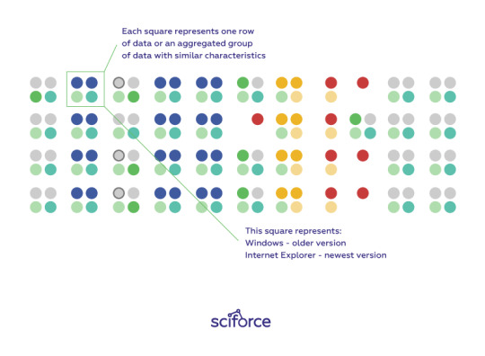
Figure 1. Glyphs arranged to represent many rows of a data set. Image courtesy of Ivy Wang and the H2O.ai team.
Correlation Graphs
A correlation graph is a two-dimensional representation of the relationships (i.e. correlation) in a data set. Even data sets with tens of thousands of variables can be displayed in two dimensions using this technique.
For the visual simplicity of correlation graphs, absolute weights below a certain threshold are not displayed. The node size is determined by a node’s number of connections (node degree), its color is determined by a graph community calculation, and the node position is defined by a graph force field algorithm. Correlation graphs show groups of correlated variables, help us identify irrelevant variables, and discover or verify important relationships that machine learning models should incorporate.
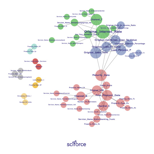
Figure 2. A correlation graph representing loans made by a large financial firm. Figure courtesy of Patrick Hall and the H2O.ai team.
In a supervised model built for the data represented in the figure above, we would expect variable selection techniques to pick one or two variables from the light green, blue, and purple groups, we would expect variables with thick connections to the target to be important variables in the model, and we would expect a model to learn that unconnected variables like CHANNEL_Rare not very important.
2-D projections
Of course, 2-D projection is not merely one technique and there exist any ways and techniques for projecting the rows of a data set from a usually high-dimensional original space into a more visually understandable 2- or 3-D space two or three dimensions, such as:
Principal Component Analysis (PCA)
Multidimensional Scaling (MDS)
t-distributed Stochastic Neighbor Embedding (t-SNE)
Autoencoder networks
Data sets containing images, text, or even business data with many variables can be difficult to visualize as a whole. These projection techniques try to represent the rows of high-dimensional data projecting them into a representative low-dimensional space and visualizing using the scatter plot technique. A high-quality projection visualized in a scatter plot is expected to exhibit key structural elements of a data set, such as clusters, hierarchy, sparsity, and outliers.
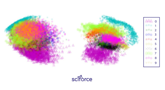
Figure 3. Two-dimensional projections of the 784-dimensional MNIST data set using (left) Principal Components Analysis (PCA) and (right) a stacked denoising autoencoder. Image courtesy of Patrick Hall and the H2O.ai team.
Projections can add trust if they are used to confirm machine learning modeling results. For instance, if known hierarchies, classes, or clusters exist in training or test data sets and these structures are visible in 2-D projections, it is possible to confirm that a machine learning model is labeling these structures correctly. Additionally, it shows if similar attributes of structures are projected relatively near one another and different attributes of structures are projected relatively far from one another. Such results should also be stable under minor perturbations of the training or test data, and projections from perturbed versus non-perturbed samples can be used to check for stability or for potential patterns of change over time.
Partial dependence plots
Partial dependence plots show how ML response functions change based on the values of one or two independent variables, while averaging out the effects of all other independent variables. Partial dependence plots with two independent variables are particularly useful for visualizing complex types of variable interactions between the independent variables. They can be used to verify monotonicity of response functions under monotonicity constraints, as well as to see the nonlinearity, non-monotonicity, and two-way interactions in very complex models. They can also enhance trust when displayed relationships conform to domain knowledge expectations. Partial dependence plots are global in terms of the rows of a data set, but local in terms of the independent variables.
Individual conditional expectation (ICE) plots, a newer and less spread adaptation of partial dependence plots, can be used to create more localized explanations using the same ideas as partial dependence plots.
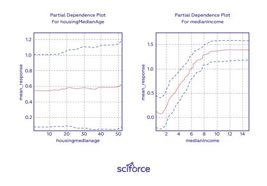
Figure 4. One-dimensional partial dependence plots from a gradient boosted tree ensemble model of the California housing data set. Image courtesy Patrick Hall and the H2O.ai team.
Residual analysis
Residuals refer to the difference between the recorded value of a dependent variable and the predicted value of a dependent variable for every row in a data set. In theory, the residuals of a well-fit model should be randomly distributed because good models will account for most phenomena in a data set, except for random error. Therefore, if models are producing randomly distributed residuals, this is an indication of a well-fit, dependable, trustworthy model. However, if strong patterns are visible in plotted residuals, there are problems with your data, your model, or both. Breaking out a residual plot by independent variables can additionally expose more granular information about residuals and assist in reasoning through the cause of non-random patterns.
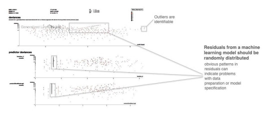
Figure 5. Screenshot from an example residual analysis application. Image courtesy of Micah Stubbs and the H2O.ai team.
Seeing structures and relationships in a data set makes those structures and relationships easier to understand and makes up a first step to knowing if a model’s answers are trustworthy.
Techniques for Creating White-Box Models
Decision trees
Decision trees, predicting the value of a target variable based on several input variables, are probably the most obvious way to ensure interpretability. They are directed graphs in which each interior node corresponds to an input variable. Each terminal node or leaf node represents a value of the target variable given the values of the input variables represented by the path from the root to the leaf. The major benefit of decision trees is that they can reveal relationships between the input and target variable with “Boolean-like” logic and they can be easily interpreted by non-experts by displaying them graphically. However, decision trees can create very complex nonlinear, nonmonotonic functions. Therefore, to ensure interpretability, they should be restricted to shallow depth and binary splits.
eXplainable Neural Networks
In contrast to decision trees, neural networks are often considered the least transparent of black-box models. However, the recent work in XNN implementation and explaining artificial neural network (ANN) predictions may render that characteristic obsolete. Many of the breakthroughs in ANN explanation were made possible thanks to the straightforward calculation of derivatives of the trained ANN response function with regard to input variables provided by deep learning toolkits such as Tensorflow. With the help of such derivatives, the trained ANN response function prediction can be disaggregated into input variable contributions for any observation. XNNs can model extremely nonlinear, nonmonotonic phenomena or they can be used as surrogate models to explain other nonlinear, non-monotonic models, potentially increasing the fidelity of global and local surrogate model techniques.
Monotonic gradient-boosted machines (GBMs)
Gradient boosting is an algorithm that produces a prediction model in the form of an ensemble of weak prediction models, typically decision trees. Used for regression and classification tasks, it is potentially appropriate for most traditional data mining and predictive modeling applications, even in regulated industries and for consistent reason code generation provided it builds monotonic functions. Monotonicity constraints can improve GBMs interpretability by enforcing a uniform splitting strategy in constituent decision trees, where binary splits of a variable in one direction always increase the average value of the dependent variable in the resultant child node, and binary splits of the variable in the other direction always decrease the average value of the dependent variable in the other resultant child node. Understanding is increased by enforcing straightforward relationships between input variables and the prediction target. Trust is increased when monotonic relationships, reason codes, and detected interactions are parsimonious with domain expertise or reasonable expectations.
Alternative regression white-box modeling approaches
There exist many modern techniques to augment traditional, linear modeling methods. Such models as elastic net, GAM, and quantile regression, usually produce linear, monotonic response functions with globally interpretable results similar to traditional linear models but with a boost in predictive accuracy.
Penalized (elastic net) regression
As an alternative to old-school regression models, penalized regression techniques usually combine L1/LASSO penalties for variable selection purposes and Tikhonov/L2/ridge penalties for robustness in a technique known as elastic net. Penalized regression minimizes constrained objective functions to find the best set of regression parameters for a given data set that would model a linear relationship and satisfy certain penalties for assigning correlated or meaningless variables to large regression coefficients. For instance, L1/LASSO penalties drive unnecessary regression parameters to zero, selecting only a small, representative subset of parameters for the regression model while avoiding potential multiple comparison problems. Tikhonov/L2/ridge penalties help preserve parameter estimate stability, even when many correlated variables exist in a wide data set or important predictor variables are correlated. Penalized regression is a great fit for business data with many columns, even data sets with more columns than rows, and for data sets with a lot of correlated variables.
Generalized Additive Models (GAMs)
Generalized Additive Models (GAMs) hand-tune a tradeoff between increased accuracy and decreased interpretability by fitting standard regression coefficients to certain variables and nonlinear spline functions to other variables. Also, most implementations of GAMs generate convenient plots of the fitted splines. That can be used directly in predictive models for increased accuracy. Otherwise, you can eyeball the fitted spline and switch it out for a more interpretable polynomial, log, trigonometric or other simple function of the predictor variable that may also increase predictive accuracy.
Quantile regression
Quantile regression is a technique that tries to fit a traditional, interpretable, linear model to different percentiles of the training data, allowing you to find different sets of variables with different parameters for modeling different behavior. While traditional regression is a parametric model and relies on assumptions that are often not met. Quantile regression makes no assumptions about the distribution of the residuals. It lets you explore different aspects of the relationship between the dependent variable and the independent variables.
There are, of course, other techniques, both based on applying constraints on regression and generating specific rules (like in OneR or RuleFit approaches). We encourage you to explore possibilities for enhancing model interpretability for any algorithm you choose and which is the most appropriate for your task and environment.
Evaluation of Interpretability
Finally, to ensure that the data and the trained models are interpretable, it is necessary to have robust methods for interpretability evaluation. However, with no real consensus about what interpretability is in machine learning, it is unclear how to measure it. Doshi-Velez and Kim (2017) propose three main levels for the evaluation of interpretability:
Application level evaluation (real task)
Essentially, it is putting the explanation into the product and having it tested by the end user. This requires a good experimental setup and an understanding of how to assess quality. A good baseline for this is always how good a human would be at explaining the same decision.
Human level evaluation (simple task)
It is a simplified application-level evaluation. The difference is that these experiments are not carried out with the domain experts, but with laypersons in simpler tasks like showing users several different explanations and letting them choose the best one. This makes experiments cheaper and it is easier to find more testers.
Function level evaluation (proxy task)
This task does not require humans. This works best when the class of model used has already been evaluated by humans. For example, if we know that end users understand decision trees, a proxy for explanation quality might be the depth of the tree with shorter trees having a better explainability score. It would make sense to add the constraint that the predictive performance of the tree remains good and does not decrease too much compared to a larger tree.
Most importantly, you should never forget that interpretability is not for machines but for humans, so the end users and their perception of data and models should always be in the focus of your attention. And humans prefer short explanations that contrast the current situation with a situation in which the event would not have occurred. Explanations are social interactions between the developer and the end user and it should always account for the social (and legal) context and the user’s expectations.
3 notes
·
View notes
Photo

Show Course Schedules and Timetables With a WordPress Calendar Plugin
Websites often need to let users know about any upcoming events like movie shows, exhibitions and classes. Listing the schedule for upcoming events helps everyone save time and plan their activities. With a good event listing calendar, your users will be able to see upcoming events along with their timing, location, availability and pricing at a single place. This helps you avoid answering a lot of repetitive inquires, and makes users more likely to buy tickets for events.
20 Best WordPress Calendar Plugins and Widgets
Whether you need an event calendar plugin, a booking system with payments, or a Google Calendar widget, this list of plugins will have something to improve...
Esther Vaati
06 Sep 2019
WordPress
8 Best WordPress Booking and Reservation Plugins
In the digital age, users are online 24/7. Everyone prefers to check availability and make appointments, reservations, or bookings online. They want to do...
Lorca Lokassa Sa
12 Apr 2019
WordPress
Best Free WordPress Calendar Plugins
In this post, we will review some of the most popular free WordPress calendar plugins that you can start using in your projects.
Monty Shokeen
18 Jun 2019
WordPress
How to Add a Calendar to Your WordPress Site With the Events Schedule Plugin
Build a schedule for your website, complete with Google Maps integration, call to action buttons, and a complete automated booking and ticketing system for...
Jessica Thornsby
14 Mar 2019
WordPress
The usefulness of these event calendar and scheduling plugins makes them very popular among website owners. There are a lot of free and paid plugins out there which can help you create such schedules and post them on your website. One of the best is Timetable Responsive Schedule for WordPress, available from CodeCanyon. In this tutorial, I'll show you how to use Timetable Responsive Schedule to create a weekly schedule to list different courses and their details.
What We'll Be Building: a Course Timetable
The plugin offers a lot of nice features that we will be using when creating our own course schedule. The image below shows the final result that you will have at the end of this tutorial.
As suggested by the name of the plugin, the timetable that we create will be responsive and look great on all devices. The plugin also provides booking functionality out of the box. This means that users will be able to register for different courses by clicking a button in the schedule itself.
The Basics of Timetable Responsive Schedule
In this section, we will simply cover some of the basics that will help you understand how the plugin works.
After installing the plugin, you will notice that there are four new menu options in your WordPress admin dashboard: Timetable, Timetable Bookings, Timetable Columns, Events.
The Timetable Columns menu option is used to specify the content that goes in the head of our table. It can be anything that you like. For example, you could create columns for months, days, dates, or places.
The Events menu option contains different settings to help you set up and create events. There is an option to create different categories to group events together. Just like the timetable columns, the event categories can also have different values with any names you want. For example, if the events are happening at different places, you could categorize them with locations. If the schedule is for movies currently being shown in different movie theaters, the category could be the movie genre.
There is no right or wrong way to set timetable columns or event categories. The important thing is to group the events together in an organized manner that makes it easier for people to find quickly find information about events that they like.
Right now, we just need to know about these two menu options to create our events and categorize them. We will discuss the remaining options later.
Creating the Course Schedule
After getting familiar with the basics, we can now start creating our responsive schedule.
First, we will create seven columns—one for each day of the week. To do so, simply go to Timetable Columns > Add New. You will just have to fill in the title of the column and click Publish. This will add the weekday to the list of columns. Do this for all seven days of the week to get seven different columns.
Now it is time to define some categories for our courses. We will use the subjects and categories for our courses. For example, both Algebra and Statistics courses will fall under the category Mathematics. Similarly, French Revolution and World War 2 will fall under the category History in our schedule.
Remember that you can create your own categories depending on how you want to organize the courses. As I said earlier, there is no absolute right or wrong here. The aim is to make the information easier to find.
Finally, we can start creating the course schedule that will appear on the website. Just go to Events > Add New and start filling out all the details. Some information that you fill out is shown only when the users click on the event link to read about it in more detail. Other information will appear in the timetable itself.
You can begin by filling the title and description of the course. The title appears in a lot of places like the tooltip, the course schedule as well as on the course details page. Try to keep it short. The description will only appear on the details page.
There are a couple of options below the description like the Subtitle and the background and text colors. The subtitle only appears on the detail page and is located right below the title. In our case, we will use it to specify the name of the instructor who will teach that course.
If you don't want people to click on the event title and go to the details page, set the value of Disable timetable event URL to Yes. We will leave it as No for our tutorial.
Now, we will set some value for the fields in Event Hours section. Here, we simply provide the basic details of the event along with the exact time when it will take place.
Select one of the weekdays from the dropdown menu next to Timetable column. It will show all the columns that you created earlier. The Start hour and End hour values specify when the classes for the course begin and end. You have to specify them in 24 hour format without adding any AM and PM at the end. This means that 9:00 AM has to be specified as 09:00 and 2:00 PM has to be specified as 14:00. However, the final format in which the date appears in the timetable can still be set to display other formats.
You don't have to fill out both the description fields. The text inside Description 1 appears before the event title. The text inside Description 2 appears after the event title. The text inside Tooltip appears as a tooltip when users hover over the event.
Set the number of available slots to the maximum number of students who are allowed to take a class. Users will be able to register for a class as long as total registered students are below the specified limit.
Click on the Add button once you have filled out all the details. This will add the event to our schedule. Once you have added all the occurrences of the event, click on the Update button at the top.
Showing the Schedule on the Website
You need to use shortcodes to add the schedule to any page or post on your website. The shortcodes for adding the timetable can get pretty big and complicated when you configure a lot of options. To make sure that you don't make any mistakes, the plugin comes with a shortcode generator that you can access by going to Timetable > Shortcode Generator.
You need to create a unique identifier for each schedule that you create. In this case, we will enter course-schedule in the shortcode id field.
Under the Main Configuration tab, we can set different options to determine what appears inside our course schedule. In Events, select all the courses that you have created. In Event Categories, select all the categories whose events you want to show in the schedule. You can select specific days for which you want to show the schedule from Columns. I have selected all days of the week except Sunday.
We will allow our users to filter the courses so that they can just see the courses that they want to take. Set the Filter Style to Tabs to show the event categories as tabs at the top of the table. The text inside Filter Label determines what text should users be shown when they want to see unfiltered schedule table. We will set it to All Courses.
These are the most important options under the Main Configuration section. You can leave the rest of the fields to their default values. Now, click on the Save button on the Shortcode Generator page and copy the generated shortcode.
Paste the copied shortcode in any page or post where you want the schedule to appear. You should get a result similar to the image below.
Final Thoughts
In this tutorial, we learned how to use the Timetable Responsive Schedule plugin to create a course schedule. The plugin comes with a lot of features which make it a perfect scheduling solution for many projects. We used the plugin in this tutorial to create a course schedule but you can use it for many other things like scheduling and booking, movie tickets across different movie theaters, or showing the schedule of different exhibits around the city in a week.
You can read about all the features of the plugin on the description page. Buying the plugin will give you access to six months of free support and lifetime updates. How do you plan on using this plugin? Let us know in the comments below.
WordPress
20 Best WordPress Calendar Plugins and Widgets
Esther Vaati
WordPress
8 Best WordPress Booking and Reservation Plugins
Lorca Lokassa Sa
WordPress
Best Free WordPress Calendar Plugins
Monty Shokeen
WordPress
How to Add a Calendar to Your WordPress Site With the Events Schedule Plugin
Jessica Thornsby
by Monty Shokeen via Envato Tuts+ Code https://ift.tt/35OFeKM
1 note
·
View note
Text
How To Clone Website Online?
It allows you to download websites from the Internet to your local hard drive on your own computer. Website Downloader arranges the downloaded site from the original websites relative link-structure. The downloaded website can be browsed by opening one of the HTML pages in a browser. The web grabber takes each HTML file and downloads and clones it to your local hard drive. You can use an HTML editor to make changes to each HTML file locally or use an HTML editor online. In case you are not a coder you can use a WYSIWYG-HTML Editor instead. They convert all the links in the HTML files so that they work locally, off-line, instead of pointing to an online website.
CSS and JavaScript files will be downloaded under a simple folder structure and referenced correctly in the HTML files. Like other assets, also images will be downloaded and referenced locally. Clone Website enables you to easily copy any website online. We do all of the work for you. Simply enter httrack of the website you want to copy, make a payment and we’ll take care of the rest! You’ll receive a download link usually within 24-hours. We copy all websites using the newest technologies and provide you with a “ready to work” clone. It is a paid service. The verify process can take up to the max.
The popularity of torrent sites is decreasing each year but they still remain one of the most visited websites on the web. However, at times, accessing a torrenting source like The Pirate Bay or 1337x can be difficult due to bans imposed by schools, offices, authorities, and governments. Talking specifically about 1337x, it’s one of the best torrent trackers around. To help you out in case the website is down, I’ve prepared a list of the popular 1337x alternatives that people tend to visit if the website faces a downtime. The Pirate Bay is the first website that should rightly make an appearance on any list of torrent sites.
Often referred to as TPB or Pirates Bay, this Swedish-origin site is available in about 35 different languages. Over time, it has, somehow, managed to survive downtime (here are some TPB alternatives) and a long list of legal troubles. The home page of this 1337x alternative is very minimal. While its text-only interface might not be pleasing to your eyes, it gets the job done. There’s a search box for entering your query and tick-boxes to select the torrent categories like audio, video, apps, games, etc. There are some ads on the search results but they won’t bother you much. While TPB might be the most popular torrent site around, Zooqle is the one getting tons of attention in the world of P2P sharing. Although its interface contains lots of information and pictures, it isn’t cluttered.
Zooqle actually sorts the torrents and the categories in a very intuitive manner. The site claims to feature more than 4 million verified torrents and supports more than 2,000 trackers. LimeTorrents is known for hosting mostly verified torrent files to ensure that users don’t end up downloading malware. The website features a pleasant color theme and its interface looks a lot like KickassTorrents. You can search for torrents, choose various categories, and sort the files as per date, size, seeders, leechers, etc. This 1337x alternative also shows a star badge in the listings to highlight a verified upload. When it comes to ads, LimeTorrents doesn’t feature many. However, the website keeps showing VPN affiliate banners that take you to different VPN providers.
Overall, the experience isn’t much intrusive as compared to other torrent providers. Just like The Pirate Bay, KickassTorrents has also faced multiple troubles like losing its primary domain, shutdowns by ISPs, and legal actions by governments. There are many mirrors and fake clones of this torrent alternative floating around — so you need to be careful. Talking about the interface, it’s the same as the original site. However, for some reason, the sorting feature doesn’t seem to be working. While the site doesn’t display any intrusive ads, the lack of sorting feature is a big downside. In 2016, the original Torrentz was shut down after a series of legal actions.
Following that, Torrentz2 surfaced as an unofficial clone of the website with about 60 million torrents. Over time, this torrent search alternative for 1337x has managed to gain back its userbase. Talking about the site, it’s basically a metasearch engine for torrent — not a typical torrent download website. It means that it indexes the torrent files from all popular sources and displays them at one place. The search result page lets you sort the torrents according to peers, rating, size, and date of upload. There’s also an option to rate the torrent and provide feedback. While P2P file sharing isn’t an illegal activity, users often indulge in sharing copyright protected media on the web. But, how do you make sure that the torrent that you’re downloading is legal? Legit Torrents is one such website that provides 100% legally free media. The website’s interface is as clean as it gets; there are a couple of ads on the pages but they are non-intrusive. The home page of this legal alternative to 1337x features a listing of torrents and a search box at the top. You can sort the results as per date, seeders, leechers, etc. There’s a link to an Extra Stats section at the top that provides lists of different sections of top 10 torrents.
The ability to execute code in parallel is crucial in a wide variety of scenarios. Concurrent programming is a key asset for web servers, producer/consumer models, batch number-crunching and pretty much any time an application is bottlenecked by a resource. It’s sadly the case that writing quality concurrent code can be a real headache, but this article aims to demonstrate how easy it is to get started writing threaded programs in Python. Due to the large number of modules available in the standard library which are there to help out with this kind of thing, it’s often the case that simple concurrent tasks are surprisingly quick to implement.
We’ll walk through the difference between threads and processes in a Python context, before reviewing some of the different approaches you can take and what they’re best suited for. It’s impossible to talk about concurrent programming in Python without mentioning the Global Interpreter Lock, or GIL. This is because of the large impact it has on which approach you select when writing asynchronous Python. The most important thing to note is that it is only a feature of CPython (the widely used “reference” Python implementation), it’s not a feature of the language. Jython and IronPython, among other implementations, have no GIL. The GIL is controversial because it only allows one thread at a time to access the Python interpreter.
This means that it’s often not possible for threads to take advantage of multi-core systems. Note that if there are blocking operations which happen outside Python, long-wait tasks like I/O for instance, then the GIL is not a bottleneck and writing a threaded program will still be a benefit. However, if the blocking operations are largely crunching through CPython bytecode, then the GIL becomes a bottleneck. Why was the GIL introduced at all? It makes memory management much simpler with no possibility of simultaneous access or race conditions, and it makes C extensions easier to write and easier to wrap.
The upshot of all this is that if you need true parallelism and need to leverage multi-core CPUs, threads won’t cut it and you need to use processes. A separate process means a separate interpreter with separate memory, its own GIL, and true parallelism. This guide will give examples of both thread and process architectures. The concurrent.futures module is a well-kept secret in Python, but provides a uniquely simple way to implement threads and processes. For many basic applications, the easy to use Pool interface offered here is sufficient. Here’s an example where we want to download some webpages, which will be much quicker if done in parallel.
Most of the code is just setting up our downloader example; it’s only the last block which contains the threading-specific code. Note how easy it is to create a dynamic pool of workers using ThreadPoolExecutor and submit a task. Using threads works well in this case since the blocking operation that benefits from concurrency is the act of fetching the webpage. This means that the GIL is not an issue and threading is an ideal solution. However, if the operation in question was something which was CPU intensive within Python, processes would likely be more appropriate because of the restrictions of the GIL. In that case, we could have simply switched out ThreadPoolExecutor with ProcessPoolExecutor.
Whilst the concurrent.futures module offers a great way to get off the ground quickly, sometimes more control is needed over different threads, which is where the ubiquitous threading module comes in. Let’s re-implement the website downloader we made above, this time using the threading module. For each thread we want to create, we make an instance of the threading.Thread class, specifying what we would like our worker function to be, and the arguments required. Note that we’ve also added a status update thread. The purpose of this is to repeatedly print “Still downloading” until we’ve finished fetching all the web pages. Unfortunately, since Python waits for all threads to finish executing before it exits, the program will never exit and the status updater thread will never stop printing.
This is an example of when the threading module’s multitude of options could be useful: we can mark the updater thread as a daemon thread, which means that Python will exit when only daemon threads are left running. The program now successfully stops printing and exits when all downloader threads are finished. Daemon threads are generally most useful for background tasks and repetitive functions which are only required when the main program is running, since a daemon can be killed at any moment, causing data loss. So far we’ve only looked at cases where we know exactly what we want the threads to be working on when we start them. However, it’s often the case that we need to start a group of worker threads, then feed them tasks as they arrive.
The best data structure for dealing with these tasks is, of course, a queue, and Python provides a queue module which is especially geared towards threading applications. FIFO, LIFO and priority queues are available. Ok, that’s pretty basic so far. Now let’s use it to create a tasks queue for our website downloader. We’ll create a group of worker threads which can all access the queue and wait for tasks to come in. Note that in this example all the tasks were added in one go for the sake of brevity, but in a real application the tasks could trickle in at any rate. Here we exit the program when the tasks queue has been fully completed, using the .join() method.
The threading module is great for detailed control of threads, but what if we want this finer level of control for processes? You might think that this would be more challenging since once a process is launched, it’s completely separate and independent - harder to control than a new thread which remains within the current interpreter and memory space. Fortunately for us, the Python developers worked hard to create a multiprocessing module which has an interface that is almost identical to the threading module. This means that launching processes follows the exact same syntax as our examples above. We think it’s awesome that Python manages to keep the same syntax between the threading and multiprocessing modules, when the action taking place under the hood is so different. When it comes to distributing data between processes, the queue.Queue that we used for threading will not work between processes.
This is because a queue.Queue is fundamentally just a data structure within the current process - albeit one which is cleverly locked and mutexed. Thankfully there exists a multiprocessing.Queue, which is specifically designed for inter-process communication. Behind the scenes, this will serialize your data and send it through a pipe between processes - a very convenient abstraction. Writing concurrent code in Python can be a lot of fun due to the inbuilt language features that abstract away a lot of problems. This doesn’t mean that a detailed level of control cannot be achieved either, but rather that the barrier to getting started with simple tasks is lowered. So when you’re stuck waiting for one process to finish before starting the next, give one of these techniques a try.
Games download website PCGames-Download - popular for offering cracked games - has announced it’s shutting down. In an announcement post on the website, the owner says it’s no longer possible for them to continue managing the site, so they have decided to shut it down. The team members have taken other paths. We removed the notification of updates also a few months ago, because we can no longer provide 20-30 updates every day as before. There are also a lot of dead links on the site not fixed for weeks. I do most of the work, alone for months. I can no longer insure it for personal reasons. I made that decision a few months ago.
The owner says they will pull the plug on the last day of this year - 31 Dec 2018. So users have a few days at hand to download stuff they want. We’ll give you a few days to continue downloading until, 31.12.2018 the server will be closed on this date, so hurry up ! Not only that, the owner also cautions people about similar but fake sites that may crop up after PCGames-Download gets shut down. Clone sites may appear to take advantage of the disappearance of the site in order to trap you with viruses or other things.if you see a site that looks like this site, run away.
’s a fake. There will be no other site. Users can be seen expressing their disappointment regarding this shutdown across the online discussion platform Reddit. For those who aren’t aware, earlier this month, another similar games-focused website GoodOldDownloads also called it quits. All we can say is, farewell PCGames-Download. The shutdown indeed left users complaining. 31.12.2018 and I just saw it. NOTE: To read more news related to app or website shutdowns, head here. PiunikaWeb is a unique initiative that mainly focuses on investigative journalism. This means we do a lot of hard work to come up with news stories that are either ‘exclusive,’ ‘breaking,’ or ‘curated’ in nature. Perhaps that’s the reason our work has been picked by the likes of Forbes, Foxnews, Gizmodo, TechCrunch, Engadget, The Verge, Macrumors, and more. Do take a tour of our website to get a feel of our work. And if you like what we do, stay connected with us on Twitter (@PiunikaWeb) and other social media channels to receive timely updates on stories we publish.
Sometimes you may want to download a website, or part of it, to your local system. Maybe you want to make use of the contents while you are offline, or for safekeeping reasons so that you can access the contents even if the website becomes temporarily or permanently unavailable. My favorite tool for the job is Httrack. It is free and ships with an impressive amount of features. While that is great if you spend some time getting used to what the program has to offer, you sometimes may want a faster solution that you do not have to configure extensively before use. That's where WebCopy comes into play. 1. Paste or enter a web address into the website field in WebCopy.
2. Make sure the save folder is correct. 3. Click on copy website to start the download. That's all there is to it. The program processes the selected page for you echoing the progress in the results tab in the interface. Here you see downloaded and skipped files, as well as errors that may prevent the download altogether. The error message may help you analyze why a particular page or file cannot be downloaded. Most of the time though, you can't really do anything about it. You can access the locally stored copies with a click on the open local folder button, or by navigating to the save folder manually.
This basic option only gets you this far, as you can only copy a single web page this way. You need to define rules if you want to download additional pages or even the entire website. Rules may also help you when you encounter broken pages that cannot be copied as you can exclude them from the download so that the remaining pages get downloaded to the local system. To add rules right-click on the rules listing in the main interface and select add from the options. Rules are patterns that are matched against the website structure. To exclude a particular directory from being crawled, you'd simply add it as a pattern and select the exclude option in the rules configuration menu. It is still not as intuitive as HTTracks link depth parameter that you can use to define the depth of the crawl and download.
WebCopy supports authentication which you can add in the forms and password settings. Here you can add a web address that requires authentication, and a username and password that you want the web crawler to use to access the contents. 1. The website diagram menu displays the structure of the active website to you. You can use it to add rules to the crawler. Additional URLs. This can be useful if the crawler cannot discover the urls automatically. 3. The default user agent can be changed in the options. While that is usually not necessary, you may encounter some servers that block it so that you need to modify it to download the website. The program is ideal for downloading single web pages to the local system. The rules system is on the other hand not that comfortable to use if you want to download multiple pages from a website. I'd prefer an option in the settings to simply select a link depths that I want the program to crawl and be done with it.
If you need to download website, use the offline browser SurfOffline. Enter the URL in this field to start download website from. This name is displayed in the project tree. If you select this item, files (except for images) will be downloaded only if they are located in the folder of the start page or its subfolders. Images are an exception since they are downloaded from any servers. This item allows you to download the entire website. Links to other websites will be ignored. Images are an exception since they are downloaded from any servers. This item disables the limitations concerning the location of the files that can be downloaded. You should be careful when selecting this item because the program will go outside the start website. It makes sense to use this option only if you limit very much the depth of the project being downloaded. Depth level. Shows how deep from the start page the links will be downloaded.
Some people want to download YouTube videos to their computer to watch offline. For instance, if you have a favorite YouTube series you want to watch while you’re not connected to the Internet, you may want to watch the video on your computer or mobile device. Or, if you’re someone who wants to practice their video editing skills, you might want to download YouTube videos to edit on your computer. There are several web tools and sites that can be used to download YouTube videos and you might be wondering if they are legal or not. Depending on whether the video creator gives you direct permission to download their content, or explicitly states that their content can be downloaded, it could be illegal to use third-party web tools to download YouTube videos.
YouTube Terms of Service: Is it legal to download YouTube videos? According to YouTube’s Terms of Service, there are at least two sections that would describe downloading YouTube videos as an action that violates their Terms of Service rules. The “Your Use of Content” section provides further insight into whether it is legal to download YouTube videos. “Content is provided to you AS IS. You may access Content for your information and personal use solely as intended through the provided functionality of the Service and as permitted under these Terms of Service. You shall not download any Content unless you see a “download” or similar link displayed by YouTube on the Service for that Content.
You shall not copy, reproduce, distribute, transmit, broadcast, display, sell, license, or otherwise exploit any Content for any other purposes without the prior written consent of YouTube or the respective licensors of the Content. But let’s face it, sometimes you might want to save YouTube videos for personal use only without any intent to redistribute for any reason. While it might not be fully legal in terms of YouTube’s Terms of Service guidelines, it can be done easily with a simple click of a button. There are several web tools that allow you to download YouTube videos for free. Some sites may force you to watch an advertisement, or send you into a black hole of ads to click on and never actually let you download the video. Most of the sites work the same.
You first copy the URL of the YouTube video and paste it into the address bar on the download website. Depending on how the video was uploaded to YouTube, you’ll be given the options to download the videos at different sizes. If you know you’re just going to look at the video on your mobile device, you may want to consider downloading a smaller size to save space on your phone. If you’re looking to play the video on your computer or practice video editing, you may want to download the largest size available and then choose to scale the size down. Here are a few sites that allow you to download YouTube videos quickly and easily.
Beware: You should scan your computer each time you visit these sites, as they can sometimes inject malware into your computer. Don’t say we didn’t warn you. A quick Google search could also lead you to other web tools, browser extensions and standalone apps that will do the same thing. If you’re someone who wants to follow YouTube’s Terms of Service agreement and download content legally, you can download videos if you’re a YouTube Premium (formerly known as YouTube Red). YouTube Premium lets you download video content to watch on your mobile device offline the same way other streaming services such as Spotify. If you're a YouTube Premium (Red) subscriber, you simply have to look for the download button in the video player to download the content and watch it offline. 11.99 and you can do a free three-month trial to see if you like it.
1 note
·
View note
Text
Mask of Anonymity: Anonymous Asks as a Teen Outlet
[The following is an article I wrote for a campus submission. I retained the rights to publish it here, as well. It regards my experiences as a fandom blogger.]
“Hi, I’ve been suffering with what is probably depression for years without any help and recently it’s been getting worse,” begins the anonymous message that drops into my inbox one night. It’s a teenager asking me how to keep themself stable until they can get a diagnosis from a pediatrician. I tell them I’m proud of them. I tell them I’m not an expert. I tell them to be kind to themself. I tell them they’re loved.
Since founding my Tumblr blog in April of 2017, these messages have become almost routine. In just a few months of actively posting my fanedits and fanfiction online, I amassed almost five thousand followers. In this particular fandom, where the most popular bloggers have ten thousand followers, that’s a dramatic amount. Via the blog’s anonymous ask feature (colloquially called “anons”), anyone in the world can drop a question into my inbox without revealing their username, even if they aren’t one of those five thousand. Many if not most of these followers are minors, and some of them are not even of the minimum age to use the site: thirteen. My sister is twelve and loves watching fandom videos on YouTube, and in one year, she will be old enough to make an account with access to my blog and the blogs of all five thousand of my followers. I wonder if she’ll be one of the faceless messages I get in my ask box.
“Could I ask for some advice? It's about gynaecologists and vaginal health while being trans.”
“What I’m wondering is, how did you go about narrowing down lists of colleges to go to?”
“I basically cant[sic] think anymore and it's really hard to do school work because of this. Do you have any advice?”
“How does one stop obsessing over someone, when that person will never be theirs?”
“Hey I really need some help like older sister stuff help”
“I had a breakdown at school today. At least I think that’s what happened because I don’t remember it clearly.”
Some of it is generalized, and some of it is specific, but it all comes from a recognizable place of teen struggle and fear. Sometimes these messages linger in my inbox, as I try to struggle for just the right words. Other times I feel urgency, and dash off a response as quickly as possible. I re-read the post later and wonder if I said the right things, if I said what I meant. I’m not the only one.
Other fandom blogs, some even larger than I am, have turned off anons or closed their ask box entirely because of an influx of personal rants, requests for help, and even suicide notes. While Tumblr’s anon feature is meant to be a place for shy and intimidated users to express themselves in a way that isn’t possible via conventional social media like Facebook and Twitter, the double anonymity of a hidden screenname offers confidence to say things that are otherwise difficult or even unsayable. When it comes to personal questions and statements, many young people lack a safe location to speak them, and the ask box offers a unique relief. Many teens don’t want to speak to their parents, teachers, or guardians about their sex life, their mental health, or their personal problems. Even Googling answers sparks fear that a teacher will confiscate their phone, or a parent will borrow their laptop, and evidence will be left in view. With a generalized segregation of America by age, most teens also don’t have other adults which they can speak to on a friendly basis, let alone speak to face to face for advice on difficult issues. Often the only adults that young people interact with face-to-face are authority figures like older relatives, teachers, and coaches. In the absence of face-to-face interactions, teens instead turn to the leaders of their fandoms, who often foster online personas as Fandom Rens, Moms, Uncles, and Sisters. Plenty of older fandom members cultivate this image, though “older” is relative and in a small community these members may be only eighteen or nineteen years old, though they are generally in their twenties and thirties. While many fandoms have a primary userbase of tweens and teens, these senior members often run the most popular blogs and produce the highest quality fanart, fanfiction, and other fan content. During fandom “discourse,” these older members often lead the way and resolve conflict.
“Discourse” in fandom is not like discourse in the academic sense. While academic discourse encompasses many elements of rhetoric and debate, fandom “discourse” is essentially a euphemism for argument, frequently with an ethical element or discussion of “problematic” behavior. This discourse can involve either relationships between real human beings like celebrities and fandom members or the content of any fictional work contained in the fandom canon. The wide umbrella of “discourse” covers everything from discussion of whether a fandom celebrity’s recent comment was racist all the way to whether fanwriting two characters romantically is incestual when both characters are figments of a third character’s imagination. In essence, discourse gets hairy, complicated, and even philosophical. Like real political and social issues and like fandom itself, discourse gives some young people a sense of belonging and also the feeling that they are on the side of right and reason. An individual’s choice to participate in discourse becomes part of their identity.
In this way, fandom becomes what Mary Louise Pratt refers to as a contact zone, “where cultures meet, clash, and grapple with each other.” Through fanfiction “AUs” (alternate universes) fans of color write white characters as PoC, queer fans write cisgender/heterosexual characters as LGBT+, and neuroatypical fans write neurotypical characters as autistic, depressed, anxious, or otherwise neuroatypical. While alternate universe only emerged as a genre with the rise of the internet, these stories reflect a longer history of the insertion of the subordinate into dominant texts. Pratt refers to a text called The First Chronicle and Good Government, in which a man native to South America uses the language of his colonizers, the Spanish, to talk about the experience of the indigenous people, “in which the subordinated subject single-handedly gives himself authority in the colonizer’s language and verbal repertoire.” Through this text, Pratt touches on what she calls transculturation, a product of the contact zone, in which “members of subordinated or marginal groups select and invent from materials transmitted by a dominant or metropolitan culture.” In the modern world, the dominant culture produces Steve Rogers, a cisgender man, and fandom reinvents him as a transgender man. The dominant culture creates Hermione Granger and Harry Potter, two white children, and fandom reinvents them as black and Indian. The dominant culture offers Legolas and Gimli, both ambiguously straight, and fandom reinvents them as a gay couple. For young marginalized people encountering this kind of contact zone for the first time, fandom becomes a community that is irreplaceable and unique, where they have the ability to express themselves and see themselves in characters.
Between the aspects of community in fandom itself and the discourse which offers a cause and creates both positive and negative relationships, it is hardly surprising that young people turn to fandom elders when they encounter a problem. After watching older fandom members participate in, manage, or even quell discourse, younger fandom members begin to look up to them as people who have all the answers, as leaders of this unique community. The availability of anonymity makes the opportunity even more enticing. A kind older fandom member becomes everyone’s shoulder to cry on, everyone’s outlet, and everyone’s therapist. While this may serve as a resource for plenty of teens, there is always an associated toll taken on the mental wellbeing of the members who serve them. Fandom creators want to help their followers, but may be struggling with their own past or present depression, anxiety, PTSD, eating disorders, body image issues, and attacks on their identity.
Self-proclaimed “Fandom Grandpa” @randomslasher (known in the community as LJ) runs the largest art and writing blog in my fandom and has struggled with a history of anon rants and anon requests both to themself and to their partner Thuri, who also runs a popular blog. As long ago as 2013, LJ posted, “I don’t think I will ever understand people who hide behind a mask of anonymity for the sole purpose of making someone else feel bad. Just because we can do something doesn’t mean we should [emphasis original].” LJ has made additional posts before and since requesting that people abstain from ranting into their inbox, but the issue continues for LJ and other major bloggers who gain new followers every single day. Many of these anonymous messages are never published, as evidenced by posts like this one, which appeared on LJ’s blog in 2018: “Anon i’m sorry to hear that, but that wasn’t a safe ask to send someone without a trigger warning, and i won’t publish it. Try to get help if you can.” The message of the post alone is ominous, and one can only guess at the content of the ask.
The teenage years are known to be a time of struggle, both personal and social. This is significant now more than ever as depression and anxiety rates among teens rise, and many teens experience suicidal ideation, unhealthy relationships with their own bodies, and struggles with their gender and sexuality in addition to the classic problems of teenhood which should be no more serious than asking someone to homecoming, getting a driver’s license, or taking a chemistry exam. However, as student struggles become more severe, especially among marginalized groups, resources to cope with this period is not moving apace, and young people use fandom as a resource to get answers and to express themselves. Older fandom members are suddenly bearing the weight of hundreds of teen struggles, and most of them have no formal training or resources to cope with them.
1 note
·
View note
Text
Blocs app hover effects

#Blocs app hover effects how to#
#Blocs app hover effects update#
#Blocs app hover effects code#
Then open page preferences and add the script:ĭocument. If is this, there are the steps to replicate:Ĭreate a div container and add it a class: “hovered-set”Īdd inside that div a font awesome link and a H6 (this example) and transform the text from that text to a link with the last button when you select text: Hello regarding your request and the link you send there you have your need working: Do you know what is the solution to this problem? When your point hovers over that leftmost image, the text beneath no longer turns red. Please open your *.bloc and click on the leftmost graphic, then Right Sidebar > Interactions > Navigate to Page > Home, then Preview in Blocs.
#Blocs app hover effects code#
But when I add a hyperlink to each graphic, both your code and my altered version of your code stops working entirely (no red text when mousing over the graphic).
To accomplish that, I would need to add a custom Class name to each text box in the right sidebar (for example: “ test”) and then change the CSS code to this (which I verified works): I want only specific text boxes to turn red.
I don’t want all H2’s on a given web page to turn red when mousing over a graphic.
I see that your suggestion is basically “add CSS to Page Settings > Add Code.” But I found 2 problems, only the first of which I am able to fix myself: We will also discuss different effects of a hover button such as grow, shrink, change color, etc. We will see two methods of creating a hover button: using pure CSS and using mouse events in the React app. Thank you for the example *.bloc document. This guide will discuss the step-by-step process of creating a hover button in a React app. And that text is NOT overlapping the image at all, but sits in a separate box above and below the image.) (The text I am talking about is HTML text, not a graphic. The aim is for the text color change to be a visual indicator to desktop computer users that their arrow cursor is hovering over that particular image. I only want the text color change to occur when the arrow pointer is hovering above the image because only the image has a hyperlink.Īgain, I want to mouseover the IMAGE and have the text above and below it change color (for as long as the arrow pointer is hovering above the associated image). I also know I can create a new Class and apply that Class to the Column that contains my Image and two pieces of text, but that isn’t what I want either because a mouseover anywhere inside that container will trigger the text color change. I know I can create a new Class and apply that Class to the image and title and model#, but mousing over the image doesn’t trigger the hover states of the text, so that isn’t a solution. I want to mouseover each image (on a desktop computer) and automatically have the associated title and model# text to change color (akin to a Hover state change). Each image also has a text title above it and a text model number below it. I have webpage with several images and hyperlinks applied to each image. If your Vue component doesn't emit those events, then we can't listen to them. You can't listen to the mouseover and mouseleave events like we were doing before. If you have a Vue component that you'd like to implement this behaviour with, you'll have to make a slight modification. Instead of writing v-on:event, we can just write how we hook it up: export default Īlthough that works, it's not the best solution.įor something like this it's better to just use CSS: Īs you can see, even though we can do it using Vue, we don't need it to achieve this effect. We will also be using the shorthand of v-on.
#Blocs app hover effects update#
To hook everything up we will use Vue events to listen for when the mouse enters and leaves, and update our state accordingly. Instead of creating a ton of unique events, there is only one - making it much faster! Let's hook things up There should be hove event for Controls that would allow to update properties so that it can be reused in other controls for updating effects or any other thing that is dependent on Hover effect. The main difference being that mouseover bubbles like most other DOM events. Hover Event for controls that would allow update of Properties. The mouseover event works pretty much the same as mouseenter. Instead, we will use the mouseover event. What will we be using instead, you ask?!? This is because mouseenter fires a unique event to the entered element, as well as every single ancestor element. The reason is that there can be significant performance problems when using mouseenter on deep DOM trees. To keep track of when the mouse leaves, we'll use the mouseleave event.ĭetecting when the mouse enters can be done with the corresponding mouseenter event, but we won't be using that one. This can be figured out by keeping track of when the mouse enters the element, and when the mouse leaves the element. We want to know when the mouse is hovering over the element. So, which events do we need to listen to?
#Blocs app hover effects how to#
How to do this even on custom Vue components.How to dynamically update classes with a mouseover.We have to implement most of this ourselves.īut don't worry, it's not that much work.
0 notes
Text
Adobe InDesign
WK - 9 - InDesign is popularly used when combining printed items with text, web, print, PDFS etc etc for digital use.
Paragraph styles -
We learnt how to set up both paragraph headings and body text in the ‘paragraph styles’ options tab which is located under ‘type’ in the top menu. First select the text you want to group together, then press the ‘+’ button on the bottom of the styles drop box, to create a new paragraph style. Then you can change the selected text to whatever you want e.g italics, bold etc You can also use a pre-existing style if it is saved in the document you are working on.
We created two different paragraph styles, one for body text and another for headings.

Character styles -
Character styles is unique to the specific characters, words within a paragraph whereas paragraph styles change the whole paragraph. The difference is quite significant as the you need to use character styles when wanting to change only specific parts/words in a paragraph. If you did not use character styles, you will end up changing the whole paragraph into that specific style.
Bullet points -
Bullet points and numbering are added in the same way , by selecting text, adding in a new style and then selecting the bullet points and numbering option and then adding in ‘bullets’ as your ‘list type’. You can also change the alignment of where the bullet points are in the page, e.g. left indent and right indent.

Loading images into InDesign - moving them around -
InDesign places all images as links, - into the folder located in your disk system. This allows you to link the image and update whatever changes happens to it on other platforms such as photoshop and illustrator and it will automatically update in InDesign. Linking files is good for saving storage space and most importantly keeping your file size smaller, as without linked files, image files are duplicated when new documents are created, creating larger files in the end. With linked image files, there is only one copy of each image file, and any edits made to it will show up in the file automatically.

Scaling images -
To scale/adjust the frame that only has the image which is the orange box in the screenshot below. Click the image, hold down SHIFT and OPT to scale the image from the centre.
To scale the image (orange box) and the frame that contains it (blue box). Hold COMMAND while scaling, or SHIFT and COMMAND together.

Running text around images -
To run text around images in InDesign, place the image where you want the text for it to run around, then use the properties menu. Go to the text wrap options, and set the text wrap around the image, which is the second option from the left. This allows the text to flow around the image, instead of behind, which would happen if the image was just another layer, and you placed it into the page.
Final outcome -
w - toggles in and out of preview mode without the lines/margins - to see the final outcome once exported as PDF etc.
0 notes
Text
BTS Valentine’s Image/Scenario [Hyung Line]
Hello! Admin Crys here to share these drabble/scenarios that drifted in my head whilst thinking of Valentine’s! This is my first time doing something like this, so feel free to give feedback on how I can make it more intriguing! Hope you enjoy~
BTS Image: Spending Valentine’s together.
Contains: Angst, Fluff
**Disclaimer!! Some images may not be to your liking as it may contain lgbt+ content/ unhappy content. If you do not like the idea, pls do not be rude and simply scroll past this post!**
Jin

You were finally going to meet up with Jin after months. Luckily, his schedule allowed him to have a little vacation around the same time as Valentine’s day. You and Jin weren’t dating; just maintaining that rather close friendship. You two became close through mutual friends a year ago and have been seeing each other quite intimately. A few ‘dates’ here and there, stealing his sweaters, casual skinship, and “if we’re both single by 30, we might as well marry” jokes. It was that kind of bond.
Stepping into the winter snow, you tightly gripped the red box closer to your frame bracing yourself against the frosty breeze. Jin invited the two of you to a small hot pot restaurant near his uncle’s farm, the place of his vacation for the time being. As you walked in, you noticed the bright blonde sat dead center of the restaurant. He was too concentrated on the menu to notice you until you pulled open the chair in front of him. “__ !” He greeted you excitedly.
“Blonde? Again? You know you and that hair color make my heart throb!” You half joked as you sat in front of him. “OH?? A present for me?” Jin asked as you placed the red box into the seat next to you. You giggled at his excitement. “Yes, but you get to open it after we are done eating, ok?” The ends of his plump lips curled up as nodded in agreement.
After you two were done eating, you finally had a moment to talk freely. Eating with Jin was pure sport. Both of you focused on the food in front of you both were barely able to speak as you devoured your food. “Ah, looks like the sun has already set, should I drop you home?” Jin prompted. Right then, your phone chimed indicating a text. You shook your head at him. “It’s fine Jinnie, I think my ride is here,” you waved your phone slightly. All he did was smile before getting up from the table with you and taking you to the entrance of the restaurant.
Coming up to the cashier, you reached into your pouch for payment. Jin gripped at your wrist to stop your gesture. “I’ll pay,” he explained, “it is Valentine’s day after all.” You’d be lying if you said your heart didn’t skip a beat at his manner. He was truly a gentleman through and through. “Thank you,” was all you could manage to say as you took in his features. Big, brown eyes. A tall nose. Soft, plump lips. Just the right height to have your head buried in the crook of his neck as you hug. Broad shoulders that you leaned on through tough times.
“Shall we head out?” Jin interrupted your daze. You nodded and walked back out into the snow. A black car pulled up right in front of the curb, and before you could speak a word to him, he hits your heart directly.
“I guess we can’t marry anymore, since your wedding is tomorrow, huh?” He asks woefully. You pursed your lips and held back the tears forming in your eyes. “I..Happy Valentine’s Day,” you whispered as you pecked his cheek good bye. Before you walked away, you gave him the red box. “My presents to you,” you kept your voice low as you were to scared he might notice your heartache.
As he watched you get into the black car, he faintly saw your fiance kiss you on the cheek as you did him. Once you were out of his sight, he opened the box to see his old sweater that you would wear frequently during movie nights, simple errand runs together, and other nights in together. He took it out from the box and a little envelope fluttered out onto his foot. A simple “I will always love you” written on the face of the envelope. He opened it up and saw the reality of it all. Your wedding invitation.
Yoongi

Faintly stepping through the doors of the Genius Lab, you placed your coat, pouch, and a little black box accented with a tiny bow onto the couch next to the entrance. Yoongi sat anchored to his desk playing with a few chords on his piano. It was nearly 1AM, February 14th. Valentine’s Day.
You and Yoongi never really scheduled dates, or so you called them, but this time he specifically asked you to visit him. Although it was late, you didn’t mind. You were use to meeting up at ungodly hours due to hectic work schedules. As you gingerly made your way behind his seat, you snaked your arm around his neck and whispered for him to take a break. He looked up at you with a smirk and brought a hand to cup your face. “If it isn’t my beautiful muse,” he grinned.
As your cheeks heated, you backed away from him. “Muse.” It was a beautiful thing to be, but also a reminder you were nothing more to him than a source of inspiration for his music. He was intrigued with many things he found in you. College drop out, check. Strong sense of justice, check. Humble yet cunning, check. Unique career that paid the bills, check.
“So..the gift?” He looked at you with a glint in his eyes. You smiled and ruffled his hair before making your way to pick up the tiny black box you laid on the couch. You tossed it towards him as you sat on the couch. He caught it showing his gummy smile. “Thank you, _ ! I hope he’ll like it!” He got up, shrugged on his coat and came up to peck your cheek goodbye. Before he walked through the door he made sure to have your heart aching again unintentionally. “I love you, my muse. Thank you for introducing us!” And as the door closed behind him, you broke down once again knowing you were only a muse. He could never love you the way you loved him, or how he loved him.
Hoseok

Although most of the members took time to rest during their vacation, Hoseok was still as busy as ever. Spending time with family, meeting up with old dance friends, and then going to Japan for TV show appearances with Jimin. You both made due with the little communication despite his strong worth ethics and passion. You couldn’t complain.
Valentine’s would mark the 100th day of being official. Since the special day fell on a Wednesday, and Hoseok was still in Japan, you both decided to at least spend if together through webcam. He was ecstatic to finally see you and hear your voice. “Baby, say my name~” He’d whine just to hear you call out for him. You giggled and called out for him. “Hoseok-ah~ I miss you~ Do you know what today is~?” You asked coyly. “Of course! Happy Valentine’s Day, my love~” he blew a kiss straight to your heart. Despite distance, this man really knew how to get you all giddy and bashful. But that response wasn’t enough for you. You didn’t know if it was because you were being too overly invested into the relationship, but you had a sliver of hope he’d also wish you a happy 100th day anniversary. So, you acted coy again to pry. “What else~? Today is extra extra special!” You mimicked a baby voice in attempts of acting cute. “Ah~ What else is today? OH! It’s special because I finished the last track to my mixtape!” He beamed. He had sent you the track file earlier in the day along with him dancing to it at a dance studio with his old female dance crew member. You had almost forgot about how jealous you were of his old friends.
“Mmm, what else~? Nothing else~?” You whined. He furrowed his eyes, and before he could speak, his manager came into his room. “Ah, one moment, babe! Manager Sejin just came in, I’ll be right back!” And he shuffled to across his hotel room. A foreboding feeling overtaking you. You felt your smile begin to sink down, and you tried to hold down a frown. It had only been about 20 minutes into the video call and you hoped it wouldn’t be cut short since it was a special day .. to you at least.
Hoseok came shuffling back in front of his laptop with a wide grin, so you thought it best to suck it up and do the same displaying a big smile. It slowly faded though, as you saw someone come up behind the seat at his desk. The women from the video earlier. Dancing, and laughing, and obviously listening to his mixtape track first as they had to choreograph to it. You felt a sting of jealous in your chest. “Babe! This is Kazane!” You both slightly bowed to each other through the webcam as he continued on. “I forgot today I had promised to practice with her and a few others at the studio..” he explained rubbing his neck. He peered up at you and saw your head droop. “Ah, __ ~” he spoke in a low voice, “I’m sorry, I know it’s a day for couples, and love and all, but-” You interjected him. “But, you’ll be back soon. Right?” You glanced at him. “It’s fine, you’re there to work anyways. I’ll see you back here, in Seoul, soon..” You spoke, voice slowly fading to a mumble.
“I’m sorry __, I’ll make it up to you. I promise!” He blew you another kiss and got up from his seat. “You always promise..” you whispered. “What was that, babe?” Hoseok asked tilting his head to the side like a puppy. “Nothing special~ Happy Valentine’s, Hoseok-ah,” you spoke softly through a half-hearted smile. “Bye bye~” he grinned, and hung up the call.
No recollection of your 100th day anniversary. Not one I love you. No sense of contemplation. He was just too in love with his work as you were with him. But you couldn’t help stop loving such a passionate man even if his passion wasn’t you just yet.
Namjoon

To your surprise, your long time friend Kim Namjoon invited you out on a date. Not just any date at that; A date on Valentine’s Day. Many of the Bangtan boys hinted his admiration for you. You just refused to believe it yourself since he was you secret crush since highschool. After being asked out on a date by the man himself, you felt a sudden confidence surge through you.
A chime from your phone rang as you finished styling your hair. “Hey, I’m in the lobby. Take your time, just wanted you to know I’m already here. See you soon, beautiful -KNJ” You slipped on a pair of suede tan shoes to accompany your navy blue attire. As you head down to the lobby, you couldn’t help but grin the entire time. Stepping out of the elevator, you noticed him right away. He sat near the entryway on the wide wooden bench. The sun from outside shining behind him as if was his personal spotlight. He sat casually, one foot propped up on the bench with an elbow rested on its knee. The free hand behind him as he leaned his weight back. And like magic, his eyes locked on yours instantly as you made your way. He got up to greet you, gingerly sticking his arm out for you to grab onto as he lead the way out. “And how are you this fine afternoon?” He asked as you both walked to his car, arm in arm. “I’m actually a bit .. nervous?” You truthfully explained. “Aw, it won’t be good if we’re both nervous now, won’t it? Let’s just both relax and enjoy our date,” he smiled opening the passenger side door of his car for you.
Instead of a cliche restaurant date, Namjoon took you to a little cafe holding free painting lessons for a Valentine’s date. “Hey, whichever drawing the teacher likes best wins ok?” Namjoon suggested. “Hah! Let’s do it! You know I studied oil panting, I don’t even think this will be a competition,” you provoked. “Oh, we’ll see,” he smirked.
As you went on to paint, you set your supplies across from Joon. Both your the backs of your canvases facing each other. The subject of your art piece was to paint your date. Portraits were nothing to you, it was your specialty per say. You began to work diligently, sketching Joon’s face first. His slim jawline, the sharp eyes that were taking in your features just as intently as you took in his. Full lips that you craved on yours. A small noses you often pressed with a little ‘boop’ to make him stop frowning.
2 hours into the workshop, you two were finally done. “Ready to reveal our work to the teach?” You cocked up an eyebrow with confidence. “Alright,” he got up and grabbed his canvas, still showing you only the backside of it. “Can’t I see myself before you show her? I’m kinda ... worried how you painted me,” you tried to peer over the canvas, but he simply wrapped an arm around you and lead you to the teacher. As she looked at the two artworks very intently, you were sure you’d win. But, as she placed the two pieces back down in front of the two of you, you noticed that you were no match for Namjoon. He painted you as he saw you. Your lips the exact color of your favorite shade of coral. Your eyes almost shining like diamonds were placed in them. But what was so astonishing was the fact he painted you crying.
“Uhm..” he broke your silence with a low tone. “I know it’s not how you looked at the moment,” he took your hands in his, “but every time I miss you, every time I close my eyes when we are apart, I always remember your tears,” he whispers. He brought one hand up to cup your cheek. You furrowed your brows in confusion. “My.. my tears? I get that we’ve known each other so long, and you’ve ... yea, you’ve witnessed me at my lowest, but .. why?” “Because I regret it. The day you were at your lowest. The day I lied to you. The moment I said I’d never love you like the way you loved me,” he gazed deep into your eyes. Your vision began to blur slightly as his painting was coming to life. Tears slowly rolling down your cheeks. “I’m sorry.” He wiped the tears away with his thumbs and peppered kisses on your forehead. “I love you, __ , I’ll make sure you’ll only cry from happiness from now on.” His soft lips pressing onto yours and you smiled into his kiss. “I love you, too, Kim Namjoon.”
Maknae Line
#bts reactions#bts scenarios#bts imagines#bts image#bts images#bts smut#bts fluff#bts angst#kim namjoon#kim seokjin#min yoongi#jung hoseok#park jimin#kim taehyung#jeon jungkook#bts#bts drabble#bts fanfiction#bts rm#bts jin#bts suga#bts jhope#bts hyung line#bts rapline#bts hyungline#bts rap line#bangtan boys#bts imagination#bts react#bangtan fanfic
176 notes
·
View notes
Text
What Website Building Industry Really Is.
What is Web Design? Web Design is the process that creates a website. This involves designing a website. This may involve using proprietary software, standardised codes, or other elements. User experience design and search engine optimization are other aspects of web designing. Also known as "user-experience design", this process is also known. But the term "website", which is used generally to describe the whole process of creating a site, is also commonly used. There are many areas of website design. Most common are graphic design (code), and user experience. Website design doesn't just include the home page. There are additional information pages as well as navigation. The navigation should be simple to understand. A search box may be placed at the top of the site. Sites may include a contact page as well as an "About” page. The "home page" of a website is the highest horizontal section. The designer may consider Z-patterns or F-patterns if this is not possible. A well-designed site is intuitively navigable and visually appealing. The navigation is simple and intuitive, and the content is easily accessed. The website design should make it easy for people to access. A well-designed website will make it easy to navigate and provide appealing visuals. You should also make it easy to navigate. Use bright colors and graphics for children. Important is the layout of a website. It should adhere to the natural scanning pattern. It should be mobile friendly, so it is easy for visitors to find what they want. A website should also be easy to use and navigate. An accessible website is essential. You need to know how long your visitors spend visiting your website. Remember to make sure your site is easy-to-use and appealing to your target audience. A website that is well-designed should be easy for users to navigate. It should have all the information the customer is looking for in a clear and concise manner. Users will want to be able to navigate the site and find the relevant information. It must be easy for users to understand. Accessibility should be easy for everyone. An easy-to-use website will appeal to your target audience as well as be a benefit for your business. People who use it are more likely to purchase their products or services. Website design is vital for online businesses. It should be clear and simple to navigate. It should be clear and easily understood by the audience. It should contain images, icons and content. It should also make it easy to understand and use. It should be clear and easy to use. The website will fail if it is not optimized. It should be simple to use. Web design should be easily accessible by all users. It should be attractive as well as functional. Apart from the functionality of the website, it should also look professional. It should have the perfect design. It shouldn't be difficult to navigate, no matter what product it might be, whether it's a company logo, a new service, or a new product. The site should not be complicated. It shouldn't have too much information. Each page should have both images and text. An image can make your website unique. This is a must-have feature for any website. The website's overall design is not only important, but so is the website's search engine optimization. The right design can have a significant impact on audience perceptions and behavior. It should be simple and easy to use. Users should find a website that is attractive. It should also be easy to navigate. It should also make it easy to find. Website design requires good typography. It should also be easy to use. If the site contains many pages, it should be obvious in all browsers. Website design is an essential part of online marketing. It is where your prospects convert. A website should consist of four elements: a web navigation structure, website visuals, and the website's framework. It should, for example, be easy to navigate. Images are also possible if you have a complicated navigation scheme. Easy navigation is key to a well-designed site. It should also be easy for users to find relevant information.
0 notes
Photo

How to Use the Free WordPress FooGallery Plugin to Create Image Galleries
Some websites require you to add many images in a single post or webpage. For example, you might want to upload a lot of images from an art exhibition or an event on a website. Similarly, any business that focuses on products and services might add a lot of relevant images on a single page.
When used properly, images can make any webpage a lot more interesting compared to a page with just lots of text. However, using multiple images on a single webpage has its own downsides. Big images will take up a lot of space on the webpage. They will also use a lot of bandwidth and decrease page loading speed on slow networks. Both these problems can be solved with use of some good WordPress gallery plugins.
10 Best WordPress Slider & Carousel Plugins of 2019
Whether you want to show off customer testimonials, your latest blog posts, your best images, or just celebrate the members of your team, there is a...
Nona Blackman
19 Mar 2019
WordPress
17 Best WordPress Gallery Plugins
Tame chaos and transform your content using one of the best WordPress gallery plugins available on CodeCanyon. Read on to find out about these WordPress...
Jane Baker
01 Feb 2019
WordPress
How to Create a WordPress Gallery Using the Justified Image Grid Plugin
Simply uploading photos in WordPress and putting them on your pages and posts is not enough. You need a professional gallery plugin to display your images in...
Daniel Strongin
15 Aug 2019
WordPress Plugins
7 Best WordPress Video Gallery Plugins
Looking to add a beautiful video gallery or grid to your WordPress site? Figure out what you need, and then check out seven of the best video gallery plugins...
Kyle Sloka-Frey
25 Jan 2019
WordPress Plugins
In this tutorial, we will learn how to create an image gallery using the free WordPress FooGallery plugin.
What We'll Be Building
As I stated earlier, we will use the FooGallery to create an image gallery.
The image gallery will have 14 images of ducks. Some of them are my own pictures and others were taken from Pixabay. The image below shows you the gallery design that you will have by the end of this tutorial. The text in the screenshot came from the Wikipedia entry about ducks.
We will use the plugin to set the border width, box shadow and size of the thumbnails.
The plugin also allows you to set up pagination for the image gallery. This is useful if you have a lot of images in the gallery. The background, border radius of the thumbnails and a few other things in the gallery have been modified using custom CSS.
By default, clicking on any thumbnail will open a large version of the image in a lightbox. However, you need to install a lightbox plugin for that to happen. The FooBox Free Edition is a free plugin that works with FooGallery.
Getting Started
Once have installed and activated the plugin, you can start creating your own responsive image gallery by clicking on FooGallery > Add Gallery in your WordPress dashboard.
You can now give a title to your gallery and add any images from the media library in your gallery by clicking on the Add From Media Library button.
After uploading the images, you can specify some general options for the gallery by clicking on the General tab.
In our case, we will set the width and height of thumbnails to 100px.
The Link To setting allows you to specify what happens when a user clicks on one of the thumbnails. If you have installed a lightbox plugin, the Full Size Image option will open the image in a lightbox. Otherwise, it will simply open the original image in the web browser. If you are creating a gallery with product images, you can also set the option to Custom URL in order to open a specific product page.
The Alignment setting controls the alignment of thumbnails within the gallery container. We will set it to Center for our gallery.
Customizing the Thumbnails
You can change a lot of aspects related to thumbnails with the help of settings in Appearance tab. This includes the border color, border width, and box shadow.
Before we make any changes to these settings, you should click on the Gallery Preview button on the top of the page in order to see a live preview of the gallery in the dashboard itself.
The Theme setting basically controls the border color for thumbnails. We will set it to light in order to add a white border around the thumbnails.
You can also determine how round the corners should be for each thumbnail. When Rounded Corners is set to None, the thumbnails would be perfect squares or rectangles. When set to Full, you will get circular thumbnails instead of square ones.
The Loading Icon setting is used to determine the icon that appears before the thumbnails have loaded. This is different than any loading animation that appears when the border is loading full image after clicking on a thumbnail.
The Loaded Effect setting determines if the thumbnails should appear on the webpage with any animation after loading. We will set it to a simple Fade In animation.
Adding Nice Hover Effects
There are a couple of settings that you can change in order to add nice hover animations on the thumbnails.
The Color Effect setting will determine if the thumbnails should be colorful or greyscale when a user hovers over them. We will set the value to Greyscale. Now, the thumbnails will originally have their natural color but turn greyscale when a user hovers over them.
The Scaling Effect scales up the thumbnails a bit when set to Scaled. We will leave it at its default value None in this tutorial.
The Transition setting determines how the overlay should animate over the thumbnails when a user hovers over them. There are a couple of options available here. If you want the overlay instantly, simply select Instant from the dropdown menu. This will remove any overlay animation from the thumbnails. For our gallery, we will apply a subtle animation with Fade.
The Icon setting determines the icon that appears in the overlay. We will use the small magnifying icon for our thumbnails because it lets the users know that clicking on the thumbnail will show them an enlarged version of the image. The icon is also small enough so as not to cover the entire thumbnail.
Adding Pagination to Gallery
Even with relatively small 100 by 100 thumbnails, the gallery will take up a lot of space if it includes many images. At this point, it probably won't be a good idea to make the thumbnails even smaller. If you cannot reduce the number of images in the gallery, a user-friendly option to display the gallery would be to add pagination. This way, you can show only a subset of images in the gallery container and allow users to click on the dots below the gallery in order to see the next set of images.
All settings related to pagination are available under the Paging tab. The Page Size setting determines the number of thumbnails to show at once. By default, the navigation dots for the gallery are added at both the top and bottom positions. We will show them only at the bottom by setting the value of Position to Bottom.
The Theme setting simply controls the color of the dots. The dark theme makes the selected dot indistinguishable from other dots so we will set the Theme to Light.
The Scroll To Top setting will take users back to the top of the gallery container when users click on any of the pagination dots. We will set it to No for our gallery because there are only 10 thumbnails on each page. Adding scrolling here will only distract the user because they can see the whole gallery anyway.
If you have a large number of images in your gallery, you should consider setting the Paging Output value to JSON. Since we don't have a lot of images in our gallery, we will select HTML.
Applying Custom CSS to the Gallery
The only thing left for us to do now is apply some custom CSS in order to make our gallery unique and stylish. There is a section below all these settings where you can write down your own custom CSS that will apply to the gallery.
The plugin will tell you the id which you can use in your selectors to target this particular gallery. Here is the CSS that we are going to use for this tutorial:
#foogallery-gallery-80 { background: radial-gradient(#f65d5d, #900090); padding: 20px 0; border-radius: 2px; border: 10px solid #f5f5f5; outline: 5px solid #e0e0e0; } #foogallery-gallery-80.fg-dark .fg-item-inner, .foogallery.fg-light .fg-item-inner { border-radius: 15% 85% 14% 86% / 86% 23% 77% 14%; } #foogallery-gallery-80 figcaption.fg-caption { background: rgba(0,0,0, 0.5); }
We begin by applying a background and outline on our gallery container. After that, we apply a fancier border radius on the thumbnails to make them more stylish.
Finally, we lighten the background color of the overlay that appears when we hover over any image. The last bit makes sure that users can still see the image when they hover over a thumbnail.
After following all the steps in the tutorial, you will get the following result.
Final Thoughts
In this tutorial, we learned how to use the free FooGallery plugin to add image galleries in our WordPress websites. The plugin provides a lot of basic features that can help you create galleries with ease.
However, there are a couple of limitations of this free plugin. For example, you cannot create a gallery that contains both images and videos. Similarly, you cannot integrate any other lightbox besides FooBox with this plugin.
If you are looking for WordPress gallery plugins that offer many more features and don't lock you in with their own plugins, please browse through these premium WordPress gallery plugins available on CodeCanyon. You will get free updates for lifetime as well as free support for six months.
WordPress
10 Best WordPress Slider & Carousel Plugins of 2019
Nona Blackman
WordPress
How to Find the Best WordPress Gallery Plugins for Images or Video
Lorca Lokassa Sa
WordPress Plugins
How to Create a WordPress Gallery Using the Justified Image Grid Plugin
Daniel Strongin
WordPress Plugins
7 Best WordPress Video Gallery Plugins
Kyle Sloka-Frey
Which is your favorite free or paid WordPress gallery plugin? Let us know in the comments below.
by Monty Shokeen via Envato Tuts+ Code https://ift.tt/32g9nRc
1 note
·
View note
Text
Ten Web Design Tips From Web Design Experts.
What is Web Design? Web Design refers to the creation of a website. This includes creating a website design, which may include standardised code, proprietary software, and other elements. Search engine optimization and user-experience design are two other aspects of web design. This process is also called "user experience design". The term website is often used to describe the entire process of creating websites. Website design involves many disciplines, including graphic design, coding and user experience. Website design includes more than just the homepage. It also includes navigation and additional information pages. A search box can also be located in the topmost section of the website. A site might have an "About" page and a contact page. The 'home page' is the topmost horizontal section of a website. Designers might consider Z-patterns and F-patterns for the home page if this is impossible. A well-designed website is visually appealing and easy to navigate. The page's content is easy to find, and the navigation is intuitive and simple. Website design should be easy to use. It should also be targeted at a particular audience. A well-designed website is easy to use and has appealing visuals. It should be easy to navigate and simple. Bright colors and graphics are best if the target audience is children. It is crucial to consider the layout of your website. It should be easy to scan. It should be mobile-friendly and easy to find what the visitor wants. Websites should be easy to navigate and user-friendly. Accessible to everyone, a good website should be easy to use. It is important to see how long your visitors spend on your site. Your site should be easy to use and visually appealing for your target audience. Good websites should be easy to use. It should provide all information that the customer requires in a simple way. It should be easy for users to locate relevant information and to interact with the site. It should be simple to understand. Every user should have access to a website. A website that is user-friendly will appeal to the target audience and be beneficial for the business. It will make it easier for people to use the website and buy its products and services. Online businesses need to have a website design. It should be easy to use and intuitive. It should be easy to use and understand by the audience. It should contain icons, images, and content. It should be simple to use and understand. It should be easy to understand and use color. Websites that aren't optimized will not be successful. It should be easy to use. The web design should be accessible to all users. It should be both functional and beautiful. Websites should be professional and attractive, in addition to their functionality. The website should be designed in a professional way. It should be easy for users to navigate, regardless of whether it is a new product or company logo. It should be easy to navigate. It shouldn't contain too many details. Each page should contain a mix of text and images. Your website will look unique if you have an image. A website should have an image. Web design has an impact on the website's SEO. The design you choose will have an impact on the audience's perceptions and behavior. It should be simple to navigate. A website should appeal to users. It should be easy to use. It should be easy to locate. The website's design is influenced by typography. It should be simple to use, for example. It should be easily accessible in all browsers if the site contains a lot of pages. Website design is important in online marketing. Your prospects will convert to your website design. A website should contain four elements: a structure, visuals and a framework. It should be simple to navigate. Images can be used if your site has a complicated navigation structure. It should be simple to navigate a well-designed website. It should be easy to locate information.
0 notes