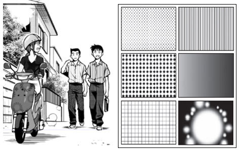
#and i gave krita two tries
Text
gonna say it outright. the only other program on that poll that doesn't suck to me is ms paint. can't entirely speak for procreate because i've never used it and i'm barred out of ever using it. but i get the feeling i'd hate it too
#🔪.text#sorry for being a hater.#not sorry about photoshop tho it does suck#but i think paint tool sai sucks. hated clip studio. did not like krita#and i gave krita two tries#first try was years ago and i gave up very fast because i couldn't even figure out how to draw on it. it Did Not Work#second try was late last year#and i still didn't really like it that much#but tbf i have been using medibang for... probably almost ten years now at this point#nothing else works the same as it and i hate that#i want to be able to use krita or some other Better program so bad#but i just hate them all!!#and they don't work for me!!#and i don't want to have to completely retrain myself on how to use an art program!#that's fucking exhausting and frustrating and just. no!
1 note
·
View note
Text
Week 10
I finally did another digital drawing, this time using Adobe Fresco on an iPad Air 2. This piece was actually way more relaxing to draw than the last time I tried drawing digitally on Krita using my roommate's touchscreen laptop because nothing was glitching out. Everything worked perfectly this time and the Apple pencil felt very intuitive in my hand. I still struggled to get my line work to look nice and I'm not sure if the process in which I colored and shaded my drawing was the way most people do it but after finishing this piece I walked away wanting to do more digital art which is a victory in itself.
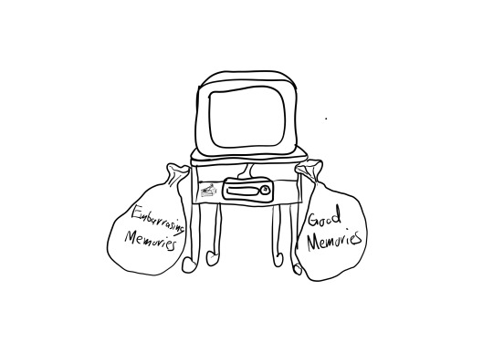
When I walked out of Manga in New York I finally understood the importance of how the presentation of an art piece can add to the overall experience of the audience member. This was a quick sketch I did in Adobe Fresco of how I was planning to display my animation. I'm thinking of getting one of those old TV carts that I would often see in elementary school where it had a big CRT TV that was hooked up to a VCR. The VCR is just for display because I'm not sure how to put my animation onto a VHS tape and even if I did it doesn't really add anything but I was planning on displaying my animation on the CRT TV. The reason the setup is like this is because this is the same setup that the two brain cells have when they are watching Dillon's embarrassing memories. I will also have two bags that will be labeled Embarasing Memories and Good Memories, after the audience member is done watching my animation they will write one happy memory and one embarrassing memory on an index card/cassette tape and throw them into their respective bag. I'm not 100% sold on this idea but it is a good start.
youtube
My professor recommended that I watch more animated short films that weren't just from previous alumni to broaden my horizons in terms of storytelling in a short animation and the way animation is used as well as its quality. I saw 10 animated short films but I'll only talk about the ones that stood out to me starting with This Actually Happens A Lot by Tom Law. I remember my professor asked me to explain why I love animation so much and I showed her the transformation sequences from Ben 10 (2005) and I just said "I mean just look at that". But she didn't see the same thing I did and said I needed to look deeper for the reason and I feel this short gave me that answer. Animation makes the unnatural feel natural without needing to explain why it is the way it is. In this short, we see that the male character's social anxiety is causing him to stick from wall to wall and be suspended in thin air. Obviously, this doesn't happen in real life but I didn't question it, I accepted immediately that this is how this world works and because of that I'm more in tune with the author's message instead of fighting the way he presented it, creating a much more enjoyable watch. If this was live-action I would be more interested in how they did the effect rather than what the point of this character being suspended in mid-air is supposed to represent in the first place.
youtube
Resilience by Yunie Choi gave me a new perspective on the horrors of war and life after death. They used animation to do a timelapse of a decaying corpse over the course of several hundred years and it is quite beautiful to see how life moves on without you. The use of colors and interesting animal designs really add to the beauty of this animation.
youtube
This guy, Manu Mercurial, does a lot of YouTube tutorials for animation but I haven't seen his animated projects in full before. I thought it would be topical for me since we are both interested in the subject of memories. He very much took a very different approach from what I was thinking of doing but I still think it was a good watch to see how people visualize revisiting their old memories
youtube
I like Afternoon Class by Osro for the same reason I like This Actually Happens A Lot, I don't question why this kid's head turns into several heavy objects but I have an immediate connection to it because I understand the feeling of trying to stay awake in class. Also, the use of sound effects is excellent in this short.
youtube
I put Forget Me Not by The Lonely Star Studio on here because it shows that even with terrible voice acting and mic quality I can still appreciate the animation of this short which has also been a huge stressor.
youtube
Bounty by Arrowmi is on here because it has the opposite problem of Forget Me Not it has amazing voice acting but the art style and animation are pretty rough. It's not bad but it's not super pretty to look at either. However, it was still able to tell an intense story of an ex-bounty hunter and suck me into the world despite its noticeable drawbacks.
Going back through my old script ideas, I had this one part where at the climax of the story the main character would wake up in a car sitting next to his dad. He's in shock because his dad is supposed to be dead and yet here he is just driving nonchalantly, the main character knows this is a memory but he decides to ask his dad a bunch of questions to see if his dad would still be proud of him if he were to meet him as an adult. I feel that this entire scene I made was inspired by this Spiderman story I found 2 years ago on Instagram in which Peter gets 5 minutes to talk to Uncle Ben after years of being Spiderman, this story really connected with me when I first found it because what I want the most in life is to just ask my dad "am I doing good". There are a lot of things that I struggle with; not being masculine enough, I'm almost 23 and still haven't had a girlfriend, and I constantly wonder if I picked the right career choice. I don't know if my dad struggled with the same things but I assume that he didn't and I often feel that if he were to meet me as an adult he would be disappointed. I know that most likely he would say that he is proud of me despite all my shortcomings because that is what parents are supposed to do but the fact that I will never get that answer kills me. I decided to read all 3 parts of this story to get a better idea as to what led up to this Uncle Ben interaction and it was pretty good, if you watched Spider-Man 2 it hits the same story beats. Lately, I've been thinking of scrapping the two-brain cell idea and instead animating the car scene I described earlier on its own.
REFLECTION:
I'm really happy that I finally found a groove into digital art and I'm hoping this will finally jumpstart some animation this week. I'm also glad that I watched all those animated short films, they all had their unique quirks and drawbacks that you don't normally get to see in professionally animated TV shows. I also want to explore the idea of being able to talk to a dead relative for a brief period of time before you never see them again.
5 notes
·
View notes
Text

You guys sleep on their friendship too much 😔
Time-laspe (I tried to download the video and attach it to this post but I think it was too big and my computer is tired because it won't download. That is the link, you can watch it if you'd like too, I know I like to watch art time-laspes. It is around fifteen minutes though, I didn't know how to make it any faster so there's your warning)
(Okay so I'm just now realizing that the part of the video where I used actually colors got cut off 😐And I can't even fix it because I've already deleted the clip off my computer and emptied my recycle bin. I'm so upset now, I'm sorry 😭😭I'm not a tech savy person at all)
You don't have to read this if you don't want to, it's more of an artist's note to myself. If you want to know more of my thought process while doing this then you can read it though.
First, I just want to give credit to the base I used!
Second, I used Krita to draw and Canva to put the video together. I've never really used another drawing app/software thing before (I've used Procreate a few times on my sister's IPad but it's not like I'm going to draw anything South Park on there) so I don't really have anything to compare it too. It's free though so... how much better can you get. The only thing I don't like about it so far is that the fill tool kind of sucks but it's not too bad, you just have to go over the edges to get a solid color (at least from my experience). And I've been using Canva for a while now, I've put together a few videos before but not in a while so I was a little rusty. The only thing I don't like about that is that I have to pay for an upgrade if I want to download a long video.
I started trying to draw seriously in April and now it's July so it's been like two months (?). I haven't posted anything since May I think but I've still been drawing a lot, I just haven't finished anything worth posting up until today.
I started out drawing this thinking it was going to be bad. Then about halfway through I thought it might actually turn out alright. Then I finished it and I kind of hate it. I think it would be much better if I practiced shading and textures but I'm too lazy for that, at least for now.
I hardly know anything about art, whether it be digital or traditional. I don't know anatomy, color theory, perspective, none of it. You can see on the time-lapse that I basically traced the base I used, did the faces and clothes and then colored it and that took me ALL DAY! Granted I had breaks like when I made my lunch and ran over to my grandma's house but other than that, I've been working on this piece (along with Stan but I did most of Stan yesterday, I just colored him this morning).
I have mad respect for every single artist out there because this is so hard... but for some reason I want to keep doing it. I know it's going to be super satisfying to look back on my art work from two years ago and see how much I've improved (hopefully I've improved, please tell me I'll improved)
As you can probably tell, I didn't get everything in the time-laspe. Recording the process was so hard, I tried to do it with Stan yesterday but I barely knew what I was doing and I kept getting called by my mom to do stuff so I had to keep pausing and un-pausing so I gave up and tried again today. I think my computer is worn out by working all day because not only have I been drawing on it all day but I have also been editing the video all day. I really like when artists post time-laspes though because it gives me an idea of their process and it's really nice to watch.
But anyway, I ended up giving Jason eyeliner because one) he's metro, two) I headcanon him wearing eyeliner (same thing with Tweek) and three) he needed a little something MORE to him, if that makes sense. I orginally wasn't going to give him eyeliner because I was afraid he would look too much like Tweek but once the picture was done, I decided they wouldn't look too similar. I also gave Tweek and Jason both freckles because for Jason, it's canon and for Tweek, it's my headcanon for him. You probably can't tell that Tweek has freckles because I made them really faint (on purpose) and I like to think he'd only have a few on his cheeks and nose. I gave Jason a lot though because I'm pretty sure that's how it is in the show. Lastly I forgot to color Jason's shirt in so that's everything that's not on the video.
I think the hardest thing for me was the eyes and the clothes. I have a love-hate relationship drawing eyes. I love looking at how different people draw their eyes but when it comes to drawing my own eyes... yikes 😬Also I think it's the facial proportions that might make this seem off, I think I have a bad habit of making the eyes too big but that's what I've been doing ever since I was a little kid so now if I make the eyes small, it just looks off. And again, I didn't do anything shading so it probably makes the picture look flat. Plus I have no idea what I'm doing.
I also usually have a hard time drawing hair but today I had a pretty easy time doing it. I was really surprised. Also another headcanon of mine for Tweek is that he has platinum blonde hair. I love platinum blonde hair and just blonde hair in general and his hair is SO YELLOW, I feel like if he was older than he'd dye it. Also they are both teens in this picture.
Tweek looks really pasty here, I tried to give him pale skin but I didn't mean for it to be THAT pale.
I think that's all I have to say. If you read this and have any tips for me, I'd love to hear them. I'd love to redraw this in a few months or maybe in a year if I decide to keep drawing, I know there's defiently room for improvement.
Despite all the complaining I just did, I don't HATE this picture per say. I really like my art style, it's simple but cute (imo of course). I feel like if I learned more about shading and learn how to draw faces and clothes better than I'd do a lot better. I think Stan was a lot cuter but this is cute too.
Lastly, ignore the two random dots if you find them, I'm too tired to fix this.
Anyway, if you read all of this, I really appreciate you! Have a great day/night! ❤️❤️
#south park#south park fanart#tweek tweak#jason white#sp tweek#sp jason#sp twason#twason#tweek x jason#jason x tweek#this can be seen as platonic or romantic#metro tweek#metro jason#south park is gay#south park metrosexual#my art
8 notes
·
View notes
Text
Digital Drawing and its things that annoy me
I am here to discuss about Sai and Krita, and say some things I don't like and some things I like.
first of all I must say that Sai is better than Krita for me, because of the fact that I adapted better with it than with krita.
Although Krita has great brushes, good resolutions and renders very well, it is very difficult to use, I understand that the intention is to be a little more professional but it ends up getting lost in that and becoming kind of a messy platform. Nothing intuitive and it has some bugs from time to time, if the file is too heavy it ends up crashing.
Sai also has this problem of the file being too big and crashing the pc, but it is much, MUCH, easier to understand and work with it.
For you to change the brush settings in Krita is hell, because they try to be professional and imitate photoshop but it ends up being very confusing (honestly I stopped messing with the settings because I got frustrated after trying so many times)
The presentation of the program, Sai, is cleaner and more intuitive whereas in Krita you have to say a big prayer to GET it working.
I keep using Krita because the brushes are really good (hard to set up, but good), and they also have a great variety. But the program itself I already gave up on it.
Not to mention that, within the program, there is an animation mode that is worse than hitting your mother. I tried to give it a chance but I didn't adapt, not only because there are many things that I consider unnecessary, but also because I spent many years using Sai and got used to it.
I'm not going to get just Krita for Christ. Now it's Sai's turn to be carved.
Currently (as far as I researched) there are two versions of Sai. The first version was average, it had very different brushes but as there were many brushes none of them managed to be excellent, or minimally good, they were all… Meh. The textures of the brushes? Meh. Nothing too extraordinary. The screen resolutions were very low because they had a very low threshold.
Here comes the Sai update, Sai 2. THEY REMOVED ALL THE BRUSHES TEXTURES!!!!!????? (only some brushes were left with the original textures) They added the mirror tool, and the text tool and increased the resolution limits. That's it. For the rest? They took everything!
And not to mention that, there comes a point when you are drawing and it simply informs you that you have no more memory, and you can't continue with the drawing???? WTF?
Both versions of Sai have that stabilizer thing, I admit that Sai 2's is relatively better ( Krita doesn't have that, and to change its stabilizer you have to change the settings of all the brushes HAHAHA >:) )
To summarize, the two are not the best, but Krita's platform annoys me, and Sai's platform, which was supposed to be updated, lacked a lot of things that were its differentiator.
I hate them both haha
Lie, I love Sai <3
#paint tool sai#kritadigitalart#softwere for drawing#digital drawing#things that only people who make digital art will understand#artists on tumblr#that pisses me off#painting
0 notes
Text
Face to Face Fanart Chapter 45
For @dp-marvel94, an illustrated adaption on a pivotal scene from her longform fanfic, Face to Face. This is page one of two.
Ramblings and a black and white version below the cut.

So yeah that top panel gave me trouble. It took me a while, but I realized that while I could get away with it in black and white, something about adding color really emphasized the window over there, essentially turning it into the focal point of the panel and completely distracting from the Danny and Phantom in the corner.
That said, I still like the original enough that I thought it would be fun to include as an extra.
If anyone knows of a font available in Krita that doesn't cause eyeburn, I'd appreciate it. It's rare that I want to switch back to adobe, but in that moment, I was tempted.
I tried to keep Phantom and Fenton as close in looks as my ability as an artist allowed. I originally wanted Phantom to have fangs, which are still visible in the black and white version, but cut them out later on to prevent his mouth from looking weird (trust me it looked weird.)
The difference in pupil size actually goes a little bit deeper than my usual "rule of cool" philosophy: It's meant to serve the twofold purpose of implying Phantom's greater light sensitivity, while also making him look subtly more predatory and dangerous than his human counterpart. The idea was to invoke the feeling of a tiger or a hawk.
In terms of colors, this would be my first time drawing Phantom green! Since I wanted to emphasize his eyes as much as possible, I opted for a Dan-esque teal.
#Danny Phantom#Fanart#of a fanfiction#It's fanception!#Digital art#color#Black and white#Comic#My post
51 notes
·
View notes
Text
Gymrat!AU Masterlist [TSS]
Since this AU is accumulating enough material for it’s own masterlist...
Mind the tags/descriptions/ratings!
Human / Slice of Life. The Sides workout at the same gym, with different histories and motivations to hit the mat. (Lots of platonic DLAMPR stuff to be expected here!)
[ Ao3 Series | Tumblr Tag ]
Playlist - “Body Movin“ [ YouTube ]
Writing
Cherry Cola (Teen) - [ Ao3 | Tumblr ] - Roman is forced to face his own limits, during one particularly reckless day at the gym. Roman-centric.
Taste The Heat (Mature) - [ Ao3 | Tumblr ] Remus has many reasons he enjoys doing exercise. It’s healthy. It’s distracting… let’s just say, there’s “self care” and then there’s self care. Remus-centric.
The Wheels Keep Spinning Around (Teen) - [ Ao3 | Tumblr ] - Remus is incorrigible, but Virgil doesn’t mind. Tree poses or spinning kicks, stress relief is stress relief. Virgil-centric.
“aching, shaking, breaking (like humans do)” (Teen) - [ Ao3 | Tumblr ] - Remus thinks Hypnos has abandoned him for good (metaphorically speaking), Patton is there to help. Patton-centric.
“more than ever, hour (work is never over)” (Teen) - [ Ao3 | Tumblr ] - Logan goes for a run, and hits a snag when Roman seems to have found himself in trouble. Again. Logan-centric. (Happens ~1 year before “Cherry Cola”, to be clear.)
“i started thinking about human nature...” (Teen) - [ Ao3 | Tumblr ] - Janus thinks Remus started off on entirely the wrong right foot with him. This is how they became best friends since. Janus-centric. (Prequel fic, taking place in high school!)
“taking is too easy, but that’s the way it is” (Teen) - [ Ao3 | Tumblr ] - Roman may or may not be prone to getting sick, thanks to his abysmal sleep hygiene and questionable self-care habits. He’s totally not sick. He totally doesn’t need a helping hand. Roman-centric.
“you work at a smile, and you go for a ride” (Teen) - [ Ao3 | Tumblr ] - Patton’s always taking care of everyone else, that sometimes he forgets that he deserves being cared for, too. Janus helps him through one of his tougher days. Patton and Janus centric.
“what the hell is love supposed to feel like?” (Teen) - [ Ao3 | Tumblr ] - This was technically not the first time the two of them met. That was a painful day Janus couldn’t forget if they wanted. A day Roman apparently did. Maybe they both needed the fresh start. Roman and Janus centric.
“you gave me nothing at all” (Mature, only because of movie watched) - [ Ao3 | Tumblr - P1 + P2 + P3] - Let’s just say Virgil really left an impact on Remus when they first met at the fated gym... with their first date, as a treat. Remus and Virgil centric.
“can’t you see i’m a fool in so many ways” (Teen) - [ Ao3 | Tumblr ] - Roman screwed up, big time. It’s going to take a lot more to even begin to pick up the pieces and everyone tries their best to help. Roman centric.
“when you find out you live without it (go along not thinkin' about it)” (Mature) - [ Ao3 | Tumblr ] - For Janus and Roman, it’s a good day to really treat themselves. Navigating around their mutual needs and limitations takes some creativity. Roman and Janus centric.
“so what is right and what is wrong? (gimme a sign)” (Teen) - [ Ao3 | Tumblr - P1 + P2] - Janus played a part in the twins’ self-discovery, and no, she’s totally not smug about it. Janus, Remus and Roman centric.
“when i needed sunshine, i got rain” (Teen) - [ Ao3 | Tumblr ] - A couple slices of Roman and Virgil’s frictive first impressions, an olive branch is extended, and a strange truce blossoms. Virgil and Roman centric.
“mama, help me, i've been cursed” (Teen) - [ Ao3 | Tumblr ] - Remus has a not-quite-monthly visitor arrive. He’s going to make that everyone’s problem. Remus centric.
Art
Krita Practice / Concept Sketch Series - [ Photoset | Logan | Patton | Roman | Remus | Janus | Virgil ]
Character Profiles + Chrono Fic List [ Ao3 ]
Memes
Get to know... [Sexual/QPP] Roceit & [Romantic] Dukexiety
Get to know... [QPP] Intruloxiety
More TBD...
#sanders sides#roman sanders#remus sanders#janus sanders#virgil sanders#logan sanders#patton sanders#gymrat au#spilled musing#pixel spill
3 notes
·
View notes
Text
of mice and artblock
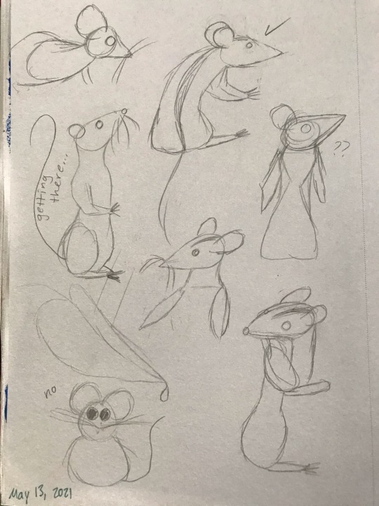
So, midterms happened and I abandoned this blog for a while. But now I’m back, and I come bearing mice.
*
I’ve been really struggling with finding subjects I like to draw. I’m happy to work on skeleton studies until Judgment Day to better understand anatomy, but I know I need to balance “homework” art with “for fun” art, or else risk losing motivation for learning to draw -- and I’m so used to writing fiction at this point that no subject really appeals to me artistically unless it’s got 5,000+ words of story attached (or at least some narrative/character ideas, yanno -- something for my brain to pick at). The obvious solution is to draw concept art and characters from my written stories, but I feel really intimidated by that because I’m such a beginner artist that nothing I create now will do justice to the vision I have in my head.
I need art OCs and concepts – things that I will only draw art of, and have never written a story about. Stuff that doesn’t have to match a previously established, written story, and that I can change as I learn more and my skills improve.
I ended up drawing a bunch of mice.
This was initially just a whim. Human anatomy requires a lot of skill to pull off, especially faces and hands, but mice felt more beginner-friendly to me. Admittedly, I was going for a more cartoony style as opposed to photorealism, so if you’re looking at this from a realism perspective then these are pretty poor mice. However, I don’t feel ashamed of them, which I am taking as a good sign.
I kept drawing one mouse over and over. I ended up calling him Leo just because it was funny – “leo” refers to lions, but here Leo is just a little mouse. But of course, giving him a name (and a gender, incidentally) is the start of a story. Via a flight of fancy, I got it into my head that I wanted to do a painting of Leo trying to catch a big snowflake. I made some thumbnails of what I wanted the scene to look like, and then cut out a roughly 7 inch x 7 inch piece of watercolor paper from a big sheet that I had under my bed, sketched the scene in pencil, and then finished with watercolor pencils (and a white gel pen for the snowflakes). The process probably took 2.5 to 3 hours.
So, now the lore is that Leo is a mouse living in a little house in an old tree at the edge of the woods, and he wears a red scarf. I did not like this painting. It seemed over-saturated and the colors didn’t quite work the way I wanted them to. I ended up watching a tutorial on color theory, and decided to redo the painting using my newfound knowledge of color schemes. I used this color palette tool to get an idea of what kinds of colors would look good together, and settled on a complementary scheme with bluish green and brownish red.
And then, everything went wrong.
I tried to redo the painting, still working traditionally. I rushed the sketch because I was so eager to get right into working with color. This time, to avoid over-saturation, I used watercolors out of a pan rather than in pencil form. Mixing the colors in the lid of the pan took a really long time because I was so picky about shades, and because I continued rushing I didn’t allow the layers enough time to dry. Leo’s scarf (now green instead of red) bled into his russet fur, and the mailbox was the wrong shape, and I tried to erase a pencil line and created a dark blotch over an area that was supposed to be white with snow – and then I gave up.
I had downloaded Krita, a piece of digital drawing/painting software, a while ago, but hadn’t had any success using it because my desk isn’t big enough to accommodate both a laptop and my small tablet. Using my lap to hold the tablet was an exercise in frustration, and I knew so little about how digital art works that I just felt really overwhelmed and lost whenever I opened the program.
However, Krita (like most digital art software) has an undo button that I find very alluring, so I decided to try it again, now on a shiny new desk from Ikea that is actually big enough to support tablet and laptop together. I think just the space on the desk really made all the difference, but also I was determined to get this artwork of a mouse to a place where I felt satisfied with it.
I spent a solid 5 hours working on what ended up being a very simple colored drawing of a mouse catching a snowflake outside his little house. I barely blended anything at all, and there’s no light source that required me to shade anything – it’s just flat color. However, I really like these colors, and I think I did well (for an absolute beginner). I want to go back and add textures/shading to give an impression of depth, but I'm not sure how.
Leo – like all of my figures – feels really stiff, so I also want to work on gestures/studies of mice doing things. And, thanks to the popularity of mice as lab animals and pets, there are way more reference photos of mice than I expected! Most refs depict the house mouse, Mus musculus, but I did find the work of a wildlife photographer named Dean Mason who spent 15 years photographing harvest mice (micromys minutus).
Unfortunately, all of the prior artwork in this post I had drawn almost purely from imagination, and I think it shows. I studied two mice from photos in pencil, then erased the lines until they were barely visible and tried to do the fur texture in ink (with a dip pen, so there is some unevenness when the pen was extra inky).
Left is my first attempt doing the fur texture. I was more cautious with layering pen strokes, so you can see the lines of strokes fairly evenly. Right is my 2nd attempt, where I was bolder with the pen. I like these mice more than the one I created in the digital painting; these ones (especially the right) feel more Beatrix Potter-ish, which is a vibe I like.
Do I want to go back and fix the anatomy in my digital art of Leo? Yes. I also want to take another stab at doing this piece traditionally, but this time, I'd go monochrome and try to do everything in brown. However, part of me is exhausted from drawing ten million snowflakes and does not want to relive that experience with a gel pen -- I've already done it once with a tablet pen, and that was enough.
I have a hazy, far-off goal of creating a comic of Leo having adventures with another mousy friend, but that’s so far in the future that it’s not worth spending time considering right now. In the nearer future, however, Leo’s friend might become a reality – I know he’s an albino mouse (name TBD) who either escaped from a drug-testing facility (I loved The Secret of NIMH movie as a kid) or else is a pet who was dumped into the wild by a human owner who no longer wanted him. Leo is outgoing and adventurous, and this friend is shy and cautious.
2 notes
·
View notes
Text
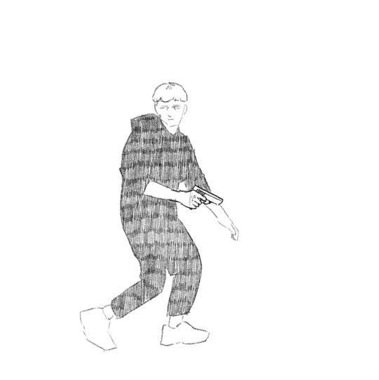
𝕮𝖗𝖊𝖆𝖙𝖎𝖓𝖌 𝖗𝖔𝖙𝖔𝖘𝖈𝖔𝖕𝖎𝖓𝖌 | 23/10/19
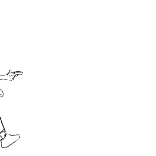
During the morning we went to the photography department of the school where we would start the day off there by filming our own footage to rotoscope later on. There were no restrictions as to what we were allowed to do in front of the camera and green screen, but we had to move from one side of the screen to the other. I decided to go for a gun man or James Bond type of vibe. I didn’t want to just do a simple walk or run cycle, but instead I wanted to challenge myself a little. I did this by sneaking into frame, holding my hands up as if I was holding a gun (this added a prop that I would have to draw form scratch during the process of rotoscoping) then doing a turn and running back out the frame. When recording the clips in the green screen room, I also decided to turn around and then turn back while moving to add to the difficulty of animating everything together. This is how both of them turned out:

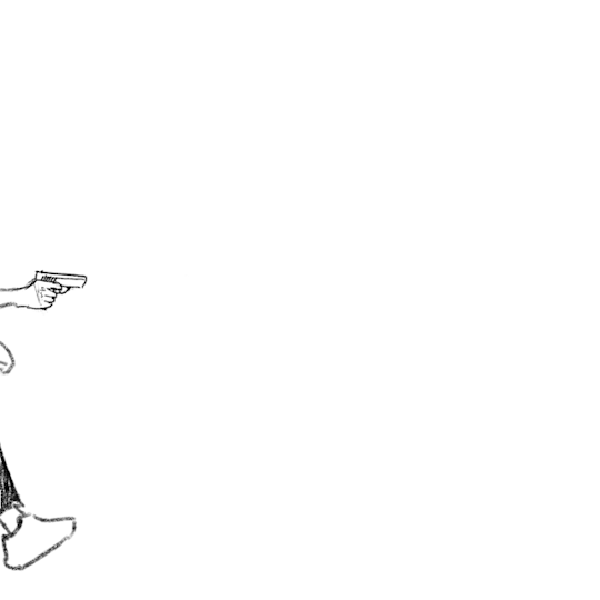
I decided to go with the first of the two clips for my rotoscope. I did this simply because of the turn being slower and therefore making it more challenging to animate the gun to follow the movement in such a way that it won't look “out of place”.
I didn’t find the time during college hours to actually do the rotoscope for this, so I did it at home using my own program (Krita) and my drawing tablet.
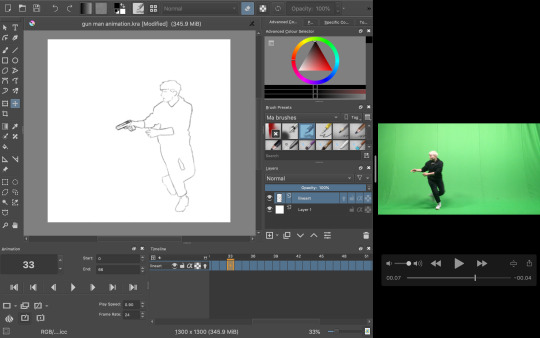
The process was relatively simple; I took the video and took a screenshot of each frame as I went, dragging the screen grab onto the canvas and began tracing my figure. As I went, I also drew in the gun for each frame, lining it up with the position with my hands.
To keep the appearance of the gun consistent I copied most of the frames, up until I came to the part where I had to change the perspective of which the gun is seen from (during the turn).
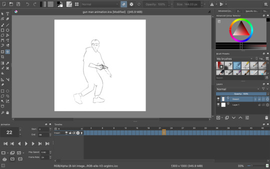
Once I had finished the whole rotoscope this is what I was left with:
The finished amount of frames came to 66. Quite a high number for such a short animation, but I didn’t want to take away from the fluidity and smoothness. Now I could have just left it here, but I wanted to do some more experimenting. I tried out filling in the clothes with some texture to create a more interesting looking sequence, but half way through I decided to go back to the original linework since I just wasn’t happy with how it was turning out, but here was that in motion:
Instead I did a bit of brainstorming, thinking about what I could do to improve what I had already made. Here’s the mindmap of the brainstorm that I did:

So as you can see, I ended up wanting to experiment with depth, leading me to be doing something to the background. Most of the mind map is based off visual language. I found using this as the root for my brainstorm really useful due to the way you can interpret each term differently to whatever the context is. I will definitely be doing this again and experiment with it further in the future.
I had also settled on wanting to keep it monochrome (misspelling in mind map) and more specifically drawing towards the style of the classic black & white manga comic book style. Based on this, what immediately popped into my mind was this program I recall trying out years and years ago called Medi Bang Paint Pro, or as I think it was used to called; Medi Bang. I was probably around 12 or 13 when I first downloaded it, but I didn't know what I was doing what so ever, so I quickly gave up. For a long time it wasn’t compatible with Mac up until recently; so I decided to take a shot and download it again. The program is free; but that wasn’t the main reason to why I wanted to try out this program again in particular. It has a lot of great tools for drawing and building comic pages, and I thought “What would it look like if I made a background inspired by traditional manga?”- so that’s what I did.
I wasn’t sure if I was going to be able to pull it off at first, so I did a little test run beforehand and I really liked the result:
So the way that I did this was by taking a picture (that I unfortunately have lost now) and then proceeding by changing the levels of the picture, playing around with it until it’s primarily just blacks and whites. With a brush tool I began cleaning everything up a little by either erasing unwanted bits or adding additional linework just to emphasise on the subject and shapes within the drawing. I added leaves and other vegetation with some pre-made brushes that came with the program. The last step was to add a screentone of a clouded sky to add a bit of texture, shading and general interest to the whole piece, and voila! Done. This technique is super quick and efficient for creating backgrounds for comics of this style, though I still prefer when everything is painted by hand. The screentone has a very recognisable style to it and is quite often used in manga’s. One of the ones that come to mind for me is Berserk. I have always loved the artwork of that comic series; it’s the kind of art that you could stare at for hours on end and not get bored with. When looking at the artwork from the series, you can clearly see the technique of screentones are being used to create a lot of additional detail to each panel.
Here are some examples of some screentones:
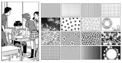

In this example, it has been used for the background. A screentone with blobs lightly shaded has been added to almost create some sort of mist, changing the whole mood and feel of the panel very effectively.

Like mentioned before, in Berserk, the screentones are mostly used as an extra bit of atmospheric detail, rather than being used for any of the shading which is all hand drawn. In this example, it has been used for the lettering/type and again for the background. It creates a gritty and sort of dirty effect, emphasising how he is in a battlefield with monsters around him; definitely not a place you could call “clean”.

In this example, different kinds of sceentones have been used in each panel. In the panel to the left, the opaque stripes are a type of screentone very often used to indicate either speed, focal point or action of some kind. Not only that, but at the bottom of the panel a softer pattern of screentone has been used to create the look of dirt or sand, again with a gritty texture to emphasise on the fact that the character, Guts, is inferior at this moment.
In this super epic and intense illustration, you can again see the great use of screentones, most notably used for the background yet again. It really helps to create a strong feel to each illustration. The use of tone is especially important in manga or comics, since it so often is done in just black & white, so you have no use of colour; this is where screentones come in as a great tool to use for just this.
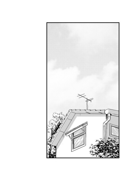
So, with all of this brainstorming and researching done, and by using the same technique as I did when doing the “test”, I began drawing. I used this picture which I recall taking somewhere on the border to Germany as the base image:

I chose this because it has that “street” vibe to it, which I thought could be cool with the whole theme of “gun man”. Very edgy, very edgy indeed.
This gif above shows loosely the process of the piece from start to finish. It was mostly just me playing around and figuring out all the tools of the program, but it was quite fun to put together.
With the background now complete, I put it into my rotoscope, went over each frame and painted the shape of myself in the animation white and was finally finished with the final rotoscope; being the third version or option that I did.


I am very happy with how it turned out in the end, and I have definitely learnt masses with this exercise of rotoscoping something that that I have filmed myself. I think if I were to further improve on this, I’d definitely consider animating the background itself (birds flying or leaves rustling), or maybe even try shading the subject somehow, taking inspiration from manga’s such as Berserk or any of Junji Ito’s work.
I decided to try out asking a few of my peers in the class what their opinion was on the final rotoscope. The feedback that I received was purely positive; the people I asked said they couldn't think of any particular way of improving the finished product. They said it both looked great as well as it answered what the task was questioning and challenging us to do.
To me, this really shows and proves that the work I have done here is successful work that I can be proud of and take what I have learnt through doing this task with me for the future, without doubting if what I have learnt is of quality.
✄┈┈┈┈┈┈┈┈┈┈┈┈┈┈┈┈┈┈┈┈┈┈┈┈┈┈
As a little extra note, here are the same frames (frame 23) in the three different versions:


4 notes
·
View notes
Photo


Colored THESE TWO! I tried painting the shading a few times...but it looked like an ugly mess, so I gave up and used airbrushing. Still, I tried to make it look more blended and natural than my usual cel-shading style. It’s...not great, but at the same time I think it’s a step in the right direction!
Also, the part I’m most proud of is putting in a background! Even just a random shape and color, I’ve been trying to figure out how to do that. I feel it really adds something, but I’ve never had an eye for how to pull it off, so I’d like to start trying!
Done, as always, in Krita.
4 notes
·
View notes
Text
me trying to make a gif part 2 (thrilling finale, buildup ver.)
ok good news and bad news: good news being withheld for Spoilers (not that it’s that hard to guess anyway lol), bad news explained first bc, chronologically, it is first
so yesterday i mentioned in the tags of that post that i had seen that krita has an animation feature so i was gonna try importing the frames into that and then exporting it as a gif. easier said than done, as it turns out
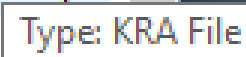
i started by opening the file i made yesterday with 62 layers as the frames and importing that into krita, which worked fine (i didn’t know you could actually open .psd files in clip stuido ((this typo is so fucking stupid it made me laugh so im leaving it)) and krita, so that’s pretty neat, i wonder if it works the other way around too) but i ran into problems when i tried to convert those layers into frames in an animation. because, like, the layout of the program has the layers displayed in one tab, and the animation timeline in another, like so:
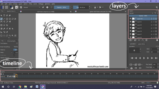
(do u like how im using pictures now, i thought of that yesterday after i published the other post and realized hey, visual reference would probably make my plight a lot easier to understand!! so enjoy these educational diagrams from now on)
so my goal was to get the frames from the layers into the timeline, and i still don’t know if i did it right bc lbr krita is not very intuitive at all,,.,, i mean i watched a video tutorial abt how to animate in krita which was v helpful (it’s the one by jesse j james on yt fuckin SHout out) but it was about animating from scratch, not importing an animation you’ve already done elsewhere
so like, the way krita’s animation thing works, from what i could piece together as i bumbled my way around w/ it, is that each layer in the layers tab is a separate timeline in the,,, timeline tab
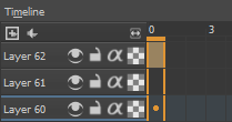
i want them all to be in the same timeline, not separate ones, and there’s no way to combine them in the timeline tab bc doing that just overwrites whatever layer you’re pasting it down onto, and also if you define the number of frames for that timeline (62 for this project) it just puts the single image of that layer for all of the frames instead of just one of them, so you’d have to go through and delete all the other frames you don’t want it to be, which would be such a fuckin pain
so i found a workaround, which is so tedious that it can’t be the right way to do it, but basically i started w/ layer 1 and defined 62 frames & then emptied frames 2-62, like this

(that blue box is the frame, btw, even tho it says 0, which actually kind of annoys me like why doesn’t it start the first frame on 1????)
from there i went up to layer two and selected that in the timeline, but for some reason the frame doesn’t show up automatically?

& i couldnt fuckin figure out how to make it into like, an Official Timeline Layer or whatever tf bc like, u see on layer 1 how theres that little lightbulb-looking icon on the right? that’s for turning on onion skin which only applies when you actually have frames with things drawn on them, so basically layer 2 in the layers tab has a drawing but in the timeline it doesn’t?
i didn’t find out what the actual reason for this is or how you’re /supposed/ to make the frame appear in the timeline, but what i did was right click on layer 2′s timeline & select “create blank frame” which magically made the frame i want appear
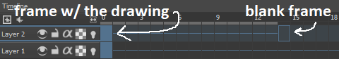
but it’s on top of the layer 1 frame, and i want it to be the frame after. also it’s still in a different timeline. this is the only easy fix in this whole damn process, u can literally just click & drag the frame from layer 2 to layer 1 and put it wherever u want on the timeline

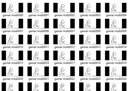
and then u just delete layer 2 and that’s it, frame transferred!! then i just had to do that for 60 more layers and after [unspecified amount of time but it was a fuckin while ok] my timeline looked like this!

(the gaps near the end are held frames, to save me time so i didn’t have to copy a bunch of frames that were exactly the same)
krita is great because as far as i know ur animation can have an unlimited number of frames, at the risk of your own pc’s processing power, which is a definite upside to SOME expensive art programs i know (clip studio, i’m talking abt csp) and u can pick the frame rate too (cough photoshop elements 5.0 even tho u dont technically have an animation feature & it’s a miracle u can even make gifs at all) so once i finally got all the frames situated all nice and in order like on the same timeline, playing it was great! played at the right speed, looped perfectly, it was a dream come true right
well, time to export it as a gif
ha
haha
hoooo oo o
so u got 2 options for exporting ur animation, u can either hit “export,” which lets u save it as different file types, one of which being gif, or you can hit “render,” which gives you gif and video options
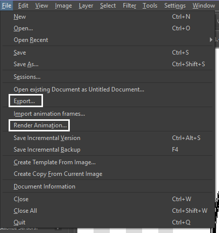
well
i tried export first, bc that seemed like a good idea, but the “””gif””” it made was distinctly not a gif, despite its claim to be one?? this is what i got:

notice: 1. it is not moving, and 2. the black bars to the sides?? those are supposed to be transparent. they’re transparent in the file i made so why didn’t they register as transparent in the export, when gifs have transparency capabilities??

so That was some real live bullshit but i still had the “render” option, right? export was wrong, so rrender must be the correct option to go to that will produce the results i am wanting to see produced in front of me like a silver dinner platter with a correctly functioning gif under the lid, that’s what i want to see and “Render Animation...” is gonna Give me that silver platter righWRONG ok look at this shit rn ok Look
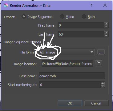
it says GIF it says it RIGHT THERE right??? right?????? then WHY

?????????????
and it also gave me all This bullshit
like did i ask?? did i fucking ask???? i already have all the individual frames why do i need even M o re i mfjgjgk
((rationally ok yea thats v useful for if ur making the animation in krita and want to export the frames to use elsewhere, but like uhhh 1. again, they’re not transparent & 2. i should have the option of saying i don’t want these??? bc *meme voice* i don’t want these)
so in the end i could find NO correct method of exporting animations as a gif in krita bc every ooption that says gif is fuckign LYING to ur face there are NO gifs in krita, aliens made the progam who looked at gifs and went “hmm i thikng this is how a gif works “ and just made jpegs instead but somehow got on the computers good side and got it to lie for them about it being a gif so thats why it says gif on the file still even tho its not a gif illimati confinr
so what is the conclusion to this? well i said there was good news too, and this is the portion where i divulge that sweet nectar (i type dthis 2 seconds ago and @ me what the fuck)
so after wasting a good 2 hours trying to figure out krita i gave up and watched some good old [youtuber name redacted bc what if it shows up in search & ppl see this dumbass post in there but it rhymes with fjackfsepticfeye] to relax into accepting my fate that i’ll never be able to upload my animations to tungle except in poor quality loopless video form, making me into a laughing stock on my own art blog, but THEN i had a stroke of genius, in my Brain
so if u read yesterday’s post u might remember that flipnote studio, the animation program i use on my ds, to animate, has the option to export files as gifs, both animated and sequential (meaning either as one fully animated gif or each individual frame separately), which is super convenient, but as i mentioned yesterday, any time i tried to open the folder with those files on my laptop, it crashed immediately
WELL today i thought “hey, how about instead of opening the folder in the sd card when it’s plugged in, how about i copy that folder from the sd card to my flash drive, and try to open it there, in case it’s the card’s hardware that’s causing the problem, not corrupted files”
so i tried that and it FUCKING WORKED THANK GOD GLORY HALLELUJAH
so now instead of spedning A THOUSAND YEARS trying and failing to force art programs to bend to my will i can just export the animations straight from my ds and drag them onto my computer Just As God Intended oh GOD im so fucking happy
here’s the gif in the end, i’m gonna post it to my art blog too but this is the Green Version bc i animate in green bc of some default settings in flipnote that i got used to, plus it makes me feel like i’m just sketching so nothing really has to be finalized so i’m comfortable while i work, and also it’s just nice ok it’s a Nice Green
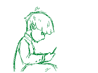
(there’s a few frames at the end that are like the extra scraps from while i was working dw i got rid of those in the final version that i’m posting to my art blog later. also i added my blog url to that one too it’s aaaaaall good)
the only downside to this method is that i can’t change the canvas size to be 540px wide to fit with tumbrl s image dimensions but whatever i can just post them in a text post and fix the html to display it at its original size instead of the resizing bullshit tmurbl pulls constantly ugh. anyway it works great on desktop but it’s inevitably gonna look like shit on mobile no matter what i do *Big Ass Shrug*
anyway thats the end of my success story uhh i can’t make the like comment & subscribe joke again bc i already did that in the last post so like bye i guess thanks 4 watchign & have a great day i’ll see u in my next fvideo
https://www.youtube.com/watch?v=YYob4uDjEKI&t=0s
(^that’s my outro music)
#this started out so boring like a tutorial (but made by someone who doesn't know what the fuck theyre talking abt)#& then things derail Real Quick#that's why this is the ''buildup ver.''#retag later#talkin bout stuff#today posts#rieley's wips#(me: i can't mention this youtuber by name in case my post shows up in search#me: *adds a link to the post rendering that effort for naught*#me: *leaves it anyway bc it's funny*)#pls listen to the outro musi c it's rly good & tunmgmldnr wouldnt let me embed the video & idk how to do it thru html & too lazy to look it#up :(
2 notes
·
View notes
Text
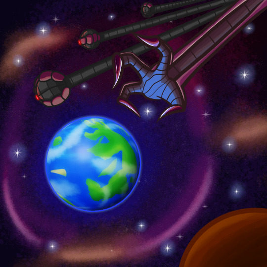
AX3001: Oddyssey TV Show - Incorporating 3D into my artwork
For the background of my book, I wanted an image of the Planet Dirt in space with the Singularity’s hand reaching down to claim the planet. Since I think that’s a really striking image, however, I absolutely hate drawing the Earth or planets that should look like the Earth. So, to make my life easier and to develop the Planet Earth a little better I thought making a map of the entire world would be a good idea.
Blender
I have been getting into 3D a little bit over the past few months and since the Earth is just a ball it wouldn’t take much effort to make it because the sphere is a default preset in Blender.

It looks a little rough with no shaders, I tried my best to smooth it out and this was the best I got.
World Map Template
When designing a planet similar to Earth, a good idea generally is to find a good picture to draw inspiration from. Get a feel of how the world looks and how you should draw it. I found this Earth map and thought it would work pretty well since it’s got this grid over it and everything should line up.

However, importing the map onto the sphere really didn’t look accurate. Just look at the UK right there. So, I went back on the Internet and found a much better alternative.

By googling, “World Map Texture” I found this quite easily and already it looks a lot better.

And on the model, it looks absolutely perfect! So, this was going to be the image I drew inspiration from to draw my own Planet Dirt.

Not entirely accurate to the Earth, but it’s not supposed to be. Some of the landmasses were just scribbles with some of them having bases. I think the most obvious is the arm shaped island in the very middle. This is where our plot takes place, beginning at the very bottom of the island and ending their journey at the top where the hand will be. I just thought that it was a nice reflection of the Singularity reaching out and an island like a hand almost reaching back to the oncoming threat.

A few other islands are based off body parts, mainly because I thought it was a pretty cool image and could maybe start some speculation amongst audiences that might wonder what happened to this place and why do these islands just happen to look like an arm or a foot or a chest. Maybe some apocalyptic event has occurred and this one island has broken up, I guess we’ll never know.
The island located where America would be is modelled after an Eagle because that’s a symbol of America and freedom and all that. I tried to make it not super on the nose, so i broke away some of the talons and stuff.

Importing it into blender, I didn’t like how big the main island appeared on the sphere. So, I quickly reopened Krita to make a smaller version of the islands.

And boom, it’s a little better. You don’t see the other islands I worked on, but I know they’re there and that’s all the matters.

Using what little 3D knowledge I have, I used two sun lights (Mainly because they’re the only lights that seem to work for me in Blender) and thinking about how I’d incorporate it into my background. I wanted the sunlight to come from the left since I wanted the Singularity coming in from the right. And having the shadowy part of the Planet Dirt on the side of the Singularity, suggesting that the Singularity’s power is already spreading through the Planet Dirt.

The shadows cast onto the Planet Dirt weren’t super dark which can make 3D renders look really bad and even though it wasn’t really needed, I added a fill light that gave the shadowy part a purplish colour since I was going to make the space background have a purplish hue too and it turned out quite nice.

The final render, a little jagged around the edges, but I was much more bothered about the textures and lighting looking smooth. It was time to render my background completely and I am quite proud of how it turned out. The Planet Dirt doesn’t clash with the 2D elements of the picture.
0 notes
Text
XP-Pen Artist 10S v2
Yeah... that’s a mouthful ain’t it?
I recently got myself a graphics tablet... with a SCREEN!! I’ve been wanting one of those since I knew they existed, but for the longest time only the insanely-priced Cintiqs were available.
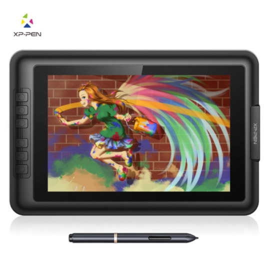
In recent years, it turns out, other manufacturers have branched into screened graphics tablets also--slowly bringing down the price to an attainable level.
I got my Artist 10S for £199.99 from Amazon. Let me tell you how it went.
From the Top
I have done art before. I was half-decent at it when I was around 10 or so. But it’s been a while. I got myself a decent “dotted” sketchbook and started sketching things out in it to run my RPG sessions. That’s really what gave me the bug to get into drawing again. And to actually buy a tablet to do so!
I downloaded Krita, a free Photoshop-like application for artists. It’s super-powerful, once you figure out how it works. But there are plenty of tutorials online about that if you’re interested in checking it out.
...But anyway, Krita has some nice smoothing algorithms you can turn on for drawing with a pen tablet. The pen doesn’t have tilt and rotation detection, but pressure sensitivity works well with Krita and gives me plenty of expressiveness to get on with. And I was pretty instantly busting out some sweet curves!
It was a pretty amazing experience, really--getting to draw freehand while also having the capability of undo, erase, etc. I’m not saying it brought a tear to my eye, but it was a nice moment. 😂
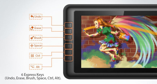
Config
The tablet has 6 “Express Keys” along the side, which are configurable to key combinations. When you hold them down, that key is held down (this’ll become important later). I currently have them set to things like canvas pan/zoom/rotate, and a couple of other “hold to use” shortcuts.
The pen is somewhat triangular along the barrel, meaning it won’t roll around on your desk. But it’s smoothed out enough to feel just fine in your hand. It has two barrel buttons, though these are only configurable to mouse various clicks and a preset “brush/eraser” toggle (which didn’t work with Krita out of the box). There is no “eraser” button at the other end (like a pencil with an eraser at the other end)... but I’d find that too fiddly and time consuming to flip it around anyway.
The lack of options for the pen is a little disappointing. Things like this are insanely easy to implement in code--as demonstrated by the express key options. So there’s not really any excuse for it other than the company being small, and this product originally belonging to a different company XP-Pen... bought out or something? I dunno. We’ll get onto them in due course.
Oh, a little side note... the configuration app is only readily accessible from a system tray icon (in Windows). This is fine when you first install the drivers. (And then install the updated drivers so the tablet actually works.) But it has a habit of just... disappearing. After Hibernation or Sleep, that icon tends to wander off somewhere.
And all XP-Pen have to say on that score is to give instructions on how to make it appear again--which only works half the time and may require a restart anyway. I’ve since figured out where the config application itself is kept, and made a shortcut to it in my start menu. In case anyone else is having the same troubles as me, here’s the file path: “C:\Windows\SysWOW64\tabcfg.exe”

Screen
This tablet has a screen! Still getting over that XD
The screen is only 10.1″ corner to corner, which is a little smaller than the average screen tablet such as the Cintiqs. But it’s plenty big enough when it’s sitting right in front of your for actual drawing.
Another reason I pulled the trigger on buying one of these is to get a second screen. I often watch various Youtube videos in the background while I’m playing games and whatnot. I used to prop my Chromebook up next to my regular monitor. This worked fine, but pausing everything when someone came in to speak to me (just a politeness thing I like to employ; nothing sneaky going on)... was a bit of a hassle. And balancing the audio between devices had its own fiddliness (besides the piddly Chromebook speakers not being able to get loud enough for quieter videos).
But now, with two monitors hooked up to the same computer, everything’s a lot easier. I can move windows between screens easily enough. And pausing a video is as simple as moving the mouse over to the other screen and clicking.
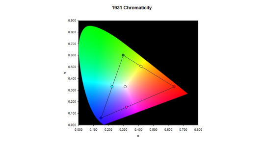
Colour Calibration
However! I am having some trouble with the colours. I was drawing away just fine, a simple cartoon character to try out the shading tools and so on and get used to Krita. Then for whatever reason, I saw the picture on my main monitor. The skin tone was way off--too red for what I was actually going for. It seems the tablet screen likes to give everything a yellow tint--making picking colours pretty tricky.
I’ve tried keeping a preview window open on my main monitor so I can see the “true” colours, but this is really not conducive to a productive work space. Or something ^^
I spend a few days trying to configure the colour management side of things from Windows and NVIDIA (the tablet has back light brightness buttons and that’s it)... but it’s just darned fiddly! I can never quite be sure if it looks right or not--or if both screens at least look similar. All I want is a “click on a colour on the screen, and remove some yellowness from it.” You wouldn’t have thought it would be that hard to do, would you?
But instead I had to use gamma, brightness, and contrast sliders. I think I get brightness and contrast... and I thought I knew what gamma was. But it just never turns out quite how I expect. All I want is a step-by-step tutorial on “First, get your gamma correct across all colours. Here’s how you do that...” And so on and so forth.
There are plenty of test-card images out there, which are a good start. But nothing giving you a list of instructions.
See, if you fix the brightness and contrast, it doesn’t necessarily mean things look right. So then you mess with the gamma and nothing makes sense any more. It seems as though you need to adjust all 3 at the same time to be sure you’re actually making any progress.
I even had a Windows bug where my colours wouldn’t stick. I had to create a new user account (with all the headaches of setting things up all over again) just to fix that issue and make any progress whatsoever!
/sigh/
And this doesn’t even talk about the contrast issues it already has. No matter what I do, it’s too bright in some areas and too dark in others. And with my colours fixed the way they are now, they look closer to my main monitor but not perfect. And they make some things just look a tad awful, across the board.
I’m managing, though. Using it for art--at least black and white art--is great, and as long as I focus on the tablet itself, the colours work just fine.
I did contact XP-Pen, to see if they had a solution. Most companies allow you to download an .icc file--a colour profile so the computer can correct a monitor’s output perfectly--but they just straight-up don’t. After 3 workdays of waiting, they told me to use Windows’ built-in calibration tools--which of course I’d been bashing my head against for the past week.
In case anyone else is having similar colour problems, I’ll give you the settings I used to half-fix it. Note that this is far from perfect, but it certainly seems a lot better than it was before, to my eye.
As I have an NVIDIA graphics card, I used their control panel to change the settings to the following values:
Red: 85% Brightness, 25% Contrast, 0.69 Gamma.
Green: 62% Brightness, 25% Contrast, 0.89 Gamma.
Blue: 90% Brightness, 25% Contrast, 0.72 Gamma.
I think the “All channels” part is just an average of the 3 colours. But in case it’s not...
All channels: 77% Brightness, 25% Contrast, 0.76 Gamma.

XP-Pen
That brings me onto the company itself. From what I understand, they’re a small company out of China? Or maybe the US? Or both? It’s really hard to tell from their website.
But anyway... I can only assume they’re too small a company to really provide decent support for their products. The response time is way too high, considering the price tags attached to their products. And the “shrug” attitude instead of providing solutions didn’t go down well with me.
Now, there are devices out there that calibrate a screen for you. The cheapest I could find is £90, and comes with a single-computer license. And that’s fair enough; most people don’t need them, and the ones that really need them are photography professionals who have to be willing to shell out some cash or produce poor work. But I’d prefer not to have to get one just to use it once and never look at it again.
The thing is, with this calibration thing, XP-Pen saying something very telling to the customer. They aren’t willing to get a calibration tool themselves, use it on a tablet, and make the resulting .icc file available for all of their customers to use--at least as a good starting point. Instead, they insist that each individual customer buys one themselves if they want any hope of getting relatively accurate colours from their purchase.
I may contact them again, to point this out to them. I mean, it may be that my unit is simply faulty and should be replaced... but then it should be replaced.
/sigh again/
Overall
I am happy with using the tablet. The tech is amazing, for the price. But such a lack of support is really dragging down the experience.
I highly recommend getting a screen tablet. If not this one, then perhaps another. Maybe your Artist 10S won’t have this issue at all and it’ll be perfect right off the bat.
It’s so awesome to be able to draw on your screen, and has really helped me get back into art-ing. I can already see improvement in my skill over the past week, through drawing every day after such a long time not drawing at all!
1 note
·
View note
Text
[Second week of 2019.5] White Spirit devlog - Flight Physics, NPC, and drawing...

Hi, there!
Last week there was another week, so last week I came to the dev status post.
Now let me show you what I've been working on.
* From this week, I decided to put the most important photos of the week first.
Platformer Physics (Flight Mechanism)
First of all, there was a problem with 'flight' which is the core mechanism of this game.
It was a problem that I was able to go through very quickly in the narrow gaps.
I tried to solve this problem by using a standing collider to determine if it was in a narrow gap.
However, I realized there was a limit, and I started looking for another way.

So the alternative was to make the standing collider shoot up the Ray, and when it hit it again it shoots it down, making it detect that it is in a narrow place if the length of the second Ray is smaller than the collider.
(Blue: not detected, green: second test attempt, pink: determined to be in a narrow gap)

Now, next is the special technique of this game, Gravity dash.
I experimented many times to create the control-feel of the Gravity dash at the same time as the 'flight'.
I have experimented with commonly used two-dimensional formulas, but I did not have the control-feel that I wanted, so I decided to add various values here to suit the conditions.


I then proceeded to apply the physical systems that I had created for the NPC or the enemy.
It also gave me an input system that made it possible to manipulate events.

While adding, I found and fixed some areas where I could improve the code.
The code in the picture is a code that slows down the speed of the character when there is no input.
The reason we do not use Mathf.Sign is because Unity's Mathf.Sign determines 0 as a positive number (1).
Math.Sign in the .NET base specification returns 0 if it is 0.

Lastly, I put in my previous use of 'the ability to return the acceleration back from the terrain' for smooth interaction with the terrain during flight.
While I was doing this, I found some problem that when the character came up from under the passable terrain then character bounced fast to upward.

The problem was solved that passable terrain did not reverse the acceleration in the first frame that received collision detection.

So now the physics are complete enough to make the character gently spin round and round!
Now is the time to drawing art.
Drawing practice and preparation
Last week, according to the advice I received at the last paragraph of dev status, I decided to organize and decorate the furnishings list this week.
In the meantime, I put together the GIFs to see what kind of landscape drawing practice I had continued, and I'm still practicing.

Gray Tone Practice

Krita New Brushes and Gray Tone Practice

Tree and grass practice (In smartphone)

Character of Baekgwi Gumarok Sun-ah Seo and dismal forest environment practice

Gray Tone Practice

Tree and Grass Practice(In smartphone)

Turkey of Hell(...)

Dormammu from MCU Doctor Strange
So... Based on the advice I received last week, I decided to have a chance to draw my own game environment.
I decided to sort out all the items I needed to draw, make a checklist, and finish it.

I did not care too much detail, I began to decorate with the general appearance of furniture.


I continue to draw one by one while checking.
If it is ready, I would like to apply it to the game.
Steady, and keep moving forward...

I am going to draw some assets to use in the game in the future.
So, in my mind, "If I continue to make steady, I will be able to finish someday." I am drawing it hard.
* The reason I am having a commit in the middle is because GitLab's midnight standard is based on 9AM in Korea,
I think that sometimes this can happen and I decided to develop it steadily.
See you in next week.
0 notes
Video
youtube
ANIMATIC
02/06/17
The above video is my animatic of the Haunted Forest scene from the “Wonderful Wizard of Oz”.
I came across many problems while making this and struggled with working the computer and the software. The one thing I was happy with doing however was drawing, and the style.
After the planning, it took me a while to get used to any animating and editing software. I did not want to use my storyboard images in the animation, instead drawing all of the elements in Adobe Photoshop.
I first tried using Krita to animate, but found it was taking too long to learn the process. I then decided to use Adobe After Effects to animate. Though I got the hang of using it within a few hours, I came across many problems throughout the whole process. I found that when I was animating, my files would corrupt often, and it would not render properly. When I finally finished animating the video, I exported it as a Premiere Pro project. I opened it in Premiere, and found on multiple attempts that some parts would be missing, like a character, or an object would disappear. I was confused as to why this was happening, and found no apparent reason. Sometimes when I redone that scene certain parts would reappear but not always. I eventually gave up on trying to reanimate every scene, exporting, viewing and finding that parts were missing again. I believe it could have been because the software was not rendering properly.
I also found that when I put the video into Premiere Pro, it would not render here either. However, I put in the appropriate titles, and exported at a normal quality. Yet the time bar when exporting would not move, and the estimated time left kept rising. When it got to 3 hours I realised something wasn’t working since it was only a two minute long video.
I decided to try exporting at a much lower quality, in the hopes of increasing its speed without the software crashing. This worked, however I am not happy with the end result. I feel I wasted too much time trying to work out software issues and did not manage to make an animatic to the quality I wanted to.
I hope that I can fix these software issues in the future to enable an easier and less frustrating process, creating work that I am happy with
0 notes
Last Seen Blogs

paralysis-comic
PARALYSIS: this is what happens
ourforartssake-blog
Ars Gratia Artis

somethinglikehell
✭𝓑𝓾𝓷𝓷𝔂✭

kai2519-blog
ไก่

doveofdeath
i am a dead man walking