#and that would be an accurate description. could even put that in the image id.
Text

First bryce scene of 2024, wooo!
(No title for this yet - I'm terrible at naming things. Check back in 6 months when I get a burst of inspiration and rename the bryce file :P)
#gallery#3d art#bryce#retro cgi#my art#or you know you could just call it 'proof playing super mario sunshine and watching the incredibles as a young child molds the brain'#and that would be an accurate description. could even put that in the image id.
77 notes
·
View notes
Text
still hung up on this attitude i've see claiming that all art should have image descriptions that are as bare as absolutely possible and contain absolutely no details about the contents of the image
listen, when people criticize overly long IDs, it's mostly because that's the general trend on this website, because a lot of people put them in captions and then everyone copies each other's bad habits instead of looking up a real guide. but like, while overly long IDs are bad practice too, the core lesson is not "make a description as short as possible" but "make an image description as relevant as possible". details are therefore necessary depending on the situation, and it's very common for art to be one of those situations
like...okay so, if i show a picture of the mona lisa that isn't intended to have the sighted reader focus on the piece too much - say, i simply drew a clown hat on her and it's a funny joke - then an image description can be, "The Mona Lisa with a clown hat scribbled onto her head." most sighted people will not be peering at the picture to take in the details very much, so the image description doesn't need to go in depth about it either - it can simply note it's a famous painting with a fairly well known subject, who in this particular case has been given a clown hat.
however, a description for a piece of art can absolutely get very wordy! it all depends on the circumstances. let's say i posted this art, which is an officially licensed annihilation movie screen print
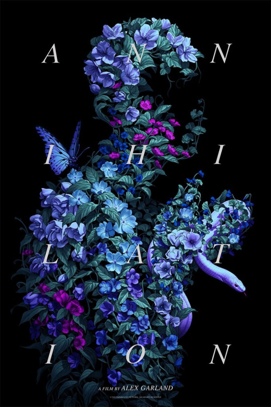
maybe i posted this image so that others can appreciate its artistic value. in that case, the image description should absolutely go into details
one might be:
"An Annihilation movie poster featuring the silhouette of a figure formed out of leaves and blue flowers. A butterfly rests on their shoulder, and a snake winds through their uplifted arms and open hands. The figure's face is empty of vegetation, leaving a blank hole. The word 'Annihilation' spans the entire image, with the letters spaced out and split into 4 even rows of 3 letters each. Smaller text at the bottom reads, 'A film by Alex Garland.'"
could i have just said that it was an annihilation movie poster? yes, and that would be accurate. but that would have made it so that anyone using a screen reader interacting with the post would have had a much worse experience! is that short ID better than nothing? yes, but we should strive for better than "better than nothing", no? at least if vision impaired people are to be treated as members of a community rather than set apart from it
the reason i was annoyed that people would say art shouldn't have an image description that gives any information about the details is that, yeah it's not possible to give every viewer the exact same experience, but to say that blind people can't possibly appreciate something for the same reasons a sighted person might, and therefore don't deserve to appreciate it at all...well, that kind of sucks!
this is also why it's best to describe YOUR own art. you know the image better than anyone else, you know what you wanted the reader to see - after all, you drew it! other people describing images for you will never do as good of a job as you can.
(as a note to the visual reader - the actual alt text i wrote for this image is not the alt text i have shown in plain text above! in fact, it's rather bare bones. why is that? because i gave another image description later in the post, which makes including it in the image redundant. please try to think about what the experience of reading the post would be if you removed all images and replaced them with their alt text! thus, if you post a piece of art, and then spend a long time discussing it in detail, it's okay in that instance to have a very brief description, cause you get to it later. context matters etc etc etc)
3K notes
·
View notes
Photo
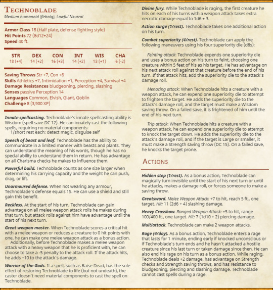
Finally got around to typing up my Technoblade D&D build!!! I’ve been working on making these for a lot of the Dream SMP characters, and I thought it would be fun to have him in stat block format, so you too can throw c!Technoblade at your players as a final boss! (Disclaimer: I don’t know how accurate the CR level is, I just set it to 8 since the build is a lv8 build PC build.)
Image description and explanation/rambling below the cut!
[Image ID: A D&D stat block for Technoblade. It reads:
Technoblade
Medium humanoid (firbolg), Lawful Neutral
Armor Class: 18 (Half plate, defense fighting style)
Hit Points: 72 (8d12+24)
Speed: 40 ft.
STR: 18 (+4)
DEX: 14 (+2)
CON: 16 (+3)
INT: 14 (+2)
WIS: 13 (+1)
CHA: 6 (-2)
Saving Throws: Str +7, Con +6
Skills: Athletics +7, Intimidation +1, Perception +4, Survival +4
Damage Resistances: bludgeoning, piercing, slashing
Senses: passive Perception 14
Languages: Common, Elvish, Giant, Goblin
Challenge: 8 (3,900 XP)
Innate spellcasting. Technoblade's innate spellcasting ability is Wisdom (spell save DC 12). He can innately cast the following spells, requiring no material components:
1/short rest each: detect magic, disguise self
Speech of beast and leaf. Technoblade has the ability to communicate in a limited manner with beasts and plants. They can understand the meaning of his words, though he has no special ability to understand them in return. He has advantage on all Charisma checks he makes to influence them.
Powerful build. Technoblade counts as one size larger when determining his carrying capacity and the weight he can push, drag, or lift.
Unarmoured defense. When not wearing any armour, Technoblade's defense equals 15. He can use a shield and still gain this benefit.
Reckless. At the start of his turn, Technoblade can gain advantage on all melee weapon attack rolls he makes during that turn, but attack rolls against him have advantage until the start of his next turn.
Great weapon master. When Technoblade scores a critical hit with a melee weapon or reduces a creature to 0 hit points with one, he can make one melee weapon attack as a bonus action. Additionally, before Technoblade makes a melee weapon attack with a heavy weapon that he is proficient with, he can choose to take a -5 penalty to the attack roll. If the attack hits, he adds +10 to the attack's damage.
Warrior of the Gods. If a spell, such as Raise Dead, has the sole effect of restoring Technoblade to life (but not undeath), the caster doesn't need material components to cast the spell on Technoblade.
Divine fury. While Technoblade is raging, the first creature he hits on each of his turns with a weapon attack takes extra necrotic damage equal to 1d6 + 3.
Action surge (1/rest). Technoblade takes one additional action on his turn.
Combat superiority (4/rest). Technoblade can apply the following maneuvers using his four superiority die (d8s):
Feinting attack: Technoblade expends one superiority die and uses a bonus action on his turn to feint, choosing one creature within 5 feet of his as his target. He has advantage on his next attack roll against that creature before the end of his turn. If that attack hits, add the superiority die to the attack's damage roll.
Menacing attack: When Technoblade hits a creature with a weapon attack, he can expend one superiority die to attempt to frighten the target. He adds the superiority die to the attack's damage roll, and the target must make a Wisdom saving throw. On a failed save, it is frightened of him until the end of his next turn.
Trip attack: When Technoblade hits a creature with a weapon attack, he can expend one superiority die to attempt to knock the target down. He adds the superiority die to the attack's damage roll, and if the target is Large or smaller, it must make a Strength saving throw (DC 15). On a failed save, he knocks the target prone.ActionsHidden step (1/rest).
As a bonus action, Technoblade can magically turn invisible until the start of his next turn or until he attacks, makes a damage roll, or forces someone to make a saving throw.
Greatsword. Melee Weapon Attack: +7 to hit, reach 5 ft., one target. Hit: 11 (2d6 + 4) slashing damage.
Heavy Crossbow. Ranged Weapon Attack: +5 to hit, range 100/400 ft., one target. Hit: 7 (1d10 + 2) piercing damage.
Multiattack. Technoblade can make 2 weapon attacks.
Rage (4/day). As a bonus action, Technoblade enters a rage that lasts for 1 minute, ending early if knocked unconscious or if Technoblade's turn ends and he hasn't attacked a hostile creature since his last turn or taken damage since then. He can also end his rage on his turn as a bonus action. While raging, Technoblade deals +2 damage, has advantage on Strength checks and Strength saving throws, and has resistance to bludgeoning, piercing and slashing damage. Technoblade cannot cast spells during a rage.
End ID.]
Okay. Rambling time.
Holy SHIT I loved making this. I tend to play spellcasters or dex based characters, so it was a lot of fun to make a str character for once.
Stats first. As a barbarian/fighter and also as a force of nature, str is his highest stat. I could have made it 20, but I have a weird aversion to writing up characters with maxed out stats for some reason? Anyway, that’s what he has. He can always boost it if he takes another level in fighter. I also decided to give him pretty high intelligence and wisdom, which are rare in barbarian characters, since, y’know, their main point is to hit things very hard. But Techno is so, SO resourceful, and one of the main reasons that he’s so good at fighting is because he does his research and acquires the best items for it and puts himself in the right place at the right time. Hence the high-ish int. I feel a little bad making his charisma so low, but cha represents several things, most notably the ability to talk to people and force of personality. Also known as: how hard it is to be swayed or controlled, magically or otherwise. Remember what happened at the festival? That’s low charisma. Also I had to give him a low stat to balance the fact that he’s insanely good at so many fucking things. Why.
As a side note, when picking his proficiencies, I was using the homebrew rule that you can use your strength modifier when you roll for intimidation. So his Strength (Intimidation) check would actually have a +7, which is MUCH better than the Charisma (Intimidation) check of +1. Big strong characters are absolutely scary, damnit, and I will die on that hill.
Next up: race. I HAD to make him a firbolg. They’re connected with nature and are often portrayed with animalistic features (e.g. Caduceus Clay from Critical Role), and it means we can have both pig Techno and anime Techno, since firbolgs naturally have the disguise self spell. I just think that’s neat. They also get the ability to turn invisible! Which Techno has been doing a LOT recently! Sure, firbolgs can only do it for a turn, but it still fits.
Onto classes. Barbarian was a dead certain for Techno, honestly - his battle prowess, how he acts when he fights, it just fits so well. Even his use of potions - he gets a lot of buffs from them, increased damage and damage resistance being the two most notable and the two that best translate to D&D rage. Even speed potions - barbarians get +10ft movement speed at level 5. And barbarians are made for two-handed weapons, so obviously I HAD to give him a greatsword. The Orphan Obliterator is a deadly weapon. He also still favours swords even when axes are better in the newest version, so a greatsword was a must. Also I just really like greatswords.
I wavered a bit when picking a subclass, to be honest. I’m not really a big fan of any of the official subclasses (they don’t really fir my playstyle, which is why I homebrewed an entire new subclass for my barbarian character, but that’s a post for another day), but looking through, there were a few that could work. Originally, I picked Juggernaut - this was because of how he fought during the Dream battle, moving Dream around the arena into a more advantageous position for Techno, which is the Juggernaut’s 3rd level ability in a nutshell. They also can’t be knocked prone, and both of these things work INCREDIBLY well for skywars/bedwars style combat - staying put on this island and knocking off your opponents.
However, in the end, I decided to go with Zealot. It was inevitable after he REALLY started building his character on the Dream SMP, which is what this is mostly based on. Zealots have two main points: they follow a God, and it’s very, VERY hard to kill them.
Sound familiar?
Techno isn’t just a barbarian - he also has three levels of Battlemaster fighter. The barbarian/fighter combo is one of the best there is for sheer combat power (bested only, in my opinion, by barbarian/moon druid - those characters are actually unkillable) and the choice of Battlemaster specifically opened up so many options in combat. I had debated going with champion, just for the crit probability boost, but ultimately decided that Battlemaster was infinitely more fun. The three maneuvers were picked for a combination of reasons - they’re all incredibly useful in combat, but I also just thought they were thematically accurate and/or funny. I just had to give him Menacing Attack, because one of the few constants in Technoblade’s combat is people running the hell away from him during competitions. Feinting is for pure combat ability, and Trip is just. Really funny to me. It worked better when he was Juggernaut and literally couldn’t be knocked prone, but I just like the idea of someone using their full action to try and knock over this eight foot tall firbolg (they’re so fucking tall! This bitch is massive!) Technoblade just. Looking down at them before knocking them clean off of their feet with one swing of his Greatsword.
And finally, weapons and magical items. The magic ones didn’t actually make it onto the stat block, because I wanted it to be purely basic character building, but I absolutely had some ideas. Some of these were rolled on loot tables, some were completely homebrewed to fit Techno’s canon weapons. Guess which ones lmao.
magical heavy crossbow (use charge to fire 3 bolts simultaneously, using only one arrow, rolling an attack for each. Each target must be within 10ft of each other. 7 charges per day)
explosive bolts (10ft radius, double dice of the weapon it’s fired from, dex save)
mithral half-plate
ring of feather falling
trident of flight (attunement) (30ft swim and flight speed, 120ft flight speed when its raining)
upgraded cape of the mountebank (8 charges, 2 for misty step, 4 for dimension door) (yes it looks like his normal cape)
bag of holding
sword of life-stealing (attunement) (I don’t know why I added this except Techno’s canon sword would be VERY hard to homebrew and also he can do enough damage with a normal one so he could literally just have like a +2 or something. Do what you want)
#candy posts#dream smp#technoblade#dnd#dream smp dnd builds#ive been working on these fucking things for MONTHS i cannot wait to post more#i have dreams stat block made too and i have a lot of other builds finished that i just havent typed up yet lol
33 notes
·
View notes
Note
hey, I was wondering if you could point me to a guide or just explain how to write image ids on posts?
oh hey absolutely! I unfortunately can’t find any guides for you, but I can give you info myself! I’m not sure how much you do or don’t know, so I’m just going to explain it all. Apologies if I come across as condescending or something, I just wanna make sure I cover all the bases :)
alternative text
on posts that are your own, you can add alternative text (or “alt text”) to images/gifs instead of writing an image ID below it. That way, when users with screen readers click on the image, instead of the reader just saying, “Image,” or “Gif,” it will read whatever you’ve written as the alternative text. While in image ID’s you need to do brackets and “/End ID” and all that (I’ll expand on that in a sec), in alt text you can just write what it is. If it’s a stack of blueberry pancakes, you can literally just write “A stack of blueberry pancakes” in the text box.
These have a 200-character limit though, which sometimes isn’t enough, so you sometimes need to write an ID below the image/gif even when it is your own post.
image IDs
if the post isn’t yours (or, like I mentioned, you need more characters than the alt text can give) you do the ID! I’ve seen a few different ways of starting them. Some people just write, “[ID: text example blah blah..”, while some (including myself) write, “Image ID: text example blah blah...”. To end it, the general consensus is to end it like, “...text example blah blah. /End ID]”. (I only just recently started including the “/” myself. I’m not sure how it helps, but that’s how I see most IDs written.) So a full example would be like this:
[Image ID: Text example blah blah. /End ID]
how to actually describe the image
If it’s an image with text, include line breaks in the description just as the text in the photo has them. Also make sure to include date/time the post was made, user who posted it, etc. If those aren’t indicated, say as such in the description. That way the people listening to the description know they’re not missing out on info that sighted people viewing the post were able to get. Also indicate when text is italicized, bolded, caps locked, or in quotes, as the screen reader won’t! (Sorry if this sounds confusing. There’s an example linked below that shows all of this!)
some other general tips
I’ve heard that putting an ID after one of those “keep reading” things that tumblr has makes the ID less accessible to those who need them, so avoid that!
I tag posts with alt text/image descriptions. I personally use “alt text” and “image id”, but I’ve also seen “image described” and “image description” floating around!
Don’t write your ID in text like this. Not all visually disabled people use screen readers — some of them read the IDs themselves but can’t see the actual image, so it’s important that the text is easily legible
Something that helps me is scrolling so the image itself is out of sight and I’m merely looking at the ID. I read it and form an image in my head based off what I’m reading. Is that image accurate? Am I getting the full picture here? If yes, then the ID is good! If not, then go back and see what details are missing.
I also highly suggest using a screen reader to proof-read your IDs! Just turn it on when you finish an ID and have it read it back to you. Not only can you scan for typos, but you can listen to how it will actually sound to those that need it, and make sure it’s satisfactory! (Using your phone with the reader on can take some getting used to, but it isn’t so bad once you do!)
Here’s a good example of an image ID that covers all the bases! If you want more, you can just go to my blog and search “image id” because I tag all IDs with that! (I also tag all posts with alternative text as “alt text”, so you can search that too.)
I hope this is helpful anon, sorry if it’s too much or confusing!! If you need any more help with it, feel absolutely free to ask more questions :)
#sorry again if this is too much skdjskdj I hope I’m not being overbearing lmaofkskfj#just wanna make sure I cover all them bases-#anon#ask box#image id#august posts
10 notes
·
View notes
Text
prim’s wildemount map scale adventures
i apologize in advance to the folk that use screen readers for this post’s reliance on image references, i will do my best to make my logic and the contents of the images comprehensible in the text portions.
this post isn’t about spoiler territory either, so i won’t go into detail about how recent developments with e111 were the initial reason i started thinking about distance on the official wildemount maps. besides, i think plenty of people will understand when i say that my digging got a lot bigger than the initial question itself lol. regardless, i’m making this post in the hopes that it might be a little helpful for anyone dealing with the same confusion.
see, i realized the funny thing about the official wildemount maps is that they don’t have any scales. as a basic explanation, scales are those funky little bars usually found on maps that illustrate what distance on the map is equivalent to what distance in ‘reality’—AKA the scale of the map.
however, for whatever reason, matt and co. did not create any for the broader wildemount maps like of the menagerie coast or the zemni fields.
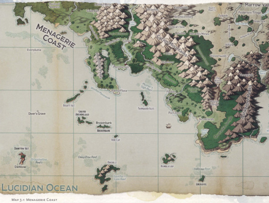

[id: two images from the explorer’s guide to wildemount. the first depicts the region of the menagerie coast and related islands in the lucidian ocean. the second depicts the zemni fields, which is the central area of western wynandir and the dwendalian empire at large. map scales are absent from both images. /end id.]
this was a little baffling and unhelpful, but i’m not here to judge matt about his choice to not include scales, considering how it would give people on twitter even more ammunition to rudely question his dming with.
but then i discovered that the maps of the major cities do have scales.
(continuing past a readmore.)

[id: an image from the explorer’s guide to wildemount. it is a map of the city of rexxentrum, the capital of the dwendalian empire. in the lower left corner is a compass rose illustrating the cardinal directions and a scale. /end id.]
at first, i was excited. maybe i could use the city’s map scale to approximate a scale for the larger maps. it wouldn’t be super accurate, especially as things got bigger and errors grew larger, but it would be a little better for some thought experiments than no scale at all.
but then it got weirder.
since the map of rexxentrum takes up a full page, the resolution of the image makes it difficult to read the map scale. so let me zoom in.
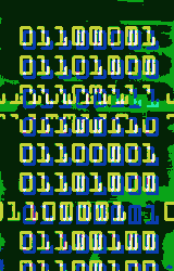
[id: an image at a higher resolution of the lower left corner of the rexxentrum map, clearly displaying the compass rose and the scale. the scale is a thin horizontal bar separated into four equal lengths of alternating black and white, with indicators claiming that each part represents 500 miles for a total bar length of 2000 miles. /end id.]
so. maybe some of you can already tell what the problem is.
for those with slightly worse spatial understanding though, that map scale is measuring in miles. and a mile is pretty damn long.
let’s have a comparative illustration from real life to show my point. los angeles, california, is the city in the united states where the critical role cast live and work and stream us their wonderful d&d games. the los angeles area as a whole is massive. anyone who lives there understands what i’m saying and has probably wept before while in traffic (and i’m sorry).
if we use the google maps function to get a distance in miles between two points in the los angeles area...
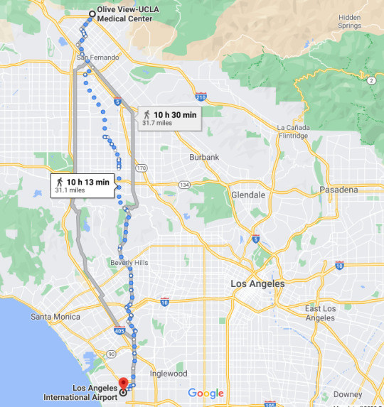
[id: a screenshot of a google maps route for traveling on foot from the olive view-ucla medical center in the far north of the los angeles area to the los angeles international airport in the southwest. the route is fairly direct as the bird flies due to the on-foot nature of the route and is labeled to be a distance of 31.1 miles. /end id.]
this is a pretty good representation of the distance from one end of los angeles to the opposite end. a modern city with a population of about 4 million people, filled to the brim with urban sprawl and suburbs.
and that distance is 31 miles, or about 50 kilometres.
that scale in the corner of the rexxentrum map? its claimed length of 2000 miles (over 3200 km) measures less than a seventh of the apparent width of rexxentrum. according to the scale, you would have to travel a distance of over 14,000 miles (over 22,500 km) to get from one end of the city to the other.
simply put, that scale at face value is nonsense lol.
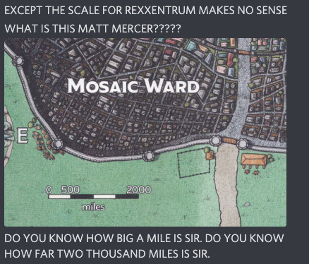
[id: a screenshot of discord messages with no identifying account attached. the messages begin with, in all caps, “EXCEPT THE SCALE FOR REXXENTRUM MAKES NO SENSE” (new line) “WHAT IS THIS MATT MERCER?????” an image of the lower left corner of the rexxentrum map follows. below that is the final visible message which reads, in all caps, “DO YOU KNOW HOW BIG A MILE IS SIR. DO YOU KNOW HOW FAR TWO THOUSAND MILES IS SIR.” /end id.]
so. maybe you are wondering if matt, huge nerd that he is, is making some oblique historical reference to a previous measurement of a “mile” that is way shorter than the modern standard mile. that was the first possible explanation to occur to me! unfortunately, based on the wikipedia article on the mile throughout history, there is no prior known definition of a “mile” short enough to make this scale make any sense.
so maybe the explanation is a unit error. maybe it’s meant to be a smaller unit of length, like a metre or a foot.
i spent a bit of time trying to guess which unit it might be by comparing details of the map to each other, since there are detailed individual buildings and roadways illustrated. it quickly became obvious, though, that the details were more for artistry and not to a reliable scale.
so it was time to dive into the transcripts.
i looked for a point where matt not only described the length of time it took for the mighty nein to travel from point A to point B within rexxentrum, but a point A and a point B that i could locate with confidence on the map. i found a scenario that fit the bill in e86, “the cathedral,” when the party raced from the cobalt soul branch in rexxentrum to the chantry of the dawn.
MATT: [...] And you've stepped out from the Rexxentrum Archive of the Cobalt Soul into the wet, slick cobblestone streets of the city, heading eastward towards the base of the Shimmer Ward, where it is believed this cathedral, known as the Chantry of the Dawn, stands.
this bit (beginning 13:39) is the first clue in matt’s narration to locating the endpoints on the map. the chantry of the dawn is located near the base, suggesting the immediate south, of the shimmer ward, and is in an eastward direction from the cobalt soul. this is consistent with the relevant textual descriptions in the explorer’s guide to wildemount: the rexxentrum branch of the cobalt soul is located within the court of colors on the west side of the city, while the chantry of the dawn is near the southern wall of the shimmer ward.

[id: two images of the rexxentrum map. the first is composed of the center and western area of the city, displaying the labeled wards of the tangles and the shimmer ward along with individual points labeled “R7,” “R6,” “R3,” “R1,” and “R2″ from west-most to east-most. at the bottom is the map scale, added for reference, that measures about a fifth of the entire image.
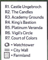
the second image is the legend of the map, which defines a few of the illustrated details and clarifies the R-series labels. truncated to relevance: R7 is the court of colors, R6 is the vigil’s circle, R3 is the academy grounds, R1 is castle ungebroch, and R2 is the candles. /end id.]
as the party made their way to the chantry, matt revealed a few more notable details on where precisely they’re traveling through (17:18).
MATT: [...] Your [Caleb’s] eyes train on the rising walkways and towers of the Soltryce Academy that are peeking over the walls of the Shimmer Ward that you can just make out on the horizon as you pass by a series of buildings where the roofs are a bit lower than the other ones you've been rushing by. You can see pale yellow walls that surround the Shimmer Ward of the capital.
You begin to approach the exterior of the Vigil’s Circle, which is a region between where you are and your destination, as noted by the network of ring-like streets that denote the circular marketplace, some varied shops, and industries that normally fill this area, as well as the mini-fortress of gray rock known as the Tower of Writ.
the view of the soltryce academy is consistent with an approach from the western side of the city, since the academy is located along the inner side of the shimmer ward’s northwest wall. the placement of the vigil’s circle in between the cobalt soul and the chantry is also consistent with their depictions on the map, as the vigil’s circle is both labeled and illustrated through a pattern of circular roads with an apparent depiction of the tower of writ in the center.
anyway, the mighty nein had traveled a little ways into the outskirts of the vigil’s circle from the west when they were abruptly stalled by a giant purple xhorhasian worm coming out of the ground.
at that moment in time is when liam gets a travel time from their current location to the chantry (21:26).
LIAM: Caduceus just asked how far we are from the chantry. Would I know that?
MATT: You would know you're probably about, I'd say, depending on— with it being pretty empty, maybe seven minutes.
this brings me to getting a precise location on the chantry of the dawn. both the explorer’s guide to wildemount and matt’s narration only describe the chantry as located within the tangles and near the southern wall of the shimmer ward. that’s a wide potential area to be seven minutes from.
there’s a pretty helpful pattern in the map details, though. most landmark buildings are visible—the soltryce academy campus is clearly delineated, as well as the colorful tower rooftops of the candles and, as previously noted, the top of the tower of writ. castle ungebroch stands massive in the center of the shimmer ward illustration.
so if the chantry of the dawn is both a huge structure and a significant landmark, that should merit a visible illustration of it on the map.
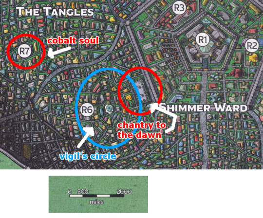
[id: the image of the western and central area of rexxentrum plus map scale appended to the bottom, edited to include my personal labels. R7 is encircled in red with the label “cobalt soul,” R6 and the visible circular road complex is encircled in blue with the label “vigil’s circle,” and a large rectangular rooftop by the southwest corner of the shimmer ward is encircled in red with the label “chantry to [sic] the dawn.” /end id.]
the position of this large building fits the details of the narration and its description in the explorer’s guide—it’s near the southern wall of the shimmer ward, it is eastward of the cobalt soul, and streets of the vigil’s circle lie on the direct path from the court of colors to this building.
so there’s the approximate location of the chantry of the dawn. we also know the approximate location of the mighty nein on this map.

[id: an image, almost identical to the last, of the marked-up western and central area of the rexxentrum map plus map scale, but with a further addition of an orange star in the northwest corner of the vigil’s circle labeled “mighty 9.” /end id.]
since they had entered the outskirts of the vigil’s circle from the direction of the cobalt soul, they would be within its northwest area by the time they were interrupted via purple worm shortly after.
two approximate locations with a travel time in between means that now i could estimate a distance in length. so i took a look at the d&d official rules for movement speed:
a fast pace is about 400 feet per minute,
a normal pace is about 300 feet per minute.
for campaign 2, matt as a dm tends to follow the official rules. so taking into account how the urgency of the situation had the party moving quickly, along with the emptiness of the streets eliminating the variable of a slowed pace through crowds, the mighty nein are likely traveling between 300 and 400 feet per minute to get to the chantry.
with matt’s provided estimate of 7 minutes, that means the on-foot distance from the party’s current position to the chantry is somewhere between 2100 to 2800 feet.
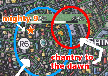
[id: a zoomed-in image of the marked-up western and central rexxentrum map, focused on the vigil’s circle and the chantry of the dawn. imposed beside the orange star representing the mighty nein’s location and the chantry is the map scale edited to remove the ‘miles’ indicator. its position allows a viewer to measure the distance between the mighty nein and the chantry to about “1500,″ or three-fourths of the total length of the scale. /end id.]
since the scale there measures distance as the bird flies, comparing it to the probable distance the mighty nein had to travel needs to account for the twists and turns of the streets.
with that in mind, though: an as-the-bird-flies distance of around 1500 feet sounds like a pretty good approximation of the estimated on-foot distance of 2100 to 2800 feet!
so with that, it’s probably safe to guess the map scale meant to claim feet instead of miles as its unit of length.
so far i haven’t puzzled out how i might translate this into a makeshift scale for the larger maps, since none of the cities like rexxentrum are clearly illustrated on them. but if anyone was very confused about the unit of length for the city maps’ scales, i think i’ve reached a reliable conclusion that it should be feet.
hopefully some of you find this helpful!
#cr#critical role#rexxentrum#maps#wildemount#wynandir#prim post#prim says some things#long post#VERY long post#readmore#enjoy this dump of what i spent a few hours on thursday night out of sheer curiosity and frustration
23 notes
·
View notes
Text
DARING DO and THE GRYPHON’S QUEST! : MLP Fan Fiction : Part 3 of 19
Return to the Master Story Index
Return to MLP Fan Fiction

DARING DO
and
THE GRYPHON’S QUEST!
by
De Writer (Glen Ten-Eyck)
and
Carmen Pondiego
Cover art by Aranel the Cyborg, now Wind the Mama Cat
29584 words
© 2020 by Glen Ten-Eyck
Writing begun 03/29/16
All rights reserved. This document may not be copied or distributed on or to any medium or placed in any mass storage system except by the express written consent of the author.
This is a Fan Fiction based on My Little Pony. Canterlot, Princess Luna and the name Daring Do are owned by Hasboro Inc.
//////////////
Copyright fair use rules for Tumblr users
Users of Tumblr.com are specifically granted the following rights. They may reblog the story. They may use the characters or original characters in my settings for fan fiction, fan art works, cosplay, or fan musical compositions, provided that such things are done without charge. I will allow those who do commission art works to charge for their images.
All sorts of fan art, cosplay, music or fictions is actively encouraged.
///////////////////////
Chapter 3. The Library within the Library
Daring Do led her two charges out of the dining hall, across the Royal University grounds and on, out into the cosmopolitan city of Canterlot.
Walking close to the Castle, they came to the impressive Royal Library building. At the top of the stairs, awaited the huge, allegorically carved doors, showing the sun and the moon rising together over the field of knowledge. They swung open in response to an ancient spell.
Entering, the Gryphons craned their heads about, trying to take in everything, their crests showing their amazement. Grata asked reverently, “I thought that you said that the Great Library would require our Imperial Identifications. The doors simply opened. This Library is amazing. There is no such place in the whole of the Empire.”
With a bit of a smile, Daring Do replied in a hushed voice, “This is the Royal Library. There is a rumor that the caravan of old Marchhare, the Rom’s Ghost Who Guides, may hold a bigger library, but nopony has ever proved it.
“The Great Library may be entered from this one, if it is allowed.” She gestured to the end of a long aisle. “Down here is the Research Desk and the Closed Stacks. That is where you will need your Imperial ID.”
Approaching the impressive curved Research Desk, Daring Do took out her ID. Following her lead, Rahak and Grata took out theirs as well. The pony at the desk took one look at the Royal Seals of Celestia and Luna and at the Seals of the Empress.
She simply nodded politely and requested, “Please wait here. I will get the Research Supervisor.” She turned and disappeared into the rows of bookshelves behind her. Soon she returned with a pale yellow unicorn who had a gray mane and tail.
As soon as the Supervisor saw Daring Do, she smiled and asked, “May I inquire your reason to visit the Great Library, Antiquarian Do?”
Daring Do gestured to her “students” and replied, “Rahak and Grata have been sent by the Empress in person to research the actual origins of the Gryphon race. Since Glugemdown’s account of a sighting in the Far North had to be in the early 180’s PNW, we are seeking earlier material that is reliable or at least may point to avenues of physical research.”
Daring Do handed over her ID and the two Gryphons did as well. The Research Supervisor made some adjustments and inserted the Ids into the Spell Reader. There was a soft chime.
She smiled as she handed back the Ids. Daring Do asked, “May we have the assistance of Apprentice Librarian Blendin, please? He and I have worked together in the past and he is excellent at finding materials.”
The Research Supervisor simply nodded and spoke to a private line magic net mirror. “Apprentice Librarian Blendin to the Canterlot main doors, please.” Shortly there was a soft chime.
Several of the closed stacks simply faded from view. In their place appeared to be stout iron bound oaken doors. That was deceptive. The appearance was a glamor spell concealing two four tonne military armor grade steel doors sealed against being forced open from outside OR inside.
Daring Do smiled at them, remembering a time or two that her visits had needed that protection … from what was in the Great Library! It was not a place for the faint of heart!
She led Grata and Rahak toward the doors. Instead of opening in the usual way, they faded to the appearance of a gossamer mist. They all three passed through. As they entered the Great Library, the doors went solid behind them.
Daring Do smiled at Blendin, her half brother and a truly talented Librarian. “Hi, Blendin! We need to find out all that we can of the true origins of the Gryphon race.”
Blendin’s green furred face twisted comically. “Their legends are easy. Facts? Not so easy.” He paused, thinking deeply. “Perhaps there is something lurking in those legends though.”
He turned to what appeared to be a physical card catalog and pulled out drawers. He laid out the drawers in order on a table. As he isolated particular cards, the Gryphons began to grasp just how unusual that card file was. As Blendin chose a card, the materials connected to that card appeared on the study table.
Looking up at the small mountain of books and scrolls, Blendin paused and took the end of the table in hoof. He pulled it out several meters. It grew more legs as it stretched out.
Blendin began laying out the assorted things. “I would give more credence for accurate descriptions to these,” he said, indicating a sub stack. “They are the oldest. It is interesting to note that, though the authors were absolutely Gryphons, they wrote in the Equestrian of the last days of Fortress Canterlot. Modern written Gryphon is easily traced back to that script.”
He sorted out a stack of perhaps fifty items.
Daring Do picked up one, stared at the title, and asked, “What did the catalog show you Blendin?”
“Dates. The very oldest manuscript there has no date but the author died in 54 PNW. Knowing that this is a huge can of worms, I am going let you sort out what happened.”
Innocently, Daring Do said, “We said nothing about it being a can of worms. What makes you so sure that it is?”
Blendin pulled a comic face and retorted, “Two Gryphons with Imperial commissions to dig into the origins of their race. You being willing to bring them HERE. The First Race Gryphon’s Manifest Destiny Party that is growing in the Empire. Isn’t it OBVIOUS?”
Rahak said quietly, “I hope not. If the MDP found us out, they would stop at nothing to silence our findings unless we truly find that ours is the Oldest of Races.”
Blendin took a few moments to show Grata and Rahak how to best organize their notes for comparing descriptions from multiple sources. Daring Do and the others began to work through the pile of manuscripts of all sorts, taking copious notes.
Blendin busied himself with another task. At the other end of the long table a different pile of far more modern books grew.
Taking a break to stretch her wings and neck, Grata took a quick look at Blendin’s new pile of books. She read a title. “Mutagenic Effects of Randomly Combined Spell Fragments From the Great South Bay Mage Weapon Blast.”
Eyes gone wide, she picked another. “Mage Weapon Use In the Final Battle of the Nightmare Wars.”
Hearing the titles, Rahak picked another. “Weaponized Weather in the Nightmare Wars. Subtitled, Tactical and Strategic Studies.”
Grata had picked up one more. “The Use of Non Equine Magic on the Nightmare War Battlefields.”
Rahak found, “Baratted the Goat, a Biography of the Inventor of Non Equine Magic.”
Grata, crest going flat in sadness, discovered, “An Encyclopedia of All Intelligent Species of the World and Their Languages,” she read. “It is by De Writer and dated the fiftieth year of Fortress Canterlot.”
Daring Do pointed out, “This predates all of the others. Equestria did not yet exist. De Writer’s invention of the basic art of writing was still only a few hundred years in the past. Literacy was still fairly rare when this was written.”
Rahak, taking the book, leafed through it carefully. His crest showing both interest and puzzlement. “There is no mention of Gryphons at all. He knows of the Zebras and X'ibian dromedaries. He covers merponies, both fresh and salt sea kinds. He even has a part on DEER.”
Grata nodded. “That fits all of the rest of what we are finding. The MDP will blow their collective gaskets if we can prove what these things are showing us.”
Rahak agreed, “I hope that the proof can be solid enough to be undeniable.” He sat and sort of drooped all over. “I fear that what we may find will not prevent a war at all. We may actually start one.” He sighed, “Proof will not sway religious fanatics. They ALREADY KNOW THE TRUTH.”
Blendin spoke briefly and quietly into a private magic net mirror before saying anything to them. “You are taking this better than I feared. I have told the guards to stand down.
“You have been granted permission to have copies of any or all of these documents sent to any place of your choosing.”
Grata thought for a moment and asked, “Can we have a map of the weather in use when the Mage Weapons were fired at the end of the Nightmare Wars? It could help us to set up our physical expedition. The Library is good but we will need to find solid physical evidence and proofs.”
Blendin nodded. “Good thought.” He rummaged in his card drawer, selecting one. The requested map joined the rest of the documents on the table.
Rahak suggested, “We will take it all. Put it in our dorm room at the Royal University.”
Blendin put his card drawers away in the card catalog and spoke briefly into his mirror again. All of the assorted books and other documents vanished from the table. Blendin pushed it back to its original shorter, four leg version.
Blendin stretched and observed, “I am hungry. As so often happens here, time got away from us. I know a place where there are great enchiladas. They will even fix ones with fish and shrimp for you Gryphons.
“So, dinner? It won’t cost you a bit.”
Daring Do brightened immensely and stated, “Free dinner? Enchiladas? I’m in!”
Rahak and Grata’s crests shot up! “Fish and shrimp? Count us in!”
Blendin nodded happily. He called in on his magic net mirror, “Apprentice Librarian Blendin leaving with Daring Do party. Give us Exit V.”
The heavy armor steel doors faded away and Blendin led them out into bright tropical sunlight.
<==PREVIOUS NEXT==>
Return to the Master Story Index
Return to MLP Fan Fiction
#DARING DO AND THE GRYPHON'S QUEST!#Part 3 of 19#MLP Fan Fiction#Written by De Writer and Carmen Pondiego
6 notes
·
View notes
Text
Recap - artifact555 video solve
In the early days of this blog, some of the solves weren’t documented as cleanly in one post as has become the pattern. In reviewing the solutions to Pangent’s publicly available videos, it was discovered that a few of them could use a newly compiled summary solve post. So here goes the first of those, enjoy!
https://www.youtube.com/watch?v=vVWfnqiuVXk
Binary title: artifact555
Video begins with a warning about flashing images, and whoo boy, those happen.
There’s lots of shots of the cube, glitching in colors and flashing, and interspersed with possible flashes of Lottie, and some more interesting effects. The sound is also ‘interesting’.
The cube is alive.
There doesn’t appear to be any coded content in the video, but the description has some things worth investigating.
almost-binary in the description, replace the ‘O’s and 'C’s with '0’s and '1’s to get actual binary for:
xV_OQ4CQqE8
This is a YouTube ID: https://youtu.be/xV_OQ4CQqE8 - A video with binary title 'theline’, showing Lottie 'speaking’ but the audio sounds computer-generated and states:
There are some things we as a species weren’t meant to know
This video also contains some pastebin links in the description, more on those later.
Back to the text in the description of 'artifact555’:
imgur bAqfpxr
This is theoriginal MSPA ad which was the trailhead for this ARG
imgur jbUD1v0
This is a nonogram, popular in those days.
Can be solved manually or with tools like http://a.teall.info/nonogram/

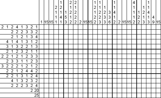
Interpret the squares as binary:
011010110111101001110110
011000110110011101110001
011010000110001001110111
011110010111100101110101
011101000101011001101011
011000100110111001100010
011011010110101101110011
011001110111010101100011
011101100110110101101001
011011010110111101111001
011011010111001001100111
011110100111001101110001
011011000110111001100111
011001111111111111111111
kzvcgqhbwyyutVkbnbmksgucvmimoymrgzsqlngg
Vigenere with key 'conscioushumansouls’ (and add spaces):
i like it here it Isnt quiet can you hear the waves
imgur 7Foyrsz

Kcode - read off the RGB values of each square
In decimal they are:
49 53 32 104 111 117 114 115 32 102 114 111 109 32 116 104 101 32 99 101 110 116 101 114 32 111 102 32 116 104 101 32 115 111 117 114 99 101 0
15 hours from the center of the source
xV_OQ4CQqE8 is a YouTube ID leading to: https://youtu.be/xV_OQ4CQqE8
unlisted video with binary title: theline
Contains several Pastebin links in the description:
PB CBiWsY85
https://pastebin.com/CBiWsY85 - hex title: themoth
contains binary text encoded as Vigenere with key 'guineapix’ which decodes to:
I have a friend, let’s call her C.
Let me talk about C for a minute.
The wonderful and terrible thing about C is that she’s a moth drawn to flame.
For a few years now I have supported her in everything she’s done.
She’s reckless. If she were a character in a movie, she’d see an explosion and run toward it while most people are running away.
She’d run into the burning building and inhale the smoke while taking notes on how it affected the building structure.
And she’s probably the one who caused the fire in the first place.
Metaphorically, I mean.
She gets results only because she loves the danger of it. She’ll come up with a solution and write it down without knowing if it’s right or not. She’ll try it a dozen different ways, watch the entire thing fall to pieces in a dozen different, irreplaceably expensive ways. Destroy everything while taking notes on the wreckage.
When she’s done she’ll clean up the mess and she’ll understand the problem on a molecular level, from the inside out. She’ll be standing in the catastrophe she created, with a thousand pages of notes on how to do it right next time.
I believe she’s the greatest genius I’ll ever know.
And she’s a disaster. A walking disasterpiece.
Her mind makes leaps that other minds can’t, because they understand that actions have consequences.
She knows that messes can be cleaned up, and systems rebuilt.
So she plays with fire.
Well, not every mess can be cleaned up. You can’t put toothpaste back in the tube.
Now that I’ve typed that I’m not so sure. She could probably figure it out. She’d ruin a lot of tubes of toothpaste in the process.
But hey, toothpaste is cheap.
The Twitter archive is still broken because of her, but I suspect if she hadn’t been fired she’d have fixed it within a few days. And because of her we did figure out how to decrypt the deleted data. It’s a slow, manual process, but it’s all there in some form or another.
I wonder if that was X’s plan all along, somehow. He remembered Sandy Bridge, and figured if there was smoke there there was fire. He followed a trail of clues and now he’s taken everything.
It’s not C’s fault. She did what she always did. She made a mess so that we could learn something.
Maybe something we shouldn’t have been messing with in the first place.
There’s this object, Artifact 555, alias The Cube. I’m not going to ask where it came from or how X’s father got it, because I value my life and my career and I know that questions have consequences.
I’m not going to ask what it is, either. But I don’t have to. C is asking.
What I know is this:
X, because he’s an asshole, sent the three of us photos of this thing.
It’s hard to see and harder to look at but I’d describe it as a glass cubic box with reflective blue matter inside.
When I looked at the photos of this thing, I was filled with a paralyzing fear unlike anything I’ve ever felt before. Afterward I was sick for two days.
Leslie was sick too. Even her cat was sick.
I don’t know how that’s even possible. I don’t want to know how that’s possible.
But then, I’m not a moth drawn to flame.
C was at the store when she saw the photos. Just on her phone, not even on a big monitor.
She fell and hit her head. E had to come and get her. She didn’t walk straight for days.
Now, a normal person’s instinct would be to get the hell away from this thing, and get the hell away from X, who used it as a weapon. Another kind of woman with another kind of mind would have changed her name, left the country, called in an exorcist and dedicated her life to rejecting satan and all his ways.
Instead she signed the world’s worst contract and said she’d be back to work on the second.
Because she’s a moth drawn to flame. She loves the mystery and danger of meddling where she shouldn’t.
I know that right now every cell in her body is screaming out wanting to know what this thing is, even if she has to burn the world down around her to understand it.
Well, that’s just who she is.
X knew that too. He knew that if he shouted “DANGER” at her with a megaphone and police sirens and flashing lights five hundred feet tall, she’d come running toward that kind of danger. She can’t help it.
For years, I’ve supported her in everything she’s done.
I hope I never have to regret that.
PB i1pxP041
https://pastebin.com/i1pxP041 - hex title: gnixob (reversed: boxing)
It’s almost-binary again, replace the 'C’s and'O’s with '1’s and'0’s then reverse, then decode as binary, then Vigenere with key 'argentina’ to get:
Another question.
Let’s say there’s an object. Let’s call it “an object.”
I looked at a few photographs of this object and became violently ill for reasons passing understanding. It was a couple days before I could walk without worry.
The others in my group had a similar reaction.
Here’s the question.
What happens when I see this thing in person?
And work alongside it for a long period of time?
What exactly happens to my sanity?
Happy Boxing Day.
PB sd7MrRX5
https://pastebin.com/sd7MrRX5 - hex title: analog
Contains binary, Vigenered text with key 'argentina’:
Okay, I’m calm now.
The Cube reacts to electrical stimuli.
It even reacts in a predictable and reproducible way, suggesting that data can be imprinted on it for later use. X’s father must have known this. Someone must have run tests, suggesting this could work for data storage, if we could only understand how it works.
Well, we don’t need to understand the Cube. And it doesn’t need to understand us.
We���ve been thinking of this thing as digital, thinking how can we connect to it, like it’s a hard drive.
But it’s not. It’s squishy, it’s meat, it’s liquid, it’s practically a brain.
It’s analog.
Do you understand?
When I was a kid, we had cassette tapes. We had vinyl records.
A vinyl record isn’t made with digital data. Vinyl doesn’t understand and interpret the music, it’s just plastic. And the needle is just a needle. There is no artificial intelligence there. But when a song is playing, you can etch the vibrations of that song onto that dumb plastic, and the needle will react the same way to play it back again.
Magnetic tape is dumb too. It doesn’t need to understand and interpret the signals being sent through it. It just needs to be able to play them back accurately. VHS tapes of movies, cassette tapes of music. Did you ever record a computer program onto a cassette tape, and then play it back? You could just play the sound, all of this whirring and beeping, and your Apple II or Commodore 64 would understand what the tape couldn’t.
The original analog medium is a book. The pages of a book don’t understand the data written on them. But the writer understood, and the reader understands, and that’s enough.
We don’t need to understand the Cube. We don’t access that data by plugging in a cable. We don’t learn its language and it doesn’t learn ours. It’s a book. We write something on it, and then we can read it later.
So. Let’s say I set up a server which reacts to data.
And we test the Cube’s reactions to the same data.
And we test it and test it and change the way we deliver the data to the Cube, until the reaction matches.
We don’t need to speak the Cube’s language.
We just need it to react in the right way when we speak ours.
PB 18E6yhak
https://pastebin.com/18E6yhak - hex title: repair
Contains binary, Vigenere’d text with key 'argentina’
Questions for this Christmas, asked of nobody but myself.
The first question is whether or not data can have a soul.
This is a question with two possible answers, so for the sake of argument let us assume the ridiculous - that the data of a soul can be saved, and that this does not disprove the existence of the soul as a theological concept and construct.
Let us say that data can have a soul.
The second question is, what if that data stream becomes broken and corrupted, in the way that souls also become broken and corrupted?
If we save the data, do we save the soul?
And if so, do we save it in a theological sense or merely on a technical level?
What exactly would we be tampering with here?
It’s four AM. I’m drunk. I should go back to sleep.
1 note
·
View note
Text
I Dream In Colour chapter 1: In Any Universe
https://archiveofourown.org/works/20335819/chapters/48217375
Jim sat up suddenly in bed, panting, his eyes wide open.
Even in the darkness of his quarters, the colours in front of his eyes were almost blinding. He screwed them shut, opened them again and blinked slowly, waiting for the bright sea of colour to lessen.
Shore leave would begin tomorrow, and he knew now more than ever where he needed to go. It was a gut feeling. But he wasn’t sure how well he’d be received and what would happen next.
Lights out,” he said as he laid down again, hoping that the darkness would stay dark long enough to get some sleep.
******
“You’re not coming?” McCoy asked him at the Starbase the next day. The Enterprise had docked primarily for shore leave but a couple of minor repairs were going to be done also and Scotty had insisted on staying aboard for now to oversee things. Jim was pretty sure he’d marry the ship if he could.
“I’ll join you later, tomorrow probably. There’s somewhere I need to be.”
McCoy’s brow furrowed. “You sure you’re ok?”
“I’m fine, Bones.” Jim smiled broadly and patted him on the arm. “There’s just something I have to do.”
McCoy looked doubtful but to Jim’s surprise and relief, he left it at that.
“Just let me know when you’re back and we can hit that bar I was telling you about.”
“I will.” Jim was still smiling as he turned around and headed off to catch a shuttle. “And make sure Chekov brings ID,” he called out over his shoulder. “Last time we all went out the bouncers thought he was twelve!”
“Dammit, Jim, I’m a doctor not a babysitter!”
*****
It was nearly evening when he arrived at his destination, straightening his uniform and checking his reflection in the glass front door before knocking on it.
“Jim?”
“No James T. Kirk this time?”
“Jim seems more appropriate now. To what do I owe the unexpected pleasure of your visit?” The elder of the two Spock’s in Jim’s life glanced down to the duffel bag bearing the Starfleet insignia that Jim was holding.
The younger man followed his gaze and laughed lightly. “Don’t worry, I’m not homeless. We’re on shore leave so I just thought I’d drop by and…” he hesitated and Spock tilted his head just slightly to one side, watching him search for the right words. “...visit.” Jim finished simply with a smile, going with Spock’s choice of word.
Spock nodded and moved aside for Jim to come in. The door led almost directly into the small but ample kitchen which opened out into a spacious living room.
“Would you like some coffee?”
"That'd be great, thank you." Jim went through, taking in the singular armchair, long sofa and shelves lined with books about Vulcan history and a couple in languages that Jim vaguely recognised from classes at the academy when he hadn’t been paying enough attention.
“I’m sorry I didn’t call ahead and tell you I was coming. It was a spur of the moment sort of thing,” he said when Spock emerged with a tray carrying a mug of tea for himself and coffee for Jim.
“Apologies are not necessary, it is good to see you again. I am, however, intrigued.” Spock set the tray down on the low coffee table and sat in the sleek armchair opposite Jim on the sofa.
“Can’t a guy drop by his new old friend’s house for a surprise visit?” Jim put on his best dazzling smile, the one that usually got him out of most kinds of trouble.
“Jim, I have known some version of you long enough to know when you’re not telling me everything.”
Jim‘s dazzling smile evolved into a rueful one, as if he'd been caught out by someone who knew him better than he knew himself. “I've been...having dreams.”
Spock arched an eyebrow. “And what is the nature of these dreams?”
“It’s hard to explain. They started before everything with Nero. From my end anyway. I mean….I think the timing works out that I started having them when you came through the black hole."
There was no mistaking the surprise on Spock's face, but his voice was as calm and even as Jim had ever heard it. “What takes place in them?”
“I’m not sure how to describe it. Nothing actually happens. No people, no talking. Just colour. Intense colour, so intense it burns my eyes. Blue and yellow. No, more like gold. And they merge together but…they don’t change. I mean that should turn everything kinda green right? But they just stay like that. The two colours fit, perfectly together and if anything they each get brighter.”
Spock nodded slowly, taking a moment before he spoke. “You are far too insightful and intelligent not to have figured out what these dreams seem to symbolise.”
“I don’t know for sure.”
“But that’s why you’re here, for confirmation.”
”I guess I am, yeah.” Jim nodded as he spoke.
“The science officer and captain’s uniforms were the same colour in my Starfleet as here in yours,” Spock said, anticipating Jim’s question before he could even ask it. He sighed heavily. “It is possible that something slipped through in the mind meld I performed in the cave. Something more than the initial emotional transference. It had been some time since I had last engaged in a meld and my mental shields may not be as fortified as they once were. I am sorry, Jim, if I have caused any of your distress.”
Jim shook his head. “This wasn’t your fault. It was already happening. For whatever reason." He met Spock's eyes, looking into them as if they were the only place left in the galaxy to look. "It’s like...I knew you were coming." He held Spock's gaze for a few moments more before closing his eyes and shaking his head as he looked away, chuckling lightly. "This sounds ridiculous. I'm sorry, I probably shouldn't have come here."
"On the contrary, I think this is the only place you could have come." Spock's small smile was kind, comforting. The kind of smile people didn't usually aim at Jim Kirk, and any thought he had of just upping and leaving right now instantly disappeared.
"There was actually a flash of something in the meld. Not an image, just a...feeling. A good one but…not familiar. And...and it…" Jim hesitated, but Spock inclined his head, brow arched just slightly, as if the end of this sentence was the final line of a book that couldn't be left unwritten.
"...It felt like you took my hand.”
There was something in Spock’s expression that Jim couldn’t read. Expressions would be more accurate: sadness, confusion, a wistful smile. Jim wondered if he even saw a glimmer of hope on his face. But they were all just glimpses, micro-expressions even on the face of this older Vulcan who was more emotive and readable than his younger self.
Jim decided to ask the question that had been on his mind during so many of his sleepless nights, the one he knew he’d really come here to ask. “Were you and the other Jim Kirk...together?”
“We were. Though I would have used a different term. T’hyla .”
“What does that mean?” Jim asked, feeling like he already knew the answer.
“There is no direct translation into English but the closest description would be -“
“Soulmate?”
“Indeed.”
Jim exhaled and nodded. “Wow. I mean, I guessed but...wow. “ He leaned back on the sofa, rubbing his eyes with one hand and holding his coffee cup in the other, the warmth radiating from it comforting and grounding him as he tried to make sense of everything.
“You are tired, Jim.”
“Yeah, well I haven’t been getting much sleep.”
“It would be advisable for you to try and rest while you are on leave.”
Jim nodded in agreement, not even trying to stifle a yawn. “I’m gonna stay at the Starfleet embassy in town tonight, catch a shuttle back later tomorrow. Hopefully, we can talk more before I go?”
“I have a guest room that has never been used and is unlikely to be. You are welcome to stay here.”
“Are you sure?”
“I am. And it would give us more time to speak about the dreams.”
“Thank you.” Jim smiled and yet again he was met with the same small, comforting smile in response.
“Let me show you upstairs and I’ll make a start on dinner while you rest." Spock rose gracefully from his chair and Jim followed him, picking up his duffel bag.
“Making sure I eat properly too, you’re starting to sound like Bones. But less…"
“Persistent?”
“I was gonna say shouty but we’ll go with your diplomatic version.”
“A wise decision.”
Jim grinned and Spock opened the guest room door, showing him in.
“I’ll just get settled and come help you with dinner.”
“You are a guest, it would be customary for me to make you dinner and for you to simply consume it if is acceptable.” There was a playful smile on his lips, which was not what Jim was used to seeing on the face of a Vulcan. Although he only knew one other Vulcan.
“Was the other me prone to being customary ?”
“He was not.”
“Well, there’s an old earth saying, ‘you can’t teach an old dog new tricks’. I guess that was written for me, all versions of me.” Jim’s smile was playful too and, he had to admit, almost flirtatious. “Besides, I’d like to help.” He hadn’t ‘helped’ in the kitchen since he was little and would watch his mother making meals from scratch then insist on stirring or mixing something for her. She would smile and scoop him up, letting him sit on the counter and help, even taste the food before it was ready. But those times had been few and soon stopped altogether.
“Very well.”
Spock turned to head back downstairs as Jim walked through the door, leaving it half-open behind him. But the temptation was, to his surprise, too much and he soundlessly turned back, watching Jim for a few seconds as he dropped his duffel bag on the bed and went to to the large window, smiling at the view. The younger man stretched, rolling his shoulders and yawning again before taking a plain grey t-shirt from his bag and starting to pull off the Starfleet one he was wearing.
Only then did Spock turn around, making his way back downstairs to the kitchen.
#kirk x spock prime#star trek#kelvin timeline#star trek aos#ao3 fic#star trek fic#i will go down with this ship#my fics
4 notes
·
View notes
Text
Equivalent Experiences: Thinking Equivalently
Constructing identical expertise could mean dynamical the means you think that regarding development and style, and potentially reevaluating your existing work. during this article, we’ll address common accessibility problems, and the way to best set about up them thus everybody will effortlessly access your content. This is the second of two articles on the topic of how digital.This is the second of two articles on the subject of however digital accessibility is enlightened by equivalency. Previously, we've got learned concerning the underlying biases that inform digital product creation, what identical expertise isn’t, the combination effects of inaccessible style and code, and powerful motivating forces for doing higher.
In this article, I will be able to discuss learning the way to embrace identical, comprehensive mentality. I will be able to additionally offer sensible, sturdy ways that to enhance your internet sites and web apps by providing solutions to common, everyday barriers cited by the individuals I interviewed. Setting a standard Setting a regular The Web Content Accessibility Guidelines (WCAG ) outlines in conscientious detail a way to craft accessible digital experiences. whereas a protracted and dense document, it's unbelievably comprehensive — to the purpose wherever it’s been written as a global commonplace. For over ten years, we’ve had a globally arranged, canonical definition of what constitutes as usable. Can we?If you would like a bit facilitate constructing the initial mental framework the WCAG gets at, an issue I perpetually raise myself once creating one thing is, “How would i exploit this if…” It’s an issue that gets you to examine all the biases that may be moving you within the moment.
Examples might be:How would I use this if...o ...I can’t see the screen?o ...I can’t move my arms?o ...I’m sensitive to flashing and strobing animation?o ...English isn’t my primary language?o ...I have a limited budget for bandwidth?o ...I’ve set a large default type size?o ...and so on.
Introduction
If you’re looking for a more approachable resource for how to dig into what the WCAG covers, the "
Inclusive Design Principles
" would be a great place to start. The seven principles it describes all map back to "
WCAG success criterion
".
Its considered best if we learn from people who are actually using it.
You don’t need to apply my words in this. Below there are some basic problems Wayfinding
Headings
Heading elements are incredibly important for maintaining an equivalent, accessible experience.
When made with talent and care, heading parts enable screen reader users to quickly verify the contents of a page or read and navigate to content relevant to their interests. This is often resembling however somebody may quickly flit around, scrolling till one thing that appears pertinent comes into read.
Justin Yarbrough
voices poorly-authored heading elements as a concern, and he’s not alone.
WebAIM’s screen reader survey
cites headings because the most vital thanks to realize data. This survey is well-worth being attentive to, because it provides valuable insight into however disabled individuals really use helpful technology.
Landmarks
An addition to heading parts, in a different way to work out the structure and layout are
landmarks
. Landmarks are roles implicitly delineated by HTML(markup language sectioning parts), wont to facilitate describe the composition of the most page or read areas.
Here’s what Justin has to say:“If I’m just trying to find the main content, I’ll first try the Q JAWS shortcut key to see if a main region’s set up. If not, I’m just more or less stuck trying to scan the page to find it arrowing through the page.”
Much as however we'd use a layer cluster name of “primary nav” in our style file, or a category name of c-nav-primary in our CSS, it’s vital we tend to conjointly use a nav sectioning component to explain our main website navigation (as well as the other navigation the page or read contains). Doing thus ensures intent is carried all the approach through from conception, to implementation, to use. a similar notion carries through for the opposite hypertext markup language sectioning parts that make landmarks for helpful technology.
Labeled Controls
Brian Moore
tells us about “form fields with no label or at least one that isn’t programmatically associated so it doesn’t read anything.”It’s another
frustratingly common problem
.
Providing a legitimate for/id attribute pairing creates a programmatic association between type inputs and also the label that describes what it will. And after I say label, I mean the label part. Not a clickable div, a placeholder, aria-label, or another brittle and/or distraught answer. label components square measure a tried-and-true answer that enjoys wide and deep support for accessibility. In addition, a label part mustn't be employed by itself, say for a label on a diagram. This might sound counter-intuitive initially, however please bear with us.In addition, a label element should not be used by itself, say for a label on a diagram. This might seem counter-intuitive at first, but please bear with me.
<!-- Please do this --> <label for="your-name">Your name</label> <input type="text" id="your-name" name="your-name" autocomplete="name"> <!-- Don’t do this --> <label for="eye">Cornea</label> <label for="eye">Pupil</label> <label for="eye">Lens</label> <label for="eye">Retina</label> <label for="eye">Optic Nerve</label> <img id="eye" alt="A diagram of the human eye." src="parts-of-the-eye.png" />
The same varieties of helpful technology that permit} an individual jump to headings and landmarks additionally allow them to leap to input labels. Attributable to this, there's the expectation that once a "label" component is gift, there's additionally a corresponding input it's related to. Alternative Descriptions
If you've got low or no vision, and/or have problem understanding a picture, HTML’s ALT attribute (and not the title attribute) provides a mechanism to know what the image is there for. a similar principle applies for providing captions for video and audio content like podcasts.
Kenny Hitt
, mentions that when …someone posts something on Twitter, if it’s just an unlabeled image; I don’t even take the time to participate in the conversation. When you start every conversation by asking what’s in the picture, it really derails things.”
Up until last week
, the only way for Twitter to
provide alternative descriptions for its images
was to enable an option buried away in the subsection of a preference menu. Compare this to a platform like
Mastodon
, where the feature is enabled by default. Soren Hamby, mentions garment worker, a preferred podcast app. “The on boarding was plenty of themed graphics, however the altitude text for everyone was ‘unselected’ and for identical image with a analyzeit had been chosen. I believe it might be affordable for them to mention ‘sci-fi genre selected’ […] it’s such a tiny low factor however it makes all the distinction.Ensuring that alternate description content is succinct and descriptive is simply as vital as as well as the flexibility to feature it.
Daniel Göransson, a developer for Axess research laboratory, includes a nice article on a way to write them effectively. Robust, accessible options may also be a part of analysis criteria, in addition as an excellent methodology for building client loyalty.
Soren mentions that they're “often the deciding issue, particularly between services.” above all; they cite Netflix’s audio descriptions. Aria
One topic Daniel Göransson’s article on different descriptions mentions is to not over-describe things. This includes info like that it's a picture, WHO the creative person is, and keyword stuffing.The same principle applies for Accessible made net Applications (ARIA). ARIA may be a set of attributes designed to increase hypertext mark-up language to fill within the gaps between interactive content and helpful technology.
Brian explains: “There looks to be a perception that a lot of ARIA fixes accessibility and it will facilitate, however an excessive amount of either reads wrong things or simply talks approach an excessive amount of. If on screen text of 1 or 2 words is nice enough for everybody else, it's ok for screen reader users too. we tend to don’t want whole sentence or 2 descriptions of buttons or links i.e. ‘link privacy policy’ is way higher than one thing like ‘this link can open our privacy policy, this link can open during a new window’ once the on screen link text is ‘privacy policy.’”Provided that you utilize the acceptable native hypertext mark-up language part, helpful technology can handle all of that for you. Do more, additional robustly, with less effort? Sounds nice to me!
Unlike most of hypertext markup language, CSS, and JS, the success of enforced ARIA is discourse, variable, and mostly invisible. In spite of this, we have a tendency to appear to be slathering ARIA onto everything while not bothering to envision not providing it truly works, however additionally what the those that truly use it think about it. Support for ARIA is fragmented across operational systems, browsers, and helpful technology offerings, all their individual versions, and each potential permutation of all 3. Simply put, writing ARIA and trusting it'll work as meant isn’t enough. If misconfigured and/or over-applied, ARIA will break. it's going to not report actual practicality, announce the incorrect practicality, and (accurately or inaccurately) over-describe practicality. Obviously, these experiences aren’t equivalent. Representation matters. to induce a far better understanding of however the ARIA code you wrote truly works, i like to recommend hiring folks to inform you.
Here are four such services that do specifically that:·
Accessible360
·
AccessWorks (by Knowbility)
·
Fable Tech Labs
·
Perkins School For The Blind
Contrast
Color Contrast
Color distinction is another common issue, one whose severity usually appears to be downplayed. If I may wager a guess, it’s as a result of it’s straightforward to forget that alternative people’s vision may well be totally different than your own.
Regardless, it's a priority that affects a large swath of the world population, and that we ought to treat the difficulty with the seriousness it deserves.
The Click-Away Pound Survey tells US that out of the highest problems Janus-faced by users with access wants, distinction and legibility weighs in because the fifth most important issue.
On high of that, it's enhanced as a priority, going from four hundred and forty yards of respondents in 2016 to fifty fifth in 2019.
We board an age wherever there’s additional color distinction checking resources than I will count. Product like Stark will facilitate designers audit their styles before it's translated into code.
Tools like Eightshape’s distinction Grid and Atul Varma’s Accessible color palette builder allow you to craft your style systems with sturdy, accessible color mixtures out of the gate.
The somewhat ironic issue regarding color distinction is however, ah, visible it's. whereas a number of the previous accessibility problems area unit invisible—hidden away because the underlying code—contrast could be a pretty easy issue.Mostly, distinction could be a binary state of affairs, therein you either will or cannot see content.
So, following time you check your web site or webapp with an automatic accessibility checker like Deque’s axe, don’t be thus fast to downplay the colour distinction errors it reports.
High Contrast
There square measure technology solutions for things wherever even satisfactory color distinction ratios isn’t sufficient—namely, inverted colours mode and High distinction Mode. Several participants I interviewed mentioned victimization these show modes throughout their daily laptop use. Provided you employ linguistics markup language, each of those modes don’t want a lot of effort on the event finish of things to figure well. The vital bit is to visualize out what you’re building in these 2 modes to create certain everything is functioning as meant. Striving For Perfection To quote
Léonie Watson
,“Accessibility doesn’t have to be perfect, it just needs to be a little bit better than yesterday.”
We will be happy to answer your questions on designing, developing, and deploying comprehensive enterprise web, mobile apps and customized software solutions that best fit your organization needs.
As a reputed Software Solutions Developer we have expertise in providing dedicated remote and outsourced technical resources for software services at very nominal cost. Besides experts in full stacks We also build web solutions, mobile apps and work on system integration, performance enhancement, cloud migrations and big data analytics. Don’t hesitate to
get in touch with us!
0 notes
Text
Equivalent Experiences: Thinking Equivalently
Constructing identical expertise could mean dynamical the means you think that regarding development and style, and potentially reevaluating your existing work. during this article, we’ll address common accessibility problems, and the way to best set about up them thus everybody will effortlessly access your content. This is the second of two articles on the topic of how digital.This is the second of two articles on the subject of however digital accessibility is enlightened by equivalency. Previously, we've got learned concerning the underlying biases that inform digital product creation, what identical expertise isn’t, the combination effects of inaccessible style and code, and powerful motivating forces for doing higher.
In this article, I will be able to discuss learning the way to embrace identical, comprehensive mentality. I will be able to additionally offer sensible, sturdy ways that to enhance your internet sites and web apps by providing solutions to common, everyday barriers cited by the individuals I interviewed. Setting a standard Setting a regular The Web Content Accessibility Guidelines (WCAG ) outlines in conscientious detail a way to craft accessible digital experiences. whereas a protracted and dense document, it's unbelievably comprehensive — to the purpose wherever it’s been written as a global commonplace. For over ten years, we’ve had a globally arranged, canonical definition of what constitutes as usable. Can we?If you would like a bit facilitate constructing the initial mental framework the WCAG gets at, an issue I perpetually raise myself once creating one thing is, “How would i exploit this if…” It’s an issue that gets you to examine all the biases that may be moving you within the moment.
Examples might be:How would I use this if...o ...I can’t see the screen?o ...I can’t move my arms?o ...I’m sensitive to flashing and strobing animation?o ...English isn’t my primary language?o ...I have a limited budget for bandwidth?o ...I’ve set a large default type size?o ...and so on.
Introduction
If you’re looking for a more approachable resource for how to dig into what the WCAG covers, the "
Inclusive Design Principles
" would be a great place to start. The seven principles it describes all map back to "
WCAG success criterion
".
Its considered best if we learn from people who are actually using it.
You don’t need to apply my words in this. Below there are some basic problems Wayfinding
Headings
Heading elements are incredibly important for maintaining an equivalent, accessible experience.
When made with talent and care, heading parts enable screen reader users to quickly verify the contents of a page or read and navigate to content relevant to their interests. This is often resembling however somebody may quickly flit around, scrolling till one thing that appears pertinent comes into read.
Justin Yarbrough
voices poorly-authored heading elements as a concern, and he’s not alone.
WebAIM’s screen reader survey
cites headings because the most vital thanks to realize data. This survey is well-worth being attentive to, because it provides valuable insight into however disabled individuals really use helpful technology.
Landmarks
An addition to heading parts, in a different way to work out the structure and layout are
landmarks
. Landmarks are roles implicitly delineated by HTML(markup language sectioning parts), wont to facilitate describe the composition of the most page or read areas.
Here’s what Justin has to say:“If I’m just trying to find the main content, I’ll first try the Q JAWS shortcut key to see if a main region’s set up. If not, I’m just more or less stuck trying to scan the page to find it arrowing through the page.”
Much as however we'd use a layer cluster name of “primary nav” in our style file, or a category name of c-nav-primary in our CSS, it’s vital we tend to conjointly use a nav sectioning component to explain our main website navigation (as well as the other navigation the page or read contains). Doing thus ensures intent is carried all the approach through from conception, to implementation, to use. a similar notion carries through for the opposite hypertext markup language sectioning parts that make landmarks for helpful technology.
Labeled Controls
Brian Moore
tells us about “form fields with no label or at least one that isn’t programmatically associated so it doesn’t read anything.”It’s another
frustratingly common problem
.
Providing a legitimate for/id attribute pairing creates a programmatic association between type inputs and also the label that describes what it will. And after I say label, I mean the label part. Not a clickable div, a placeholder, aria-label, or another brittle and/or distraught answer. label components square measure a tried-and-true answer that enjoys wide and deep support for accessibility. In addition, a label part mustn't be employed by itself, say for a label on a diagram. This might sound counter-intuitive initially, however please bear with us.In addition, a label element should not be used by itself, say for a label on a diagram. This might seem counter-intuitive at first, but please bear with me.
<!-- Please do this --> <label for="your-name">Your name</label> <input type="text" id="your-name" name="your-name" autocomplete="name"> <!-- Don’t do this --> <label for="eye">Cornea</label> <label for="eye">Pupil</label> <label for="eye">Lens</label> <label for="eye">Retina</label> <label for="eye">Optic Nerve</label> <img id="eye" alt="A diagram of the human eye." src="parts-of-the-eye.png" />
The same varieties of helpful technology that permit} an individual jump to headings and landmarks additionally allow them to leap to input labels. Attributable to this, there's the expectation that once a "label" component is gift, there's additionally a corresponding input it's related to. Alternative Descriptions
If you've got low or no vision, and/or have problem understanding a picture, HTML’s ALT attribute (and not the title attribute) provides a mechanism to know what the image is there for. a similar principle applies for providing captions for video and audio content like podcasts.
Kenny Hitt
, mentions that when …someone posts something on Twitter, if it’s just an unlabeled image; I don’t even take the time to participate in the conversation. When you start every conversation by asking what’s in the picture, it really derails things.”
Up until last week
, the only way for Twitter to
provide alternative descriptions for its images
was to enable an option buried away in the subsection of a preference menu. Compare this to a platform like
Mastodon
, where the feature is enabled by default. Soren Hamby, mentions garment worker, a preferred podcast app. “The on boarding was plenty of themed graphics, however the altitude text for everyone was ‘unselected’ and for identical image with a analyzeit had been chosen. I believe it might be affordable for them to mention ‘sci-fi genre selected’ […] it’s such a tiny low factor however it makes all the distinction.Ensuring that alternate description content is succinct and descriptive is simply as vital as as well as the flexibility to feature it.
Daniel Göransson, a developer for Axess research laboratory, includes a nice article on a way to write them effectively. Robust, accessible options may also be a part of analysis criteria, in addition as an excellent methodology for building client loyalty.
Soren mentions that they're “often the deciding issue, particularly between services.” above all; they cite Netflix’s audio descriptions. Aria
One topic Daniel Göransson’s article on different descriptions mentions is to not over-describe things. This includes info like that it's a picture, WHO the creative person is, and keyword stuffing.The same principle applies for Accessible made net Applications (ARIA). ARIA may be a set of attributes designed to increase hypertext mark-up language to fill within the gaps between interactive content and helpful technology.
Brian explains: “There looks to be a perception that a lot of ARIA fixes accessibility and it will facilitate, however an excessive amount of either reads wrong things or simply talks approach an excessive amount of. If on screen text of 1 or 2 words is nice enough for everybody else, it's ok for screen reader users too. we tend to don’t want whole sentence or 2 descriptions of buttons or links i.e. ‘link privacy policy’ is way higher than one thing like ‘this link can open our privacy policy, this link can open during a new window’ once the on screen link text is ‘privacy policy.’”Provided that you utilize the acceptable native hypertext mark-up language part, helpful technology can handle all of that for you. Do more, additional robustly, with less effort? Sounds nice to me!
Unlike most of hypertext markup language, CSS, and JS, the success of enforced ARIA is discourse, variable, and mostly invisible. In spite of this, we have a tendency to appear to be slathering ARIA onto everything while not bothering to envision not providing it truly works, however additionally what the those that truly use it think about it. Support for ARIA is fragmented across operational systems, browsers, and helpful technology offerings, all their individual versions, and each potential permutation of all 3. Simply put, writing ARIA and trusting it'll work as meant isn’t enough. If misconfigured and/or over-applied, ARIA will break. it's going to not report actual practicality, announce the incorrect practicality, and (accurately or inaccurately) over-describe practicality. Obviously, these experiences aren’t equivalent. Representation matters. to induce a far better understanding of however the ARIA code you wrote truly works, i like to recommend hiring folks to inform you.
Here are four such services that do specifically that:·
Accessible360
·
AccessWorks (by Knowbility)
·
Fable Tech Labs
·
Perkins School For The Blind
Contrast
Color Contrast
Color distinction is another common issue, one whose severity usually appears to be downplayed. If I may wager a guess, it’s as a result of it’s straightforward to forget that alternative people’s vision may well be totally different than your own.
Regardless, it's a priority that affects a large swath of the world population, and that we ought to treat the difficulty with the seriousness it deserves.
The Click-Away Pound Survey tells US that out of the highest problems Janus-faced by users with access wants, distinction and legibility weighs in because the fifth most important issue.
On high of that, it's enhanced as a priority, going from four hundred and forty yards of respondents in 2016 to fifty fifth in 2019.
We board an age wherever there’s additional color distinction checking resources than I will count. Product like Stark will facilitate designers audit their styles before it's translated into code.
Tools like Eightshape’s distinction Grid and Atul Varma’s Accessible color palette builder allow you to craft your style systems with sturdy, accessible color mixtures out of the gate.
The somewhat ironic issue regarding color distinction is however, ah, visible it's. whereas a number of the previous accessibility problems area unit invisible—hidden away because the underlying code—contrast could be a pretty easy issue.Mostly, distinction could be a binary state of affairs, therein you either will or cannot see content.
So, following time you check your web site or webapp with an automatic accessibility checker like Deque’s axe, don’t be thus fast to downplay the colour distinction errors it reports.
High Contrast
There square measure technology solutions for things wherever even satisfactory color distinction ratios isn’t sufficient—namely, inverted colours mode and High distinction Mode. Several participants I interviewed mentioned victimization these show modes throughout their daily laptop use. Provided you employ linguistics markup language, each of those modes don’t want a lot of effort on the event finish of things to figure well. The vital bit is to visualize out what you’re building in these 2 modes to create certain everything is functioning as meant. Striving For Perfection To quote
Léonie Watson
,“Accessibility doesn’t have to be perfect, it just needs to be a little bit better than yesterday.”
We will be happy to answer your questions on designing, developing, and deploying comprehensive enterprise web, mobile apps and customized software solutions that best fit your organization needs.
As a reputed Software Solutions Developer we have expertise in providing dedicated remote and outsourced technical resources for software services at very nominal cost. Besides experts in full stacks We also build web solutions, mobile apps and work on system integration, performance enhancement, cloud migrations and big data analytics. Don’t hesitate to
get in touch with us!
#b2bsales
#b2bservices
#b2b ecommerce
#b2b seo
#Ecommerce
0 notes
Text
Equivalent Experiences: Thinking Equivalently
Constructing identical expertise could mean dynamical the means you think that regarding development and style, and potentially reevaluating your existing work. during this article, we’ll address common accessibility problems, and the way to best set about up them thus everybody will effortlessly access your content. This is the second of two articles on the topic of how digital.This is the second of two articles on the subject of however digital accessibility is enlightened by equivalency. Previously, we've got learned concerning the underlying biases that inform digital product creation, what identical expertise isn’t, the combination effects of inaccessible style and code, and powerful motivating forces for doing higher.
In this article, I will be able to discuss learning the way to embrace identical, comprehensive mentality. I will be able to additionally offer sensible, sturdy ways that to enhance your internet sites and web apps by providing solutions to common, everyday barriers cited by the individuals I interviewed. Setting a standard Setting a regular The Web Content Accessibility Guidelines (WCAG ) outlines in conscientious detail a way to craft accessible digital experiences. whereas a protracted and dense document, it's unbelievably comprehensive — to the purpose wherever it’s been written as a global commonplace. For over ten years, we’ve had a globally arranged, canonical definition of what constitutes as usable. Can we?If you would like a bit facilitate constructing the initial mental framework the WCAG gets at, an issue I perpetually raise myself once creating one thing is, “How would i exploit this if…” It’s an issue that gets you to examine all the biases that may be moving you within the moment.
Examples might be:How would I use this if...o ...I can’t see the screen?o ...I can’t move my arms?o ...I’m sensitive to flashing and strobing animation?o ...English isn’t my primary language?o ...I have a limited budget for bandwidth?o ...I’ve set a large default type size?o ...and so on.
Introduction
If you’re looking for a more approachable resource for how to dig into what the WCAG covers, the "
Inclusive Design Principles
" would be a great place to start. The seven principles it describes all map back to "
WCAG success criterion
".
Its considered best if we learn from people who are actually using it.
You don’t need to apply my words in this. Below there are some basic problems Wayfinding
Headings
Heading elements are incredibly important for maintaining an equivalent, accessible experience.
When made with talent and care, heading parts enable screen reader users to quickly verify the contents of a page or read and navigate to content relevant to their interests. This is often resembling however somebody may quickly flit around, scrolling till one thing that appears pertinent comes into read.
Justin Yarbrough
voices poorly-authored heading elements as a concern, and he’s not alone.
WebAIM’s screen reader survey
cites headings because the most vital thanks to realize data. This survey is well-worth being attentive to, because it provides valuable insight into however disabled individuals really use helpful technology.
Landmarks
An addition to heading parts, in a different way to work out the structure and layout are
landmarks
. Landmarks are roles implicitly delineated by HTML(markup language sectioning parts), wont to facilitate describe the composition of the most page or read areas.
Here’s what Justin has to say:“If I’m just trying to find the main content, I’ll first try the Q JAWS shortcut key to see if a main region’s set up. If not, I’m just more or less stuck trying to scan the page to find it arrowing through the page.”
Much as however we'd use a layer cluster name of “primary nav” in our style file, or a category name of c-nav-primary in our CSS, it’s vital we tend to conjointly use a nav sectioning component to explain our main website navigation (as well as the other navigation the page or read contains). Doing thus ensures intent is carried all the approach through from conception, to implementation, to use. a similar notion carries through for the opposite hypertext markup language sectioning parts that make landmarks for helpful technology.
Labeled Controls
Brian Moore
tells us about “form fields with no label or at least one that isn’t programmatically associated so it doesn’t read anything.”It’s another
frustratingly common problem
.
Providing a legitimate for/id attribute pairing creates a programmatic association between type inputs and also the label that describes what it will. And after I say label, I mean the label part. Not a clickable div, a placeholder, aria-label, or another brittle and/or distraught answer. label components square measure a tried-and-true answer that enjoys wide and deep support for accessibility. In addition, a label part mustn't be employed by itself, say for a label on a diagram. This might sound counter-intuitive initially, however please bear with us.In addition, a label element should not be used by itself, say for a label on a diagram. This might seem counter-intuitive at first, but please bear with me.
<!-- Please do this --> <label for="your-name">Your name</label> <input type="text" id="your-name" name="your-name" autocomplete="name"> <!-- Don’t do this --> <label for="eye">Cornea</label> <label for="eye">Pupil</label> <label for="eye">Lens</label> <label for="eye">Retina</label> <label for="eye">Optic Nerve</label> <img id="eye" alt="A diagram of the human eye." src="parts-of-the-eye.png" />
The same varieties of helpful technology that permit} an individual jump to headings and landmarks additionally allow them to leap to input labels. Attributable to this, there's the expectation that once a "label" component is gift, there's additionally a corresponding input it's related to. Alternative Descriptions
If you've got low or no vision, and/or have problem understanding a picture, HTML’s ALT attribute (and not the title attribute) provides a mechanism to know what the image is there for. a similar principle applies for providing captions for video and audio content like podcasts.
Kenny Hitt
, mentions that when …someone posts something on Twitter, if it’s just an unlabeled image; I don’t even take the time to participate in the conversation. When you start every conversation by asking what’s in the picture, it really derails things.”
Up until last week
, the only way for Twitter to
provide alternative descriptions for its images
was to enable an option buried away in the subsection of a preference menu. Compare this to a platform like
Mastodon
, where the feature is enabled by default. Soren Hamby, mentions garment worker, a preferred podcast app. “The on boarding was plenty of themed graphics, however the altitude text for everyone was ‘unselected’ and for identical image with a analyzeit had been chosen. I believe it might be affordable for them to mention ‘sci-fi genre selected’ […] it’s such a tiny low factor however it makes all the distinction.Ensuring that alternate description content is succinct and descriptive is simply as vital as as well as the flexibility to feature it.
Daniel Göransson, a developer for Axess research laboratory, includes a nice article on a way to write them effectively. Robust, accessible options may also be a part of analysis criteria, in addition as an excellent methodology for building client loyalty.
Soren mentions that they're “often the deciding issue, particularly between services.” above all; they cite Netflix’s audio descriptions. Aria
One topic Daniel Göransson’s article on different descriptions mentions is to not over-describe things. This includes info like that it's a picture, WHO the creative person is, and keyword stuffing.The same principle applies for Accessible made net Applications (ARIA). ARIA may be a set of attributes designed to increase hypertext mark-up language to fill within the gaps between interactive content and helpful technology.
Brian explains: “There looks to be a perception that a lot of ARIA fixes accessibility and it will facilitate, however an excessive amount of either reads wrong things or simply talks approach an excessive amount of. If on screen text of 1 or 2 words is nice enough for everybody else, it's ok for screen reader users too. we tend to don’t want whole sentence or 2 descriptions of buttons or links i.e. ‘link privacy policy’ is way higher than one thing like ‘this link can open our privacy policy, this link can open during a new window’ once the on screen link text is ‘privacy policy.’”Provided that you utilize the acceptable native hypertext mark-up language part, helpful technology can handle all of that for you. Do more, additional robustly, with less effort? Sounds nice to me!
Unlike most of hypertext markup language, CSS, and JS, the success of enforced ARIA is discourse, variable, and mostly invisible. In spite of this, we have a tendency to appear to be slathering ARIA onto everything while not bothering to envision not providing it truly works, however additionally what the those that truly use it think about it. Support for ARIA is fragmented across operational systems, browsers, and helpful technology offerings, all their individual versions, and each potential permutation of all 3. Simply put, writing ARIA and trusting it'll work as meant isn’t enough. If misconfigured and/or over-applied, ARIA will break. it's going to not report actual practicality, announce the incorrect practicality, and (accurately or inaccurately) over-describe practicality. Obviously, these experiences aren’t equivalent. Representation matters. to induce a far better understanding of however the ARIA code you wrote truly works, i like to recommend hiring folks to inform you.
Here are four such services that do specifically that:·
Accessible360
·
AccessWorks (by Knowbility)
·
Fable Tech Labs
·
Perkins School For The Blind
Contrast
Color Contrast
Color distinction is another common issue, one whose severity usually appears to be downplayed. If I may wager a guess, it’s as a result of it’s straightforward to forget that alternative people’s vision may well be totally different than your own.
Regardless, it's a priority that affects a large swath of the world population, and that we ought to treat the difficulty with the seriousness it deserves.
The Click-Away Pound Survey tells US that out of the highest problems Janus-faced by users with access wants, distinction and legibility weighs in because the fifth most important issue.
On high of that, it's enhanced as a priority, going from four hundred and forty yards of respondents in 2016 to fifty fifth in 2019.
We board an age wherever there’s additional color distinction checking resources than I will count. Product like Stark will facilitate designers audit their styles before it's translated into code.
Tools like Eightshape’s distinction Grid and Atul Varma’s Accessible color palette builder allow you to craft your style systems with sturdy, accessible color mixtures out of the gate.
The somewhat ironic issue regarding color distinction is however, ah, visible it's. whereas a number of the previous accessibility problems area unit invisible—hidden away because the underlying code—contrast could be a pretty easy issue.Mostly, distinction could be a binary state of affairs, therein you either will or cannot see content.
So, following time you check your web site or webapp with an automatic accessibility checker like Deque’s axe, don’t be thus fast to downplay the colour distinction errors it reports.
High Contrast
There square measure technology solutions for things wherever even satisfactory color distinction ratios isn’t sufficient—namely, inverted colours mode and High distinction Mode. Several participants I interviewed mentioned victimization these show modes throughout their daily laptop use. Provided you employ linguistics markup language, each of those modes don’t want a lot of effort on the event finish of things to figure well. The vital bit is to visualize out what you’re building in these 2 modes to create certain everything is functioning as meant. Striving For Perfection To quote
Léonie Watson
,“Accessibility doesn’t have to be perfect, it just needs to be a little bit better than yesterday.”
We will be happy to answer your questions on designing, developing, and deploying comprehensive enterprise web, mobile apps and customized software solutions that best fit your organization needs.
As a reputed Software Solutions Developer we have expertise in providing dedicated remote and outsourced technical resources for software services at very nominal cost. Besides experts in full stacks We also build web solutions, mobile apps and work on system integration, performance enhancement, cloud migrations and big data analytics. Don’t hesitate to
get in touch with us!
#b2b website#b2b ecommerce b2b content marketing b2b seo b2b market research companies b2bservices Ecommerce
0 notes
Text
Equivalent Experiences: Thinking Equivalently
Constructing identical expertise could mean dynamical the means you think that regarding development and style, and potentially reevaluating your existing work. during this article, we’ll address common accessibility problems, and the way to best set about up them thus everybody will effortlessly access your content. This is the second of two articles on the topic of how digital.This is the second of two articles on the subject of however digital accessibility is enlightened by equivalency. Previously, we've got learned concerning the underlying biases that inform digital product creation, what identical expertise isn’t, the combination effects of inaccessible style and code, and powerful motivating forces for doing higher.
In this article, I will be able to discuss learning the way to embrace identical, comprehensive mentality. I will be able to additionally offer sensible, sturdy ways that to enhance your internet sites and web apps by providing solutions to common, everyday barriers cited by the individuals I interviewed. Setting a standard Setting a regular The Web Content Accessibility Guidelines (WCAG ) outlines in conscientious detail a way to craft accessible digital experiences. whereas a protracted and dense document, it's unbelievably comprehensive — to the purpose wherever it’s been written as a global commonplace. For over ten years, we’ve had a globally arranged, canonical definition of what constitutes as usable. Can we?If you would like a bit facilitate constructing the initial mental framework the WCAG gets at, an issue I perpetually raise myself once creating one thing is, “How would i exploit this if…” It’s an issue that gets you to examine all the biases that may be moving you within the moment.
Examples might be:How would I use this if...o ...I can’t see the screen?o ...I can’t move my arms?o ...I’m sensitive to flashing and strobing animation?o ...English isn’t my primary language?o ...I have a limited budget for bandwidth?o ...I’ve set a large default type size?o ...and so on.
Introduction
If you’re looking for a more approachable resource for how to dig into what the WCAG covers, the "
Inclusive Design Principles
" would be a great place to start. The seven principles it describes all map back to "
WCAG success criterion
".
Its considered best if we learn from people who are actually using it.
You don’t need to apply my words in this. Below there are some basic problems Wayfinding
Headings
Heading elements are incredibly important for maintaining an equivalent, accessible experience.
When made with talent and care, heading parts enable screen reader users to quickly verify the contents of a page or read and navigate to content relevant to their interests. This is often resembling however somebody may quickly flit around, scrolling till one thing that appears pertinent comes into read.
Justin Yarbrough
voices poorly-authored heading elements as a concern, and he’s not alone.
WebAIM’s screen reader survey
cites headings because the most vital thanks to realize data. This survey is well-worth being attentive to, because it provides valuable insight into however disabled individuals really use helpful technology.
Landmarks
An addition to heading parts, in a different way to work out the structure and layout are
landmarks
. Landmarks are roles implicitly delineated by HTML(markup language sectioning parts), wont to facilitate describe the composition of the most page or read areas.
Here’s what Justin has to say:“If I’m just trying to find the main content, I’ll first try the Q JAWS shortcut key to see if a main region’s set up. If not, I’m just more or less stuck trying to scan the page to find it arrowing through the page.”
Much as however we'd use a layer cluster name of “primary nav” in our style file, or a category name of c-nav-primary in our CSS, it’s vital we tend to conjointly use a nav sectioning component to explain our main website navigation (as well as the other navigation the page or read contains). Doing thus ensures intent is carried all the approach through from conception, to implementation, to use. a similar notion carries through for the opposite hypertext markup language sectioning parts that make landmarks for helpful technology.
Labeled Controls
Brian Moore
tells us about “form fields with no label or at least one that isn’t programmatically associated so it doesn’t read anything.”It’s another
frustratingly common problem
.
Providing a legitimate for/id attribute pairing creates a programmatic association between type inputs and also the label that describes what it will. And after I say label, I mean the label part. Not a clickable div, a placeholder, aria-label, or another brittle and/or distraught answer. label components square measure a tried-and-true answer that enjoys wide and deep support for accessibility. In addition, a label part mustn't be employed by itself, say for a label on a diagram. This might sound counter-intuitive initially, however please bear with us.In addition, a label element should not be used by itself, say for a label on a diagram. This might seem counter-intuitive at first, but please bear with me.
<!-- Please do this --> <label for="your-name">Your name</label> <input type="text" id="your-name" name="your-name" autocomplete="name"> <!-- Don’t do this --> <label for="eye">Cornea</label> <label for="eye">Pupil</label> <label for="eye">Lens</label> <label for="eye">Retina</label> <label for="eye">Optic Nerve</label> <img id="eye" alt="A diagram of the human eye." src="parts-of-the-eye.png" />
The same varieties of helpful technology that permit} an individual jump to headings and landmarks additionally allow them to leap to input labels. Attributable to this, there's the expectation that once a "label" component is gift, there's additionally a corresponding input it's related to. Alternative Descriptions
If you've got low or no vision, and/or have problem understanding a picture, HTML’s ALT attribute (and not the title attribute) provides a mechanism to know what the image is there for. a similar principle applies for providing captions for video and audio content like podcasts.
Kenny Hitt
, mentions that when …someone posts something on Twitter, if it’s just an unlabeled image; I don’t even take the time to participate in the conversation. When you start every conversation by asking what’s in the picture, it really derails things.”
Up until last week
, the only way for Twitter to
provide alternative descriptions for its images
was to enable an option buried away in the subsection of a preference menu. Compare this to a platform like
Mastodon
, where the feature is enabled by default. Soren Hamby, mentions garment worker, a preferred podcast app. “The on boarding was plenty of themed graphics, however the altitude text for everyone was ‘unselected’ and for identical image with a analyzeit had been chosen. I believe it might be affordable for them to mention ‘sci-fi genre selected’ […] it’s such a tiny low factor however it makes all the distinction.Ensuring that alternate description content is succinct and descriptive is simply as vital as as well as the flexibility to feature it.
Daniel Göransson, a developer for Axess research laboratory, includes a nice article on a way to write them effectively. Robust, accessible options may also be a part of analysis criteria, in addition as an excellent methodology for building client loyalty.
Soren mentions that they're “often the deciding issue, particularly between services.” above all; they cite Netflix’s audio descriptions. Aria
One topic Daniel Göransson’s article on different descriptions mentions is to not over-describe things. This includes info like that it's a picture, WHO the creative person is, and keyword stuffing.The same principle applies for Accessible made net Applications (ARIA). ARIA may be a set of attributes designed to increase hypertext mark-up language to fill within the gaps between interactive content and helpful technology.
Brian explains: “There looks to be a perception that a lot of ARIA fixes accessibility and it will facilitate, however an excessive amount of either reads wrong things or simply talks approach an excessive amount of. If on screen text of 1 or 2 words is nice enough for everybody else, it's ok for screen reader users too. we tend to don’t want whole sentence or 2 descriptions of buttons or links i.e. ‘link privacy policy’ is way higher than one thing like ‘this link can open our privacy policy, this link can open during a new window’ once the on screen link text is ‘privacy policy.’”Provided that you utilize the acceptable native hypertext mark-up language part, helpful technology can handle all of that for you. Do more, additional robustly, with less effort? Sounds nice to me!
Unlike most of hypertext markup language, CSS, and JS, the success of enforced ARIA is discourse, variable, and mostly invisible. In spite of this, we have a tendency to appear to be slathering ARIA onto everything while not bothering to envision not providing it truly works, however additionally what the those that truly use it think about it. Support for ARIA is fragmented across operational systems, browsers, and helpful technology offerings, all their individual versions, and each potential permutation of all 3. Simply put, writing ARIA and trusting it'll work as meant isn’t enough. If misconfigured and/or over-applied, ARIA will break. it's going to not report actual practicality, announce the incorrect practicality, and (accurately or inaccurately) over-describe practicality. Obviously, these experiences aren’t equivalent. Representation matters. to induce a far better understanding of however the ARIA code you wrote truly works, i like to recommend hiring folks to inform you.
Here are four such services that do specifically that:·
Accessible360
·
AccessWorks (by Knowbility)
·
Fable Tech Labs
·
Perkins School For The Blind
Contrast
Color Contrast
Color distinction is another common issue, one whose severity usually appears to be downplayed. If I may wager a guess, it’s as a result of it’s straightforward to forget that alternative people’s vision may well be totally different than your own.
Regardless, it's a priority that affects a large swath of the world population, and that we ought to treat the difficulty with the seriousness it deserves.
The Click-Away Pound Survey tells US that out of the highest problems Janus-faced by users with access wants, distinction and legibility weighs in because the fifth most important issue.
On high of that, it's enhanced as a priority, going from four hundred and forty yards of respondents in 2016 to fifty fifth in 2019.
We board an age wherever there’s additional color distinction checking resources than I will count. Product like Stark will facilitate designers audit their styles before it's translated into code.
Tools like Eightshape’s distinction Grid and Atul Varma’s Accessible color palette builder allow you to craft your style systems with sturdy, accessible color mixtures out of the gate.
The somewhat ironic issue regarding color distinction is however, ah, visible it's. whereas a number of the previous accessibility problems area unit invisible—hidden away because the underlying code—contrast could be a pretty easy issue.Mostly, distinction could be a binary state of affairs, therein you either will or cannot see content.
So, following time you check your web site or webapp with an automatic accessibility checker like Deque’s axe, don’t be thus fast to downplay the colour distinction errors it reports.
High Contrast
There square measure technology solutions for things wherever even satisfactory color distinction ratios isn’t sufficient—namely, inverted colours mode and High distinction Mode. Several participants I interviewed mentioned victimization these show modes throughout their daily laptop use. Provided you employ linguistics markup language, each of those modes don’t want a lot of effort on the event finish of things to figure well. The vital bit is to visualize out what you’re building in these 2 modes to create certain everything is functioning as meant. Striving For Perfection To quote
Léonie Watson
,“Accessibility doesn’t have to be perfect, it just needs to be a little bit better than yesterday.”
We will be happy to answer your questions on designing, developing, and deploying comprehensive enterprise web, mobile apps and customized software solutions that best fit your organization needs.
As a reputed Software Solutions Developer we have expertise in providing dedicated remote and outsourced technical resources for software services at very nominal cost. Besides experts in full stacks We also build web solutions, mobile apps and work on system integration, performance enhancement, cloud migrations and big data analytics. Don’t hesitate to
get in touch with us!
0 notes
Text
Most Important HTML Tags For Search Engine Optimization

Tags are small snippets of html coding that tell engines how to properly read your content. In fact you can vastly improve search engine visibility by adding S-E-O tags in html. When a search engine's crawler come across your content , it takes a look at the html tags of the site .This information helps engines like google determine what your content is about and how to categorize the material.
Some of them also improve how visitors view your content in those search engines. And this is in addition to how social media uses content tags to show your articles. In the end it's html tags for S-E-O that will affect how your website performs on the internet. Without these tags you are far less likely to really connect with an audience.
1)Title Tags

Title tag is your main and most important anchor. The <title> element typically appears as a clickable headline in the S-E-R-P's and also shows up on social networks and in browsers.Title tags are placed in the <head> of your web page and are meant to provide a clear and comprehensive idea of what the page is all about. The page's title still is the first thing for a searcher to see in S-E-R-P-'s and decide if the page is likely to answer the search intent.
A well written one may increase the number of clicks and traffic which have at least some impact on rankings.
Best Tips
Give each page a unique title that describes the page's content accurately.
Keep the title's up to 50-60 characters long . Remember that long titles are shortened to about 600-700px on the S-E-R-P.
Put important keywords first ,but in a natural manner, as if you write titles for your visitors in the first place.
Make sure of your brand name in the title ,even if it ends up not being shown on the S-E-R-P's it will still make a difference for the search engine.
Use your title to attract attention like inserting it in title tab in your web browser.
2)Meta Description Tags
Meta description also resides in the <head> of a web page and is commonly displayed in a S-E-R-P snippet along with the title and page U-R-L.
The description occupies the largest part of a S-E-R-P snippet and invites searchers to click on your site by promising a clear and comprehensive solution to the query.The description impacts the no of clicks you get , and may also may improve ctr and decrease bounce rates if the page's content indeed fulfills the promises. That's why the description must be as realistic. If your description contains the keywords a searcher used in their search query, they will appear on the S-E-R-P in bold. This goes a very long way in helping you standout and inform the searcher exactly what they will find on their page .
A good way to figure out what to write in your meta description , what works best for your particular topic right now is to do some competition research. Look for how your competitors make their own descriptions to get an idea about it.
best tips
Give each page a unique meta description that clearly reflects what value the page carries.
Google's snippet typically max out around 150-160 characters(including spaces).
Include your most significant keywords so they could get highlighted on the actual S-E-R-P, but be careful to avoid keyword stuffing .
Use an eye catchy call to action
3)Heading Tags(H-1 to H-6)
Heading tags are html tags used to identify headings and subheadings within your content from other types of text (example :paragraph text). While H-2 TO H-6 tags are not considered as important to search engines proper usage of H-1 tag has been emphasized in many industries. Headings are crucial for text and content optimization.
best tips
Keep your headings relevant to the data of the text they are describing.
Always have your headings reflect the sentiment of the text they are placed over.
Don't overuse the tags and the keywords. keep it readable.
4)Image ALT Attributes
The image ALT attribute is added to an image tag to describe it's contents. ALT attributes are important for on-page optimization because alt text is displayed to visitors if any particular image cannot be loaded. And alt attributes provide context because search engines can't see images. For E-Commerce sites images often have a crucial impact on how a visitor interacts with a page . Helping search engines understand what the images are about and how they go with the rest of the content may help them serve a page for suitable search queries.
best tips
Do your best to optimize the most prominent images (product images, info graphics or training images )that are likely to be looked up in google images search.
Add ALT text on pages where there is not too much content apart from the images.
Keep the alt text clear and descriptive enough ,use your keywords reasonably, and make sure they fit in page's content.
5)No Follow Attributes
External/Outbound links are the links on your site pointing to other sites. These are used to refer to proven sources, point people towards other useful resources , or mention a relevant site for some reasons.
These links matter a lot for S-E-O. They can make your content look like a well defined one or a link with not so much content. Google may treat the sources you refer to as the context to better understand the content on your page.By default all hyperlinks are followed , and when you place a link on your site you basically cast a vote of confidence to the linked page.
When you add a no follow attribute to a link , it instructs search engine's bots to not follow the link .Keeping your S-E-O neat , you must ensure a healthy balance between followed and non followed links on your pages.
best tips
Links to any resources that in any way can be considered as untrusted content.
Any paid or sponsored links
Links from comments or other kinds of user generated content which can be spammed beyond your control.
Internal sign in and register links following , which is just a waste of crawl budget.
6)Robots Meta Tag
Robots tags is a useful element if you want to prevent certain articles from being indexed. These can stop crawlers from sites like google from accessing the content. In some cases you may want certain pages to stay out of S-E-R-P's as they feature some kind of special deal that is supposed to be accessible by a direct link only. And if you have a site wide search options google recommend closing custom results pages, which can be crawled indefinitely and waste bot's resources on no unique content.
best tips
Close unnecessary/unfinished pages with thin content that have little value and no intent to appear in the serp's
Close pages that unreasonably waste crawl budget.
Make sure carefully you don't mistakenly restrict important pages from indexing.
7)Rel="Canonical" Link Tag
The rel="canonical" link tag is a way of telling search engines which version of a page you consider the main one and would like to be indexed by search engines and found by people. It's commonly used in cases when the same page is available under multiple different U-R-L's or multiple different pages have very similar content covering the same subject. Internal duplicate content is not treated as strictly as copied content as there's no usually manipulative intent behind it. Another benefit is that canonicalizing a page makes it easier to track performances stats associated with the content.
best tips
Pages with similar content on the same subject
Duplicate pages available under multiple url's.
Versions of the same page with session id's or other url parameters that do not affect the content .
Use canonical tag for near duplicate pages carefully: if the two pages connected by a canonical tag differ too much in content, the search engine will simply disregard the tag.
8)Schema Markup
Schema markup is a specific technique of organizing the data on each of your web pages in a way that is recognized by the search engines.having a structured schema markup is a great boost to your U-X and it carries huge S-E-O value . Structured data markup is exactly what helps search engines to not only read the content but also understand what certain words relate to.
If one is about to click a rich snippet,with a nice image, a 5-star rating, specified price-range, stock status, operating hours, or whatever is useful – is very likely to catch an eye and attract more clicks than a plain-text result.
Assigning schema tags to certain page elements makes your S-E-R-P snippet rich in information that is helpful and appealing for users.
best tips
Study available schema's on schema.org
Create a map of your most important pages and decide on the concepts relevant to each.
Implement the markup carefully.
Thoroughly test the markup to make sure it isn't misleading or added improperly.
9)Social Media Meta Tags
Open graph was initially introduced by Facebook to let you control how a page would look when shared on social media. It's now recognized by LinkedIn as well. Twitter cards offer similar enhancements but are exclusive to Twitter. Main open graph tags are:
og:title=Here you put the title which you want to be displayed when your page is linked to.
og:url=Your page's U-R-L.
og:description=Your page's description. Remember that Facebook will display only about 300 characters of description.
og:image=Here you can put the U-R-L of an image you want to be shown when your page is linked to.
Use the specific social media meta tags in order to boost how your links look to your following.
best tips
Add basic and relevant meta data using Open graph protocol and test the U-R-L's to see how they will be displayed
Setup twitter cards and validate them once done.
10)View Port Meta Tag
View Port meta tag allows you to configure how a page would be scaled and displayed on any device. View Port meta tag has nothing to do with rankings directly but has a tone to do with user experience. It's especially important considering the variety of devices that are being used nowadays and the noticeable shift to mobile browsing.
Transorze Solutions
0 notes
Text
Google Shopping Actions: How to Increase Product Visibility for Free

Did you know Google Shopping listings are free for most merchants to use?
Google has also dropped commissions for its Buy on Google program. This means nearly any retailer can sign up for Google Shopping Actions and link their products without paying the 12% commission Google formerly collected on each sale.
Retailers and advertisers have a unique opportunity to get incredible exposure for their products. Almost half of users turn to Google to find or discover new products. This means even small businesses can put themselves in front of millions of new potential customers with just a few clicks.
What Is Google Shopping Actions?
Google Shopping Actions partners with several retailers to create a shopping experience in direct competition with Amazon. Today, this program allows retailers to upload products that appear in organic search across Google platforms. In turn, shoppers can find, compare, and buy products without ever having to leave Google.
The user-facing side is called “Google Shopping.” When a user searches for a product, it places relevant items in the Shopping tab of their results page, alongside a number of options regarding how to buy them. It gives customers access to a universal shopping cart, shareable lists, and instant checkout with saved payment credentials.
So if you burn a pan while you’re cooking, you can use Google Home to buy a new one, add it to your shopping cart to buy later, or browse and compare new pans on your phone and buy it immediately.
Just like Amazon, when users start using Google Shopping for purchases, they’ll begin seeing personalized recommendations across platforms.
It all makes for a seamless shopping experience that may increase conversions and decrease abandoned carts.
Note: Google Shopping Actions isn’t the same as Google Shopping Ads. Retailers pay for their results to appear as featured Google Shopping Ads, while organic Shopping Actions are free. The organic search element makes it different from Google Shopping Ads, where retailers pay for placement.
What Does the Order Process Look Like on Google Shopping Actions?
Let’s go back to the burnt skillet example to walk through the customer buying process. After you enter “skillet” and get a results page, click on the “Shopping” tab at the top of the first SERP. You’ll get a list of skillet options, as well as filters on the left to narrow your search.

If you choose “Buy on Google,” you’ll only get options you can buy directly from Google. You’ll know which ones are part of the Buy on Google Program by the little shopping cart icon at the top left of each result:
Let’s say you chose to look at this Lodge skillet that ships from Target. You’ll see product descriptions and reviews, plus the average price of similar items to help you compare.
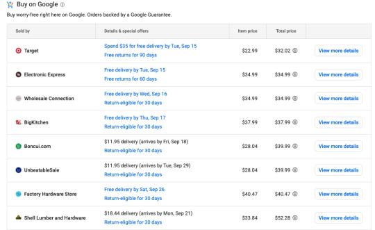
If this is what you want to purchase, you can add the item to your cart or buy it instantly.
You never had to go to the Target site, and you never had to search multiple sites to compare.
How to Get Started With Google Shopping Actions
The Google Merchant Center and Google Shopping Actions are very flexible. You can connect third-party platforms you’re already using, such as Shopify and SureDone, and even link your Amazon feed, to reduce work redundancy.
To set up Shopping Actions, you first need to sign up for a free account on Google’s Merchant Center. It’s basically your Google Shopping dashboard. You then select Shopping Actions as part of the Merchant Center sign-up process.
Once you’re signed up, you will be prompted to do the following:
List products
Add branding
Select tax and shipping preferences
Choose return preferences
Establish user roles
Provide customer service contact information
Decide whether customers will be invited to sign up for a newsletter at checkout
Include promotional information
That last one is optional, but Google recommends running promotions to attract more customers.
In order to use Google Shopping Actions, you have to implement the Orders API. This allows you to use the Google Merchant Center to manage your orders.
Of course, one of the really attractive features of Google Shopping Actions is you don’t have to manage your orders yourself. Google can handle shipping and returns and provide customer service if you choose. It’s entirely up to you.
Once a user purchases something through Google Shopping, the order shows up in your API as “in progress” for about 30 minutes. This half-hour window allows shoppers to cancel all or part of their order, if they need to. Google recommends you don’t ship anything until the status changes to “Pending Shipment.”
Things to Look Out for With Google Shopping Actions
First of all, it’s important to note that free Google shopping listings are for organic search only. If you want to place your products on specific SERPs, you have to pay through Google’s Shopping Ads program.
If you’re running Google Ads already, it’s worth setting up those same products in Google Shopping Actions, too. That way, you’re getting double the exposure for the same price.
youtube
Additionally, Google Shopping Actions is currently only available in the U.S. and France. If you’re going to sign up, you have to be a legally registered business in one of those countries and accept payment, make deliveries, and handle returns in those places.
Google Shopping Actions policies also include the following:
Your Inventory can’t include restricted products and services. A list is available through Google Support.
You need a valid ID from the country where your business is registered.
You must meet all of Google’s returns and customer support standards.
Listing Your Products on Google Shopping Actions
To get your products listed on Google Shopping, you have to set up a product feed. For your product feed, Google needs the following information:
A product ID number (id)
Product title, such as cast iron pan (title)
A product description (description)
A link to your product page (link)
A link to your image (image_link)
Product availability (availability)
Product price (price)
Google product category, such as kitchenware or cooking (google_product_category)
Product brand name (brand)
Global Trade Item Number (GTIN)
Google can crawl your site if you already have this information set up, or you can do a fetch from your servers. If you don’t have this information set up, you can create a Google Sheet or Excel spreadsheet to upload to your merchant account. Use the names in the parentheses to label your categories.
A very basic product data spreadsheet would look something like this:

Now, this information is for your primary feed. You can set up supplemental feeds as well, which can cover sales, limited edition products, or special offers.
Optimizing Your Google Shopping Listings
Like you would for your site, you want to make sure your listings are optimized for organic search.
First of all, make sure all of your information is accurate, from your description to your price. If appropriate, use geotags to make sure you pop up in local searches.
Verify your title, description, and images are optimized, as well.
Product Titles
Use strong keywords that reflect user search queries in your title. Do keyword research to see what users are searching for when they look for products similar to yours. You can use a keyword tool or simply look at the “People also ask” and “Searches related to” sections of a Google results page.
Remember, using strong keywords in your product title not only lets users find you, but it also helps Google place your products on the right results pages. Google crawls both product titles and descriptions for detailed keywords to place products.
So, instead of using “skillet” alone as your title, try something more detailed, such as “12-inch cast iron skillet.”
Product Descriptions
Make your product descriptions detailed and pragmatic. Phrases such as “amazing skillet” aren’t going to win you any organic search points. But, “Our 12-inch cast-iron skillet is seasoned with olive oil and holds heat well” tells both the user and Google precisely what your product is.
Remember to keep it short and sweet. Only 70 words show up on product pages in Google.
Product Images
According to a Weebly survey, 75% of online shoppers said product images are very influential in their decision process. That means your images should make your products look as appealing as possible.
Images should be clear, well-lit, and professional. And your products should be front and center.
Choose multiple images that give your product scale, display it from different angles, and show it in use so users can get a sense of how it will work for them.
For the cast iron skillet, Lodge shows their product served up with chicken and sizzling away on a grill with vegetables.

Monitor Your Product Listings
Finally, keep a constant eye on your product listings. Compare them to similar listings that are doing well to determine how to improve your own. Watch for rises or dips in visibility and clicks to see if you can attribute them to search trends.
Keep abreast of Google’s algorithm changes. A change in the way Google places organic search content could affect your listings.
What’s Changing With Google Shopping Actions?
Aside from free listings and no commissions, Google is making a few other changes to the Google Shopping experience:
Starting with PayPal, Google is now allowing direct linking of merchants’ payment accounts to Google Merchant Center.
Merchants can handle customer service directly, but they still have Google customer service to back them up.
Google allows merchants to handle their own returns or choose to let Google manage them.
The Google Merchant Center is compatible with your Amazon feed.
Google Shopping Actions vs. Amazon
Amazon is still the leader in online shopping. But, Google is beginning to give the e-commerce giant a run for its money, particularly now that listings are free. Google has a few other advantages over Amazon as well.
To begin with, unlike Amazon, Google gives shoppers more than one buying option for products. They can buy from a retailer’s site or from their brick-and-mortar locations. Many products are even available to buy right through Google.
Because Google Shopping is available across all of its platforms, users can browse shopping results and add products to their universal shopping cart wherever they are, even YouTube:

Google Shopping Actions gives you access to customer data, where Amazon doesn’t. You can track purchasing habits and trends to build stronger relationships with your customers.
Now that you can upload your Amazon feed to Google Merchant Center, it’s easier to run both programs for your products, potentially doubling their exposure.
Conclusion
With free Google Shopping, merchants have an incredible opportunity to increase their revenue through e-commerce. By optimizing your product listings through Google Shopping Actions, you can get your products in front of users and potentially help increase your conversions.
Consider running paid campaigns or just utilizing the free listings to grow your customer base and allow users to compare prices.
Have you tried Google Shopping Actions for your e-commerce store?
The post Google Shopping Actions: How to Increase Product Visibility for Free appeared first on Neil Patel.
Original content source: https://ift.tt/2GTRp0R via https://neilpatel.com
The post, Google Shopping Actions: How to Increase Product Visibility for Free, has been shared from https://ift.tt/2RrAuop via https://ift.tt/2r0Go64
0 notes
Text
Google Shopping Actions: How to Increase Product Visibility for Free

Did you know Google Shopping listings are free for most merchants to use?
Google has also dropped commissions for its Buy on Google program. This means nearly any retailer can sign up for Google Shopping Actions and link their products without paying the 12% commission Google formerly collected on each sale.
Retailers and advertisers have a unique opportunity to get incredible exposure for their products. Almost half of users turn to Google to find or discover new products. This means even small businesses can put themselves in front of millions of new potential customers with just a few clicks.
What Is Google Shopping Actions?
Google Shopping Actions partners with several retailers to create a shopping experience in direct competition with Amazon. Today, this program allows retailers to upload products that appear in organic search across Google platforms. In turn, shoppers can find, compare, and buy products without ever having to leave Google.
The user-facing side is called “Google Shopping.” When a user searches for a product, it places relevant items in the Shopping tab of their results page, alongside a number of options regarding how to buy them. It gives customers access to a universal shopping cart, shareable lists, and instant checkout with saved payment credentials.
So if you burn a pan while you’re cooking, you can use Google Home to buy a new one, add it to your shopping cart to buy later, or browse and compare new pans on your phone and buy it immediately.
Just like Amazon, when users start using Google Shopping for purchases, they’ll begin seeing personalized recommendations across platforms.
It all makes for a seamless shopping experience that may increase conversions and decrease abandoned carts.
Note: Google Shopping Actions isn’t the same as Google Shopping Ads. Retailers pay for their results to appear as featured Google Shopping Ads, while organic Shopping Actions are free. The organic search element makes it different from Google Shopping Ads, where retailers pay for placement.
What Does the Order Process Look Like on Google Shopping Actions?
Let’s go back to the burnt skillet example to walk through the customer buying process. After you enter “skillet” and get a results page, click on the “Shopping” tab at the top of the first SERP. You’ll get a list of skillet options, as well as filters on the left to narrow your search.

If you choose “Buy on Google,” you’ll only get options you can buy directly from Google. You’ll know which ones are part of the Buy on Google Program by the little shopping cart icon at the top left of each result:

Let’s say you chose to look at this Lodge skillet that ships from Target. You’ll see product descriptions and reviews, plus the average price of similar items to help you compare.

If this is what you want to purchase, you can add the item to your cart or buy it instantly.
You never had to go to the Target site, and you never had to search multiple sites to compare.
How to Get Started With Google Shopping Actions
The Google Merchant Center and Google Shopping Actions are very flexible. You can connect third-party platforms you’re already using, such as Shopify and SureDone, and even link your Amazon feed, to reduce work redundancy.
To set up Shopping Actions, you first need to sign up for a free account on Google’s Merchant Center. It’s basically your Google Shopping dashboard. You then select Shopping Actions as part of the Merchant Center sign-up process.
Once you’re signed up, you will be prompted to do the following:
List products
Add branding
Select tax and shipping preferences
Choose return preferences
Establish user roles
Provide customer service contact information
Decide whether customers will be invited to sign up for a newsletter at checkout
Include promotional information
That last one is optional, but Google recommends running promotions to attract more customers.
In order to use Google Shopping Actions, you have to implement the Orders API. This allows you to use the Google Merchant Center to manage your orders.
Of course, one of the really attractive features of Google Shopping Actions is you don’t have to manage your orders yourself. Google can handle shipping and returns and provide customer service if you choose. It’s entirely up to you.
Once a user purchases something through Google Shopping, the order shows up in your API as “in progress” for about 30 minutes. This half-hour window allows shoppers to cancel all or part of their order, if they need to. Google recommends you don’t ship anything until the status changes to “Pending Shipment.”
Things to Look Out for With Google Shopping Actions
First of all, it’s important to note that free Google shopping listings are for organic search only. If you want to place your products on specific SERPs, you have to pay through Google’s Shopping Ads program.
If you’re running Google Ads already, it’s worth setting up those same products in Google Shopping Actions, too. That way, you’re getting double the exposure for the same price.
youtube
Additionally, Google Shopping Actions is currently only available in the U.S. and France. If you’re going to sign up, you have to be a legally registered business in one of those countries and accept payment, make deliveries, and handle returns in those places.
Google Shopping Actions policies also include the following:
Your Inventory can’t include restricted products and services. A list is available through Google Support.
You need a valid ID from the country where your business is registered.
You must meet all of Google’s returns and customer support standards.
Listing Your Products on Google Shopping Actions
To get your products listed on Google Shopping, you have to set up a product feed. For your product feed, Google needs the following information:
A product ID number (id)
Product title, such as cast iron pan (title)
A product description (description)
A link to your product page (link)
A link to your image (image_link)
Product availability (availability)
Product price (price)
Google product category, such as kitchenware or cooking (google_product_category)
Product brand name (brand)
Global Trade Item Number (GTIN)
Google can crawl your site if you already have this information set up, or you can do a fetch from your servers. If you don’t have this information set up, you can create a Google Sheet or Excel spreadsheet to upload to your merchant account. Use the names in the parentheses to label your categories.
A very basic product data spreadsheet would look something like this:
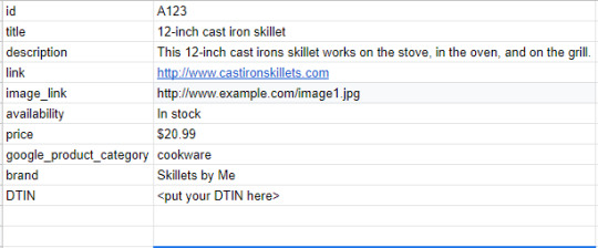
Now, this information is for your primary feed. You can set up supplemental feeds as well, which can cover sales, limited edition products, or special offers.
Optimizing Your Google Shopping Listings
Like you would for your site, you want to make sure your listings are optimized for organic search.
First of all, make sure all of your information is accurate, from your description to your price. If appropriate, use geotags to make sure you pop up in local searches.
Verify your title, description, and images are optimized, as well.
Product Titles
Use strong keywords that reflect user search queries in your title. Do keyword research to see what users are searching for when they look for products similar to yours. You can use a keyword tool or simply look at the “People also ask” and “Searches related to” sections of a Google results page.
Remember, using strong keywords in your product title not only lets users find you, but it also helps Google place your products on the right results pages. Google crawls both product titles and descriptions for detailed keywords to place products.
So, instead of using “skillet” alone as your title, try something more detailed, such as “12-inch cast iron skillet.”
Product Descriptions
Make your product descriptions detailed and pragmatic. Phrases such as “amazing skillet” aren’t going to win you any organic search points. But, “Our 12-inch cast-iron skillet is seasoned with olive oil and holds heat well” tells both the user and Google precisely what your product is.
Remember to keep it short and sweet. Only 70 words show up on product pages in Google.
Product Images
According to a Weebly survey, 75% of online shoppers said product images are very influential in their decision process. That means your images should make your products look as appealing as possible.
Images should be clear, well-lit, and professional. And your products should be front and center.
Choose multiple images that give your product scale, display it from different angles, and show it in use so users can get a sense of how it will work for them.
For the cast iron skillet, Lodge shows their product served up with chicken and sizzling away on a grill with vegetables.
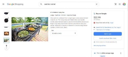
Monitor Your Product Listings
Finally, keep a constant eye on your product listings. Compare them to similar listings that are doing well to determine how to improve your own. Watch for rises or dips in visibility and clicks to see if you can attribute them to search trends.
Keep abreast of Google’s algorithm changes. A change in the way Google places organic search content could affect your listings.
What’s Changing With Google Shopping Actions?
Aside from free listings and no commissions, Google is making a few other changes to the Google Shopping experience:
Starting with PayPal, Google is now allowing direct linking of merchants’ payment accounts to Google Merchant Center.
Merchants can handle customer service directly, but they still have Google customer service to back them up.
Google allows merchants to handle their own returns or choose to let Google manage them.
The Google Merchant Center is compatible with your Amazon feed.
Google Shopping Actions vs. Amazon
Amazon is still the leader in online shopping. But, Google is beginning to give the e-commerce giant a run for its money, particularly now that listings are free. Google has a few other advantages over Amazon as well.
To begin with, unlike Amazon, Google gives shoppers more than one buying option for products. They can buy from a retailer’s site or from their brick-and-mortar locations. Many products are even available to buy right through Google.
Because Google Shopping is available across all of its platforms, users can browse shopping results and add products to their universal shopping cart wherever they are, even YouTube:

Google Shopping Actions gives you access to customer data, where Amazon doesn’t. You can track purchasing habits and trends to build stronger relationships with your customers.
Now that you can upload your Amazon feed to Google Merchant Center, it’s easier to run both programs for your products, potentially doubling their exposure.
Conclusion
With free Google Shopping, merchants have an incredible opportunity to increase their revenue through e-commerce. By optimizing your product listings through Google Shopping Actions, you can get your products in front of users and potentially help increase your conversions.
Consider running paid campaigns or just utilizing the free listings to grow your customer base and allow users to compare prices.
Have you tried Google Shopping Actions for your e-commerce store?
The post Google Shopping Actions: How to Increase Product Visibility for Free appeared first on Neil Patel.
Original content source: https://neilpatel.com/blog/google-shopping-actions/ via https://neilpatel.com
The original post, Google Shopping Actions: How to Increase Product Visibility for Free, has been shared from https://imtrainingparadise.wordpress.com/2020/09/14/google-shopping-actions-how-to-increase-product-visibility-for-free/ via https://imtrainingparadise.wordpress.com
0 notes
Text
Google Shopping Actions: How to Increase Product Visibility for Free

Did you know Google Shopping listings are free for most merchants to use?
Google has also dropped commissions for its Buy on Google program. This means nearly any retailer can sign up for Google Shopping Actions and link their products without paying the 12% commission Google formerly collected on each sale.
Retailers and advertisers have a unique opportunity to get incredible exposure for their products. Almost half of users turn to Google to find or discover new products. This means even small businesses can put themselves in front of millions of new potential customers with just a few clicks.
What Is Google Shopping Actions?
Google Shopping Actions partners with several retailers to create a shopping experience in direct competition with Amazon. Today, this program allows retailers to upload products that appear in organic search across Google platforms. In turn, shoppers can find, compare, and buy products without ever having to leave Google.
The user-facing side is called “Google Shopping.” When a user searches for a product, it places relevant items in the Shopping tab of their results page, alongside a number of options regarding how to buy them. It gives customers access to a universal shopping cart, shareable lists, and instant checkout with saved payment credentials.
So if you burn a pan while you’re cooking, you can use Google Home to buy a new one, add it to your shopping cart to buy later, or browse and compare new pans on your phone and buy it immediately.
Just like Amazon, when users start using Google Shopping for purchases, they’ll begin seeing personalized recommendations across platforms.
It all makes for a seamless shopping experience that may increase conversions and decrease abandoned carts.
Note: Google Shopping Actions isn’t the same as Google Shopping Ads. Retailers pay for their results to appear as featured Google Shopping Ads, while organic Shopping Actions are free. The organic search element makes it different from Google Shopping Ads, where retailers pay for placement.
What Does the Order Process Look Like on Google Shopping Actions?
Let’s go back to the burnt skillet example to walk through the customer buying process. After you enter “skillet” and get a results page, click on the “Shopping” tab at the top of the first SERP. You’ll get a list of skillet options, as well as filters on the left to narrow your search.
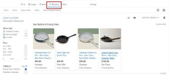
If you choose “Buy on Google,” you’ll only get options you can buy directly from Google. You’ll know which ones are part of the Buy on Google Program by the little shopping cart icon at the top left of each result:

Let’s say you chose to look at this Lodge skillet that ships from Target. You’ll see product descriptions and reviews, plus the average price of similar items to help you compare.

If this is what you want to purchase, you can add the item to your cart or buy it instantly.
You never had to go to the Target site, and you never had to search multiple sites to compare.
How to Get Started With Google Shopping Actions
The Google Merchant Center and Google Shopping Actions are very flexible. You can connect third-party platforms you’re already using, such as Shopify and SureDone, and even link your Amazon feed, to reduce work redundancy.
To set up Shopping Actions, you first need to sign up for a free account on Google’s Merchant Center. It’s basically your Google Shopping dashboard. You then select Shopping Actions as part of the Merchant Center sign-up process.
Once you’re signed up, you will be prompted to do the following:
List products
Add branding
Select tax and shipping preferences
Choose return preferences
Establish user roles
Provide customer service contact information
Decide whether customers will be invited to sign up for a newsletter at checkout
Include promotional information
That last one is optional, but Google recommends running promotions to attract more customers.
In order to use Google Shopping Actions, you have to implement the Orders API. This allows you to use the Google Merchant Center to manage your orders.
Of course, one of the really attractive features of Google Shopping Actions is you don’t have to manage your orders yourself. Google can handle shipping and returns and provide customer service if you choose. It’s entirely up to you.
Once a user purchases something through Google Shopping, the order shows up in your API as “in progress” for about 30 minutes. This half-hour window allows shoppers to cancel all or part of their order, if they need to. Google recommends you don’t ship anything until the status changes to “Pending Shipment.”
Things to Look Out for With Google Shopping Actions
First of all, it’s important to note that free Google shopping listings are for organic search only. If you want to place your products on specific SERPs, you have to pay through Google’s Shopping Ads program.
If you’re running Google Ads already, it’s worth setting up those same products in Google Shopping Actions, too. That way, you’re getting double the exposure for the same price.
youtube
Additionally, Google Shopping Actions is currently only available in the U.S. and France. If you’re going to sign up, you have to be a legally registered business in one of those countries and accept payment, make deliveries, and handle returns in those places.
Google Shopping Actions policies also include the following:
Your Inventory can’t include restricted products and services. A list is available through Google Support.
You need a valid ID from the country where your business is registered.
You must meet all of Google’s returns and customer support standards.
Listing Your Products on Google Shopping Actions
To get your products listed on Google Shopping, you have to set up a product feed. For your product feed, Google needs the following information:
A product ID number (id)
Product title, such as cast iron pan (title)
A product description (description)
A link to your product page (link)
A link to your image (image_link)
Product availability (availability)
Product price (price)
Google product category, such as kitchenware or cooking (google_product_category)
Product brand name (brand)
Global Trade Item Number (GTIN)
Google can crawl your site if you already have this information set up, or you can do a fetch from your servers. If you don’t have this information set up, you can create a Google Sheet or Excel spreadsheet to upload to your merchant account. Use the names in the parentheses to label your categories.
A very basic product data spreadsheet would look something like this:

Now, this information is for your primary feed. You can set up supplemental feeds as well, which can cover sales, limited edition products, or special offers.
Optimizing Your Google Shopping Listings
Like you would for your site, you want to make sure your listings are optimized for organic search.
First of all, make sure all of your information is accurate, from your description to your price. If appropriate, use geotags to make sure you pop up in local searches.
Verify your title, description, and images are optimized, as well.
Product Titles
Use strong keywords that reflect user search queries in your title. Do keyword research to see what users are searching for when they look for products similar to yours. You can use a keyword tool or simply look at the “People also ask” and “Searches related to” sections of a Google results page.
Remember, using strong keywords in your product title not only lets users find you, but it also helps Google place your products on the right results pages. Google crawls both product titles and descriptions for detailed keywords to place products.
So, instead of using “skillet” alone as your title, try something more detailed, such as “12-inch cast iron skillet.”
Product Descriptions
Make your product descriptions detailed and pragmatic. Phrases such as “amazing skillet” aren’t going to win you any organic search points. But, “Our 12-inch cast-iron skillet is seasoned with olive oil and holds heat well” tells both the user and Google precisely what your product is.
Remember to keep it short and sweet. Only 70 words show up on product pages in Google.
Product Images
According to a Weebly survey, 75% of online shoppers said product images are very influential in their decision process. That means your images should make your products look as appealing as possible.
Images should be clear, well-lit, and professional. And your products should be front and center.
Choose multiple images that give your product scale, display it from different angles, and show it in use so users can get a sense of how it will work for them.
For the cast iron skillet, Lodge shows their product served up with chicken and sizzling away on a grill with vegetables.

Monitor Your Product Listings
Finally, keep a constant eye on your product listings. Compare them to similar listings that are doing well to determine how to improve your own. Watch for rises or dips in visibility and clicks to see if you can attribute them to search trends.
Keep abreast of Google’s algorithm changes. A change in the way Google places organic search content could affect your listings.
What’s Changing With Google Shopping Actions?
Aside from free listings and no commissions, Google is making a few other changes to the Google Shopping experience:
Starting with PayPal, Google is now allowing direct linking of merchants’ payment accounts to Google Merchant Center.
Merchants can handle customer service directly, but they still have Google customer service to back them up.
Google allows merchants to handle their own returns or choose to let Google manage them.
The Google Merchant Center is compatible with your Amazon feed.
Google Shopping Actions vs. Amazon
Amazon is still the leader in online shopping. But, Google is beginning to give the e-commerce giant a run for its money, particularly now that listings are free. Google has a few other advantages over Amazon as well.
To begin with, unlike Amazon, Google gives shoppers more than one buying option for products. They can buy from a retailer’s site or from their brick-and-mortar locations. Many products are even available to buy right through Google.
Because Google Shopping is available across all of its platforms, users can browse shopping results and add products to their universal shopping cart wherever they are, even YouTube:

Google Shopping Actions gives you access to customer data, where Amazon doesn’t. You can track purchasing habits and trends to build stronger relationships with your customers.
Now that you can upload your Amazon feed to Google Merchant Center, it’s easier to run both programs for your products, potentially doubling their exposure.
Conclusion
With free Google Shopping, merchants have an incredible opportunity to increase their revenue through e-commerce. By optimizing your product listings through Google Shopping Actions, you can get your products in front of users and potentially help increase your conversions.
Consider running paid campaigns or just utilizing the free listings to grow your customer base and allow users to compare prices.
Have you tried Google Shopping Actions for your e-commerce store?
The post Google Shopping Actions: How to Increase Product Visibility for Free appeared first on Neil Patel.
Google Shopping Actions: How to Increase Product Visibility for Free Publicado primeiro em https://neilpatel.com
0 notes
Last Seen Blogs

iwantkosokoso
Secretly... I’ll teach you where it lies ♪

mastertorture77
MasterTorture

trendzstyle
Women Clothing - Buy Designer Ethnic Wear, Ethnic Suits Online

honey-tongued-devil
the devil in disguise

zola-film-complet-top26
REGARDER Zola 2021 STREAMING VF FILM COMPLET EN Français