#annotated wireframes
Explore tagged Tumblr posts
Visit Tumblr Blog
Explore Tumblr blogs with no restrictions, modern design and the best experience.
Last Seen Tumblr Blogs


Fun Fact
Tumblr was attacked by a cross-site scripting worm deployed by the Internet troll group GNAA on Dec 3, 2012.
Text

AI's new body
Midjourney prompt: This image presents a highly detailed, futuristic digital infographic centered around a human figure displayed in a wireframe or holographic style. The figure, shown in a standing pose with hands extended, is surrounded by various scientific and technological elements, reminiscent of a human anatomy diagram combined with astrophysical and molecular illustrations. Key Elements: 1. Human Figure in Holographic Wireframe: A detailed, semi-transparent human figure occupies the central area of the image. The figure is rendered in a green, holographic style, with a translucent, grid-like structure. This structure may represent a scientific exploration of the human body, possibly focused on anatomy, energy fields, or neural networks. The figure stands with one hand extended forward and the other close to the torso, as if interacting with an unseen interface. 2. Background and Surrounding Elements: The background features a dark grid, enhancing the scientific and futuristic feel. Surrounding the figure are various circular diagrams, graphs, and text boxes. These elements appear to be scientific annotations, with some sections resembling molecular structures, energy fields, and celestial objects. 3. Scientific and Cosmic Diagrams: The image includes numerous circular illustrations that look like schematics of planets, atoms, or particles. Some depict planetary orbits or atomic structures, emphasizing a connection between human physiology and cosmic or quantum phenomena. One larger circle around the human figure might represent an energy field, aura, or magnetic field, as if suggesting the human body’s interaction with a broader cosmic or energetic system. 4. Text Boxes and Graphical Data: Text boxes containing intricate, fine-text annotations cover the left and right sides. [...]
#Midjourney#AI#AI art#AI art generation#AI artwork#AI generated#AI image#computer art#computer generated
5 notes
·
View notes
Text
AutoCAD 2D & 3D Online Course – Learn Professional Drafting & Modeling Skills
Transform your design ideas into professional CAD drawings with our complete AutoCAD 2D & 3D Online Course. This course is tailored for students, engineers, architects, interior designers, and anyone seeking CAD skills. Begin your journey with an introduction to the AutoCAD interface, menus, toolbars, and navigation tools. Start with 2D drafting, learning to draw accurate floor plans, elevations, and mechanical parts. Master key tools such as line, polyline, circle, arc, offset, trim, and extend. Organize your drawings using layers, blocks, and object properties for cleaner and smarter designs. Add dimensions, text, hatches, and annotations to make your drawings informative and presentation-ready. Use templates and layout sheets to prepare your drawings for printing and sharing. Advance to 3D modeling, starting with basic shapes and evolving to detailed objects using extrude, revolve, loft, and sweep. Learn how to modify 3D objects using Boolean operations, shelling, fillets, and chamfers. Create realistic presentations with materials, lighting, and rendering tools. Understand the difference between wireframe, surface, and solid modeling in AutoCAD. Work with real-world projects like house plans, mechanical components, and furniture models. Gain efficiency with shortcut keys, command-line use, and drawing management techniques. Practice through guided exercises, downloadable DWG files, and self-paced assignments. Interactive quizzes and hands-on projects help you apply what you’ve learned. Get support from expert instructors through community discussions and Q&A sections. No prior experience is needed—just a willingness to learn and basic computer literacy. Flexible online learning allows you to access the course anytime, on any device. Receive a certificate of completion recognized by employers and academic institutions. Stay updated with lessons aligned to the latest AutoCAD software version. Perfect for both academic learning and professional development. Improve your portfolio with high-quality 2D and 3D project work. Boost your career opportunities in architecture, engineering, design, and drafting. Enroll now and build professional AutoCAD skills from the comfort of your home!

#autocad 2d & 3d course#autocad 2d and 3d online course#autocad 2d and 3d courses#auto cad 2d and 3d course#online autocad 2d & 3d course#autocad 3d and 2d
0 notes
Text
Streamlining Collaboration with Adobe Acrobat for Architectural Document Management
Design Architecture using Adobe: Common Queries Answered
1. How can Adobe Photoshop be utilized in architectural design to create realistic renderings of building concepts?
Adobe Photoshop can be utilized in architectural design by enhancing images of 3D models with textures, shadows, and lighting effects to create realistic renderings. Designers can layer elements, adjust colors, and add backgrounds to simulate real environments. Additionally, Photoshop allows for the integration of graphic elements and annotations, making presentations more visually compelling and easier to understand.
2. What are the advantages of using Adobe Illustrator for creating detailed architectural diagrams and floor plans compared to traditional drafting methods?
Adobe Illustrator offers precision, scalability, and flexibility for creating detailed architectural diagrams and floor plans. Unlike traditional drafting methods, it allows for easy modifications, layering, and the integration of colors and textures. Additionally, digital files can be easily shared, edited, and printed without loss of quality, making collaboration more efficient and enhancing overall design presentation.
3. In what ways can Adobe InDesign enhance the presentation of architectural portfolios and project proposals?
Adobe InDesign enhances architectural portfolios and project proposals by providing flexible layout options, precise typography, and high-quality image handling. It allows for the integration of text, graphics, and visuals in a cohesive design. Features like master pages, grids, and styles streamline the design process, ensuring a professional presentation that effectively communicates concepts and showcases projects to clients and stakeholders.
4. How can Adobe XD be leveraged to design user interfaces for architectural visualization applications or websites?
Adobe XD can be used to design user interfaces for architectural visualization by creating wireframes, mockups, and interactive prototypes. Its vector tools allow for precise design of layouts, while repeat grids help manage multiple elements efficiently. Collaboration features enable feedback from stakeholders, ensuring the UI aligns with architectural elements, enhancing user experience in navigating visual content.
5. What are some best practices for using Adobe Acrobat to share and collaborate on architectural documents and blueprints with clients and stakeholders?
Use Adobe Acrobat to share architectural documents by utilizing features like commenting, markup tools, and shared reviews. Ensure documents are organized and labeled clearly. Use secure permissions for sensitive information and consider using PDF Portfolios for multiple documents. Regularly update stakeholders through notifications and maintain a version history for transparency and clarity in collaboration.

Visit: VS Website See: VS Portfolio
0 notes
Text
Week 9: Feedback, Framing, and Low-Fidelity Prototypes
Part I: The Experience
This week marked a key moment in the development of Hīkoi Huna. My primary focus was preparing for Crit Session 2, where I shared the evolution of my concept and gathered peer and tutor feedback to guide the next design stage. Drawing from my preparation in Week 8, I pitched my concept through a structured walkthrough. I narrated the cultural and historical motivations behind the work, explained the choice of mobile-based AR and NFC tags, and presented sketches and annotated screen mockups in Figma that helped communicate how users might interact with the system. I also shared insights from last week’s site audit and NFC experiments and talked through my early interface mockups developed in Figma. I also created a narrative script mapping the flow of interactions across proposed locations like Britomart and Albert Park. The script helped prototype user pacing, story sequencing, and reflective prompts without building an actual interface yet. I plan to convert this into a visual flow or simple clickable wireframe next week.

During the critique, feedback highlighted the strength of the concept’s cultural sensitivity and experiential ambition, but also raised key questions about accessibility, visual clarity, and scope. Several peers commented that while the narrative layering was powerful, the technology stack needed simplification to ensure usability. One tutor suggested testing a text-and-audio-only version to see if the emotional core still resonated without full AR visuals. Phoenix and Humayra offered particularly thoughtful suggestions—Phoenix encouraged me to clarify entry points to the experience and consider how users would emotionally onboard into the story, while Humayra suggested more modular storytelling so users could explore at their own pace.

Part II: Reflection on Action
I left the crit session with a clearer understanding of how my design values were being interpreted by others. While I had assumed the technical elements would elevate the experience, the feedback reminded me that emotional clarity and narrative cohesion matter more than technological flair. This validated my decision to start with low-fidelity tools like narrative script and Figma before jumping into Unity or AR SDKs.
I also appreciated the conversation around my role as a facilitator rather than the author of these stories. Their suggestions affirmed that my design was being received in the spirit of care I intended, while also highlighting areas where I could improve emotional pacing and user agency.
Part III: Theory
I returned to Linda Tuhiwai Smith’s writing on indigenous knowledge systems and user agency. Her emphasis on relational accountability made me re-examine how my prototype invites participation—are users passive receivers or active navigators of knowledge? I found this insight useful as I began restructuring my narrative script to offer more choice and reflection moments.
I also revisited Creative New Zealand’s placemaking strategies and found useful parallels in their emphasis on "shared authorship" in public design. These frameworks helped me better frame the co-design elements I want to include in future phases.
References
Smith, L. T. (2012). Decolonizing Methodologies: Research and Indigenous Peoples (2nd ed.). Zed Books.
Part IV: Preparation
Next week, I aim to integrate the feedback from Crit Session 2 into my next prototypes. My goals are:
Simplify interaction flow based on feedback (e.g. audio-first story triggers)
Explore map-based interfaces that align with urban walking patterns
Continue iterating on narrative script for story structure and Figma for UI concepts
Create a short field test using NFC-triggered text prompts at 2–3 sites
Week 9 helped me refine Hīkoi Huna into something more focused, culturally mindful, and technically feasible. My next step is to begin grounding the digital prototype in real-world spatial movement.
0 notes
Text
Use Pencil to Edit PDFs on iPad: The Ultimate Productivity Combo
If you’ve ever tried editing PDFs on your iPad, you know that typing and tapping can only go so far. But with the Apple Pencil, editing PDFs becomes fast, fluid, and incredibly precise. Whether you're signing contracts, highlighting lecture notes, or annotating business reports, using Pencil to edit PDFs on iPad turns your device into a powerful digital workstation.
In this blog, we’ll explore how to fully unlock the potential of the Apple Pencil for PDF editing — including tools, apps, and pro tips that will streamline your workflow.
Why Use Apple Pencil to Edit PDFs on iPad?
The Apple Pencil wasn’t just made for artists — it’s a productivity powerhouse for document editing. Here’s why:
🖋️ Natural Precision: Write, highlight, or draw exactly as you would on paper.
📋 Instant Edits: No need for a keyboard — make quick notes, markups, and signatures.
📱 On-the-Go Power: Edit and manage PDFs from anywhere, whether in a classroom, office, or on a plane.
💡 Paperless Efficiency: Skip printing and scanning — everything is digital, fast, and organized.
What You Need to Get Started
Before you start editing PDFs with Apple Pencil, make sure you’ve got the right setup:
✅ iPad: Any model that supports Apple Pencil (iPad 6th gen or later, iPad Pro, Air 3rd gen or later)
✅ Apple Pencil: Gen 1 or Gen 2 depending on your iPad model
✅ PDF Editing App: An app that fully supports Pencil input (more on that below)
Best Apps to Use Pencil to Edit PDFs on iPad
Not all PDF apps are created equal when it comes to Apple Pencil functionality. Here are some top recommendations:AppWhy It’s GreatPDF 7All-in-one editor: annotations, text edits, form filling, signatures — fully optimized for Apple PencilGoodNotesBest for students and handwritten notes on PDFsPDF ExpertGreat for professionals managing large documentsNotabilityIdeal for blending handwriting, audio, and sketches in PDF notes
If you’re looking for the most seamless experience, PDF 7 is built from the ground up to work beautifully with Apple Pencil.
How to Use Pencil to Edit PDFs on iPad
Let’s walk through how to use your Apple Pencil to handle every kind of PDF task:
✍️ 1. Annotate with Ease
Just open your PDF in a compatible app, grab your Pencil, and start marking:
Highlight text with a swipe
Underline or circle key points
Draw arrows or shapes to point things out
Jot down notes in the margins
📝 2. Fill Out Forms
Interactive PDFs? No problem. Use your Pencil to:
Tap into text fields and write by hand
Check boxes or initial forms
Submit right from the app
✒️ 3. Sign Documents Instantly
Gone are the days of printing and scanning. With Apple Pencil:
Open the PDF in an editor like PDF 7
Tap the signature tool
Sign naturally using Pencil
Save or send — all in under a minute
🔧 4. Edit Text (Yes, Actual Text)
Some PDF editors — like PDF 7 — allow direct text editing. Simply:
Select the text block you want to change
Use Pencil to highlight or delete
Type or handwrite new content
Pro Tips for Smoother Editing with Apple Pencil
Make the most of your Apple Pencil by using these smart tips:
🔒 Enable Palm Rejection This avoids accidental marks from your hand while writing.
🔍 Zoom In for Detail Work Perfect for small annotations or fine-tuning your signature.
💾 Use Cloud Storage Apps with iCloud, Dropbox, or Google Drive integration make saving and accessing your work seamless.
🎯 Customize Your Toolbar Set up quick access to your favorite tools — highlighter, pen, shape tool, etc.
Who Benefits Most from Using Pencil to Edit PDFs?
📚 Students – Annotate textbooks, add notes to slides, highlight lectures 💼 Professionals – Sign contracts, review proposals, mark up reports 🧠 Creatives – Sketch wireframes, give visual feedback, hand-draw edits 📄 Everyday Users – Fill out forms, sign documents, organize paperwork
If you're working with PDFs in any capacity, the Pencil-iPad combo is a total game-changer.
FAQs: Pencil to Edit PDFs on iPad
Q: Can I edit PDF text using Apple Pencil? Yes, with apps like PDF 7, you can highlight text, delete, and even write in new text directly on the document.
Q: Which is the best app to edit PDFs with Pencil on iPad? PDF 7 is highly recommended for its full suite of editing tools and flawless Pencil support.
Q: Is Apple Pencil better than finger or keyboard for editing PDFs? Absolutely. The Pencil allows for precise edits, natural handwriting, and faster annotations than typing or tapping.
Q: Can I use Pencil on free PDF apps? Yes, but premium apps offer better precision, features, and cloud sync options.
Final Thoughts
Using Pencil to edit PDFs on iPad makes document management easier, faster, and more natural than ever before. Whether you’re a student, professional, or anyone who works with PDFs regularly, this combination lets you interact with your documents in a way that feels truly hands-on — but with all the benefits of going fully digital.
So grab your iPad, connect your Apple Pencil, and start editing smarter today.
0 notes
Text
From Wireframes to Prototypes: The Workflow of a UI Design Consultant

Brands do not hire UI (User Interface) design consultants on a whim. It is a strategic business move, often sparked by specific needs or challenges. One big reason is perspective. Internal teams can get too close to a project, missing flaws or fresh ideas. UI consultants step in with an outsider’s clarity, spotting solutions that might otherwise stay hidden. Specialized skills are another draw. Building an in-house design team takes time and money; consultants deliver expertise on demand, whether conducting research or prototype testing.
UI design consultants are the masterminds behind the digital interfaces we interact with daily. They shape the visual and interactive layers of websites, apps, and other digital products, ensuring they are both eye-catching and easy to use.
We are about to explore the methodical workflows of these professionals. We’ll show how each phase builds on the last - from wireframing to prototyping – to create UIs that distill complexity into simplicity and make advanced functionalities feel seamless.
The Workflow: From First Chat to Final Launch
The workflow of a professional UI design consultant is a structured process rooted in collaboration, research, and refinement. Here’s how it unfolds:
The Kickoff: Setting the Stage
Every project starts with a kickoff meeting. It is the handshake that aligns everyone - consultants, clients, stakeholders. Goals get defined. Scope takes shape.
Timelines and budgets lock in. Responsibilities are assigned.
Consultants soak up details on brand values, target users, and business aims. It is the foundation that everything else builds on.
Research and Discovery: Digging Deep
Next comes research. Consultants dive into the product’s world. They study competitors, pore over analytics, and sift through user feedback. Sometimes, they chat with users directly through interviews or surveys.
The goal? Uncover pain points, grasp behaviors, and spot opportunities.
This phase is about grounding design in real insights. By the end, they know what users want and how the business can deliver.
Wireframing: Sketching the Skeleton
With research in hand, wireframing begins. Wireframing is where UI design consultants translate abstract ideas into tangible structures. Think of it as building the skeleton of a digital product - every bone must align perfectly before adding muscle or skin.
Consultants begin by synthesizing insights from user research, stakeholder interviews, and competitive analysis into a visual blueprint. These blueprints are stripped of color, imagery, or branding, focusing purely on layout, functionality, and user flow.
Sketching
A UI consultant’s first step in this stage often involves sketching rough layouts by hand. This low-cost method allows rapid iteration.
For example, a consultant might draft three versions of a mobile app’s home screen in minutes, testing each with stakeholders to gauge which layout best supports quick navigation.
Paper wireframes excel at identifying structural flaws early, like a misplaced call-to-action button or cluttered menus.
Digital Wireframes
Once the core structure is validated, consultants transition to digital tools like Figma or UXPin. Here, wireframes evolve into precise, annotated diagrams. Each element - buttons, forms, image placeholders - is positioned to reflect priority. An eCommerce wireframe might cluster product filters and search bars at the top, ensuring users can refine choices instantly.
Annotations are used to clarify interactions: “Hovering over this icon displays a tooltip; clicking this button triggers a modal window.” In this stage, UI consultants create multiple wireframe variations for different devices (mobile, desktop) and user scenarios (logged-in vs. guest). For example, for a SaaS dashboard, this might mean designing a collapsed sidebar for mobile to maximize screen space, while the desktop version features an expanded menu.
Why This Step Matters
Early Problem Detection: Fixing a UI navigation flaw in wireframes costs 10x less than post-development.
Stakeholder Alignment: Non-designers get to grasp the structure of the UI the consultants are envisioning (without any visual distractions) and share focused feedback.
Efficiency: Developers receive clear guidelines regarding the UI’s core structure so that there’s no back-and-forth during coding.
By the wireframing phase’s end, the UI consultant has established a functional hierarchy - a roadmap ensuring the final UI design aligns with user needs and technical constraints.
Mockups: Crafting Visual Identity
With wireframes approved, UI design consultants shift from architects to visual storytellers. Mockups inject brand personality into the skeletal structure, transforming grayscale outlines into polished interfaces.
This phase answers: How do we make functionality feel cohesive, trustworthy, and engaging?
Consultants start by developing style tiles - a curated collection of fonts, color palettes, and UI components. Unlike full mockups, style tiles are mood boards that define visual language. For a fintech app, a consultant might propose a palette of navy blue (trust) and gold (premium), paired with clean, sans-serif typography.
Stakeholders approve this direction before screen designs begin, preventing costly rebrands later. Next, consultants apply these styles to wireframes. A healthcare app’s wireframe might evolve from basic buttons to rounded, teal-colored elements with subtle shadows, conveying approachability.
Every visual choice serves a dual purpose: aesthetics and communication. High-contrast colors highlight interactive elements; whitespace guides the eye; consistent iconography reduces cognitive load.
Responsive design is critical here. Consultants create mockup variants for every screen size and state. A retail website’s product page might include:
Desktop: A grid layout with large images and side-by-side product details.
Mobile: A stacked layout with full-width images and collapsible specs.
Error State: A friendly illustration when items are out of stock, maintaining brand voice.
Tools like Sketch or Adobe XD allow consultants to build reusable component libraries - buttons, headers, modals - that ensure consistency across screens. For a food delivery app, this means the “Add to Cart” button looks identical on the menu, checkout, and confirmation pages.
Why This Step Matters
Brand Integrity: Colors and typography are aligned with existing marketing materials in this stage.
Usability Testing: Stakeholders get to interact with and critique near-final UI visuals, spotting issues like poor contrast.
Mockups bridge logic and emotion, ensuring interfaces are not just usable, they are memorable.
Prototyping: Simulating Reality
Prototyping is where UI design consultants transform static screens into living experiences. These interactive models let users feel the product before a single line of code is written.
Consultants select prototyping fidelity based on three factors: audience, project stage, and risk level.
Low-Fidelity Prototypes
Early-stage prototypes are often basic clickable wireframes made with tools like InVision or Marvel. For a travel booking app’s low-fi prototype, a consultant might simulate searching for flights: users tap a departure field, select dates, and click “Search.” Feedback collected from testing these prototypes focuses on task efficiency: Was the calendar easy to use? Did users notice the fare comparison toggle?
High-Fidelity Prototypes
To create more realistic UIs, consultants use tools like Figma or Adobe XD that can inject animations and micro-interactions into the prototype. A consultant building a fitness app might prototype a workout timer with haptic feedback. In this hi-fi prototype, the screen pulses during workout session intervals. These added details let the design team test the UI’s emotional resonance and ask questions like - does the animation feel motivating or distracting? – to users.
No-Code/Coded Prototypes
For highly complex UIs, consultants might use tools like Webflow (no-code) or React (coded) to build functional UI models. For example, a UI consultant redesigning a sophisticated CMS platform might create a live-data UI prototype where users can drag-and-drop content blocks. This lets them test the UI’s technical feasibility and ask highly nuanced questions like - does the interface lag with 100+ blocks? – to test users. Ultimately, consultant-driven prototyping delivers a smoother, more user-friendly final UI by ironing out kinks early.
Extensive user testing during this phase provides the team with concrete insights that let them know what they need to do to ground the final UI design in real user behavior. Stakeholders also gain an extremely in-depth understanding of the product’s UI by this stage.
Testing and Iteration: Polishing the Edges
With prototypes ready, consultants run multiple usability sessions - some casual, some formal. They track how users fare, spotting friction or delight. Insights pour in, and revisions follow. A confusing label might get clarified. An awkward step might get streamlined.
This loop might spin several times, each pass refining the design. The aim? To create a flawless interface.
Handoff and Beyond: Passing the Baton
Finally, it is time for the handoff. Consultants prep detailed specs (measurements, spacing, behaviors) for developers. After handing off all the details designers and developers need to create the perfect, user-centric UI, they don’t just vanish. Many stick around during coding, answering questions or checking builds. Post-launch, they might review the live product, suggesting tweaks for the next round.
Conclusion
By methodically progressing from research to wireframes to prototypes, UI Design Consultants de-risk product development. They transform ambiguity into clarity, ensuring every pixel serves a purpose—and every interaction feels like second nature.
Consider bringing in a UI design consultant when your internal teams lack UI/UX design expertise, your user feedback highlights persistent issues with your product’s UI, or your UI feels outdated compared to competing products’ UIs. Also, assistance from such consultants is vital when you are entering new markets with different user expectations.
The ROI? Faster task completion, higher user satisfaction, and increased conversions.
0 notes
Text
aiforeducation.io tutorial activities
Use Prompt library (Bloom's Taxonomy tab) and ask ChatGPT to
You are an expert university art and design teacher, experienced in developing lesson plans, assessments, and educational frameworks that result in effective and meaningful learning for your students. Your task is to create a Bloom’s Taxonomy for university second year students module on studying visual hierarchy, with three activities for each level of Bloom’s Taxonomy. Format as a bulleted list.
Bloom’s Taxonomy for Studying Visual Hierarchy
1. Remembering
Activity 1: Create flashcards of key terms related to visual hierarchy (e.g., contrast, alignment, proximity) and definitions. Use them to quiz each other in pairs.
Activity 2: Compile a list of famous designers and artists who are known for their use of visual hierarchy in their works. Write a brief description of each.
Activity 3: Identify and list various elements that contribute to visual hierarchy in design (e.g., size, color, space).
2. Understanding
Activity 1: Write a short essay explaining the importance of visual hierarchy in graphic design and its impact on viewer engagement.
Activity 2: Illustrate different types of visual hierarchy through annotated diagrams. Explain how each type guides the viewer’s eye.
Activity 3: Analyze a series of design examples (posters, webpages, advertisements) and discuss how visual hierarchy is established and its effectiveness.
3. Applying
Activity 1: Create a simple poster for a fictional event using principles of visual hierarchy. Explain your design choices in a presentation.
Activity 2: Develop a webpage layout wireframe that demonstrates effective visual hierarchy. Present and justify your design to the class.
Activity 3: Re-design a poorly constructed flyer or advertisement to improve its visual hierarchy. Write a summary of the changes made and the rationale behind them.
4. Analyzing
Activity 1: Conduct a peer review session where students critique each other’s designs, focusing on the use of visual hierarchy. Provide constructive feedback based on specific criteria.
Activity 2: Break down a complex design into its constituent parts and analyze how each element contributes to the overall visual hierarchy. Present findings in a report.
Activity 3: Compare and contrast two designs with different approaches to visual hierarchy. Discuss which is more effective and why.
5. Evaluating
Activity 1: Write a critical analysis paper evaluating the effectiveness of visual hierarchy in a professional design project of your choice.
Activity 2: Participate in a group debate on the importance of visual hierarchy versus other design principles. Support arguments with examples and research.
Activity 3: Assess the visual hierarchy of a given set of design pieces using a rubric. Provide detailed feedback and suggest improvements.
6. Creating
Activity 1: Design a multi-page brochure or booklet that uses advanced principles of visual hierarchy. Present the final product and the process behind it.
Activity 2: Develop a brand identity guide that includes visual hierarchy guidelines for consistent application across different media.
Activity 3: Create an interactive digital experience (e.g., a website, app prototype) that relies heavily on visual hierarchy to guide user interaction. Conduct user testing and refine the design based on feedback.
0 notes
Text
The Freelancer's Secret Weapon: Building Unbreakable Client Bonds

In the ever-evolving landscape of the gig economy, freelancers are the backbone of countless businesses and projects. They bring specialized skills, fresh perspectives, and the agility to tackle diverse challenges. However, freelance life isn’t without its hurdles. One of the biggest challenges freelancers face is building and maintaining strong client relationships.
Forging unbreakable client bonds goes beyond exceptional work. It’s about establishing trust, clear communication, and a genuine understanding of the client’s needs. In this comprehensive guide, we’ll delve into the secrets of building strong client relationships as a freelancer, transforming you from a hired gun into a trusted partner.
Why Strong Client Relationships Matter for Freelancers
Client satisfaction is the cornerstone of a successful freelance career. Here’s why building strong relationships is crucial:
Repeat Business and Referrals: Happy clients are more likely to return for future projects and recommend you to their network. Positive word-of-mouth is a powerful marketing tool in the freelance world.
Enhanced Credibility and Reputation: Strong client relationships solidify your reputation as a reliable and trustworthy professional. Positive testimonials and glowing reviews can significantly boost your credibility and attract new clients.
Improved Project Outcomes: When trust and open communication exist, collaboration flourishes. Clients feel comfortable sharing their vision and concerns, leading to more effective project management and higher quality deliverables.
Streamlined Workflow and Reduced Friction: Strong relationships foster a collaborative environment where challenges are addressed promptly and effectively. This minimizes friction and ensures a smoother workflow throughout the project lifecycle.
Higher Earning Potential: Clients who value your expertise and appreciate your working style are more likely to offer you higher rates and extended project opportunities.
Building Unbreakable Client Bonds: A Step-by-Step Guide
Now that we’ve established the importance of strong client relationships, let’s explore actionable steps you can take to cultivate them:
1. Pre-Project Onboarding: Setting the Stage for Success
The foundation for a successful client relationship is laid even before the project commences. Here’s how to make a positive first impression and set the stage for a smooth collaboration:
Clearly Define the Scope of Work: A well-defined scope of work outlines the project deliverables, timelines, milestones, and communication protocols. This transparency prevents misunderstandings and ensures everyone is on the same page from the outset. Utilize tools like online workspaces (e.g., Sorbet, Asana, Trello) or project management platforms (e.g., Basecamp, Monday.com) to ensure clear communication and document everything.
Leveraging Sorbet for Streamlined Communication
Imagine you’re a freelance web designer working on a new website for a client. Using a platform like Sorbet during the pre-project onboarding phase allows you to collaboratively define the website’s functionalities, layout, and desired user experience. Sorbet facilitates this process by providing a shared workspace where you can upload mockups, wireframes, and design assets. The client can then offer feedback directly on the visuals, using Sorbet’s annotation tools to pinpoint specific areas for improvement. This fosters clear communication and streamlines the approval process, ensuring everyone is aligned before development begins.
Establish Open Communication Channels: Clearly define preferred communication methods (email, instant messaging, project management tools) and their appropriate usage. Set expectations for response times and keep clients informed of project progress.
Understand Client Needs and Expectations: Take the time to delve into the client’s project goals, target audience, and desired outcomes. This understanding allows you to tailor your approach and deliver solutions that truly resonate with their needs.
2. Proactive Communication: Keeping Clients in the Loop
Regular and transparent communication is paramount throughout the project lifecycle. Here are some tips for keeping clients informed and engaged:
Schedule Regular Check-Ins: Establish a cadence for regular check-ins, whether it’s weekly calls, video conferences, or progress reports. This allows you to address concerns promptly, showcase your progress, and solicit client feedback.
Be Proactive in Updates: Don’t wait for clients to reach out for updates. Provide them with regular progress reports, even if it’s just to highlight completed milestones or upcoming deliverables.
Embrace Transparency: Be upfront about any roadblocks or challenges you encounter. Discuss potential solutions with the client and keep them informed of any adjustments to the project timeline or scope.
3. Delivering Quality Work: Exceeding Client Expectations
Exceptional work is the cornerstone of any successful client relationship. Here’s how to ensure your deliverables consistently exceed client expectations:
Prioritize Quality: Always prioritize quality over speed. Deliver work that is polished, professional, and meets the highest standards.
Meet Deadlines Consistently: Timeliness
1 note
·
View note
Text
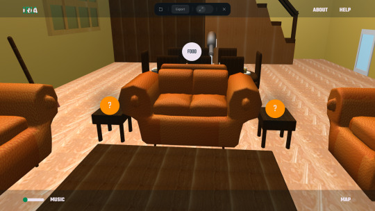
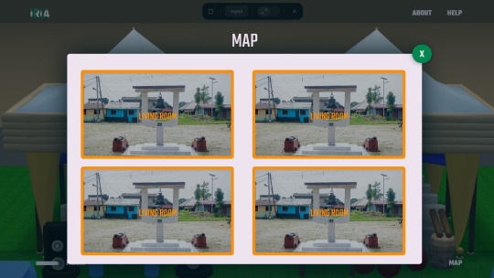
MP: WIREFRAMES & PRESENTATION(LO2)
FINAL CRIT
To manage everybody's time, I decided the best way to display my idea is by creating a video (I know I will talk and try to over-explain)
These are some notes I took during the presentation.
Question mark should be smaller.
It should change from question mark to words.
Music - Look at UI
Name of tracks.
Preview mode of music tracks.
Go button in a different color to the others
Title case home
Annotations for food.
Where the users are going to instead of go,
Next stage.
Quick show of map.
Below are the changes I made after the presentation.

I contemplated again how the food will look with images but after conversations and considering feasibility, the smartest thing I can do is use real images (this gives users a real view of how the food looks).
I also reduced elements within the navbar and the buttons as advised. For the buttons, I am still contemplating the colors because the orange may blend in but unsure green is the appropriate choice. The white in this scenario is really bright so that is up for consideration.

These are some iterations of the clothes before I decided on the final choice. The first design shows closeups of the model and captions the element. However, this would be excessive to create.
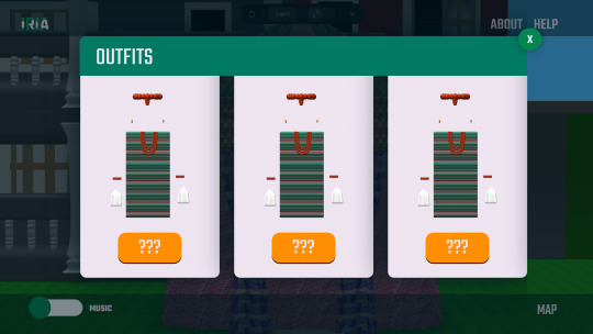
This second idea is to show the outfits like a mystery jukebox and users can horizontally scroll to the next outfit. It's simple but would mean I would need to create a second pop-up explaining what the outfits are.

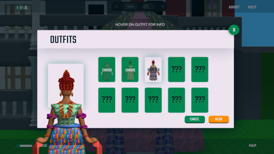
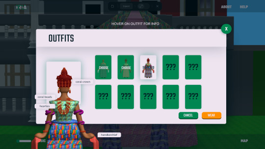
These round of iterations allows the least amount of trouble for me and the user. It also gives clear instructions about how to learn more about the outfit. The green cards seemed a better choice than the white as it captures attention to the outfits
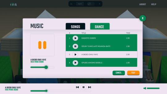
After speaking to Rich, I created a simple music UI that doesn't require all images to show as I struggled to visually represent them in the first place.
It's still a work in progress but now, I need to consider how the map would look.

Now, for this section, I changed it a tad and made sure the pictures are bigger to display it's importance over the text.
Conclusion
I still need to work out how the map will look, appropriate colors for the buttons, the images for the music and how to tell the narrative before inviting users to explore the house.
0 notes
Text
What is Different types of CADD formats

WHAT ARE THE DIFFERENT CADD FORMATS CADD FORMATS There are several different CADD formats. The most recognized CADD formats include 2D drawings and 3D wireframe, surface, and solid models. In general, 2-D drawings and 3-D solid models are the most common CADD formats currently used in the industry. Three-dimensional surface models are also widely used, but often for specific applications. Three-dimensional wireframe models are rare in the current industry. Software specifies the CADD format, which usually focuses on a certain process such as 2-D drawing or 3-D solid modeling. However, some systems offer tools for working in a variety of formats or the ability to use drawing or model content created in a different format. For example, you can often develop a 2D drawing from 3D model geometry or build a 3-D solid model from 3-D surface model geometry. A software add-on or separate application is sometimes required to work with multiple CADD formats. Beyond the Basics: A Granular Look at CADD Formats While the article rightly mentions 2D drawings and 3D models (wireframe, surface, solid) as the primary CADD formats, let's delve deeper into their characteristics: - 2D Drawings: The workhorse of many industries, 2D drawings offer a familiar and efficient way to represent designs. They excel in: - Manufacturing & Construction: Standard format for conveying precise dimensions and details. - Simple Designs: Ideal for quick projects that don't require significant revisions. - Annotation & Communication: Effective for adding notes, dimensions, and other project-critical information. - 3D Wireframe Models: These skeletal representations depict designs using lines and curves to connect points in 3D space. While less common today, they can be useful for: - Conceptualization & Early Design Stages: Providing a basic framework for visualizing initial design ideas. - Rapid Prototyping: Laying the groundwork for creating physical models. - 3D Surface Models: A step up from wireframes, these models capture a design's outer "skin" using mathematically defined surfaces. They find application in: - Organic Shapes & Complex Geometry: Representing curved and freeform elements effectively. - Visualization & Aesthetics: Creating realistic renderings for presentations or marketing purposes. - 3D Solid Models: The crown jewel of CADD formats, solid models represent a design as a complete, volumetric entity. This allows for: - Advanced Analysis & Simulation: Performing stress analysis, calculating weight and volume, and simulating real-world behavior. - Detailed Design & Manufacturing: Creating highly accurate models for downstream processes like CNC machining or 3D printing. - Collaboration & Assembly: Facilitating seamless integration of different design components. Understanding these distinctions empowers you to choose the right format for the job. CHOOSING A CADD FORMAT Several factors influence CADD software and format selection. Design and drafting practices and specific project requirements are primary considerations. Two-dimensional drawings are often required because they are the standard format in manufacturing and construction. The figure shows a 2-D structural detail required for building construction. In addition, 2-D drawing is effective for a project that is quick to design, does not require extensive revision, and does not require advanced visualization, simulation, and analysis. Three-dimensional solid modelling is a better solution when a complex project requires extensive revision and when advanced visualization, simulation, and analysis are required. A 3-D representation of a design can help overcome visualization problems and produce a realistic, testable product model. The figure shows a multidiscipline 3D model of a building providing structural, electrical, HVAC, and piping layouts. A combination of CADD formats and software may prove most effective for a project when applied correctly. Bringing the advantages of each CADD format together maximizes product design flexibility and effectiveness. Collaboration and communication during a project also influence CADD software and format selection. Everyone involved in a project must be able to use a common CADD format or be able to convert data to a usable format easily. Costs are another important factor to consider when choosing a CADD software and format. For example, advanced 3-D solid modelling software is generally more expensive than 2-D drafting software. Operating a new or different CADD system also requires training and time to learn. Training is an expense and takes time from projects that produce income. A more capable CAD format, such as 3D solid modeling, is extremely cost-effective for some users, especially over time, but others will never benefit from the initial costs of the software and training. Several additional factors also influence selecting CADD software and format, including choosing a product and a format that is a known industry standard for project requirements, software stability and usability, the availability and effectiveness of support and training, and personal preference. Beyond the List: Advanced CADD Format Considerations The realm of CADD formats extends beyond the basic types mentioned earlier. Here's a glimpse into some specialized options: - Neutral Formats (DXF, STEP): These formats allow data exchange between different CAD software programs, promoting interoperability. - Point Cloud Data: Captured from 3D scanners, point clouds represent objects as a collection of data points, providing a highly detailed representation of physical objects that can be integrated into CAD models. - Additive Manufacturing Formats (STL, AMF): Used for 3D printing, these formats translate CAD models into a format compatible with 3D printers for physical fabrication. Understanding these advanced formats expands your design toolbox, allowing you to leverage the power of CADD for a wider range of applications. Conclusion CADD formats are more than just file extensions; they are the building blocks of your design workflow. By understanding their nuances and selecting the right format for your project needs, you can optimize your design process, enhance collaboration, and ultimately achieve superior design outcomes. Australian Design & Drafting Services provides excellent service for CAD Design and Drafting. Contact Us for more info. Read the full article
0 notes
Text
How to Create a Website Design Before Development?

In the digital age, a website serves as the online face of a business or individual. Crafting an effective Affordable Web Design Services is crucial for attracting visitors, conveying information, and achieving specific goals.
Before diving into development, it's essential to lay a solid foundation through meticulous design planning. Here's a straightforward guide on how to create a website design before development.
1. Define Objectives and Audience
Before sketching out designs, clarify the objectives of the website and identify the target audience. Ask questions like: What is the purpose of the website? What actions do you want visitors to take? Understanding these aspects will guide design decisions and ensure alignment with business goals.
2. Conduct Research
Research is key to creating a successful website design. Study competitor websites to identify industry standards, trends, and areas for differentiation. Additionally, gather insights about the target audience's preferences, behavior, and expectations through surveys, interviews, or analytics data.
3. Create a Wireframe
A wireframe serves as the blueprint of the website, outlining its structure and functionality. Start with a simple sketch of the layout, focusing on essential elements such as navigation, content sections, and call-to-action buttons. Use online tools or paper and pencil to create wireframes that represent the desired user flow.
4. Design Visual Elements
Once the wireframe is finalized, it's time to add visual elements to breathe life into the design. Choose a color scheme that reflects the brand identity and evokes the desired emotions. Select fonts that are readable and complement the overall aesthetic. Incorporate images, icons, and other graphics strategically to enhance the user experience.
5. Prioritize Responsiveness
In today's mobile-driven world, ensuring responsiveness is non-negotiable. Design with mobile devices in mind from the outset to create a seamless experience across all screen sizes. Consider factors like touch-friendly navigation, flexible layouts, and optimized image sizes to accommodate different devices.
6. Test and Iterate
Testing is an integral part of the design process to identify and address any issues before development begins. Gather feedback from stakeholders or conduct usability testing with representative users to uncover usability issues or areas for improvement. Iterate on the design based on the feedback received to refine the final product.
7. Prepare Design Assets
Before handing off the design to developers, prepare all necessary assets such as images, icons, and style guides. Organize files in a clear and accessible manner to facilitate the development process. Provide detailed annotations or specifications to ensure that the design is implemented accurately.
8. Collaborate with Developers
Collaboration between designers and developers is essential for translating the design into a functional website. Maintain open communication throughout the development process to address any challenges or discrepancies that may arise. Work closely to ensure that the design vision is realized while considering technical constraints and best practices.
Conclusion
creating a website design before development is a critical step in the web development process. By defining objectives, conducting research, creating wireframes, designing visual elements, prioritizing responsiveness, testing and iterating, preparing design assets, and collaborating with developers, you can lay a solid foundation for a successful website. Remember, a well-thought-out design sets the stage for a remarkable user experience and contributes to the overall success of the website.
0 notes
Text
Exploring the Dynamics of Chatbot Development: From Concept to Conversation

In today’s digital age, chatbots have emerged as powerful tools revolutionizing the way businesses interact with customers. These conversational agents, powered by artificial intelligence (AI), are designed to simulate human-like conversations, offering assistance, information, and engagement across various platforms. The development of chatbots involves a myriad of components, including natural language processing (NLP), machine learning algorithms, and user experience (UX) design. This article delves into the intricate process of chatbot development, exploring its key stages, challenges, and future prospects.
Understanding Chatbot Development:
Chatbot development encompasses a multi-disciplinary approach, blending elements from AI, software engineering, and linguistics. At its core lies NLP, the technology enabling chatbots to understand and generate human language. NLP algorithms process user inputs, extract relevant information, and generate appropriate responses. These algorithms are trained on vast datasets to improve accuracy and adaptability over time.
Machine learning plays a vital role in chatbot development, facilitating continuous learning and enhancement. Through techniques like supervised learning, reinforcement learning, and deep learning, chatbots refine their understanding of language patterns and user intents. This iterative learning process enables chatbots to provide more accurate and contextually relevant responses.
The design phase of chatbot development focuses on crafting intuitive user experiences. UX designers map out conversational flows, anticipate user queries, and incorporate interactive elements for seamless interactions. Effective UX design ensures that chatbots are user-friendly, engaging, and capable of meeting user expectations.
Key Stages of Chatbot Development:
1. Conceptualization: The development process begins with defining the chatbot’s purpose, target audience, and functionality. Stakeholders collaborate to outline the scope and objectives of the project, laying the foundation for subsequent stages.
2. Design: UX designers create wireframes and prototypes, mapping out conversational flows and user interfaces. Design decisions prioritize simplicity, clarity, and accessibility to optimize the user experience.
3. Development: Software engineers and AI specialists implement the chatbot’s backend infrastructure and NLP algorithms. Integration with messaging platforms and APIs ensures compatibility and connectivity across various channels.
4. Training: Chatbots undergo extensive training using annotated datasets and machine learning algorithms. Training data includes sample conversations, user queries, and corresponding responses to teach the chatbot language patterns and context.
5. Testing: Quality assurance teams conduct rigorous testing to identify bugs, errors, and performance issues. Testing scenarios encompass a wide range of user inputs to validate the chatbot’s accuracy and responsiveness.
6. Deployment: Once testing is complete, the chatbot is deployed to production environments, making it accessible to users. Continuous monitoring and updates are essential to maintain optimal performance and address evolving user needs.
Despite advancements in AI and NLP, chatbot development presents several challenges:
1. Natural Language Understanding: Interpreting nuanced language nuances, slang, and context remains a complex task for chatbots, leading to misinterpretations and errors.
2. Scalability: Scaling chatbots to handle large volumes of user interactions requires robust infrastructure and optimization techniques to maintain responsiveness and efficiency.
3. Personalization: Tailoring responses to individual user preferences and behaviors requires sophisticated algorithms and data analytics capabilities.
4. Ethical Considerations: Ensuring chatbots adhere to ethical guidelines, privacy regulations, and bias mitigation strategies is essential to maintain user trust and credibility.
The future of chatbot development holds exciting possibilities:
1. Advanced AI Capabilities: Continued advancements in AI, particularly in deep learning and natural language generation, will enable chatbots to exhibit more human-like conversational abilities.
2. Multimodal Interactions: Integration with voice, gesture, and visual interfaces will enhance the versatility and accessibility of chatbots, enabling richer interactions across diverse platforms.
3. Industry-Specific Solutions: Chatbots will evolve to cater to specific industries and domains, offering tailored solutions for healthcare, finance, customer service, and education.
4. Emotional Intelligence: Incorporating emotional intelligence into chatbots will enable them to recognize and respond to user emotions, fostering more empathetic and engaging interactions.
Conclusion:
Chatbot development is a dynamic and interdisciplinary endeavor, encompassing AI, NLP, software engineering, and UX design. By leveraging machine learning algorithms and intuitive user interfaces, chatbots offer personalized assistance and engagement across various platforms. Despite challenges such as natural language understanding and scalability, ongoing advancements in AI promise to enhance chatbots’ capabilities and user experiences. As chatbots continue to evolve, they will play an increasingly integral role in reshaping how businesses interact with customers in the digital age.
#kickrtechnology#chatbot#chatbotdevelopment#chatbotdevelopmentcompany#chatbotdevelopmentservices#bestchatbotdevelopment#bestchatbotcompany#chartbotcompanyinnoida#chatbotserviceinnoida#bestchatbotserviceinnoida#bestchatbotcompanyinnoida
0 notes
Note
Heya Line! 💗 Congratulations on 100 followers, I am very proud of you for reaching this milestone! 🤗 I've been in a very fluffy, lovey dovey mood lately so may I request D, K, and W from the fluff alphabet for our most beloved mochi husband, Katakuri? This wonderful deserves the world and more, it is my life mission to spread the love for Katakuri as much as possible 😉 Thank you so much! Don't feel pressured to write this either, it is up to you if you want to take this request 💕
I
AM
ALIVE!!!!!!
*Eye of the Tiger chorus plays*
I’m back to writing, my final assignment is coming along well, all I have left to do is the annotations for all the resources I found (the finding took the most time so I’m glad I took time off writing to focus on that). Finish the wireframe (draft layout of a webpage) and do the report. I know it sounds like a lot but trust me, it isn’t.
AND WE’RE KICKING IT OFF WITH A KATA REQUEST!!!
MY SWEET MOCHI HUSBAND!!!
Wanna stay up to date? Come sign my taglist form!
Tagging: @lautluk
Katakuri Fluff Alphabet: D, K, W

(Look at him, he's so cool! 😍)
Dreams (How do they picture their future with their s/o?)
His ideal future with his s/o is surprisingly very white piquet fence-esque, cozy house in the woods, at least half a dozen children running around (he doesn’t mind if they’re biologically his or not) and a dog and a cat that like to lounge in the sun together.
But he’s all too aware this can’t become a reality if he wants to continue to protect his large family.
His more realistic future is quite calculated, thinking beyond if his mother was to pass away from old age, he knows either Perospero or himself will take her place as head of the Big Mama pirates. If a brawl were to occur for the spot, he knows he’d come out on top, same if it came down to a family vote thanks to his popularity. With this path thought out, he pictures himself on a throne as the new King of Totto Land, his s/o either on his lap or by his side. As for kids, he sees himself having a sizeable brood of children, no more than fourteen and a bare minimum of three, most of which are adopted (think like Doflamingo taking in stray kids but for less nefarious reasons and more to just give them a home).
Kiss (Are they a good kisser? What was the first kiss like?)
Kata? A kisser?
Nope, not till he met his s/o.
First step here is for him to first reveal his face to them, once they show him they don’t see anything wrong it’ll still be quite some time before he’s ready to kiss them. Mostly because he’s scared his teeth will hurt them.
For his first kiss (and quite a few after) he won’t initiate, and after the first couple of times he’s gonna be checking their lips to see if he hurt them or not. Slow and steady is the way to go with Katakuri, honestly, I think he’d be sleep with his partner before trying a full on make out with them. However, as he gains experience, so too will his confidence grow and he’ll be less hesitant to initiate, just give him time.
Though if his s/o individually kisses each of his four fangs he will get chocked up, no matter how hot and heavy things have gotten.
Wild Card (A random Fluff Headcanon.)
This man lives for cuddles, has no idea what being touch starved meant till his s/o cuddled up to him one night. He now requires them to get to sleep and is restless if he ever has to go away on a mission for his mother.
Also, please for the love of god if his partner is bigger than or a similar size to him let him be the little spoon every now and then. Man hasn’t been held since he was an infant and it makes him feel so warm and happy inside, he feels like crying! In fact, even if they are smaller than him, they should just drape themselves over his shoulder as he lies on his side.

Just hold him please, it makes him so happy.
#charlotte katakuri x reader#katakuri x reader#katakuri x y/n#katakuri x you#one piece#charlotte katakuri#fluff#fluff alphabet#100 event#my writing
312 notes
·
View notes
Text
Midterm HW
Wireframes/Annotations
Home Page (1)

Home Page under the fold (2)

Fashion Page

Philanthropy Page

About

Stylesheet
https://codepen.io/pen/?editors=0100
0 notes
Photo


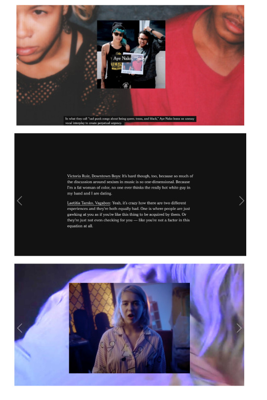


In Project Three, we created a single-page website that incorporates various types of content that allow for our audience to enjoy reading the article, “The Man Who Recorded, Tamed, and Then Sold Nature Sounds to America.”
Step 1: We began this project through conducting research on different responsive websites that are user-friendly on mobile, tablet, and desktop devices. It became clear that most often the size of the images are manipulated to allow the user to see the entire picture regardless of the device they are using.
After conducting our initial research, we also narrowed down the two long-form articles that we were most interested in working on. Our first choice, was the article on Irv Teibel titled, “The Man Who Recorded, Tamed, and Then Sold Nature Sounds to America.” We particularly liked this article because it included a variety of different media sources, including videos and sounds. Additionally, given the nature of the article, we were excited to find external videos and sounds that were produced by Teibel to incorporate in our project. Our second choice for this article was “Waco Restored,” as we have both seen the show Fixer Upper, and were interested in learning more about the effects of Chip and Joanna’s home renovations on the greater Waco area. Ultimately, we received our first choice pick of “The Man Who Recorded, Tamed, and Then Sold Nature Sounds to America” and were ready to begin Step 2!
Step 2: In Step 2, we took the time to read through the entire article, making sure to make careful annotations of how to split the article and where we could incorporate interesting media. Additionally, we took the time to research more about Irv Teibel, his recordings, and his influence, to discover external sources that we could use in our project.
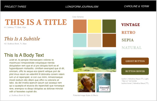
Step 3: Independently, we created two different visual directions based on our own interpretations of the article. Mine had a more vintage aesthetic, while Yerim’s had a more nature-inspired aesthetic. Based on the feedback we received in class, there were pros and cons to each visual direction, and we were unsure which direction to pursue.
Step 4: We ultimately decided to create a third visual direction, highlighted in Step 4, that is a combination of my ideas, and Yerim’s ideas.
In this step, we also discovered an article written by the New York Times documenting women’s place in Rock N Roll ( https://www.nytimes.com/interactive/2017/09/05/arts/music/25-women-making-best-rock-music-today.html). We were both inspired by the way that New York Times utilized media in new and diverse ways to create an enjoyable and interesting site. We decided that we would explore using similar interactions in our site, in an attempt to incorporate both audio and visuals into our long-form article.
Step 5: We created multiple wireframes in Adobe XD with about 7 different main slides that we would be able to easily replicate for different text throughout the article. We then used these sketches to produce coded wireframes in HTML and CSS.
Step 6: We coded static digital wireframes in html and css for a mobile, tablet, and desktop device. We were able to use the Interneting is Hard tutorial, in addition to our in class exercises to create this simple responsive website. With our digital wireframes complete, we were then ready to add our styles.
Step 7: We turned our digital static mockups into our final site. Using the mockups was incredibly beneficial, however our end product differed slightly from our initial ideas.
Project Discussion: I really enjoyed working on this project, as it gave me the opportunity to showcase everything that we learned in the classroom and explore new types of code. There were definitely elements of this project that we struggled with, as it took time to discover the best way to share our code, and we were ambitious with the number of interactions we wanted to incorporate into our site. Ultimately, we hope to have highlighted the incredible work of Irv Teibel through creating an interesting and user-friendly website.
1 note
·
View note
Text
Journal - Week of 07/10/19
Monday & Tuesday
I wasn’t really in the best mood these days and didn’t get much done so they kinda blurred together somehow. anyway, here’s what I did:
printed off a bunch of poetry I done did before. my plan is to interoperate them into artwork. I’ll use the thumbnail sketches idea Mark told me before.
Also did a few things:
I wanted to get an idea of what it would look like if I “trapped” one of my paint-drag-things. I used a sharpie with this one because it’s just a quick idea. But I like it, and I want to go further with it. I’m thinking of using black/dark paper/card/paint/screen print for the cage/wireframe thing:

For this one I really just put splodges of leftover black paint down and worked out from there. nothing fancy, just bullshitting stuff to be honest:

My idea for this one was similar to the first, in that I wanted not so much to “trap” the paint, but more to restrain and define its area. as in, I wanted to separate it from the rest of the page. It makes sense to me. And I like it, I like the colours and the direction/shape contrast. Not sure where to go from here though. screen/lino printing? who knows:

Wednesday
Started planning on The Snowball Effect, one of the poems. Annotated the poem with interpretations of what each verse should look like. Harder than I thought but I’ve got a good basis to go off: grey the persona, pink, the flower and black, the background/void. I got a bit stuck on the first one but i’ll get back to it. I might need more than one piece for that verse. It was hard to convey the idea of isolation/alienation:

I also noticed that Euan Rutter is doing something cool with a collage where he’s wetting his fingers and rubbing away paper to reveal the layer beneath how he wants. I really like that and I’m slightly mad I didn’t think of it before. I’ll definitely use it some time:

Thursday
Had the cap workshop intro, was fun, pretty easy. might use it to make bases for stuff like The Snowball Effect etc. No idea how people are making massive canvases with the machines there but hey ho, it’s a learning experience. But yeah I’ll be heading back there some time.
Friday
Continued planning on TSE, finding it difficult to make it look like something’s happening quickly. I’m thinking of making the subject matter smaller or messier among other things to see what effect it has. here’s to hoping:

Had to catch a train so didn’t get much done.
1 note
·
View note