#appbar in flutter
Explore tagged Tumblr posts
Visit Tumblr Blog
Explore Tumblr blogs with no restrictions, modern design and the best experience.
Last Seen Tumblr Blogs


Fun Fact
In 2020, Tumblr had 29.4 million users in the US.
Text
A Comprehensive Guide of Flutter AppBar Widget

The AppBar widget is an essential component in Flutter for creating a top-level navigation bar in your application. It provides a consistent and customizable way to display the toolbar, leading icon, title, and actions at the top of the screen. In this blog post, we will explore the various features and usage of the Flutter AppBar widget.
What is the AppBar widget?
The AppBar widget is based on Material Design principles and is part of the Flutter material library. It serves as the primary navigation component for your application and is typically placed at the top of the screen. The AppBar can contain other widgets within its layout, making it versatile for different use cases.
Key Features of the AppBar widget
Toolbar: The AppBar displays the toolbar widgets, including the leading icon, title, and actions. The toolbar provides a space for important controls and information.
Leading Icon: The leading icon is typically an icon or widget placed at the start of the AppBar. It can be used for navigation or to indicate the current screen or context.
Title: The title is a text or widget that represents the current screen or application. It is usually centered within the AppBar.
Actions: Actions are a set of widgets placed at the end of the AppBar. They can be used for additional functionality, such as search, settings, or user profile.
FlexibleSpace: The AppBar can have a flexible space that allows for more customization. This space can contain widgets like images, gradients, or animations.
Usage of the AppBar widget
To use the AppBar widget in your Flutter application, follow these steps:
Import the material library:
import 'package:flutter/material.dart';
Create a Scaffold widget as the root of your application:
void main() {
runApp(MyApp());
}
class MyApp extends StatelessWidget {
@override
Widget build(BuildContext context) {
return MaterialApp(
home: Scaffold(
appBar: <link>AppBar</link>(
title: Text('My App'),
),
body: Container(
// Your app content goes here
),
),
);
}
}
Customize the AppBar as per your requirements:
appBar: <link>AppBar</link>(
leading: IconButton(
icon: Icon(Icons.menu),
onPressed: () {
// Handle leading icon press
},
),
title: Text('My App'),
actions: [
IconButton(
icon: Icon(Icons.search),
onPressed: () {
// Handle search action
},
),
IconButton(
icon: Icon(Icons.settings),
onPressed: () {
// Handle settings action
},
),
],
),
Add additional widgets and functionality to your application as needed.
Conclusion
The Flutter AppBar widget is a powerful tool for creating a top-level navigation bar in your application. It provides a consistent and customizable way to display important controls and information. By understanding its features and usage, you can create stunning and user-friendly app bars in your Flutter projects.
I hope this blog post helps you in understanding the Flutter AppBar widget better. Happy coding!
Remember to replace the code snippets with your own implementation and customize the AppBar according to your application's needs.
0 notes
Text
flutter steps :
Last week work:
SECTION 1: Getting Started with Flutter :
1.1 - Course Overview
1.2 - Flutter Installation
1.3 - Creating Your First Flutter App
1.4 - Introduction to Flutter UI Widgets
1.5 - Organizing Flutter Code
1.6 - Working with Logic in Flutter
SECTION 2: Building User Interfaces :
2.1 - Understanding Stateless Widgets
2.2 - Adding Images in Flutter
2.3 - Adding Icons in Flutter
2.4 - Creating Containers in Flutter
2.5 - Working with Buttons
2.6 - Implementing an Appbar
2.7 - Using Row, Column, and Expanded Widgets
2.8 - Creating ListViews and ListView.builder
2.9 - Implementing a Navigation Drawer
2.10 - Adding a Floating Action Button
2.11 - Working with the Stack Layout Widget
2.12 - Creating Custom Widgets
SECTION 3: Managing State and Navigation:
3.1 - Introduction to Stateful Widgets
3.2 - Navigation in Flutter (Push and Pop)
3.3 - TextFields and TextFormFields
3.4 - Implementing Checkboxes
3.5 - Using Radio Buttons
3.6 - Working with Dropdown Buttons
3.7 - Building a Complete Form Flutter App
#software#flutter#flutter app developers#flutter app development#developer#programming#python#100daysofcode#software engineering#fluttercord#coding#design#figmadesign
11 notes
·
View notes
Text
Health Technology Application Development

In the age of digital innovation, health technology (HealthTech) applications are revolutionizing the medical industry. From telemedicine and electronic health records (EHRs) to wearable health trackers and AI-powered diagnostics, software development is at the core of modern healthcare solutions. In this post, we’ll explore how to approach HealthTech app development, what tools and technologies are involved, and key considerations for success.
What is HealthTech Application Development?
HealthTech application development refers to the creation of software solutions that aim to improve medical services, patient care, hospital management, and personal wellness. These applications may be mobile apps, desktop systems, or cloud-based platforms designed for healthcare professionals, patients, or administrators.
Common Types of HealthTech Applications
Telemedicine Platforms: Allow virtual consultations between patients and doctors.
Health Tracking Apps: Monitor physical activity, sleep, heart rate, and other health metrics.
Electronic Health Record Systems: Store and manage patients’ medical data securely.
Medication Reminder Apps: Help patients follow their treatment plans.
AI Diagnostic Tools: Analyze symptoms or medical images to assist in diagnosis.
Key Technologies in HealthTech Development
Mobile Development: Flutter, React Native, Swift, Kotlin
Backend Development: Node.js, Django, Ruby on Rails, Firebase
Database: PostgreSQL, MongoDB, Firebase Realtime Database
Cloud Platforms: AWS, Google Cloud, Microsoft Azure
APIs: FHIR (Fast Healthcare Interoperability Resources), HL7, wearable APIs (Fitbit, Apple Health)
Example: Flutter Code for a Simple Health Tracker
import 'package:flutter/material.dart'; void main() => runApp(HealthApp()); class HealthApp extends StatelessWidget { @override Widget build(BuildContext context) { return MaterialApp( home: Scaffold( appBar: AppBar(title: Text("Health Tracker")), body: Center( child: Text("Steps Today: 3,200"), ), ), ); } }
Best Practices for Health App Development
Security & Privacy: Comply with HIPAA, GDPR, and other healthcare data regulations.
User-Centered Design: Create interfaces that are intuitive for all ages, especially older users.
Data Integration: Ensure smooth data exchange with hospitals, devices, and cloud storage.
Testing: Perform thorough unit, integration, and usability testing before launch.
Scalability: Design apps that can grow with user demand and healthcare partnerships.
Real-World Applications
MyFitnessPal: Nutrition and fitness tracking app
Teladoc: Telehealth services for virtual consultations
Apple Health: Integrates data from multiple health devices
Medisafe: Medication reminder and pill organizer
Conclusion
Health technology application development is empowering people to take charge of their wellness and enabling healthcare providers to deliver better care more efficiently. Whether you're building a personal fitness tracker or a comprehensive EHR platform, your work has the potential to transform lives. Prioritize user needs, follow compliance standards, and stay updated with healthtech trends to make a meaningful impact in the digital healthcare revolution.
0 notes
Text
Building and Deploying Your First Flutter App: A Step-by-Step Guide

Flutter is one of the most popular open-source frameworks for mobile app development, thanks to its efficiency, cross-platform capabilities, and fast development cycle. If you're looking to develop your first Flutter app, you’ve made a great choice. Whether you’re a beginner or have prior experience in app development, Flutter offers an easy entry point into mobile app creation. In this step-by-step guide, we'll walk you through the essential stages of building and deploying your first Flutter app. As you embark on your Flutter journey, if you require assistance, consider partnering with a Flutter App Development Company to get expert guidance and tailored solutions.
What is Flutter and Why Choose It?
Before we dive into building your Flutter app, let's take a moment to understand why Flutter has become so widely adopted. Flutter is a free, open-source framework created by Google for building natively compiled applications for mobile, web, and desktop from a single codebase. This means you can develop apps for both Android and iOS using the same code, which saves time and reduces the complexity of managing two separate codebases.
The main programming language used in Flutter is Dart, which is also developed by Google. Dart is easy to learn and well-suited for building high-performance apps, making it a great option for developers, both new and experienced. The Flutter framework comes with a rich set of pre-built widgets, which allows developers to create beautiful, responsive, and highly customizable user interfaces.
Step 1: Setting Up the Flutter Environment
The first step in building a Flutter app is to set up your development environment. This involves installing the necessary tools and dependencies.
Install Flutter SDK:
Download the Flutter SDK from the official Flutter website.
Follow the installation instructions for your operating system (Windows, macOS, or Linux).
Make sure that you have the latest version of Flutter and that your environment is correctly configured. You can run flutter doctor in your terminal to check for any issues.
Install an IDE:
Flutter supports a range of Integrated Development Environments (IDEs), including Android Studio, Visual Studio Code, and IntelliJ IDEA.
Install the Flutter and Dart plugins in your chosen IDE to enable features like code completion, debugging, and UI design tools.
Set Up Android Studio (Optional but Recommended):
While Visual Studio Code is lightweight, Android Studio provides additional tools for Android-specific development, including an emulator and device management.
Step 2: Creating Your First Flutter App
Once the development environment is set up, it's time to create your first Flutter app.
Create a New Flutter Project:
Open your IDE and create a new Flutter project by selecting New Flutter Project.
Choose a project name, set the location, and configure other project settings.
This will create a basic Flutter project structure with default files like main.dart in the lib directory.
Write the App Code:
Navigate to the main.dart file in the lib folder and replace the default code with a simple "Hello World" app.
dart
Copy code
import 'package:flutter/material.dart'; void main() { runApp(MyApp()); } class MyApp extends StatelessWidget { @override Widget build(BuildContext context) { return MaterialApp( home: Scaffold( appBar: AppBar(title: Text('Hello Flutter')), body: Center(child: Text('Hello, World!')), ), ); } }
This basic app will display a "Hello, World!" message in the center of the screen with a simple AppBar.
Run the App:
Connect a physical device or use an emulator to test your app.
Use the command flutter run to launch your app on the connected device. You should see the "Hello World" app running on your device or emulator.
Step 3: Enhancing the User Interface
Flutter allows you to easily build custom UIs using its rich set of widgets. You can start enhancing the UI of your app by adding buttons, text fields, images, and other elements.
Add a Button:
Update the body of the Scaffold widget to include a FlatButton that displays a message when clicked.
dart
Copy code
body: Center( child: Column( mainAxisAlignment: MainAxisAlignment.center, children: <Widget>[ Text('Hello, World!'), FlatButton( onPressed: () { print('Button Pressed'); }, color: Colors.blue, child: Text('Click Me', style: TextStyle(color: Colors.white)), ), ], ), ),
Test the UI:
Run the app again to see the changes in action. You should now have a button below the "Hello, World!" text, which will print "Button Pressed" in the terminal when clicked.
Step 4: Preparing the App for Deployment
Now that your Flutter app is ready for deployment, it’s time to prepare it for submission to app stores.
Build the App for Release:
Use the command flutter build apk to build the APK file for Android or flutter build ios to generate the iOS build.
This process optimizes the app for release and ensures it runs efficiently on devices.
Test on Real Devices:
It’s essential to test the release build on real devices before deploying it to the app store. Install the APK on your Android device or use Xcode to test the iOS version.
Sign the App:
For Android, you’ll need to sign your APK with a release key. You can generate this key using keytool and configure it in the build.gradle file.
For iOS, use Xcode to configure your app’s signing settings.
Step 5: Deploying the App
The final step is deploying your app to the app store.
Publish to Google Play:
Log in to your Google Play Developer account, upload the APK, and fill out the necessary app details.
After submitting, your app will go through the review process before it is published.
Publish to the Apple App Store:
For iOS, use Xcode to upload your app to the Apple App Store Connect platform.
Fill out app details, upload screenshots, and submit for review.
How Much Does It Cost to Build a Flutter App?
Developing a Flutter app involves several factors, including design, development, and testing. To get a rough estimate of the costs, you can use a mobile app cost calculator. This tool will help you determine the expenses based on the features and complexity of your app.
If you're interested in exploring the benefits of Flutter app development services for your business, we encourage you to book an appointment with our team of experts.
Book an Appointment
Conclusion
Building and deploying your first Flutter app is an exciting journey, and with the right tools and guidance, you can create high-quality apps quickly and efficiently. By following the steps outlined in this guide, you can create your app, test it, and deploy it to the app stores. If you want to ensure your app is developed and deployed with the best practices, consider reaching out to a Flutter App Development Company. Their expertise in Flutter App Development will help bring your app ideas to life while ensuring smooth performance and user experience.
0 notes
Text
A Guide to Building Responsive Flutter Apps with responsive_framework 1.4.0
Introduction: In today's fast-paced digital world, creating responsive mobile applications is essential to providing users with a seamless experience across different devices. Flutter, Google's UI toolkit for building natively compiled applications for mobile, web, and desktop, offers various tools and packages to achieve responsiveness. One such tool is the responsive_framework package, version 1.4.0. In this blog post, we'll explore how to utilize this package to build responsive Flutter apps that adapt to different screen sizes and orientations. For businesses, working with a Flutter app development company can further enhance the responsiveness and functionality of your app.
Understanding responsive_framework 1.4.0: responsive_framework is a Flutter package that simplifies the process of creating responsive layouts in your Flutter apps. With version 1.4.0, developers have access to enhanced features and functionalities for building responsive UIs. This package offers a grid-based approach to handle layout scaling, allowing developers to define breakpoints and adjust the layout accordingly.
Getting Started: To integrate responsive_framework into your Flutter project, you need to add it as a dependency in your pubspec.yaml file:
yaml
Copy code
dependencies: responsive_framework: ^1.4.0
After adding the dependency, run flutter pub get to install the package.
Usage:
Import the package: First, import the responsive_framework package in your Dart code:dartCopy codeimport 'package:responsive_framework/responsive_framework.dart';
Wrap your MaterialApp or CupertinoApp with ResponsiveWrapper: Wrap your MaterialApp or CupertinoApp widget with ResponsiveWrapper and configure it according to your desired breakpoints and settings:dartCopy codeResponsiveWrapper.builder( BouncingScrollWrapper.builder( MaterialApp( // Your app configuration ), ), maxWidth: 1200, minWidth: 450, defaultScale: true, breakpoints: [ ResponsiveBreakpoint.resize(450, name: MOBILE), ResponsiveBreakpoint.autoScale(800, name: TABLET), ResponsiveBreakpoint.resize(1000, name: DESKTOP), ], ) Here, you can specify the maxWidth, minWidth, and breakpoints for different device sizes such as MOBILE, TABLET, and DESKTOP.
Building Responsive UIs: Utilize the provided widgets from responsive_framework to create responsive UIs. For example, ResponsiveRow, ResponsiveColumn, and ResponsiveGridList help in organizing widgets in a responsive manner.
Example: Let's create a simple example demonstrating the usage of responsive_framework:
dart
Copy code
import 'package:flutter/material.dart'; import 'package:responsive_framework/responsive_framework.dart'; void main() { runApp(MyApp()); } class MyApp extends StatelessWidget { @override Widget build(BuildContext context) { return ResponsiveWrapper.builder( BouncingScrollWrapper.builder( MaterialApp( title: 'Responsive Framework Demo', theme: ThemeData( primarySwatch: Colors.blue, ), home: MyHomePage(), ), ), maxWidth: 1200, minWidth: 450, defaultScale: true, breakpoints: [ ResponsiveBreakpoint.resize(450, name: MOBILE), ResponsiveBreakpoint.autoScale(800, name: TABLET), ResponsiveBreakpoint.resize(1000, name: DESKTOP), ], ); } } class MyHomePage extends StatelessWidget { @override Widget build(BuildContext context) { return Scaffold( appBar: AppBar( title: Text('Responsive Framework Demo'), ), body: Center( child: Text( 'Welcome to Responsive Framework Demo!', style: TextStyle(fontSize: 24), ), ), ); } }
Conclusion: Building responsive Flutter apps has never been easier with the responsive_framework package version 1.4.0. By leveraging its grid-based approach and breakpoint system, developers can create adaptive layouts that cater to various device sizes and orientations. Partnering with a Flutter app development company can ensure that your app achieves the highest standards of responsiveness and usability, delivering a consistent and user-friendly experience across all devices. Start incorporating responsive_framework into your Flutter projects today and take your app's responsiveness to the next level!
0 notes
Text
Understanding Flutter Widgets: The Building Blocks of Your App
In the world of mobile app development, Flutter has quickly gained popularity due to its fast development cycle, beautiful UI, and cross-platform capabilities. At the heart of Flutter lies its widget-based architecture. Every visual component, from buttons and images to more complex user interfaces, is a widget. But what exactly are Flutter widgets, and why are they so important? Let’s dive into understanding Flutter widgets and how they play a crucial role in Flutter app development.

What Are Flutter Widgets? In Flutter, everything is a widget. From simple UI elements like buttons, text, and images to complex layouts like lists, forms, and navigation bars, everything is created using widgets. Flutter’s architecture is based on a declarative style, which means you describe the UI and let Flutter handle the rest. A widget in Flutter is essentially an immutable description of a part of the user interface.
Widgets can be divided into two main categories: Stateless Widgets and Stateful Widgets.
Stateless Widgets A StatelessWidget is a widget that doesn't change over time. Once built, a stateless widget does not need to be rebuilt unless external changes are made. These widgets are ideal for static content, such as displaying a label or an image that does not change during the lifecycle of the widget.
Examples of Stateless Widgets:
Text: Displays a string of text. Icon: Displays a material design icon. Container: A box that can contain a child widget, with customizable padding, margins, and decoration. Since they don't change, stateless widgets are more lightweight and faster to render, making them a great choice for static elements.
Stateful Widgets A StatefulWidget, on the other hand, is a widget that can change during its lifecycle. Unlike stateless widgets, stateful widgets have mutable state. This means they can update their appearance based on user interactions, network responses, or other changes during the app’s runtime.
For instance, think about a button that increments a counter when clicked, or a form that dynamically updates based on user input—these require stateful widgets.
Examples of Stateful Widgets:
TextField: For user input. Checkbox: To show a checked or unchecked state. Slider: For selecting values from a range. These widgets are perfect for interactive components, animations, or complex UI structures that need to respond to changes in real time.
Core Flutter Widgets Now that we have an idea of the basic types of widgets, let’s explore some of the most commonly used Flutter widgets that you’ll work with to build your app.
Text Widget The Text widget is used to display text. It's the simplest way to display a string in your Flutter app. You can customize the font size, color, style, and alignment using the TextStyle class.
Container Widget The Container widget is a powerful and versatile layout widget. It can be used to create boxes around other widgets with custom padding, margins, borders, and background colors. Containers are often used to wrap other widgets for layout purposes.
Column and Row Column: A widget that displays its children vertically, one on top of the other. Row: A widget that arranges its children horizontally, side by side. These layout widgets allow you to structure your UI elements and create responsive designs.
Stack The Stack widget allows you to stack widgets on top of each other. This is useful for designing complex layouts, such as positioning text or images over other widgets, creating card-like effects, or managing multiple overlapping components.
ListView The ListView widget is one of the most powerful and widely used widgets for displaying a list of items that can scroll vertically. It allows you to display a dynamic list of elements like text, images, or custom widgets.
Scaffold The Scaffold widget provides a basic structure for implementing the visual layout of your app. It includes elements such as the AppBar (top navigation bar), Body (main content area), FloatingActionButton (for actions), and Drawer (side navigation).
Drawer The Drawer widget is a sliding panel that typically contains navigation links. It's commonly used for app navigation, especially when your app has multiple sections. Users can open the drawer by swiping from the left side of the screen or clicking on a menu icon.
Layout Widgets When building your app’s UI, you’ll need to arrange widgets within the screen. Flutter provides a rich set of layout widgets that allow you to structure content easily.
Padding: Adds space around a widget to ensure it doesn't touch the edges of its parent. Align: Helps position a widget inside its parent by aligning it to specific points (top, bottom, left, right, etc.). Expanded: Makes a widget fill the available space within a parent widget like Row or Column. Flexible: Similar to Expanded but allows you to allocate space proportionally between multiple children. These layout widgets help organize and present your content efficiently.
Gesture Widgets User interaction is a big part of any mobile app, and Flutter provides several gesture-related widgets to detect and handle user input.
GestureDetector: A widget that detects different types of gestures such as taps, drags, and swipes. InkWell: A material design widget that responds to taps with a ripple effect, commonly used for buttons or interactive elements. Custom Widgets Flutter also allows you to create custom widgets by composing multiple existing widgets together. This is essential for creating modular and reusable components, making your codebase cleaner and more maintainable.
For example, you can build a custom card widget that combines an image, title, and description into one reusable component.
The Power of Flutter’s Widget Tree One of the unique aspects of Flutter is its widget tree. The widget tree is a hierarchy of widgets that describes the UI of your app. Each widget can contain other widgets, and those in turn can contain even more widgets. This tree-like structure allows you to compose complex UIs by nesting widgets.
When the state of a widget changes, Flutter efficiently rebuilds only the parts of the widget tree that need to be updated, minimizing the performance cost and ensuring smooth UI transitions.
Conclusion Widgets are the foundation of Flutter’s UI framework, and understanding how they work is essential to mastering Flutter development. Whether you’re creating simple UI elements or complex interactive screens, you’ll be using Flutter widgets to construct your app. By composing stateless and stateful widgets, along with layout and gesture widgets, you can build beautiful, responsive, and dynamic apps.
Flutter's widget-centric design is not only powerful but also flexible, enabling you to create cross-platform apps with a single codebase. As you continue to explore Flutter, mastering widgets will be your first step toward becoming a proficient Flutter developer
0 notes
Text
Discovering the Power of Flutter's Ecosystem: Unveiling Essential Packages and Plugins

Introduction to Flutter's Ecosystem
As an experienced Flutter developer, I've come to appreciate the sheer power and versatility of the Flutter ecosystem. Flutter, the open-source mobile application development framework created by Google, has quickly become a game-changer in the world of cross-platform development. At the heart of Flutter's success lies its robust and ever-expanding ecosystem of packages and plugins, which have transformed the way we approach app development.
In this comprehensive article, I'll delve into the intricacies of Flutter's ecosystem, exploring the essential packages and plugins that can elevate your app development journey. From UI design and functionality to state management and navigation, we'll uncover the tools and resources that can streamline your development process and unlock new possibilities for your Flutter-based applications.
Understanding the Importance of Packages and Plugins in Flutter
One of the key strengths of the Flutter framework is its modular and extensible nature. Rather than reinventing the wheel for every feature or functionality, Flutter developers can leverage a vast array of packages and plugins that have been meticulously crafted by the community. These pre-built solutions not only save time and effort but also ensure consistency, reliability, and scalability in your app development.
Packages and plugins in the Flutter ecosystem serve as building blocks, allowing you to quickly integrate a wide range of features and functionalities into your application. Whether you need to implement a stunning UI design, integrate with third-party services, or handle complex state management, there's likely a package or plugin that can provide a seamless solution.
Essential Flutter Packages for UI Design and Development
When it comes to creating visually stunning and user-friendly Flutter applications, the ecosystem offers a wealth of packages that cater to various UI design and development needs. Some of the essential packages in this category include:
Flutter Widgets: The core set of widgets provided by the Flutter framework, including Scaffold, AppBar, ListView, GridView, and more, which form the foundation of your UI.
Material Design Widgets: Packages like flutter_material_color_picker and flutter_material_pickers that bring the power of Google's Material Design guidelines to your Flutter apps.
Animation Packages: Packages such as flutter_animations and flare_flutter that enable smooth and engaging animations to enhance the user experience.
UI Element Packages: Packages like flutter_spinkit and flutter_svg that provide a wide range of pre-built UI elements, from loading indicators to vector graphics.
Layout and Styling Packages: Packages such as flutter_layout_grid and flutter_screenutil that simplify responsive layout management and ensure consistent styling across different screen sizes.
By leveraging these essential UI packages, you can create visually stunning and highly functional Flutter applications that stand out in the market.
Popular Flutter Plugins for Integration and Functionality
Beyond the UI realm, the Flutter ecosystem also offers a vast collection of plugins that enable seamless integration with various services and functionalities. These plugins can help you extend the capabilities of your Flutter app and provide a more comprehensive user experience. Some of the popular Flutter plugins include:
Connectivity Plugins: Packages like connectivity_plus and internet_connection_checker that allow you to monitor and manage the device's network connectivity.
Geolocation Plugins: Plugins such as geolocator and google_maps_flutter that provide access to the device's location services and enable location-based features.
Media Handling Plugins: Packages like image_picker and video_player that simplify the process of capturing, storing, and displaying multimedia content within your Flutter app.
Notification Plugins: Plugins such as flutter_local_notifications and firebase_messaging that enable push notifications and in-app messaging capabilities.
Payment Plugins: Packages like flutter_stripe and in_app_purchase that allow you to integrate secure payment processing and in-app purchase functionalities.
By incorporating these powerful plugins into your Flutter projects, you can unlock a wide range of advanced features and functionalities, elevating the overall user experience of your applications.
Exploring Advanced Packages for State Management and Navigation
As your Flutter applications grow in complexity, the need for robust state management and navigation solutions becomes increasingly important. The Flutter ecosystem offers a variety of advanced packages that can help you tackle these challenges:
State Management Packages: Packages like provider, bloc, and riverpod that provide different approaches to managing the state of your application, enabling you to maintain a clean and scalable codebase.
Navigation Packages: Plugins such as go_router and auto_route that simplify the implementation of complex navigation flows, including deep linking and route parameters.
Internationalization Packages: Packages like flutter_localizations and intl that assist with translating and localizing your app for global audiences.
Testing Packages: Tools like flutter_test and mocktail that help you write comprehensive unit, integration, and widget tests for your Flutter applications.
Utility Packages: Packages such as freezed and json_serializable that streamline common development tasks, such as data serialization and code generation.
By exploring and leveraging these advanced packages, you can elevate your Flutter development skills, create more robust and maintainable applications, and deliver exceptional user experiences.
Best Practices for Using Packages and Plugins in Flutter
As you delve deeper into the Flutter ecosystem and incorporate packages and plugins into your projects, it's crucial to follow best practices to ensure the long-term success and scalability of your applications. Here are some key guidelines to keep in mind:
Evaluate Package Quality: Carefully assess the popularity, documentation, and community support for any package or plugin before integrating it into your project. Prioritize well-maintained, actively supported, and widely-used packages.
Manage Dependencies: Maintain a clean and organized dependency structure, ensuring that your app's dependencies are up-to-date and compatible with each other. Use tools like pub outdated to stay on top of package updates.
Customize and Extend: Whenever possible, customize and extend the functionality of packages and plugins to fit your specific use cases. This can involve forking the package, creating custom wrappers, or contributing back to the open-source community.
Implement Robust Error Handling: Anticipate and handle potential errors or failures that may occur when using packages and plugins, ensuring a smooth and resilient user experience.
Monitor Performance: Regularly monitor the performance impact of the packages and plugins you use, and be prepared to optimize or replace them if they negatively affect your app's performance.
By adhering to these best practices, you can leverage the power of Flutter's ecosystem while maintaining a high-quality, scalable, and maintainable codebase.
Case Studies of Successful Apps Built with Flutter's Ecosystem
The power of Flutter's ecosystem is best showcased through real-world examples of successful applications that have been built using the framework and its extensive package and plugin offerings. Let's explore a few case studies:
Google Ads: The Google Ads mobile app, built using Flutter, leverages a wide range of packages and plugins to deliver a seamless user experience. This includes packages for UI design, data visualization, and integration with the Google Ads API.
Alibaba: The Alibaba app, one of the largest e-commerce platforms, has successfully adopted Flutter for its mobile development. The app utilizes packages for state management, internationalization, and payment processing to provide a consistent and feature-rich experience across platforms.
Nubank: The Brazilian digital bank Nubank has chosen Flutter as the primary technology for its mobile app development. By incorporating packages for UI design, animations, and database management, Nubank has been able to rapidly iterate and deliver innovative features to its customers.
Hamilton: The official mobile app for the hit Broadway musical "Hamilton" was built using Flutter. The app leverages packages for media playback, in-app purchases, and push notifications to enhance the user experience and engagement.
Birch Finance: The personal finance management app Birch Finance has been developed using Flutter, taking advantage of packages for data visualization, user authentication, and integration with financial services APIs.
These case studies demonstrate the versatility and scalability of the Flutter ecosystem, showcasing how leading organizations have leveraged packages and plugins to build robust, feature-rich, and highly performant mobile applications.
Challenges and Limitations of Using Packages and Plugins in Flutter
While the Flutter ecosystem offers an abundance of packages and plugins, it's important to be aware of the potential challenges and limitations that may arise when incorporating them into your projects:
Compatibility and Versioning: Ensuring seamless compatibility between the packages and plugins you use, as well as with the core Flutter framework, can be a constant challenge, especially when dealing with frequent updates and version changes.
Performance Considerations: Some packages and plugins, if not implemented carefully, can introduce performance bottlenecks or increase the overall app size, negatively impacting the user experience.
Maintenance and Support: The longevity and active maintenance of packages and plugins can be a concern, as the community-driven nature of the ecosystem means that some packages may become abandoned or unsupported over time.
Customization Limitations: While packages and plugins provide a wealth of pre-built functionality, they may not always perfectly fit your specific requirements, leading to the need for custom implementation or workarounds.
Security and Privacy Concerns: When integrating third-party packages and plugins, it's crucial to ensure that they adhere to best practices for data handling, user privacy, and security, as vulnerabilities in these dependencies could expose your app and its users to potential risks.
To navigate these challenges effectively, it's essential to carefully evaluate and select packages, maintain a well-organized dependency structure, and be prepared to adapt or even create custom solutions when necessary.
know more: Flutter vs React Native: Which is the Best Choice 2023- 24?
Conclusion: Harnessing the Power of Flutter's Ecosystem for App Development
In the ever-evolving world of mobile app development, the Flutter ecosystem has emerged as a true game-changer. By leveraging the vast array of packages and plugins available, Flutter developers can unlock unprecedented levels of productivity, creativity, and innovation.
Throughout this article, we've explored the essential packages and plugins that can transform your Flutter development journey. From UI design and functionality to state management and navigation, the Flutter ecosystem provides a rich tapestry of tools and resources to help you build exceptional mobile applications.
As you continue to explore and harness the power of Flutter's ecosystem, remember to stay vigilant in evaluating package quality, managing dependencies, and implementing best practices. By doing so, you can create robust, scalable, and high-performing Flutter applications that captivate users and drive your business forward.To take your Flutter development to the next level, I encourage you to dive deeper into the Flutter ecosystem and start incorporating the essential packages and plugins we've discussed. If you need any assistance or have questions, feel free to reach out to our team of Flutter experts. We're here to help you unlock the full potential of Flutter and deliver exceptional mobile experiences.
0 notes
Text
Navigation in flutter – how to add stack, tab, and drawer navigators to your apps - Flutter Agency

If we design or develop apps, we have to focus on the type of navigation used. Of course, as a developer, it is a must to try Flutter as the best framework. Here, the flutter web app development takes full pledge guidance regarding adding stack, tab and drawer navigation to your apps professionally.
There are 3 types of navigation used in the common for all apps. Flutter is supportive in focusing on these types which is similar to how to do in the other apps. They are rather focused on navigation into the Flutter app. When building a Flutter app, you have to learn about the types of navigation used in design and development.
Types of navigation you must know
When you develop apps, you must notice the basic three types of navigation in detail. However, developers are keen on guiding the use of the navigation types accordingly.
Stack Navigation
Tab Navigation
Drawer Navigation
What is stack navigation?
Stack navigation in Flutter is nothing but adding or removing pages or screens by stacking new pages of existing ones. If the developer has to move to a new screen, the current screen might push into the navigation stack.
When you return to the top screen it pops off the stack immediately. So, this type of navigation is mainly useful for hierarchical and linear flows within app design and development.
What is tab navigation?
Of course, tabs are a staple in the design or development of mobile app navigation. Hence, it allows users to find out switches and enable them to focus on the current context. The flutter makes it easy to find tabbed navigation within built-in widgets such as TabBar, and TabBarView.
They are integrating into the beautiful and functional tab navigation experience. It is mainly perfect for organizing content into logical sections. You have to create a unique look and design for your app.
What is drawer navigation?
The drawer navigation is nothing but a pattern which includes a hamburger menu or side menu. It is a familiar navigation style which includes the design and development of mobile apps.
It consists of hidden panels which slide out with the screen or reveal the menu with dynamic navigation options. Hence, it consists of a space-saving technique which is visible and provides easy access.
How to build the tab navigation
Of course, flutter app design and development using drawer and tab navigations are found at the top. Developers have to press the button in the first tab and take them to the next page via the stack navigator.
Tab navigation in flutter
Creating a class named HomePage has to be embedded in the build method and returned with the default tab controller widget. It has to take part in defining the 3 tabs in the lengthy property. In the bottom appBar property, users have to define icons for each tab with the body property rendering all the tabs inside it.
Then, immediately paste the code and notice if some errors may be highlighted in the VS code editor.
Create a new folder named the tabs inside the lib/directory and create the files named tab1 to tab3 in the list
If you look at the code for three navigation types you will notice the same except for the first tab and the rest continue with an additional button to disclose secrets. Then, it has to press the navigation user with the secret route as well. It will work for any error and the route must be defined yet.
The errors may be seen in the tab. dart file which sets out the resolved condition. The app must be noticed with changes in the execution time. It is because of creating a tab layout and mapping it with the main. dart file as well.
Tab layout in flutter app
In the section, don’t need to press the disclose secret button. If you press it, it shows an error and makes changes before executing the output. The navigation route should be on the press property with a button and the route is yet to be maintained secretly.
How to build the drawer navigation
The next target is to add the drawer navigation and create the files with navigation types.
drawer. dart: to show the Navigation Drawer
. dart: an option will be provided on the Drawer Navigator to navigate here
On the other hand, creating a drawer.dart file inside the library and directory has to bring touch with further results and done with tabs. Then, you have to copy the code into the drawer. dart file.
drawer. dart file
In this file, developers have to define the right class and name MyDrawer. It is helpful for them to build a method which renders the drawer widget with home and about options in the lists. Then, developers have to choose options which navigate with appropriate routes.
about. dart file
In this file, the developer has to create a class named “About” and return the scaffold widget which contains a drawer. It will define the right code before this file usage. The appBar and the body will show in the text about code again to make changes in the app design. It is because we could retrieve or link into the main. dart file.
secret. dart file
In this file, the developer has to create SecretPage and return with a text in the body. Of course, users have to identify the simple flutter widget and backlog in the above procedure. It is mainly set out defining routes now. Then, it makes sure to obtain the main. dart file and follow the importing method to the top of the file.
Update in main.dart file
By following the code, you have to check to define the MaterialApp to contain routes. It will assign key-value pairs and be able to map routes with a widget. Coders have to navigate with three routes and find key-value pairs.
/about – the route for the drawer navigator
/home – the route for the tab navigator
/secret – the route for the stack navigator
Merged tab and drawer view
By pressing the disclose secret button, you will be taken to the secret page which was created. The developer should be able to scroll with tabs smoothly and notice with an error-free execution. The back button is shown on the first screen and would help to assign navigation bars and styles of your app.
Conclusion
Finally, you will learn about the navigation in Flutter and how to add them in Flutter app design and development. Of course, the flutter web app development brings you more guidance to check and create the navigation in Flutter as well. Most apps must be developed using two or more navigation types.
#Navigation in flutter#drawer navigators to your apps#stack navigation#tab navigation#drawer navigation#Tab navigation in flutter#flutter web app development#Flutter app design
0 notes
Text
こんにちは、Copilotです。😊
Flutterで複数人の位置情報をBing Map上に表示するサンプルコードを生成してみました。
以下のコードは、`location`と`flutter_map`というパッケージを使用しています。
`location`パッケージは、位置情報の取得や距離計算に便利です¹。
`flutter_map`パッケージは、Bing Mapを含む様々なタイルサーバーから地図を表示することができます²。
Bing Mapを使用するには、APIキーが必要です³。
APIキーは[こちら](^4^)から取得できます。
```dart
import 'package:flutter/material.dart';
import 'package:location/location.dart';
import 'package:flutter_map/flutter_map.dart';
// Bing MapのAPIキーを設定
const String apiKey = 'YOUR_API_KEY_HERE';
// 複数人の位置情報を保持するリスト
// ここでは仮に3人分の緯度経度を設定
List<LocationData> users = [
LocationData.fromMap({'latitude': 35.6833, 'longitude': 139.7667}), // 東京
LocationData.fromMap({'latitude': 34.6936, 'longitude': 135.5019}), // 大阪
LocationData.fromMap({'latitude': 43.0643, 'longitude': 141.3469}), // 札幌
];
void main() {
runApp(MyApp());
}
class MyApp extends StatelessWidget {
@override
Widget build(BuildContext context) {
return MaterialApp(
home: Scaffold(
appBar: AppBar(
title: const Text('Bing Map Sample'),
),
body: BingMap(),
),
);
}
}
class BingMap extends StatefulWidget {
@override
_BingMapState createState() => _BingMapState();
}
class _BingMapState extends State<BingMap> {
// 地図のコントローラー
MapController mapController = MapController();
// Bing MapのURLテンプレートを取得する関数
Future<String?> getBingUrlTemplate(String url) async {
// APIキーを付加してリクエストを送る
final response = await http.get(Uri.parse('$url?key=$apiKey'));
// レスポンスが成功した場合
if (response.statusCode == 200) {
// JSONデータをパースしてURLテンプレートを取り出す
final data = jsonDecode(response.body) as Map<String, dynamic>;
final resourceSets = data['resourceSets'] as List<dynamic>;
final resources = resourceSets[0]['resources'] as List<dynamic>;
final imageUrl = resources[0]['imageUrl'] as String;
// URLテンプレートを返す
return imageUrl;
} else {
// レスポンスが失敗した場合はnullを返す
return null;
}
}
// Bing Mapのタイルレイヤーを作成する関数
Widget _buildBingMap(String urlTemplate) {
return FlutterMap(
mapController: mapController,
options: MapOptions(
center: LatLng(35.6812, 139.7671), // 地図の中心を東京駅に設定
zoom: 5.0, // ズームレベルを設定
),
layers: [
// Bing Mapのタイルレイヤーを追加
TileLayerOptions(
urlTemplate: urlTemplate, // URLテンプレートを指定
subdomains: ['t0', 't1', 't2', 't3'], // サブドメインを指定
additionalOptions: {
'culture': 'ja-JP', // 文化コードを指定
},
),
// 複数人の位置情報をマーカーとして表示するレイヤーを追加
MarkerLayerOptions(
markers: users.map((user) {
// 位置情報からマーカーを作成
return Marker(
width: 80.0,
height: 80.0,
point: LatLng(user.latitude!, user.longitude!),
builder: (ctx) => const Icon(Icons.person_pin_circle),
);
}).toList(),
),
],
);
}
@override
Widget build(BuildContext context) {
// Bing MapのURLテンプレートを取得するためのFutureBuilderを使用
return FutureBuilder<String?>(
future: getBingUrlTemplate(
'http://dev.virtualearth.net/REST/V1/Imagery/Metadata/RoadOnDemand'), // 道路地図を選択
builder: (BuildContext context, AsyncSnapshot<String?> snapshot) {
if (snapshot.connectionState == ConnectionState.done) {
if (snapshot.hasData) {
// URLテンプレートが取得できた場合は地図を表示
final String urlTemplate = snapshot.data!;
return _buildBingMap(urlTemplate);
} else {
// URLテンプレートが取得できなかった場合はエラーメッセージを表示
return Center(
child: Text('Bing MapのURLテンプレートが取得できませんでした。'),
);
}
} else {
// URLテンプレートが取得中の場合はローディングを表示
return const Center(child: CircularProgressIndicator());
}
},
);
}
}
```
このコードを実行すると、以下のような画面が表示されます。
![Bing Map Sample]
このサンプルコードは参考程度にしてください。
実際に使用する場合は、エラー処理やUIの調整などを行ってください。
また、Bing Mapの利用規約にも従ってください。
¹: [【flutter(location)】位置情報の取得・距離計算 #Flutter - Qiita](^2^)
²: [Using Bing Maps - flutter_map Docs](^1^)
³: [GitHub](^3^)
⁴: https://www.bingmapsportal.com/
: https://i.imgur.com/8cY7Q0k.png
: https://www.microsoft.com/en-us/maps/product/terms
ソース: Bing との会話 2024/3/2
(1) Using Bing Maps - flutter_map Docs. https://docs.fleaflet.dev/tile-servers/using-bing-maps.
(2) 【flutter(location)】位置情報の取得・距離計算 #Flutter - Qiita. https://qiita.com/appzs/items/f6c5afbeaefd6cca7de5.
(3) GitHub. https://github.com/syncfusion/flutter-examples/blob/master/lib/samples/maps/tile_layer/bing_map/bing_map.dart.
(4) undefined. http://dev.virtualearth.net/REST/V1/Imagery/Metadata/.
(5) 【flutter(location)】位置情報の取得・距離計算 #Flutter - Qiita. https://qiita.com/appzs/items/f6c5afbeaefd6cca7de5.
(6) Using Bing Maps - flutter_map Docs. https://docs.fleaflet.dev/tile-servers/using-bing-maps.
(7) GitHub. https://github.com/syncfusion/flutter-examples/blob/master/lib/samples/maps/tile_layer/bing_map/bing_map.dart.
(8) undefined. http://dev.virtualearth.net/REST/V1/Imagery/Metadata/.
0 notes
Text
Creating a Flutter Layout: An Easy Tutorial

Designing engaging user interfaces is a difficulty that many of us face during the app development process. But relax! Google’s open-source UI toolkit, Flutter, has got you covered. Flutter enables you to build an application’s user interface and create stunning layouts with a single codebase during hybrid, iOS, and Android app development. With its powerful graphics and animation libraries, Flutter helps you to build incredible interfaces that work smoothly with just a feather-like touch. Built on Dart programming Flutter provides you with a quick developmental flow, and allows you to quickly iterate your codes.
Flutter known for its rich arrangement of gadgets, it is a go-to instrument for designers looking to make lovely, locally gathered applications for versatile, web, and work areas from a solitary codebase. In this blog, we’ll help you create a Flutter layout to ease your mobile app development journey. Whether you’re a beginner or an experienced iOS or Android developer, this guide will help you use Flutter’s powerful UI capabilities for seamless mobile app development.
Prerequisites
When considering a flutter UI design, one of the most important things you must do is ensure that it provides value to end users. In contrast to the past, you don’t have to be very good at designing to make a great UI design. There are numerous easy-to-utilize apparatuses that have been created to assist with accomplishing the planning work quickly, with compelling reasons to have complex programming abilities or information. Flutter UI design instruments are easy to utilize, so exceptionally even as a novice, you needn’t bother with a ton of preparation to utilize it. Before beginning with the guide, it is crucial to know what flutter is and what it requires. Created by Google, Flutter gained popularity due to its rapid development, highly interactive UI, and visual appeal. Flutter uses the programming language, Dart, which was also created by Google. Dart is object-oriented and safe. It is not only easy to learn but can also be used to build web and desktop applications. Developers can make changes and those changes will be reflected in the application right away.
It’s essential to check if you have all the required components before creating Flutter layouts. The first and foremost step is installing Flutter by following the official instructions on the Flutter website. In addition, an Integrated Development Environment (IDE) to develop Flutter applications; options include Visual Studio Code, IntelliJ IDEA, and Android Studio. It is also necessary to have a basic understanding of the Dart programming language because Flutter depends on Dart for its logic and functionality. With these elements in space, you can kickstart your Flutter layout journey in Android, iOS, and hybrid app development.
An Easy Guide to Flutter Layout
Assuming you are new to Flutter, let’s start from the beginning. In this detailed lesson on Flutter layouts, we’ll begin with the basic terms you need to know. Remember, everything in Flutter has to do with widgets. The Flutter app’s screen elements are all widgets. Widgets are the foundation of Flutter’s layout mechanism. In Ripple, nearly everything is a gadget — even format models are gadgets. The pictures, symbols, and text that you find in a Flutter application are gadgets. However, things you don’t see are additional gadgets, like the lines, segments, and networks that organize, oblige, and adjust the noticeable gadgets. You make a design by creating gadgets to fabricate more complicated gadgets.
The selection and order of the widgets used to build the apps determines the entire screen view. What’s more?, the design of the code of applications is a tree of gadgets. So, start with a new Flutter project and then configure it. Then, define the app’s structure using Flutter widgets like MaterialApp, Scaffold, and AppBar. Organize the material using a responsive layout with rows and columns. When talking about flutter, we need to talk about “child and children”. Don’t worry! It has nothing to do with actual children.
Child and children
The difference between “child and children” is very important in Flutter. As we mentioned earlier, flutter has everything to do with widgets. Thus, one widget is referred to as a child, and multiple widgets are referred to as children. The same goes for containers and columns. A container can only have a single child whereas a column can have many widgets, thus, many children. You might be wondering what a container might be. A container is a widget class that permits you to customize your child widget. Utilize a Container when you need to add padding, margins, borders, or background color tone, to name a portion of its capacities.
Many child layout widgets are available in Flutter which will make coding easier if you choose the correct widget accordingly. Remembering all the widgets is not necessary when you are just a beginner. But, knowing what each widget can be used for would be extremely helpful. Using the right widget will help you save time, also making the code a bit more readable. Make sure to be aware of the difference while programming. Now that we are clear with child and children, Let’s get into rows and columns.
Rows and Columns
Rows and columns are the most essential widgets in Flutter. These help you align children horizontally or vertically as per your requirements. Because we are aware that any UI (User Interface) that we design in a flutter must arrange its content in rows and columns, these Row and Column widgets are necessary when designing UI. Three things to keep in mind are:
If a group of UI items are arranged vertically in a row, use a column.
If they are lined up horizontally, use a row.
If they are stacked, use a stack where the floating widgets are placed around the widgets.
Row enables you to create a horizontal array of children whereas columns enable you to create a vertical array of children. In that row, we can use Main Axis Alignment to align children horizontally and Cross Axis Alignment to align them vertically. A row widget doesn’t seem scrollable because it shows the widgets inside the noticeable view. So it is viewed as off-base if we have more children in a row which won’t fit in the accessible space. If we have any desire to make a scrollable rundown of row widgets, we would need to utilize the List View gadget.
Columns are another form of widget that is equally important in Flutter. It organizes its children in a vertical position from top to bottom. Similar to the Row widget, A column widget doesn’t seem scrollable because it shows the widgets inside the visible view. So it is viewed as off-base if we have more children in a column which won’t fit in the accessible space. If we have any desire to make a scrollable rundown of column widgets, we would need to utilize the ListView gadget. We can likewise control how a column widget adjusts its children utilizing the property mainAxisAlignment and crossAxisAlignment. The column’s cross-axis will run horizontally, and the main axis will run vertically. These are highly customizable. You can find a row inside a column, and combining them can produce various layouts for various types of mobile applications.
For a consistent design, use themes to alter the fonts and colors. A responsive design is essential for applications as it guarantees a stable client experience across all gadgets. A very well-designed layout can improve the convenience of the application and make it simpler for clients to explore and cooperate with the point of interaction. To dynamically update interactive elements like buttons and text fields, you can use state management strategies like setState. Utilize the AssetImage and Icon widgets to include images and icons. To make the styling consistent across the application, a style ought to be applied each time, which would prompt code duplication. There are strategies for getting around it, such as making augmentations or custom buttons. Be that as it may, this studio is about easy UI consistency, which can be accomplished with the “Themewidget”. A Themewidget applies a Themedata, which describes the colors and typographic choices of an application to the next widget.
Now that we have gone through the basics, let’s begin by creating the user interface for a mobile application. There are 5 initial steps you need to keep in mind:
Step One is that you need the Flutter software and an editor who can complete a codelab. A codelab is something that enables you to write codes in an android IDE (Integrated development environment). Flutter app can be run both in mobile and web.
Step Two is to design an easy template that will be modified when your app is completed. Select “Start” from the homepage. Verify that the SDK’s location is indicated by the flutter SDK path. Enter your project UI name and tap straightaway. When completed tap “finish”. The Android studio will install the SDK and create the Flutter UI project.
Step Three is to begin modifying the default sample app. Start to modify the default sample app. This project aims to create a user-friendly chat app that displays text messages quickly and lets users send messages by pressing the send or return key button.
Step Four is where you create a user interface where the users can enter and send chats. “Textfield” is a material design widget in Flutter UI that offers properties that help you customize the behaviour of the input field. The friendlychat app should have the stateful widget added.
Step Five is the final step where you define the location as to where the messages are displayed, you can attach the animation to the widget if you please. You can also custom make more detailed features if you are interested.
So yes! Now you learned how to make a Flutter layout that suits your needs. Unlock endless possibilities with Flutter and create intricate and gorgeous UIs during your mobile app development. Flutter’s versatile design framework permits you to make one codebase that consistently works across different gadgets and screen sizes. This implies you don’t need to stress over customizing designs for each screen, making it simpler to construct magnificent and responsive applications. Therefore, give these strategies a shot and have fun developing fantastic Flutter apps! To learn Flutter’s potent UI features, continue exploring and constructing new layouts for your iOS, hybrid, and Android app development. Make your app development journey innovative with seamless coding sessions.
Apps Ait: Your Partner in Digital Innovations
Are you planning to develop your Flutter layout into a complete mobile application? For the best mobile app development experience, turn to Apps AiT. Be it Android, iOS, or hybrid app development, Apps Ait provides top-notch and innovative digital realities. Our tech-savvy team is adept at offering complete solutions for your app development requirements.
To begin your mobile app development journey, contact us right away! We promise you a seamless and brand-new digital experience. Apps AiT comprises designers and developers who are passionate about mobile apps and want to bring their vision to life. Be it gaming mods and skins, websites, or mobile applications, our tech-savvy is adept at offering revolutionizing digital solutions. We understand the importance of user-centric mobile design and have a knack for creating apps that look elegant and provide a seamless user experience.
Our mobile applications are intuitive, user-friendly, and top-notch. Whether you’re building a social network application, an e-commerce platform, or a productivity solution, we have everything you need to turn your app into a digital success. Well, walk you through every stage of the app development process, from concept to launch to post-launch support to ensure your app stays fresh and competitive in today’s ever-evolving digital landscape. So, hurry up! Get ready to partner with Apps Ait and readily turn your app idea into a reality. We will make your app dreams come true with our best app designs.
0 notes
Text
Mastering Flutter UI: A Deep Dive into Essential Widgets
Flutter has become the go-to framework for developers aiming to create beautiful, natively compiled applications for mobile, web, and desktop from a single codebase. One of Flutter's biggest strengths lies in its rich set of UI components. In this blog, we’ll explore five powerful Flutter widgets you should know to build smooth, feature-rich apps: RadioListTile, Card, Badge, Carousel, and Tab widgets.
Let’s break them down one by one 👇
Flutter RadioListTile
If you're looking to implement multiple-choice or preference selection in your app, RadioListTile is a clean and user-friendly way to go. It’s a combination of a radio button and a ListTile, offering an interactive selection item with built-in tap response and styling.
Use Case: Perfect for forms, settings screens, and user surveys.
Key Features:
Combines Radio and ListTile in one widget
Automatically manages selection logic
Easily styled and customized
Explore Flutter RadioListTile →
Flutter Card Widgets
The Card widget is your go-to for building polished, material-style containers that can hold content and actions. Whether you're listing profiles, products, or posts, Cards offer a neat, elevated look with built-in shadows and padding.
Use Case: Ideal for displaying grouped information, like user profiles, news snippets, or dashboard tiles.
Key Features:
Elevation for depth effect
Rounded corners and padding
Works seamlessly with images, text, and buttons
Explore Flutter Card Widgets →
Flutter Badge Widgets
Badges are tiny but mighty UI elements used to convey notifications, updates, or status indicators. In Flutter, Badge widgets can be easily integrated with icons or buttons to highlight new content or activity counts.
Use Case: Useful in apps with notifications, messages, or shopping carts.
Key Features:
Lightweight and customizable
Can be styled with numbers, icons, or colors
Typically used alongside BottomNavigationBar or AppBar
Explore Flutter Badge Widgets →
Flutter Carousel Widgets
The Carousel widget brings dynamic image sliders or content carousels into your app with swipe support and animations. It’s often seen on landing pages, featured product sections, or onboarding flows.
Use Case: Great for showcasing banners, promotions, or featured content.
Key Features:
Swipeable image/content sliders
Autoplay and manual control options
Customizable indicators and transitions
Explore Flutter Carousel Widgets →
Flutter Tab Widgets
Organizing content in a clean and swipeable layout? Flutter’s TabBar and TabBarView combo is your solution. It allows users to switch between sections smoothly—perfect for settings screens, app categories, or dashboards.
Use Case: Best used for apps with segmented content like music, shopping, or news.
Key Features:
Horizontal tab navigation
Syncs easily with content views
Can be scrollable or fixed
Explore Flutter Tab Widgets →
Wrap-Up
These Flutter widgets—RadioListTile, Card, Badge, Carousel, and Tab—are staples in modern app development. They not only help improve UX but also allow developers to maintain a consistent and elegant UI throughout the app.Want to dig deeper into each widget? Visit our website for more, visit Getwidget.
0 notes
Text
Flutter and Dart: A Match Made in Heaven for Development
Welcome to the dynamic duo of app development - Flutter and Dart! They're the perfect match, like peanut butter and jelly or Batman and Robin, when it comes to creating apps that are both functional and a joy to build. So, grab your capes, and let's explore how Flutter and Dart are the match made in heaven for app development - where tech meets fun!
The Perfect Match: Flutter and Dart
When it comes to developing mobile and web applications, the combination of Flutter and Dart is a match made in heaven. The programming language used to create Flutter apps is Dart, and Flutter is an open-source UI framework. They provide a smooth and engaging development experience when used together.
Why Flutter Flies High
Flutter has a tagline that goes, "Build natively compiled applications for mobile, web, and desktop from a single codebase." Let's break down why Flutter is soaring high:
Declarative UI
Declarative design is used in Flutter to construct the user interface. Flutter handles rendering the user interface based on the specifications you provide. This facilitates intuitive and effective UI development.
Here's a quick code snippet to give you a taste:
class MyApp extends StatelessWidget {
@override
Widget build(BuildContext context) {
return MaterialApp(
home: Scaffold(
appBar: AppBar(
title: Text('Hello, Flutter & Dart!'),
),
body: Center(
child: Text('Welcome to the world of Flutter and Dart!'),
),
),
);
}
}
See how straightforward it is to define your UI structure in Flutter!
Dart: The Sidekick
Dart is the language that brings your Flutter apps to life. It's known for its simplicity and speed. With features like ahead-of-time (AOT) compilation and just-in-time (JIT) compilation, Dart ensures your apps run fast.
Here's a snappy code snippet in Dart:
void main() {
print('Dart makes app development fun!');
}
The Match Made in Heaven
The widgets of Flutter and the effectiveness of Dart are the perfect match. Dart is simple to learn, and you can easily make stunning, responsive interfaces using Flutter's widgets. It is like a superhero team that can overcome any growth obstacle.
Explore Flutter Development with Magnigeeks
If you're looking to harness the incredible potential of Flutter and Dart for your app project, look no further. Magnigeeks Technologies Pvt Ltd is your trusted partner in delivering exceptional Flutter development services. Our talented development team specializes in creating high-performance, cross-platform solutions that satisfy your particular requirements.
With the strong structure of Flutter and the effective Dart language, we guarantee that your app is not only beautifully designed but also exceptionally functional. Magnigeeks is here to make your app idea a reality and produce a flawless user experience that distinguishes your company.
Together, let's design an app that seamlessly combines innovation, style, and performance by embracing the power of Flutter and Dart. Visit https://magnigeeks.com/ to book a consultation today.
Conclusion
Flutter and Dart are a couple made in heaven when it comes to creating apps. They are the go-to option for developers because of their intuitive UI construction and effective, high-performance code. So don your developer cape and get ready to build apps that, thanks to Flutter and Dart, are as much fun to use as they are to produce!
0 notes
Text
flutter step

These are the steps I am following, and I am using a YouTube video to guide me towards this goal.
link to the video:
youtube
SECTION 1: Getting Started with Flutter :
1.1 - Course Overview
1.2 - Flutter Installation
1.3 - Creating Your First Flutter App
1.4 - Introduction to Flutter UI Widgets
1.5 - Organizing Flutter Code
1.6 - Working with Logic in Flutter
SECTION 2: Building User Interfaces :
2.1 - Understanding Stateless Widgets
2.2 - Adding Images in Flutter
2.3 - Adding Icons in Flutter
2.4 - Creating Containers in Flutter
2.5 - Working with Buttons
2.6 - Implementing an Appbar
2.7 - Using Row, Column, and Expanded Widgets
2.8 - Creating ListViews and ListView.builder
2.9 - Implementing a Navigation Drawer
2.10 - Adding a Floating Action Button
2.11 - Working with the Stack Layout Widget
2.12 - Creating Custom Widgets
SECTION 3: Managing State and Navigation:
3.1 - Introduction to Stateful Widgets
3.2 - Navigation in Flutter (Push and Pop)
3.3 - TextFields and TextFormFields
3.4 - Implementing Checkboxes
3.5 - Using Radio Buttons
3.6 - Working with Dropdown Buttons
3.7 - Building a Complete Form Flutter App
#programming#design#flutter#developer#flutter app development#figmadesign#flutter app developers#ui ux design#software#100daysofcode#software development#flollows#Youtube
0 notes
Text
Mobile UI Design

Mobile UI (User Interface) design plays a critical role in the success of any mobile application. A well-designed UI enhances usability, accessibility, and the overall user experience. In this blog post, we'll explore the essentials of mobile UI design and how developers and designers can collaborate to build intuitive and visually pleasing apps.
What is Mobile UI Design?
Mobile UI design is the process of designing graphical and interactive elements of a mobile application, such as buttons, icons, typography, navigation, and layout. The goal is to ensure users can easily interact with the app and achieve their goals without confusion or frustration.
Principles of Good Mobile UI Design
Simplicity: Keep the interface clean and uncluttered to avoid overwhelming users.
Consistency: Maintain uniformity in colors, fonts, and component styles throughout the app.
Feedback: Provide immediate responses to user actions like button clicks or form submissions.
Accessibility: Design for all users, including those with disabilities. Use readable fonts, contrast, and screen reader support.
Intuitive Navigation: Make sure users can easily find their way around the app using clear icons and menus.
Popular Tools for Mobile UI Design
Figma: Collaborative interface design tool popular for mobile UI and prototypes.
Adobe XD: Used for designing and prototyping user experiences for web and mobile apps.
Sketch: Mac-only vector design tool great for UI/UX design.
InVision: Helps with creating interactive mockups and wireframes.
Mobile UI Design Tips
Design for different screen sizes and resolutions (responsive design).
Use a grid system to align elements consistently.
Prioritize touch-friendly elements (big enough buttons with enough spacing).
Stick to platform guidelines (Material Design for Android, Human Interface Guidelines for iOS).
Include microinteractions to make the app feel alive and responsive.
Common UI Components in Mobile Apps
Navigation Bar
Bottom Tab Bar
Buttons and Icons
Sliders and Switches
Cards and Lists
Modals and Dialogs
Example: A Simple UI Layout in Flutter
import 'package:flutter/material.dart'; void main() => runApp(MyApp()); class MyApp extends StatelessWidget { @override Widget build(BuildContext context) { return MaterialApp( home: Scaffold( appBar: AppBar(title: Text('Simple UI')), body: Center( child: ElevatedButton( onPressed: () {}, child: Text('Click Me'), ), ), ), ); } }
Testing and Improving UI
Use tools like Firebase Analytics to track user interactions.
Perform user testing with real users to identify pain points.
Iterate based on feedback and usage data.
Conclusion
Designing a mobile UI is more than just making an app look pretty—it's about creating a seamless, engaging, and efficient experience for the user. By following core design principles, using the right tools, and focusing on the user, you can build mobile interfaces that stand out in both form and function.
0 notes
Text
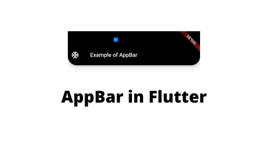
AppBar in Flutter. How to Implement and Use It
AppBar in Flutter. How to Implement and Use It
AppBar in Flutter It consists a toolbar with other widgets, like TabBar, Flexible SpaceBar, icon buttons, etc. if the AppBar is in Scaffold with Drawer so you will be able to see the Drawer icon which operates drawer else it shows back Icon which is used to navigate to previous routes. Below is the syntax from which you can make AppBar. appBar: AppBar( title: Text(title), ) Properties of…
View On WordPress
0 notes
Link
Build Flutter app with AppBar and SilverAppBar? Concetto Labs provide material design app bar that integrates with a CustomScrollView.
0 notes